| Person | Age |
|---|---|
| 1 | 20 |
| 2 | 32 |
| 3 | 45 |
| 4 | 25 |
| 5 | 45 |
3 Descriptive and Inferential Statistics
3.1 Descriptive Statistics
Descriptive statistics involve the use of numerical and graphical methods to summarize and present data in a meaningful way. Descriptive statistics focus on describing and summarizing the main features of a dataset. The primary goal is to simplify large amounts of data. This can help researchers, clinicians, and public understand it.
Key aspects of descriptive statistics include measures of central tendency and variability. We will also briefly visit figures/graphical representations of data.
3.1.1 Measures of Central Tendency
Imagine we measure five people’s ages and get the following data:
3.1.1.1 Mean (Average)
- The sum of all values divided by the number of observations.
- Pros:
- Takes into account every data point in the dataset, making it sensitive to changes in any value.
- Has convenient mathematical properties, making it suitable for various statistical analyses.
- Cons:
- The mean is highly affected by extreme values (outliers), and a few outliers can significantly skew the result.
- Typically represented by \(\bar{x}\) or \(\bar{X}\)
- \(\bar{x} = \frac{1}{n} \sum_{i=1}^{n} x_i\)
For our hypothetical data:
\(\bar{x} = \frac{20+32+45+25+45}{5}=33.4\)
In r:
x <- c(20, 32, 45, 25, 45)
mean(x)
[1] 33.43.1.1.2 Median
- The middle value in a dataset when it is ordered from least to greatest.
- The 50% percentile of the data.
- When there are an even number of observations, take the mean of the middle two values only.
- Pros:
- Not influenced by extreme values, making it a robust measure of central tendency.
- It accurately represents the center of skewed distributions.
- Cons:
- Only considers the order of values and does not use the actual numerical values, ignoring information about the magnitudes of differences.
I recommend, if you ever do this by hand, ordering from smallest to largest.
\(20, 25, 32, 45, 45\)
\(Median=32\)
In r:
median(x)[1] 32Example with even number of observations:
\(20, 25, 32, 45, 45, 50\)
\(Median = \frac{32+45}{2}=38.5\)
3.1.1.3 Mode
- The most frequently occurring value in a dataset.
- Pros:
- Can be used with nominal data, where there is no inherent order.
- Easy to understand and calculate.
- Cons:
- A dataset may have no mode, or it may have multiple modes. In cases with multiple modes, the distribution is called multimodal.
- The mode may not accurately represent the center of a distribution, especially in datasets with a continuous range of values.
For our data:
| Value | Observed Frequency |
|---|---|
| 20 | 1 |
| 25 | 1 |
| 32 | 1 |
| 45 | 2 |
\(Mode = 45\)
There’s no built-in function for mode. But you can manually use the following function:
#Mode Function
getMode <- function(x) {
  uniqX <- unique(x)
  uniqX[which.max(tabulate(match(x, uniqX)))]
}
getMode(x)
[1] 453.1.2 Variability
3.1.2.1 Range
- The difference between the maximum and minimum values in a dataset.
For our data, the min value is 20 and the max value is 45.
\(45-20=25\)
In r:
# Range only gives the extremes
# So need to subtract the 2nd element (max) from the 1st (min)
range(x)[2]-range(x)[1]
[1] 253.1.2.2 Variance
- A measure of how spread out the values in a dataset are from the mean.
\(\sigma^2 = \frac{\sum_{i=1}^{n}(x_i - \bar{x})^2}{n}\)
Where:
- \(\sigma^2\) is variance.
- \(\sum\) is the sum.
- \(n\) is the number of data points in the dataset.
- \(x_i\) represents each individual data point.
- \(\bar{x}\) is the mean of the dataset.
The above is the population variance. The sample variance, which you will likely use is:
\(s^2 = \frac{\sum_{i=1}^{n}(x_i - \bar{x})^2}{n-1}\)
See another chapter for why we subtract from \(n-1\) instead of \(n\).
For our data:
\(s^2=\frac{(20-33.4)^2+(25-33.4)^2+(32-33.4)^2+(45-33.4)^2+(45-33.4)^2}{5-1}=\frac{521.2}{4}=130.3\)
In r:
var(x)[1] 130.33.1.2.3 Standard Deviation
- The square root of the variance; it provides a more interpretable measure of dispersion.
Population:
\(\sigma = \sqrt{\frac{\sum_{i=1}^{n}(x_i - \bar{x})^2}{n}}\)
Sample:
\(s = \sqrt{\frac{\sum_{i=1}^{n}(x_i - \bar{x})^2}{n-1}}\)
For our data:
\(s=\sqrt{\frac{(20-33.4)^2+(25-33.4)^2+(32-33.4)^2+(45-33.4)^2+(45-33.4)^2}{5-1}}=\sqrt{\frac{521.2}{4}}=\sqrt{130.3}=11.41\)
Or, in r:
sd(x)[1] 11.41493.1.3 Graphical Representations
3.1.3.1 Histograms
- A visual representation of the distribution of a dataset, showing the frequency of different ranges of values.
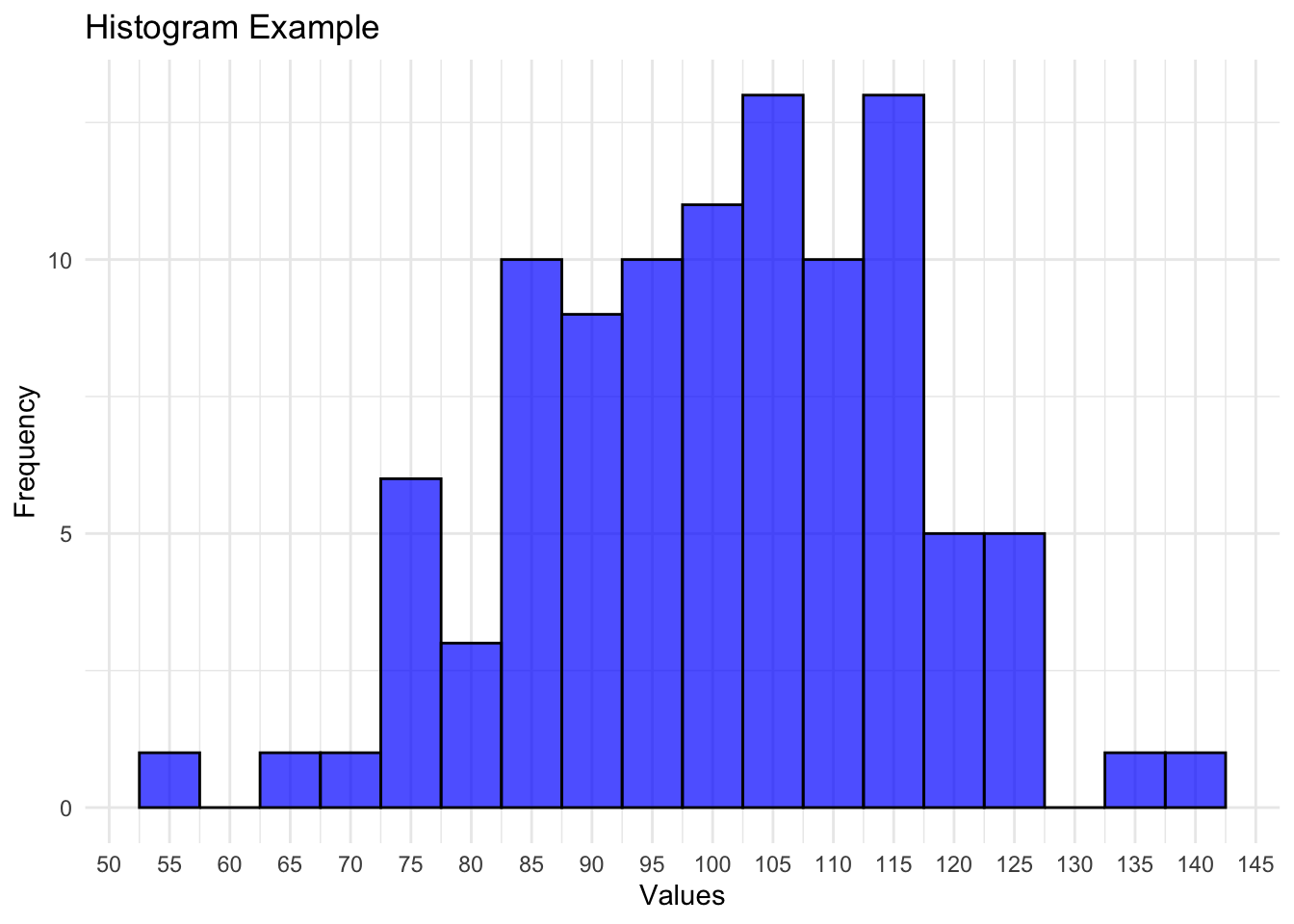
To read a histogram, start by examining the x-axis, which represents the range of values in the dataset. The data is divided into intervals or bins along the x-axis, and the y-axis displays the frequency or count of observations within each bin.
The height of each bar corresponds to the number of data points falling within that bin. A key aspect is the width of the bins, as it influences the visual interpretation. A narrower bin width can reveal finer details in the distribution, while a broader bin width may smooth out fluctuations.
Additionally, the overall shape of the histogram indicates the data’s central tendency, spread, and symmetry. Peaks and valleys highlight regions of higher or lower frequency, and the tails provide insights into outliers or extreme values.
3.1.3.2 Box plots
- A graphical summary of the distribution of a dataset, including the median, quartiles, and potential outliers.
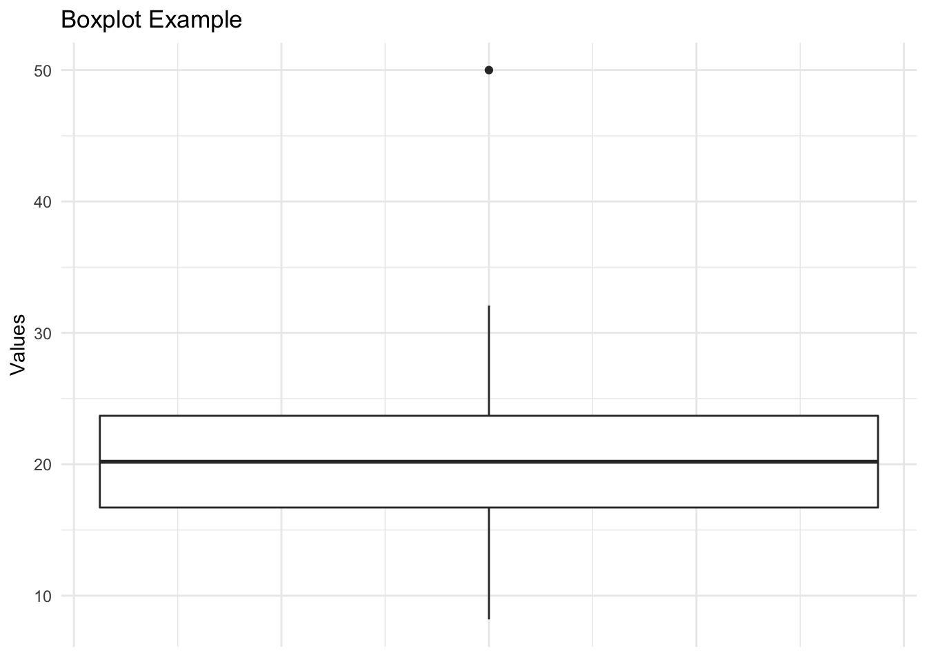
Interpreting a boxplot:
- Box (Interquartile Range - IQR):
- The box represents the middle 50% of the data, known as the interquartile range (IQR).
- The lower (Q1) and upper (Q3) edges of the box correspond to the 25th and 75th percentiles, respectively.
- Median (Line Inside the Box):
- The line inside the box represents the median.
- Whiskers:
- The whiskers extend from the box to the minimum and maximum values within a certain range.
- The length of the whiskers can vary. There are several equations that may be used.
- Outliers:
- Outliers are individual data points that fall significantly outside the typical range of the data.
- They are often plotted as individual points or dots.
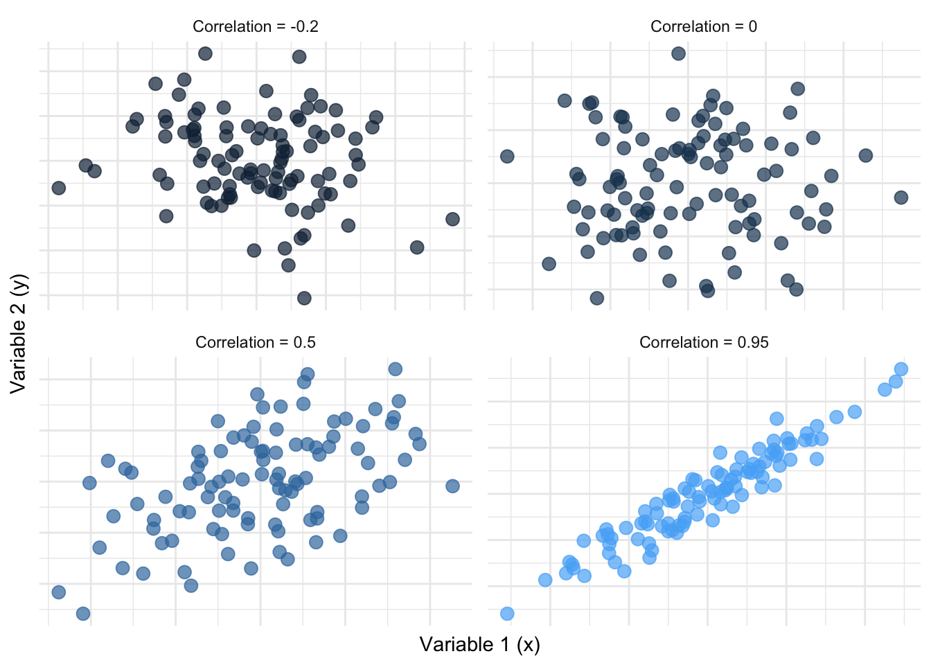
3.1.3.3 Scatter plots
- Displaying the relationship between two variables in a two-dimensional space.
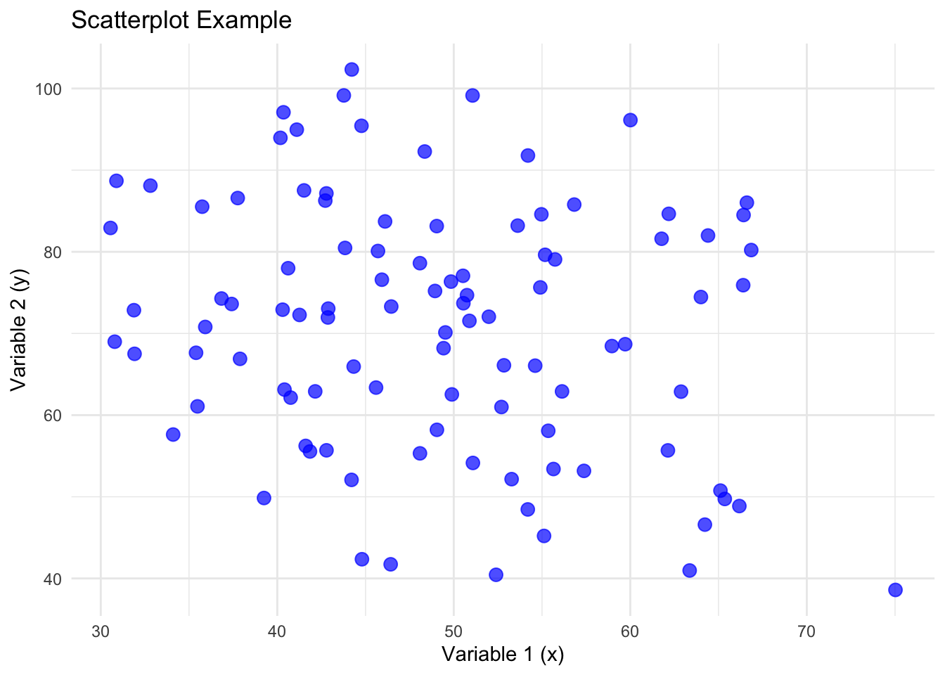
Scatterplots serve as powerful tools for exploring the relationship between two variables in a dataset. The direction in which points trend across the two-dimensional plane, whether upward or downward, offers immediate insights into the correlation between the variables.
As the correlation between two variables increases, the points approximate a line.
Descriptive statistics provide a concise summary of the main features of a dataset, aiding in the interpretation and communication of data patterns. These statistics are fundamental for understanding the characteristics of a dataset before applying more advanced statistical analyses or drawing conclusions based on the data.
3.2 Inferential Statistics
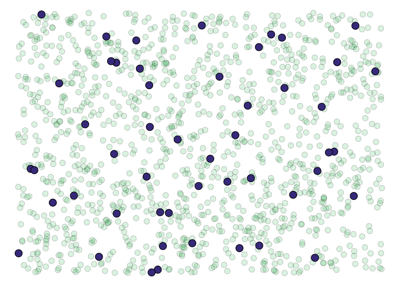
Our theories and resulting hypotheses are typically assumed to apply to a specific population (e.g., EVERYONE, men, university students). However, we do not have the time or resources to collect data from the entire population. Therefore, we try to collect a sample that is representative of that population. After we identify a suitable sample, we collect data from that sample. Once we analyze our results using data from the sample, we assume the results generalize to the entire population. We infer about the population based on studies using samples. This is inferential statistics.
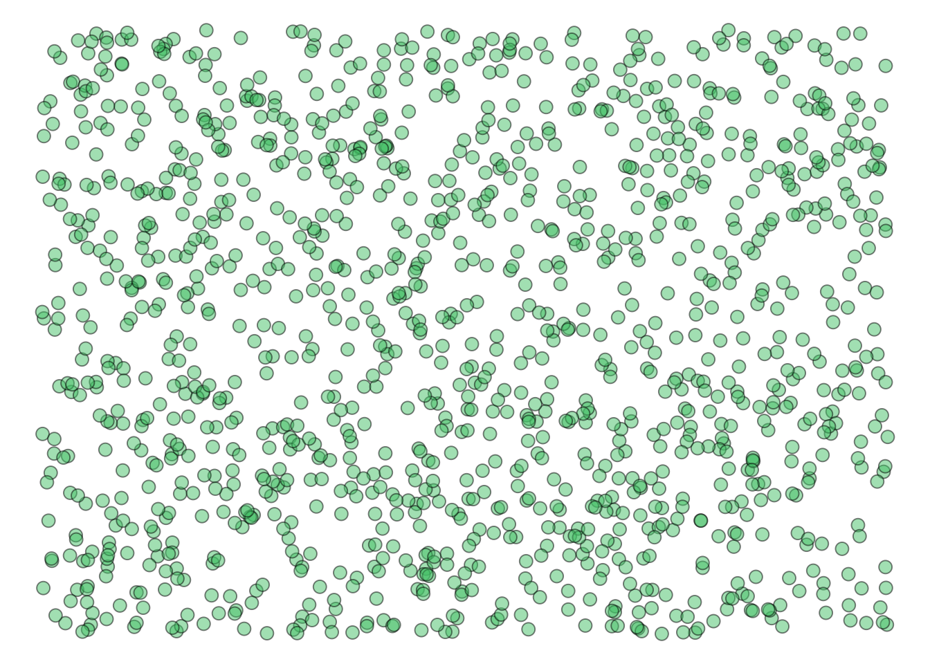
For example, imagine we are interested in understanding the link between depression and anxiety in Grenfell Students (our population). Hypothetically, the following figure represents all Grenfell Students.
We don’t havr the time or money to sample all students. Perhaps we sample 50 of these individuals (indicated by dark purple).
We would conduct analysis with the sample. The following figure visualized the link between depression and anxiety in our sample:
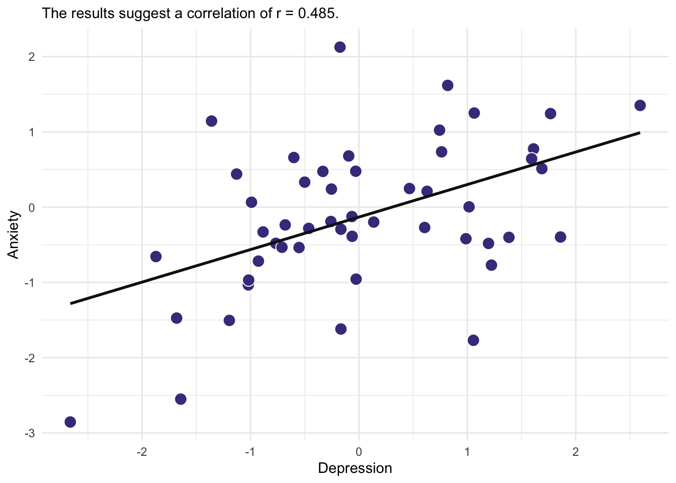
and infer that they generalize to the population!
Practice
- How can inferential statistics help psychologists draw meaningful conclusions from data, beyond just describing the sample at hand?
- Can inferential statistics be misinterpreted or misused, and what steps can psychologists take to ensure the accuracy and validity of their statistical inferences?
- What challenges and opportunities arise when applying inferential statistics to complex psychological phenomena, such as emotions, cognition, or interpersonal relationships?
- How do cultural and contextual factors impact the appropriateness and interpretation of inferential statistics in cross-cultural psychological research?