12 Lab 6 (Stata)
12.1 Lab Goals & Instructions
Today we are using a new dataset. See the script file for the lab to see the explanation of the variables we will be using.
Research Question: What characteristics of campus climate are associated with student satisfaction?
Goals
- Use component plus residuals plots to evaluate linearity in multivariate regressions.
- Add polynomial terms to your regression to address nonlinearity
- Turn a continuous variable into a categorical variable to address nonlinearity
- Add interaction terms to your regression and evaluate them with margins plots.
Instructions
- Download the data and the script file from the lab files below.
- Run through the script file and reference the explanations on this page if you get stuck.
- No challenge activity!
Jump Links to Commands in this Lab:
This is the main new command in today’s lab. Otherwise we will be playing with margins plots quite a bit.
12.2 Components Plus Residuals Plot
This week we’re returning to the question of nonlinearity in a multivariate regression. First we’re going to discuss a new plot to detect nonlinearity –specifically in regressions with more than one independent variable: the component plus residuals plot.
Sometimes we want to examine the relationship between one independent variable and the outcome variable, accounting for all other independent variables in the model. They take the residual and subtract the parts of the residual that come from the other independent variables.
Let’s run through an example.
STEP 1: First, run the regression:
regress satisfaction climate_gen climate_dei instcom ///
    fairtreat female ib3.race_5
> fairtreat female ib3.race_5
Source | SS df MS Number of obs = 1,416
-------------+---------------------------------- F(9, 1406) = 134.18
Model | 692.700417 9 76.966713 Prob > F = 0.0000
Residual | 806.483199 1,406 .573601137 R-squared = 0.4621
-------------+---------------------------------- Adj R-squared = 0.4586
Total | 1499.18362 1,415 1.05949372 Root MSE = .75736
-------------------------------------------------------------------------------
satisfaction | Coefficient Std. err. t P>|t| [95% conf. interval]
--------------+----------------------------------------------------------------
climate_gen | .4549723 .0402608 11.30 0.000 .3759946 .53395
climate_dei | .0914773 .039135 2.34 0.020 .0147081 .1682466
instcom | .291927 .0325804 8.96 0.000 .2280156 .3558384
fairtreat | .1642801 .0384167 4.28 0.000 .0889198 .2396404
female | -.0647484 .0419125 -1.54 0.123 -.1469663 .0174694
|
race_5 |
White | .3724681 .0683034 5.45 0.000 .2384805 .5064557
AAPI | .3445667 .0754328 4.57 0.000 .1965937 .4925396
Hispanic/L~o | .2711118 .0763919 3.55 0.000 .1212575 .4209662
Other | .2489596 .0872887 2.85 0.004 .0777294 .4201897
|
_cons | -.2139648 .1334109 -1.60 0.109 -.4756706 .0477411
-------------------------------------------------------------------------------STEP 2: Run the cprplot command specifying the independent variable you want to examine.
Basic Command:
cprplot climate_dei, lowess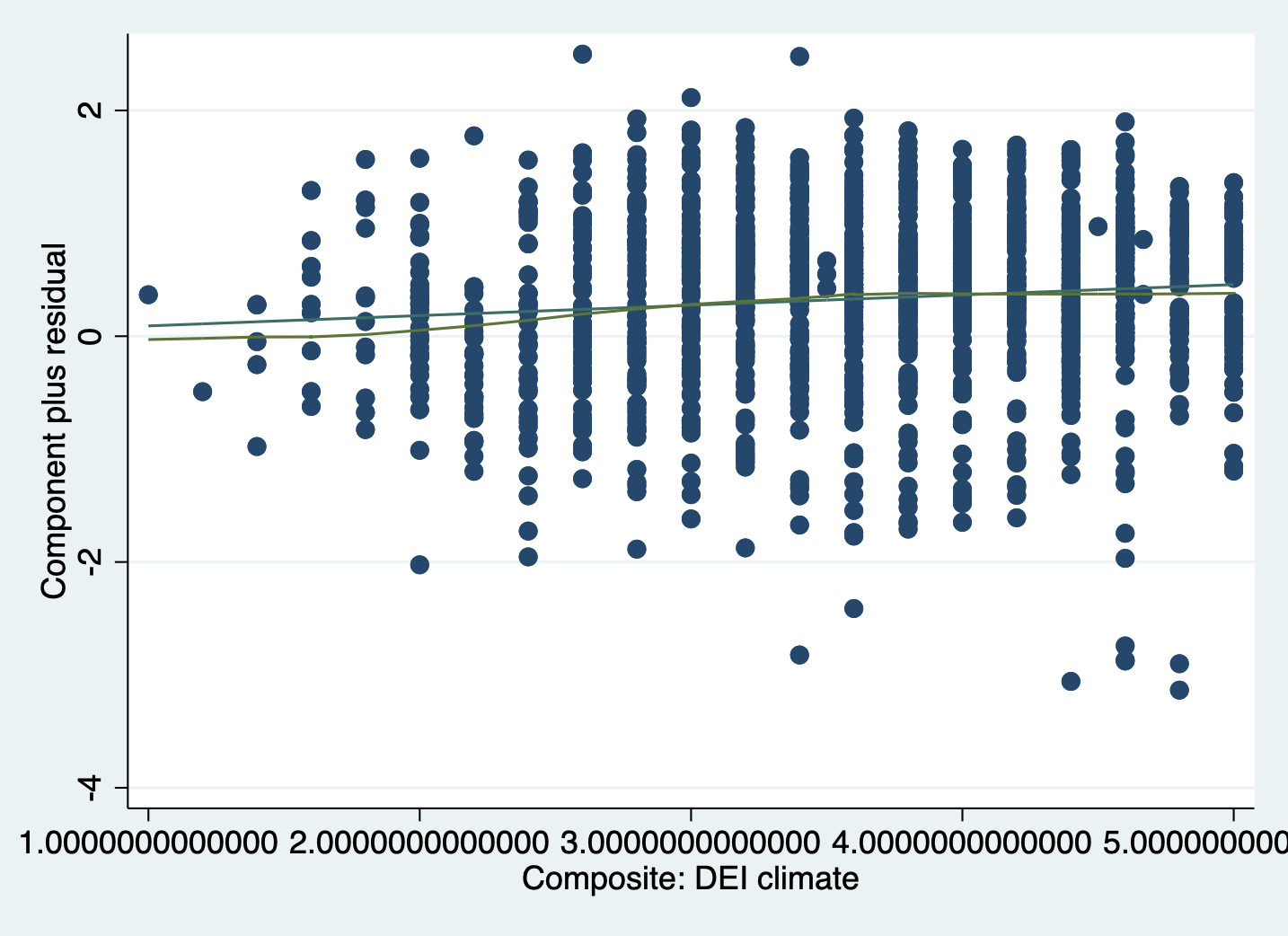
Command with clearer line colors:
I changed the regression line to be dashed and the lowess line to be red. This makes the lines and patterns easier to distinguish.
cprplot climate_dei, rlopts(lpattern(dash)) ///
    lowess lsopts(lcolor(red))
INTERPRETATION:
If the independent variable being examined and the outcome variable have a linear relationship, then the lowess line will be relatively straight and line up with the regression line. If there is a pattern to the scatter plot or clear curves in the lowess line, that is evidence of nonlinearity that needs to be addressed.
Now we’ll move on to addressing nonlinearity when we find it.
12.3 Approach 1: Polynomials
One way we can account for non-linearity in a linear regression is through polynomials. This method operates off the basic idea that \(x^2\) and \(x^3\) have pre-determined shapes when plotted (to see what these plots look like, refer to the explanation of this lab on the lab wepage. By including a polynomial term we can essentially account account for some curved relationships, which allows it to become a linear function in the model.
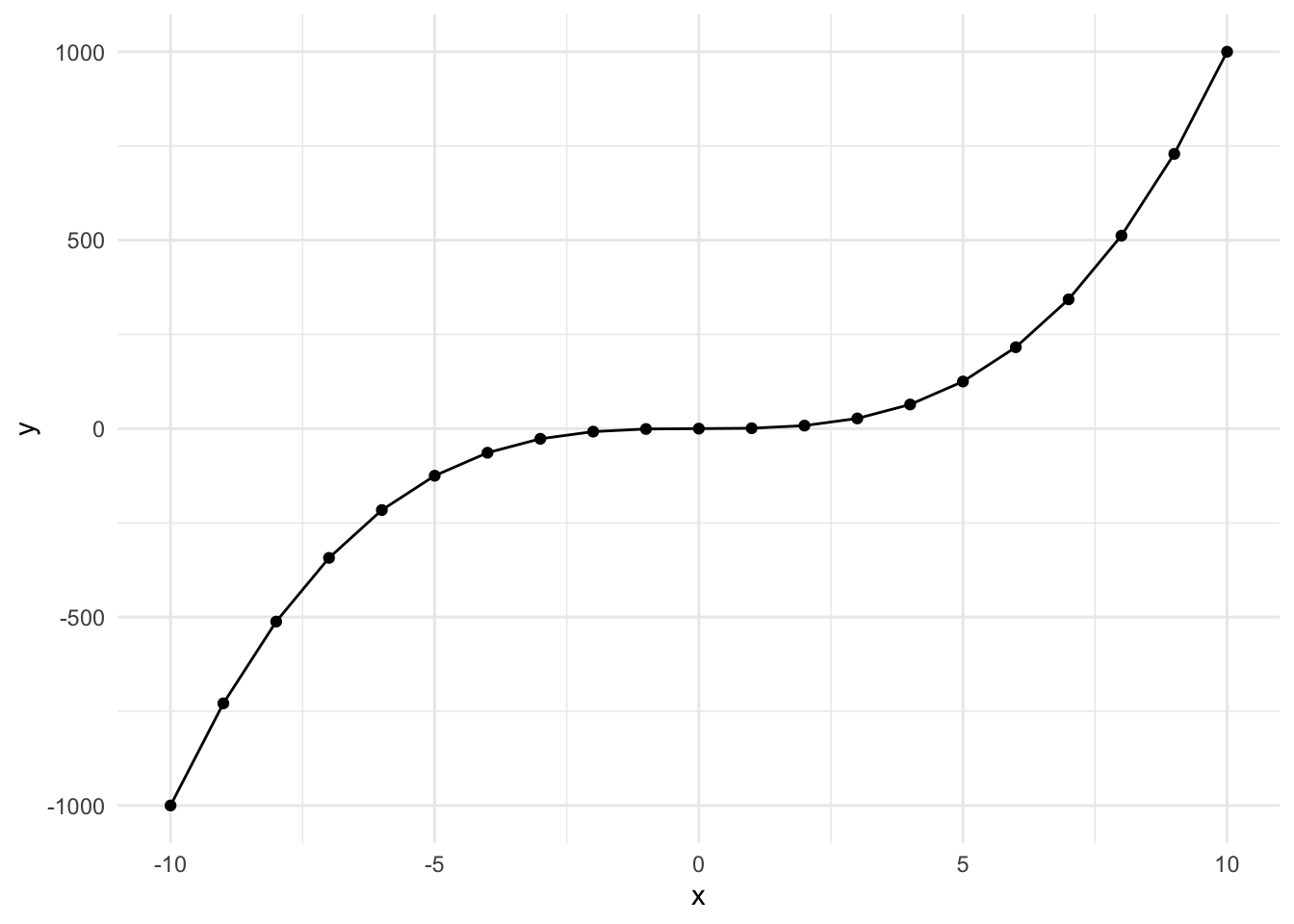
Squared Polynomial
Here’s what a \(y = x^2\) looks like when plotted over the range -10 to 10. It’s u-shaped and can be flipped depending on the sign.
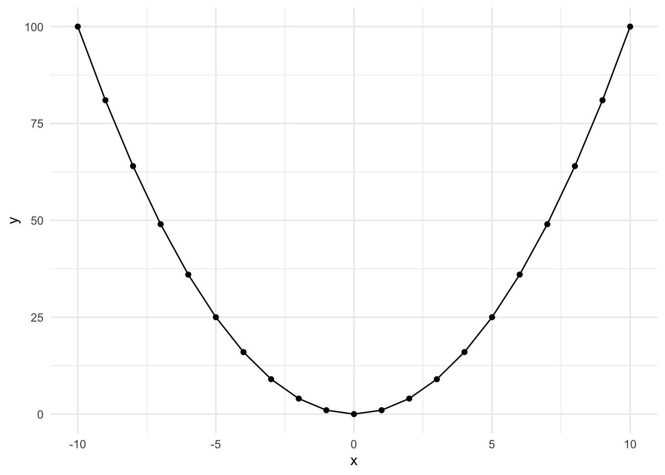
This occurs when an effect appears in the middle of our range or when the effect diminishes at the beginning or end of our range. Let’s look at an example:
STEP 1: Evaluate non-linearity and possible squared relationship
scatter satisfaction instcom || lowess satisfaction instcom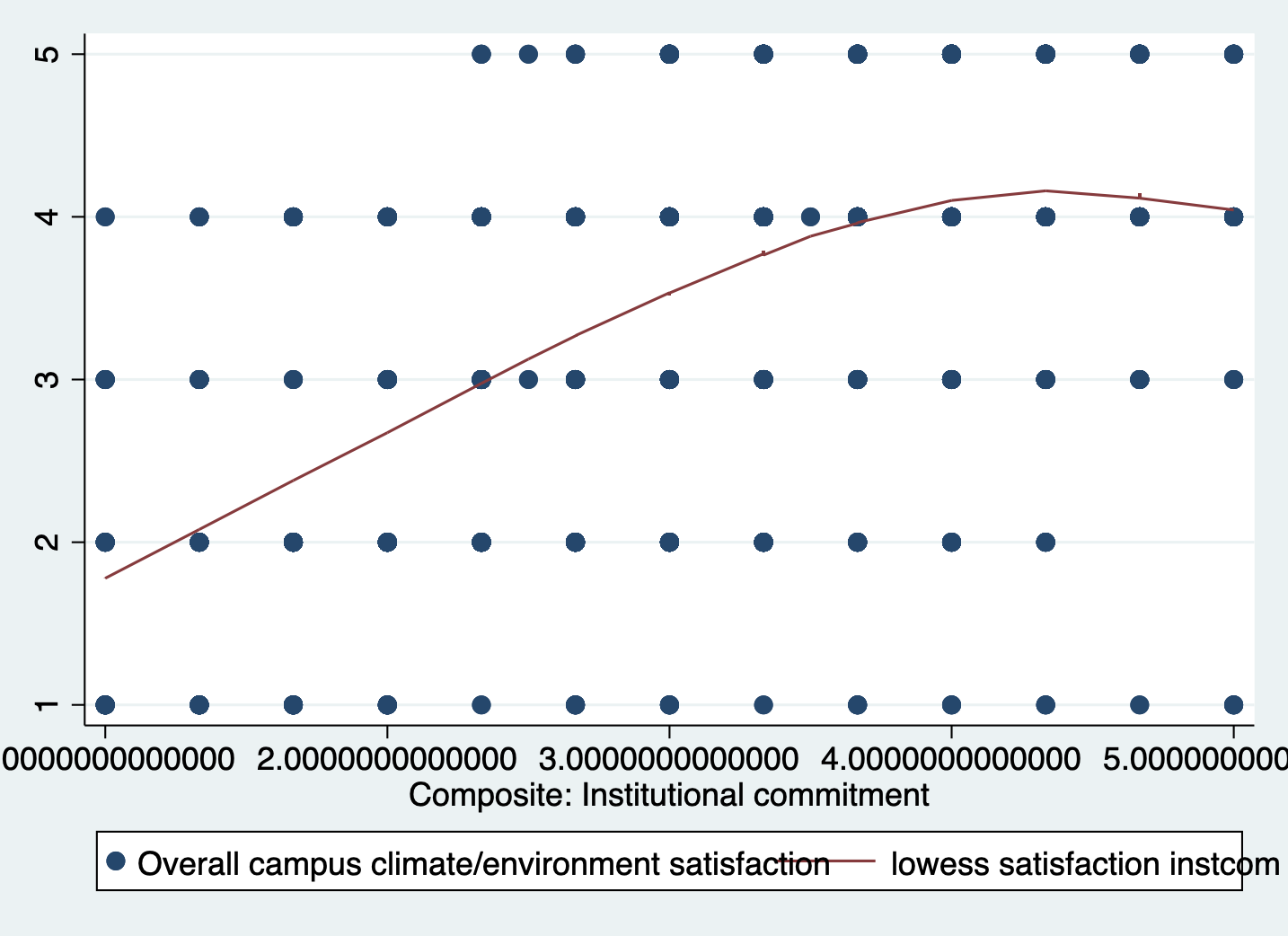
This is flipped and less exagerated, but it’s still an upside down u-shape.
STEP 2: Generate a squared variable for key variable
gen instcom_sq = instcom * instcomSTEP 3: Run regression with the squared expression to check significance
NOTE: You must always put both the original and the squared variables
in the model! Otherwise, you aren’t telling STATA to model both an initial and cubic change to the line.
regress satisfaction climate_gen climate_dei fairtreat female ib3. ///
    race_5 instcom instcom_sq
> race_5 instcom instcom_sq
Source | SS df MS Number of obs = 1,416
-------------+---------------------------------- F(10, 1405) = 122.56
Model | 698.460566 10 69.8460566 Prob > F = 0.0000
Residual | 800.72305 1,405 .569909644 R-squared = 0.4659
-------------+---------------------------------- Adj R-squared = 0.4621
Total | 1499.18362 1,415 1.05949372 Root MSE = .75492
-------------------------------------------------------------------------------
satisfaction | Coefficient Std. err. t P>|t| [95% conf. interval]
--------------+----------------------------------------------------------------
climate_gen | .4335635 .0406921 10.65 0.000 .3537397 .5133874
climate_dei | .0965462 .0390414 2.47 0.014 .0199605 .173132
fairtreat | .1597253 .0383197 4.17 0.000 .0845553 .2348954
female | -.0721038 .0418415 -1.72 0.085 -.1541823 .0099747
|
race_5 |
White | .3629737 .0681488 5.33 0.000 .2292894 .496658
AAPI | .3254566 .0754296 4.31 0.000 .1774898 .4734233
Hispanic/L~o | .2634913 .0761834 3.46 0.001 .1140459 .4129368
Other | .2499186 .0870079 2.87 0.004 .0792393 .420598
|
instcom | .741871 .1452069 5.11 0.000 .4570254 1.026717
instcom_sq | -.0718686 .0226061 -3.18 0.002 -.1162139 -.0275233
_cons | -.7750299 .2209744 -3.51 0.000 -1.208505 -.3415547
-------------------------------------------------------------------------------STEP 4: Generate margins graph if significant
NOTE: We use ## interact variables in a model. When you interact
a variable with itself, it acts as a squared term. This is
called ‘factor notation’ and we must use it instead of
the squared variable we created in order to get margins.
regress satisfaction climate_gen climate_dei fairtreat female ib3. ///
    race_5 c.instcom##c.instcom
margins, at(instcom = (0(1)5))
marginsplot, noci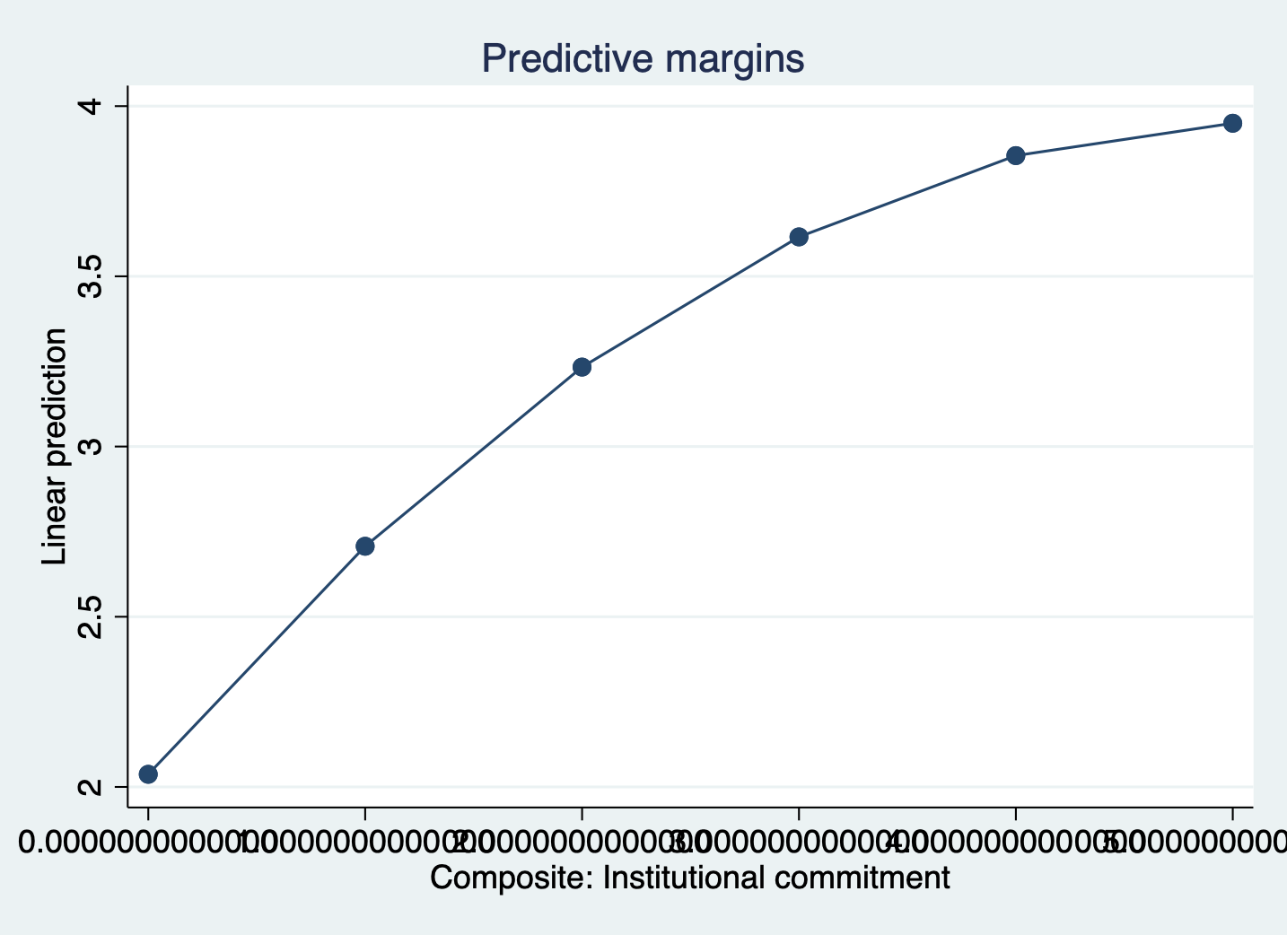
Cubed Polynomial
Here’s what a \(y = x^3\) looks like when plotted over the range -10 to 10. It’s slightly s-shaped.
This occurs when the effect is perhaps less impactful in the middle of the range. Let’s go through the example. The steps are the same, so we’re going to skip the generating a new variable step.
STEP 1: Evaluate non-linearity and possible cubic relationship
scatter satisfaction fairtreat || lowess satisfaction fairtreat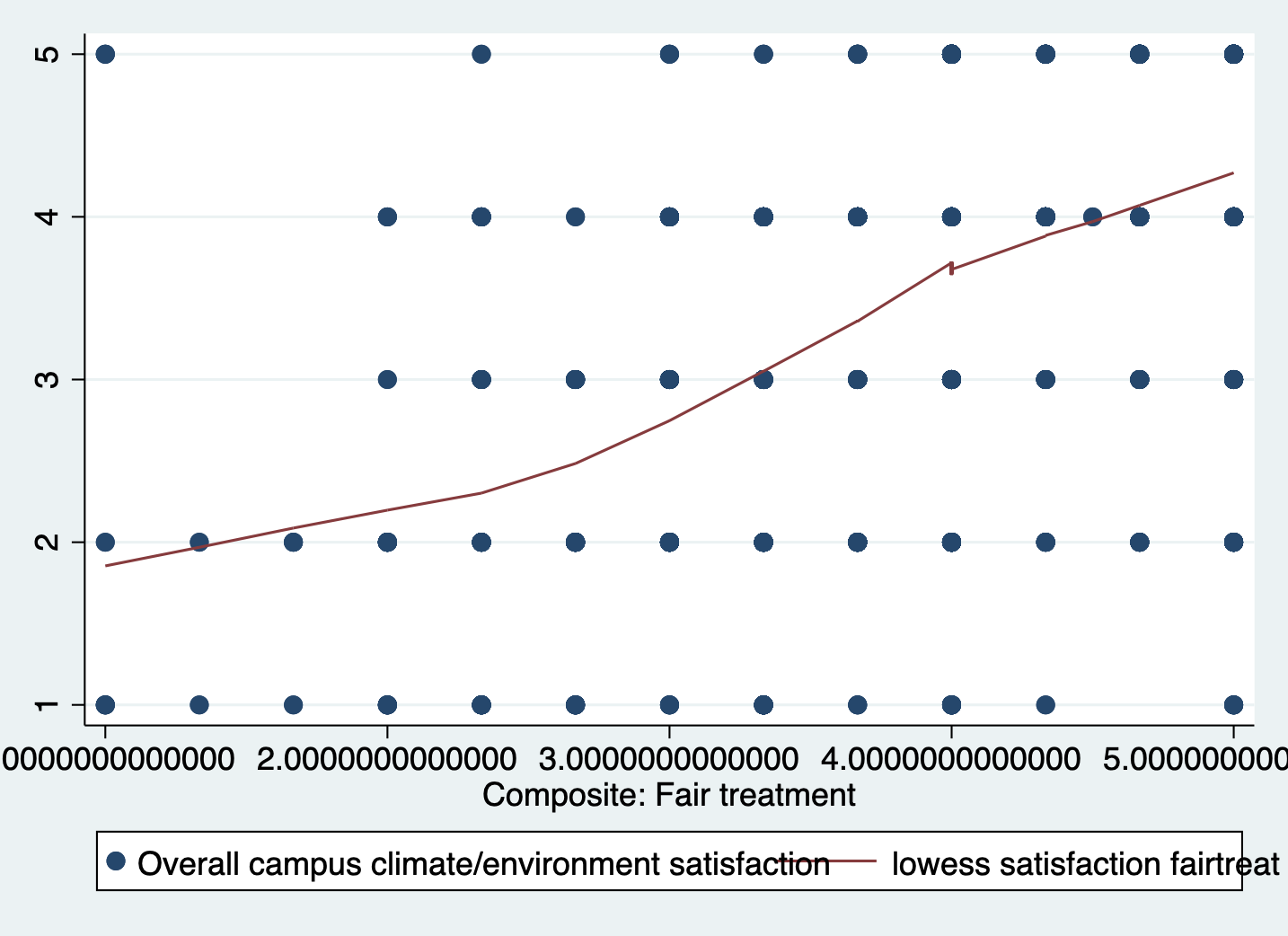
You can see our slight characteristic s-shape to the data.
STEP 2: Run Regression with cubic using interaction factor ( ## )
NOTE: We interact the variable “fairtreat” with itself twice
to make a cubed term. Again, we need to do this in
order to generate margins. If you find the regression
output harder to read with factor notation you can
manually create new cubed variable.
regress satisfaction climate_gen climate_dei instcom female ///
    ib3.race_5 c.fairtreat##c.fairtreat##c.fairtreat
> ib3.race_5 c.fairtreat##c.fairtreat##c.fairtreat
Source | SS df MS Number of obs = 1,416
-------------+---------------------------------- F(11, 1404) = 110.48
Model | 695.586279 11 63.2351163 Prob > F = 0.0000
Residual | 803.597337 1,404 .572362776 R-squared = 0.4640
-------------+---------------------------------- Adj R-squared = 0.4598
Total | 1499.18362 1,415 1.05949372 Root MSE = .75655
-------------------------------------------------------------------------------
satisfaction | Coefficient Std. err. t P>|t| [95% conf. interval]
--------------+----------------------------------------------------------------
climate_gen | .4434539 .0405782 10.93 0.000 .3638534 .5230544
climate_dei | .0917208 .0391412 2.34 0.019 .0149392 .1685024
instcom | .2880597 .0325941 8.84 0.000 .2241213 .351998
female | -.0688182 .0419067 -1.64 0.101 -.1510246 .0133882
|
race_5 |
White | .3710566 .0684485 5.42 0.000 .2367842 .505329
AAPI | .3416881 .0761053 4.49 0.000 .1923958 .4909803
Hispanic/L~o | .2759983 .0765125 3.61 0.000 .1259071 .4260894
Other | .254486 .0872918 2.92 0.004 .0832496 .4257224
|
fairtreat | -1.405129 .7489441 -1.88 0.061 -2.874299 .0640413
|
c.fairtreat#|
c.fairtreat | .493122 .2257115 2.18 0.029 .050354 .93589
|
c.fairtreat#|
c.fairtreat#|
c.fairtreat | -.0479178 .0215204 -2.23 0.026 -.0901333 -.0057022
|
_cons | 1.324045 .8063997 1.64 0.101 -.2578329 2.905923
-------------------------------------------------------------------------------Margins plot:
margins, at(fairtreat = (1(1)5))
marginsplot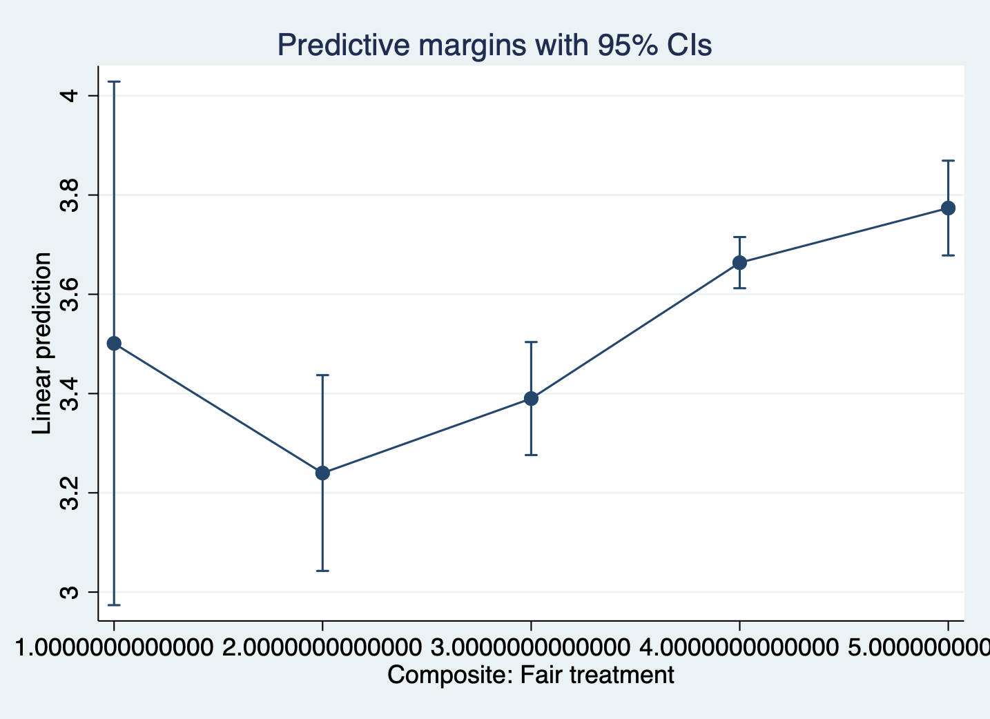
12.4 Approach 3: Creating a Categorical Variable
A second way we can account for non-linearity in a lienar regression is through transforming our continuous variable into categories. Age is a very common variable to see as categorical in models. We can capture some aspects of nonlinearity with ordered categories, but it may not be as precise as working with squared or cubed terms.
Let’s run through an example:
STEP 1: Evaluate what categories I want to create
sum climate_gen, d Composite: General climate
-------------------------------------------------------------
Percentiles Smallest
1% 1.571429 1
5% 2.285714 1
10% 2.714286 1 Obs 1,797
25% 3.142857 1.142857 Sum of wgt. 1,797
50% 3.714286 Mean 3.607732
Largest Std. dev. .7253975
75% 4.142857 5
90% 4.571429 5 Variance .5262015
95% 4.714286 5 Skewness -.500229
99% 5 5 Kurtosis 3.205013It looks pretty evenly spread across the range, so I’m going to create five categories.
STEP 2: Create the Category
gen climategen_cat =.
    replace climategen_cat =1 if climate_gen >=1 & climate_gen<2
    replace climategen_cat =2 if climate_gen >=2 & climate_gen<3
    replace climategen_cat =3 if climate_gen >=3 & climate_gen<4
    replace climategen_cat =4 if climate_gen >=4 & climate_gen<5
    replace climategen_cat =5 if climate_gen >=5
STEP 3: Run regression with indicator
regress satisfaction climate_dei instcom fairtreat female ib3.race_5 ///
        i.climategen_cat
> i.climategen_cat
Source | SS df MS Number of obs = 1,416
-------------+---------------------------------- F(12, 1403) = 96.90
Model | 679.419147 12 56.6182622 Prob > F = 0.0000
Residual | 819.764469 1,403 .584293991 R-squared = 0.4532
-------------+---------------------------------- Adj R-squared = 0.4485
Total | 1499.18362 1,415 1.05949372 Root MSE = .76439
-------------------------------------------------------------------------------
satisfaction | Coefficient Std. err. t P>|t| [95% conf. interval]
--------------+----------------------------------------------------------------
climate_dei | .1449277 .0390442 3.71 0.000 .0683363 .2215191
instcom | .2859731 .0331552 8.63 0.000 .220934 .3510122
fairtreat | .1982309 .0381992 5.19 0.000 .1232972 .2731647
female | -.060501 .0423081 -1.43 0.153 -.1434949 .0224929
|
race_5 |
White | .3467763 .0691179 5.02 0.000 .2111907 .4823618
AAPI | .3305859 .0764519 4.32 0.000 .1806136 .4805582
Hispanic/L~o | .2366182 .0770686 3.07 0.002 .085436 .3878003
Other | .2477479 .0882183 2.81 0.005 .074694 .4208018
|
climategen_~t |
2 | .589944 .1564542 3.77 0.000 .2830347 .8968534
3 | 1.04883 .1580689 6.64 0.000 .7387531 1.358907
4 | 1.297643 .1671818 7.76 0.000 .9696895 1.625596
5 | 1.501673 .2290519 6.56 0.000 1.052352 1.950994
|
_cons | .0892198 .1855177 0.48 0.631 -.2747021 .4531418
-------------------------------------------------------------------------------STEP 4: Double-Check linearity with margins
margins climategen_cat
marginsplot, noci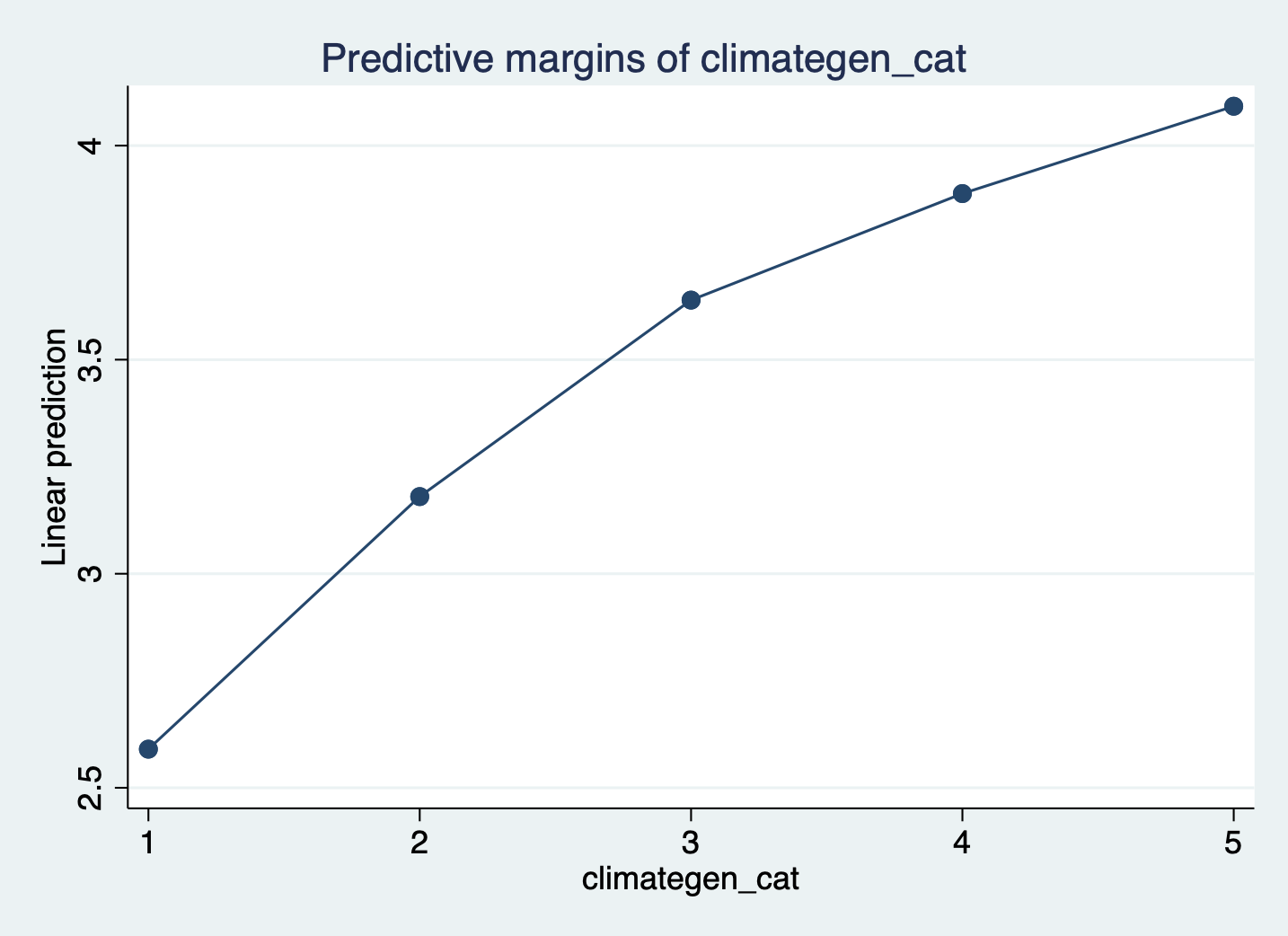
12.5 Interactions
We have finally arrived at interactions. It is finally time for ‘margins’ to TRULY shine. Wrapping your head around interactions might be difficult at first but here is the simple interpretation for ALL interactions:
The effect of ‘var1’ on ‘var2’ varies by ‘var3’
OR
The association of ‘var1’ and ‘var2’ significantlydiffers for each value of ’var3’s
Interactions are wonderful because for any combination of variable types. The key thing to be aware of is how you display/interpret it. Let’s see some options.
Continous variable x continuous variable
The first thing we are going to look at is the interaction between two continuous variables. Let’s run a simple regression interacting climate_dei & instcom. The question I’m asking here then is: Does the effect of people’s overall sense of DEI climate on their satisfaction differ based on a person’s perception of institutional
commitment to DEI?
First we run the regression with the interaction term:
regress satisfaction climate_gen undergrad female ib3.race_5 ///
    c.climate_dei##c.instcom
> c.climate_dei##c.instcom
Source | SS df MS Number of obs = 1,428
-------------+---------------------------------- F(10, 1417) = 116.36
Model | 689.376078 10 68.9376078 Prob > F = 0.0000
Residual | 839.539188 1,417 .592476491 R-squared = 0.4509
-------------+---------------------------------- Adj R-squared = 0.4470
Total | 1528.91527 1,427 1.07141925 Root MSE = .76972
-------------------------------------------------------------------------------
satisfaction | Coefficient Std. err. t P>|t| [95% conf. interval]
--------------+----------------------------------------------------------------
climate_gen | .5038651 .0380054 13.26 0.000 .4293123 .578418
undergrad | -.0216865 .0429315 -0.51 0.614 -.1059026 .0625296
female | -.0738629 .0425678 -1.74 0.083 -.1573655 .0096397
|
race_5 |
White | .4226195 .0679349 6.22 0.000 .2893557 .5558834
AAPI | .3526495 .0766823 4.60 0.000 .2022265 .5030726
Hispanic/L~o | .3064282 .076708 3.99 0.000 .1559547 .4569016
Other | .303079 .0877973 3.45 0.001 .1308523 .4753057
|
climate_dei | .4501156 .0965718 4.66 0.000 .2606766 .6395546
instcom | .6256633 .09919 6.31 0.000 .4310882 .8202385
|
c. |
climate_dei#|
c.instcom | -.0978223 .0272883 -3.58 0.000 -.1513522 -.0442924
|
_cons | -.9367096 .2943789 -3.18 0.001 -1.514175 -.3592444
-------------------------------------------------------------------------------Then we look at the margins plot. Because I’m mostly interested in what the graph looks like, I’ve added quietly to the front of the margins command. This tells Stata to run the margins command in the background without displaying the results in the console or in your log.
quietly margins, at(climate_dei=(1(1)5) instcom=(1(1)5))
marginsplot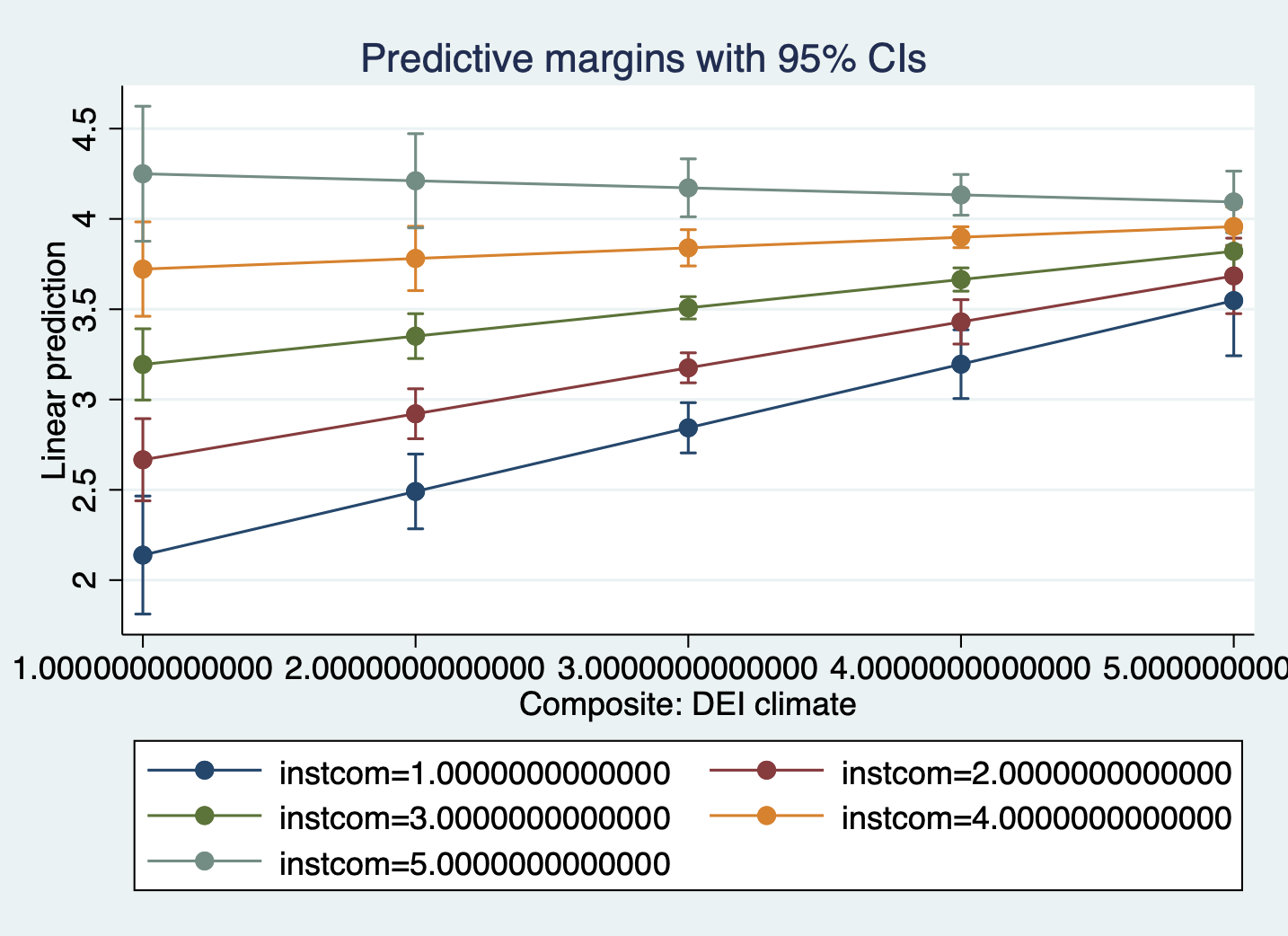
When creating a margins plot with a continuous x continuous interaction:
- You need to specify the
(min(interval)max)to tell STATA which predicted values to calculate for the plot. - Because both variables are continuous and you want STATA to calculate for each combination of two numbers, you have to put both in the
same_at(xxx)bracket so STATA knows to interact them.
Interpretation:
- The association between rating of DEI climate and satisfaction is MODERATED by perception of the institution’s commitment to DEI.
- The association between rating of DEI climate and satisfaction varies based on perception of the institution’s commitment to DEI.
- For students with low perception of the institution’s commitment to DEI, increased DEI climate ratings are associated with an significant increase in satisfaction. As perception of the institution’s commitment to DEI increases, the effect of DEI climate on satisfaction dampens (the slope gets less steep).
Sometimes, you may decide that interpreting this relationship in this direction is difficult to interpret/doesn’t make sense. In situations like that, you might want to change what is your key ‘x’ and your ‘moderator’ variable. Essentially, you are switching your x and y axis.
One way to do this is to switch which variable comes first in the _at() bracket:
quietly margins, at(instcom=(1(1)5) climate_dei=(1(1)5))
marginsplot
The other way is to tell marginsplot which variable to ‘plot’ (present as *moderator on the graph essentially:
quietly margins, at(climate_dei=(1(1)5) instcom=(1(1)5))
marginsplot, plot(climate_dei)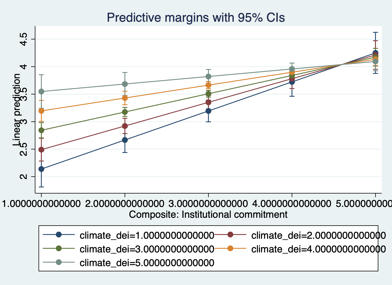
Updated Interpretation:
Because we switched which variable is the moderator, our interpration of the relationship changes.
- The association between perception of institutional commitment to DEI and satisfaction is MODERATED by the rating of DEI climate.
- The association between perception of institutional commitment to DEI and satisfaction varies based on rating of DEI climate.
- For students who rate the DEI climate lower, increased perception of institutional commitment to DEI is associated with higher satisfaction. For more positive ratings of DEI climate, the positive effect of perception of institutional commitment to DEI on satisfaction is dampened.
One last thing you can change is the number of lines that appear on the graph.
Approach 1: change the intervals
quietly margins, at(instcom=(1(1)5) climate_dei=(1(2)5))
marginsplot
Approach 2: specify the values that should be predicted
quietly margins, at(instcom=(1(1)5) climate_dei=(1 3 5))
marginsplot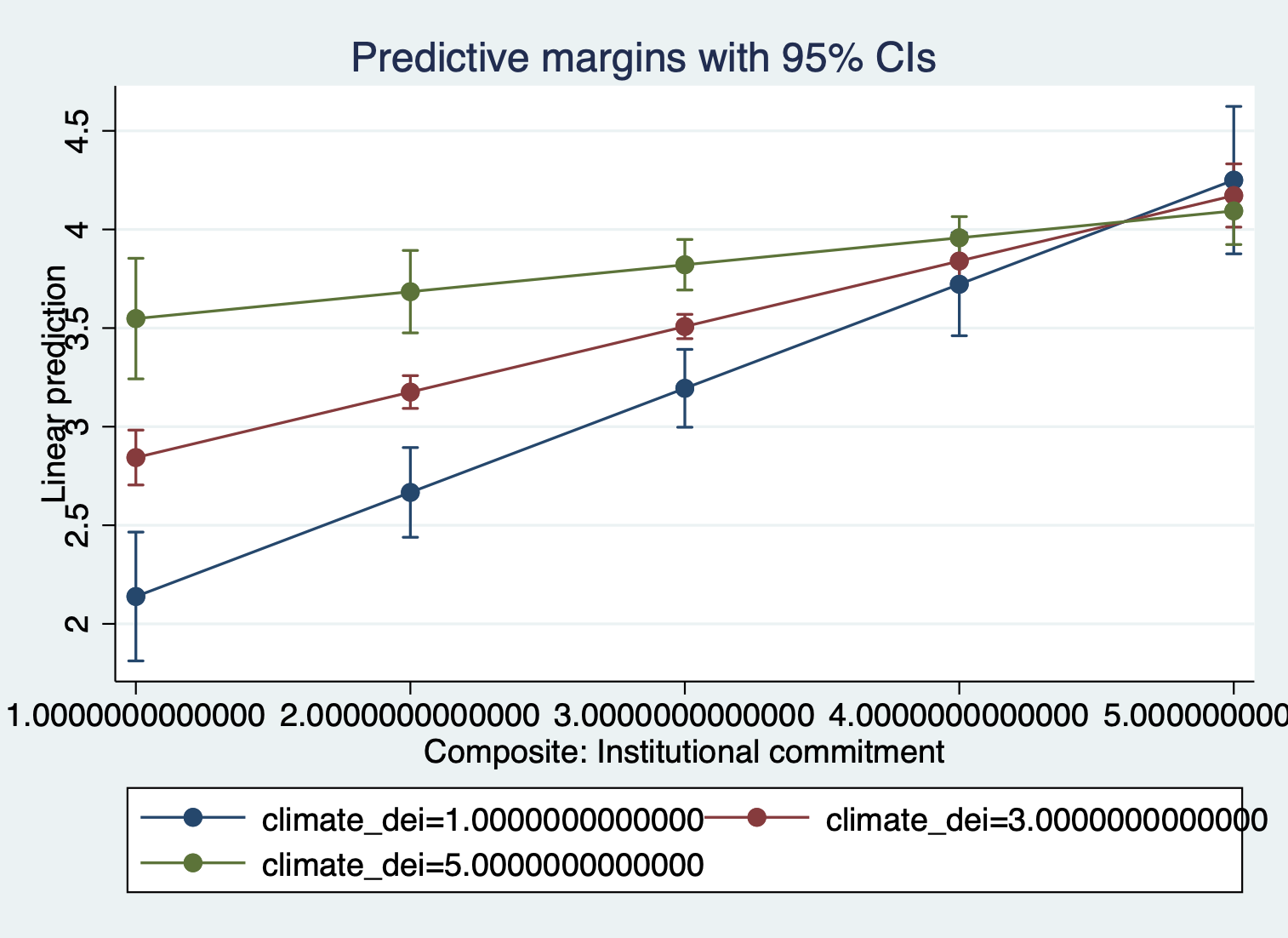
Continuous variable x dummy variable
Once you get a handle on continuous variables, the continuous dummy variable is extremely straightforward.
First run the regression.
regress satisfaction climate_gen instcom ib3.race_5 i.female##c.climate_dei Source | SS df MS Number of obs = 1,428
-------------+---------------------------------- F(9, 1418) = 128.65
Model | 687.2481 9 76.3609 Prob > F = 0.0000
Residual | 841.667166 1,418 .593559356 R-squared = 0.4495
-------------+---------------------------------- Adj R-squared = 0.4460
Total | 1528.91527 1,427 1.07141925 Root MSE = .77043
-------------------------------------------------------------------------------
satisfaction | Coefficient Std. err. t P>|t| [95% conf. interval]
--------------+----------------------------------------------------------------
climate_gen | .5208932 .0368994 14.12 0.000 .4485099 .5932765
instcom | .2856222 .0326096 8.76 0.000 .2216539 .3495904
|
race_5 |
White | .4265764 .0679328 6.28 0.000 .2933168 .559836
AAPI | .3730469 .076419 4.88 0.000 .2231404 .5229533
Hispanic/L~o | .3190265 .0767491 4.16 0.000 .1684726 .4695805
Other | .3101714 .0877853 3.53 0.000 .1379685 .4823743
|
female |
Female | -.650237 .1951897 -3.33 0.001 -1.033129 -.2673455
climate_dei | .0498149 .0471972 1.06 0.291 -.0427689 .1423987
|
female#|
c.climate_dei |
Female | .1588592 .0519094 3.06 0.002 .0570318 .2606866
|
_cons | .355042 .1677356 2.12 0.034 .0260054 .6840787
-------------------------------------------------------------------------------Then look at the margins plot:
quietly margins female, at(climate_dei=(1(1)5))
marginsplot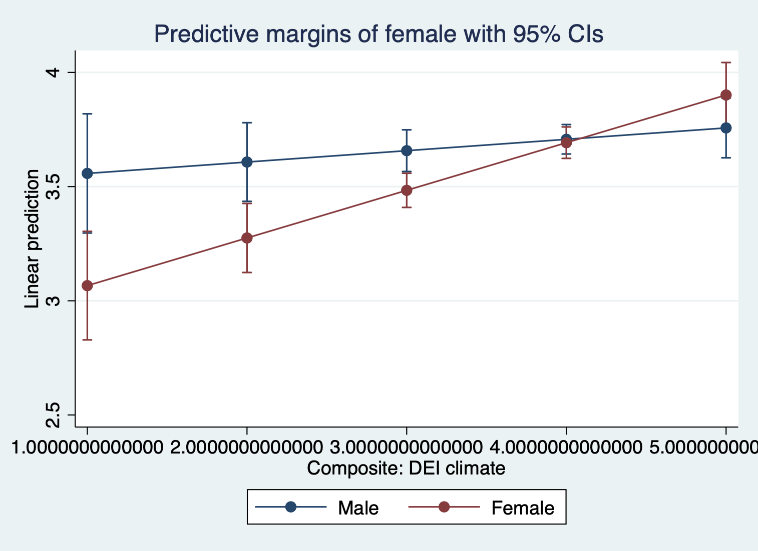
Interpretation:
The association between rating of DEI climate and satisfaction is MODERATED by gender
The association between rating of DEI climate and satisfaction varies based on a student’s gender identity
The positive effect/association of rating of DEI climate on/with satisfaction is stronger for females than males.
Continuous variable x Categorical variable
Categorical variables are often feel most confusing for interactions.
Let’s say I’m interested in how climate_dei is moderated by race. Let’s look at the regression results:
regress satisfaction climate_gen instcom female i.race_5##c.climate_dei Source | SS df MS Number of obs = 1,428
-------------+---------------------------------- F(12, 1415) = 98.65
Model | 696.431535 12 58.0359612 Prob > F = 0.0000
Residual | 832.483731 1,415 .588327725 R-squared = 0.4555
-------------+---------------------------------- Adj R-squared = 0.4509
Total | 1528.91527 1,427 1.07141925 Root MSE = .76703
-------------------------------------------------------------------------------
satisfaction | Coefficient Std. err. t P>|t| [95% conf. interval]
--------------+----------------------------------------------------------------
climate_gen | .5163975 .0370079 13.95 0.000 .4438013 .5889937
instcom | .2820706 .0325448 8.67 0.000 .2182293 .3459118
female | -.0669802 .0421579 -1.59 0.112 -.1496789 .0157186
|
race_5 |
AAPI | .5523891 .3057571 1.81 0.071 -.0473968 1.152175
Black | -1.043364 .2810924 -3.71 0.000 -1.594766 -.4919609
Hispanic/L~o | -.9812627 .2657842 -3.69 0.000 -1.502636 -.4598894
Other | -.2390071 .3184738 -0.75 0.453 -.8637387 .3857245
|
climate_dei | .0902564 .0489236 1.84 0.065 -.0057142 .186227
|
race_5#|
c.climate_dei |
AAPI | -.1571012 .0788798 -1.99 0.047 -.311835 -.0023673
Black | .1855982 .0830573 2.23 0.026 .0226696 .3485268
Hispanic/L~o | .2401252 .0712755 3.37 0.001 .1003082 .3799421
Other | .0307093 .0874273 0.35 0.725 -.1407918 .2022105
|
_cons | .6527546 .1785275 3.66 0.000 .3025476 1.002962
-------------------------------------------------------------------------------And then the margins plot:
quietly margins race_5, at(climate_dei=(1(1)5))
marginsplot, noci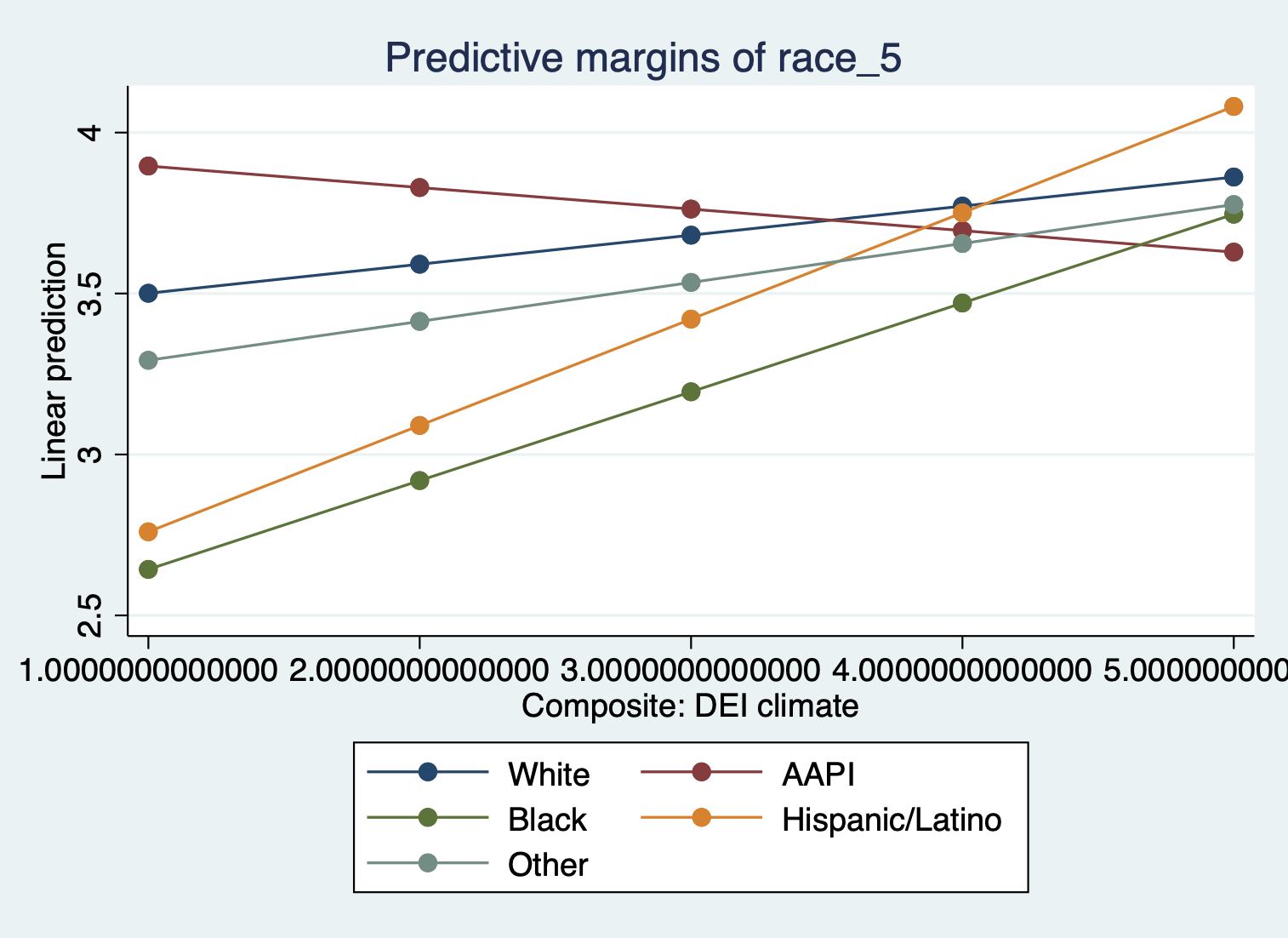
When creating a margins plot with a continuous x categorical interaction:
- Plot your variable of interest, that you think is a moderator, on the graph by putting it before the comma in the margins command. In this case we’re interested in the effect of race.
Interpretation:
- What we see then is how the effect of DEI climate rating on satisfaction varies by racial identity.
Let’s say, though, that you’re only interested in comparing how DEI and satisfaction differs. You might want to specify which racial groups to plot.
quietly margins, at(climate_dei=(1(1)5) race_5=(2 3 4))
marginsplot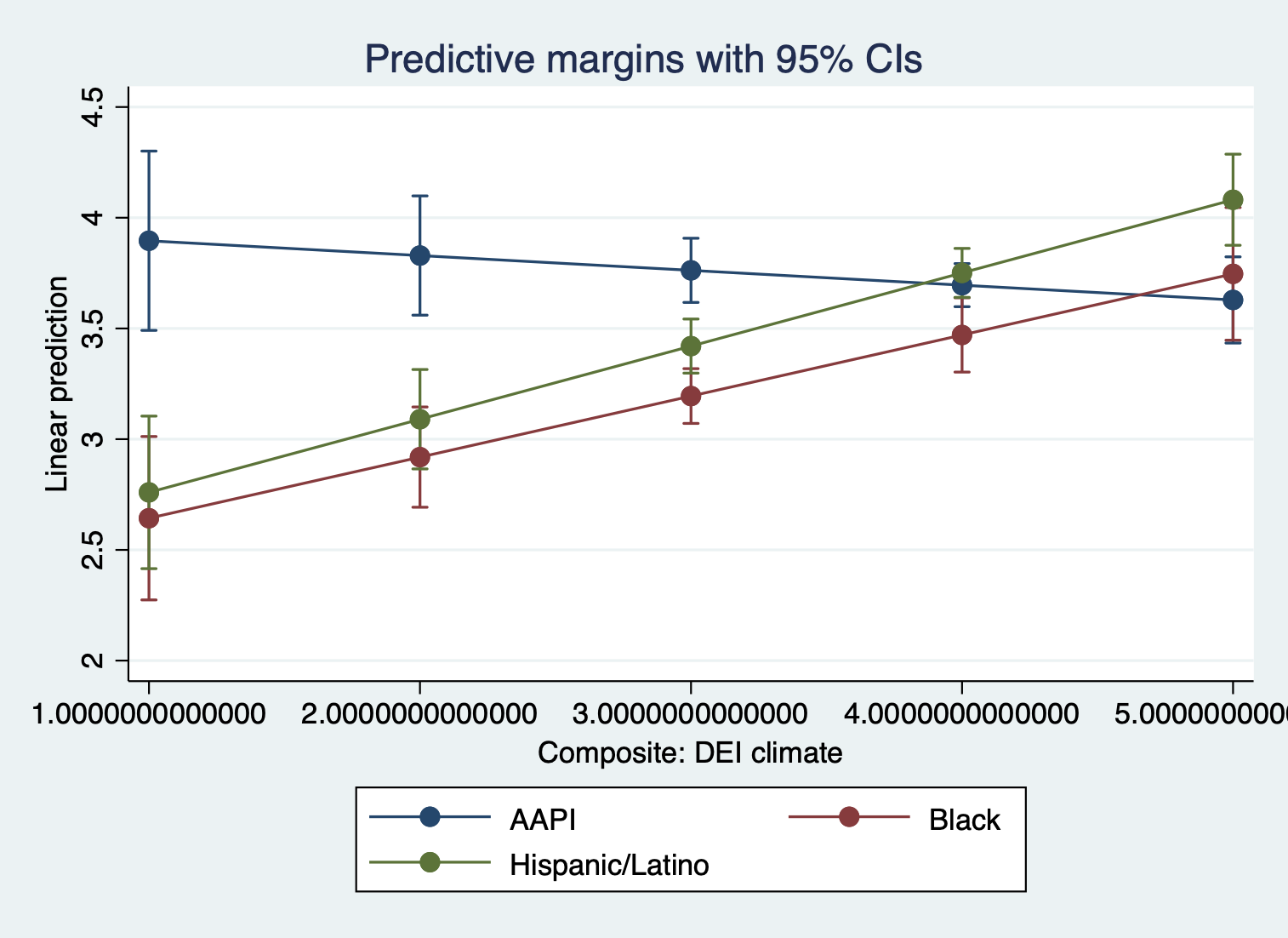
Categorical variable x dummy variable
We’ll now look at the categorical and dummy variables interaction.
First the regression:
regress satisfaction climate_gen climate_dei instcom undergrad ///
    i.race_5##i.female
> i.race_5##i.female
Source | SS df MS Number of obs = 1,428
-------------+---------------------------------- F(13, 1414) = 89.58
Model | 690.509811 13 53.1161393 Prob > F = 0.0000
Residual | 838.405456 1,414 .592931722 R-squared = 0.4516
-------------+---------------------------------- Adj R-squared = 0.4466
Total | 1528.91527 1,427 1.07141925 Root MSE = .77002
-------------------------------------------------------------------------------
satisfaction | Coefficient Std. err. t P>|t| [95% conf. interval]
--------------+----------------------------------------------------------------
climate_gen | .5146673 .0378538 13.60 0.000 .4404117 .588923
climate_dei | .1383065 .0389207 3.55 0.000 .061958 .214655
instcom | .2899488 .0328652 8.82 0.000 .225479 .3544186
undergrad | -.0102032 .0430071 -0.24 0.813 -.0945678 .0741613
|
race_5 |
AAPI | -.1500545 .0789974 -1.90 0.058 -.3050192 .0049102
Black | -.2799878 .106818 -2.62 0.009 -.4895265 -.0704491
Hispanic/L~o | -.1299022 .0869353 -1.49 0.135 -.3004383 .0406339
Other | .0592291 .1093019 0.54 0.588 -.1551821 .2736403
|
female |
Female | -.0515413 .0643228 -0.80 0.423 -.1777197 .0746371
|
race_5#female |
AAPI#Female | .20961 .1132215 1.85 0.064 -.0124902 .4317103
Black#Female | -.2356153 .1338683 -1.76 0.079 -.4982172 .0269866
Hispanic/L~o #|
Female | .0289424 .1185801 0.24 0.807 -.2036695 .2615543
Other#Female | -.3206363 .1473326 -2.18 0.030 -.6096503 -.0316223
|
_cons | .449525 .134609 3.34 0.001 .1854701 .7135798
-------------------------------------------------------------------------------And then the margins plot:
quietly margins female, at(race=(1(1)5))
marginsplot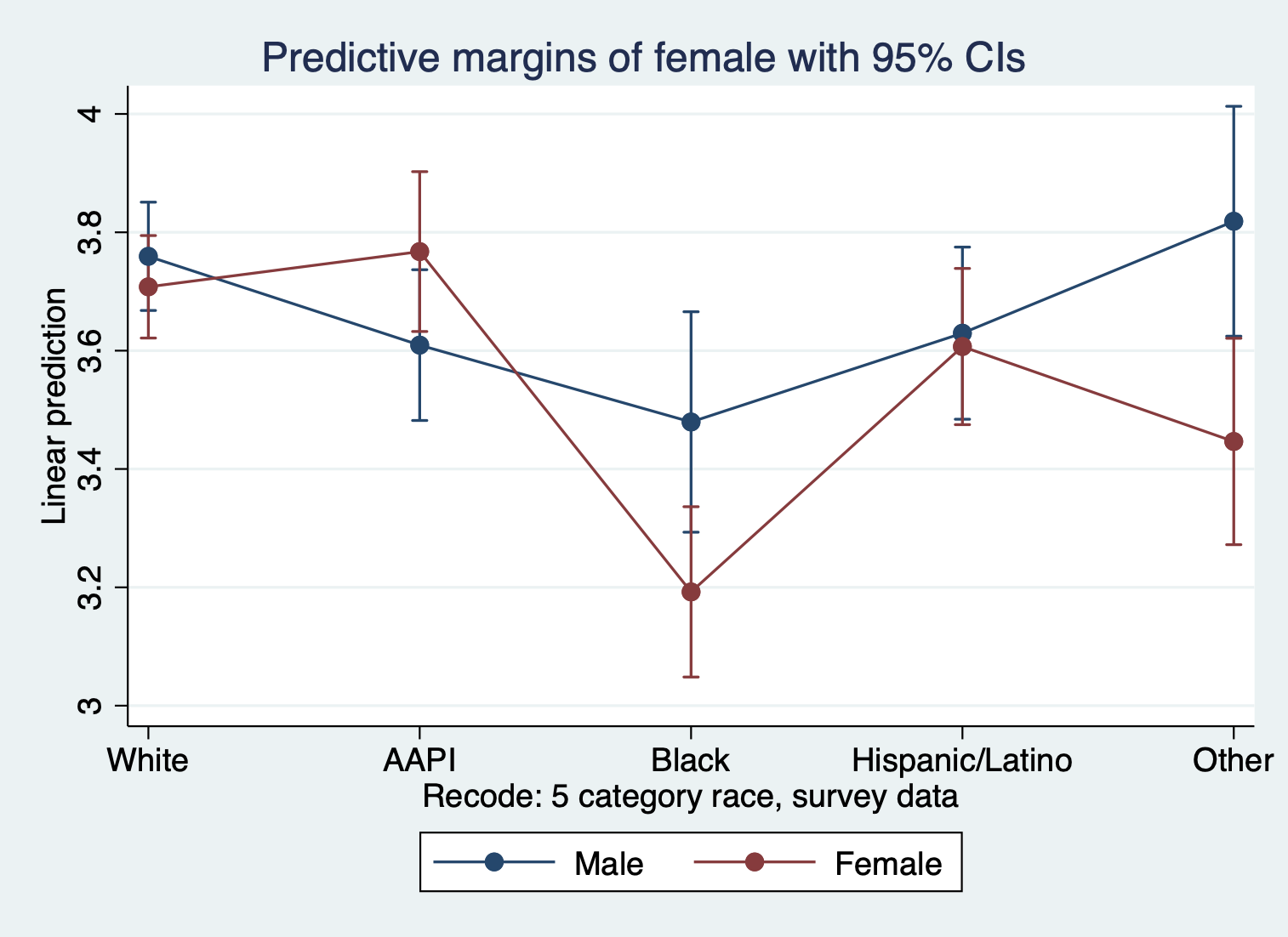
The first thing to notice is how ENTIRELY unhelpful this graph is because of how many things are happening. The way to do it is to break it down:
- FOCUS ON TWO DOTS EACH COLUMN TO SEE GENDER DIFFERENCES IN EACH RACIAL GROUP. We can see the difference between female and male satisfaction for each racial group. We can see, for example, that there is a major difference in satisfaction by gender for black students and students whose identity was grouped into other. Interestingly, the confidence intervals tell us that while the ‘other’ category’s difference is statistically significant, we can’t be sure for black students given the overlap.
- FOCUS ON LINES TO SEE RACIAL DIFFERENCES IN EACH GENDER CATEGORY. We can see the difference between the races for each gender. We can see for example, that black female students have lower satisfaction than all other female students, and that gap is statistically different with all the groups except women in the ‘other’ category.
What if we wanted to see these differences more clearly?
APPROACH 1: Change the type of graph we see
marginsplot, recast(bar) by(female)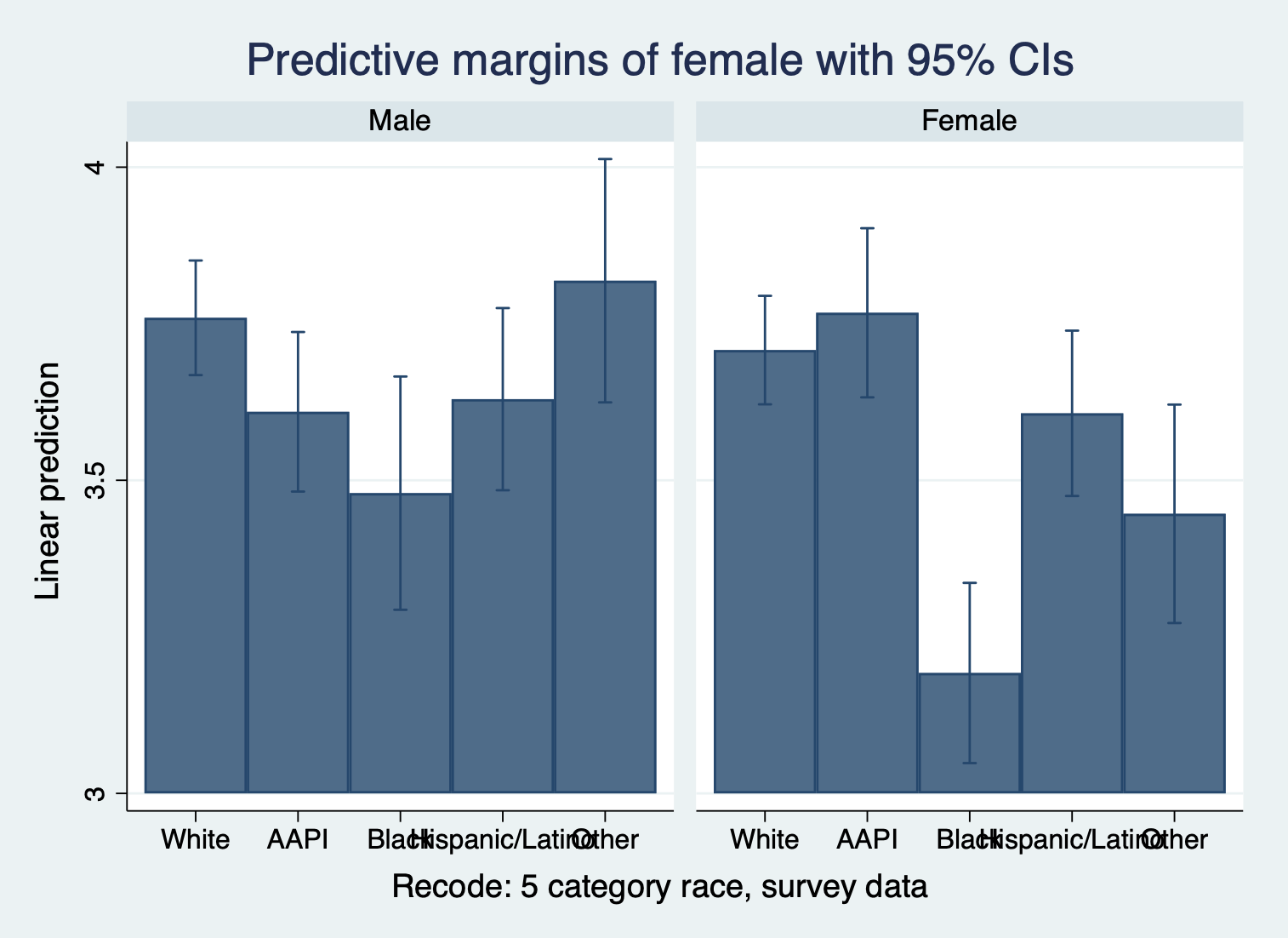
The ‘recast’ function allows you to use a different type of graph The ‘by’ creates a new graph for each value in the specified variable
APPROACH 2: Create margins that show the coefficient differences
quietly margins, dydx(female) at(race=(1(1)5))
marginsplot, recast(bar)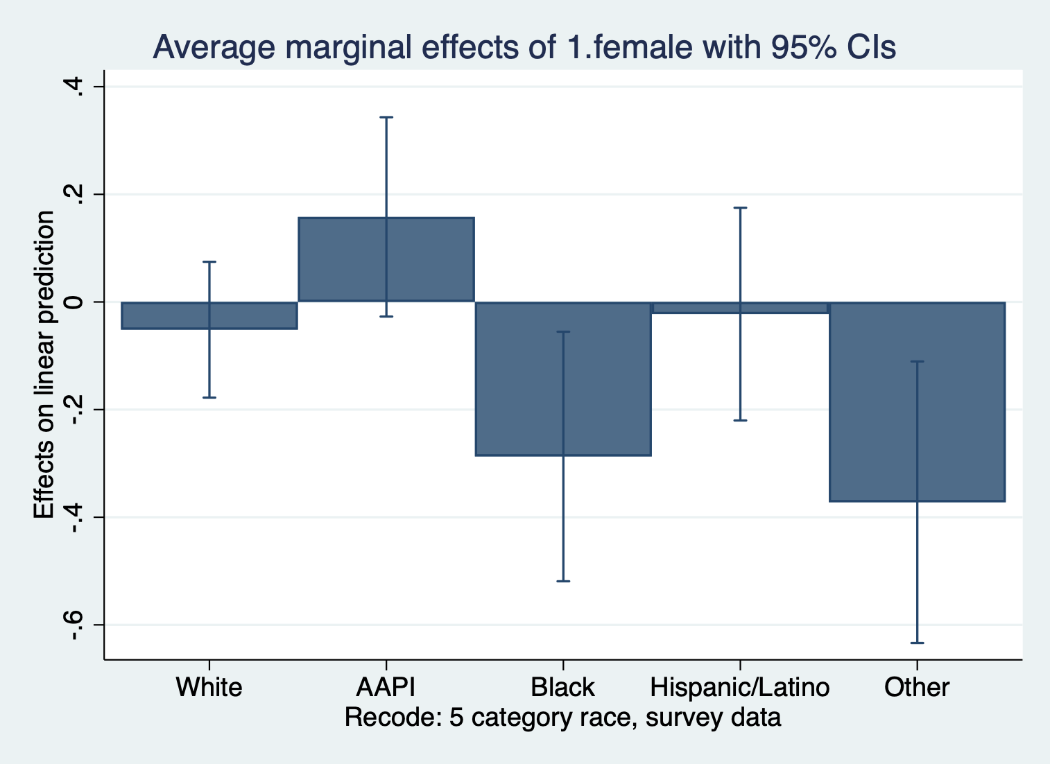
The ‘dydx’ command calculates the marginal effects of the variable specified. This shows how much more or less satisfaction is for women compared to men for each race. The unit of ‘dydx’ here: the change in outcome units.
quietly margins female, dydx(race)
marginsplot, recast(bar) by(female)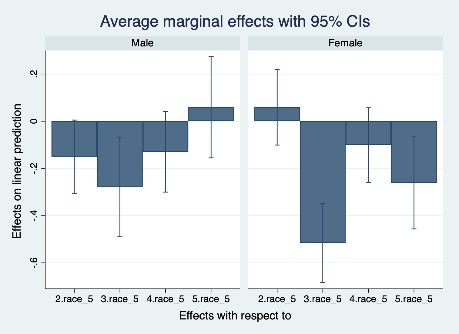
Here, we see how much more or less satisfaction is for each racial group compared to white students in their shared gender. Here, we care about whether or not the confidence interval crosses over 0. If it does, then we can see that this is likely not statistically significant.
There is no challenge activity in today’s lab. Interactions can be challenging to wrap your mind around, but the better you can understand an interaction on a graph the more you will grasp interactions.