9 Lab 4 (R)
9.1 Lab Goals & Instructions
We’re using a new dataset today. This is from the World Health Organization, containing various measures related to health outcomes.
Research Question: What measures are associated with a country’s life expectancy?
Goals
- Transform variables in your dataset in a few new ways
- Predict marginal effects from your regression
- Visualize marginal effects to communicate your regression results
Instructions
- Download the data and the script file from the lab files below.
- Run through the script file and reference the explanations on this page if you get stuck.
- If you have time, complete the challenge activity on your own.
Libraries
library(tidyverse)
library(ggplot2)
library(ggeffects)
Jump Links to Commands in this Lab:
Generating related variables
log()
xtile()
ggpredict()
Graphing Margins
Saving plots
9.2 Generating Related Variables
At various point in your data cleaning, you will want to create related variables, something that shows the same information but in a different form. By related variables, I mean you are using some variables in your dataset to calculate or configure a new variable.
For these related variables, we will rely on the mutate() function and various calculations.
Example 1: New variables with simple calculations
You can always manipulate numeric variables in your dataset with basic math operations (adding, subtracting, multiplying, and so on). This is a relatively simple process, you just need to do it carefully.
For our first example, let’s say we want to know the percent population change between years. This data set contains measures from 2010, but it also has a variable for the 2005 population.
A) Lets take a look at our two population variables for an example country, say Lebanon…
# 2010 population
    mydata %>%
      filter(country == "Lebanon") %>%
      select(population)
population
1 4337141# 2005 population
mydata %>%
filter(country == "Lebanon") %>%
select(pop_2005) pop_2005
1 3986852We could calculate the percent change manually
4337141 - 3986852 # difference in population totals[1] 350289350289 / 4337141 * 100 # pct change[1] 8.076496B) You can generate a simple variable based on a basic calculation
mydata <- mydata %>%
  mutate(pop_change = (population - pop_2005) / population * 100)
C) Let’s check out our new variable
summary(mydata$pop_change) Min. 1st Qu. Median Mean 3rd Qu. Max. NA's
-97846.89 -785.45 5.04 -1416.08 89.30 99.90 40 head(mydata$pop_change)[1] 91.058513 -6.922261 7.833292 16.331754 NA 5.041739And for extra measure, the percent change for Lebanon…
mydata %>% filter(country == "Lebanon") %>% select(pop_change) pop_change
1 8.076496There are clearly some funky populations in this dataset we would need to look closer at, but right now I want you to focus on knowing how to calculate the new variable.
Example 2: Logging variables
This next example is really an extension of the last. We’re just explicitly using the log function to address nonlinearity in our model.
Let’s take a closer look at GDP and life expectancy.
A) Scatter plot of life expectency vs gdp
    ggplot(mydata, aes(x = gdp, y = lifeexpectancy)) +
      geom_point() +
      geom_smooth(method = "loess", se = FALSE) +
      theme_minimal()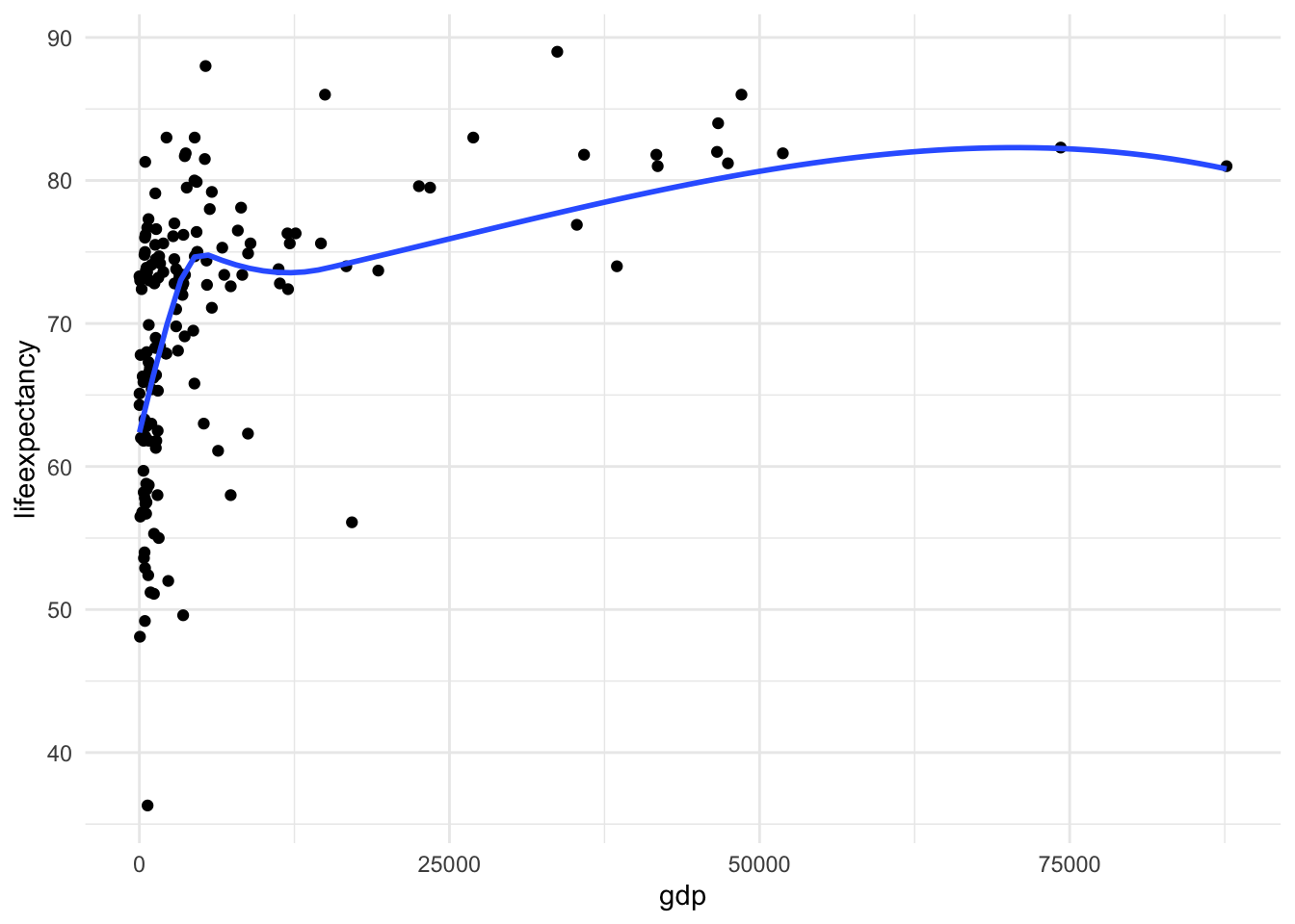
There is a clear nonlinear relationship between these two variables
B) Create a new logged version of the variable to deal with the nonlinearity
    mydata <- mydata %>%
      mutate(log_gdp = log(gdp))
C) Now let’s look at the scatter plot again
    ggplot(mydata, aes(x = log_gdp, y = lifeexpectancy)) +
      geom_point() +
      geom_smooth(method = "loess", se = FALSE) +
      theme_minimal()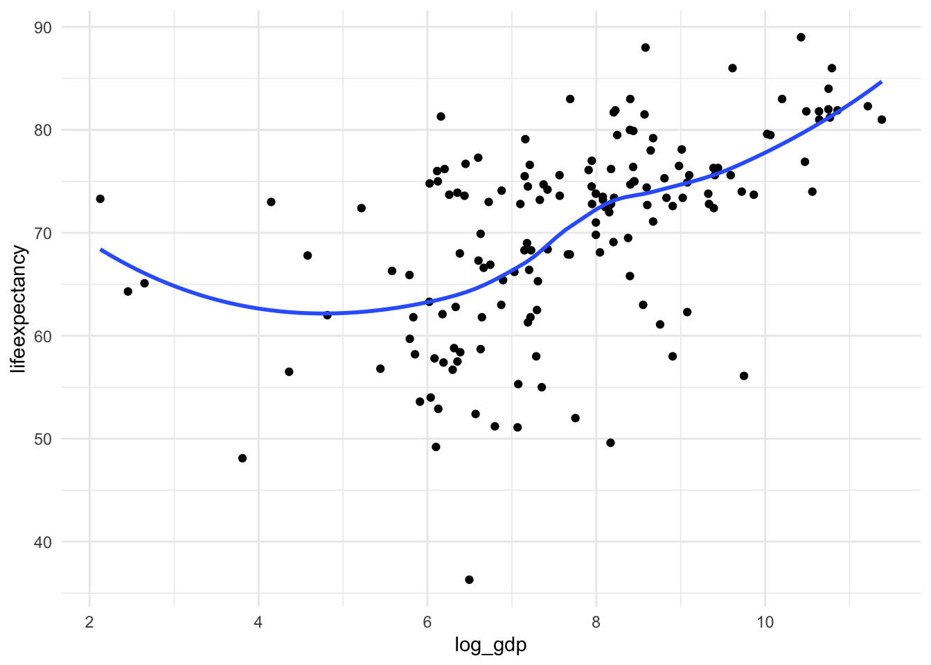
It’s not perfectly linear, but it’s a lot better!
Example 3: From continuous to categorical via quantiles
There are other ways to deal with nonlinearity besides logging the variable. In this case we are going to divide a continuous variables into categories based on the quantiles. Essentially, we will now be asking in our regression–does it matter whether someone is in the bottom quantile vs the second, third, or top quantile?
But first, let’s learn how to go from continuous to quantile categories.
A) Scatterplot of life expectancy vs infant death rate
    ggplot(mydata, aes(x = infantdeaths, y = lifeexpectancy)) +
      geom_point() +
      theme_minimal()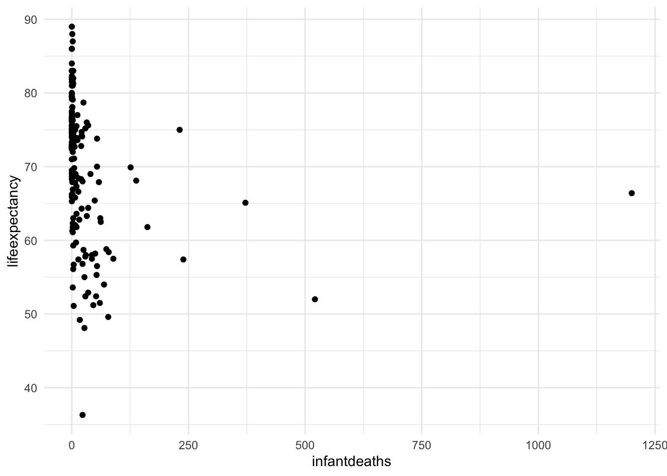
We can see that the infant death rate has a huge positive skew. Now let’s turn it into a categorical variable with quantiles. Quantiles refer to the values from 0-25%, 26-50%, 51-75%, and 76-100% of the range.
B) Use xtile() to make quantiles
Use the function ‘xtile()’ from the library ‘statar’ library, which automatically sorts the values into quantile ranges and assigns a category number 1-4. We also want to make R recognize it as a categorical (aka factor) variable, so we put the xtile() function inside of the factor() function.
Note: Install the statar package if you have not used it before. i am not loading the package fully, just calling it with statar:: so I can use the specific function we need.
    mydata <- mydata %>%
      mutate(infant_quantiles = factor(statar::xtile(infantdeaths, n = 4)))
C) Let’s take a look at the new variable
    mydata %>%
      group_by(infant_quantiles) %>%
      count()
# A tibble: 4 × 2
# Groups: infant_quantiles [4]
infant_quantiles n
<fct> <int>
1 1 54
2 2 46
3 3 38
4 4 45 ggplot(mydata, aes(x = as.numeric(infant_quantiles), y = lifeexpectancy)) +
geom_point() +
geom_smooth(method = "loess", se = FALSE) +
theme_minimal()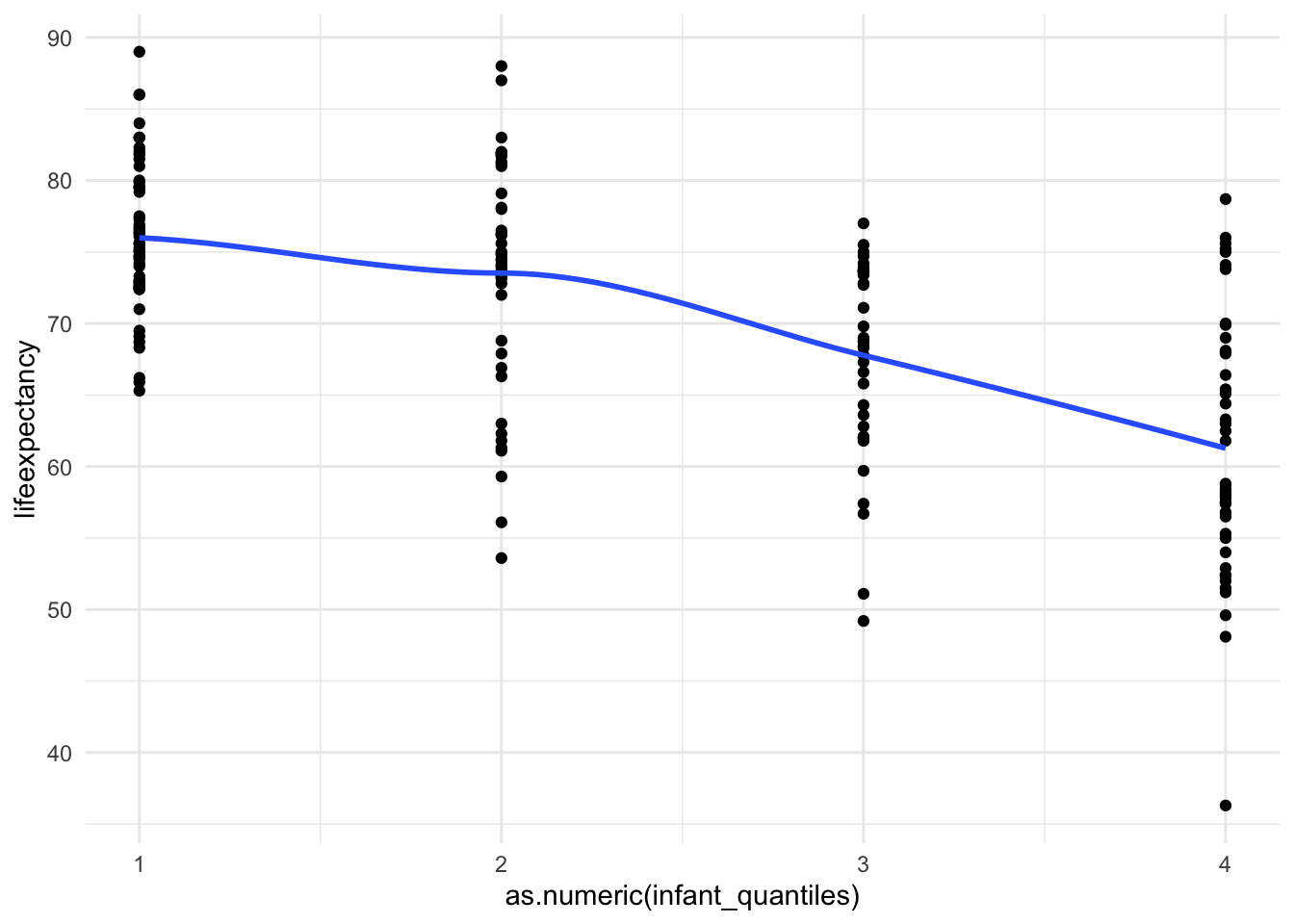
And just like that we are linear!
Now we have a categorical variable for infant deaths
where the bottom part of the range (0-25%) is category 1, the second
quantile (25-49%) is category 2, and so on. You can see where each value
fell into the range. It has a much more linear relationship
9.3 Interpreting Results with Margins
This is what marginal effects tell us. “Marginal effects” refer to the average predicted values for groups of observations, the groups being defined by levels of some variable(s) in the model, or for certain values of continuous variables (like the average). Marginal values will give us a lot of ways to visualize the results of our linear regression model.
The R function for margins is ggpredict() from the ggeffects package. Again you need to install this package if you have not used it before.
Important Note: The results from ggpredict are going to be slightly different from Stata’s margins command. This appears to be the result of the way the function calculates the standard errors (see explanation here)
Margins for Categorical Variables
Margins is easy for categorical variables in a bivariate regression. You just have to enter the model results into ggpredict().
Run the regression first
fit1 <- lm(lifeexpectancy ~ infant_quantiles, data = mydata)
summary(fit1)
Call:
lm(formula = lifeexpectancy ~ infant_quantiles, data = mydata)

Residuals:
     Min       1Q   Median       3Q      Max
-24.9778  -3.8278   0.4056   5.5988  17.4222

Coefficients:
                  Estimate Std. Error t value Pr(>|t|)
(Intercept)         75.994      0.998  76.145  < 2e-16 ***
infant_quantiles2   -2.468      1.472  -1.677   0.0952 .
infant_quantiles3   -8.218      1.553  -5.292 3.51e-07 ***
infant_quantiles4  -14.717      1.480  -9.942  < 2e-16 ***
---
Signif. codes:  0 '***' 0.001 '**' 0.01 '*' 0.05 '.' 0.1 ' ' 1

Residual standard error: 7.334 on 179 degrees of freedom
Multiple R-squared:  0.3887,    Adjusted R-squared:  0.3785
F-statistic: 37.95 on 3 and 179 DF,  p-value: < 2.2e-16
Predict the marginal effects for x (infant_quantiles).
ggpredict(fit1)$infant_quantiles
# Predicted values of lifeexpectancy
infant_quantiles | Predicted | 95% CI
---------------------------------------------
1 | 75.99 | [74.04, 77.95]
2 | 73.53 | [71.41, 75.65]
3 | 67.78 | [65.44, 70.11]
4 | 61.28 | [59.13, 63.42]
attr(,"class")
[1] "ggalleffects" "list"
attr(,"model.name")
[1] "fit1"In a bivariate regression, the regression tells us the predicted values of people who are in each infant death rate quantile.
Interpretation: Countries in the lowest infant death quantile have an average life expectancy of 76 years whereas countries in the highest infant death quantile have an average life expectancy of 61 years.
Margins for Continuous Variables
When you are calculating marginal effects for continuous variables, you have enter in more information. You have to specify the specific value or values of x you want to predict the outcome for.
Run the regression first (not displaying the results this time for brevity)
fit2 <- lm(lifeexpectancy ~ total_hlth, data = mydata)
summary(fit2)
With this command you specify the values that you want to calculate the marginal effects for inside the brackets. You can specify a single value, a range of values, or more.
Margins for 5% total health expenditures.
ggpredict(fit2, terms = "total_hlth [5]")# Predicted values of lifeexpectancy
total_hlth | Predicted | 95% CI
---------------------------------------
5 | 69.13 | [67.72, 70.53]Interpretation: Countries who spend 5% of total government expenditures on health are associated with a life expectancy of 69 years. Margins for a range of total health expenditure levels. This code reads:
Margins for a range of total health expenditure levels. This code reads:
- calculate margins (GGPREDICT)
- for the model (FIT2)
- with the variable total_hlth (TERMS = "total_hlt …)
- starting from 0
- to a maximum of 15
- by increments of 5 I chose these cut points based on the range of total_hlth
ggpredict(fit2, terms = "total_hlth[0:15 by = 5]")# Predicted values of lifeexpectancy
total_hlth | Predicted | 95% CI
---------------------------------------
0 | 64.32 | [61.12, 67.51]
5 | 69.13 | [67.72, 70.53]
10 | 73.94 | [71.70, 76.18]
15 | 78.75 | [74.36, 83.14]Interpretation: As health expenditure increases, the life expectancy in that country also increases. At a 5% health expenditure, the associated life expectancy is 64 years, where as at a 15% health expenditure, the associated life expectancy is 79 years.
Margins for regressions with more than one X variable
Run the regression first
fit3 <- lm(lifeexpectancy ~ total_hlth + infant_quantiles, data = mydata)
summary(fit3)
Calculate the margins for the infant death rate quantiles
ggpredict(fit3, terms = "infant_quantiles")# Predicted values of lifeexpectancy
infant_quantiles | Predicted | 95% CI
---------------------------------------------
1 | 75.54 | [73.61, 77.48]
2 | 73.41 | [71.34, 75.48]
3 | 68.22 | [65.89, 70.55]
4 | 61.91 | [59.76, 64.06]
Adjusted for:
* total_hlth = 6.15Like the previous example, we are asking R to generate the predicted values for the variable infant death rate quantiles (coded as 1, 2, 3, 4). But when calculating the predicted value for a person in each quantile, we now have to take into account our other x variable - total health expenditures. So what does this function do?
The function makes an assumption: that the other x values are being held at their mean (for continuous variables) or the “reference category” (for categorical variables). When you put just one variable, what the function actually calculates is the predicted value for each value of x when age is at its mean in the dataset. You’ll see R very kindly tells us that it has kept total_hlth at it’s mean (6.15).
mean(mydata$total_hlth, na.rm = TRUE)[1] 6.151222Interpretation: Countries in the lowest infant death quantile have an average life expectancy of 75 years whereas countries in the highest infant death quantile have an average life expectancy of 61 years, holding total health expenditures constant at the average.
Other variations of margins
We can do a lot with ggpredict() and the margins it produces. For example, Let’s say we want to know…
A) The predicted life expectancy for at various levels of health expenditure, but only for countries in the first infant death quantile:
ggpredict(fit3, terms = c("total_hlth[0:15 by = 5]",
                          "infant_quantiles[1]"))
# Predicted values of lifeexpectancy
total_hlth | Predicted | 95% CI
---------------------------------------
0 | 71.67 | [68.36, 74.97]
5 | 74.82 | [72.77, 76.87]
10 | 77.97 | [75.69, 80.24]
15 | 81.12 | [77.39, 84.84]Interpretation: For countries in with the lowest infant death rate, at a 5% health expenditure, the associated life expectancy is 74 years, where as at a 15% health expenditure, the associated life expectancy is 81 years.
B) The predicted values for each quantile at different levels of health expenditure.
ggpredict(fit3, terms = c("total_hlth[0:15 by = 5]",
                          "infant_quantiles"))
# Predicted values of lifeexpectancy
# infant_quantiles = 1
total_hlth | Predicted | 95% CI
---------------------------------------
0 | 71.67 | [68.36, 74.97]
5 | 74.82 | [72.77, 76.87]
10 | 77.97 | [75.69, 80.24]
15 | 81.12 | [77.39, 84.84]
# infant_quantiles = 2
total_hlth | Predicted | 95% CI
---------------------------------------
0 | 69.54 | [66.30, 72.77]
5 | 72.69 | [70.55, 74.82]
10 | 75.84 | [73.31, 78.36]
15 | 78.99 | [75.00, 82.97]
# infant_quantiles = 3
total_hlth | Predicted | 95% CI
---------------------------------------
0 | 64.35 | [61.22, 67.48]
5 | 67.50 | [65.18, 69.81]
10 | 70.65 | [67.71, 73.58]
15 | 73.80 | [69.37, 78.22]
# infant_quantiles = 4
total_hlth | Predicted | 95% CI
---------------------------------------
0 | 58.03 | [54.93, 61.13]
5 | 61.18 | [59.02, 63.34]
10 | 64.33 | [61.60, 67.05]
15 | 67.48 | [63.25, 71.71]Interpretation: (Choosing one example from these margins) In countries with the highest level of health expenditure (15%), those with the highest infant death rates have an associated life expectancy of 67 years whereas those with the lowest infant death rates have a life expectancy of 81 years.
In these two examples, we use c() to indicate that we’re dealing with a list.
NOTE: This is a good example of why you have to be precise with ggpredict() margins. By changing our specification of infant_quantiles, we can find out the predicted life expectancy for a) only the first quantile at different levels of health expenditure OR b) each quantile at different levels of health expenditure.
9.4 Graphing Results with Margins
Knowing the margins can help you translate your findings into comprehensible statements. Displaying them is a great visual way to communicate those findings.
We can use either base R’s plot() command or ggplot() to visualize our predicted values. Let’s visualize the margins from the last two examples.
Plot A with Base R
Here, we can just send the margins straight into a graph with use of a pipe %>%. The benefit of base R here is simplicity.
ggpredict(fit3, terms = c("total_hlth[0:15 by = 5]",
                          "infant_quantiles[1]")) %>%
  plot()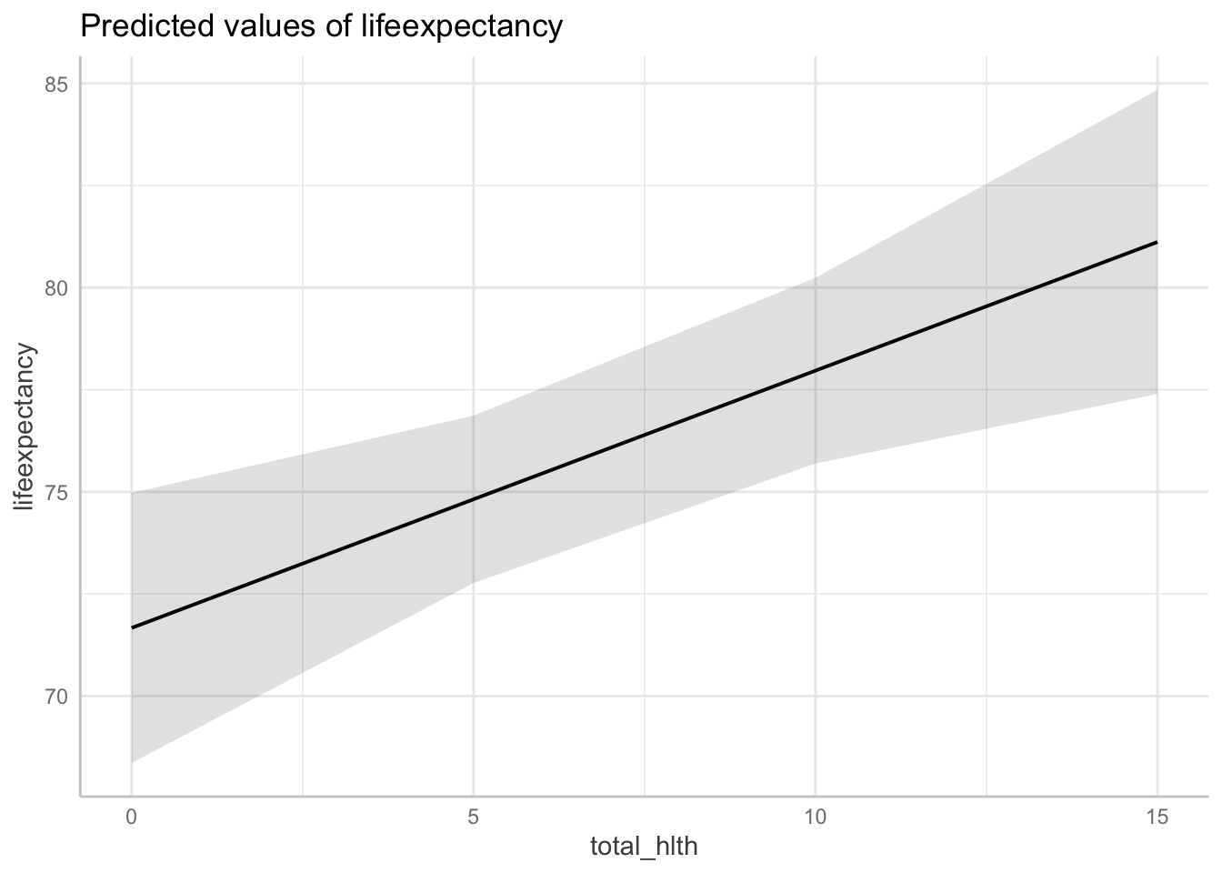
Plot A with ggplot
Again, we can use a pipe to build the plot from the ggpredict() command. The benefit of ggplot here is that you can more easily change features of the plot.
ggpredict(fit3, terms = c("total_hlth[0:15 by = 5]",
                          "infant_quantiles[1]")) %>%
  ggplot(aes(x, predicted, group = 1)) +
  geom_point() + # Display point
  geom_line() + # Display line
  geom_errorbar(aes(ymin = conf.low, ymax = conf.high, # CI bar
                    width = .3)) + # making bar more narrow
  theme_bw()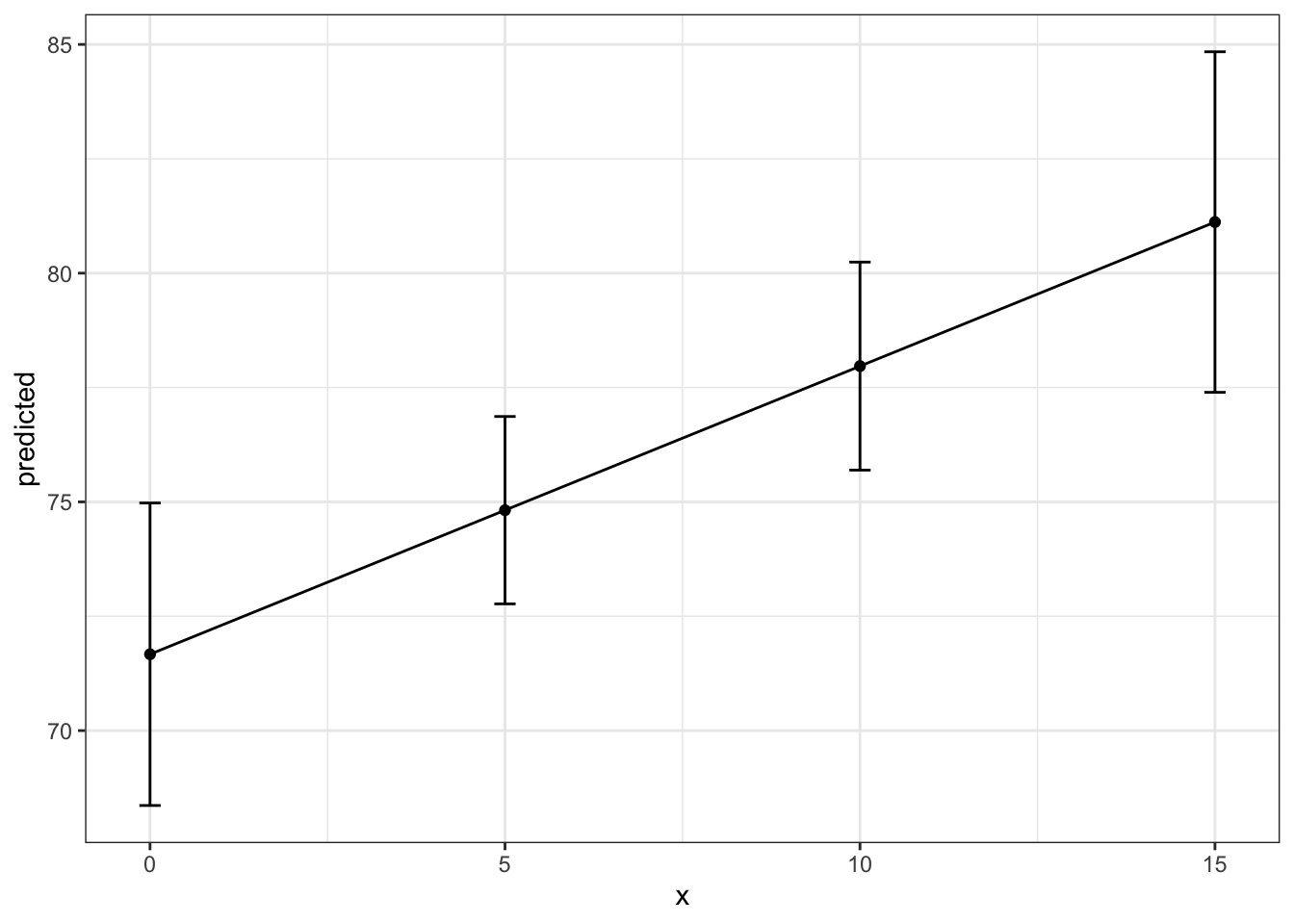
Plot B with Base R
Again, here’s the simple option.
ggpredict(fit3, terms = c("total_hlth[0:15 by = 5]",
                          "infant_quantiles")) %>%
  plot()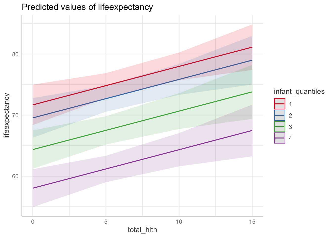
Plot B with ggplot
And again, the more flexible option.
ggpredict(fit3, terms = c("total_hlth[0:15 by = 5]",
                          "infant_quantiles")) %>%
  ggplot(aes(x, predicted, color = group)) +
  geom_point() +
  geom_line() +
  geom_errorbar(aes(ymin = conf.low, ymax = conf.high,
                    width = .3)) +
  theme_bw()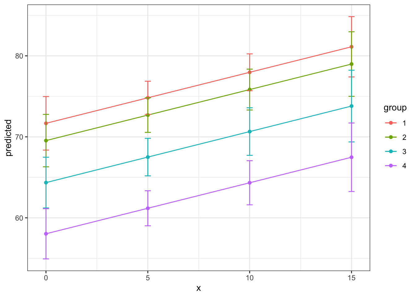
Plotting the margins allows us to actually make easier the visualization of what we are trying to describe with the predicted results. There are also some fun things we can do while visualizing relationships. Here is an option with a bar graph!
ggpredict(fit3, terms = "infant_quantiles") %>%
  ggplot(aes(x, predicted)) +
  geom_col() +
  theme_bw() +
  coord_cartesian(ylim = c(60,80)) # changing the y axis range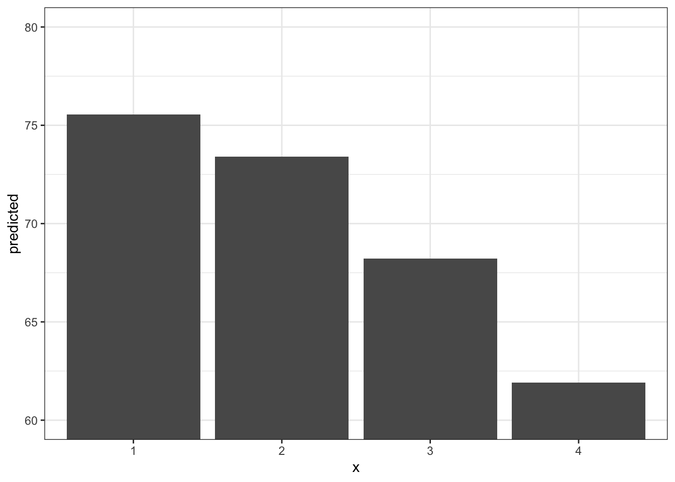
9.5 BONUS: Saving and Improving your Graphs
You may be manually saving your plots or taking screenshots, but here is some other helpful code to save a ggplot in code. If you tweak anything in your previous code that would affect the graph, your new graph will be saved when you rerun your code. It saves times as you are iterating your findings I also want to show you a few options to play around with ggplot()’s design features.
Improving the design of your graph
First, I’m going to save one of the plots we just created as an object. From here we can add layers onto it, which is one of the nice features of ggplot.
plot1 <- ggpredict(fit3, terms = c("total_hlth[0:15 by = 5]",
                          "infant_quantiles")) %>%
  ggplot(aes(x, predicted, color = group)) +
  geom_point() +
  geom_line() +
  geom_errorbar(aes(ymin = conf.low, ymax = conf.high,
                    width = .3)) +
  theme_bw()
Now let’s bring this graph to the next level with titles, different color themes, and more.
plot1 +
  # Add titles
  labs(
    title = "Marginal Effects",
    x = "% Health Expenditures",
    y = "Predicted Life Expectancy"
  ) +
  # Change the color scheme and legend title
  scale_color_brewer(palette = "Dark2", name = "Infant Death Quantile") +
  # Move legend to the bottom
  theme(legend.position = "bottom",
  # Center the plot title and increase size (within the theme function)
        plot.title = element_text(hjust = 0.5, size = 16))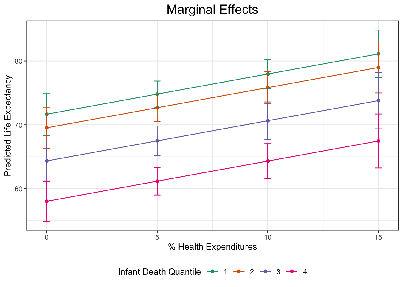
Saving your graphs
You can save whatever the most recent graph you produced by running:
ggsave("figs_output/marginal_effects_1.png")You can also save any plot as an object and save that plot at any point in your code. Here, I’m saving our base plot1 and specifying the size of the image.
ggsave("figs_output/marginal_effects_2.png",
       plot = plot1,
       width = 5,
       height = 4)
9.6 Challenge Activity
Run a regression of life expectancy (lifeexpectancy) and child HIV/AIDS death rate (child_hivaids).
Create a new variable that addresses the skew of the HIV/AIDS variable. There are multiple ways to do this.
Produce a margins plot that clearly communicates the effect of the child HIV/AIDS death rate on life expectancy.
This activity is not in any way graded, but if you’d like me to give you feedback email me your script file and a few sentences interpreting your results.