13 Lab 6 (R)
13.1 Lab Goals & Instructions
Today we are using a new dataset. See the script file for the lab to see the explanation of the variables we will be using.
Research Question: What characteristics of campus climate are associated with student satisfaction?
Goals
- Use component plus residuals plots to evaluate linearity in multivariate regressions.
- Add polynomial terms to your regression to address nonlinearity
- Turn a continuous variable into a categorical variable to address nonlinearity
- Add interaction terms to your regression and evaluate them with margins plots.
Instructions
- Download the data and the script file from the lab files below.
- Run through the script file and reference the explanations on this page if you get stuck.
- No challenge activity!
Libraries
# Load libraries
library(tidyverse)
library(ggplot2)
library(ggeffects)
library(car)
library(interactions)
Jump Links to Commands in this Lab:
These are two new functions in today’s lab. Otherwise we will be playing with margins plots quite a bit.
13.2 Components Plus Residuals Plot
This week we’re returning to the question of nonlinearity in a multivariate regression. First we’re going to discuss a new plot to detect nonlinearity –specifically in regressions with more than one independent variable: the component plus residuals plot.
Sometimes we want to examine the relationship between one independent variable and the outcome variable, accounting for all other independent variables in the model. They take the residual and subtract the parts of the residual that come from the other independent variables.
Let’s run through an example.
STEP 1: First, run the regression:
fit1 <- lm(satisfaction ~ climate_gen + climate_dei + instcom +
           fairtreat + female + race_5, data = mydata)
summary(fit1)
Call:
lm(formula = satisfaction ~ climate_gen + climate_dei + instcom +
    fairtreat + female + race_5, data = mydata)

Residuals:
    Min      1Q  Median      3Q     Max
-3.5737 -0.4027  0.0853  0.4965  2.2607

Coefficients:
                      Estimate Std. Error t value Pr(>|t|)
(Intercept)            0.13060    0.14639   0.892   0.3725
climate_gen            0.45497    0.04026  11.301  < 2e-16 ***
climate_dei            0.09148    0.03913   2.337   0.0196 *
instcom                0.29193    0.03258   8.960  < 2e-16 ***
fairtreat              0.16428    0.03842   4.276 2.03e-05 ***
female                -0.06475    0.04191  -1.545   0.1226
race_5Black           -0.34457    0.07543  -4.568 5.36e-06 ***
race_5Hispanic/Latino -0.07345    0.06783  -1.083   0.2791
race_5Other           -0.09561    0.08045  -1.188   0.2349
race_5White            0.02790    0.05640   0.495   0.6209
---
Signif. codes:  0 '***' 0.001 '**' 0.01 '*' 0.05 '.' 0.1 ' ' 1

Residual standard error: 0.7574 on 1406 degrees of freedom
  (384 observations deleted due to missingness)
Multiple R-squared:  0.4621,    Adjusted R-squared:  0.4586
F-statistic: 134.2 on 9 and 1406 DF,  p-value: < 2.2e-16
STEP 2: Run the crPlots() command from the car package
Basic command - produce plots for every independent var in the regression
crPlots(fit1)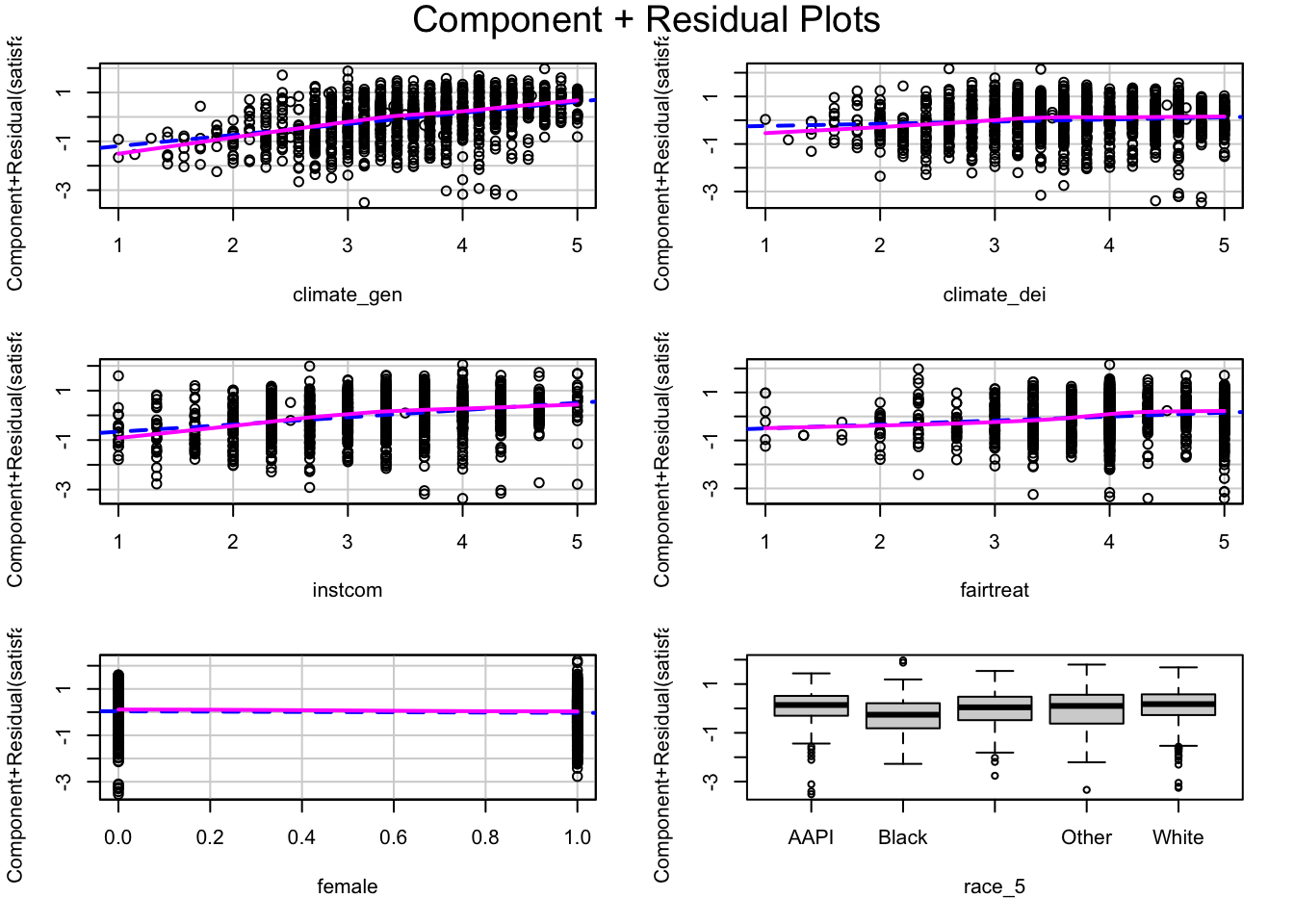
Pull up a single plot for climate_dei
crPlots(fit1, terms = ~ climate_dei)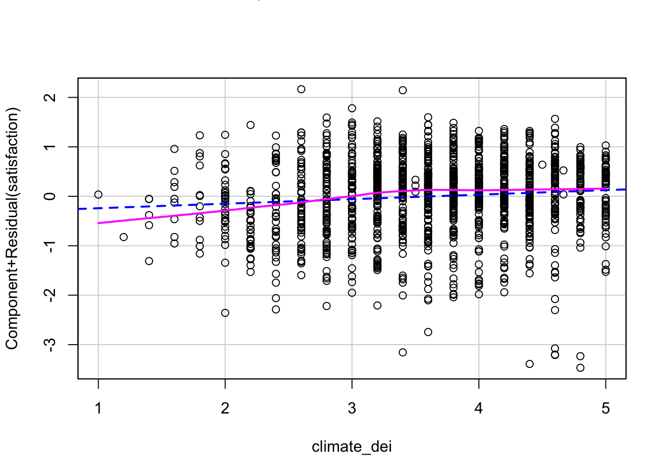
INTERPRETATION:
If the independent variable being examined and the outcome variable have a linear relationship, then the lowess line will be relatively straight and line up with the regression line. If there is a pattern to the scatter plot or clear curves in the lowess line, that is evidence of nonlinearity that needs to be addressed.
Now we’ll move on to addressing nonlinearity when we find it.
13.3 Approach 1: Polynomials
One way we can account for non-linearity in a linear regression is through polynomials. This method operates off the basic idea that \(x^2\) and \(x^3\) have pre-determined shapes when plotted (to see what these plots look like, refer to the explanation of this lab on the lab wepage. By including a polynomial term we can essentially account account for some curved relationships, which allows it to become a linear function in the model.
Squared Polynomial
Here’s what a \(y = x^2\) looks like when plotted over the range -10 to 10. It’s u-shaped and can be flipped depending on the sign.
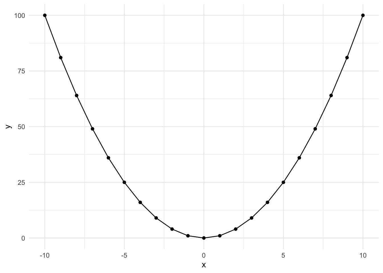
This occurs when an effect appears in the middle of our range or when the effect diminishes at the beginning or end of our range. Let’s look at an example:
STEP 1: Evaluate non-linearity and possible squared relationship
ggplot(mydata, aes(x = instcom, y = satisfaction)) +
  geom_point(position = "jitter") +
  geom_smooth(method = "loess", se = FALSE) +
  theme_classic()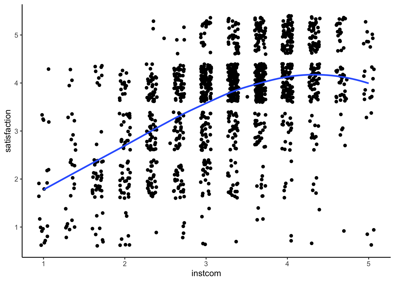
This is flipped and less exagerated, but it’s still an upside down u-shape.
STEP 2: Run the regression with the original and squared variables
fit2 <- lm(satisfaction ~ climate_gen + climate_dei + instcom + I(instcom^2) +
             fairtreat + female + race_5, data = mydata)
summary(fit2)
Call:
lm(formula = satisfaction ~ climate_gen + climate_dei + instcom +
    I(instcom^2) + fairtreat + female + race_5, data = mydata)

Residuals:
    Min      1Q  Median      3Q     Max
-3.5501 -0.4061  0.0797  0.4859  2.5005

Coefficients:
                      Estimate Std. Error t value Pr(>|t|)
(Intercept)           -0.44957    0.23366  -1.924  0.05455 .
climate_gen            0.43356    0.04069  10.655  < 2e-16 ***
climate_dei            0.09655    0.03904   2.473  0.01352 *
instcom                0.74187    0.14521   5.109 3.68e-07 ***
I(instcom^2)          -0.07187    0.02261  -3.179  0.00151 **
fairtreat              0.15973    0.03832   4.168 3.26e-05 ***
female                -0.07210    0.04184  -1.723  0.08506 .
race_5Black           -0.32546    0.07543  -4.315 1.71e-05 ***
race_5Hispanic/Latino -0.06197    0.06771  -0.915  0.36029
race_5Other           -0.07554    0.08044  -0.939  0.34783
race_5White            0.03752    0.05630   0.666  0.50526
---
Signif. codes:  0 '***' 0.001 '**' 0.01 '*' 0.05 '.' 0.1 ' ' 1

Residual standard error: 0.7549 on 1405 degrees of freedom
  (384 observations deleted due to missingness)
Multiple R-squared:  0.4659,    Adjusted R-squared:  0.4621
F-statistic: 122.6 on 10 and 1405 DF,  p-value: < 2.2e-16
Coding note: We use I() to put the squared term in the model. You must always put both the original and the squared variables in the model! Otherwise, you aren’t telling R to model both an initial and cubic change to the line.
STEP 3: Generate margins graph if significant This command incorporates both the original and squared version of institutional commitement to DEI.
ggpredict(fit2, terms = "instcom[0:5 by = 1]")| x | predicted | std.error | conf.low | conf.high | group |
|---|---|---|---|---|---|
| 0 | 2.08 | 0.238 | 1.61 | 2.55 | 1 |
| 1 | 2.75 | 0.125 | 2.51 | 3 | 1 |
| 2 | 3.28 | 0.0641 | 3.15 | 3.4 | 1 |
| 3 | 3.66 | 0.049 | 3.56 | 3.76 | 1 |
| 4 | 3.9 | 0.0522 | 3.8 | 4 | 1 |
| 5 | 3.99 | 0.098 | 3.8 | 4.19 | 1 |
ggpredict(fit2, terms = "instcom[0:5 by = 1]") %>% plot()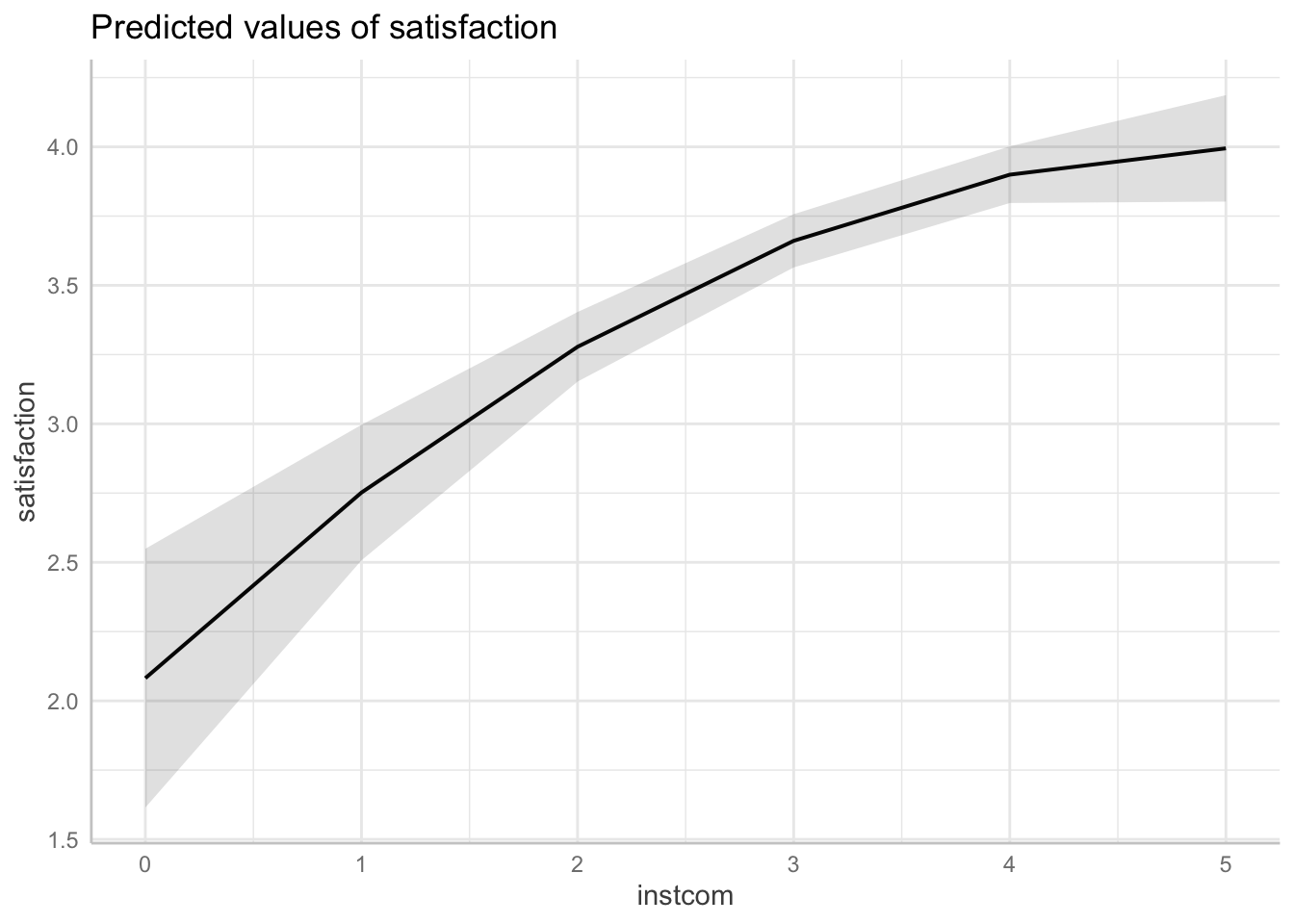
Cubed Polynomial
Here’s what a \(y = x^3\) looks like when plotted over the range -10 to 10. It’s slightly s-shaped.
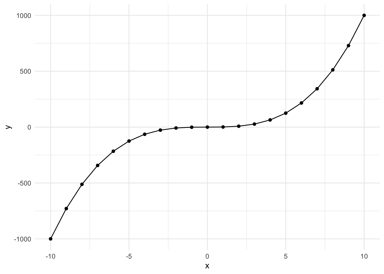
This occurs when the effect is perhaps less impactful in the middle of the range. Let’s go through the example. The steps are the same, so we’re going to skip the generating a new variable step.
STEP 1: Evaluate non-linearity and possible cubic relationship
ggplot(mydata, aes(x = fairtreat, y = satisfaction)) +
  geom_point(position = "jitter") +
  geom_smooth(method = "loess", se = FALSE) +
  theme_classic()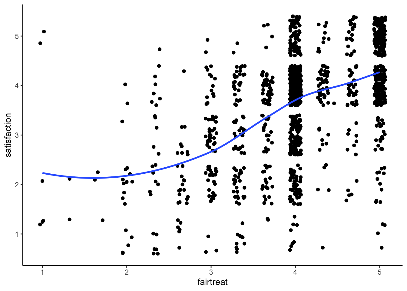
You can see our slight characteristic s-shape to the data.
STEP 2: Run Regression with cubic terms
We have to include the original, squared, and cubed terms in the model in order to capture the effect.
fit3 <- lm(satisfaction ~ climate_gen + climate_dei + instcom + fairtreat +
             I(fairtreat^2) + I(fairtreat^3) + female + race_5, data = mydata)
summary(fit3)
Call:
lm(formula = satisfaction ~ climate_gen + climate_dei + instcom +
    fairtreat + I(fairtreat^2) + I(fairtreat^3) + female + race_5,
    data = mydata)

Residuals:
    Min      1Q  Median      3Q     Max
-3.5348 -0.3858  0.0843  0.4898  2.3439

Coefficients:
                      Estimate Std. Error t value Pr(>|t|)
(Intercept)            1.66573    0.81292   2.049   0.0406 *
climate_gen            0.44345    0.04058  10.928  < 2e-16 ***
climate_dei            0.09172    0.03914   2.343   0.0193 *
instcom                0.28806    0.03259   8.838  < 2e-16 ***
fairtreat             -1.40513    0.74894  -1.876   0.0608 .
I(fairtreat^2)         0.49312    0.22571   2.185   0.0291 *
I(fairtreat^3)        -0.04792    0.02152  -2.227   0.0261 *
female                -0.06882    0.04191  -1.642   0.1008
race_5Black           -0.34169    0.07611  -4.490 7.72e-06 ***
race_5Hispanic/Latino -0.06569    0.06807  -0.965   0.3347
race_5Other           -0.08720    0.08078  -1.080   0.2805
race_5White            0.02937    0.05658   0.519   0.6038
---
Signif. codes:  0 '***' 0.001 '**' 0.01 '*' 0.05 '.' 0.1 ' ' 1

Residual standard error: 0.7565 on 1404 degrees of freedom
  (384 observations deleted due to missingness)
Multiple R-squared:  0.464, Adjusted R-squared:  0.4598
F-statistic: 110.5 on 11 and 1404 DF,  p-value: < 2.2e-16
STEP 3: Generate margins graph if significant
This command incorporates both the original and squared version of institutional commitement
ggpredict(fit3, terms = "fairtreat[1:5 by = 1]")| x | predicted | std.error | conf.low | conf.high | group |
|---|---|---|---|---|---|
| 1 | 3.55 | 0.273 | 3.02 | 4.09 | 1 |
| 2 | 3.29 | 0.109 | 3.08 | 3.51 | 1 |
| 3 | 3.44 | 0.0698 | 3.31 | 3.58 | 1 |
| 4 | 3.72 | 0.0481 | 3.62 | 3.81 | 1 |
| 5 | 3.83 | 0.0686 | 3.69 | 3.96 | 1 |
ggpredict(fit3, terms = "fairtreat[1:5 by = 1]") %>% plot(ci = FALSE)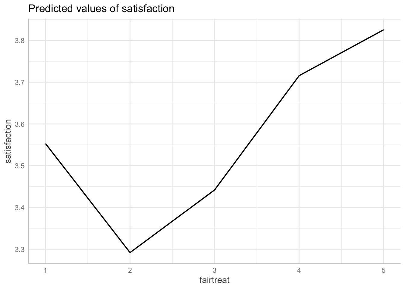
13.4 Approach 3: Creating a Categorical Variable
A second way we can account for non-linearity in a lienar regression is through transforming our continuous variable into categories. Age is a very common variable to see as categorical in models. We can capture some aspects of nonlinearity with ordered categories, but it may not be as precise as working with squared or cubed terms.
Let’s run through an example:
STEP 1: Evaluate what categories I want to create
summary(mydata$climate_gen) Min. 1st Qu. Median Mean 3rd Qu. Max. NA's
1.000 3.143 3.714 3.608 4.143 5.000 3 hist(mydata$climate_gen)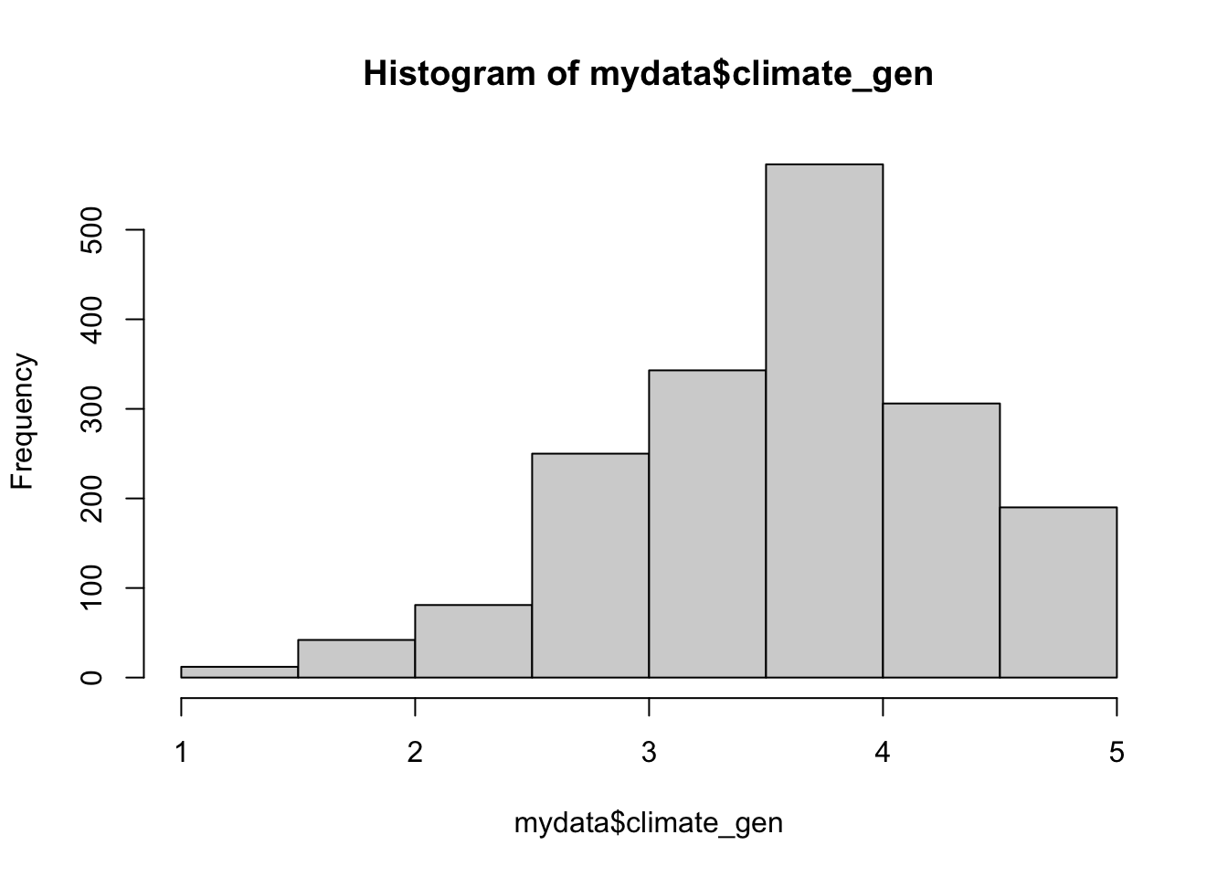
It looks pretty evenly spread across the range, so I’m going to create five categories.
STEP 2: Create the Category
mydata <- mydata %>%
    mutate(climategen_cat = factor(ifelse(climate_gen >=1 & climate_gen<2, 1,
                                   ifelse(climate_gen >=2 & climate_gen<3, 2,
                                          ifelse(climate_gen >=3 & climate_gen<4, 3,
                                                 ifelse(climate_gen >=4 & climate_gen<5, 4,
                                                        ifelse(climate_gen >=5, 5, NA)))))))
STEP 3: Run regression with indicator
fit4 <- lm(satisfaction ~ climate_dei + instcom + fairtreat + female +
             race_5 + climategen_cat, data = mydata)
summary(fit4)
Call:
lm(formula = satisfaction ~ climate_dei + instcom + fairtreat +
    female + race_5 + climategen_cat, data = mydata)

Residuals:
    Min      1Q  Median      3Q     Max
-3.5725 -0.4110  0.0844  0.5168  2.2560

Coefficients:
                      Estimate Std. Error t value Pr(>|t|)
(Intercept)            0.41981    0.19317   2.173 0.029929 *
climate_dei            0.14493    0.03904   3.712 0.000214 ***
instcom                0.28597    0.03316   8.625  < 2e-16 ***
fairtreat              0.19823    0.03820   5.189 2.42e-07 ***
female                -0.06050    0.04231  -1.430 0.152937
race_5Black           -0.33059    0.07645  -4.324 1.64e-05 ***
race_5Hispanic/Latino -0.09397    0.06849  -1.372 0.170283
race_5Other           -0.08284    0.08148  -1.017 0.309492
race_5White            0.01619    0.05689   0.285 0.776002
climategen_cat2        0.58994    0.15645   3.771 0.000170 ***
climategen_cat3        1.04883    0.15807   6.635 4.61e-11 ***
climategen_cat4        1.29764    0.16718   7.762 1.60e-14 ***
climategen_cat5        1.50167    0.22905   6.556 7.74e-11 ***
---
Signif. codes:  0 '***' 0.001 '**' 0.01 '*' 0.05 '.' 0.1 ' ' 1

Residual standard error: 0.7644 on 1403 degrees of freedom
  (384 observations deleted due to missingness)
Multiple R-squared:  0.4532,    Adjusted R-squared:  0.4485
F-statistic:  96.9 on 12 and 1403 DF,  p-value: < 2.2e-16
STEP 4: Double-Check linearity with margins
ggpredict(fit4, terms = "climategen_cat")| x | predicted | std.error | conf.low | conf.high | group |
|---|---|---|---|---|---|
| 1 | 2.65 | 0.163 | 2.33 | 2.97 | 1 |
| 2 | 3.24 | 0.0787 | 3.09 | 3.39 | 1 |
| 3 | 3.7 | 0.0511 | 3.6 | 3.8 | 1 |
| 4 | 3.95 | 0.0569 | 3.84 | 4.06 | 1 |
| 5 | 4.15 | 0.164 | 3.83 | 4.47 | 1 |
ggpredict(fit4, terms = "climategen_cat") %>%
  plot(ci = FALSE, connect.lines = TRUE)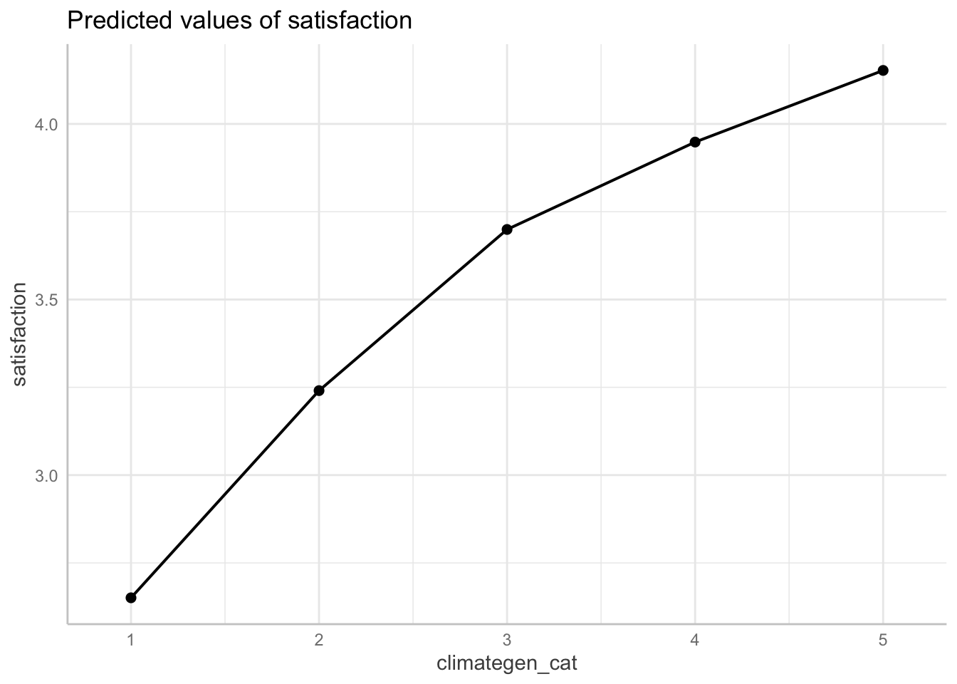
13.5 Interactions
We have finally arrived at interactions. It is finally time for ‘margins’ to TRULY shine. Wrapping your head around interactions might be difficult at first but here is the simple interpretation for ALL interactions:
The effect of ‘var1’ on ‘var2’ varies by ‘var3’
OR
The association of ‘var1’ and ‘var2’ significantlydiffers for each value of ’var3’s
Interactions are wonderful because for any combination of variable types. The key thing to be aware of is how you display/interpret it. Let’s see some options.
Continous variable x continuous variable
The first thing we are going to look at is the interaction between two continuous variables. Let’s run a simple regression interacting climate_dei & instcom. The question I’m asking here then is: Does the effect of people’s overall sense of DEI climate on their satisfaction differ based on a person’s perception of institutional
commitment to DEI?
First we run the regression with the interaction term:
fit5 <- lm(satisfaction ~ climate_gen + undergrad + female + race_5 +
             climate_dei*instcom, data = mydata)
summary(fit5)
Call:
lm(formula = satisfaction ~ climate_gen + undergrad + female +
    race_5 + climate_dei * instcom, data = mydata)

Residuals:
    Min      1Q  Median      3Q     Max
-3.4324 -0.4037  0.0695  0.5118  2.2670

Coefficients:
                      Estimate Std. Error t value Pr(>|t|)
(Intercept)           -0.58406    0.30456  -1.918 0.055344 .
climate_gen            0.50387    0.03801  13.258  < 2e-16 ***
undergrad             -0.02169    0.04293  -0.505 0.613538
female                -0.07386    0.04257  -1.735 0.082926 .
race_5Black           -0.35265    0.07668  -4.599 4.63e-06 ***
race_5Hispanic/Latino -0.04622    0.06879  -0.672 0.501760
race_5Other           -0.04957    0.08143  -0.609 0.542807
race_5White            0.06997    0.05718   1.224 0.221280
climate_dei            0.45012    0.09657   4.661 3.44e-06 ***
instcom                0.62566    0.09919   6.308 3.78e-10 ***
climate_dei:instcom   -0.09782    0.02729  -3.585 0.000349 ***
---
Signif. codes:  0 '***' 0.001 '**' 0.01 '*' 0.05 '.' 0.1 ' ' 1

Residual standard error: 0.7697 on 1417 degrees of freedom
  (372 observations deleted due to missingness)
Multiple R-squared:  0.4509,    Adjusted R-squared:  0.447
F-statistic: 116.4 on 10 and 1417 DF,  p-value: < 2.2e-16
Then we look at the margins plot. This time we’re using a handy tool to look at interactions from the interactions package
interact_plot(fit5, pred = climate_dei, modx = instcom,
              modx.values = c(1:5))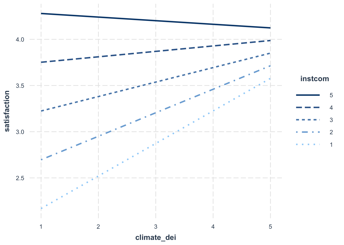
When creating a margins plot with a continuous x continuous interaction:
- You have to specify which value is the predictor (x axis) and which is the moderator (y axis).
- You can specify the values of the moderator, which determines how many lines will show up in the plot.
Interpretation:
- The association between rating of DEI climate and satisfaction is MODERATED by perception of the institution’s commitment to DEI.
- The association between rating of DEI climate and satisfaction varies based on perception of the institution’s commitment to DEI.
- For students with low perception of the institution’s commitment to DEI, increased DEI climate ratings are associated with an significant increase in satisfaction. As perception of the institution’s commitment to DEI increases, the effect of DEI climate on satisfaction dampens (the slope gets less steep).
Sometimes, you may decide that interpreting this relationship in this direction is difficult to interpret/doesn’t make sense. In situations like that, you might want to change what is your key ‘x’ and your ‘moderator’ variable. Essentially, you are switching your x and y axis.
interact_plot(fit5, pred = instcom, modx = climate_dei,
                    modx.values = c(1:5))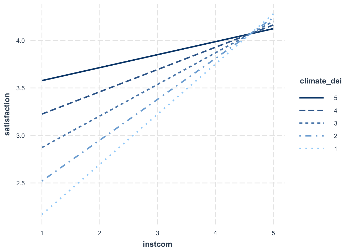
Updated Interpretation:
Because we switched which variable is the moderator, our interpration of the relationship changes.
- The association between perception of institutional commitment to DEI and satisfaction is MODERATED by the rating of DEI climate.
- The association between perception of institutional commitment to DEI and satisfaction varies based on rating of DEI climate.
- For students who rate the DEI climate lower, increased perception of institutional commitment to DEI is associated with higher satisfaction. For more positive ratings of DEI climate, the positive effect of perception of institutional commitment to DEI on satisfaction is dampened.
One last thing you can change is the number of lines that appear on the graph.
interact_plot(fit5, pred = instcom, modx = climate_dei,
              modx.values = c(1, 3, 5))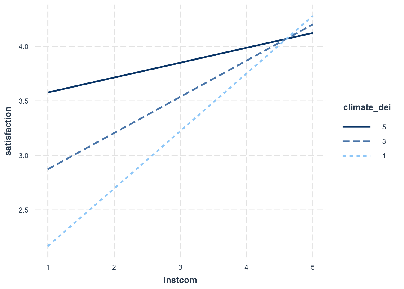
Continuous variable x dummy variable
Once you get a handle on continuous variables, the continuous dummy variable is extremely straightforward.
First run the regression.
fit6 <- lm(satisfaction ~ climate_gen + instcom + race_5 + female*climate_dei,
           data = mydata)
Then look at the interaction plot:
interact_plot(fit6, pred = climate_dei, modx = female)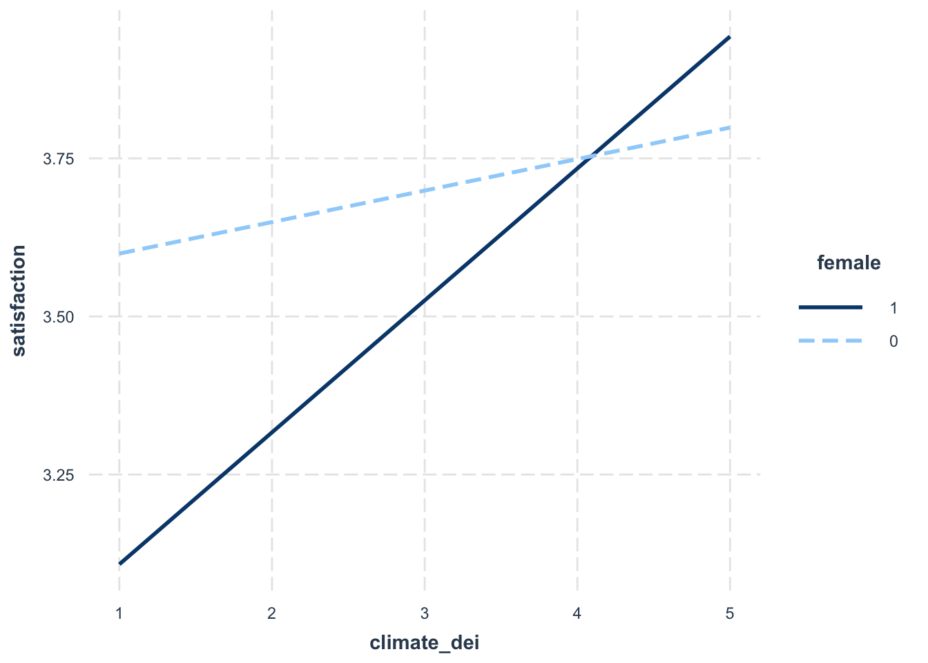
Interpretation:
The association between rating of DEI climate and satisfaction is MODERATED by gender
The association between rating of DEI climate and satisfaction varies based on a student’s gender identity
The positive effect/association of rating of DEI climate on/with satisfaction is stronger for females than males.
Continuous variable x Categorical variable
Categorical variables are often feel most confusing for interactions.
Let’s say I’m interested in how climate_dei is moderated by race. Let’s look at the regression results:
fit7 <- lm(satisfaction ~ climate_gen + instcom + female +
             race_5*climate_dei, data = mydata)
summary(fit7)
Call:
lm(formula = satisfaction ~ climate_gen + instcom + female +
    race_5 * climate_dei, data = mydata)

Residuals:
    Min      1Q  Median      3Q     Max
-3.5062 -0.4120  0.0732  0.5038  2.2183

Coefficients:
                                  Estimate Std. Error t value Pr(>|t|)
(Intercept)                        1.20514    0.27642   4.360 1.40e-05 ***
climate_gen                        0.51640    0.03701  13.954  < 2e-16 ***
instcom                            0.28207    0.03254   8.667  < 2e-16 ***
female                            -0.06698    0.04216  -1.589 0.112331
race_5Black                       -1.59575    0.35147  -4.540 6.10e-06 ***
race_5Hispanic/Latino             -1.53365    0.33916  -4.522 6.64e-06 ***
race_5Other                       -0.79140    0.38191  -2.072 0.038427 *
race_5White                       -0.55239    0.30576  -1.807 0.071033 .
climate_dei                       -0.06684    0.07205  -0.928 0.353722
race_5Black:climate_dei            0.34270    0.09883   3.467 0.000541 ***
race_5Hispanic/Latino:climate_dei  0.39723    0.08931   4.448 9.36e-06 ***
race_5Other:climate_dei            0.18781    0.10267   1.829 0.067568 .
race_5White:climate_dei            0.15710    0.07888   1.992 0.046601 *
---
Signif. codes:  0 '***' 0.001 '**' 0.01 '*' 0.05 '.' 0.1 ' ' 1

Residual standard error: 0.767 on 1415 degrees of freedom
  (372 observations deleted due to missingness)
Multiple R-squared:  0.4555,    Adjusted R-squared:  0.4509
F-statistic: 98.65 on 12 and 1415 DF,  p-value: < 2.2e-16
And then the margins plot:
interact_plot(fit7, pred = climate_dei, modx = race_5)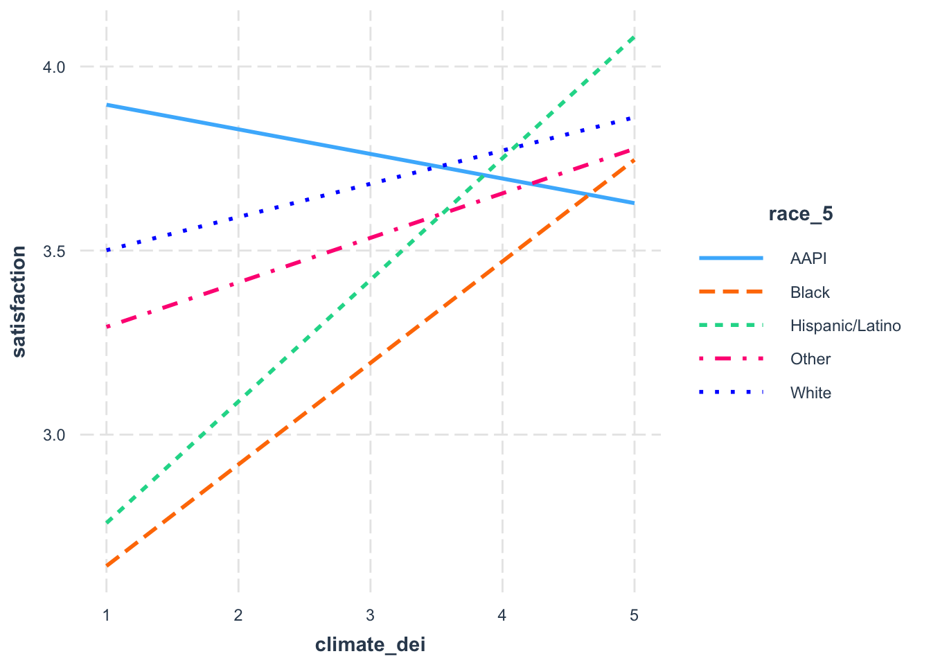
When creating a margins plot with a continuous x categorical interaction:
- Plot your variable of interest, that you think is a moderator, on the graph by putting it before the comma in the margins command. In this case we’re interested in the effect of race.
Interpretation:
- What we see then is how the effect of DEI climate rating on satisfaction varies by racial identity.
Let’s say, though, that you’re only interested in comparing how DEI and satisfaction differs. You might want to specify which racial groups to plot.
interact_plot(fit7, pred = climate_dei, modx = race_5,
                modx.values = c("AAPI", "Black", "Hispanic/Latino"))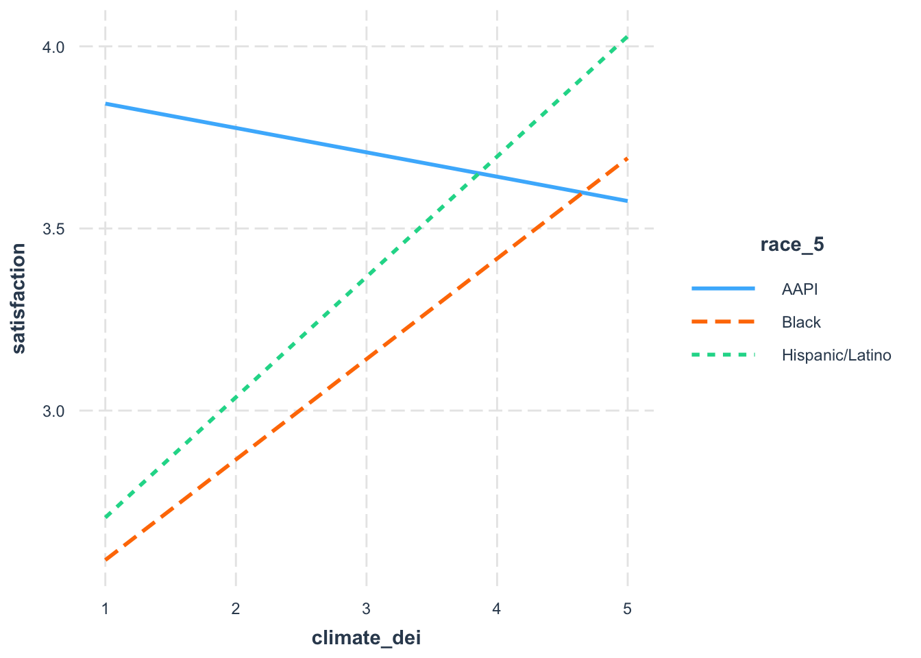
Categorical variable x dummy variable
We’ll now look at the categorical and dummy variables interaction.
First the regression:
fit8 <- lm(satisfaction ~ climate_gen + climate_dei + instcom + undergrad +
             race_5*female, data = mydata)
summary(fit8)
Call:
lm(formula = satisfaction ~ climate_gen + climate_dei + instcom +
    undergrad + race_5 * female, data = mydata)

Residuals:
    Min      1Q  Median      3Q     Max
-3.5657 -0.4480  0.0747  0.5103  2.3302

Coefficients:
                             Estimate Std. Error t value Pr(>|t|)
(Intercept)                   0.29947    0.14203   2.108 0.035166 *
climate_gen                   0.51467    0.03785  13.596  < 2e-16 ***
climate_dei                   0.13831    0.03892   3.554 0.000393 ***
instcom                       0.28995    0.03287   8.822  < 2e-16 ***
undergrad                    -0.01020    0.04301  -0.237 0.812500
race_5Black                  -0.12993    0.11564  -1.124 0.261382
race_5Hispanic/Latino         0.02015    0.09801   0.206 0.837117
race_5Other                   0.20928    0.11777   1.777 0.075764 .
race_5White                   0.15005    0.07900   1.899 0.057704 .
female                        0.15807    0.09441   1.674 0.094313 .
race_5Black:female           -0.44523    0.15061  -2.956 0.003166 **
race_5Hispanic/Latino:female -0.18067    0.13728  -1.316 0.188382
race_5Other:female           -0.53025    0.16266  -3.260 0.001141 **
race_5White:female           -0.20961    0.11322  -1.851 0.064331 .
---
Signif. codes:  0 '***' 0.001 '**' 0.01 '*' 0.05 '.' 0.1 ' ' 1

Residual standard error: 0.77 on 1414 degrees of freedom
  (372 observations deleted due to missingness)
Multiple R-squared:  0.4516,    Adjusted R-squared:  0.4466
F-statistic: 89.58 on 13 and 1414 DF,  p-value: < 2.2e-16
Now the first thing is that we can’t use our interact_plot with two factor variables or with a factor variable as the predictor variable. Instead we’ll use a ggpredict plot
ggpredict(fit8, terms = c("race_5", "female")) %>% plot()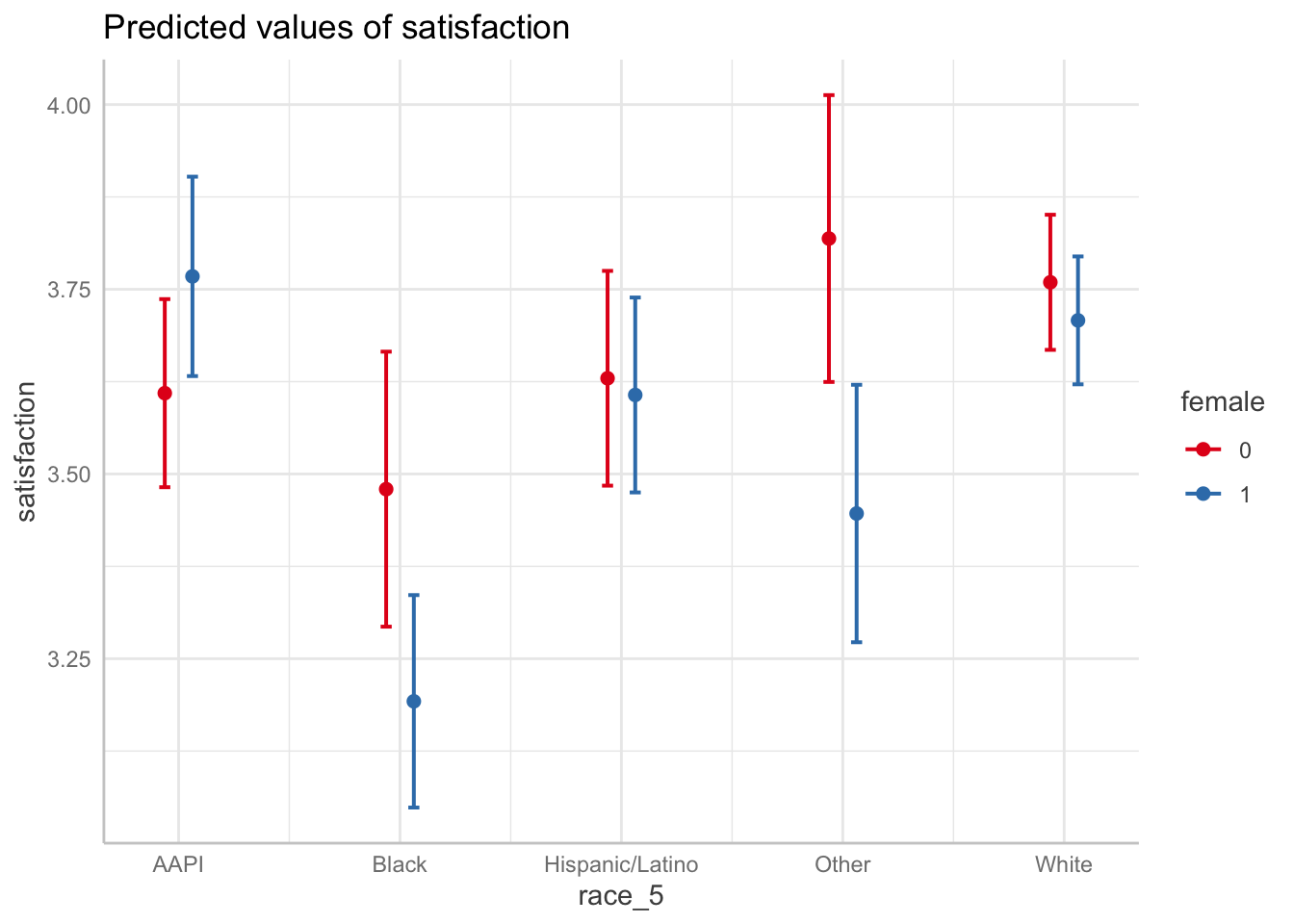
Interpretation:
- FOCUS ON TWO DOTS EACH COLUMN TO SEE GENDER DIFFERENCES IN EACH RACIAL GROUP. We can see the difference between female and male satisfaction for each racial group. We can see, for example, that there is a major difference in satisfaction by gender for black students and students whose identity was grouped into other. Interestingly, the confidence intervals tell us that while the ‘other’ category’s difference is statistically significant, we can’t be sure for black students given the overlap.
- FOCUS ON LINES TO SEE RACIAL DIFFERENCES IN EACH GENDER CATEGORY. We can see the difference between the races for each gender. We can see for example, that black female students have lower satisfaction than all other female students, and that gap is statistically different with all the groups except women in the ‘other’ category.
There is no challenge activity in today’s lab. Interactions can be challenging to wrap your mind around, but the better you can understand an interaction on a graph the more you will grasp interactions.