6 Lab 3 (Stata)
6.1 Lab Goals & Instructions
Goals
- Produce three key plots to evaluate your linear regression model
- Run through all the ways to evaluate each assumption of the linear regression model
- Learn how to save predicted values and residuals from your model
Research Question: What features are associated with how wealthy a billionaire is?
Instructions
- Download the data and the do file from the lab files below.
- Run through the do file and reference the explanations on this page if you get stuck.
- If you have time, complete the challenge activity on your own.
Jump Links
Saving predicted values
Saving residuals
Plot 1: Residuals vs Fitted (Predicted) Values
Plot 2: Scale Location Plot
Plot 3: Q-Q Plot
Linearity
Homoskedasticity
Normal Errors
Uncorrelated Errors
X is not invariant
X is independent of the error
6.3 Three Key Plots to Test Assumptions
After you conduct a linear regression, I recommend that you produce these three plots to test whether or not the assumptions of a linear regression model are violated. There are many different ways to test the assumptions of linear regression, but I find these three plots to be relatively simple, and they cover most of the assumptions. In the following sections we’ll go through a variety of ways to test each assumption.
Make sure you run the linear regression code first. In this regression, we’re still looking at whether gender and age are associated with wealth of billionaires.
regress wealthworthinbillions i.female age Source | SS df MS Number of obs = 2,229
-------------+---------------------------------- F(2, 2226) = 8.88
Model | 515.668041 2 257.834021 Prob > F = 0.0001
Residual | 64627.4392 2,226 29.0329916 R-squared = 0.0079
-------------+---------------------------------- Adj R-squared = 0.0070
Total | 65143.1073 2,228 29.2383785 Root MSE = 5.3882
------------------------------------------------------------------------------
wealthwort~s | Coefficient Std. err. t P>|t| [95% conf. interval]
-------------+----------------------------------------------------------------
female |
Female | .4309052 .3898967 1.11 0.269 -.3336941 1.195504
age | .0354921 .008692 4.08 0.000 .0184469 .0525373
_cons | 1.461568 .5575309 2.62 0.009 .3682333 2.554903
------------------------------------------------------------------------------6.4 Saving Predicted Values and Residuals
Predicted Values
When we run a linear regression, we produce a linear equation that describes the relationships between our variables. In this lab, our linear equation is:
\[ y_{wealth} = A + \beta_1 x_{gender} + \beta_2 x_{age} + e_i\]
Our predicted value is what this equation would produce if we ingore the error term. The error term bumps the value up or down to what is actually observed. But if we just went by the equation, the predicted value is what the model estimates would occur. Once we run a regression and save the results, we can very simply add those predicted values to our dataset:
predict yhatNote: I have labeled the predicted values as “yhat” because it is common in statistics to represent the predicted value with the symbol \(\hat y\) (i.e. a y with a little hat on top).
Residuals
As I mentioned above, there is often a difference between our predicted value and our observed value of Y in our dataset. The residual or error represents that difference. Here’s a graph I like that visualizes what the residuals are: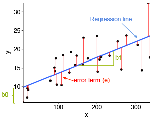
Just like the predicted value, we can easily save the residuals onto our dataset.
predict r1, residualsThen you can look at the residuals (or the predicted values) like any other variable.
summarize r1 Variable | Obs Mean Std. dev. Min Max
-------------+---------------------------------------------------------
r1 | 2,229 -2.00e-09 5.385808 -3.764222 72.47989list r1 in 1/10 | r1 |
|----------|
1. | 15.61875 |
2. | 55.64129 |
3. | 72.47989 |
4. | 11.23145 |
5. | 28.35398 |
|----------|
6. | 67.91202 |
7. | . |
8. | 27.23481 |
9. | 59.80554 |
10. | 8.824969 |
+----------+Plot 1: Residuals vs Predicted (Fitted) Values
This plot puts the residuals on the y axis and your predicted values on the x-axis. So the logic is: for each predicted value, how big is the residual or error between the predicted and observed values? We then look to see if there is a pattern in those errors in our model, which would indicate our problem.
This plot can help us detect:
- Linearity: The residuals should form a horizontal band around 0, which is approximated by the red line. If linearity does not hold, there will be a curve to the line.
- Homoskedasticity: If this assumption holds, the spread of the points will be approximately the same from left to right. If it does not hold, there may be a cone shaped pattern to the points.
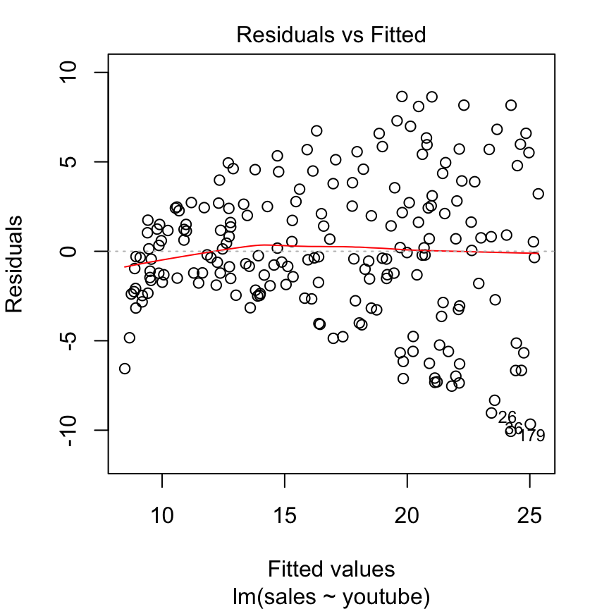
This is an example of a residuals vs fitted plot where the linearity assumption is met, but there is evidence of heteroskedasticity (that classic cone shape to the error points).
Let’s produce this plot for our model. You can do this in two ways. If you are already saving your residuals and predicted values, you can make a scatterplot.
scatter r1 yhat, yline(0)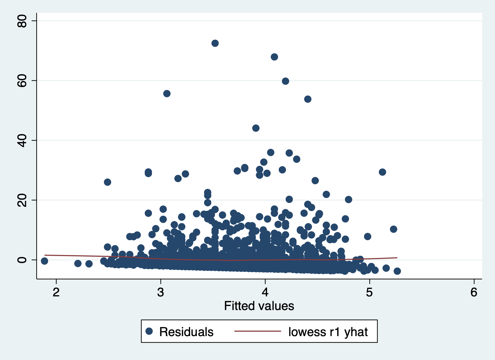
If you want to produce the plot without saving anything, you can run this command right after a regression. But you will not get the red line.
It can be difficult to detect violations of the homoskedasticity assumption with this plot, so we move on two our second plot.
Plot 2: Scale Location Plot
This plot is very similar to our previous one, but it makes it easier to detect heteroskedasticity. This time we plot the square root of standardized residuals on the y axis and the fitted values again on our x axis. This lets us look at a line representing the mean of the √standardized residuals, or the spread of the error across values.
This plot is primarily good for evaluating:
- Homoskedasticity: If this assumption holds, the standardized residuals will be roughly horizontal, aka the red line should be approximately horizontal. The residuals should also appear randomly scattered around the plot.
Let’s take a look at this plot for our model. First we have to calculate the square root of the standardized residuals.
predict rs, rstandard
gen rs_sqrt = sqrt(rs)
And then we can plot it with a smoothing line:
scatter rs_sqrt yhat || lfit rs_sqrt yhat 
In this case we can more clearly see that the line is NOT horizontal, and that the variance of our errors increases across our predicted values.
Plot 3: Normal Q-Q Plot
The final key plot that helps us test our assumptions is a normal Q-Q plot (or quantile-quantile plot). A Normal Q-Q plot takes your data, sorts it into ascending order, and puts those points into quantiles. It then plots those quantiles against what we would expect a normal distribution to look like. In more plain terms, we are plotting our error values and seeing how close they fall to the normal distribution. This graph plots the normal distribution as a straight line and the farther our points fall from that line, the less normal the errors are.
Here’s an example of a Q-Q plot with errors that follow the normal distribution. You can see that the plotted points fall close to the dotted line representing normality.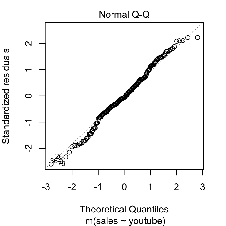
Now let’s look at this plot in our model. Stata gives us an easy command for this plot.
qnorm r1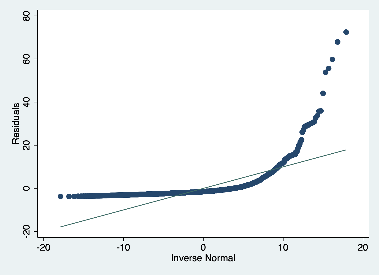
You can clearly see that our errors do NOT follow the normal distribution.
6.5 Testing each assumption
With the three plots above, you can assess most of the assumptions. However, you also have a whole slew of tools at your disposal to look more at each assumption (at least the ones that are testable). Let’s go through each one by one. I’ll also remind you what each assumption means.
6.5.1 Linearity
Assumption: The relationship between whatever units our X and Y variables are measured in can be reasonably predicted by a linear line.
With this assumption, we have to make sure that the relationship between our X and Y variables falls along a straight line, and not a curved one. We discussed some initial ways to evaluate this assumption last week, which we’ll review here along with looking at means of X on y and our Residuals vs. Predicted plot.
Method 1: Scatterplot of y on x
A simple way of testing this assumption is to look at a scatterplot, but this method can only look at one X as a time.
scatter wealthworthinbillions age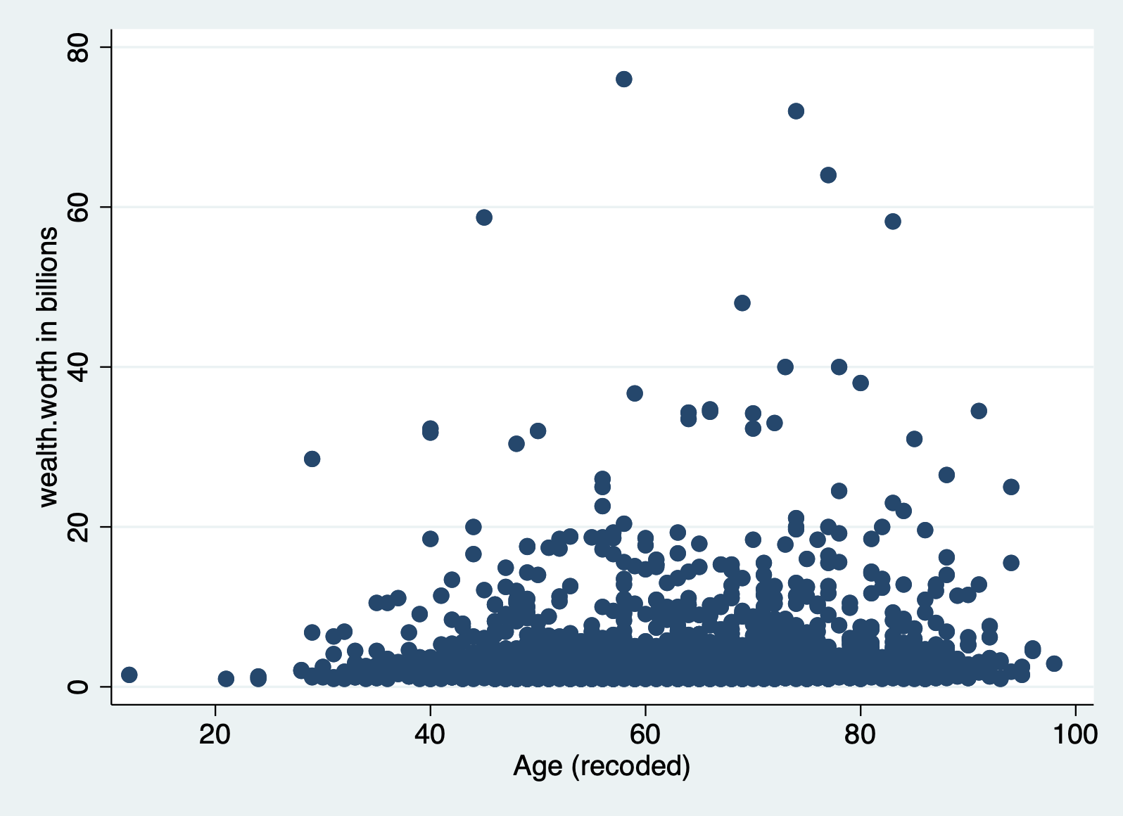
Method 2: Scatterplot with lowess smoothing line
Adding a lowess smoothing line can make the pattern more visible in busy scatterplots. But again,t his can only look at one X at a time.
    scatter wealthworthinbillions age || ///
        lowess wealthworthinbillions age, bwidth(0.1)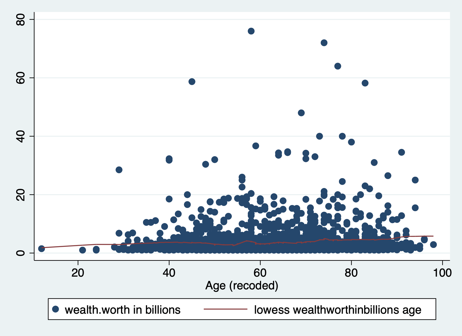
Method 3: Means of X on Y
This is a method we went over in class. To make sure a continuous X variable has a linear relationship with our Y, we can break it up into categories, and then look at the means of those categories. Here are the steps in R.
Step 1: Create a categorical variable from your X
    generate age2 = .
    replace age2 = 0 if age > 20 & age <= 40
    replace age2 = 1 if age > 40 & age <= 60
    replace age2 = 2 if age > 60 & age <= 80
    replace age2 = 3 if age > 80 & age <= 100

    label define agel 0 "21-40" 1 "41-60" 2 "61-80" 3 "81-100", replace
    label values age2 agel
Always check your new variable
tab age2 age2 | Freq. Percent Cum.
------------+-----------------------------------
21-40 | 89 3.99 3.99
41-60 | 916 41.11 45.11
61-80 | 1,003 45.02 90.13
81-100 | 220 9.87 100.00
------------+-----------------------------------
Total | 2,228 100.00Step 2: Run a regression with the categorical variable
regress wealthworthinbillions i.age2Step 3: Create a marginsplot of the predicted values
    margins age2
    marginsplot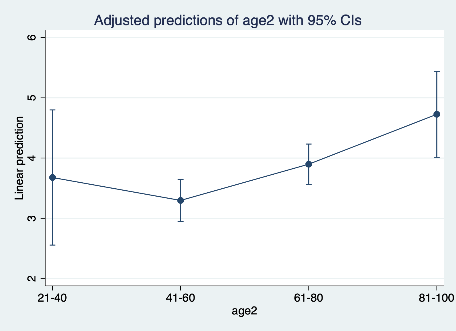
We’re jumping ahead of things by creating margins, but what this command does is plot the predicted value for each category or ranges of x (age2). What this ends up doing is creating and plotting the means for each range. You want to see if these means fall roughly on a straight line. In this case, the mean for 41-60 falls slightly, which is notable but not definitive.
BONUS: What is the difference between predict and margins?
The
predictcommand calculates a separate predicted value for every observation in the data set for which all of the predictor variables are non-missing. This means, it accounts for all variables and observations in our model.The
marginscommand calculates average predicted values for groups of observations, the groups being defined by levels of some variable(s) in the model (like how we prediced the mean of each age category using margins).
Method 4: Residuals vs Predicted (Fitted) Values
This is our first plot above. Again you should be looking for non-linear patterns in this plot. The residuals should form a horizontal band around 0, and the red line should be roughly horizontal.
scatter r1 yhat, yline(0)6.5.2 Homoskedasticity
Assumption: The variance of the error term is the same for all X’s.
With this assumption we are concerned about the size of the residuals (i.e. errors) for each observation. We expect there to be some differences between the predicted values and the observed values. However, we assume that those differences don’t follow any noticeable pattern. For example, if we get a lot bigger errors for people with greater ages, that would be a problem. We call that problem heteroskedasticity. The opposite of our assumption of homoskedasticity. These are some of my favorite words to pronounce in statistics.
There are three methods we’ll go over to detect hetereoskedasticity.
Method 1: Residuals vs Predicted Values Plot
Back to our favorite key plot. To evaluate this plot for heteroskedasticity, you want to look for any identifable pattern in the residuals. A cone shape is often indicative of hetereoskedasticity. If the residuals appear randomly scattered, that is an indicator that our assumption of homoskedasticity has been met.
scatter r1 yhat, yline(0)Method 2: Standardized Residuals vs. Fitted Values
Now we move to our second key plot. There should be no discernable pattern in the residuals, and the points should occupy the same space above and below the red line. The red line should be roughly horizontal.
First we have to calculate the square root of the standardized residuals.
predict rs, rstandard
gen rs_sqrt = sqrt(rs)
And then we can plot it with a smoothing line:
scatter rs_sqrt yhat || lfit rs_sqrt yhat Method 3: Scatter Plot of residuals vs continuous x variable
Again with this method we are looking for a random pattern of errors. By choosing a specific x variable, you can see whether the errors follow a pattern along the distribution of any given variable in your model.
scatter r1 age, yline(0)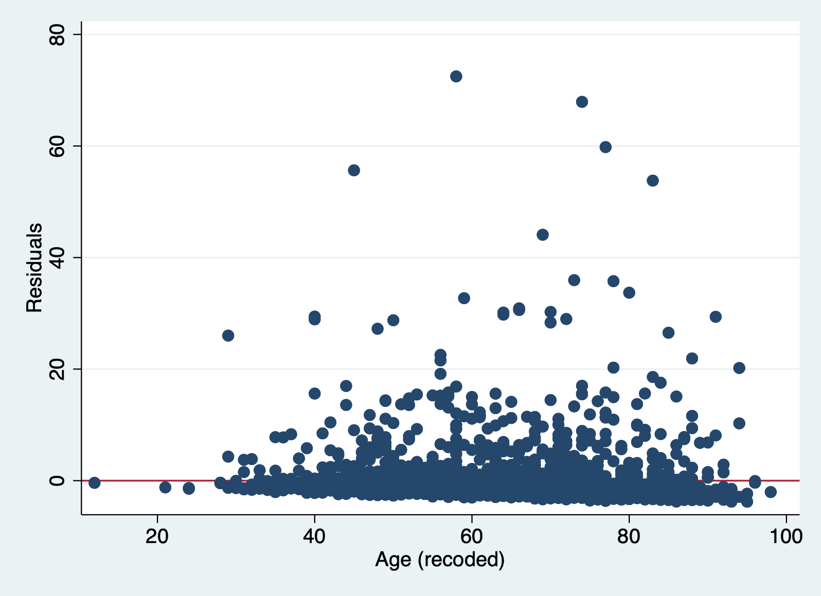
6.5.3 Normally Distributed Errors
Assumption: The errors (i.e. residuals) follow a normal distribution.
Like our last assumption, a linear regression model assumes that the errors don’t have any particular pattern. In fact, we expect the errors to follow the normal distribution. The normal distribution is one of the most common distributions that describes the probability of event occurring. It is relatively straightforward to detect whether or not this assumption is violated. If our sample is large (\(n \geq40\)), then we don’t have to worry too much about violating this assumption. If our sample is small then we cannot trust the results of the model.
Here are three ways to detect non-normally distributed errors.
Method 1: Histogram of Residuals
Here you want to make sure that histogram looks roughly like a normal distribution. You can google what that looks like if you forget, but it is your classic bell curve.
hist r1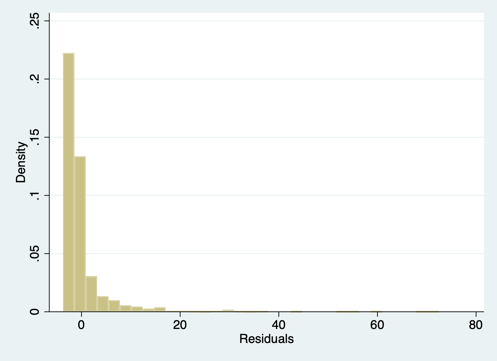
Method 2: Skew of residuals
We haven’t touched on skew as a descriptive statistics in class. It is automatically produced in Stata descriptives with the detail option. You are looking out for a skew greater than 1 to indicate heavy skew.
sum r1, d Residuals
-------------------------------------------------------------
Percentiles Smallest
1% -3.389872 -3.764222
5% -2.928475 -3.762333
10% -2.702825 -3.744793 Obs 2,229
25% -2.216999 -3.662333 Sum of wgt. 2,229
50% -1.507157 Mean -2.00e-09
Largest Std. dev. 5.385808
75% -.0910937 55.64129
90% 3.47989 59.80554 Variance 29.00693
95% 8.218493 67.91202 Skewness 5.946823
99% 26.5216 72.47989 Kurtosis 54.9318Method 3: Q-Q Plot
This is our third key plot. Again, it plots the normal distribution as a straight line and the farther the points from the line, the less normal the errors.
qnorm r16.5.4 Uncorrelated Errors
Assumption: The errors (i.e. residuals) are not correlated with each other.
There is no “method” per se to ensure that your errors are not correlated with each other. This is something you have to recognize about the structure of the dataset. Ask yourself: Are there groupings of observations in my dataset? Would observations in those groupings potentially look more like each other than those in other groups?
Some examples would be students from the same school, observations from different years, people from the same city, patients in the same hospital, and so on. There may be unobservable factors related to being in that group that make errors correlated with each other. We will talk ways to account for this in the future.
A look at year reveals we might have this problem in our model:
tab year year | Freq. Percent Cum.
------------+-----------------------------------
1996 | 423 16.18 16.18
2001 | 538 20.58 36.76
2014 | 1,653 63.24 100.00
------------+-----------------------------------
Total | 2,614 100.00We can see that people were collected from waves. This means we have a time series. If you delve in further (i.e. look at rank==1) you’ll notice an example of the time series danger: most people who were extremely wealthy in the first waves were likely to be the top of the pile in future assessments, even if their wealth changed.
In this situation, we’d have to ask ourselves what the best approach is to address the correlated errors.
6.5.5 X is not invariant
Assumption: X is not invariant.
Again, there’s no method to detect this one other than making sure you have variation in your independent variables. Is everyone in your study the same age, well then you can’t detect any effect of different ages! Make sure you have different values for your independent variables.
6.5.6 X is independent of the error terms
Assumption: The errors (i.e. residuals) are independent of X. Meaning, there is no ommitted variable biasing our model.
This assumption all has to do with unseen variables. It cannot be tested for. In the .do file, I had you do some correlations with the error terms. That doesn’t work because you want to know whether those errors are related to variables NOT in your dataset. Therefore, you just have to read in your area, get feedback, and think through what might be affecting the relationship you are studying that you do not have measures for.
6.6 Challenge Activity
Run another regression with wealth as your outcome and one or two new variables. It can be the same one as last week if you got this far.
Create the three key plots and determine whether or the assumptions of linearity, homoskedasticity, and normality of errors are violated.
This activity is not in any way graded, but if you’d like me to give you feedback email me your script file and a few sentences interpreting your results.