5 Lab 2 (R)
5.1 Lab Goals & Instructions
Goals
- Use scatter plots and correlation to assess relationships between two variables
- Run a basic linear regression
- Interpret the results
Research Question: What features are associated with how wealthy a billionaire is?
Instructions
- Download the data and the script file from the lab files below.
- Run through the script file and reference the explanations on this page if you get stuck.
- If you have time, complete the challenge activity on your own.
Jump Links to Commands in this Lab:
Scatter plots with geom_point()
Line of best fit with geom_smooth()
Lowess line with geom_smooth()
cor()
correlate()
lm()
glm()
5.3 Evaluating Associations Between Variables
In this lab you’ll learn a couple ways to look at the relationship or association between two variables before you run a linear regression. In a linear regression, we assume that there is a linear relationship between our independent (x) and dependent (y) variables. To make sure we’re not horribly off base in that assumption, after you clean your data you should check the relationship between x and y. We’ll look at two ways to do this: scatter plots and correlation.
First, here are the libraries you will need for this lab. I’m not including the other set-up code here, but it is in your script file.
library(tidyverse)
library(ggplot2)
library(corrr)
Scatter Plots
A scatter plot simply plots a pair of numbers: (x, y). Here’s a simple plot of the point (3, 2).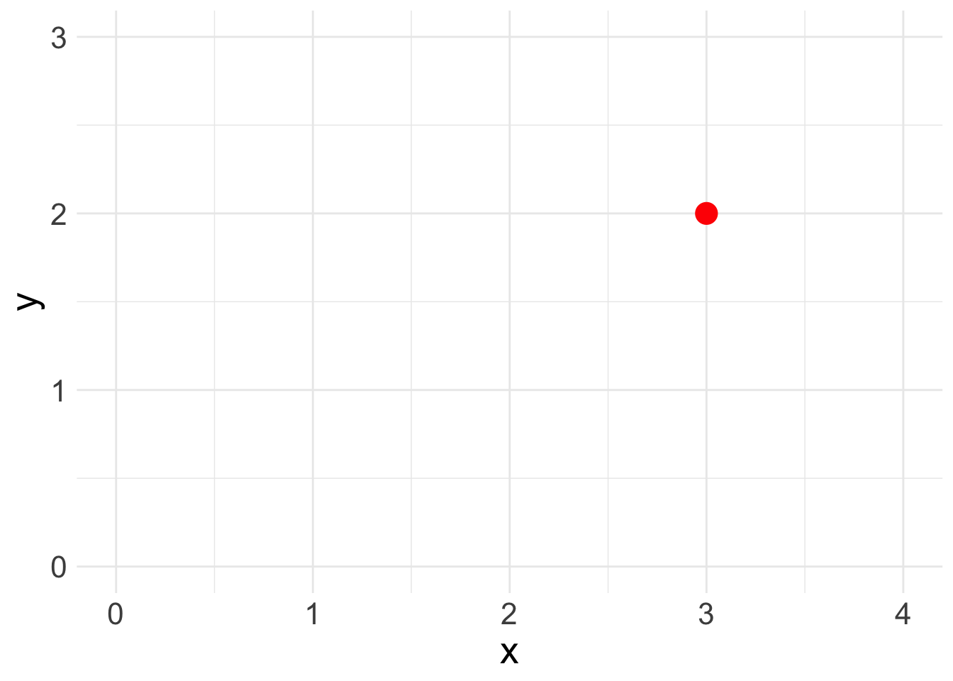
To look at the relationship between our independent and dependent variables, we plot the (x,y) pairings of all our observations.
Let’s look at the relationship between the two variables of interest in our analysis today: age (x) and wealth (y). You’ll produce a basic scatter plot of x and y, which can let you see at a glance whether there is a linear relationship between the two.
This function uses three lines of code, though you can fancy up any graph in ggplot. The first line specifies the dataset and the variables you are ploting. The second line creates a scatter plot (geom_point()). The third line adds a basic theme to make the graph look nicer.
ggplot(data = mydata, aes(y = wealthworthinbillions, x = age)) +
  geom_point() +
  theme_minimal()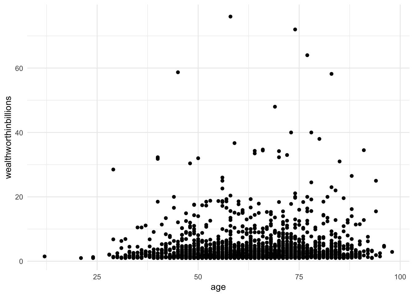
At times, we need extra help to see linear associations. This is especially true whether there are a ton of observations in our data. There may be an association, our eyes just cannot detect it through all the mess. To solve this problem, we add what’s called a line of best fit (aka a linear regression line) over our graph.
Line of Best Fit
When we run a regression, we are generating a linear formula (something like y = ax + b). We can plot that line to visually see the relationship between two variables. In Stata, you do this by using lfit and add it to the end of your scatter plot command. In the lfit command you include the same variables on your scatterplot in the same order.
Here we are adding one more line of code to our plot, geom_smooth(). This command can plot any number of trend lines. To create a line of best fit, you have to specify the method (lm = linear regression). By default the command adds a confidence interval band around the line. We’ve set that option to FALSE to make a cleaner graph.
ggplot(data = mydata, aes(y = wealthworthinbillions, x = age)) +
  geom_point() +
  geom_smooth(method = "lm", se = FALSE) + # adds line using linear formula,
  # se = FALSE removes the confidene interval around the line.
  theme_minimal()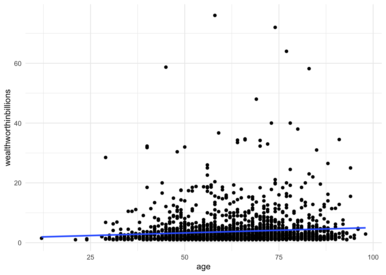
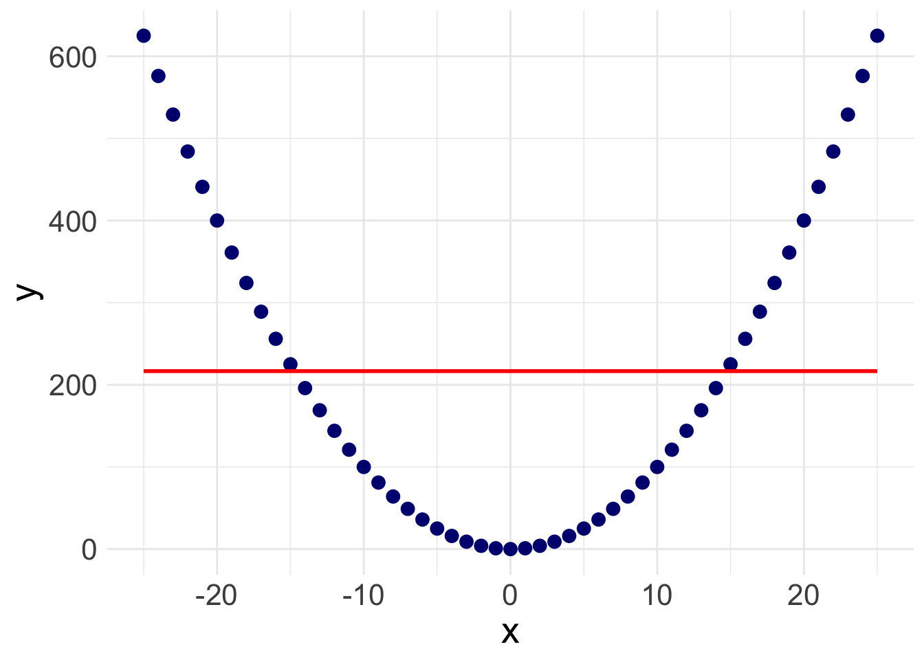
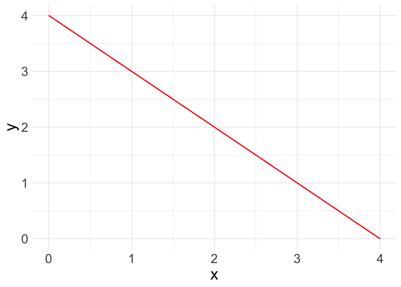
There is a slight slope to the line, indicating we may have a significant linear relationship. However, Stata will plot a straight line even if the relationship is NOT linear. Take the following example. Here, I’ve plotted a data set with a parabolic relationship ( \(y = x^2\) ) and then plotted a line of best fit. Even though there is a clear relationship, it’s a curved relationship, not a linear one. Our line of best fit is misleading.
So how do we overcome this problem? Rather than assuming a linear relationship, we can instead plot a ‘lowess’ curve onto our graph.
Lowess Curve
A Lowess (Locally Weighted Scatterplot Smoothing) curve creates a smooth line showing the relationship between your independent and dependent variables. It is sometimes called a Loess curve (there is no difference). Basically, the procedure cuts your data into a bunch of tiny chunks and runs a linear regression on those small pieces. It is weighted in the sense that it accounts for outliers, showing possible curves in the relationship between your two variables. Lowess then combines all the mini regression lines into a smooth line through the scatter plot. Here is a long, mathematical explanation for those of you who are interested. All you need to know is that it plots a line that may or may not be linear, letting you see at a glance if there is a big problem in your linearity assumption.
Here, we use the geom_smooth() function again, but specify loess as the method.
ggplot(data = mydata, aes(y = wealthworthinbillions, x = age)) +
  geom_point() +
  geom_smooth(method = "loess", se = FALSE) + # adds line using linear formula,
  # se = FALSE removes the confidene interval around the line.
  theme_minimal()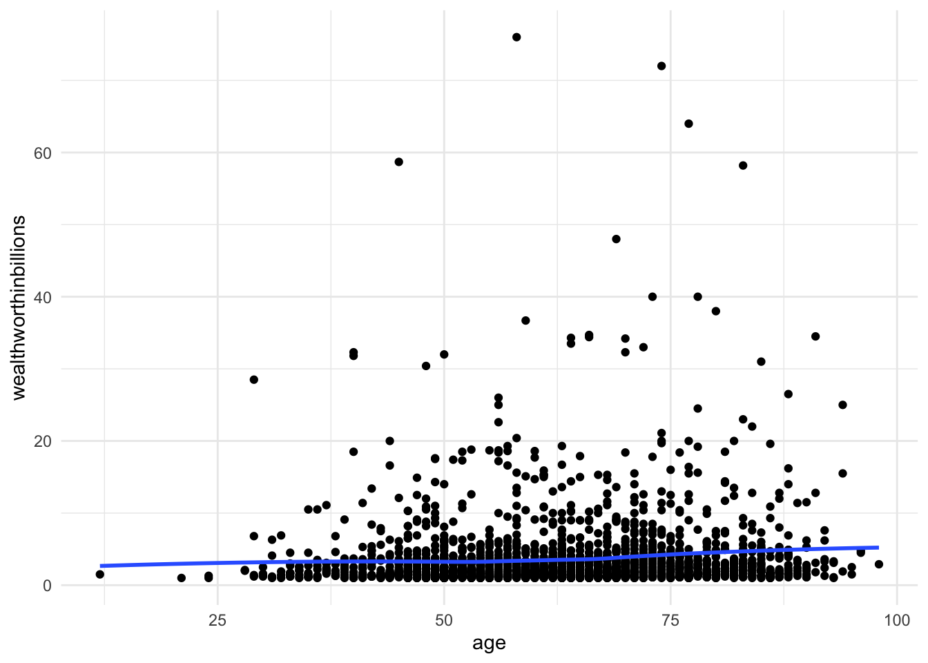
![]() Research Note
Research Note
Evaluating linearity, as with many aspects of quantitative research, involves subjective interpretation. Sometimes the nonlinearity will jump out at you, and sometimes it won’t. You have to think carefully about what does or doesn’t count as linear. This is just one method.
Correlation
Another way to evaluate for a linear relationship is looking at the correlation between your variables. You may or may not remember correlation from your introductory statistics classes. A quick review…
Correlation refers to the extent to which two variables change together. Does x increase as y increases? Does y decrease as x decreases? If whether or not one variable changes is in no way related to how the other variable changes, there is no correlation. In mathematical terms, the correlation coefficient (the number you are about to calculate) is the covariance divided by the product of the standard deviations. Again, here’s a mathematical explanation if you are interested. What you need to know is that the correlation coefficient can tell you how strong the relationship between two variables is and what direction the relationship is in, positive or negative. Of course, we must always remember that correlation \(\neq\) causation.
There are actually a number of different ways to calculate a correlation (aka. a correlation coefficient) in R.
Option 1:
With two variables
cor(x = mydata$age, y = mydata$wealthworthinbillions,
      use = "complete.obs")
[1] 0.08585782With more than two variables
mydata %>%
    select(wealthworthinbillions, age, female) %>%
    cor(use = "complete.obs")
wealthworthinbillions age female
wealthworthinbillions 1.00000000 0.08585782 0.02201988
age 0.08585782 1.00000000 -0.01524580
female 0.02201988 -0.01524580 1.00000000Option one cor comes from the base R packages and uses “listwise deletion” to deal with missing values. If an observation is missing on ANY of the variables you are correlating it automatically deletes them from the entire correlation matrix.
Option 2:
With two variables
correlate(x = mydata$age, y = mydata$wealthworthinbillions)# A tibble: 1 × 2
term x
<chr> <dbl>
1 x 0.0859With more than two variables
mydata %>%
    select(wealthworthinbillions, age, female) %>% # a quick temporary subset
    correlate()
# A tibble: 3 × 4
term wealthworthinbillions age female
<chr> <dbl> <dbl> <dbl>
1 wealthworthinbillions NA 0.0859 0.0175
2 age 0.0859 NA -0.0152
3 female 0.0175 -0.0152 NA The command correlate comes from the package corrr. First, it uses “pairwise deletion,” meaning it excludes an observation from the correlation calculation of each pair of correlations (i.e., if there are missing values on age, but not the other variables).
Now we know that there is a significant, positive correlation between wealth and age. It’s time to run a linear regression.
![]() Research Note
Research Note
In the future, it is going to be important for you to know whether or not your independent variables are correlated with one another. This is called collinearity, and it can cause all sorts of problems for your analysis. Keep these correlation commands in your toolbelt for the future.
5.4 Running a Basic Linear Regression
Refresh: What is a linear regression model anyways?
Now you are ready to run a basic linear regression! With a linear regression, you are looking for a relationship between two or more variables: one or more x’s and a y. Because we are looking at linear relationships, we are assuming a relatively simple association. We may find that either as x increases, y increases: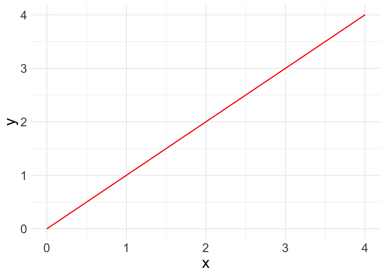
What a linear regression analysis tells us is the slope of that relationship. The slope is what we want to learn from linear regression. This is the linear formula you may be used to seeing:
\[ y = ax + b\]
Because statisticians love to throw different annotation at us, here’s the same equation as you will see it in linear regression books:
\[ y_i = A + \beta x_i\]
In this equation:
- \(y_i\): refers the value of the outcome for any observation
- \(A\): refers to the intercept or constant for your linear regression line
- \(x_i\): refers to the value of the independent variable for any observation
- \(\beta\): refers to the slope or “coefficient” of the line.
When we add more variables of interest, or “covariates”, we also add them in as X’s with a subscript. The betas ( \(\beta\) ) also take on a subscript. So a linear equation with three covariates would look like:
\[ y_i = A + \beta_1 x_{1i} + \beta_2 x_{2i} + \beta_3 x_{3i}\]
In general terms, this equation means that for any observation if I want to know the value of y, I have to add the constant (\(A\)) plus the value for \(x_1\) times its coefficient, plus the value for \(x_2\) times its coefficient, plus the value for \(x_3\) times its coefficient.
However, the line that linear regression spits out isn’t perfect. There’s going to be some distance between the value that is predicted and what the actual value is according to our equation. This is called the “error” or the “residual” The whole point of linear regression estimation is to minimize the error. We refer to the error with the term \(e_i\). Each observation has its own error term or residual, aka the amount that the true value of that observation is off from what our regression line predicts. We’ll play more with residuals in the next lab.
So the final equation in a linear regression is:
\[ y_i = A + \beta_1 x_{1i} + \beta_2 x_{2i} + \beta_3 x_{3i} + e_i\]
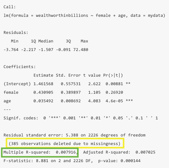
Run your model in R with lm()
Now let’s look at a real example with data: what is the relationship between a billionaire’s wealth and their gender and age. The equation for this regression would be:
\[ y_{wealth} = A + \beta_1 x_{gender} + \beta_2 x_{age} + e_i\]
There are two ways to run a linear regression in R. We’ll run through both. The first option is the lm() function.
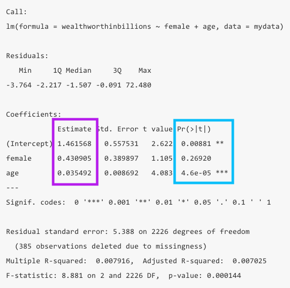
fit_lm <- lm(wealthworthinbillions ~ female + age, data = mydata)
summary(fit_lm)
The code is simple enough. You are actually writing out the formula above, using a ~ as the equals sign. Always put your outcome variable ( y ) first followed by any independent variables ( x ). The logic is that you are regressing \(y\) (wealth), on \(x_1\) (gender) plus \(x_2\) (age).
The first line of code runs the regression and saves the results as an object. This is helpful for future labs when we’ll want to pull out specific values from the model results. The second line produces a summary of the results so we can evaluate them.
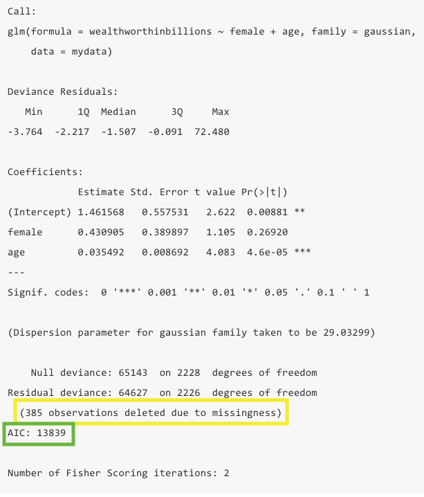
Run your model in R with glm()
The second way to run a linear regression is with the glm() command. Linear regression is part of a larger family of Generalized Linear Models. The glm() command allows you to run any number of models in that family.
To run a linear regresion, you have to specify which model you want to run. If you continue on to 401-2, we’ll use this function to run other types of regressions.
fit_glm <- glm(wealthworthinbillions ~ female + age, family = gaussian,
                  data = mydata)
    # Run the model with family =  gaussian for a linear regression
summary(fit_glm)
Interpreting the output
I have broken down understanding the output into two parts. First, what are the findings of the model? Second, is this a good model or not?
What are the findings?
When you glance at a regression table, you want to know at a glance what the findings are and if they are significant. The two main columns you want to look at are the values for the Estimate, aka your coefficients, in purple and the p-values (Pr(>|t|)) in blue.
- The estimates are your coefficients, aka \(\beta\) values. We can interpret these by saying “For every one unit increase in x, y increases by \(\beta\).” In this example, for every year that age increases, wealth increases by .035 billion dollars.
- The
(Intercept)value in the estimate column is your y intercept or constant. TheAin your equation above. In this case it means when both female and age are zero, wealth is 1.46 billion. Of course age being zero doesn’t make much sense, so in this model it is not very informative to interpret the constant.
- The p-values tell you whether your coefficients are significantly different from zero. In this example, the coefficient for age is significant, but the coefficient for gender is not. R also puts stars to indicate levels of significance, which makes interpreting significance at a glance really easy.
- You can also look at the 95% confidence interval to see if it contains 0 for significance, but it will align with the p-value. If your confidence interval is super wid, that can be an indicator that your results aren’t precise or your sample size is too small.
lm() call.
glm() call. There are some differences, but for drawing our findings we look in the same spot:
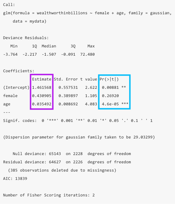
5.4.0.1 How good is this model?
Now that you know your findings, you still need to take a step back and evaluate how good this model is. To do so, you’ll want to look at the the total number of observations in yellow, the R-squared in green, which is calculated from the sum of squares values (not shown in R). However, we’re only going to get the R-squared in the summary for the lm() function.
- You should take note of the number of observations dropped to ensure it is not wildly different than what you expected. If you have a significant amount of missing values in your dataset, you may lose a bunch of observations in your model.
- R-squared: This value tells us at a glance how much explanatory power this model has. It can be interpreted as the share of the variation in y that is explained by this model. In this example only 0.79% of the variation is explained by the model.
- The R-squared is a function of the sum of squares. The “sum of squares” refers to the variation around the mean. Unlike Stata, R does not show these actual values. Because R calculates the R-squared for you, that’s not that big of a deal. But as a reminder, here’s what goes into the R-squared calculation:
- SSTotal = The total variation around the mean squared (\(\sum{(Y - \bar{Y}})^2\))
- SSResidual = The sum of squared errors (\(\sum{(Y - Y_{predicted}})^2\))
- SSModel = How much variance the model predicts (\(\sum{(Y_{predicted} - \bar{Y}})^2\))
- The SSTotal = SSModel + SSResidual and the R-squared = SSModel/SSTotal.
lm(), we get the R-squared.
glm() call we trade having an R-squared value in the output for an AIC value. For the sake of this class, you should probably use use lm() to get the R-squared, but in future classes we’ll learn about the use of the AIC.
Important variations to linear regressions
Categorical independent variables
In our first example, we actually put in gender as a continuous variable. R reads that variable as numeric because its format is numeric, even though we know it’s categorical. To tell R a variable is categorical you have to turn it into a factor.
You can turn a variable into a factor (aka a cateogrical variable in R lanaguage) using the mutate() and factor() functions.
mydata <- mydata %>%
  mutate(female = factor(female))
If our variable is ordinal, it can be helpful to know how to set levels, aka the order of the variable. Levels will go in the order that you list them.
mydata <- mydata %>%
    mutate(female = factor(female, levels = c("0", "1")))
R will now treat this as a categorical, non-numeric variable. If we want to keep the underlying values at 0 and 1, we can apply labels to the levels
mydata <- mydata %>%
    mutate(female = factor(female,
                            levels = c("0", "1"),
                            labels = c("male", "female")))
Now, let’s rerun our example above, correctly specifying our variable female as a categorical variable. Notice how our female variable now shows the name of the variable, and next to it the name of the value labeled as 1.
fit_lm2 <- lm(wealthworthinbillions ~ female + age, data = mydata)
    # Run model and save results as object
summary(fit_lm2)
Call:
lm(formula = wealthworthinbillions ~ female + age, data = mydata)

Residuals:
   Min     1Q Median     3Q    Max
-3.764 -2.217 -1.507 -0.091 72.480

Coefficients:
             Estimate Std. Error t value Pr(>|t|)
(Intercept)  1.461568   0.557531   2.622  0.00881 **
femalefemale 0.430905   0.389897   1.105  0.26920
age          0.035492   0.008692   4.083  4.6e-05 ***
---
Signif. codes:  0 '***' 0.001 '**' 0.01 '*' 0.05 '.' 0.1 ' ' 1

Residual standard error: 5.388 on 2226 degrees of freedom
  (385 observations deleted due to missingness)
Multiple R-squared:  0.007916,  Adjusted R-squared:  0.007025
F-statistic: 8.881 on 2 and 2226 DF,  p-value: 0.000144
R’s automatic response is to treat any variable as “a ONE unit difference in.” While that makes sense for continuous and MOST ordinal variables, that doesn’t really make sense for nominal variables, especially those with more than two categories. It doesn’t make much difference here though, but in the future it will.
Running regressions on subsets
Sometimes, you want to run a regression on a subsample of people in your dataset. You can use a tidyverse pipe (%>%) to filter your data within the regression function (I selected observations with billionaires whose wealth was inherited).
lm(wealthworthinbillions ~ female + age,
    data = mydata %>% filter(wealthtype2 == 3)) %>%
    summary()
Call:
lm(formula = wealthworthinbillions ~ female + age, data = mydata %>%
    filter(wealthtype2 == 3))

Residuals:
   Min     1Q Median     3Q    Max
-4.490 -2.313 -1.378  0.232 35.656

Coefficients:
             Estimate Std. Error t value Pr(>|t|)
(Intercept)   0.82065    0.83065   0.988 0.323486
femalefemale  0.58441    0.41305   1.415 0.157517
age           0.04826    0.01286   3.754 0.000187 ***
---
Signif. codes:  0 '***' 0.001 '**' 0.01 '*' 0.05 '.' 0.1 ' ' 1

Residual standard error: 4.827 on 762 degrees of freedom
  (188 observations deleted due to missingness)
Multiple R-squared:  0.02053,   Adjusted R-squared:  0.01796
F-statistic: 7.988 on 2 and 762 DF,  p-value: 0.0003689
Notice how the number of observations changes. This is also another way to produce a summary via a pipe ( %>% ). The downside to running the code this way is you haven’t saved your results anywhere.
5.5 Challenge Activity
Run another regression with wealth as your outcome and two new variables. Note: You may need to clean these variables before you use them.
Interpret your output in plain language (aka. “A one unit change in x results in…”) and whether it is statistically significant.
This activity is not in any way graded, but if you’d like me to give you feedback email me your script file and a few sentences interpreting your results.