8 Day 7
Office hours today
Exam 1 is in 3 weeks
Review
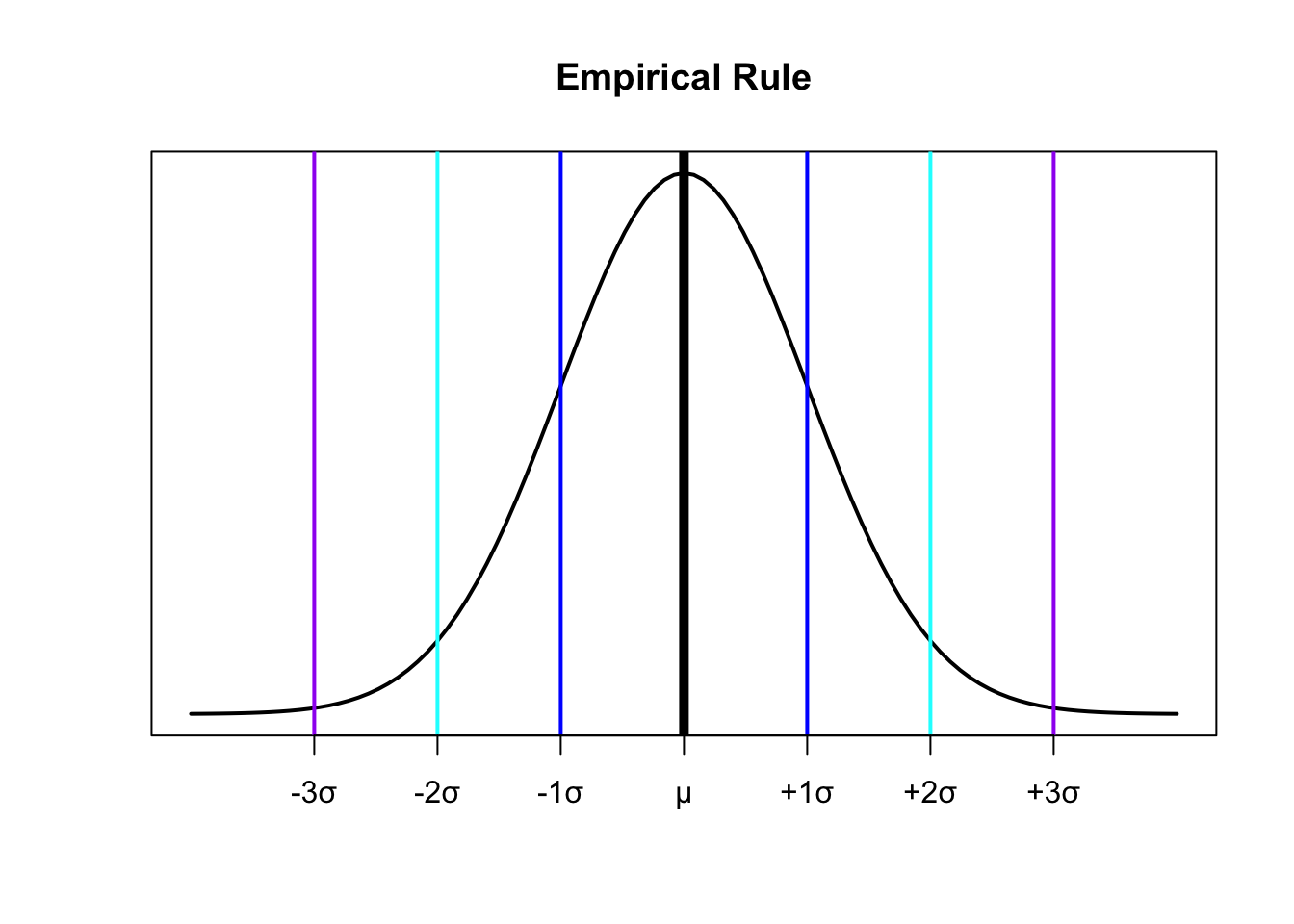
The Empirical Rule
For a population that has an approximately bell-shaped distribution:
\(\approx 68\%\) of the data is within ONE standard deviation of the mean
\(\approx 95\%\)$ of the data is within TWO standard deviations of the mean
\(\approx\) All or almost all of the data is within THREE standard deviations of the mean
z-scores
Let \(x\) be a value from a population with mean \(\mu\)
- The z-score is:
\[z={x-\mu \over \sigma}\]
- For a sample:
\[z={x-\bar{x} \over s}\]
A \(z\)-score data value \(x\) is the number of standard deviations \(x\) is from the mean of the data set
\(z < 0 \Rightarrow\) the value of \(x\) is less than the mean
\(z = 0 \Rightarrow\) the value of \(x\) is equal to the mean
\(z > 0 \Rightarrow\) the value of \(x\) is greater than the mean
Z-Scores and the Empirical Rule:
\(\approx 68\%\) of the data will be between \(z=-1\) and \(z=1\)
\(\approx 95\%\) of the data will be between \(z=-2\) and \(z=2\)
\(\approx 100\%\) of the data will be between \(z=-3\) and \(z=3\)
Quartiles
Every data set has three quartiles:
\(1^{st}\) quartile, denoted \(\textbf{Q}_1\) separates the lowest \(25\%\) of the data from the highest \(75\%\)
\(2^{nd}\) quartile, denoted \(\textbf{Q}_2\) separates the lowest \(50\%\) of the data from the highest \(50\%\) (\(Q_2 = Median\))
\(3^{rd}\) quartile, denoted \(\textbf{Q}_3\) separates the lowest \(75\%\) of the data from the highest \(25\%\)
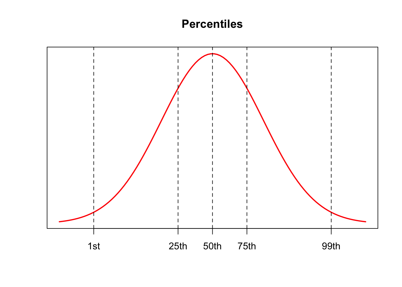
Percentiles:
For a number \(p\) between \(1\) and \(99\), the \(p^{th}\) percentile separates the lowest \(p\%\) of the data from the highest \((100-p)\%\)
Quartiles separate data into \(4\) parts
- Each part is \(\approx 25\%\) of the data
Percentiles divide the data set into \(100\) parts
- Five-Number Summary
The five-number summary is a set of five measures of position computed from a data set. The summary consists of:
\[Min \ \ \ \ \ Q_1 \ \ \ \ \ Median \ \ \ \ \ Q_3 \ \ \ \ \ Max\]
Outliers:
- An outlier is a value that is considerably large or smaller than most of the values in a data set
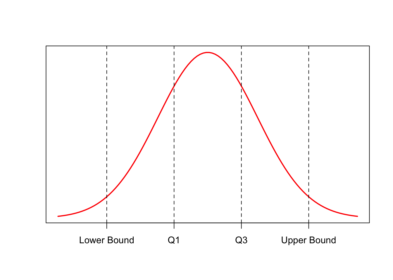
Interquartile Range (IQR)
The IQR is a measure of spread that is often used to detect outliers
Take the difference between \(Q_1\) and \(Q_3\):
\[IQR = Q_3 - Q_1\]
- Finding outliers:
- Define outlier boundaries:
\[Lower \ Outlier \ Boundary = Q_1 - 1.5*IQR\] \[Upper \ Outlier \ Boundary = Q_3 + 1.5*IQR\]
- Check to see if any data is outside of these boundaries:
\[Upper \ Boundary < x < Lower \ Boundary\]
Boxplots
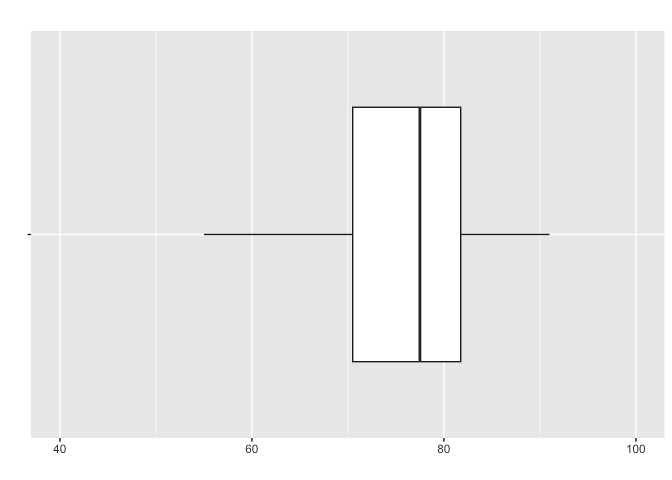
A boxplot or “box-and-whiskers” plot is a graphical display of a five number summary
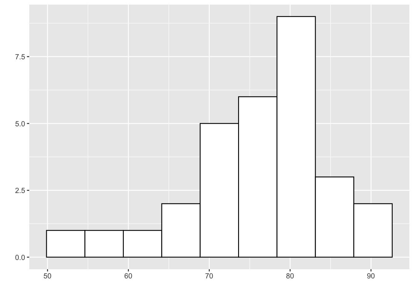
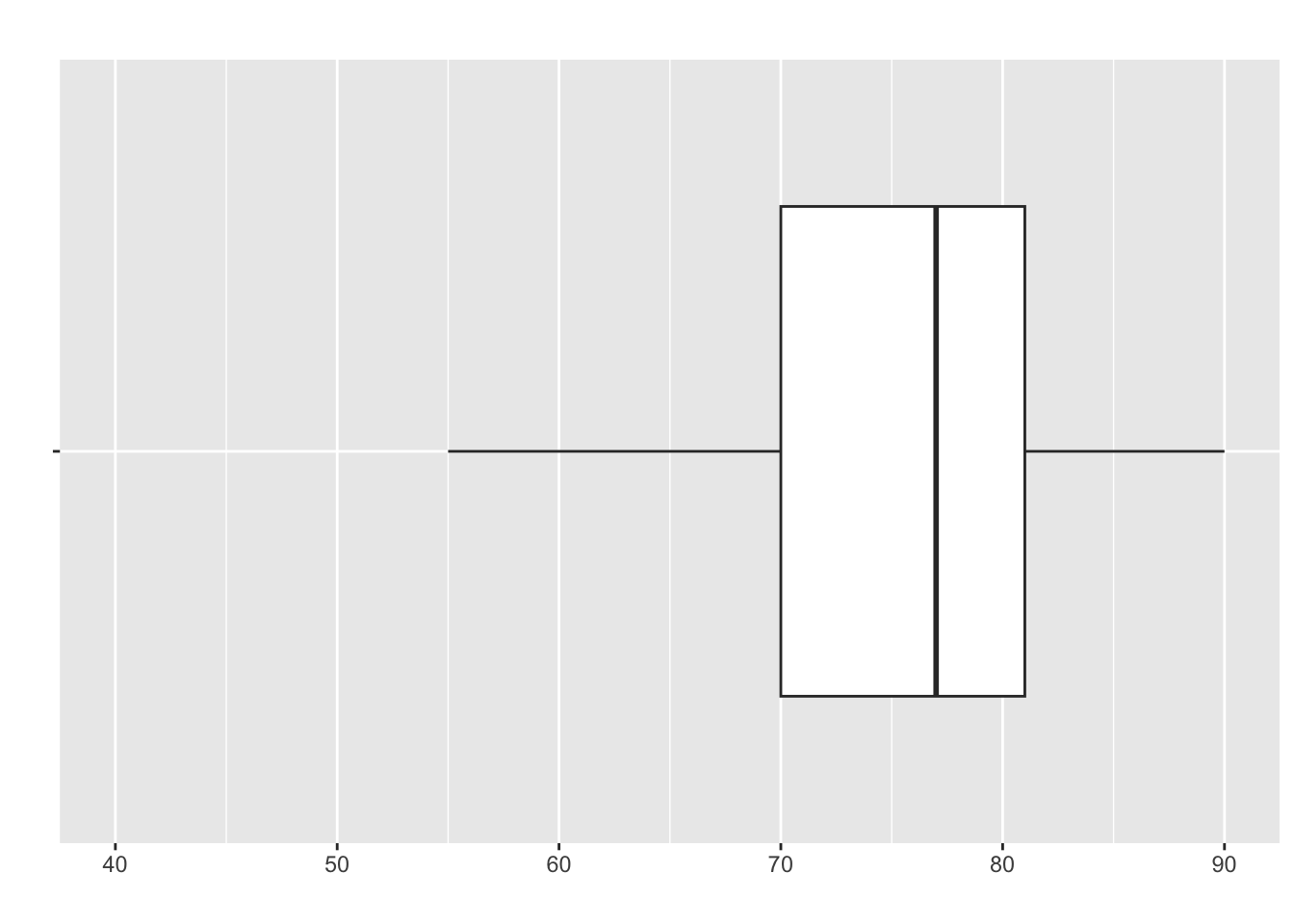
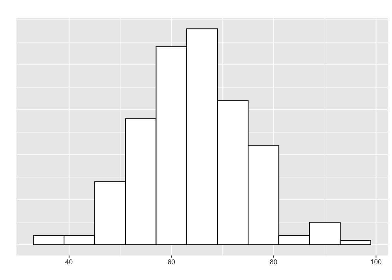
- Recall our five-number summary of the exam data:
| Metric | Min | Q1 | Median | Q3 | Max |
| Value | 53 | 70 | 78 | 82 | 91 |
- The boxplot for this:
How to Construct a Boxplot
- Find the 5 values in the five number summary
Compute the IQR
Find the upper & lower bounds for outliers
Draw a number line to represent the scale
Above the number line, draw a box with one end at \(Q_1\) and the other at \(Q_3\)
- Draw a verticle line across the box at the median
Draw horizontal lines (“whiskers”) from the box to the smallest and largest values within the upper & lower outlier bounds
Plot observations outside the bounds with a “star” (*) to identify them as outliers
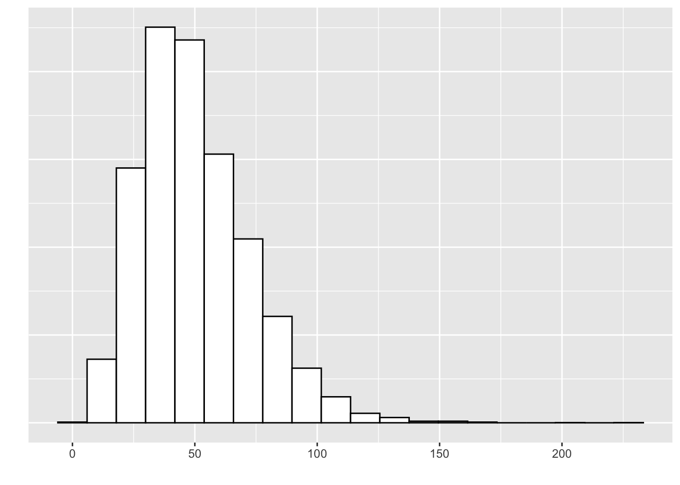
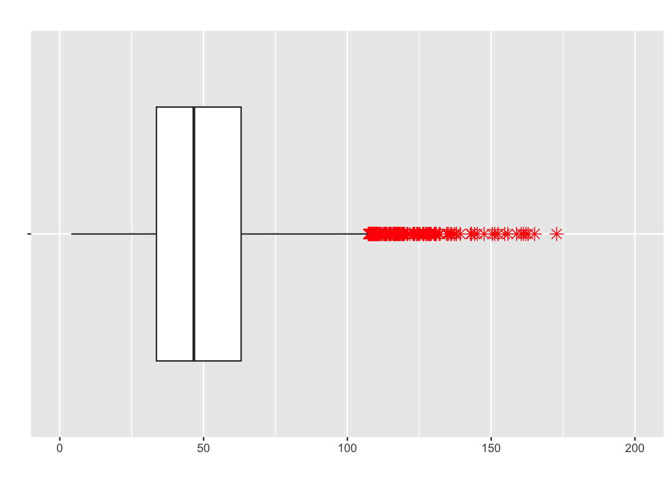
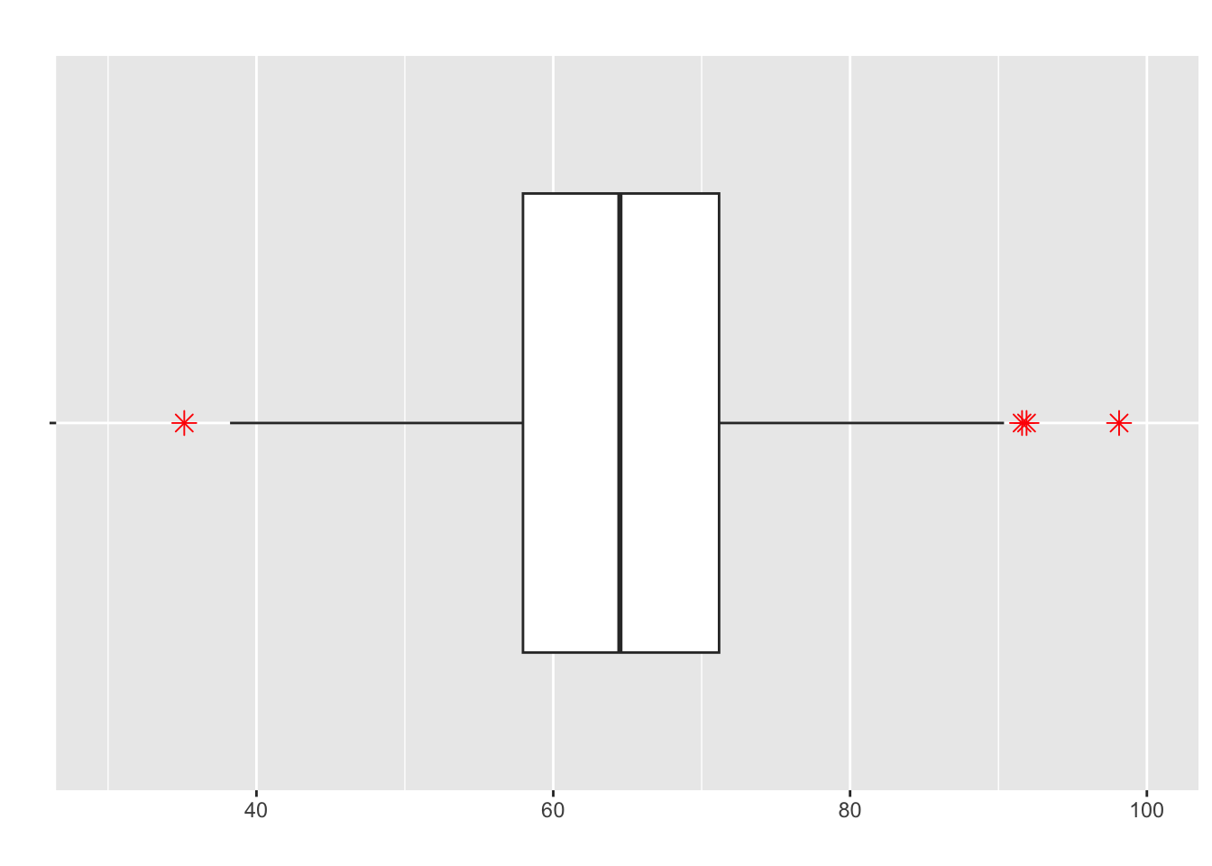
Example: Boxplot from 5 Number Summary
Recall our five-number summar for Jamie’s commute time:
| Metric | Min | Q1 | Median | Q3 | Max |
| Value | 15 | 19 | 21 | 22 | 39 |
The outliers were 31, 36, 38, and 39. Use the information to construct a boxplot:
Skewness and Boxplots
- Showing the skew of data with a boxplot is relatively intuitive and mimics histograms:
This would be negatively-skewed
Which is the higher value in these plots? Median or Mean
- Positively-skewed is the opposite:
- Median or mean, which is higher?
- Approximately symmetric (otherwise known as?)
- What are the stars?
Comparative Boxplots
Boxplots are extremely useful for comparing data sets on the same scale
Below is annual rainfall data (in inches) in LA during February: \(1930-1974\)
| Year | Rainfall | Year | Rainfall | Year | Rainfall | Year | Rainfall | Year | Rainfall |
|---|---|---|---|---|---|---|---|---|---|
| 1930 | 0.45 | 1939 | 1.13 | 1948 | 1.29 | 1957 | 1.47 | 1966 | 1.51 |
| 1931 | 3.25 | 1940 | 5.43 | 1949 | 1.41 | 1958 | 6.46 | 1967 | 0.11 |
| 1932 | 5.33 | 1941 | 12.42 | 1950 | 1.67 | 1959 | 3.32 | 1968 | 0.49 |
| 1933 | 0.00 | 1942 | 1.05 | 1951 | 1.48 | 1960 | 2.26 | 1969 | 8.03 |
| 1934 | 2.04 | 1943 | 3.07 | 1952 | 0.63 | 1961 | 0.15 | 1970 | 2.58 |
| 1935 | 2.23 | 1944 | 8.65 | 1953 | 0.33 | 1962 | 11.57 | 1971 | 0.67 |
| 1936 | 7.25 | 1945 | 3.34 | 1954 | 2.98 | 1963 | 2.88 | 1972 | 0.13 |
| 1937 | 7.87 | 1946 | 1.52 | 1955 | 0.68 | 1964 | 0.00 | 1973 | 7.89 |
| 1938 | 9.81 | 1947 | 0.86 | 1956 | 0.59 | 1965 | 0.23 | 1974 | 0.14 |
- We can compare the data from \(1930-1974\) with the daya from \(1975-2019\) using boxplots:
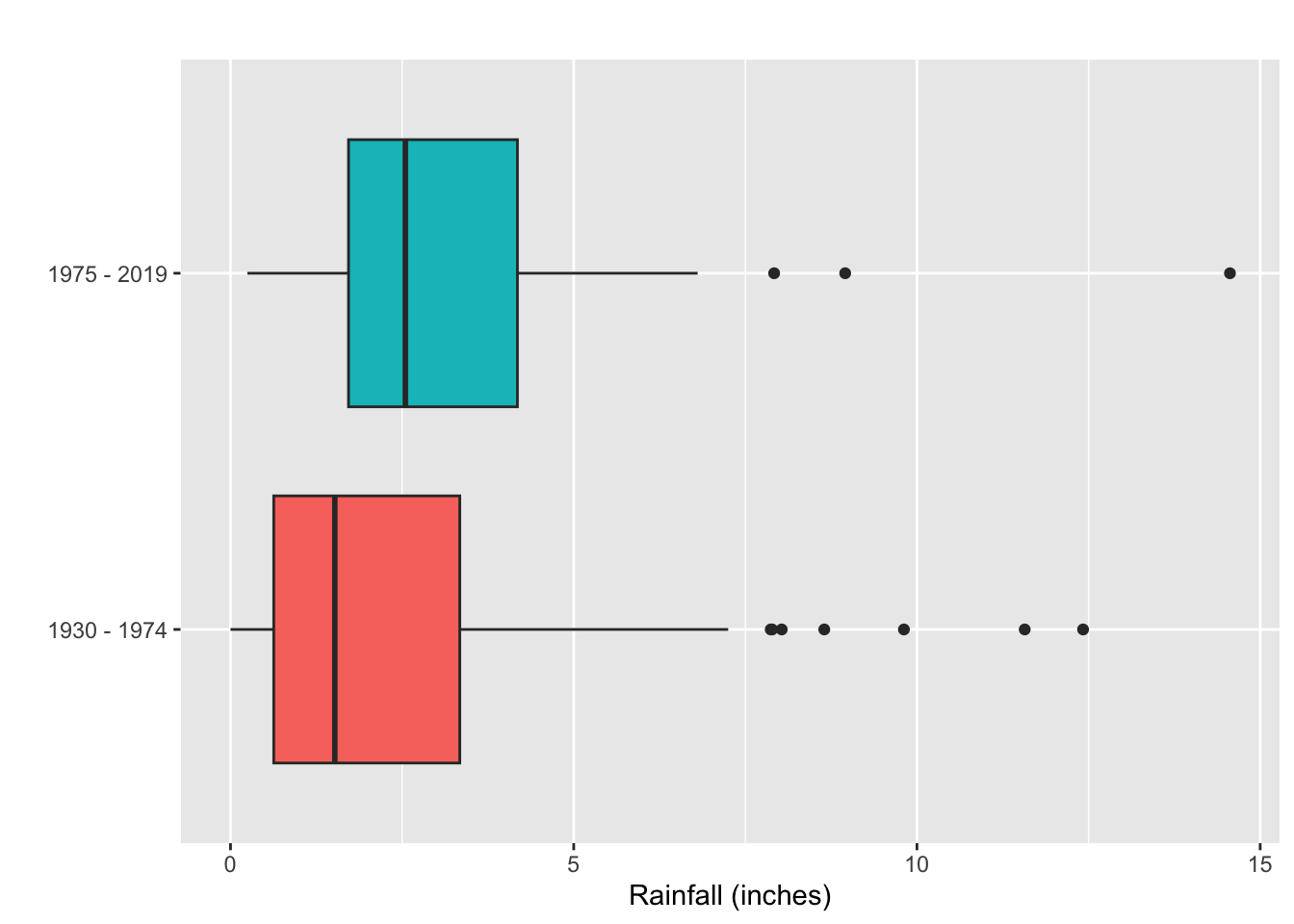
What can you say about the shape of each dataset?
In which time period was the amount of rainfall generally greater?
On the whole, the rainfall was more variable in which time period?
- Take a break
Correlation and Scatterplots
The most basic goal of statistics is to describe the relationship between two variables measured on a sample of individuals from a given population
We know what to do with one quantitative variable
- How about two?
Example: MHK Houses
We have a sample of \(14\) homes for sale in west Manhattan, Kansas (\(n=14\))
Each home has a value for its asking price (in dollars) and another for the size of its living space (in square feet)
- Two variables for each individual in the sample
\(x=\) size of the living space
\(y=\) asking price of the home
For the \(i^{th}\) home, we’ll denote it’s observated values as:
\(x_i=\) the size of the \(i^{th}\) home in \(ft^2\)
\(y_i=\) the asking price of the \(i^{th}\) home in dollars
| Square Feet | Asking Price (in USD) |
|---|---|
| 2761 | 349900 |
| 1824 | 219000 |
| 3362 | 385000 |
| 4048 | 350000 |
| 3016 | 325000 |
| 3768 | 399900 |
| 3072 | 305000 |
| 3815 | 307500 |
| 3213 | 325000 |
| 1963 | 257500 |
| 3507 | 310000 |
| 3386 | 389000 |
| 1896 | 240000 |
| 3206 | 369900 |
- Our data consist of ordered pairs:
\[(x_1,y_1)=(2761,349900),...,(x_{14},y_{14})=(3206,369900)\]
- Data that consist of ordered pairs are called bivariate data
How are \(x\) and \(y\) related in this data?
Does size of a house tend to effect price of a house?
In our head we have an idea, but the way we can see this visually is called a scatterplot
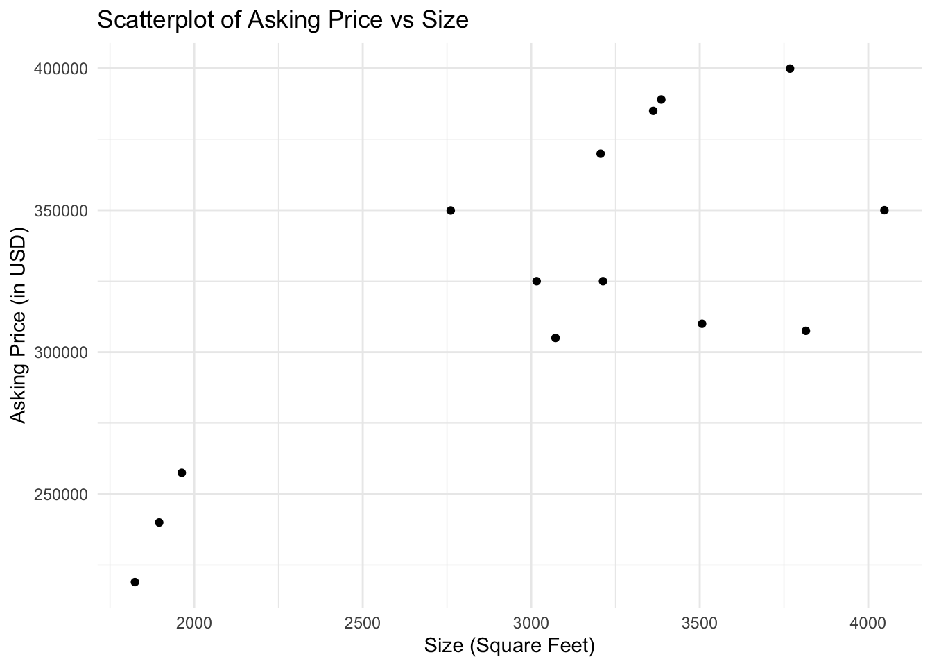
What do we think of the relationship between \(x\) and \(y\)?
We could even describe this relationship with a line
- We call that a linear association
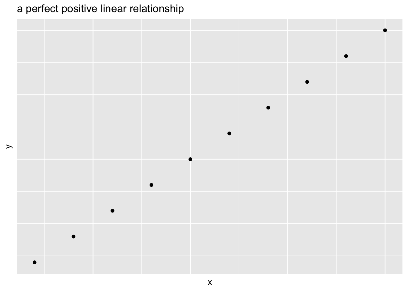
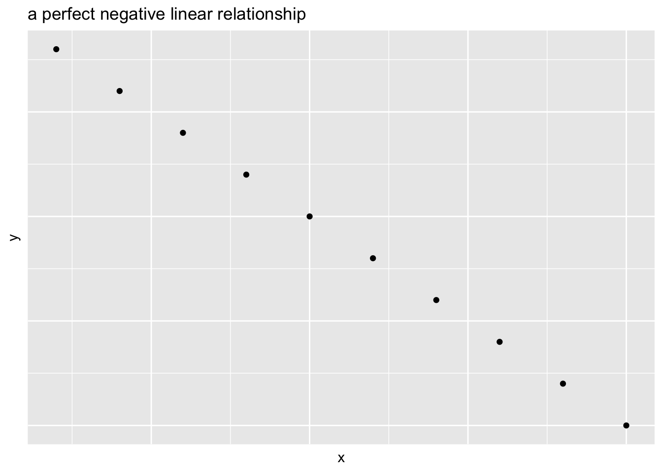
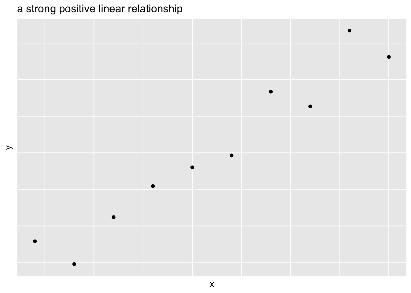
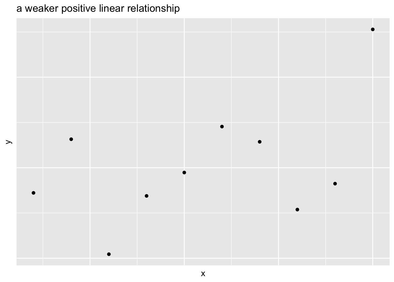
Scatterplot Definitions
For any two variables we can define their relationship as a:
Positive association if large values of one variable are associated with large values of another
Negative association if large values of one variable are associated with small values of another
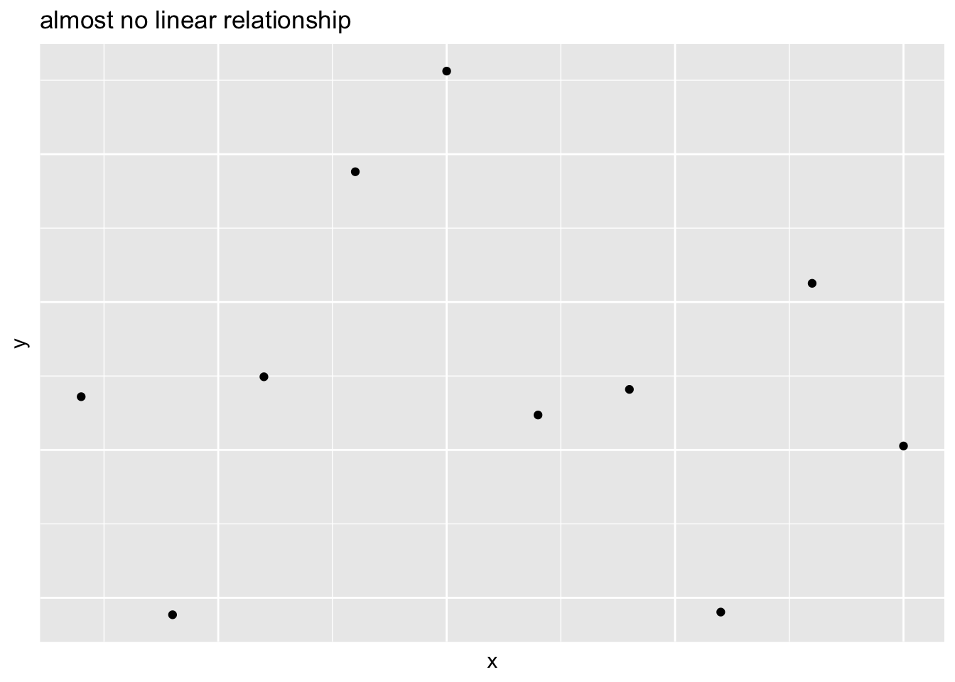
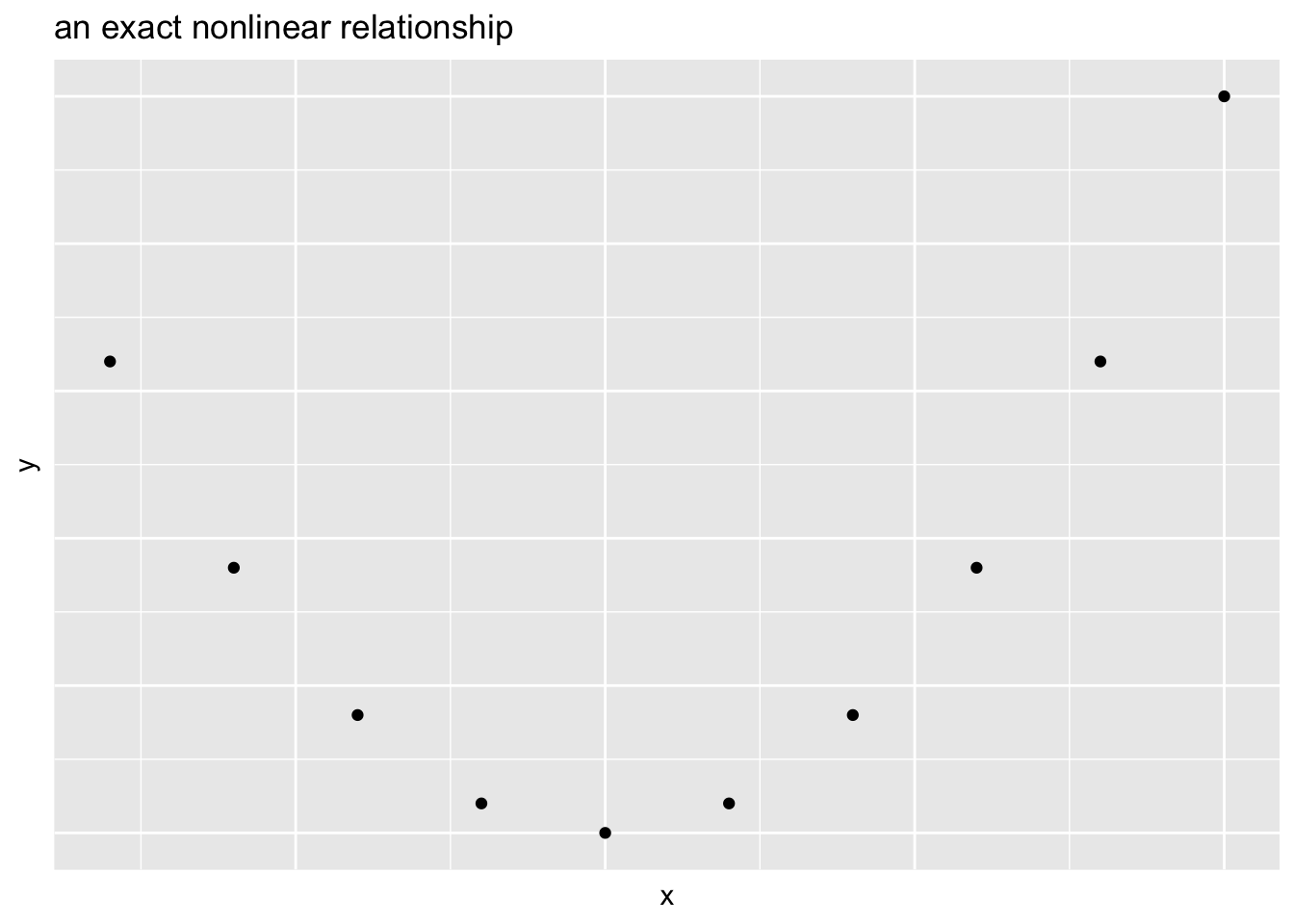
- Two variables can have a linear relationship if the data tend to cluster around a straight line when plotted on a scatterplot
- Go away