4 Day 3
Reminders:
My Office: Dickens 009C
Office Hours: 3-4 PM Monday/Wednesday
This specific Wednesday I’m moving office hours around
Check Canvas
Zoom Office Hours
On-request, I won’t sit in a Zoom room by default every week
Email me: rmsholl@ksu.edu
ALEKS issues
Please email me
Apparently we can fix more with ALEKS than IT
Homework policy
- On Canvas
Class room conduct:
If I’m prompting a question you can just reply
Outside of a prompted question please raise your hand
If you’re arriving late/leaving early, just be respectful with your entrance/exit
- If you need to step out for whatever reason, same courtesies apply
Try not to disrupt class/break laws in general
You can take pictures of annotations on the screen anytime
You can record the lecture
You just can’t distribute the recordings, that ends badly
- Technically everything I produce is owned by the University
Attendance policy:
You should attend class
I am obligated to take attendance at random
\[{n \choose k}p^k(1-p)^{n-k}\] \[p = 0.5\]
If you need to/happened to miss class for whatever reason just email me
- I have systems available for keeping you from falling behind
Review
Data set
- Collected information
Individuals
- Something the information is collected on
Variables
- Characteristics about the individuals we collected information from
Qualitative (Categorical) variable
Values represent categories
Identifying labels/names
“Can I do math with this by default?”
- “Is the math arbitrary?” (i.e., does the 1 in “rank 1 salesperson at Amazon” actually represent a quantity? or does it describe them?)
Quantitative variable
- Values represent meaningful numbers
Qualitative variables can be ordinal or nominal
Ordinal variables
Categories/values of the variable have a natural ordering
- Letter grade: A, B, C, D
Nominal variable
Categories/values of the variable cannot be ordered
- Degree programs
Quantitative variables can be discrete or continuous
Discrete variable
A countable number of values (0, 1, 2, 3, 4, …)
- Number of students in a classroom
Continous variable
A continuous range of numbers (0, 0.1, 0.11, 0.111, …)
- Temperature
Quantitative variables can be Interval or Ratio:
Interval level
Can’t make a meaningful ratio
Zero doesn’t mean absence
Temperature in Celsius/Fahrenheit (Does 0 mean there’s no heat?)
Ratio level
Ratios make sense
Zero represents absence of the variable
If you’re 0 inches tall do you have height?
Raw data isn’t entirely useful
Statistics is really good at summarizing and visualizing data
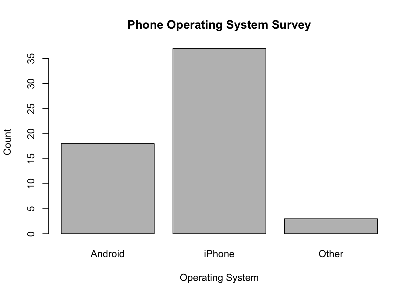
Bar graph: One or more categorical variable
- Histogram: One numerical variable
Scatterplot: More than one numerical variable
Frequency distribution
Group data into categories
Record the number of observations that fall into each category
“How frequently do these variables occur in my sample?”
Relative frequency distribution
Divide the number in each category by the total number of observations
This gives us the proportion of units in each category
“What percentage of my sample is represented by this variable?”
Count up how many times each variable occurs in the sample
For each variable, divide the occurrences of the variable by the sample total
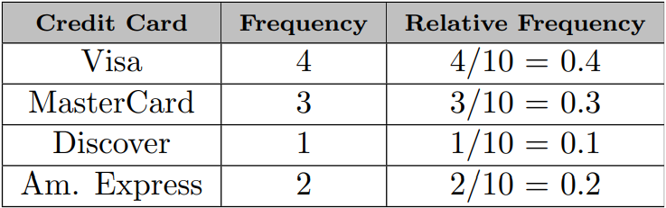
\(4\) customers use Visa
\(10\) customers total in the sample
\({4 \over 10}=0.4\)
\(0.4*100\%=40\%\)
Graphs are prettier than tables
| Credit Card | Frequency | Relative Frequency |
|---|---|---|
| Master Card | 11 | 0.22 |
| Visa | 23 | 0.46 |
| Am. Express | 9 | 0.18 |
| Discover | 7 | 0.14 |
One or more categorical variables
- So we use a bar graph
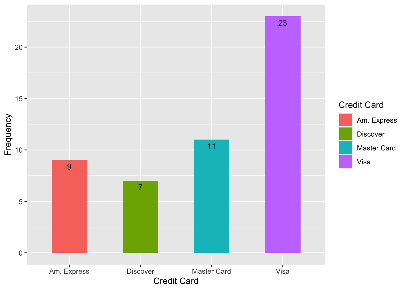
- We can make a bar graph using relative frequency too
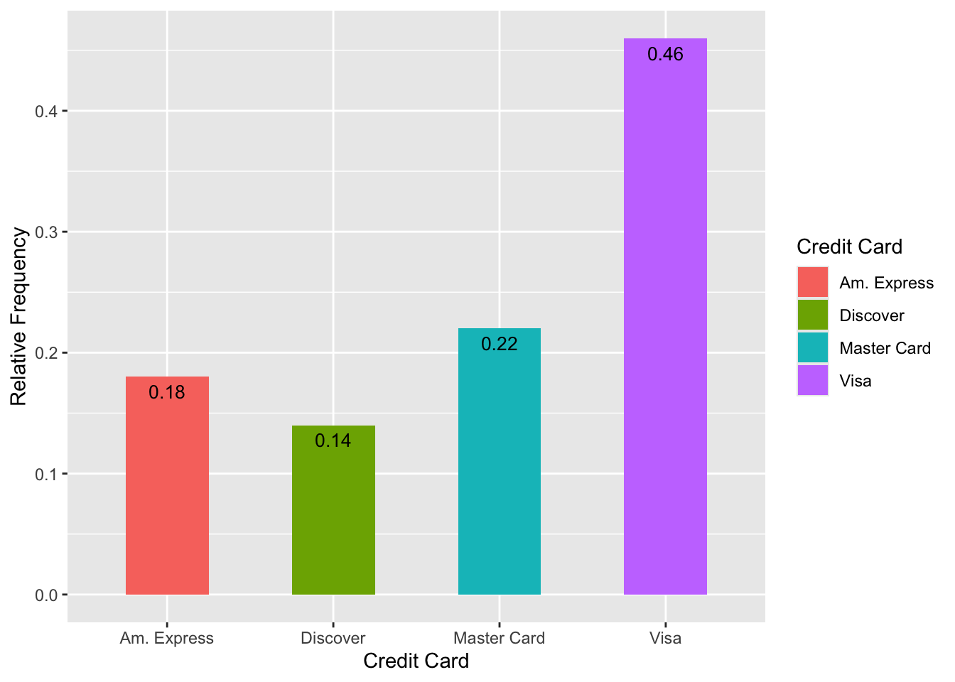
- We can also just flip this horizontal
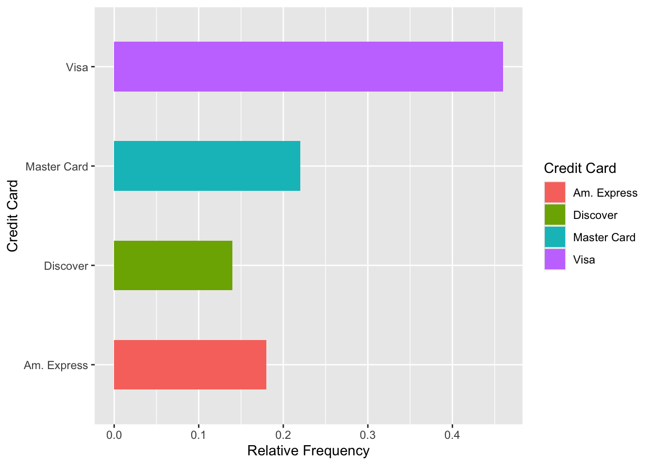
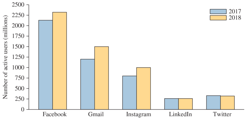
- Side-by-side bar graphs can be used to compare two or more categorical variables with the same categories
Bar graphs showing frequency can be converted into pie charts
Generally a pie chart will show relative frequency
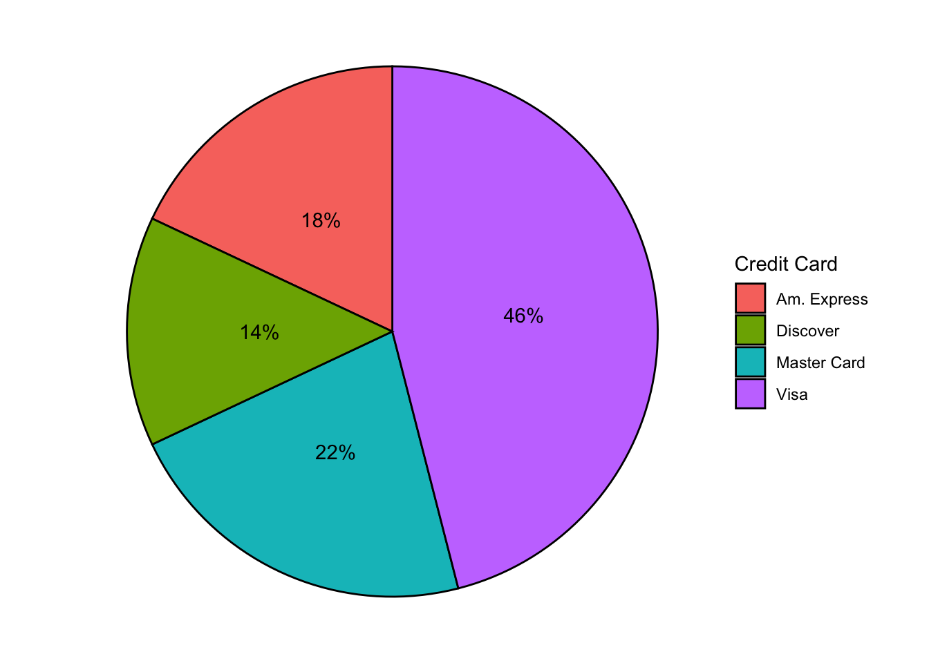
They’re very pretty
- Not very useful
Graphical Summaries Continued
We’ve looked at some qualitative (categorical) visualizations
What about quantitative (numerical) visualizations?
When we have one quantitative variable we have several options:
Histograms
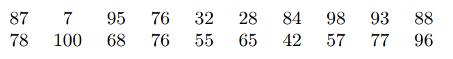
Steam-and-leaf plots
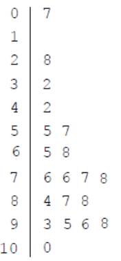
Dotplots
With two quantitative variables we generally use a scatterplot
We’ll talk about this at length in Chapter 4 (so not important right now)
Side Note: we can use more than two quantitative variables in a scatterplot
It’s not very useful
Why? Can you think in 3 dimensions? What about 4? 5?
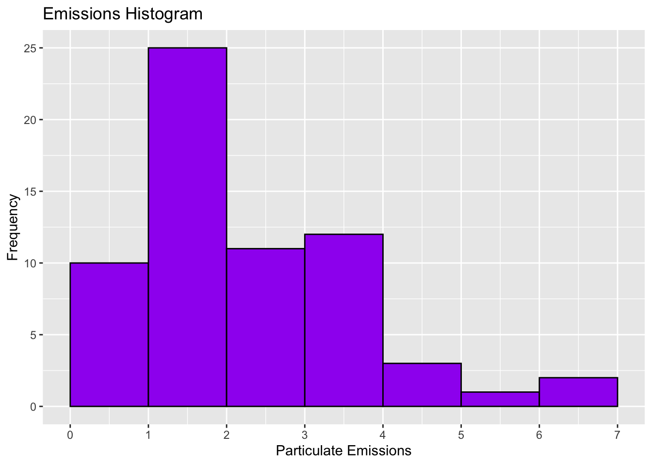
Frequency Distribution
- In a study of the emissions of particulate matter, the amount of emission for 65 vehicles were recorded in a table:
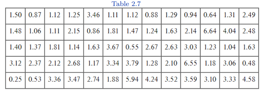
Population?
Sample?
Variables?
Variable types?
Quantitative variables can also be summarized with a frequency distribution
Define interval(s) for the data (referred to as classes/class)
Record the number of observations that fall into each class
| Class | Frequency |
|---|---|
| 0.00-0.99 | 9 |
| 1.00-1.99 | 26 |
| 2.00-2.99 | 11 |
| 3.00-3.99 | 13 |
| 4.00-4.99 | 3 |
| 5.00-5.99 | 1 |
| 6.00-6.99 | 2 |
Lower class limit: the smallest value that can appear in that class
- Lower class limit of the third class?
Upper class limit: largest value that can appear in that class
- Upper class limit of the first class?
Class width: the difference between consecutive lower class limits
- Class width of the above frequency distribution?
There’s no “one” right way to choose the number of classes or the width for a frequency distribution
There are general requirements however:
Every observation must fall into one of the classes
The classes must not overlap
The classes must be of equal width
There must be no gaps between classes
- Even if there are no observations in a class it must be included in the frequency distribution
Histograms
Histogram: visual representation of a frequency distribution
- Not a bar graph
Bar height (y-axis) represents class frequency
Bar width (x-axis) represents class width
Left edge of each bar corresponds to the lower class limit
No gaps between classes so no gaps between bars of a histogram
- If there are gaps between the bars what is it?
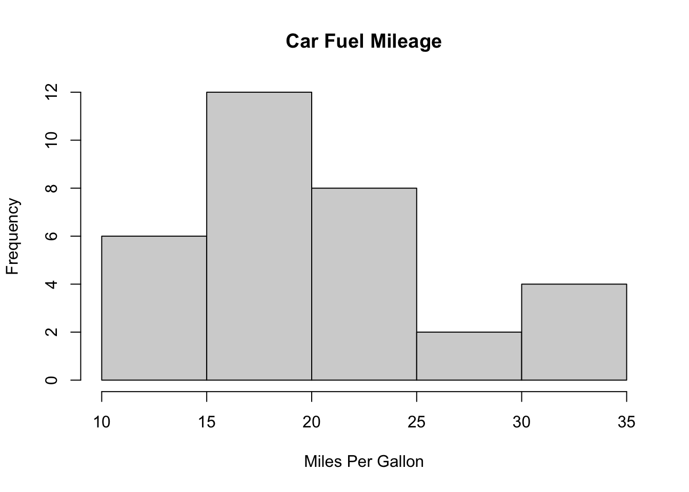
This histogram has 7 classes
You can choose a different number of classes
You can choose different widths
Free will exists, there are no rules
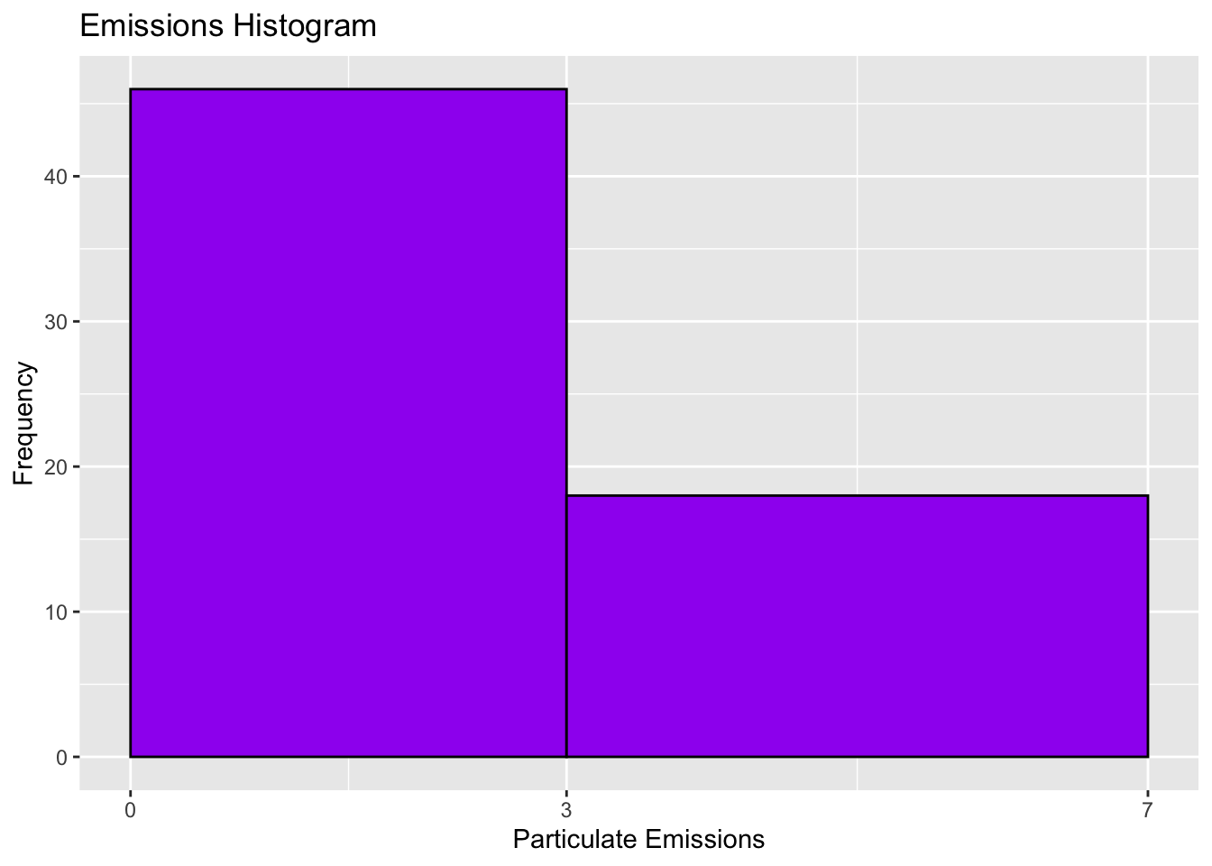
It’s not wrong (it’s very unhinged behavior)
- Is this interpretable though?
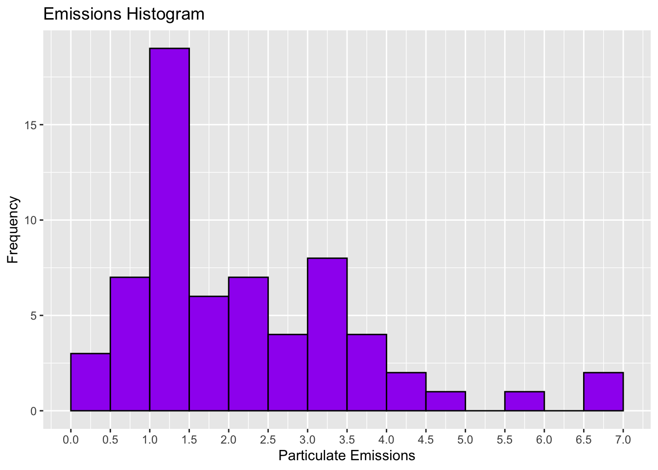
Is this one okay?
We care about the shape of our data
This is the primary purpose of a histogram
So we want to not fail at that task
The shape of our data can help us observe the distribution of our data
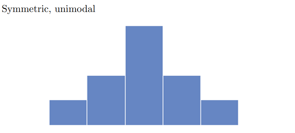
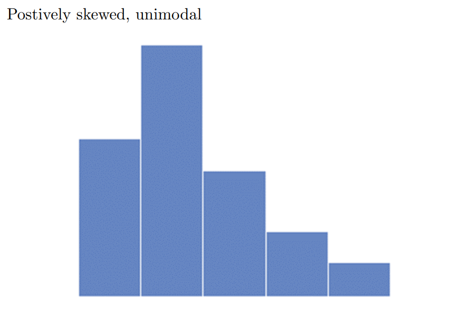
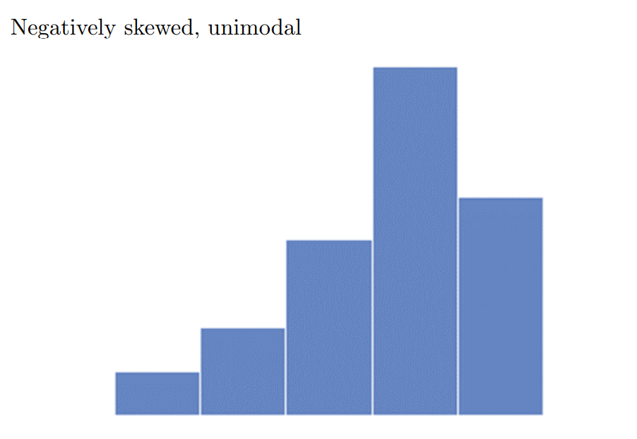
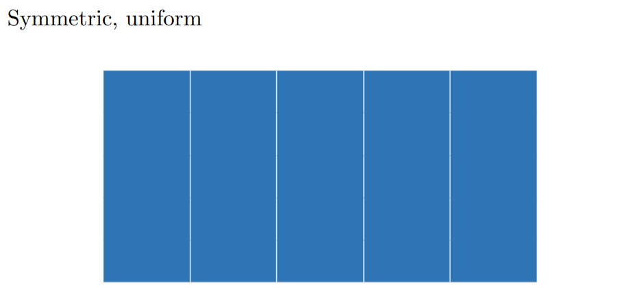
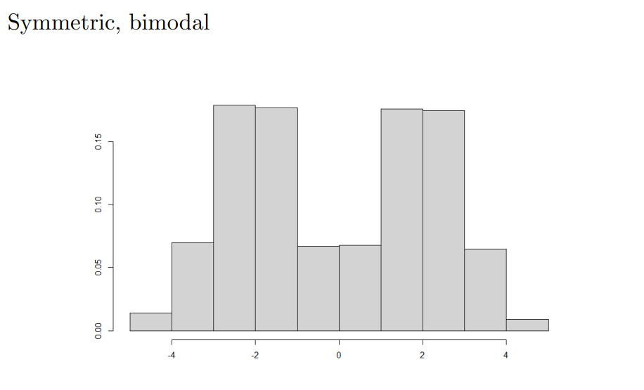
Vocabulary for describing the shape of data:
Symmetric - mirror image on both sides of it’s center
Positively-skewed - Long, narrow tail to the right
Negatively-skewed - Long, narrow tail to the left
Unimodal - One peak/hump
Bimodal - two peaks/humps
Uniform - b o x
- Histogram showing the GPAs of a sample of students at a certain college
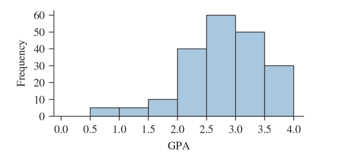
Which class has the highest frequency?
How many students were in the sample?
What percentage of the students had GPAs between 2.0 and 3.0?
Describe the shape of the above histogram.
One of these histograms represents the age at death from natual causes, (heart attack, cancer, etc.)
The other represents the age at death from accidents
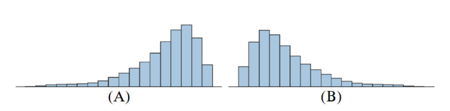
Which represents the age at death from accidents?
- Justify your answer
Histograms can be used to summarize both small and large data sets
Sometimes we prefer more detailed visualizations for smaller data sets
Stem-and-leaf plots and dotplots are alternative summaries that display the actual values