Lesson 8 Statistical uncertainty
In data science, we reach conclusions using data and models. The tools of statistical inference are designed to help us answer the logical follow-up question: “how sure are you of your conclusions?” Inference means providing a margin of error: some way of quantifying our uncertainty about what the data (or our model of the data) are capable of saying. Instead of saying something like, “I think the answer is 10,” you say something like, “I think the answer is 10, plus or minus 3.” That “3” is your margin of error. The question is how big that margin of error should be, in light of the data.
In this lesson, you’ll learn the core ideas behind statistical inference, including:
- how uncertainty might arise in data science.
- the core thought experiment of statistical inference.
- how to use Monte Carlo simulation to simulate a data-generating process.
- what a sampling distribution is.
- what the standard error is, and what it’s supposed to measure.
- the limitations of statistical inference when reasoning about real-world uncertainty.
Compared with the other lessons, this one is unusual, in that there’s no real data here. That’s by design: the goal here is to take a step back, understand a few crucial ideas, and get our minds limbered up for the subsequent lessons, where we’ll discuss practical tools for statistical inference on real-world problems.
8.1 Sources of uncertainty
There are many reasons why a data analysis might still leave us in a position of uncertainty, even if all the numbers have been calculated correctly. Here’s a nonexhaustive list of five such ways.
Our data consists of a sample, and we want to generalize from facts about that sample to facts about the wider population from which it was drawn. For instance, when a political pollster asks a sample of several hundred Americans about their voting intentions, the fundamental question isn’t about the survey respondents per se, but about how the results from that survey can be generalized to the entire electorate. This process of generalizing from a sample to a population is inherently uncertain, because we haven’t sampled everyone.
Our data come from a randomized experiment. Take, for example, this excerpt from a published paper on a new therapy for stomach cancer, from the New England Journal of Medicine:
We randomly assigned patients with resectable adenocarcinoma of the stomach, esophagogastric junction, or lower esophagus to either perioperative chemotherapy and surgery (250 patients) or surgery alone (253 patients)… With a median follow-up of four years, 149 patients in the perioperative-chemotherapy group and 170 in the surgery group had died. As compared with the surgery group, the perioperative-chemotherapy group had a higher likelihood of overall survival (five-year survival rate, 36 percent vs. 23 percent).23
So the group randomized to receive the new therapy (the “perioperative-chemotherapy group”) had a 13% higher survival rate. But is that because of the new therapy? Or could it have just been dumb luck? In other words, maybe the designers of the experiment randomized the healthier patients to get the new therapy, just by chance, and these patients were always going to have a higher survival rate no matter what therapy they got. Historically, the tools of statistical inference have been designed to address concerns just like this.
We want to use our data to make a prediction about the future, and we expect the future to be similar to the past. Imagine that your morning commute consists of walking to a metro station, taking a train, and then walking the rest of the way to work. There are several sources of uncertainty here: how long you’ll have to wait for the green “Walk” signs, how long it will take the train to show up, how crowded the stairs will be, etc. The point is that you could never predict exactly what your commute time is going to be. The best you could do, if you were a meticulous record-keeper, would be to collect data on past commute times and come up with a decent probabilistic forecast for future commute time—something like, “There’s a 90% chance that my commute will take between 34 and 41 minutes.” (If you’ve turned on location tracking on your phone, this is more or less what Google Maps tries to do if you ask it for a travel time tomorrow, so if you think that’s creepy, you should turn off location tracking.) Of course, if one day the city needs to make emergency repairs on your local metro line, or you trip and fall on the stairs and need to take a detour via the hospital, then all bets are off; the past data isn’t useful for those situations. That’s why it’s important to add the qualification that we expect the future to be similar to the past.
Our observations are subject to measurement or reporting error. Do you wear an old-school watch that isn’t connected to the internet? If so, compare your watch to time.gov, which calculates the official time based on averaging a large number of absurdly accurate atomic clocks, and then corrects for the few milliseconds of network lag between those clocks and your computer to tell you the time. Compared with this time.gov benchmark, your watch is probably wrong, maybe even by a few minutes. That’s measurement error. Now, if you’re using your non-smart watch to decide when you should leave for work, a small measurement error might not matter very much in practical terms—especially when compared with the inherent uncertainty of your commute time (see above). But if you’re using that same watch to time your viewing of a total solar eclipse, whose moment of arrival is known very precisely and which doesn’t last long, then an error of a minute or two actually does matter.
Similar measurement errors arise in nearly every area of human inquiry, from particle physics to economics to disease monitoring. How precisely, for example, do you think that the following quantities are typically measured?
- the speed of a proton in CERN’s particle accelerator.
- the number of people with the flu in Travis County, TX.
- a professional cyclist’s V02 max.
- the U.S. unemployment rate.
- the average price for a gallon of milk paid by American consumers.
Most measurements are subject to at least some kind of error, and sometimes those errors are large enough to matter.
Our data arise from an intrinsically random or variable process. Try this: count your pulse for 15 seconds. Wait 5 minutes, then do the same thing again. You’ll likely get a slightly different number. That’s because a heart rate is not some fixed property of a person, like the number of chromosomes they have. Rather, heart rate varies from one measurement to the next, and probably the best we can say is that each person has a “typical” resting heart rate that we might estimate, but never know with 100% accuracy, by averaging many measurements collected over time. Moreover, the intrinsic variability in someone’s heart rate makes it difficult to be certain about more complex quantities—such as, for example, the relationship between age and heart rate.
Like it or not, uncertainty is a fact of life. Indeed, sometimes the only way to be certain is to be irrelevant. Statistical inference means saying something intelligent about how uncertain our conclusions actually are, in light of the data.
8.2 Sampling distributions
Real-world vs. statistical uncertainty
If you look up “uncertain” in the dictionary, you’ll see something like:
uncertain: not known beyond doubt; not having complete knowledge
We’ll call this real-world uncertainty; it’s what people mean when they use the term outside of a statistics classroom.
But inside a statistics classroom, or inside the pages of an academic journal where statistics are the coin of the realm, that’s not what the term “uncertainty” means at all. In fact, historically, the field of statistics has adopted a different, very narrow—some have even called it narrow-minded—notion of what is actually meant by the term “uncertainty.” It’s important that you understand what this narrow notion of statistical uncertainty is, and what it is not. At the end of this lesson, we’ll talk about why this term has been defined so narrowly, and what the consequences of this narrow definition are for reasoning about data in the real world. But the short version is this: anytime someone tells you how much statistical uncertainty they have about something, they are understating the amount of real-world uncertainty that actually exists about that thing.
Let’s get down to details. In statistics, “certainty” is roughly equivalent to the term “repeatability.” Suppose, for example, that we take a random sample of 100 Americans, and we ask them whether, if offered the choice for dessert, they would prefer huckleberry pie or tiramisu. The numbers shake out like this:
- Huckleberry pie: 52%
- Tiramisu: 48%
So the data seem to say that more people like huckleberry pie. But this is just a sample. If we want to generalize these results to the wider population, then clearly we need a margin of error, just like they have in political polls. We didn’t ask all 300+ million Americans about their dessert preference, so we’re at least a little bit uncertain how these survey results might generalize.
The following definition will help us talk about these ideas precisely.
In our dessert example, the estimand is the true nationwide proportion of folks that prefer huckleberry pie to tiramisu, while the estimator is the corresponding proportion based on a survey of size n=100. Clearly our sample provides some information about the population, but not perfect information. Even after seeing the data, we’re uncertain.
But just how uncertain are we? The statistician’s answer to this question is to invoke the concept of repeatability. You’re certain if your results are repeatable. So to measure repeatability, and therefore certainty, you take a different sample of 100 people, you ask the same question again, and you see how much your estimator changes. And then you do it again, and again, and again, thousands of times! If you get something close to 52% every time, then you’re pretty certain the true value of the estimand is about 52%.
OK, so that’s not the actual procedure that an actual statistician would recommend that you follow. It’s ludicrously infeasible. But it is the fundamental thought experiment of statistical inference, which seeks to answer the question:
If our data set had been different merely due to chance, how different might our answer have been?
To oversimplify, but not by much: in statistical inference, we’re “certain” of our answer if, when we ask the same question over and over again, we get the same answer each time. If our answer fluctuates each time, we’re uncertain—and the amount by which those answers fluctuate provides us a quantitative measure of our statistical uncertainty.
The best way I know to build intuition for the concept of statistical uncertainty is to actually run the thought experiment. In other words, let’s pretend we actually can collect thousands of different data sets, by using a computer to repeatedly simulate the random process that generated our data. (This approach of using a computer to simulate a random process is called Monte Carlo simulation, named after the casino capital of Europe.)
Let’s see this process play out on some examples. To get started, please load the tidyverse and mosaic libraries:
library(tidyverse)
library(mosaic)
Example 1: dessert
Suppose it were actually true that, if offered the choice, 52% of all Americans would prefer huckleberry pie and 48% would prefer tiramisu. Now imagine setting out to measure these numbers using a survey. What range of plausible survey results might we expect to see if we asked 100 people about their preference? If our survey is designed well, we’d hope that on average, it would yield the right result: that 52% of people prefer huckleberry pie. This is the estimand, or fact about the wider population, that we seek to uncover. But any individual survey could easily deviate from the right answer, just by chance. The question is: by how much? What kind of statistical fluctuations should we expect in our survey result?
Let’s find out. We’ll use R to simulate a single survey of size 100, using the rflip function. This function is designed to simulate coin flips; in our simulation, we imagine that each survey respondent is like a metaphorical coin, and that the result of each coin flip represents some particular respondent’s dessert preference. In the code below, we’ve specified that we want to flip 100 “weighted” coins, and that the probability that any one coin comes up “H” is 0.52:
rflip(100, prob=0.52)##
## Flipping 100 coins [ Prob(Heads) = 0.52 ] ...
##
## H H H T T H H H H H H H H T H H H H H T H H T H T T H T T H H H H H H H
## T H T H H H H T T H T H T T T H H H H H H T H T T T T T T T H H H H H H
## T T H T T H T H T T T H T T H T T T T T T H T H H H H T
##
## Number of Heads: 57 [Proportion Heads: 0.57]In interpreting these results, we’ll just pretend that, instead of “heads” and “tails,” the letters stand for “huckleberry pie” and “tiramisu.”
Here, it looks like 57% of our survey respondents said they preferred huckleberry pie. Remember, the true population-wide proportion was assumed to be 52%, so the right answer (estimand) and the survey answer (estimator) differ by about 5%.24 This represents an error arising from natural statistical fluctuations in our sample.
Is 5% a typical error, or did we just get very unlucky? Remember the basic mantra of statistical inference: you’re certain if your results are repeatable. So let’s repeat our hypothetical survey 10 times, using the following statement.
do(10)*nflip(100, prob=0.52)## nflip
## 1 58
## 2 47
## 3 55
## 4 59
## 5 50
## 6 52
## 7 57
## 8 53
## 9 46
## 10 51The statement nflip(100, prob=0.52) says to flip a weighted coin 100 times and count the H’s, while do(10)* says to repeat that whole process 10 times. (Notice we use nflip rather than rflip so that we don’t print out all the individual H’s and T’s.) The result is 10 simulated dessert surveys from the same underlying population. Each number represents how many H’s, or “huckleberry pie” answers, we got in one survey of size n=100. Or if you prefer: you can think of each number as the survey result in some imaginary parallel universe in which you surveyed a different random set of 100 Americans.
The key thing to appreciate about these results is their variation. When compared with the right answer of 0.52…
- Sometimes the huckleberry pie folks are over-represented by chance (surveys 1, 3, 4, 7, 8).
- Sometimes the tiramisu folks are over-represented by chance (surveys 2, 5, 9, 10).
- Occasionally the survey answer is exactly right (survey 6).
Moreover, if you inspect the numbers themselves, you get the sense that a random error of 5% is actually quite typical for a survey like this:
- Some errors are bigger than 5%, i.e. further away than this away from 52/100 (surveys 1, 4, 9).
- Some errors are smaller than 5% (surveys 3, 5, 6, 8, 10).
- Some errors are exactly 5% (surveys 2, 7).
So clearly 10 simulated surveys gives us some idea for the likely magnitude of random error we should expect from our survey. But we can get an even better idea if we simulate 10,000 surveys, rather than just 10. Of course, that’s an awful lot of survey results to inspect manually. So rather than printing the results to the console, we’ll save them in an object called dessert_surveys:
dessert_surveys = do(10000)*nflip(100, prob=0.52)If you look at the first several lines of this object we just created, you’ll see that it has a single column, called nflip, representing the number of H’s in each simulated survey:
head(dessert_surveys)## nflip
## 1 55
## 2 50
## 3 51
## 4 53
## 5 53
## 6 59Let’s divide these numbers by 100 (the notional sample size of each survey) so we can interpret the results as a proportion, and then make a histogram of the results:
dessert_surveys = dessert_surveys %>%
  mutate(huckleberry_prop = nflip/100)

ggplot(dessert_surveys) +
  geom_histogram(aes(x=huckleberry_prop), binwidth = 0.01)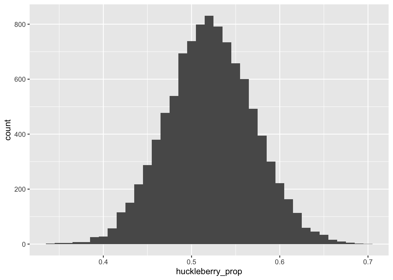
Figure 8.1: The sampling distribution for the proportion of H’s (huckleberry pie) in our hypothetical dessert survey.
This histogram depicts the central object of concern in statistical inference. It is an example of what’s called a sampling distribution. Here’s the full definition of this very important concept, which formalizes what we mean when we use terms like “repeatability” or “statistical fluctuations.”
If your data is the result of a random process, then any statistical summary you compute from that data will have a sampling distribution. In Figure 8.1, the statistical summary in question is a proportion—specifically, the proportion of H’s in a sample of size 100, assuming that the true population proportion of H’s is 0.52.
What the sampling distribution tells us
There are at least two important questions to ask about a sampling distribution, one about its center and one about its spread.
First, where is the sampling distribution centered? In Figure 8.1, we see that our sampling distribution of survey results is centered on the right answer of 0.52. That is: on average, our survey can be expected to get the right answer about how many Americans prefer huckleberry pie.
We formalize this notion in the following definition.25
So we’ve seen in Figure 8.1 that our sample proportion of H’s has an expected value of 0.52 under repeated sampling. This is re-assuring. But remember, any individual survey will likely make an error, reflected in the spread of the distribution around its expected value. So that brings us to the second question: how spread out is the sampling distribution? The answer to this question provides a quantitative measure measure of repeatability, and therefore statistical uncertainty.
You could certainly just eyeball the histogram in Figure 8.1 and almost surely end up saying something intelligent: for example, that about 2/3 of all samples look within 5% of the right answer, or the vast majority (at least 9 out of 10) look within 10% of the right answer. But the most common way of providing a quantitative answer to this question is to quote the standard deviation of the sampling distribution. In fact, this number is so special that statisticians have given it a special name: the standard error.
We can easily calculate that the sampling distribution in Figure 8.1 has a standard deviation of about 0.05, or 5%:
dessert_surveys %>%
  summarize(std_err = sd(huckleberry_prop))
## std_err
## 1 0.04924524Said in English: the “typical” error our survey makes is about 5% either way from the right answer. So if we wanted to quote a margin of error for our survey, a decent place to start might be “survey result, plus or minus 5%,” or maybe even “survey result, plus or minus 10%.” if we wanted to be more conservative and go out two standard errors to either side of our estimate. By adding a “plus or minus” based on the standard error, we’re telling our audience not to expect any more precision than what the data are capable of offering.
So to summarize a few important facts about sampling distributions:
- If your data is the result of a random process, then any statistical summary you compute from that data will have a sampling distribution.
- The sampling distribution represents the results of a thought experiment: specifically, how much your answer might change from one sample to the next under the same random process that generated your data. It therefore measures the repeatability of your results.
- The typical way to summarize a sampling distribution is to quote its standard deviation, which we call the “standard error.” This number measures the typical size of the error your statistical summary makes, compared to its expected value.
Example 2: fishing
In the prior example, our statistical summary was the proportion of those surveyed, out of 100, that preferred huckleberry pie. Let’s now see an example where the statistical summary is a bit more complicated: the estimated slope in a regression model.
Imagine that you go on a four-day fishing trip to a lovely small lake out the woods. The lake is home to a population of 800 fish of varying size and weight, depicted below in Figure 8.2. On each day, you take a random sample from this population—that is, you catch (and subsequently release) 15 fish, recording the weight of each one, along with its length, height, and width (which multiply together to give a rough estimate of volume). You then use the day’s catch to compute a different estimate of the volume–weight relationship for the entire population of fish in the lake. These four different days—and the four different estimated regression lines—show up in different colors in Figure .
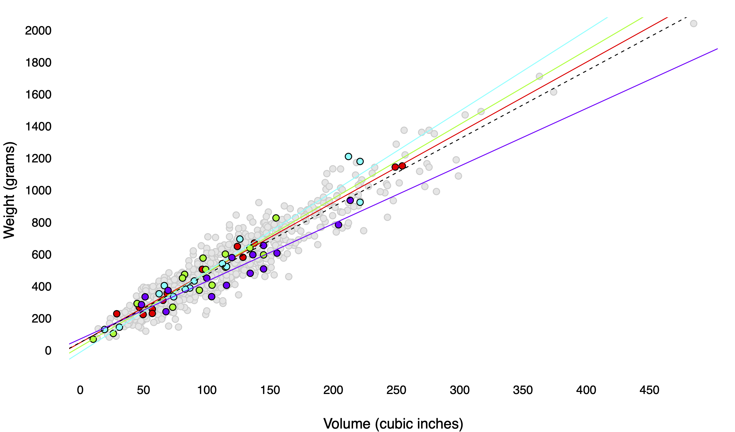
Figure 8.2: An imaginary lake with 800 fish, together with the results of four different days of fishing.
In this case, the two things we’re trying to estimate are the slope (\(\beta_1\)) and intercept (\(\beta_0\)) of the dotted line in the figure. I can tell you exactly what these numbers are, because I used R to simulate the lake and all the fish in it:
\[ E(y \mid x) = 49 + 4.24 \cdot x \]
This line represents the population regression line: the conditional expected value of weight (\(y\)), given measured volume (\(x\)), for all 800 fish in the lake. Each individual sample of size 15 provides a noisy, error-prone estimate of this population regression line. To distinguish these estimates from the true values of their corresponding estimands, let’s call these estimates \(\hat{\beta}_0\) and \(\hat{\beta}_1\), where the little hats mean “estimates.” (Once, on a midterm exam, a student informed me that “\(\hat{\beta}\) wears a hat because he is an impostor of the true value.” So if that helps you remember what the hat means, don’t let me stop you.)
Four days of fishing give us some idea of how the estimates \(\hat{\beta}_0\) and \(\hat{\beta}_1\) vary from sample to sample. But 2500 days of fishing give us a better idea. Figure 8.3 shows just this: 2500 different samples of size 15 from the population, together with 2500 different regression estimates of the weight–volume relationship. This is another example of a Monte Carlo simulation, where we run a computer program to repeatedly simulate the random process that gave rise to our data (in this case, sampling from a population).
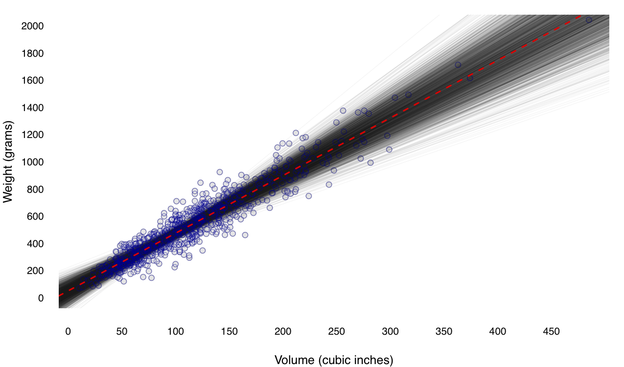
Figure 8.3: The same imaginary lake with 800 fish, together with the results of 2500 different days of fishing. Each translucent grey line represents a single regression estimate from a single sample.
These pictures show the sampling distribution of the least-squares line—that is, how the estimates for \(\beta_0\) and \(\beta_1\) vary from sample to sample, shown in histograms in the right margin. In theory, to know the sampling distributions exactly, we’d need to take an infinite number of samples, but 2500 gives us a pretty good idea. The individual sampling distributions of the intercept and slope are shown in histograms, below.
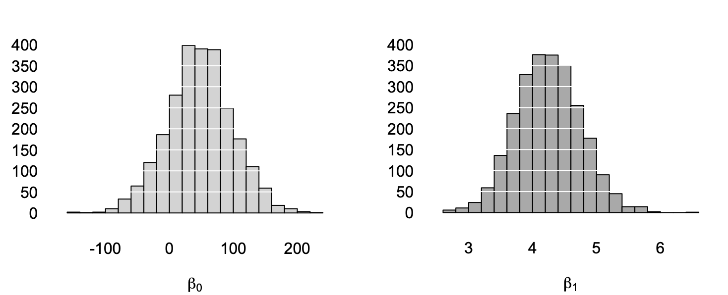
Figure 8.4: The sampling distributions of the intercept (left) and slope (right) from our 2500 simulated fishing trips.
Let’s ask our two big questions about these sampling distributions.
- Where are they centered? They seem to be roughly centered on the true values of \(\beta_0 = 49\) and \(\beta_1 = 4.24\). This is reassuring: our sample estimates are right, on average.
- How spread out are they? We’ll answer this by quoting the standard deviation of each sampling distribution, also known as the standard error. The standard error of \(\hat{\beta}_0\) is about 50, while the standard error of \(\hat{\beta}_1\) is about \(0.5\). These represent the “typical errors” or “typical statistical fluctuations” when using a single sample to estimate the population regression line, and they provide a numerical description of the spread of the grey lines in Figure 8.3.
Summary
The figure below shows a stylized depiction of a sampling distribution that summarizes everything we’ve covered so far.
The sampling distribution depicts the results of a thought experiment. Our goal is to estimate some fact about the population, which we’ll denote generically by \(\theta\); that’s our estimand. We repeatedly take many samples (say, 1000) from same random process that generated our data. For each sample, we calculate our estimator \(\hat{\theta}\): that is, some summary statistic designed to provide our best guess for \(\theta\), in light of that sample.
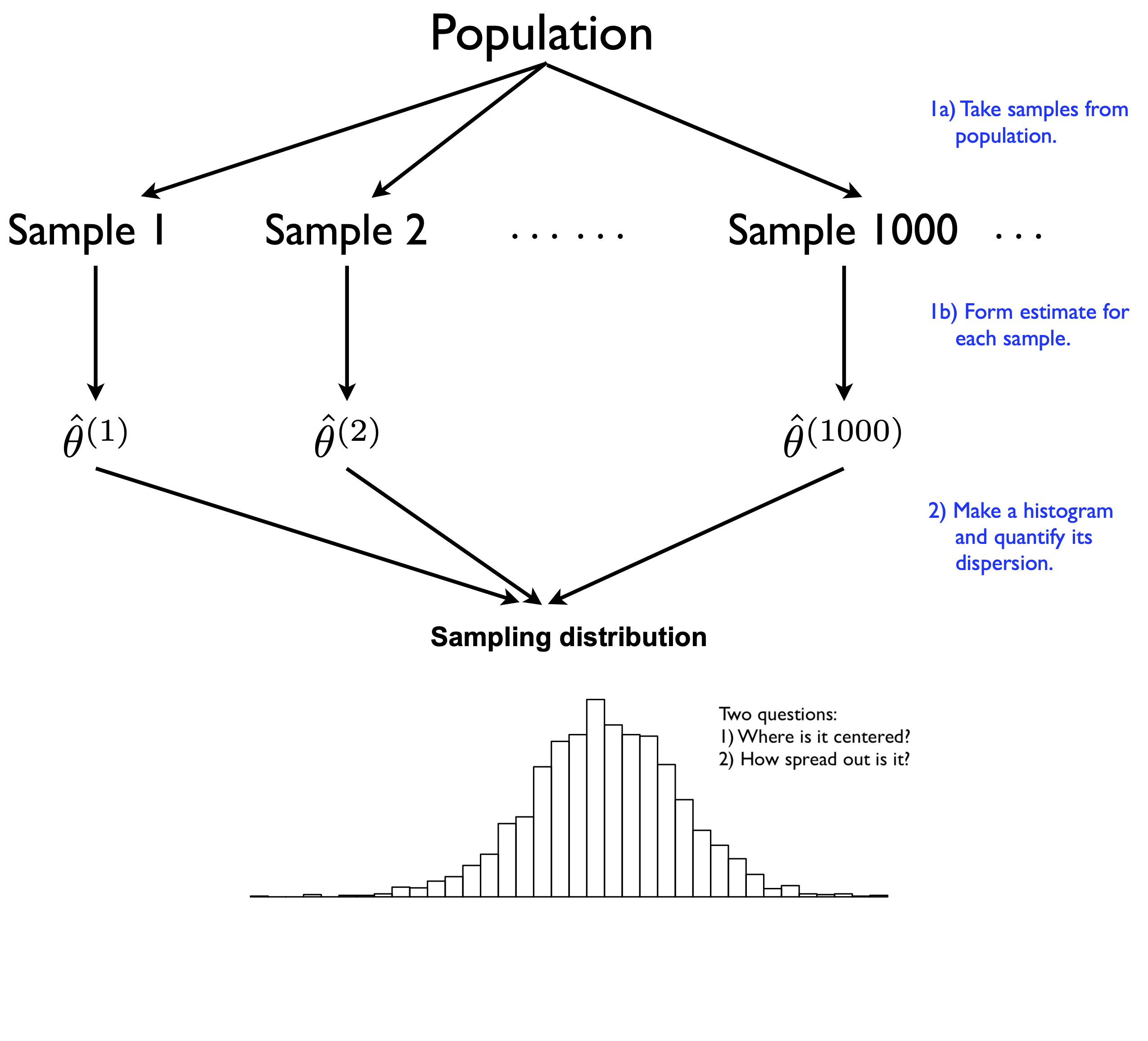
Figure 8.5: A stylized depiction of a sampling distribution of an estimator.
At the end, we combine all the estimates \(\hat{\theta}^{(1)}, \ldots, \hat{\theta}^{(1000)}\) into a histogram. This histogram represents the sampling distribution of our estimator.26
We then ask two questions about that histogram. First, where is the sampling distribution centered? We hope that it’s centered at or near the true value of the estimand, i.e. that our estimator gets roughly the right answer on average across multiple samples.
Second, how spread out is the sampling distribution? We usually measure this by quoting the standard error, i.e. the standard deviation of the sampling distribution. The standard error answers the question: “When I take repeated samples from the same random process that generated my data, my estimate is typically off from the truth by about how much?” The bigger the standard error, the less repeatable the estimator across different samples, and the less certain you are about the results for any particular sample.
8.3 The truth about statistical uncertainty
I hope you now appreciate these two big take-home lessons:
- the core object of concern in statistical inference is the sampling distribution.
- the sampling distribution measures our “statistical uncertainty,” which is a very narrow definition of uncertainty, roughly equivalent to the notion of repeatability. You’re certain if your results are repeatable. You’re uncertain if your results are subject to a lot of statistical fluctuations.
Of course, we’ve focused only on intuition-building exercises involving simulated data. We haven’t at all addressed the very practical question of how to actually find the sampling distribution in a real data-analysis problem. Don’t worry—that’s exactly what the next few lessons are for.
But to close things off, I’d to revisit two questions we deferred from the beginning of this lesson.
First, why is statistical uncertainty defined so narrowly? Basically, because uncertainty is really hard to measure! By definition, measuring uncertainty means trying to measure something that we don’t know about. In the face of this seemingly impossible task, the statistician’s approach is one of humility. We openly acknowledge the presence of many contributions to real-world uncertainty. But we set out to make quantitative claims only about the specific contributions to uncertainty that we know how to measure: the role of randomness in our data-generating process. If we don’t know how large the other contributions to uncertainty might be, we don’t try to make dubiously precise claims about them.
Second, what are the implications of this narrowness for reasoning about data in the real world? Basically, it means that while statistical uncertainty is a very useful concept, it isn’t always useful—and even when it is useful, it nearly always provides an under-estimate of real-world uncertainty. It’s important that you understand both the usefulness and the limitations of this central idea.
Example 1: commuting
Let’s return to our hypothetical commuting example from above, where we imagine that your morning commute consists of walking to a metro station, taking a train, and then walking the rest of the way to work. The sources of statistical uncertainty include the typical random fluctuations subject to repeated measurement over time, like:
- how long you have to wait for each green “Walk” sign.
- how long you have to wait on the metro platform.
- how long the elevator takes to arrive.
- whether rain affects your commute.
You may have heard it said that “history doesn’t repeat itself, but it does rhyme.” One working definition of “statistical uncertainty” might be: “uncertainty about the stuff that rhymes.”
On the other hand, the sources of non-statistical uncertainty on your morning commute include major systematic distortions or departures from the past, like:
- whether they suddenly close the subway line for emergency repairs.
- whether state-sponsored hackers break into the metro’s computers and shut down the whole system.
- whether a global pandemic forces you to work from home, rendering your commute time zero.
- whether a piano-moving company accidentally drops a piano on your head while you’re walking down the street, rendering your commute time infinite (and irrelevant).
The point about this latter type of uncertainty is that the chance of any particular crazy thing, like the global pandemic or the piano falling on your head, is so rare, and so difficult to quantify using data, that you probably never even considered it. But the probability of at least one crazy thing happening isn’t necessarily negligible. (See: Covid.) This is a very real source of uncertainty. It’s just not what we measure when we measure statistical uncertainty.
Moreover, while this is an important limitation, it isn’t necessarily a bad limitation. And it’s definitely not, as some folks have tried to argue, an indictment of the whole concept of statistical uncertainty. After all, do you really want Google Maps to give you a commute-time forecast that tries to incorporate all the crazy things that might happen? If your goal is to decide when you should leave for work to be pretty sure that you’ll make your 9 AM meeting, a forecast that says “your commute time today will be between zero and infinity, because pandemic or piano” is frankly a useless forecast.
Example 2: dessert again
So now let’s apply the same logic to our hypothetical dessert survey, which presents a more traditional kind of statistics problem. The source of statistical uncertainty here is obvious: we survey 100 people randomly. Therefore two random surveys would reach two different sets of 100 people, giving us two different answers. We have to account for this by reporting error bars, based on the sampling distribution.
But there are also some very real sources of non-statistical uncertainty here as well, involving the possibility of major systematic distortions in our measurement process. Roughly speaking, these are the survey equivalents of pandemics and dropped pianos, except that they’re much more common. For example:
Is our survey biased? Maybe we systematically over-sampled people from the Pacific Northwest, where huckleberries actually grow, and where huckleberry pie is therefore popular. In the survey world, this is called “sampling bias” or “design bias.”
Are some people more likely to respond to our survey than others? This can happen even if our survey was unbiased in whom it reached; in the survey world, it’s called “nonresponse bias.” Maybe, for example, you got more responses from Boston, with a large population of tiramisu fans who believe that huckleberry pie is a threat to American dessert and are notably eager to share their reasoning. Or maybe the people who like huckleberry pie are secretly embarrassed about their preference, and therefore less likely to answer honestly when asked about it by a stranger over the phone.
Did we ask a leading question? Maybe rather than asking about “huckleberry pie,” we instead used a British English term for the same fruit and asked about “whortleberry pie” or “bilberry pie”—which, to an American ear at least, sound uncomfortably close to non-dessert words like “hurl” and “bilge,” or perhaps at best like desserts that Severus Snape might have eaten. No doubt this would bias the results in favor of tiramisu. (And if we received funding to conduct our survey from the National Tiramisu Council, we might feel some pressure, whether consciously or unconsciously, to do this.)
Might people’s preferences change? Maybe somebody tells you over the phone today that they prefer huckleberry pie, but then when they show up next week at the dinner table and cast their vote in the big dessert election, they change their mind and say, “Tiramisu, please.” Hey, it happens!
The possible presence of a bias, or a change in the underlying reality, should make us uncertain in interpreting the results from our survey. But these uncertainties are not directly measured by the sampling distribution—and by extension, they are not encompassed by the idea of statistical uncertainty. The sampling distribution measures random or repeatable contributions to uncertainty. It doesn’t measure systematic or non-random distortions of our measurement process, even though these also contribute to our real-world uncertainty.
The corollary is simple. Whenever our measurement process has a large systematic bias that we don’t know about, then our non-statistical uncertainty can easily dwarf our statistical uncertainty. In fact, if the bias is large enough, then discussions of statistical uncertainty are, at best, a pointless academic exercise, and at worst, a dangerous distraction from the real problem with our data. (Of course, if we know about the bias, then we can correct for it, and then we’re back to a problem where statistical uncertainty matters again. These kinds of bias-correction techniques are a more advanced topic we’ll consider soon.)
For examples, you need look no further than the 2016 and 2020 U.S. presidential elections. In the late stages of both races, the Democratic candidate looked to be far enough ahead of Donald Trump in the polls to be outside the “margin of error.” But the margin of error in a political poll only measures statistical uncertainty. The real problem was non-statistical uncertainty, i.e. bias that was hard to measure: the polls just didn’t reach Trump voters as effectively as they did non-Trump voters. To polling insiders, this kind of systematic polling error was not a big surprise. And the best election forecasters are actually pretty good at taking account of these errors in stating their overall level of uncertainty about a future election. But it seems clear that both journalists and the general public put too much faith in the “margin of error” from traditional polls, incorrectly assuming that this margin represents all or even most forms of uncertainty about the actual election result.
When is statistical inference useful?
So does that make the concept of statistical uncertainty useless? Not at all! It just requires us to put the tools of statistical inference in the proper context. Statistical inference is not a magic flashlight that we can shine into every dark corner of the universe to illuminate all possible sources of our ignorance. Rather, it comprises a suite of tools that are effective at quantifying uncertainty in data-science situations that happen to be very common.
Which ones? Well, let’s return to the list from the beginning of this lesson. Statistical inference is useful when:
- Our data consists of a well-designed sample.
- Our data come from a randomized experiment.
- We want to use data to make a prediction about the future, and we expect the future to be similar to the past.
- Our observations are subject to measurement error.
- Our data arise from an intrinsically random or variable process.
This list is far from exhaustive, but it still covers an awful lot of situations involving data.
On the other hand, statistical inference is likely to be less useful (although maybe not completely useless) when:
- We have data on the entire relevant population.
- Our data come from a biased study or a convenience sample.
- We have no interest in generalizing from conclusions about our data to conclusions about anything or anyone else.
- We expect that the future may look very different from the past.
- Systematic biases in our measurement process dwarf random, repeatable sources of uncertainty.
This list also covers a lot of situations involving data. Therefore, an important skill that every good data scientist needs is the ability to examine a claim and ask: “How useful are the tools of statistical inference in evaluating this claim?” This often boils down to asking the follow-up question: “Where does the uncertainty here come from?”
Ten claims about the world (study questions)
Let’s practice this skill. I’ll give you ten claims about the world involving data. For each claim, I’ll provide my reasoning as to why statistical inference might be more useful, or less useful, in evaluating that claim. I’d encourage you to think about each claim first and come to your own judgment before hovering over (or tapping) the spoiler alert to reveal my take. You might even disagree on some of these, and if you’ve got a good reason, that’s OK. I’m just giving you my personal thoughts, not necessarily the “right answer,” whatever that might mean here.
Claim 1: Based on a survey of 172 students, we estimate that 15.1% of UT-Austin undergraduates have experienced food insecurity in the last 12 months. The tools of statistical inference are very useful here. The data comes from a sample of students, and the explicit goal is to generalize the survey result to a fact about the wider population. There may be other sources of non-statistical uncertainty here, like whether the survey was free of sampling bias or nonresponse bias, or how food insecurity was operationally defined on the survey. But you absolutely can’t ignore the statistical uncertainty arising from the sampling process.
Claim 2: Of 8,459 UT-Austin freshmen who entered last fall, 25.5% were in their family’s first generation to attend college. This is a claim about a specific population observed in its entirety: UT-Austin freshmen in fall 2020. It makes no pretense to generalize to any other group. Therefore, the tools of statistical inference are likely to be less useful here. (But if you wanted to compare rates across years, or make a prediction of what next year’s data might show, the tools of statistical inference would suddenly become useful, because of the intrinsic variability in family circumstances across different cohorts of students.)
Claim 3: I asked ten friends from my data science class, and they all prefer tiramisu to huckleberry pie. There’s simply no way that huckleberry pie can win the upcoming dessert election. This is a convenience sample: you didn’t sample a random set of 10 students in your class; you just asked your friends. And even if it were a random sample, it would still be biased: students in data science classes are unlikely to be representative of the wider American population. The tools of statistical inference are not useful here. All this data point tells you is what you should serve your friends for dessert.
Claim 4: Global average temperatures at the peak of the last Ice Age, about 22,000 years ago, were 4 degrees C colder than in 1990. The fundamental source of uncertainty here is measurement error: how do we know what the temperature was thousands of years ago, when there wasn’t a National Weather Service? It turns out we know this pretty well, but not with perfect certainty. The tools of statistical inference are very useful here.
Claim 5: Global average temperatures in 2100 are forecast to be 4 degrees C warmer than in 1990. One fundamental source of uncertainty involves both measurement error and natural variability: how the global climate responds to changes in C02 emissions, and how well we can measure those changes. Another fundamental source of uncertainty here is people’s behavior: how much C02 we will emit over the coming decades. The tools of statistical inference are very useful for understanding the former, but nearly useless for understanding the latter. Overall, statistical inference is somewhat useful for evaluating this claim, but likely doesn’t speak to the dominant sources of uncertainty about the climate in 2100.
Claim 6: Teams in the National Football League (NFL) averaged 3.46 punts per game in 2020. This claim purports to be nothing more than a fact about the past. There is no attempt to generalize it to any other season or any other situation. The tools of statistical inference are not useful here.
Claim 7: Reported crimes on and around the UT-Austin campus are 10% lower this year than last year, and therefore on a downward trend. Crime statistics reflect an intrinsically variable process; as criminologists will tell you, many crimes are “crimes of opportunity” and reflect very little or no advanced planning. Therefore we’d expect crime statistics to fluctuate from year to year, without those fluctuations necessarily reflecting any long-term trend. (In fact, we’d likely be quite skeptical of any official crime statistics that didn’t exhibit these “steady-state” fluctuations; like with Bernie Madoff or the Soviet Union, suspicious consistency may be a sign that someone’s cooking the books.) To establish whether a 10% drop in crime represents a significant departure from the historical norm, versus a typical yearly fluctuation, we need more information, so that we can place a 10% drop in historical context. For this kind of thing, statistical inference is very useful.
Claim 8: Of 15,000 unique visitors to our website, we randomly assigned 1,000 to see a new version of the home page. Among those 1,000 visitors to the new page, sales were 3% higher by average dollar value per visitor. These data come from a randomized experiment. It’s possible that a few more of the “gonna spend big anyway” folks were randomized to the new home page, just by chance. If so, the experimental results don’t reflect a difference attributable to the home page itself. They simply reflect a pre-existing difference in which visitors saw which version of the page. The tools of statistical inference are very useful in evaluating which explanation—real difference versus chance difference—looks more plausible.
Claim 9: In a study of 1000 contraceptive users, 600 chose a hormonal method (e.g. the pill or a hormonal IUD), while 400 chose a non-hormonal method (e.g. condoms or a copper IUD). Those who chose non-hormonal methods gained an average of 1.4 pounds of body weight during the study period, versus an average of 3.8 pounds for those who chose hormonal methods. This claim is qualitatively similar to the basic style of argument in many published research papers: there’s a scientifically plausible hypothesis (that hormonal contraception leads to mild weight gain), and some data that seems consistent with the hypothesis (that hormonal vs. non-hormonal contraceptive users experienced different weight-gain trajectories over the study period). Statistical inference might be useful for this problem; basically, it would help you assess whether the observed difference in weight gain could have been explained by random fluctuations in people’s weight. But that’s probably not the most important source of uncertainty surrounding this claim. The most important source of uncertainty is: how comparable are the hormonal and non-hormonal contraceptive users? There’s actually a very good reason to think they’re not comparable at all: many contraceptive users have heard the claim that hormonal methods might cause weight gain and aren’t sure whether it’s true, and so specifically avoid those methods if they’re more concerned about their weight than the average person. If this were the case—I don’t know if it is, but it seems plausible—then the comparison of hormonal vs. non-hormonal users is really more like a comparison of “more weight-conscious” versus “less weight-conscious” people, and it would therefore be no surprise if the “more weight-conscious” group gained less weight on average over some fixed time interval. Overall, statistical inference might be somewhat useful or even very useful for evaluating this claim, but it’s quite hard to say how useful without more information about the study cohort. If the groups are very non-comparable in their prior tendency to gain weight, then statistical inference is a pointless academic exercise here, unless you’ve got some way of correcting for the differences between the two groups.
Claim 10: As of May 3, 2021, the U.S. had reported 573,042 deaths due to Covid-19. But this represents an under-count of the true, unknown Covid-19 death total through May 3. We compared overall death statistics during Covid to what would have been expected based on past trends and seasonalities, and we estimate the true number of Covid deaths to have been 905,289. You can find this exact claim here. These scientists tried to estimate under-counted Covid-19 deaths by measuring the “excess death rate” during the pandemic, week by week, compared to what would have been expected based on past trends and seasonality, and then adjusting for pandemic-driven changes in how many people died of things like drug overdoses, car accidents, suicide, or flu. But their reported estimates didn’t have any error bars, and the figure of 905,289 seemed suspiciously precise. A journalist e-mailed to ask me about this, so I’ll just tell you exactly what I told her: “I appreciate very much what the authors here are trying to do, and I think the basic approach makes sense. But especially in an effort like this, where one is trying to reconstruct a fundamentally unknown quantity based on other fundamentally unknown quantities, you need error bars. For example, some of those excess deaths were drug overdoses or suicides indirectly attributable to the devastation wrought by Covid on people’s lives and livelihoods, but not ‘direct’ Covid deaths that the authors are trying to measure. These ‘indirect’ deaths have to be subtracted out. But how many drug overdoses do you subtract out? How many suicides? No one can tell you for sure: yes, there’s data on it, but those numbers are probably subject to at least as much reporting and measurement error as the official Covid deaths themselves. Moreover, you need to propagate those errors bars for more ‘basic’ or primitive quantities, like how many people died of a drug overdose, through a complex calculation, which should lead to even wider error bars for the derived quantity you care about: direct Covid deaths. Error bars are what turn a back-of-the-envelope calculation into something that one can actually judge and engage with as a scientific endeavor.” I think statistical inference is very useful for a question like this.
Cunningham, et. al. Perioperative chemotherapy versus surgery alone for resectable gastroesophageal cancer. New England Journal of Medicine, 2006 July 6; 355(1):11-20.↩︎
Of course, if you run this code yourself, you’ll get a slightly different simulated survey result. This is expected—the result is random!↩︎
Minor technical point: this isn’t the same definition of expected value you would find in a probability textbook, which invokes the idea of a sum or integral under an assumed probability distribution. So if you want to get technical: what I’ve given is actually is an informal “working definition” of expected value. Specifically, it’s the one implied by the Law of Large Numbers, rather than the more fundamental definition in a probability textbook. It is possible for this working definition to break down, of course; if you want to hear about an example, find a physicist, grab a liter or two of coffee, and ask them about ergodicity and the difference between ensemble and time averages. But those kind of technical details take us way beyond the scope of these lessons.↩︎
Technically, the sampling distribution is the distribution of estimates we’d get with an infinite number of Monte Carlo samples, and the histogram based on 1000 Monte Carlo samples is an approximation of this distribution. The error in this approximation is called “Monte Carlo error.” This type of error is usually negligible.↩︎