Lesson 16 Prediction
In this lesson, we turn to the use of regression models for pure prediction. This is one of the most common uses of regression in an area called machine learning, or ML.
Machine learning is a sub-field of computer science that studies how we can design machines that “learn” from data and improve from experience. Machine learning shares a lot of things in common with the field of statistics. For example, both stats and ML are fundamentally about learning from data. Moreover, both fields lean heavily on regression (or variations on regression) as one of their key methodological tools.
But there are also some important differences between ML and statistics. For example, statistics is mainly about helping people learn and improve from data. The field evolved to support human decision-making, and as a result has more of a science-like culture. ML, on the other hand, is mainly about helping machines learn and improve from data. The field evolved to support automated machine decision-making, and as a result has more of an engineering-like culture.
Because of these differences, statistics is focused mainly on understanding and interpreting data, while ML is focused mainly on using data to make accurate predictions and build automated AI systems. I don’t mean that good prediction is irrelevant to statistics, or that interpretability is irrelevant to ML; I speak in generalities. But the focus on pure predictive performance as the fundamental measure of model quality is part of the “cultural DNA” of machine learning as a field, in the way that it simply isn’t in statistics.
This lesson focuses on the simplest type of machine-learning problem, called supervised learning. In supervised learning, we try to fit or “learn” a model that correctly maps an input (x) to an output (y), based on having seen a bunch of examples of input-output (x-y) pairs. Then when a new case arises for which you know x but not the corresponding y, you use your model to make a prediction.
If this sounds a lot like regression, that’s because it is! Now, don’t get me wrong: I’m not saying that linear regression and machine learning are somehow equivalent. That would be an absurd statement; ML is a highly technical field, and it uses a lot of advanced tools that go far, far beyond what we’ll cover here.
But what I am saying is that you can understand a decent amount of ML through the lens of linear regression, and that this is exactly what we’ll set out to do in this lesson. For one thing, regression can be a perfectly sensible starting point in many supervised-learning problems. More importantly, linear regression can be used to illustrate some core ideas in ML that apply even to much fancier methods not covered in these lessons (random forests, support vector machines, neural networks, and so on). A rough analogy is that, in this lesson, we’ll learn to kick a ball towards a net; this basically teaches you the gist of soccer, although it clearly doesn’t teach you all the rules of soccer or how to play it at a professional level.
16.1 Evaluating predictive models
Example: predicting the price of a house
Suppose you have a house in Saratoga, NY that you’re about to put up for sale. It’s a 1900 square-foot house on a 0.7-acre lot. It has 3 bedrooms, 2.5 bathrooms, 1 fireplace, gas heating, and central air conditioning. The house was built 16 years ago. How much would you expect it to sell for?
Although we’ve been focusing on only a few variables of interest so far, our Saratoga house-price data set (which we’ve seen before) actually has information on all these variables, and a few more besides. So our approach here for assessing the value of the house is to use the available data to fit a regression model for its price (y), given its features (x). We can then use this model to make a best guess for the price of a house with some particular combination of features.
This sounds superficially similar to what we did in the previous lesson, on Regression. But there are some key differences.
In the previous lesson, we focused exclusively on using regression models for understanding and explanation. We asked questions like:
- What’s driving our outcome of interest?
- Is one variable a stronger predictor than the other?
- Could we attribute what we’re seeing to causation?
Our goal is was tell a story about what and why. A specific example of a question along these lines was: how much is a fireplace worth? To answer that question required fitting a regression model, so that we could assess the partial relationship between fireplaces and price, holding other features of a house constant.
In this lesson, although we will still use regression, our goal is fundamentally different. Here, we don’t care so much about isolating and interpreting one particular partial relationship (like that between fireplaces and price). Instead, we just care about getting the most accurate predictions. Telling a story? Understanding how the variables relate to each other? Pshaw. All that stuff is for silly humans. We’re simply trying to build a machine—a “black box” model, in the parlance of ML—that predicts price as well as possible.
Why might we want to do so? I can think of at least two circumstances where such a model might be useful, and I’m sure there must be others.
- Your fellow citizens have elected you as their humble Tax Assessor-Collector, and it now falls to you to place a “fair market valuation” on everyone’s house. This valuation will determine what each homeowner owes the county in property taxes, which pay for most local government services (schools, firefighters, and so on). Of course, your job is pretty simple if someone’s house sold last month, or even last year: just value the house based on its recent selling price. But what if the last time the house went up for sale was in the Nixon administration?63 Without recent sales data, you basically have no choice but to predict what the house would sell for in today’s market, using data from other houses that have sold recently. A machine-learning model would be really useful here.
- You frickin’ love houses. You can’t get enough of them. If houses were as tiny as coins, you’d pile them in a private vault and swim in them like Scrooge McDuck. Coincidentally, your personal charisma and fondness for black sweaters have also won you access to hundreds of millions of dollars in venture capital funding. So you decide to start a website where people can provide some basic facts about their house and receive an instant cash offer to sell it to you. Happily for you, tens of thousands of sellers flock to your website to sell their homes. This offers a golden opportunity to increase the size of your house collection. But it creates an immediate problem of scalability: how do you decide what prices to offer all these strangers for their houses? There seem to be one of two paths forward. Either you can: (1) hire an army of human property assessors large enough to invade Russia in the winter, dispatching them to fly across the country anytime someone submits a request on your website; or (2) hire maybe 10 or 11 data scientists and coders to build a predictive model that predicts the price of a house based on its features. Reflecting for a moment on the lessons of Napoleon’s 1812 misadventures, you choose option (2).
Let’s see how this would work.
Split, train, test
We’ll start by laying out the core elements of how you evaluate the performance of a predictive model. The key operational detail here is simple: the true test of a model’s performance is how accurately it predicts previously unseen data points. By “unseen,” we mean data points that weren’t directly used as part of fitting the model in the first place. In principle, this no different than the way you might assess the performance of a fortune-teller at a carnival. You wouldn’t judge a fortune teller on how well they made predictions about the past; you’d judge them on how well they made predictions about about the future.
In ML, there are typically three steps in the process of evaluating a model’s performance: data splitting, training, and testing. Let’s go through how these steps work, postponing for now the question of why these steps are necessary.
- The first step is data splitting. This entails splitting your data into what’s called a training set and a testing set. Usually the split is done randomly—for example, by randomly sampling 75% of your data points to include in the training set, reserving the remaining 25% for the testing set.
- Next, you “train” or fit your model using only the data points in the training set. (Don’t touch the testing set yet.) Actually, most of the time you’ll end up fitting multiple models using the same training data, with the goal of deciding which is the best model.
- Finally, you measure the performance of your model (or models) “out of sample”, using the data points in the testing set. You do this by comparing your model’s predictions for the \(y\) variable in the testing set, versus the actual \(y\) outcomes. These test-set points have been purposefully held out of the model-fitting process in order to serve the role of notionally “future” or “unseen” data points, used solely for assessing your model’s accuracy.
One last detail: to measure our model’s performance in Step 3, we need to choose an error metric that quantifies model performance in whatever way is relevant to the problem domain. In prediction problems, a typical error metric is root mean-squared error, or RMSE. This has a formal definition that’s a bit technical, but the basic idea is simple: it’s the average error we’d expect a model to make when predicting future data points.64
(Lower RMSE is better, just like a lower score in golf is better.) We’ll use the modelr library, which implements RMSE in addition to numerous other error metrics relevant to many different problem domains.
To see this whole process in action, you’ll need to import the SaratogaHouses.csv data set. You’ll also need several libraries for this, including two new ones that you may need to install first: modelr (for model performance metrics) and rsample (for easy data splitting).
library(tidyverse)
library(modelr) # for common model performance metrics
library(rsample)  # for creating train/test splits
library(mosaic)
As a final preliminary step, we’ll also use the set.seed function to fix R’s random-number seed. This isn’t strictly necessary, but it will ensure the reproducibility of the data-splitting step (in which we split the data randomly into training and testing sets). The seed itself is totally arbitrary; I picked the one below by letting a two-year-old mash on my keyboard’s number pad.
set.seed(1720104007)Data splitting
We’ll use some handy functions from the rsample library to split our data into training and testing sets:
saratoga_split =  initial_split(SaratogaHouses, prop=0.75)
saratoga_train = training(saratoga_split)
saratoga_test  = testing(saratoga_split)
The initial_split function actually does the splitting, while the trainging and testing functions extract the training and testing sets, respectively. The prop=0.75 argument tells R to randomly sample 75% of the available data for the training set, saving 25% for the testing set.
How much of the data should you reserve for the testing set? There are no hard-and-fast rules here. A common rule of thumb is to use about 75% of the data to train the model, and 25% to test it. For example, if you had 100 data points, you would randomly sample 75 of them to use for model training, and the remaining 25 to estimate the mean-squared predictive error. But other ratios (like 50% training, or 90% training) are common, too. My general guideline is that the more data I have, the larger the fraction of that data I will use for training the model. Thus with only 100 data points, I might use a 75/25 split between training and testing; but with 10,000 data points, I might use more like a 90/10 split between training and testing. That’s because estimating the model itself is generally harder than estimating the RMSE, in the sense that “model fitting” is more data-hungry than “RMSE estimation.”65 Therefore, as more data accumulates, I like to preferentially allocate more of that data towards the intrinsically harder task of model training, rather than model testing. To continue with our vague soccer analogy: Leo Messi has surely spent more time in his life training than he has playing games, because it’s harder to become the GOAT at soccer than it is to show you’re the GOAT at soccer.
Model training
Next, we’ll train our model. Actually, we’ll train three models:
- a small model of price versus living area, lot size, and number of fireplaces.
- a medium model of price versus those same three predictors in the small model, plus 7 more: number of bedrooms, number of bathrooms, number of total rooms, heating system type, fuel type, and whether the house has central air conditioning.
- a big model with all 14 variables in the data set, along with all possible pairwise interactions among the variables.
The goal here is to pick which of the three models—small, medium, or large—does best at predicting the price of the house.
First we’ll fit our small model, which has four parameters in it (three coefficients for numerical variables, plus an intercept). Notice how we use only the data in saratoga_train to fit the model. This is important; don’t use the full data set!
# small model fit to the training set
lm_small = lm(price ~ livingArea + lotSize + fireplaces, data=saratoga_train)
length(coef(lm_small))
## [1] 4Next we’ll fit our medium model, which has 10 variables 13 parameters. There are more coefficients than variables because some of the original variables are categorical with more than two levels (e.g. heating system type), and must therefore be represented using more than one dummy variable in the regression equation.
lm_medium = lm(price ~ lotSize + age + livingArea + bedrooms +
        fireplaces + bathrooms + rooms + heating + fuel + centralAir, data=saratoga_train)
length(coef(lm_medium))
## [1] 13Now we’ll fit the big model, with all variables in it except landValue, along with all pairwise interactions. (I excluded land value for pedagogical purposes; it’ll give us something to improve upon below.) Counting all dummy variables and interactions, this model has a whopping 151 parameters in it:
lm_big = lm(price ~ (. - landValue)^2, data=saratoga_train)
length(coef(lm_big))
## [1] 151Our model statement, lm(price ~ (. - landValue)^2, might look strange at first. But we’ve just used some handy R shortcuts to make it more concise. The dot (.) means “all variables not otherwise named,” while ()^2 says “include all pairwise interactions among variables inside the parentheses.” These shortcuts save us from having to type out all the variables one by one. So in English, our call to lm says: fit a regression for price based on all the predictors (.) in the data set except land value, and also include all possible interactions among those variables. The sheer number of interactions in the big model is how we end up with 151 parameters.
Model testing
Finally we test our models. We can do this easily using the rmse function in the modelr library, which expects two inputs: a fitted model, and data for which you want predictions. Based on those two inputs, rmse does three things:
- It calls
predictin order to make predictions for thedatayou specify, using themodelyou specify.
- It then compares the predicted outcomes from step (1) to the actual outcomes in the
datayou specify.
- It calculates the average magnitude of the errors in step (2) and returns the result as a single number: the RMSE.
Let’s see what happens when we ask for each models RMSE on the testing set (not the training set—again, that’s important). First let’s check the small model. The units here are dollars, so they’re easy to interpret:
rmse(lm_small, saratoga_test)## [1] 68851.57Its average out-of-sample error, or \(\mathrm{RMSE}_\mathrm{out}\), is about $70,200. What about the medium model?
rmse(lm_medium, saratoga_test)## [1] 66466.34Better—its \(\mathrm{RMSE}_\mathrm{out}\) is about $67,800, which is about a 3.5% improvement over the small model. Finally, what about the big model?
rmse(lm_big, saratoga_test)## [1] 391654.04The big model gets crushed! It’s \(\mathrm{RMSE}_\mathrm{out}\) is awful: hundreds of thousands of dollars worse than that of the medium model. Despite using all of the available predictors in the data, and including all possible interactions, it performs worse than even the small model, with only three variables in it.
This might seem even more mysterious when you consider that the RMSE of the big model on the training data is more than $10,000 lower than that of the medium model. It’s easy to verify by calling rmse for each model on the training data, calculating our in-sample prediction error, which we refer to as \(\mathrm{RMSE}_\mathrm{in}\).
rmse(lm_small, saratoga_train)## [1] 68829.72rmse(lm_medium, saratoga_train)## [1] 66057.43rmse(lm_big, saratoga_train)## [1] 54998.27In fact, this is a special case of a very general phenomenon: a more complex model with more parameters will usually fit the training data better, because it has more “degrees of freedom” to play with.66 More parameters means more ways in which the regression equation can be tuned as finely as possible in order to describe the outcomes in the training data with minimal error.
So what’s going on? Why does the big model predict so poorly, despite providing a noticeably better fit to the training data?
Overfitting
Let’s back up and answer a different, related question. Why do we need to evaluate each model’s performance using a testing set? Why can’t we just evaluate performance on the training set, i.e. the same data that was used to fit the parameters in each model?
The answer is because of a phenomenon called overfitting. As the term itself would suggest, overfitting occurs when a model fits the training data too well! Said another way, an overfit model has essentially “memorized” the random noise in the original training data, causing it to generalize poorly whenever it is asked to make predictions on new data.
An analogy. Suppose that Alice and Bob both “train” their problem-solving skills on the following math question:
You buy 10 apples from the grocery store, but eat 3 of them on the way home. How many apples do you have left when you arrive back home?
With some training (i.e. feedback about the right answer), Alice and Bob both learn to answer this question correctly. But each does so by learning a different rule, or mental model, of how to answer this general type of problem:
- Alice: "If I start with \(S\) items and take away \(T\) items, I’m left with the difference, so that \(D = S-T\) items remain.
- Bob: “Whenever I eat something on the way home from the grocery store, I arrive home with 7 apples.”
Both of these mental models produce the correct answer to the original question: 7 apples. If we test Alice and Bob on the same “training” question again, both will get the right answer by applying their own mental models. They’ll both seem to have learned something.
But only one of these models generalizes to other, similar problems. Now imagine that both Alice and Bob are both asked to demonstrate their newly acquired math skills on a “testing” question—one that looks similar to the original “training” question, but with slightly different details:
You buy 100 miniature pieces of Halloween candy from the grocery store, but eat 6 of them on the way home. How many do you have left when you arrive back home?
How do our two heroes answer this new question? Let’s listen to their internal monologues as they each apply the mental models they learned from the training question:
- Alice: I started with \(S=100\), and I took away \(T=6\). Since \(100 - 6 = 94\), the answer is 94 pieces of candy.
- Bob: Whenever I eat something on the way home from the grocery store, I arrive home with 7 apples. Since I ate some candy on the way home, the answer is 7 apples.
Clearly Alice is correct: she has successfully learned the general rule. Poor Bob, on the other hand, will become very confused when he arrives home and searches, fruitlessly, for those 7 apples he’s convinced that he has remaining in his shopping bag. He has simply memorized some extraneous particulars of the original problem: that the objects were apples and that the answer was 7. Those particulars happened to be right on the “training” question, giving Bob the sense that he had learned something. But this approach didn’t generalize at all to the “testing” question. Bob’s learning was just an illusion—one that became apparent only when we tested him on a new, slightly different question.
Overfitting as “memorizing the training data.” Our big model for house prices, with 151 parameters, is just like Bob: its learning is an illusion. It hasn’t learned a general rule of how to predict price (\(y\)) using the features you’ve given it (\(x\)). Instead, it’s simply “memorized” some extraneous particulars of the training data set. We know this because the had the highest RMSE on the testing data, despite having the lowest RMSE on the training data. As the table below shows, it suffered a massive performance drop when moving from the training data to the testing data:
| Model | Training Data, \(\mathrm{RMSE}_\mathrm{in}\) | Testing Data, \(\mathrm{RMSE}_\mathrm{out}\) | Drop |
|---|---|---|---|
| Small | $68,400 | $70,200 | $1,800 |
| Medium | $66,000 | $67,800 | $1,800 |
| Big | $53,700 | $391,700 | $338,000 |
Such severe degradation when making predictions on new data is a telltale sign of overfitting. The table also shows that the small and medium model suffered only mild drops in performance on new data, suggesting that they are not overfit. This is a special case of a general phenomenon: some degradation in predictive performance on testing versus training data is expected for any model, but simpler models tend to degrade a lot less.
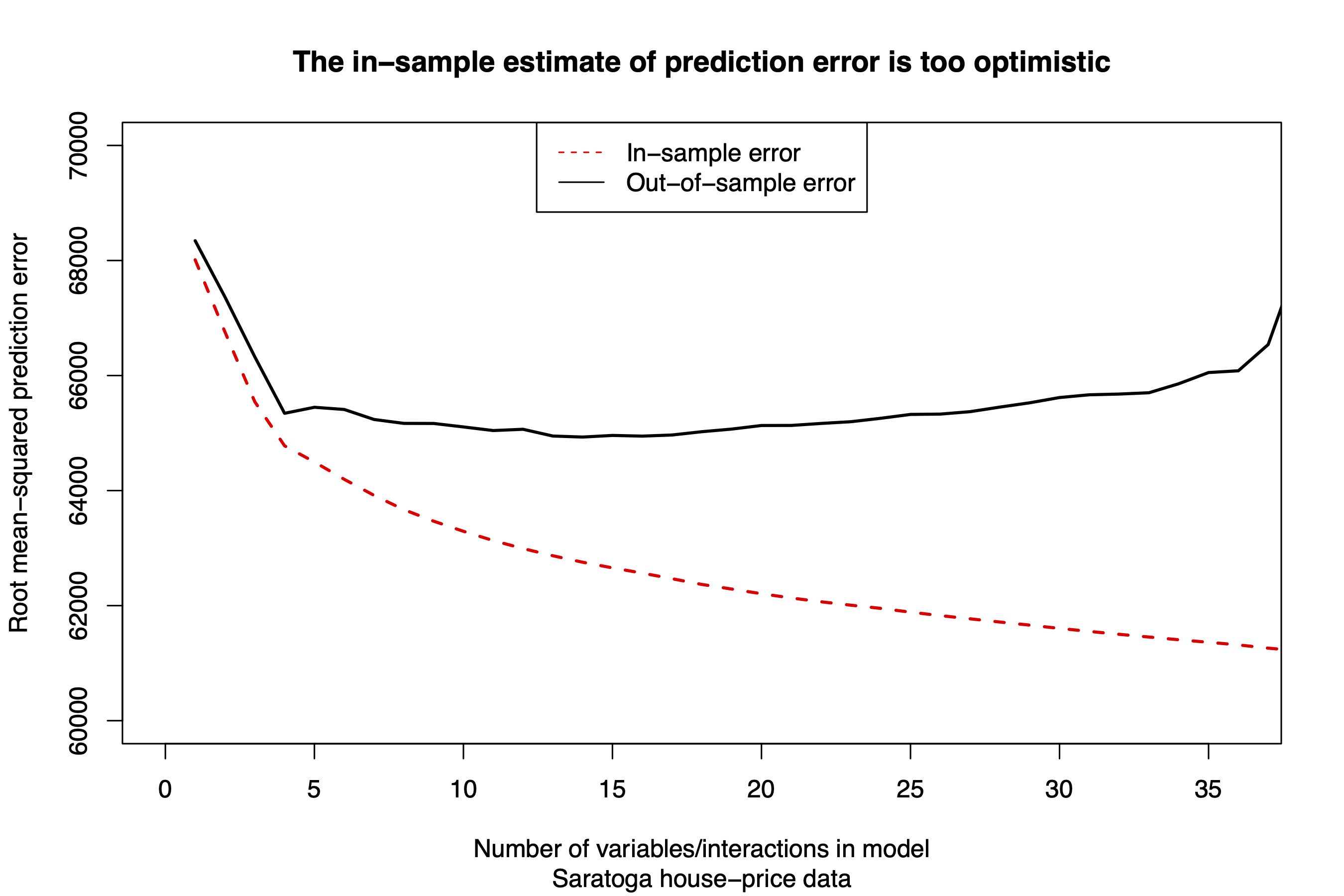
Figure 16.1: Etc.
Figure 16.1 demonstrates this point visually. Starting from a very simple model of price (using only lot size as a predictor), we’ve added one variable or interaction at a time from among the variables in our big model. For each new variable or interaction, we recalculated both the in-sample (training set) and out-of-sample (testing set) values of RMSE.67 As we add variables, the out-of-sample error initially gets smaller, reflecting a better fitting model that still generalizes well to new data. But after about 15 or 20 variables, eventually the testing-set error starts creeping back up, due to overfitting. The in-sample estimate of error, however, keeps going down, falling even further out of line with the real out-of-sample error as we add more variables to the model.
There are three take-home lessons from this example:
- We can’t use the training data as a guide to how well a model will be able to predict outcomes for data it hasn’t seen before. That’s because, by construction, our models enjoyed the benefit of already knowing the outcomes for all the data points in the training set. So it’s not especially surprising if a model—especially a complex model with lots of parameters—can learn to predict those particular outcomes accurately. It’s like asking a fortune teller to make “predictions” about the past, and then being impressed when they can do so.
- An overfit model is one that predicts well on the training data, but generalizes poorly to the testing data.
- The only way to know how a model will predict outcomes for new data is… to force it to predict outcomes for new data. That’s the whole point of our “split/train/test” process.
Averaging over different test sets. In general, it’s a good idea to average your estimate of the RMSE over multiple different train/test splits of the data set. This reduces the dependence of your test-set error on the particular random split into training and testing sets that you happened to choose. One simple way to do this is average your estimate of RMSE over many different random splits of the data set into training and testing sets. Even 5 random splits will help reduce Monte Carlo variability, but more is better, depending on the computational resources available.
Another classic way to estimate RMSE it is to divide your data set into \(K\) non-overlapping chunks, called folds. You then average your estimate of RMSE over \(K\) different testing sets, one corresponding to each fold of the data. This technique is called cross validation. A typical choice of \(K\) is 5, which gives us five-fold cross-validation. So when testing on the first fold, you use folds 2-5 to train the model; when testing on fold 2, you use folds 1 and 3-5 to train the model; and so forth. We won’t go into cross validation here, since it’s a slightly more advanced topic, but it’s pretty standard practice in many areas of machine learning.
16.2 Feature engineering
Feature engineering means applying domain-specific knowledge in order to:
- extract useful features from raw data, and/or…
- improve the usefulness of existing features for predicting y.
Good feature engineering is absolutely vital to success in most applications of machine learning. When it comes to prediction accuracy, the quality of your features should be priority number one. Said another way, a simple model with better features can easily beat a fancier model with inferior features. Data scientists who work on ML models spend a huge amount of their time thinking about how to engineer/extract more useful features from data sets.
Here’s a non-exhaustive list of some common steps in feature engineering:
- Extract numbers from time stamps (e.g. month, day of week, hour of day)
- Encode categorical variables as dummy variables
- Apply nonlinear transformations (logs, powers, etc) to existing numerical variables
- Combine existing features to form new, derived features
- Discretize: convert continuous features into categorical/discrete features
- Simplify complex features (for example, if we had someone’s heart-rate trace every second, we might encode that as max/min/average heart rates for the day)
- Merge existing data with new sources that provide additional features
Domain-specific knowledge plays a huge role in good feature engineering. So even though we call this whole area “machine learning,” people play a huge role in the process. We decide what features to use. We decide how to engineer and represent those features. We decide how to measure the performance of those features. The machine just does what we tell it to do.
Let’s see a couple of examples.
Example 1: Capital Metro bus boardings
The file capmetro_UT.csv contains data from Austin’s Capital Metro bus network, including shuttles to, from, and around the UT-Austin campus. These data track ridership on buses in the university area. Ridership is measured by an optical scanner that counts how many people embark and alight the bus at each stop.
Each row in the data set corresponds to a 15-minute period between the hours of 6 AM and 10 PM, each and every day, from September through November 2018. The variables are:
- timestamp: the beginning of the 15-minute window for that row of data
- boarding: how many people got on board any Capital Metro bus on the UT campus in the specific 15 minute window
- alighting: how many people got off (“alit”) any Capital Metro bus on the UT campus in the specific 15 minute window
- day_of_week and weekend: Monday, Tuesday, etc, as well as an indicator for whether it’s a weekend.
- temperature: temperature at that time in degrees F
- hour_of_day: on 24-hour time, so 6 for 6 AM, 13 for 1 PM, 14 for 2 PM, etc.
- month: July through December
Here we’ll focus on the boarding variable as our outcome. We’ll try to build a linear model that predicts boardings as well as possible, using the available features in the data set.
But this won’t work well if we just charge ahead blindly without any feature engineering. In particular, consider the hour_of_day variable. Let’s do a little data wrangling here so that we can plot average boardings by hour of the day and see what the relationship looks like:
hour_summary = capmetro_UT %>%
  group_by(hour_of_day) %>%
  summarize(mean_boardings = mean(boarding))

ggplot(hour_summary) +
  geom_line(aes(x=hour_of_day, y=mean_boardings))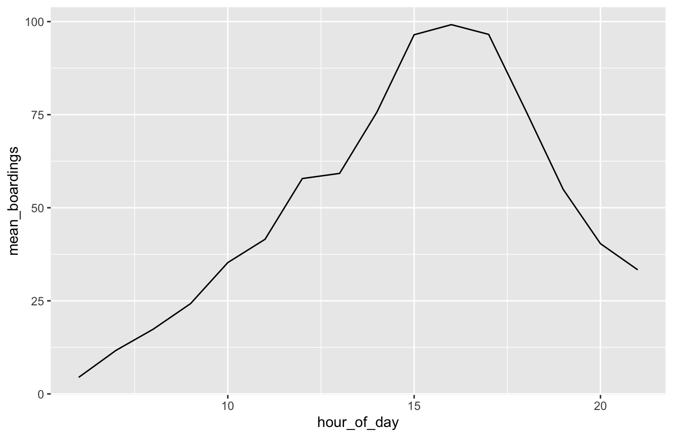
Clearly it doesn’t make sense to think that boardings would either increase or decrease linearly throughout the day—and indeed, the plot confirms this. The real relationship is obviously nonlinear: we see a peak in the late afternoon, followed by a lull overnight and in the early morning, when fewer people ride the bus.
An easy way to capture this kind of non-linearity is to do some feature engineering. Specifically, we’ll use factor to introduce a separate dummy variable for each hour of the day, which will allow us to tell lm to treat hour as categorical rather than numerical. Mathematically, what we’re doing here is regressing boardings vs hour of day using a step function, i.e. a function that steps up or down in discrete increments at each hour. The size of each step is determined by the coefficients on each hour’s dummy variable. Step functions are still pretty limited, but they’re a lot more flexible than linear functions.
capmetro_UT = capmetro_UT %>%
  mutate(hour_cat = factor(hour_of_day))
Having taken this simple feature-engineering step, now let’s split the data into our training and testing sets.
capmetro_UT_split = initial_split(capmetro_UT, prop = 0.75)
capmetro_UT_train = training(capmetro_UT_split)
capmetro_UT_test = testing(capmetro_UT_split)
Next, we’ll fit four models to the training data. Below are the features included in each model. As you can see, each model gets progressively bigger and more complex.
- Model 1: hour of day
- Model 2: hour of day, day of week
- Model 3: hour of day, day of week, and an hour:day interaction. The interaction here is designed to accommodate the idea that the hour-of-day effects might be different, for example, on weekdays versus weekends (when class isn’t in session).
- Model 4: boardings vs. hour of day, day of week, temperature, month, and all pairwise interactions among those four variables.
In each case we’ll use the “engineered” hour-of-day predictor that treats hour as categorical rather than numerical, to avoid any assumption that boardings vary linearly throughout the day.
lm1 = lm(boarding ~ hour_cat, data=capmetro_UT_train)
lm2 = lm(boarding ~ hour_cat + day_of_week, data=capmetro_UT_train)
lm3 = lm(boarding ~ hour_cat + day_of_week + hour_cat:day_of_week, data=capmetro_UT_train)
lm4 = lm(boarding ~ (hour_cat + day_of_week + temperature + month)^2, data=capmetro_UT_train)
Finally, let’s test each model and see which one has the lowest RMSE on the testing set:
rmse(lm1, capmetro_UT_test)## [1] 37.83595rmse(lm2, capmetro_UT_test)## [1] 30.24887rmse(lm3, capmetro_UT_test)## [1] 26.23671rmse(lm4, capmetro_UT_test)## [1] 25.69004Each model improves on the previous model. So it looks like Model 4 wins—although just barely over Model 3!
Now watch what happens if we instead use the original hour_of_day feature, rather than the engineered one that encodes the hour using a bunch of dummy variables. To do this, we’ll use the exact same model statement that we used to fit lm4, except we’ll swap in the original hour_of_day feature rather than our “engineered” hour_cat feature:
lm4_no_engineering = lm(boarding ~ (hour_of_day + day_of_week + temperature + month)^2, data=capmetro_UT_train)

# Compare the RMSEs
rmse(lm4_no_engineering, capmetro_UT_test)
## [1] 35.0554Clearly our model with the engineered feature was way better:
# RMSE of model with engineered hour of day feature
rmse(lm4, capmetro_UT_test)
## [1] 25.69004This shows the value of good feature engineering:
- recognizing that the relationship between boardings and hour of day was nonlinear, and…
- engineering a better set of features, by introducing separate dummy variables for each hour of the day so that we could model the nonlinearity with a step function.
A secondary take-home lesson from this example is that we clearly need all the variables included in Model 3, based on the fact that it improves noticeably over Model 2. But all those extra interaction terms in Model 4 aren’t worth too much, since they don’t really improve RMSE by much over Model 3. If pressed, though, I’d probably go with Model 3: it’s a lot simpler and only a tiny bit worse. I guess Model 4 is a tiny bit better, and with more training data it probably would probably be noticeably better: more complex models are data-hungry, and they tend to outperform simple models by a larger margin in situations with lots and lots of data. (By the way, it’s perfectly OK on real problems to put your “thumb on the scale” like this in favor of simplicity in the case of a close call between models.)
Example 2: Electricity demand in Texas
Texas is an unusual state in many ways. It’s the only U.S. state that was once an independent country (1836-45). It’s the only state where you can find Buc-ee’s, a chain of gas stations whose stores must be seen to be believed.68 And—more to the point for our purposes here—it’s also the only state that has decided to run its own electrical power grid, rather than take the distinctly un-Texan step of accepting shared regulatory oversight with the other 49 states.
The file load_ercot.csv contains over 6 years of data from the electrical power grid in Texas, which is run by an organization called the Electricity Reliability Council of Texas (ERCOT, although the “Reliability” part is perhaps doubtful). The ERCOT grid is divided into 8 subregions of Texas. Here, we’ll focus on the coastal region containing Houston, the largest city in the state and the fourth largest city in the U.S.
Focusing just on the COAST and Time variables in this data set, the basic structure looks like this:
load_ercot %>%
  select(Time, COAST) %>%
  head(5)
## Time COAST
## 1 2010-01-01 01:00:00 7775.457
## 2 2010-01-01 02:00:00 7704.816
## 3 2010-01-01 03:00:00 7650.576
## 4 2010-01-01 04:00:00 7666.708
## 5 2010-01-01 05:00:00 7744.961Each of the 56,952 rows in this data set corresponds to a single hour between 2010 and mid-2016. The Time column shows the time stamp for that hour (specifically, the beginning of the one-hour period corresponding to that row). The COAST column gives the peak electricity demand on the ERCOT grid, in megawatts, for the coastal region of Texas during that one-hour period.69 To put these numbers in perspective, an ordinary LED light bulb draws on the order of 10 watts. So 7775 megawatts is nearly a billion light bulbs, or roughly 6.42 time machines, worth of electrical power. That’s a lotta watts.
Our goal here is to build a predictive model for peak demand. You can imagine this would be very useful to a power company, who has to plan which sources of power generation to have running at a given time in order to meet the anticipated demand for electricity. You’ve probably never stopped to think about the power grid unless it stops working, but the basics physics of the situation requires that power demanded must exactly equal power supplied at all times, second by second, hour by hour—not easy, if you’re the supplier! (How on earth can the power company produce exactly the right amount of power, no more and no less, to meet your and my and Elon Musk’s every electrical whim on a moment’s notice, whether it’s turning on the lights or plugging in a Tesla? No matter how much I think about this, it still amazes me.)
A good predictive model of aggregate power demand can help a great deal. Let’s build one. Along the way, we’ll see how a few basic feature engineering steps can result in pretty decent predictions, even though we’ll be using nothing fancier than our old friend lm to build our model.
Merge with weather data. No matter the problem, one of the most helpful feature engineering steps you can take is to get more data with more useful features. After all, you can’t build a functioning Dreamliner out of wool or turnips; using high-quality raw material, where available, is a general principle of good engineering. In ML, “high-quality raw material” means “good data with rich features.”
Remember that good feature engineering involves applying domain-specific knowledge. I don’t have a ton of domain-specific knowledge about power grids, but I do live in Texas, and I do know that I use the air conditioner a lot in the summer. The same is true state-wide: the air conditioner is the single most power-hungry appliance in most people’s homes. This suggests that at least some variation in power usage should reliably track the temperature. So I’m willing to bet that we can improve the overall quality of our features by merging our data on power demand with weather data for the same time period.
To that end, I scraped some data from the National Weather Service that covered the same time period as the ERCOT data, and I stuck it in load_temperature.csv. You can see its basic structure here:
head(load_temperature)## Time KHOU
## 1 2009-12-31 23:00:00 51.962
## 2 2010-01-01 00:00:00 51.062
## 3 2010-01-01 01:00:00 51.962
## 4 2010-01-01 02:00:00 55.562
## 5 2010-01-01 03:00:00 53.762
## 6 2010-01-01 04:00:00 51.962Like our load_ercot data, this data set also has a column called Time, representing a specific one-hour period between 2010 and 2016. The other column is KHOU, which gives the average temperature in degrees Fahrenheit recorded over that specific hour at Houston’s Hobby Airport. (KHOU is the air-traffic-control designation for Hobby Airport, and also the National Weather Service’s four-letter designation for the weather station there.) While I also scraped the data for hundreds of other weather stations in Texas, we won’t bother with those here, just to keep things simple. After all, I figure that the temperature at one representative weather station in Texas’s Gulf Coast region will provide a big help in predicting power demand, and that while we could use the data from all those other weather stations, that we’d see some pretty serious diminishing marginal returns in doing so.
Because both the load_ercot and the load_temperature data sets have a column called Time, we can use the merge function in R to join these databases together, like in the code block below. (If you want to learn more about joins and other database operations in R, I suggest going here.)
# Feature engineering step 1:
# Merge the two data sets on their common field: Time
# Now we'll have access to the temperature data to predict power consumption
load_combined = merge(load_ercot, load_temperature, by = 'Time') %>%
  select(Time, COAST, KHOU)

# print a few rows of the variables we care about
load_combined %>%
  head(5)
## Time COAST KHOU
## 1 2010-01-01 01:00:00 7775.457 51.962
## 2 2010-01-01 02:00:00 7704.816 55.562
## 3 2010-01-01 03:00:00 7650.576 53.762
## 4 2010-01-01 04:00:00 7666.708 51.962
## 5 2010-01-01 05:00:00 7744.961 51.962Now load_combined has both the power demand (COAST, the outcome) and the temperature (KHOU, the feature) for each one-hour period. We’ll return to temperature soon, but for now: mischief managed.
Engineer some features based on the time stamp. People are creatures of habit. Most of us tend to wake up, turn on the lights, or watch TV at similar times each day. We tend to be at work or school on weekdays, and at home or out and about on weekends. We need more heat and artificial light in the winter, and less in the summer. These regularities makes it possible to predict fluctuations in power demand that reliably track the hour of the day, day of the week, or month of the year.
To build these effects into our model, consider the time stamp in our data set, labeled Time:
load_combined %>%
  head(5)
## Time COAST KHOU
## 1 2010-01-01 01:00:00 7775.457 51.962
## 2 2010-01-01 02:00:00 7704.816 55.562
## 3 2010-01-01 03:00:00 7650.576 53.762
## 4 2010-01-01 04:00:00 7666.708 51.962
## 5 2010-01-01 05:00:00 7744.961 51.962All the information we need is there in that time stamp. It’s just in an awkward format (a string of characters) that can’t easily be understood by a regression model. Clearly we need to do some feature engineering with this time stamp. But how?
Enter the lubridate library, which gives us magic powers for working with times and dates in R. Go ahead and install lubridate and get it loaded:
library(lubridate)The first step here is to get the Time variable into a format R understands. Right now R thinks this variable is just a string of characters. We need to tell R it’s actually a time stamp in a specific format: Year-Month-Day Hour:Minute:Second, or Y-M-D H:M:S. We’ll do this with the ymd_hms function in the lubridate package, which “parses” character strings as dates. “Parsing,” in this context, means telling R that these strings have a meaningful structure that encodes time and date information in a specific way. (lubridate has other analogous “parsing” functions, like dmy_hms, for other sensible orderings of the basic constituent parts of time stamps.)
# parse the Time variable as a time stamp
load_combined = load_combined %>%
  mutate(Time = ymd_hms(Time))
Once we’ve run this parsing function in our call to mutate, we can now do some feature engineering based on the parsed time stamps. Specifically, we’ll call several other functions in the lubridate package: hour, wday, month, and time_length.
load_combined = load_combined %>%
  mutate(hour = hour(Time) %>% factor(),     # hour of day
         wday = wday(Time) %>% factor(),     # day of week (1 = Monday)
         month = month(Time) %>% factor(),   # month of year (1 = Jan)
         weeks_elapsed = time_length(Time - ymd_hms('2010-01-01 01:00:00'), unit='weeks'))

# examine the result
head(load_combined)
## Time COAST KHOU hour wday month weeks_elapsed
## 1 2010-01-01 01:00:00 7775.457 51.962 1 6 1 0.000000000
## 2 2010-01-01 02:00:00 7704.816 55.562 2 6 1 0.005952381
## 3 2010-01-01 03:00:00 7650.576 53.762 3 6 1 0.011904762
## 4 2010-01-01 04:00:00 7666.708 51.962 4 6 1 0.017857143
## 5 2010-01-01 05:00:00 7744.961 51.962 5 6 1 0.023809524
## 6 2010-01-01 06:00:00 7980.653 48.362 6 6 1 0.029761905Let’s step through each line inside our call to mutate:
hour(Time)extracts the hour of the day (0 to 23) from the time stamp. For example,hour("2021-08-26 09:00:00")would return 9, for 9 AM. We then pass the result tofactor, encoding hour of the day as a categorical variable.
wday(Time)extracts the day of the week from the time stamp, using the convention that Monday=1. For example,wday("2021-08-26 09:00:00")would return 4, since that day was a Thursday.
month(Time)extracts the month. For example,month("2021-08-26 09:00:00")would return 8 for August.
time_lengthcalculates the elapsed time between two moments, in our unit of choice (we chose weeks). So in words, this line is calculating the number of weeks (or partial weeks) that have elapsed from the beginning of the study period until the hour in question for each row of the data set. We’ll use this variable to capture long-term trends in electrical demand related to population growth over the 7-year period in question.
Add a quadratic term for temperature. Return for a moment to the relationship between demand and temperature that we considered earlier. Let’s examine a plot, which is generally a good thing to do if you want to understand your data:
ggplot(load_combined) +
  geom_point(aes(x=KHOU, y=COAST), alpha=0.1)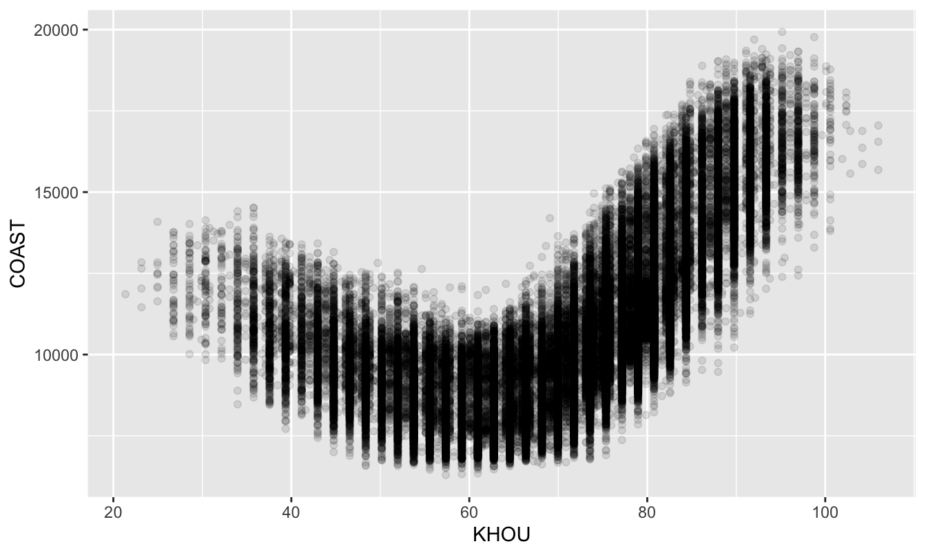
Figure 16.2: A plot of hourly power demand versus temperature in Texas’s Gulf Coast region.
It’s clear that temperature is going to be a useful feature for forecasting power demand. But it’s equally clear that a linear relationship is not going to cut it. The relationship between temperature and power demand looks more quadratic than linear: demand is high at both the hot and cold extremes of temperature, but comparatively low when temperatures are mild.
To address this, we’ll undertake a simple but powerful feature-engineering step: squaring temperature and adding it as a feature to our model. This will allow us to fit a quadratic equation whose basic form looks like this:
\[
\mathrm{Demand} = \beta_0 + \beta_1 \cdot \mathrm{Temp} + \beta_2 \cdot \mathrm{Temp}^2
\]
Since this is the equation of a parabola, it should be able to accommodate the general shape we see in Figure 16.2. Adding powers or nonlinear transformations of your original features is a common feature-engineering step in ML. Much as we saw in the unit on Beyond straight lines, many moons ago, these transformations allow us to estimate nonlinear functions for \(y\) versus \(x\), all within the friendly confines of lm.
Let’s use mutate to accomplish this step:
# Add temperature-squared as a feature
# This will help us estimate the quadratic-looking relationship
load_combined = mutate(load_combined,
                       KHOU_squared = KHOU^2)
Now we’re ready to start training and testing some models.
Split/train/test. Our first step in model evaluation is to split the data into training and testing sets. Since we have a fairly large data set here (more than 65,000 rows), and since I know we’ll be fitting some pretty complicated models, I’ll reserve a larger fraction of the data (90%) for training. That still leaves over 6,500 data points for testing our models’ predictive performance.
load_split =  initial_split(load_combined, prop=0.9)
load_train = training(load_split)
load_test  = testing(load_split)
Now let’s start building models, gradually layering in complexity to see if it improves our test-set performance. We’ll start with a simple baseline model, motivated by Figure 16.2, that regresses power demand (COAST) on temp and temp-squared:
# just KHOU temperature and temp^2
lm1 = lm(COAST ~ KHOU + KHOU_squared, data=load_train)

# check performance on the testing set
rmse(lm1, load_test)
## [1] 1415.827It looks like our average prediction error on the test set is a little over 1400 megawatts (1.4 gigawatts, or 1.16 time machines). We can certainly do better than this. But a good general principle in ML is to start simple and create a “baseline” model that performs adequately, if not amazingly. This will help provide context for any gains in performance that can be realized using a more complex model. This simple quadratic model of demand vs. temperature can serve as our baseline.
Let’s now try a more complex model. Here we’ll incorporate all those time-stamp variables:
- dummy variables for each hour of the day, day of the week, and month of the year
- the
weeks_elapsedvariable, to account for a linear time trend in power demand caused by population growth
An important note here: it was vital that we encoded the month/hour/day variables as categorical variables using factor. We want them to be dummy variables, not linear terms, for the reason we discussed in Example 1: Capital Metro bus boardings. This will allow us to describe the hour, day, and month effects using nonlinear step functions, rather than linear functions.
lm2 = lm(COAST ~ KHOU + KHOU_squared + month + hour + wday + weeks_elapsed,
         data=load_train)

# test-set performance
rmse(lm2, load_test)
## [1] 827.6298We see a big improvement here: from an RMSE of over 1400 MW, to a little over 800 MW.
But as Leonardo DiCaprio said in Inception: we have to go deeper. Let’s add some interactions:
lm3 = lm(COAST ~ KHOU + KHOU_squared + month + hour + wday + weeks_elapsed +
           (KHOU + KHOU_squared):(month + hour + wday) +
           hour:(wday + month),
         data=load_train)
coef(lm3) %>% length
## [1] 515As you can see, this model has 515 parameters in it—easily the biggest model we’ve fit so far in these lessons. They include:
- main effects for all the terms in model 2
- interactions between the two temperature variables (
KHOU + KHOU_squared) and the three variables derived from the timestamp (month + hour + wday). This is getting at the idea that the effect of temperature on power demand might change for different times of day, days of the week, and months of the year.
- interaction between
hourand bothwdayandmonth. This is getting at the idea that intra-day patterns in power demand might change from one day to the next. For example, I’d expect that the hour-by-hour pattern of power demand would be different in June than in December, and different on a Wednesday than on a Sunday. These interaction terms accommodate that possibility.
So how does this model perform? Pretty well!
rmse(lm3, load_test)## [1] 546.798It’s RMSE is about 550 MW—another big improvement over the RMSE of 815 MW or so from Model 2, and certainly way better than our baseline model’s RMSE of over 1400 MW.
Summary
We could probably continue to add model terms and eke out further marginal performance gains (although we’d eventually start to overfit). I encourage you to try on your own; it’s kinda fun! But the point has been made: good feature engineering can make a huge difference to the success of ML. Better features usually beat a better model. Feature engineering, moreover, depends a lot on domain-specific knowledge of the problem area. It tends to be a hands-on, iterative, exploratory process: you basically try stuff and see what works, keeping your model “honest” by checking test-set performance.
I’ll also note that three areas of machine learning have their own, highly specialized feature engineering pipelines: text, vision (i.e. images and videos), and robotics. These lessons won’t cover these areas—but now that you know some of the basic principles of ML, you’ll probably understand a lot more if you decide to read on your own about these areas!
16.3 Feature selection
The problem: combinatorial explosion
Let’s now turn to the question of how, in general, we might choose a good combination of features to include in our model.
The key principle in building predictive models is something called Occam’s razor, which is the broader philosophical idea that models should be only as complex as they need to be in order to explain reality well. The principle is named after a medieval English theologian called Willam of Occam. Since he wrote in Latin, he put it like this: Frustra fit per plura quod potest fieri per pauciora (“It is futile to do with more things that which can be done with fewer.”) A more modern formulation of Occam’s razor might be the KISS rule: keep it simple, stupid.
When it comes to building a predictive model, this principle is especially relevant for feature selection—that is, deciding which possible predictor variables (features) to add to a model, and which to leave out. We’ve already seen an example where including too many features to worse predictions, because of the problem of overfitting.
In principle, the combination of features leading to the lowest root mean-squared error (RMSE) should be the one we choose. The challenge is to actually find that specific combination from among the set of candidate features in a problem, often referred to as the scope for feature selection.
The seemingly obvious approach is to fit all possible combinations of features under consideration to a training set, and to measure the generalization error of each one on a testing set. If you have only a few features, this will work fine. For example, with only 2 features, there are only 2\(^2\) = 4 possible combinations to consider: the first feature in, the second feature in, both features in, or both features out. You can fit and test those four models in no time. This is called exhaustive enumeration.
But if there are lots of features, exhaustive enumeration of all the combinations becomes a lot harder to do, for the simple fact that it’s too exhausting—there are too many combinations, or models, to consider. For example, suppose we have 10 possible features, each of which we could put in or leave out of the model. Then there are \(2^{10} = 1024\) possible models to consider, since each feature could be in or out in any combination. That’s painful enough. But if there are 100 possible features, there are \(2^{100}\) possible combinations to consider. That’s 1 nonillion models—about \(10^{30}\), or a thousand billion billion billion. This number is larger than the number of atoms in a human body. This problem as combinatorial explosion: when the number of options gets large, the number of combinations of those options gets explosively large.
You will quite obviously never be able to fit all these countless billions of models, much less compare their RMSEs on a testing set, even with the most powerful computer on earth. Moreover, that’s for just 100 candidate features with main effects only. Ideally, we’d like the capacity to build a model using many more candidate variables than that, or to include the possibility of interactions among the variables. Recall that our best model for predicting power demand had 515 individual features, counting all dummy variables and interactions. The number of possible combinations of these features is \(2^{515}\), which is more vastly more atoms than there are in the entire universe.
One possible solution: stepwise selection
Thus a more practical approach to model-building is iterative: that is, to start somewhere reasonable, and to make small changes to the model, one variable at a time. Model-building in this iterative way is really a three-step process:
- Choose a baseline model, consisting of initial set of features to include in the model, including appropriate transformations (e.g. powers, logs) and interactions. Exploratory data analysis (i.e. plotting your data) will generally help you get started here, in that it will reveal obvious relationships in the data. Then fit the model for \(y\) versus these initial predictors.
- Check the model.
- Are we missing any important variables or interactions? If so, this is generally addressed by adding candidate variables or interactions to the model from step (1), to see how much each one improves the generalization error (RMSE).
- Or, on the other hand, are there signs that the model might be overfitting the data? If so, this is generally addressed by deleting variables or interactions that are already in the model, to see if doing so actually improves the model’s generalization error.
- You may need to iterate this step many times, going through many rounds of adding or deleting variables, before you’re satisfied with your final model. Once you’re happy with the model itself, then you can…
- Are we missing any important variables or interactions? If so, this is generally addressed by adding candidate variables or interactions to the model from step (1), to see how much each one improves the generalization error (RMSE).
- Use your fitted model on the test set.
In this three-step process, step 1 (start somewhere reasonable) and step 3 (use the final model) are usually pretty easy. The part where you’ll spend the vast majority of your time and effort is step 2, when you consider many different possible variables to add or delete to the current model, checking how much they improve or degrade the generalization error of that model.
This iterative process is a lot easier than considering all possible combinations of variables in or out. But with lots of candidate variables, even this iterative process can get super tedious. A natural question is, can it be automated?
The answer is: sort of. We can easily write a computer program that will automatically check for iterative improvements to some baseline (“working”) model, using an algorithm called stepwise selection:
- From among a candidate set of variables (the scope), check all possible one-variable additions to or deletions from the working model.
- Choose the single addition or deletion that yields the best improvement to the model’s generalization error. This becomes the new working model.
- Iteratively repeat steps (1) and (2) until no further improvement to the model is possible.
The algorithm terminates when it cannot find any one-variable additions or deletions that will improve the generalization error of the working model.
Stepwise selection tends to work tolerably well in practice. But it’s far from perfect, and there are some important caveats. Here are three; the first one is minor, but the second two are pretty major.
First, if you run stepwise selection from two different baseline models, you will probably end up with two different final models. This tends not to be a huge deal in practice, however, because the two final models will often have similar RMSEs. Remember, when we’re using stepwise selection, we don’t care too much about which combination of variables we pick, as long as we get good generalization error. Especially if the predictors are correlated with each other, one set of variables might be just as good as another set of similar (correlated) variables.
Second, stepwise selection usually involves some approximation. Specifically, at each step of stepwise selection, we have to compare the generalization errors of many possible models. Most statistical software will perform this comparison not by actually calculating RMSE on some test data, but rather using one of several possible heuristic approximations for RMSE. The most common one is called the AIC approximation:70 \[ \mathrm{RMSE}_\mathrm{AIC} = \mathrm{RMSE}_\mathrm{in} \cdot \sqrt{1 + \frac{p}{n}} \, , \] where \(n\) is the sample size and \(p\) is the number of parameters in the model.
The AIC estimate of RMSE is not a true out-of-sample estimate. Rather, it is like an “inflated” or “penalized” version of the in-sample estimate from the training data, \(\mathrm{RMSE}_\mathrm{in}\), which we know is too optimistic. The inflation factor involving \((1 + p/n)\) is always larger than 1, and so \(\mathrm{RMSE}_\mathrm{AIC}\) is always larger than \(\mathrm{RMSE}_\mathrm{in}\). But the more parameters \(p\) you have relative to data points \(n\), the larger the inflation factor gets. It’s important to emphasize that \(\mathrm{RMSE}_\mathrm{AIC}\) is just an approximation to test-set RMSE. It’s a better approximation than \(\mathrm{RMSE}_\mathrm{in}\), but it still relies upon some pretty specific mathematical assumptions that can easily be wrong in practice.
The third and most important caveat is that, when using any kind of automatic feature-selection procedure like stepwise selection, we lose the ability to use our eyes and our brains each step of the way. We can’t check whether our model’s assumptions are met, and we can’t ensure that the combination of variables visited by the algorithm make any sense, substantively speaking. It’s worth keeping in mind that your eyes, your brain, and your computer are your three most powerful tools for statistical reasoning. In stepwise selection, you’re taking two of these tools out of the process, for the sake of doing a lot of brute-force calculations very quickly.
None of these caveats are meant to imply that you shouldn’t use stepwise selection—merely that you shouldn’t view the algorithm as having God-like powers for discerning the single best model, or treat it as an excuse to be careless. You should instead proceed cautiously. Always verify that the stepwise-selected model makes sense and doesn’t violate any crucial assumptions.
An example
Let’s revisit the Saratoga house-price data to see stepwise selection in action. I’ll use the same train/test split that we used above, in the section on Evaluating predictive models. But if you’ve closed R out and need to re-create a train/test split from scratch, just run the following code block:
Data splitting
We’ll use some handy functions from the rsample library to split our data into training and testing sets:
saratoga_split =  initial_split(SaratogaHouses, prop=0.75)
saratoga_train = training(saratoga_split)
saratoga_test  = testing(saratoga_split)
Let’s use the medium model we fit above as a starting point. This will be our initial working model.
lm_medium = lm(price ~ lotSize + age + livingArea + bedrooms +
        fireplaces + bathrooms + rooms + heating + fuel + centralAir, data=saratoga_train)
Now we can run stepwise selection using the step command, which expects two main inputs: 1) a working model to use as a starting point for iterative feature selection, here lm_medium; and 2) a scope, i.e. a set of candidate features for possible include in the model. Our scope statement below says: "consider everything in lm_medium (.), along with the other variables we explicitly name that weren’t in lm_medium, i.e. landValue + sewer + newConstruction + waterfront.
When you execute this code, get ready for R to print a lot of information to the console:
lm_just_one_step = step(lm_medium,
            scope=~(. + landValue + sewer + newConstruction + waterfront),
            steps=1)
## Start: AIC=28837.8
## price ~ lotSize + age + livingArea + bedrooms + fireplaces +
## bathrooms + rooms + heating + fuel + centralAir
##
## Df Sum of Sq RSS AIC
## + landValue 1 1.1850e+12 4.6703e+12 28547
## + waterfront 1 3.1286e+11 5.5424e+12 28769
## + newConstruction 1 1.8777e+10 5.8365e+12 28836
## - fireplaces 1 7.0218e+08 5.8560e+12 28836
## - heating 2 1.1319e+10 5.8666e+12 28836
## + sewer 2 2.0342e+10 5.8349e+12 28837
## - age 1 8.1411e+09 5.8634e+12 28838
## <none> 5.8553e+12 28838
## - fuel 2 2.1708e+10 5.8770e+12 28839
## - rooms 1 3.0007e+10 5.8853e+12 28842
## - lotSize 1 4.5319e+10 5.9006e+12 28846
## - centralAir 1 6.2290e+10 5.9176e+12 28850
## - bedrooms 1 8.7769e+10 5.9430e+12 28855
## - bathrooms 1 9.8708e+10 5.9540e+12 28858
## - livingArea 1 1.1076e+12 6.9629e+12 29060
##
## Step: AIC=28546.74
## price ~ lotSize + age + livingArea + bedrooms + fireplaces +
## bathrooms + rooms + heating + fuel + centralAir + landValueNotice how I also said steps=1 in my call to step, and saved the result in a model called lm_just_one_step. With the steps=1 flag, I’ve told R to take only a single step from the starting model—in other words, to consider all possible one-variable additions or deletions to the model, to pick the single best one, and then to just stop right there without trying to make further improvements. What we get is the largest possible one-step improvement to our starting model. Normally we wouldn’t do this, because it’s usually better to keep trying to improve; the default is steps=1000. But I’ve restricted this to steps=1 for pedagogical purposes, so you can get a feel for what step is actually doing under the hood.
What you see at the top of the printout is your starting model, which included all the variables in lm_medium. Below that, you see a giant table. Every row of this table corresponds to a possible addition (marked +) or deletion (marked -) of a single variable. For each possible addition or deletion, R has calculated the AIC for that new model—which, we recall from our discussion above, can be interpreted as an approximation of how well we would expect that model to generalize to a testing set. Lower AIC is better, just like lower RMSE is better. So R has ranked all the possible one-variable additions or deletions in ascending order of AIC. + landValue is at the top of the table, suggesting that adding landValue to lm_medium is the single best change we can make to improve predictive performance.
OK, now let’s remove the restriction that we only take a single step, by deleting the steps=1 flag. If you thought the last call to step printed out a lot of stuff, you ain’t seen nothing yet. Hold on to your hats…
lm_step = step(lm_medium,
            scope=~(. + landValue + sewer + newConstruction + waterfront))
OK, so I’ve chosen not to show all of what R prints to the console, because it would take a ridiculous amount of space. But what you’re seeing is called the trace of the algorithm: a report of its progress as it adds and deletes variables, each time trying to make the single best choice that improves the prediction error. The model at the end of each step becomes the new working model, and thus the starting point for the next step. When R can no longer find a single one-variable addition or deletion that improves the model, it stops, saving the result model in an object called lm_step.
Now for the moment of truth: let’s see how well we did, by comparing our stepwise-selected model with our original model when we ask them both to make predictions on the same testing set:
rmse(lm_medium, saratoga_test)## [1] 62702.96rmse(lm_step, saratoga_test)## [1] 56767.61It looks like a pretty substantial improvement: a little over $7,000 lower RMSE than lm_medium, which was our starting point, or initial “working model,” for stepwise selection.
As this last step illustrates, it’s always a good idea to reserve some data for a testing set and compute the RMSE of your final model from stepwise selection (or any feature selection procedure), just as a sanity check. This will ensure sure that you’re actually improving the generalization error versus your baseline model.
I’m looking at you, aged NIMBY on my street corner.↩︎
Formally, RMSE is defined as follows. First you define mean-squared error as \(\mbox{MSE} = E\left[ (y^{\star} - \hat{y}^{\star})^2 \right]\). Here \(y^{\star}\) is some future outcome; \(\hat{y}^{\star}\) is your model’s prediction for that outcome on the basis of its features; and \(E\) means the expected value, taken under the same probabilistic data-generating process that gave rise to your training data. RMSE is then defined as the square root of this quantity: \(\mbox{RMSE} = \sqrt{\mbox{MSE}}\).↩︎
The reason why is quite simple. Estimating the prediction accuracy of a model entails estimating a single number: the RMSE. On the other hand, estimating a model generally requires estimating many numbers: all the parameters of the model. Each parameter that must be estimated entails spreading your data a bit more thinly, inflating your statistical uncertainty. Therefore it makes sense that you’d usually want to reserve more of your data for training than for testing.↩︎
We can be a bit more precise here: if Model A has predictor set \(S_A\), and model B has all the predictors in set \(S_A\) as well as some additional predictors, then we say that Model A is nested in Model B. In that case, Model B will always fit the training data better—but it won’t necessarily fit the testing data better. In our house price example, the small model is nested in the medium model, which is in turn nested in the big model.↩︎
To be specific here, at each stage we added the single variable or interaction that most improved the fit of the model. See the next section on stepwise selection. Moreover, to estimate the test-set error, we actually averaged over multiple train/test splits of the data, in order to reduce dependence on the specific (random) split.↩︎
I’m told there is a Buc-ee’s in Orlando, but I choose to ignore this fact.↩︎
The other columns in the data set are similar: they give peak demand for the other regions, as well as the total for all regions in the
ERCOTcolumn.↩︎In case you’re curious, AIC stands for “Akaike information criterion.” If you find yourself reading about AIC on Wikipedia or somewhere similar, it will look absolutely nothing like the equation I’ve written here. The connection is via a related idea called Mallows’ \(C_p\) statistic.↩︎