Lesson 10 p-values
Among professional football fans, the New England Patriots are a polarizing team.

Figure 10.1: The dark side of the Force is strong.
The Patriots’ fan base is hugely devoted, probably due to their long run of success over nearly two decades. Many others, however, dislike the Patriots for their highly publicized cheating episodes, whether for deflating footballs or clandestinely filming the practice sessions of their opponents. This feeling is so common among football fans that sports websites often run articles with titles like “11 reasons why people hate the Patriots.” Despite—or perhaps because of—their success, the Patriots always seems to be dogged by scandal and ill will.
But could even the Patriots cheat at the pre-game coin toss, which decides who starts the game with the ball?
Believe it or not, many people think so. That’s because, for a stretch of 25 games spanning the 2014-15 NFL seasons, the Patriots won 19 out of 25 coin tosses, for a suspiciously high 76% winning percentage. Sports writers had a field day with this weird fact, publishing headlines like this one:
But to the Patriots’ detractors, this fact was more than weird. It was infuriating, and clear evidence that something fishy was going on. As one TV commentator remarked when this unusual fact was brought to his attention: “This just proves that either God or the devil is a Patriots fan, and it sure can’t be God.”
But before turning to fraud or the Force as an explanation, let’s take a closer look at the evidence. Just how likely is it that one team could win the pre-game coin toss at least 19 out of 25 times, assuming that there’s no cheating going on?
This question calls for something called a hypothesis test, which is another core tool of statistical inference. The innocent explanation here is that the Patriots just got lucky; in the parlance of data science, that’s called a hypothesis. The goal of our test is to check whether this hypothesis seems capable of explaining the data, or whether instead we need a new hypothesis (i.e. a different explanation for the data). To do that, we’ll calculate a number called a p-value.
In this lesson, you’ll learn:
- the four steps common to all hypothesis testing problems.
- how to conduct a hypothesis test via simulation.
- what a p-value is, and why it confuses people so much.
10.1 Example 1: did the Patriots cheat?
So let’s return to our burning question: just how likely is it that one team could win the pre-game coin toss at least 19 out of 25 times, assuming that there’s no cheating going on? Of course we’d “expect” any given team to win only about half of its pre-game coin tosses, or roughly 12 or 13 out of 25. But that’s hardly enough evidence to open a cheating investigation into the Patriots. We have to account for the possibility that they just got lucky.
One way to get a feel for the inherent randomness of coin-flipping is to visit random.org, which has a cute feature where you can “flip” a state quarter of your choice, as many times as you like. Since there was no quarter available for the Patriots’ actual home state of Massachusetts, I chose the next-best “New England” option and flipped a Connecticut state quarter a bunch of times. It didn’t take me too long to notice a few lucky streaks. For example, here’s a stretch with 12 out of 15 heads:
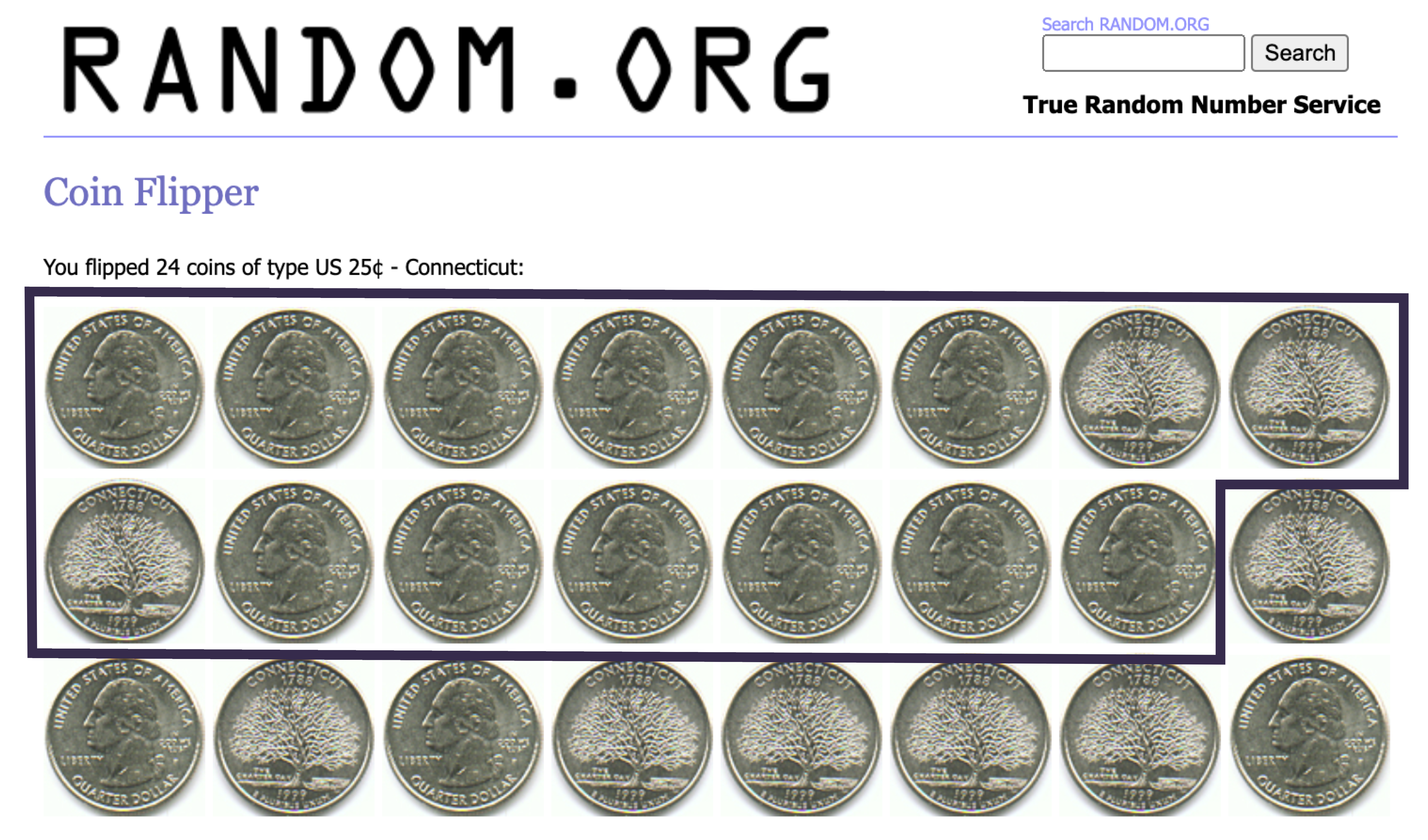
Figure 10.2: A lucky streak with 12 heads out of 15 flips.
So these lucky streaks clearly do happen. How likely, then, is a lucky streak with at least 19 wins out of 25 coin tosses?
Rather than wasting the day away on random.org, we’ll answer this question more systematically, using the Monte Carlo method—which, you’ll recall, entails writing a computer program that simulates a random process (in this case a stretch of 25 coin flips).
Please load the tidyverse and mosaic libraries, and start by running the command rflip(25), like in the code block below:
library(tidyverse)
library(mosaic)

rflip(25)
##
## Flipping 25 coins [ Prob(Heads) = 0.5 ] ...
##
## T H T H T H T T H H H T H H H T T H H T T T T T H
##
## Number of Heads: 12 [Proportion Heads: 0.48]This simulates 25 coin flips. Here we’ll identify the “H” outcome with the event “Patriots win the pre-game coin toss,” and the “T” outcome with the event “Patriots lose the pre-game coin toss.” This isn’t just a metaphor; it turns out that the guy who called the pre-game coin toss for the Patriots actually did call heads every single game for six years in a row, which only intensified speculation that the Patriots knew something about the coin that the rest of the NFL did not.
So in this simulation, it looks like the Patriots won 12 out of 25 coin tosses—about what we’d expect, considering that half of 25 is 12.5. That’s far shy of the 19 coin tosses the Patriots won in real life. Then again, one simulation doesn’t establish a very good baseline for understanding how “lucky” a 19-out-of-25 streak might be.
So let’s simulate that same stretch of 25 coin flips, but 10,000 different times. To do this we’ll use do and nflip, which just counts “H” outcomes (as opposed to rflip, which prints out the individual H’s and T’s to the screen):
patriots_sim = do(10000)*nflip(25)The object we created, patriots_sim, is a data frame with a single column, called nflip. Each entry represents the number of “H” outcomes (i.e. notional Patriots wins) in a single simulation of 25 coin flips:
head(patriots_sim)## nflip
## 1 10
## 2 12
## 3 14
## 4 13
## 5 9
## 6 9Let’s make a histogram of all 10,000 of these outcomes:
ggplot(patriots_sim) +
  geom_histogram(aes(x=nflip), binwidth=1)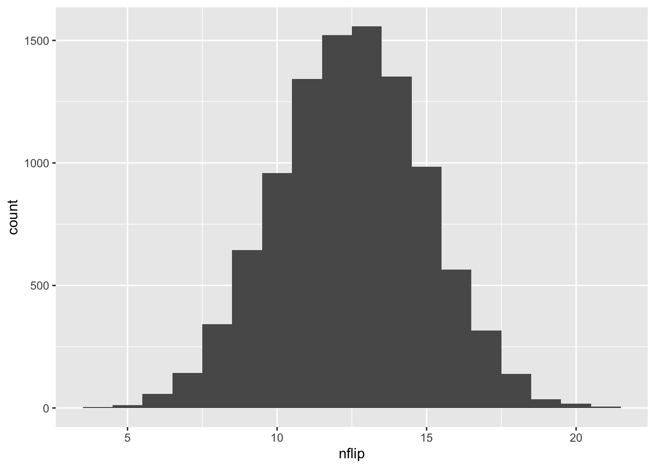
Just eyeballing the histogram, 19 wins or more seems pretty unlikely. How unlikely? According to our simulation, it happened only…
sum(patriots_sim >= 19)## [1] 58…58 times out of 10,000. Clearly 19 wins is an unusual, although not impossible, result: based on the Monte Carlo simulation, we estimate its probability to be about 58/10000 \(\approx\) 0.006.
So did the Patriots win 19 out of 25 coin tosses by chance? Well, nobody knows for sure—you can examine the evidence and decide for yourself.
But despite the small probability of such an extreme result, it’s hard to believe that the Patriots cheated on the coin toss, for a few reasons. First, how could they? The coin toss would be extremely hard to manipulate, even if you were inclined to do so. Moreover, the Patriots are just one team, and this is just one 25-game stretch. But the NFL has 32 teams, so the probability that at least one of them would go on an unusual coin-toss winning streak over at least one 25-game stretch over a long time period is a lot larger than the number we’ve calculated. Finally, after this 25-game stretch, the Patriots reverted back to a more typical coin-toss winning percentage, closer to 50%. I conclude that the 25-game stretch was probably just luck.34
10.2 The four steps of hypothesis testing
But unless you’re a hard-core NFL conspiracy theorist, let me encourage you to forget the Patriots for a moment and focus instead on the process we’ve used to reason through this question. This simple example has all the major elements of hypothesis testing, which is the subject of this lesson.
- We have a null hypothesis, or a “hypothesis of no effect.” Here our null hypothesis is that the pre-game coin toss in the Patriots’ games was truly random.
- We use a test statistic, or a numerical summary used to measure the strength of evidence against the null hypothesis. Here our test statistic is the number of Patriots’ coin-toss wins out of 25: higher numbers entail stronger evidence against the null hypothesis.
- We have a way of calculating the probability distribution of the test statistic, assuming that the null hypothesis is true. Here, we ran 10,000 Monte Carlo simulations (with each simulation having 25 coin flips), assuming an unbiased coin.
- We have an assessment: we used the distribution in step (3) to assess whether the null hypothesis seemed capable of explaining the observed test statistic.
To perform our assessment in step (4), we calculated a number (0.006) that represented the probability that the Patriots would go on a lucky streak with at least 19 wins out of 25 coin tosses. This number of 0.006 is referred to as a p-value. Here’s the formal definition of this term.
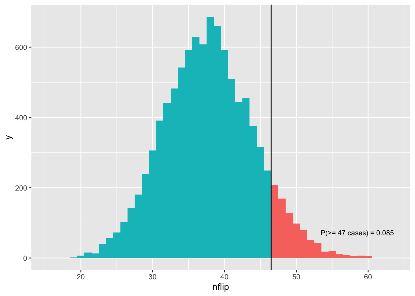
This sounds a bit abstract, but it’s easier to understand from a picture:
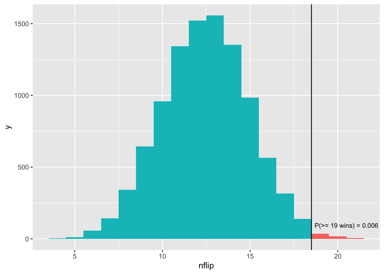
Figure 10.3: The p-value represents a tail area of the probability distribution for our test statistic, assuming the null hypothesis is true.
Remember, this histogram shows the results of our simulation, where we assumed that the null hypothesis was true (i.e. 50% chance of winning the coin flip). The vertical bar shows our observed test statistic (19 wins). The p-value represents the tail area of this distribution: specifically, the area at or beyond the observed value of the test statistic of 19. This area of \(p = 0.006\) is shaded in red. The smaller this number, the harder it is for our null hypothesis to explain the data.
10.3 Example 2: a disease cluster?
Let’s see a second example to help us understand p-values better.
Between 1990 and 2011, there were 2,876 “cancer cluster” investigations conducted in the U.S. These investigations are triggered when citizens believe they have anomalously high rates of cancer in their community, and they ask the local health department to conduct a formal investigation. Many times there is no initially obvious hypothesis for why there migth be a cluster. Other times, citizens may already suspect a possible cause.
Here we’ll look at a famous such investigation surrounding nuclear power plants in Illinois during the period 1996-2005. The basic facts of the investigation are straightforward. Among households less than 10 miles from a nuclear plant:
- there were 80,515 children ages 0-14.
- there were 47 cases of childhood leukemia.
- Thus the rate of leukemia was 0.00058, or 5.8 cases per 10,000 children.
In comparison, among households more than 30 miles from a nuclear plant:
- there were 1,819,636 children ages 0-14.
- there were 851 cases of childhood leukemia.
- Thus the rate of leukemia was 0.00046 (4.7 cases per 10,000 children).
In epidemiology, the ratio of these two rates is referred to as the incidence ratio. Here the incidence ratio was 5.8/4.7 = 1.23, implying that the rate of leukemia was 23% higher among childen living within 10 miles of a nuclear power plant, compared with the baseline risk among children living more than 30 miles away. Based on this fact, citizens called for a formal cancer-cluster investigation.
But let’s remember what we’ve learned so far. Whenever randomness is involved, you have to rule out blind luck before you can say you’ve found an anomaly. Cancer is linked to a mutation of your genes. This is clear example of a chance event. Is it possible that Illinois children living near power plants experienced this chance event at an unluckily high rate, without there being a systematic reason for it? In other words, is it plausible that, over the long run, children near nuclear plants actually do experience leukemia at the same background rate as other children, and that the apparent anomaly in the 1996-2005 data can be explained purely by chance?
Let’s run a hypothesis test to find out. We’ll follow the same four steps we followed in the Patriots example.
Step 1: Our null hypothesis is children near nuclear power plants in Illinois experience leukemia at the background rate of 4.7 per 10,000, on average over the long run.
Step 2: Our test statistic is the number of leukemia cases. Higher numbers of cases imply stronger evidence against the null hypothesis. In our data, 47 of 80,515 children living near nuclear plants had leukemia between 1996 and 2005.
Step 3: we must calculate the probability distribution of the test statistic, assuming that the null hypothesis is true. This distribution provides context for the observed data. It allows us to check if the observed data looks plausible under this distribution, or instead whether the null hypothesis looks too implausible to be believed.
To do this, we’ll use the same strategy of Monte Carlo simulation. Specifically, we’ll simulate 80,515 flips of a metaphorical biased “coin” that comes up heads 4.7 times per 10,000 flips (prob = 0.00047), on average:
- 80,515 is the number of children living within 10 miles of a nuclear plant.
- 0.00047 is the base rate of leukemia among Illinois children living more than 30 miles from a nuclear plant. Remember, our null hypothesis assumes that all children experience the same average rate of leukemia, regardless of their proximity to a nuclear power plant.
In our metaphor, each occurrence of “heads” corresponds to a case of leukemia.
I suggest that you run this following statement 4 or 5 times to see the variation you get:
nflip(n=80515, prob=0.00047)## [1] 46Each time you run this statement, you get a single number. This number represents the simulated number of cancer cases among children within 10 miles of a nuclear plant, assuming that the null hypothesis is true.
Let’s now repeat this simulation 10,000 times and store the result.
sim_cancer = do(10000)*nflip(n=80515, prob=0.00047)As before, the result is a data frame with one column called “nflip”:
head(sim_cancer)## nflip
## 1 28
## 2 36
## 3 34
## 4 44
## 5 33
## 6 40Let’s now visualize the distribution. Remember that our observed test statistic was 47 cancer cases. Can we eyeball how much of the distribution is 47 or larger?
ggplot(sim_cancer) +
  geom_histogram(aes(x=nflip), binwidth=1)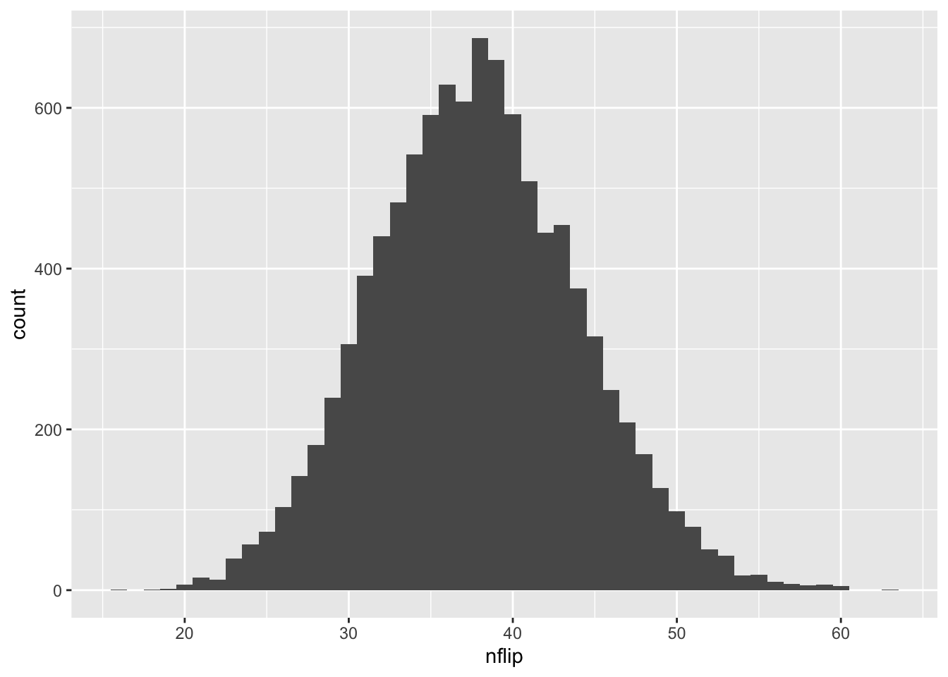
Maybe 10% Of course, if we don’t trust our eyeballs, we can ask R! And that brings us to step 4: calculate a p-value. How many simulations yielded 47 cases of cancer or more, just by chance?
sum(sim_cancer >= 47)## [1] 850That’s 850 out of 10,000, or about 8.5%. So our p-value is \(p = 0.085\). In other words, such a “cancer cluster” could easily have happened by chance. This is a bit smaller than the probability that you’ll get heads three times in three coin flips (which is 0.125).
Here is the p-value shown visually, as a tail area of the simulated distribution of test statistics:
Based on this p-value, the Illinois Department of Public Health reached a similar conclusion. They published a study on their investigation, writing:
The objective of this study was to examine childhood cancer incidence in proximity to nuclear power plants in Illinois. Cancer cases diagnosed among Illinois children 0 to 14 years old from 1986 through 2005 were included in the study… The results show that children living within 10 miles of any nuclear power plant did not have significant increase in incidence for leukemia, lymphomas, or other cancer sites. Neither did the children living 10 to 20 miles or 20 to 30 miles from any nuclear power plants. This study did not find any significant childhood cancer excess among children living near nuclear plants and did not observe any dose-response patterns.35
In summary, I hope this second example brings home some of the key terms and ideas from this lesson.
- Null hypothesis: the hypothesis of no effect, i.e. that blind luck can account for an apparent “anomaly” or “effect” that we observe in the data.
- Test statistic: a numerical summary of the data that measures the evidence against the null hypothesis.
- p-value: the probability of observing a test statistic at least as extreme as what we actually observed, just by chance, if the null hypothesis were true.
In hypothesis testing, the hard part is usually calculating the probability distribution of the test statistic, assuming that the null hypothesis is true. In both examples here, we did this by simulating coin flips. On future data sets, we’ll have to work a bit harder, but we’ll cover those details if and when we need them.
10.4 Interpreting p-values
Let’s come back to the final number that we calculate in a hypothesis test: a p-value.
Using a p-value as a measure of statistical significance has both advantages and disadvantages. The main advantage is that the p-value gives us a continuous measure of evidence against the null hypothesis. The smaller the p-value, the more unlikely it is that we would have seen our data under the null hypothesis, and therefore the stronger (“more significant”) the evidence that the null hypothesis is false.
The main disadvantage is that the p-value is really, really hard to interpret correctly. I mean, just look at the definition:
A p-value is the probability of observing a test statistic as extreme as, or more extreme than, the test statistic actually observed, given that the null hypothesis is true.
That’s pretty convoluted! For example, a p-value is used to decide whether the null hypothesis is true, and yet the definition assumes that the null hypothesis is true, which seems kinda weird. Moreover, in real life, we’ve always observed some particular value of a test statistic. But the p-value asks us to compute the probability of our test statistic, along with all possible test statistics that are more extreme than ours. This is also kinda weird, since we never actually observed those “more extreme” test statistics—nor, presumably, did the null hypothesis predict that we would observe them. Of course, there is a logic behind these definitional choices, and this logic explains why p-values have been important historically. But it’s a very subtle kind of logic, one based on a combination of thought experiment (“What if the null hypothesis were true?”) and mathematical argument not worth going into here (“What, mathematically speaking, can we say about this p-value thing we’ve just defined?”).
The point is this: there are three levels at which you can understand a p-value.
- Knowing, at a qualitative level, that a p-value measures the strength of evidence against some null hypothesis, with smaller values implying stronger evidence. This “level 1” understanding is attainable for anyone.
- Knowing what, specifically, the formal definition of a p-value actually says (and does not say). If you work with data, you should simply memorize the formal definition to the point of being able to state it on demand. You should also make sure you understand how that definition corresponds to a picture like Figure 10.3. This “level 2” understanding is also attainable for anyone, with a bit of work and attention to detail.
- Feeling deep in your soul what a p-value actually means, substantively speaking. It’s very natural for you to want to attain this. But I’m convinced this “level 3” understanding is basically impossible, or at best possible only for Jedis, and my advice to you is to not even try unless you pursue a Ph.D in statistics or the philosophy of science. (And you certainly shouldn’t feel bad about it if you never get there. P-values really are very hard understand.)
Speaking personally: I wrote my Ph.D thesis on statistical hypothesis tests, and while I have a firm level-2 understanding of p-values, I’m pretty sure I fall short of a level-3 understanding. So, apparently, do most scientists; here’s a link to a 538 story and funny-if-you’re-a-nerd video of a bunch of scientists trying to explain what a p-value means. Of those scientists featured in the video, maybe one person has a level-2 understanding of p-values. Most seem stuck at either level 0 (“Ummmm….”) or level 1. Nobody comes anywhere close to level 3.
OK, so now what?
To avoid injuring themselves by thinking too hard about what a p-value actually means, many people just shrug their shoulders and ask a simple question about any particular p-value they happen to encounter: is it less than some magic threshold? Of course, there is no such thing as a genuinely magic threshold where results become important, any more than there is such a thing as a magic height at which you can suddenly play professional basketball. But in many fields, the threshold of \(p \leq 0.05\) is often taken as an symbolically important boundary that demarcates “statistically significant” (\(p \leq 0.05\)) from “statistically insignificant” (\(p > 0.05\)) results. You pretty much cannot publish a result in a medical journal unless your p-value is 0.05 or smaller. You’ve read my thoughts on Statistical vs. practical significance before, so you can probably imagine how silly I think this is. Moreover, while there are some legitimate reasons36 for thinking in these terms, in practice, the \(p \leq 0.05\) criterion can feel pretty arbitrary. After all, \(p=0.049\) and \(p=0.051\) are nearly identical in terms of the amount of evidence they provide against a null hypothesis.
Because of how counter-intuitive p-values are, people make mistakes with them all the time, even (perhaps especially) people with Ph.D’s quoting p-values in original research papers. Here is some advice about a few common misinterpretations:
- The p-value is not the probability that the null hypothesis is true, given that we have observed our statistic.
- The p-value is not the probability of having observed our statistic, given that the null hypothesis is true. Rather, it is the probability of having observed our statistic, or any more extreme statistic, given that the null hypothesis is true.
- The p-value is not the probability that your procedure will falsely reject the null hypothesis, given that the null hypothesis is true. To get a guarantee of this sort, you have to set up a pre-specified “rejection region” for your p-value (like \(p \leq 0.05\)), in which case the size of that rejection region—and not the observed p-value itself—can be interpreted as the probability that your procedure will reject the null hypothesis, given that the null hypothesis is true.37
So here’s my summary advice for this lesson.
First, be broadly conversant with p-values. People will throw them at you and expect you to know what they mean (even if, as seems quite likely, the people doing the throwing don’t even understand what they mean). Moreover, many common “off the shelf” statistical analyses produce p-values as part of their standard summary output. Therefore, you should reach a level-2 understanding of what p-values are. Know the common misinterpretations and why they’re wrong.
Second, know that most data scientists carry around in their head a subjective, not-very-scientific scale for interpreting p-values. I won’t claim to know anyone else’s subjective scale, but here’s mine, based purely on my own experience:
- p \(\approx\) 0.05: Maybe you’ve found something, but it could easily be nothing. I’d really like to see more data.
- p \(\approx\) 0.01: You’ve piqued my interest. It could still be nothing, but it’s looking less likely.
- p \(\approx\) 0.001, or \(10^{-3}\): That’s pretty small. I suppose it could still be nothing, but there’s probably something here in need of an explanation.
- \(10^{-6} < p < 10^{-3}\): This region between “one in a thousand” and “one in a million” is clearly very small, but I honestly struggle to find the words to say how small in subjective terms.
- p < \(10^{-6}\): Wow, that’s so small that even particle physicists would take an interest in it, and they’re harder to impress than anyone.
Third, don’t split hairs with p-values. You should pay basically just as much attention to an effect with a p-value of 0.051 as you do to an effect with a p-value of 0.049.
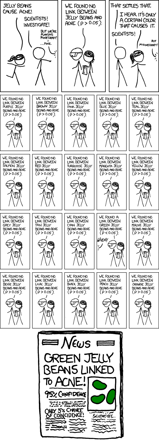
Fourth, pay attention to the context in which a p-value was calculated. It matters whether we’re talking about the p-value for a single test, or the p-value that happened to be the smallest out of a bunch of tests. Think of it this way: it would be remarkable if you won the lottery tomorrow, but it would not be remarkable for someone to win the lottery tomorrow, because there are an awful lot of lottery contestants. In hypothesis-testing terms, the “number of contestants” should affect how we interpret a p-value. The online cartoon xkcd gets this exactly right:
Finally, you should appreciate that, while p-values might be interesting and useful for some purposes, they are still fundamentally impoverished, because they measure only statistical significance, entirely ignoring any questions of practical significance. In many circumstances, a much better question to ask than “what’s the p-value?” is “what is a plausible range for the size of the effect I’m trying to measure?” This question can be answered only with a confidence interval, not a p-value.
Out of curiosity, I actually dug deeper and ran a more involved simulation consisting of all NFL games over a ten-year period. In about 23% of those simulations, at least one team went on a lucky streak where they won at least 19 out of 25 coin flips. So overall, there’s not much evidence to suggest that the Patriots were cheating at the coin toss.↩︎
“Childhood Cancer Incidence in Proximity to Nuclear Power Plants In Illinois.” Illinois Department of Public Health Division of Epidemiologic Studies, November 2012.↩︎
If you are interested in these reasons, you should read up on the Neyman–Pearson school of hypothesis testing.↩︎
As above: if you’re interested, read about the Neyman–Pearson approach to testing.↩︎