Lesson 11 Large-sample inference
Up to now, we’ve answered every question about statistical uncertainty by running a Monte Carlo simulation, of which the bootstrap is a special case. This depends, obviously, on having a pretty fast computer, so that we can do() things repeatedly and not wait too long. So you might ask: what on earth did people do before there were computers fast enough to make this possible? How did they ever measure their statistical uncertainty?
The answer is: people did math. Lots and lots of math, spanning at least three centuries (18th to 20th). And in this lesson, we’re going to summarize what people learned from all that math.
Did someone say “math?”
If you enjoy math, feel free to skip this section. But if you don’t enjoy math, you might have some concerns. Let me try to address those concerns head-on, with the following FAQ.
“Is this math hard?” Some of it is accessible to anyone with a high-school math education, and that’s the part that gets taught in a high-school AP Statistics course. But yes, certain other parts of this math actually are pretty hard. And if you don’t dig into this math, there will always be parts of the high-school version that you just have to accept because someone tells you to do it that way. I’d say that overall, this math is harder than a college course on differential equations, but not as hard as, for example, a PhD course on quantum mechanics.38
“Holy smokes. That sounds terrifying. Am I going to have to learn do this math myself?” Emphatically not, unless you decide to take your studies a lot further than these lessons can carry you.
“Whew. OK, so am I going to have to understand this math?” It depends what you mean by “understand.” I will not ask you to actually stare at mathematical derivations and understand what’s going on. I will summarize the practical consequences of this math and ask that you understand them.
“Do I even need this math to do statistical inference?” Usually not, at least for the problems we consider in this book. Remember, not every data-science situation you’ll encounter even requires statistical inference. (See “The truth about statistical uncertainty.”) And when statistical inference is required, you typically don’t need any math at all—just what we’ve learned so far (mainly the bootstrap).
“Seriously? So you’re telling me we’re going to talk about some hard math from a long time ago, rendered largely unnecessary by computers. Why am I still here?” Let me congratulate you on your keen sense of the opportunity cost of your time. (I wish you were in charge of most meetings I attend.) Yours is such an excellent question that it deserves a much longer answer.
Why bother?
There’s one overwhelmingly important reason why it’s important, even for beginners, to understand this historically older, more mathematical approach to statistical inference: because a lot of people out there still use it.
Why, you ask, do they still use this older approach? (I mean, haven’t they read my FAQ?!) That’s an interesting question, but it’s a question for another day. The fact is, folks do use this older approach, many with good reasons. And when they communicate their results to you, using terms like “z test” or “t interval,” they’ll expect you to understand them. As a basic matter of statistical literacy, it is important that you do.
And you will! If you understood the lesson on “The bootstrap,” these folks describing their “z test” or “t interval” won’t be talking about anything fundamentally unfamiliar to you, despite their exotic vocabulary. In fact, you stand a decent chance of understanding what they’re saying better than they understand it themselves. It does take a bit of time and effort to learn a few new terms for a few old ideas (hence this lesson). But at the end of the day, everyone’s just talking about Sampling distributions.
To convince you of this, let me show you the following table. In the left column are a bunch of phrases associated with the older, more mathematical way of approaching statistical inference. In the right column are some corresponding translations in terms of the bootstrap. If you understand what the right column is referring to, you’re going to find this lesson a breeze. It’ll be just like memorizing how to say “please,” “thank you,” and “where’s the bathroom?” in the local language of a foreign country you’re about to visit.
| If someone uses a… | That’s basically the same thing as… |
|---|---|
| one-sample t-test (or “t inverval”) | Bootstrapping a sample mean and making a confidence interval (and possibly checking whether that confidence interval includes some specific value, like 0). |
| one-sample test of proportion (or “z interval”) | Bootstrapping a proportion and making a confidence interval (and possibly checking whether that confidence interval includes some specific value, like 0.5). |
| Two-sample t-test (or z-test) | Bootstrapping the difference in means between two groups (diffmean) and making a confidence interval for the difference (and possibly checking whether that confidence interval contains zero). |
| Two-sample test of proportions | Bootstrapping the difference in proportions between two groups (diffprop) and making a confidence interval for the difference, (and possibly checking whether that confidence interval contains 0). |
| Regression summary table | Bootstrapping a regression model (lm) and making confidence intervals for the regression coefficients (and possibly checking whether those confidence intervals contain zero). |
The rest of this lesson is about understanding Table 11.1.
Let me also add four other reasons why you’d actually want to understand this table, quite apart from the practical need to understand what other people are talking about when they use the terms in the left column.
It’s a time-saver. Hey, life is short. I don’t know about you, but sometimes I get bored waiting for my computer to
do()something 10,000 times in order to produce a confidence interval. It turns out that, if you understand the correspondences in the table above, you can get a perfectly fine confidence interval in no time at all, without actually bootstrapping. This is pretty useful, especially if you’re just exploring a data set and want a quick answer without having to twiddle your thumbs while R is thinking.It works on bigger data sets. A related problem is that for some very large data sets, bootstrapping might take so much time that it’s no longer just a question of boredom, but of whether you’ll get an answer at all within some reasonable time frame.
It offers insight. To give one example: the math behind Table 11.1 helps you understand a very fundamental relationship between sample size and statistical uncertainty, called de Moivre’s equation.
It prepares you to do more. We’ve already talked about how Bootstrapping usually, but not always, works. If you decide to pursue further studies—in statistics, machine learning, computer science, economics, or any number of fields—eventually you will encounter the limits of the simple bootstrapping approach, and you’ll need to rely on some math (or, at the very least, on the results of some other people’s math). This lesson will give you the proper foundation to understand what’s going on if and when that happens. Of course, my primary goal here is to teach you some practical data-science skills, not to run you through some mathematical boot camp for advanced studies in statistics. Future-proofing your stats education is mainly just a nice side benefit.
Let’s dive right in.
11.1 The Central Limit Theorem
The normal distribution
The first piece of the mathematical puzzle here is something called the normal distribution. It helps us give a formal mathematical description of a phenomenon that you may have noticed yourself: that all sampling distributions basically look the same.
To dramatize this point, here’s a cut-and-paste montage of nine different sampling distributions from eight different problems we’ve seen so far in these lessons:
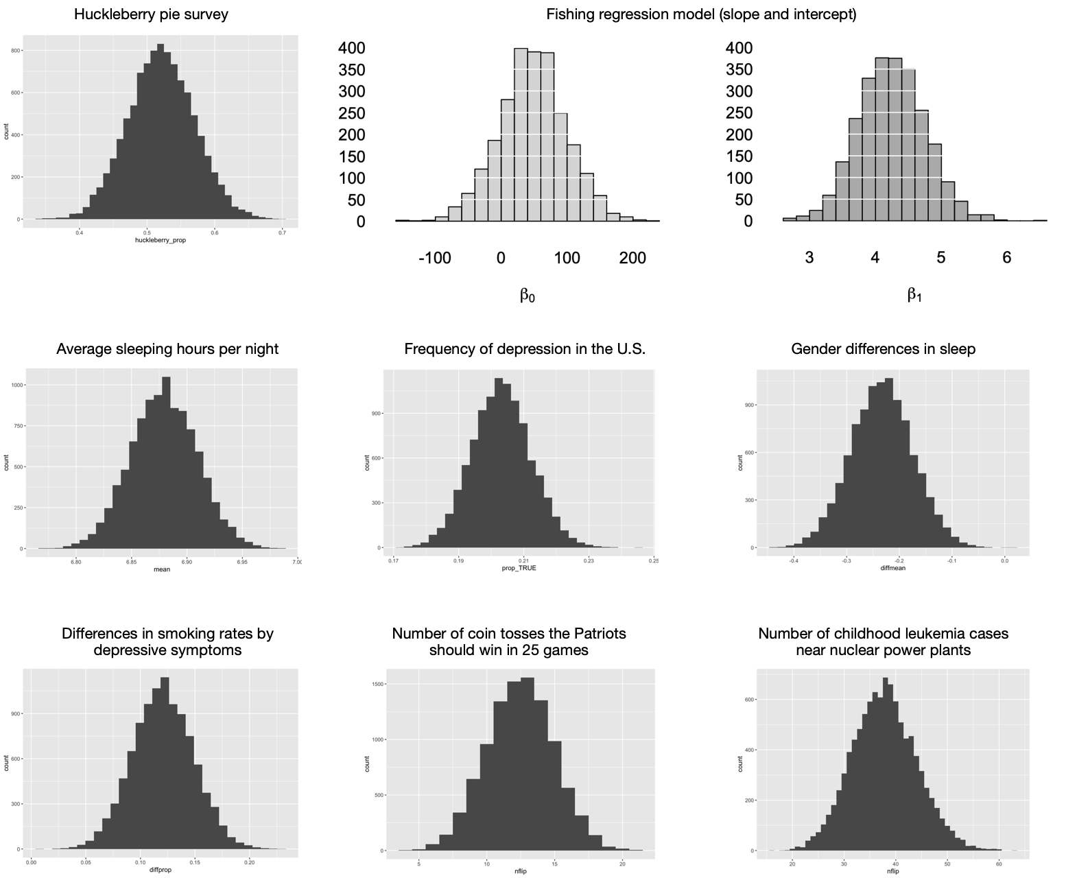
Figure 11.1: Nine sampling distributions that all look pretty much the same.
I mean, just look at them. It’s like that famous first line of Anna Karenina, where all happy families are the same. Without getting out your magnifying glass to inspect the scale of the \(x\) axis in each plot, can you tell the difference between these sampling distributions? I sure can’t. They all look the same! More to the point, they all look like this:

Distributions that look like this have a name: we call them normal distributions (or more colloquially, “bell curves,” or more verbosely, “Gaussian distributions”). Normal distributions are “normal” in the same sense that blue jeans are normal, which is to say they’re ubiquitous—as evidenced by the fact that all the sampling distributions in Figure 11.1 look normal. This is emphatically not a coincidence, but rather a consequence of a very important result in mathematics called the Central Limit Theorem, or CLT for short. We’ll see a more precise statement of this theorem soon, but here’s the basic idea.
Central Limit Theorem, simplified version: sampling distributions based on averages from a large number of independent samples basically all look the same: like a normal distribution.
Since the normal distribution seems so… well… central to all this business, let’s try to understand it a bit more. A normal distribution, written as \(N(\mu, \sigma)\), can be described using two numbers:
- the mean \(\mu\), which determines where the peak of the distribution is centered.
- the standard deviation \(\sigma\), which determines how spread out the distribution is.
The nine sampling distributions shown in Figure 11.1 all have different means and standard deviations, but it’s hard to tell because they’re all shown on different scales/aspect ratios (i.e. different sets of \(x\) and \(y\) axes). Below are three different normal distributions, all shown on the same scale, so you can appreciate their variety.
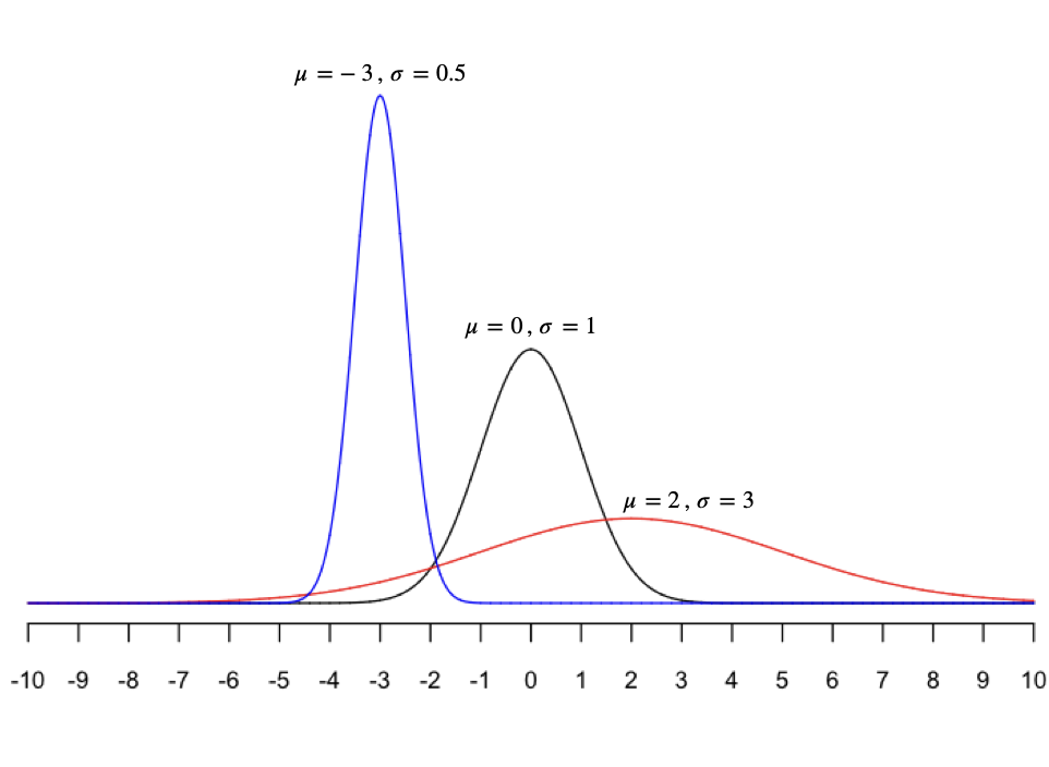
As you can see, a normal distribution can be centered anywhere (depending on \(\mu\)). And it can be tall and skinny, short and broad, or anywhere in between (depending on \(\sigma\)). If we think that some random quantity \(X\) follows a normal distribution, we write \(X \sim N(\mu, \sigma)\) as shorthand, where the tilde sign (\(\sim\)) means “is distributed as.”
Here are some useful facts about normal random variables—or more specifically, about the central areas under the curve, between the extremes of the left and right tail. If \(X\) has a \(\mbox{N}(\mu, \sigma)\) distribution, then the chance that \(X\) will be within \(1 \sigma\) of its mean is about \(68\%\); the chance that it will be within \(2\sigma\) of its mean is about \(95\%\); and the chance that it will be within \(3\sigma\) of its mean is about \(99.7\%\). Said in equations:
\[\begin{eqnarray*} P(\mu - 1\sigma < X < \mu + 1\sigma) &\approx& 0.68 \\ P(\mu - 2\sigma < X < \mu + 2\sigma) &\approx& 0.95 \\ P(\mu - 3\sigma < X < \mu + 3\sigma) &\approx& 0.997 \, . \end{eqnarray*}\]
And said in a picture, with fastidiously accurate numbers:
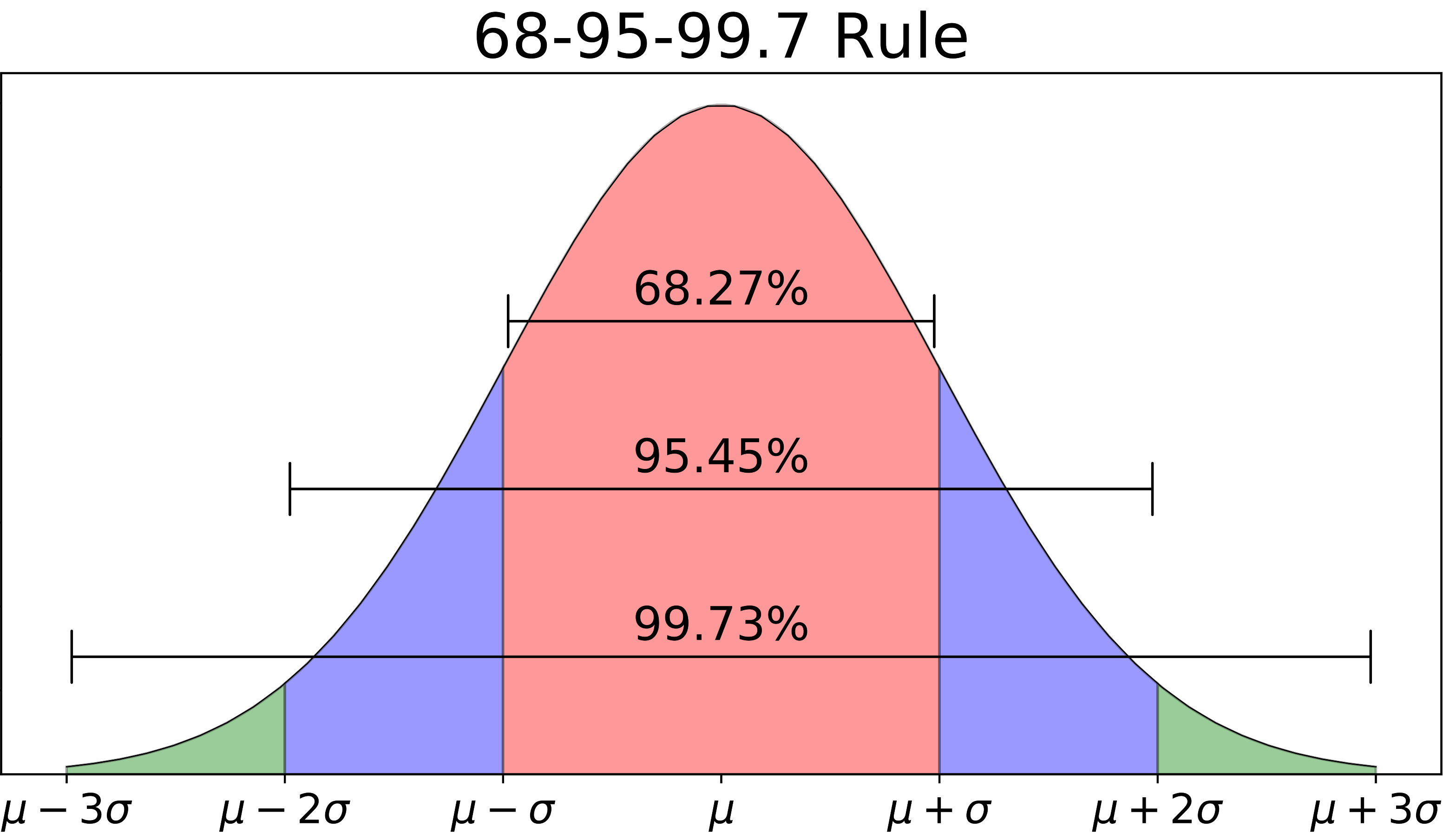
Figure 11.2: A useful fact worth remembering about the normal distribution.
de Moivre’s equation
But our discussion of the Central Limit Theorem so far is incomplete. Suppose we take a bunch of samples \(X_1, \ldots, X_N\) from some wider population whose mean is \(\mu\), and we calculate \(\bar{X}_N\), the mean of the sample. Can we say anything a bit more specific about the statistical fluctuations in \(\bar{X}_N\), beyond the fact that those fluctuations will be approximately normal? Specifically, can we say how spread out those fluctuations might be around the population mean of \(\mu\)?
It turns out that the answer is: yes, quite precisely.
This leads us to the second big piece of our mathematical puzzle: something called de Moivre’s equation, also known as the “square root rule.”39 The Central Limit Theorem tells us that, with enough data points, the distribution of an average looks approximately normal; de Moivre’s equation tells us precisely how narrow or wide that normal distribution will be, as a function of two things:
- The variability of a single data point.
- The number of data points you’re averaging.
This equation was discovered by a Swiss mathematician named Abraham de Moivre in 1730. In my opinion, it represents one of the most under-rated triumphs of human reasoning in history. Most educated people, for example, have heard of Einstein’s equation: \(e = mc^2\). De Moivre’s equation is just as profound; it represents an equally universally truth, and is equally useful for making accurate scientific predictions. Yet very few people outside statistics and data science know it.
De Moivre’s equation concerns a situation we’ve approached before, using the bootstrap: one where we take an average of many samples, and we want to understand how much statistical uncertainty we have about that average. Specifically, the equation establishes an inverse relationship between the variability of the sample average and the square root of the sample size. It goes like this:
\[ \mbox{Variability of an average} = \frac{\mbox{Variability of a single data point}}{\sqrt{\mbox{Sample size}}} \]
Data scientists usually use the Greek letter \(\sigma\) (sigma) to denote the variability of a single data point, and the letter N to denote the sample size. Also, you should remember our more technical term for the variability (or statistical fluctuations) of an average: the “standard error.” This terminology allows us to express de Moivre’s equation a little more compactly:
\[ \mbox{Standard error of the mean} = \frac{\sigma}{\sqrt{N}} \]
This equation looks simple, but its consequences are profound.
First, de Moivre’s equation places a fundamental limit on how fast we can learn about something subject to statistical fluctuations. Naively, you might think that statistical uncertainty goes down in proportion to how much data you have, i.e. your sample size. But de Moivre’s equation tells us otherwise: it tells us that statistical uncertainty goes down in proportion to the square root of your sample size. So, for example:
- if you collect 4 times as much data as you had before, you’re not 4 times as certain as you were before: de Moivre’s equation says that your standard error will go down by a factor of \(1/\sqrt{4} = 1/2\). That is, you’ll have half as much uncertainty as you had before.
- if you collect 100 times as much data as you had before, you’re not 100 times as certain as you were before: de Moivre’s equation says that your standard error will go down by a factor of \(1/\sqrt{100} = 1/10\). That is, you’ll have 10% as much uncertainty as you had before.
Second, de Moivre’s equation also allows us to state a more precise version of the Central Limit Theorem, as follows.
Theorem 11.1 (Central Limit Theorem, more precise version) Suppose we take \(N\) independent samples from some wider population, and we compute the average of the samples, denoted \(\bar{X}_N\). Let \(\mu\) be the mean of the population, and let \(\sigma\) be the standard deviation of a single observation from the population. If \(N\) is sufficiently large, then the statistical fluctuations in \(\bar{X}_N\) can be well approximated by a normal distribution, with mean \(\mu\) and standard deviation \(\sigma/\sqrt{N}\):
\[ \bar{X}_N \approx N \left( \mu, \frac{\sigma}{\sqrt{N}} \right) \]Three notes here:
- The Central Limit Theorem holds regardless of the shape of the original population distribution.40 In particular, the population itself does not have to be normally distributed, and indeed can be crazily non-normal. It doesn’t matter. As long as the sample size is large enough, the statistical fluctuations in the sample mean will look approximately normal. We’ll see examples of this below.
- The requirement that \(N\) be “sufficiently large” is what gives this lesson (and this whole approach to statistics) its name: large-sample inference. The basic idea behind all this math is that, by studying what happens when we collect lots of data, we can learn some things that allow us to make inferential statements that hold approximately across a wide variety of situations, even if we don’t necessarily have lots of data ourselves.
- You might notice two remaining weasel words in this supposedly more precise version of the Central Limit Theorem: “sufficiently large” and “well approximated.” What, precisely, do those mean? Alas, it’s hard to say without going into some very detailed math, specifically a result called the Berry–Esseen theorem. But here’s a rough guideline: if the population you’re sampling from isn’t too skewed or crazy looking, then 30 samples is generally “sufficiently large” for the approximation to be really quite good.
The CLT in action
The Central Limit Theorem and de Moivre’s equation can feel a bit abstract. It’s certainly not obvious or intuitive why either mathematical result is true. In a course covering probability or mathematical statistics, you would actually prove that they’re true, but those kinds of mathematical proofs are not really our focus in these lessons.
Instead, we’re going to take a different approach. In my opinion, the best way to make the Central Limit Theorem and de Moivre’s equation feel concrete is to mess around with some Monte Carlo simulations until they both start to make sense. This web app allows you to explore the CLT to your heart’s content, and I highly recommend it! But we’ll look at two specific examples here.
Example 1: FedEx packages
In our first example, we’ll try to reason our way through a deceptively simple question: what’s the average weight of packages that a FedEx driver delivers in a single day, and how does that average fluctuate from truck to truck (or from day to day for a single truck)?
To FedEx, understanding fluctuations in average package weight for a delivery truck is very much not an academic question. In fact, I once heard a really interesting conference presentation from a data scientist at FedEx who discussed this very issue. Her reasoning was roughly the following:
- Every pound of package weight you’re carrying around requires more fuel, so you need to make sure a given truck is adequately fueled to complete its delivery run.
- But you don’t want to over-fuel a truck either. Unnecessary fuel means you’re carrying unnecessary weight, and therefore burning more fuel than you need to.
- So there’s really an “ideal” amount of fuel to carry: not too much, but enough to cover typical day-to-day fluctuations in package weight. You only save a small amount per truck, per day by getting this right. But over many trucks and many days, it can add up. Considering that 3-5% of FedEx’s roughly $80 billion in revenue is spent on fuel in any given year, we’re talking about real money here.41
With that in mind, let’s now return to our question: how does the average weight of packages delivered by a single FedEx truck vary from one truck to the next?
We can think of a single truck’s daily load of packages as a random sample from the population of all FedEx packages. So the two relevant questions are: (1) What the does “the population of all FedEx packages” look like? And (2) What is the “sample size,” i.e. how many packages does a FedEx truck carry in a single day? Since I don’t work for FedEx, I’ll have to make some assumptions.
As far as what the population looks like, here are some basic facts I remember from that presentation by the FedEx data scientist:
- the average weight of a FedEx package was 6.1 pounds
- the standard deviation in weight was 5.6 pounds
- the distribution of weights was very skewed, where most packages were pretty light but a handful of them were very heavy.
Since I don’t have access to FedEx’s raw data, I simulated a notional population with 100,000 imaginary packages having these statistical properties. You can find them in fedex_sim.csv. Go ahead and load this (simulated) data set into R studio. (You’ll also need tidyverse and mosaic.)
library(tidyverse)
library(mosaic)
This data set has a single column called weight, notionally measured in pounds. If we make a histogram of this weight variable, you’ll see what I mean when I say that the distribution of individual package weights is very skewed:
ggplot(fedex_sim) +
  geom_histogram(aes(x=weight), binwidth=0.5)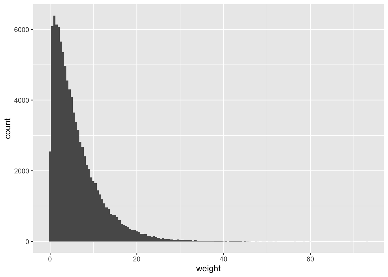
Figure 11.3: A simulated distribution of FedEx package weights.
So let’s treat this distribution as a decent stand-in for “the weight distribution of all FedEx packages.” While it’s surely wrong in the particulars, it’s probably pretty similar in shape to the real distribution, which none of us actually know unless we work for FedEx. And as you can see from favstats, the distribution matches the mean (6.1 pounds) and standard deviation (5.6 pounds) that I recall hearing:
favstats(~weight, data=fedex_sim)## min Q1 median Q3 max mean sd n missing
## 0.1 2.07 4.52 8.42 72.99 6.10375 5.605429 100000 0The next question is: how many packages per day does a typical FedEx truck deliver? I’m not sure, but according to some guy on the Internet who claims to have worked for a shipping company (and who might also have fought at the Alamo), the answer is “it depends.” Our hero claims that a driver on an urban express route might deliver 300 packages, while a driver on a more rural route might deliver only 60. These numbers sound reasonable to me, and frankly I wouldn’t know any better, so let’s run with them.
We’ll start on the low end, with 60 packages. Let’s say there are five different trucks in your general neighborhood today, each delivering 60 packages. Each truck represents a sample of size 60 from the population, which we can simulate like this:
do(5)*mean(~weight, data=sample_n(fedex_sim, 60))## mean
## 1 5.607500
## 2 5.106167
## 3 6.718167
## 4 6.822000
## 5 5.970167You might get the sense, even from just 5 samples, that the average package weight for a single truck is usually pretty close to the population average of 6.1 pounds.
But what about if we look across, say, 5000 trucks, which is about the number of FedEx trucks making deliveries in Texas on a single day?42 Let’s take 5000 different samples of size 60, representing 5000 different trucks, and make a histogram of each truck’s mean package weight.
# Monte Carlo simulation: 5000 samples of size n = 60
sim_n60 = do(5000)*mean(~weight, data=sample_n(fedex_sim, 60))

# histogram of the 5000 different means
ggplot(sim_n60) +
  geom_histogram(aes(x=mean), binwidth=0.1)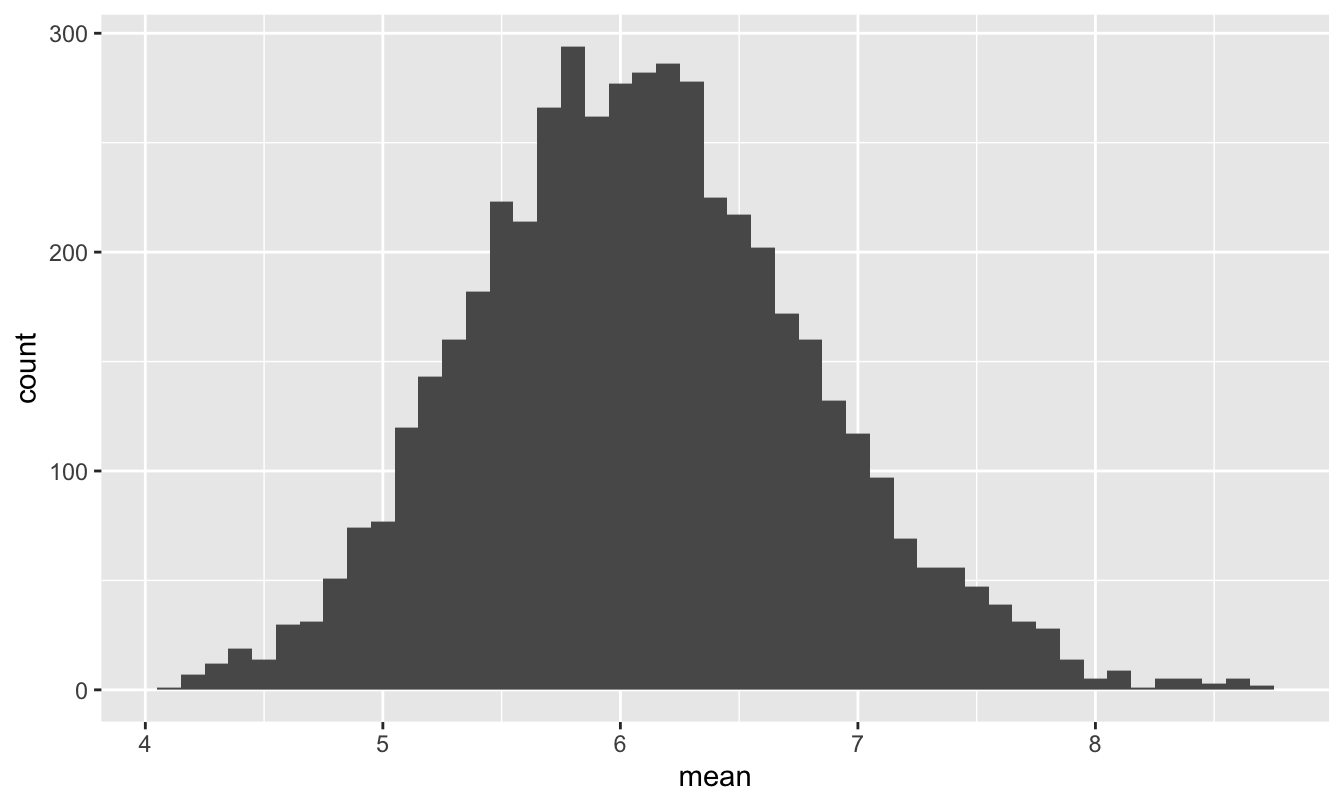
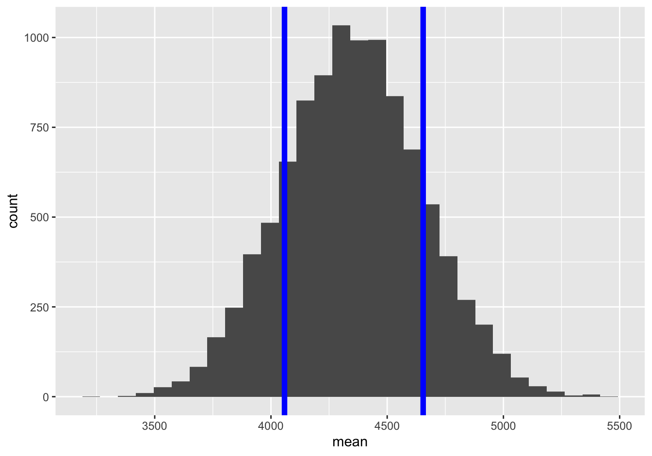
Figure 11.4: The sampling distribution of the mean package weight for a FedEx truck, assuming it carries 60 packages.
Even though the population distribution in Figure 11.3 looks wildly non-normal, the sampling distribution of the mean is really quite close to a normal distribution centered around the population mean of 6.1. This is just as the Central Limit Theorem would predict.
Moreover, de Moivre’s equation tells us that the standard error of the mean of 60 packages is:
\[ \mbox{std. err.} = \frac{\sigma}{\sqrt{N}} = \frac{5.6}{\sqrt{60}} \approx 0.72 \]
This predicts how wide the histogram in Figure 11.4 should be. So let’s check! To dramatize how accurate de Moivre’s equation is, let’s superimpose a \(N(6.1, 0.72)\) distribution on top of this histogram:
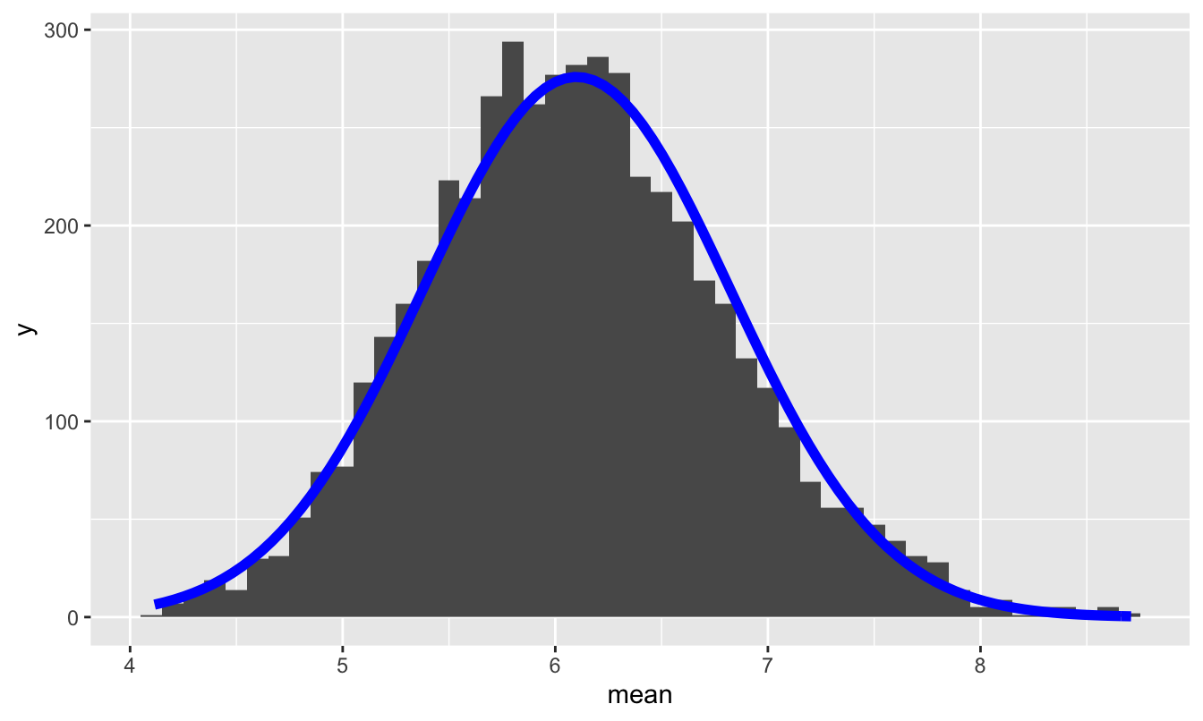
We’ve learned that the prediction of the Central Limit Theorem, together with de Moivre’s equation, is pretty good, even with just 60 samples from a very non-normal population.
Now what happens if we assume that a FedEx truck carries 300 packages? We can simulate this by changing the sample size in our simulation, as in the code block below:
# Monte Carlo simulation: 5000 samples of size n = 300
sim_n300 = do(5000)*mean(~weight, data=sample_n(fedex_sim, 300))
For this larger sample size de Moivre’s equation predicts that the standard error of the sample mean should be
\[ \mbox{std. err.} = \frac{\sigma}{\sqrt{N}} = \frac{5.6}{\sqrt{300}} \approx 0.32 \]
So let’s plot our simulated sampling distribution, together with the prediction from de Moivre’s equation of a \(N(6.1, 0.32)\) distribution. As you can see, the predicted normal distribution is near-exact fit to the true sampling distribution:
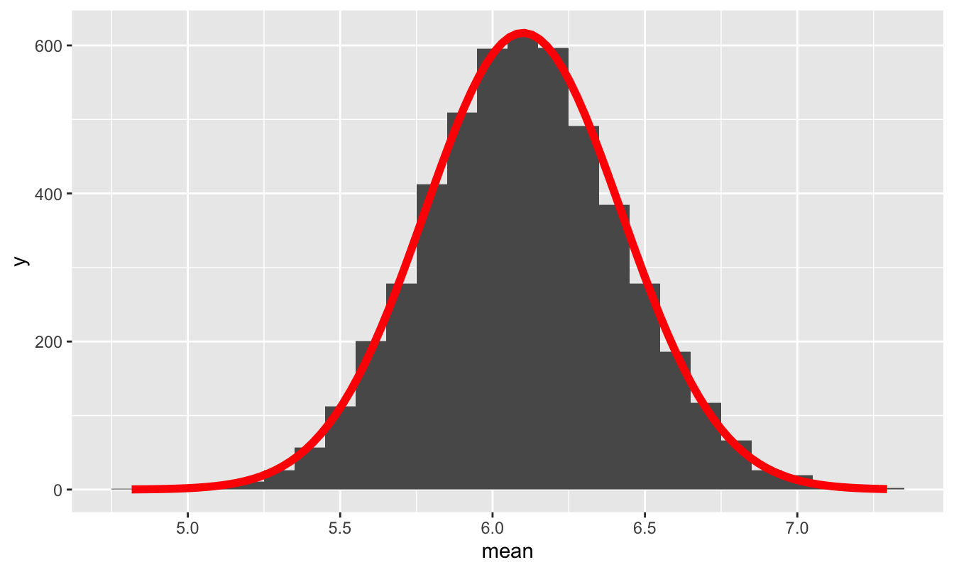
Figure 11.5: The sampling distribution of the mean package weight for a FedEx truck, assuming it carries 300 packages, together with the prediction from the Central Limit Theorem and de Moivre’s equation.
Below you can see these two sampling distributions plotted on the same scale, allowing you to appreciate their differences in shape.
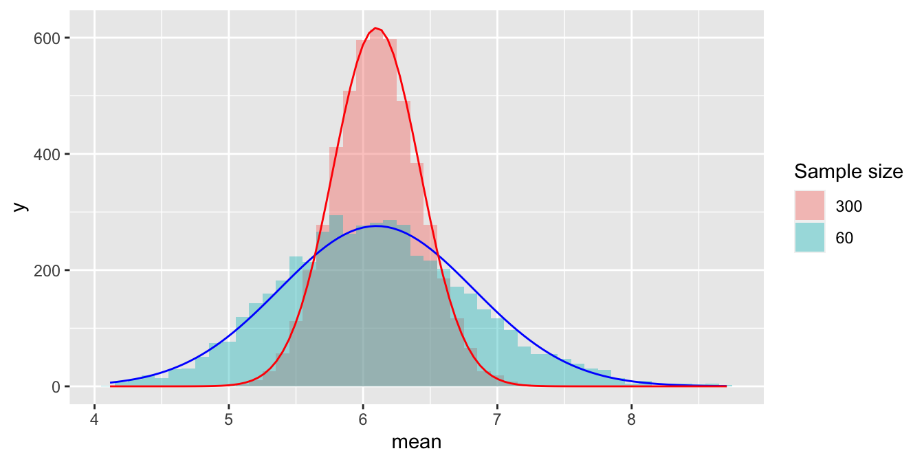
Since a sample of 300 has 5 times as much data as a sample of 60, de Moivre’s equation says that the red histogram should be narrower than the blue histogram by a factor of \(1/\sqrt{5} \approx 0.45\). Just eyeballing the figure, this looks about right.
Example 2: class GPA
In our second example, we’ll use the Central Limit Theorem to examine a question that I certainly think about from time to time: what kind of statistical fluctuations should we expect in the class GPA for a single section of a college statistics course?
To begin, I grabbed some data on students’ final grades from many, many sections of a course called STA 371 that I taught for a long time at the University of Texas. These grades are on traditional plus/minus letter-grade scale, which I then converted to GPA points, where an A is 4.0, an A- is 3.67, a B+ is 3.33, and so on. I also asked my colleagues for the grade distribution (although obviously not individual students’ grades) from their sections, and I summarized all this information into a single table. You can see the results in grade_distribution.csv, which looks like this:
| GPA | letter_grade | n |
|---|---|---|
| 4.00 | A | 901 |
| 3.67 | A- | 1127 |
| 3.33 | B+ | 532 |
| 3.00 | B | 469 |
| 2.67 | B- | 364 |
| 2.33 | C+ | 266 |
| 2.00 | C | 147 |
| 1.67 | C- | 42 |
| 1.33 | D+ | 35 |
| 1.00 | D | 28 |
| 0.67 | D- | 11 |
| 0.00 | F | 7 |
The column labeled n represents the total number of students who received that letter grade across all sections. We can think of this as a population distribution of GPA for all students who take the course. Here’s a bar graph of this distribution:
ggplot(grade_distribution) +
  geom_col(aes(x=factor(GPA), y = n)) +
  labs(x="Student GPA")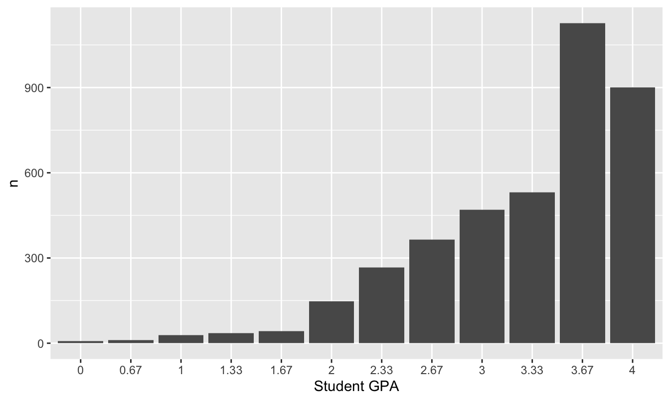
Figure 11.6: The distribution of student grades across many, many sections of a single college statistics course, where 4.0=A, 3.67=A-, etc.
This is obviously nothing like a normal distribution. It’s highly skewed, and it can only take on a discrete set of values. But as we’ll soon see—and as the Central Limit Theorem would predict—it turns out that the average GPA for an individual section of this course does look very close to normal.
To give us something to sample from, I simulated a hypothetical population of 5000 students from this grade distribution. You can find this simulated population in grade_population.csv. Go ahead and import this into RStudio. Here are the first six lines of the file, representing the first six students in our population:
head(grade_population)## GPA letter_grade
## 1 2.67 B-
## 2 3.00 B
## 3 2.00 C
## 4 3.67 A-
## 5 3.67 A-
## 6 3.67 A-We can compute an overall population GPA for this course by taking the average of the GPA column, like this:
mean(~GPA, data=grade_population)## [1] 3.296666As you can see, the overall GPA across lots and lots of sections is very close to 3.3, which is actually what our dean’s office “suggests” that we, as instructors of individual courses, aim for.
But what about the class GPA for a single section of, say, 45 students? Obviously it won’t be exactly 3.3, but how close can we expect it to be, assuming that students in a specific section are a random sample of all students? We can simulate a single section as follows, by randomly sampling 45 students from our entire “population”:
# Construct a random sample
single_section = sample_n(grade_population, size = 45)

# mean GPA for all 45 students in the simulated section
mean(~GPA, data=single_section)
## [1] 3.423333In this particular simulated section, the class GPA was close to, but not exactly equal to, the “population” GPA of 3.3.
So now let’s repeat this process 10000 times to get a sampling distribution for the class GPA in a section of 45:
gpa_sim = do(10000)*mean(~GPA, data = sample_n(grade_population, size = 45))Here’s a histogram of this sampling distribution:
ggplot(gpa_sim) +
  geom_histogram(aes(x=mean), binwidth=0.02)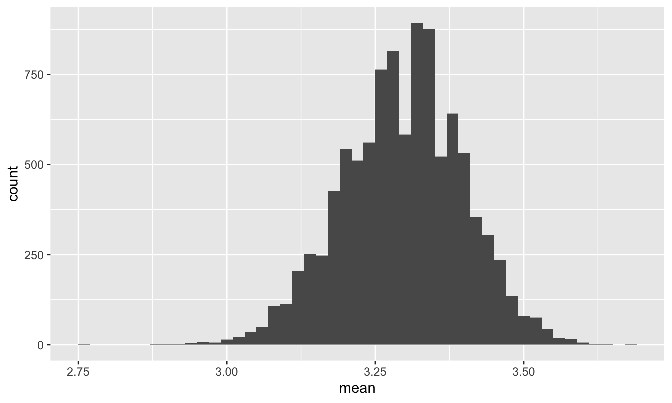
Figure 11.7: The sampling distribution of course GPA in a section of 45 students.
As the CLT would predict, this looks quite close to normal, despite the striking non-normality in Figure 11.6. Moreover, the population standard deviation is…
sd(~GPA, data=grade_population)## [1] 0.6868995about 0.687. Therefore, since our sample size is n=45, de Moivre’s equation predicts that the standard error of this sampling distribution should be:
\[ \mbox{std. err.} = \frac{\sigma}{\sqrt{N}} = \frac{0.687}{\sqrt{45}} \approx 0.1 \]
So let’s superimpose a normal distribution with mean 3.3 and standard deviation 0.1 on top of this histogram:
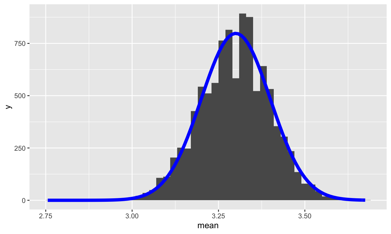
The prediction of the Central Limit Theorem, together with de Moivre’s equation, accords pretty closely with reality.
Take-home lesson. I was surprised when I put this example together and saw the sampling distribution in Figure 11.7 for the first time. It was wider than I (naively) expected. I don’t think this kind of “typical” variability from one section of a course to the next is widely appreciated by either faculty or students. Moreover, I think ignorance of this variability has some important practical consequences. For example, there are a few major teaching awards in my college for which faculty are eligible only if their course GPA is very close to 3.3—much closer than this sampling distribution would suggest is reasonable. For another thing, every faculty member who teaches big undergraduate classes has it ingrained in their minds what the “expected” GPA for their course is. But no one emphasizes to faculty how much natural variability to expect around this number. Heck, I’m a statistics professor and I didn’t know it until I actually ran the simulation!
Why does this matter? Well, when I look back over the years, I see that the course GPA’s in my own sections of this course are much more clustered around 3.3 than this distribution in Figure 11.7 predicts that they should be. And the only way this could happen is if we’re actually punishing the very best students! Here’s why: on a practical level, the way most faculty arrive at a target GPA is by setting the curve on students’ raw percentage grades in order to “curve them up” so that the course GPA comes close to 3.3. In some years the curve is more aggressive, in other years less so. But course GPA’s that are too tightly clustered around 3.3 are not just unwarranted, they’re actively damaging. For example, I must have had at least one or two abnormally good sections over the years, i.e. sections that probably “should” have had a GPA of maybe 3.4-3.5. These are sections drawn from the upper tail of Figure 11.7. But the students in these “better” sections didn’t get the grades they deserved: because I didn’t appreciate that they were in abnormally good sections, I curved their grades less than I should have, because I was aiming for something spuriously close to 3.3. (Of course, the opposite is also true; I must also have had some sections that probably “should” have had a course GPA of 3.1-3.2, and I curved their raw grades more than I should have.)
Anyway, when I saw Figure 11.7, I e-mailed the dean about it. I’m not sure if anything will come of it, but the exercise was certainly instructive for me—and, I hope, for you.
11.2 Confidence intervals for a mean
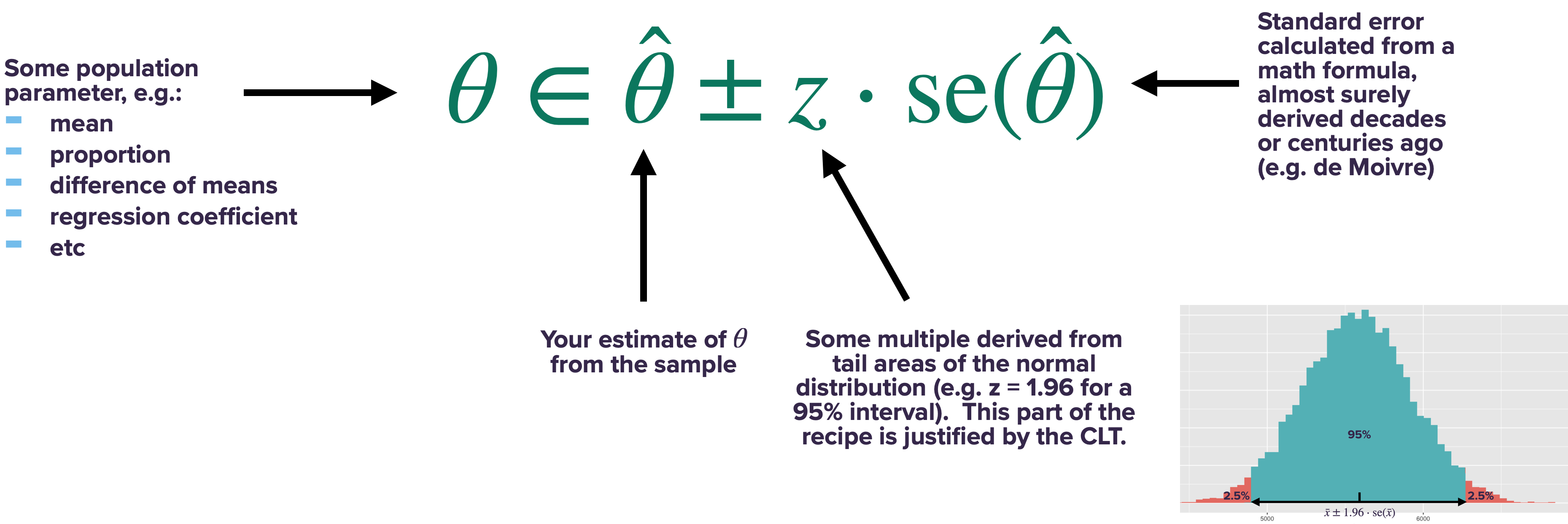
Let’s now turn to the main question we’re trying to answer in this lesson: how can we use the Central Limit Theorem, combined with de Moivre’s equation, to get confidence intervals without bootstrapping?
You might remember the “confidence interval rule of thumb” from our lesson on The bootstrap:
Confidence interval rule of thumb: a 95% confidence interval tends to be about two standard errors to either side of your best guess. A 68% confidence interval tends to be about one standard error to either side of your best guess.
These numbers of 68% and 95% actually come from the normal distribution (recall Figure 11.2), and the underlying justification for this rule of thumb is the Central Limit Theorem. The logic here, roughly, is as follows.
- The Central Limit Theorem says that statistical fluctuations in the sample mean \(\bar{X}_N\) can be described by a normal distribution, centered around the population mean \(\mu\).
- de Moivre’s equation tells us the standard deviation of that normal distribution: \(\sigma/\sqrt{n}\), where \(\sigma\) is the standard deviation of a single data point, and \(n\) is the sample size.
- A normally distributed random variable is within 2 standard deviations of its mean 95% of the time. Therefore, \(\bar{X}_N\) should be within 2 standard errors of \(\mu\) (the population mean) 95% of the time.
- Thus if we quote the confidence interval \(\bar{X}_N \pm 2 \cdot \sigma/\sqrt{n}\), we should capture \(\mu\) in our interval 95% of the time.
And that’s basically it—a couple centuries’ worth of math in a handful of bullet points. Or even more succinctly: just use de Moivre’s equation and quote \(\bar{X}_N \pm 2 \cdot \sigma/\sqrt{n}\) as your 95% confidence interval for the mean. The Central Limit implies that this confidence interval should be really close to the confidence interval you get from bootstrapping.
The caveat, of course, is that such a confidence interval characterizes only statistical uncertainty. It doesn’t have anything to say about non-statistical uncertainty, i.e. systematic biases in your measurement process. So if your sample is biased, then all bets are off regarding whether your confidence interval contains the true value. But this is true of pretty much any confidence interval, including those calculated by bootstrapping.
With that caveat in mind, let’s see some examples.
Example 1: sleep, revisited
For our first example, let’s revisit the NHANES_sleep data we saw in the lesson on bootstrapping. Please import this data set into RStudio, and then load the tidyverse and mosaic libraries:
library(tidyverse)
library(mosaic)
You’ll recall that, in our original analysis of this data, we looked at Americans’ average number of sleep hours per night, based on the following distribution of results from the NHANES survey:
ggplot(NHANES_sleep) +
  geom_histogram(aes(x = SleepHrsNight), binwidth=1)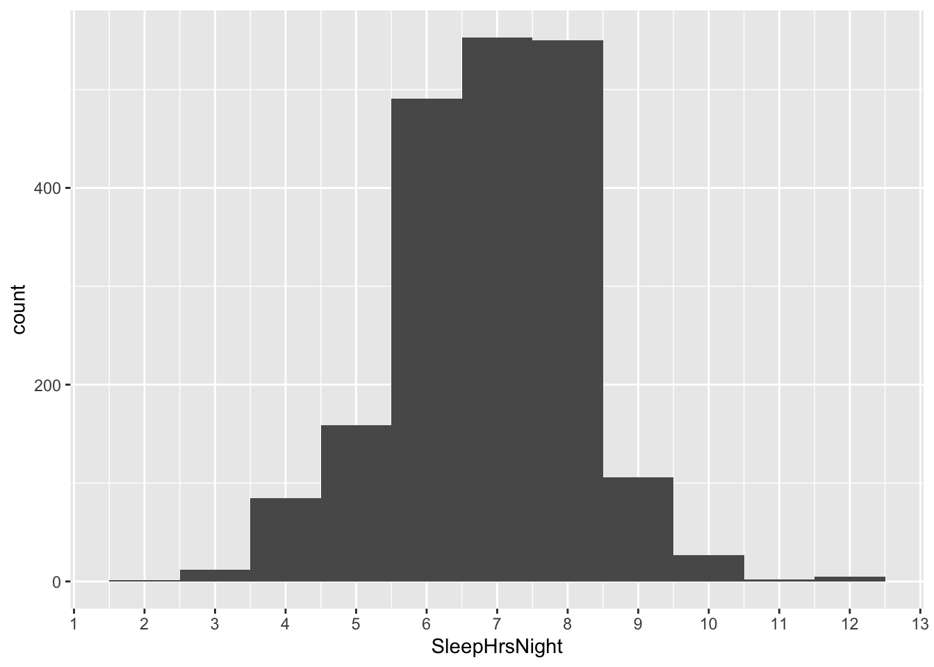
We took the mean of this data distribution, and we found that on average, Americans sleep 6.88 hours per night.
mean(~SleepHrsNight, data=NHANES_sleep)## [1] 6.878955Now let’s turn to the question of statistical uncertainty. How much should the sample mean of 1,991 people fluctuate around the true population mean?
de Moivre’s equation makes a specific mathematical prediction: it says that the standard error of the sample mean is equal to the standard deviation of a single measurement (\(\sigma\)), divided by the square root of the sample size. So as long as you know \(N\) and can calculate \(\sigma\) from the data, we can use de Moivre’s equation to quantify our statistical uncertainty, all without ever running the bootstrap—which, of course, de Moivre couldn’t feasibly do, since he sadly had never encountered a computer.
Let’s churn through the math. Our sample size \(N\) is…
nrow(NHANES_sleep)## [1] 1991…1,991 survey respondents. And we estimate that standard deviation \(\sigma\) of the SleepHrsNight variable is:
sd(~SleepHrsNight, data=NHANES_sleep)## [1] 1.317419… about 1.32 hours. Therefore de Moivre’s equation says that the standard error of our sample mean should be…
1.32/sqrt(1991)## [1] 0.02958273…about 0.0296 hours.
Remember, this number represents a specific mathematical prediction for the statistical uncertainty of the sample mean—that is, the typical error of the mean across many repeated samples. Let’s compare this prediction with the standard error we get when we bootstrap:
boot_sleep = do(10000)*mean(~SleepHrsNight, data=mosaic::resample(NHANES_sleep))

# calculate bootstrapped standard error
boot_sleep %>%
  summarize(std_err_sleep = sd(mean))
## std_err_sleep
## 1 0.02971529About 0.0295. Clearly the answer from de Moivre’s equation was really, really similar. In fact, here’s \(\pm\) 1 bootstrap standard error to either side of the sample mean, superimposed on the bootstrap sampling distribution:
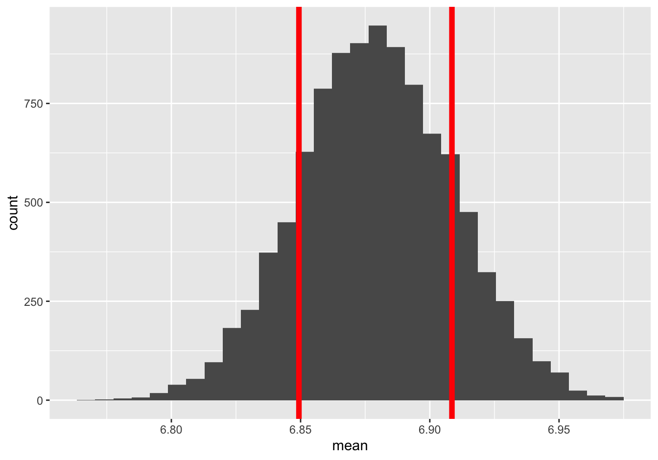
And here’s \(\pm\) 1 standard error calculated from de Moivre’s equation, superimposed on the same sampling distribution:
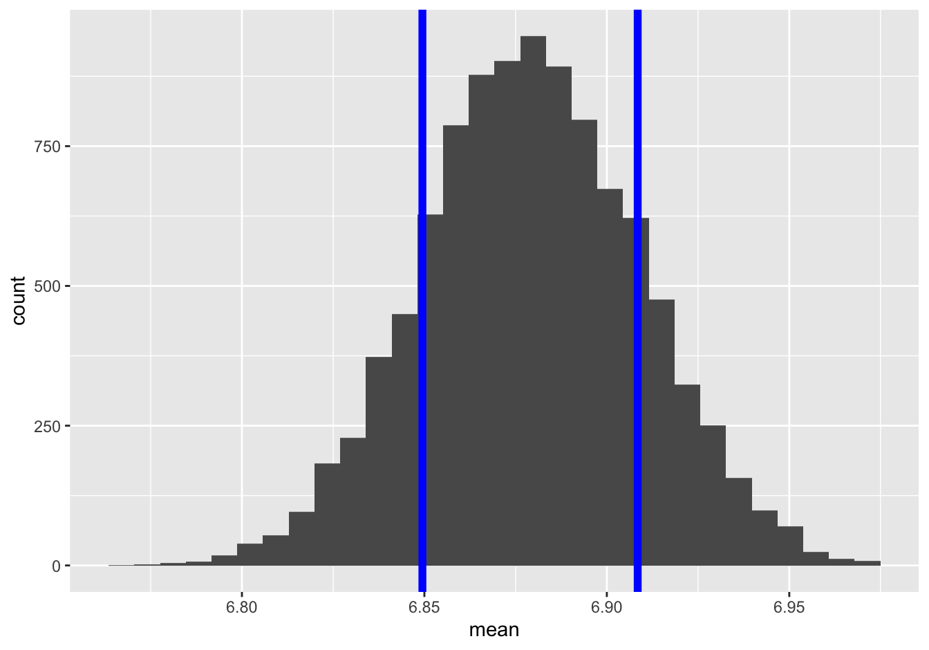
I don’t know about you but I definitely can’t tell the difference.
What about a 95% confidence interval? Let’s compare our bootstrapped confidence interval with what we get using de Moivre’s equation—that is, going out two “de Moivre” standard errors from the sample mean. Our bootstrapped confidence interval goes from about 6.82 to 6.94:
confint(boot_sleep, level = 0.95)## name lower upper level method estimate
## 1 mean 6.821195 6.93772 0.95 percentile 6.86439And if we go use de Moivre’s equation to go out two standard errors to either side of the sample mean of 6.88, we get a confidence interval of…
6.88 - 2 * 1.32/sqrt(1991)## [1] 6.8208356.88 + 2 * 1.32/sqrt(1991)## [1] 6.939165… also 6.82 to 6.94. Voila—a confidence interval that’s basically identical to what you get when you bootstrap, except using math rather than computational muscle.
Finally, let’s remember our caveat: this confidence interval characterizes only statistical uncertainty. But in this case, since the NHANES study consists of a representative sample of all Americans, any biases in our measurement process are likely to be small. It seems reasonable to assume that statistical uncertainty is what matters most here.
t.test shortcut
In this particular case, it is both trivial and fast to compute a bootstrapped confidence interval. However, I hope you think it’s at least somewhat cool that de Moivre could have used his equation back in 1730 to tell you what bootstrap confidence interval you could expect to get 300 years later, with your fancy modern computer.
However, it’s also a little bit tedious to have to do these calculations “by hand,” i.e. treating R as a calculator and manually type out the formula for de Moivre’s equation, like this:
6.88 - 2 * 1.32/sqrt(1991)## [1] 6.8208356.88 + 2 * 1.32/sqrt(1991)## [1] 6.939165Luckily, there’s a shortcut, using a built-in R command called t.test. It works basically just like mean, as follows:
t.test(~SleepHrsNight, data=NHANES_sleep)##
## One Sample t-test
##
## data: SleepHrsNight
## t = 232.99, df = 1990, p-value < 2.2e-16
## alternative hypothesis: true mean is not equal to 0
## 95 percent confidence interval:
## 6.821052 6.936858
## sample estimates:
## mean of x
## 6.878955This command prints out a bunch of extraneous information to the console. You can safely ignore just about everything for now, except the part labeled “95% confidence interval,” which is indeed the interval calculated using de Moivre’s equation.
Summary: inference for a mean. If you want to get a 95% confidence interval for a mean without bootstrapping, use t.test, and ignore everything in the output except for the part that says “confidence interval.” This is, in fact, the shortcut that most people use. And now you understand the first row of Table 11.1. This is often called the “t interval” for a mean.
Minor technical point. You might ask: why is the confidence interval calculated via t.test really similar, but not exactly identical, to the confidence interval we calculated by hand by going out 2 standard errors from the sample mean? Here those two intervals are, out to 4 decimal places:
- 2 standard errors by hand: (6.8208, 6.9392)
- using
t.test: (6.8211, 6.9369)
These two intervals are slightly different because going out 2 standard errors is just a rule of thumb that’s easy to remember. It gives you something really close, but not exactly identical, to a 95% confidence interval based on the Central Limit Theorem. For a normal distribution, the exact number is closer to 1.96 (see Figure 11.2). So instead of the rule of thumb based on 2 standard errors, t.test is using an exact figure, and is a bit narrower as a result.
In fact, t.test is being even a little bit more clever. It uses a number that’s always pretty close to 2 but that depends on the sample size. For example, if you had only 10 samples, t.test would calculate a confidence interval by going out 2.26 standard errors from the sample mean. If you had 30 samples, it would go out 2.04 standard errors. Only if you had thousands of samples of more would it actually use 1.96, which is the mathematically “correct” number for a normal distribution.
Is there any rhyme or reason to these numbers? Yes, there is—but the reasoning is very complicated. It’s based on something called the t distribution (hence the “t interval” and the function t.test in R). There’s a huge amount of detail here, but the short version is this:
- de Moivre’s equation and the Central Limit Theorem assume that the population standard deviation \(\sigma\) is known.
- But \(\sigma\) is almost never known. We have to estimate it using the data—and this estimate, like all estimates, is subject to error.
- When we use an estimate of \(\sigma\) rather than the true \(\sigma\) in de Moivre’s equation, it introduces extra uncertainty in our calculation.
- The t distribution is like a version of the normal distribution that accounts in a precise mathematical way for this extra uncertainty.
Lots of introductory statistics courses spend a whole lot of time on these details. In these lessons, we’re basically going to ignore them; in my opinion, they’re just not that important until you reach a much more advanced level in your statistics education. It’s enough to understand that t.test is basically just computing a confidence interval based on the Central Limit Theorem and de Moivre’s equation, with a minor correction that widens the confidence intervals to account for small sample sizes. It’s not important that you understand the precise details of how that “minor correction” is actually calculated.
Example 2: cheese
Let’s see a second example, using the data on weekly cheese sales across 68 weeks at 11 different Kroger grocery stores that we examined back in the lesson on Plots.
We’ll start by filtering down this data set to consider only sales for the Dallas store:
kroger_dfw = filter(kroger, city == 'Dallas')Here’s a quick histogram of the data distribution for the vol variable, representing weekly sales of American cheese:
ggplot(kroger_dfw) +
  geom_histogram(aes(x=vol))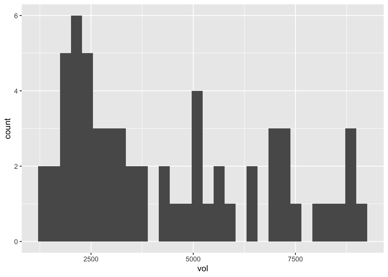
This clearly isn’t normally distributed, but having seen the examples of the previous section, that shouldn’t faze us a bit in applying de Moivre’s equation.
Let’s calculate the mean weekly sales volume for the Dallas store across these 61 weeks, which we can think of as a good approximation to the long-run average of this store’s “true” sales level. This sample mean is…
# mean for the sample...
mean(~vol, data=kroger_dfw)
## [1] 4356.508… about 4356 packages of cheese per week.
But what about statistical uncertainty? Weekly sales of pretty much any consumer good are an inherently variable thing, even such a staple product as American cheese. Maybe a couple weeks were a bit colder than average, depressing demand for patio fare like nachos. Or maybe the Dallas area had a big power outage one week, implying that nobody could microwave any cheese. These things happen. And what if this particular store had a weekly target of 4500 packages? Does this data set imply that they’re really, truly under-performing their target, or might they have been the victim of some unlucky weekly fluctuations?
With these statistical fluctuations in mind, let’s use de Moivre’s equation to calculate the standard error of this sample mean. Our sample size is…
nrow(kroger_dfw)## [1] 61…61 weeks. And our sample standard deviation is…
sd(~vol, data=kroger_dfw)## [1] 2353.645… about 2354. So de Moivre’s equation says is that our standard error is \(\sigma/\sqrt{n}\), or:
2353.645/sqrt(61)## [1] 301.3534…about 300 packages of cheese. Let’s compare this with our bootstrapped standard error, which is…
boot_cheese = do(10000)*mean(~vol, data=mosaic::resample(kroger_dfw))

# calculate bootstrapped standard error
boot_cheese %>%
  summarize(std_err_vol = sd(mean))
## std_err_vol
## 1 300.1206… about 300. Again, that’s nearly identical to the answer from de Moivre’s equation. For reference, here’s \(\pm\) 1 bootstrap standard error to either side of the sample mean, superimposed on the sampling distribution:
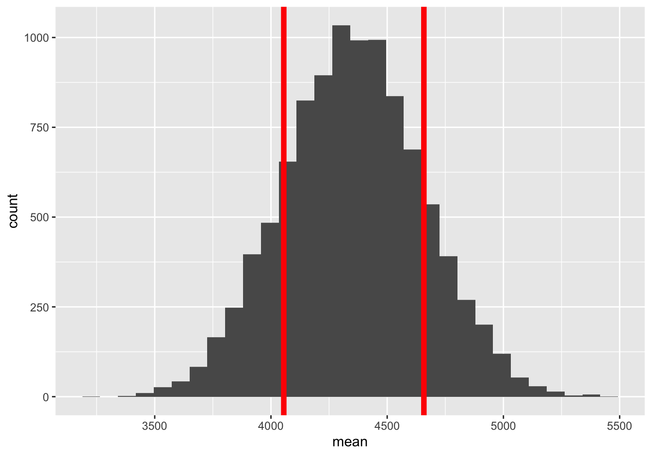
And here’s \(\pm\) 1 standard error calculated from de Moivre’s equation, superimposed on the same sampling distribution:
Again, pretty hard to tell apart. No matter which standard error we use, it’s totally plausible that the real long run average sales figure for this store exceeds its hypothetical target of 4500 weekly units, and that the low sample mean just reflects natural variation. This is a good example of where our statistical uncertainty comes not from sampling (like in a political poll), but rather from the intrinsic variability of some phenomenon—in this case, the economic and culinary phenomenon of how much cheese the people of Dallas happen to want to buy in any given week.
What about a 95% confidence interval for the long-run average of this store’s sales? Let’s compare our bootstrapped confidence interval with what we get using de Moivre’s equation by going out “de Moivre” standard errors from the sample mean. Our bootstrapped confidence interval is…
confint(boot_cheese, level = 0.95)## name lower upper level method estimate
## 1 mean 3775.129 4943.099 0.95 percentile 4093.033… about 3780 to 4950. And if we go use de Moivre’s equation to go out two standard errors (that is, 2 times \(2353.645/\sqrt{61}\)) to either side of the sample mean of 4356.5, we get a confidence interval of…
4356.5 - 2 * 2353.645/sqrt(61)## [1] 3753.7934356.5 + 2 * 2353.645/sqrt(61)## [1] 4959.207… about 3750 to 4960. As with the previous example, our bootstrap confidence interval and our CLT-based confidence interval are very similar. Moreover, the differences between the two confidence intervals are much smaller (on the order of 10 packets of cheese) than than the statistical uncertainty associated with the sample mean itself (on the order of 1000 packets of cheese). It basically doesn’t matter which one you use.
Finally, also remember that we can use t.test to compute this latter CLT-based confidence interval (a.k.a. “t-interval”), without taking the trouble to plug in numbers to de Moivre’s equation ourselves:
t.test(~vol, data=kroger_dfw)##
## One Sample t-test
##
## data: vol
## t = 14.456, df = 60, p-value < 2.2e-16
## alternative hypothesis: true mean is not equal to 0
## 95 percent confidence interval:
## 3753.712 4959.305
## sample estimates:
## mean of x
## 4356.508Abraham de Moivre presumably never encountered American cheese. I like to think that, being Swiss, he would have appreciated its similarity, at least in nacho-cheese form, to fondue. (Although being French-Swiss, he might instead have found it bizarre). Either way, his equation is pretty good for describing statistical fluctuations in American cheese sales.
11.3 Beyond de Moivre’s equation
The basic recipe of large-sample inference
In the previous section on the Central Limit Theorem, we focused exclusively on the sample mean. We learned that, for large enough samples, the statistical fluctuations in the sample mean can be described by a normal distribution whose width is known quite precisely, via de Moivre’s equation.
It turns out that the sample mean isn’t special: many other common data summaries also have approximately normal sampling distributions, regardless of whether the underlying population itself looks normal. The upshot is that we can make approximate probability statements about most common estimators using the normal distribution, using the same basic logic from the section on confidence intervals for a mean. This includes means, medians, proportions, differences of means, differences of proportions, standard deviations, correlations, regression coefficients, quantiles… it’s quite a long list! These estimators are all said to be asymptotically normal, assuming your data consists a random sample from some underlying population.
For any asymptotically normal estimator \(\hat{\theta}\), we can calculate a confidence interval using the same basic approach:
- Calculate the sample estimate \(\hat{\theta}\).
- Calculate the standard error of your estimate, \(\mbox{se}(\hat{\theta})\), from the appropriate formula (like de Moivre’s equation).
- Form the confidence interval like this:
In fact, the only thing that changes from one summary statistic to another is the formula for the standard error. For a sample mean, we calculate the standard error using de Moivre’s equation: \(\mbox{se}(\bar{X}_N) = \sigma/\sqrt{n}\). For any statistic other than the sample mean, we simply require a different formula for the standard error. Luckily, over the last couple of centuries, many of these “de-Moivre-like” formulas have been worked out for a huge range of situations, and they’re programmed into every common statistical software package (including R).
I’ll issue a pre-emptive warning here: the details of these formulas can get a little tedious! In practice, this traditional way of doing statistical inference involves a lot of time spent looking up these formulas, and a lot of “plug and chug,” where you plug numbers into a formula and then just do the darn arithmetic. (If you took AP Statistics in high school, this likely describes your experience for much of the course.) I’ll quote a few of these formulas briefly below, just to give you a sense for what they’re like—but there’s no need to memorize them. Then we’ll go through several examples that illustrate how these formulas compare with bootstrapped standard errors. (Spoiler alert: they give nearly identical results.) My advice is to not focus on the micro-details of the formulas. Instead, focus on how this basic three-step recipe is applied each time.
Sample mean
Suppose we collect a random sample of data points \(x_1, \ldots, x_N\) from some wider population with mean \(\mu\), and we calculate their sample mean \(\bar{x}\). The standard error of this sample mean is:
\[ \mathrm{se}(\bar{x}) = \frac{\sigma}{\sqrt{N}} \]
where \(N\) is the sample size and \(\sigma\) is the standard deviation, typically estimated by taking the sample standard deviation of \(x_1, \ldots, x_N\). This is de Moivre’s equation, as we’ve already covered.
Sample proportion
Suppose we collect observe a sample of \(N\) independent “yes-or-no” outcomes, all with common but unknown probability \(p\) of being “yes.” We let \(\hat{p}\) denote the proportion of “yes” outcomes in our sample. The standard error of this sample proportion is:
\[ \mathrm{se}(\hat{p}) = \sqrt{\frac{\hat{p} \cdot (1-\hat{p})}{N}} \]
The Pythagorean theorem
Suppose we collect independent random samples from two groups, and that we calculate the same summary statistic in each group, denoted \(\hat{\theta}_1\) and \(\hat{\theta}_2\), respectively. We are interested in the difference between the two groups, \(\hat{\theta}_1 - \hat{\theta}_2\). The standard error of this difference can be calculated using the Pythagorean Theorem for standard errors:
\[ \left[ \mathrm{se}(\hat{\theta}_1 - \hat{\theta}_2) \right]^2 = \left[ \mathrm{se}(\hat{\theta}_1) \right]^2 + \left[ \mathrm{se}(\hat{\theta}_2) \right]^2 \]
Intuitively, it’s like \(\mathrm{se}(\hat{\theta}_1 - \hat{\theta}_2)\) is the hypotenuse of a right triangle, while \(\mathrm{se}(\hat{\theta}_1)\) and \(\mathrm{se}(\hat{\theta}_2)\) are the two legs of that triangle. If you have that picture in your head, then it makes sense to use the Pythagorean theorem to calculate the “length of the hypotenuse,” i.e. the standard error of the differences between the two groups.43 For example:
difference of means, \(\bar{x}_1 - \bar{x}_2\). According to the Pythagorean Theorem for standard errors, the standard error of this difference is:
\[ \mathrm{se}(\bar{x}_1 - \bar{x}_2) = \sqrt{\frac{\sigma_1^2}{N_1} + \frac{\sigma^2_2}{N_2}} \]difference of proportions, \(\hat{p}_1 - \hat{p}_2\). According to the Pythagorean Theorem for standard errors, the standard error of this difference is:
\[ \mathrm{se}(\hat{p}_1 - \hat{p}_2) = \sqrt{\frac{\hat{p_1} \cdot (1 - \hat{p_1})}{N_1} + \frac{\hat{p_2} \cdot (1 - \hat{p_2})}{N_2}} \]
Example 1: sample proportion
Let’s now see some examples of these formulas in action.
First, please download and import the data in beer.csv, which contains a sample of beers (and ciders) available for purchase in Texas. The first six lines of the file look like this:
head(beer)## item ped IPA
## 1 WOODCHUCK GUMPTION 6PK -1.63 FALSE
## 2 BUD 12PK CAN -1.20 FALSE
## 3 NO-LI BORN AND RAISED IPA 22 -2.59 TRUE
## 4 BALLAST PT SCULPIN 22 -1.34 FALSE
## 5 BALLAST PT EVEN KEEL IPA 6PK -3.06 TRUE
## 6 WIDMER HEFEWEIZEN 6PK -1.62 FALSEHere we’ll focus on the IPA column, which indicates whether a beer is a particular style called an India Pale Ale. Our question is simple: what proportion of unique beers available for sale in Texas are IPA’s?
prop(~IPA, data=beer)## prop_TRUE
## 0.2063953A little over 20%. What about a confidence interval? Let’s follow the three steps outlined in “The basic recipe of large-sample inference.”
Step 1: summary statistics. The sample proportion of IPA’s is \(\hat{p} = 0.206\), based on a sample of size N=344.
Step 2: standard error. Our standard error formula for a proportion is:
\[ \mathrm{se}(\hat{p}) = \sqrt{\frac{\hat{p} \cdot (1 - \hat{p})}{N}} = \sqrt{\frac{0.206 \cdot (1 - 0.206)}{344}} = 0.022 \]
Step 3: confidence interval. For a confidence interval of 95%, we go out two standard errors from our sample estimate of 0.206. Therefore our 95% confidence interval is:
\[ \begin{aligned} &\phantom{\approx} 0.206 \pm 2 \cdot 0.022 \\ &\approx (0.16, \, 0.25) \end{aligned} \]
Our conclusion is that between 16% and 25% of unique beers on the wider market in Texas are IPA’s.
Let’s compare this with a bootstrapped confidence interval, which we can calculate easily using the following code block:
boot_IPAprop = do(10000)*prop(~IPA, data=mosaic::resample(beer))
confint(boot_IPAprop)
## name lower upper level method estimate
## 1 prop_TRUE 0.1627907 0.25 0.95 percentile 0.1889535This is nearly identical to what we get using the Central Limit Theorem.
prop.test shortcut
There’s also a handy shortcut to get a large-sample confidence interval for a proportion, using R’s built-in prop.test function. It works just like prop, mean, and t.test. Again, you can safely ignore everything except the part labeled “confidence interval”:
prop.test(~IPA, data=beer)##
## 1-sample proportions test with continuity correction
##
## data: beer$IPA [with success = TRUE]
## X-squared = 117.44, df = 1, p-value < 2.2e-16
## alternative hypothesis: true p is not equal to 0.5
## 95 percent confidence interval:
## 0.1656553 0.2538389
## sample estimates:
## p
## 0.2063953This avoids having to do any tedious standard-error calculations by hand.
Example 2: difference of means
Let’s now focus on the column labeled ped, which stands for price elasticity of demand. This represents consumer price sensitivity for each beer in the sample. We’ll compare price elasticity for IPA’s versus non-IPA’s:
ggplot(beer) +
  geom_boxplot(aes(x=IPA, y=ped))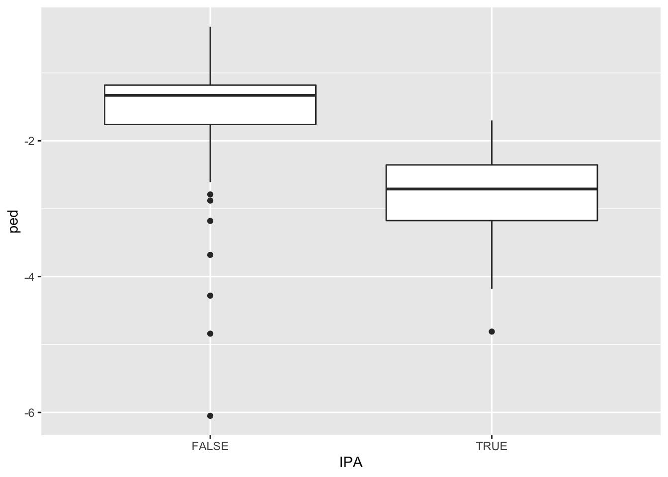
It looks like IPA’s have considerably more negative price elasticities, on average, implying great consumer price sensitivity for IPA’s than non-IPA’s. We can calculate the average value of ped in each group as follows:
mean(ped ~ IPA, data=beer)## FALSE TRUE
## -1.485055 -2.792113One possible explanation for this difference is that consumers consider IPA’s to be highly substitutable for one another. So if one particular IPA seems expensive, consumers just buy a different one.
Let’s get a confidence interval for the difference between these two means, applying our three-step recipe. Here we’ll need to use both de Moivre’s equation as well as the “Pythagorean theorem” for the difference in sample means between two groups.
Step 1: summary statistics. To apply the correct formulas, we need the sample mean, sample standard deviation, and sample size in each group. We’ll get this via group/pipe/summarize:
beer %>%
  group_by(IPA) %>%
  summarize(xbar = mean(ped),
            sigma = sd(ped),
            n = n())
## # A tibble: 2 × 4
## IPA xbar sigma n
## <lgl> <dbl> <dbl> <int>
## 1 FALSE -1.49 0.606 273
## 2 TRUE -2.79 0.623 71We can also get R to calculate the difference between the two means, which is about 1.31% (i.e. more negative elasticity for IPA’s):
diffmean(ped ~ IPA, data=beer)## diffmean
## -1.307058Step 2: standard error. Our formula for the standard error of the difference between two sample means \(\bar{x}_1\) and \(\bar{x}_2\) is:
\[ \mathrm{se}(\bar{x}_1 - \bar{x}_2) = \sqrt{\frac{\sigma_1^2}{N_1} + \frac{\sigma^2_2}{N_2}} = \sqrt{\frac{0.606^2}{273} + \frac{0.623^2}{71}} = 0.082 \]
Step 3: confidence interval. For a 95% interval, we go out standard errors from our difference in sample means, which is 1.31:
\[ \begin{aligned} &\phantom{\approx} 1.31 \pm 2 \cdot 0.082 \\ &\approx (1.15, \, 1.47) \end{aligned} \]
So there you have it. What a slog. This kind of “by-hand” calculation gets so tedious so quickly that I almost never bother—but I do want to show you the details for these examples so you see what’s going on “under the hood.” It’s the kind of thing that makes you sympathize with those scientists in years past who lacked computers and had to do everything by hand.
But since I do have a computer, I typically just use t.test, which applies the correct formulas automatically to calculate a large-sample confidence interval for the difference of two means:
t.test(ped ~ IPA, data=beer)##
## Welch Two Sample t-test
##
## data: ped by IPA
## t = 15.827, df = 106.98, p-value < 2.2e-16
## alternative hypothesis: true difference in means between group FALSE and group TRUE is not equal to 0
## 95 percent confidence interval:
## 1.143341 1.470774
## sample estimates:
## mean in group FALSE mean in group TRUE
## -1.485055 -2.792113The output labeled “95% confidence interval” goes from 1.14 to 1.47, just like our “by hand” calculation. This interval represents our statistical uncertainty about the difference in average elasticity for IPA’s versus non-IPA’s. This confidence interval doesn’t contain zero, so we have a statistically significant difference in elasticity: it appears IPA-beer consumers are more price-sensitive than non-IPA beer consumers.
You may notice that t.test quotes a p-value. This p-value is calculated under the null hypothesis that the true difference in ped for IPA’s and non-IPA’s were zero. The fact that this p-value is tiny means we’re very confident of a non-zero difference in elasticity between the two groups.
We can compare our large-sample confidence interval to what we get when we bootstrap the difference in means:
boot_IPA_ped = do(10000)*diffmean(ped ~ IPA, data=mosaic::resample(beer))
confint(boot_IPA_ped, level=0.95)
## name lower upper level method estimate
## 1 diffmean -1.472852 -1.14667 0.95 percentile -1.345383Other than the difference in sign, this confidence interval is basically identical to the large-sample confidence interval calculated using t.test. (The difference in sign arises because t.test calculates the IPA mean minus the non-IPA mean, whereas our bootstrapped confidence interval is for the non-IPA mean minus the IPA mean.)
Example 3: difference of proportions
For our third example, we’ll consider the case of a difference in proportions between two groups. Please download and import the data set in recid.csv. This contains data on the recividism status for a random sample of 432 prisoners released from Maryland state prisons:
head(recid)## arrest highschool fin emp1
## 1 1 no no no
## 2 1 no no no
## 3 1 no no no
## 4 0 yes yes no
## 5 0 no no no
## 6 0 no no noThe arrest column indicates whether someone was re-arrested within 52 weeks after their release from prison. We’ll compare recidivism rates stratified by the emp1 variable, which indicates whether someone was employed within 1 week after their release:
prop(arrest ~ emp1, data=recid, success=0)## prop_0.no prop_0.yes
## 0.7231183 0.8166667By adding success = 0 as an optional flag, we’re telling prop which outcome corresponds to a “success” (1 = arrest, or 0 = no arrest). We choose success=0 because it would be odd to interpret re-arrest as a “success.” So here, it looks like 81.7% of those who were employed within a week of release avoided re-arrest, versus 72.3% for those who weren’t.
To get a confidence interval for the population-wide difference in proportions, let’s use prop.test, which applies the appropriate standard-error formulas:
prop.test(arrest ~ emp1, data=recid, success=0)##
## 2-sample test for equality of proportions with continuity correction
##
## data: tally(arrest ~ emp1)
## X-squared = 1.871, df = 1, p-value = 0.1714
## alternative hypothesis: two.sided
## 95 percent confidence interval:
## -0.21117680 0.02408002
## sample estimates:
## prop 1 prop 2
## 0.7231183 0.8166667This tells us that the 95% confidence interval for the difference in re-arrest rates was somewhere between -21.1% and +2.4%. So there’s a large amount of uncertainty here. prop.test also provides a p-value under the null hypothesis that the true difference in proportions is 0. This p-value is 0.1714, indicating that the difference is not statistically significant at any commonly accepted level (e.g. 0.05).
Let’s compare our large-sample confidence interval with a bootstrapped confidence interval:
boot_recid = do(10000)*diffprop(arrest ~ emp1, data=mosaic::resample(recid))
confint(boot_recid)
## name lower upper level method estimate
## 1 diffprop -0.197808 0.01970262 0.95 percentile -0.1762621This isn’t identical to our large-sample confidence interval from prop.test, but it’s very similar: about -20% to about +2%. Both confidence intervals are telling us basically the same thing: recidivism is probably lower among released prisoners who get jobs quickly, but there’s a lot of uncertainty about how much lower.
This, incidentally, provides another example of the difference between statistical and practical significance. The difference between recidivism rates in the two groups here is not statistically significant at the 5% level. But that doesn’t prove that there’s no difference! Here, it just means the sample size is too small to rule out statistical fluctuations (particularly among prisoners who did find work within a week of release, of whom there are only 60).
It’s worth re-iterating a lesson we learned in our discussion of Statistical vs. practical significance, back when we learned about the bootstrap:
Confidence intervals are almost always more useful than claims about statistical significance. My advice to you is to entertain the full range of values encompassed by the confidence interval, rather than jumping straight to the needlessly binary question of whether that confidence interval contains zero.
Think of it this way. Can the data rule out a 0% difference in overall recividism rates between the employed and non-employed groups? No. But can the data rule out, for example, an 18% difference? Also no—and 18% would be a really large difference, in practical terms. (If a program to get released prisoners into work quickly reduced recidivism by 18%, that would be an incredible policy triumph and a major win for society.) So here, we have an effect that is not statistically significant, but that might actually be quite large. Of course, it might also be small, or zero, or even negative (which admittedly seems implausible, at least to me). We’re just not sure, in light of the data. We probably need a bigger study.
Example 4: regression model
For our last example, let’s return to the data in heartrate.csv. We looked at this data in our unit on Fitting equations, when we looked at the relationship between someone’s maximum heart rate and their age:
ggplot(heartrate) +
  geom_point(aes(x=age, y=hrmax))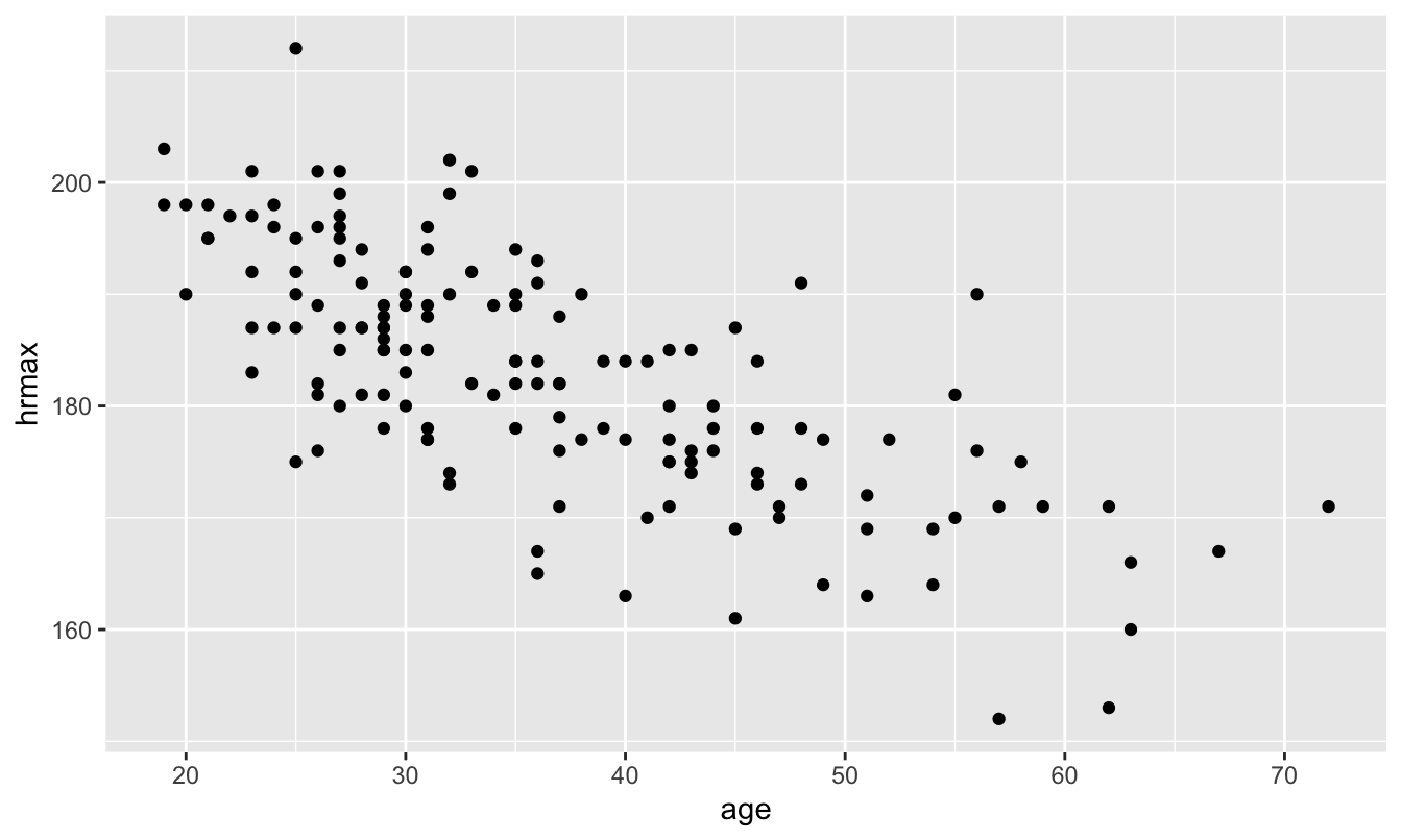
We then used regression to learn that, on average, maximum heart rate declines about 0.7 beats per minute with each additional year of age:
lm_heart = lm(hrmax ~ age, data=heartrate)
coef(lm_heart)
## (Intercept) age
## 207.9306683 -0.6878927In R, it’s incredibly simple to get a confidence interval for regression coefficients based on the Central Limit Theorem: just call confint on your fitted model object, like this!44
confint(lm_heart)## 2.5 % 97.5 %
## (Intercept) 203.824290 212.0370467
## age -0.795802 -0.5799834So our 95% large-sample confidence interval for the slope on age is about (-0.80, -0.58). Let’s compare this with a bootstrap confidence interval:
boot_hr = do(10000)*lm(hrmax ~ age, data=mosaic::resample(heartrate))
confint(boot_hr)
## name lower upper level method estimate
## 1 Intercept 203.9333136 212.2295863 0.95 percentile 205.0399657
## 2 age -0.8064830 -0.5795911 0.95 percentile -0.6086706
## 3 sigma 6.5835051 8.3599125 0.95 percentile 7.6625312
## 4 r.squared 0.4083306 0.6171445 0.95 percentile 0.4806727
## 5 F 102.8298313 240.1807661 0.95 percentile 137.9096246If you inspect the row labeled age, you’ll see that our bootstrap confidence interval for this coefficient is incredibly close to our large-sample confidence interval: roughly (-0.81, -0.58).
And now, finally, we’re in a position to revisit this figure from our original lesson on Fitting equations, where we introduced geom_smooth:
ggplot(heartrate) +
  geom_point(aes(x=age, y=hrmax)) +
  geom_smooth(aes(x=age, y=hrmax), method='lm')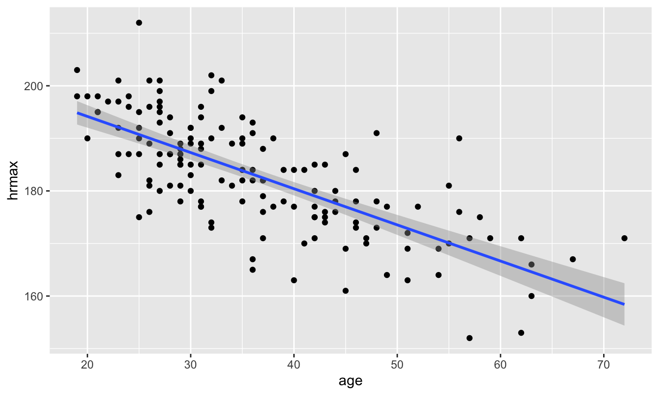
Notice those darker grey bands around the blue trend line? Those represent a large-sample confidence interval for the regression line, based on the Central Limit Theorem. With 95% confidence, we think that the true regression line falls somewhere inside those grey bands.
Summary
We’ve now covered every row of Table 11.1. Let’s summarize what we’ve learned:
- Most common statistical summaries (means, proportions, regression coefficients, etc) have sampling distributions that look approximately normal for large enough samples.
- This is a consequence of a deeper principle called the Central Limit Theorem.
- We can use the Central Limit Theorem to calculate “large-sample” confidence intervals for these summaries. We expect these confidence intervals to be pretty accurate unless the sample size is very small.
- This whole approach requires some fairly tedious math, to calculate the standard error of the sampling distribution for a specific kind of estimator.
- Luckily R has built-in routines for computing large-sample confidence intervals that do the tedious math for you.
- In nearly every case, the large-sample confidence interval calculated using R’s built-in routines looks very similar to the corresponding confidence interval calculated via bootstrapping.
Here’s a table that covers these built-in R functions, together with their bootstrapping equivalents. In the table, y refers to an outcome variable, group to some grouping factor (like IPA’s vs. non-IPA’s), and x refers to a predictor variable in a regression model.
| Situation | Built-in R function | Bootstrapping equivalent |
|---|---|---|
| Estimating a mean | t.test(~y, data=D) |
do(10000)*mean(~y, data=resample(D)) |
| Estimating a proportion | prop.test(~y, data=D) |
do(10000)*prop(~y, data=resample(D)) |
| Comparing two means | t.test(y~group, data=D) |
do(10000)*mean(y~group, data=resample(D)) |
| Comparing two proportions | prop.test(y~group, data=D) |
do(10000)*prop(y~group, data=resample(D)) |
| Regression model | lm(y~x, data=D), then confint |
do(10000)*lm(y~x, data=resample(D)) |
For those that know this math, I’m thinking of, for example, the proof of the Central Limit Theorem involving characteristic functions, or the proof of the asymptotic normality of the OLS estimator.↩︎
To be clear, this is not the same thing as de Moivre’s formula for complex exponentials.↩︎
OK, not entirely regardless. It is easy for mathematicians to find counterexamples, because that’s what mathematicians do. A more accurate statement is that the “basic” Central Limit Theorem holds whenever your population distribution has a finite mean and variance. This covers the vast majority of all common data-science situations.↩︎
You might ask, why doesn’t FedEx just weigh each truck and fuel it accordingly? Someone actually asked this question in the conference presentation I attended. The answer was, basically, that time costs more than fuel. Can you imagine how long it would take to line up every FedEx truck and weigh it as it leaves the warehouse? It’s far better, time-wise, to have a rule of thumb that covers expected statistical fluctuations in package weight.↩︎
In 2020 FedEx claimed a fleet of 78,000 trucks. Texas represents about 9% of the US population, and so probably about 9% of the FedEx trucks. That’s about 7000 trucks. But probably not all are driving on any given day, so I’m using 5000 as a round, ballpark figure.↩︎
This analogy can be made precise using probability theory, but that’s beyond the scope of these lessons.↩︎
You may notice that I never even gave you the formulas for the standard error of regression coefficients. You can look it up here if you really want to!↩︎