Lesson 7 Fitting equations
In data science, the term “regression” means, roughly, “fitting an equation to describe relationships in data.” This is a huge topic, and we’ll cover it across multiple lessons. This lesson is about the most basic kind of equation you can fit to a data set: a straight line, also known as a “linear regression model.” You’ll learn:
- what a linear regression model is.
- how to fit a regression model in R.
- why regression models are useful.
- how to go beyond “simple” straight lines.
7.1 What is a regression model?
Let’s first see a simple example of the kind of thing I mean. You may have heard the following rule from a website or an exercise guru: to estimate your maximum heart rate, subtract your age from 220. This rule can be expressed as an equation:
\[ \mathrm{MHR} = 220 - \mathrm{Age} \, . \]
This equation provides a mathematical description of a relationship in a data set: maximum heart rate (the target, or thing we want to predict) tends to get slower with age (the feature, or thing we know). It also provides you with a way to make predictions. For example, if you’re 35 years old, you predict your maximum heart rate by “plugging in” Age = 35 to the equation, which yields MHR = 220 – 35, or 185 beats per minute.
A “linear regression model” is exactly like that: an equation that describes a linear relationship between input (\(x\), the feature variable) and output (\(y\), the target or “response” variable). Once you’ve used a data set to find a good regression equation, then any time you encounter a new input, you can “plug it in” to predict the corresponding output—just like you can plug in your age to the equation \(\mathrm{MHR} = 220 - \mathrm{Age}\) and read off a prediction for your maximum heart rate. This particular equation has one parameter: the baseline value from which age is subtracted, which we chose, or fit, to be 220.
So how would you actually come up with the number \(220\) as your fitted parameter in this equation? Basically, like this:
- Recruit a bunch of people of varying ages and give them heart rate monitors.
- Tell them to run really hard, ideally just short of vomiting, and record their maximum heart rate.
- Fiddle with the parameter until the resulting equation predicts people’s actual maximum heart rates as well as possible.
That last part is where we have to get specific. In data science, the criterion for evaluating regression models is pretty simple: how big are the errors the model makes, on average? No regression model can be perfect, mapping every input \(x\) to exactly the right output \(y\). All regression models make errors. But the smaller the average error, the “better” the model, at least in this narrow mathematical sense. In our equation \(\mathrm{MHR} = 220 - \mathrm{Age}\), we could have chosen a baseline of 210, or 230, or anything. But it turns out that the choice of 220 fits the data best. It’s the value that leads to the smallest average error when you compare the resulting age-based predictions for MHR versus people’s actual MHR that they clocked on the treadmill.
We can visualize the predictions of this equation in a scatter plot like the one below. The points show the individual people in the study, while the grey line shows a graph of the equation \(\mathrm{MHR} = 220 - \mathrm{Age}\):
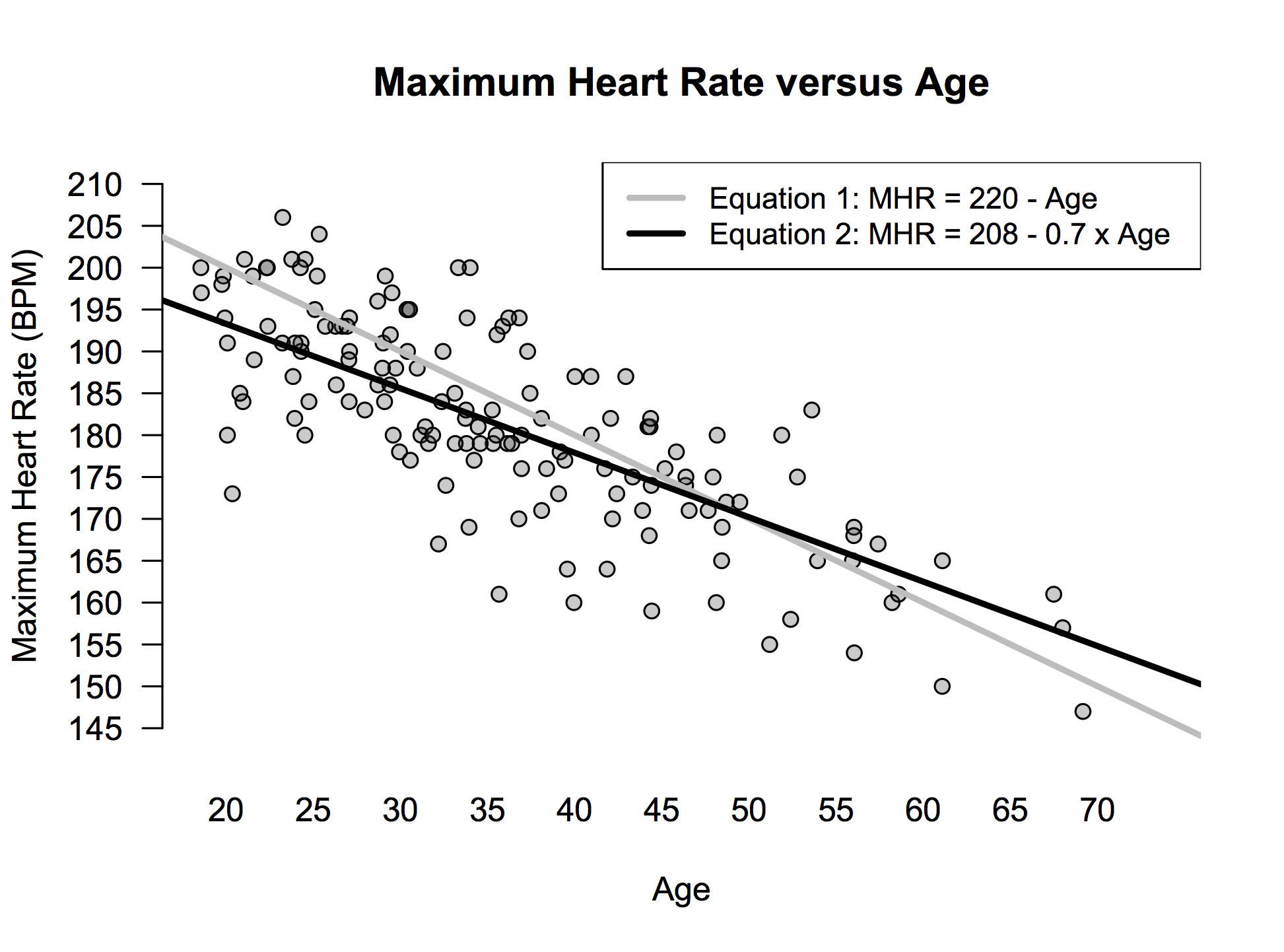
Figure 7.1: Heart rate versus age.
But as this also picture shows, there’s actually a slightly more complex equation that fits the data even better: \(\mathrm{MHR} = 208 - 0.7 \cdot \mathrm{Age}\). In words, multiply your age by 0.7 and subtract the result from 208 to predict your maximum heart rate. The original model had only one parameter, while this new model has two: the baseline of 208 and the “age multiplier” or “weight” of 0.7. These values fit the data best, in the sense that, among all possible choices, they result in the smallest average prediction error.
In the picture above, you can probably just eyeball the difference between the grey and black line and conclude that the black line is better: it visibly passes more through the middle of the point cloud. But you could also conclude logically that the black line must be better, because it allows us to fiddle with both the baseline and the age multiplier to fit the data. After all, given a free choice of both the baseline and the age multiplier, we could have picked a baseline of 220 and a weight on age of 1, thereby matching the predictions of the original “baseline only” model. But we didn’t—those weren’t the best choices! We can therefore infer that the equation \(\mathrm{MHR} = 208 - 0.7 \cdot \mathrm{Age}\) must fit the data better than the first equation of \(\mathrm{MHR} = 220 - \mathrm{Age}\).
And that’s a very general principle in regression: more complex models, with more parameters, can always be made to fit the observed data better. (That doesn’t necessarily mean they’ll generalize to future observations better; that’s an entirely different and very important question, and one that we’ll consider at length soon.)
So how do we actually know that these fitted parameters of 208 and 0.7 are the best choices? Well, you could just guess and check until you’re convinced you can’t do any better. (You can’t.) But modern computers do this for us in a much more intelligent fashion, finding the best-fitting parameters by cleverly exploiting matrix algebra and calculus in ways that, while fascinating, aren’t worth going into here. If you major in math or statistics or computer science, or if you program statistical software for a living, those details are super important. (I was a math major and I still remember sweating them out line by line.) Most people, on the other hand, are safe in simply trusting that their software has done the calculations correctly.
Quick preview: multiple regression models
We can also fit regression models with multiple explanatory variables. Although we won’t cover them in detail quite yet, let’s briefly see what one of these models looks like, as a preview of what’s to come.
Suppose that you were a data scientist at Zillow, the online real-estate marketplace, and that you had to build a model for predicting the price of a house. You might start with two obvious features of a house, like the square footage and the number of bathrooms, together with weights for each feature. For example:
\[ \mbox{Expected Price = 10,000 + 125 $\times$ (Square Footage) + 26,000 $\times$ (Num. Bathrooms)} \]
In words, this says that to predict the price of a house, you should follow three steps:
- Multiply the square footage of the house by 125 (parameter 1).
- Multiply the number of bathrooms by 26,000 (parameter 2).
- Add the results from A and B to 10,000 (the baseline parameter). This yields the predicted price.
This is called a multiple regression model, because it’s an equation that uses multiple features (square footage, bathrooms) to predict price. In real life, the weights or multipliers would be tuned to describe the prices in a particular housing market. You’ll always have one more parameter (here, 3) than you have features (here, 2): one parameter per feature, plus one extra parameter for the baseline.
Of course, we don’t need to stop at two features! Houses have lots of other features that affect their price—for example, the distance to the city center, the size of the yard, the age of the roof, and the number of fireplaces. With modern software, we can easily fit an equation that incorporates all of these features, and hundreds more. Every feature gets its own weight; more important features end up getting bigger weights, because the data show that they have a bigger effect on the price. Now, if you try to write out such a model in words—“add this,” “multiply this,” like we did for the two-feature rule above—it starts to look like the IRS forms they hand out in Hell. But R just churns through all the calculations with no problem, even for models with hundreds of parameters.
In this lesson, we’re going to focus on basic regression models with just one feature. In a later lesson, we’ll learn about multiple regression models, which incorporate lots of features (like our imaginary Zillow example above). But whether a model has 1 feature or 101 features, the underlying principles are the same:
- A regression model is an equation that describes relationships in a data set.
- Regression models have free parameters: the baseline value, and the weights on each feature.
- We choose these parameters so that the regression model’s predictions are as accurate as possible.
7.2 Fitting regression models
First, a bit of notation. The general form of a simple regression model with just one feature looks like this:
\[ y_i = \beta_0 + \beta_1 x_i + e_i \]
Each piece of this equation (a.k.a. “regression model”) has a name:
- \(x\) and \(y\): the feature (x) and target (y) variables.
- \(\beta_0\) and \(\beta_1\): the intercept and slope of the line (the parameters or weights of the model)
- \(e\): the model error, also called the residual
- \(i\): an index that lets us refer to individual data points (\(i=1\) is the first data point, \(i=2\) the second, and so on).
Given a data set with bunches of pairs \((x_i, y_i)\), we choose the intercept (\(\beta_0\)) and slope (\(\beta_1\)) to make the model errors (\(e_i\)) as small as we can, on average. To be a bit more specific, for mathematical reasons not worth going into, we actually make the sum of the squared model errors as small as we can. That’s why this approach is called ordinary least squares, or OLS. (“Ordinary” to distinguish it from other variations on the same idea that you might learn about in another course, like “weighted” or “generalized” least squares.)
Let’s see an example in R. First, load the tidyverse and mosaic libraries:
library(tidyverse)
library(mosaic)
Next, download the data in heartrate.csv shown in Figure 7.1, and import it into RStudio as an object called heartrate. Here are the first several lines of the file:
head(heartrate)## age hrmax
## 1 25 190
## 2 43 176
## 3 19 203
## 4 31 177
## 5 23 183
## 6 27 201This data is from an exercise study on maximum heart rates. Each row is a person. The two variables are the person’s age in years and their maximum heart rate (hrmax) in beats per minute, as measured by a treadmill test.
Visualization. Let’s visualize this data in a scatter plot and superimpose the trend line on the plot, which we can do using the geom_smooth function. This displays a fitted regression line:
ggplot(heartrate) +
  geom_point(aes(x=age, y=hrmax)) +
  geom_smooth(aes(x=age, y=hrmax), method='lm')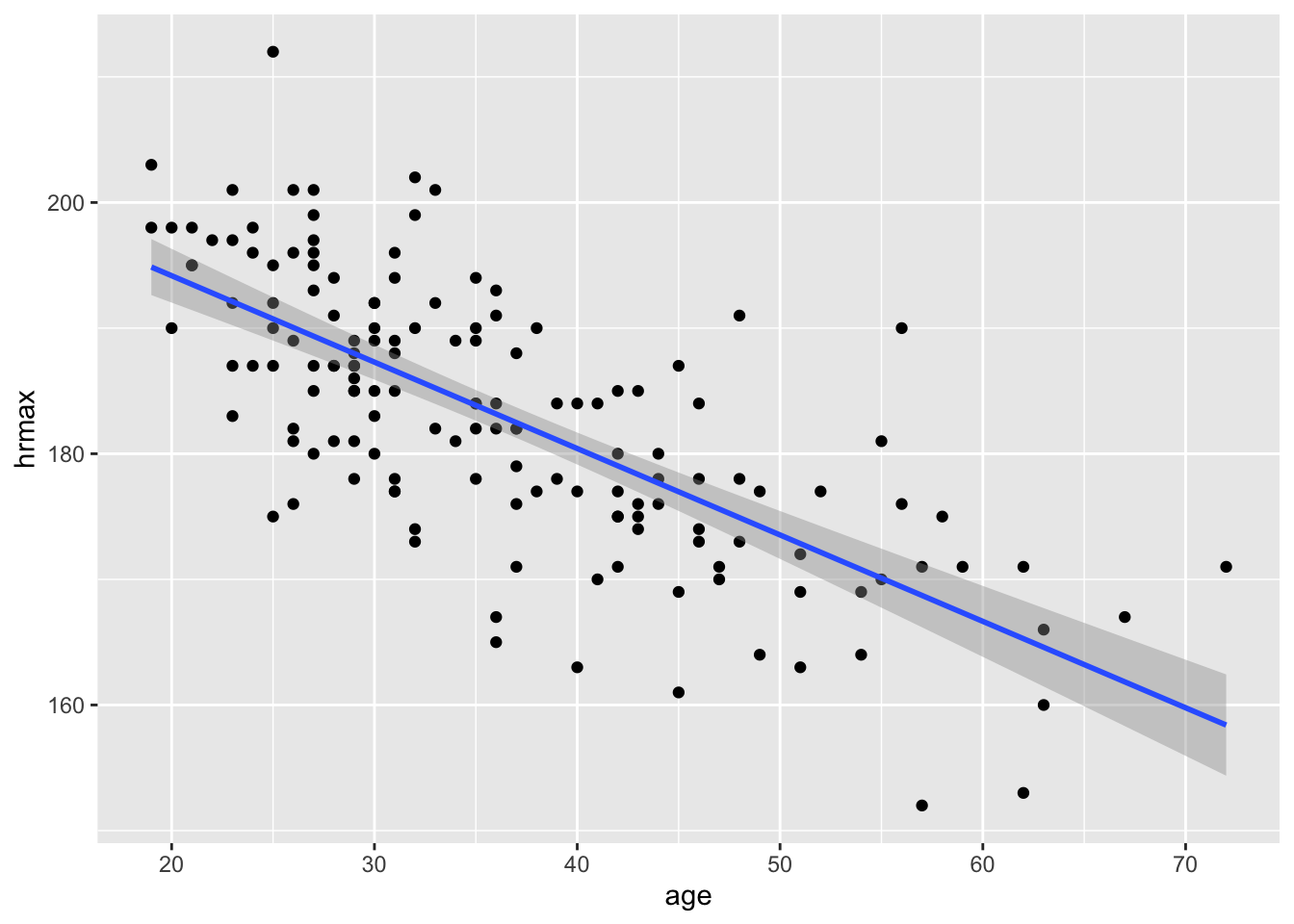
The first two lines of this code block should be familiar from our lesson on Scatter plots. But the third line, geom_smooth, is something new:
- To tell R to add a smooth trend line to a plot, use
geom_smooth.
geom_smoothhas the same aesthetic mappings as the underlying scatter plot: an \(x\) and \(y\) variable that tell R what the predictor and response are in the regression.
method=lmtells R to fit the trend line using a linear model (lm).
You might ask: what about the grey “bands” surrounding the blue line? We’ll cover this more in a future lesson, so don’t worry too much about those bands. But briefly: those bands are meant to visualize your “statistical uncertainty” about the trend line, in light of the inherent variability in the raw data.
Fitting. So what is the actual equation of the blue trend line in the figure above? For that, we need to explicitly call the lm function, and then print out the coefficients (intercept and slope) of the fitted model, like this:
model_hr = lm(hrmax ~ age, data=heartrate)
coef(model_hr)
## (Intercept) age
## 207.9306683 -0.6878927And that’s it—your first regression model! Let’s go line by line.
- The first line,
model_hr = lm(hrmax ~ age, data=heartrate), fits a regression model using thelmfunction, which stands for “linear model.”hrmaxis the the target (or “response”) variable in our regression.ageis the feature (or “predictor”) variable.
heartrateis the data set where R can find these variables.- the
~symbol means “by,” as in “modelhrmaxbyage.”
model_hris the name of the object where information about the fitted model is stored. (We get to choose this name.)
- The second line,
coef(model_hr), prints the weights (“coefficients”) of the fitted model to the console.
The output is telling us that the baseline (or “intercept”) in our fitted model is about 208, and the weight on age is about -0.7. In other words, our fitted regression model is:
\[ \hat{y} = 208 - 0.7 x \]
The notation \(\hat{y}\), read aloud as “y-hat,” is short for “predicted \(y\).” It represents the fitted value or conditional expected value: our best guess for the \(y\) variable, given what we know about the \(x\) variable. Here are the fitted values for the first five people in our data set:
fitted(model_hr) %>%
   head(5)
## 1 2 3 4 5
## 190.7334 178.3513 194.8607 186.6060 192.1091Optional stylistic note. When visualizing the trend line, it turns out that we can make our calls to geom_point and geom_smooth a little more concise, as in the code block below:
ggplot(heartrate, aes(x=age, y=hrmax)) +
  geom_point() +
  geom_smooth(method='lm')
The difference here is that we’ve put the aesthetic mapping (aes) in the first line, i.e. in the call to ggplot. That way, we didn’t have to repeat the same statement, aes(x=age, y=hrmax) inside both the geom_point layer and the geom_smooth layer. The general rule here is that, if you place aes inside the call the ggplot, then all subsequent layers will inherit that same aesthetic mapping. If you’re going to build up a plot in multiple layers that all have the same aesthetic mappings, you might find this useful.
Choosing where to put the call to aes is largely a matter of coding style and personal preference. You get the same result either way. But it’s handy to know about the more concise option.
7.3 Using and interpreting regression models
There are four common use cases for regression models:
- Summarizing a relationship.
- Making predictions.
- Making fair comparisons.
- Decomposing variation into predictable and unpredictable components.
Let’s see each of these ideas in the context of our heart-rate data.
Summarizing a relationship
How does maximum heart rate change as we age? Let’s turn to our fitted regression model, which has these coefficients:
coef(model_hr)## (Intercept) age
## 207.9306683 -0.6878927The weight on age of about -0.7 is particularly interesting. Remember, it represents the slope of a line, and it therefore summarizes the overall or average relationship between max heart rate and age. Specifically, it says that a one-year change in age is associated with a -0.7 beats-per-minute change in max heart rate, on average. Of course, this isn’t a guarantee that your MHR will decline like this. Virtually all of the points lie somewhere off the line! The line just represents an average trend across lots of people.
What about the baseline or “intercept” of about 208? Mathematically, this intercept is where the line crosses or “intercepts” the \(y\)-axis, which is an imaginary vertical line at \(x=0\). (See the cartoon below.) So if you want to interpret this number of 208 literally, it would represent our “expected” maximum heart rate for someone with age = 0. But this literal interpretation is just silly. Newborns can’t run on treadmills. Moreover, the youngest person in our data set is 18, so using the fitted model to predict someone’s max heart rate at age 0 represents a pretty major extrapolation from the observed data. Therefore let’s not take this interpretation too literally.
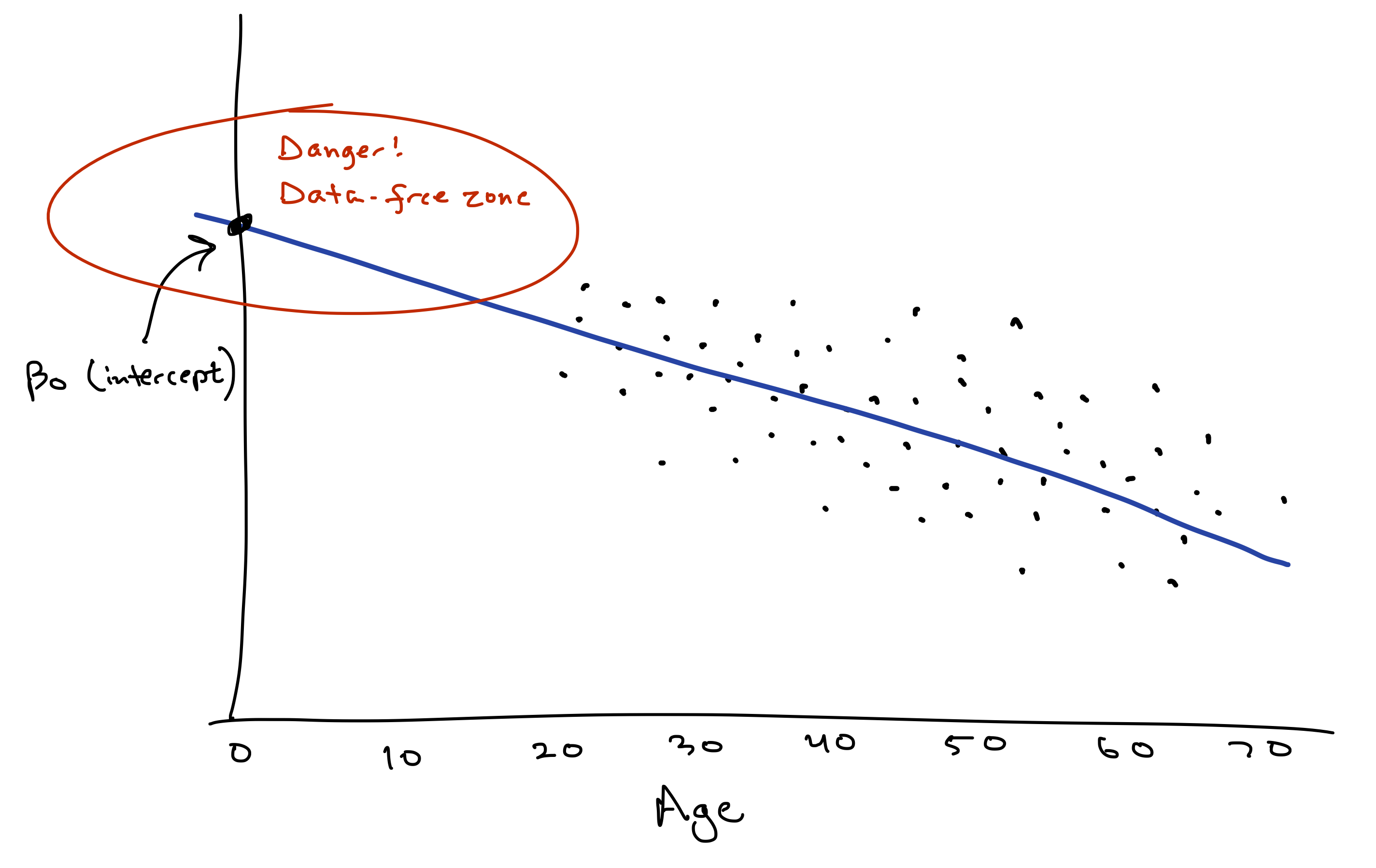
This example conveys a useful fact to keep in mind about the “intercept” or “baseline” in a regression model:
- By mathematical necessity, every model has an intercept. A line’s gotta cross the \(y\) axis somewhere!
- Mathematically, this intercept represents the “expected outcome” (\(\hat{y}\)) when \(x=0\).
- But only sometimes does this intercept have a meaningful substantive interpretation. If you’ve never observed any data points near \(x=0\), or if \(x=0\) would be an absurd value, then the intercept doesn’t really provide much useful information by itself. It’s only instrumentally useful for forming predictions at more sensible values of \(x\).
Making predictions
This brings us to our second use case for regression: making predictions. For example, suppose your friend Alice is 28 years old. What is her predicted max heart rate?
Our equation gives the conditional expected value of MHR, given someone’s age. So let’s plug in Age = 28 into our fitted equation:
\[ \mbox{E(MHR | Age $=$ 28)} = 208 - 0.7 28 = 188.4 \]
This is our best guess for Alice’s MHR, knowing her age, but without actually asking her to do the treadmill test. Just remember: this is an informed guess, but it’s still a guess! If we were to run the treadmill test for real, Alice’s actual max heart rate will almost certainly be different than this.
Let’s see how to use R to do the plugging-in for us, to generate predictions for many data points at once. Please download and import the data in heartrate_test.csv. This data file represents ten imaginary people whose heart rates we want to predict, and it has a single column called age:
heartrate_test## age
## 1 69
## 2 59
## 3 27
## 4 55
## 5 26
## 6 31
## 7 53
## 8 65
## 9 45
## 10 70Let’s now use the predict function in R to make predictions for these people’s heart rates, based on the fitted model.
predict(model_hr, newdata=heartrate_test)## 1 2 3 4 5 6 7 8 9 10
## 160.4661 167.3450 189.3576 170.0966 190.0455 186.6060 171.4724 163.2176 176.9755 159.7782This output is telling us that:
- the first person in
heartrate_testhas a predicted MHR of about 160, based on their age of 69.
- the second person in has a predicted MHR of about 167, based on their age of 59.
- and so on.
The predict function expects two inputs: the fitted model (here model_hr), and the data for which we want predictions (here heartrate_test). This newdata input must have a column in it that exactly matches the name of features used in your original fitted model. Since our fitted model used a feature called age, our newdata input must also have a column called age.
The output above is perfectly readable, but I personally find it easier if I put these predictions side by side with the original \(x\) values. So I’ll use mutate to add a new column to heartrate_test, consisting of the model predictions:
heartrate_test = heartrate_test %>%
   mutate(hr_pred = predict(model_hr, newdata = .))
The dot (.) is just shorthand for “use the thing piped in as the new data.” Here the “thing piped in” is the heartrate_test data frame.
With this additional column, now we can see the ages and predictions side by side:
heartrate_test## age hr_pred
## 1 69 160.4661
## 2 59 167.3450
## 3 27 189.3576
## 4 55 170.0966
## 5 26 190.0455
## 6 31 186.6060
## 7 53 171.4724
## 8 65 163.2176
## 9 45 176.9755
## 10 70 159.7782Making fair comparisons
Regression models can also help us make fair comparisons that adjust for the systematic effect of some important variable. To understand this idea, let’s compare two hypothetical people whose max heart rates are measured using an actual treadmill test:
- Alice is 28 with a maximum heart rate of 185.
- Brianna is 55 with a maximum heart rate of 174.
Clearly Alice has the higher MHR, but let’s make things fair! We know that max heart rate declines with age. So the real question isn’t “Who has a higher maximum heart rate?” Rather, it’s “Who has a higher maximum heart rate for her age?”
The key insight is that a regression model allows us to make this idea of “for her age” explicit. Alice’s predicted heart rate, given her age of 28, is:
\[ \hat{y} = 208 - 0.7 \cdot 28 = 188.4 \]
Her actual heart rate is 185. This is 3.4 BPM below average for her age. In regression modeling, this difference between actual and expected outcome is called the “residual” or “model error”:
\[ \begin{aligned} \mbox{Residual} &= \mbox{Actual} - \mbox{Predicted} &= 185 - 188.4 \\ & = -3.4 \end{aligned} \]
Brianna, on the other hand, is age 55. Her predicted max heart rate, given her age, is:
\[
\hat{y} = 208 - 0.7 \cdot 55 = 169.5
\]
Her actual heart rate is 174. This is 4.5 BPM above average for her age:
\[ \begin{aligned} \mbox{Residual} &= \mbox{Actual} - \mbox{Predicted} \\ &= 174 - 169.5 \\ & = 4.5 \end{aligned} \]
So while Alice has the higher max heart rate in absolute terms, Brianna has the higher heart rate for her age.
This example illustrates how to use a regression model to make comparisons that adjust for the systematic effect of some variable (here, age). Fair comparison just means subtraction: you take the difference between actual outcomes and expected outcomes, and then compare those differences, rather than the outcomes themselves. In other words, just compare the residuals!
Let’s see how to do this in R. The relevant function here is called resid, which calculates the residuals, or model errors, for a fitted regression model. In the code block below, I extract the residuals from our fitted model, and then I use mutate to add them as a new column to the original heartrate data frame:
heartrate = heartrate %>%
   mutate(hr_residual = resid(model_hr))
Now we can look at the newly augmented data frame:
head(heartrate)## age hrmax hr_residual
## 1 25 190 -0.7333508
## 2 43 176 -2.3512823
## 3 19 203 8.1392930
## 4 31 177 -9.6059947
## 5 23 183 -9.1091362
## 6 27 201 11.6424346We see, for example, that of these 6 people, the 3rd person has the highest absolute hrmax (203), but the 6th person has the highest max heart rate for their age (11.6 BPM above their age-adjusted average).
We can also use arrange to sort the data set by residual value. Remember that arrange, by default, sorts things in ascending order. So here are the bottom 5 folks in our data set, as measured by age-adjusted max heart rate:
heartrate %>%
   arrange(hr_residual) %>%
   head(5)
## age hrmax hr_residual
## 1 36 165 -18.16653
## 2 40 163 -17.41496
## 3 57 152 -16.72078
## 4 36 167 -16.16653
## 5 45 161 -15.97550And here are the top 5, based on sorting the residuals in descending order:
heartrate %>%
   arrange(desc(hr_residual)) %>%
   head(5)
## age hrmax hr_residual
## 1 25 212 21.26665
## 2 56 190 20.59132
## 3 48 191 16.08818
## 4 32 202 16.08190
## 5 33 201 15.76979Decomposing variation
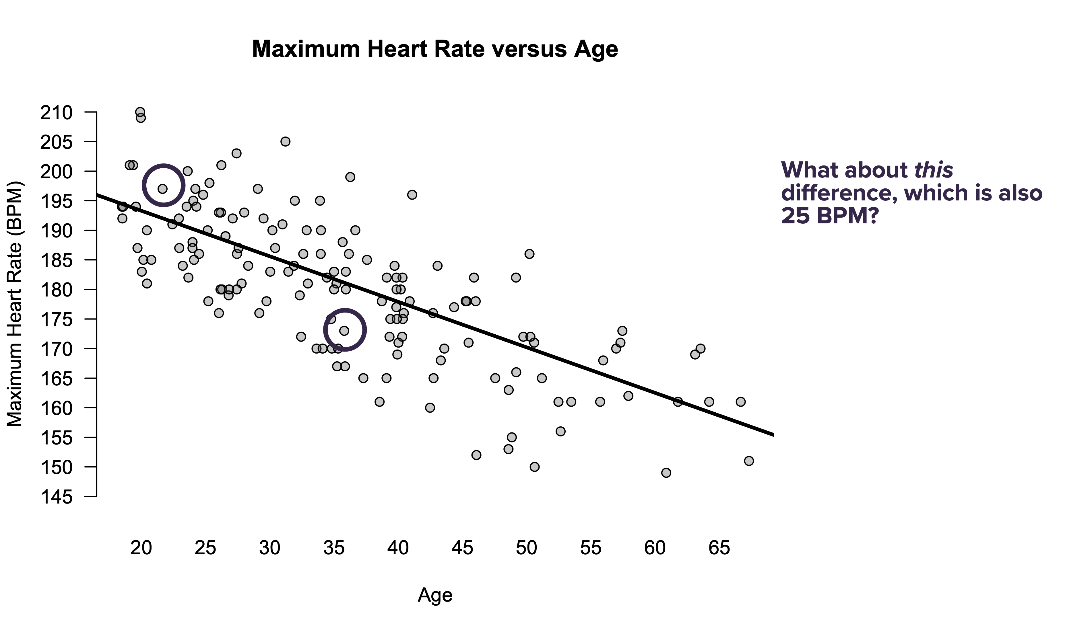
Consider the question posed by the following figure.
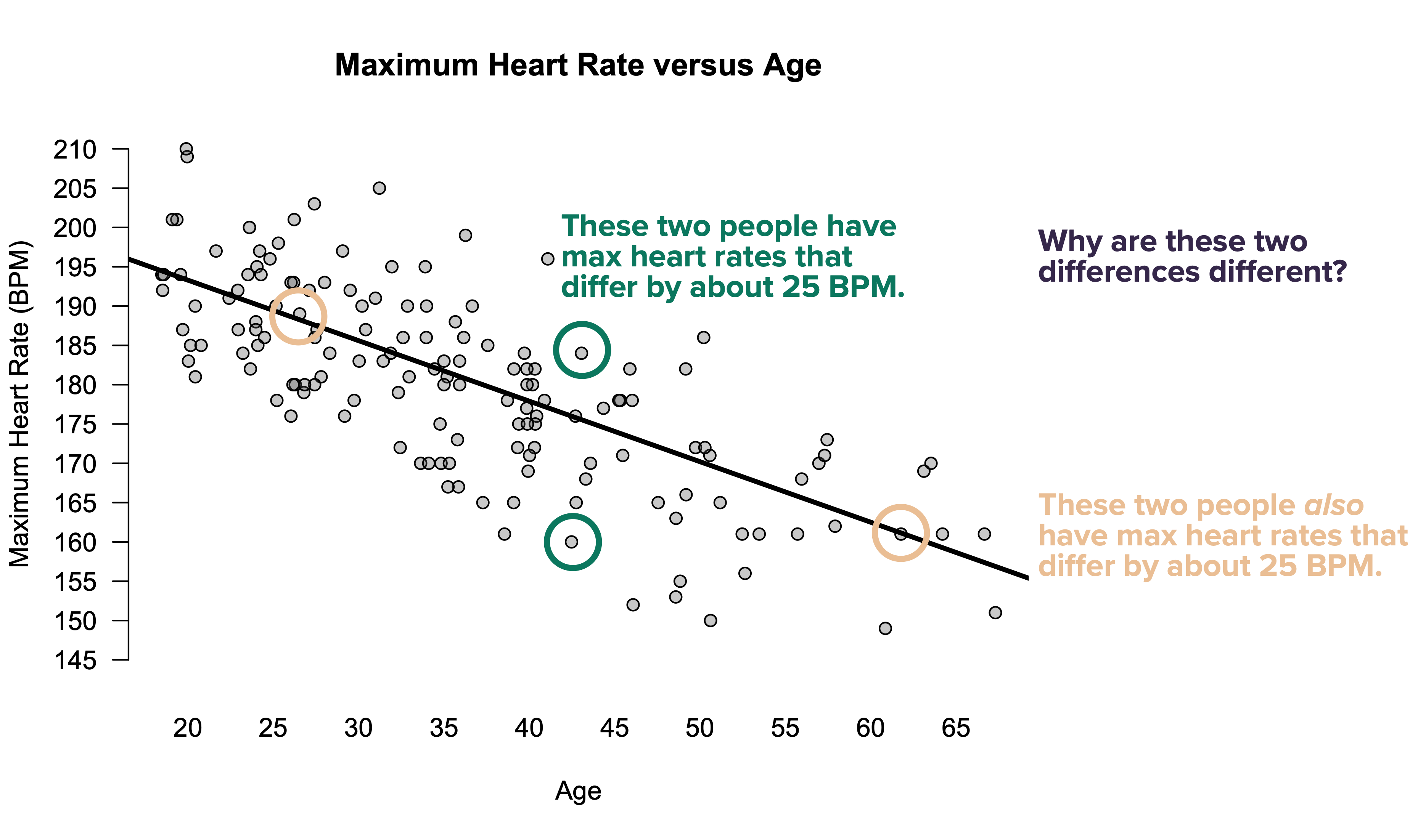
Why, indeed? Let’s compare.
- The two dots circled in beige represent people whose max heart rates differ by 25 BPM. This difference is entirely predictable: each has a max heart rate that is almost perfectly average for their age, but they differ in age by 36 years. The difference of 25 BPM, in other words, is exactly what we’d expect based on their ages.
- The two dots circled in green also represent people whose heart rates differ by 25 BPM. But this difference is entirely unpredictable, because these two people are basically the same age. Almost by definition, therefore, the difference in their maximum heart rates must have nothing to do with their age. It must be down to something else.
Now, to make things more interesting, let’s consider a third pair of points:
Here’s yet another pair of people in the study whose max heart rates differ by 25 BPM. But this difference is clearly intermediate between the two extreme examples we saw in the previous figure:
- One person is 21 and the other 36. This difference in age accounts for some of the difference in their maximum heart rates. To be specific, since the weight on age in our model is \(-0.7\), age can account for a difference of \(-0.7 \cdot (36-21) = -10.5\) BPM.
- But even once you account for age, there’s still an unexplained difference: the 21-year-old has an above-average MHR for their age, while the 36-year old has a below-average MHR for their age. So age predicts some, but not all, of the observed difference in their MHRs.
This example illustrates an important point. Some variation is predictable. Other variation is unpredictable. Any individual difference can be one or the other, but is usually a combination of both types.
And that brings us to our fourth use-case for regression: to decompose variation into predictable and unpredictable components. Specifically, this is based on examining and comparing the following quantities:
- \(s_{e}\), the standard deviation of the model errors \(e\). This represents unpredictable variation in \(y\). This is sometimes called the “root mean squared error,” or RMSE.
- \(s_{\hat{y}}\), the standard deviation of the model’s predicted or fitted values \(\hat{y}\). This represents predictable variation in \(y\).
The simplest thing to do here is to just quote \(s_e\), the standard deviation of the model residuals (or RMSE). Here this number is for our heart-rate regression:
sd(resid(model_hr))## [1] 7.514252This says that the typical model error is about 7.5 beats per minute. This represents the unpredictable component of variation in max heart rate.
How does this compare to the predictable component of variation? Let’s check by calculating the standard deviation of our model’s fitted values:
sd(fitted(model_hr))## [1] 7.754332So it looks like the predictable and unpredictable components of variation are similar in magnitude.
As a more conventional way of measuring this, we often report the following quantity:
\[ R^2 = \frac{s_{\hat{y}}^2}{s_{\hat{y}}^2 + s_{e}^2} = \frac{PV}{TV} \]
This number, pronounced “R-squared,” measures how large the predictable component of variation is, relative to the total variation (i.e. the sum of both the predictable and unpredictable components). Hence the mnemonic: \(R^2 = PV/TV\).
In English, \(R^2\) answers the question: what proportion of overall variation in the \(y\) variable can be predicted using a linear regression on the \(x\) variable? Here are some basic facts about \(R^2\).
- It’s always between 0 and 1.
- 1 means that \(y\) and \(x\) are perfectly related: all variation in \(y\) is predictable.
- 0 means no relationship: all variation in \(y\) is unpredictable (at least, unpredictable using a linear function of \(x\)).
- \(R^2\) is independent of the units in which \(x\) and \(y\) are measured. In other words, if you ran the regression using “beats per second” rather than “beats per minute,” or using “age in days” rather than “age in years,” \(R^2\) would remain unchanged.
- \(R^2\) does not have a causal interpretation. It measures strength of linear association, not causation. High values of \(R^2\) do not imply that \(x\) causes \(y\).
- If the true relationship between \(x\) and \(y\) is nonlinear, \(R^2\) doesn’t necessarily convey any useful information at all, and indeed can be highly misleading.
You might stare at the definition of \(R^2\) above and ask: why do we square both \(s_{\hat{y}}\) and \(s_e\) in the formula for \(R^2\)? Great question! There’s actually a pretty deep mathematical answer—one that you’d learn in a mathematical statistics course, and that is, believe it or not, intimately connected to the Pythagorean theorem for right triangles. But that takes us beyond the scope of these lessons. If you’d like to read more, the Wikipedia page for \(R^2\) goes into punishing levels of detail, as would an advanced course with a name like “Linear Models.”
The easiest way to calculate \(R^2\) in R is to use the rsquared function from the mosaic library:
rsquared(model_hr)## [1] 0.5157199This number is telling us that about 52% of the variation in maximum heart rates is predictable by age. The other 48% is unpredictable by age. (Although it might be predictable by something else!)
As a quick summary:
- \(s_e\), the standard deviation of the model residuals, represents an absolute measure of our model’s ability to fit the data It tells us about unpredictable variation alone: that is, the typical size of a model error, in the same units as the original response variable.
- \(R^2\) represents a relative measure of our model’s ability to fit the data. It a unit-less quantity that tells us how large the predictable component of variation is, relative to the total variation.
7.4 Beyond straight lines
Linear regression models describe additive change: that is, when x changes by 1 unit, you add to (or subtract from) y. This is clear enough in our running heart-rate example: when you add 1 year to age (x), you subtract 0.7 BPM from your expected max heart rate (y). We describe this kind of relationship with a slope: “rise over run,” or the expected change in y for a one-unit change in x. This kind of relationship is very common in the real world. For example:
- If you increase your electricity consumption by 1 kilowatt-hour, your energy bill in Texas will go up by about 12 cents, on average.
- If you travel 1 mile further in a ride-share like an Uber or Lyft, your fare will go up by about $1.50.
- If you add 100 square feet to a house in Los Angeles, you’d expect its value to go up by about $50,000.
But not every quantitative relationship is like that. We’ll look at two other common kinds of relationships: multiplicative change and relative proportional change.
Exponential models
Many real-world relationships are naturally described in terms of multiplicative change: that is, when x changes by 1 unit, you multiply y by some amount. These relationships are referred to as exponential growth (or exponential decay) models. For example:
- If your bank offers you interest of 5% on your savings account, that means your money grows not by a constant amount each year, but at a constant rate: when you add 1 year to the calendar, you multiply your account balance by 1.05. If you start with more, you gain more each year in absolute terms.
- In New York City’s first pandemic wave in March/April 2020, each new day saw 22% more Covid cases than the previous day, on average. This, too, represents multiplicative change: when you add 1 day to the calendar, you multiply expected cases by 1.22. This reflects the way diseases spread through the population: the more infected people there are transmitting the disease, the more new infections there will be the next day.
- If you start with a given mass of Carbon-14 and wait 5,730 years, about half of what was there previously will remain, due to radioactive decay. Once again, this is multiplicative change: when you add 5,730 years to the calendar, you multiply the mass of your remaining Carbon-14 by 0.5. (Since the multiplier is less than 1, this is exponential decay.)
We describe this kind of multiplicative change not in terms of a slope, but in terms of a growth rate—or, if the relationship is negative, a decay rate. This describes how y changes multiplicatively as x changes additively.
Mathematically, the equation of an exponential model is pretty simple. It looks like this:
\[\begin{equation} y = \alpha e^{\beta x} \tag{7.1} \end{equation}\]
The two parameters of this model are:
- \(\alpha\), which describes the initial model value of \(y\), when \(x=0\) (i.e. before \(y\) starts growing or decaying exponentially).
- \(\beta\), which is the growth rate (if positive) or decay rate (if negative). You can interpret \(\beta\) as like an interest rate. For example, if \(\beta = 0.05\), then \(y\) grows at the same per-period rate as an investment account with 5% interest.
An exponential model is nonlinear. But the punch line here is that, via a simple math trick, we can actually use linear regression to fit it. That simple trick is to fitting our model using a logarithmic scale for the y variable. To see why, observe what happens if we take the (natural) logarithm of both sides of Equation (7.1):
\[\begin{equation} \begin{aligned} \log y & = \log( \alpha e^{\beta x} ) \\ &= \log \alpha + \beta x \end{aligned} \end{equation}\]
This is a linear equation for \(\log\) y versus x, with intercept \(\log \alpha\) and slope \(\beta\). The implication is that we can fit an exponential growth model using a linear regression for \(\log\) y versus x. Let’s see two examples to walk through the details.
Example 1: Ebola in West Africa
Beginning in March 2014, West Africa experienced the largest outbreak of the Ebola virus in history. Guinea, Liberia, Niger, Sierra Leone, and Senegal were all hit hard by the epidemic. In this example, we’ll look at the number of cases of Ebola in these five countries over time, beginning on March 25, 2014 (which will be our “zero date” for the epidemic).
Please download and import the data in ebola.csv into RStudio. The first six lines of the file look like this:
head(ebola)## Date Day GuinSus GuinDeath GuinLab LibSus LibDeath LibLab NigSus NigDeath NigLab SLSus SLDeath SLLab SenSus SenDeath
## 1 2014-03-25 0 86 59 0 0 0 0 0 0 0 0 0 0 0 0
## 2 2014-03-26 1 86 60 1 0 0 0 0 0 0 0 0 0 0 0
## 3 2014-03-27 2 103 66 4 0 0 0 0 0 0 0 0 0 0 0
## 4 2014-03-31 6 112 70 24 0 0 0 0 0 0 0 0 0 0 0
## 5 2014-04-01 7 122 80 24 0 0 0 0 0 0 0 0 0 0 0
## 6 2014-04-02 8 127 83 35 0 0 0 0 0 0 0 0 0 0 0
## SenLab totalSus totalDeath totalLab
## 1 0 86 59 0
## 2 0 86 60 1
## 3 0 103 66 4
## 4 0 112 70 24
## 5 0 122 80 24
## 6 0 127 83 35This file breaks things down by country, but we’ll look at the totalSus column, for total suspected cases across all five countries. Let’s visualize this in a line graph, starting from day 0 (March 25):
# total cases over time
ggplot(ebola) +
  geom_line(aes(x=Day, y = totalSus))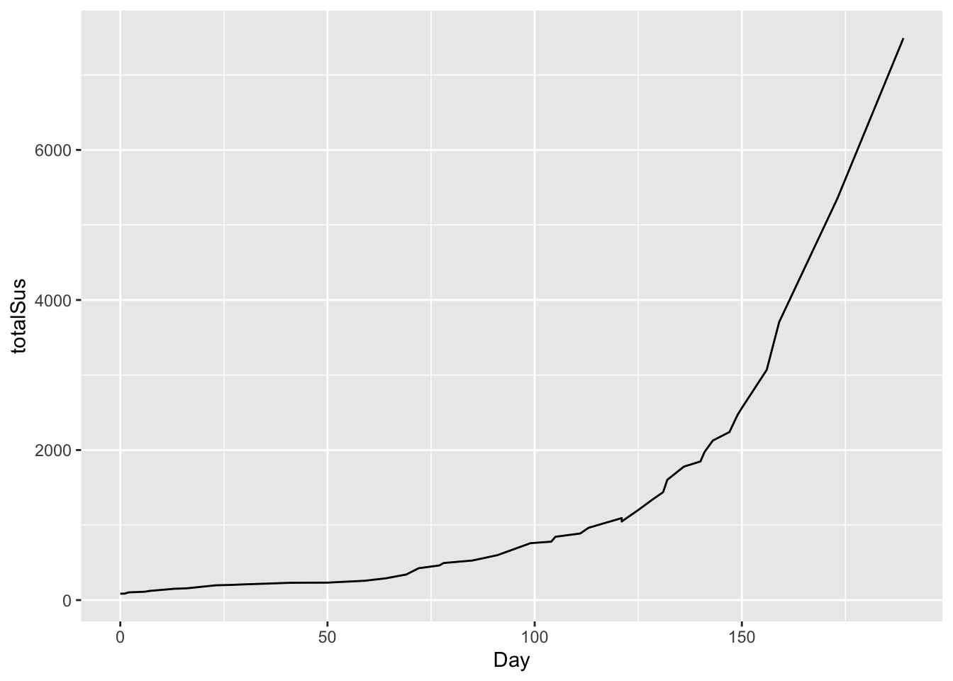
This is clearly non-linear. But if we plot this on a logarithmic scale for the y axis, the result looks remarkably close to linear growth:
# total cases over time: logarithm scale for y variable
ggplot(ebola) +
  geom_line(aes(x=Day, y = log(totalSus)))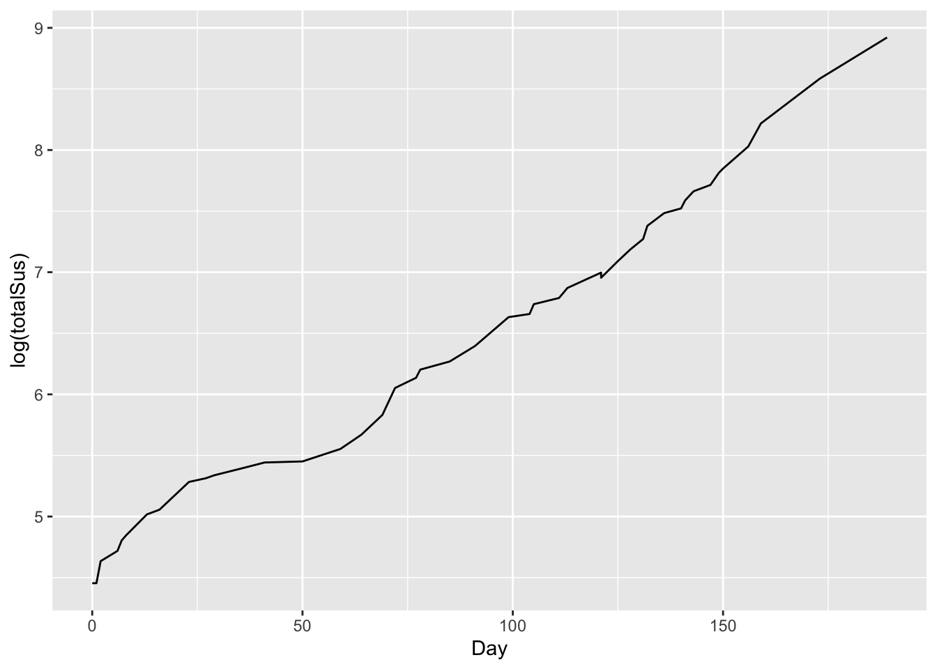
So let’s use our trick: fit the model using a log-transformed y variable (which here is totalSus):
# linear model for log(cases) versus time
lm_ebola = lm(log(totalSus) ~ Day, data=ebola)
coef(lm_ebola)
## (Intercept) Day
## 4.53843517 0.02157854So our fitted parameters are:
- intercept = \(\log(\alpha)\) = 4.54. So our initial model value is \(\alpha = e^{4.54} = 93.7\).
- A slope of \(\beta = 0.0216\). This corresponds to a daily growth rate in cases of a little over 2.1%.
We can actually add this “reference” line to our log-scale plot, to visualize the fit:
# total cases over time with reference line
ggplot(ebola) +
   geom_line(aes(x=Day, y = log(totalSus))) +
   geom_abline(intercept = 4.54, slope = 0.0216, color='red')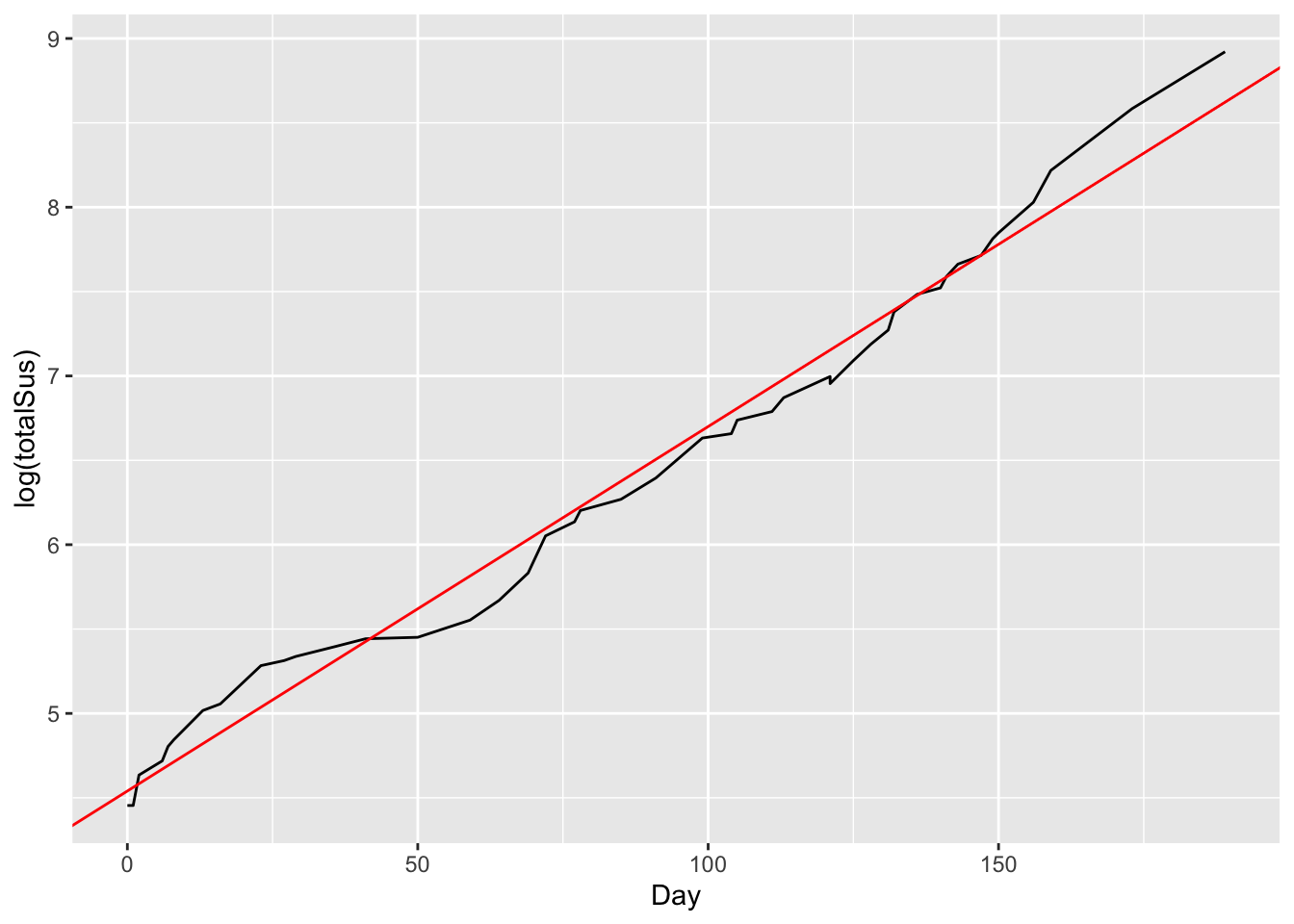
This emphasizes that the slope of the red line is the average daily growth rate over time.
Example 2: Austin’s population over time
Austin is routinely talked about as one of the fastest-growing cities in America.. But just how fast is it growing, and how long has this growth trend been going on?
Please import the data in austin_metro.csv, which contains estimated population for the Austin metropolitan area all the way back to 1840.22 Here are the first six lines of the file:
head(austin_metro)## Year Population
## 1 1840 553
## 2 1850 629
## 3 1860 3494
## 4 1870 4428
## 5 1880 11013
## 6 1890 14575And here’s a plot of Austin’s population over time:
ggplot(austin_metro) +
   geom_line(aes(x=Year, y=Population))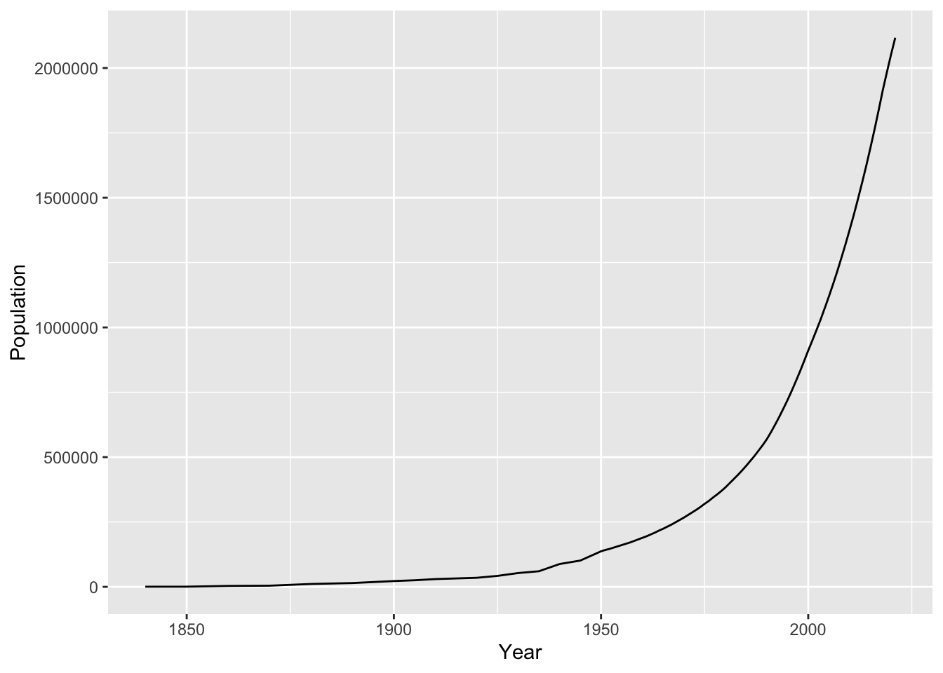
Let’s fit an exponential growth model to this. We’ll first define a new variable that treats 1840 as our “zero” date, called YearsSince1840. As you can see, the data looks relatively linear on a logarithmic scale:
austin_metro = mutate(austin_metro, YearsSince1840 = Year - 1840)
ggplot(austin_metro) +
   geom_line(aes(x=YearsSince1840, y=log(Population)))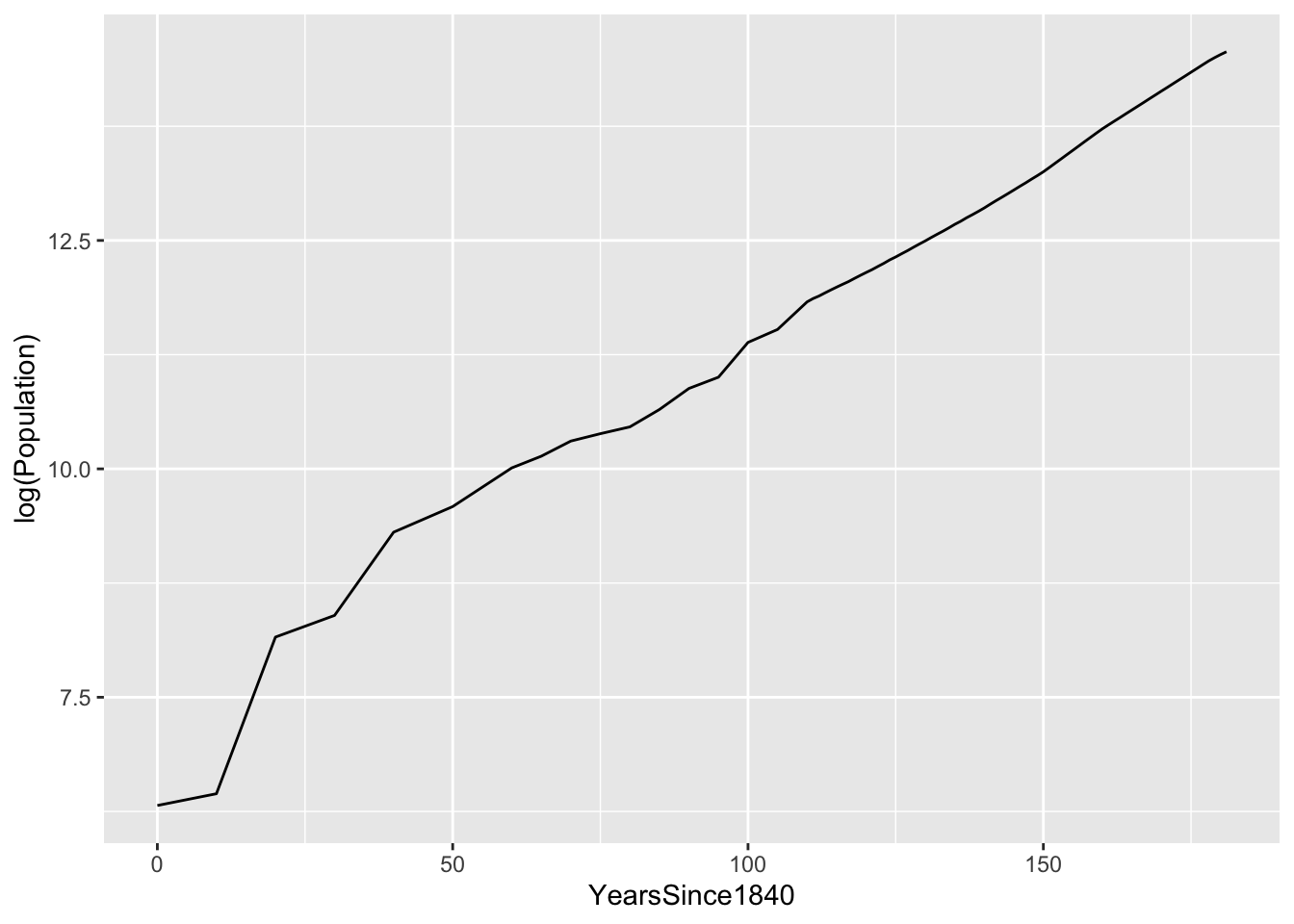
So let’s fit a linear model for log(Population) versus years since 1840:
lm_austin = lm(log(Population) ~ YearsSince1840, data=austin_metro)
coef(lm_austin)
## (Intercept) YearsSince1840
## 7.13896689 0.04125391Our average population growth rate is a little over 4.1% per year, every year back to 1840. Here’s this reference line, superimposed on the log-scale plot of the data:
ggplot(austin_metro) +
   geom_line(aes(x=YearsSince1840, y=log(Population)))  +
   geom_abline(intercept = 7.14, slope = 0.0412, color='red')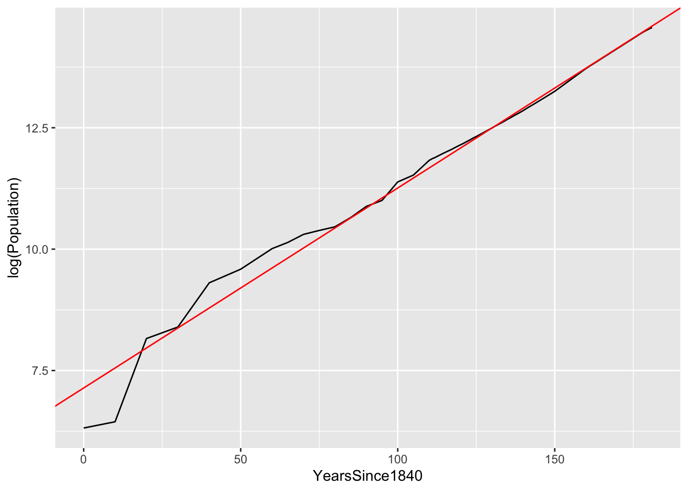
As you can see, the fit is quite good. There’s some wobble around the trend line in the earlier years, but since at least 1915 (i.e. 75 years after 1840), Austin has grown at a nearly constant 4.1% annual rate.
So to summarize:
- if your data look roughly linear when you plot log(y) versus x, then an exponential model is appropriate.
- you can fit this exponential model by running a linear regression for log(y) versus x.
- the estimated slope of this regression model is the growth rate (or, if negative, the decay rate) of your fitted exponential model.
Power laws
So far we’ve covered additive change (described by a linear model) and multiplicative change (described by an exponential model). A third important type of relationship is relative proportional change: when x changes by 1%, you expect y to change by some corresponding percentage amount, independent of the initial size of \(x\) and \(y\). These relationships are referred to as power laws. For example:
- if you double the radius of a circle, you multiply it’s area by 4, no matter how big the initial circle is. This is just math, since \(A = \pi r^2\).
- if you increase your running speed by 1% (x), you will reduce the amount of time it takes to finish a race by 1% (y), regardless of the race distance or your initial speed.
- if stores charge 1% more for Bud Light beer (x), on average consumers will buy about 2% fewer six-packs of it (y). Bud Light, relatively speaking, is an elastic good: consumers respond strongly to price changes (e.g. by buying some other beer instead).
- if oil companies charge 1% more for gasoline (x), on average consumers will buy about 0.05% to 0.1% fewer gallons of it (y). Gasoline, relatively speaking, is an inelastic good: consumers respond weakly to price changes, because unless you’re Doc in “Back to the Future,” you can’t run your car on beer (or anything else).
- if someone’s income goes up by 1% (x), on average they buy 2% fewer cups of cheap coffee from gas stations (y). In economics, gas-station coffee is called an “inferior good.” This isn’t coffee snobbery; to an economist, “inferior” just means that people buy less of something when they get richer.
- if someone’s income goes up by 1% (x), on average they buy 1.5% more cups of coffee from Starbucks (y). In economics, Starbucks coffee is called a “luxury good,” because people buy more of it when they get richer.
We describe this kind of change in terms of an elasticity, which measures how responsive changes in y are to changes in x. Indeed, as some of the examples above illustrate, elasticities are a fundamental concept in economics.
The basic equation of a power-law model is this:
\[\begin{equation} y = K x^{\beta} \tag{7.2} \end{equation}\]
The two parameters of this model are:
- \(K\), which describes the base value of \(y\), when \(x=1\).
- \(\beta\), which is the elasticity, which describes relative proportional change in y versus x. In a power law, when x changes by 1%, y changes by \(\beta\)%, on average.
A power law, like an exponential model, is also non-linear. But via a similar trick to what we tried with exponential models, we can still use linear regression to fit it. That simple trick is to fit our model using a logarithmic scale for both the x variable and the y variable. To see why, observe what happens if we take the (natural) logarithm of both sides of Equation (7.2):
\[\begin{equation} \begin{aligned} \log y & = \log( K x^{\beta} ) \\ &= \log K + \log (x^\beta) \\ &= \log K + \beta \log x \end{aligned} \end{equation}\]
This is a linear equation for \(\log\) y versus \(\log\) x, with intercept \(\log K\) and slope \(\beta\). The implication is that we can fit a power-law model using a linear regression for \(\log\) y versus \(\log\) x. Let’s see two examples to walk through the details.
Example 1: brain versus body weight
Which animal has the largest brain? Let’s look at the data in animals.csv to find out. This data set has the body weight (in kilos) and brain weight (in grams) for 34 different land animal species.
In one sense, it’s obvious which animals in this data set have the largest brains… elephants! We can see this by sorting the brain column in descending order:
# the largest brains
animals %>%
   arrange(desc(brain))  %>%
   head(5)
## animal body brain
## 1 African elephant 6654 5712
## 2 Asian elephant 2547 4603
## 3 Human 62 1320
## 4 Giraffe 529 680
## 5 Horse 521 655But a more interesting question is: which animal has the the largest brain, relative to its body weight? Your first thought here might be to compute the ratio of brain weight to body weight:
# compute brain to body weight ratio
animals = animals %>%
  mutate(brain_body_ratio = round(brain/body, 2))

# print the top 5 animals
animals %>%
   arrange(desc(brain_body_ratio)) %>%
   head(5)
## animal body brain brain_body_ratio
## 1 Rat 0.480 15.5 32.29
## 2 Rhesus monkey 6.800 179.0 26.32
## 3 Mole 0.122 3.0 24.59
## 4 Human 62.000 1320.0 21.29
## 5 House mouse 0.023 0.4 17.39We might expect that a primate like a rhesus monkey would have a relatively large brain. But rats with the gold medal? Moles with the bronze? Somehow this doesn’t seem right.
What’s going on here is that a straight-up ratio is misleading, because body weight and brain weight follow a nonlinear relationship. But this isn’t necessarily obvious from a standard scatter plot. The problem is that these weights vary over many, many orders of magnitude: we have lots of small critters and a couple of elephants:
ggplot(animals) +
  geom_point(aes(x=body, y=brain))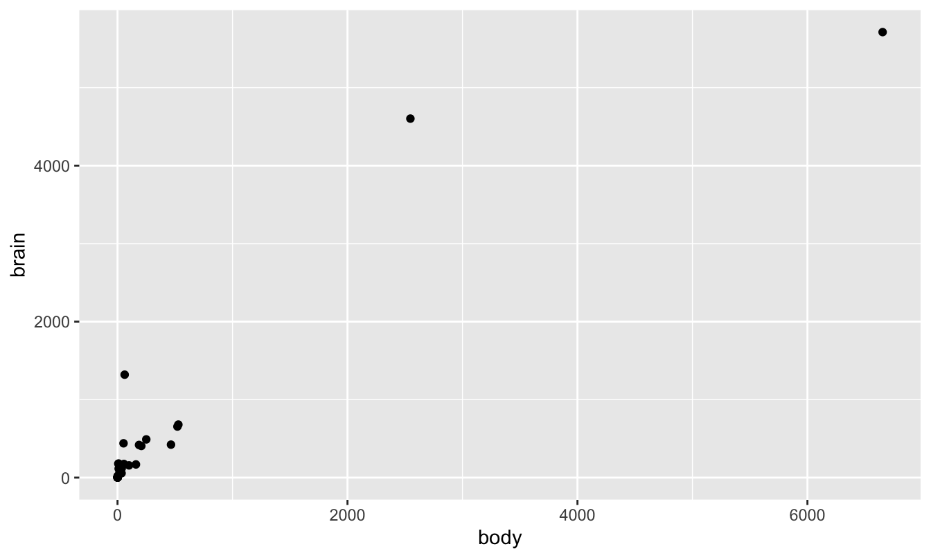
As a result, all the points look “squished” in the lower left corner of the plot. However, things look much nicer when plotted on a log-log scale. The log transformation of both axes has stretched the lower left corner of the box out in both x and y directions, allowing us to see the large number of data points that previously were all trying to occupy the same space.
ggplot(animals) +
  geom_point(aes(x=log(body), y=log(brain)))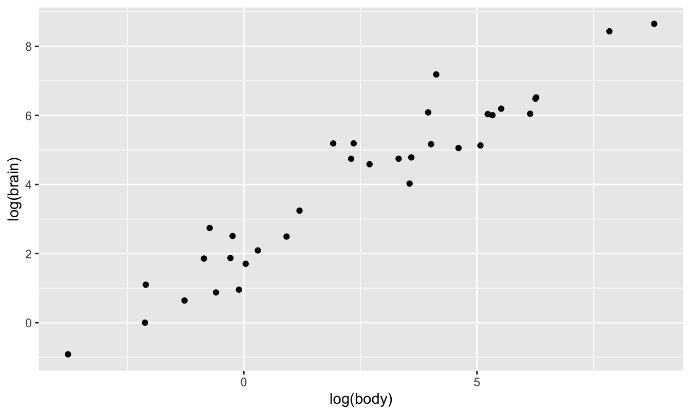
This pattern—a linear relationship in log(y) versus log(x)—is characteristic of a power law. So let’s run our regression on this log-log scale:
lm_critters = lm(log(brain) ~ log(body), data=animals)
coef(lm_critters)
## (Intercept) log(body)
## 2.2049405 0.7500543The fitted slope tells us the elasticity: when an animal’s body weight changes by 1%, we expect its brain weight to change by 0.75%, regardless of the initial size of the animal. As you can see, the fit of this line looks excellent when superimposed on the log-log-scale plot:
ggplot(animals) +
   geom_point(aes(x=log(body), y=log(brain))) +
   geom_abline(intercept=2.2, slope=0.75, color='red')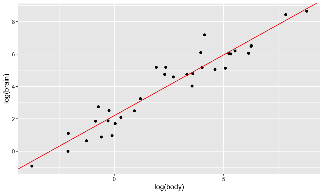
Our fitted equation on the log scale is \(\log(y) = 2.2 + 0.75 \cdot \log(x)\), meaning that our power law is:
\[ y = e^{2.2} \cdot x^{0.75} \approx 9 x^{0.75} \]
We can also look at the residuals of this model to help us understand which animal has the largest brain, relative to what we’d expect based on body size:
# add the residuals to the data frame
animals = animals %>%
   mutate(logbrain_residual = resid(lm_critters))

# print the top 5 animals by residual brain weight
animals %>%
   arrange(desc(logbrain_residual))  %>%
   head(5)
## animal body brain brain_body_ratio logbrain_residual
## 1 Human 62.00 1320.0 21.29 1.8848714
## 2 Rhesus monkey 6.80 179.0 26.32 1.5446491
## 3 Fox 10.55 179.5 17.01 1.2180122
## 4 Rat 0.48 15.5 32.29 1.0864162
## 5 Chimpanzee 52.16 440.0 8.44 0.9158823This looks a bit more like what we’d expect based on prior knowledge of “smart” animals.
Random aside: when I first fit a power law to this data set, it told me that the chinchilla had the largest brain relative to its body weight, and that humans had the second largest brains. I initially regarded the chinchilla with new-found respect, and I began trying to understand what made chinchillas so smart. Did they have complex societies? Did they have a secret chinchilla language? I couldn’t find anything. As far as I could discern from my research, chinchillas were just cute, chunky ground squirrels that could jump surprisingly high, but were not surprisingly brainy.
Then I finally discovered what was wrong. See this line in the data set, where it says the chinchilla brain weighs 6.4 grams, or about half a tablespoon of sugar?
animals %>% filter(animal == 'Chinchilla')## animal body brain brain_body_ratio logbrain_residual
## 1 Chinchilla 0.425 6.4 15.06 0.2931535There was a typo in the original version. Someone had typed in 64 grams of brain weight, rather than 6.4 grams, making chinchillas look 10 times more cerebral than they really were. This is what the original plot of the data on the log-log scale looked like. The chinchilla stands out as the largest residual:
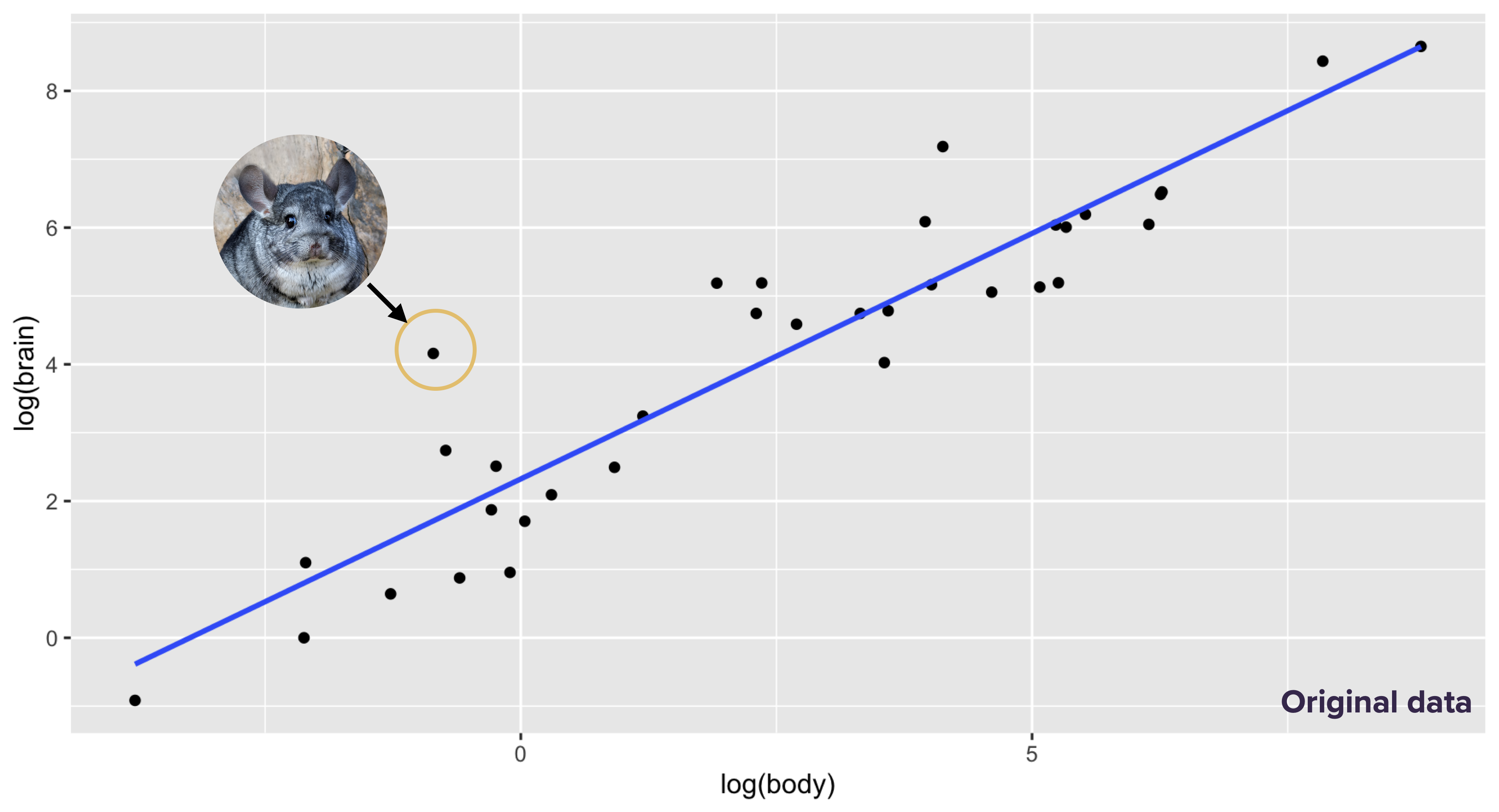
I discovered and corrected this error only after a lot of looking through obscure sources on mammalian brain weights. The corrected plot looked like this, with the chinchilla much closer to the line and the human standing out as the largest residual:
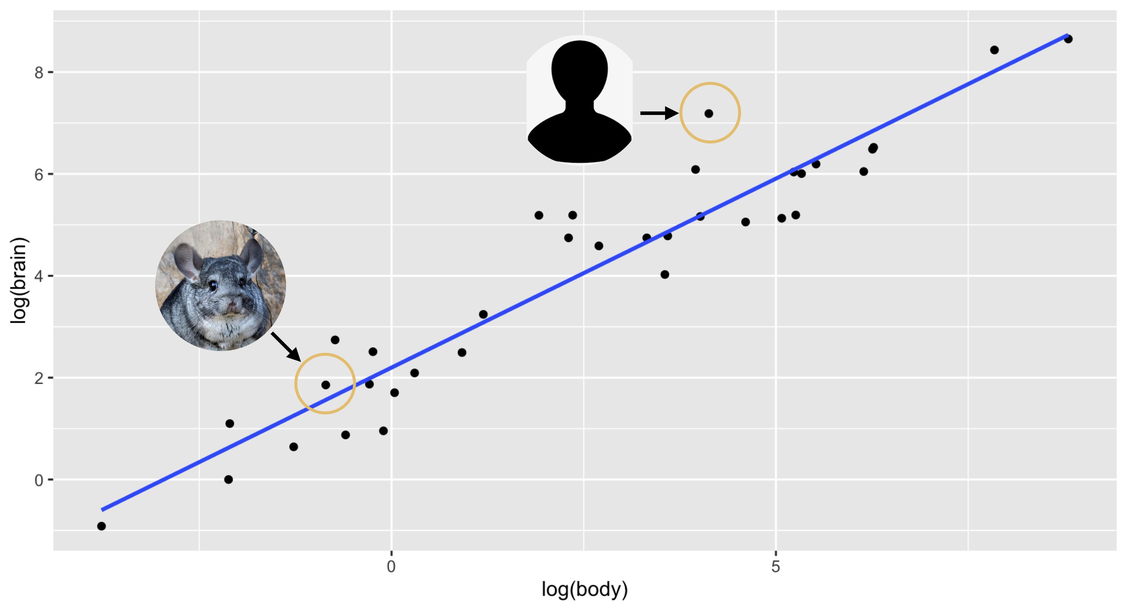
Lesson learned: if a result is surprising, consider double-checking your data for dumb clerical errors!
The residuals in a power-law model
As we’ve just seen, we can fit power laws using ordinary least squares after a log transformation of both the predictor and response. In introducing this idea, we didn’t pay much attention to the residuals, or model errors. If we actually keep track of these errors, we see that the model we’re fitting for the \(i\)th data point is this:
\[ \log y_i = \log \alpha + \beta_1 \log x_i + e_i \, , \]
where \(e_i\) is the amount by which the fitted line misses \(\log y_i\). We previously suppressed these residuals to lighten the notation, but now we’ll pay them a bit more attention.
Our equation with the residuals in it, \(\log y_i = \log \alpha + \beta_1 \log x_i + e_i\), says that the residuals affect the model in an additive way on the log scale. But if we exponentiate both sides, we find that they affect the model in a multiplicative way on the original scale:
\[ \begin{aligned} e^{\log y_i} &= e^{\log \alpha }\cdot e^{ \beta_1 \log x} \cdot e^{e_i} \\ y_i &= \alpha x^{\beta_1} e^{e_i} \, . \end{aligned} \]
Therefore, in a power low, the exponentiated residuals describe the percentage error made by the model on the original scale. Let’s work through the calculations for three examples:
- If \(e_i = 0.2\) on the log–log scale, then the actual response is \(e^{0.2} \approx 1.22\) times the value predicted by the model. That is, our model underestimates this particular \(y_i\) by 22%.
- If \(e_i = -0.1\) on the log–log scale, then the actual response is \(e^{-0.1} \approx 0.9\) times the value predicted by the model. That is, our model overestimates this particular \(y_i\) by \(10\%\).
- If \(e_i = 1.885\) on the log–log scale, then the actual response is \(e^{1.88} \approx 6.55\) times the value predicted by the model. That is, our model underestimates this particular \(y_i\) by a multiplicative factor of 6.55. This was the residual for humans in our brain-weight regression; humans’ brains are 6.55 times larger than expected based on their body weight.
The key thing to realize here is that the absolute magnitude of the error will therefore depend on whether the \(y\) variable itself is large or small. This kind of multiplicative error structure makes perfect sense for our body–brain weight data: a 10% error for a lesser short-trailed shrew will have us off by a gram or two, while a 10% error for an elephant will have us off by 60 kilos or more. Bigger critters mean bigger errors—but only in an absolute sense, and not if we measure error relative to body weight.
Example 2: demand for milk
A very important application of power laws in economics arises when estimating supply and demand curves.
- A supply curve answers the question: as a function of price (P), what quantity (Q) of a good or service will suppliers provide? When price goes up, suppliers are willing to provide more. But how much more?
- A demand curve answers the question: as a function of price (P), what quantity (Q) of a good or service do consumers demand? When price goes up, consumers are willing to buy less. But how much less?
Both curves are characterized by elasticities. One goal of microeconomics is to understand how these two curves define a market equilibrium price. But our goal here is a bit simpler: given some data on price and quantity demanded, can we estimate a demand curve and the corresponding price elasticity of demand?
Please download and import the data in milk.csv. This data comes from something called a “stated preference” study, which is intended to measure someone’s willingness to pay for a good or service. The basic idea of this study is that you give participants a hypothetical grocery budget, say $100, together with a “menu” of prices for various goods, and you ask them to allocate their fixed budget however they want. By manipulating the menu prices—for example, by making milk notionally more expensive for some participants and less expensive for others—you can indirectly measure how sensitive people’s purchasing decisions are to prices. In milk.csv, there are two columns: price, representing the price of milk on the menu; and sales, representing the number of participants willing to purchase milk at that price. Each study participant saw three versions of the menu: one where milk was cheap, one where it was expensive, and one where it was somewhere in the middle. But within those broad price bands, the exact numerical value of the prices each participant saw were jittered, so that in the aggregate, many different prices were represented.
Here’s a scatter plot of the data:
ggplot(milk) +
   geom_point(aes(x=price, y=sales))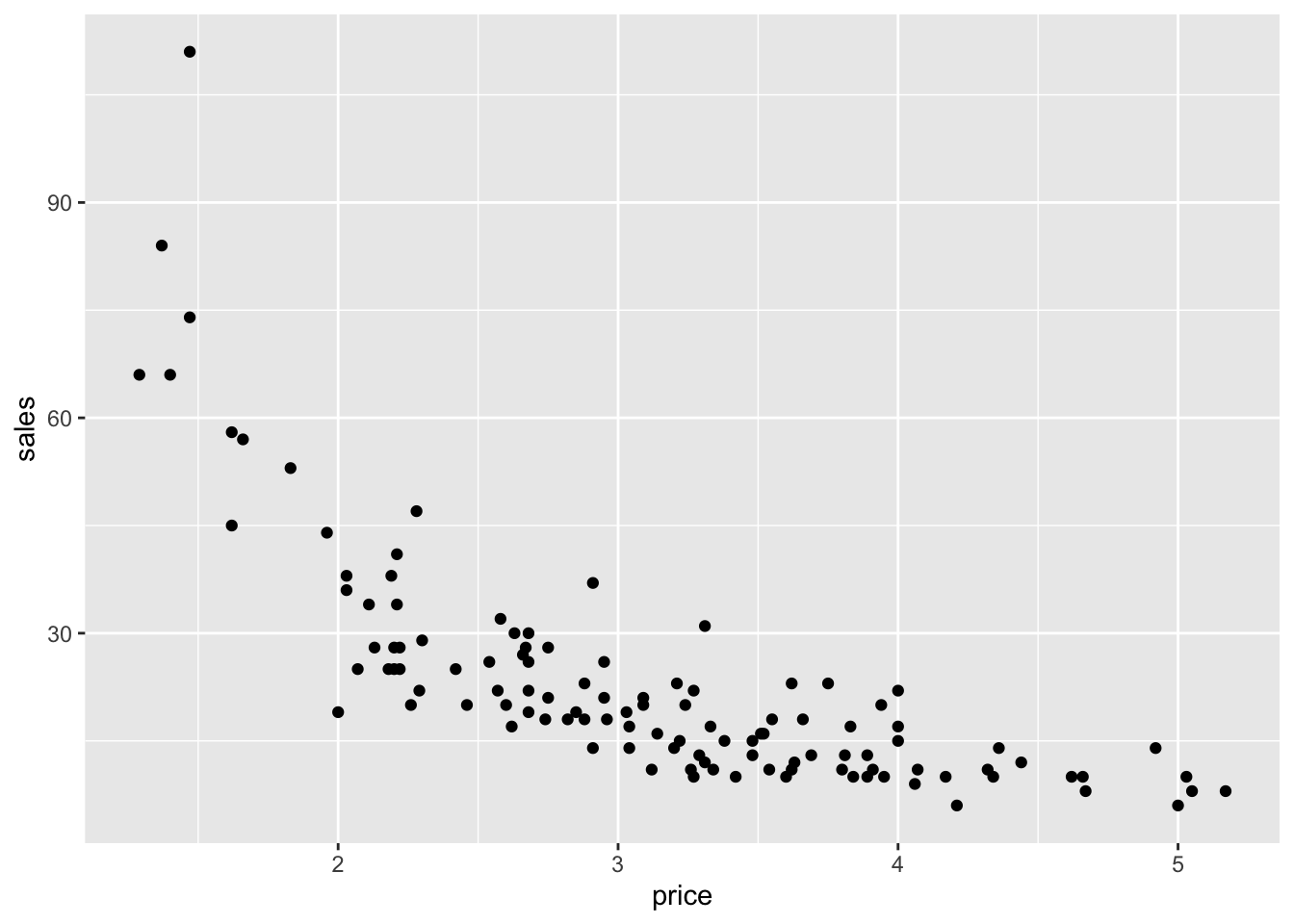
As you can see, people are generally less willing to buy milk at higher prices. Moreover, it becomes clear that a power law makes sense for this data when we plot it on a log-log scale:
ggplot(milk) +
   geom_point(aes(x=log(price), y=log(sales)))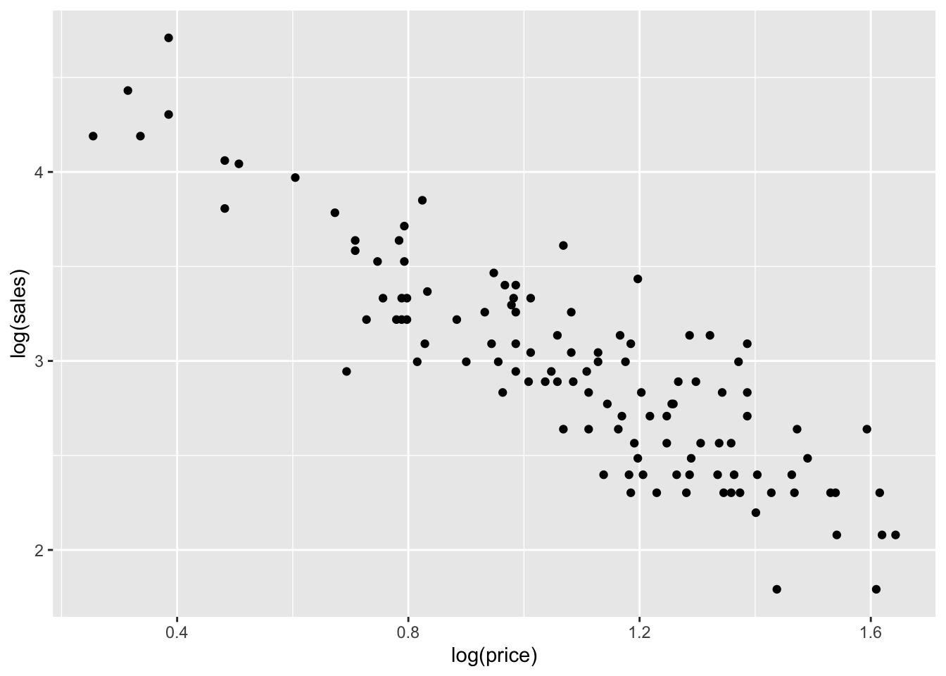
Remember, the characteristic feature of a power law is that it looks linear when plotting log(y) versus log(x), which is exactly what we see here. So let’s fit a linear model for log(sales) versus log(price):
lm_milk = lm(log(sales) ~ log(price), data=milk)
coef(lm_milk)
## (Intercept) log(price)
## 4.720604 -1.618578Our fitted equation on the log scale is \(\log(y) = 4.72 - 1.62 \cdot \log(x)\), meaning that our power law is:
\[ y = e^{4.72} \cdot x^{-1.62} \approx 112.2 \cdot x^{-1.62} \]
Our estimated elasticity is about -1.62: that is, when the price of milk increases by 1%, consumers want to buy about 1.62% less of it, on average.
Summary
Here’s a quick table wrapping up our discussion of “Beyond straight lines.”
| Type of change | Model | Example | Fitting in R | Coefficient on x |
|---|---|---|---|---|
| Additive | Linear | Heart rate vs. age | lm(y ~ x, data=D) |
Slope |
| Multiplicative | Exponential | Population vs. time | lm(log(y) ~ x, data=D) |
Growth rate |
| Relative proportional | Power law | Demand vs. price | lm(log(y) ~ log(x), data=D) |
Elasticity |
If I had to summarize this table in a single phrase, it would be: additive change on the log scale is the same thing as multiplicative change on the original scale. As long as you understand that basic principle, the whole table should fall into place.
All population estimates from 1950 onwards are rounded to the nearest thousand people.↩︎