Lesson 17 Probability models
Probability is often described as “the language of randomness.” The basic idea of probability is that even random outcomes exhibit structure and obey certain rules. In this lesson, we’ll learn to use these rules to build probability models, which are mathematical descriptions of random phenomena. Probability models can be used to answer interesting questions about uncertain real-world systems. For example:
- American Airlines oversells a flight from Dallas to New York, issuing 140 tickets for 134 seats, because they expect at least 6 no-shows (i.e. passengers who bought a ticket but fail to show up for the flight). How likely is it that the airline will have to bump someone to the next flight?
- Arsenal averages 1.45 goals per game, whereas Manchester City averages 2.18 goals per game. How likely it is that Arsenal beats Man City when they play each other?
- Since 1900, stocks have returned about \(6.5\%\) per year on average, net of inflation, but with a lot of variability around this mean. How does this variability affect the likely growth of your investment portfolio? How likely it is that you won’t meet your retirement goals with your current investment strategy?
Learning to answer these questions using probability means learning to build models of real-world systems, and to connect those models with data. In this lesson we’ll learn about four specific types of probability models: the binomial distribution, the Poisson distribution, the normal distribution, and the bivariate normal distribution.
17.1 What is a probability model?
Describing randomness
Building a probability model involves a few simple steps.
First, you identify the random variables of interest in your system. A random variable is just a numerical summary of an uncertain outcome.
- In our airline example, we could have any possible combination of passengers fail to show up (seat 2C, 14G, etc). But at the end of the day, if we want to know whether any passengers are likely to get bumped to the next flight, all we care about is how many ticketed passengers are no-shows, not their specific identities or seat numbers. So that’s our numerical summary, i.e. our random variable: \(X\) = the number of no-shows.
- Or in the soccer game between Arsenal and Man City, there are two obvious numerical summaries: \(X_1\) = the number of goals scored by Arsenal, and \(X_2\) = the number of goals scored by Man City.
Second, you identify the set of possible outcomes for your random variable, which we refer to as the sample space. In our airline example, the sample space is the set of whole numbers between 0 and 140 (the maximum number of no-shows possible, because that’s how many tickets were sold).
Finally, you provide a probability distribution, which is a rule for calculating probabilities associated with each possible outcome in the sample space. In the airline example, this distribution might be described using a simple lookup table based on historical data, e.g. 1% of all flights have 1 no-show, 1.2% have 2 no-shows, 1.7% have 3 no-shows, and so forth. In building a probability model, this final step is usually where the action is, and it’s what we’ll discuss extensively in this lesson.
There are two common types of random variables, corresponding to two common types of outcomes.
- Discrete: the sample space consists of whole numbers (0, 1, 2, 3, etc.).71 Both the number of airline no-shows and the score of a soccer game are discrete random variables: you can’t have 2.4 no-shows or 3.7 goals.
- Continuous: the random variable could be anything within a continuous range of numbers, like the price of Apple stock tomorrow, or the volume of a subsurface oil reservoir.
A simple example
Here’s a simple example that will help you practice your understanding of these concepts. Imagine that you’ve just pulled up to your new house after a long cross-country drive, only to discover that the movers have buggered off and left all your furniture and boxes sitting in the front yard. What a mess! (This actually happened to a friend of mine.) You decide to ask your new neighbors for some help getting your stuff indoors. Assuming your neighbors are the kindly type, how many pairs of hands might come to your aid? Let’s use the letter \(X\) to denote the (unknown) size of the household next door.
The table below shows a probability distribution for \(X\), taken from U.S. census data in 2015, in the form of a simple look-up table:
| Size | 1 | 2 | 3 | 4 | 5 | 6 | 7 | 8 |
| Probability | 0.28 | 0.336 | 0.155 | 0.132 | 0.06 | 0.023 | 0.011 | 0.003 |
You might find this easier to visualize using the barplot below:
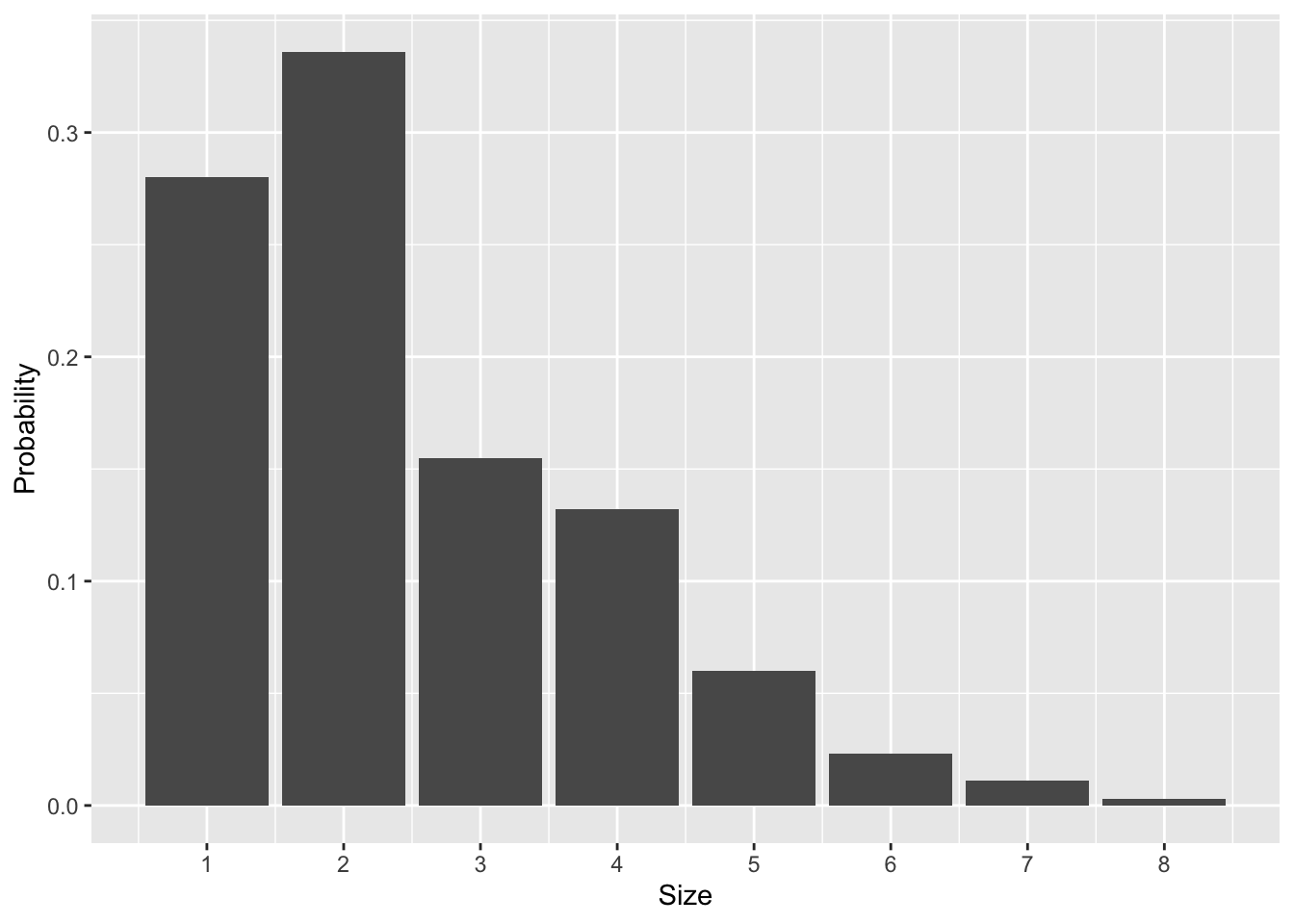
Figure 17.1: The probability distribution over U.S. household size, based on 2015 census data.
This probability distribution provides a complete representation of your uncertainty in this situation. It has all the key features of any probability distribution:
- There is a random variable, or a numerical summary of an uncertain situation—here, the size of the household next door (\(X\)).
- There is a set of possible outcomes for the random variable—here, the numbers 1 through 8. (There’s a tiny probability of 9 or more members of the household, which we’ve truncated to 0.)
- Finally, there are probabilities for each possible outcome—here provided via a simple look-up table or a bar graph.
Most probability distributions won’t be this simple, but they will all require specifying these same basic elements.
Expected value
When you knock on your neighbors’ door in the hopes of getting some help with your moving fiasco, how many people should you “expect” to be living there?
The expected value of a random variable is just an average of the possible outcomes—but a weighted average, rather than an ordinary average. This is a crucial distinction. If you take the 8 possible outcomes in Figure 17.1 and form their ordinary average, you get
\[ \mbox{Ordinary average} = \frac{1}{8} \cdot 1 + \frac{1}{8} \cdot 2 + \cdots + \frac{1}{8} \cdot 7 + \frac{1}{8} \cdot 8 = 4.5 \, . \]
Here, the weight on each possible outcome is \(1/8 = 0.125\), since there are 8 numbers. This is not the expected value; it give each possible outcome an equal weight, ignoring the fact that these outcomes have different probabilities.
To calculate an expected value, we instead form an average using unequal weights, given by the probabilities of each outcome:
\[ \mbox{Expected value} = (0.280) \cdot 1 + (0.336) \cdot 2 + \cdots + (0.011) \cdot 7 + (0.003) \cdot 8 \approx 2.5 \, . \]
The more likely numbers (e.g. 1 and 2) get higher weights than \(1/8\), while the unlikely numbers (e.g. 7 and 8) get lower weights.
This example conveys something important about expected values. Even if the world is black and white, an expected value is often grey. For example, the expected American household size is 2.5 people, a baseball player expects to get 0.25 hits per at bat, and so forth.
As a general rule, suppose that the possible outcomes for a random variable \(X\) are the numbers \(x_1, \ldots, x_N\). The formal definition for the expected value of \(X\) is
\[ E(X) = \sum_{k=1}^N P(X = x_k) \cdot x_k \, . \]
This measures the center or mean of the probability distribution, in the same way that the sample mean measures the center of a data distribution. Notice how we use big \(X\) to denote the random variable itself, and little \(x_k\) to denote the possible outcomes for the random variable. This is a common notational convention in probability (although if the possible outcomes are the integers, e.g. 0, 1, 2, etc, then we might just refer to them as \(k\)).
A related concept is the variance, which measures the dispersion or spread of a probability distribution. It is the expected (squared) deviation from the mean, or
\[ \mbox{var}(X) = E \big( \{X-E(X)\}^2 \big) \, . \]
The standard deviation of a probability distribution is \(\sigma = \mbox{sd}(X) = \sqrt{\mbox{var}(X)}\). The standard deviation is more interpretable than the variance, because it has the same units (dollars, miles, etc.) as the random variable itself.
17.2 Models for discrete outcomes
Of the steps required to build a probability model, the requirement that we provide a rule that can be used to calculate probabilities for each possible outcome in the sample space is usually the hardest one. In fact, for most scenarios, if we had to build such a rule from scratch, we’d be in for an awful lot of careful, tedious work. Imagine trying to list, one by one, the probabilities for all possible outcomes of a soccer game, or all possible outcomes for the performance of a portfolio containing a mix of stocks and bonds over 40 years.
Thus instead of building probability distributions from scratch, we will rely on a simplification called a parametric probability model. A parametric probability model is a probability distribution that can be completely described using a relatively small set of numbers, far smaller than the number of distinct outcomes in the sample space. These numbers are called the parameters of the distribution. There are lots of commonly used parametric models that have been invented for specific purposes. A large part of getting better at probability modeling is to learn about these existing parametric models, and to gain an appreciation for the typical kinds of real-world problems where each one is appropriate.
Recall our distinction earlier between discrete and continuous random variables. A discrete random variable means that you can count the possible outcomes on your fingers and toes.72 Examples here include the number of no-shows on a flight, the number of goals scored by Man U in a soccer game, or the number of gamma rays emitted by a gram of radioactive uranium over the next second. Continuous random variables, on the other hand, can take on any value within a given range, like the price of a stock or the speed of a tennis player’s serve.
We’ll start with the case of discrete random variables. Suppose that we have a random variable \(X\) whose possible outcomes are \(x_1\), \(x_2\), and so forth. You’ll recall that, to specify a probability model, we must provide a rule that can be used to calculate \(P(X = x_k)\) for each possible outcome. When building parametric probability models, this rule takes the form of a probability mass function, or PMF: \[ P(X = x_k) = f(x_k \mid \theta) \, . \] In words, this equation says that the probability that \(X\) takes on the value \(x_k\) is a function of \(x_k\). The probability mass function depends a number (or set of numbers) \(\theta\), called the parameter(s) of the model.
To specify a parametric model for a discrete random variable, we must both provide both the probability mass function \(f\) and the parameter \(\theta\). This is best illustrated by example. We’ll consider two: the binomial and Poisson distributions.
The binomial distribution
One of the simplest parametric models in all of probability theory is called the binomial distribution, which generalizes the idea of flipping a coin many times and counting the number of heads that come up. The binomial distribution is a useful parametric model for any situation with the following properties:
- We observe \(N\) different random events, each of which can be either a yes or a no.
- The probability of any individual event being yes is equal to \(P\), a number between 0 and 1.
- Each event is yes or no independently of the others.
- The random variable \(X\) of interest is total number of yes events. Thus the sample space is the set \(\{0, 1, \ldots, N-1, N\}\).
The meaning of “yes” events and “no” events will be context-dependent. For example, in the airline no-show example, we might say that a “yes” event corresponds to a single passenger failing to show up for his or her flight (which is probably not good for the passenger, but definitely a success in the eyes of an airline that’s overbooked a flight). Another example: in the PREDIMED study of the Mediterranean diet, a “yes” event might correspond to single study participant experiencing a heart attack.
If a random variable \(X\) satisfies the above four criteria, then it follows a binomial distribution, and the probability mass function of \(X\) is
\[ P(X=k) = f(k \mid N,P) = \binom{N}{k} \ P^k \ (1-P)^{N-k} \, , \]
where \(N\) and \(P\) are the parameters of the model. The notation \(\binom{N}{k}\), which we read aloud as “N choose k,” is shorthand for the following expression in terms of factorials:
\[ \binom{N}{k} = \frac{N!}{k! (N-k)!} \, . \]
This term, called a binomial coefficient, counts the number of possible ways there are to achieve \(k\) “yes” events out of \(N\) total events.
The way we calculate these binomial probabilities in R is using the dbinom function. Let’s see an example.
Example: airline no-shows
Let’s use the binomial distribution as a probability model for our earlier example on airline no-shows. The airline sold tickets 140 people, each of which will either show up to fly that day (a yes'' event) or not (ano’’ event). Let’s make two simplifying assumptions: (1) that each person decides to show up or not independently of the other people, and (2) that the probability of any individual person failing to show up for the flight is 9%.73 These assumptions make it possible to apply the binomial distribution. Thus the distribution for \(X\), the number of ticketed passengers who fail to show up for the flight, has PMF
\[ P(X = k) = \binom{140}{k} \ (0.09)^k \ (1-0.09)^{140-k} \, . \]
So, for example, how likely is it that we’d expect to see exactly 7 no-shows under this model? Let’s use dbinom to find out, which uses the above equation to calculate binomial probabilities:
dbinom(7, size=140, prob=0.09)## [1] 0.03065435About 0.03, or a 3% chance of exactly 7 no shows. What about 13 no shows?
dbinom(13, size=140, prob=0.09)## [1] 0.1146275Much higher: about an 11.5% chance. We can also visualize these binomial probabilities as a function of \(k\), the number of no-shows, like this:
airlines = tibble(k=0:30)
airlines = airlines %>%
  mutate(prob=dbinom(k, size=140, prob=0.09))
First we create a tibble, or table of data, that has a single column called k, containing the numbers 0 through 30 (0:30). Then we use mutate to add a column to our table that contains the binomial probabilities for each value of \(k\).
ggplot(airlines) +
  geom_col(aes(x=k, y=prob))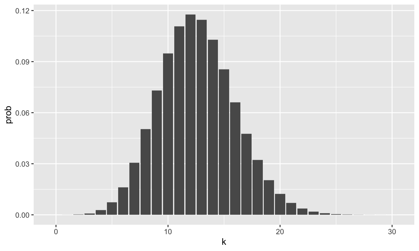
Figure 17.2: A barplot showing the probability distribution for the number of no-shows on an overbooked airline flight with 140 tickets sold, assuming a no-show rate of 9% and that individual no-shows are independent. The horizontal axis has been truncated at k=30 because the probability of more than 30 no-shows is vanishingly small under the binomial model.
So let’s return to the question we began this lesson with. Suppose the airline issued 140 tickets, but that they are only 134 seats on the plane. How likely is it that the airline will have to bump someone to the next flight and compensate them for hassle? Everything will be fine if there are 6 or more no-shows. So this question boils down to the probability that 5 or fewer ticketed passengers will fail to show up.
This doesn’t seem very likely based on the probability distribution in Figure 17.2, where the bars down in the “5 or fewer” region are pretty small. To get a more precise answer, we could add up the individual probabilities for the numbers 0 up through 5:
\[ P(X \leq 5) = P(X = 0) + P(X = 1) + \cdots + P(X = 5) \, . \]
The function called pbinom calculates this probability, \(P(X \leq 5)\), directly:
pbinom(5, size=140, prob=0.09)## [1] 0.01098229So according to the model, there’s about a 1.1% chance of 5 or fewer no-shows.
We refer to pbinom as the cumulative distribution function of the binomial model, because it sums up the cumulative probability of all outcomes up to and including the requested value of \(X=5\).
The binomial model—like all parametric probability models—is just an approximation. This approximation trades away flexibility for simplicity: instead of having to specify the probability of all possible outcomes between 0 and 140, we only have to specify two numbers: \(N=140\) and \(p=0.09\), the parameters of the binomial distribution. These parameters then determine the probabilities for all possible outcomes.
In light of this trade-off, any attempt to draw conclusions from a parametric probability model should also involve the answer to two important questions. First, what unrealistic simplifications have we made in building the model? Second, have these assumptions made our model too simple? This second answer will always be context dependent, and it’s hard to provide general guidelines about what “too simple” means. Often this boils down to the question of what might go wrong if we use a simplified model, rather than invest the extra work required to build a more complicated model. This is similar to the trade-off that engineers face when they build simplified physical models of something like a suspension bridge or a new fighter jet. Like many things in statistics and probability modeling, this is a case where there is just no substitute for experience and subject-area knowledge.
The expected value. Recall our definition of expected value as the probability-weighted average of possible outcomes:
\[ E(X) = \sum_{k=1}^N P(X = x_k) \cdot x_k \, . \]
Now let’s imagine that \(X\) is a binomial random variable: \(X \sim \mbox{Binomial}(N, P)\). If we apply the formal definition of expected value and churn through the math, we find that
\[ \begin{aligned} E(X) &= \sum_{k=0}^{k=N} \binom{N}{k} \ P^k \ (1-P)^{N-k} \cdot k \\ &= N P \, . \end{aligned} \]
We’ve skipped a lot of algebra steps here, but the punchline is a lot more important than the derivation: a random variable with a binomial distribution has expected value \(E(X) = NP\).
This is sometimes called the “NP rule” for expected value: the expected number of events is the number of times an event has to occur (N), times the probability that the event will occur each time (P). The NP rule is a valid way of calculating an expected value precisely for those random events that can be described by a binomial distribution. (Note: a similar calculation shows that a random variable with a binomial distribution has standard deviation \(\mbox{sd}(X) = \sqrt{NP(1-P)}\).)
The Poisson distribution
Our second example of a parametric probability model is the Poisson distribution, named after the French mathematician Simeon Denis Poisson. The Poisson distribution is used to model the number of times than some event occurs in a pre-specified interval of time. For example:
- How many goals will Arsenal score in their game against Man U? (The event is a goal, and the interval is a 90-minute game.)
- How many couples will arrive for dinner at a hip new restaurant between 7 and 8 PM on a Friday night? (The event is the arrival of a couple asking to sit at a table for two, and the interval is one hour).
- How many irate customers will call the 1-800 number for AT&T customer service in the next minute? (The event is a phone call that must be answered by someone on staff, and the interval is one minute.)
In each case, we identify the random variable \(X\) as the total number of events that occur in the given interval. The Poisson distribution will provide an appropriate description for this random variable if the following criteria are met:
- The events occur independently; seeing one event neither increases nor decreases the probability that a subsequent event will occur.
- Events occur the same average rate throughout the time interval. That is, there is no specific sub-interval where events are more likely to happen than in other sub-intervals. For example, this would mean that if the probability of Arsenal scoring a goal in a given 1-minute stretch of the game is 2%, then the probability of a goal during 1-minute stretch is 2%.
- The chance of an event occuring in some small sub-interval is proportional to the length of that sub-interval. For example, this would mean that if the probability of Arsenal scoring a goal in any given 1-minute stretch of the game is 2%, then the probability that they score during a 2-minute stretch is 4%.
A random variable \(X\) meeting these criteria is said to follow a Poisson distribution. The possible outcomes of a Poisson distribution are the non-negative integers \(0, 1, 2,\) etc. This is one important way in which the Poisson differs from the binomial. A binomial random variable cannot exceed \(N\), the number of trials. But there is no fixed upper bound to a Poisson random variable.
The probability mass function of Poisson distribution takes the following form:
\[ P(X = k) = \frac{\lambda^k}{k!} e^{-\lambda} \, , \]
with a single parameter which we denote with the Greek letter \(\lambda\), called the rate. This parameter governs the average number of events in the interval: \(E(X) = \lambda\). It also governs the standard deviation: \(\mbox{sd}(X) = \sqrt{\lambda}\).
Example: modeling the score in a soccer game
Let’s return to our soccer game example. Across all games in the 2020-21 English Premiere League (widely considered to be the best professional soccer league in the world), Arsenal scored 1.45 goals per game, while Manchester City scored 2.18 goals per game.74 How likely is it that Arsenal beats Man City? How likely is a scoreless draw at 0-0? To answer these questions, let’s make some simplifying assumptions.
- Let \(X_{A}\) be the number of goals scored in a game by Arsenal. We will assume that \(X_A\) can be a described by a Poisson distribution with rate parameter \(1.45\): that is, \(X_A \sim \mbox{Poisson}(\lambda = 1.45)\).
- Let \(X_{M}\) be the number of goals scored in a game by Manchester City. We will assume that \(X_M \sim \mbox{Poisson}(\lambda = 2.18)\).
- Finally, we will assume that \(X_A\) and \(X_M\) are independent of one another.
In other words, our model sets the rate parameters for each team’s Poisson distribution to match their average scoring rates across the season, and then assumes that the two teams score goals independently. This is pretty simple, but it’s surely better than guessing!
To calculate probabilities under this model, we can use the dpois function in R. This behaves much like dbinom does: you give it a possible outcome (k) and a rate parameter (\(\lambda\)), and dpois will tell you how likely that possible outcome is under a Poisson distribution with that rate parameter.
Let’s visualize the probability distribution for Man City in the code block below. We’ll only take it out to 8 goals, since the probabilities become vanishingly small beyond that:
man_city_probs = tibble(k=0:8)
man_city_probs = man_city_probs %>%
  mutate(prob = dpois(k, lambda=2.18))

ggplot(man_city_probs) +
  geom_col(aes(x=k, y=prob))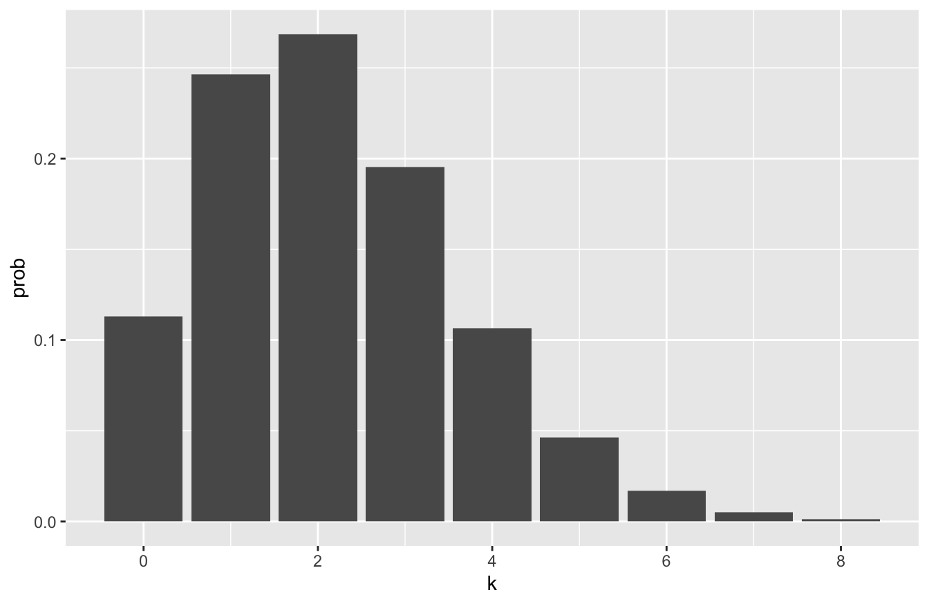
The probability distribution for Arsenal looks like this. You can see it’s visibly shifted to the left compared to the distribution for Manchester City:
arsenal_probs = tibble(k=0:8)
arsenal_probs = arsenal_probs %>%
  mutate(prob = dpois(k, lambda=1.45))

ggplot(arsenal_probs) +
  geom_col(aes(x=k, y=prob))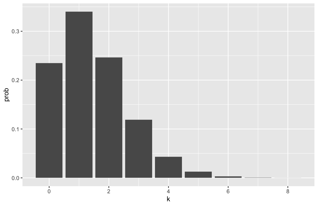
So, for example, if we wanted to estimate the probability of a 2-1 win for Man City, we can multiply the two Poisson probabilities together under the assumption of independence. This allows us to multiply together the two probabilities we get from each random variable’s Poisson distribution:
\[ P(X_M = 2, X_A = 1) = \left( \frac{2.18^2}{2!} e^{-2.18} \right) \cdot \left( \frac{1.45^1}{1!} e^{-1.45} \right) \approx 0.091 \, . \]
R’s dpois function gives us this result with little fuss:
# P(X_M = 2) * P(X_A = 1)
dpois(2, lambda=2.18) * dpois(1, lambda=1.45)
## [1] 0.09136125About 9.1%. What about a 0-0 draw?
# P(X_M = 0) * P(X_A = 0)
dpois(0, lambda=2.18) * dpois(0, lambda=1.45)
## [1] 0.02651618About 2.7%.
With just a little bit more work, we can calculate the probability of all possible outcomes up to a rip-roaring (but very unlikely) 6-6 draw. We’ll first create a data frame that lists the possible scores for each team, up to 6 goals apiece:
soccer_scores = tibble(man_city = 0:6, arsenal = 0:6)We’ll use a combination of an old friend (mutate) and a handy new data verb, expand from the tidyr library, that expands the data frame to include all possible combinations of the variables (which here, are all possible scores of the game):
soccer_probs = soccer_scores %>%
  tidyr::expand(man_city, arsenal) %>%
  mutate(prob = dpois(man_city, 2.18) * dpois(arsenal, 1.45))
This soccer_probs object now contains the probabilities for all possible game scores up to 6-6:
head(soccer_probs, 10)## # A tibble: 10 × 3
## man_city arsenal prob
## <int> <int> <dbl>
## 1 0 0 0.0265
## 2 0 1 0.0384
## 3 0 2 0.0279
## 4 0 3 0.0135
## 5 0 4 0.00488
## 6 0 5 0.00142
## 7 0 6 0.000342
## 8 1 0 0.0578
## 9 1 1 0.0838
## 10 1 2 0.0608To visualize these probabilities, we can make a heat map, which will array the possible scores in a 2D grid of tiles, and then color in each possible score according to its probability. The simplest way to make a heat map in R is using geom_tile, like this:
ggplot(soccer_probs) +
  geom_tile(aes(x=man_city, y=arsenal, fill=prob))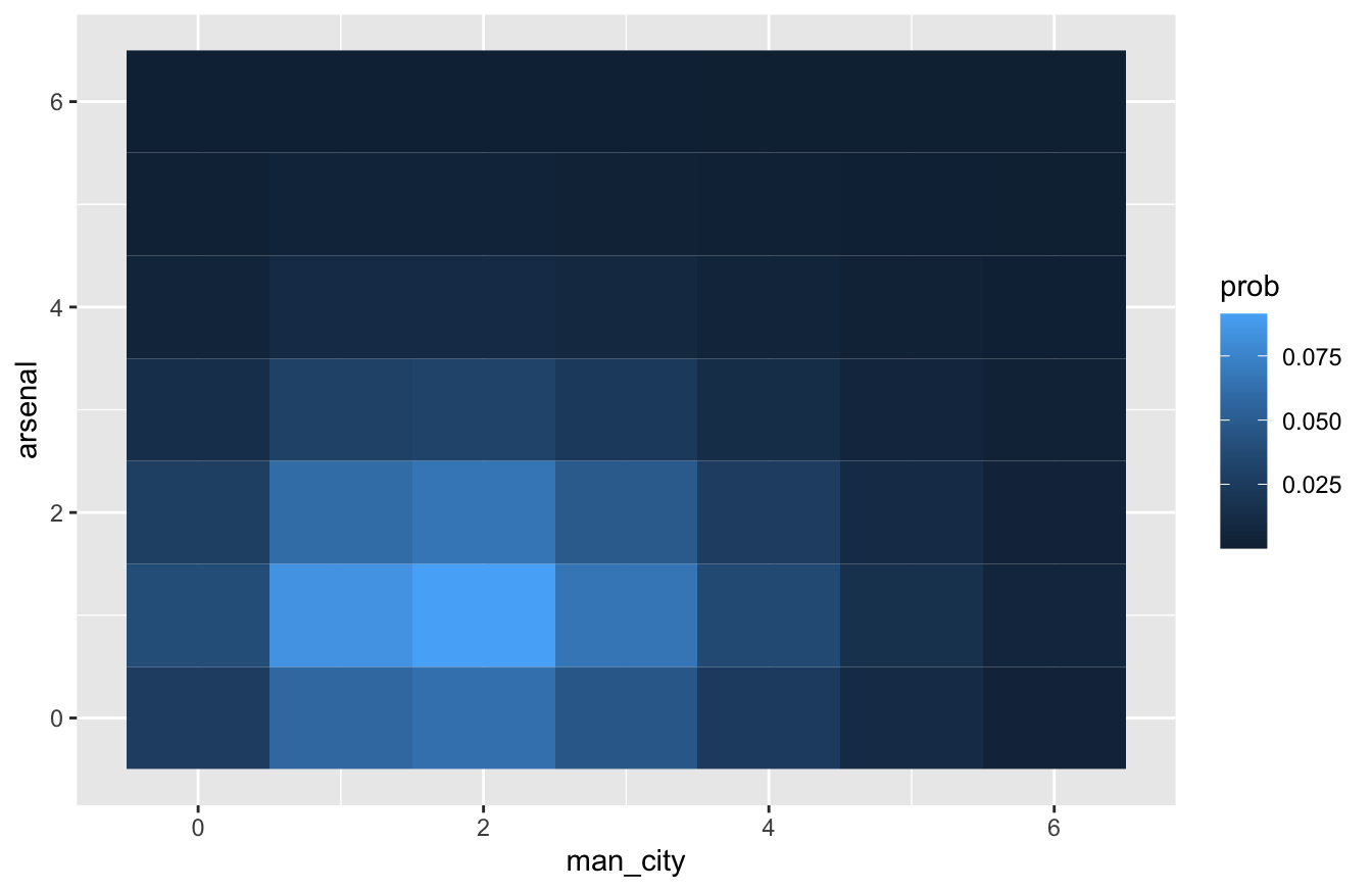
This looks nice enough. But here’s a fancier version I like slightly better; it adds a text layer that provides some helpful redundancy, and it tweaks the color scale to something that I find a little more intuitive:
ggplot(soccer_probs) +
  geom_tile(aes(x=man_city, y=arsenal, fill=prob)) +
  geom_text(aes(x=man_city, y=arsenal, label=round(prob, 3)), color='darkblue') +
  scale_fill_gradient(low = "white", high = "red")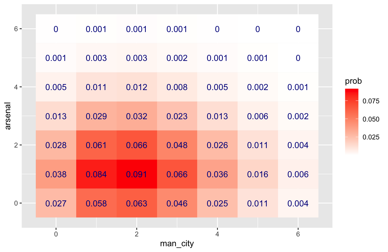
What if we wanted to calculate the overall probability of a Man City win? Let’s filter our soccer_probs data frame to include those game scores where Man City beats Arsenal, and sum the probabilities for all those scores:
soccer_probs %>%
  filter(man_city > arsenal) %>%
  summarize(sum(prob))
## # A tibble: 1 × 1
## `sum(prob)`
## <dbl>
## 1 0.535So our model predicts about a 53.5% chance of a Man City win. What about a draw?
soccer_probs %>%
  filter(man_city == arsenal) %>%
  summarize(sum(prob))
## # A tibble: 1 × 1
## `sum(prob)`
## <dbl>
## 1 0.205About 20.5%. And an Arsenal win?
soccer_probs %>%
  filter(man_city < arsenal) %>%
  summarize(sum(prob))
## # A tibble: 1 × 1
## `sum(prob)`
## <dbl>
## 1 0.252About 25.2%.
Poisson tail probabilities
If you have eagle eyes, you might notice that the probabilities of our simulated outcomes (Man City win + draw + Arsenal win) don’t quite sum up to 1. That’s partially because of rounding, but also because, in the interest of keeping things simple, we’ve ignored all game scores where either Arsenal or Man City score more than 6 goals. These outcomes collectively have a very small (but nonzero) probability under our model.
You might wonder: just how large is this probability? In other words, how likely is it that either Arsenal or Man City will score more than 6 goals?
Let’s start with the probability that Man City scores 6 or more goals: \(P(X_M > 6)\). To calculate this, we’ll use the ppois function, which works much like pbinom did above. Specifically, it computes tail areas under the Poisson distribution. So to calculate \(P(X_M > 6)\) under a Poisson(2.18) distribution, we call ppois like this:
ppois(6, 2.18, lower.tail=FALSE)## [1] 0.007118364Note that if instead we specified lower.tail=TRUE, ppois would calculate \(P(X_M \leq 6)\).
A similar calculation can get us \(P(X_A > 6)\) under the Poisson(1.45) distribution for Arsenal:
ppois(6, 1.45, lower.tail=FALSE)## [1] 0.0007622702Now we have to combine these two pieces using the addition rule:
\[ \begin{aligned} P(X_M > 6 \mbox{ or } X_A > 6) &= P(X_M > 6) + P(X_A > 6) - P(X_M > 6, X_A > 6) \\ &= P(X_M > 6) + P(X_A > 6) - P(X_M > 6) \cdot P(X_A > 6) \quad \mbox{(independence)} \\ &\approx 0.00712 + 0.00076 - 0.00712 \cdot 0.00076 \\ &\approx 0.0078 \end{aligned} \]
So all told, by truncating the game scores at 6 in our calculation, we’ve ignored less than 1% of all the possible outcomes in the probability distribution.
An alternative approach: simulation
Now let’s consider a second, alternative approach to analyzing the same situation: running a Monte Carlo simulation. Specifically, we’ll use the rpois function, which generates Poisson random variables, to simulate the result of 100,000 soccer games under our model.
You’ll see how easy this is in R! In fact, it’s borderline trivial, especially compared to doing math with the PMF of a Poisson distribution. All we really need to do is to simulate each team’s score across many games (here 100,000):
NMC = 100000   # number of Monte Carlo simulations
arsenal = rpois(NMC, 1.45)
ManCity = rpois(NMC, 2.18)
Once we’ve simulated game outcomes, now we can ask how likely various outcomes are. For example, here’s the approximate probability of an Arsenal win:
sum(arsenal > ManCity)/NMC## [1] 0.25293And here are the probabilities of a draw and a Man City win, respectively:
sum(arsenal == ManCity)/NMC## [1] 0.2051sum(arsenal < ManCity)/NMC## [1] 0.54197As you can see, these are very close to the numbers we calculated using the Poisson PMF above. If we were interested in a finer-grained look at the results, we could also cross-tabulate the different combinations of scores, like this.
# Cross-tabulate the simulated results
xtabs(~arsenal + ManCity)
## ManCity
## arsenal 0 1 2 3 4 5 6 7 8 9 10 12
## 0 2625 5870 6210 4656 2503 1033 437 104 25 7 2 0
## 1 3763 8483 9191 6666 3579 1567 613 168 53 17 3 1
## 2 2791 5993 6679 4851 2596 1099 403 135 26 8 6 0
## 3 1398 2954 3369 2191 1214 507 216 62 17 1 2 0
## 4 496 1053 1121 854 462 194 85 20 8 2 1 0
## 5 141 325 278 233 132 62 25 6 3 0 0 0
## 6 34 75 92 64 39 11 8 5 0 0 0 0
## 7 11 13 19 11 8 4 2 0 0 0 0 0
## 8 0 2 5 1 0 0 0 0 0 0 0 0
## 9 0 1 0 0 0 0 0 0 0 0 0 0The resulting table isn’t as pretty as the heat map above, but it gets the job done. Based on the table, it looks like the most likely outcome under our model is a 2-1 Man City win, which happens roughly 9,000 times out of 100,000 (9%).
17.3 The normal distribution, revisited
Our third example of a parametric probability model is the normal distribution—the most famous and widely used distribution in the world. We’ve seen the normal distribution before because of its importance in Large-sample inference, specifically The Central Limit Theorem. Now we’ll consider the use of the normal distribution as a building block for probability models of real-world systems.
Some history
Historically, the normal distribution arose as an approximation to the binomial distribution. In 1711, a Swiss mathematician named Abraham de Moivre published a book called The Doctrine of Chances. The book was reportedly was prized by gamblers of the day for its many useful calculations that arose in dice and card games. In the course of writing about these games, de Moivre found it necessary to perform computations using the binomial distribution for very large values of \(N\), the number of independent trials. Imagine flipping a large number of coins and making bets on the outcomes with otherwise-bored French aristocrats, and you too will see the necessity of this seemingly esoteric piece of mathematics.
The issue de Moivre faced, however, was quite boring and practical: calculations involving the binomial distribution required multiplying very large numbers together. This became tedious very quickly. In fact, the required arithmetic behind the binomial was far too time-consuming without modern computers, which de Moivre didn’t have. So he derived an approximation to binomial probabilities based on the number \(e \approx 2.7183\), the base of the natural logarithm. He discovered that, if a random variable \(X\) has a binomial distribution with parameters \(N\) and \(p\), which we recall is written \(X \sim \mbox{Binomial}(N,p)\), then the approximate probability that \(X = k\) is
\[ P(X=k) \approx \frac{1}{\sqrt{2\pi \sigma^2}} \ e^{-\frac{(k - \mu)^2}{2 \sigma^2 } }\, , \]
where \(\mu = Np\) and \(\sigma^2 = Np(1-p)\) are the expected value and variance, respectively, of the binomial distribution. When considered as a function \(k\), this results in the familiar bell-shaped curve plotted in the figure below—the famous normal distribution. And with a modern computer that can do exact calculations with the binomial, we can see what an accurate approximation it is.
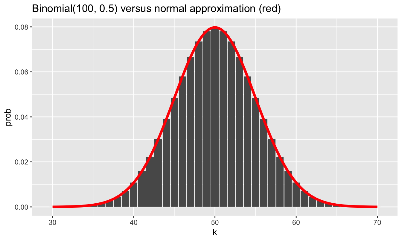
In fact, this famous result of de Moivre’s is usually thought of as the first central limit theorem in the history of statistics.
The other term for the normal distribution is the Gaussian distribution, named after the German mathematician Carl Gauss. This raises a puzzling question. If de Moivre invented the normal approximation to the binomial distribution in 1711, and Gauss (1777–1855) did his work on statistics almost a century after de Moivre, why then is the normal distribution named after Gauss and not de Moivre? This quirk of naming arises because de Moivre viewed his approximation only as a narrow mathematical tool for performing calculations using the binomial distribution. He gave no indication that he saw it as a more widely applicable probability distribution for describing random phenomena. But Gauss—together with another mathematician around the same time, named Laplace—did see this, and much more.
If we want to use the normal distribution to describe our uncertainty about some random variable \(X\), we write \(X \sim N(\mu, \sigma)\). The numbers \(\mu\) and \(\sigma\) are parameters of the distribution. The first parameter, \(\mu\), describes where \(X\) tends to be centered; it also happens to be the expected value of the random variable. The second parameter, \(\sigma\), describes how spread out \(X\) tends to be around its expected value; it also happens to be the standard deviation of the random variable. Together, \(\mu\) and \(\sigma\) completely describe a normal distribution, and therefore completely characterize our uncertainty about a normally distributed random variable \(X\).
We’ve already covered some important basic facts about the normal distribution several lessons ago (see The normal distribution), and I encourage you to review those. Our focus here is different: we won’t be using the normal distribution for statistical inference, but rather to build probability models.
When is the normal distribution an appropriate model?
The normal distribution is now used as a probability model in situations far more diverse than de Moivre, Gauss, or Laplace ever would have envisioned. But it still bears the unmistakeable traces of its genesis as a large-sample approximation to the binomial distribution. That is, it tends to work best for describing situations where each normally distributed random variable can be thought of as the sum of many tiny, independent effects of about the same size, some positive and some negative. In cases where this description doesn’t apply, the normal distribution may be a poor model of reality. Said another way: the normal distribution describes an aggregation of nudges: some up, some down, but all pretty small.
As a result, the normal distribution shares the property of the binomial distribution that huge deviations from the mean are unlikely. It has, in statistical parlance, “thin tails.” Using our rule of thumb that we learned in a previous lesson, a normally distributed random variable has only a \(5\%\) chance of being more than two standard deviations away from the mean. It also has less than a \(0.3\%\) chance of being more than three standard deviations away from the mean. Large outliers are vanishingly rare.
Let’s examine the consequences of this fact, taking our examples from the world of finance.
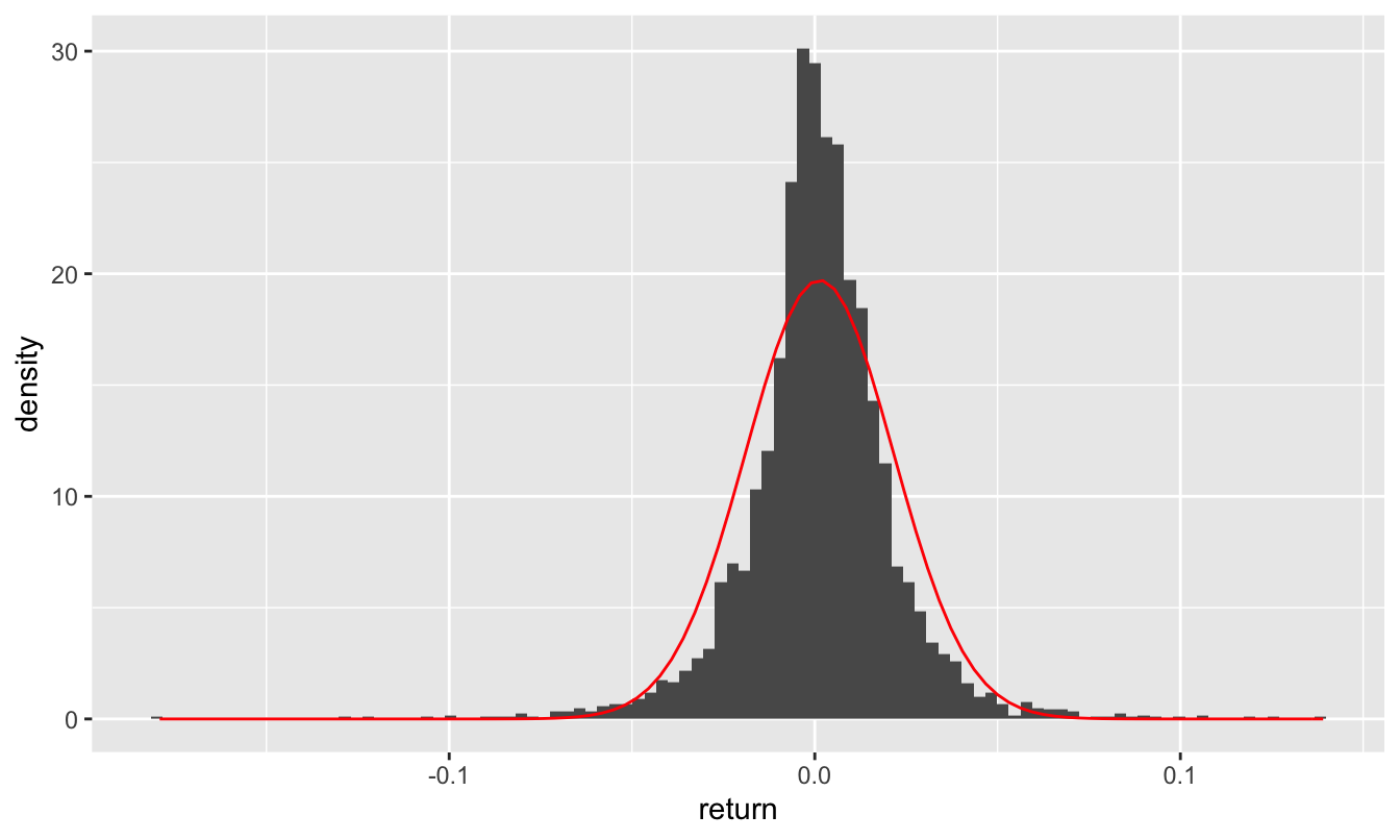
Figure 17.3: Daily stock returns of AAPL, 2007-2021, together with the best-fitting normal approximation.
Daily returns, single stock. For example, in the histogram above, we see the daily returns (where 0.01 = 1%) for Apple stock between 2007 and 2021, which you can find in aapl_returns.csv. We also see a curve with the best-fitting normal approximation to this histogram, based on the sample mean of \(\mu = 0.0013\) and sample standard deviation of \(\sigma = 0.0202\), i.e. about 2%:
library(mosaic)
favstats(~return, data=aapl_returns) %>% round(4)
## min Q1 median Q3 max mean sd n missing
## -0.1792 -0.0078 0.0011 0.0115 0.139 0.0013 0.0202 3738 0The normal approximation is visibly poor, but just how bad is it? To illustrate, let’s consider the tails of the distribution. In the real word, over the 15 year period covered by our data, AAPL had ten really bad days where it lost at least 8% of its value in a single day:
aapl_returns %>%
  count(return <= -0.08)
## return <= -0.08 n
## 1 FALSE 3728
## 2 TRUE 10These losses were “four sigma” events, since they were roughly four standard deviations (\(\sigma \approx 0.02\)) below the mean (\(\mu \approx 0\)). So let’s ask: how likely is such a four-sigma loss under the normal model? The function pnorm can give us the answer; like pbinom and ppois, can tell us how much cumulative probability falls into either the lower or upper tail of the distribution, beyond some specific query value. So using pnorm, we can ask how likely it is that, under our normal model, we would see a daily return as bad as -8%:
pnorm(-0.08, mean=0.0013, sd = 0.0202)## [1] 0.00002851764That’s a small number. According to the model, there is an approximate probability of \(2.8 \times 10^{-5} \approx 0.00003\) of seeing a four-sigma loss or worse. In the 3738 trading days covered by our data, the model predicts that such a large negative swing should have occurred approximately \(0.00003 \times 3738 \approx 0.1\) times, i.e. not at all. In fact, the model expects that such a large negative return should occur roughly once every 140 years.75 Yet we saw such a swing ten times in only 15 years. These four-sigma events would be wildly implausible if the returns really followed a normal distribution.
We can ask a similar question about the upper tail of the distribution. How likely is it that, under the normal model, we’d expect to see a daily return in excess of +10%? This is a “five-sigma” event, since it’s roughly five standard deviations above the mean. We can also use pnorm for this calculation, by specifying that we want an upper-tail rather than a lower-tail probability:
pnorm(0.10, mean=0.0013, sd = 0.0202, lower.tail=FALSE)## [1] 0.0000005141641Such an extreme event has a probability of roughly \(5 \times 10^{-7}\), or 1 out of 2 million. According to the normal model, this should happen roughly once every 2 million trading days, or equivalently, about once every 8000 years (at roughly 250 trading days per year). But in reality, in the fifteen years spanned by our data, such a five-sigma gain of 10% or more happened 6 times:
aapl_returns %>%
  count(return >= 0.10)
## return >= 0.1 n
## 1 FALSE 3732
## 2 TRUE 6Clearly the normal model is inadequate—and it’s especially inadequate in the tails, or extremes, of the distribution, where it wildly underestimates the probability of big losses or big gains that are many standard deviations away from the mean. I’ve marked up the histogram to reflect this; pardon the iPad chicken scratch!
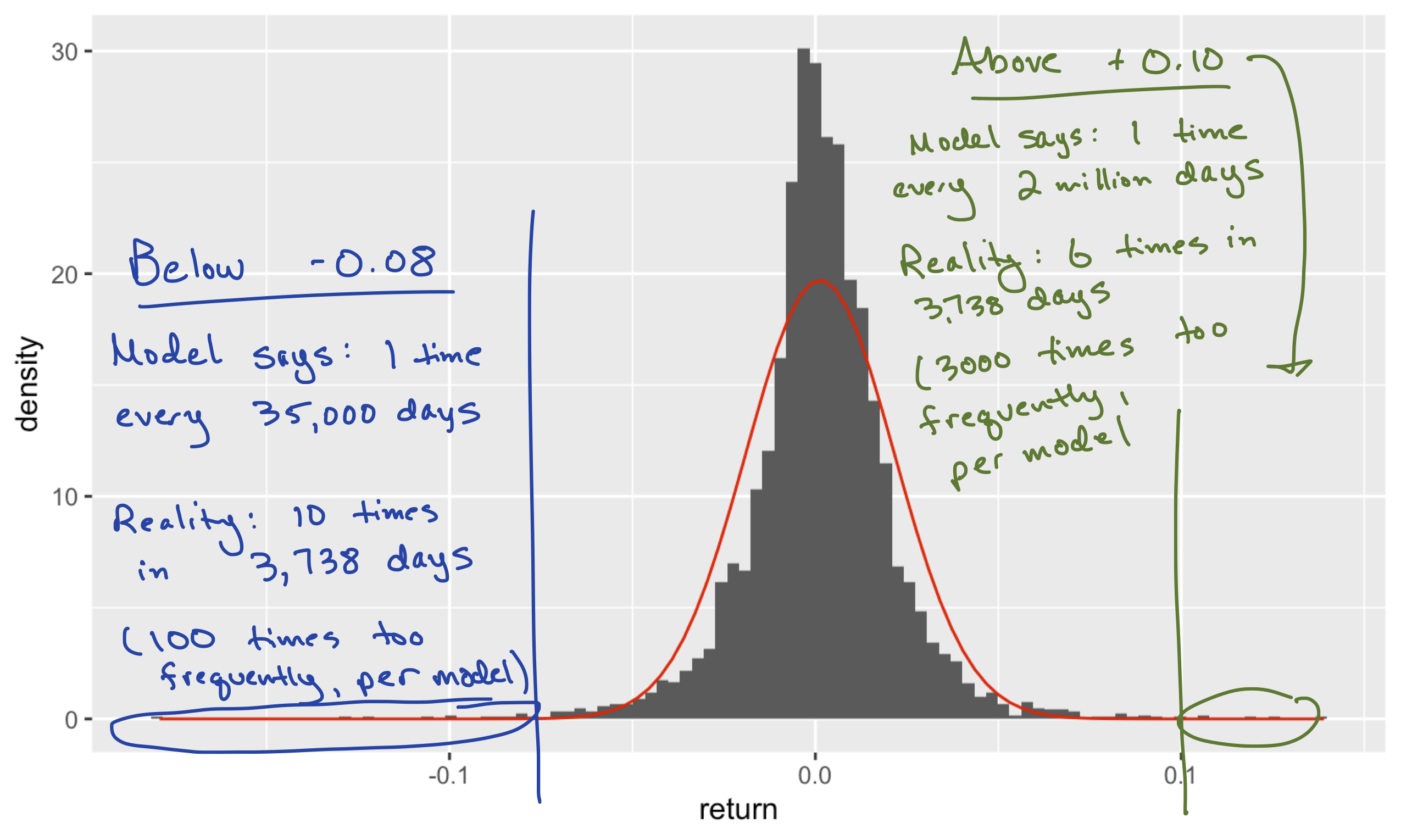
To some extent, this isn’t surprising. A daily return for a single company’s stock tends to be dominated by one or two major pieces of information. It does not resemble an aggregation of many independent up-or-down nudges, and so reasoning from first principles alone, we should probably expect the normal distribution to provide a poor fit.
Annual returns, whole market. On the other, let’s see what happens when we look at annual returns for the entire stock market, rather than daily returns for just a single stock. You can find this data in annual_returns_since1928.csv, which looks like this:
head(annual_returns_since1928)## Year SP500 TBill3Month TBond10Year Inflation
## 1 1928 0.44 0.03 0.01 -0.017
## 2 1929 -0.08 0.03 0.04 0.000
## 3 1930 -0.25 0.05 0.05 -0.023
## 4 1931 -0.44 0.02 -0.03 -0.090
## 5 1932 -0.09 0.01 0.09 -0.099
## 6 1933 0.50 0.01 0.02 -0.051The SP500 column gives each year’s annual return on the S&P 500 stock index, which is a decent proxy for the whole stock market. These numbers are on the same 0-to-1 scale we used above, where 0.01 means 1%. The other important column for our purposes is Inflation; on this time scale of decades, it’s important that we account for the effects of inflation when thinking about investment returns. So let’s define a new column, SP500_net, that measures each year’s “whole-market” return, net of inflation:
annual_returns_since1928 = annual_returns_since1928 %>%
  mutate(SP500_net = SP500 - Inflation)
Let’s now compute the mean and standard deviation of net returns, and use these numbers to come up with our best-fitting normal approximation to the data:
favstats(~SP500_net, data=annual_returns_since1928) %>% round(4)## min Q1 median Q3 max mean sd n missing
## -0.408 -0.026 0.1 0.211 0.551 0.0834 0.2018 88 0It looks like the mean is about 8% per year (net of inflation), with a standard deviation of about 20%.76 Here’s the fit of the corresponding normal distribution to the actual data:
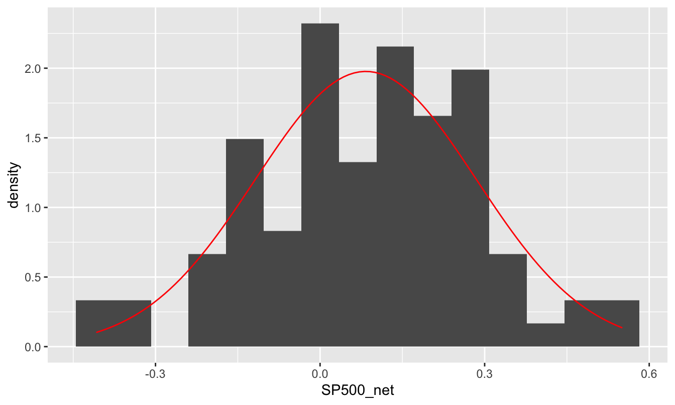
Figure 17.4: Annual net returns on the S&P500 net of inflation, 1928-2015, together with the best-fitting normal approximation.
This fit is much better than we saw in the prior example. It’s true that the normal curve is smooth whereas the histogram itself looks pretty lumpy, but that mainly reflects the relative paucity of data here: only 88 years from 1928 to 2015. It’s a bit easier to verify that the normal distribution fits well by looking on the cumulative probability scale, like in the plot below.
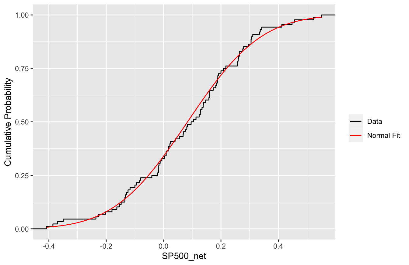
To read this plot, pick a value \(x\) along the horizontal axis (say, \(x=0.2\), for 20%). The height of the cumulative probability curve at that point (about 0.7 or so) gives you the cumulative probability of seeing a return of \(x=0.2\) or less. The black line shows these cumulative probabilities as a function of \(x\) from the data, whereas the red line shows the cumulative probabilities as a function of \(x\) from the normal approximation (i.e. from pnorm). As you can see, the two are in excellent agreement, even in the tails of the distribution.
So we’ve learned that the normal distribution provides a poor fit to the daily stock returns for a single company like Apple, but a pretty good fit to the annual returns of the entire stock market. The reason can be traced back to the Central Limit Theorem: annual returns for the whole market involve a lot of averaging, and the normal distribution describes how averages behave. In calculating an annual return for the S&P 500, not only are we averaging the performance of hundreds of stocks, but we are also effectively averaging across hundreds of days as well. It should be no surprise this double-averaging process, involving many “nudges” up and down across individual stocks and individual days, would produce a distribution of results that looks pretty close to normal.
Application: modeling long-term asset returns
Now that we feel comfortable with the idea of describing annual stock-market returns using a normal distribution, we can make use of this fact to model the long-term performance of a retirement portfolio.
First, some notation. Let’s say that your initial investment is \(W_0 = \$10,000\), and that \(X_t\) is the return of your portfolio in year \(t\), expressed as a decimal fraction (e.g. a 10% return in year 1 would mean that \(X_t = 0.1\)). Suppose we want to track your portfolio over 40 years, meaning that \(t\) will run from 1 to 40. If we knew the returns \(X_1, X_2, \ldots, X_{40}\) all the way into the future, we could calculate your terminal wealth after 40 years as
\[ W_{40} = W_0 \cdot (1+X_1) \cdot (1+X_2) \cdots (1+X_{40}) = W_0 \cdot \prod_{t=1}^{40} (1 + X_t) \, . \]
In other words, we just keep compounding the interest year after year. Here the symbol \(\prod\) means we take the running product of all the terms, from \(t=1\) to \(t=40\), just like \(\Sigma\) means we take a running sum. This formula follows from the fact that \(W_{t}\), your wealth in year \(t\), is given by the simple interest formula: \(W_{t} = W_{t-1} \cdot (1 + X_t)\). Accumulating (i.e. compounding) returns year after year then gives us the above formula.
Of course, we don’t know these returns \(X_1\) up to \(X_{40}\), forty years out into the future. But we do have a probability model for them, whose parameters we get to choose. Let’s make some conservative assumptions: say, that stocks will net a 6% real return per year on average (\(\mu = 0.06\)), with a standard deviation of 20% (\(\sigma = 0.2\)). Thus we’re setting the mean a bit lower than the mean of \(0.083\) that we calculated based on the historical data back to 1928. Said concisely, our model will assume that each year’s return, net of inflation, is a normal random variable, \(X_t \sim N(\mu = 0.06, \sigma = 0.2)\).
The basic code block (the “inner loop”). To create a probability distribution of the random variable \(W_{40}\), your terminal wealth after 40 years, we will use a Monte Carlo simulation. The basic step of our simulation consists of simulation a 40-year trajectory for our portfolio. For each year from \(t=1\) up to \(t=40\):
- Simulate a random return from the normal probability model: \(X_t \sim N(\mu = 0.06, \sigma = 0.2)\).
- Update your wealth using the simple-interest formula \(W_{t} = W_{t-1} \cdot (1 + X_t)\).
If we repeat this basic step many thousands of times, we can build up a probability distribution for \(W_{40}\), the final value of our portfolio.
We’ll accomplish this in R using what’s called a for loop. First let’s define objects that store our investment horizon (40 years) and initial wealth ($10,000):
horizon = 40
current_wealth = 10000
Now let’s sweep through the years, from \(t=1\) to \(t=40\), using a for loop, before printing out the final value of wealth after 40 years:
for(t in 1:horizon) {
  return_t = rnorm(1, mean=0.06, sd=0.2)   # generate random return
  current_wealth = current_wealth * (1 + return_t)   # update wealth via simple interest formula
}
current_wealth
## [1] 135910.1Let’s unpack what happened here. Our for loop was a concise way to repeatedly execute the same block of code:
- The bit between the curly braces is what gets executed repeatedly. Each execution of this code block is called a “pass” of the
forloop. In each pass of this particular loop, two things happen:- A random return is simulated from our normal probability model.
- The value of
current_wealthis updated (i.e. over-written in memory), combining the old value ofcurrent_wealthwith the simulated return, using the simple interest formula we discussed above: \(W_{t} = W_{t-1} \cdot (1 + X_t)\).
- A random return is simulated from our normal probability model.
- The
for(t in 1:horizon)tells R how many times to execute this code block: one pass for each value oftfromt=1up tot=horizon. Heretis called the “counter” or “iterator” variable.
For reasons that will shortly become clear, we refer to this for loop as the “inner loop” of our Monte Carlo simulation. The magic of the for loop here is that allows us to chain calculations together, where the ending point of one calculation becomes the starting point for the next calculation. This mirrors the financial reality that your portfolio’s value at the end of one year becomes the starting point for next year’s gain or loss. This is referred to as a recursive process, or simply a recursion. Loosely speaking, the term “recursive” means that the ending result of one computation feeds into the beginning of the next computation, with the chain of computations finally stopping when some “termination condition” is met. In this case, the chain terminates when t=40, i.e. when we’ve reach our investment horizon.77
Repeat over and over again (the “outer loop”). Once we have the basic for loop in place, we can run it thousands of times, simulating thousands of possible trajectories of wealth to build up a probability distribution for the final value of our all-stock portfolio. We refer to this as the “outer loop,” because it literally goes around the outside of the “inner loop” in our code block. You’ll need to load the mosaic library for this code block to work:
library(mosaic)

horizon=40
portfolio_stocks = do(10000)*{  # beginning of outer loop
  current_wealth = 10000 # reset at the beginning of each simulated trajectory

  for(t in 1:horizon) {  # start of inner loop
    return_t = rnorm(1, mean=0.06, sd=0.2)   # generate random return
    current_wealth = current_wealth * (1 + return_t)   # update wealth via simple interest formula
  }  # end of inner loop

  # save the final value of wealth
  current_wealth
}  # end of outer loop
The outer do loop repeats our inner for loop 10000 times, collecting whatever we ask it to (here, current_wealth in an object we created called portfolio_stocks. Upon inspecting this object, we find that it has a single column called result. Each entry represents the final value, after 40 years of investment, of our initial $10,000 investment in the S&P 500:
head(portfolio_stocks)## result
## 1 35982.55
## 2 50241.94
## 3 77923.17
## 4 32489.23
## 5 29836.93
## 6 62987.18Let’s make a histogram of these 10000 results. This simulated probability distribution of final wealth was constructed using nothing but normally distributed random variables as inputs. But this distribution is itself highly non-normal. This provides a good example of using Monte Carlo simulation to simulate a complex probability distribution by breaking down into a function of many smaller, simpler parts (in this case, the yearly returns):
ggplot(portfolio_stocks) +
  geom_histogram(aes(x=result), bins=50)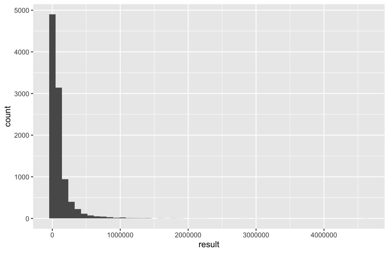
The key thing to understand about this histogram is that it reflects your uncertainty about the final value of your portfolio. (Remember the basic principle of Monte Carlo simulation: variability from one simulation to the next implies uncertainty about the result you’ll see in real life.) The heavy right skew here results from the fact that, in the handful of simulations where we get really lucky, we end up multiplying our initial investment 50- or even 100-fold. But in those handful of simulations where we get really unlucky, the most we can lose is $10,000. Hence the asymmetry in the distribution. (This right skewness is pretty typical of probability distributions for any outcome that has a hard lower bound, but no hard upper bound.)
More often, however, our luck is neither especially great nor especially awful, and we see more modest results:
favstats(~result, data=portfolio_stocks) %>% round(0)## min Q1 median Q3 max mean sd n missing
## 459 21077 48444 112905 4613060 102049 170761 10000 0Based on these summary statistics, we can conclude that:
- The median value of our portfolio after 40 years is about $50,000, reflecting roughly five-fold growth (net of inflation) of our initial investment. According to our model, there’s a 50% chance you’ll do better than this, and a 50% chance you’ll do worse.
- The third quartile is about $110,000, suggesting a 25% chance of roughly eleven-fold growth or better. Surely most people would think this is a pretty good result.
- But the first quartile is about $20,000, suggesting that there’s also a 25% chance that you’d only double your money in 40 years. “Only doubling” your money might sound pretty nice, but it’s not a very impressive result after four decades. For perspective, you’d basically double your money (in real terms) over that period if you invested your 10K in a savings account that garnered 1.75% interest net of inflation. You’d surely hope to do better than that investing in the stock market—but according to our model, there’s a 25% chance that you won’t.
And based on our simulation, what’s the chance that you’ll lose money?
portfolio_stocks %>% count(result < 10000)## result < 10000 n
## 1 FALSE 8930
## 2 TRUE 1070It happened about 1000 times out of 10000 simulations, suggesting roughly a 10% chance that you’ll be worse off than you started after four decades in the stock market. Ouch.
The moral of the story is that the stock market is probably a good way to get rich over time, at least if future returns are statistically similar to (or even a bit worse than) past returns. But there’s a nonzero chance of losing money—and the riches come only over the long run, if they come at all, since there’s a lot of uncertainty about how things will unfold along the way.
17.4 The bivariate normal distribution
Finally, we consider a widely used probability model for a correlated pair of random variables: the bivariate normal distribution.
Modeling correlation
The bivariate normal distribution is a parametric probability model that describes the joint behavior of two correlated random variables, which we’ll denote \(X_1\) and \(X_2\). It has applications in a broad range of areas.
- finance: \(X_1\) = return of stocks this year, \(X_2\) = return of government bonds this same year.
- sports: \(X_1\) = batting average of a baseball player this year, \(X_2\) = batting average of that same baseball player the following year.
- genetics: \(X_1\) = height of mom, \(X_2\) = height of daughter.
You’ll recall that the ordinary normal distribution is a distribution for one variable with two parameters: a mean and a standard deviation The bivariate normal distribution is for two variables (\(X_1\) and \(X_2\)), and it has five parameters:
- The mean and standard deviation of the first random variable: \(\mu_1 = E(X_1)\) and \(\sigma_1 = \mbox{sd}(X_1)\).
- The mean and standard deviation of the second random variable: \(\mu_2 = E(X_2)\) and \(\sigma_2 = \mbox{sd}(X_2)\).
- The correlation between \(X_1\) and \(X_2\), which we denote as \(\rho\).
The correlation is what’s especially new and interesting about the bivariate normal. After all, a mean and a standard deviation can only tell us about a single variable in isolation. When two or more variables are in play, the mean and the variance of each one are no longer sufficient to understand what’s going on; they don’t tell us anything about how the two variables are related.
In this sense, a quantitative relationship is much like a human relationship: you can’t describe one by simply listing off facts about the characters involved. You may know that Homer likes donuts, works at the Springfield Nuclear Power Plant, and is fundamentally decent despite being crude and incompetent. Likewise, you may know that Marge wears her hair in a beehive, despises the Itchy and Scratchy Show, and takes an active interest in the local schools. Yet these facts alone tell you little about their marriage. A quantitative relationship is the same way: if you ignore the interactions of the “characters,” or individual variables involved, then you will miss the best part of the story.
To quantify the strength of association between two variables, we need to refer to their correlation. The general definition of correlation between random variables \(X_1\) and \(X_2\) is pretty mathy and technical. It’s the kind of formula that mathematicians swoon over—“How elegant! How intuitive!”—but that most people find intimidating. Anyway, here it is:
\[ \mbox{cor}(X_1, X_2) = \frac{ E \Big\{ [X_1 - E(X_1)] [X_2 - E(X_2)] \Big\} } {\sigma_1 \cdot \sigma_2} \, . \]
It’s not essential that you know this formula unless you intend to carry your studies further than these lessons can take you. What is essential is that you understand the basic properties of correlation, and what it measures.
Basically, the correlation measures the extent to which \(X_1\) and \(X_2\) tend to be on the same side of their respective means more often, or whether they tend to be on the opposite side of their means more often. It’s always between +1 (perfect positive correlation) and -1 (perfect negative correlation). Values in between -1 and +1 describe a relationship of varying strength.
To build some intuition, here are 24 examples of bivariate normal distributions with different combinations of standard deviations and correlations.
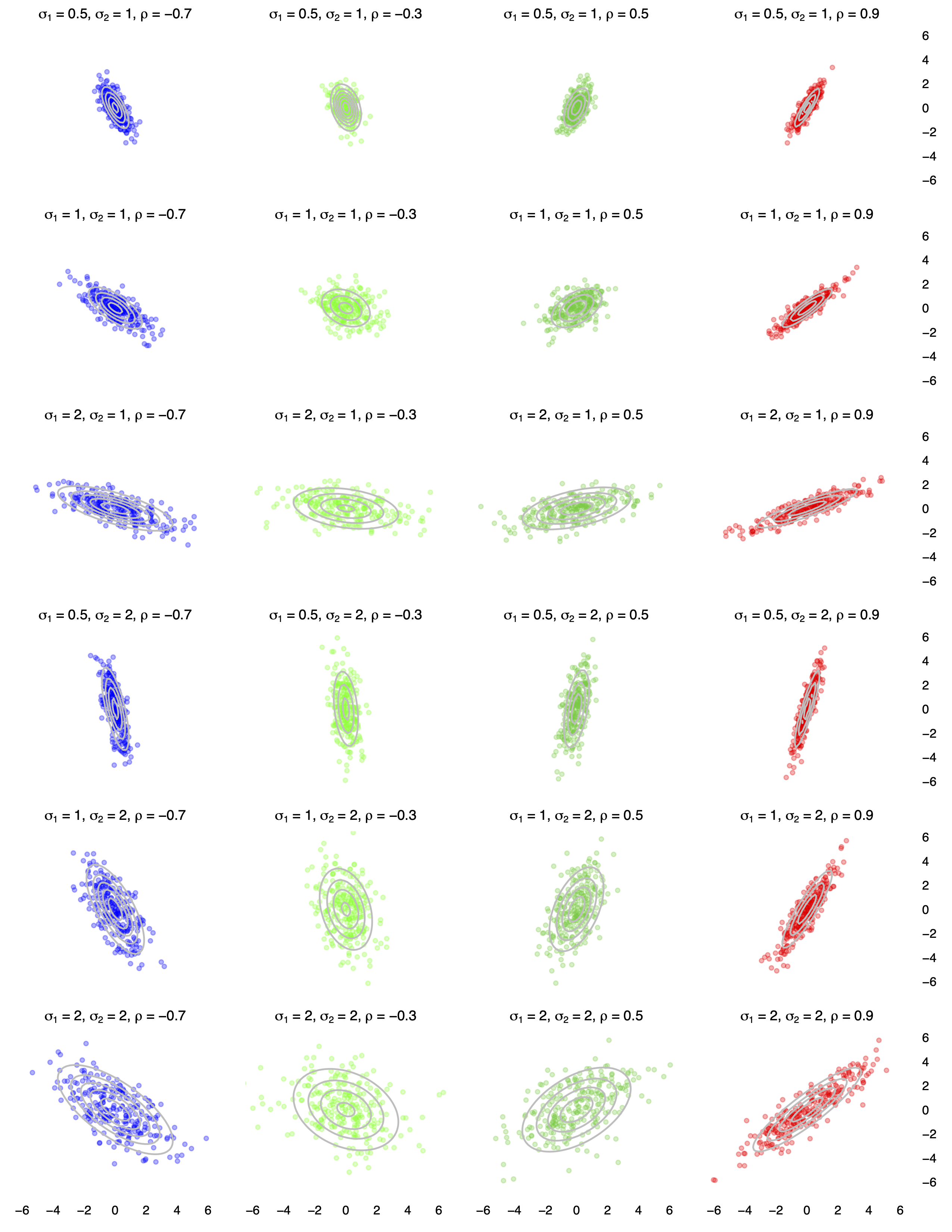
In each panel, 250 random samples of \((X_1, X_2)\) from the corresponding bivariate normal distribution are shown:
- Moving down the rows from top to bottom, the standard deviations of the two variables change, while the correlation remains constant within a column.
- Moving across the columns from left to right, the correlation changes from negative to positive, while the standard deviations of the two variables remain the same within a row.
The mean of both variables is 0 in all 24 panels. Changing either mean would translate the point cloud so that it was centered somewhere else, but would not change the shape of the cloud.
Each panel of the figure above also shows contour lines for the corresponding bivariate normal distribution, overlaid in grey. We read these contours in a manner similar to how we would on a topographical map. On a topographical map of an actual mountain, the contour lines show relative elevation. In our picture, these contour lines show relative probability: that is, how likely it is that we’d expect to see a joint outcome for \((X_1, X_2)\) in that region of the plane.
Application: stocks and bonds
We will use the bivariate normal distribution as a building block for describing the joint probability distribution for two correlated financial assets. Specifically, we will generalize our prior case study on modeling long-term stock returns. Instead of just stocks, now we’ll consider when we have two assets: stocks and bonds.
Let’s say that \(X_1\) is the return on the S&P 500 index next month, while \(X_2\) is the return on 30-year treasury bond next month. (As you might know, buying a Treasury bond entails lending money to the U.S. federal government over a specified period and collecting interest in return.) Stock and bond returns are almost sure to be correlated, although the magnitude and even the direction of this correlation has changed a lot over the last century. This is actually a fascinating topic at the intersection of macroeconomics and finance. The conventional explanation for why stocks and bonds are correlated has to do with the so-called “flight to quality” effect: when stock prices plummet, investors get scared and pile their money into safer assets (like bonds), thereby driving up the price of those safer assets. This effect will typically produce a negative correlation between the returns of stocks and bonds held over a similar period. But this need not happen. In fact, a “flight to quality” effect can also produce a positive correlation between U.S. stocks and bonds. If you’re interested in more detail, see this short article, written by two economists at the Reserve Bank of Australia, who discuss the changing patterns of correlation between stocks and bonds over a century of econonimic history.
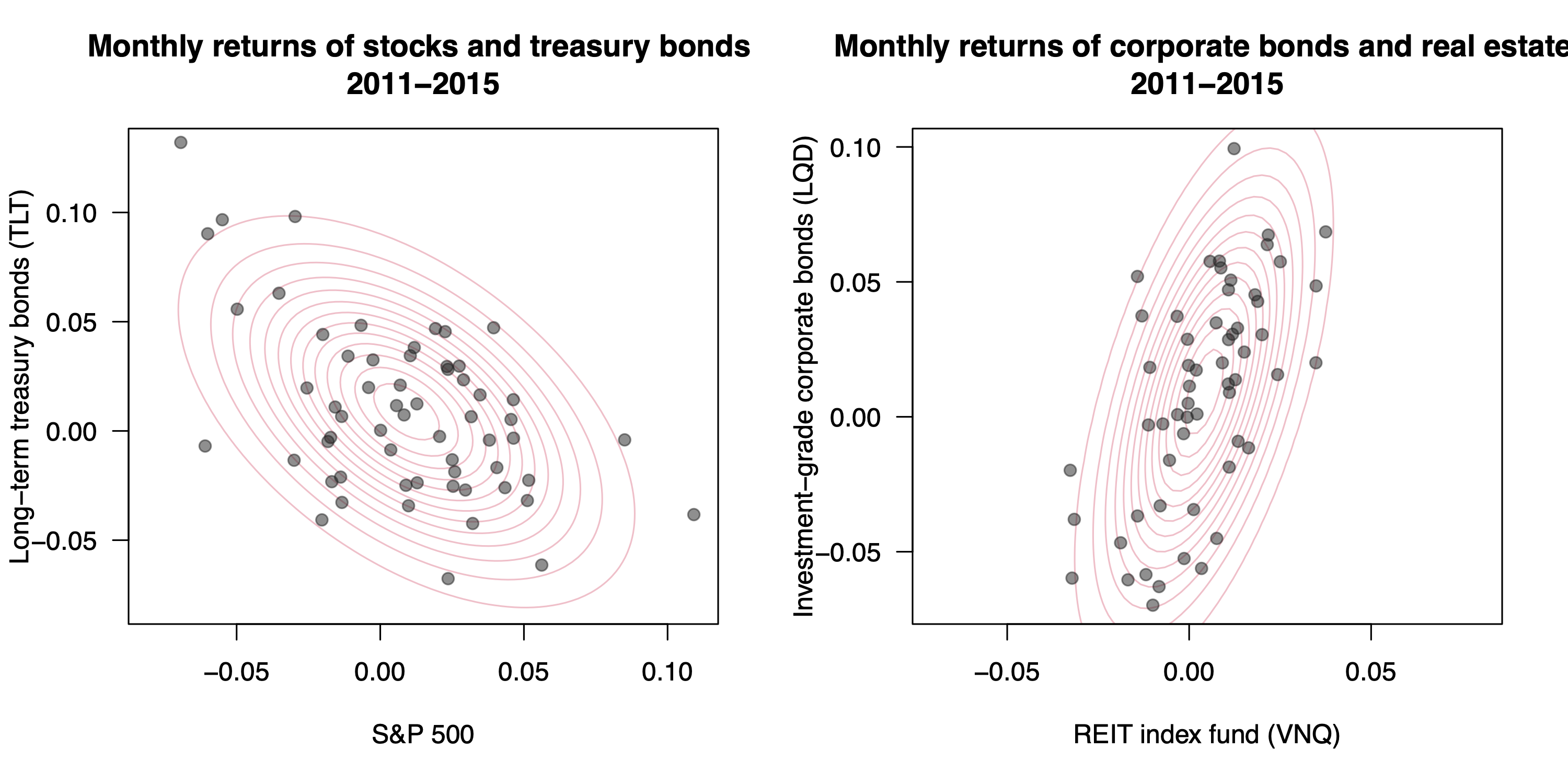
To illustrate this, the left panel of the figure below shows the 2011-2015 monthly returns for long-term U.S. Treasury bonds versus the S&P 500 stock index, together with the best-fitting bivariate normal approximation. Over this period, at least, it’s clear that stocks and bonders were negatively correlated. (The right panel shows a similar plot for the returns for real-estate investment trusts and corporate bonds. These assets’ monthly returns were positively correlated, presumably because they both respond in similar ways to underlying macroeconomic forces.)
The broader point here is that the correlation between stocks and bonds is a key input in financial models involving these major asset classes. We’re going to build a little simulation that will show us two things: (1) how to model the long-term growth of a portfolio consisting of stocks and bonds, and (2) why an assumption about correlation is such a crucial input to that model. And in case you didn’t see it coming: the bivariate normal distribution will be the basic building block of our simulation.
Overview of simulation. Much like in our original “stock-only” simulation, our goal here is to track the growth of a portfolio of assets. The difference is that now we’ll assume the portfolio to comprise a mix of stocks and bonds.
We’ll let \(W_{t,1}\) and \(W_{t,2}\) denote the amount you have invested at step \(t\) in stocks and bonds, respectively, starting from some initial values at \(t=0\). To update your portfolio from the previous step (\(t-1\)) to the next step (\(t\)), we need to do two things:
- Simulate a random return for month \(t\) from a bivariate normal probability model for stocks and bonds: \((X_{t1}, X_{t2)} \sim N(\mu_1, \mu_2, \sigma_1, \sigma_2, \rho)\).
- Using the simple interest formula, update the value of your investment to account for the period-\(t\) returns in each asset: \[ W_{t, i} = W_{t-1, i} \cdot (1 + X_{t,i}) \]
At every step, your current total wealth is \(W_{t} = W_{t,1} + W_{t,2}\).
Using these two steps as our building blocks, we’ll then need to create two loops:
- an inner loop that chains the two basic steps together, 40 times in a row, to simulate a single trajectory of our portfolio.
- an outer loop that repeats the inner loop many thousands of times, to simulate many thousands of possible trajectories under our probability model.
Version 1: negative correlation. We’ll start by assuming that the initial allocation is a 50/50 mix of a $10,000 total investment, so that \(W_{0,1} = W_{0, 2} = \$5,000\). We also need to make some assumptions about the statistical properties of future stock and bond returns. Let’s start with these:
# parameters for bivariate normal
mu_stocks = 0.06
mu_bonds = 0.03
sigma_stocks = 0.2
sigma_bonds = 0.1
rho = -0.5  # correlation
Our code block is saying that:
- Real returns for stocks (net of inflation) average 6% per year, with an standard deviation of 20%.
- Real returns for long-term treasury bonds average 3% per year, with a standard deviation of 10%.
- Stock and bond returns have a negative correlation of \(\rho = -0.5\). As we’ll see, this assumption is crucial.
To generate a single draw from the bivariate normal distribution with these parameters, you’ll first need to install the extraDistr library. Once you’ve done so, you can load it and use the rbvnorm function, like this:
library(extraDistr)

# a single draw of stock/bond returns from the bivariate normal model
rbvnorm(n=1, mu_stocks, mu_bonds, sigma_stocks, sigma_bonds, rho)
## [,1] [,2]
## [1,] 0.07266533 -0.03502679The first entry is the draw for stocks, while the second entry is the draw for bonds. So in this single simulated year, it looks like stocks gained about 7% and bonds lost about 3.5%. Such is the investing life.
With that machinery in place, let’s start building our portfolio. Here are the initial conditions:
horizon = 40   # length of our investing horizon in years
weights = c(0.5, 0.5) # fraction of wealth in each asset?
total_wealth = 10000
wealth_by_asset = total_wealth * weights
The weights vector specifies the fraction of our portfolio is invested in stocks (first entry) versus bonds (second entry). Let’s now simulate a single trajectory of our portfolio with a for loop:
for(t in 1:horizon) {
  # Simulate a bivariate normal set of returns
  returns = rbvnorm(1, mu_stocks, mu_bonds, sigma_stocks, sigma_bonds, rho)
  # Recursively update wealth in each asset: simple interest formula
  wealth_by_asset = wealth_by_asset * (1 + returns)
}
wealth_by_asset
## [,1] [,2]
## [1,] 23401.64 7940.136After 40 years, it looks like we have about $23,000 in stocks and about $7,900 in bonds.
Based on that result, you might wonder: weren’t we aiming for a 50/50 split between stocks and bonds in the portfolio? If so, how did we end up with so much more money in stocks than we intended by the end of the simulated 40-year horizon?
The reason is that we failed to rebalance our portfolio each year. As a result, the initial 50/50 allocation gradually diverged from our target mix, based on how stocks and bonds actually performed from year to year. Rebalancing would entail adjusting the amount invested in each asset class every year, so that it matches the target allocation. Here’s how this looks in R:
total_wealth = 10000
wealth_by_asset = total_wealth * weights
for(t in 1:horizon) {
  # 1) Simulate a bivariate normal pair of returns
  returns = rbvnorm(1, mu_stocks, mu_bonds, sigma_stocks, sigma_bonds, rho)
  # 2) Recursively update wealth in each asset: simple interest formula
  wealth_by_asset = wealth_by_asset * (1 + returns)
  # 3) Rebalance by calculating total wealth and redistributing
  total_wealth = sum(wealth_by_asset)
  wealth_by_asset = total_wealth * weights
}
wealth_by_asset
## [1] 14987.89 14987.89In the real world, rebalancing would require actually buying and selling assets to bring them into balance. But this is a simulation, and we don’t have to worry about such practicalities; the arithmetic of step 3 is all we need!
Finally, let’s wrap an outer do loop around this inner loop, repeating the same simulation 10000 times. We’ll save the results in an object called portfolio_sb_1, since our stocks-only portfolio above was called portfolio_stocks. We’ll also record the correlation for each simulation, which will help us do the bookkeeping later, when we want to compare different scenarios.
# Set-up
horizon = 40   # length of our investing horizon in years
weights = c(0.5, 0.5) # fraction of wealth in each asset?

portfolio_sb_1 = do(10000)*{
  total_wealth = 10000  # reset our initial wealth for each pass
  wealth_by_asset = total_wealth * weights
  for(t in 1:horizon) {
    # 1) Simulate returns
    returns = rbvnorm(1, mu_stocks, mu_bonds, sigma_stocks, sigma_bonds, rho)
    # 2) Recursively update wealth
    wealth_by_asset = wealth_by_asset * (1 + returns)
    # 3) Rebalance
    total_wealth = sum(wealth_by_asset)
    wealth_by_asset = total_wealth * weights
  }
  c(rho=rho, result = total_wealth)  # save the final value of total wealth from each pass
}

# inspect first several lines of the simulation
head(portfolio_sb_1)
## rho result
## 1 -0.5 41597.23
## 2 -0.5 35278.44
## 3 -0.5 91790.05
## 4 -0.5 62078.15
## 5 -0.5 19566.61
## 6 -0.5 90524.02Let’s now look at a histogram of the results, along with some summary statistics from favstats.
ggplot(portfolio_sb_1) +
  geom_histogram(aes(x=result), bins=50)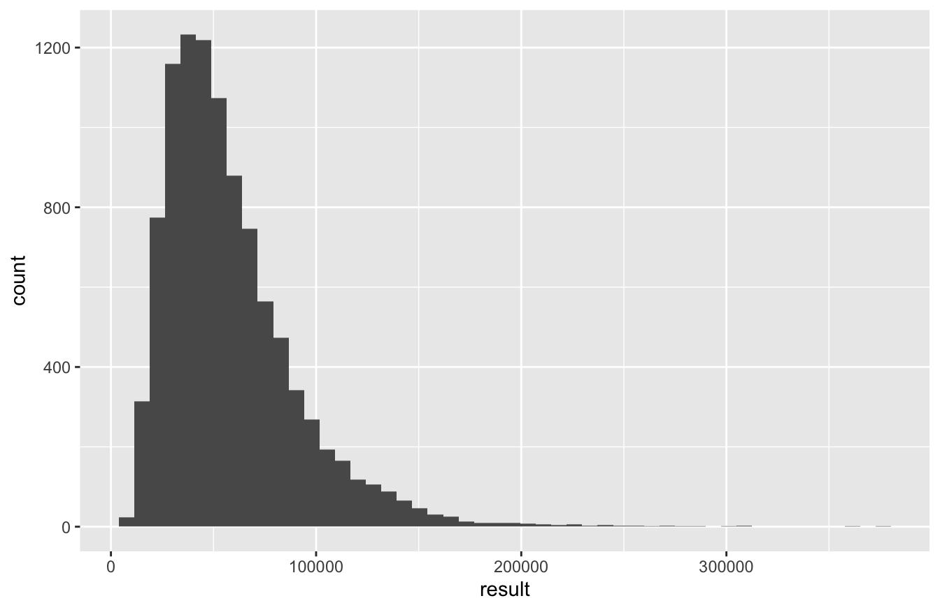
favstats(~result, data=portfolio_sb_1)## min Q1 median Q3 max mean sd n missing
## 5671.647 35265.68 50730.91 72305.33 374675 58110.84 32773.61 10000 0Compared to the stock-only portfolio, our distribution of results is a lot narrower. There’s a smaller chance of enormous, 10x-plus gains (roughly a 10% chance, versus 30% for stocks alone)…
# stocks only portfolio
portfolio_stocks %>% count(result >= 100000)
## result >= 100000 n
## 1 FALSE 7176
## 2 TRUE 2824# stock and bond portfolio
portfolio_sb_1 %>% count(result >= 100000)## result >= 100000 n
## 1 FALSE 9026
## 2 TRUE 974But there’s also a much smaller chance of losing money over your forty-year horizon (less than a 1% chance, versus 10% for stocks alone)…
# stocks only portfolio
portfolio_stocks %>% count(result < 10000)
## result < 10000 n
## 1 FALSE 8930
## 2 TRUE 1070# stock and bond portfolio
portfolio_sb_1 %>% count(result < 10000)## result < 10000 n
## 1 FALSE 9991
## 2 TRUE 9The introduction of bonds to the portfolio has made your investment less risky, at the cost of reducing its overall rate of growth.
Version 2: positive correlation. We’ll now make a crucial change to the assumptions behind our simulation. What if stocks and bonds were positively correlated instead, with \(\rho = 0.5\) instead of \(-0.5\)? Let’s tweak our bivariate normal parameters to reflect this, keeping the means and standard deviations exactly the same was they were before:
# parameters for bivariate normal
mu_stocks = 0.06
mu_bonds = 0.03
sigma_stocks = 0.2
sigma_bonds = 0.1
rho = 0.5  # now positive correlation
Now we can re-run the simulation under this new assumption, saving the result in portfolio_sb_2:
# Set-up
horizon = 40   # length of our investing horizon in years
weights = c(0.5, 0.5) # fraction of wealth in each asset?

portfolio_sb_2 = do(10000)*{
  total_wealth = 10000  # reset our initial wealth for each pass
  wealth_by_asset = total_wealth * weights
  for(t in 1:horizon) {
    # 1) Simulate returns
    returns = rbvnorm(1, mu_stocks, mu_bonds, sigma_stocks, sigma_bonds, rho)
    # 2) Recursively update wealth
    wealth_by_asset = wealth_by_asset * (1 + returns)
    # 3) Rebalance
    total_wealth = sum(wealth_by_asset)
    wealth_by_asset = total_wealth * weights
  }
  c(rho=rho, result = total_wealth)  # save the final value of total wealth from each pass
}
Now let’s do a little data wrangling using the bind_rows function, to combine the portfolios into a single data frame so that we can compare their performance.
portfolios_all = bind_rows(portfolio_sb_1, portfolio_sb_2)We can now compute summary statistics grouped by the value of rho, including the probability of losing money in real terms:
portfolios_all %>%
  group_by(rho) %>%
  summarize(fav_stats(result),
            p_lose_money = sum(result < 10000)/n())
## # A tibble: 2 × 11
## rho min Q1 median Q3 max mean sd n missing p_lose_money
## <dbl> <dbl> <dbl> <dbl> <dbl> <dbl> <dbl> <dbl> <int> <int> <dbl>
## 1 -0.5 5672. 35266. 50731. 72305. 374675. 58111. 32774. 10000 0 0.0009
## 2 0.5 1224. 23897. 42093. 73553. 959691. 57981. 55464. 10000 0 0.043This table bears closer inspection, because it contains a powerful lesson. Let’s note some basic facts:
First, the mean is nearly identical in both simulations. The degree of correlation between stocks and bonds doesn’t seem to affect the expected final wealth, at least in this narrow mathematical sense of “the mean final value of all simulation trajectories.”
The variability of final wealth, on the other hand, is much lower under the negative correlation scenario (\(\rho = -0.5\)) than the positive-correlation scenario (\(\rho=0.5\)). We can see this reflected in many of the numbers here. For example, when \(\rho = -0.5\), the portfolio has:
- a higher median despite having a nearly identical mean.
- a much lower standard deviation.
- a higher min and lower max (therefore a narrower overall range).
- a higher Q1 and a similar Q3 (therefore a narrow interquartile range).
So overall, the negative correlation scenario results in an essentially identical expected return, but lower risk and less uncertainty. It’s really easy to see this if we use a logarithmic scale to plot a faceted histogram of the returns under each scenario:
ggplot(portfolios_all) +
  geom_histogram(aes(x=result)) +
  facet_wrap(~rho, nrow=2) +
  scale_x_log10()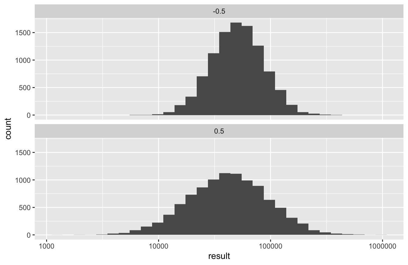
Clearly, if offered the choice, you’d rather invest in a world where stocks and bonds exhibit a negative correlation! The lesson here is that negative correlation equals diversification. When one asset performs poorly, the other tends to perform well, on average, thereby picking up the slack in your portfolio and leading to a reduced level of risk overall.
Version 3: all correlations. We’ve investigated how changing our assumption about the sign of the stocks-bonds correlation affects the level of risk in our portfolio. What about the magnitude of that correlation?
Luckily it’s simple enough to set up a simulation that sweeps through many different possible values of \(\rho\), simulating 10,000 portfolios for each one. Our code has to get more complex as a result: instead of two loops, we’ll now have three!
- inner loop: simulate a single trajectory of the portfolio over 40 years.
- middle loop: repeat the inner loop thousands of times to build a probability distribution for your final wealth. (This was the outer loop in our last simulation.)
- new outer loop: repeat the middle loop over many different values of
rho, the assumed correlation between stocks and bonds.
Let’s dive in. First, we’ll keep the means and standard deviations the same, but we’ll set up a grid of possible values for the correlation parameter. We’ll go from extreme negative correlation (-0.95) to extreme positive correlation (+0.95) in increments of 0.05:
rho_grid = seq(from=-0.9, to=0.9, by=0.05)Now we loop over this grid of rho values, re-running our prior simulation for each one. Be aware that this code will take awhile to run—perhaps even several minutes, depending on the speed of your computer.
horizon = 40   # length of our investing horizon in years
weights = c(0.5, 0.5) # fraction of wealth in each asset?

# initialize an empty tibble to store all the results
portfolio_tracker = tibble()

for(rho in rho_grid) { # outer loop: different rho values
  portfolio_sb_rho = do(10000)*{ # middle loop: different trajectories
    total_wealth = 10000  # reset our initial wealth for each pass
    wealth_by_asset = total_wealth * weights
    for(t in 1:horizon) { # inner loop: single trajectory
      # 1) Simulate returns
      returns = rbvnorm(1, mu_stocks, mu_bonds, sigma_stocks, sigma_bonds, rho)
      # 2) Recursively update wealth
      wealth_by_asset = wealth_by_asset * (1 + returns)
      # 3) Rebalance
      total_wealth = sum(wealth_by_asset)
      wealth_by_asset = total_wealth * weights
    }
    c(rho=rho, result = total_wealth)  # save the final value of total wealth from each pass
  }
  # add the simulated results for the latest portfolio to our portfolio_tracker
  portfolio_tracker = bind_rows(portfolio_tracker, portfolio_sb_rho)
}
Now we calculate summary statistics of our portfolios, grouped by the value of \(\rho\):
portfolio_summary = portfolio_tracker %>%
  group_by(rho) %>%
  summarize(fav_stats(result),
            p_lose_money = sum(result < 10000)/n())

head(portfolio_summary)
## # A tibble: 6 × 11
## rho min Q1 median Q3 max mean sd n missing p_lose_money
## <dbl> <dbl> <dbl> <dbl> <dbl> <dbl> <dbl> <dbl> <int> <int> <dbl>
## 1 -0.9 12109. 42521. 54457. 69723. 221542. 58081. 21514. 10000 0 0
## 2 -0.85 10873. 41418. 54081. 70189. 239792. 58093. 23125. 10000 0 0
## 3 -0.8 9825. 40385. 53552. 70521. 257883. 58095. 24655. 10000 0 0.0001
## 4 -0.75 8914. 39409. 53059. 70906. 276153. 58102. 26118. 10000 0 0.0001
## 5 -0.7 8111. 38480. 52618. 71301. 294780. 58108. 27530. 10000 0 0.0003
## 6 -0.65 7398. 37612. 52155. 71684. 313877. 58108. 28897. 10000 0 0.0003Finally, we can use this table of summary statistics to plot a few measures of performance as a function of \(\rho\). Let’s start with the mean. I’m using a line graph here, taking care to start the y axis at zero so that you can see the main take-home lesson:
ggplot(portfolio_summary) +
  geom_line(aes(x=rho, y=mean)) +
  ylim(0, NA)  # NA tells R to calculate the upper y limit for me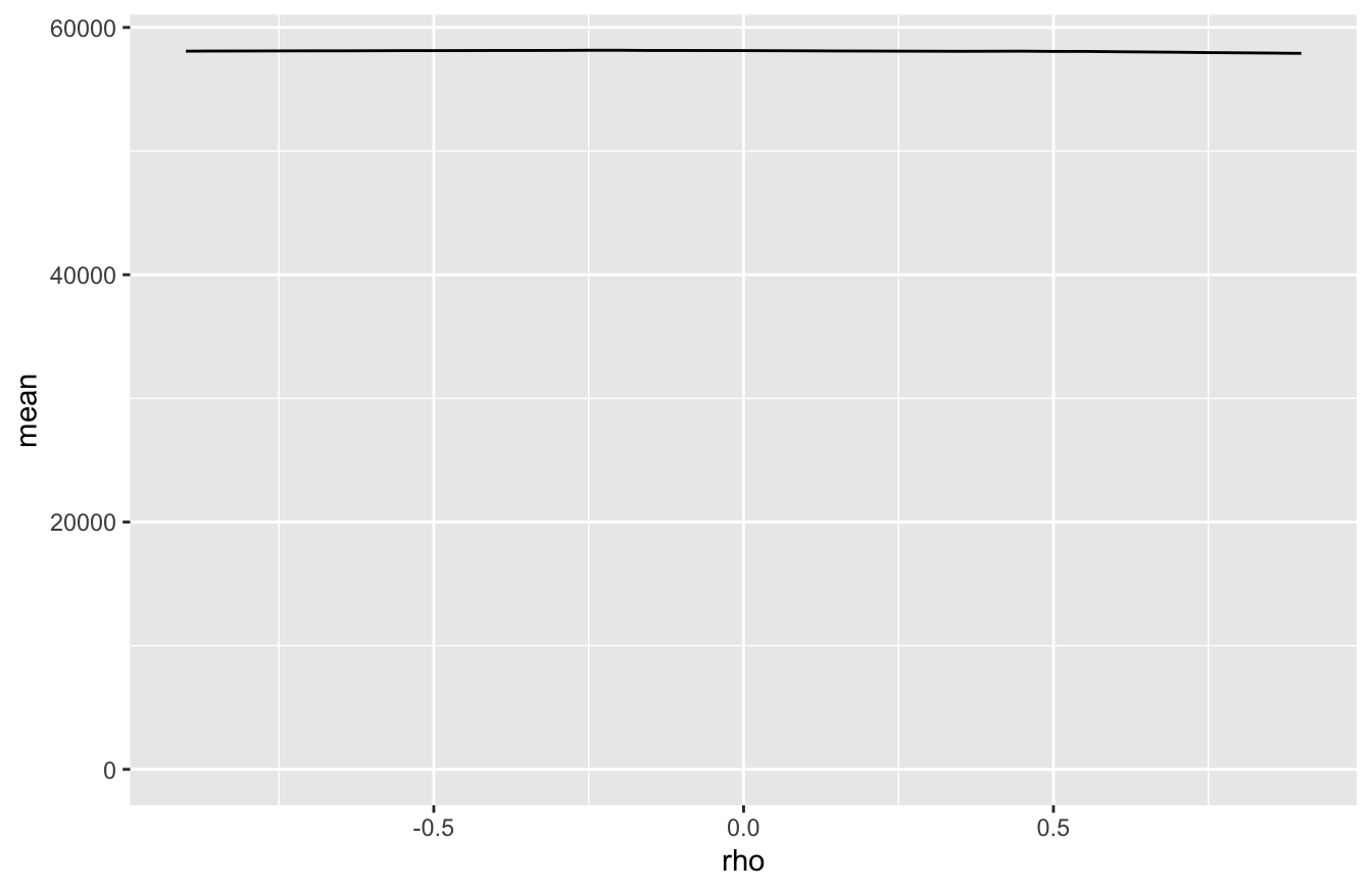
This is pancake flat: the expected return of our portfolio is completely independent of our assumption about the correlation between stocks and bonds. Any tiny wiggles in the line are due solely to Monte Carlo variability.
But it’s a very different story for the level of risk. Let’s plot the standard deviation of final wealth as a function of \(\rho\), which is a natural measure of our uncertainty about future wealth:
ggplot(portfolio_summary) +
  geom_line(aes(x=rho, y=sd)) +
ylim(0, NA) 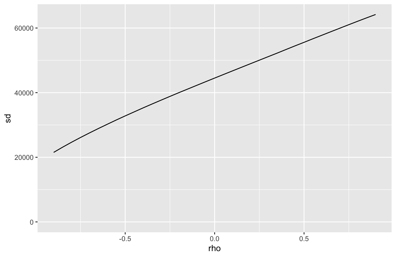
Standard deviation (and therefore uncertainty) increases as a function of our assumed correlation. The story is the same if we examine the probability of losing money in real terms:
ggplot(portfolio_summary) +
  geom_line(aes(x=rho, y=p_lose_money)) +
ylim(0, NA) 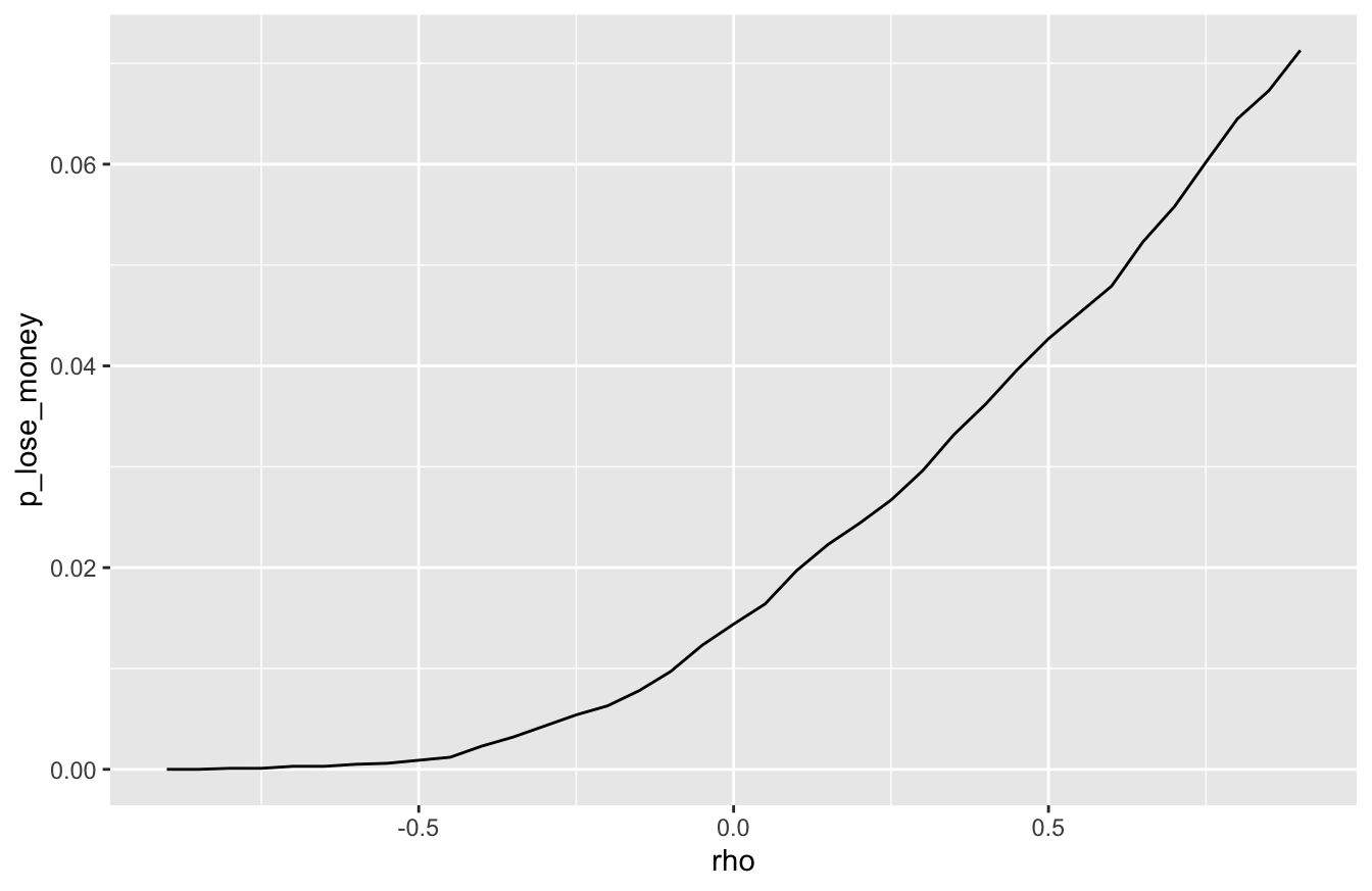
The lesson is simple: the higher the correlation between stocks and bonds, the higher the risk in a portfolio holding both.
- negative correlation: when it rains on your stocks parade, bonds provide an umbrella.
- positive correlation: when it rains on your stocks parade, bonds dump more water on your head.
You pay no penalty in expected value when the correlation between your assets is negative. But you gain a big advantage in reduced risk. This is the true value of diversification—the only free lunch in finance that most retail investors can ever expect to enjoy.
The corollary is also simple. Suppose you invest your savings across multiple asset classes. You might think: “job done, I’m diversified!” But if those asset classes are positively correlated with each other, then you’re not really diversified at all.
More generally, a discrete random variable is one whose sample space is finite or at most countably infinite.↩︎
Repeating as required when you get beyond 20 :-)↩︎
This is the industry average, quoted in “Passenger-Based Predictive Modeling of Airline No-show Rates,” by Lawrence, Hong, and Cherrier (SIGKDD 2003 August 24-27, 2003).↩︎
Data from https://www.soccerstats.com/latest.asp?league=england_2021↩︎
140 years is roughly 35,000 trading days, and \(2.8 \times 10^{-5} \times 35000 \approx 1\).↩︎
Depending on your purposes, this mean can be misleading. It’s perfectly valid as a mathematical description of the data distribution of annual stock returns. But it doesn’t imply that a portfolio of stocks invested since 1928 would have grown at an average rate of 8% per year. If we wanted to understand the growth rate of a portfolio invested over this time horizon, the relevant measure would actually be the geometric mean, for the reason that asset returns compound multiplicatively rather than additively.↩︎
Optional technical aside: Colloquially, a recursive function is one that calls itself—and indeed, many recursive processes are performed using calls to recursive functions. But as our
forloop illustrates, a recursive process need not involve an explicit call to a recursive function. This wonderful, old-school lecture from a famous MIT professor conveys this idea clearly.↩︎