Lesson 4 Plots
If you start reading deeply on the topic of data visualization, you’ll encounter dozens, if not hundreds, of different types of statistical plots. But in my opinion, there are only five basic plots that are truly essential for a beginner to know: scatter plots, line graphs, histograms, boxplots, and bar plots. Collectively, these five basic plots cover a very broad range of data-science situations.
In this lesson, you’ll learn to:
- understand the grammar of graphics.
- create five basic plots:
- Scatter plots, to show relationships among numerical variables.
- Line graphs, to show change over time.
- Histograms, to show data distributions.
- Boxplots, to show between-group and within-group variation.
- Bar plots, to show summary statistics (like counts, means, or proportions).
- Scatter plots, to show relationships among numerical variables.
- use faceting and aesthetic variation (e.g. color) to encode multivariate information.
- customize plots by exercising finer, more advanced control over their visual details.
4.1 The grammar of graphics
Plots are like sentences:
- we use them to tell stories.
- it’s easy to make basic ones, but it takes work to make really good ones.
- most of the work in making really good ones lies not in creating but in editing: sharpening your meaning; adding important details while removing what’s extraneous or distracting; and adding those little grace notes that elevate your creation from functional to beautiful.
And there’s one more unexpected way that plots are like sentences: they follow a grammar, which you might call the “grammar of graphics.” This grammar forms the foundation of some of the best plotting software out there, including Plotly, Tableau—and ggplot2, the R library that we’ll use in this lesson (and the lessons to come). The grammar of graphics is much simpler than the grammar of a natural language, like English, but it’s still a grammar.15
In fact, to make the analogy more explicit, consider a simplified version of English that I’ll call “learner English.” Toddlers, for example, often say things like “Squirrel climbs tree” or “Jimmy eats apple” as they’re learning to talk. These sentences may lack the articles, prepositions, and other adornments of textbook English sentences. But they’re still comprehensible because they obey a simple, consistent grammar with these three elements:
- a subject that performs an action (squirrel, Jimmy).
- an object that receives the action (tree, apple).
- a verb, i.e. the action itself (climbs, eats).
Statistical plots also obey a simple, consistent grammar. Like “learner English,” this grammar also has three basic elements:
- variables in a data set (like the weight or engine size of a vehicle). These are like the subject of a sentence.
- objects: specifically, geometric objects (like dot or lines or bars). These are like the object of a sentence.
- mappings from the data variables to aesthetic properties of the geometric objects (like their size, location, or color). These are like the verb in a sentence.
If you swap out different subjects/objects/verbs in our basic “learner English” grammar, you can generate lots of different sentences whose basic structure is familiar to any parent of a toddler (“I throw Cheerios,” “Daddy needs sleep,” and so on). Similarly, if you swap out different variables/geometric objects/mappings in the same graphical grammar, you can generate lots of different plots.
An example
Here’s an example to make this idea explicit. Below you see the first several rows of a data set on median hourly demand for bike-share rentals in Washington, DC’s Capital Bikeshare program, stratified by whether it’s a working day (1) or not (0):
| hr | workingday | median_rentals |
|---|---|---|
| 0 | 0 | 94 |
| 0 | 1 | 33 |
| 1 | 0 | 71 |
| 1 | 1 | 14 |
| 2 | 0 | 54 |
| 2 | 1 | 7 |
So, for example, during the 2 AM hour on working days, the median demand was 7 bikes, whereas during that same hour on weekends and holidays, the median demand was 54 bikes.
Now let’s visualize this data using a specific type of plot, called a line graph:
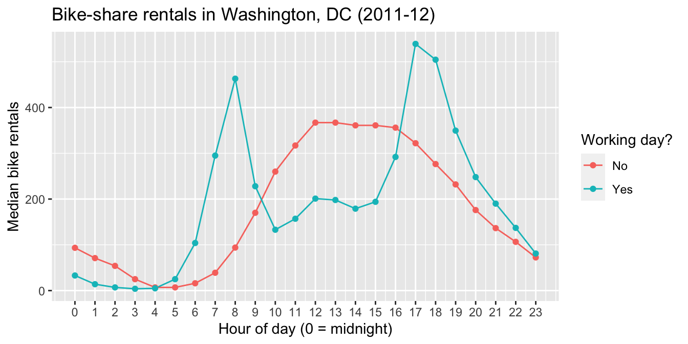
Figure 4.1: A line graph.
Remember, a plot tells a story. The story here is fairly intuitive: working days show sharp peaks in bike-rental demand during morning and evening rush hours, while non-working days have a broader plateau across the middle of the day, along with notably higher demand during the wee hours.
Let’s unpack the grammatical elements of this plot.
- The variables are the hour of the day, the median bike rentals for that hour, and whether the data point in question falls on a working day.
- The geometric objects are the dots, as well as the lines that connect those dots.
- The aesthetic mappings are what connect, or “map,” the variables to visual properties of the geometric objects, as follows:
- the hour of the day (
hr) is mapped to the horizontal (x) location of each dot.
- the median demand for that hour (
median_rentals) is mapped to the vertical (y) location of each dot. - the categorical variable
workingdayis mapped to the color of each dot, as well as the color of the lines that connect those dots.
- the hour of the day (
Let’s try one more plot, where we use the same variables, but change the geometric objects and the aesthetic mappings. The result is an entirely different plot of the same basic data, called a bar plot. This bar plot happens to have two different facets or panels:
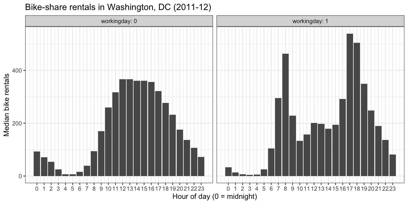
Figure 4.2: A faceted bar plot.
Let’s unpack the grammatical elements of this new plot.
- The variables are unchanged: hour of the day, median rentals, and whether it’s a working day.
- The geometric objects are the bars within each facet, as well as the facets themselves (left vs. right).
- The aesthetic mappings are as follows:
workingdayis mapped to the two facets of the plot, left for 0 (no) and right for 1 (yes).
- the hour of the day (
hr) is mapped to the horizontal (x) location of bar.
- the median demand for that hour (
median_rentals) is mapped to the height of each bar.
So there you have it: same grammar, but different combinations of the basic grammatical elements, and therefore different plots.
The rest of this lesson is about how to use R to make plots like these, and many more. As you might guess from the “gg” in its from its name, ggplot2 (the R library we’ll use) relies heavily on the grammar of graphics.
4.2 The five basic plots
Start by loading the tidyverse, which will load the ggplot2 library automatically behind the scenes:
library(tidyverse) You’ll also want to download several data sets:
- tvshows.csv, which contains data on 40 television shows, and which you already saw in our lesson on Importing a data set.
- power_christmas2015.csv, hourly data on electricity consumption in Texas on December 25, 2015.
- rapidcity.csv, daily average temperatures in Rapid City, South Dakota from 1995 to 2011.
- kroger.csv, data on sales of packaged, sliced American cheese at Kroger’s grocery stores in 11 different cities.
- car_class_summaries.csv, summary statistics on six different classes of vehicle (sedans, SUVs, etc).
Scatter plots
Scatter plots are built out of the simplest geometric object of all: points. They’re great for visualizing the relationship between two numerical variables.
Let’s see an example, revisiting the tvshows data you saw in this example analysis awhile ago. The two variables we’ll plot are each TV show’s GRP, which measures ratings/audience size, and its PE, which stands for “predicted engagement” and which measures how closely viewers are paying attention to the show. Here’s the basic ggplot2 code for a scatter plot of these two variables.
ggplot(tvshows) +
  geom_point(aes(x=GRP, y=PE))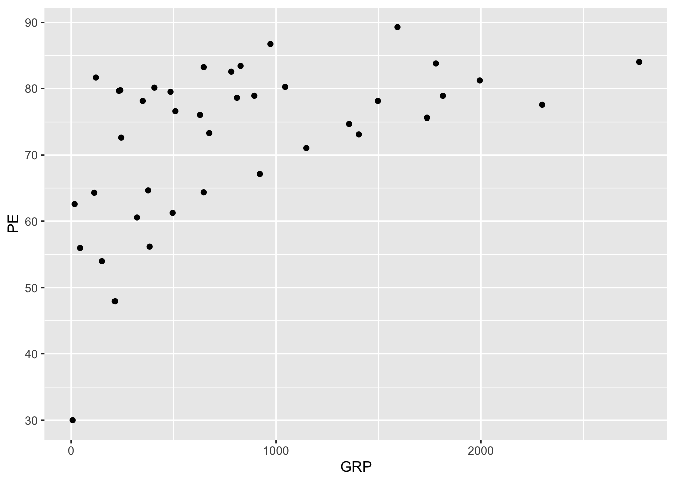
It seems that shows with larger audiences also tend to have more engaged audiences, on average.
Let’s go line by line to understand what’s happening in this code block. Here’s the code again, without the plot, so you don’t have to keep scrolling back up:
ggplot(tvshows) +
  geom_point(aes(x=GRP, y=PE))
The first line, ggplot(tvshows), tells R that you’re going to be plotting data from the tvshows data set. All plots in these lessons will begin with a similar line: ggplot(name_of_data_set).
The second line, geom_point(aes(x=GRP, y=PE)), is our first actual “sentence” in the grammar of graphics, and it’s where the real action is. geom_point means that the type of geometric objects we’re using in our plot are points (where each point is a TV show). Inside the parentheses of geom_point, aes specifies the mapping between data variables and aesthetic properties of the points, as follows:
- a TV show’s
GRPgets mapped to the \(x\) coordinate of that show’s corresponding point.
- a TV show’s
PEgets mapped to the \(y\) coordinate of the point.
Notice that the two lines are separated by a + symbol. Don’t think of this as mathematical addition, but rather as a punctuation mark in the grammar of graphics that means “add a layer.” All plots in ggplot are built up in layers using +, just like paragraphs are built up in sentences. The base layer is always the data set itself, here constructed via ggplot(tvshows).
Beyond two variables: color, shape, etc.
To build your intuition about aesthetic mappings, let’s try adding some further detail to this scatter plot. Specifically, we’ll add a third aesthetic mapping, from a show’s Genre to the color of the point. This is just one of several techniques we can employ to encode more than two variables within the constraints of a flat screen or page:
ggplot(tvshows) +
  geom_point(aes(x=GRP, y=PE, color=Genre))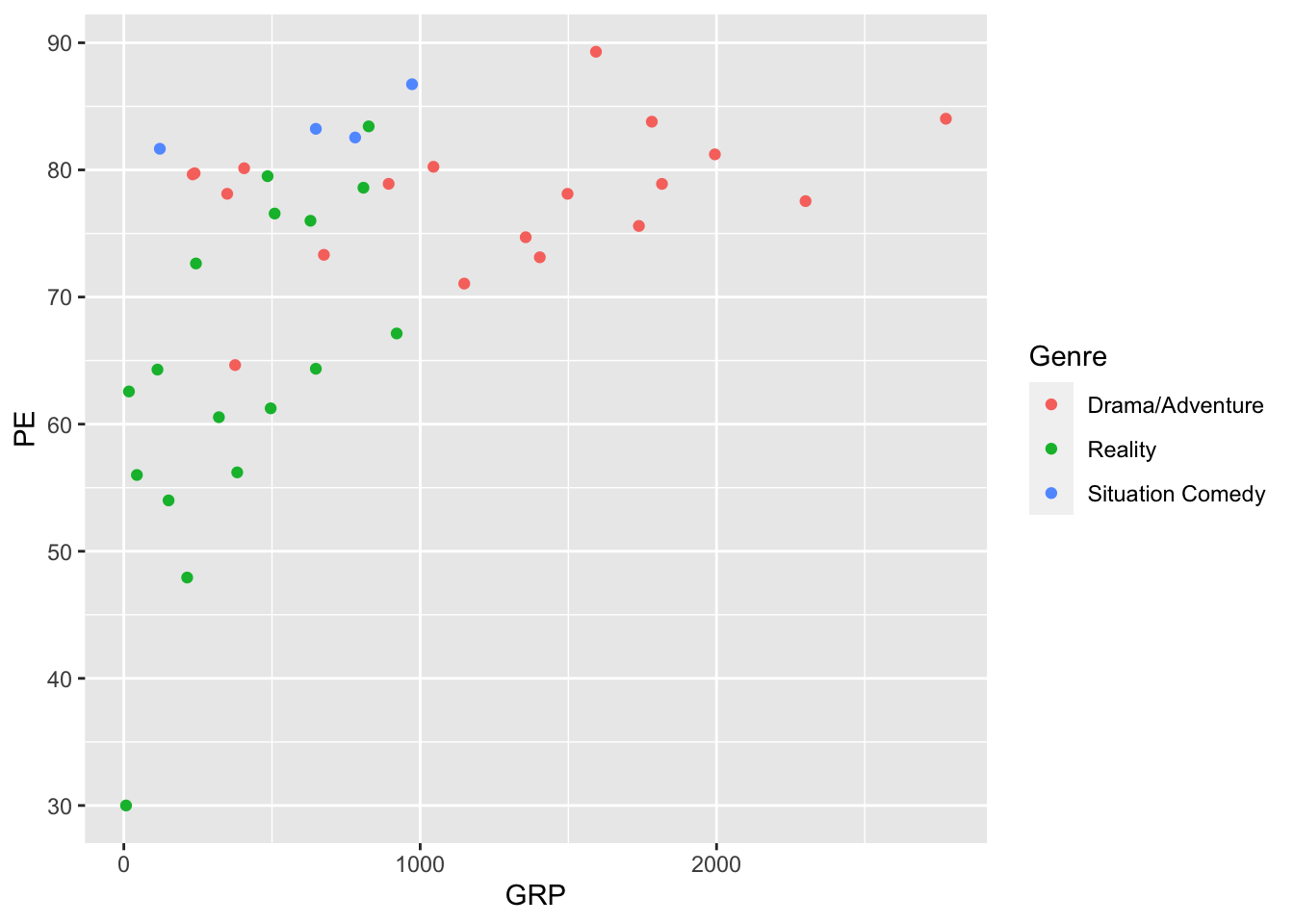
You’ve actually seen this plot before, in “mimic first, understand later” mode—and we’re now in a position to understand the code that produced it. It’s still a scatter plot (hence geom_point), but the aesthetic mapping now involves three variables:
GRPgets mapped to the \(x\) coordinate of the point.
PEgets mapped to the \(y\) coordinate of the point.
Genregets mapped to the color of the point.
It turns out that color isn’t our only option for encoding the information in the Genre variable. For example, here we map Genre to the shape of each point:
ggplot(tvshows) +
  geom_point(aes(x=GRP, y=PE, shape=Genre))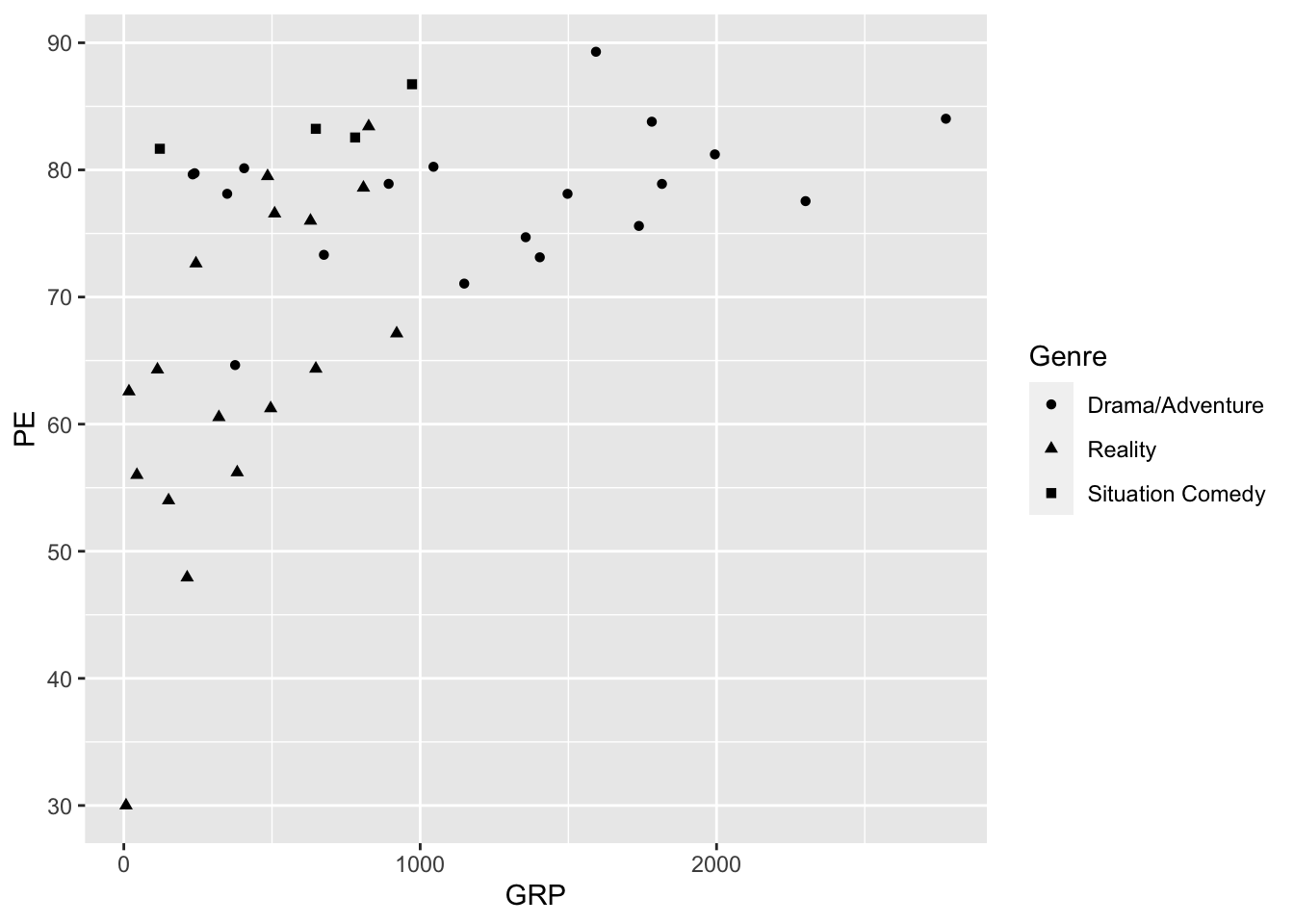
Do you find this easier or harder to interpret than the color-based plot?
There are still more options beyond color and shape. Try, for example, mapping the Genre variable to one of these:
sizealpha(transparency)
These are less successful for encoding the information in a discrete variable like Genre. But they might be really useful for encoding the information in a continuous numerical variable, like a TV show’s production budget or its critical rating on IMDb.
Beyond two variables: faceting
Let’s briefly discuss the concept of faceting, which is another effective strategy for showing more than two variables on a flat screen or page. Faceting means constructing multiple plots of the same fundamental type, with the same axes and scale, with each individual plot, called a facet, corresponding to some subset of the data. (You already saw an example of a faceted bar plot in Figure 4.2.)
Let’s now see how the code works, continuing with our data set on TV shows:
ggplot(tvshows) +
  geom_point(aes(x=GRP, y=PE)) +
  facet_wrap(~Genre)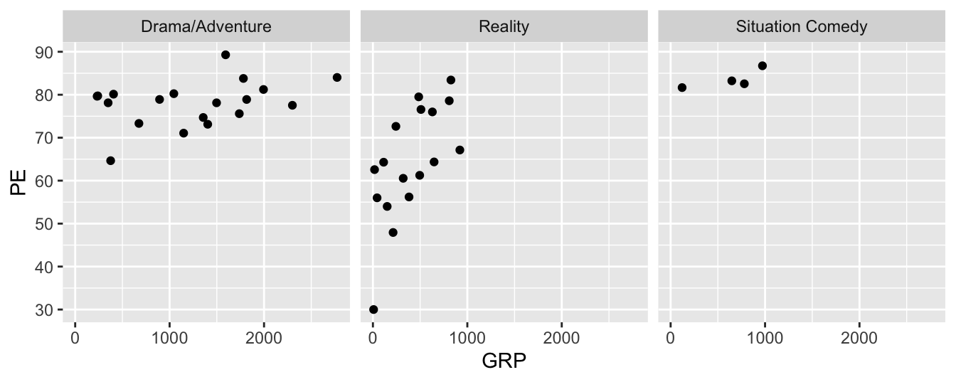
As you can see, this plot contains three distinct scatter plots of PE versus GRP, one plot per genre. The individual plots are referred to as facets; Genre, which defines the subsets of the data used for constructing the facets, is called the faceting variable. Faceting variables are always categorical (although you can also facet on a numerical variable if you discretize it first).
Let’s understand each element of the code block in terms of the grammar of graphics. Here’s the code block once more, so you don’t have to scroll back up:
ggplot(tvshows) +
  geom_point(aes(x=GRP, y=PE)) +
  facet_wrap(~Genre)
The first two lines will look familiar, but we’ll cover them anyway for the sake of completeness.
- The first line,
ggplot(tvshows), is the base or data layer. It tells R where to look for the variables you’ll be naming on subsequent lines.
- The second line,
geom_point(aes(x=GRP, y=PE)), tells R to make a scatter plot with each point as a TV show, with the following aesthetic mappings:GRPgets mapped to the \(x\) coordinate.
PEgets mapped to the \(y\) coordinate.
- The third line,
facet_wrap(~Genre), tells R to add a faceting layer to the plot, mapping the variableGenreto the individual facets. The tilde symbol (~) here means “by,” as in “facet by genre.” (If you don’t include the tilde in your command, you’ll get an error.)
Faceting is a very general strategy, and it works for pretty much any kind of plot. Below we’ll see several examples of this strategy in action.
Line graphs
If you connect points, you get lines, the second most basic geometric object. The resulting plot is called a line graph. Line graphs are useful for showing change over time, or more generally for showing change in a numerical variable (\(y\)) as a function of some sequentially ordered explanatory variable (\(x\)). To make a line graph, you play “connect the dots”—that is, you connect the \((x,y)\) coordinates of your data points sequentially, in order of the \(x\) variable.
Begin by importing power_christmas2015.csv into RStudio. This data shows hourly electricity demand in Texas on December 25, 2015. The two columns are:
hour, marking the beginning of a one-hour period, with 0 meaning midnight and 23 meaning 11:00 PM.
ERCOT, the peak instantaneous demand for electricity (in megawatts) on the Texas power grid during that one-hour period.
Here’s how to make a line graph of electricity demand over the course of that particular Christmas day. The code is almost the same as that for a scatter plot, except that we substitute geom_line for geom_point:
ggplot(power_christmas2015) +
  geom_line(aes(x=hour, y=ERCOT))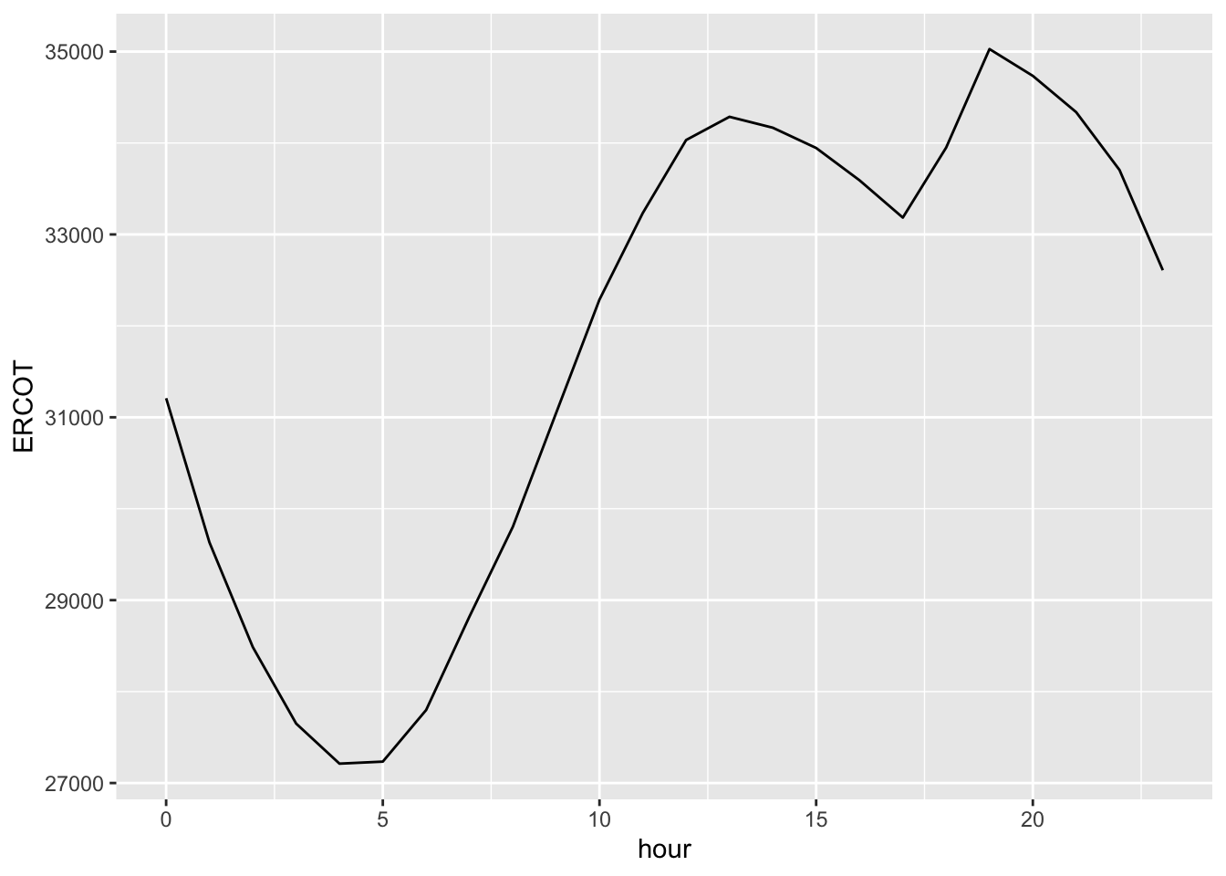
Is that dip in power demand from 1 PM to 5 PM a result of millions of Texans turning off their TVs, dimming the lights, and gathering around the table for a mid-afternoon holiday meal? Maybe, maybe not; below we’ll examine how this data compares to data in other years and on other days, to see if this “dinner dip” is a consistent pattern unique to Christmas day, or whether it’s something that happens on other days, too.
Before we add complexity, however, let’s interpret each bit of this basic code block through the grammar of graphics:
ggplot(power_christmas2015)tells R that you’re going to be plotting data from thepower_christmas2015data set.
+means add a layer.
geom_linemeans that the type of geometric objects we’re using in our plot are lines.
aesspecifies the mapping between data variables and aesthetic properties of the lines, as follows:hourgets mapped to the \(x\) coordinate.
ERCOTgets mapped to the \(y\) coordinate.
As you can see, both scatter plots (geom_point) and line graphs (geom_line) are built out of the \((x,y)\) coordinates of data points. Scatter plots show those \((x,y)\) coordinates as points, whereas line graphs connect the points in the order of the \(x\) variable. If you ever find yourself in doubt about whether a scatter plot or a line graph is more appropriate, ask yourself a simple question:
Does my \(x\) variable have an inherent progression or sequential ordering, like the hours of the day?
If the answer is no, a line graph almost certainly doesn’t make sense; you’re better off with a scatter plot. But if the answer is yes, a line graph might be worth trying, to emphasize the sequential nature of the data.
Histograms
A histogram is used to visualize the distribution of a single numerical variable (\(x\)). Let’s jump right in, using the rapidcity.csv data, which you should import into RStudio. The first six lines of the data set should look like this. The Temp column, measured in degrees F, shows the average daily temperature, which is the midpoint between that day’s high and low temps:
head(rapidcity)## Year Month Day Temp
## 1 1995 1 1 12.6
## 2 1995 1 2 19.9
## 3 1995 1 3 9.2
## 4 1995 1 4 6.2
## 5 1995 1 5 16.0
## 6 1995 1 6 17.8The plot below shows a histogram of the Temp variable:
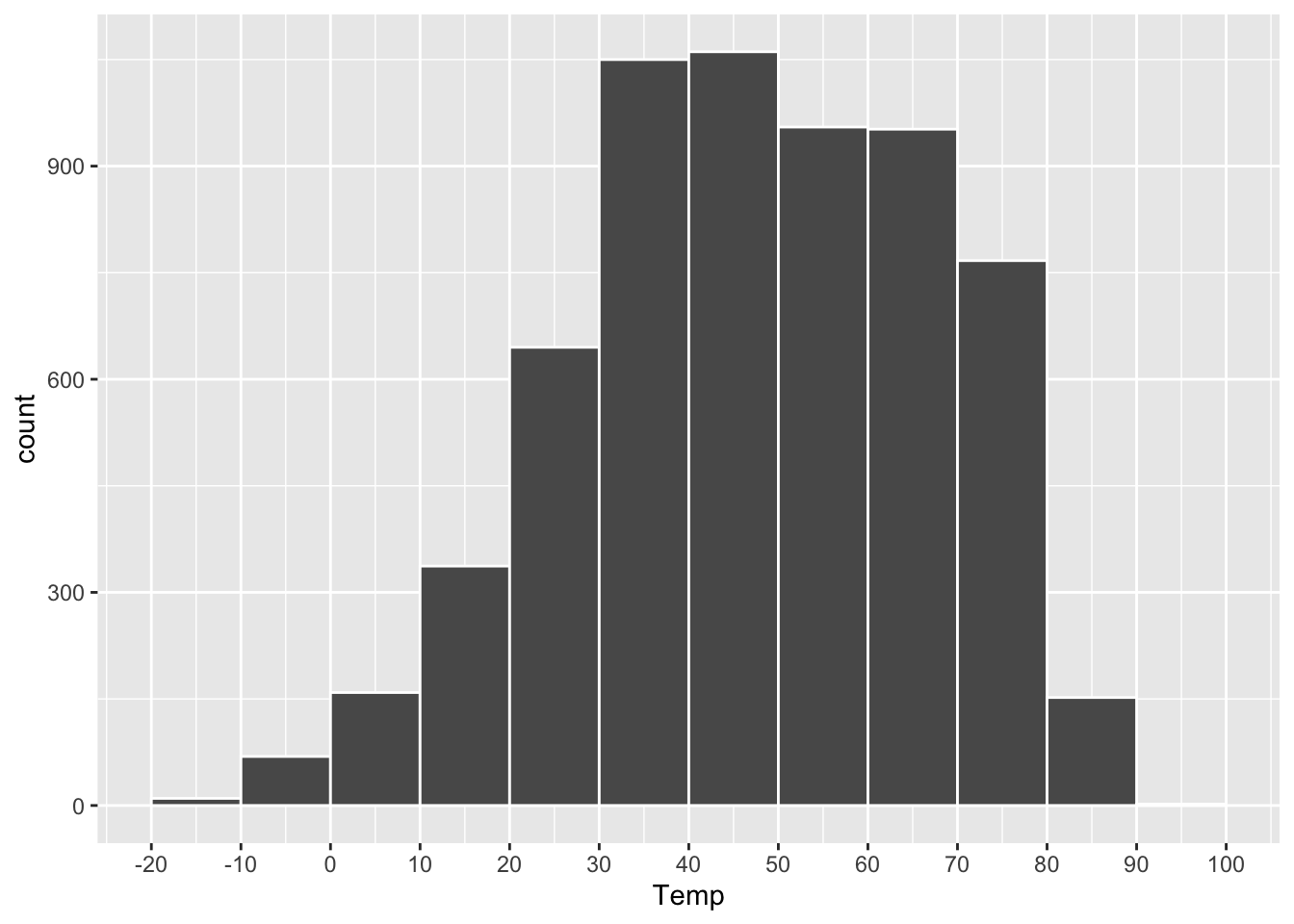
Figure 4.3: A histogram of daily average temperatures in Rapid City, SD.
A histogram like this is constructed by first chopping up the range of the \(x\) variable (here, Temp) into a set of non-overlapping intervals, or bins, where each bin represents a specific range of values. Then for each bin, we count the number of data points within that bin’s range, and we draw a bar whose height (\(y\) position) marks the corresponding count.
In the plot above, the bins are 10 degrees in width:
- The height of the bar between 10 and 20 is about 300. So there were about 300 days in the data set with temperatures between 10 and 20 degrees.
- The height of the bar between 20 and 30 is about 600. So there were about 600 days in the data set with temperatures between 20 and 30 degrees.
- And so on.
The resulting plot is useful for answering high-level questions about a data distribution, such as: Where is the center of the distribution? How spread out are the data points? Does the data show “heavy tails,” with a small number of data points very far from the center? Is the distribution skewed? In other words, does it fall off more quickly to one side of its peak than the other? (The distribution above looks mildly skewed left, since it falls off less quickly on the left-hand side of the plot.)
The code to make a basic histogram in ggplot2 looks like this, with just a single aesthetic mapping:
ggplot(rapidcity) +
  geom_histogram(aes(x=Temp))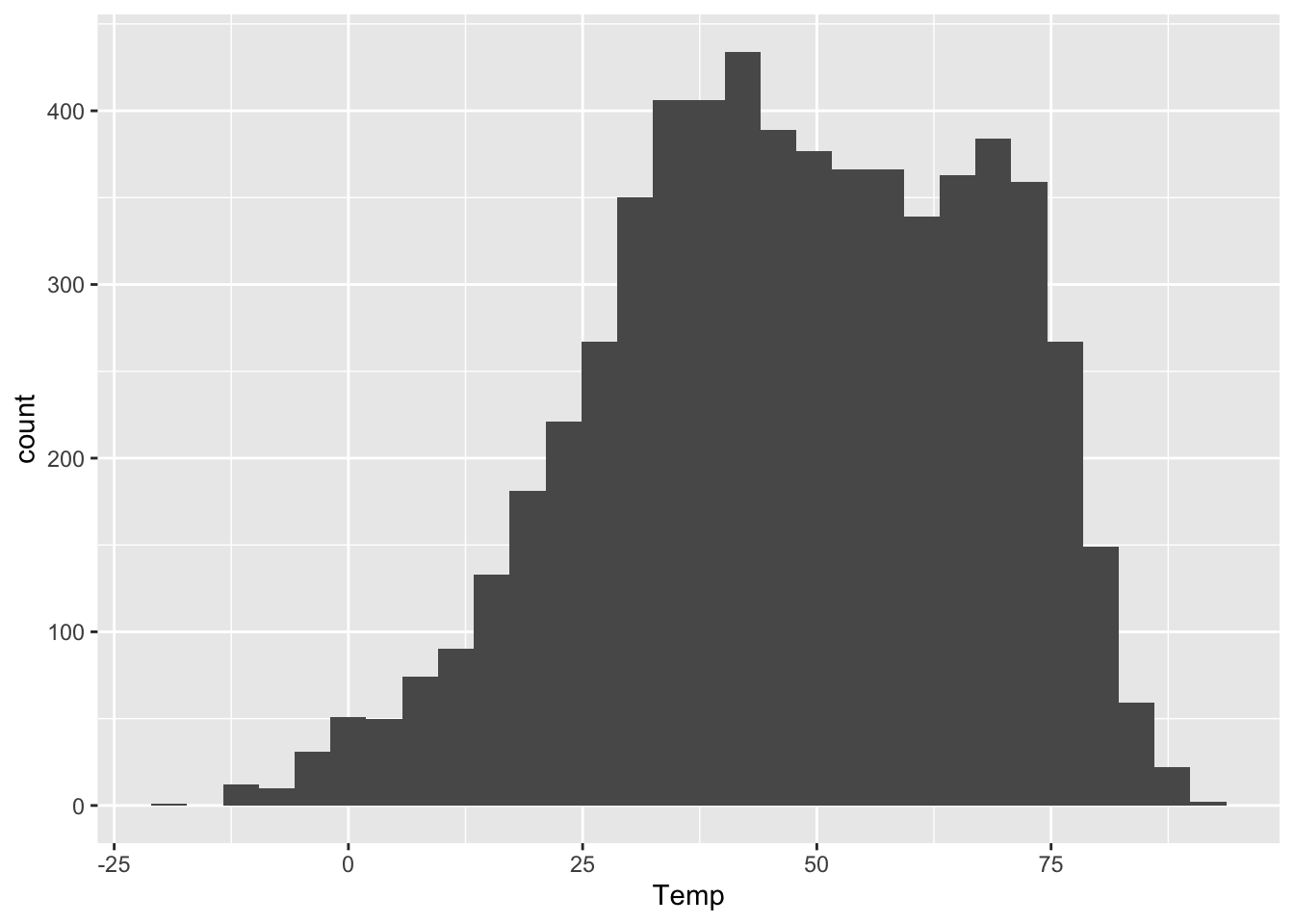
The \(y\) aesthetic, the height of the bars, gets calculated automatically. If we don’t specify how we want R to bin up the data, it will choose on its own, usually aiming for about 30 bins overall. But we can also exercise finer control over the bin width, like this:
ggplot(rapidcity) +
  geom_histogram(aes(x=Temp), binwidth=1)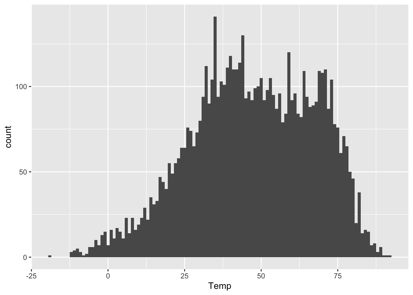
This tells R to pick bins of width 1 (so 49-50 degrees, 50-51 degrees, and so on). Compare this with the first histogram above, which had bins of width 10. Or even this one, with extra-wide 20-degree bins:
ggplot(rapidcity) +
  geom_histogram(aes(x=Temp), binwidth=20)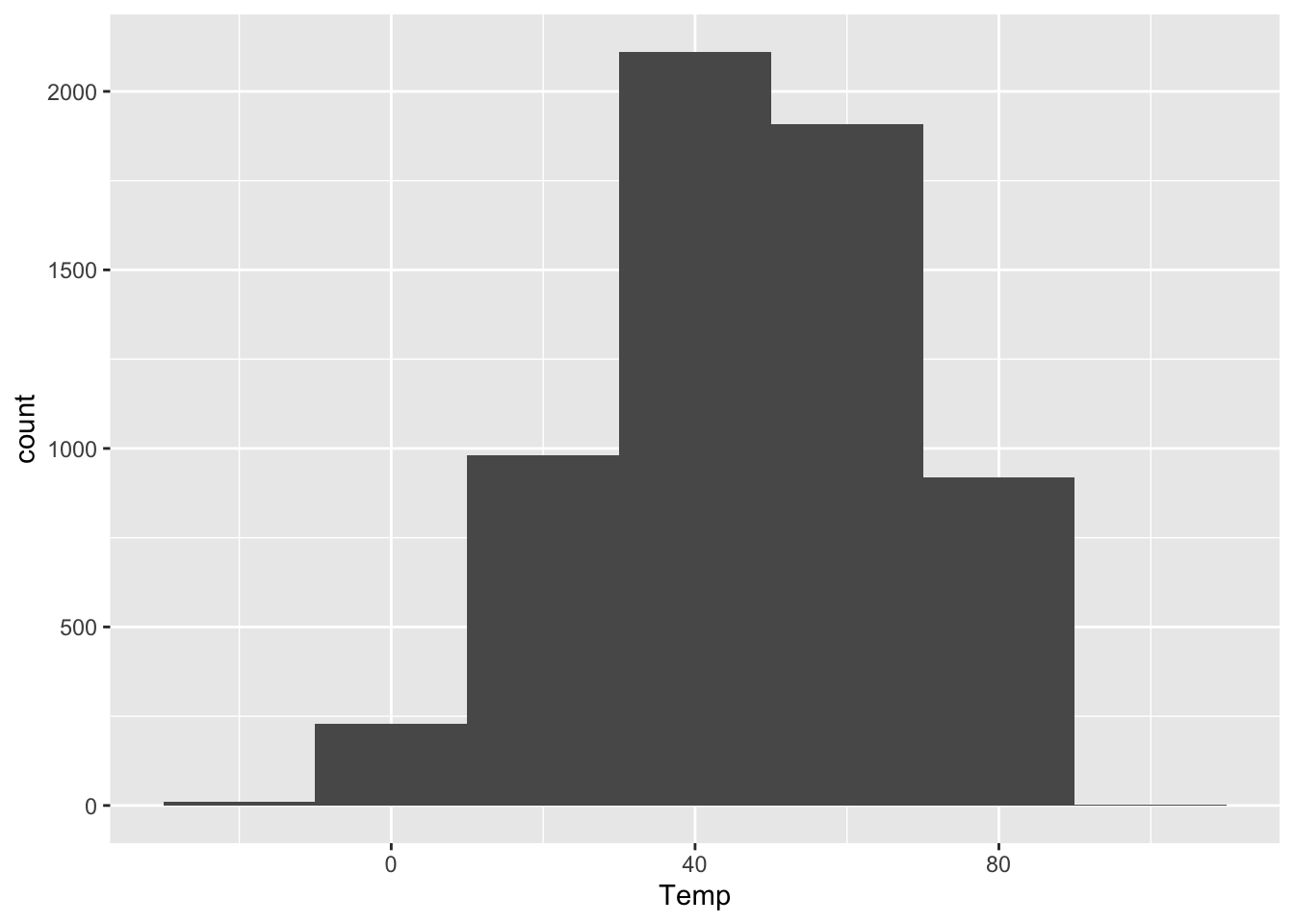
As you can see, the bin width has a dramatic effect on the overall look of a histogram. Narrower bins show fine-scale detail, but also look spikier and noisier. Wider bins obscure fine-scale detail, but generally look smoother. There’s no single best choice for all purposes. I generally play around with the bin width until I find one that looks like a nice compromise between the extremes of “not showing enough relevant detail” and “overwhelming the viewer with superfluous detail.” This often entails drawing on prior knowledge of the problem. On a data set like this, I might reason as follows.
- Would I notice a temperature swing of 1 degree F? I’m not a meteorologist or a goldfish, so I doubt it; 1-degree bins are probably needlessly narrow.
- Would I notice a temperature swing of 10 degrees F? Heck yes! So 10-degree bins might be too coarse. They’d obscure some relevant detail.
- Would I notice a temperature swing of 2 or 3 degrees F? Probably, but I’m actually not sure! So a bin width of roughly 2 or 3 degrees seems pretty reasonable. It’s not obscuring big 10-degree differences in temperature within a single bin. But it’s also not making distinctions so needlessly fine that they don’t actually matter to a person who just wants to know whether they need a t-shirt, a sweater, or a plane ticket to Texas.
Let’s try it:
ggplot(rapidcity) +
  geom_histogram(aes(x=Temp), binwidth=3)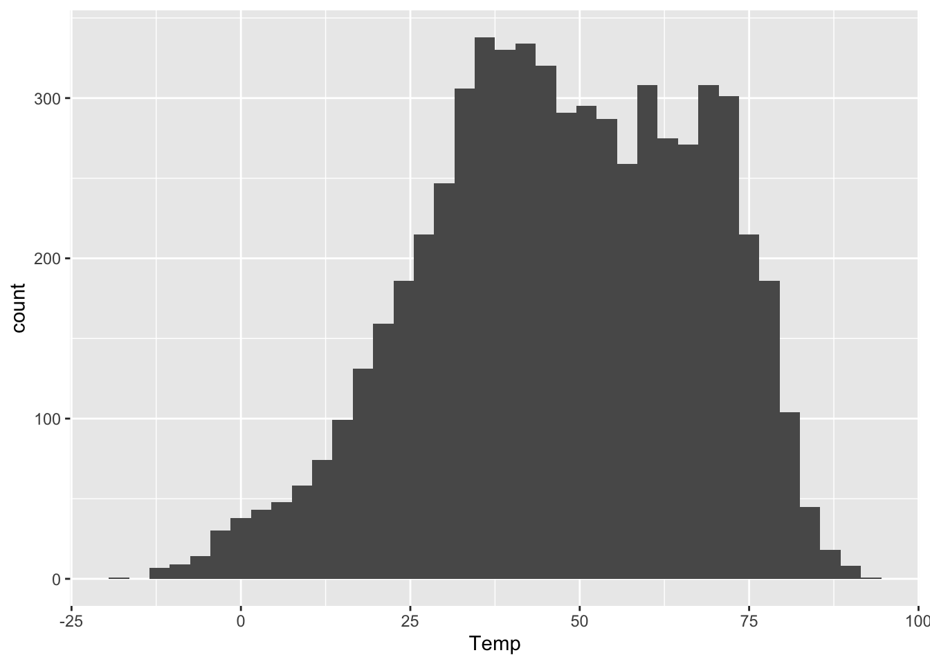
This bin width seems like a nice middle ground.
A faceted histogram
We can also use the same strategy of faceting if we wish to plot multiple histograms, each corresponding to some subset of the data. As above, this is easily accomplished by adding a facet_wrap layer to the base plot. Here’s a histogram of daily average temperatures in Rapid City, faceted by the Month variable:
ggplot(rapidcity) +
  geom_histogram(aes(x=Temp), binwidth=3) +
  facet_wrap(~Month)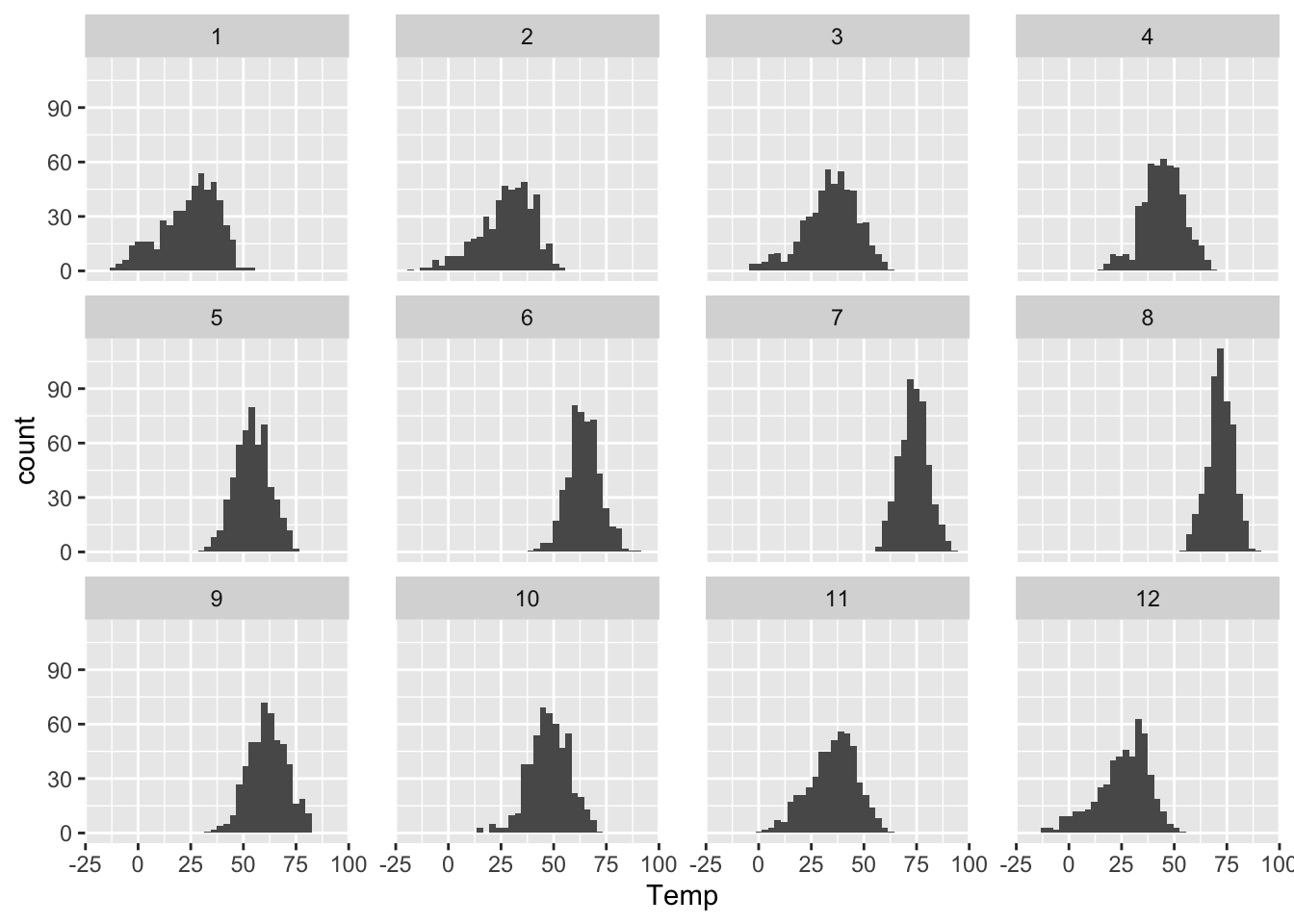
You can also tell R how how many rows you want in your faceted plot. So, for example, if you wanted a really tall and skinny plot that lined up all the months vertically, you could create it with the following code block. This is kind of a neat way to see seasonal changes in temperature:
ggplot(rapidcity) +
  geom_histogram(aes(x=Temp), binwidth=3) +
facet_wrap(~Month, nrow=12) 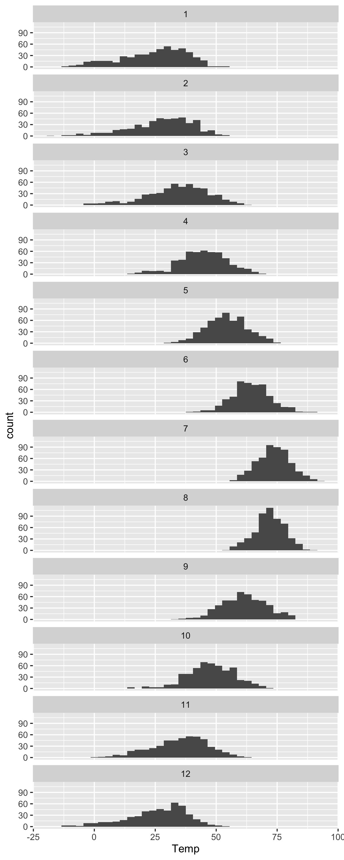
A density histogram
An ordinary histogram has counts on the \(y\) axis: the height of each bar corresponds to the number of cases falling into that bin. But we can also re-scale the \(y\) axis so that the histogram represents an approximate probability distribution, whose total “area under the curve” is 1. This is called a density histogram, and it’s very easy to do in ggplot. This won’t change the shape of the histogram at all; it just represents a different scaling convention for the \(y\) axis.
To make a density histogram rather than a “raw” histogram of counts, just add y=..density.. as an additional aesthetic mapping. You do this inside the call to geom_histogram, like so:
ggplot(rapidcity) +
  geom_histogram(aes(x=Temp, y=..density..), binwidth=3)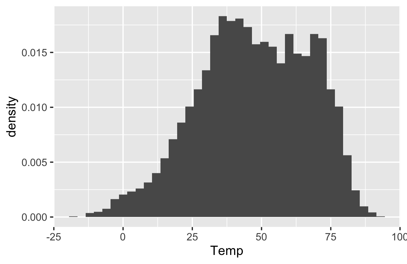
Note that the \(y\)-axis has different numbers on it and is labeled “Density.” The scale here isn’t super intuitive, but it’s chosen so that the total area of all the bars is equal to 1. With that scaling convention, we can interpret the histogram as an approximate probability distribution (because probabilities have to sum to 1 across all possible outcomes). The double-dots in y=..density.. are there to inform R that density is not actually a variable in the data set, but rather something that R has to calculate behind the scenes in order to correctly scale the \(y\) axis.
Density scaling is most useful in situations where we want to compare histograms across multiple conditions, but where the conditions involve disparate sample sizes. In that case, scaling all the histograms to have the same total area makes it more straightforward to compare the shape of the data distribution across conditions.
Boxplots
A boxplot, sometimes called a “box and whisker plot,” is used for comparing distributions. Specifically, it allows us to visualize the distribution of a numerical variable, stratified according to the values of a second categorical variable. In that sense, it plays a role very similar to that of a faceted histogram. The difference between a boxplot and a histogram is that, while a histogram tries to show the full shape of a data distribution, a boxplot shows only a summary of that distribution, in the form of a little cartoon with a box and whiskers.
Let’s see an example, using the data on weekly cheese sales across 68 weeks at 11 different Kroger grocery stores. Here are the first six lines of the file, via head(kroger):
##           city price  vol disp
## 1      Houston  2.48 6834  yes
## 2      Detroit  2.75 5505   no
## 3       Dallas  2.92 3201   no
## 4      Atlanta  2.89 4099  yes
## 5   Cincinnati  2.69 5568   no
## 6 Indianapolis  2.67 4134  yes
Each row shows the sales volume (vol) at a Kroger store in a particular city over a particular week. Our goal is to examine the distribution of weekly sales volume, both within individual cities and across the different cities. The boxplot below allows us to do just this:
ggplot(kroger) +
  geom_boxplot(aes(x = city, y = vol))
Each box represents the distribution of weekly cheese sales at Kroger store within a single city. Since there are 11 different boxes, we’re looking at 11 different data distributions, one distribution per city. Each box encodes a five-number summary for that particular Kroger’s sales volume. Let’s focus on Columbus as an example. The data distribution of weekly sales volume in Columbus has the following properties:
- Minimum: 2149 packages of cheese
- First quartile (25th percentile): 2958 packages
- Median (50th percentile): 3670 packages
- Third quartile (75th percentile): 5105 packages
- Maximum: 13588 packages
Now let’s see how this information is encoded in the box for Columbus.
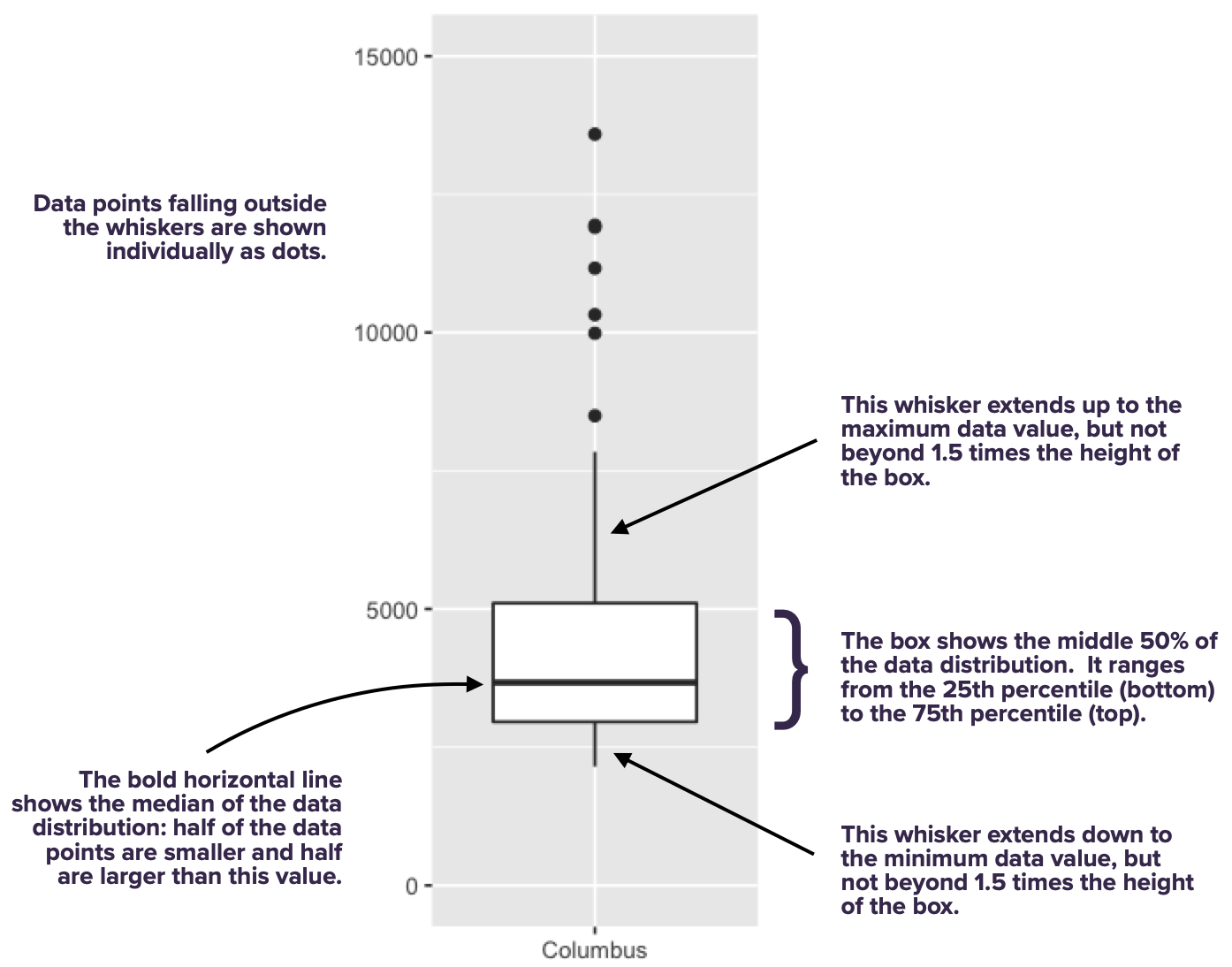
As you can see, the box spans the middle 50% of the data distribution, while the whiskers show what happens in the top and bottom quartiles. The whiskers, however, don’t necessarily go all the way to the minimum and maximum values. By default, they extend only 1.5 times the height of the box itself, with points falling outside this range shown individually as dots. (There’s a temptation to refer to these points as “outliers,” but that’s a loaded term, so we’ll avoid it for now.)
With one box, we can ask questions like: where is the data distribution centered? How spread out is it around that center? With multiple boxes, we can compare the groups, asking questions like: how far apart are the group averages (medians)? How do these between-group differences compare in magnitude to the within-group variation (that is, the spread of the individual boxes themselves)? In fact, that’s the most common use case for a box plot: to understand between-group differences placed in the context of the within-group variation.
To illustrate this idea, here’s the boxplot again:
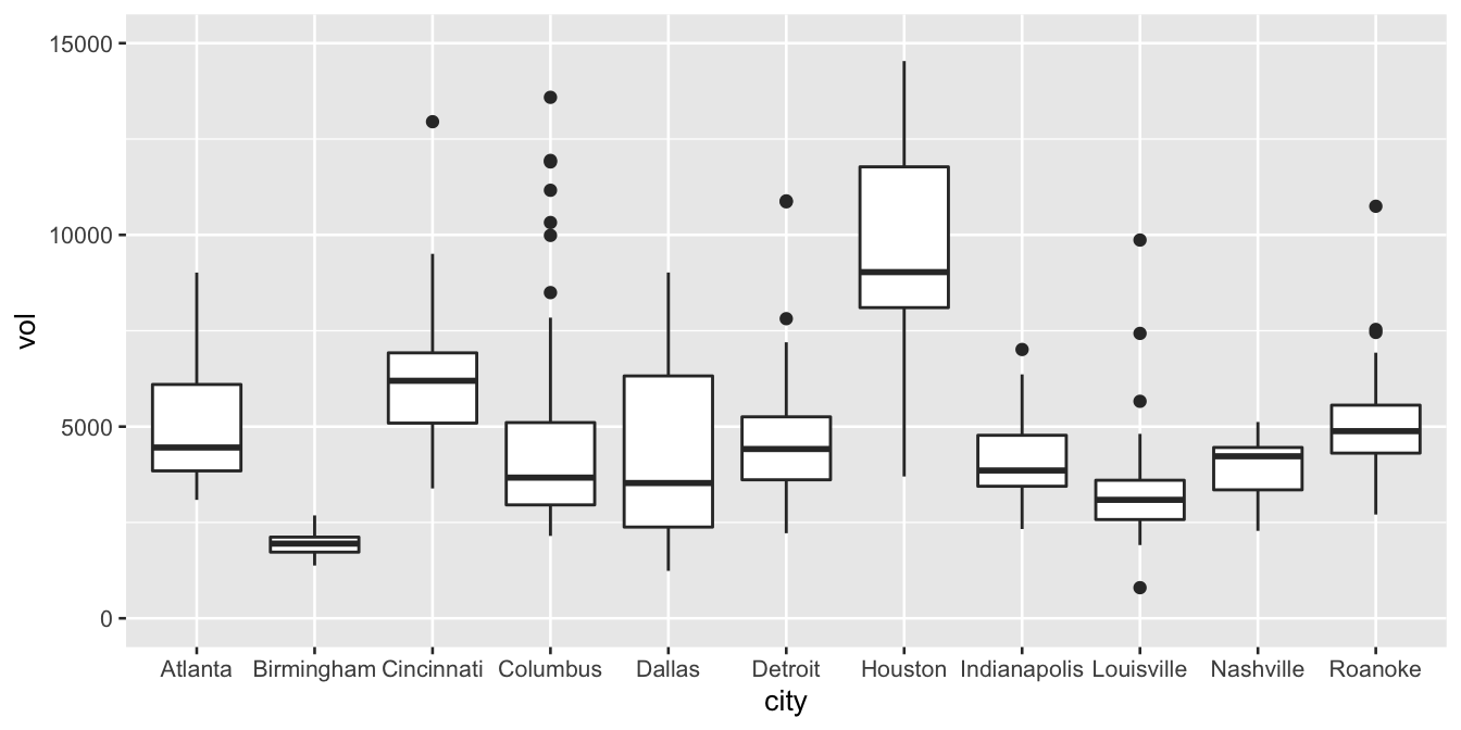
We can use this plot to make a few example statements about within-group and between-group variation:
- Columbus has higher average weekly sales than Dallas. But in context, that difference looks pretty small: the difference in their averages looks much smaller than the typical week-to-week variation in sales within either city individually. Said another way, the difference between a bad sales week (25th percentile) and a good sales week (75th percentile) in Dallas is much larger than the difference between an average sales week in Columbus and an average sales week in Dallas.
- Houston has higher average weekly sales than Detroit. Moreover, in context, this difference looks pretty large: in fact, the difference in their averages looks larger than the typical week-to-week variation in sales within either city individually. Said another way, the difference between a bad sales week (25th percentile) and a good sales week (75th percentile) in Detroit is much smaller than than the difference between an average sales week in Detroit and an average sales week in Houston.
- Nashville has higher average weekly sales than Louisville. This difference between their averages looks to be about the same size as the typical week-to-week variation in either Louisville or Nashville. Said another way, the difference between a bad sales week (25th percentile) and a good sales week (75th percentile) in Louisville is about the same size as the difference between an average sales week in Louisville and an average sales week in Nashville.
The basic principle is: within-group variation is a really valuable yardstick for reasoning about the magnitude of group differences. Boxplots make both the within-group variation and the between-group differences readily apparent.
A boxplot always has a numerical \(y\) variable (here, sales volume) and a categorical \(x\) variable (here, city). I suppose you could make a boxplot with just one group (and therefore no \(x\) variable), but in that case, you’re probably better off with a histogram.
Let’s look once again at the code to make a boxplot, so we can unpack it piece by piece:
ggplot(kroger) +
  geom_boxplot(aes(x = city, y = vol))
This code says that:
- the geometric objects in our plot are boxes with whiskers.
- the
cityvariable gets mapped to the location of the box itself, along the \(x\) axis
- the
volvariable gets used to calculate summary statistics (medians/quartiles/min/max), which are mapped to the \(y\)-axis heights of each box (and whiskers).
You might ask: when is it reasonable to use a faceted histogram versus a boxplot? To some extent this is a matter of preference, but here’s the guideline I generally follow. I tend to use faceted histograms when I want to compare distributions for a small number of groups, because histograms offer more high-resolution detail. On the other hand, I tend to use boxplots when I want to compare distributions for a large number of groups, where too much detail about each individual distribution might be overwhelming.
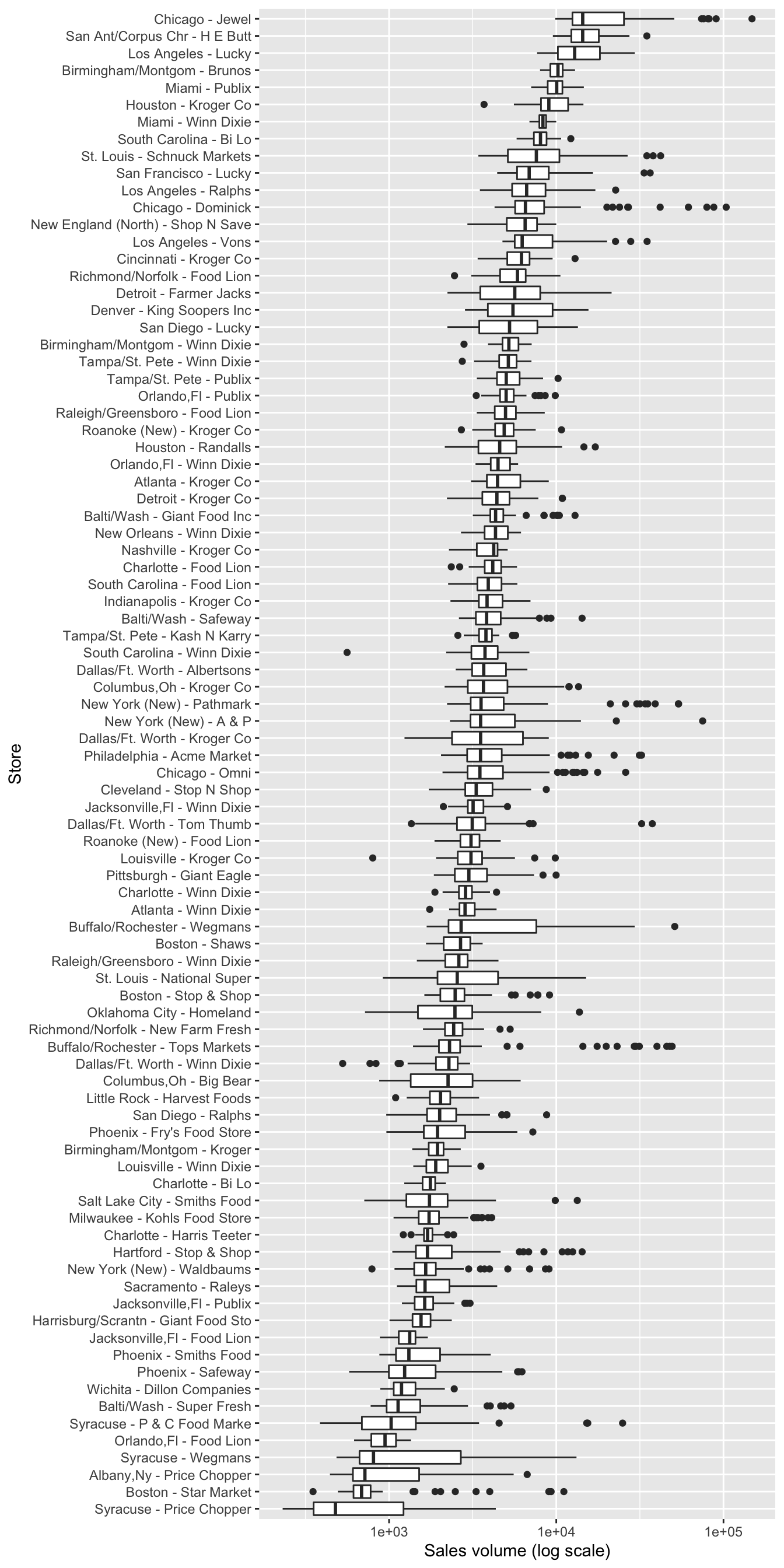
For example, here’s a boxplot of cheese sales from a much larger data set encompassing 88 different stores, arranged top to bottom by median sales. You might argue that this is too much information in a single plot. Maybe so! The point is, using a faceted histogram here would certainly be too much.
Jitter plots. A jitter plot is a variation on a boxplot that’s particularly useful for smaller data sets. Instead of showing one box per group, a jitter plot shows each data point individually above a label for its corresponding group.
To illustrate jitter plots, let’s focus only on the cheese sales from the store in Dallas. We’ll use filter to pull out these observations into a separate data frame:
kroger_dallas = kroger %>%
  filter(city == 'Dallas')
(We’ll learn more about filter in the lesson on Data wrangling soon to come, but for now it’s behavior should be readily apparent:we’re restricting attention to only the cases in the data frame where city == Dallas.)
Let’s now make a jitter plot to show how the disp correlates with sales volume for the Dallas store. This disp variable indicates whether the store had a marketing display for cheese that week.
ggplot(kroger_dallas) +
  geom_jitter(aes(x = disp, y = vol), width=0.1)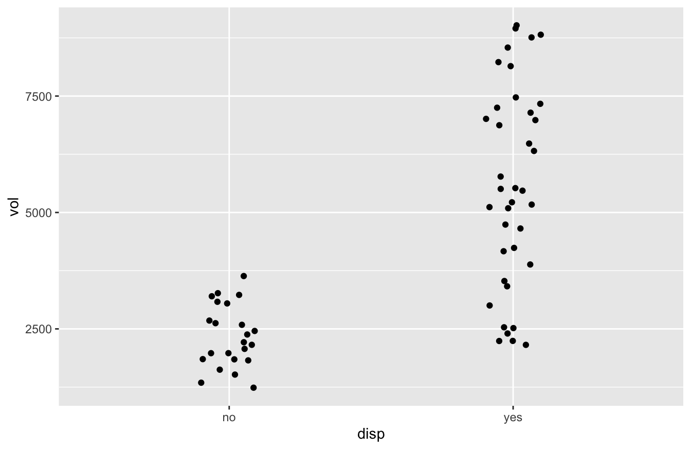
Now you see each individual case plotted above, but not exactly above, its group label. The points don’t line up exactly above the the “yes” or “no” labels because we added a bit of meaningless random “jitter” to the dots, which allows the eye to distinguish the individual cases more easily. (The width parameter controls how much jitter is added.) Don’t worry; we haven’t messed with the original data; the jitter is added solely for plotting purposes.
Jitter plots are a nice alternative to boxplots when you want to show each data point individually, but when you want to avoid overplotting, which is what happens when the data points in a plot overlap (and therefore obscure) each other.
Bar plots
Bar plots are typically used to visualize group-level summary statistics, like counts, averages, or proportions. Thus unlike any of our previous plots, the typical workflow to make a bar plot actually has two distinct stages:
- Summary stage: split your data set into subgroups and calculate summary statistics for each subgroup.
- Plotting stage: make a bar plot of those summary statistics, one bar per group.
In this section, we’re going to assume that stage 1 (calculating summary statistics), has already been accomplished, and that you’re starting from stage 2 (plotting). In a later series of lessons, we’ll show how to deal with stage 1 itself.
To illustrate, we’ll use car_class_summaries.csv, which contain simple summary statistics on seven different classes of vehicle. Go ahead and import this data set into RStudio, making sure that R is aware that the file has a header row. Here it is:
car_class_summaries## class n average_cty prop_4cyl
## 1 2seater 5 15.40000 0.00000000
## 2 compact 47 20.12766 0.68085106
## 3 midsize 41 18.75610 0.39024390
## 4 minivan 11 15.81818 0.09090909
## 5 pickup 33 13.00000 0.09090909
## 6 subcompact 35 20.37143 0.60000000
## 7 suv 62 13.50000 0.12903226This data set has only seven lines in it—remember, it’s a set of summary statistics about entire classes of vehicle, rather than data on individual vehicles. The four variables are:
class: the class of vehicle
n: the number of vehicles in that class in the original data set from which these summary statistics were derived
average_cty: the average city gas mileage (miles per gallon) of cars within that class
prop_4cyl: the proportion of cars within that class having a four-cylinder engine. (Four-cylinder engines are generally smaller engines, with larger vehicles often having six- or even eight-cylinder engines.)
To make a bar plot in R, we use geom_col, as follows. Here’s a bar plot of average city gas mileage across vehicle classes:
ggplot(car_class_summaries) +
  geom_col(aes(x=class, y=average_cty))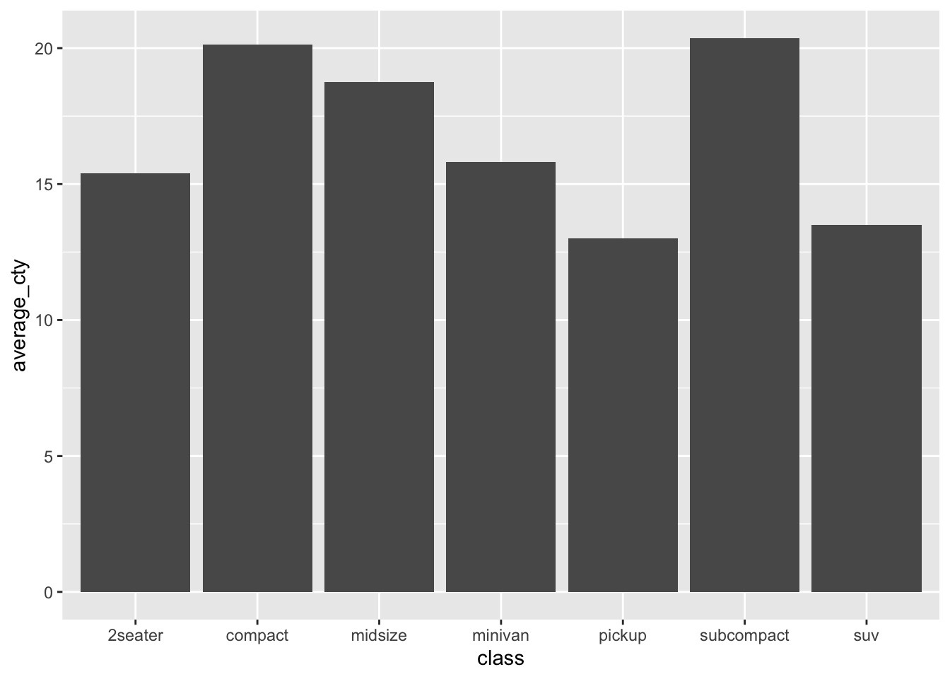
We see seven bars/columns, one per vehicle class. The average_cty variable for that class is mapped to the height (\(y\)) of the bar.
Let’s see a second example, where we plot the proportion of four-cylinder engines in each vehicle class. This entails changing the aesthetic mapping to use prop_4cyl for the \(y\) variable:
ggplot(car_class_summaries) +
  geom_col(aes(x=class, y=prop_4cyl))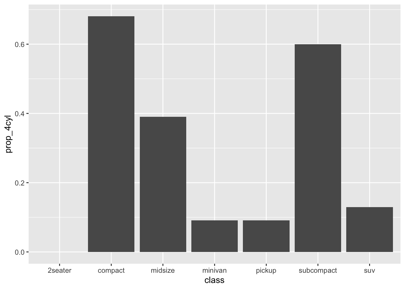
In both of these examples, the group-level summaries were “pre-computed” in the table we imported, in car_class_summaries.csv. Later on, in the lesson on Data Wrangling, we’ll see how to start from a “raw” data set and calculate these summary statistics ourselves.
What about geom_bar?
We’ve seen how to make bar plots using geom_col, assuming we have a table of pre-computed summary statistics, one row per group. Confusingly, there’s also a function in ggplot2 called geom_bar. It sounds like that should be for a bar plot, right? So what’s the difference?
It’s actually pretty simple:
- If you want to make a bar plot of counts, and you need R to do the counting for you, use
geom_bar.
- For pretty much any other bar plot, use
geom_col.
To illustrate, consider the mpg data set that comes pre-packaged with the tidyverse. Assuming you’ve already loaded the tidyverse, you can load this data set using the data command, like this:
data(mpg)Let’s look at a random sample of ten lines of this data set:
| manufacturer | model | displ | year | cyl | trans | drv | cty | hwy | fl | class |
|---|---|---|---|---|---|---|---|---|---|---|
| dodge | dakota pickup 4wd | 3.7 | 2008 | 6 | auto(l4) | 4 | 14 | 18 | r | pickup |
| audi | a4 quattro | 2.8 | 1999 | 6 | manual(m5) | 4 | 17 | 25 | p | compact |
| toyota | corolla | 1.8 | 1999 | 4 | auto(l4) | f | 24 | 33 | r | compact |
| dodge | caravan 2wd | 3.3 | 2008 | 6 | auto(l4) | f | 11 | 17 | e | minivan |
| dodge | ram 1500 pickup 4wd | 5.2 | 1999 | 8 | manual(m5) | 4 | 11 | 16 | r | pickup |
| toyota | camry | 3.5 | 2008 | 6 | auto(s6) | f | 19 | 28 | r | midsize |
| ford | mustang | 4.0 | 2008 | 6 | manual(m5) | r | 17 | 26 | r | subcompact |
| dodge | caravan 2wd | 4.0 | 2008 | 6 | auto(l6) | f | 16 | 23 | r | minivan |
| chevrolet | malibu | 3.1 | 1999 | 6 | auto(l4) | f | 18 | 26 | r | midsize |
| dodge | caravan 2wd | 3.3 | 1999 | 6 | auto(l4) | f | 16 | 22 | r | minivan |
As you can see, each row is a vehicle, and one of the variables is class. In fact, this was the original vehicle-level data set from which the class-level summary statistics I gave you in car_class_summaries.csv were derived. (Again, we’ll see how that process works in the lesson on Data Wrangling.)
We can now compare geom_col with geom_bar. Here is bar plot of class counts, based on the “derived” or summary variable n in car_class_summaries:
ggplot(car_class_summaries) +
  geom_col(aes(x=class, y=n))
This tells you have many vehicles were in each class, by explicitly mapping the summary variable n to the height of the bars (\(y\)).
Now here’s the exact same bar plot, but based on the original mpg data set:
ggplot(mpg) +
  geom_bar(aes(x=class))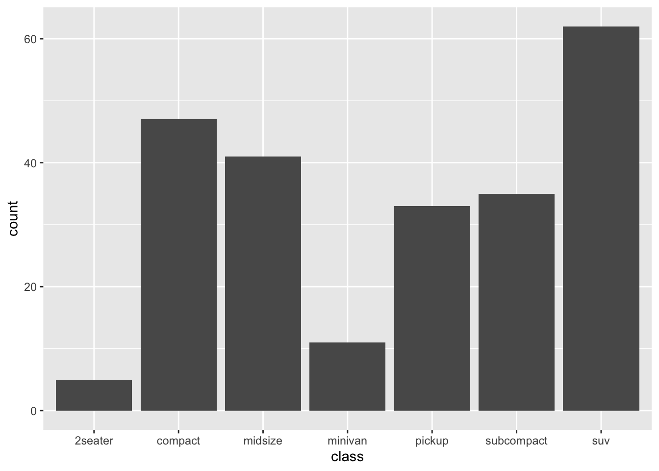
Notice that we use the mpg data, and that there’s no \(y\) aesthetic. This example illustrates the difference between geom_col and geom_bar:
- with
geom_col, you need to supply a \(y\) aesthetic for the heights of the bars. This is usually derived from a table of summary statistics. It could be a count, a mean, a proportion—anything.
- with
geom_bar, you don’t supply a \(y\) aesthetic for the heights of the bars. R calculates this for you, by counting how many cases fall into each group.
As you can see, geom_bar only makes sense if you want a quick bar plot of how many cases fall into each class. Virtually all other use cases for bar plots require geom_col, which is much more generally useful. Personally, I use geom_col approximately 100% of the time. Depending on the data sets you work with, your mileage may vary.
4.3 Customizing plots
ggplot2 offers near infinite possibilities for customizing your plots. If you can Google it, you can probably make it happen in ggplot, but I can’t promise the code will be pretty! (Unfortunately, with great power comes great complexity.) In this section, we’ll discuss a few of the most basic and important customization options.
In the beginning, these options may have the feel of mystical incantations you have to utter to get your plots to behave the right way. That’s OK, even normal; eventually you’ll start to build muscle memory for ggplot2. My advice is not to try to memorize anything. If you want to customize a plot, just start from the code blocks below as templates, and type the relevant bits of customization code into your plot, changing the names of the data and variables as appropriate.
Changing titles and labels
It’s easy to customize the title and axis labels of a plot. You do this by adding a labs layer to an existing plot. To illustrate, let’s go back to the data on weekly cheese sales in Kroger stores:
Here was our basic box plot, with default axis labels and no title:
ggplot(kroger) +
  geom_boxplot(aes(x = city, y = vol))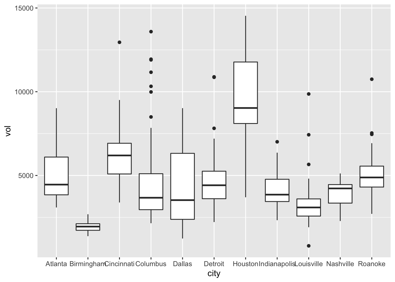
And here’s the same plot, but with some nicer labels:
ggplot(kroger) +
  geom_boxplot(aes(x = city, y = vol)) +
  labs(x="Location of store",
       y="Weekly sales volume (packages sold)",
       title="Weekly cheese sales at 11 U.S. Kroger stores")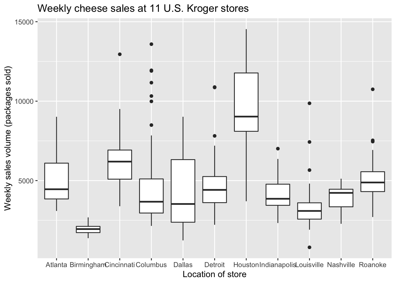
Color scales
Color is a fascinating, rich topic at the intersection of physics, neuroscience, and art. We can’t hope to cover even a tiny fraction of what there is to say about color here. Suffice it to say that in R, you can geek out as much as you want with custom color palettes for your plots.
The one color-related topic we’ll discuss seriously is the creation of color-blind friendly plots. Take, for example, this plot from above:
ggplot(tvshows) +
  geom_point(aes(x=GRP, y=PE, color=Genre))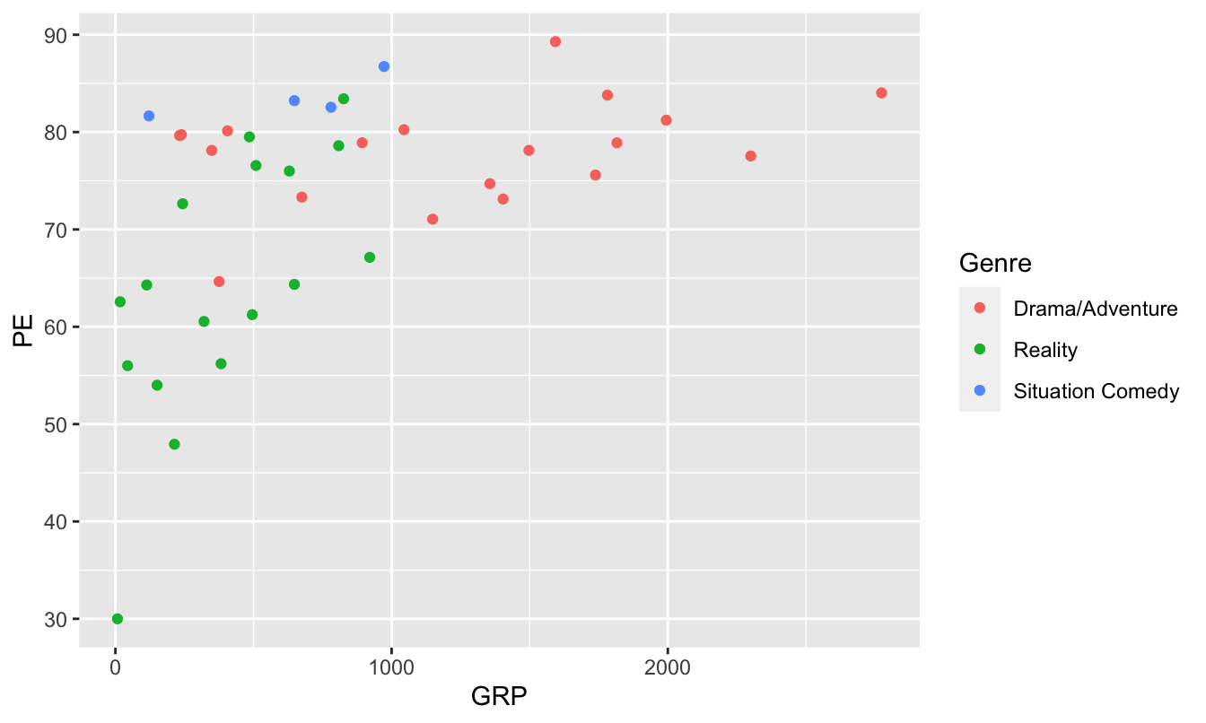
Not so great for color-blind viewers, for whom reds and greens can be challenging. But this next version is much friendlier.
ggplot(tvshows) +
  geom_point(aes(x=GRP, y=PE, color=Genre)) +
  scale_color_brewer(type="qual")
This adds a “color-scale” layer to the basic scatter plot, thereby changing how R encodes each genre in a color. Specifically, these are Color Brewer colors, a palette put together by an expert in visibility and color theory named Cynthia Brewer. Our command is telling R that the type of color scale we want (qual) is one appropriate for qualitative (that is, categorical) variables.
Another option is to install viridis, another library of color palettes that are specifically designed to be easier to read by those with colorblindness. (They also print well in grayscale.)
library(viridis)

ggplot(tvshows) +
  geom_point(aes(x=GRP, y=PE, color=Genre)) +
  scale_color_viridis(discrete=TRUE)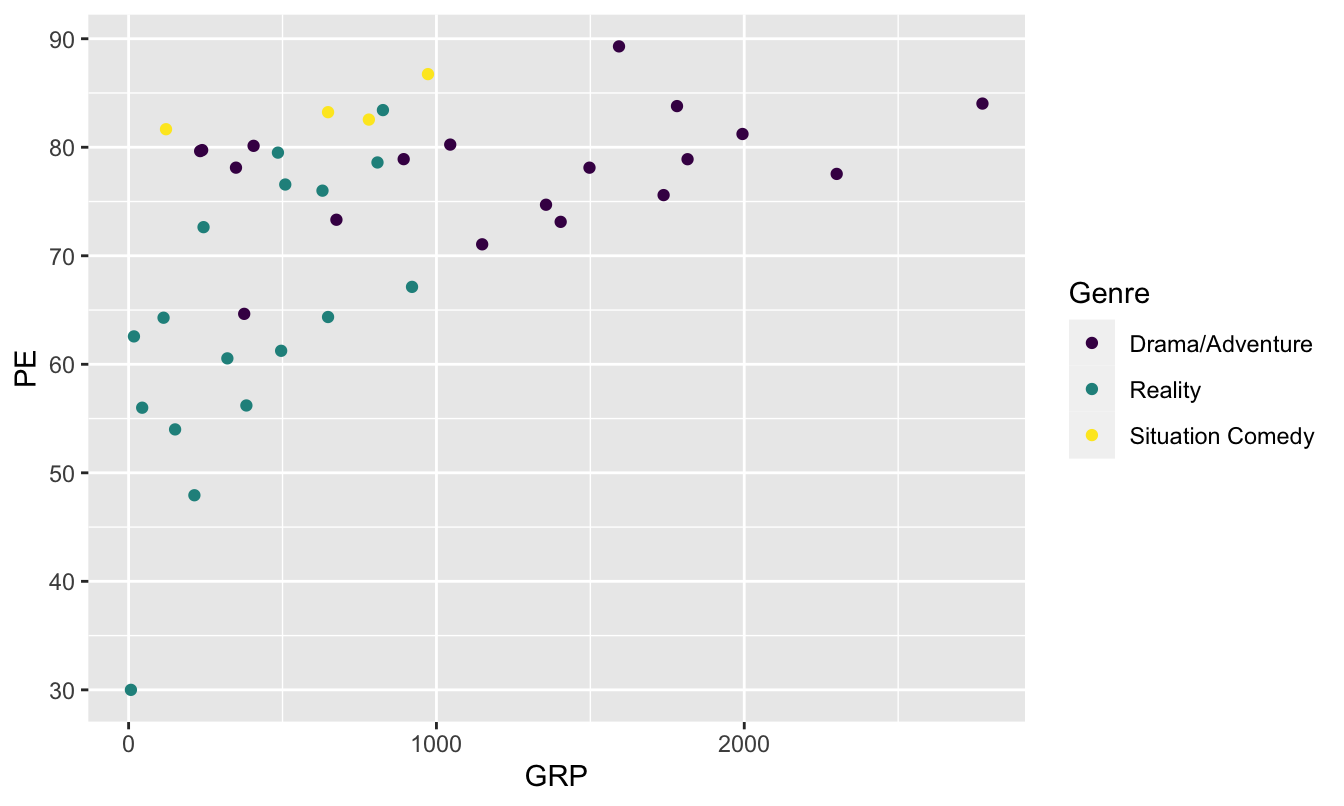
The layer scale_color_viridis(discrete=TRUE) tells R to use the viridis color scale for showing the individual genres (which is a discrete categorical variable, hence discrete=TRUE). This is another good, research-backed option when you want to use color to encode multivariate information in a plot and want to maximize accessibility.
Font size
It’s a little bit tedious to change font sizes in ggplot2. But this is something we probably want to do in our boxplot above, because the names of the stores are running together along the \(x\) axis.
In ggplot2, font sizes are governed by adding a theme layer. Here we are making the font smaller, to avoid overlapping text.
ggplot(kroger) +
  geom_boxplot(aes(x = city, y = vol)) +
  labs(x="Location of Kroger store",
       y="Weekly sales volume (packages sold)",
       title="Weekly cheese sales at 11 U.S. Kroger stores") +
theme(axis.text = element_text(size = 8)) 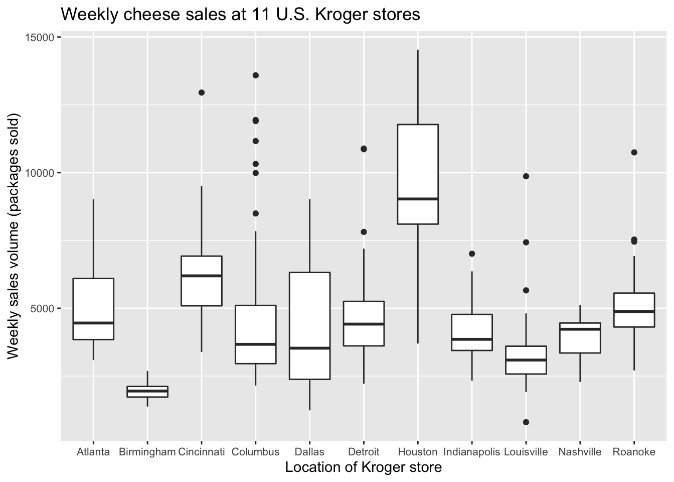
theme(axis.text = element_text(size = 8)) is not the prettiest or most intuitive command in the world, but it works. You can also change font sizes for other aspects of the plot, including axis labels and titles. This reference shows a lot of these other customization options, which follow a very similar template to the example above.
Flipping the \(x\) and \(y\) axes
You can flip the coordinate axes in any ggplot using coord_flip:
ggplot(kroger) +
  geom_boxplot(aes(x = city, y = vol)) +
  labs(x="Location of Kroger store",
       y="Weekly sales volume (packages sold)",
       title="Weekly cheese sales at 11 U.S. Kroger stores") +
  coord_flip()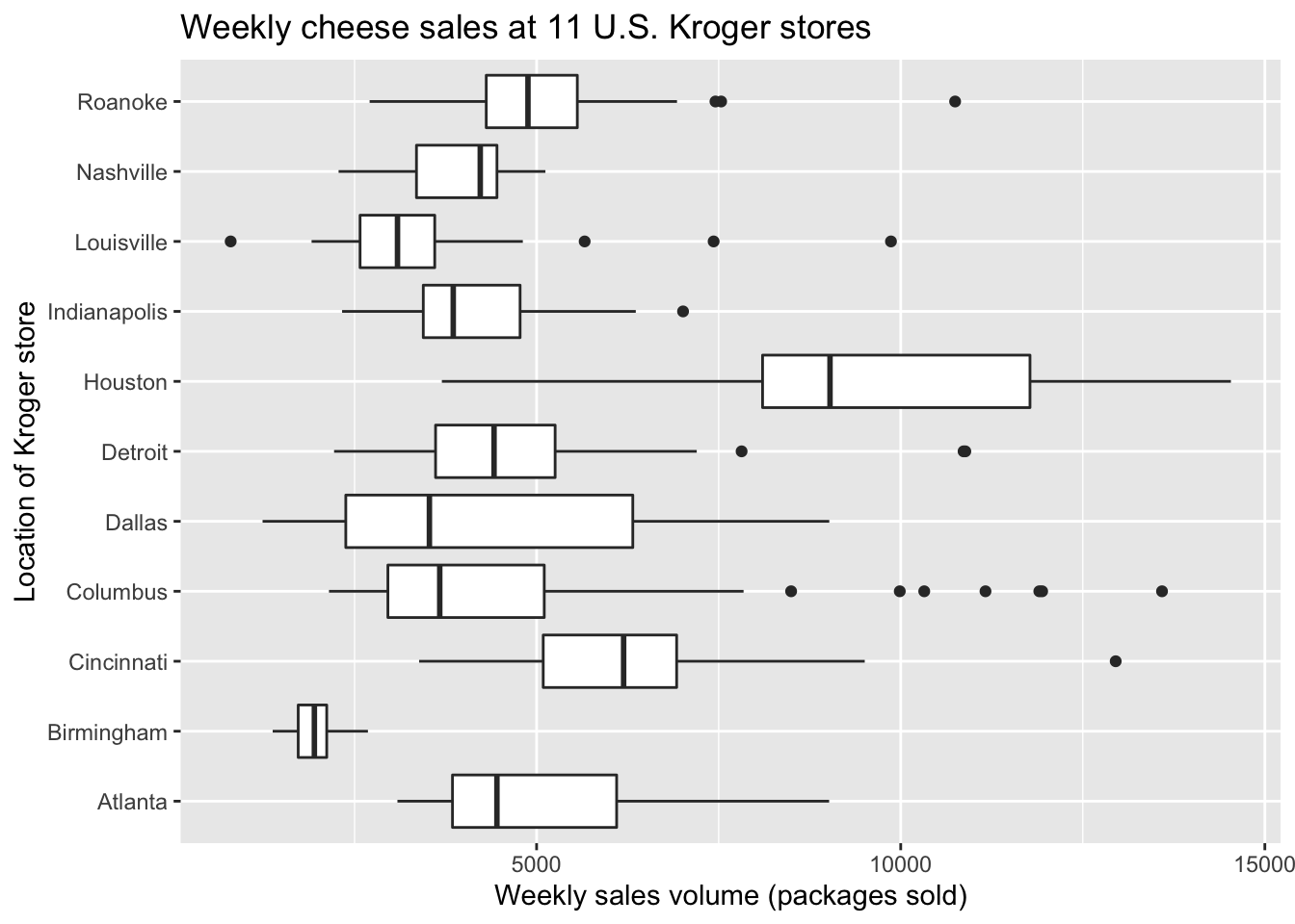
This is a perfectly fine solution to the problem of overlapping text in our previous boxplot, but for some data sets you might prefer horizontal boxes/bars/whatever for their own sake. Here’s a second example, based on our bar plot of vehicle mileage vs. class:
ggplot(car_class_summaries) +
  geom_col(aes(x=class, y=average_cty)) +
  coord_flip()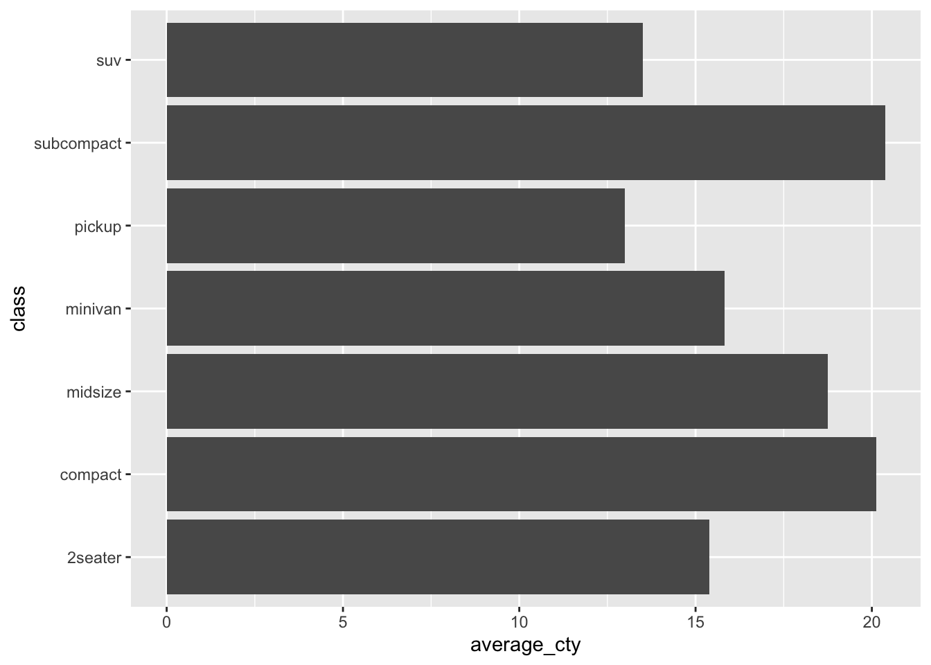
Plotting cheat sheet
In the table below, \(x\) refers to an explanatory variable and \(y\) refers to a response variable (i.e. the variable whose behavior is being “explained” by \(x\)).
| If you have… | Consider a… |
|---|---|
| Numerical \(y\) and numerical \(x\) | Scatter plot of \(y\) vs \(x\) |
| Numerical \(y\) and sequential \(x\) | Line graph of \(y\) vs \(x\) |
| Numerical \(y\) alone (no \(x\)) | Histogram of \(x\) |
| Numerical \(y\) and categorical \(x\) | Boxplot or faceted histogram of \(y\) vs \(x\) |
| Summary statistics by group | Bar plot |
| More than two explanatory variables | Plot that uses faceting or additional aesthetic mappings (color/shape/etc.) |
| A plot that encodes information via color | Colorblind-friendly color scale |
Study questions
Subjects, objects, and verbs are three key elements in the grammar of English. What are the three key elements in the grammar of graphics?
In the section on “The grammar of graphics,” you saw two examples of a plots: a line graph and a bar plot. Both were plots of the same data, and both had the same goal: to compare bike-rental demand across the day and for working vs. non-working days. Do you think one plot is more effective than the other at making that comparison. Or do you think they’re about equally effective? Explain your reasoning.
Recall this code block, that created a scatter plot of
PEvs.GRPfor television shows:ggplot(tvshows) + geom_point(aes(x=GRP, y=PE))Now download the gapminder2007 data, originally from www.gapminder.org, which contains human development data on 142 countries in 2007.
- Start from the code block above as a template. Modify the code to produce a scatter plot of a country’s life expectancy (
lifeExp, \(y\) variable) versus its per-capita GDP (gdpPercap, \(x\) variable). This should entail changing the data set name and the variable names, leaving the other elements of the code block as-is.
- Starting from the plot in (A), modify your scatter plot of
lifeExpvs.gdpPercapso that thecontinentvariable gets mapped to the color of each point.
- Starting from the plot in (B), modify your plot so that the population variable (
pop) gets mapped to the size of each point. Your points now encode four pieces of information about each country: GDP, life expectancy, continent, and population. Can you guess which points correspond to China, India, and the United States?
- Start from the code block above as a template. Modify the code to produce a scatter plot of a country’s life expectancy (
Technically the grammar of graphics is what’s known to logicians as a formal grammar. While the term “formal grammar” might connote unpleasant images of Teacher Thistlebottom scolding pupils for their split infinitives, formal grammars are typically much simpler than the grammars used by native speakers of natural languages.↩︎