Lesson 2 Data
R is all about data. So let’s look at some! In this lesson, you’ll learn:
- The basic vocabulary of data.
- The difference between a sample and a population.
- Why the unit of analysis is a fundamental choice in data science.
- How to import and view a data set in R.
- Conduct a short but complete data analysis by computing simple statistics and making a plot.
To start, open RStudio and create a new script for this lesson (calling it, e.g., lesson_data.R, or whatever you want). You’ll use this script to type out some code chunks and see what results they produce.
Then place the following line at the top of your R script, and run it in the console. This will load the tidyverse library, just like we covered in the Libraries lesson:
library(tidyverse)This will make all the functionality of the tidyverse library available when we need it down below.
2.1 Data frames, cases, and variables
Consider the dogs of the world, in all their variety:

All dogs exhibit some similarities: they bark, they have four legs and a fur coat, they like to sniff each other’s butts, and so on. Yet they also differ from one another in their specific features: some are large and others small; some have shaggy fur and others smooth; some have dark coats and others light. Put simply, dogs vary. In data science, we study and try to understand this variation.
A data set is like the collection of dogs shown above. It consists of cases, also known as examples—here, the individual dog breeds. A collection of cases is called a sample, and the number of cases in the sample is called the sample size, usually denoted by the letter \(n\). Each case can be described in terms of its variables, also known as features or attributes.
A data set records a specific set of variables across a specific collection of cases. For instance, suppose we examine five specific dog breeds: border collie, Chihuahua, Siberian husky, beagle, and Bernese mountain dog. That’s our collection, or our sample, or breeds. Suppose, moreover, that we choose to record four pieces of information on each breed in the sample: (1) average height in inches, (2) average weight in pounds, (3) length of fur, and (4) country of origin. Those are our variables, or features of interest.
Typically, the most convenient way to represent a data set is to use a tabular format called a data frame, also known as a data table. In a data frame, the rows correspond to individual cases in our sample, and the columns correspond to the variables, like this:
| Height | Weight | Fur | Origin | |
|---|---|---|---|---|
| Border collie | 20 | 35 | Long | Britain |
| Chihuahua | 8 | 5 | Short | Mexico |
| Siberian husky | 22 | 45 | Long | Russia |
| Beagle | 15 | 22 | Short | Britain |
| Bernese mountain dog | 26 | 100 | Long | Switzerland |
Each row of our data frame is a case, here a dog breed. Each breed has a unique name that identifies it, along with four other variables, or pieces of information about the breed. A data frame has as many rows are there are cases in the sample (here 5), and as many columns as there are variables (here 4, or 5 if we include the row names that serve to identify the breed).
Numerical vs. categorical variables. Our data set on dogs in Table 2.1 has two different kinds of variables:
- Some variables in our data set are actual numbers; appropriately enough, these are called numerical variables. The numerical variables in this data set are
HeightandWeight.
- Other variables can only take on a limited number of possible values, like the answer to a multiple-choice question. These are called categorical variables. The categorical variables in this data set are
FurandOrigin.
This distinction between numerical and categorical variables is essential in data science, because only numerical variables have magnitudes that obey the rules of arithmetic. Imagine, for example, that you had two Chihuahuas and a border collie. You can add the weights of all three dogs and make meaningful statements about the sum: two Chihuahuas (2 \(\times\) 5 = 10 lbs) plus one border collie (35 lbs) equals 45 lbs, which happens to be the weight of a single Siberian husky. But you can’t do the same kind of arithmetic with the dogs’ countries of origin; it doesn’t make sense to add two Mexicos and a Britain and say that this is somehow equal to Russia. Arithmetic makes sense with Weight, but not with Country. More generally, the fact that you can do arithmetic with numerical variables, but not categorical variables, has all sorts of downstream consequences for how we summarize, plot, and model our data—and we’ll be exploring these consequences for much of the rest of the book.
Code books. To complete our data set on dogs, we also need to provide some detail about each variable, in the form of a code book, like this:
- Height: breed average height of adult dogs measured at the shoulders, in inches
- Weight: breed average weight of adult dogs, in pounds
- Fur: length of fur. Levels: short, long.
- Origin: country of origin of the breed.
The code book is typically stored as a separate file or web page. It provides all the necessary information to interpret each variable in the data set, answering questions like: what does the variable represent? How is it measured? If numerical, what are its units? If categorical, what are the possible levels or categories of the variable?
2.2 Samples versus populations
We’ve referred to a sample as a collection of cases. This brings us to an important distinction in data science: that of a sample versus a population.
A population refers the set of all the possible units that might have been included in the collection. In our example above, the population was the set of all dog breeds. For what it’s worth, the World Canine Organization recognizes 339 distinct breeds of dog, so that’s the size of our population here.
The term population comes from the Latin root for “people,” and indeed in many data-science situations, the population actually does consist of people. But we have to interpret this term more broadly. For example, we might refer to the “population” of all dog breeds, the “population” of all houses within the Austin city limits… or of all books in English, of all e-mails ever sent on Gmail, of all public companies in the U.S., of all squid in the ocean, and so on.
A sample, meanwhile, is a specific selection of cases from the population. Samples run the gamut, from large to small, from well-constructed surveys to useless crap. Throughout many of the lessons to follow, we’ll return to this question of what distinguishes “good” from “bad” samples, so for now we’ll just lay out some preliminary points to keep in mind.
In the small-sample extreme, your sample might consist only of a single observation. “The vaccine gave me a rash!” says your Uncle Fred. That’s one data point, and not particularly useful for drawing conclusions. After all, maybe Uncle Fred is just rashy anyway. A single sample is basically just an anecdote in disguise.
In the other, large-sample extreme, your sample might consist of the entire population, in which case we’d call that sample a census. For example, if you live in the U.S., you have probably filled out a census form and returned it to the federal government. Theoretically, at least, this process results in a data set containing information on every person living in America (although people can and do debate the accuracy of the U.S. census). This usage of the term census, to mean an enumeration of people, is quite old; in ancient Rome, for example, the “census” was a list that tracked all adult males fit for military service. But the modern term “census,” like the term “population,” should be interpreted more generally. For example, these days it’s common enough for companies to have a census of some population relevant to their business interests:
- Google has data on every e-mail ever sent through a Gmail account.
- Amazon has data on every item ever purchased through its online platform.
- Lyft has data on every ride share ever hailed through its app.
And so on. These are all censuses, i.e. data sets comprising the entire relevant population.
In between, we find samples that consist of some fraction of the overall population. Often this fraction is quite small, if only for the reason that it would be too expensive or complex to get data on everyone or everything. Take the example of a political poll, which is a very common kind of sample that makes the news every time an election comes around. In a political poll, the population is the set of all registered voters, which in the U.S. numbers about 160 million people. But the size of the sample itself rarely exceeds about 1,000 people, which is fewer than 1 poll respondent for every 100,000 voters. (The question of how sample size relates to accuracy is one we’ll return to in the lessons on Statistical uncertainty and Large-sample inference.)
The manner in which a sample is collected determines a lot about how useful that sample is for drawing conclusions about the broader population from which it was drawn. A random sample is one in which each member of the population is equally likely to be included. One of the most important ideas in the history of statistics is the idea that a random sample will tend to be representative of the population from which it was drawn, and it can therefore allow us to generalize from the sample to the population. For any other type of sample (except a census, where generalization is unnecessary), this isn’t necessarily true.
Collecting a true random sample is a lot harder than it sounds. Collecting data aimlessly or arbitrarily is not the same as collecting it randomly. If you’re not using a computer to generate random numbers to decide which units to include in your sample, you’re probably not taking a random sample.
In fact, many (most?) samples are convenience samples, collected in a way that minimizes effort rather than maximizes science. For example:
- The data on dog breeds in Table 2.1 is a convenience sample. It consists of the first five dog breeds that I personally recognized from a Google image search for “dog breeds.” As a sample, it was useful for illustrating the concept of a data frame. But scientifically speaking, it’s pretty limited. I guess we can use it to draw conclusions about the specific cases included in our sample—for example, that Huskies are heavier than Chihuahuas (after all, it says so right in our data frame). But we certainly can’t use this data to draw any broad conclusions about general trends among the whole population of dog breeds, like whether sight hounds tend to be taller than scent hounds. To answer a question like that, we’d probably just take a census, e.g. look on Wikipedia for information about all 339 dog breeds, since the size of the population is pretty tractable.
- Online reviews of products or services tend to be convenience samples. For example, Yelp reviews are submitted by people who bother to log on to Yelp and write out a review. This is very convenient for Yelp, but not very scientific, since Yelp reviewers are unlikely to be representative of the entire population of patrons at a particular restaurant.
- When I take a poll of students in one of my large stats classes at UT-Austin, you could think of that as either a census or a convenience sample, depending on the population of interest. If the population is construed as “students in my class that semester,” then the sample is a census. But if the population of interest is construed as “all students at UT,” then it’s a convenience sample, since the students in my stats class are unlikely to be representative of all UT students.
Convenience samples can be fine for some purposes and disastrous for others—indeed, this is a running theme we’ll encounter throughout the lessons to come, and so it’s worth raising the point now. The basic issue is that non-random samples (including convenience samples) can introduce sampling bias into a data analysis: that is, systematic discrepancies between the sample and the population. For example, many clinical trials of new drugs involve convenience samples—basically, whomever could be recruited to participate. This potentially raises concerns about external validity, i.e. whether the results gleaned from a sample can be generalized to the wider population.
The general advice in statistics is to use a random sample, where possible. If it isn’t possible, and if you believe that a non-random selection of cases may have introduced biases, be honest about it, and do what you can to correct for those biases after the fact. (We’ll learn some ways to do this in future lessons on Observational studies and Regression.)
2.3 The unit of analysis
We often collect data to study the relationship between different variables—for example, how people’s gas consumption changes in response to changing gas prices, or how a student’s performance depends upon the number of other students in a class.
When doing so, a very important concept is the unit of analysis, which refers to the type of entity you choose to focus on—whether dogs, people, states, countries, firms, houses, fruit flies, or something else entirely. The unit of analysis is an absolutely fundamental choice, because it determines what kinds of questions your analysis is capable of answering:
- Questions about dog breeds are different than questions about individual dogs.
- Questions about companies are different than questions about employees within those companies.
- Questions about U.S. states are different than questions about the individual people living with those states.
Sometimes, but not always, the unit of analysis will correspond to the cases in your data frame. Suppose, for example, that we’re interested in the relationship between average height and average weight among different breeds of dog. In this case, we’re asking a question at the breed level, and our unit of analysis should be a dog breed. So (a larger version of) our toy data set on dogs in Table 2.1, reproduced below, would be perfect. We’re asking a breed-level question, and we have breed-level data in this data frame (reproduced below):
| Height | Weight | Fur | Origin | |
|---|---|---|---|---|
| Border collie | 20 | 35 | Long | Britain |
| Chihuahua | 8 | 5 | Short | Mexico |
| Siberian husky | 22 | 45 | Long | Russia |
| Beagle | 15 | 22 | Short | Britain |
| Bernese mountain dog | 26 | 100 | Long | Switzerland |
But suppose we’re interested in whether Frisbee-chasing behavior is more frequent in some breeds versus others, and that we had a data set on individual dogs, like this:
| Breed | Age | City | Chases frisbee | |
|---|---|---|---|---|
| Oscar | Border collie | 14 | London | Yes |
| Ray | Welsh Corgi | 5 | Austin | No |
| Twix | Beagle | 2 | Houston | No |
| Belle | Bordie collie | 12 | Des Moines | Yes |
| Willow | Welsh Corgi | 9 | London | Yes |
In this instance, we’re still asking a simple descriptive question at the breed level: how does Frisbee-chasing frequency change across breeds? But now we have data on individual dogs, and Breed is a variable in that data set. In other words, there’s a mismatch between our desired unit of analysis (a breed) and the notion of a case embodied in our data set (an individual dog). In situations like this, we often have to do some additional work—perhaps bringing together multiple data frames, or using our original data frame on dogs to create a new, derived data frame that has some breed-level summary statistics. This process is often referred to as Data wrangling; we won’t cover this topic in detail yet, but we’ll return to it soon once we’ve laid the proper foundation of R skills.
The broader point is this: whenever you’re using data to address a question, you need to be thoughtful and specific about what your unit of analysis is. Moreover, you should also be aware of a potential mismatch between: A) the unit of analysis you care about, and B) the entities that form “cases” in your data frame. In some situations, the “correct” unit of analysis might not be obvious—although a good general guideline would be to choose the finest unit of analysis that makes sense, e.g. students rather than classrooms in a study on educational outcomes. In other cases, there might be multiple choices for the unit of analysis that are defensible. And in still other cases you might be constrained in your choice by the availability of data.
For example, suppose you want to understand the link between a person’s educational attainment and income. This is fundamentally a person-level question; we’re interested in what would happen if we could compare the incomes of two people with different education levels but who are otherwise similar. It’s easy to imagine at least two different data frames, each with a different notion of a case, that you might think about using to address this question:
- A data frame where each case is a person, and the variables include that person’s annual income and their highest degree (high school, college, master’s, etc.), along with other features that effect income (like age, city of residence, etc).
- A data frame where each case is a ZIP code, and the variables include the average income of that ZIP code’s residents as well as the fraction of residents in that ZIP code with a college degree.
In this example, it would be far better to have the first data frame, if you could get it. We’re asking a person-level question about how someone’s educational attainment affects their income, and so we should choose a person as our unit of analysis. Therefore we’d like person-level data, i.e. where the cases in our data set are individual persons. But you might not have access to person-level data, perhaps for reasons of data privacy—whereas the second data frame would be straightforward to download from the U.S. Census Bureau.
That might tempt you into choosing the ZIP code as your unit analysis, and using the second data frame to check whether ZIP-level income correlates with ZIP-level educational attainment. But this is problematic because of the following mismatch:
- The person-level question you care about is how strongly a person’s education affects their income.
- But with the second data frame, the ZIP-code-level question you’d actually be asking is whether rich ZIP codes tend also to be ZIP codes with high average educational attainment. This is a fundamentally different question, because it’s a question about ZIP codes, not people!
This kind of “mismatched unit of analysis” problem is surprisingly common, especially when you’re trying to answer questions about people. To illustrate, let’s see several real examples that show how problematic it can be when the question you’re asking doesn’t correspond to the unit of analysis you’re working with.
Example 1: politics
Let’s start with a piece of common political knowledge. Everyone knows that there’s a correlation between income and party affiliation in the U.S. The political analyst Thomas Frank may have crystallized the red-blue stereotypes most memorably: on one side there’s “the average American, humble, long-suffering, working hard,” who votes Republican; and on the other side, there are the “latte-sipping liberal elite,” the “know-it-alls of Manhattan and Malibu” who “lord it over the peasantry with their fancy college degrees”8 and who vote Democratic.
The national political map initially seems to bear this idea out. In pretty much every presidential election for a generation, the Republican has won more of the states in the south and middle of the country, which tend to be conservative and poorer. The Democrat, meanwhile, has won more of the coastal states, which tend to be liberal and richer. For example, here was the US electoral map in 2020:
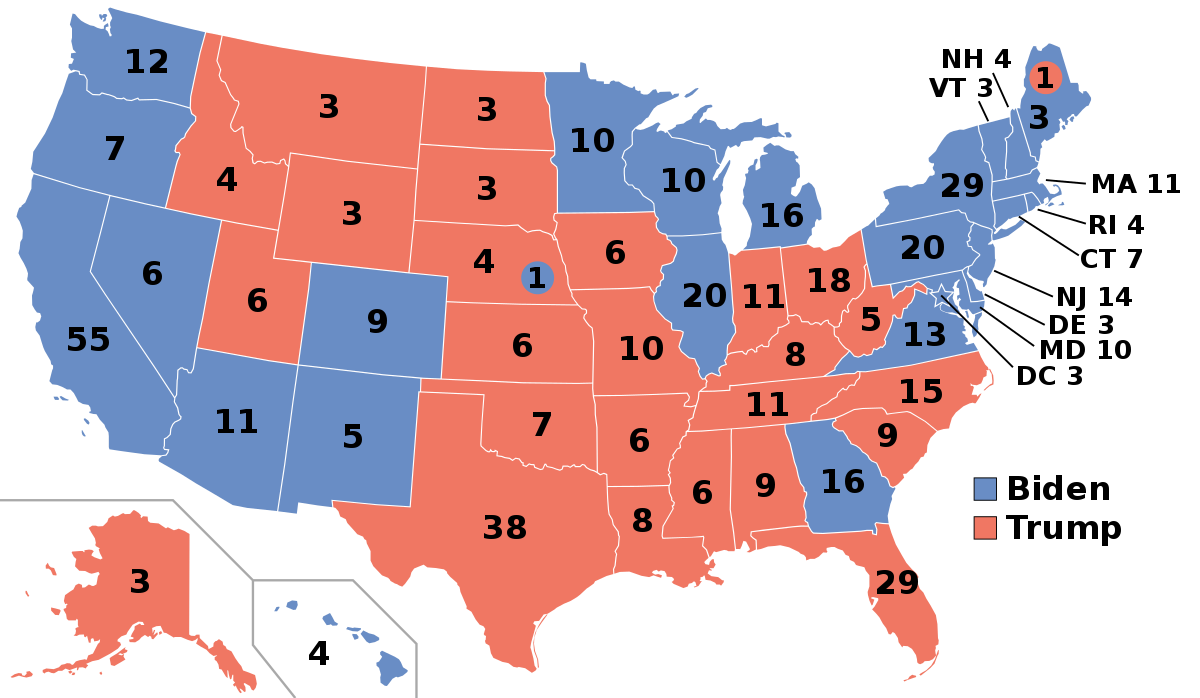
According to statistician and political scientist Andrew Gelman, of Columbia University, this correlation is not an illusion or a coincidence. Democrats really do tend to perform better in richer parts of the country, while Republicans perform better in poorer parts of the country.
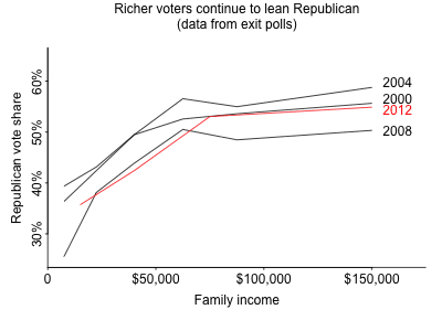
However, Gelman asks, how are we to square this with the fact that Republicans tend to win the votes of individual rich people, but not individual poor people? For example, in his 2004 election, George W. Bush won only 36% of the votes of people who earn under $15,000, and 41% of the votes of those who earn between $15,000 and $30,000. In contrast, he won 62% of the vote of those who earn more than $200,000. And that broad trend holds in other elections. In fact, no matter what state you’re in, and no matter what presidential election you look at from 2000-2020, the higher up in the income distribution you go, the more likely you are to find someone who votes Republican. Here’s a figure from the Pew Research Center, via Gelman, showing Republican vote share vs. personal income across four recent presidential elections:
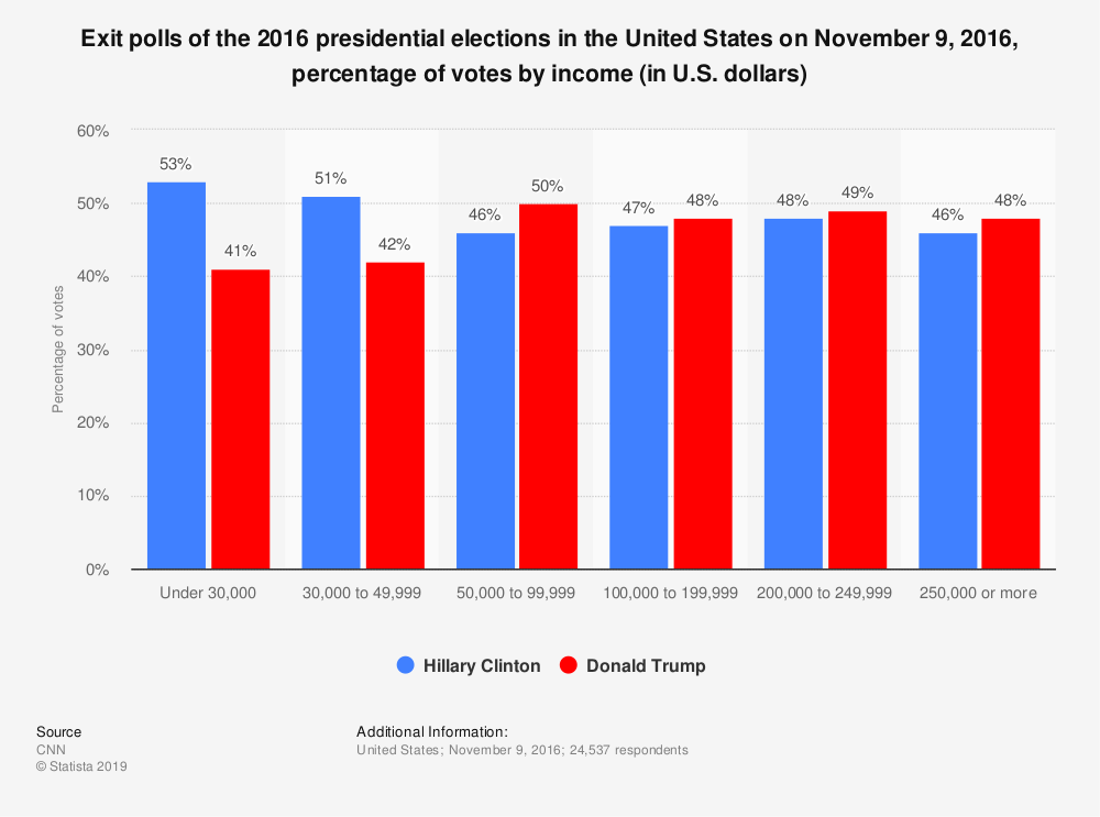
And here is a bar plot from CNN showing the same basic relationship for the 2016 presidential election: support for the Republican candidate generally increases with personal income.
Given the fact that Democrats tend to win the richest states, this seems like a paradox. As Gelman puts it,
Nowadays the Democrats win the rich states, but rich people vote Republican, just as they have for decades. If poor people were a state, they would be bluer even than Massachusetts; if rich people were a state, they would be about as red as Alabama, Kansas, the Dakotas, or Texas.9
How can it be that rich people tend to vote Republican, but that rich states tend to vote Democratic? Gelman explains this “unit of analysis” paradox in terms of the increasing polarization of American politics. Both parties are much more ideologically cohesive than they used to be. Conservative Democrats and liberal Republicans have now essentially vanished:
The resolution of the paradox is that the more polarized playing field has driven rich conservative voters in poor states toward the Republicans and rich liberals in rich states toward the Democrats, thus turning the South red and New England and the West Coast blue… What this means is that the political differences among states are driven by cultural issues, but within states, the traditional rich–poor divide remains.
Of course, we’re not doing justice to Gelman’s full explanation of the paradox, from his book Red State, Blue State, Rich State, Poor State: Why Americans Vote the Way They Do. For example, one of his subtler points is that the rich-poor divide in blue states looks sociologically different, and statistically weaker, than it does in red states. We encourage you to read the book.
But the broader empirical lesson is this: even if a correlation holds strongly for states, that same correlation need not hold for people. Sometimes state-level correlations and people-level correlations can run in completely opposite directions. These correlations concern different units of analysis, and address fundamentally different questions about different populations (states vs. people).
What we’re seeing here is sometimes called an aggregation paradox. You aggregate a data set and treat groups as your unit of analysis (here, states), and you see one trend. Then you disaggregate your data and focus on a finer unit of analysis (here, people), and you see a different trend—sometimes even the opposite trend. Paradoxical or not, this happens all the time. It illustrates how important it is to be specific and thoughtful about your unit of analysis when using data to examine relationships among variables.
Example 2: baseball salaries
Consider the following data frame on the batting averages and salaries of baseball players across three professional classes: AA, AAA, and the Major League. (AAA is the top minor league just below the Major Leagues, while AA is one one step below AAA.) Batting average is a standard measure of offensive skill in baseball, while here salary is in US dollars. The two columns of the table show league-wide averages across all three classes of play.
| Class | Mean_Salary | Mean_BA |
|---|---|---|
| MLB | 3049896 | 0.281 |
| AAA | 364320 | 0.289 |
| AA | 45091 | 0.304 |
If we plot these three data points (one point per class of play), we see a negative trend. It looks like salary decreases with batting average, which seems paradoxical, since better offensive skill should, it seems, lead to a higher baseball salary.
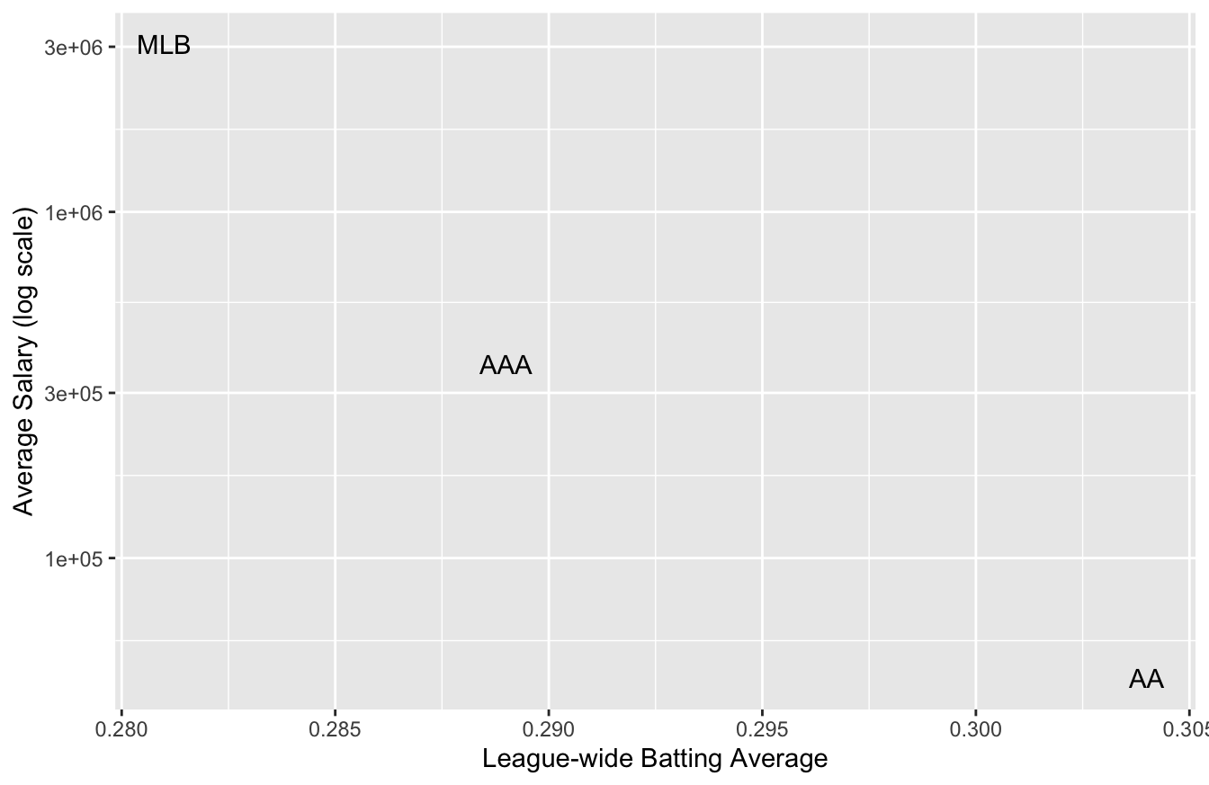
But this is an artifact of treating class of play (AA vs. AAA vs. Major League) as our unit of analysis. The higher classes of play tend to have higher average salaries as well as lower batting averages overall, presumably because of higher overall defensive skill. So at the league level, batting average correlates negatively with salary.
But if we treat the individual baseball players as our unit of analysis, we see the expected trend: higher batting average predicts higher salary. The plot below shows salary versus batting average for each class of play separately, where each dot is an individual player:
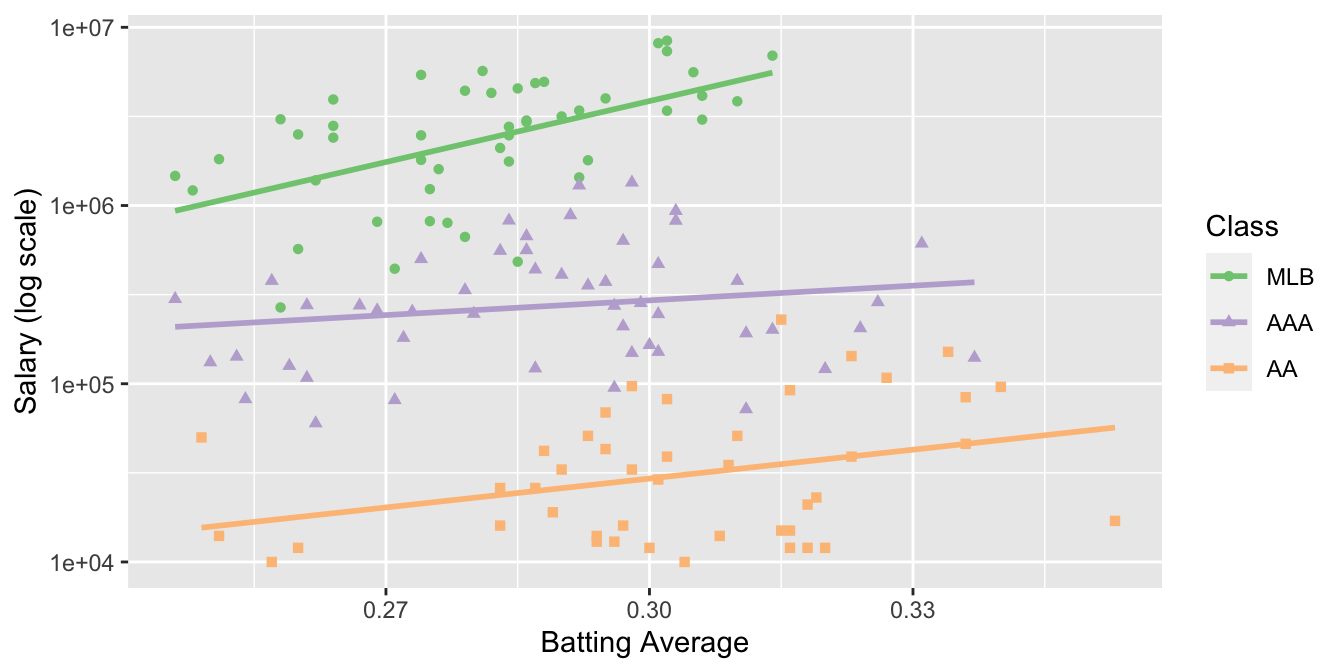
Clearly treating class of play as our unit of analysis leads to a fundamentally different (and misleading) conclusion, versus treating the individual players as our unit of analysis.
Example 3: politics again
Let’s see a third example of a “mismatched unit of analysis” problem, this time at the intersection of politics and demography.
In America, marriage and fertility rates have been declining for decades, as people are having fewer children, on average, than their parents. Moreover, among people that do decide to have children, many choose to remain uncoupled—or, sometimes, to live with their partner, but not to get married. And those who do get married tend to do so later in life than previous generations.
Different social commentators have different pet theories about why this is happening, from the declining influence of religious authority, to the more prominent role of women in most workplaces compared to generations past. But one thing is clear: these social changes have provoked years of disagreement and discussion. Many people, especially those in younger generations, view them benignly or positively, and wonder what the big deal is. Some are ambivalent about them. And some in a vocal minority, mostly on the political right, seem to view them apocalyptically.
In light of all this, it certainly seems plausible that the size of a person’s family might correlate with their political attitudes. Such a correlation would certainly fit with many common stereotypes, whether about singles in the city with their dating apps, or about families in the suburbs with their big back yards full of scampering children. But if you’d perused the November 2012 edition of New York magazine, you might have been surprised at just how strong that correlation seemed to be:
Almost invisibly over the past decade, family size in America has emerged as our deepest political dividing line. Stunningly, the postponement of marriage and parenting—the factors that shrink the birth rate—is the very best predictor of a person’s politics in the United States, over even income and education levels, a Belgian demographer named Ron Lesthaeghe has discovered. Larger family size… correlates to early marriage and childbirth, lower women’s employment, and opposition to gay rights—all social factors that lead voters to see red.10
Family size as the very best predictor of a person’s politics? More so than income? That’s a bold claim—one that, if true, has major implications for American party politics in the 21st century.
Here’s the evidence for the claim. The article measured “family size” using a state’s fertility rate as a proxy: that is, the number of births in a state per 1,000 women between ages 15 and 44. By this standard, here are the ten most fertile states in the country.
| State | Fertility Rate |
|---|---|
| Utah | 83.6 |
| Alaska | 78.5 |
| South Dakota | 77.1 |
| North Dakota | 72.4 |
| Idaho | 72.3 |
| Nebraska | 72.0 |
| Kansas | 71.2 |
| Oklahoma | 70.4 |
| Texas | 69.8 |
| Wyoming | 69.1 |
And here are the ten least fertile states in the country:
| State | Fertility Rate |
|---|---|
| Rhode Island | 51.5 |
| Vermont | 51.8 |
| New Hampshire | 51.9 |
| Maine | 53.1 |
| Connecticut | 54.3 |
| Massachusetts | 54.4 |
| Pennsylvania | 58.8 |
| Oregon | 59.4 |
| Florida | 59.6 |
| New York | 59.8 |
You can probably see the pattern if you know something about American politics: the most fertile states strongly tilt Republican, while the least fertile strongly tilt Democratic. Moreover, the difference in red-state versus blue-state fertility is pretty large: 32 more babies per 1,000 women in first-place Utah compared to last-place Rhode Island.
On the strength of this seemingly cut-and-dried evidence, the author of the New York article went on to speculate about what the correlation between politics and family size might herald for American democracy:
Americans are increasingly rejecting traditional conservative power structures—the old models of authoritarian Church and State—as Europeans have for decades. “It’s amazing how once you get rid of obedience to the authority of institutions so much simply falls away,” Lesthaeghe [the study author] told me over coffee at a conference in Vienna last year. He went on to predict that, despite the GOP backlash against it, Americans’ adaptation toward a more liberal way of living could only encourage a political shift to the left.
In other words, as families get smaller, America will get bluer.
On the other hand, at least one newspaper had a very different prediction of what is likely to happen as a result of these social changes. Under the headline “Republicans are red-hot breeding machines,” the San Francisco Chronicle argued that, since most kids grow up to hold the same politics as their parents, the red-blue fertility gap…
… is invisibly working to guarantee the political right will outnumber the left by an ever-growing margin. Over the past three decades, conservatives have been procreating more than liberals—–continuing to seed the future with their genes by filling bassinets coast to coast with tiny Future Republicans of America. “Liberals have got a big ‘baby problem,’ and it risks being the death of them,” contends Arthur Brooks, professor at Syracuse University’s Maxwell School of Public Affairs. He reckons that unless something gives, Democratic politicians in the future may not have many babies to kiss.
At least we finally have one thing that liberals and conservatives can agree on: that demography is destiny! But who’s correct here? By 2050, will changing social attitudes, even among conservative families, have colored the map blue? Or will liberal families continue to have dogs instead of kids, and slow-breed themselves out of existence, one Labradoodle at a time?
I’m not disputing the correlation between a state’s average fertility and its politics, which seems clear as day in those tables of the most fertile and least fertile states shown above. Nor am I trying to debunk the original research about state-level politics, by demographers Ron Lesthaeghe and Lisa Neidert, that was described in the New York magazine article. But I do want to emphasize the most important word here: state. This line of reasoning suffers from a unit-of-analysis problem. The tables, and the research, do show a correlation between fertility and politics—but at the state level, not at the person level. The difference is crucial: Oregon isn’t a hipster, and Texas ain’t a cowboy. States aren’t people.
Yes, it’s true that states with higher fertility rates tend to also be states with higher levels of Republican support. But as we learned on the previous example, a state-level relationship doesn’t necessarily tell us anything about the person-level relationship between someone’s politics and how many kids they have. To prove a person-level correlation, you have to compare persons—that is, you need a data frame that enables you to have a person as your unit of analysis.
It will not surprise you that social scientists actually have examined people as their unit of analysis, and they have found that the relationship between politics and fertility is a bit more complicated than the caricature. Here’s one important finding: as recently as 2006, the average Democratic woman had 2.39 children, and the average Republican woman had 2.38. This may have changed a bit since then, but not by much: at the person level, neither party currently has much of an advantage in fertility, despite the huge differences among the state-level averages.11
This directly answers our person-level question: is it even true that the size of someone’s family correlates strongly with their politics? No. You cannot accurately predict a person’s politics from their family size. You’d do much better if you made your prediction using their income.
Moreover, while it is true that the two parties’ relative fertility rates are changing, it is definitely not true that Republicans are “red-hot breeding machines” compared with Democrats. In fact, Democratic women used to have a fertility edge, but the fertility rate of women in both parties has been declining for decades. It has merely done so faster among Democrats, to the point that the two rates are now roughly equal. If this trend continues—which is a big if—then Republicans will soon have an edge in fertility. By mid-century, that advantage may even be sizable. But then again, this may be more than offset by immigration, or changes in society that make the children of Republicans think more like Democrats, or vice versa.
In fact, a group of demographers, led by Eric Kaufmann of the University of London, actually tried to do some honest-to-God demographic projections of party composition in America out to 2043.12 They built 11 different scenarios, reflecting many different combinations of assumptions about fertility, immigration, and the “stickiness” of party allegiance across generations. Their conclusion: things probably won’t change by much, but there’s a lot of uncertainty! Their baseline scenario predicts that by 2043, the Democrats will gain about 2.5 points in voter registration versus 2013. But other scenarios give different numbers—and as the authors point out, all of their scenarios “assume no realignment of party allegiance or other social changes” over the ensuing three decades. Reflect on the last 30 years, or even just the last 10, and ask yourself: how likely is that?
Example 4: getting older
Joe is an avid bicyclist, and he’s been going on a long bike ride out into the Austin hill country most weekends for the last 30 years. It’s a big group ride, coordinated by a long-established local bike shop. Folks have drifted in an out of the group over the years, but there are usually about 75 cyclists that join any given ride—and there’s a core of group of serious cyclists, like Joe, that have been going on the same ride for decades.
Once the group hits the road out of Austin, it usually splinters into smaller groups, some of whom go faster and some slower. And Joe has noticed that, over the years, he’s gotten slower. Back in his early 20s, he would always be in the front group, and he might finish the ride in about 3 hours. Now that he’s in his 50s, he’s more often in one of the back groups, pushing 4 hours. Hey, it’s just what happens as we get older, Joe tells himself. We get slower.
But Joe is also really into data, and therefore he decides to check whether this general trend—that you tend to get slower as you age—holds for other people. So one weekend, he collects a bunch of data on the ages and finish times of the other folks attending the group ride, and he plots a trend line. (We’ll learn how to estimate these trend lines in the upcoming lesson on Fitting equations.) He finds something surprising:
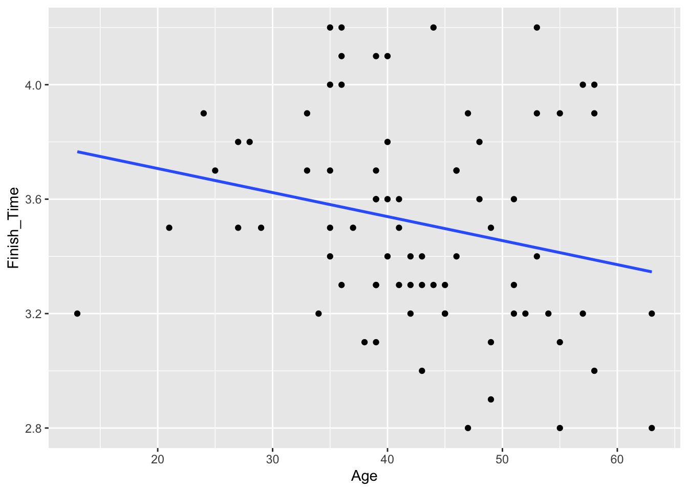
Figure 2.1: A cross-sectional sample of 75 bike riders showing their age in years and their finishing time on a long bike ride.
Contrary to what Joe expected, it looks like that, on average, people have a lower finishing time as they age—that is, they get faster. Is there something wrong with him, Joe wonders? Is he just an outlier—the rare bicyclist who actually gets slower with age, in the face of this trend?
Not so fast! The data Joe has collected from his group ride is called a cross-sectional sample. It represents a snapshot at a single moment in time that includes people across a range of ages, like this:
| Person | Age | Finish_Time |
|---|---|---|
| 1 | 49 | 3.1 |
| 2 | 45 | 3.2 |
| 3 | 45 | 3.3 |
| 4 | 44 | 4.2 |
| 5 | 44 | 3.3 |
| 6 | 45 | 3.2 |
| 7 | 36 | 4.2 |
Here the unit of analysis is a person, and the population is the set of recreational bike riders.
But when Joe is thinking about his own performance over time, he’s thinking about a longitudinal sample, where a single unit (in this case, Joe) is tracked through time, with data recorded at many different time points, like this:
| Joe_Age | Joe_Finish_Time |
|---|---|
| 20 | 3.10 |
| 25 | 3.40 |
| 30 | 3.36 |
| 35 | 3.60 |
| 40 | 3.73 |
| 45 | 3.70 |
| 50 | 3.93 |
Here the unit of analysis is a year, and the population is the set of all years from Joe’s life. It shows a clear upward trend in finishing time, just as he’s noticed:
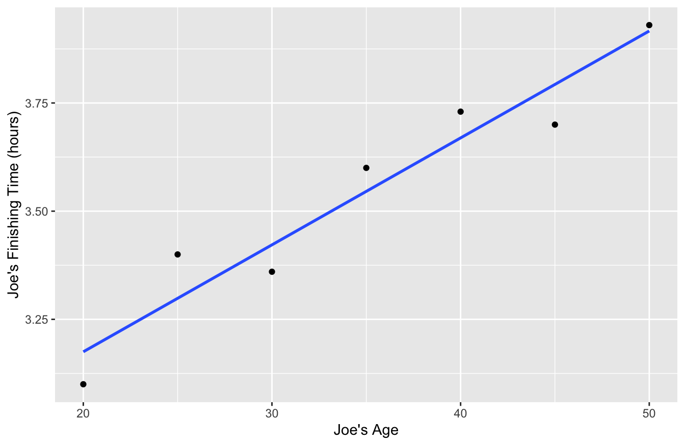
The cross-sectional sample and longitudinal sample are from different populations, involve different units of analysis, and address different questions. If you’re interested in a question like “How does a person’s bicycling speed change with age?” then you really need to be looking at within-person data over time, i.e. a longitudinal sample where the unit of analysis is a year.
In this particular situation, why is the cross-sectional sample no good for drawing conclusions about what we should expect to happen to individual riders over time? One very good reason is survivorship bias. It seems likely that the slower, less serious riders are more likely to quit bike-riding (or at least ride less often) as they get older. If that’s true, the older people in the sample are disproportionately faster, more-serious riders—and they have probably been that way their entire lives. Therefore the older riders can be faster, on average, than the younger riders—even if each individual rider is, just like Joe, actually getting slower as they age.
And while the example I’ve been discussing is hypothetical, this phenomenon does show up in real data sets on sports performance. For example, here’s a cross-sectional sample of 8636 runners who ran in the 2005 Cherry Blossom 10 Mile Road Race, held every spring in Washington, DC:
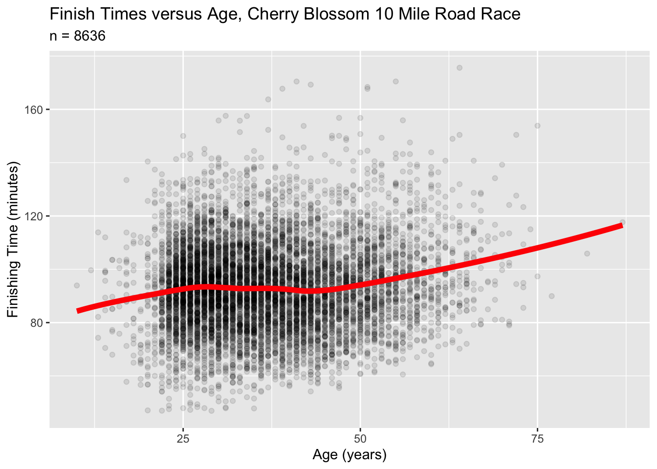
The red curve shows the trend in average finishing times as a function of age. What’s interesting here is the runners in their 30s and 40s: these runners are actually a bit faster, on average, than runners in their late 20s. Why? Are they hitting a late peak in their athletic lives?
Probably not. I’d conjecture that it’s a form of survivorship bias: the runners in their 30s and 40s are disproportionately the serious lifelong runners. After all, they’re in a time of life when the demands of family and careers tend to peak. At that age, if you’re still making the effort to train for and run in a 10-mile road race, then you’re probably more serious than the average recreational runner. So even if the individual 30 and 40-somethings are still getting slower over time (in a longitudinal sense), the cross-sectional relationship shown in this data doesn’t necessarily reflect that.
This illustrates a point I made above and that I’ll now repeat:
The unit of analysis is a fundamental choice in data science. Be thoughtful and specific about about your unit of analysis is. Always be aware of a potential mismatch between the unit of analysis you care about and the entities that form “cases” in your data frame.
2.4 Importing a data set
Let’s now turn to the nitty-gritty details of importing a data set into R.
A data frame is often stored on disk in a spreadsheet-like file, and in particular, a very common format is .csv, which stands for “comma-separated values.” Most of the data sets I’ll provide you with in this book are in .csv format, since it’s easily shareable across different computer platforms and software environments.
Let’s see how to import a .csv-formatted data set into R. The way I’m going to describe here is very beginner friendly; another (totally optional and more advanced) way is described in “Importing data from the command line.”
Start by downloading the data set tvshows.csv, which contains data on 40 shows that aired on major U.S. television networks.
Important public-service announcement: don’t open that .csv file with Excel first! I see folks do this from time to time in my classes at UT-Austin, and it can produce bizarre errors. Basically, if you open a .csv file with Excel and then hit
Control-Sto save (or let it auto-save), Excel might decide to barf under the rug in your file. This effect will remain insidiously invisible within Excel itself, but can potentially render the file unreadable to RStudio. If you’ve already done this, don’t worry — just delete the file and download a fresh copy.13
This video shows how import a data set into RStudio. But we’ll cover the steps here, too:
- Go to the
Environmenttab in RStudio’s top-right panel.
- Click the
Import Datasetbutton. You’ll see a pop-up menu. Choose the first option:From Text (base)....
- A standard file-browser window should pop up. Use it to navigate to wherever you saved the
tvshows.csvfile. When you find it, clickOpen.
At this point, a new window should pop up that looks something like this. I’ve labeled several parts of this screen shot in red, so that I can refer to them below.
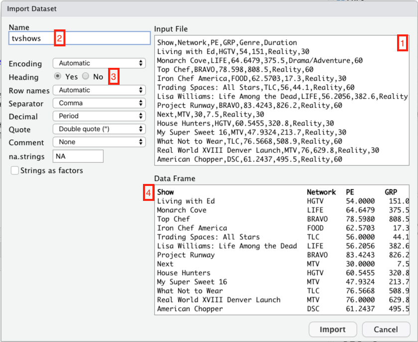
Let’s take those four red boxes in turn:
- This is what the raw .csv looks like. It’s just what you’d see if you opened the file in a plain text editor.
- This is the name of the object in R that will be created in order to hold the data set. It’s how you’ll refer to the data set when you want to do something with it later. R infers a default name from the file itself; you can change it if you want, but there’s usually no good reason to do so.
- This tells R whether the data set has a header row—that is, whether the first row contains the names of the columns. Usually R is pretty good at inferring whether your data has a header row or not. But it’s always a good idea to double-check: click
Yesif there’s a header row (like there is here), andNoif there isn’t.
- This little window shows how the imported data set will appear to R. It’s a useful sanity check. If you’ve told R (or R has inferred) that your data set has a header row, the first row will appear in bold here.
Now click Import. The imported data set should pop up in a Viewer window, like this:
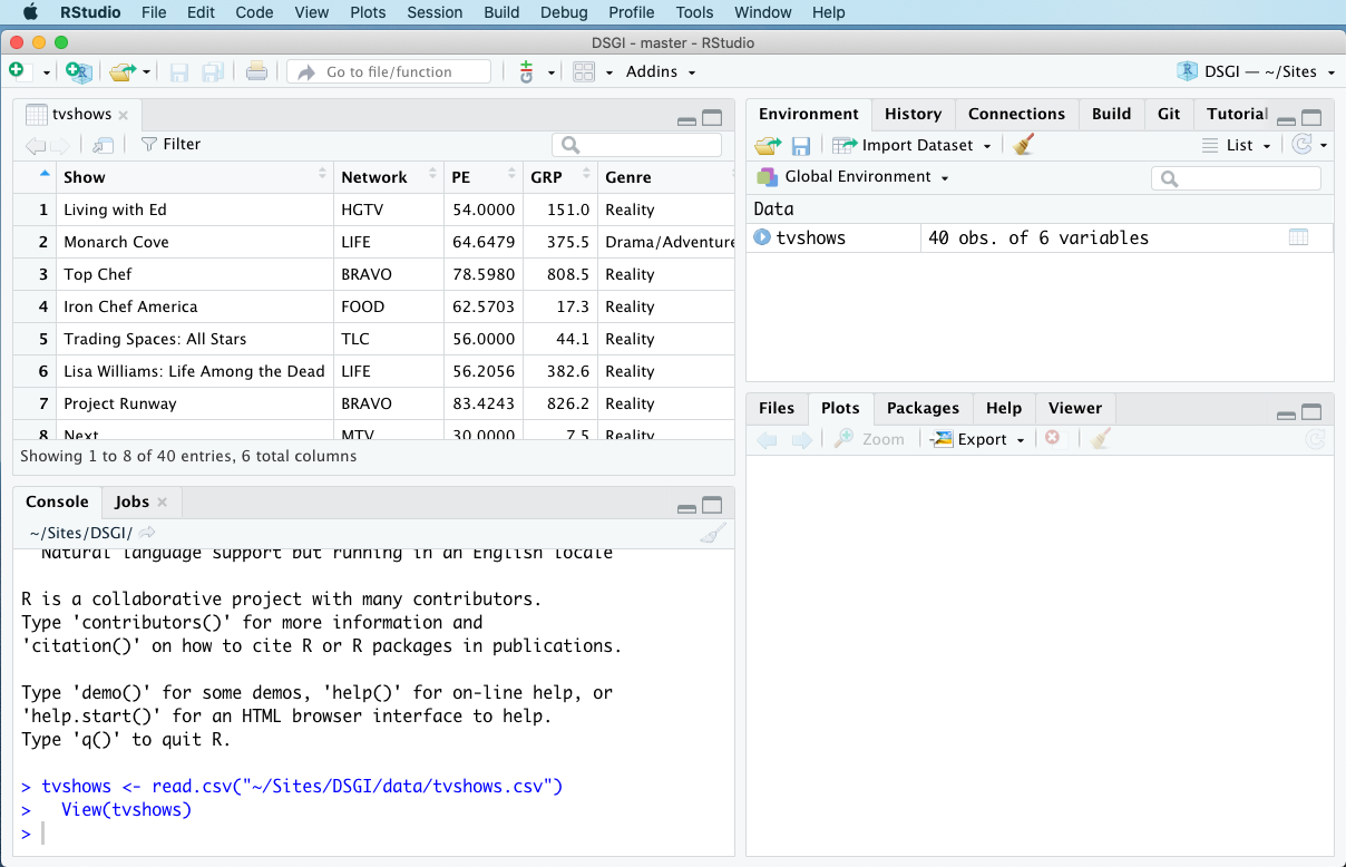
Note that you can’t actually edit the data set in this window—only view it. You may also notice that tvshows is now listed under the Environment tab in the top-right panel. This tab keeps track of all the objects you’ve created.
The Viewer window is a perfectly fine way to look at your data. I find it especially nice for giving me a “birds-eye” view of an unfamiliar data set. If you’ve closed the Viewer window, you can always conjure it back into existence using the view function, like this:
view(tvshows)Another handy “data viewing” command in R is called head. This command will print out the first six of a data set in the console, like this:
head(tvshows)## Show Network PE GRP Genre Duration
## 1 Living with Ed HGTV 54.0000 151.0 Reality 30
## 2 Monarch Cove LIFE 64.6479 375.5 Drama/Adventure 60
## 3 Top Chef BRAVO 78.5980 808.5 Reality 60
## 4 Iron Chef America FOOD 62.5703 17.3 Reality 30
## 5 Trading Spaces: All Stars TLC 56.0000 44.1 Reality 60
## 6 Lisa Williams: Life Among the Dead LIFE 56.2056 382.6 Reality 60I use this one all the time to get a quick peek at the data, but don’t want the pop-up viewer window to take me away from my script—like, for example, when I need to remind myself what the columns are called.
Let’s review the structure of this tvshows data set, as a way of reminding ourselves of some important vocabulary terms.
- The data is stored in a tabular format called a data frame.
- Each row of the data frame is called a case or an example. Here, each case is a TV show.
- Our collection of cases is called a sample, and the number of cases is called the sample size, denoted by the letter \(n\). Here \(n=40\).
- Each column of the data frame is called a variable or a feature. Each variable conveys a specific piece of information about the cases.
- The first column of the data frame,
Show, tells us which TV show we’re talking about. This is a unique identifier for each case.
- Some variables in the data set are actual numbers; these are numerical variables. The numerical variables in this data set are
Duration,GRP(“gross rating points”, a measure of audience size), andPE(which stands for “predicted engagement” and measures whether the audience is actually paying attention to the show).
- Other variables in the data set can only take on a limited number of possible values. These are categorical variables. The categorical variables in this data set are
NetworkandGenre.14
If you want to know the size of your data set as well as the names of the variables, use the str command, like this:
str(tvshows)## 'data.frame': 40 obs. of 6 variables:
## $ Show : chr "Living with Ed" "Monarch Cove" "Top Chef" "Iron Chef America" ...
## $ Network : chr "HGTV" "LIFE" "BRAVO" "FOOD" ...
## $ PE : num 54 64.6 78.6 62.6 56 ...
## $ GRP : num 151 375.5 808.5 17.3 44.1 ...
## $ Genre : chr "Reality" "Drama/Adventure" "Reality" "Reality" ...
## $ Duration: int 30 60 60 30 60 60 60 30 30 30 ...This tells us we have a sample of \(n=40\) TV shows, with \(p=6\) variables about each TV show.
2.5 Analyzing data: a short example
Once you’ve imported a data set and comprehended its basic structure (using, e.g., view or head), the next step is to try to learn something from the data by actually analyzing it. We’ll see many ways to do this in the lessons to come! But for now, here’s a quick preview of two very common ways: calculating summary statistics and making plots.
A statistic is any numerical summary of a data set. Statistics are answers to questions like: How many reality shows in the sample are 60 minutes long? Or: What is the average audience size, as measured by GRP, for comedies?
A plot is exactly what it sounds like: per Wikipedia, a “graphical technique for representing a data set, usually as a graph showing the relationship between two or more variables.” Plots can help us answer questions like: What is the nature of the the relationship between audience size (GRP) and audience engagement (PE)?
Let’s see some examples, on a “mimic first, understand later” basis. Just type out the code chunks into your lesson_data.R script and run them in the console, making sure that you can reproduce the results you see below. In all of these examples, our unit of analysis is an individual TV show (and, for example, individual TV viewers.)
Our first question is: how many reality shows in the sample are 60 minutes long, versus 30? As we’ll learn in the upcoming lesson on Counting, the xtabs function gets R to count for us:
xtabs(~Genre + Duration, data=tvshows)## Duration
## Genre 30 60
## Drama/Adventure 0 19
## Reality 9 8
## Situation Comedy 4 0It looks like 8 reality shows are 60 minutes long, versus 9 that are 30 minutes long. These numbers (8 and 9) are statistics: numerical summaries of the data set.
Let’s answer a second question: what is the average audience size for comedies, as measured by GRP? Calculating this requires multiple lines of R code chained together, and it relies upon functions defined in the tidyverse library, so it won’t work if you haven’t already loaded that library. You might be able to guess what this code chunk is doing, but we’ll understand it in detail in the upcoming lesson on Summaries.
tvshows %>%
  group_by(Genre) %>%
  summarize(mean_GRP = mean(GRP))
## # A tibble: 3 × 2
## Genre mean_GRP
## <chr> <dbl>
## 1 Drama/Adventure 1243.
## 2 Reality 401.
## 3 Situation Comedy 631.The result is a summary table with one column, called mean_GRP. It looks like comedies tend to have middle-sized audiences: an average GRP of about 630, versus 401 for reality shows and 1243 for drama/adventure shows. Again, these are statistics: numerical summaries of the data.
Next, let’s make a plot to understand the relationship between audience size (GRP) and audience engagement (PE). We’ll make this plot using a function called ggplot, which is made available by loading the tidyverse. Again, don’t sweat the details; we’ll cover ggplot in detail in the upcoming Plots lesson. Just type the statements into your script, run them, and observe the result:
ggplot(tvshows) +
  geom_point(aes(x=GRP, y=PE, color=Genre))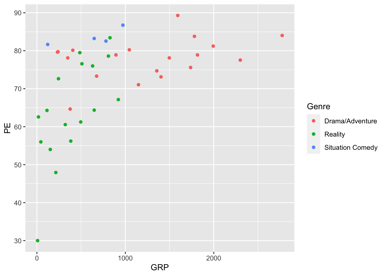
We’ve learned from this plot that shows with bigger audiences (high GRP) also tend to have more engaged audiences (higher PE), a fact that isn’t necessarily obvious (at least to me) until you actually look at the data. If you wanted to save this plot (say, for including in a report or a homework submission), you could click the Export button right above the plot itself and save it in a format of your choosing. You can also click the Zoom button to make the plot pop out in a resizeable window.
Note: this plot above actually isn’t great, because the red and green can look nearly identical to color-blind viewers. I’m especially sensitive to that issue, since I’m red-green colorblind myself.

We’ll clean up that problem in a later lesson, when we learn more about plots. But for now, focus on your victory! You’ve now conducted your first data analysis—a small one, to be sure, but a “complete” one, in the sense that it has all the major elements involved in any data analysis using R:
- import a data set from an external file.
- decide what questions you want to ask about the data.
- write a script that answers those questions by running an analysis (calculating statistics and making plots).
- run the script to see the results.
In the lessons to come, we’re going to focus heavily on the “analysis” part of this pipeline, addressing questions like: what analyses might I consider running for a given data set? How do I write statements in R to run those analyses? And how do I interpret the results?
2.6 Importing data from the command line
This section is totally optional. If you’re an R beginner, or you’re happy with the Import Dataset button for reading in data sets, you can safely skip this section and move on to the next lesson.
If, on the other hand, you have a bit more advanced knowledge of computers and are familiar with the concepts of pathnames and absolute vs. relative paths, you might prefer to read in data from the command line, rather than the point-and-click interface of the Import Dataset button. I personally prefer the command-line way of doing things, because it makes every aspect of a script (including the data-import step) fully reproducible. The downside is that it’s less beginner-friendly.
Let’s see an example. To read in the tvshows.csv file from the command line in R, I put the following statement at the top of my script:
tvshows = read.csv('data/tvshows.csv', header=TRUE)This statement reads the “tvshows.csv” file off my hard drive and stores it in on object called tvshows. Let’s break it down:
read.csvis the command that reads .csv files. It expects the path to a file as its first input.
'data/tvshows.csv'is the path to the “tvshows.csv” file on my computer. In this case it’s a relative path (i.e. relative to the directory on my computer containing the R file from where the command was executed). But you could provide an absolute path or a url instead.
header=TRUEtells R that the first row of the input file is a header, i.e. a list of column names.
tvshowsis the name of the object we’re creating with the call toread.csv. It’s how we’ll refer to the data set in subsequent statements.
R has a whole family of read functions for various data types, and they all follow more or less this structure. I won’t list them all here; this overview is terse but authoritative, while this one is a bit friendlier-looking.
T. Frank, What’s the matter with liberals? New York Review of Books, May 12, 2005.↩︎
A. Gelman, Red State, Blue State, Rich State, Poor State: Why Americans Vote the Way They Do. Princeton University Press, 2010.↩︎
L.Sandler. “Tell Me a State’s Fertility Rate, and I’ll Tell You How It Voted.” New York Magazine, November 19, 2012. Emphasis added.↩︎
Kaufmann et.al. American political affiliation, 2003-43: A cohort component projection. Population Studies, 66:1, 53-67, 2012.↩︎
Kaufmann et. al., ibid.↩︎
In my experience this behavior seems to depend on your platform and version of Excel. It is possible to safely open and edit .csv files within Excel, but then you have to re-export them as .csv files again if you want to use them in RStudio.↩︎
You could also argue that
Duration, despite being a number, should really be considered a categorical variable, since it only takes on a set of specific values like 30 and 60.↩︎