Lesson 13 Observational studies
In good experiments, we:
- Use a control group. This gives us a basis for comparison.
- Block what we can. This explicitly balances known, controllable nuisance variables between treatment and control units.
- Randomize what we cannot. This implicitly balances all other nuisance variables, both known and unknown (at least on average).
In an observational study, we can’t do any of these things, because we can’t intervene. We merely observe the effect of some treatment or risk factor, without having the ability to change who is or isn’t exposed to it. However, that doesn’t stop us from looking for scientifically favorable situations that resemble the experimental ideal as closely as possible, and then passively observing what happens in those situations. In a nutshell, that’s what good observational studies try to do.
In this lesson you’ll learn about:
- natural experiments.
- matching.
- cohort studies.
13.1 Natural experiments
Some of the most convincing observational studies involve what are called natural experiments, also known as quasi-experiments. A natural experiment is a lot like a real experiment, but without an actual experimental intervention performed by the researchers. More specifically, in these studies, units (e.g. people, states, firms) are assigned to the “treatment” and “control” conditions by a mechanism that is:
- Outside the control of either the investigators or the people actually in the study.
- Plausibly resembles a random assignment.
How could that happen, you might wonder? To illustrate the idea, let’s look at some examples.
Example 1: school class size. Do smaller classes improve student achievement in elementary school? To study this question, you can’t just compare students in small classes to those in large classes. There are way too many nuisance variables! Students in need of remediation are sometimes put in very small classes. Or sometimes high achieving students are also put in very small classes. Richer school districts can afford both smaller classes and many other potential sources of instructional advantage. Or maybe better teachers successfully convince their bosses to let them teach the smaller classes themselves. The list of possible confounders could go on and on.
One example of a real experiment on class size was something called Project STAR, in Tennessee. In Project STAR, kindergarten through 3rd-grade students and teachers were randomly assigned to two groups:
- Small classes, with 13-17 students.
- Regular classes, with 22-25 students.
All told, the experiment involved 6500 students in 330 classes at 80 schools. This was a true randomized controlled trial of class size, and gave a clean result: smaller classes did indeed improve test scores.
The downside of Project STAR, however, was that the experiment was very costly. Moreover, it did not provide enough data to estimate context-specific effects (i.e. heterogeneity in students’ responses to smaller classes). This is often the case with experiments: because they’re expensive, they’re often too small to get the kind of highly granular results we’d like.
Now let’s examine a natural experiment on school class size. In Israel, it turns out, primary school class sizes are capped at 40 students. This has an important consequence:
- A cohort of 40 tots will be educated in one class of 40.
- A cohort of 41 tots will be educated in two classes of 20 and 21.
This fact can be used to investigate the effect of class size on student achievement. After all, the difference between being in a cohort of 40 vs 41 is as good as random, even if—unlike in Project STAR—it’s not experimentally assigned. This gives us a natural experiment: you just compare outcomes for size-40 cohorts (control group, one big class) vs. size-41 cohorts (treatment group, two small classes). This is a lot cheaper than running a real experiment! Two economists, Angrist and Lavy, actually conducted this analysis, and they found that smaller classes led to better results.52
Example 2: health insurance. Does access to health insurance save lives? It seems obvious that the answer should be yes, but it’s a surprisingly hard question to answer with data. That’s because the insured and uninsured populations differ in many ways that also affect mortality. These nuisance variables include age, income, baseline health, and so on.
Multiple studies have showed lower mortality rates after various states expanded access to Medicaid, a federal health-insurance program for low-income Americans. But these weren’t experiments; states cannot randomly pick who receives Medicaid. The one exception was Oregon, who actually ran a lottery in 2008 for new Medicaid spots. It did seem to improve health outcomes for those who won the lottery. But the study that examined that data yielded such wide confidence intervals that they were not really useful for policymaking.
Then in 2016 something curious happened. The IRS sent a letter to 3.9 million Americans who had recently paid a tax penalty for not having insurance, under the “individual mandate” provision of the Affordable Care Act. In the letter, the IRS suggested some possible ways to enroll in insurance via an exchange, which would avoid the tax penalty in the following year. However, the IRS had originally planned to send the letter to 4.5 million Americans; they simply ran out of cash to send the letter to everyone in the country who’d paid a fine. (Ironic for the IRS, no?) So about 600,000 uninsured taxpayers were randomly left out of the mailing.
This kind of thing is another example of a natural experiment: some people randomly received a nudge to get insured, and some didn’t. Nobody intended this randomization to happen. It was an unintended result of a budget shortfall. But there it was!
So what happened? The researchers compared death rates among those who had received a letter (treatment), versus those who hadn’t received a letter (control). For every 1,648 people who received a letter, one fewer death occurred than among those who hadn’t received a letter, by virtue of having nudged some people towards getting insured.
You might argue that 1 out of 1,648 a really small effect. But in a group this large, the letters alone seemed to have saved 700 lives. Moreover, there’s not much uncertainty because of the huge sample size. Also, keep in mind one key fact: 1 out of 1,648 not the effect of the insurance itself. It’s the effect of a letter nudging you to get insurance. Since not everyone responded to the nudge, the effect of the insurance itself must be larger.
Example 3: home-field advantage. Do fans impact sports outcomes? Common knowledge says yes, but it’s really hard to estimate the size of the effect. Let’s take soccer as a specific example, using data from the four top European professional soccer leagues (the English Premier League, German Bundesliga, Italian Serie A, and Spanish La Liga). From 2008-2019, home teams in these four leagues outperformed away teams by 0.38 goals per game, with the home team winning 58.5% of the time. The main factors contributing to this advantage would be familiar to any sports fan: they include travel fatigue (for the away team) as well as venue familiarity and fan support (for the home team).
But it’s very difficult to estimate the specific contributions of the fans, as distinct from the travel effect or the the venue effect. In general, these three effects are all confounded with one another: true “home games” without fans almost never happen. Moreover, better teams typically have bigger stadiums and higher attendances, so even when observing a correlation between fan support and home-team performance, the direction of causality is not necessarily clear.
But the Covid-19 pandemic created unusual circumstances. In response to the public-health situation, all four top European leagues implemented no-fans policies for the last quarter of the 2019-20 season. But unlike, say, America’s NBA (which moved all remaining 2020 games “inside the bubble,” to a neutral site at Disney World), these European leagues still held games at their original venues, with the home team hosting each match in front of an empty stadium. This meant that home teams retained their “travel fatigue” and “venue familiarity” advantages, but not their fan support. Researchers at UC Santa Barbara used this as a natural experiment, comparing the post-Covid (“treatment”) and pre-Covid (“control”) home-field advantages. They found that the absence of fans clearly reduced the home-field advantage: home teams without fans won games 5.4 percentage points less often.
Summary. Natural experiments have some of the same core features of true experiments. There’s a treatment group and a control group. There’s also a randomization mechanism: units are assigned to the treatment or control condition in a random (or “as if random”) way. The main difference is that the researchers themselves aren’t doing the randomizing. Rather, nature (or circumstance) does the randomization for us. But this still has the same balancing effect of intentional randomization, because nuisance variables are not systematically correlated with the treatment assignment. The key question in evaluating a natural experiment is: how good is the assignment mechanism? That is, how effective is it at removing other systematic differences between the treatment and control conditions?
13.2 Matching
Natural experiments are great, when you can find them. But you can’t always find them; they tend to rely on arbitrary bureaucratic rules or acts of God.
So in situations where a real experiment is impossible, and where no natural experiment is available, a simple thing to try is matching. To estimate a cause-and-effect relationship by matching, we artificially construct a balanced data set out of an unbalanced one, by explicitly matching treated cases with control cases that have similar observable characteristics. We then compare the outcomes in treatment versus control groups, using only the balanced data set.
This is most easily seen by example. We’ll look at two.
Example 1: green buildings. Over the past two decades, both investors and the general public have paid increasingly close attention to the benefits of environmentally conscious buildings. There are both ethical and economic forces at work here. To quote a recent report entitled "Energy efficiency and real estate: Opportunities for investors: created by Mercer, an investment-consulting firm:
Investing in energy efficiency has two intertwined virtues that make it particularly attractive in a world with a changing climate and a destabilized economy: It cuts global-warming greenhouse gas emissions and saves money by reducing energy consumption. Given that the built environment accounts for 39 percent of total energy use in the US and 38 percent of total indirect CO2 emissions, real estate investment represents one of the most effective avenues for implementing energy efficiency.
This only scratches the surface. In commercial real estate, issues of eco-friendliness are intimately tied up with ordinary decisions about how to allocate capital. Every new project involves negotiating a trade-off between costs incurred and benefits realized over the lifetime of the building. In this context, the decision to invest in eco-friendly buildings could pay off in many possible ways. Of course, at the end of the day, tenants may or may not be willing to pay a premium for rental space in green buildings. We can only find out by carefully examining data on the commercial real-estate market.
The file greenbuildings.csv contains data on 7,894 commercial rental properties from across the United States. Of these, 685 properties have been awarded either LEED or EnergyStar certification as a green building.53 The basic idea is that a commercial property can receive a green certification if its energy efficiency, carbon footprint, site selection, and building materials meet certain environmental benchmarks.
A group of real estate economists constructed the data set in the following way. They first sampled 679 green-certified buildings listed on the LEED or EnergyStar websites, and cross-referenced those buildings with data from the CoStar Group (), a standard data vendor in commercial real estate. In order to provide a control population, each of these 685 buildings was matched to a cluster of nearby commercial buildings in the CoStar database. Each small cluster contains one green-certified building, and all non-rated buildings within a quarter-mile radius of the certified building. On average, each of the 679 clusters contains roughly 12 buildings, for a total of 7,820 data points.
If you want to follow along, please download the greenbuildings.csv data and get it loaded into R. You’ll also need to load the tidyverse and mosaic libraries. We’ll start by looking at just two variables:
- rev_psf: rental revenue per square foot per year. This will be our outcome variable.
- green_rating: a binary (0/1) variable indicating whether the building has a green certification (whether LEED or EnergyStar).
Let’s see a boxplot of revenue versus green rating. In the code below, remember that factor tells R to treat a numerical code (here green_rating, coded as 0 or 1) as a categorical variable:
library(tidyverse)
library(mosaic)

ggplot(greenbuildings) +
  geom_boxplot(aes(x=factor(green_rating), y=rev_psf)) +
  coord_flip()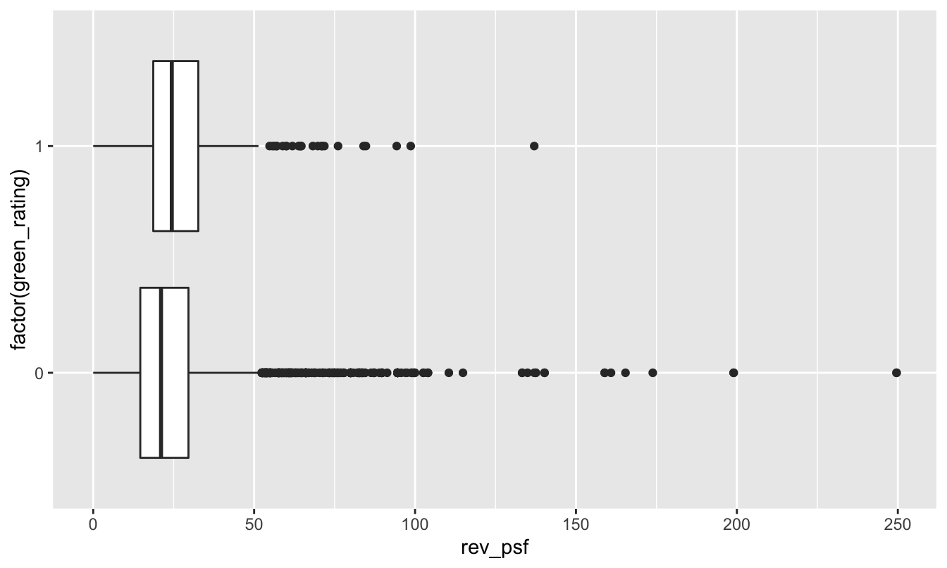
It’s a little bit hard to tell from this boxplot because these data distributions have such long upper tails (mainly from expensive buildings in places like NYC and San Francisco). But based on the plot, it looks as though the green buildings enjoy a slightly higher average revenue per square foot. We can confirm this by looking at the mean rev_psf in each group:
mean(rev_psf ~ green_rating, data=greenbuildings)## 0 1
## 23.78839 26.93526Sure enough, the green buildings (green_rating=1) earn about $3.15 more in rental revenue per square foot than non-green buildings:
diffmean(rev_psf ~ green_rating, data=greenbuildings)## diffmean
## 3.146869But this is an unfair comparison. That’s because, upon further inspection, the green buildings differ from the non-green buildings in many other ways. For example, let’s look the age variable. Green buildings (average age 24 years old) tend to be a lot newer than non-green buildings (average age 49 years old):
mean(age ~ green_rating, data=greenbuildings)## 0 1
## 49.30766 23.89838Moreover, if we look at the class_a variable, it’s also clear that green buildings are more likely to be fancy “Class A” buildings, which are the most desirable properties in a given market:
xtabs(~ class_a + green_rating, data=greenbuildings) %>%
  prop.table(margin=2)
## green_rating
## class_a 0 1
## 0 0.6388461 0.2047128
## 1 0.3611539 0.7952872Nearly 80% of green buildings are Class A, versus only 36% of non-green buildings.
So the important question is: do green buildings command a market premium because they are green, or simply because they just happen to be newer, better buildings in the first place? We can’t tell by simply computing the average revenue in each group, because the green (treatment) and non-green (control) groups are highly unbalanced with respect to some important confounders.
The mechanics of matching. This is where matching comes in. Matching means constructing a balanced data set from an unbalanced one. It involves three steps:
- For each case in the treatment group, find a case (or multiple cases) in the control group that’s a close match in terms of confounding variables, and pair them up. Put both the treatment cases and the matched control cases into your “matched” data set, and discard the cases in the original data set for which there are no close matches.
- Verify balance for the matched data set, by checking that the confounders are well balanced between the treatment and control groups.
- Assuming that the confounders are approximately balanced, then compare the treatment-group outcomes with the control-group outcomes, using only the matched data.
Matching relies on a simple principle: compare like with like. In this example, that means if we have a 25-year-old, Class A building with a green rating, we try to find another 25-year old, Class A building without a green rating to compare it to.
Let’s see how this works in R. You’ll first need to install the MatchIt library, which has a handy function that actually does the matching for you. Once you’ve done so, please load MatchIt:
library(MatchIt)Let’s now follow the three steps of matching. First, we look for matches, using the matchit function. We’ll then save these matches in a new “matched” data set, that we’ll call greenbuildings_matched:
greenbuildings_matched = matchit(green_rating ~ age + class_a,
                                 data = greenbuildings, ratio=3) %>%
  match.data
Let’s unpack this command:
- The
matchitfunction is what actually does the hard work of scanning the data set to look for matches.
- The formula
green_rating ~ age + class_atells R to find matches the balance theageandclass_avariables for each level of thegreen_ratingvariable. In yourmatchitstatement, the treatment variable should go on the left-hand side, while the confounders should go on the right-hand side. You’ll notice that the response variable (in this case, revenue per square foot, orrev_psf) doesn’t appear at all. That’s important: the first step of matching doesn’t look at the response variable, only the treatment variable and the confounders.
- The flag
ratio=3tells R to look for 3 non-green buildings (control cases) for every green building (treated case). Why 3? To be honest, it’s a bit arbitrary. There are two competing forces at work here. The more matches you can find, the larger the sample size you’ll have in your matched data, and the less statistical uncertainty you’ll have about your answer.54 But the more matches you ask for, the less likely you are to be able to find really good matches for each green building. The bestratiois going to balance these two criteria: as many matches as possible, but not so many that you compromise the quality of the matches. I came up with 3 here by trying out different numbers. I found I could safely ask for 3 and still end with a balanced data set, but many more than that required settling for some less-than-ideal matches.
- after calling
matchit, we pipe the result tomatch.datafunction, which extracts only the matched pairs, discarding the unmatched data.
And that brings us to step 2: verify balance for our matched data set. Here there are only two confounders to look at, age and class. First let’s check age:
mean(age ~ green_rating, data=greenbuildings_matched)## 0 1
## 23.97251 23.89838The average age is now nearly identical in the green and non-green groups. Now let’s look at class_a:
xtabs(~ class_a + green_rating, data=greenbuildings_matched) %>%
  prop.table(margin=2)
## green_rating
## class_a 0 1
## 0 0.2061856 0.2047128
## 1 0.7938144 0.7952872The green and non-green buildings have nearly identical proportions of class A buildings.
So once we’ve constructed the data set of matched pairs, the confounder variables (age and class_a) are much more closely balanced between the treatment and control groups.
Now we come to step 3: compare outcomes in the treated (green) and untreated (non-green) buildings, using only the matched data. This is straightforward: rev_psf is a numerical outcome, so we’ll look at the difference of means between the two groups:
mean(rev_psf ~ green_rating, data=greenbuildings_matched)## 0 1
## 24.81501 26.93526diffmean(rev_psf ~ green_rating, data=greenbuildings_matched)## diffmean
## 2.120244A comparison of revenue for this matched data set makes the premium for green buildings look smaller: more like $2 per square foot, versus more like $3 for the unmatched data. We can also quantify our uncertainty for this difference using t.test, which calculates a large-sample confidence interval for the difference in average rev_psf between the two groups:
t.test(rev_psf ~ green_rating, data=greenbuildings_matched)##
## Welch Two Sample t-test
##
## data: rev_psf by green_rating
## t = -3.6463, df = 1217.9, p-value = 0.0002772
## alternative hypothesis: true difference in means between group 0 and group 1 is not equal to 0
## 95 percent confidence interval:
## -3.2610432 -0.9794447
## sample estimates:
## mean in group 0 mean in group 1
## 24.81501 26.93526How do we actually find matches? The nitty-gritty algorithmic details of actually finding good matched pairs of cases are best left to the experts who write the software for these things. The two most common types of matching are called nearest-neighbor search and propensity-score matching; follow the links if you’d like to know more. In R, the MatchIt library uses nearest-neighbor matching as a default; this is a very commonly used algorithm in real-world data analysis. In addition, the paper linked here55 has a much more detailed overview of different matching methods.
Example 2: cardiac care and RHC. If you’ve ever been admitted to the intensive-care unit at a hospital, you may have undergone a diagnostic procedure called right heart catheterization, or RHC. RHC is used to see how well a patient’s heart is pumping, and to measure the pressures in that patient’s heart and lungs. RHC is widely believed to be helpful, since it allows the doctor to directly measure what’s going on inside a patient’s heart. But it is an invasive procedure, since it involves inserting a small tube (the catheter) into the right side of your heart, and then passing that tube through into your pulmonary artery. It therefore poses some risks—for example, excessive bleeding, partial collapse of a lung, or infection.
A natural question is: do the diagnostic benefits of RHC outweigh the possible risks? But this turns out to be tricky to answer. The reason is that doctors would not consider it ethical to run a randomized controlled trial to see if RHC improves patient outcomes. As the authors of one famous study56 from the 1990s pointed out:
Many cardiologistics and critical care physicians believe that the direct measurement of cardiac function provided by right heart catheterization (RHC)… is necessary to guide therapy for certain critically ill patients, and that such management leads to better patient outcomes. While the benefit of RHC has not been demonstrated in a randomized controlled trial (RCT), the popularity of this procedure, and the widespread belief that it is beneficial, make the performance of an RCT difficult. Physicians cannot ethically participate in such a trial or encourage a patient to participate if convinced the procedure is truly beneficial.
We’re therefore left with only observational data on the effectiveness of RHC—which, on the surface, doesn’t look good! In fact, the study quoted above showed that critically ill patients undergoing RHC actually have a worse 180-day survival rate (698/2184, or 32%) than patients not undergoing RHC (1315/3551, or 37%).
What’s going on here? Should we conclude that right heart catheterization is actually killing people, and that the doctors are all just plain wrong about its putative benefits?
Not so fast. The problem with this conclusion is that the treatment (RHC) and control (no RHC) groups are heavily unbalanced with respect to baseline measures of health. Put simply, the patients who received RHC were a lot sicker to begin with, so it’s no surprise that they have a lower 6-month survival rate. To cite a few examples: the RHC patients were three times more likely to have suffered acute trauma, 50% more likely to have had a heart attack, and 16% more likely to be suffering from congestive heart failure. The RHC patients also had an average APACHE score that was 10 points higher than the non-RHC patients. (The APACHE score is a composite severity-of-disease score used by hospital ICUs to estimate which patients have a higher risk of death. Patients with higher numbers have a higher risk of death.)
The left half the table below shows these rates of various baseline complications for the two groups in the original data set. They’re quite different, implying that the survival rates of these two groups cannot be fairly compared without adjusting for confounders.
| Original data | Matched data | ||||
|---|---|---|---|---|---|
| No RHC | RHC | No RHC | RHC | ||
| Sample size | 3551 | 2184 | 2184 | 2184 | |
| 180-day survival rate | 0.370 | 0.320 | 0.354 | 0.320 | |
| APACHE score | 50.9 | 60.7 | 57.6 | 60.7 | |
| Heart attack | 0.030 | 0.043 | 0.036 | 0.043 | |
| Congestive heart failure | 0.168 | 0.195 | 0.209 | 0.195 | |
| Sepsis | 0.148 | 0.321 | 0.240 | 0.321 |
And what about after matching? Unfortunately, the right half of the table above shows that, even after matching treatment cases (RHC) with controls (non-RHC) having similar complications, the RHC group still seems to have a lower survival rate. The gap looks smaller than it did before on the unmatched data—a 32% survival rate for RHC patients, versus a 35.4% survival rate for non-RHC patients—but it’s still there.
Again we find ourselves asking: what’s going on? Is the RHC procedure actually killing patients? Well, it might be, at least indirectly. The authors of the study speculate that one possible explanation for this finding is “that RHC is a marker for an aggressive or invasive style of care that may be responsible for a higher mortality rate.” Given the prevalance of overtreatment within the American health-care system, this is certainly plausible.
But we can’t immediately jump to that conclusion on the basis of the matched data. In fact, this example points to some basic limitations with using matching to estimate a cause-and-effect relationship.
Limitations of matching. The first (and most important) limitation of matching is that we can’t match on what we haven’t measured. If there is some confounder that we don’t know about, then we’ll never be able to make sure that it’s balanced between the treatment and control groups within the matched data. This is why experiments are so much more persuasive: because they also ensure balance for unmeasured confounders. The authors of the RHC study acknowledge as much, writing:
A possible explanation is that RHC is actually beneficial and that we missed this relationship because we did not adequately adjust for some confounding variable that increased both the likelihood of RHC and the likelihood of death. As we found in this study, RHC is more likely to be used in sicker patients who are also more likely to die.
A second limitation of matching is that, even if we observe all the relevant possible confounders, we still may not able to match treatment cases with control cases very effectively. Said concisely, the treated and control cases just don’t resemble each other as much as we’d like! The right half of the RHC table above shows that confounder balance for the matched data is noticeably better than for the unmatched data, but it’s not perfect. We still see some small differences in complication rates and APACHE scores between the treatment and control group. In matching, this problem is often referred to as a poor overlap.
Why does poor overlap happen? Well, finding a match on one or two variables is often relatively easy, but finding a match on several variables is pretty hard. Think of this in terms of your own life experience—for example, in seeking a spouse or partner. It probably isn’t too hard to find someone who’s a good match for you in terms of your interests and your sense of humor. But if you require that this person also match you in terms of age, career, education, home town, height, hair color, preferences in BBQ, and favorite sport, then you’re a lot less likely to find a match. Picky people are a lot less likely to find a satisfying match in life. For this same reason, it’s unlikely that we’ll be able to find an exact match for each treatment case in a matching problem, especially if we need to be “picky” about matching on lots of possible confounders. This problem is especially acute for treatment cases with rare confounders, where it might be nearly impossible to find a good match.
These two limitations underline a basic difficulty with matching: perfect matches usually don’t exist, and we have no choice but to accept approximate matches. In practice, therefore, we give up on the requirement that every single pair of matched observations is similar in terms of all possible confounders, and settle for having matched groups that are similar in their confounders, on average. That’s why it’s so important to check the covariate balance/overlap after finding matched pairs, to make sure that there’s nothing radically different between the two groups.
13.3 Cohort studies
A cohort study is similar in concept to an experiment, but involves no randomization. It is especially important in medicine, and it is one of the most common study designs in epidemiology.
In a cohort study, you start with a cohort of people (or firms, or whatever) who share some particular defining characteristic. Maybe they all had the same birth year, maybe they all live in the same city, or maybe they’re all doctors. You follow those people over time and you see what they do and what happens to them. During this follow-up period, some of the cohort will be exposed to a specific risk factor (pollution, sugary foods, etc.), and some of the cohort won’t. These form your treatment and control groups, respectively. If you wait long enough, you can start to look for statistical associations between people’s health outcomes (respiratory disease, diabetes, etc) and their exposure to the risk factor of interest.
Cohort studies are very often used in conjunction with matching. That is, the researchers find “exposed” individuals and then try to match them with “unexposed” individuals that are otherwise similar (e.g. same sex, similar age, etc.). As in our examples above, this helps minimize the role of known confounders.
Let’s consider two examples.
Example 1. The most famous cohort study of all time began in 1951, when Richard Doll and Austin Bradford-Hill surveyed all registered doctors in the United Kingdom to ask about their smoking habits. The so-called “British Doctors Study” ended up recruiting and following more than 40,000 participants, examining mortality rates and causes of death over the ensuing years. It was meant to last decades, but even three years in, by 1954, the study had already produced evidence to link smoking with lung cancer and increased risk of death. Over the ensuing decades, as study participants got older, the study went on to provide definitive evidence of the link between smoking and various health risks.
Example 2. The Nurse’s Health Study began in 1976 and continues today. The original goal was to investigate the health consequences of the long-term use of oral contraceptives, but the study has since expanded to include a huge number of health and lifestyle factors. Among the study’s hundreds of findings include some fairly major ones:
- The study showed a link between circulating sex hormones and postmenopausal breast cancer risk, which led to effective hormonal therapies for breast cancer prevention and treatment, no doubt saving many lives.
- It showed a link between vitamin D levels and lower risk of colon cancer.
- It gave doctors crucial insight into the multiple genetic variations involved in breast cancer, knowledge that subsequently led to life-saving forms of targeted cancer therapy.
Interestingly, nurses were chosen for the study cohort for a very practical reason: they were highly motivated to participate and, because of their specialized training, they were capable of responding accurately to brief, technically worded survey questions. That made them ideal study participants from the standpoint of the researchers who wanted good follow-up dates and accurate data. I’d encourage to read more about the history of this fascinating study!
The most convincing kind of cohort study is prospective, where participants are enrolled before the researchers know what outcomes are going to happen to them. The participants are then followed prospectively over time to see whether their outcomes correlate with the exposure of interest. (Both the British Doctors Study and the Nurses Health Study were prospective.) But there are also retrospective cohort studies. In this type of study, both the exposure and the outcomes have already occurred, and the researchers are looking strictly backward in time to correlate past exposures with notionally future outcomes. So the notion of “following a cohort” is bit artificial here; you don’t follow people over time, but rather follow people through a database to reconstruct a sequence of events involving the exposure of interest and the outcome of interest.
Cohort studies have both advantages and disadvantages.
- A cohort study allows you to examine multiple outcomes. For example, you can imagine a researcher saying, “We don’t know exactly what vaping does to you, so let’s follow some vapers and non-vapers and see what happens to them.” You wouldn’t necessarily have to identify the outcomes of interest in advance.
- Cohort studies are especially good for investigating rare exposures/treatments. You can focus specifically on those who’ve been treated and then find suitable matches as controls.
- Cohort studies rule out “reverse causality,” in which the “response” actually causes the “treatment.” That’s because, in a cohort study, we actually observe the temporal order of events. This is not true of all observational studies. Take our green buildings example above. There, we didn’t observe the timing of green certification versus any possible rent increases, leaving open the possibility of reverse causality, i.e. that building owners pursued green certification because their properties generated enough revenue to allow them to afford it. (See Bertolt Brecht: “Erst kommt das Fressen, dann kommt die Moral.”)
- On the downside, big samples are needed to study rare outcomes. Cohort studies can also be expensive and take a long, long time to conduct (consider, for example, the Framingham Heart Study, which started in the 1940’s and is still going). Prospective cohort studies are also susceptible to withdrawals or losing subjects to follow-up.
- Retrospective studies are generally cheaper and take a lot less time, since you don’t have to sit around twiddling your thumbs, waiting for data to come in while life happens to other people. But retrospective studies introduce many possible forms of bias about how “exposure” is defined. Moreover, it can be difficult to validate information about possible exposures to confounding factors from long ago.
- The weak point of any cohort study (as opposed to an experiment) is its lack of randomization. This is generally addressed via some form of Matching: that is, comparing exposed individuals with unexposed individuals who are as similar as possible. But as we discussed above, matching is no panacea: it can sometimes fail, and moreover you can only match on the confounders you know about.
Finally, we’ll briefly mention one more common form type of observational study design: the case-control study. A case-control study is sort of like the inverse of a cohort study. In a cohort study, we enroll study participants according to their exposure status, ideally matching “exposed” individuals with “unexposed” individuals. In a case-control study, we enroll study participants according to their outcomes. That is, we find a group of people who have experienced a particular outcome of interest (say, stomach cancer), and another group of people who haven’t experienced the outcome. We then look back to see what kinds of possible exposures might have explained the difference in outcomes between the two groups. Case-control studies are inherently retrospective; they use existing records and are therefore relatively fast and inexpensive. These studies are especially good for examining rare outcomes or outcomes with long latency (e.g. unusual forms of cancer, firm bankruptcy, etc.)
I mention case-control studies here mainly for the sake of completeness. I’m not going to cover them in detail for the simple reason that, while they’re relatively simple to run, they’re more complex to analyze. They require more advanced statistical tools than we cover here, and they also offer also a greater scope for subtle analytical errors that introduce bias. So if you ever find yourself in a situation where you need to analyze data from a case-control study, my advice is to read more or consult an expert.
Angrist and Lavy (1999), “Using Maimonides’ Rule to Estimate the Effect of Class Size on Scholastic Achievement.” Quarterly Journal of Economics, 114(2): 533–75.↩︎
You can easily find out more about these rating systems on the web.↩︎
Up to a point, that is. Assuming you have more controls than treated cases, which is typical, you’re still inherently limited by the number of treated cases you have in your original data set.↩︎
Matching Methods for Causal Inference: A Review and a Look Forward. Elizabeth A. Stuart, Statistical Science, 2010↩︎
The effectiveness of right heart catheterization in the initial care of critically ill patients. Connors et.~al. Journal of the American Medical Association. 1996 Sep 18; 276(11):889-97.↩︎