Lesson 6 Data wrangling
Data wrangling refers to the process of getting your data into a useful form for visualization, summary, and modeling. Wrangling is an important part of data science, because data rarely comes in precisely the form that suits some particular analysis. For example, you might want to focus only on specific rows or columns of your data, or calculate summary statistics only for specific subgroups. Maybe you want to create a new variable derived from existing ones. Or else you just want to sort the rows according to some variable, to make a table a little easier to read. All of these tasks involve wrangling your data.
Luckily, R—or more specifically, the tidyverse library—comes equipped with several handy data verbs that streamline these wrangling tasks. In this lesson, you’ll learn to:
- use six key data verbs (
summarize,group_by,mutate,filter,select, andarrange) to transform your data into a more convenient form.
- calculate complex summary statistics for arbitrary subsets of your data and combinations of variables.
This covers just the very basics of data wrangling in R. For a more advanced treatment, I recommend R for Data Science, by Hadley Wickham and Garrett Grolemund. (Wickham is the author of many popular R libraries, including the tidyverse.)
For this lesson, create a fresh new script, and then load the tidyverse library by placing the following line at the top of your script and running it in the console:
library(tidyverse)Let’s get wranglin’!
6.1 Key data verbs
You’ve already learned one important data verb: summarize. Now, we’ll learn five new verbs:
group_by, for splitting a data set into groups.
filter, for looking at specific rows (cases).
select, for looking at specific columns (variables).
mutate, for defining new variables from old ones.
arrange, for sorting a data frame according some specific variable.
In the examples to follow, we’ll again work with the rapidcity.csv data set that we used in the previous lesson on Summaries. Go ahead and get this data set imported into RStudio.
group_by
A nice feature of R is that we can calculate any common summary statistic grouped according to the value of some other variable. For example, take (a simplified version of) our summary pipeline from the lesson on Summaries, where we calculated summary statistics for temperatures in Rapid City:
rapidcity %>%
  summarize(avg_temp = mean(Temp),
            sd_temp = sd(Temp),
            q05_temp = quantile(Temp, 0.05),
            q95_temp = quantile(Temp, 0.95)) %>%
  round(1)
## avg_temp sd_temp q05_temp q95_temp
## 1 47.3 20.1 12.9 77.2These summary statistics tell us what’s happening across the entire year. But what if we wanted to calculate these statistics separately for each month? After all, as a simple boxplot confirms, Rapid City has a lot of seasonal variation in temperature. In the summer months, temperatures are higher, but also less variable:
ggplot(rapidcity) +
  geom_boxplot(aes(x=factor(Month), y=Temp))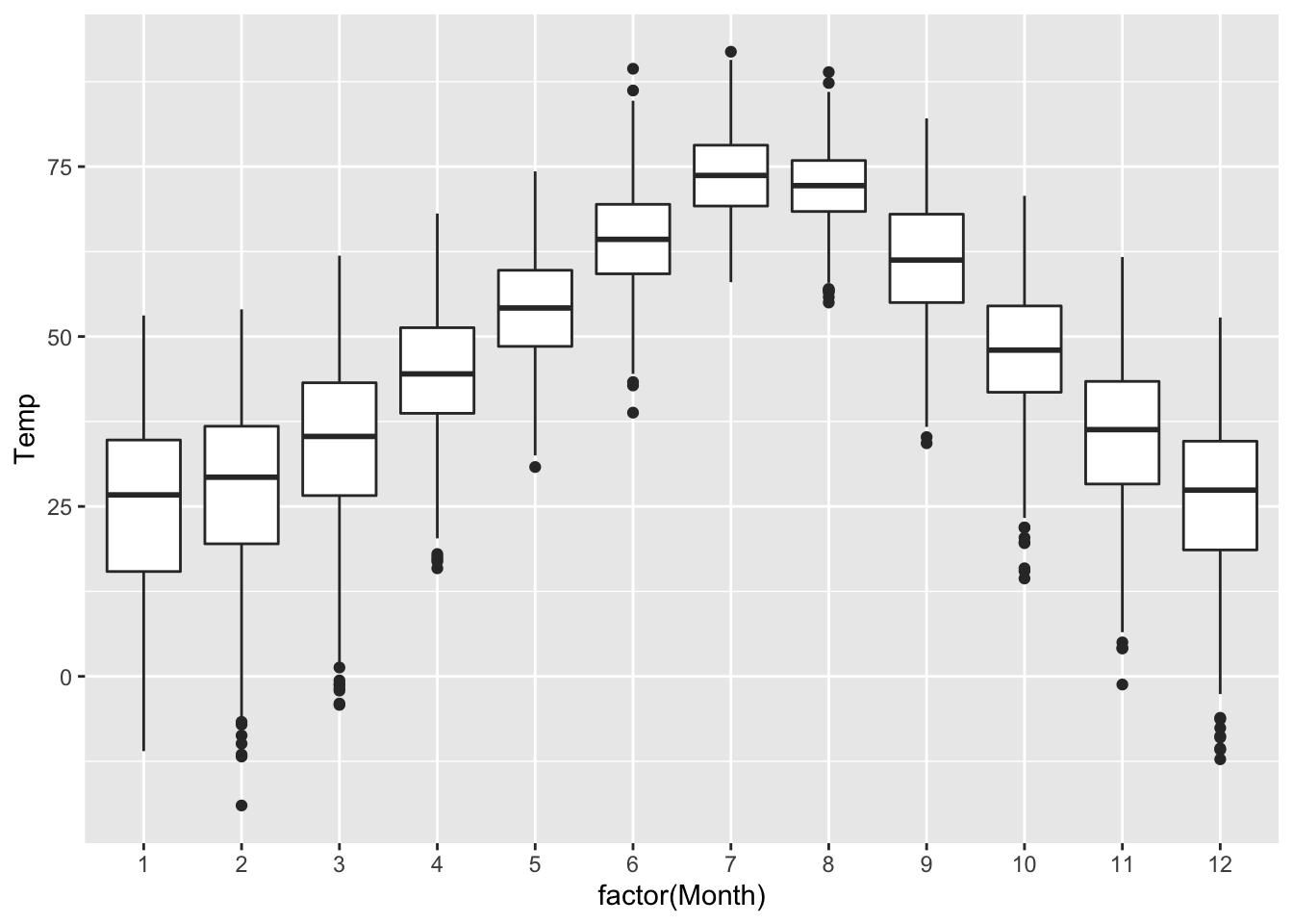
To calculate our summaries by month, we insert a group_by statement before summarize, like in the code block below:
rapidcity %>%
  group_by(Month) %>%
  summarize(avg_temp = mean(Temp),
            sd_temp = sd(Temp),
            q05_temp = quantile(Temp, 0.05),
            q95_temp = quantile(Temp, 0.95)) %>%
  round(1)
## # A tibble: 12 × 5
## Month avg_temp sd_temp q05_temp q95_temp
## <dbl> <dbl> <dbl> <dbl> <dbl>
## 1 1 24.4 13.5 -1.1 42.4
## 2 2 27.4 13 2.2 45.4
## 3 3 34.2 12.7 9 52.9
## 4 4 44.5 9.7 27.2 60
## 5 5 54.3 8.3 41.1 68.8
## 6 6 64.3 7.7 52 77.6
## 7 7 73.7 6.6 62.5 85.1
## 8 8 71.9 6.1 60.6 82
## 9 9 61.4 9.1 47.2 77.1
## 10 10 47.9 9.7 32.4 64
## 11 11 35.1 11.5 14.7 52.6
## 12 12 25.7 12.4 1.1 42.3The result is a table of summary statistics with one row per month. In English, this code block reads as follows:
- start with the
rapidcitydata set…
- then group the observations by the
Monthvariable…
- then calculate summary statistics separately for each month…
- then round the numbers to the first decimal place.
It’s important that group_by precede summarize in our code block, because that reflects the logical order of operations. If we called summarize first, we’d be summarizing the full data set, not the subgroups defined by the different months.
We can perform the same grouping trick with most common summary statistics. You’ll see several other examples below; for a full list, type ?summarize into your console.
Bar plots again
The combination of group_by and summarize is especially useful for making tables of group-level summary statistics to feed into bar plots. As we discussed in the lesson on Plots, the typical workflow to make a bar plot actually has two distinct stages:
- Summary stage: split your data set into subgroups and calculate summary statistics for each subgroup.
- Plotting stage: make a bar plot of those summary statistics, one bar per group.
In the lesson on Bar plots, I took care of stage 1 for you and just handed you a table of summary statistics. But you’re now in a position to undertake both stages yourself. Let’s see an example on our Rapid City data. Below, we calculate two summary statistics for each month: the average temperature and the proportion of sub-freezing days. We then store the result in an object called rapidcity_summary:
rapidcity_summary = rapidcity %>%
  group_by(Month) %>%
  summarize(avg_temp = mean(Temp),
            prop_freeze = sum(Temp <= 32)/n())
Now let’s make bar plots for each of our two summary statistics. First, average temperature:
ggplot(rapidcity_summary) +
  geom_col(aes(x=factor(Month), y=avg_temp))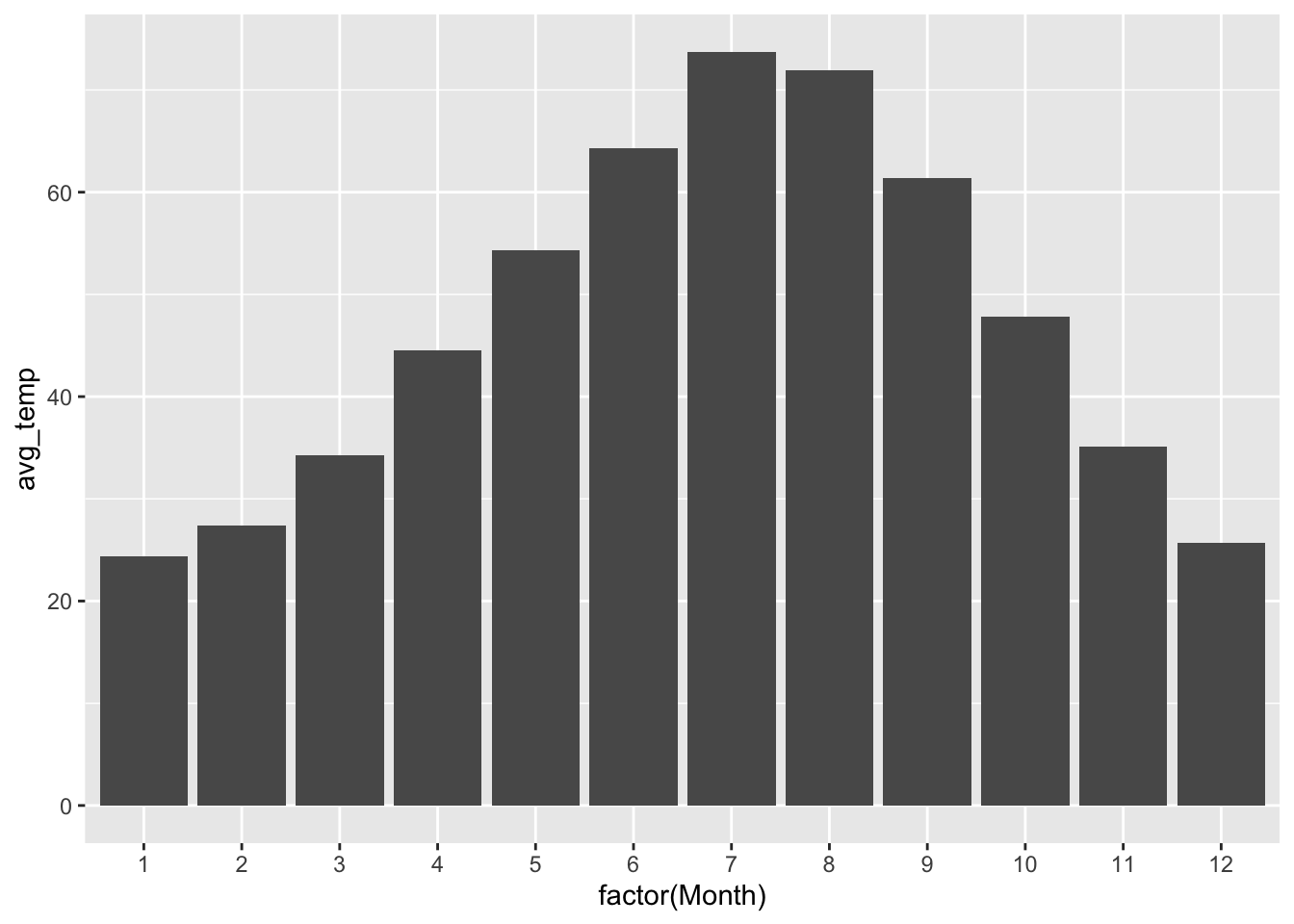
Next, proportion of days that are sub-freezing, on average:
ggplot(rapidcity_summary) +
  geom_col(aes(x=factor(Month), y=prop_freeze))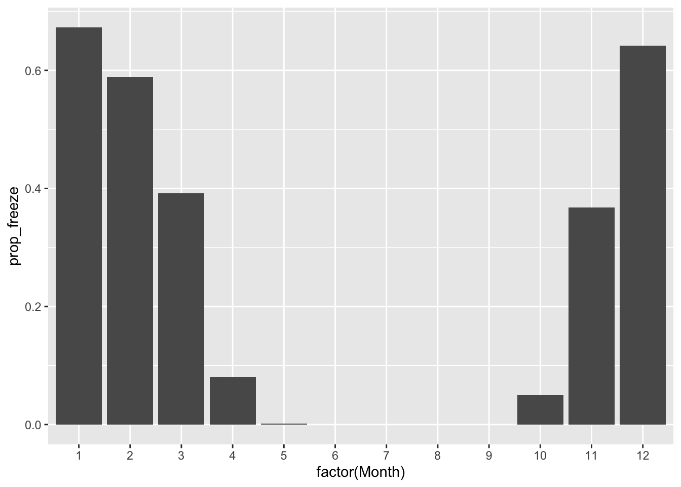
You might notice an oddity in this code: why factor(Month) rather than just Month? The reason is that bar plots expect a categorical \(x\) variable to define the groups/bars. But Month in our data set is actually a number: 1 for January, 2 for February and so on. R will therefore treat it as a numerical variable by default. The command factor overrides this default behavior, telling R to treat the number as a label, not as a number with a meaningful magnitude.
filter
The verb filter is how we look at specific rows our data frame. Suppose, for example, that we didn’t care about calculating our monthly temperature statistics in every year—just, for some odd reason, in 2009. We can filter the data set to include only the 2009 data, like this.
# create a 2009-only subset
rapidcity2009 = rapidcity %>%
  filter(Year == 2009)
You might be confused by the two different types of equal signs here. The double-equals sign (==) inside filter is used to test for equality. That is, we are filtering the data frame to include only those cases where the Year variable is equal to 2009. The single equals sign, =, is used for object assignment. The assignment, although it comes first in our sequence of commands, actually doesn’t happen until the very end. So in English, this code block says:
- start with the
rapidcitydata frame… - then filter down to only those rows where
Year == 2009.
- and finally store the resulting filtered data frame in an object called
rapidcity2009.
We can verify that this worked as expected by peeking at the first six lines of our filtered data frame.
head(rapidcity2009)## Year Month Day Temp
## 1 2009 1 1 30.7
## 2 2009 1 2 20.3
## 3 2009 1 3 16.9
## 4 2009 1 4 8.0
## 5 2009 1 5 13.9
## 6 2009 1 6 28.2We can use any of the following logical tests in our filter statements:
==for exact equality, e.g.Month == 3for March. Note that if our variable is a text string, we need to surround it with quotation marks. So if the months were encoded using English names rather than letters, we’d needMonth == "March"instead. You’ll see examples of this soon.
!=for “is not equal to.”
<and<=for “less than” and “less than or equal to,” respectively. For example,Temp <= 50will include only those days where theTempvariable is less than or equal to 50 degrees. Similarly,>and>=mean “greater than” and “greater than or equal to,” respectively.
|for “or” statements. E.g.Month == 1 | Month == 2will get you all rows from January and February across all years.
&for “and” statements. E.g.Month == 1 & Year == 2009will get you all rows specifically from January 2009.
Finally, we can combine filter with other verbs—like in the code block below, where we calculate monthly summary statistics for a subset of the data that spans 2006–09:
rapidcity %>%
  filter(Year >= 2006 & Year <= 2009) %>%
  group_by(Month) %>%
  summarize(avg_temp = mean(Temp),
            sd_temp = sd(Temp)) %>%
  round(1)
## # A tibble: 12 × 3
## Month avg_temp sd_temp
## <dbl> <dbl> <dbl>
## 1 1 27.4 12.6
## 2 2 25.3 12.4
## 3 3 36.2 11.9
## 4 4 44.2 11
## 5 5 56.1 8.7
## 6 6 65.5 8.2
## 7 7 75.1 7.4
## 8 8 71.3 6.5
## 9 9 60.7 8.2
## 10 10 45.3 9.8
## 11 11 37.6 10.2
## 12 12 22 11.9In English, this code block says:
- start with the
rapidcitydata…
- then filter down to cases from 2006 to 2009 (inclusive)…
- then group those cases by month…
- then calculate summary statistics…
- then round the numbers to the first decimal place.
select
The verb select, meanwhile, is used to select specific columns (variables) in your data set. I find this particularly useful for removing superfluous detail and de-cluttering output tables. For example, in our rapidcity2009 data frame, we might feel that the Year column is now unnecessary, since every data point is from 2009. We can use select to pick only the variables we want to retain, separating those variable names by commas:
rapidcity2009 %>%
  select(Month, Day, Temp) %>%
  head
## Month Day Temp
## 1 1 1 30.7
## 2 1 2 20.3
## 3 1 3 16.9
## 4 1 4 8.0
## 5 1 5 13.9
## 6 1 6 28.2The Year column no longer appears in our data frame. Note that we could have accomplished the same task by saying select(-Year), like this:
rapidcity2009 %>%
  select(-Year) %>%
  head
## Month Day Temp
## 1 1 1 30.7
## 2 1 2 20.3
## 3 1 3 16.9
## 4 1 4 8.0
## 5 1 5 13.9
## 6 1 6 28.2This code chunk selects all columns except Year and prints the first six lines of the filtered data frame.
mutate
Use mutate to define new variables from old ones. For example, suppose we wanted to augment our rapidcity data frame with a new variable, Summer, telling us whether a specific row was in June, July, or August. We’d accomplish this as follows:
rapidcity_augmented = rapidcity %>%
  mutate(Summer = ifelse(Month == 6 | Month == 7 | Month == 8,
                         yes="summer", no="not_summer"))
In English, this code block says:
- Start with the
rapidcitydata frame. - Then add a variable called
Summer, defined as follows:- if the
Monthvariable is either 6, 7, or 8, setSummerto have the valuesummer.
- if not, set
Summerto have the valuenot_summer.
- if the
- Then store the result in a data frame called
rapidcity_augmented.
Let’s verify that this worked as intended:
head(rapidcity_augmented)## Year Month Day Temp Summer
## 1 1995 1 1 12.6 not_summer
## 2 1995 1 2 19.9 not_summer
## 3 1995 1 3 9.2 not_summer
## 4 1995 1 4 6.2 not_summer
## 5 1995 1 5 16.0 not_summer
## 6 1995 1 6 17.8 not_summerLooks good!
We can now use the Summer variable just like any of our original variables. For example, here we are showing a faceted histogram of temperatures by summer status:
ggplot(rapidcity_augmented) +
  geom_histogram(aes(x=Temp), binwidth=2) +
  facet_wrap(~Summer, nrow=2)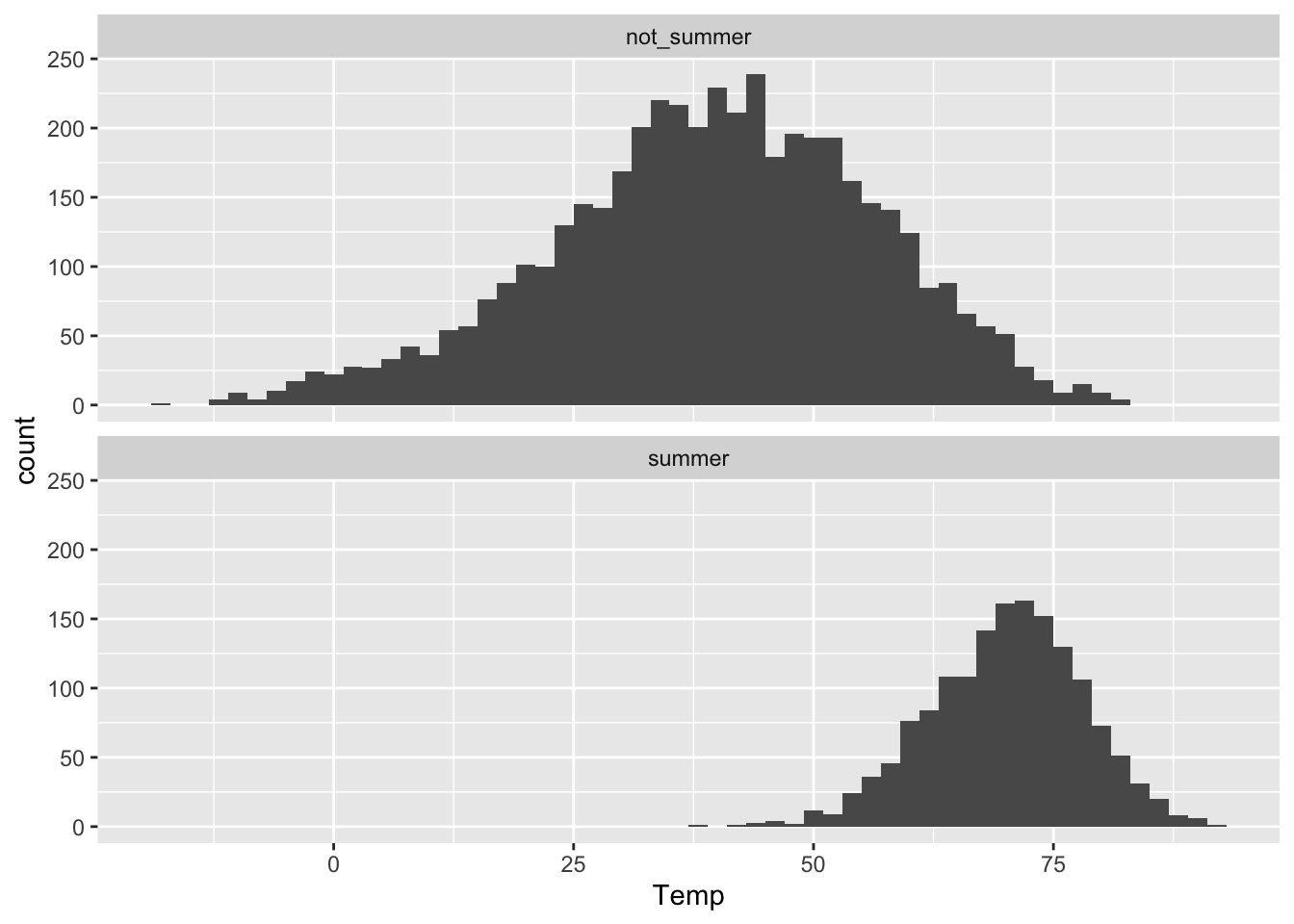
arrange
Use arrange for sorting on specific variables. This is useful on a raw data frame if you wanted to see the “Top-N” cases according to some measure. It’s also useful on tables of summary statistics, as we’ll see below.
As an example, let’s find the ten coldest days in Rapid City over the sample period:
rapidcity %>%
  arrange(Temp) %>%
  head(10)
## Year Month Day Temp
## 1 1996 2 2 -19.0
## 2 2008 12 15 -12.2
## 3 1996 2 3 -11.8
## 4 2006 2 18 -11.5
## 5 1996 1 30 -11.0
## 6 1996 12 26 -10.8
## 7 1996 1 19 -10.6
## 8 1996 12 24 -10.6
## 9 1996 1 29 -10.4
## 10 1997 1 11 -10.2If we wanted the ten hottest days, we’d have to arrange in descending order of Temp using desc, like this:
rapidcity %>%
  arrange(desc(Temp)) %>%
  head(10)
## Year Month Day Temp
## 1 2007 7 7 91.9
## 2 2006 7 16 90.7
## 3 2006 7 30 89.8
## 4 2007 7 23 89.5
## 5 2007 7 24 89.5
## 6 2002 6 29 89.4
## 7 2002 7 15 89.3
## 8 2006 7 15 89.0
## 9 2003 8 23 88.9
## 10 2002 7 16 88.46.2 Complex summaries
In this section we’ll see some examples of how we can combine data verbs to perform complex tasks very concisely.
Anytime you’re faced with complex data-analysis tasks like these, I’d encourage you to remember our basic mantra of data science that we introduced all the way back here:
Manage complexity by breaking complex tasks down into simple tasks, and then stitching the simple tasks together.
Keep this mantra in mind at all times. For each of these examples below, focus on three questions:
- What are main high-level tasks that must be accomplished?
- How can those “main” tasks be broken down into a sequence of simpler subtasks? (What are the tasks themselves, and how should they be sequenced)
- How can those sub-tasks be translated into data verbs, like
group_by,summarize,filter, etc.?
Example 1: the five coldest months
For our first example, our main high-level task is to find the five coldest individual months in our data set on Rapid City, which spans the seventeen years from 1995 to 2011.
This main task breaks down into simpler sub-tasks that look something like the following:
- Import the data set (we’ve done this already).
- Split the data set into individual months in individual years: January 1995, February 1995, March 1995, and so on, all the way through December 2011.
- For each individual month, calculate the average of the
Tempvariable (along with any other summaries we might find interesting).
- Sort the individual months according to their average temperatures.
- Make a table of the five coldest months.
Our pipeline for this analysis, shown below, reflects this logical structure. It uses a combination of group_by, summarize, and arrange, before piping the results into head and round (which truncate the table and round the numbers):
rapidcity %>%
  group_by(Year, Month) %>%
  summarize(avg_temp = mean(Temp),
            coldest_day = min(Temp),
            warmest_day = max(Temp)) %>%
  arrange(avg_temp) %>%
  head(5) %>%
  round(1)
## # A tibble: 5 × 5
## # Groups: Year [4]
## Year Month avg_temp coldest_day warmest_day
## <dbl> <dbl> <dbl> <dbl> <dbl>
## 1 1996 1 14.9 -11 46.1
## 2 2009 12 16.4 -2.6 35.6
## 3 2000 12 17.3 -9 38.8
## 4 1996 12 17.5 -10.8 40.4
## 5 2001 2 17.6 -3.9 40.8It seems January of 1996 was very cold.
Notice how we can group by multiple variables—in this case, both Year and Month. When we call group_by with multiple variables, it groups the data according to all possible combinations of those variables. So to be concrete, because there are 17 distinct years and 12 distinct months, this group_by statement splits the data set into \(17 \times 12 = 204\) groups:
- Group 1:
Year = 1995,Month = 1
- Group 2:
Year = 1995,Month = 2 - …
- Group 203:
Year = 2011,Month = 11 - Group 204:
Year = 2011,Month = 12
With the data grouped in this fashion, my code chunk then computes the requested summary measure separately for each group (in this case, the mean temperature and the min/max daily temperatures), and then sorts the groups by avg_temp.
The other thing to notice is that variables and summaries defined earlier in the pipeline become available to be used by later steps in the pipeline. In this example, the summary measure avg_temp is created by summarize on the 3rd line, and then subsequently used as a basis for sorting on the 4th line, via arrange(avg_temp).
But the ordering of the steps here is crucial. Your pipeline can only use variables and summaries from the “pipeline past,” not the “pipeline future.” This is one of those times where it’s informative to see what happens if we make a mistake. If we’d switched the order of summarize and arrange, we’d get a cryptic error message, rather than a table of really cold months:
rapidcity %>%
  group_by(Year, Month) %>%
  arrange(avg_temp) %>%
  summarize(avg_temp = mean(Temp))
## Error: arrange() failed at implicit mutate() step.
## * Problem with `mutate()` column `..1`.
## ℹ `..1 = avg_temp`.
## x object 'avg_temp' not foundThe core of this error is object 'avg_temp' not found. Basically, R is telling us that it can’t arrange the data frame according to avg_temp because the avg_temp summary has not yet been defined. In fact, it was supposed to be defined in the next step of our ill-fated pipeline—by which point R had already choked and thrown the error.
Refining data is like refining oil: when it comes to pipelines, the order in which you perform the tasks really matters. Breakdowns in code sometimes just reflect silly mistakes, like typos or missing commas. But other times, breakdowns in code reflect much more fundamental breakdowns in logic. The code block above is a good example of the latter.
Example 2: survival on the Titanic
For this example, you’ll need the data in titanic.csv. Go ahead and import the data set into R, calling the imported object titanic (which, once again, will be the default if you use the Import Dataset button).
If you take a quick peek at the first 6 lines…
head(titanic)## name survived sex age passengerClass
## 1 Allen, Miss. Elisabeth Walton yes female 29.0000 1st
## 2 Allison, Master. Hudson Trevor yes male 0.9167 1st
## 3 Allison, Miss. Helen Loraine no female 2.0000 1st
## 4 Allison, Mr. Hudson Joshua Crei no male 30.0000 1st
## 5 Allison, Mrs. Hudson J C (Bessi no female 25.0000 1st
## 6 Anderson, Mr. Harry yes male 48.0000 1st…you’ll see that each row is a person: specifically, a passenger on the Titanic when it sank on April 15, 1912. Each column contains details about that passenger, including their sex, age, class of travel, and whether they survived the sinking of the ship.
For this example, we’ll answer the question: how did survival among adult passengers vary by sex and cabin class? Again, remember the basic mantra of data science:
Manage complexity by breaking down complex tasks into simpler tasks and then stitching those simple tasks together.
Here our simple tasks look something like this:
- create a new variable, which we’ll call
Adult, that determines whether a passenger is at least 18 years old.
- filter the data set down to adults only.
- group the filtered data set by sex and cabin class (2 sexes \(\times\) 3 classes = 6 groups).
- calculate the survival percentage for each group.
To do all this, we’ll use a combination of mutate, filter, group_by, and summarize. We’ll then pass the resulting summary table into ggplot to make a bar plot, adding a little visual pizzazz to what might otherwise be a dry table.
We’ll actually break our sequence of tasks down into two parts. Here’s part 1, where we create a table called surv_adults:
surv_adults = titanic %>%
  mutate(age_bracket = ifelse(age >= 18,
                              yes="adult", no="child")) %>%
  filter(age_bracket == "adult") %>%
  group_by(sex, passengerClass) %>%
  summarize(total_count = n(),
            surv_count = sum(survived == 'yes'),
            surv_pct = surv_count/total_count)
Remember, = is for assigning values to objects, while == is for testing equality. Notice that in the filter step, we had to put quotation marks around adult, since age_bracket is a categorical variable rather than a number.
The only other unfamiliar part of this pipeline might be in the details of the summarize step. Here we created three summary variables:
total_countis created by the handy functionn(), which counts the total number of cases in each group.n()behaves a bit likextabsdoes, but it’s used inside pipelines.
surv_countcalculates the number of people that survived in each group, by summing up the cases where thesurvivedvariable isyes. This is done viasum(survived == 'yes')surv_pctis then calculated as the ratio of of these two numbers:surv_count/total_count.
The result is a table of our requested summary statistics for each combination of sex and passenger class:
surv_adults## # A tibble: 6 × 5
## # Groups: sex [2]
## sex passengerClass total_count surv_count surv_pct
## <chr> <chr> <int> <int> <dbl>
## 1 female 1st 125 121 0.968
## 2 female 2nd 85 74 0.871
## 3 female 3rd 106 47 0.443
## 4 male 1st 144 47 0.326
## 5 male 2nd 143 12 0.0839
## 6 male 3rd 289 45 0.156This is fine as a table, but you might want to make it more visually appealing. So in part 2, let’s feed this table into ggplot to create a faceted bar plot, comparing survival percentages by sex across all three passenger classes:
ggplot(surv_adults) +
  geom_col(aes(x=sex, y=surv_pct)) +
  facet_wrap(~passengerClass, nrow=1)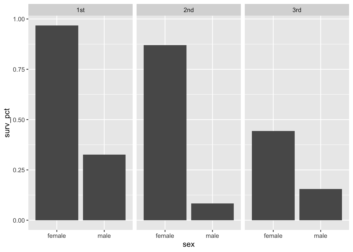
Example 3: toy imports
For our final example, we’ll look at the data in toyimports.csv, which tracks imports of toys to the United States from 129 countries over the period 1996–2005. Here’s a random sample of 10 rows from this data set.
| year | partner_name | product | product_name | US_report_import |
|---|---|---|---|---|
| 1997 | Malta | 950330 | Other construction sets and constru | 0.000 |
| 1999 | Mauritius | 950320 | Reduced-size (“scale”) model assemb | 54.326 |
| 2000 | Israel | 950341 | Toys representing animals or non-hu | 0.000 |
| 2002 | Costa Rica | 950310 | Electric trains, including tracks, | 1.964 |
| 2002 | Greece | 950349 | Toys representing animals or non-hu | 103.486 |
| 2003 | Luxembourg | 950320 | Reduced-size (“scale”) model assemb | 27.160 |
| 2003 | Venezuela | 950341 | Toys representing animals or non-hu | 0.000 |
| 2004 | United Kingdom | 950341 | Toys representing animals or non-hu | 1003.450 |
| 2004 | Hungary | 950320 | Reduced-size (“scale”) model assemb | 63.397 |
| 2005 | Peru | 950291 | Parts and accessories :– Garments | 1.299 |
Every row shows the total dollar value of toys imported to the U.S. (US_report_import, in multiples of $1,000) in a specific product category from a specific country in a specific year. The product categories have unique numerical codes (product) as well as product names exciting enough to quicken the heart of any toy-loving child (“Parts and accessories :– Other,” “Toys representing animal or non-human figures,” and so on).
Our goal for this data analysis is to make a line graph showing total toy imports over time, summed across all categories, for the U.S.’s top 3 trading partners by total dollar value of toys imported.
Let’s break this down into simpler tasks. First, we need to find the top 3 partners by total dollar value. This task itself can be broken down into simpler sub-tasks:
- Group all the observations by trading partner (the
partner_namevariable).
- For each partner, calculate total dollar value by summing toy imports (
US_report_import) across all categories and years.
- Arrange the partners by total dollar value.
Let’s see how to accomplish this using a combination of group_by, summarize, and arrange:
country_totals = toyimports %>%
  group_by(partner_name) %>%
  summarize(total_dollar_value = sum(US_report_import)) %>%
  arrange(desc(total_dollar_value))
Now we can look at the top trading partners:
head(country_totals)## # A tibble: 6 × 2
## partner_name total_dollar_value
## <chr> <dbl>
## 1 China 26842305.
## 2 Denmark 1034990.
## 3 Canada 572309.
## 4 Hong Kong, China 545186.
## 5 Switzerland 400969.
## 6 Korea, Rep. 350612.So the U.S.’s top 3 toy-trading partners were China, Denmark, and Canada. Let’s encode that information in a list, taking taking to use the precise values reflected in the parter_name column of the table above:
top3_partner_names = c('China', 'Denmark', 'Canada')Here c means “combine,” and it’s how we create a list21 of multiple elements. This list of names will be useful when we turn to our second main task: plotting toy imports over time for each categories, separately for each of these three top trading partners.
This second main task also breaks down into sub-tasks:
- Filter the data set so that it includes only data points from the top 3 trading partners.
- Group the data points by partner and year.
- Within each group, sum the toy imports across all categories.
Here’s how to translate this into R code, as well as the top 6 lines of the data frame created as a result:
top3_byyear = toyimports %>%
  filter(partner_name %in% top3_partner_names) %>%
  group_by(year, partner_name) %>%
  summarize(yearly_dollar_value = sum(US_report_import))

head(top3_byyear)
## # A tibble: 6 × 3
## # Groups: year [2]
## year partner_name yearly_dollar_value
## <int> <chr> <dbl>
## 1 1996 Canada 42650.
## 2 1996 China 1842478.
## 3 1996 Denmark 85972.
## 4 1997 Canada 56189.
## 5 1997 China 2574251.
## 6 1997 Denmark 75918.Now we can make our line graph of yearly_dollar_value versus year. We’ll color in each line according to trading partner, like this:
ggplot(top3_byyear) +
  geom_line(aes(x=year, y=yearly_dollar_value, color=partner_name))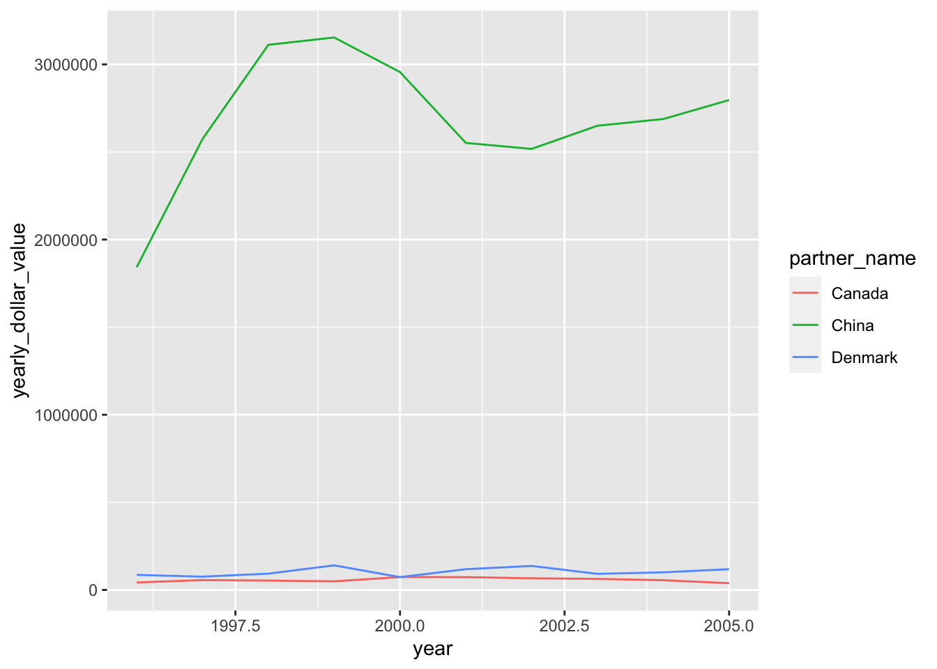
But this isn’t great for two reasons:
- The color scale is unfriendly to those with colorblindness. We’ll fix this by using
scale_color_brewer, as we learned in the lesson on Customizing plots.
- The lines for Denmark and Canada are dwarfed by the line for China. We’ll fix this by plotting the data on a logarithmic axis, which is a more natural way to compare quantities on very different scales.
We can do this as follows:
ggplot(top3_byyear) +
  geom_line(aes(x=year, y=yearly_dollar_value, color=partner_name)) +
  scale_color_brewer(type='qual') +
  scale_y_log10()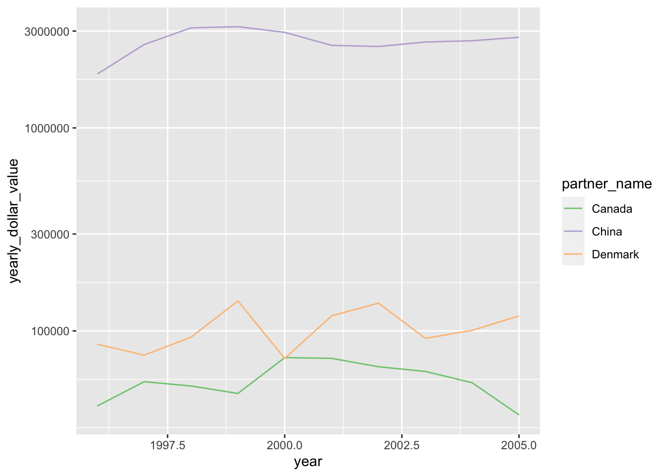
The last, minor issue here is that ggplot has made a poor choice about where to place axis labels. We can fix that easily, while also adding more informative axis labels:
ggplot(top3_byyear) +
  geom_line(aes(x=year, y=yearly_dollar_value, color=partner_name)) +
  scale_color_brewer(type='qual') +
  scale_y_log10() +
  scale_x_continuous(breaks = 1996:2005) +
  labs(x="Year", y = "Dollar value of imports (log scale)",
       title="Toy imports from the U.S.'s top-3 partners, 1996-2005")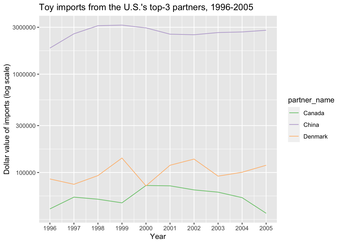
And we’re done! Now we can compare across countries, as well as examine change over time within countries.
6.3 Summary shortcuts
Having covered several examples of complex summaries, we’ll finish off this section at the opposite end of the difficulty spectrum: with some shortcuts for calculating simple summaries “on the fly,” in a single line of code. We’ll also revisit these shortcuts in our section on statistical inference—specifically, in the upcoming lesson on The bootstrap.
For these shortcuts to work, you’ll need the mosaic library loaded:
library(mosaic)Here are the basic shortcuts, illustrated on the titanic data. To calculate the mean of a variable, you can use mean directly, like this:
mean(~age, data=titanic)## [1] 29.88113This statement computes the mean value of the age variable for everyone in the titanic data set. Don’t forget the tilde (~) in front of age.
You can also calculate a mean stratified by some other grouping variable, like this:
mean(age ~ sex, data=titanic)## female male
## 28.68707 30.58523This tells us the mean of the age variable for males and females separately. Of if all you care about is the difference between means, you can use diffmean:
diffmean(age ~ sex, data=titanic)## diffmean
## 1.898162This tells us that the average age among males is about 1.9 years older than among females. (diffmean only works if the grouping variable on the right-hand side of the tilde has exactly two levels.)
The same type of shortcut works for proportions, too, using prop. For example, here’s the overall proportion of those who died on the Titanic (i.e. where survived == "no"):
prop(~survived, data=titanic)## prop_no
## 0.5917782Here is that same proportion stratified by sex:
prop(survived ~ sex, data=titanic)## prop_no.female prop_no.male
## 0.2474227 0.7948328And here is the difference of those two proportions, using diffprop:
diffprop(survived ~ sex, data=titanic)## diffprop
## 0.5474101This tells us that the survival rate among females was about 55% higher than among males.
The following summaries all have shortcut forms that follow the same basic logic:
medianrange,sd, andIQRfor measuring dispersionmaxandmin
favstatsfor a collection of multiple summary statistics
I particularly like the favstats shortcut. For example:
favstats(age ~ sex, data=titanic)## sex min Q1 median Q3 max mean sd n missing
## 1 female 0.1667 19 27 38 76 28.68707 14.57700 388 0
## 2 male 0.3333 21 28 39 80 30.58523 14.28057 658 0Of course, these shortcuts aren’t nearly as flexible as the full set of data verbs covered above, in that they don’t let us filter, mutate, etc. Nor do they let us compute any old summary statistic we might care about. But they are useful for quick data exploration, when simple summaries often do the trick.
Technically it’s a vector, if you want to get specific about R’s internal data structures.↩︎