Lesson 14 Grouped data
If you’ve made it this far through these lessons, you’ve already analyzed a lot of grouped data. Let’s briefly review.
- To start with, you’ve learned some useful tools for visualizing grouped data, including Boxplots, faceted Histograms, and Bar plots.
- In the lessons on Summaries and Data wrangling, you also learned the basic data workflow required to calculate group-level summary statistics. (Remember “group/pipe/summarize” from our discussion of Key data verbs.)
- From there we learned how to use The bootstrap and the tools of Large-sample inference to quantify our uncertainty about key group-level quantities when we want to generalize from samples to populations. Recall, for example, the lessons on Bootstrapping differences and Beyond de Moivre’s equation. These tools allowed us to get confidence intervals for quantities like the difference in proportions or means between two groups.
Now we go one step further, by fitting equations that describe grouped data. In effect, what we’re doing here is to marry the concepts from our lessons on Summaries and Data wrangling with the concept of linear regression from the lesson on Fitting equations. As we will see below, this allows us to do several powerful things that we can’t easily do with the tools we’ve learned so far.
In this lesson, you’ll learn to:
- understand “baseline/offset form” as a way of making statements about numbers.
- encode categorical data in terms of dummy variables.
- fit and interpret regression equations with dummy variables.
- model a numerical outcome in terms of multiple categorical predictors.
- understand the appropriate use and interpretation of interaction terms.
- interpret an analysis-of-variance (ANOVA) table as a way of partitioning credit among multiple predictors.
14.1 Baseline/offset form
A very common goal in analyzing grouped data is to quantify differences in some outcome variable across different groups, i.e. different levels of some categorical variable:
- How much more cheese do people buy when you show them an ad for cheese, versus not showing them an ad?
- How much less likely is a heart attack on a Mediterranean diet versus a low-fat diet?
- How much more quickly do video-gamers react to a bad guy popping up on the screen when the bad guy is large, rather than small?
These are all questions about differences—that is, questions about comparing some situation of interest versus a baseline situation. In fact, these kinds of questions arise so frequently with grouped data that we typically build a model that allows us to make these comparisons directly, as opposed to making them indirectly, i.e. by computing a bunch of group-specific means or proportions and then taking differences.
For this reason, we usually fit models for grouped data in “baseline/offset” form, which is a way of expressing a set of numbers in terms of differences (or offsets) from some specific baseline number.
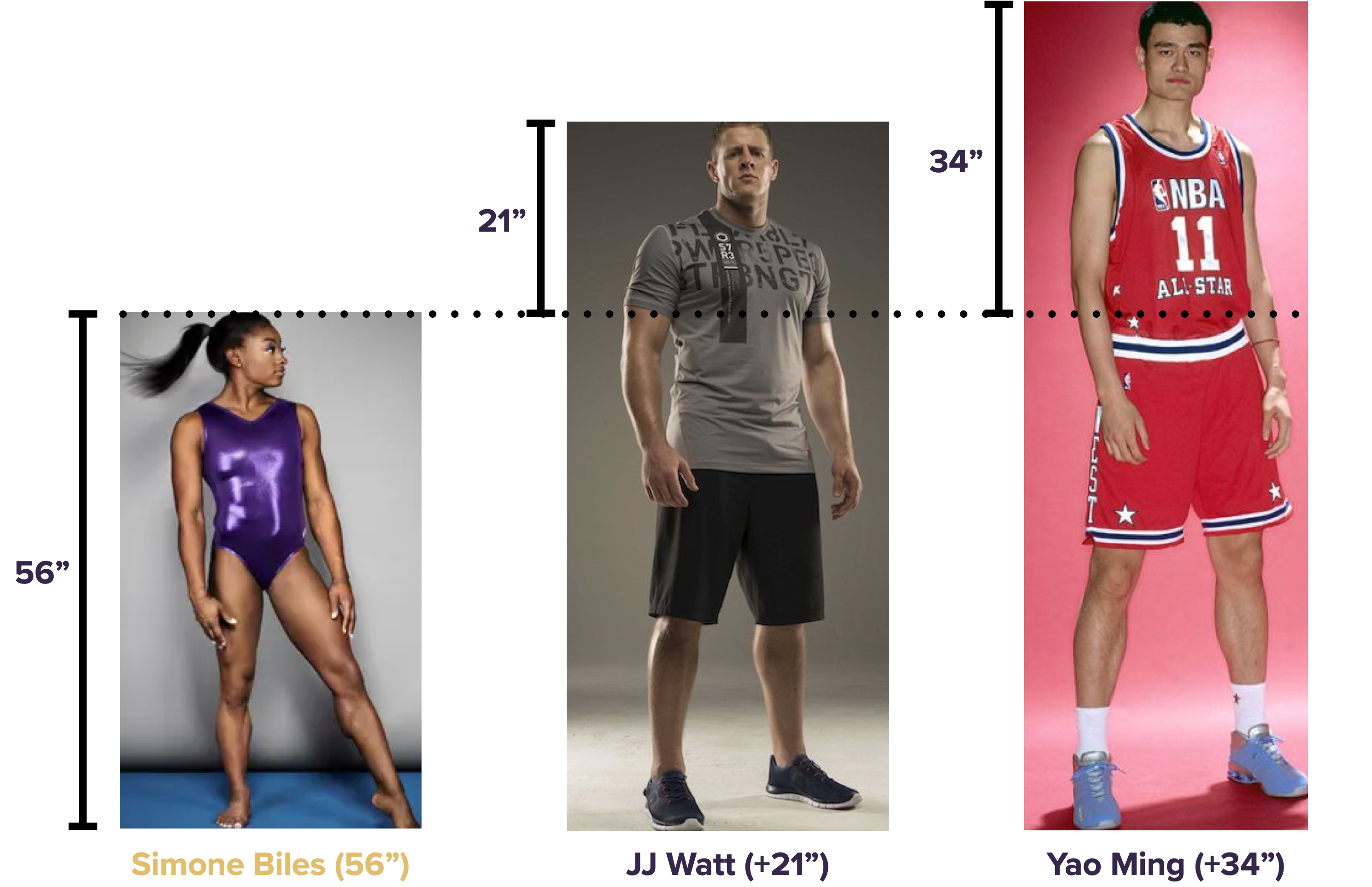
Example 1: heights
To understand baseline/offset form, let’s start with an example involving three Texas sporting legends: Yao Ming, JJ Watt, and Simone Biles. If you asked a normal person to tell you the heights of these three athletes in inches, they’d probably head to Google and come back a minute later to report these numbers:
- Simone Biles is 56 inches tall.
- JJ Watt is 77 inches tall.
- Yao Ming is 90 inches tall.
And here are those numbers in a picture.

This is a perfectly sensible way—indeed, it’s the completely obvious way—to report the requested information on the athletes’ heights. We’ll call it “raw-number” form, just to contrast it with what we’re about to do.
Now let’s see how to report the same information in “baseline/offset” form, using Simone Biles’ height as our baseline:
- Simone Biles is 56 inches tall (baseline = 56).
- JJ Watt is 21 inches taller than Simone Biles (offset = +21).
- Yao Ming is 34 inches taller than Simone Biles (offset = +34).
Or, if you prefer to see these numbers in a picture:
Same three heights, just a different way of expressing them. Instead of giving Watt’s and Yao’s heights as raw numbers, we express them as differences, or offsets, from Simone Biles’ height (our baseline).
Moreover, it should also be clear that we can choose any of the three athletes as our baseline. For example, here are the same three heights expressed in baseline/offset form using JJ Watt as the baseline.
- JJ Watt is 77 inches tall (baseline = 77).
- Simone Biles is 21 inches shorter than JJ Watt (offset = -21).
- Yao Ming is 13 inches taller than JJ Watt (offset = +13).
Or again, in a picture:
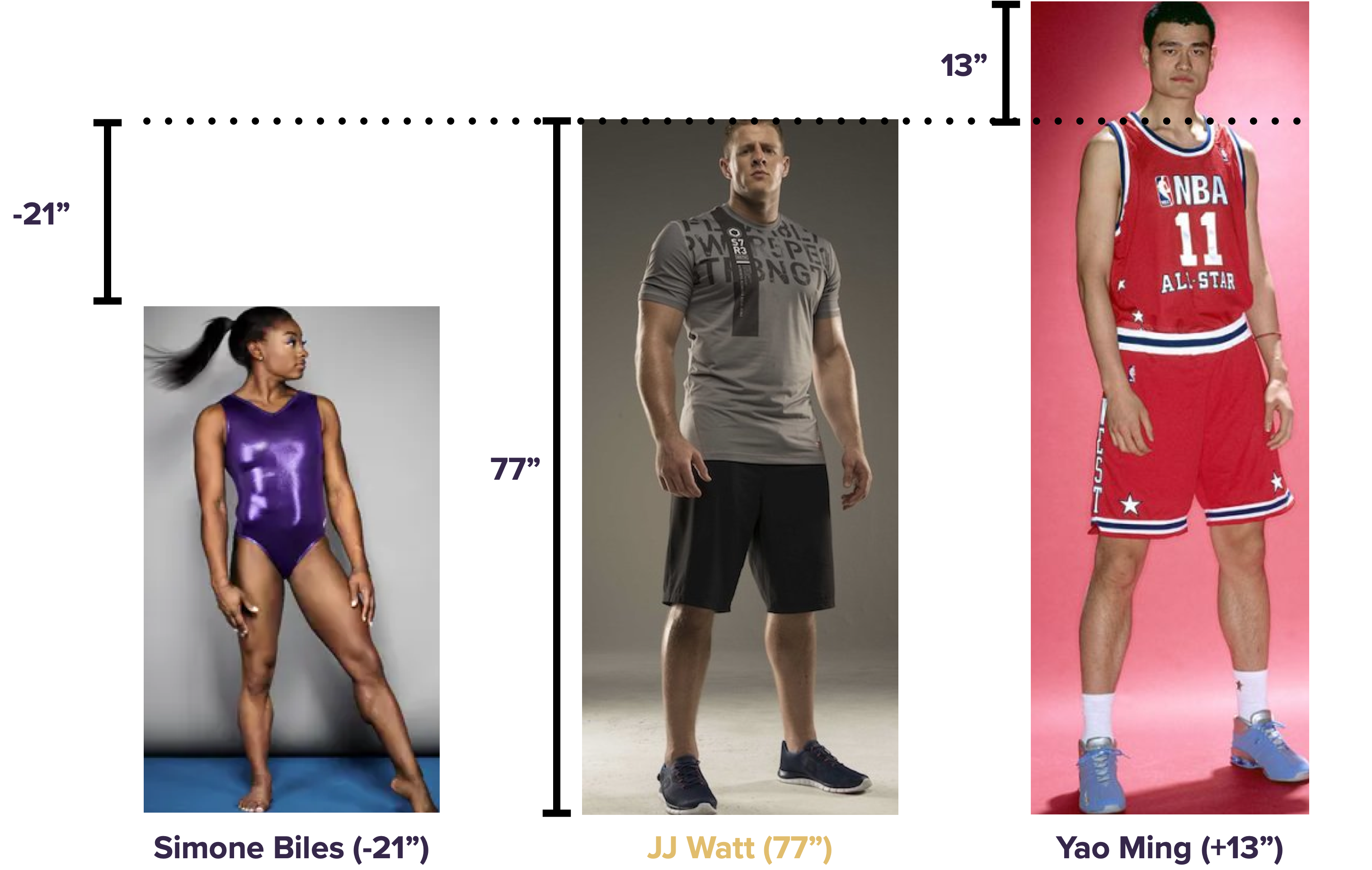
As before: same three heights, just a different way of expressing them with three numbers (one baseline + two offsets).
Example 2: cheese
Let’s see a second example of baseline/offset form. We’ll return to the data in kroger.csv, which we saw for the first time in the lesson on Plots. Import this data into R, and then load the tidyverse and mosaic libraries:
library(tidyverse)
library(mosaic)
The first few lines of the kroger data look like this:
head(kroger)## city price vol disp
## 1 Houston 2.48 6834 yes
## 2 Detroit 2.75 5505 no
## 3 Dallas 2.92 3201 no
## 4 Atlanta 2.89 4099 yes
## 5 Cincinnati 2.69 5568 no
## 6 Indianapolis 2.67 4134 yesYou may recall that this data shows the weekly sales volume of package sliced cheese over many weeks at 11 Kroger’s grocery stores across the U.S. Each case in the data frame corresponds to a single week of cheese sales at a single store. The variables are:
city: which city the store is located in
price: the average transaction price of cheese sold that week at that store
vol: the sales volume that week, in packages of cheese
disp: a categorical variable indicating whether the store set up a prominent marketing display for cheese near the entrance (presumably calling shoppers’ attention to the various culinary adventures they might undertake with packaged, sliced cheese).
For now, we’ll focus only on the sales data from the store in Dallas. We’ll use filter to pull out these observations into a separate data frame, and then make a jitter plot to show how the disp variable correlates with sales volume. I’ll also use a handy function called stat_summary to add an extra layer to the jitter plot, showing the group means as big red dots:
kroger_dallas = kroger %>%
  filter(city == 'Dallas')

ggplot(kroger_dallas) +
  geom_jitter(aes(x = disp, y = vol), width=0.1) +
  stat_summary(aes(x = disp, y = vol), fun='mean', color='red', size=1)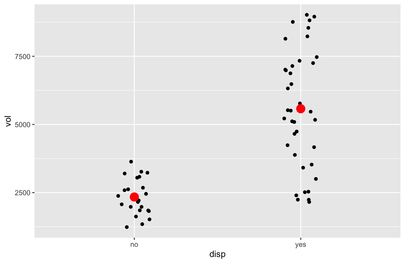
This jitter plot shows that, in the 38 “display-on” weeks, sales were higher overall than in the 23 “display-off” weeks. How much higher? Let’s use mean to find out:
mean(vol ~ disp, data=kroger_dallas) %>%
  round(0)
## no yes
## 2341 5577That’s a difference of \(5577 - 2341 = 3236\), rounded to the nearest whole number. So first, here’s the information on average sales volume in raw-number form:
- In “display-off” weeks, average sales were 2341 units.
- In “display-on” weeks, average sales were 5577 units.
And now here’s the same information expressed in baseline/offset form:
- In “display-off” weeks, average sales were 2341 units (baseline = 2341).
- In “display-on” weeks, average sales were 3236 units higher than in “display-off” weeks (offset = +3236).
Just as with our heights example, we see that baseline/offset form expresses the same information as raw-number form, just in a different way.
So to recap what we’ve learned so far:
- You can express any set of numbers in baseline/offset form by picking one number as the baseline, and expressing all the other numbers as offsets (whether positive or negative) from that baseline.
- The choice of baseline is arbitrary. You are free to make any convenient choice. If you pick a different baseline, just be aware that all the offsets will change accordingly to encode the same information.
- If you have \(N\) numbers in raw form, you’ll still need \(N\) numbers in baseline/offset form: one number to serve as the baseline, and \(N-1\) offsets for all the other numbers.
- In our heights example, we had 3 heights to report: 1 baseline, and 2 offsets. .
- In our cheese example, we had 2 averages to report: 1 baseline, and 1 offset.
- In our heights example, we had 3 heights to report: 1 baseline, and 2 offsets. .
Why do this?
A very natural question here is: why on earth would we do this? Doesn’t it seem needlessly complex? After all, when you ask a normal human being for a set of numbers, they usually just give you the damn numbers. In particular, they don’t do what we’ve done: choose one number as a baseline, run off to a laptop for a few minutes of quiet time, calculate a bunch of offsets from that baseline, and come back to report the numbers you asked for in this perfectly understandable but kinda-strange-and-roundabout “baseline/offset” way. Why would we do that here?
I acknowledge that it’s not at all obvious why we’d use baseline/offset form—yet. But the gist of it is this. Baseline/offset form is slightly more complex and annoying to work with when you’ve got a simple data set with only a few groups. But it’s radically simpler to work with when you’ve got a complex data set involving dozens, hundreds, or thousands of groups. It’s kind of like what happened when your parents removed the training wheels on your first bike: initially it seemed strange, and you might have even wondered why anybody would willingly make their bike harder to ride by removing a couple of wheels. But eventually, once you got the hang of it, you realized that it was possible to go further and faster that way, as evidenced by the fact that no one has ever won the Tour de France on a bike with training wheels.
More specifically, here are two advantages of baseline/offset form:
- Convenience. Expressing numbers in baseline/offset form puts the focus on differences between situations (e.g. the difference in average cheese sales between display and non-display weeks). Since we often care about differences more than absolute numbers, this is convenient.
- Generalizability. Once we understand baseline/offset form, we can easily generalize it to situations involving multiple categorical variables, or combinations of categorical and numerical variables. This will eventually lead us to a full discussion of Regression.
We’ll cover these advantages in detail below.
14.2 Models with one dummy variable
But before we can return to the question of why we might might actually prefer baseline/offset form, there’s one more crucial concept to cover: that of a dummy variable, also called an “indicator variable” or a “one-hot encoding.” Dummy variables are a way of representing categorical variables in terms of numbers, so that we can use them in regression equations, just like the ones we introduced in the lesson on Fitting equations. As you’ll see, dummy variables are intimately related to the concept of Baseline/offset form that we just covered.
Definition 14.1 A dummy variable, or a dummy for short, is a variable that takes only two possible values, 1 or 0. It is used to indicate whether a case in your data frame does (1) or does not (0) fall into some specific category. In other words, a dummy variable uses a number (either 1 or 0) to answer a yes-or-no question about your data.
There are typically two steps involved in building a model using dummy variables:
- Encoding categorical variables using dummies.
- Fitting a regression model using those dummies as predictors.
We’ll cover both of these steps in the example below. (Although these steps are conceptually distinct, we’ll see that it’s often possible to collapse them both into a single line of R code, as long as you know what you’re doing.)
Example: cheese
To illustrate, we’ll return to the cheese example from the previous section. The goal of this analysis is the same as it was before: to understand how the disp variable correlates with sales volume. But now we’re going to fit a regression model with a dummy variable, rather than compute the means directly and take their difference. For now, focus on what we’re doing, postponing for now the question of why we’re doing it this way.
Step 1: Encoding. Here are the first ten lines of our data on the Dallas-area Kroger store:
| city | price | vol | disp |
|---|---|---|---|
| Dallas | 2.92 | 3201 | no |
| Dallas | 2.92 | 3230 | no |
| Dallas | 2.92 | 3082 | no |
| Dallas | 3.73 | 3047 | no |
| Dallas | 3.73 | 2240 | yes |
| Dallas | 3.73 | 2158 | no |
| Dallas | 2.65 | 7010 | yes |
| Dallas | 2.67 | 4740 | yes |
| Dallas | 2.65 | 3415 | yes |
| Dallas | 3.12 | 2242 | yes |
Now let’s use mutate to add a new column to this data frame containing a dummy variable, called dispyes. This dummy variable will take the value 1 if the corresponding case was was a “display-on” week, and 0 otherwise.
kroger_dallas = kroger_dallas %>%
  mutate(dispyes = ifelse(disp == 'yes', 1, 0))
And now here are the first ten lines of our augmented data frame, which includes this newly defined dummy variable.
| city | price | vol | disp | dispyes |
|---|---|---|---|---|
| Dallas | 2.92 | 3201 | no | 0 |
| Dallas | 2.92 | 3230 | no | 0 |
| Dallas | 2.92 | 3082 | no | 0 |
| Dallas | 3.73 | 3047 | no | 0 |
| Dallas | 3.73 | 2240 | yes | 1 |
| Dallas | 3.73 | 2158 | no | 0 |
| Dallas | 2.65 | 7010 | yes | 1 |
| Dallas | 2.67 | 4740 | yes | 1 |
| Dallas | 2.65 | 3415 | yes | 1 |
| Dallas | 3.12 | 2242 | yes | 1 |
As you can see, the dummy variable dispyes has encoded the answer to our yes-or-no question (was there a display that week?) in terms of a number, where 1 means yes and 0 means no.
Step 2: Fitting. Let’s now see what happens when we fit a regression model for vol, using dispyes, our dummy variable, as a predictor. We’ll fit the model using lm, just as we learned to do in the lesson on Fitting equations. Then we’ll print out the coefficients, rounding them to the nearest whole number:
model1_vol = lm(vol ~ dispyes, data=kroger_dallas)
coef(model1_vol) %>%
  round(0)
## (Intercept) dispyes
## 2341 3236These coefficients are telling us that equation of our fitted regression model is:
\[ \mbox{vol} = 2341 + 3236 \cdot \mbox{dispyes} + e \]
where \(e\) is the residual or “model error” term. But since dispyes is a dummy variable, it can only take the value 0 or 1. Therefore there are only two fitted values that our regression model can produce: one value when dispyes = 0, and another when dispyes = 1.
Let’s take these two cases one by one. When dispyes == 0, the expected sales volume is
\[
\mbox{expected vol} = 2341 + 3236 \cdot 0 = 2341
\]
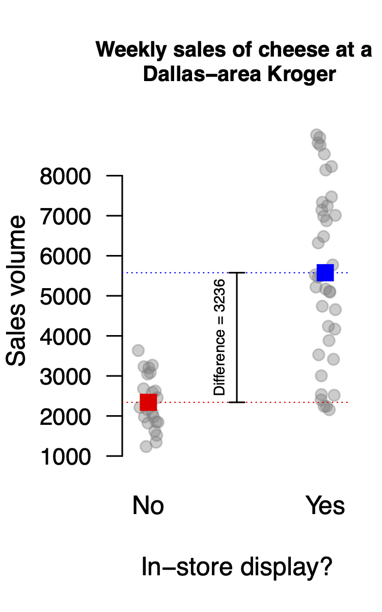
When the dispyes dummy variable is 0, it zeroes out the entire second term of \(3236 \cdot 0\). Thus all we’re left with is the intercept of 2341. This is our baseline, i.e. our expected sales volume in “display-off” weeks.
On the other hand, when dispyes == 1, the expected sales volume is
\[ \mbox{expected vol} = 2341 + 3236 \cdot 1 = 5577 \] This is our expected sales volume in “display-on” weeks, expressed in the form of our baseline of 2341, plus an offset of 3236, to give a total of 5577. This offset is the coefficient on our dummy variable in the fitted regression model.
Moreover, you can interpret both this baseline of 2341 and this offset of 3236 graphically. In the figure below, the baseline of 2341 is the red dot (for display-on weeks), while the offset of 3236 is the difference between the blue and red dots, i.e. the means of the display-on weeks and the display-off weeks:
So to recap:
- Dummy variables encode categorical variables as numbers, in the form of an answer to a yes-or-no question: 1 means yes, 0 means no.
- Once you’ve encoded a categorical variable using dummy variables, you can use those dummy variables as predictors in a regression model, just like you did in the lesson on Fitting equations.
- The coefficients in a regression model involving dummy variables will encode information about your response (\(y\)) variable, expressed in Baseline/offset form. The intercept corresponds to a baseline, and the coefficient on a dummy variable corresponds to an offset, i.e. what should be added to the baseline whenever the dummy variable is “on” (1).
R can create dummy variables for you
I’ll get to some more examples shortly here. But first I want to pause for a short digression about a nice feature of R that can save you a lot of needless coding effort down the line.
In the previous example, we explicitly separated the two different steps involved in working with dummy variables: (1) encoding a categorical variable using a dummy variable, and (2) fitting a model with the dummy variable as a predictor. We accomplished the first step using the statement mutate(dispyes = ifelse(disp == 'yes', 1, 0)), which added a dummy variable to our original kroger_dallas data frame. Then in step 2, we fed this dispyes variable into lm in order to fit the model.
But it turns out that we can get R to handle step 1 for us automatically. The basic rule of thumb is this: if you provide lm with a categorical variable as a predictor, it will recognize it as such, and it will automatically create dummy variables for you. This is a nice feature; it enables us to handle the encoding and fitting steps in a single line of R code.
Let’s return to our original kroger_dallas data frame, minus the dummy variable we created, which looked like this:
| city | price | vol | disp |
|---|---|---|---|
| Dallas | 2.92 | 3201 | no |
| Dallas | 2.92 | 3230 | no |
| Dallas | 2.92 | 3082 | no |
| Dallas | 3.73 | 3047 | no |
| Dallas | 3.73 | 2240 | yes |
| Dallas | 3.73 | 2158 | no |
| Dallas | 2.65 | 7010 | yes |
| Dallas | 2.67 | 4740 | yes |
| Dallas | 2.65 | 3415 | yes |
| Dallas | 3.12 | 2242 | yes |
Clearly the original disp variable is expressed as an English word (no or yes), rather than as a dummy variable (0 or 1). So you wouldn’t think it would be suitable to include in a regression model. But watch what happens when we blindly charge ahead, throwing disp into lm as our predictor variable:
model2_vol = lm(vol ~ disp, data=kroger_dallas)
coef(model2_vol) %>%
  round(0)
## (Intercept) dispyes
## 2341 3236We get the exact same coefficients as before: a baseline of 2341 and an offset of 3236. What’s happened is that, behind the scenes, R has encoded the original disp variable as a dummy variable (which it called dispyes) and then fit the model using dispyes as a predictor. That’s helpful, because it saves us the trouble of using mutate and ifelse to create the dummy variable by hand. The moral of the story is: let R create the dummy variables for you. Just give it the categorical variable directly in lm.
You might ask: how did R know to choose disp == no as the baseline case, and to make a dummy variable for dispyes, rather than the other way around? The answer is simple: by default, R will choose the baseline to correspond to whatever level of your categorical variable comes first, alphabetically. Since no precedes yes in the dictionary, disp == no becomes the baseline case, and disp == yes gets represented using a dummy variable.
14.3 Models with multiple dummy variables
Let’s see a second example of dummy variables in action. This one is about video games—and it’s the first example where we’ll really begin to appreciate the advantages of using dummy variables and working in baseline/offset form, which provide us with a very clean way to model the effect of more than one variable in a single equation.
The data
Making a best-selling video game is hard. Not only do you need a lot of cash, a good story, and a deep roster of artists, but you also need to make the game fun to play.
Take Mario Kart for the Super Nintendo, my favorite video game from childhood. In Mario Kart, you had to react quickly to dodge banana peels and Koopa shells launched by your opponents, as you all raced virtual go-karts around a track with Max Verstappen-like levels of speed and abandonment. The game was calibrated just right in terms of the reaction time it demanded from players. If the required reaction time had been just a little slower, the game would have been too easy, and therefore boring. But if the required reaction time had been a little bit faster, the game would have been too hard, and therefore also boring.
Human reaction time to visual stimuli is a big deal to video game makers. They spend a lot of time studying it and adjusting their games according to what they find. The data in rxntime.csv shows the results of one such study, conducted by a major British video-game manufacturer. Subjects in the study were presented with a scene on a computer monitor, and asked to react (by pressing a button) when they saw an animated figure appear in the scene. The outcome of interest was each subject’s reaction time. The experimenters varied the conditions of the scene: some were cluttered, while others were relatively open; in some, the figure appeared far away in the scene, while in others it appeared close up. They presented all combinations of these conditions to each participant many times over. Essentially the company was measuring how quickly people could react to a bad guy popping up on the screen in a video game, as the conditions of the game varied.
If you want to follow along, download the reaction time data and import it into RStudio. Here’s a random sample of 10 rows from this data frame:
| Subject | Session | Trial | FarAway | Littered | PictureTarget.RT | Side |
|---|---|---|---|---|---|---|
| 8 | 4 | 13 | 0 | 1 | 617 | left |
| 10 | 2 | 18 | 0 | 1 | 522 | left |
| 10 | 3 | 32 | 1 | 1 | 661 | left |
| 12 | 1 | 16 | 0 | 1 | 611 | right |
| 14 | 2 | 30 | 1 | 0 | 440 | right |
| 18 | 2 | 19 | 0 | 1 | 575 | right |
| 18 | 4 | 33 | 1 | 1 | 731 | left |
| 20 | 2 | 8 | 0 | 0 | 414 | right |
| 20 | 4 | 1 | 0 | 0 | 449 | right |
| 22 | 1 | 18 | 0 | 1 | 877 | right |
The variables here are as follows:
- Subject: a numerical ID for each subject in the trial
- Session and Trial: the trials were arranged in four sessions of 40 trials each. These two entries tell us which trial in which session each row represents.
- FarAway: a dummy variable for whether the stimulus (i.e. the “bad guy” popping up on the screen) was near (0) or far away (1) within the visual scene.
- Littered: a dummy variable for whether the visual scene was cluttered (1) or not (0) with other objects or not. (Note: I don’t think there was actual litter, in the sense of roadside trash, in the scene. I guess “littered” is how the Brits would say “cluttered,” and since this is data from a British games-maker, their lingo goes.)
- PictureTarget.RT: the reaction time, in milliseconds, of the subject. This is the response variable of interest in the study.
- Side: which side of the visual scene the stimulus was presented on.
Model 1: FarAway + Littered
Let’s first build a model that incorporates the effect of both the FarAway and the Littered variables. This is where you’ll really begin to see the use of dummy variables become advantageous, by allowing us to simultaneously model the effect of more than one categorical variable on the response.
As you see in the code block below, this is as simple as adding both variables as predictors in lm, on the right-hand side of the ~ symbol:
games_model1 = lm(PictureTarget.RT ~ FarAway + Littered, data=rxntime)
coef(games_model1) %>%
  round(0)
## (Intercept) FarAway Littered
## 482 50 87What we’ve done here is to write an equation for reaction time \(y\) that looks like this:
\[ \hat{y} = 482 + 50 \cdot \mbox{FarAway} + 87 \cdot \mbox{Littered} \]
where we recall that \(\hat{y}\) is our notation for “fitted y” or “expected y.” This single equation encodes all four possible combinations of the two dummy variables. Specifically, it says that:
- If FarAway=0 and Littered=0, \(\hat{y} = 482\).
- If FarAway=1 and Littered=0, \(\hat{y} = 482 + 50\).
- If FarAway=0 and Littered=1, \(\hat{y} = 482 + 87\).
- If FarAway=1 and Littered=1, \(\hat{y} = 482 + 50 + 87\).
The baseline (or “intercept”) of 482 is our expected \(y\) value when both dummy variables are 0, while the coefficients on the dummy variables are interpretable as offsets from the “FarAway=0, Littered=0” baseline. When the scene was littered, the average reaction time was 87 milliseconds slower; while when the stimulus was far away, the average reaction time was 50 milliseconds slower.
Using factor
Once you understand the basic recipe for incorporating two categorical predictors, you can easily extend that recipe to build a model involving more than two. This allows you to build models that incorporate many different drivers of your outcome variable. For example, in our video games data, we see large differences in average reaction time between subjects, as the table below demonstrates.
# calculate mean reaction time for each subject
subject_means = rxntime %>%
  group_by(Subject) %>%
  summarize(mean_RT = mean(PictureTarget.RT))

# sor the subjects by mean reaction time
subject_means %>%
  arrange(mean_RT)
## # A tibble: 12 × 2
## Subject mean_RT
## <int> <dbl>
## 1 13 481.
## 2 9 493.
## 3 20 511.
## 4 14 516.
## 5 15 536.
## 6 8 539.
## 7 26 549.
## 8 12 552.
## 9 10 584.
## 10 22 594.
## 11 18 621.
## 12 6 629.Clearly some subjects are faster overall than other subjects. Ideally we’d like to build a model that incorporates these between-subject differences in reaction time.
The first thing we must do, however, is to actually tell R that Subject is a categorical variable. After all, each subject is referred to in the data set using a numerical code (13, 9, 20, etc.). R has no way of knowing that this number is just a label, and that it isn’t really a numerical variable, i.e. a variable whose magnitudes can be meaningfully compared. If we were to ignore this fact by plunging ahead and putting Subject into a model, R would dutifully assume that we’ve got a numerical variable and perform its calculations accordingly. The result wouldn’t make any sense at all—why would someone’s arbitrary numerical ID in a video-game study predict their reaction time?
To see what can go wrong here, observe what happens when we ask R to give us a boxplot of reaction time by Subject ID:
ggplot(rxntime) +
  geom_boxplot(aes(x=Subject, y=PictureTarget.RT))
## Warning: Continuous x aesthetic -- did you forget aes(group=...)?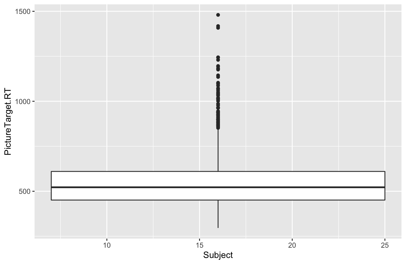
We expected 12 different boxplots (one per subject), but we got only one, along with a terse warning. What happened? This unexpected behavior is a symptom of a deeper problem: the x variable in a boxplot should be categorical, but R thinks that Subject is numerical—which, despite being wrong, is actually quite a reasonable inference, since Subject is coded as a number in our data set!
The solution is to explicitly tell R that Subject, despite being a number, is really a categorical variable. And that’s exactly what the factor command does: it explicitly creates a categorical variable based on whatever you feed it. (“factor” is just R’s synonym for categorical variable.) Here’s how it works:
# Tell R that Subject is categorical, not numerical
rxntime = mutate(rxntime, Subject = factor(Subject))
This block of code has mutated the Subject variable in such a way that now R recognizes it to be categorical, rather than numerical. You’re basically telling R: “Don’t treat this number as a number, per se. Instead treat it as a factor, i.e. a set of category labels.”
Once we’ve done this, any R commands that expect a categorical variable will work as expected. For example, here’s that same block of code from above, where we tried to make a boxplot of reaction time by Subject:
ggplot(rxntime) +
  geom_boxplot(aes(x=Subject, y=PictureTarget.RT))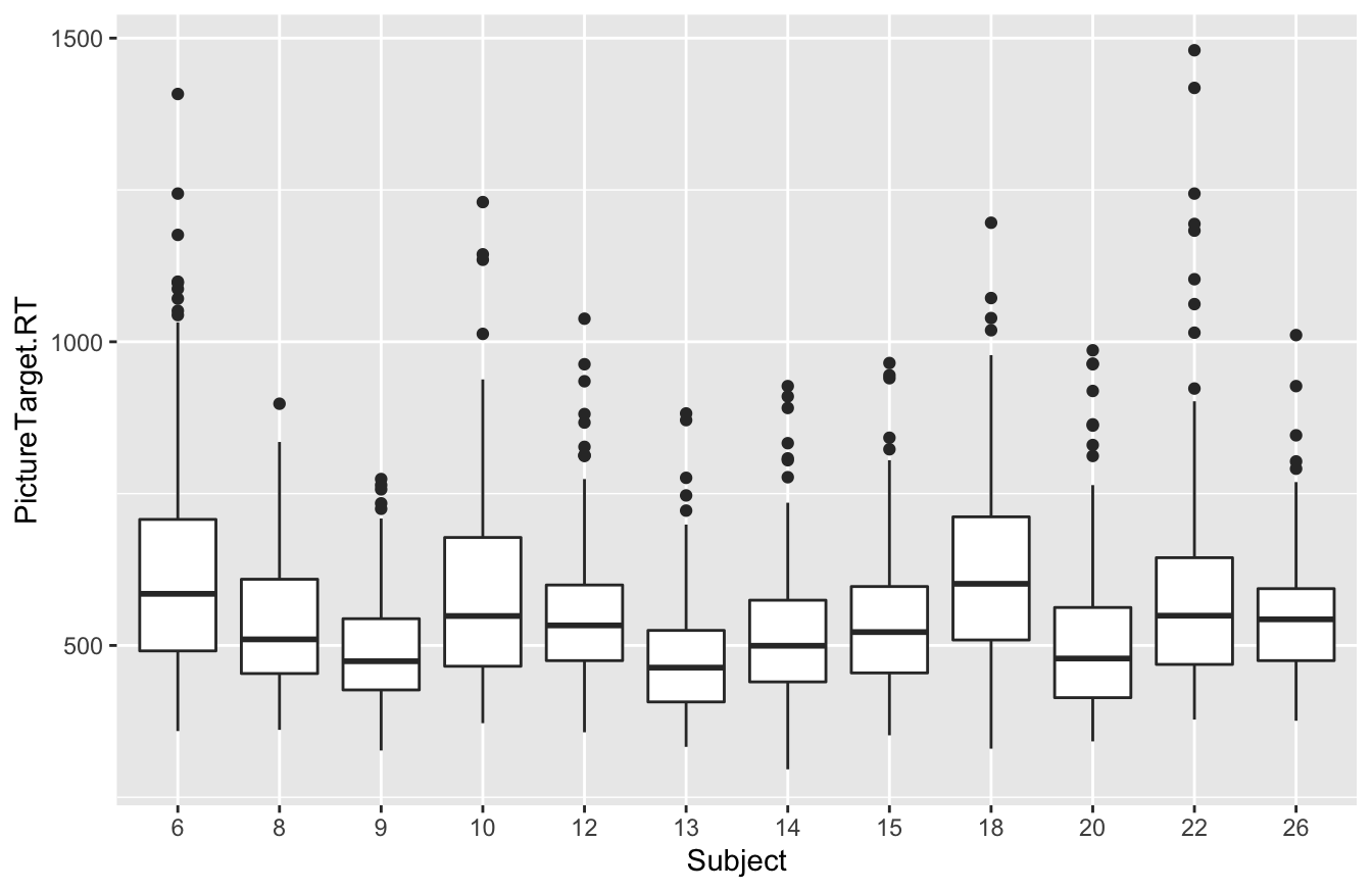
Now it works just fine, because we used factor to tell R that Subject was actually a categorical variable.
Model 2: adding subject-level effects
At this point, we’re ready to build our model. It’s as simple as adding Subject as a predictor to our model-fitting statement in R, on the right-hand side of the tilde (~):
games_model2 = lm(PictureTarget.RT ~ FarAway + Littered + Subject, data=rxntime)Now let’s examine the coefficients of this model:
coef(games_model2) %>%
  round(0)
## (Intercept) FarAway Littered Subject8 Subject9 Subject10 Subject12 Subject13 Subject14 Subject15
## 560 50 87 -90 -136 -44 -76 -147 -112 -93
## Subject18 Subject20 Subject22 Subject26
## -8 -118 -34 -79That’s a lot of coefficients! Let’s review what’s going on here: When we fit our model using Subject as a predictor, behind the scenes R picks one specific subject as the baseline (whichever label comes first alphabetically, which here is Subject 6). It then creates a dummy variable for every other level of the Subject variable.
- For example, there’s one dummy variable called
Subject8that takes the value 1 for all rows involving Subject 8, and 0 for all other rows.
- There’s another dummy variable called
Subject9that takes the value 1 for all rows involving Subject 9, and 0 for all other rows.
- And so on for all other subjects except Subject 6 (who corresponds to the baseline).
- There are also dummy variables for FarAway and Littered, just like we had in our previous model.
Effectively what we’ve done is go from a data frame that looks like this, with Subject encoded as a numerical label:
| FarAway | Littered | Subject |
|---|---|---|
| 0 | 1 | 6 |
| 1 | 1 | 8 |
| 0 | 1 | 9 |
| 0 | 1 | 13 |
| 0 | 1 | 13 |
| 0 | 0 | 14 |
| 0 | 0 | 14 |
| 1 | 1 | 15 |
| 0 | 0 | 18 |
| 0 | 0 | 26 |
To a much wider data frame that looks like this, with Subject encoded as a bunch of dummy variables:
| FarAway | Littered | Subj6 | Subj8 | Subj9 | Subj10 | Subj12 | Subj13 | Subj14 | Subj15 | Subj18 | Subj20 | Subj22 | Subj26 |
|---|---|---|---|---|---|---|---|---|---|---|---|---|---|
| 0 | 1 | 1 | 0 | 0 | 0 | 0 | 0 | 0 | 0 | 0 | 0 | 0 | 0 |
| 1 | 1 | 0 | 1 | 0 | 0 | 0 | 0 | 0 | 0 | 0 | 0 | 0 | 0 |
| 0 | 1 | 0 | 0 | 1 | 0 | 0 | 0 | 0 | 0 | 0 | 0 | 0 | 0 |
| 0 | 1 | 0 | 0 | 0 | 0 | 0 | 1 | 0 | 0 | 0 | 0 | 0 | 0 |
| 0 | 1 | 0 | 0 | 0 | 0 | 0 | 1 | 0 | 0 | 0 | 0 | 0 | 0 |
| 0 | 0 | 0 | 0 | 0 | 0 | 0 | 0 | 1 | 0 | 0 | 0 | 0 | 0 |
| 0 | 0 | 0 | 0 | 0 | 0 | 0 | 0 | 1 | 0 | 0 | 0 | 0 | 0 |
| 1 | 1 | 0 | 0 | 0 | 0 | 0 | 0 | 0 | 1 | 0 | 0 | 0 | 0 |
| 0 | 0 | 0 | 0 | 0 | 0 | 0 | 0 | 0 | 0 | 1 | 0 | 0 | 0 |
| 0 | 0 | 0 | 0 | 0 | 0 | 0 | 0 | 0 | 0 | 0 | 0 | 0 | 1 |
R then finds the best-fitting equation based on all these dummy variables, which turns out to be:
\[
\hat{y} = 562 + 50 \cdot \mbox{FarAway} + 87 \cdot \mbox{Littered} - 90 \cdot \mbox{Subject8} - \cdots - 79 \cdot \mbox{Subject26}
\]
where the \(\cdots\) indicates all the other Subject-specific terms that I’ve left out to make the equation fit on one line.
Let’s now focus on interpreting each of these fitted coefficients.
- The
Intercept, or baseline, corresponds to the expected value of \(y\) when all the variables in the equation take the value 0. To see this, observe that if we plug in 0 for every single variable, we get: \[ \begin{aligned} \hat{y} &= 562 + 50 \cdot 0 + 87 \cdot 0 - 90 \cdot 0 - \cdots - 79 \cdot 0 \\ &= 562 \end{aligned} \] - Concretely, the baseline value of 562 corresponds to the average response time for Subject 6 when viewing scenes where FarAway=0 and Littered=0. How do we know that the baseline corresponds to Subject 6? Because they come first alphabetically, and because there’s a dummy variable for every subject except Subject 6. (Remember our heights example: when we had Simone Biles as our baseline, we needed offsets for JJ Watt and Yao Ming, but we didn’t need an offset for Biles herself.)
- All other coefficients in the model correspond to offsets. They are what we add to the baseline to produce \(\hat{y}\) when a particular dummy variable is “on.”
To help fix this interpretation in your mind, let’s work through a couple of specific cases. What, for example, does this model say \(\hat{y}\) is when Subject 12 views a scene where Littered = 1 and FarAway = 0? In that case, we plug the following variables into our fitted equation:
- 1 for
Littered
- 0 for
FarAway
- 1 for
Subject12
- 0 for all other subject dummy variables.
The resulting fitted value is:
\[ \begin{aligned} \hat{y} &= 562 + 87 \cdot 1 - 76 \cdot 1 \\ &= 573 \end{aligned} \]
The offset of 87 comes from the Littered=1 term in our equation. The offset of -76 comes from the Subject12=1 term in our equation. And all other coefficients get annihilated when we multiply them by their corresponding dummy variables, which are all 0.
Let’s try a second example. What does our model say \(\hat{y}\) is when Subject 18 views a scene where Littered = 1 and FarAway = 1? Now we plug the following variables into our fitted equation:
- 1 for
Littered
- 1 for
FarAway
- 1 for
Subject18
- 0 for all other subject dummy variables.
The resulting fitted value is:
\[ \begin{aligned} \hat{y} &= 562 + 50 \cdot 1 + 87 \cdot 1 - 8 \cdot 1 \\ &= 691 \end{aligned} \]
The offsets of 50 and 87 come from the FarAway=1 and Littered=1 terms in our equation, respectively. The offset of -8 comes from the Subject18=1 term. And as before, all other coefficients get annihilated when we multiply them by their corresponding dummy variables, which are all 0.
To recap what we’ve learned:
- If you have a categorical variable with 2 levels (e.g. near versus far away), you represent it with 1 dummy variable. This can initially seem confusing, but remember: one level of your categorical variable corresponds to the baseline, and so you need only one offset (and therefore one dummy variable) to represent the other level.
- More generally, if your categorical variable has more than two levels, you represent it in terms of more than one dummy variable. Specifically, for a categorical variable with K levels, you will need K-1 dummy variables, and at most one of these K−1 dummy variables is ever “active” (i.e. equal to 1) for a given row of your data frame. In our video games example, we had 12 subjects. Subject 6 corresponded to the baseline, while the other 11 subjects all had their own dummy variables.
14.4 Interactions
What’s an interaction?
We use the term interaction in data science to describe situations where the effect of some predictor variable on the outcome \(y\) is context-specific. For example, suppose that we ask some cyclists to rate the difficulty of various biking situations on a 10-point scale, and they come up with the following numbers:
- Biking on flat ground in a low gear: easy (say 2 out of 10)
- Biking on flat ground in a high gear: a bit hard (4 out of 10)
- Biking uphill in a low gear: medium hard (5 out of 10)
- Biking uphill in a high gear: very hard (9 out of 10)
So what’s the “effect” of gear, i.e. changing the gear from low to high, on difficulty? There is no one answer. It depends on context! You have to compare high-gear difficulty versus low-gear difficulty in two separate situations:
- On flat ground: “high gear” effect = 4 - 2 = 2.
- Uphill: “high gear” effect = 9 - 5 = 4.
So one feature (slope is flat vs. uphill) changes how another feature (gear is low vs. high) affects y. The numerical effect of gear on difficulty (\(y\)) is context-specific. That’s an interaction—specifically, an interaction between gear and slope.
Interactions play a massive role in data science. They are important for making good predictions based on data, and they come up literally everywhere. For example, take the weather. What’s the effect of a 5 mph breeze on comfort? It depends!
- When it’s hot outside, a 5 mph breeze makes life more pleasant.
- When it’s freezing outside, a 5 mph breeze makes life more miserable.
So the effect of the wind on comfort is context-specific. That’s an interaction between wind speed and temperature.
Or take the example of pain medication: what’s the effect of two Tylenol pills on a headache? It depends!
- This dose will most likely help a headache in a 165 pound adult human being.
- What about the effect of that same dose on a 13,000 pound African elephant?
So the effect of Tylenol on pain is context-specific. That’s an interaction between dosage level and body weight.
When we talk about modeling interactions, we’re trying to capture these context-specific phenomena. That is, we’re trying to account for the fact that the joint effect of two predictor variables may not be reducible to the sum of the individual effects. The ancient Greeks referred to this idea as “synergia,” which roughly means “working together.” It’s the origin of the English word “synergy,” and it’s what people mean when they say that “the whole is greater than the sum of the parts.” (Although examples of the whole being worse than the sum of the parts are equally common: ill-conceived corporate mergers, Tylenol and alcohol, Congress, and so forth. If wanted to sound like a corporate buffoon, you might refer to these as “negative synergies.”)
Example 1: Back to video games
Let’s see how these ideas play out in the context of our video-games data. A key assumption of the model we fit in the previous section is that the Littered and FarAway variables are separable in terms of how they affect reaction time. That is, if we want to compute the joint effect of both variables, we simply add the individual effects together. No synergy, no interaction. The effect of Littered doesn’t depend on the value of FarAway, and vice versa.
This was an assumption. But what if it’s wrong? That is, what if the effects of the Littered and FarAway variables aren’t separable? We might instead believe that there’s something different about scenes that are both littered and far away that cannot be described by just summing the two individual effects. In other words, what if we believed that the effect of Littered on reaction time depended on whether the stimulus was FarAway, and vice versa? (Why we might believe that isn’t important right now—let’s just pretend that a neuroscientist told us, or that we just strongly suspected it on the basis of our own experience.)
In statistics, we can model this phenomenon by including an interaction term between the Littered and FarAway variables. (For the moment, just to get the idea of an interaction across, we’ll ignore the subject-level effects.) In R, we can fit an interaction term using the code block below. The colon (:) tells R to include an interaction term between FarAway and Littered:
games_model3 = lm(PictureTarget.RT ~ FarAway + Littered + FarAway:Littered, data=rxntime)
coef(games_model3) %>%
  round(0)
## (Intercept) FarAway Littered FarAway:Littered
## 491 31 68 39This model now has four pieces to it: a baseline (or “intercept”), two main effects (one for FarAway and one for Littered), and an interaction term. A main effect represents the effect of a single variable in isolation. An interaction corresponds to the product of the two variables and represents the synergistic effect of having both variables “active” (i.e. 1) at the same time. Mathematically speaking, we’ve fit the following equation for average reaction time:
\[ \hat{y} = 491 + 31 \cdot \mbox{FarAway} + 68 \cdot \mbox{Littered} + 39 \cdot \mbox{FarAway} \cdot \mbox{Littered} \]
We can interpret the individual terms in this equation as follows:
- The baseline reaction time for scenes that are neither littered nor far away is 491 milliseconds (ms).
- The main effect for the
FarAwayvariable is 31 ms. This is the effect ofFarAwayin isolation.
- The main effect for the
Litteredvariable is 68 ms. This is the effect ofLitteredin isolation.
- The interaction effect for
FarAwayandLitteredis 39 ms. In other words, scenes that are both littered and far away yield average reaction times that are 39 milliseconds slower than what you would expect from summing the individual “isolated” effects of the two variables.
This single equation encodes all four possible combinations of the two dummy variables. Specifically, it says that:
- If FarAway=0 and Littered=0, \(\hat{y} = 491\).
- If FarAway=1 and Littered=0, \(\hat{y} = 491 + 31 = 522\).
- If FarAway=0 and Littered=1, \(\hat{y} = 491 + 68 = 559\).
- If FarAway=1 and Littered=1, \(\hat{y} = 491 + 31 + 68 + 39 = 629\).
A key point regarding the fourth case in this list is that, when a scene is both littered and far away, both the main effects and the interaction term enter the equation for the fitted value. That is, each variable contributes its own main effect in isolation, and they also contribute an extra (synergistic) effect when they occur together. That “extra” is called the “interaction term,” and it’s what gets us context-specific effects. It implies that the marginal effect of the FarAway variable on reaction time depends on whether Littered=0 or Littered=1. Similarly, the marginal effect of the Littered variable on reaction time depends on whether FarAway=0 or FarAway=1.
When to include interactions
The key thing to emphasize is that the decision to include an interaction is a modeling choice. It’s up to you to choose wisely!
So when should you include an interaction term in your model? The essence of the choice is actually quite simple. If a variable affects the response \(y\) in a similar way under a broad range of conditions, regardless of what values the other variables take, then that variable warrants only a main effect in our model. But if a variable’s effect on \(y\) is contingent on some other variable, we should include an interaction between those two variables.
This choice should ideally be guided by knowledge of the problem at hand. For example, in a rowing race, a strong headwind makes all crews slower. But wind affects lighter crews more than heavier crews: that is, the strength of the wind effect is contingent on the weight of the crew. Thus if we want to build a model to predict the winner of an important race, like the one between Oxford and Cambridge every spring on the Thames in London, we should strongly consider including an interaction between wind speed and crew weight. This is something that anyone with knowledge of rowing could suggest, even before seeing any data.
But the choice of whether to include an interaction term in a model can also be guided by the data itself. For example, let’s return to our model of the video-games data that included an interaction. You’ll recall we fit this model with the following statement:
games_model3 = lm(PictureTarget.RT ~ FarAway + Littered + FarAway:Littered, data=rxntime)Let’s now look at confidence intervals for the coefficients in this model:
confint(games_model3, level = 0.95) %>% round(0)## 2.5 % 97.5 %
## (Intercept) 479 503
## FarAway 14 47
## Littered 51 85
## FarAway:Littered 15 63You’ll notice that the confidence interval for the interaction term goes from 15 to 63. In other words, we’re pretty sure based on our sample that this interaction term is positive, and in particular that it isn’t likely to be zero. Moreover, the actual size of the estimated interaction effect (about 40 ms) is roughly 8% of a typical person’s baseline reaction time in this study (about 500 ms). While not enormous, this effect isn’t tiny, either. It looks both statistically significant and practically significant. (Recall Statistical vs. practical significance.) This is a perfectly fine reason to prefer the model with the interaction term, versus the model we fit in the previous section that had main effects only, i.e. this model:
games_model = lm(PictureTarget.RT ~ FarAway + Littered, data=rxntime)In fact, if you’re ever in doubt about whether to include an interaction, a decent approach is:
- Fit a model with the interaction you’re unsure about.
- Look at the confidence interval for that interaction term. If the interaction looks practically significant, statistically significant, or both, you should probably keep it.
This isn’t the only way to decide whether to include an interaction term in your model, but it’s a sensible way.
Here’s one final generic guideline about interactions: it is highly unusual to include an interaction in a regression model without also including both corresponding main effects. There are various technical math reasons why most textbooks warn you about this, and why I’m doing so now. But the most important concern is that it is very difficult to interpret a model having interaction terms but no main effects. You should fit such a model only if you have a very good reason.
Example 2: Recidivism and employment
Let’s see a second example. The data in recid.csv contains a sample of 432 inmates released from Maryland state prisons. We’ll look at this data to examine how employment status predicts recividism—that is, whether getting a job upon release affects the likelihood that someone will end up back in prison within the next year.
Go ahead and download the data set and get it imported into RStudio. The first five lines of the data frame look like this:
head(recid, 5)## arrest highschool fin emp1
## 1 1 no no no
## 2 1 no no no
## 3 1 no no no
## 4 0 yes yes no
## 5 0 no no noEach row corresponds to a single released inmate (so inmate is our unit of analysis here.) The four variables in the data set are as follows:
arrest: a binary (0-or-1) variable indicating whether the released inmate was re-arrested within 52 weeks after their release from prison. This is our outcome variable that measures recidivism.
highschool: a categorical variable indicating whether the inmate had a high school diploma prior to their incarceration.
fin: a categorical variable indicating whether the inmate had attended a financial literary training course while incarcerated.
emp1: a categorical variable indicated whether the inmate was employed within one week after their release.
Here the outcome \(y\) is itself a 0/1 variable, where 1 means “yes” (i.e. the inmate was re-arrested). That’s a little bit non-standard, but perfectly OK! We can write out regression equations for 0/1 outcomes as well; the results should be interpreted as proportions.
Some initial exploration of the data suggests that both emp1 and highscool predict recidivism. Here’s a bar plot of re-arrest rates by employment status and high-school diploma:
recid_summary = recid %>%
  group_by(emp1, highschool) %>%
  summarize(mean_arrest = mean(arrest))

ggplot(recid_summary) +
  geom_col(aes(x=emp1, y=mean_arrest, fill=highschool), position='dodge')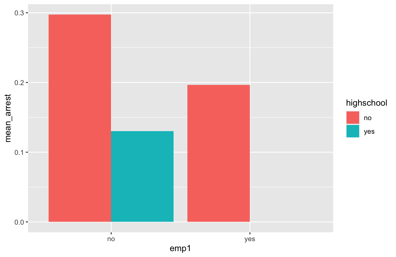
So it appears from this bar plot that re-arrest rates are lower for those with high-school diplomas and for those who are employed within one week of release. (In fact, the re-arrest rate for those with both a diploma and a job looks to be zero.)
In light of this bar plot, let’s fit a model that includes the following terms:
- a main effect for
highschool.
- a main effect for
emp1.
- an interaction between
highschoolandemp1. This will allow us to assess if the effect of employment on recidivism is context-specific, i.e. if it depends on whether someone has a high-school diploma.
Here’s our model statement in R, along with the fitted coefficients:
recid_model1 = lm(arrest ~ emp1 + highschool + emp1:highschool, data=recid)
coef(recid_model1) %>%
  round(2)
## (Intercept) emp1yes highschoolyes emp1yes:highschoolyes
## 0.30 -0.10 -0.17 -0.03Note that R has taken our categorical variables (emp1 and highschool, provided as yes/no answers) and encoded them as dummy variables (emp1yes and highschoolyes, coded as 0 or 1). Now let’s interpret these coefficients.
- The baseline re-arrest rate when
emp1yes=0andhighschoolyes=0is 0.3, i.e. 30%.
- When
emp1yes=1andhighschoolyes=0, the average re-arrest rate is changed by -0.1 (10% lower).
- When
emp1yes=0andhighschoolyes=1, the average re-arrest rate is changed by -0.17 (17% lower).
- When
emp1yes=1andhighschoolyes=1, the average re-arrest rate is changed by \(-0.1 - 0.17 - 0.03 = -0.3\), i.e. 30% lower. Remember, when both dummy variables are equal to 1, we add both the main effects for each variable as well as the interaction between those variables to form their combined effect.
This interaction term would seem to suggest that the effect of employment on recividism is stronger (i.e. more negative) for those with a high-school diploma. However, we probably want to be careful in interpreting that interaction term. When we ask R to give us confidence intervals for these model terms, we notice that the interval for the interaction effect is super wide:
confint(recid_model1)## 2.5 % 97.5 %
## (Intercept) 0.2498404 0.34525159
## emp1yes -0.2257142 0.02347935
## highschoolyes -0.3027743 -0.03144813
## emp1yes:highschoolyes -0.4952922 0.43665750It goes from -0.5 to nearly +0.5, which is nearly useless! In effect, the confidence interval is telling us that we really can’t estimate the value of the interaction term with any precision. The reason for this is we have only four inmates in our sample with both a high-school diploma and a job within one week of release:
xtabs(~emp1 + highschool, data=recid)## highschool
## emp1 no yes
## no 326 46
## yes 56 4This limits our ability to contrast the “employment effect” for those with versus without a high-school diploma. So while it might be the case the the effect of employment on recidivism rates depends on high-school diploma status, this data set isn’t really capable of telling us. We’d probably be better off dropping the interaction term from our model and fitting one with main effects only, like this:
recid_model2 = lm(arrest ~ emp1 + highschool, data=recid)
confint(recid_model2) %>%
  round(2)
## 2.5 % 97.5 %
## (Intercept) 0.25 0.35
## emp1yes -0.22 0.02
## highschoolyes -0.30 -0.0414.5 ANOVA: the analysis of variance
The analysis of variance, or ANOVA, is a way of attributing “credit” to individual variables in your model. Historically, it was an important tool used to analyze the differences among means arising from what are called “factorial” experiments, which involve multiple categorical variables (“factors”) that are experimentally manipulated. The video-games data is a perfect example of such a factorial experiment, since it involves more than one experimental factor that was manipulated from trial to trial (both Littered and FarAway).
Let’s see an example of ANOVA in action. Now that we understand about interactions from the previous section, we’ll revisit our video-games data and build a model for reaction time (PictureTarget.RT) with the following variables in it:
- an effect due to visual clutter (
Littered).
- an effect due to distance of the stimulus in the scene (
FarAway).
- effects due to differences among experimental subjects (
Subject, encoded as multiple dummy variables).
- an interaction effect (synergy) between
LitteredandFarAway.
You’ll recall that we had temporarily dropped the Subject variable when introducing the idea of an interaction, just to simplify the presentation; now we’re adding it back in. Here’s how to fit this model fit in R, with all of these variables (and the interaction) included as predictors on the right-hand side of the regression equation:
games_model4 = lm(PictureTarget.RT ~ FarAway + Littered + Subject + FarAway:Littered, data=rxntime) The starting point for an analysis of variance is to ask a question that we’ve already learned how to answer: how well does this model predict reaction time? To answer that, let’s return to the topic of Decomposing variation, from the lesson on Fitting equations. There, we learned about \(R^2\), which measured the proportion of overall variation in the \(y\) variable (here, reaction time) can be predicted using a linear regression on the \(x\) variables? You might recall these basic facts about \(R^2\):
- It’s always between 0 and 1.
- 1 means that all variation in \(y\) is predictable using the \(x\) variables in the regression.
- 0 means no linear relationship: all variation in \(y\) is unpredictable (at least, unpredictable using a regression on the \(x\) variables).
So let’s compute the value of \(R^2\) for our model above, using the rsquared function from the mosaic library:
rsquared(games_model4)## [1] 0.2327839The \(R^2\) for this model is about \(0.23\). This tells us something about the overall predictive power of the model: 23% of the variation in reaction time in accounted for by the predictor variables in the model. The remaining 77% is residual variation, i.e. unexplained trial-to-trial differences.
But in ANOVA, we go one step further, by attempting to say something about the predictive power of the individual variables within this model, and not merely the whole model itself. As you’ll see, an analysis of variance really boils down to a simple book-keeping exercise. To run an ANOVA, we build our model one step at time, adding one new variable (or one new interaction among variables) at each step. Every time we do this, we ask a simple question: By how much did we improve the predictive power of the model when we added this variable?
There are actually a lot of ways to answer this question, but this simplest way is just to track \(R^2\) as we build the model one step at a time. \(R^2\) will always go up as a result of adding a variable to a model. In ANOVA, we keep track of the precise numerical value of this improvement in \(R^2\). For reasons not worth going into, statisticians usually use the term “\(\eta^2\)” to refer to this change in \(R^2\). Here \(\eta\) is the Greek letter “eta,” so you’d read this allowed as “eta-squared.”57
To actually run an ANOVA in R, we need to install the effectsize library. (If you’ve forgotten how, revisit our lesson on Installing a library.) Once you’ve got this library installed, load it like this:
library(effectsize)This library has a function called eta_squared that will compute the measure we need. You call eta_squared by passing it a fitted model object, like you see below. (Don’t forget to add partial = FALSE.)
eta_squared(games_model4, partial=FALSE)## # Effect Size for ANOVA (Type I)
##
## Parameter | Eta2 | 95% CI
## ------------------------------------------
## FarAway | 0.03 | [0.02, 1.00]
## Littered | 0.09 | [0.07, 1.00]
## Subject | 0.10 | [0.08, 1.00]
## FarAway:Littered | 4.69e-03 | [0.00, 1.00]
##
## - One-sided CIs: upper bound fixed at (1).The result is (a simple version of) what we call an “ANOVA table.” Let’s focus on the column labeled Eta2, which is our \(\eta^2\) measure—that is, it measures change in \(R^2\) as we add variables to a model. This column reads as follows:
- First we started with a model for reaction time that has only the
FarAwayvariable in it (PictureTarget.RT ~ FarAway) The \(R^2\) of this model is 0.03, so thatFarAwayvariable accounts for 3% of the total variation in subjects’ reaction time in this experiment.
- Next, we add
Litteredto the model, so now we havePictureTarget.RT ~ FarAway + Littered. The improvement in \(R^2\) is 0.09, soLitteredaccounts for 9% of the total variation in subjects’ reaction time.
- Next, we add
Subjectto the model, so now we havePictureTarget.RT ~ FarAway + Littered + Subject. The improvement in \(R^2\) is 0.10, so subject-level differences account for 10% of the total variation in reaction time in this study.
- Finally, we add the interaction, giving us the model
PictureTarget.RT ~ FarAway + Littered + Subject + FarAway:Littered. The improvement in \(R^2\) is \(4.7 \times 10^{-3}\), or about 0.005. Thus any interaction or “synergy” effects betweenLitteredandFarAwayaccount for about half a percent of the overall variation in reaction times in this study.
And if you add up this individual contributions (0.03 + 0.09 + 0.10 + 0.005), you get the overall \(R^2\) for the model, which was about 0.23 (with minor differences due to rounding).
As you’ve now seen, the analysis of variance (ANOVA) really is just bookkeeping. The change in \(R^2\) at each stage of adding a variable gives us a more nuanced picture of the model, compared with simply quoting an overall \(R^2\), because it allows us to partition credit among the individual predictor variables in the model.
The last thing to remember that the construction of an ANOVA table is inherently sequential. For example, first we add the FarAway variable, which remains in the model at every subsequent step; then we add the Littered variable, which remains in the model at every subsequent step; and so forth. The question being answered at each stage of an analysis of variance is: how much variation in the response can this new variable predict, in the context of what has already been predicted by other variables in the model? In light of that, you might ask, does the order in which you list the variables matter? After all, this order is an entirely arbitrary choice that shouldn’t affect anything, right? Well, let’s check, by naming the variables in a different order:
games_model4_neworder = lm(PictureTarget.RT ~ Subject + FarAway + Littered + FarAway:Littered, data=rxntime)
eta_squared(games_model4_neworder, partial=FALSE)
## # Effect Size for ANOVA (Type I)
##
## Parameter | Eta2 | 95% CI
## ------------------------------------------
## Subject | 0.10 | [0.08, 1.00]
## FarAway | 0.03 | [0.02, 1.00]
## Littered | 0.09 | [0.07, 1.00]
## FarAway:Littered | 4.69e-03 | [0.00, 1.00]
##
## - One-sided CIs: upper bound fixed at (1).Looks like we get the same ANOVA table, just re-arranged. This is re-assuring; it implies that our conclusions aren’t affeceted by the (arbitrary) order in which named the variables.
However, let’s be careful not to over-generalize here. The order in which we added the variables didn’t matter for this problem. But it turns out that this isn’t always true. We’ll cover this point in more detail later, but the reason is that, because this data comes from a well-designed factorial experiment, the individual predictor variables (Littered, FarAway, and Subject) are all uncorrelated with each other. Outside the context of a designed experiment, this won’t always be true, and the order in which you add the variables will change the numbers in the ANOVA table. In fact, in observational studies it’s quite common to encounter data sets with where the predictor variables in a regression model are correlated with each other, and it therefore becomes difficult to determine the effect of each variable in isolation.
We’ll revisit this point in detail in the next lesson. For now, your take-home lessons are these:
- An analysis of variance (ANOVA) attempts to attribute “credit” for predicting variation in \(y\) to each individual variable in a model. It is typically used to analyze factorial experiments, i.e. those involving more than one categorical predictor.
- An ANOVA is conducted by adding the variables sequentially, and tracking how much each addition improves the overall predictive power of the power. A simple way to do this is to track \(\eta^2\), which is the improvement in \(R^2\) with each new variable added.
- ANOVA makes sense when the predictor variables are uncorrelated, in which case the ANOVA table will not depend on the order in which you add the variables. This is common in designed experiments but much less common in observational studies.
- Outside the context of experiments, ANOVA is less useful, because its results become nearly impossible to interpret. We’ll see examples of this soon.
ANOVA is a huge topic in classical statistics, and I’m only scratching the surface here. To those already initiated into the world of ANOVA, I offer the following explanation: introducing ANOVA as “tracking \(R^2\) when we add variables to the model” is obviously a non-standard presentation of this material. Most textbooks begin with something like the table returned by the
anovafunction in R, which tracks sums of squares rather than \(R^2\). Over the years, I’ve noticed that students have a really hard time making sense of that “classic” ANOVA table; the numbers in it are non-intuitively huge, and the units don’t make sense. (Squared milliseconds, anyone?) Besides, the whole business of tracking sums of squares is a historical artifact, driven by the \(F\) statistics that we could compute and do math with in a pre-computer age. (These days, you’d almost surely be better off with a permutation test than an F test.) Starting with \(\eta^2\) is a much better way of introducing this material: the basic idea of tracking \(R^2\) as one sequentially adds variables is quite intuitive, even for beginners. The full ANOVA table can be layered in later, if and when it becomes necessary—i.e. maybe in a psychology PhD program, an agriculture program (where they run factorial experiments every day), or in a graduate course on experimental design.↩︎