Lesson 15 Regression
In this lesson, we continue our discussion of the theme we introduced in the last lesson: building models that incorporate the effect of multiple explanatory variables (x) on a single response (y). In the last lesson, we had only categorical variables as predictors, which we learned to encode using dummies. In this lesson, we learn about multiple regression models, which incorporate arbitrary combinations of categorical and numerical variables as predictors.
Most applications of regression will fall into one of two use cases:
Explanation. Here we want to understand and explain the relationships in the data. What’s driving our outcome of interest? Is one variable a stronger predictor than the other? Could we attribute what we’re seeing to causation? Our goal is to tell a story: what are we seeing in the data and why?
Prediction. Here we want to predict some \(y\) variable—maybe the price of a house or the number of flu cases we expect to see next week—using information from a set of predictors (\(x\) variables). But we don’t care all that much about telling a story or understanding how the variables relate to each other. We care only about making accurate predictions. It’s OK if our model is a non-interpretable black box.
We’ll soon come to an entire lesson on Prediction that covers the second use case. But in the rest of this lesson, we’ll focus on the first use case: using regression to explain the variation we see in the data.
This is a long lesson, one that covers many core topics in modern data science. So give yourself some time to make it all the way through. Here you’ll learn:
- how “baseline/offset form” extends to situations involving a numerical predictor.
- how correlation among predictor variables leads to causal confusion.
- to understand the difference between overall and partial relationships between variables.
- to interpret interactions between numerical and categorical predictors.
- to fit, interpret, and summarize multiple regression models.
- to use regression to answer real-world questions of interest.
- how to think through the question of what variables to include in a regression model.
15.1 Numerical and grouping variables together
Example 1: causal confusion in house prices
In house.csv, we have data on 128 houses in 3 different neighborhoods in Ames, Iowa. The question we’ll seek to answer here is: how much does an extra square foot of space add to the value of a house in this market? Go ahead and download the data, get it imported into R, and load the tidyverse and mosaic libraries, which you’ll need for this whole lesson.
The first six lines of the data set should look like:
head(house)## home nbhd sqft price
## 1 1 nbhd02 1790 114300
## 2 2 nbhd02 2030 114200
## 3 3 nbhd02 1740 114800
## 4 4 nbhd02 1980 94700
## 5 5 nbhd02 2130 119800
## 6 6 nbhd01 1780 114600The four columns here are:
home, a numerical ID for each house.
nbhd, a categorical variable indicating which of three neighborhoods the house is in.
sqft, the size of the house in square feet.
price, the selling price of the house in dollars. These are old data so these are 1990s prices!
A good starting point here would be to look at a scatter plot of price versus size, using geom_smooth to add a trend line:
ggplot(house, aes(x=sqft, y=price)) +
  geom_point() +
  geom_smooth(method='lm', color='black')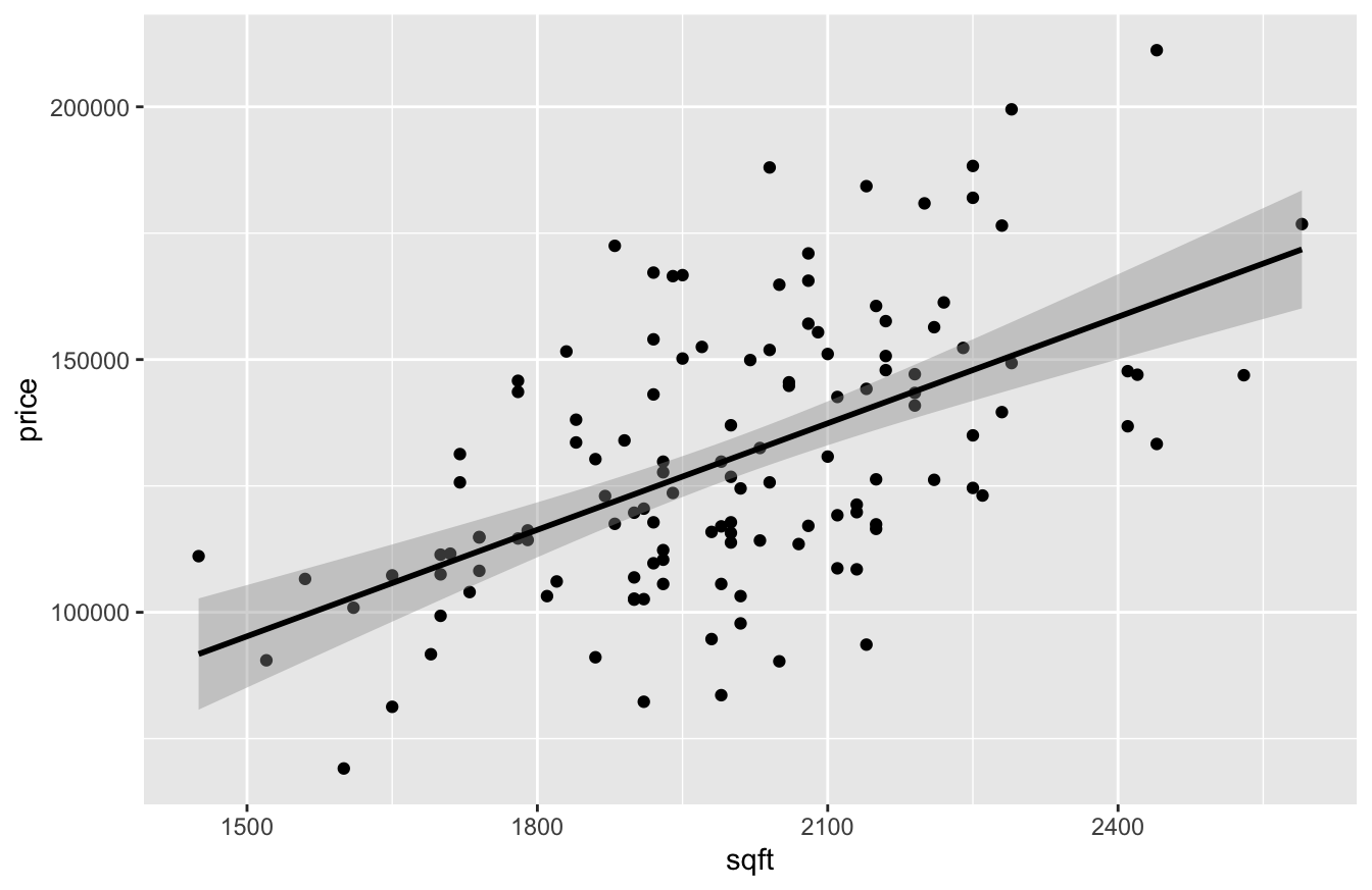
Looks pretty straightforward: bigger houses sell for more, on average. How much more? Let’s fit a linear regression model to find out:
lm0 = lm(price ~ sqft, data=house)
coef(lm0) %>% round(0)
## (Intercept) sqft
## -10091 70Looks like the slope on sqft is about 70, implying that each additional square foot of living area adds $70 of value to a house in this market, on average.
But not so fast. Notice that we actually have three different neighborhoods in this data, indicated by the nbhd variable. So let’s see what happens when examine each neighborhood separately, using three different colors to represent the houses in each neighborhood:
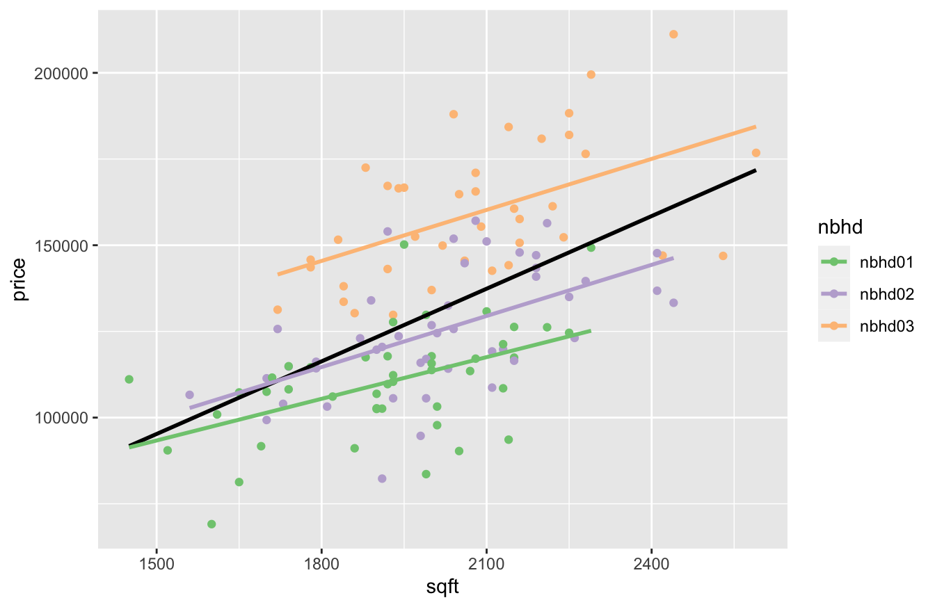
In the figure above, the black line shows the relationship between square footage and price across neighborhoods; that’s our original $70-per-square-foot slope from the model above. The three colored lines, on the other hand, show the the relationship between square footage and price within each neighborhood. Clearly the black line is steeper than the trend within any of the three individual neighborhoods. How can this be? It might remind you of the aggregation paradoxes we saw in our discussion of “The unit of analysis.” You get one answer if you group and fit across neighborhoods, but a different answer if you ungroup and fit within neighborhoods. Why, and which one is right?
Well, in a narrow sense, both fits are right; it’s simply that they’re answering different questions. When we run the “across-neighborhood” regression of price vs. square footage (black line), we may think we are just comparing houses of different sizes, but we are also implicitly comparing neighborhoods. And comparing two houses of different sizes in the same neighborhood is different than comparing two houses of different sizes in different neighborhoods. To emphasize this point, let’s look at the average size and price for houses in all of these neighborhoods:
house %>%
  group_by(nbhd) %>%
  summarize(mean(price), mean(sqft))
## # A tibble: 3 × 3
## nbhd `mean(price)` `mean(sqft)`
## <chr> <dbl> <dbl>
## 1 nbhd01 110155. 1917.
## 2 nbhd02 125231. 2014
## 3 nbhd03 159295. 2081.The neighborhoods differ in both their typical house size and their typical price. Moreover, some of these price differences between neighborhoods are likely due to other non-size factors. Perhaps, for example, neighborhood 3 might be closer to the center of town or have more amenities; if so, it might command a price premium for reasons having nothing to do with the size of its houses. Said another way, the neighborhood variable is a confounder for the relationship between square footage and price: it’s something that affects price on its own terms, but is also correlated with size (since the three neighborhoods have different average sizes).58
This illustrates a major take-home lesson of this section, and of this book more generally: correlation among predictor variables leads to causal confusion. Our naive analysis of price versus size confused the effect of size with the effect of neighborhood, because size and neighborhood are correlated. What we thought were differences in price driven by size were, in fact, partially attributable to differences in neighborhood—differences that we didn’t account for.
In order to account for these neighborhood-level differences, we need to explicitly include the nbhd variable in our model, like so:
lm1 = lm(price ~ sqft + nbhd, data=house)
coef(lm1) %>% round(0)
## (Intercept) sqft nbhdnbhd02 nbhdnbhd03
## 21241 46 10569 41535Our fitted regression equation now involves an intercept, a slope on square footage, and two dummy variables (for nbhd02 and nbhd03):
\[ \mbox{price} = 21241 + 46 \cdot \mbox{sqft} + 10569 \cdot \mbox{nbhd02} + 41535 \cdot \mbox{nbhd03} \]
To interpret these numbers, we need to combine what we know about Using and interpreting regression models with what we know about Baseline/offset form. Let’s go piece by piece:
- The
Interceptof 21241 is our baseline. It’s awkward to interpret here because it represents the price that we would expect when all variables take the value 0—in other words, for a house with 0 square feet in neighborhood 1.
- Notice that the
sqftslope of 46 is now lower once we’ve accounted for neighborhood effects (it was 70 in our simple linear model). This is telling us that when we compare houses of different sizes within the same neighborhood, an additional square foot of living area is associated with an extra $46 in value.
- We can interpret the
nbhd02andnbhd03dummy coefficients as shifting the whole regression line up from thenbhd01baseline:- the
nbhd02coefficient of 10569 represents the effect of being in neighborhood 2, adjusting for or conditioning on size. It looks like houses in neighborhood 2 are about $10,600 more expensive than a similarly sized house in neighborhood 1 (our baseline).
- the
nbhd03coefficient of 41535 represents the effect of being in neighborhood 3, adjusting for adjusting for or conditioning on size. It looks like houses in neighborhood 3 are about $41,500 more expensive than a similarly sized house in neighborhood 1 (our baseline).
- the
You can visualize this in the plot below, where we’ve now deleted the misleading “across-neighborhood” regression line:
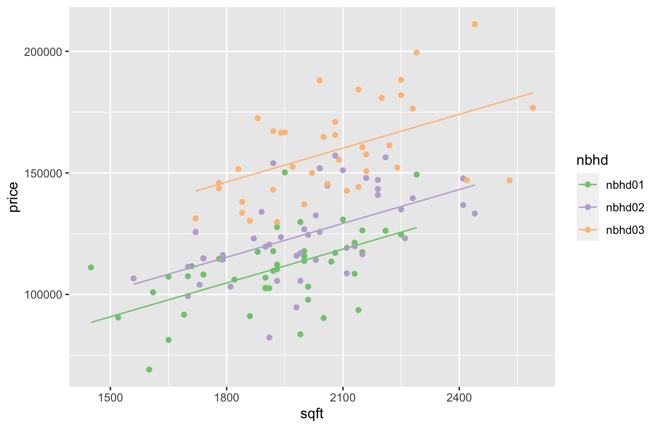
What we see here are three separate linear fits, for three separate neighborhoods, represented by a single regression equation:
- The fit for neighborhood 1 is \(\mbox{price} = 21241 + 46 \cdot \mbox{sqft}\).
- The fit for neighborhood 2 is \(\mbox{price} = (21241 + 10569) + 46 \cdot \mbox{sqft}\). The whole line is shifted up by 10569, the coefficient on the
nnbhd02dummy variable.
- The fit for neighborhood 3 is \(\mbox{price} = (21241 + 41535) + 46 \cdot \mbox{sqft}\). The whole line is shifted up by 41535, the coefficient on the
nnbhd03dummy variable.
These lines are parallel, because they all have the same slope, but different intercepts. Those dummy variable coefficients for the different neighorhoods are what shift the intercept up or down from the baseline.
Partial vs. overall relationships
This example illustrates the major theme of this lesson: a multiple regression equation estimates a set of partial relationships between \(y\) and each of the predictor variables included in the model. By a partial relationship, we mean the relationship between \(y\) and a single predictor variable, holding other the predictor variables constant. The partial relationship between \(y\) and some \(x\) is very different than the overall relationship between \(y\) and \(x\), because the latter ignores the simultaneous effects of the other variables in describing how changes in \(x\) predict changes in \(y\).
- Partial relationship: how changes in \(x\) predict changes in \(y\), holding other variables constant.
- Overall relationship: how changes in \(x\) predict changes in \(y\), letting the other variables change as they might.
In our house-price data set, the overall relationship between price and size is $70 per square foot—that’s what we got from our first regression, lm(price ~ sqft). This regression does provide an accurate answer to a very specific question. Imagine that I show you two houses, one of them 100 square feet larger, but that I don’t tell you which neighborhoods the two houses are in. Would you expect to pay about \(70 \cdot 100 = \$7000\) more for the bigger house? Based on the regression: yes, you would.
But if want to compare houses in the same neighborhood, this regression is misleading! Imagine now that I show you two houses next door to each other, one of them 100 square feet larger. Would you expect to pay \(70 \cdot 100 = \$7000\) more for the bigger house? No! That figure of $70 per square foot comes from a comparison of houses across different neighborhoods with different non-size characteristics. But when you compare two side-by-side houses, one of which is larger, across-neighborhood comparisons of price aren’t relevant. To isolate the “pure” effect of size on price, we need to compare houses of different sizes within neighborhoods.
And that’s exactly what our second regression model, lm(price ~ sqft + nbhd), did: it estimated the partial relationship between price and size, holding neighborhood constant, to be about $46 per square foot. It implies that you’d expect to pay about \(46 \cdot 100 = \$4600\) more for the bigger of those two side-by-side houses, rather than \(\$7000\) more. Including neighborhood in the model helped to resolve our causal confusion, at least partially: we were able to isolate the size effect and neighborhood effect separately in our model.
Watch for unmeasured confounders. Of course, the reason I say that we’ve only partially resolved our causal confusion is that there may be other things we’re still confused about. For example, swimming pools or fancy commercial-grade appliances tend to increase the value of a house, regardless of its size. But what if the bigger houses are more likely to have pools or fancy appliances? If that’s true, then our model of price ~ size + nbhd might still be confusing the size effect with the hidden effect of some of these other amenities that are correlated with size. In regression, this is called the problem of unmeasured confounders. In regression, an unmeasured confounder is a variable that: (1) we don’t have data on; (2) has on an effect on our outcome (\(y\)) variable, and (3) is correlated with one or more of the predictor (\(x\)) variables in our model. Unmeasured confounders lead to causal confusion that is unresolvable by just running a regression, for the simple reason that our model can’t control for variables that we haven’t measured.
The problem of unmeasured confounders is why you’ll often see researchers use the word association rather than effect when describing the results of a regression model, as a way of tacitly acknowledging the possibility of unresolved causal confusion. Association, in this context, is the social scientist’s favorite weasel word: it suggests causation while stopping short of actually claiming it.
The moral of the story is this. If you want to estimate a partial relationship between \(y\) and some particular \(x\), holding some other variables constant, then you need to estimate a multiple regression model that includes those other variables as predictors. So if, for example, we had variables that told us whether each house had a swimming pool or fancy appliances, we’d want to include those in the model as well, to isolate the pure price effect even better. If we don’t have data on those variables, and we think they might be confounders (i.e. correlated with both size and price), then our conclusions about the price–size relationship can only be considered tentative, at best.
Example 2: cheese sales, revisited
In the previous example, we saw that the overall relationship of $70 per square foot was spuriously strong (at least if our goal was to compare side-by-side houses), and that the partial relationship was more like $46 per square foot, once we held neighborhood constant by including it in our regression model. A natural question is: can it happen the other way? That is, can we have a situation where failing to adjust for some confounding variable makes a relationship appear spuriously weak? As we’ll see now, the answer is yes.
Before working through this example, you might want to revisit our discussion of Power laws, specifically our example on estimating a demand curve for milk. There, we learned a few basic facts that are also relevant to this example:
- A demand curve answers the question: as a function of price (P), what quantity (Q) of a good or service do consumers demand? When price goes up, consumers are willing to buy less. But how much less?
- A demand curve is characterized by an elasticity, which represents relative percentage change. If price goes up by 1%, the elasticity tells us how much we should expect demand to go down in percentage terms.
- To estimate an elasticity, we can run a regression for demand versus price on a log-log scale—that is, regressing log(demand) versus log(price) and examining the slope on the log(price) variable.
Let’s put these ideas into action on our Kroger cheese-sales data in kroger.csv, which we saw for the first time in our lesson on Boxplots. Go ahead and load this data into R. The first six lines look this:
head(kroger)## city price vol disp
## 1 Houston 2.48 6834 yes
## 2 Detroit 2.75 5505 no
## 3 Dallas 2.92 3201 no
## 4 Atlanta 2.89 4099 yes
## 5 Cincinnati 2.69 5568 no
## 6 Indianapolis 2.67 4134 yesEach row correspond to a week of sales data for a particular Kroger store. The city variable represents the city of the store, while the price and vol represent price and sales volume in packages of cheese.
We’ll use sales volume as our demand variable to estimate the elasticity. If we run the regression for demand vs. price on a log-log scale, we get a coefficient on log(price) of about -0.9:
lm1_kroger = lm(log(vol) ~ log(price), data=kroger)
coef(lm1_kroger)
## (Intercept) log(price)
## 9.2435126 -0.9286161This implies that a 1% increase in price predicts a 0.9% decrease in demand.
But not so fast! If, for example, the store in Houston were to raise its prices next week by 1%, would we predict a 0.9% drop in demand? No! This is an overall relationship between demand and price, and it involves comparing data points across 11 different stores. Surely store-level differences in demand for cheese might explain some of what we’re seeing in the data. Houstonians, for example, seem notably mad for nacho cheese, while those in Louisville and Birmingham are less so—and it seems unlikely that all of these cross-city differences in demand can be explained purely by the price of cheese:
kroger %>%
  group_by(city) %>%
  summarize(mean_demand = mean(vol), mean_price = round(mean(price), 2)) %>%
  arrange(desc(mean_demand))
## # A tibble: 11 × 3
## city mean_demand mean_price
## <chr> <dbl> <dbl>
## 1 Houston 9796. 2.64
## 2 Cincinnati 6182. 2.75
## 3 Atlanta 5078. 2.83
## 4 Roanoke 5009. 2.52
## 5 Columbus 4636. 2.6
## 6 Detroit 4628. 2.83
## 7 Dallas 4357. 2.95
## 8 Indianapolis 4117. 2.61
## 9 Nashville 3926. 2.4
## 10 Louisville 3335. 2.59
## 11 Birmingham 1912. 2.39These city-level differences lead to causal confusion about the relationship between price and vol. So let’s include city as a variable in our regression model, allowing us to estimate a partial relationship between vol and price, holding city constant. In other words, let’s use within-store comparisons of vol versus price to estimate the elasticity:
lm2_kroger = lm(log(vol) ~ log(price) + city, data=kroger)
coef(lm2_kroger)
## (Intercept) log(price) cityBirmingham cityCincinnati cityColumbus cityDallas cityDetroit
## 10.70619948 -2.14970869 -1.30013440 0.15720940 -0.35043200 -0.18729899 -0.08765513
## cityHouston cityIndianapolis cityLouisville cityNashville cityRoanoke
## 0.53220894 -0.35211975 -0.61580279 -0.58670484 -0.22871972Pay attention to the coefficient on log(price). Now the elasticity looks much steeper: a coefficient of -2.1, versus -0.9 in our previous model. This implies that consumers are more price-sensitive than we previously thought: a 1% increase in the price of cheese seems to be associated with a 2.1% decrease in demand, holding city constant. So if you a were a data scientist at Kroger’s and expected a 1% price increase to yield a 0.9% drop in demand based on the overall relationship, you’d be in for a nasty surprise.
The figure below dramatizes this point. Here we see a scatter plot of log(vol) versus log(price), faceted by city. In each facet:
- the red line represents the overall, or “across-city,” relationship between sales and price. It’s the line with a slope of about -0.9, from our first regression model.
- the blue line represents the partial, or “within-city,” relationship. These lines all have the same slope of about -2.1, but have their intercepts shifted up or down by the coefficients on their corresponding store-level dummy variables in our model that had
lm(log(vol) ~ log(price) + store).
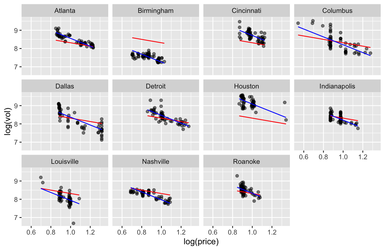
Clearly the blue lines are a much better fit to the data, while the red line is visibly too shallow to describe what’s happening to demand as price changes within each store.
The moral of the story is that, in general, a partial relationship between two variables could be stronger than, weaker than, or basically the same as the corresponding overall relationship. The only way to find out is to actually estimate that partial relationship using the data!
15.2 Interactions of numerical and grouping variables
Example 1: used Mercedes cars
How much does the market value of a used car depreciate as a function of mileage? It depends on the car! Some cars, especially trucks and off-roaders, tend to retain their value longer; others, especially large luxury sedans, tend to depreciate quite fast. As Investopedia explains, it’s just a question of supply and demand:
Luxury sedans make up four of the top five cars that depreciate the fastest… The issue with these expensive luxury cars is that they have features and technology that are not valued by used car buyers. These high-end cars are also often leased, which increases the supply of off-lease vehicles once the typical three-year lease period ends.
Said concisely, the effect of mileage on price depends on the type of car. If you remember our discussion of Interactions from the last lesson, that should ring a bell. An interaction is used to describe any situation where the effect of some predictor (like mileage) on the outcome (price) depends on some third variable (like the type of car). If we want to model the effect of mileage used-car prices, it seems like we’re going to need an interaction between mileage (a numerical variable) and type (a categorical variable).
To illustrate this, we’ll focus specifically on the fast-depreciating large luxury sedan market. The data set in sclass2011.csv contains data on 1822 used Mercedes S-Class vehicles sold on cars.com. (These are big, very expensive, luxurious cars used frequently by chauffeurs.) The three variables of interest here are price, mileage, and trim. Every vehicle in here is from the 2011 model year, and there are two trim levels represented: the S550 and the S63AMG. These are like two submodels of the same large sedan, with the more expensive S63AMG having a nicer interior and a more powerful engine.
Go ahead and get this data downloaded and imported into R. We’ll use this data to step through the process of diagnosing and fitting an interaction term between a numerical and categorical variable.
Diagnosing interactions
The simplest way to diagnose an interaction between a numerical and categorical predictor is to visualize a separate trend line in each category and to compare their slopes.
To see how this works, we’ll start with a plot of price versus mileage for all 1822 cars, colored by trim level. (I’ve used alpha = 0.3 to make the points translucent.) The key layer in this plot that will help us diagnose an interaction is geom_smooth, which adds a trend line:
ggplot(sclass2011) +
  geom_point(aes(x=mileage, y=price, color=trim), alpha = 0.3) +
  geom_smooth(aes(x=mileage, y=price, color=trim),  method='lm')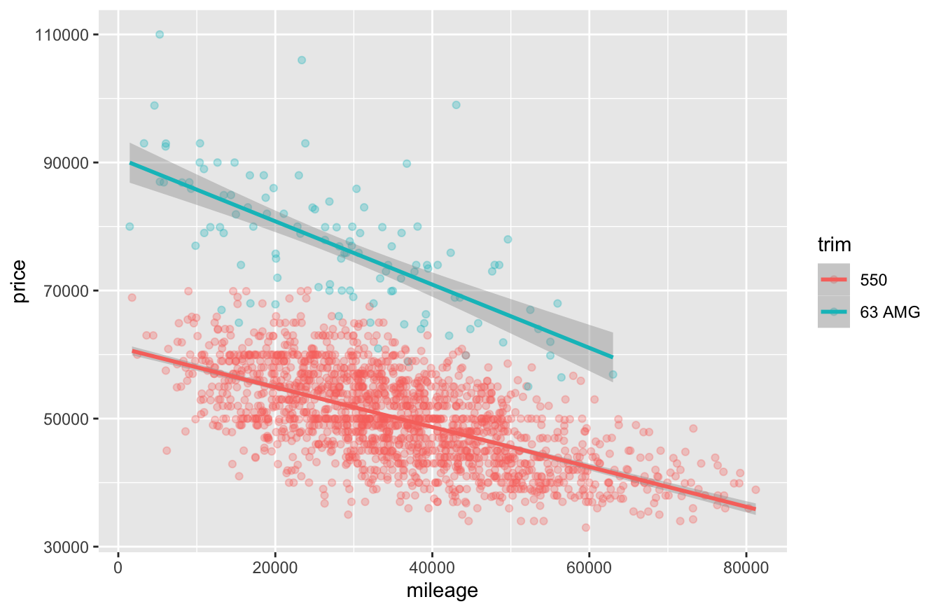
Figure 15.1: Mileage versus price for used Mercedes S-Class sedans (2011 model year).
Recall from our lesson on Fitting equations that geom_smooth is used to tell R to add a smooth trend line to a plot. Here, geom_smooth has the same aesthetic mappings as the underlying scatter plot: an \(x\) and \(y\) variable, along with a categorical variable (trim) that maps to the color of the trend line. As a result, it fits a separate trend line for price versus mileage to each level of the trim variable.
To use this plot to diagnose an interaction between mileage and trim, we have to answer one key question: do the lines in each group have the same slope or different slopes?
- If the lines in each group have the same slope (or nearly the same slope), then the price–mileage relationship is the same (or nearly the same) across trim levels. If this is the case, we don’t need an interaction—just main effects for
trimandmileage.
- But if the lines in each group have different slopes, then the price–mileage relationship depends on the trim level. If this is the case, we do need an interaction between
trimandmileage, in addition to both main effects.
In Figure 15.1 it’s pretty clear that the blue line has a steeper slope than the red line. In substantive terms, that means the S63AMG cars depreciate faster as a function of mileage than the (slightly less nice but still over-the-top luxurious) S550 cars. Thus we need an interaction.
Fitting and interpreting interactions
Before we proceed, let’s change the units on mileage so that we’re working with multiples of 1,000 miles. This will make our model easier to interpret: one additional mile will hardly change the value of a used car by a substantial amount, but 1,000 additional miles probably will. (You should always feel free to fiddle with the scales of your predictor variables to facilitate interpretation in this way.)
sclass2011 = mutate(sclass2011, miles1K = mileage/1000)Now let’s fit our model with an interaction, using miles1K as a predictor.
lm1_sclass = lm(price ~ miles1K + trim + miles1K:trim, data=sclass2011)
coef(lm1_sclass) %>% round(0)
## (Intercept) miles1K trim63 AMG miles1K:trim63 AMG
## 61123 -311 29571 -183This output is telling us that the fitted equation is:
\[ \mathrm{Price} = 61123 - 311 \cdot \mathrm{Miles1K} + 29571 \cdot \mathrm{63AMG} -183 \cdot \mathrm{Miles1K} \cdot \mathrm{63AMG} \, , \]
where \(\mathrm{63AMG}\) is a dummy variable equal to 1 for every car whose trim is 63AMG. (Thus trim == S550 is our baseline category.)
Notice how this single equation implies two different lines with two different slopes. For S550 cars, the dummy variable \(\mathrm{63AMG} = 0\), and so:
\[ \begin{aligned} \mathrm{Price} &= 61123 - 311 \cdot \mathrm{Miles1K} + 29571 \cdot 0 -183 \cdot \mathrm{Miles1K} \cdot 0 \\ &= 61123 - 311 \cdot \mathrm{Miles1K} \end{aligned} \]
Whereas for S63AMG cars, the dummy variable \(\mathrm{63AMG} = 1\), and so:
\[ \begin{aligned} \mathrm{Price} &= 61123 - 311 \cdot \mathrm{Miles1K} + 29571 \cdot 1 -183 \cdot \mathrm{Miles1K} \cdot 1 \\ &= (61123 + 29571) - (311 + 183) \cdot \mathrm{Miles1K} \\ &= 90694 - 494 \cdot \mathrm{Miles1K} \end{aligned} \]
One fitted equation but two separate lines—pretty nifty! Here are some notes to help you interpret the terms in our fitted model:
- The coefficient on \(\mathrm{63AMG}\) is an offset to the intercept: compared to the baseline intercept of $61,123, it shifts the whole line up by $29,571.
- The coefficient on the
miles1K:triminteraction is an offset to the slope: compared to the baseline slope of -311, this term makes the line steeper by an additional -$183 per 1K miles.
- In substantive terms, the S550 trim starts at a lower value (intercept of $61,123 when
mileage = 0) but depreciates mores slowly with mileage: $311 per additional 1,000 miles on the odometer.
- The S63AMG trim starts at a higher value (intercept of $90,694 when
mileage = 0) but depreciates mores rapidly with mileage: $494 per additional 1,000 miles on the odometer.
- The interaction term does not directly encode the slope. Rather, it measures the difference in slopes between the levels of the categorical variable—which, here, corresponds to the difference in depreciation rates between trims. Here, the S63AMG trim depreciates at a rate that is $183 per 1K miles steeper than the (baseline) S550 trim.
Just to convince ourselves that this interaction effect is real, and not just a small-sample phenomenon, let’s examine the confidence interval for the terms in this model:
confint(lm1_sclass, level = 0.95) %>%
  round(0)
## 2.5 % 97.5 %
## (Intercept) 60379 61867
## miles1K -331 -292
## trim63 AMG 27077 32065
## miles1K:trim63 AMG -261 -105We do have some statistical uncertainty regarding the interaction term, which could be somewhere between about -105 and -261. But we can pretty clearly rule zero as a plausible value with 95% confidence, so the interaction effect is statistically significant at the 5% level. More importantly, it also looks practically significant: the difference in slopes between the two trims is visually apparent in Figure 15.1. And even at the very smallest end (-105) of the confidence interval, we’re still talking about a $105-per-1K-miles difference in slopes. That translates to $1,050 of extra depreciation over 10,000 miles when comparing an S63AMG to an S550, which (even in this very expensive segment of the market) is hardly a trivial amount of money.
Interaction vs. correlation
Those who are new to regression often get confused about the difference between an interaction effect and correlation among predictor variables. This distinction is absolutely fundamental for understanding regression well, so it’s worth pausing to clarify matters as much as possible.
- Correlation among the predictors means exactly what it says: that your predictor variables are correlated with each other, and are therefore partially redundant in predicting variation in your outcome \(y\). Correlated predictors lead to causal confusion; when all the predictors are changing together, it’s difficult to isolate which of them is truly driving variation in the \(y\) variable.
- An interaction is fundamentally different: rather than causal confusion, interactions imply causal complexity. If two variables \(x_1\) and \(x_2\) interact, the relationship between \(x_1\) and your outcome \(y\) depends on the value of the other interacting variable, \(x_2\). (And vice versa for \(x_2\) versus \(y\)). What that means, practically speaking, is that you can’t reason about the relationship between \(x_1\) and \(y\) in isolation. You first have to say what \(x_2\) is, and that value will determine the strength of the relationship between \(x_1\) and \(y\).
Or, to reduce matters to the level of slogans… If someone asks you, “what’s the effect of \(x\) on \(y\)?” then:
- correlation among predictors means “it’s hard to tell.” You can’t just look at the overall \(x\)–\(y\) relationship; you need to adjust for other variables that are correlated with \(x\).
- an interaction means “it depends.” You can’t summarize the \(x\)–\(y\) relationship in a single number, because the strength of that relationship depends on other factors.
Neither one implies the other. You can have correlated predictors but no interaction effect. Or you can have an interaction effect between two variables even if those variables are statistically independent of one another.
Example 2: SAT scores and GPA
The file utsat.csv contains data on all 5,191 undergraduates at the University of Texas at Austin who matriculated in a single year. All students from this cohort who went on to receive a bachelor’s degree within 6 years are included. Please download and import this data set, whose first six lines look like this:
head(utsat)## SAT.V SAT.Q SAT.C School GPA Status
## 1 690 580 1270 BUSINESS 3.8235 G
## 2 530 710 1240 NATURAL SCIENCE 3.5338 G
## 3 610 700 1310 NATURAL SCIENCE 3.3679 G
## 4 730 700 1430 ENGINEERING 3.3437 G
## 5 700 710 1410 NATURAL SCIENCE 3.7205 G
## 6 540 690 1230 LIBERAL ARTS 2.6851 GEvery row corresponds to a single student. The variables in this data set are:
- SAT.V: score on the verbal section of the SAT (200-800)
- SAT.Q: score on the math (quantitative) section of the SAT (200-800)
- SAT.C: combined SAT score
- School: college or school at which the student first matriculated
- GPA: college GPA upon graduation, on a standard 4-point scale (i.e. 4.0 = perfect).
- Status: this should be G, for graduated, for everyone in this data set
The question we’ll consider here is: how does a UT-Austin student’s SAT math score predict their graduating GPA, and does that relationship differ across the undergraduate colleges? Let’s make a plot of GPA versus SAT.Q, faceted by School. For the obvious reason, I’ll plot these points in burnt orange (hexadecimal code #bf5700):
ggplot(utsat) +
  geom_point(aes(x=SAT.Q, y=GPA), alpha = 0.2, color='#bf5700') +
  geom_smooth(aes(x=SAT.Q, y=GPA), method='lm') +
  facet_wrap(~School, nrow=4)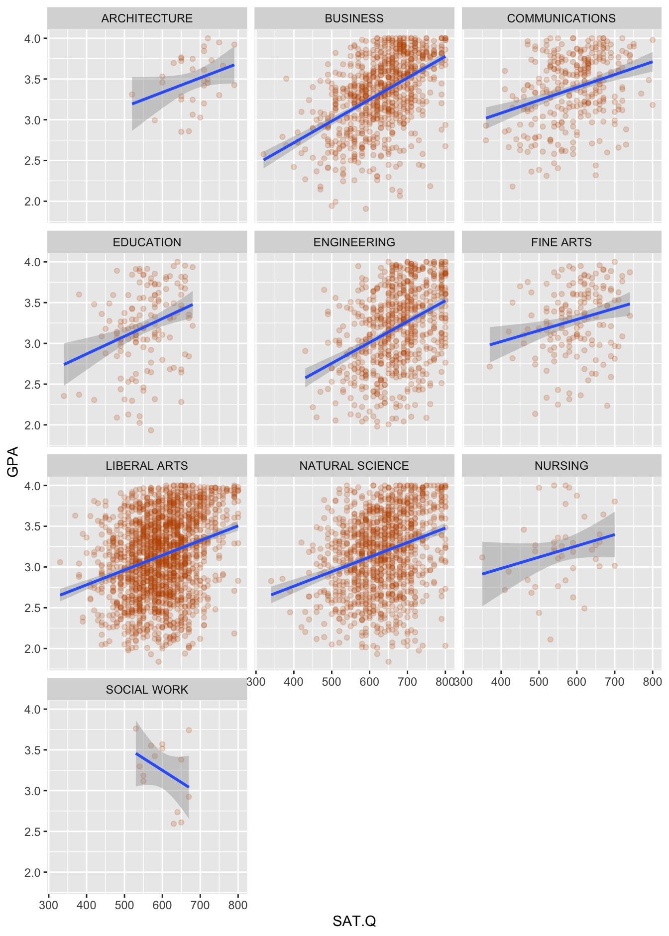
Figure 15.2: Graduating GPA versus SAT Math scores for 5,191 UT-Austin students.
I don’t know about you, but the first thing I notice in this plot is just how weakly GPA and SAT scores are related. Yes, there’s a positive relationship on average, but the individual GPAs are all over the place at every level of SAT Math score. Maybe the best you can say from the figure alone is that it’s pretty unusual (although hardly unprecedented, especially in Engineering) for a student with an SAT Math score over 750 to graduate with less than a 2.5 GPA.
But can we be a bit more precise? More to the point, can we find differences among the Schools in how strongly or weakly SAT Math scores predict GPA? This is where a regression model—more specifically, a model with an interaction term—can help.
Remember that to diagnose an interaction here, we have to answer one key question about this figure: do the lines in each group have the same slope or different slopes? If the lines in each group have the same slope (or nearly the same slope), then the SAT–GPA relationship is the same (or nearly the same) across colleges. If this is the case, we don’t need an interaction—just main effects for SAT.Q and School. But if the lines in each group have different slopes, then the SAT–GPA relationship depends on School. If this is the case, we do need an interaction between SAT.Q and School, in addition to both main effects.
Figure 15.2 has a lot going on, so answering this question might require careful scrutiny. I encourage you to try it yourself before proceeding!
Here are some things I notice:
- In all schools except Social Work, the slope looks positive. But I discount the negative slope in Social Work, because the confidence bands around the fitted blue line reflect a large amount of statistical uncertainty. In other words, I wouldn’t use the negative slope in Social Work to claim the need for an interaction here; there’s just not much data for that school, and the negative estimate of the slope is likely an artifact of the small sample size.
- I can convince myself that I see some subtle differences in slopes among the larger colleges. For example, the slope looks maybe a bit steeper in Engineering and Business than it does in Communications or Fine Arts. Moreover, in substantive terms, you can see why this might make sense: majors in Engineering and Business take more quantitative courses (where SAT Math scores might be a stronger predictor of GPA) than do majors in Communications or Fine Arts.
- However, the differences in slopes look small, in practical terms. They do seem to differ, but I wouldn’t say they differ across the colleges in a major, obvious way,
This visual inspection leaves me on the fence about a potential interaction term here. I think the interaction effect is there, but likely small in magnitude. Sometimes this will happen! When it does, I at least like to check to see what happens when we do include an interaction term. Maybe the model output will tell me something more definitive than my eyes.
As we’ve done before, to make interpreting our model easier, we’ll tweak the scale of our predictor variable, measuring changes in SAT scores in increments of 100 points. After all, given that the SAT Math test is on an 800-point scale, it seems silly to ask about the effect of one additional point on GPA, whereas it makes more sense to ask about the effect of 100 additional points.
utsat = utsat %>%
  mutate(SAT.Q100 = SAT.Q/100)
Now we can fit our model with an interaction using the following model statement:
lm1_utsat = lm(GPA ~ SAT.Q100 + School + SAT.Q100:School, data=utsat)As usual, we can inspect our model output using a call to coef:
coef(lm1_utsat) %>% round(2)## (Intercept) SAT.Q100 SchoolBUSINESS SchoolCOMMUNICATIONS
## 2.27 0.18 -0.61 0.18
## SchoolEDUCATION SchoolENGINEERING SchoolFINE ARTS SchoolLIBERAL ARTS
## -0.26 -0.79 0.21 -0.21
## SchoolNATURAL SCIENCE SchoolNURSING SchoolSOCIAL WORK SAT.Q100:SchoolBUSINESS
## -0.22 0.16 2.76 0.09
## SAT.Q100:SchoolCOMMUNICATIONS SAT.Q100:SchoolEDUCATION SAT.Q100:SchoolENGINEERING SAT.Q100:SchoolFINE ARTS
## -0.02 0.04 0.08 -0.04
## SAT.Q100:SchoolLIBERAL ARTS SAT.Q100:SchoolNATURAL SCIENCE SAT.Q100:SchoolNURSING SAT.Q100:SchoolSOCIAL WORK
## 0.00 0.00 -0.04 -0.47Admittedly, there are so many numbers here that this output is kind of a mess, and below we’ll learn a nicer way to format these numbers in a structured way. But for now, we’ll stick with this simple list of model terms. Let’s interpret three of them, just to fix your intuition for what the SAT.Q100:School interaction is doing here.
- The coefficient of 0.18 on
SAT.Q100implies that a 100-point increase in SAT Math score is associated with a 0.18 increase in graduating GPA in our baseline school (Architecture, which comes alphabetically first).
- The coefficient of -0.61 on the
SchoolBUSINESSdummy variable implies that the intercept for the school of Business is shifted down by 0.61 GPA points, compared to the baseline school. That doesn’t mean that GPAs in Business are lower by 0.61 points across the board; it just means that the Architecture line and the Business line have different intercepts. (Recall our discussion of Summarizing a relationship: the intercept in a regression line isn’t always easy to interpret.)
- The coefficient of 0.09 on the
SAT.Q100:SchoolBUSINESSinteraction term implies that the slope of the GPA-SAT line for the school of Business is steeper by 0.09 compared to the baseline school. Specifically, we estimate that the slope in Business is the sum of the main effect and the interaction: 0.18 + 0.09 = 0.27 predicted GPA points per extra 100 points on the SAT Math test.
And you would interpret the other School-level coefficients in the model—both the main effects and the interactions—in a similar manner.
A reasonable question is: do we need the interaction term? A useful piece of information is to calculate our \(\eta^2\) statistic—that is, how much does including the interaction in the model improve \(R^2\), versus a model that has only two two main effects in it?
library(effectsize)

eta_squared(lm1_utsat, partial=FALSE)
## # Effect Size for ANOVA (Type I)
##
## Parameter | Eta2 | 95% CI
## -----------------------------------------
## SAT.Q100 | 0.10 | [0.09, 1.00]
## School | 0.04 | [0.03, 1.00]
## SAT.Q100:School | 4.93e-03 | [0.00, 1.00]
##
## - One-sided CIs: upper bound fixed at (1).It looks like SAT Math scores, on their own, predict about 10% of the overall variation in graduating GPA. The School dummy variables add a further 4% to \(R^2\), while the School:SAT.Q100 interactions add roughly another 0.5% to \(R^2\). The rest of the variation in GPA (roughly 85%) remains unexplained by the model.
So where does that leave us? Honestly, in a somewhat ambiguous place. But that’s OK! Life isn’t always cut and dried. On balance, I’d probably keep the interaction in the model, especially because I think I can see differences in slopes in Figure 15.2. But the interaction term isn’t really the major story here. Overall my top-level conclusions would be:
- Graduating GPAs are highly variable.
- SAT Math scores are, at best, a weak predictor of GPA, explaining about 10% of student-to-student variation in GPA across all UT-Austin schools.
- There may be some differences among schools in just how weakly SAT Math scores predict GPA (i.e. there’s a small interaction effect). But those differences don’t seem that large or important in practical terms: we’re talking about small differences in a weak effect. More than 85% of student-to-student variation in GPA remains unexplained by SAT Math scores and School-level differences.
15.3 Multiple numerical variables
Regression, as we’ve learned, is a powerful tool for finding patterns in data. But so far, we’ve considered only models that involve a single numerical predictor, together with as many categorical variables as we want. These categorical variables were allowed to modify the intercept, or both the intercept and the slope, of the underlying relationship between the numerical predictor (like SAT score) and the response (like GPA). This allowed us to fit different lines to different groups, all within the context of a single regression equation.
Next, we learn how to build more complex models that incorporate two or more numerical predictors. Once we move beyond a single numerical predictor, we move from regression lines in two dimensions (y vs. a single x variable) to regression planes in more than two dimensions (y vs. a bunch of x variables). This immediately poses a challenge: while you can easily plot two numerical variables on a flat page or screen, it’s a lot harder to plot three, and basically impossible to plot four or more. But we’ll be interested in fitting models with potentially hundreds of predictors. This is hopeless to visualize, so we’ll need to rely on careful notation, and a bit of imagination, to make progress.
Example 1: gas mileage
Let’s start with the case of two numerical predictors, which we’ll call \(x_1\) and \(x_2\). In that case our multiple regression equation would look like:
\[ \hat{y} = \beta_0 + \beta_1 x_{1} + \beta_2 x_{2} \, . \]
In geometric terms, this equation describes a plane passing through a three-dimensional cloud of points, one triplet \((x_1, x_2, y)\) for each observation. Just as before, we call the \(\beta\)’s the coefficients of the model.
For example, Figure 15.3 shows the highway gas mileage versus engine displacement (in liters) and weight (in pounds) for 59 different sport-utility vehicles:
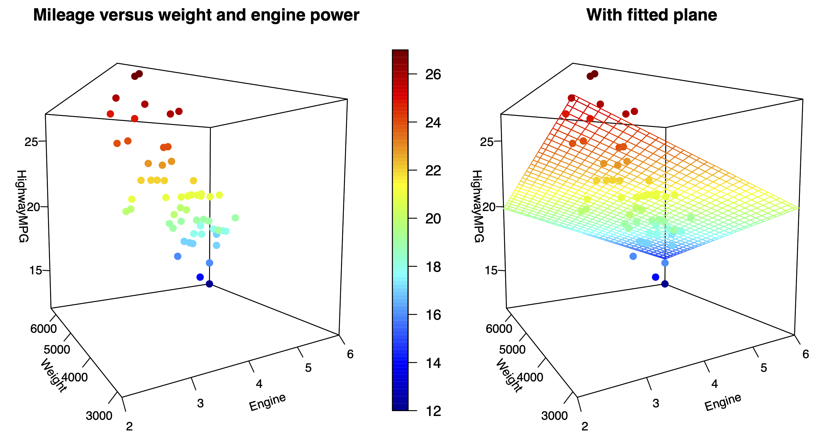
Figure 15.3: Highway gas mileage versus weight and engine displacement for 59 SUVs, with the least-squares fit shown in the right panel.
The data points here are arranged in a three-dimensional point cloud, where the three coordinates \((x_{1}, x_{2}, y)\) for each vehicle are:
- \(x_{1}\), engine displacement, increasing from left to right.
- \(x_{2}\), weight, increasing from foreground to background.
- \(y_i\), highway gas mileage, increasing from bottom to top.
Since it can be hard to show a 3D cloud of points on a 2D screen, a color scale has been added to encode the height of each point in the \(y\) direction. In general I’m not a fan of 3D graphics, but I wanted to show you this so you can get a geometric sense for what a regression equation looks like with two numerical predictors. In the right panel, the fitted regression equation is
\[ \mbox{MPG} = 33 - 1.35 \cdot \mbox{displ} - 1.64 \cdot \mbox{weight1000} \, , \]
where weight1000 is weight measured in multiples of 1,000 pounds. Both coefficients are negative, showing that gas mileage gets worse with increasing weight and engine displacement.
Beyond two predictors, we have to start relying on our imagination. In principle, there’s no reason to stop at two numerical predictors, even if we can no longer visualize the data. With a regression equation, we easily generalize the idea of a line or a plane to incorporate \(p\) different predictors \((x_{1}, x_{2}, \ldots, x_{p})\), where \(p\) can be any positive integer:
\[ \hat{y} = \beta_0 + \beta_1 x_{1} + \beta_2 x_{2} + \cdots + \beta_p x_{p} = \beta_0 + \sum_{k=1}^p \beta_k x_{k} \, . \]
This is the equation of a \(p\)-dimensional plane59 embedded in \((p+1)\)-dimensional space. This plane is impossible to visualize beyond \(p=2\), but straightforward to describe mathematically.
Partial slopes
We’ve already seen how a multiple regression equation isolates a set of partial relationships between \(y\) and each of the predictor variables. By a partial relationship, I mean the relationship between \(y\) and a single variable \(x\), holding other variables constant. The partial relationship between \(y\) and \(x\) is very different than the overall relationship between \(y\) and \(x\), because the latter ignores the effects of the other variables. When the two predictor variables are correlated, this difference matters a great deal.
So far, we’ve only seen this idea play out in settings with a single numerical predictor, in combination with one or more categorical predictors. But the same basic reasoning extends to the case of multiple numerical variables. Indeed, the best way to think of \(\beta_k\) is as an estimated partial slope: that is, the change in \(y\) associated with a one-unit change in \(x_k\), holding all other variables constant. This is a subtle interpretation that is worth considering at length.
To understand it, it helps to isolate the contribution of \(x_k\) on the right-hand side of the regression equation. For example, suppose we have two numerical predictors, and we want to interpret the coefficient associated with \(x_2\). Our equation is
\[ \underbrace{y }_{\mbox{Response}} = \beta_0 + \underbrace{\beta_1 x{_{1}} }_{\mbox{Effect of $x_1$}} + \underbrace{\beta_2 x{_{2}} }_{\mbox{Effect of $x_2$}} + \underbrace{e}_{\mbox{Residual}} \, . \]
To interpret the effect of the \(x_2\) variable, we isolate that part of the equation on the right-hand side, by subtracting the contribution of \(x_1\) from both sides:
\[ \underbrace{y - \beta_1 x_{1} }_{\mbox{Response, adjusted for $x_1$}} = \underbrace{\beta_0 + \beta_2 x{_{2}} }_{\mbox{Regression on $x_2$}} + \underbrace{e}_{\mbox{Residual}} \, . \]
On the left-hand side, we have something familiar from one-variable linear regression: the \(y\) variable, adjusted for the effect of \(x_1\). If it weren’t for the \(x_2\) variable, this would just be the residual in a one-variable regression model. Thus we might call this term a partial residual.
On the right-hand side we also have something familiar: an ordinary one-dimensional regression equation with \(x_2\) as a predictor. We know how to interpret this as well: the slope of a linear regression quantifies the change of the left-hand side that we expect to see with a one-unit change in the predictor (here, \(x_2\)). But here the left-hand side isn’t \(y\); it is \(y\), adjusted for \(x_1\). We therefore conclude that \(\beta_2\) is the change in \(y\), once we adjust for the changes in \(y\) due to \(x_1\), that we expect to see with a one-unit change in the \(x_2\) variable.
This same line of reasoning can allow us to interpret \(\beta_1\) as well:
\[ \underbrace{y - \beta_2 x_{2} }_{\mbox{Response, adjusted for $x_2$}} = \underbrace{\beta_0 + \beta_1 x{_{1}} }_{\mbox{Regression on $x_1$}} + \underbrace{e}_{\mbox{Residual}} \, . \]
Thus \(\beta_1\) is the change in \(y\), once we adjust for the changes in \(y\) due to \(x_2\), that we expect to see with a one-unit change in the \(x_1\) variable.
We can make the same argument in any multiple regression model involving two or more predictors, which we recall takes the form
\[ y = \beta_0 + \sum_{k=1}^p \beta_k x_{k} + e \, . \]
To interpret the coefficient on the \(j\)th predictor, we isolate it on the right-hand side:
\[ \underbrace{y - \sum_{k \neq j} \beta_k x_{k} }_{\mbox{Response adjusted for all other $x$'s}} = \underbrace{\beta_0 + \beta_j x{_{j}} }_{\mbox{Regression on $x_j$}} + \underbrace{e}_{\mbox{Residual}} \, . \]
Thus \(\beta_j\) represents the rate of change in \(y\) associated with one-unit change in \(x_j\), after adjusting for all the changes in \(y\) that can be predicted by the other predictor variables.
Gas mileage again
Let’s return to our multiple regression model we fit to the data on SUVs in Figure 15.3:
\[ \mbox{MPG} = 33 - 1.35 \cdot \mbox{Displacement} - 1.64 \cdot \mbox{Weight1000} + \mbox{Residual} \, . \]
This model isolates two partial slopes:
We expect highway gas mileage to decrease by 1.35 MPG for every 1-liter increase in engine displacement, after adjusting for the simultaneous effect of vehicle weight on mileage. That is, when comparing vehicles of equal weight whose engine sizes differ by 1 liter, we’d expect their mileage to differ by 1.35 MPG.
We expect highway gas mileage to decrease by 1.64 MPG for every additional 1,000 pounds of vehicle weight, after adjusting for the simultaneous effect of engine displacement on gas mileage. That is, when comparing vehicles of equal engine size that differ by 1,000 pounds of weight, we’d expect their mileage to differ by 1.64 MPG.
Let’s compare these partial relationships with the overall relationships for mileage versus each variable on its own. These are depicted in the figure below, where I’ve fit two separate one-variable regression models: mileage versus engine displacement on the left, and mileage versus vehicle weight on the right.
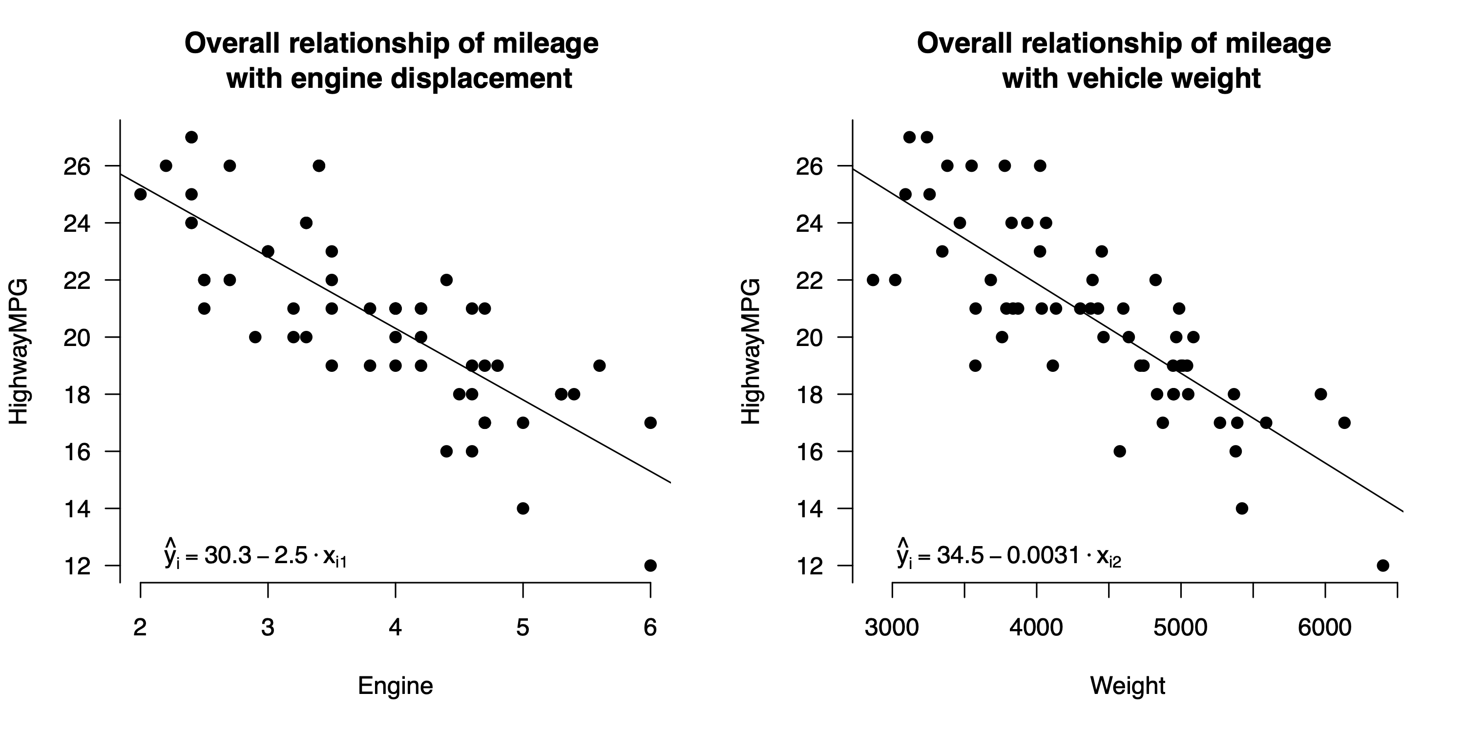
Figure 15.4: Overall relationships for highway gas mileage versus weight and engine displacement individually.
Focus on the left panel of Figure 15.4 first. The least-squares fit to the data is
\[ \mbox{MPG} = 30.3 - 2.5 \cdot \mbox{Displacement} + \mbox{Residual} \, . \]
So when displacement goes up by 1 liter, we expect mileage to go down by \(2.5\) MPG. This overall slope is quite different from the partial slope of \(-1.35\) isolated by the multiple regression equation. That’s because this model doesn’t attempt to adjust for the effects of vehicle weight. Because weight is correlated with engine displacement, we get a steeper estimate for the overall relationship than for the partial relationship: for cars where engine displacement is larger, weight also tends to be larger, and the corresponding effect on the \(y\) variable isn’t controlled for in the left panel.
Similarly, in the right panel of Figure 15.4, the overall relationship between mileage and weight is
\[ \mbox{MPG} = 34.5 - 3.11 \cdot \mbox{Weight1000} + \mbox{Residual} \, . \]
The overall slope of \(-3.1\) on Weight1000 is nearly twice as steep the partial slope of \(-1.64\). That’s because the one-variable regression model hasn’t successfully isolated the effect of increased weight from that of increased engine displacement. But the multiple regression model has: once we hold engine displacement constant, the marginal effect of increased weight on mileage looks smaller.
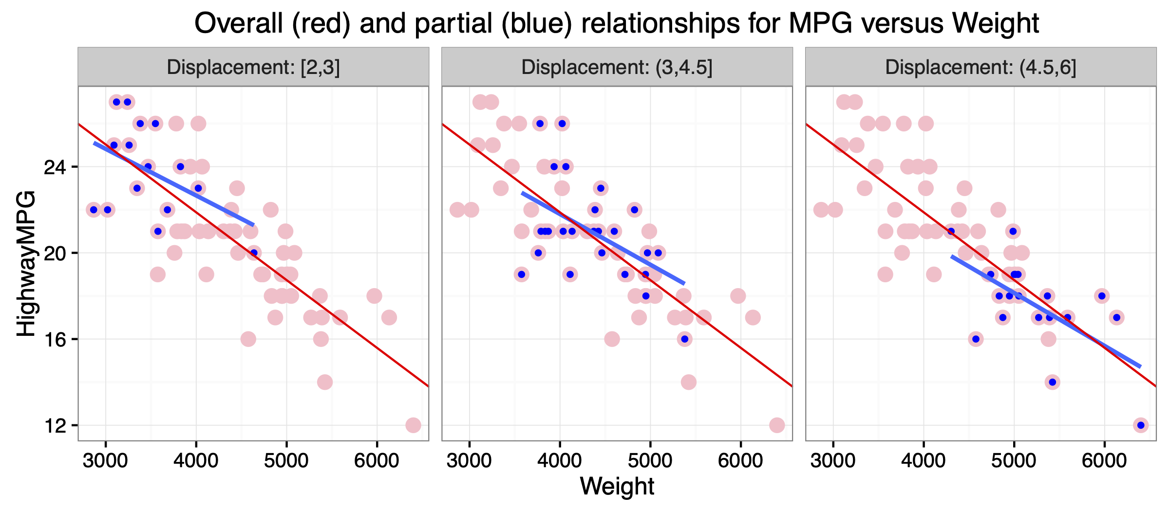
Figure 15.5: Partial relationship for highway gas mileage versus weight, holding engine displacement roughly constant. The blue points within each panel show only the SUVs within a specific range of engine displacements: <3 liters on the left, 3-4.5 liters in the middle, and >4.5 liters on the right. The blue line shows the least-squares fit to the blue points alone within each panel.
Figure 15.5 provides some intuition here about the difference between an overall and a partial relationship. The figure shows a faceted scatter plot where the panels correspond to three different strata of engine displacement: 2–3 liters, 3–4.5 liters, and 4.5–6 liters. Within each stratum, engine displacement doesn’t vary by much—that is, it is approximately held constant. Each panel in the figure shows a straight line fit that is specific to the SUVs in each stratum (blue dots and line), together with the overall linear fit to the whole data set (red dots and line).
Notice two things here.
- The SUVs within each stratum of engine displacement are in systematically different parts of the \(x\)–\(y\) plane. For the most part, the smaller engines are in the upper left, the middle-size engines are in the middle, and the bigger engines are in the bottom right. When weight varies, displacement also varies, and each of these variables has an effect on mileage. Another way of saying this is that engine displacement is a confounding variable for the relationship between mileage and weight. Recall that a confounder is something that is correlated with both the predictor and response.
- In each panel, the blue line has a shallower slope than the red line. That is, when we compare SUVs that are similar in engine displacement, the mileage–weight relationship is not as steep as it is when we compare SUVs with very different engine displacements.
This second point—that when we hold displacement roughly constant, we get a shallower slope for mileage versus weight—explains why the partial relationship estimated by the multiple regression model is different than the overall relationship from the left panel of Figure 15.4. This is a very general property of regression: if \(x_1\) and \(x_2\) are two correlated predictors, then adding \(x_2\) to the model will change the coefficient on \(x_1\), compared to a model with \(x_1\) alone:
- The slope of \(-1.64\) MPG per 1,000 pounds from the multiple regression model addresses the question: how fast should we expect mileage to change when we compare SUVs with different weights, but with the same engine displacement?
- This is similar to the question answered by the blue lines in Figure 15.5, but very different than the question answer by the red line, which asks: how fast should we expect mileage to change when we compare SUVs with different weights, regardless of their engine displacement?
One last caveat: it is important to keep in mind that this “isolation” or “adjustment” is statistical in nature, rather than experimental. Most real-world systems simply don’t have isolated variables: in observational studies, confounding tends to be the rule, rather than the exception. The only real way to isolate a single factor is to run an experiment that actively manipulates the value of one predictor, holding the others constant, and to see how these changes affect \(y\). Still, using a multiple-regression model to perform a statistical adjustment is often the best we can do when facing questions about partial relationships that, for whatever reason, aren’t amenable to experimentation.
Example 2: education spending
There is a long-running debate in the U.S. about the relationship between spending on public education—specifically high school—and educational outcomes for students. For example, back in the 1990s, noted conservative columnist George Will argued that:
- Of the 10 states with lowest per-pupil spending, 4 have top-10 SAT averages.
- Of the 10 states with highest per pupil spending, only 1 has a top-10 SAT average.
- New Jersey has the highest per-pupil spending and only the 39th highest SAT scores.
Taken at face value, these numbers would seem to imply that many states are spending more and getting less in return. Will’s point is that these facts seem to undercut the argument of those calling for more investment in public education. As he put it: “The public education lobby’s crumbling last line of defense is the miseducation of the public.”
Is he right? Let’s take a careful look at the data from this period, in sat.csv, to see if it bears out Will’s argument:
head(sat)## State expend ratio salary takers verbal math total
## 1 Alabama 4.405 17.2 31.144 8 491 538 1029
## 2 Alaska 8.963 17.6 47.951 47 445 489 934
## 3 Arizona 4.778 19.3 32.175 27 448 496 944
## 4 Arkansas 4.459 17.1 28.934 6 482 523 1005
## 5 California 4.992 24.0 41.078 45 417 485 902
## 6 Colorado 5.443 18.4 34.571 29 462 518 980Every row here is a state. This data frame contains the following columns:
- expend: expenditure per pupil in public schools in 1994-95 (thousands of dollars)
- ratio: pupil/teacher ratio in public schools, Fall 1994
- salary: average salary of teachers, 1994-95 (thousands of dollars)
- takers: Percentage of all eligible students taking the SAT, 1994-95
- verbal: Average verbal SAT score, 1994-95
- math: Average math SAT score, 1994-95
- total: average total score on the SAT, 1994-95
The relationship of interest here concerns per-pupil expenditures and SAT scores. So let’s examine a scatter plot of students’ average SAT scores (total) in each state, versus that state’s per-pupil expenditures in public schools:
ggplot(sat, aes(x=expend, y=total)) +
  geom_point() +
  geom_smooth(method='lm')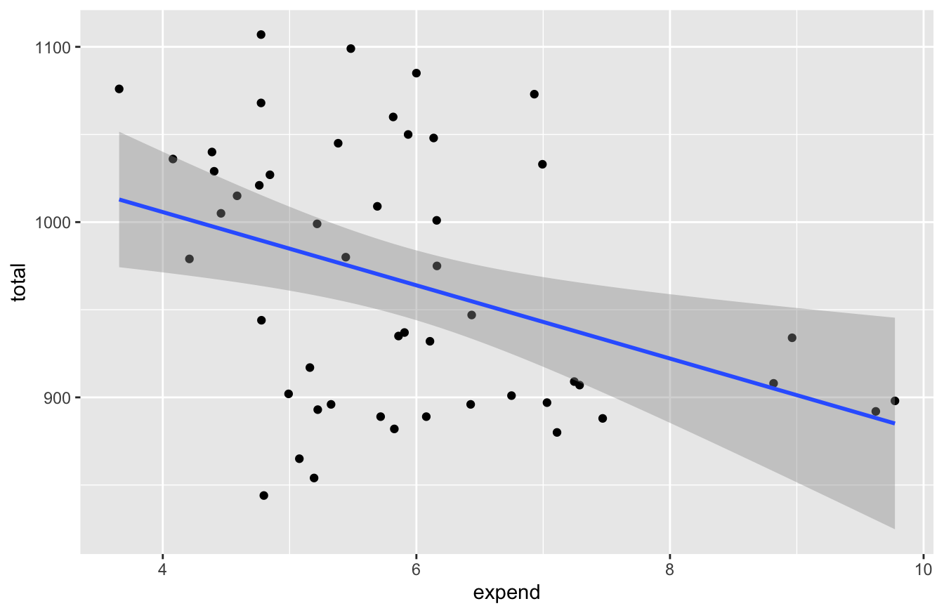
Sure enough, the line slopes downward: more spending implies lower SAT scores. How strong is the relationship? Let’s fit a model to check:
fit1 = lm(total~expend, data=sat)
coef(fit1) %>% round(0)
## (Intercept) expend
## 1089 -21confint(fit1, level=0.95)## 2.5 % 97.5 %
## (Intercept) 1000.04174 1178.545695
## expend -35.62652 -6.157823So the relationship seems clearly negative: SAT scores are expected to be somewhere between 6 and 36 points lower for every additional $1,000 in per-pupil expenditures. This seems counter-intuitive, but it’s certainly consistent with Will’s argument. What’s going on here?
The answer is that Will’s analysis is failing to account for a key confounding variable here: the participation rate, i.e. the fraction of students in a given state who actually take the SAT. It turns out that a state’s participation rate (takers) is a very strong predictor of that state’s average SAT score. There are (at least) two reasons for this:
- States vary in what proportion of their high-schools students intend to go to college. States who send fewer students to college tend to have lower SAT participation rates.
- During this time period, different colleges/geographic areas had different test requirements or preferences: some colleges preferred the SAT, some the ACT, and not every college accepted both. So in some states, you might not need to take the SAT to attend a state college, while in others you’d be required to take it. However, most applicants to prestigious out-of-state colleges were taking the SAT, no matter their state of residence.
These two factors would suggest that, in states with low SAT participation during this period, the SAT-taking population consisted of disproportionately high-performing students. We see this effect very clearly in the data, by plotting total vs. takers:
ggplot(sat, aes(x=takers, y=total)) +
  geom_point() +
  geom_smooth(method='lm')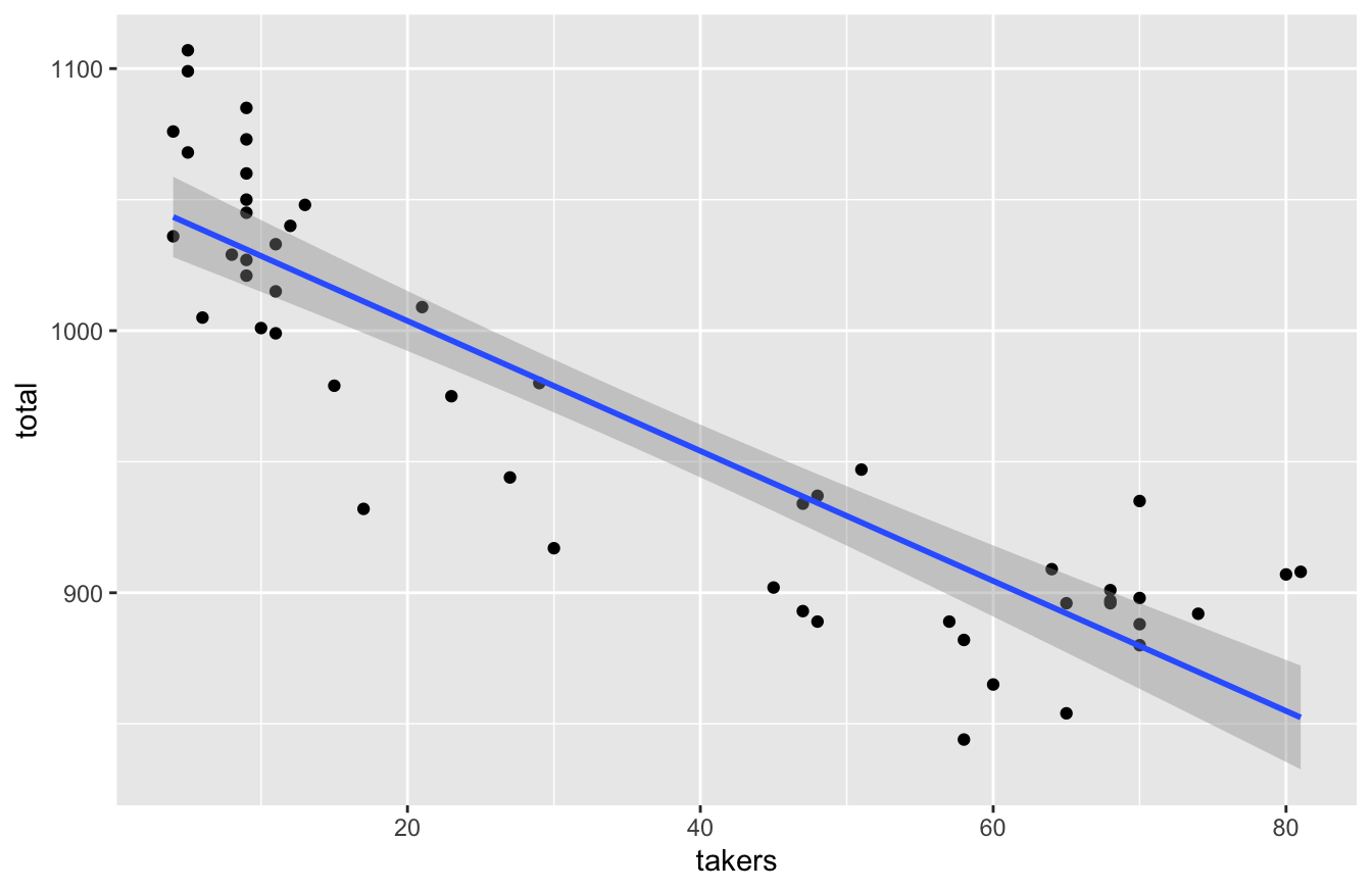
In states where participation is low, it tends to be the strongest students who the SAT, leading to this strong negative correlation: the higher the participation rate, the lower the state’s average score.
Moreover—and here’s the key point for dissecting Will’s argument—states that spend more on education tend to have higher SAT participation rates. In fact, one could argue that this is a major policy goal of spending more money on public schools: to prepare more of your state’s students to be college-ready. We see this in the data by examining a scatter plot of takers vs. expend:
ggplot(sat, aes(x=expend, y=takers)) +
  geom_point() +
  geom_smooth(method='lm')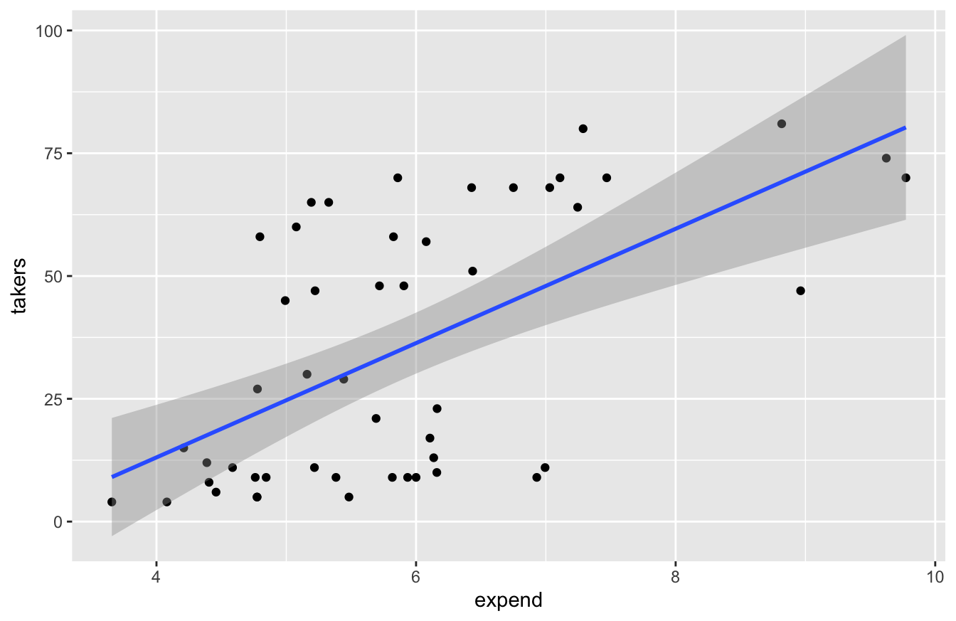
Schools that spend more per pupil tend to have more of those students taking the SAT. So when we fit a model for total ~ expend, ignoring the effect of participation rates on average SAT scores, we’re allowing expenditures to work as a “proxy” for participation rates, leading us astray. This is fundamentally misleading: we need to adjust for this lurking variable, similar to how we adjusted for neighborhood in thinking about the effect of size (sqft) on house price in our example above. (See Example 1: causal confusion in house prices.) Remember one of our main take-home lessons from that example: correlated predictors leads to causal confusion. Will’s naive analysis confuses the effect of spending with the effect of participation rate, because spending and participation rate are correlated.
Now let’s see what happens when we compare states with similar SAT participation rates. A simple way to do this is to discretize the participation-rate variable into quartiles, so that we can compare states within each quartile. We’ll use the cut_number function to cut the takers variable into four categories, one category per quartile:
sat = sat %>%
  mutate(takers_quartile = cut_number(takers, 4))
Now we’ll re-do our scatter plot of SAT scores (total) versus per-pupil spending (expend), except that we’ll fit four separate lines, stratified by participation rate:
ggplot(sat, aes(x=expend, y=total, color=takers_quartile)) +
  geom_point() +
  geom_smooth(method='lm')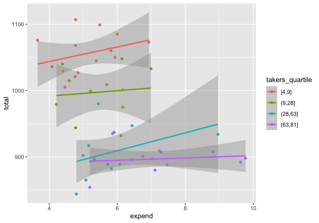
Figure 15.6: Regressing state-level SAT scores vs. per-pupil spending, separately for each quartile of SAT participation rate.
The slope within each participation quartile is positive. So it seems clear that when we compare states with similar SAT participation rates, extra per-pupil spending seems to correlate with better, not worse, SAT scores.
Now let’s complete our analysis by turning to a multiple regression model for SAT scores, using both expend and takers as variables. Multiple linear regression lets us make the necessary adjustment for participation rate using a single model, instead of examining each participation-rate quartile separately. Our model postulates that a state’s SAT score can be predicted by the linear equation
\[ \mbox{total} = \beta_0 + \beta_1 \cdot \mbox{expend} + \beta_2 \cdot \mbox{takers} + \mbox{error} \]
The coefficient \(\beta_1\) represents the change in expected SAT scores for a one-unit (i.e. $1000) increase in expenditures, holding the SAT participation rate constant. Let’s fit this model and examine the coefficients:
fit3 = lm(total ~ expend + takers, data=sat)
coef(fit3) %>% round(1)
## (Intercept) expend takers
## 993.8 12.3 -2.9The slope on expend is positive, consistent with what we expected to see based on Figure 15.6. But let’s look at a confidence interval to take account of our statistical uncertainty:
confint(fit3, level=0.95) %>% round(1)## 2.5 % 97.5 %
## (Intercept) 949.9 1037.8
## expend 3.8 20.8
## takers -3.3 -2.4Since the confidence interval for expend doesn’t contain 0, this positive relationship is statistically significant at 0.05 level.
Our conclusion is simple: George Will was wrong. When controlling for the SAT participation rate—that is, when estimating the relationship between expenditures and average SAT scores for states that have similar levels of SAT participation—we see that there is actually a positive partial relationship between school expenditures and SAT scores. This doesn’t necessarily mean the relationship can be attributed to cause and effect, i.e. that more spending causes better results. (Remember, we might still have unmeasured confounders here.) But this analysis does undercut the idea that some states are spending more on public education yet getting systematically less in return than their more frugal peers. Such an idea might find support in some political circles, but it certainly doesn’t find support in this data.
Example 3: Airbnb prices
Exploratory analysis
For our third example, we’ll work with the data in airbnb.csv, which contains a sample of 99 rentals in Santa Fe scraped from Airbnb’s website by three students in my Spring 2018 statistics class. The main variables here are:
- Price: rental price in $/night on a random day in April 2018.
- Bedrooms/Baths: number of bedrooms and bathrooms, respectively.
- PlazaDist: distance in miles from the unit to the Santa Fe Plaza in the center of town.
- Style: description of the style of rental (e.g. entire house, entire apartment, etc)
There are also several other variables in the data set that are interesting, but not the topic today. The question we’ll seek to answer is: What is the premium for renting the entire place, versus a “shared-space” unit of equivalent size and location?
Let’s start with some basic plots to get ourselves familiar with the data. First, a scatter plot of Price versus PlazaDist shows a clear drop off with greater distance from the center of town.
ggplot(airbnb, aes(x=PlazaDist, y=Price)) +
  geom_point() +
  geom_smooth(method='lm')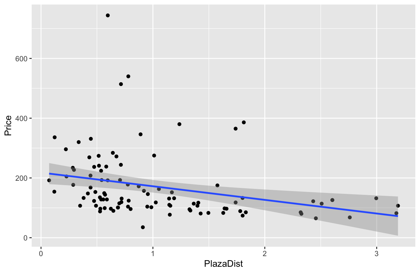
The size of the rental explains a lot, too. Here’s a jitter plot of Price versus Bedrooms:
ggplot(airbnb) +
  geom_jitter(aes(x=Bedrooms, y=Price), width=0.05)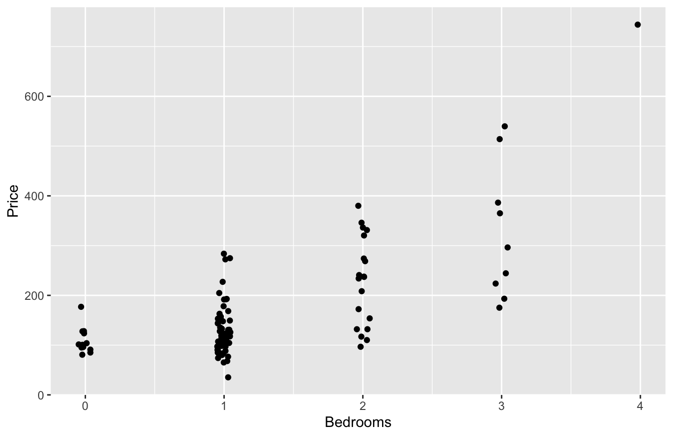
And Price versus Baths:
# and price vs bathrooms...
ggplot(airbnb) +
  geom_jitter(aes(x=Baths, y=Price), width=0.05)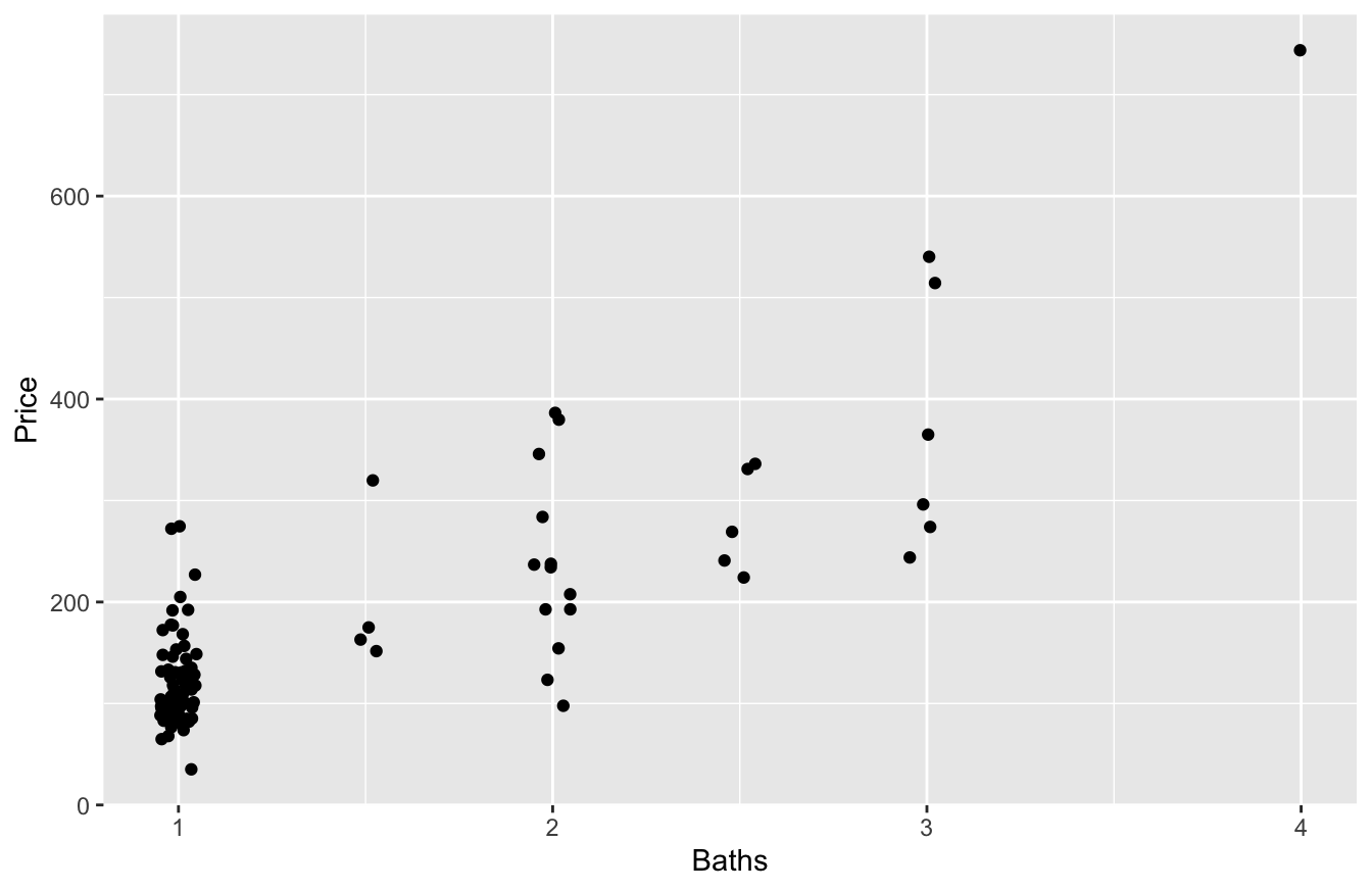
Clearly bigger units command a premium, on average.
And now we come to the predictor of interest: are you renting the entire place? Let’s use the str_detect (“string detect”) function to check for the presence of the word “entire” in the Style field:
# Define the 'entire' variable
airbnb = mutate(airbnb, entire = str_detect(Style, pattern = 'entire'))

# Plot price vs entire
ggplot(airbnb) +
  geom_jitter(aes(x=entire, y=Price), width=0.1)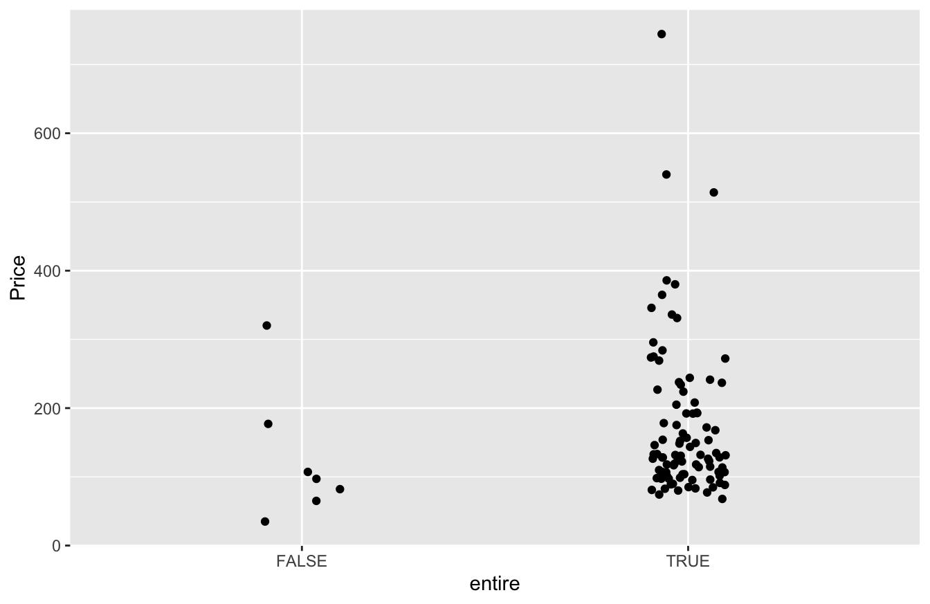
It looks like entire=TRUE rentals command more, on average, than entire=FALSE rentals. But how much more?
Model building
Now we turn to the task of model-building, with the goal of answering our question: Is there a premium for renting the entire place, versus a “shared-space” unit of equivalent size and location?
Before this lesson, you might have reasoned as follows: if you’re interested in the effect of entire on Price, just run a regression with entire as a predictor!
lm1_airbnb = lm(Price ~ entire, data=airbnb)
coef(lm1_airbnb) %>% round(0)
## (Intercept) entireTRUE
## 126 47The coefficient of 47 on the entire=TRUE dummy variable implies that the average price is $47 higher for rentals that give you the entire place (i.e. no shared space with others).
But as you should now appreciate, this answer is potentially misleading, especially if entire is correlated with other features in our data set. After all, if you rent an entire apartment, versus a single room in a larger shared unit, you’re probably getting more space—and space costs money. So with our naive answer of $47, we are likely confusing the effect of getting the entire place with the effect of getting a bigger place. Those are different things.
There’s also a second source of causal confusion here: distance. If we compute the mean distance to the Santa Fe Plaza for entire versus non-entire rentals, we see the “entire-place” rentals tend to be closer to the center of town, on average, by nearly 3/4 of a mile:
mean(PlazaDist ~ entire, data=airbnb)## FALSE TRUE
## 1.7164388 0.9968143So in comparing entire=FALSE with entire=TRUE rentals, we’re implicitly comparing far-away rentals with close-in rentals. That’s not an apples-to-apples comparison. Visitors to Sante Fe want to be close in and are willing to pay for it.
To resolve our causal confusion here, let’s include Bedrooms, Baths, and PlazaDist in a model, so that we can isolate the effect of renting the entire unit from the effect of renting a bigger unit that is closer to the center of town:
lm2_airbnb = lm(Price ~ Bedrooms + Baths + PlazaDist + entire, data=airbnb)
coef(lm2_airbnb) %>% round(0)
## (Intercept) Bedrooms Baths PlazaDist entireTRUE
## 18 30 101 -17 -8Why does the entire=TRUE dummy variable have a negative coefficient now? Are entire-place rentals actually less desirable? Let’s look at a confidence interval.
confint(lm2_airbnb) %>% round(0)## 2.5 % 97.5 %
## (Intercept) -45 82
## Bedrooms 6 54
## Baths 70 131
## PlazaDist -36 1
## entireTRUE -58 43So there’s no basis for claiming that “entire-place” rentals are less desirable: the confidence interval on the entire=TRUE dummy variable is very wide, from -$58 to $43.
To summarize, two things happened when we adjusted for the effects of Bedrooms, Bathrooms, and PlazaDist:
- The
entire=TRUEcoefficient became dramatically smaller, versus the model that failed to adjust for size and distance to the Plaza.
- The confidence interval on the
entire=TRUEcoefficient was extremely wide, reflecting a lot of uncertainty.
Why did these two things happen? The answer is simple and familiar: correlation among the predictors. We simply don’t have enough data here to isolate an “entire-place” effect, distinct from size. Our best guess is that the entire=TRUE effect is small, but we have a lot of uncertainty. Said another way: we’re confused: the entire=TRUE effect could be positive or negative, large or small, and we really have no clear idea about it in light of the data.
Take-home lesson. The main lesson of this example is that sometimes, you just need better data. This is really a special case of the general lesson we learned earlier, that correlated predictors lead to causal confusion.
- One manifestation of causal confusion is that overall relationships and partial relationships are different from each other:
lm(Price ~ entire)leads to a different coefficient onentirethan doeslm(Price ~ Bedrooms + Bathrooms + PlazaDist + entire).
- Another manifestation of causal confusion is wide confidence intervals for predictor variables that are highly correlated with one another. When all the predictors are changing together in a tightly coupled way, it’s difficult to make precise statements about which of them is actually driving variation in the \(y\) variable. The result is uncertainty. “You can ask the question all you want about the effect of
entire=TRUE,”lmis telling you, “but the data don’t provide an answer with precision!”
We set out to answer a simple question: What is the premium for renting the entire place, versus a “shared-space” unit of equivalent size and location? And the answer is equally simple: we don’t really know. Regression isn’t magic: the entire=TRUE and entire=FALSE units in our data set are just too different from each other for a regression model to be able to answer the question. Moreover, the solution here isn’t a better model. The solution is better data: that is, information on some entire=TRUE and entire=FALSE units that are otherwise similar to each other, so that you can make a fair comparison that actually does isolate the effect of interest.
15.4 Summarizing regression models
For all the models we’ve fit so far, we’ve basically just asked R to vomit out the coefficients for us, using the coef function. This works well enough for small models. But when we start to fit larger regression models with many terms, we need to pay more careful attention to how we summarize the results. After all, regression equations involve a lot of numbers: coefficients, standard errors, confidence intervals, p-values, ANOVA tables, and so on. And let’s be realistic: some ostensibly well-educated people, up to and including Supreme Court justices, are intimidated by numbers—especially when there are a lot of them. Now, I’m not suggesting that you should shy away from making your case with numbers. I’m simply stating the obvious: it’s worth the effort to present those numbers in the tidiest and most understandable way possible, so that your message stands the greatest chance of being heard.
Besides, you’ll find it a lot easier to interpret regression models yourself if the results are presented cleanly. Let’s dive in.
The regression table
A regression table summarizes the results from fitting a regression model—both the estimates of the coefficients themselves, as well as their statistical uncertainty, ideally in the form of a confidence interval. The overall goal of a regression table is to convey the strength of the relationship between an outcome variable and one or more predictor variables in your model.
There a lot of options for printing regression tables in R, but my favorite is the function get_regression_table, from the moderndive library. To use this, you’ll first need to install moderndive, and then load it:
library(moderndive)Let’s look at a regression table for our model of Airbnb prices in Santa Fe, using Bedrooms, Baths, PlazaDist, and entire as predictors:
lm2_airbnb = lm(Price ~ Bedrooms + Baths + PlazaDist + entire, data=airbnb)Now we can pass our fitted model to the get_regression_table function, like below. We’ll specify that we want a confidence level of 0.95, and that the entries in our table should display no more than two decimal digits:
get_regression_table(lm2_airbnb, conf.level = 0.95, digits=2)## # A tibble: 5 × 7
## term estimate std_error statistic p_value lower_ci upper_ci
## <chr> <dbl> <dbl> <dbl> <dbl> <dbl> <dbl>
## 1 intercept 18.1 32.0 0.57 0.57 -45.5 81.7
## 2 Bedrooms 30.1 12.0 2.51 0.01 6.33 54.0
## 3 Baths 101. 15.4 6.53 0 70.0 131.
## 4 PlazaDist -17.4 9.4 -1.85 0.07 -36.0 1.3
## 5 entireTRUE -7.66 25.5 -0.3 0.76 -58.4 43.0The result is a table whose rows are the terms in our regression equation, and whose columns convey specific pieces of information about each term. The first column to look at is estimate, which lists the estimated coefficients for each term in the model.
- For example, our model estimates that the coefficient on
Bedroomsis \(30.1\). When comparing two units that differ by one bedroom, but are otherwise similar, we’d expect the larger unit to cost about $30 more.
- Similarly, our model estimates that the coefficient on
Bathsis \(101\). When comparing two units that differ by one bathroom, but are otherwise similar, we’d expect the larger unit to cost about $101 more.
So what about the other columns of our regression table? Let’s take them one by one.
- the
std_errorcolumn is the standard error of each estimated coefficient. It measures our statistical uncertainty about each model term. The standard errors are calculated using the techniques of Large-sample inference; the math here is interesting but beyond the scope of these lessons.
- The
statisticcolumn is for “t-statistic,” which measures the ratio of theestimateto itsstd_error. Like the standard error itself, this column is a measure of uncertainty—but it’s a relative measure of uncertainty. It’s answering the question: how precisely have the data enabled us to estimate this coefficient, relative to its magnitude? Larger values entail greater relative precision. Or another what of saying the same thing is: how many standard errors away from zero is the estimated coefficient? I don’t use this column much, but some people like it.
- The
p_valueis a column of p-values, which can be used to assess the statistical significance of each coefficient. Specifically, each entry is a p-value computed under the null hypothesis that the corresponding coefficient in the regression equation is exactly zero. Again, I don’t use this column much, but some people like it. For example, the p-value of \(0.01\) for the Bedrooms coefficient is telling us that the null hypothesis of no partial relationship between Bedrooms and Price looks unlikely, in light of the data. One the other hand, the p-value of \(0.76\) for theentire=TRUEcoefficient is telling us that the null hypothesis of no partial relationship betweenentireandPricelooks plausible, in light of the data.
- Finally, the
lower_ciandupper_cicolumns give us the lower and upper bounds, respectively, of a 95% confidence interval for each model term. (We can change the desired confidence level via theconf.levelargument to theget_regression_tablefunction.)
R’s default “summary” table
As you’ve seen, the regression table provides a well-organized way to summarize the results of a regression analysis. But you might wonder: isn’t it crazy that we have to use an external library like moderndive to get a regression table in R? Doesn’t R have this capability built in?
Well, yes and no. R does have a way to print a regression table, via the summary function, that doesn’t require loading an external library like moderndive. It looks like this:
lm1_utsat = lm(GPA ~ SAT.Q + School, data=utsat)
summary(lm1_utsat)
##
## Call:
## lm(formula = GPA ~ SAT.Q + School, data = utsat)
##
## Residuals:
## Min 1Q Median 3Q Max
## -1.48357 -0.30715 0.04291 0.33826 1.02829
##
## Coefficients:
## Estimate Std. Error t value Pr(>|t|)
## (Intercept) 2.10595157 0.09594785 21.949 < 2e-16 ***
## SAT.Q 0.00201603 0.00007982 25.256 < 2e-16 ***
## SchoolBUSINESS -0.04669029 0.08046802 -0.580 0.56178
## SchoolCOMMUNICATIONS 0.08484054 0.08321269 1.020 0.30798
## SchoolEDUCATION -0.01899720 0.08790917 -0.216 0.82892
## SchoolENGINEERING -0.26311959 0.08065825 -3.262 0.00111 **
## SchoolFINE ARTS -0.02001739 0.08685214 -0.230 0.81773
## SchoolLIBERAL ARTS -0.17197206 0.07984371 -2.154 0.03130 *
## SchoolNATURAL SCIENCE -0.20190240 0.08008007 -2.521 0.01172 *
## SchoolNURSING -0.03171001 0.10513890 -0.302 0.76297
## SchoolSOCIAL WORK -0.07682349 0.14309700 -0.537 0.59139
## ---
## Signif. codes: 0 '***' 0.001 '**' 0.01 '*' 0.05 '.' 0.1 ' ' 1
##
## Residual standard error: 0.4461 on 5180 degrees of freedom
## Multiple R-squared: 0.1366, Adjusted R-squared: 0.1349
## F-statistic: 81.96 on 10 and 5180 DF, p-value: < 2.2e-16I’m fond of this table in the same way I might be fond of an ugly family dog: I’ve known this table since I first started learning R as a freshman in college in 2000, and we’ve been through a lot together. We’re old pals. But I’m under no illusions about its aesthetic merit.
The basic issue with R’s summary table is that it absolutely bloody loves to print numbers using scientific notation (e.g. 2.016e-03 for \(2.016 \times 10^{-3} \approx 0.002\))—a convention that, while useful in many other contexts, is befuddling here. (I’m pretty sure that summary is basically just stuck in the 1970s, when computer terminals were 80 characters wide and therefore needed a notational convention that allowed them to juxtapose very large numbers with very small numbers in the same narrow table.) A secondary issue is that R’s default table encourages people to anchor on questions of statistical significance, rather than practical significance—which is, in my view, usually inappropriate.
That’s why I like the moderndive option. Here’s the same regression model summarized via get_regression_table:
get_regression_table(lm1_utsat)## # A tibble: 11 × 7
## term estimate std_error statistic p_value lower_ci upper_ci
## <chr> <dbl> <dbl> <dbl> <dbl> <dbl> <dbl>
## 1 intercept 2.11 0.096 21.9 0 1.92 2.29
## 2 SAT.Q 0.002 0 25.3 0 0.002 0.002
## 3 School: BUSINESS -0.047 0.08 -0.58 0.562 -0.204 0.111
## 4 School: COMMUNICATIONS 0.085 0.083 1.02 0.308 -0.078 0.248
## 5 School: EDUCATION -0.019 0.088 -0.216 0.829 -0.191 0.153
## 6 School: ENGINEERING -0.263 0.081 -3.26 0.001 -0.421 -0.105
## 7 School: FINE ARTS -0.02 0.087 -0.23 0.818 -0.19 0.15
## 8 School: LIBERAL ARTS -0.172 0.08 -2.15 0.031 -0.328 -0.015
## 9 School: NATURAL SCIENCE -0.202 0.08 -2.52 0.012 -0.359 -0.045
## 10 School: NURSING -0.032 0.105 -0.302 0.763 -0.238 0.174
## 11 School: SOCIAL WORK -0.077 0.143 -0.537 0.591 -0.357 0.204I like this much better, in particular because it includes confidence intervals. But your mileage may vary.
Standardized coefficients
One issue that sometimes arises in regression analysis involves how to compare coefficients for variables that are on very different scales. For example, let’s examine a model for the rent of an apartment, using the data on student apartments in the West Campus neighborhood near UT-Austin, which we first met in the lesson on Bootstrapping regression models. Each row in this data set is an apartment building. The four variables we’ll look at are:
two_bed_rent: monthly rent for a two-bedroom unit in the building.
two_bed_sf: square footage of a two-bedroom unit.
distance_from_tower: distance in miles from the UT Tower (the notional center of campus), measured in miles.
furnished: a categorical variable indicating whether the unit comes furnished (true or false).
To illustrate the issue that arises when comparing coefficients, we’ll fit a model for rent versus size, distance from the Tower, and whether the unit is furnished. Then we’ll print out the regression table for this model.
lm_apt = lm(twobed_rent ~ twobed_sf + distance_from_tower + furnished, data = apartments)
get_regression_table(lm_apt, conf.level = 0.95, digits=2)
## # A tibble: 4 × 7
## term estimate std_error statistic p_value lower_ci upper_ci
## <chr> <dbl> <dbl> <dbl> <dbl> <dbl> <dbl>
## 1 intercept 876. 178. 4.91 0 520. 1233.
## 2 twobed_sf 0.42 0.17 2.45 0.02 0.08 0.76
## 3 distance_from_tower -479. 143. -3.35 0 -764. -194.
## 4 furnishedTRUE 159. 60.5 2.62 0.01 37.8 279.These coefficient estimates tell us that:
- a difference of 1 square foot is associated with a $0.42 change in rent (95% CI: 0.08 to 0.76).
- a difference of 1 extra mile from the UT Tower is associated with a -$479 change in rent (95% CI: -764 to -194).
- furnished units are about $159 more expensive (95% CI: 38 to 279) than similar non-furnished apartments.
Based on these coefficient estimates, you might be tempted to conclude that distance_from_tower, with a coefficient of -479, is a much more important predictor of rent than the unit’s size (two_bed_sf), with a coefficient of only about 0.42. But this is a misleading comparison, because the distance from the Tower and the size of the unit are measured in entirely different units: miles versus square feet. When reasoning about the magnitude of a coefficient in a regression model, units matter. The distance_from_tower coefficient might be 1000 times larger than the twobed_sd coefficient, but this emphatically doesn’t mean that it’s 1000 times as important. It just means that the variables are measured on very different scales.
To emphasize this point, let’s see how what happens when we change the units of distance. Specifically, suppose that we decided to measure distance from the UT Tower in feet rather than miles. We’ll use mutate to define a new variable, feet_from_tower, as follows:
apartments = apartments %>%
  mutate(feet_from_tower = distance_from_tower*5280)
Clearly this variable encodes exactly the same information as our original distance_from_tower variable. But notice what happens when we use feet_from_tower in our regression instead:
lm_apt_feet = lm(twobed_rent ~ twobed_sf + feet_from_tower + furnished, data = apartments)
get_regression_table(lm_apt_feet, conf.level = 0.95, digits=2)
## # A tibble: 4 × 7
## term estimate std_error statistic p_value lower_ci upper_ci
## <chr> <dbl> <dbl> <dbl> <dbl> <dbl> <dbl>
## 1 intercept 876. 178. 4.91 0 520. 1233.
## 2 twobed_sf 0.42 0.17 2.45 0.02 0.08 0.76
## 3 feet_from_tower -0.09 0.03 -3.35 0 -0.14 -0.04
## 4 furnishedTRUE 159. 60.5 2.62 0.01 37.8 279.The coefficient on our distance variable (feet_from_tower) is much smaller than it was before: -0.09, versus -479. Does this mean that the effect of distance from the Tower somehow became weaker in our second regression? Of course not. A one-unit change in feet means something entirely different than a one-unit change in miles—and both of these mean something different yet again than a one-unit change in the square footage of the unit. The general principle is that you cannot directly compare the sizes of coefficients for variables with different units.
We can, however, can compare these coefficients indirectly—not by comparing one-unit changes in each variable, but by comparing typical changes in each variable. The trick is to say what we mean by a “typical” change. We somehow have to specify a natural scale for each variable, and then measure changes in each variable not in absolute units, but rather relative to its own scale. We could do this by hand, answering questions like: “What’s a typical change in distance_from_tower? What’s a typical change in twobed_sf?” And so on, re-coding each numerical variable in multiples of its own notionally “typical” change. (This solves our “feet vs. miles” problem: if the units of a variable change, then that variable’s natural scale will change as well.)
This is often a smart thing to do. The only problem is that it gets tedious, especially with lots of variables. A much simpler, more automatic way to do this is to \(z\)-score all the numerical variables in the model (including the response), thereby putting all numbers onto a common, unitless scale. This implies that we’re using the standard deviation of each variable to provide us with a yard stick for measuring what constitutes a “typical” change in that variable. (Remember our earliest lesson on z-scores: to z-score, you subtract the mean and divide by the standard deviation.) In R, this can be done in a post-hoc fashion, by calling standardize_parameters (in the effectsize library) on a fitted model object, like this:
standardize_parameters(lm_apt)## # Standardization method: refit
##
## Parameter | Coefficient (std.) | 95% CI
## ---------------------------------------------------------
## (Intercept) | -0.10 | [-0.32, 0.11]
## twobed_sf | 0.25 | [ 0.05, 0.45]
## distance_from_tower | -0.36 | [-0.57, -0.15]
## furnishedTRUE | 0.87 | [ 0.21, 1.53]This function prints out a table of standardized coefficients. A standardized coefficient tells us how many standard deviations our response variable changes for a one-standard-deviation increase in the predictor variable. So in this case:
- The standardized coefficient on
twobed_sfis 0.25. A one standard-deviation increase in square-footage is a associated with a 0.25 standard-deviation increase in price, holding other variables constant.
- The standardized coefficient on
distance_from_toweris -0.36. A one standard-deviation increase in distance from the Tower is a associated with a 0.36 standard-deviation decrease in price, holding other variables constant. - The standardized coefficient on
furnishedTRUEis 0.87. Furnished units tend to be 0.87 standard deviations more expensive than non-furnished units, holding other variables constant.
Standardized coefficients are independent of the variables’ units of measurement, which makes comparing their relative size more straightforward. Based on this table, for example, we could conclude that a “statistically typical” change in distance from the Tower (standardized coefficient -0.36) seems to have a bigger effect on price than a “statistically typical” change in the size of the unit (standardized coefficient 0.25).
So should you always standardize the coefficients in a regression model? Not necessarily. It depends on your goals: the fact that standardized coefficients are unitless makes them easier to compare to each other, but harder to interpret. So if your goal is to isolate some specific partial relationship of interest, and to interpret that relationship in terms of the natural units of observation, then standardized coefficients don’t make sense. On the other hand, if your goal is specifically to compare the magnitudes of two or more effects in your model, or to compare the magnitude of the effect in the same regression model run on two different samples, then standardized coefficients might be sensible.
There are four other guidelines worth keeping in mind. First, any time you report standardized coefficients, it’s a good idea to also report three other quantities alongside them: the units of each variable, the standard deviations of each variable, and the original (unstandardized) coefficients. This will help people interpret your results.
Second, if the data distribution of your predictor or response variable is such that the standard deviation is a misleading summary, then the standardized coefficient of that variable will also be misleading. In particular, if the data distribution is heavily skewed or has massive outliers, then the standard deviation is not a sensible way to measure a “statistically typical” change in that variable. It’s almost surely better to find some other way than the standard deviation of comparing what happens to \(y\) for “typical” changes in the predictor variables.
Third, you shouldn’t standardize a dummy variable. After all, dummy variables aren’t numbers with meaningful units, magnitudes, or standard deviations; they’re merely a device by which we can can encode categorical variables using 0’s and 1’s. By default, standardize_parameters knows not to do this with categorical variables. But there’s a caveat: if your categorical predictor is already coded as 0/1 in your data frame, then R will think it’s numerical rather than categorical, and will standardize it (inappropriately). So if you plan to report standardized parameters, pay attention to how your predictors are encoded in the data frame. For any dummy variables pre-encoded as 0/1, use factor to explicitly tell R that these are categorical rather than numerical variables.
Finally, if your model has only categorical predictors (like in the lesson on Grouped data), don’t bother with standardized coefficients at all. The coefficients on dummy variables can already be compared directly, because each one represents the same kind of change: the difference in expected outcome for the “off” versus “on” configuration of the dummy variable.
What about ANOVA?
You might think that an ANOVA table, of the kind we discussed in the previous lesson on Grouped data, would be a helpful way to summarize a regression model. (See ANOVA: the analysis of variance.) After all, wouldn’t it be nice to be able to partition “credit” for explaining \(y\) to the individual predictors in a regression? Yes, it would. Unfortunately, for most uses of regression, it’s not quite so simple.
Let’s see an example of how ANOVA tables for regression models can be misleading. To follow along, please download and import epa_cars.csv, which contains data on every passenger vehicle offered for sale in the U.S. between 1985 and 2020—or at least, all 37,440 vehicles that underwent fuel-economy testing by the Environmental Protection Agency (EPA) over this period. (This is a much bigger version of the data on SUVs we looked at earlier.) The first six lines of the data set look like this:
head(epa_cars)## make model year displ cityMPG highwayMPG co2TailpipeGpm Powertrain Category Subcategory
## 1 Acura MDX AWD 2020 3.5 19.3663 26.0000 404 Gasoline SUV/Van Small Sport Utility Vehicle 4WD
## 2 Acura MDX AWD A-SPEC 2020 3.5 19.2200 24.6935 415 Gasoline SUV/Van Small Sport Utility Vehicle 4WD
## 3 Acura MDX FWD 2020 3.5 20.0000 27.0000 387 Gasoline SUV/Van Small Sport Utility Vehicle 2WD
## 4 Acura MDX Hybrid AWD 2020 3.0 26.0000 27.1955 333 Hybrid SUV/Van Small Sport Utility Vehicle 4WD
## 5 Acura RDX AWD 2020 2.0 21.3942 27.4851 385 Gasoline SUV/Van Small Sport Utility Vehicle 4WD
## 6 Acura RDX AWD A-SPEC 2020 2.0 20.9627 25.9065 385 Gasoline SUV/Van Small Sport Utility Vehicle 4WDThe variables here are:
makeandmodel: the make and model of the car (e.g. Ford F-150, Toyota Corolla, etc.)
year: the model year of the car, 1985-2020.
displ: engine displacement in liters; a measure of the car’s engine size.
cityMPGandhighwayMPG: city and highway gas mileage (miles per gallon) on the EPA testing cycle.
co2TailpipeGpm: emissions of carbon dioxide (CO2), in grams of CO2 per mile driven.
Powertrain: what kind of engine or motor the car has. Levels include: diesel, gasoline, EV (battery electric vehicle), hybrid, plug-in hybrid, or FFV (flexible-fuel vehicle).
CategoryandSubcategory: type of vehicle (car, truck, SUV, etc.), withSubcategoryreflecting finer distinctions among vehicle types.
This data encompasses many different vehicle types across 35 years, from Fords to Ferraris, and from trucks to Teslas. Our goal is to examine the relationship between engine size and fuel economy. But this presents some challenges; “engine size” isn’t meaningful for a pure electric vehicle, for example, and “miles per gallon” is a strange way to measure the efficiency of a plug-in hybrid, which also runs on electrons. Clearly we need to focus our analysis a bit. Therefore we’ll filter down to the pure gasoline-powered cars in the year 2020:
epa_cars_gas2020 = epa_cars %>%
  filter(Powertrain == "Gasoline",
         year == 2020)
Using this subset of the data, let’s make a scatter plot of highway fuel economy (highwayMPG) versus engine size (displ), faceted by vehicle category. We’ll also include a trend line for each group:
ggplot(epa_cars_gas2020, aes(x = displ, y = highwayMPG)) +
  geom_point(alpha=0.5) +
  geom_smooth(method = "lm") +
  facet_wrap(~Category, nrow=2)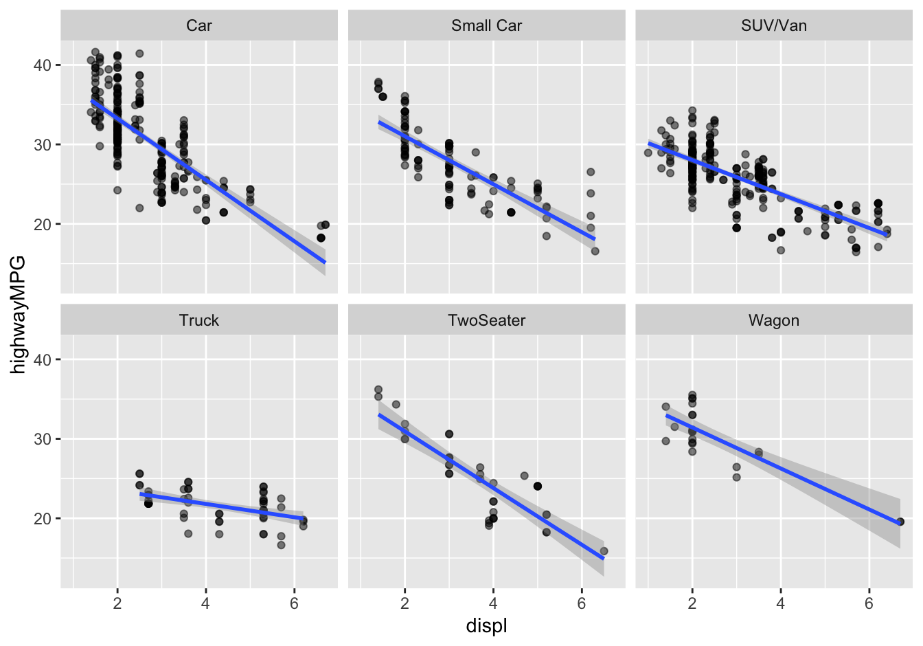
Figure 15.7: City gas mileage versus engine size for six categories of passenger vehicle.
There seem to be clear differences in slopes across the six different vehicle types. In order to model fuel economy well, we definitely need an interaction between displ and Category. Let’s incorporate this into a model for highwayMPG and calculate the model’s \(R^2\):
lm1_cars = lm(highwayMPG ~ displ + Category + displ:Category, data=epa_cars_gas2020)
rsquared(lm1_cars)
## [1] 0.7083828So this model predicts about 71% of the model-to-model variation in fuel economy. What about each individual predictor? Let’s run a quick ANOVA, calculating \(\eta^2\) for each variable:
eta_squared(lm1_cars, partial=FALSE)## # Effect Size for ANOVA (Type I)
##
## Parameter | Eta2 | 95% CI
## ------------------------------------
## displ | 0.56 | [0.52, 1.00]
## Category | 0.11 | [0.07, 1.00]
## displ:Category | 0.04 | [0.02, 1.00]
##
## - One-sided CIs: upper bound fixed at (1).According to this table, our model attributes most of the credit for predicting fuel economy to the engine-size variable, displ, which improves the model’s \(R^2\) by 56%. Category gets credit for predicting 11% of the variation in mileage, while the interaction produces a further change in \(R^2\) of 4%. This bears out the visual impression conveyed by Figure 15.7, in which the slopes in each panel are clearly different.
So if you were to naively take the results of this ANOVA at face value, you’d conclude that engine size mattered five times as much as vehicle category for predicting fuel economy (56% vs. 11%).
But this conclusion is wrong, because our ANOVA table here involves a major, even deal-breaking, caveat. Remember that an analysis of variance is inherently sequential: first we add the engine size variable, then we add vehicle category, and then we add the interaction, tracking \(R^2\) at each stage in our sequential model-building process. To build the ANOVA table, R just adds the variables one at a time, in the same order you named them in your call to lm. But this order is inherently arbitrary. Therefore a natural question is: what happens if we build our ANOVA table by adding Category before we add displ?
lm2_cars = lm(highwayMPG ~ Category + displ + displ:Category, data=epa_cars_gas2020)
rsquared(lm2_cars)
## [1] 0.7083828The first thing to emphasize here is that this is the same model as before. All we did was switch the order in which we named the coefficients. The model has the same \(R^2\), as it should, since it has the same variables in it. Moreover, the two models have exactly the same coefficients:
| Variable | Model 1 (displ added first) | Model 2 (Category added first) |
|---|---|---|
| (Intercept) | 40.97 | 40.97 |
| CategorySmall Car | -3.91 | -3.91 |
| CategorySUV/Van | -8.68 | -8.68 |
| CategoryTruck | -15.81 | -15.81 |
| CategoryTwoSeater | -2.91 | -2.91 |
| CategoryWagon | -4.39 | -4.39 |
| displ | -3.86 | -3.86 |
| displ:CategorySmall Car | 0.84 | 0.84 |
| displ:CategorySUV/Van | 1.72 | 1.72 |
| displ:CategoryTruck | 3.02 | 3.02 |
| displ:CategoryTwoSeater | 0.29 | 0.29 |
| displ:CategoryWagon | 1.28 | 1.28 |
Again, this is re-assuring: our estimated coefficients don’t depend on the (totally arbitrary) order in which we name the variables.
But what about the analysis of variance?
eta_squared(lm2_cars, partial=FALSE)## # Effect Size for ANOVA (Type I)
##
## Parameter | Eta2 | 95% CI
## ------------------------------------
## Category | 0.28 | [0.23, 1.00]
## displ | 0.39 | [0.35, 1.00]
## Category:displ | 0.04 | [0.02, 1.00]
##
## - One-sided CIs: upper bound fixed at (1).Now we see a big difference. According to this table, our second model attributes 28% of the credit for predicting fuel economy to Category, versus 11% before. And now it attributes only 39% of the credit to displ, versus 56% before.
Why does this happen? How could our conclusion about the relative importance of the variables depend upon something so arbitrary as the order in which we named them in our call to lm?
Shared vs. unique information
The figure below provides some intuition why this is so. In our data on gas mileage, the two predictors (engine size and vehicle class) are correlated with each other. Vehicles in certain categories, like SUVs and trucks, tend to have bigger engines than wagons and sedans.
ggplot(epa_cars_gas2020) +
  geom_boxplot(aes(x=reorder(Category, displ), y=displ))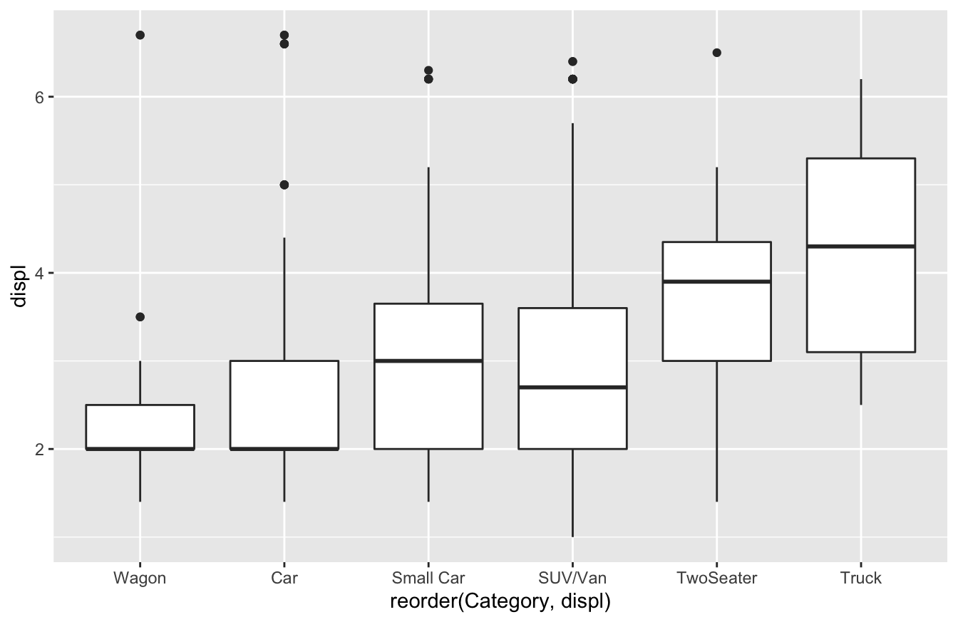
To understand why this correlation between predictors would matter so much in an analysis of variance, let’s consider the information provided by each variable. First, a vehicle’s Category tells us at least two important things relevant for predicting gas mileage.
- Weight: for example, SUVs tend to be heavier than sedans, and heavier vehicles will get poorer gas mileage.
- Aerodynamics: for example, minivans tend to be boxier than sports cars, and boxier cars will get poorer gas mileage due to increased drag at highway speeds.
Second, a vehicle’s engine displacement (displ) tells us at least two important things relevant for predicting gas mileage.
- Weight: bigger engines are themselves heavier, and tend to come in cars that are heavier in other ways, too.
- Fuel consumption: a smaller engine consumes less fuel and typically implies better mileage than a bigger engine.
Notice that both variables provide information about a vehicle’s weight; let’s call this the shared information. But each also provides information on something else specific to that variable; let’s call this the unique information. The shared information between the predictors manifests itself as correlation between predictors: bigger cars tend to have both bigger engines, and they also to be in certain classes.
We can use a Venn diagram to represent both the shared and the unique information provided by the predictors in a stylized (i.e. non-mathematical) way. Where the two predictors overlap can be thought of as the “shared” information they convey that is relevant for predicting fuel economy.
In the first analysis of variance, we added engine size (displ) first (step 1). When we did so, the regression model greedily used all the information it could from this predictor, including both the unique information, as well as any information that displ might share with other predictors. As a result, when we added the Category variable second (step 2), the shared information was redundant—it was already accounted for by the model. We therefore end up giving theCategory variable credit only for its unique information content; all the information content it shares with engine size was already counted in step 1. This is illustrated in the Venn diagram below:
Figure 15.8: Attribution of credit when engine size (displ) is added first.
But when we flip things around and add vehicle category to the model first, this picture changes. We end up giving Category credit both for its unique information content and for the information it shares with engine size. This leaves less overall credit for displ when we add it in step 2 of the ANOVA. This is illustrated in the figure below:
Figure 15.9: Attribution of credit when vehicle class/category is added first.
This example highlights an unsatisfying but true feature of the analysis of variance: when the predictor variables are correlated, their ordering matters when you build the ANOVA table. It’s yet another symptom of the general fact that correlated predictors leads to causal confusion.
This feature of an ANOVA table at first seems counterintuitive, even disturbing. Yet similar problems of “credit attribution” occur all the time in everyday life. A good analogy here is the dessert buffet at Thanksgiving dinner. Imagine two different versions of dessert.
Version 1: After Thanksgiving dinner, your aunt offers you apple pie, and you eat your fill. The apple pie is delicious—you were really looking forward to something sweet after a big Thanksgiving meal. It makes you very happy. Next, after you’ve eaten your fill of apple pie, your aunt offers you pumpkin pie. Pumpkin pie is also delicious—you love it just as much as apple. But your dessert tummy is pretty full already. You eat a few bites, and you enjoy it; that spicy pumpkin flavor is a little different to what you get from an apple pie. But of course, pumpkin pie is still a dessert, and you don’t enjoy it as much as you might have if you hadn’t eaten so much apple pie first.
Version 2: After Thanksgiving dinner, your aunt offers you pumpkin pie, and you eat your fill. The pumpkin pie is delicious—all that whipped cream on top goes so well with the nutmeg and earthy pumpkin flavor. It makes you very happy. Next, after you’ve eaten your fill of pumpkin pie, your aunt offers you apple pie. Apple pie is also delicious—you love it just as much as pumpkin. But your dessert tummy is pretty full already. You eat a few bites, and you enjoy it; those tart apples with all the cloves and cinnamon give a little different flavor to what you get from a pumpkin pie. But apple pie is still a dessert, and you don’t enjoy it as much as you might have if you hadn’t eaten so much pumpkin pie first.
That evening, which pie are you going to remember? In version 1, you’ll attribute most of your Thanksgiving dessert afterglow to the apple pie; while in version 2, you’ll attribute most of it to pumpkin pie. Context matters, even if in the abstract you like both pies the same amount.
An analysis of variance is like the one-at-a-time dessert eater at Thanksgiving. Whatever variable we add to the model first, the ANOVA greedily eats its fill of that, before turning to the second variable. This affects how credit gets attributed. In our ANOVA tables for the gas mileage data, our two variables (engine size and vehicle class) are like apple and pumpkin pie. Yes, they each offer something unique, but they also share a lot of their information content (just like the pies are both desserts). Because of this, the order in which they are added to the ANOVA table—or equivalently, the context in which each variable’s marginal contribution to the model is evaluated—matters a lot.
There are four important points to take away here:
- When the predictors are correlated, it doesn’t make sense to speak of “the” ANOVA table for a model, only “an” ANOVA table. There is no unique way to partition credit among multiple variables for their shared information content in a regression model. We must make an arbitrary choice—and in an ANOVA table, that choice is “winner take all shared information” to the first variable added to the model (i.e. the first variable named in your call to
lm).
- This problem doesn’t arise when the predictors are uncorrelated. In this case, the ANOVA table is independent of the order in which the variables are added to the model. This is rare in observational studies, but common in well-designed factorial experiments.
- Because of (1) and (2), ANOVA is very useful in experiments, but much less useful in observational studies.
- The one situation where I think ANOVA can still be useful, even for non-experimental data, is when evaluating the practical significance of an interaction term in a model that already contains both main effects. That’s because you always add both main effects before you add an interaction term, obviating concerns over the ordering in which variables are included.
The bottom line is to reserve the use of ANOVA tables for when they make sense, which is (mostly) in the context of designed experiments.
15.5 Regression in the real world
The data
As a case study, we’ll data on house prices from Saratoga County, New York. We’ll show how, together with multiple regression, this data set can be used to address interesting questions of the kind that might be relevant to anyone buying, selling, or assessing the taxable value of a house. The data is available in SaratogaHouses.csv.60 Go ahead and download the data and get it imported in RStudio. Please also load the tidyverse and effectsize packages.
library(tidyverse)
library(effectsize)
Each row in the data set is a house, and we’ll consider the following variables in our analysis:
- price, in dollars
- lotSize, in acres
- age, in years
- livingArea, in square feet
- number of fireplaces in the house
- fuel, the type of fuel used to heat the house (gas, electric, or oil)
The specific question we’ll set out to ask is: how much is a fireplace worth? This question entails isolating a partial relationship between our \(y\) variable (price) and a specific \(x\) variable of interest (number of fireplaces). In addressing a question like this, I generally follow these steps:
- Start by examining the overall relationship between \(x\) and \(y\), using e.g. a plot and/or a simple model. What do you see?
- Think about and Examine the other variables in the problem. Which of these might be important confounders of the relationship between \(x\) and \(y\)? Use any relevant data visualization and modeling tools to identify these confounders. We should be most concerned about adjusting for variables that are likely to be strongly associated both with \(x\) and \(y\).
- Estimate the partial relationship between x and y, adjusting for an appropriate set of confounders. Use your judgment and findings from step 2 to inform your choices here.
- Refine your estimate, potentially adding interactions or adjusting for more variables. We’ll cover this in a bit.
Or if you want an acronym: STEER (start, think, examine, estimate, refine). Keeping in mind that these are general guidelines rather than rigid steps, let’s see this approach in action.
Model building
We’ll start with some exploratory analysis, looking a jitter plot of each house’s price versus the number of fireplaces it has:
ggplot(data=SaratogaHouses, aes(x=fireplaces, y=price)) +
  geom_jitter(data=SaratogaHouses, width=0.2, alpha=0.1) +
  geom_smooth(method='lm') +
stat_summary(fun = 'mean', color='blue') 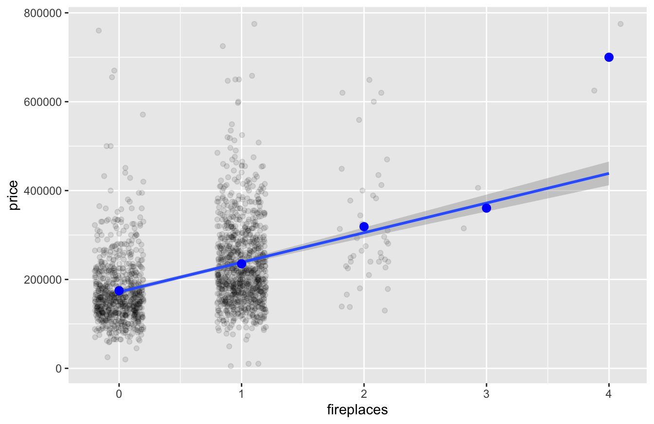
The blue points, via stat_summary, show us the mean price of each group (one-fireplace houses, two-fireplace houses, and so on). As you can see, a straight-line fit of price versus fireplaces looks very reasonable here; you might object that it misses the average four-fireplace house, but since there are only two such houses in the data set, this is hardly a bad miss.
Let’s estimate the slope of the line from this figure by running a regression:
lm0 = lm(price ~ fireplaces, data=SaratogaHouses)
get_regression_table(lm0)
## # A tibble: 2 × 7
## term estimate std_error statistic p_value lower_ci upper_ci
## <chr> <dbl> <dbl> <dbl> <dbl> <dbl> <dbl>
## 1 intercept 171824. 3234. 53.1 0 165481. 178166.
## 2 fireplaces 66699. 3947. 16.9 0 58958. 74440.The naive answer is that each additional fireplace is associated with an additional $67,000 in value. If this figure represented the true monetary value of a fireplace, simply building more fireplaces would offer a ridiculous return on your home-improvement dollar.
But before you knock a hole in your ceiling and load up on bricks at Home Depot, remember a key fact: this is an overall relationship. In comparing houses with different numbers of fireplaces, we are not making an apples-to-apples comparison, and so we’re not really isolating the effect of the fireplace itself. For example, houses with more fireplaces also tend to be bigger inside and to sit on properties with more land area, as the table below shows:
SaratogaHouses %>%
  group_by(fireplaces) %>%
  summarize(mean_size = mean(livingArea),
            mean_lot = mean(lotSize),
            count = n())
## # A tibble: 5 × 4
## fireplaces mean_size mean_lot count
## <int> <dbl> <dbl> <int>
## 1 0 1448. 0.453 740
## 2 1 1952. 0.514 942
## 3 2 2571. 1.01 42
## 4 3 2669 0.84 2
## 5 4 4598 0.465 2These factors of living area and lot size are also strongly correlated with the price of a house. Our initial model could easily be confusing the effect of having more fireplaces with the effect of having a bigger house that can actually fit all those fireplaces.
Thus we have two possible explanations for the relationship we see between price and number of fireplaces. This correlation may happen because fireplaces are so valuable. On the other hand, it may instead (or also) happen because fireplaces happen to occur more frequently in houses that are desirable for other reasons (i.e. they are bigger). This is confounding again: when some third variable is correlated with both the response and the predictor of interest.
Disentangling these two possibilities requires estimating the partial relationship between fireplaces and prices, rather than the overall relationship. We should know what to do by now: let’s build a model that adjusts for the size of the house and the lot, by including them as predictors in the regression. This is our Estimate step.
lm1 = lm(price ~ livingArea + lotSize + fireplaces, data=SaratogaHouses)
get_regression_table(lm1)
## # A tibble: 4 × 7
## term estimate std_error statistic p_value lower_ci upper_ci
## <chr> <dbl> <dbl> <dbl> <dbl> <dbl> <dbl>
## 1 intercept 13656. 5018. 2.72 0.007 3813. 23499.
## 2 livingArea 108. 3.07 35.3 0 102. 114.
## 3 lotSize 6008. 2405. 2.50 0.013 1291. 10724.
## 4 fireplaces 8887. 3385. 2.63 0.009 2248. 15525.This results in a much more modest effect of fireplaces on price: roughly $8900 per fireplace (95% CI: $2250 to $15,525). This coefficient arises from comparing the prices of houses with similar lot sizes and living areas, but different numbers of fireplaces.
Model checking and further refinement
A multiple regression model assumes that the relationship between the response and the predictors can be described by a linear equation. Therefore, an important sanity check on your results is to verify whether this assumption looks plausible, in light of the data.
The simplest way to do this is the make a scatter plot of the actual \(y\) values versus the fitted \(y\) values coming out of the regression. If this scatter plot shows an approximately linear relationship, then your multiple regression model has passed the sanity check:
ggplot(SaratogaHouses) +
  geom_point(aes(x=fitted(lm1), y= price), alpha=0.1) # lower alpha = more transparent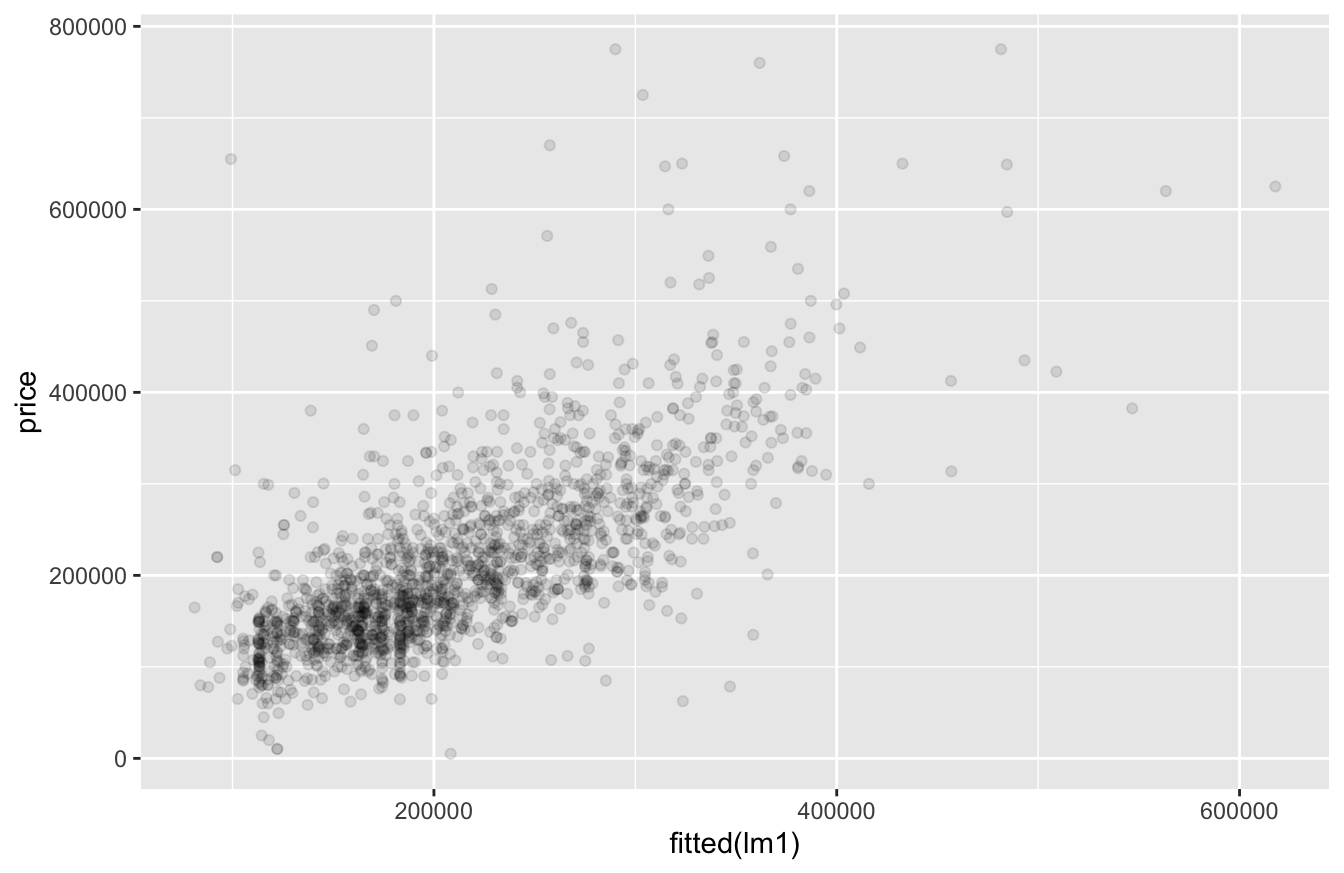
There’s no obvious nonlinearity here. Our assumption of a linear relationship looks sensible in light of the data.
You might ask: what about other possible confounders? Sure, we’ve adjusted for the size of the house and property. But maybe there are other differences between, say, zero-fireplace houses and one-fireplace houses that make our estimate of $8900 per fireplace misleading.
To address this concern, we can enrich our model by additional variables as controls in the regression. For example, let’s consider what a house’s fuel system type, i.e. how it’s heated. This could be a confounder for fireplaces, because houses with gas heating seem to have more fireplaces, on average:
SaratogaHouses %>%
  group_by(fuel) %>%
  summarize(mean_fp = mean(fireplaces))
## # A tibble: 3 × 2
## fuel mean_fp
## <chr> <dbl>
## 1 electric 0.419
## 2 gas 0.675
## 3 oil 0.463So let’s see what happens when we add fuel type to the model:
lm2 = lm(price ~ livingArea + lotSize  + fireplaces + fuel, data=SaratogaHouses)
get_regression_table(lm2)
## # A tibble: 6 × 7
## term estimate std_error statistic p_value lower_ci upper_ci
## <chr> <dbl> <dbl> <dbl> <dbl> <dbl> <dbl>
## 1 intercept 8282. 5555. 1.49 0.136 -2613. 19177.
## 2 livingArea 105. 3.14 33.5 0 99.0 111.
## 3 lotSize 8640. 2488. 3.47 0.001 3760. 13520.
## 4 fireplaces 7494. 3382. 2.22 0.027 860. 14127.
## 5 fuel: gas 15494. 4537. 3.42 0.001 6596. 24393.
## 6 fuel: oil -3484. 6173. -0.564 0.573 -15591. 8623.Two things happen when we added fuel-system type to the model:
- We saw there’s a clear effect on price of fuel type, holding other variables constant. Notice the confidence intervals on the fuel-type: electric and oil heating clearly predict lower prices than the baseline category, which is gas. These effects aren’t small: our best guess is that gas heating is worth something like $15,000 to $19,000 more than other heating-system types, possibly because of its lower operating costs in a very cold climate.
- The estimated coefficient on the fireplaces variable got smaller, compared with our prior model: about $7500, versus $8900 before. It turns out that some of the “fireplace” premium we estimated in
lm1was actually a “gas heating” premium. Since houses with more fireplaces were more likely have gas heating, we wrongly attributed some of the “gas heating” premium to fireplaces when we left fuel type out of the model.
Now let’s consider yet another possible confounder: the age of the house. What happens when we add age to the model?
lm3 = lm(price ~ livingArea + lotSize + fireplaces + fuel + age, data=SaratogaHouses)
get_regression_table(lm3)
## # A tibble: 7 × 7
## term estimate std_error statistic p_value lower_ci upper_ci
## <chr> <dbl> <dbl> <dbl> <dbl> <dbl> <dbl>
## 1 intercept 15131. 5878. 2.57 0.01 3602. 26661.
## 2 livingArea 104. 3.15 32.9 0 97.7 110.
## 3 lotSize 8214. 2483. 3.31 0.001 3344. 13084.
## 4 fireplaces 6391. 3386. 1.89 0.059 -250. 13033.
## 5 fuel: gas 17385. 4555. 3.82 0 8451. 26320.
## 6 fuel: oil 3058. 6435. 0.475 0.635 -9563. 15679.
## 7 age -209. 60.2 -3.47 0.001 -327. -90.9The fireplace coefficient changed yet again: now we think an additional fireplace is worth something like $6400 when we compare houses with similar living areas, lot sizes, fuel systems, and ages. Moreover, we can confidently identify the sign of the age effect: older houses cost less, holding other variables constant. So again we have a situation where we added a variable to the model, it has a definite effect on the outcome (see the confidence interval), and its inclusion changes the magnitude of the coefficient we care about (in this case, fireplaces). The conclusion is simple: we need to include age in the model as an important confounder.
This example emphasizes the use of multiple regression to adjust statistically for the effect of confounders, by estimating a partial relationship between the response (price) and the predictor of interest (fireplaces). This is one of the most useful real-world applications of regression modeling, and there are several take-home lessons from this example:
First, if you want to estimate the effect of a single variable in isolation, make sure you include the potential confounders in the model.
Second, the biggest confounders are the most important! Confounders are “big” if they are strongly correlated with the predictor of interest and also exert a large effect on the outcome.
- By far the most biggest confounder here was size: houses with different numbers of fireplaces were very different from each other, on average, with respect to their living area and lot size. So when we included these two variables in the model, our estimate of the “fireplace effect” changed by an enormous amount: from $67000 down to $8900. Said another way, when we failed to adjust for differences in living area and size, our estimate of the fireplace effect was nearly ten times too large!
- By comparison, fuel-system type was a smaller confounder, since—for obvious reasons—fuel type is a weaker predictor of price than the size of a house. As a result, adjusting for fuel-system type did not change our estimate of the fireplace effect by nearly so drastic an amount: from $8900 to $7500, or about 19% lower. (Further adjustment for age dropped the estimate by another 17% or so, to about $6400).
The general rule is that, in terms of getting an accurate estimate for your partial relationship of interest, you get the most mileage out of adjusting for the biggest confounders.
Third, if you believe there might be other confounders you haven’t measured, then acknowledge them, and be honest about the fact that your conclusions are inherently tentative—especially if those unmeasured confounders might have a large effect. In fact, our analysis of the Saratoga house price data almost certainly leaves out some potentially important confounders, like whether a house has air conditioning or whether it’s on the water front. I encourage you to play around with the data to try to get an even better estimate for the “fireplace effect” that adjusts for these other variables.
Statistical vs. practical significance, revisited
A question that often comes up in multiple regression is whether a particular term in the model is “statistically significant” at some specified level (e.g. 5%). All this means is whether zero is a plausible value for that partial slope in the model. Remember, a coefficient of zero means that there is no partial relationship between the response and the corresponding predictor, adjusting for the other terms in the model. So when we say that a predictor is statistically significant, all we mean is that it we think it has a nonzero (partial) relationship with the response.
Remember that, by convention, people express the statistical significance level as the opposite of the confidence level. So a confidence level of 95% means a significance level of 5%; a confidence level of 99% means a significance level of 1%; and so forth. This is confusing at first, but you’ll get used to it. Just remember: the lower the significance level, the stronger the evidence that some variable has a nonzero relationship with the response.
In regression models we can assess statistical significance just by looking at whether zero is included in the confidence interval. That’s because “statistically significant” just means “zero is not a plausible value,” and a confidence interval gives us a range of plausible values.
For example, let’s take the regression table for our model of price versus living area, lot size, fireplaces, fuel, and age:
get_regression_table(lm3)## # A tibble: 7 × 7
## term estimate std_error statistic p_value lower_ci upper_ci
## <chr> <dbl> <dbl> <dbl> <dbl> <dbl> <dbl>
## 1 intercept 15131. 5878. 2.57 0.01 3602. 26661.
## 2 livingArea 104. 3.15 32.9 0 97.7 110.
## 3 lotSize 8214. 2483. 3.31 0.001 3344. 13084.
## 4 fireplaces 6391. 3386. 1.89 0.059 -250. 13033.
## 5 fuel: gas 17385. 4555. 3.82 0 8451. 26320.
## 6 fuel: oil 3058. 6435. 0.475 0.635 -9563. 15679.
## 7 age -209. 60.2 -3.47 0.001 -327. -90.9The 95% confidence interval for the partial slope on lot size is roughly $3,300 to $13,000. We can rule out zero as a plausible value at a 95% confidence level, and so we can say that the lot size variable is statistically significant at the 5% level.
On the other hand, the 95% confidence interval for the partial slope on fireplaces is about -$250 to $13,000. We cannot rule out zero as a plausible value with 95% confidence, and so the fireplaces variable is not statistically significant at the 5% level.
But remember our discussion of Statistical vs. practical significance: the fact that some variable is “statistically significant” does not necessarily mean that this variable is important in practical terms. A “significant” variable does not necessarily have a large effect on the response, nor is it automatically important for generating good predictions. Statistical significance means that we think the corresponding coefficient isn’t zero, but that doesn’t by itself tell us how important the variable is. So the fact that the lot size variable is “statistically significant” might be interesting, but it’s probably more useful to actually say how big the effect might be. This is why, in most cases, it is better to focus on a variable’s confidence interval, rather than on whether a variable is significant. The confidence interval carries a lot more information than a simplistic distinction between “significant” and “insignificant,” because it gives you a range of plausible values for the coefficient: in the case of lot size, $3,300 to $13,000 per acre.
Finally, the fact that some variable is not statistically significant does not prove that this variable is unrelated to the response with the response, or that it should automatically be dropped from the model. A lack of statistical significance could just mean a big standard error—in other words, that we have a lot of uncertainty about the numerical magnitude of some variable’s partial relationship with the response. There’s an important but subtle distinction here: an insignificant coefficient means that we have an absence of compelling evidence for a nonzero effect. It does not mean that we have found compelling evidence that the effect is absent.
Since the confidence interval for the fireplaces term in our regression table is -$250 to $13,000, we cannot rule out zero as a plausible value. But there are plenty of large values, like $6,000 or $12,000, that we cannot rule out, either! There’s a lot of uncertainty here. One symptom of this is a big standard error of about $3,400; another symptom is a lack of statistical significance at the 5% level. But it does not follow that fireplaces are without value, or irrelevant for predicting the price of a house. We just can’t pin down their value with a precision greater than about $13,000, the approximate width of the confidence interval.
15.6 “What variables should I include?”
The hardest part of building a regression model is knowing what variables to include. To be honest, there’s a reason that even people with Ph.D’s in scientific fields struggle to know what to do here: because it’s hard, and you get better only with experience. It’s just not possible to equip you with a decision tree that will give you the right answer, in all cases, to every possible question of the form “Should I include this variable in my model?” Often there’s no obvious correct answer; many feisty academic debates turn on the question of whether some regression model has appropriately adjusted for the right set of confounders, with sensible arguments on both sides.
So with that in mind, the best I can do is to give you some general summary guidelines.
If your goal is to use regression to isolate a partial relationship of interest, you’ll want to include other variables in the model that directly affect \(y\), to adjust for them. As we’ve seen, it’s especially important to include confounders: variables that directly affect \(y\) and are also correlated with \(x\). Leaving out an important confounder leads to causal confusion: estimating the wrong partial relationship by failing to adjust for important differences among the data points in your regression. (This is often called “omitted-variable bias.”
It’s also a nice bonus to include independent drivers of \(y\): variables that affect the outcome, but aren’t correlated with your \(x\) variable of interest. Leaving these out isn’t a big deal, in that doing so won’t lead to causal confusion. But including them can lead to narrower confidence intervals for the partial relationship of interest, for more or less the same reasons that Blocking to lead to sharper estimates in experiments: by telling the model what matters for predicting \(y\), you’re making it easier for that model to make like-for-like comparisons. So, for example, even if lot size wasn’t correlated with the number of fireplaces (our predictor of interest), we’d likely still want to include it in our model, because it clearly helps to predict the price of a house.
But we can’t include everything! Here are some kinds of variables we can safely leave out:
- Variables that don’t predict any variation in \(y\).
- Variables whose effect on \(y\) is largely redundant with other variables already included. (This might be one case where an ANOVA table helps in observational studies: to measure how redundant a predictor is, in light of others already included.)
- Variables whose inclusion in the model doesn’t change the answer, i.e. the partial relationship of interest (though it’s nice to show this, especially if it might surprise your readers that the answer doesn’t change).
Beware of colliders. Finally, there are actually some variables that must be left out of your regression model, because they could seriously bias your results if you include them. These variables are called colliders, and they are kind of like the opposite of confounders. Intuitively, a confounder is like a common cause of both x and y, while a collider is a common effect of both x and y.
.](images/collider_bias.png)
Figure 15.10: Figures from Catalogue of Bias.
You can see from the picture where the term “collider” comes from, because if you draw a diagram with arrows between variables representing the direction of causal influence, a collider is a variable where arrows from the x (“exposure” or “treatment”) and y (“outcome”) variables collide head to head.
Including a collider in a model leads to something called collider bias. Let’s see a stylized example. Suppose we decide to run a study that seeks to answer the question: does Covid protect against car accidents? (Seems silly, but bear with me.) Imagine, moreover, that if we could tabulate everyone in the general population of our city according to whether they have Covid and whether they’ve been in a car accident, the data would look something like this:
##          Car_Accident No_Car_Accident
## Covid             100             900
## No_Covid         1000            9000
This is a table of counts. Now let’s turn this into a table of conditional probabilities, given the levels of the Covid variable along the rows of the table:
##          Car_Accident No_Car_Accident
## Covid             0.1             0.9
## No_Covid          0.1             0.9
So in the general population, P(Car accident | Covid) is 10%, and P(Car accident | No Covid) is also 10%. Clearly Covid and car accidents are independent.
But now suppose we make the following crucial error: we decide to run our study not using a sample from the general population, but rather using data on patients in the hospital. After all, this seems like a convenient place to find both Covid patients and car-accident victims for the purposes of our study.
To make the numbers simple here, let’s suppose that: 1) everybody with Covid or in a car accident ends up in the hospital; and that 2) there are an additional 1000 people in the hospital due to other causes (that is, neither Covid nor a car accident). Therefore, based on our study of hospital patients, we end up with a sample that looks like this:
##          Car_Accident No_Car_Accident
## Covid             100             900
## No_Covid         1000            1000
The bottom right entry in the table is now 1,000, rather than 9,000, because we’re including only people that ended up in the hospital in our study: most of those 9,000 people in our wider population who never had Covid and weren’t in a car accident don’t end up in our data set.
Now look what happens when we use this convenience sample to calculate the probability of a car accident, given the levels of the Covid variable along the rows of the table:
##          Car_Accident No_Car_Accident
## Covid             0.1             0.9
## No_Covid          0.5             0.5
Notice how P(Car accident | no Covid) = 50%, but that P(Car accident | Covid) is only 10%. Covid is associated with a lower probability of being in a car accident. Miraculous! Covid protects against car accidents, we conclude.
Umm, not so fast. Remember, we already determined that Covid and car accidents were independent in our hypothetical population. The problem is that our analysis of hospitalized people suffers from a clear collider bias:
- You can end up in the hospital with Covid (our “treatment,” “exposure” or x variable).
- You can also end up in the hospital because of a car accident (our outcome or y variable).
Thus hospitalization status is a collider variable: it is a common effect of both x and y in our study. And by studying only those patients in the hospital, we were implicitly “adjusting for hospitalization status” by comparing outcomes only for people where “Hospital = True.” If our goal is to estimate the relationship between Covid and car accidents, we should not condition on or adjust for the collider! You can see what goes wrong here if you don’t follow this advice: you end up with a distorted association between your x and y variables of interest, mistakenly concluding that Covid is associated with a reduced risk of car accidents.
And while this example is hypothetical, real versions of this mistake are made all the time, by people who really ought to know better. For example:
- Sackett (1979) analyzed data on 257 hospitalized individuals and detected an association between locomotor ataxia and respiratory disease.61 The effect wasn’t small: those with locomotor ataxia were 4 times were likely to have respiratory disease, versus those without locomotor disease. It was also scientifically plausible: locomotor ataxia could cause inactivity, which could cause respiratory disease. But the analysis of hospitalized individuals was biased: both diseases can lead to hospitalization. Looking only at hospitalized individuals led to a distorted association. Sackett repeated the analysis for a sample from the general population, and found no association.
- Some researchers have used data to argue that obesity, rather than being a health risk, actually confers a survival advantage in certain clinical subgroups. This “obesity paradox” has been studied in those suffering from stroke, heart attacks, heart failure, kidney disease, and diabetes. In these subgroups, moderate obesity paradoxically seems to be associated with a higher survival rate. But a recent article in the journal Epidemiology argued that this paradox doesn’t reflect a real phenomenon, but rather a statistical artifact that arises because of collider bias—that is, conditioning on an outcome (such as kidney disease or diabetes) that is itself a possible consequence of obesity.62
- According to a recent paper published in Nature, collider bias undermines our understanding of the long-term consequences of Covid-19, because so many studies of Covid are done on patients that have been admitted to the hospital—thereby conditioning on something that is the result of, not the cause of, Covid infection.
To avoid collider bias, the remedy is simple: never include post-treatment variables in your regression model if your goal is to isolate a cause-and-effect relationship. By a “post-treatment” variable, I mean anything that is causally downstream of (i.e. affected by) the particular \(x\) (“treatment”) variable you care about. Post-treatment variables can never be confounders, because by definition they cannot causally influence your treatment (x) variable. But they can be potential colliders. Just leave them out and you won’t have a problem.
Example: beauty in the classroom. To close this lesson off, let’s reason through a specific, non-hypothetical example involving both confounders and colliders.
Consider Professor Dan Hamermesh at the University of Texas at Austin, who, along with colleague Amy Parker, is interested in whether professors that are perceived as more physically attractive receive higher evaluations from their students, holding other factors constant. They collect data on a bunch of individual courses and professors: the basic facts of the course, the seniority of the professor, demographic facts about the professor, and so. Most amusingly, they also ask a panel of 6 students to look at each professor’s photo and rate their physical attractiveness on a 1-5 scale, producing an average “beauty score” for each professor. Altogether, the data represent course evaluations from 25,547 students in 463 different courses across most major academic departments. They decide to run a regression for “course-instructor survey rating” (y) versus “beauty score” (x) to look for a relationship, on the theory that college students unfairly reward a pretty face in the classroom with higher-than-expected ratings.
But what confounders should they adjust for? Consider several possibilities.
- race of the professor? Absolutely. Sadly, there’s plenty of evidence to suggest that race is a factor in how people perceive others’ attractiveness more generally, and how students perceive a professor’s course more specifically. Race could be a big confounder here, affecting both the x and y variables; it definitely needs to be included in the model.
- sex of the professor? Again, absolutely, for more or less the same reasons that race needs to be included.
- whether the course is an elective? Probably this should be included. I suppose it could be true that sexier people get to teach electives, although that seems far fetched. But the more salient fact is that electives consistently receive higher course-instructor ratings than required courses, and so elective status therefore falls under the category of “independent drivers of \(y\) that are nonessential, but nice to included if you can.”
- survey participation rate, i.e. what fraction of the students in a professor’s class participated in the survey? I would argue that this variable definitely should not be included. It’s a clear collider: if a student thinks a professor is attractive (our x variable), or if the student enjoys the class and rates it highly (our y variable), then that student might be more likely to participate in the course-instructor survey at the end of the semester. Participation rate could therefore be a common effect of our x and y variables of interest and should be excluded from the model to avoid introducing a collider bias.
- whether the professor has tenure? This is debateable, but I come down on the side of “no.” This smells like a collider to me. It’s entirely plausible that physical attractiveness predicts who will receive tenure, at least weakly. This would make tenure a “post-treatment” variable, in the sense that it’s causally influenced by our x variable of interest (beauty score). Moreover, I can actually see how the correlation might go either way! Maybe above-average physical attractiveness confers an unfair advantage in the faculty promotion process, making you more likely to be judged by your faculty peers as worthy of tenure. Or on the other hand, maybe those who managed to hit most of the branches on the fall down from the ugly tree are more likely to take an academic path in life, putting in the long antisocial hours in the lab or library that are necessary to receive tenure in the first place. To me, either one of these stories seems more plausible than the idea that tenure is a “pre-treatment” confounder, i.e. that students’ perceptions of a professor’s physical attractiveness are causally influenced by that professor’s tenure status. (“Oh, a full professor, you said? Well now I think he’s ugly as sin.”) For these reasons, I would be uncomfortable with a model that adjusted for tenure status, on the grounds that it might be introducing collider bias.
Do you see what I mean about how these “which variables should I include?” questions can get very subtle? The bottom line is that a lot of thought must go into your regression specification if you want to produce convincing evidence of cause and effect.
In conclusion, you can always read Hamermesh and Parker’s paper on this topic and see what they actually did. If you have a different view of how to run the regression, you can always look at the data yourself!
If you’re shaky on what a confounder means, I suggest revisiting our discussion of confounders in the lesson on Causal vs. statistical questions.↩︎
Technically, a hyperplane.↩︎
Data from “House Price Capitalization of Education by Part Year Residents,” by Candice Corvetti (Williams College honors thesis, 2007) and in the
mosaicR package.↩︎Sackett DL. Bias in analytic research. J Chron Dis 1979; 32: 51-63↩︎
https://journals.lww.com/epidem/FullText/2013/05000/The__Obesity_Paradox__Explained.20.aspx↩︎