1.4 Synoptic charts
1.4.1 Isobars and wind
Synoptic weather charts show the pressure at the earth’s surface. They are rather like contour maps, but instead of contours of constant height they have isobars showing lines of consistent pressure. Areas of low and high pressure appear as concentric rings. The chart also shows fronts - boundaries between warm and cold air masses.
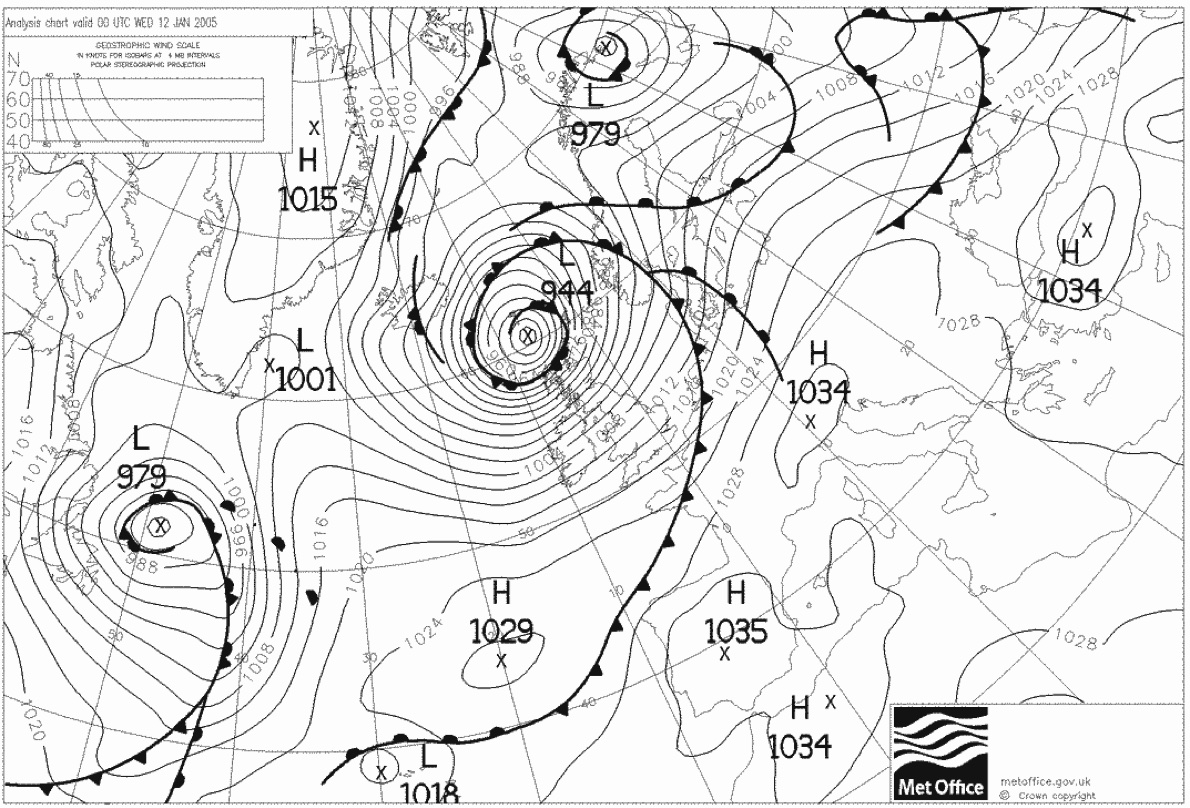
This chart shows an especially nasty area of low pressure (marked L 944) centred north of Scotland. We can see a cold front (black line with triangles) marking the boundary between warm air in front and cold air behind, as well as a warm front (black line with semicircles) which has warm air behind and cold air ahead. The area between the two is called the warm sector. It is the wedge of warm air that has pushed into the cold air to the north. The line with both triangles and semicircles is called an occluded front. It shows where the warm air has been lifted completely away from the ground.
Where the isobars are close together, we expect strong winds. Here, storm force winds were blowing over much of the UK, whilst Italy would have experienced light winds. The wind will blow anticlockwise around low pressure areas, clockwise around high pressure. The wind direction will be angled 15-30˚ inward towards low pressure - so we would expect wind to be blowing from WSW over Wales given the chart above.
In the area marked ‘H 1029’, some perturbations are appearing in the cold front. Perturbtions like this can develop into new depressions, in the same way that we described a depression developing along the polar front.
We said that the wind is stronger where the isobars are closer together. It’s possible to estimate the wind speed using the ‘geostrophic wind scale’ shown at the top left of the image.
For example, say we’d like to estimate the wind in Cornwall from the chart shown above. We measure the shortest distance between the isobars over Cornwall:
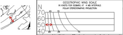
We then transfer this measurement (using a pair of dividers, or a ruler) to the geostrophic scale. We measure from the left hand axis of the scale. Because Cornwall is at 50˚N latitude (as we can see from the grid on the chart), we measure along the ‘50N’ line. The estimated geostrophic wind can be found from reading off the value of the curve we measure to - in this case 40 knots. The geostrophic wind follows the isobars, so we’d expect this wind to be a westerly.
The geostophic wind is the wind we’d expect at high altitude if the isobars were straight. We need to adjust it to find the wind expected on the surface. There are more complicated ways to do this, but as a rule of thumb:
Over the sea, the surface wind will be 2/3 of the geostrophic wind and backed (i.e. direction changed anticlockwise) by about 15˚
Over the land, the surface wind will be 1/2 of the geostrophic wind and back 30˚
So, over the sea near Cornwall, we might expect 27 knot winds from around 255˚. Over the land, we’d expect this to drop to 20 knots, and the direction to be 240˚.
As a very rough guide, assuming westerly winds, the surface wind speed in knots is around 4 times the number of isobars running across the UK mainland.
1.4.2 Low pressure
Areas of low pressure, or depressions (L on the chart), tend to cause unsettled weather, often bringing stronger winds and rain. There is more information on low pressure systems elsewhere in these notes.
1.4.3 High pressure
High pressure systems, or anticyclones (H on the chart), tend to be associated with fine summer weather. Air circulates clockwise around an anticyclone - the opposite to a depression.
Air in anticyclones tends to be descending towards the earth. This makes it difficult for air to rise and it is this that leads to clear skies with few clouds and settled weather.
Semi - permanent areas of high pressure often develop over the Azores and Southern Europe. As these come north in the summer, they can serve to push depressions northwards, keeping them away from the UK. These anticyclones develop in the warm mid-latitude cell and are warm-cored features.
We also see areas of higher pressure between depressions, giving a temporary respite from poor weather. These develop in the cold polar air, are cold-cored and tend to move across the globe. They do sometimes warm through and stay put.