12.3 Lab 12: Visualization
ggplot2 is a system for declaratively creating graphics. It is based on the Grammar of Graphics and was developed by Hadley Wickham and others. You can download the cheat sheet here. Below some quick examples with the tweets-sentiment datasets:
data.agg <- data %>% group_by(user) %>% dplyr::summarise(n.tweets = n(), mean.target = mean(target, na.rm=TRUE)) %>% arrange(desc(n.tweets))
str(data.agg)
## Classes 'tbl_df', 'tbl' and 'data.frame': 148569 obs. of 3 variables:
## $ user : chr "lost_dog" "tweetpet" "SongoftheOss" "webwoke" ...
## $ n.tweets : int 72 40 39 38 36 34 32 31 31 30 ...
## $ mean.target: num 0 0 2.051 0.737 1 ...# library(ggplot2)
ggplot(data.agg, aes(x = n.tweets, y = mean.target)) +
geom_point()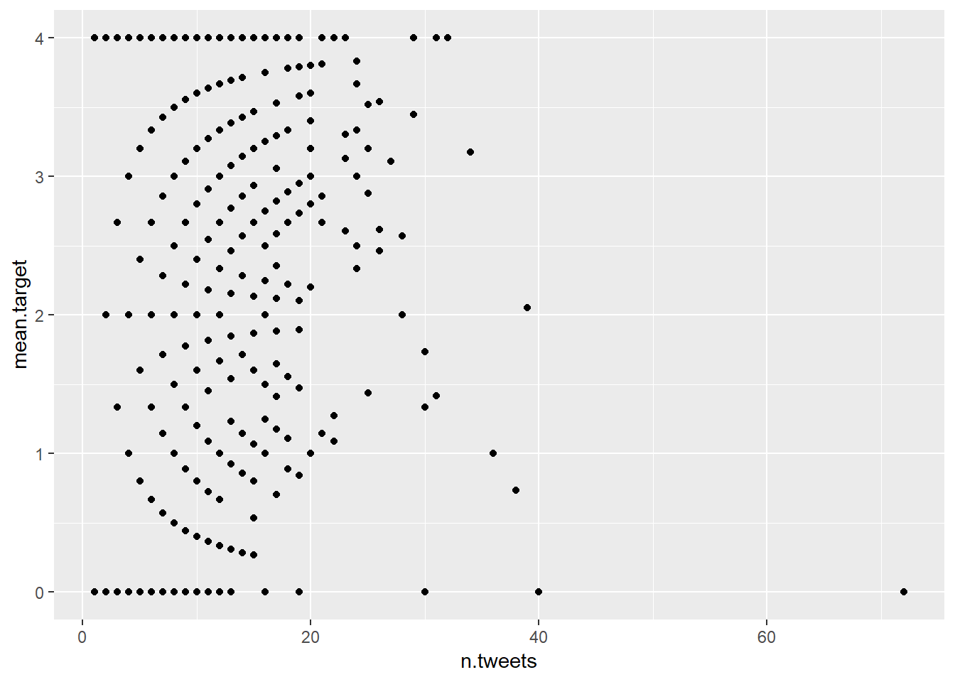
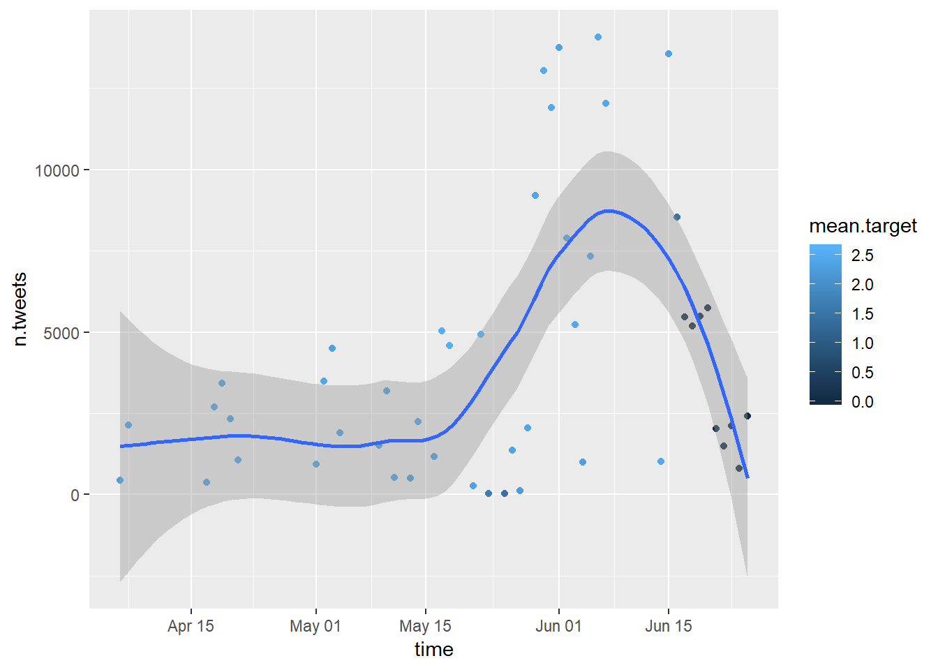
Below we plot the aggregate the data according to time and plot it.
library(lubridate)
# Convert the date variable
data$date <- gsub("PDT", "", data$date)
data$date <- strptime(data$date, "%a %b %d %H:%M:%S %Y", tz = "us/pacific")

# Extract month and year from date variable
data$month <- as.character(month(data$date, label = TRUE, abbr=TRUE))
data$year <- as.numeric(year(data$date))
data$day <- as.numeric(day(data$date))

# Aggregate by year and month
data.agg <- data %>% select(year, month, day, target) %>% group_by(year, month, day) %>% dplyr::summarise(n.tweets = n(), mean.target = mean(target, na.rm=TRUE)) %>% arrange(year, month, day)

# Create time variabled
data.agg$time <- paste(data.agg$day, data.agg$month, data.agg$year, sep = " ")
data.agg$time <- strptime(data.agg$time, "%d %b %Y", tz = "us/pacific")
data.agg$time <- as.Date(data.agg$time)
data.agg <- data.frame(data.agg)

# Visualize
ggplot(data.agg, aes(x = time, y = n.tweets, colour = mean.target)) +
  geom_point() +
  geom_smooth()