6 Sampling
Last week we learned a lot about random variables and how they are “Data Generating Processes”: an random variable describes the relative probability of certain events occuring.
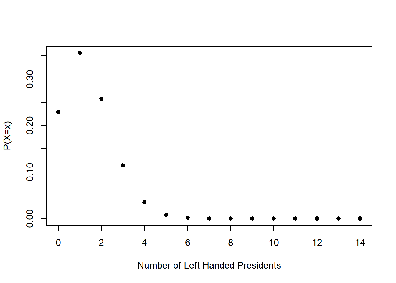
So, for example, a binomial random variable with \(n=14\) and \(\pi=.1\) describes the expected distribution of left-handedness for 14 randomly chosen people (because the population level incidence of left-handedness is 10%). That distribution looks like this:
We posited: what if this is the distribution that was generating President’s handedness? If this is the case, is it surprising to get 6/14 presidents being left handed? Yes! That is very surprising. Very rarely would we just randomly draw 6/14 successes or more from this binomial random variable.
Our conclusion would be that it’s unlikely that this random variable is generating President’s handidness. (We might guess that President’s are being drawn from a population that has a higher percentage of left handed people. To my knowledge people haven’t really figured this one out.)
We could do something similar if we are talking about the normal distribution.
Say a President institutes a new tax on the wealthiest Americans, and in the same year the S&P 500 has a yearly return of -20%.
A lot of people would conclude that the two things are definitely related, but if we think about the randomness underlying the stock market, is that true?
The yearly returns of the S&P 500 are approximately normally distributed with a mean of 7.5% and a standard deviation of 18.5%. Here is what that looks like:
plot(seq(-100,100,.001),dnorm(seq(-100,100,.001), 7.5,18.5), type="l", xlab="Percent Return",
     ylab=("P(X=x)"))
Again, we can say: if this is the distribution that is producing yearly stock market returns, is it strange to get -20% as an outcome? Is 20% so crazy relative to the distribution we think it comes from that we have to overturn the idea that this is the data generating process?
Looking at the position of -20 relative to this distribution, my intuition is that this sort of thing would happen relatively frequently. So we can’t overrule the idea that this was just bad luck.
plot(seq(-100,100,.001),dnorm(seq(-100,100,.001), 7.5,18.5), type="l", xlab="Percent Return",
     ylab=("P(X=x)"))
abline(v=-20, col="firebrick", lty=2)
Ok let’s investigate a third question. Here is some real data that I collected previous to the 2022 election for my work with NBC News. These data represent the opinions of just over 5000 Pennsylvania’s surveyed in the last 2 weeks before election day.
library(rio)
sm.pa <- import("https://raw.githubusercontent.com/marctrussler/IIS-Data/main/PAFinalWeeks.csv")
head(sm.pa)
#>   V1           id    weight week bi.week state county.fips
#> 1  1 118158155235 0.1206374   43      22    PA          NA
#> 2  2 118157935453 1.7210773   43      22    PA       34029
#> 3  3 118158176148 0.3807310   43      22    PA       36061
#> 4  4 118159127460 0.2034677   43      22    PA       36055
#> 5  5 118159752075 0.8093504   43      22    PA       42007
#> 6  6 118159742401 0.4906236   43      22    PA       42007
#>   predicted.vote.prob senate.topline governor.topline
#> 1           0.1097317           <NA>             <NA>
#> 2           0.9906782     Republican       Republican
#> 3           0.9877372       Democrat         Democrat
#> 4           0.2573954       Democrat         Democrat
#> 5           0.6907676     Republican       Republican
#> 6           0.9863851       Democrat         Democrat
#>        biden.approval presvote2020         pid
#> 1    Somewhat approve    dnv/other Independent
#> 2 Strongly disapprove          rep  Republican
#> 3    Somewhat approve          dem    Democrat
#> 4    Somewhat approve          dem    Democrat
#> 5 Strongly disapprove          rep  Republican
#> 6    Somewhat approve          dem Independent
#>            ideology most.important.problem abortion.policy
#> 1           Liberal         Climate change            <NA>
#> 2 Very conservative       Crime and safety            <NA>
#> 3      Very liberal               Abortion            <NA>
#> 4 Very conservative                   Guns            <NA>
#> 5          Moderate              Inflation            <NA>
#> 6          Moderate               Abortion            <NA>
#>   age  race gender hispanic             education
#> 1  59 white   male    FALSE  Post graduate degree
#> 2  83 white   male    FALSE          Some college
#> 3  60 white   male    FALSE  Post graduate degree
#> 4  60 black female    FALSE High school or G.E.D.
#> 5  44 white female    FALSE          Some college
#> 6  44 white   male    FALSE      College graduate
Let’s ask this question: what is the probability that people in this sample supported John Fetterman over Mehmet Oz? For reference, in the actual election John Fetterman won 2,751,012 votes to Oz’s 2,487,260 votes, which is a two party percentage of 52.5%.
Subsetting down to just the people who voted for one of the two major candidates, what was the probability someone was voting for Fetterman?
nrow(sm.pa[sm.pa$senate.topline %in% c("Democrat","Republican"),])
#> [1] 4369
nrow(sm.pa[sm.pa$senate.topline %in% c("Democrat"),])
#> [1] 2432

2432/4369
#> [1] 0.5566491
Above, we were able to say: here is the true proportion of people who are left handed, so is getting 6/14 left=handed president’s crazy? Or we were able to say: here is the true distribution of S&P 500 annual returns, is it crazy to get a year with -20% returns?
How can we apply that same logic here?
Well after the fact we could say: if the truth is that Fetterman received 52.5% support, how crazy is it to get 55.6% in a survey of 5000 people? But that’s only possible after the election is over, and who cares about a poll after the election is done… Before the election we might ask instead: what if the truth is that the race is tied (50%). If that’s the case, is it crazy to get a result of 55.6%?
Ok but…. crazy compared to…. what? What is the random variable that produced this mean of 55.6%?
We know that if I had done another poll of 5000 Pennsylvanians I would have gotten a slightly different result simply due to random chance. But how much random chance should I expect?
To put it into the terms we’ve been talking about: there is some unknown random variable that has an unknown mean, unknown variance, and an unknown shape that produces a new mean every time I go into the population, sample 5000 people, and determine the mean level of support for Fetterman.
Even if we posit that the truth is 50% and look to either confirm or overturn that idea, what is the range of possibilities that might happen? There is this black box random variable that will produce sample means given an underlying truth of 50%. Is 55% likely? What about 60%? What about 100%?
To ultimately answer this question we need to consider what the forces are that shape the outcomes when we collect a sample and calculate an estimate from a random variable, and how we can possibly make conclusions about the “data generating process” from one sample. In other words we have to understand the black box random variable that turns true population numbers into samples of data.
6.1 Law of Large Numbers & The Central Limit Theorem
We want to understand is if there is any regularity to sampling. Can I predict, before I take a sample of 5000 people, what sort of random variable will produce the sample mean I calculate from those people?
We have done a fair number of simulations in this class, such as simulating how frequently you get 0,1,2, or 3 heads when you flip 3 coins. We have taken for granted the fact that to properly approximate the true probability we have to sample a large number of times.
For example if I flip 3 coins 15 times and compare that to what we know the true probability of each number of heads are:
set.seed(19140)
heads <- c(0,1,2,3)
true.prob <- c(.125,.375,.375,.125)
sim.heads<- sample(heads,size=15, prob=true.prob,replace=T)
sim.prob <- as.numeric(prop.table(table(sim.heads)))

plot(heads, true.prob, pch=16, ylim=c(0,.5), xlim=c(-1,4),
     axes=F, xlab="",ylab="Prob")
points(heads, sim.prob, pch=16, col="firebrick")
axis(side=1, at=c(0,1,2,3))
axis(side=2, las=2)
The red dots, representing our simulation, are not all that close to the black dots.
But if we instead pull a sample of 1000:
set.seed(19140)
heads <- c(0,1,2,3)
true.prob <- c(.125,.375,.375,.125)
sim.heads<- sample(heads,size=1000, prob=true.prob,replace=T)
sim.prob <- as.numeric(prop.table(table(sim.heads)))

plot(heads, true.prob, pch=16, ylim=c(0,.5), xlim=c(-1,4),
     axes=F, xlab="",ylab="Prob")
points(heads, sim.prob, pch=16, col="firebrick")
axis(side=1, at=c(0,1,2,3))
axis(side=2, las=2)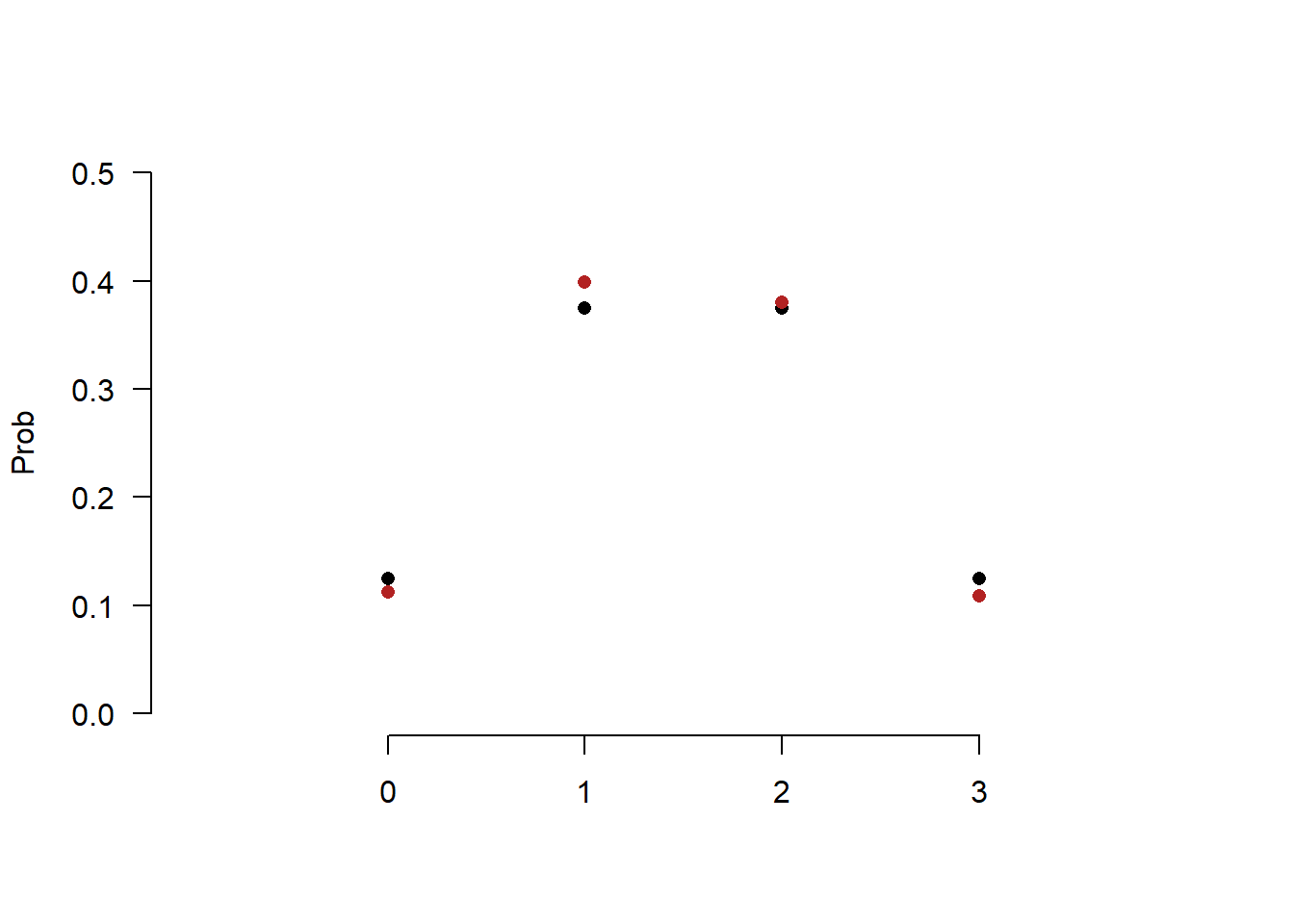
We get a much closer estimate.
Similarly, If I wanted to know the true probability of Pennsylvanians who supported Fetterman in November 2022, I could, say, sample a huge number of voters. Let’s say 500,000. We have seen through Monte Carlo simulations that if I randomly sample a random variable a huge number of times we get a solid approximation of the PDF/PMF of that distribution.If I only sampled 10 voters then I might get an unlucky streak of 10 voters. But If I sample 500,000 the unlucky streaks should cancel out and I should get an average that is close to the truth. Just as they did with the dice example above.
Beyond the fact that I can’t afford to sample 500,000 people, what we want to understand is just how much worse a sample of 5000,1000, or 500 people would be. How much would I be off on average if I ran samples of those sizes? How much variance could I expect?
Let’s start interrogating that.
Let’s say I am sampling Pennsylvanian voters in November 2022, who had a true probability of supporting Fetterman over Oz of .525. That is, if I reach into the “hat” of PA voters and pull out one, the probability they support Fetterman is .525.
We can think about each voter being a Bernoulli random variable with a probability of success of .525. I’m going to create a sample of 10,000 voters drawn from this Bernoulli Random. I’m going to sample all 10,000 at once but we can interrogate the first 10 voters as a sample of 10, the first 50 as a sample of 50, the first 100 as a sample of 100 etc. There is no “Bernoulli” function in R, but the Binomial distribution with size 1 is by definition the Bernoulli RV. So we can use that.
set.seed(19104)
samp <- rbinom(10000,1,.525)
head(samp, 50)
#>  [1] 1 1 0 1 0 1 0 1 1 0 1 1 1 0 1 0 0 0 1 1 1 1 1 0 1 0 0 0
#> [29] 0 1 0 1 1 0 0 0 0 1 1 0 1 1 1 0 1 1 1 0 1 0
We know that the “truth” that we are sampling from is a success rate of .525. We want to know how relatively close an estimate made at different sample sizes is. So for each “sample size” from 1 to 10,000 I’m going to calculate the proportion of people supporting Fetterman. We will start by looking at the first 1000 samples.
#The cumsum() function adds up every value that occurs previous in a vector

cumulative <- cumsum(samp)

#Divide by the position to get the average at each value

relative.error <- cumulative/1:length(samp)

plot(1:10000,relative.error, xlab="Sample Size",ylab="Fetterman Percent", type="l",
     ylim=c(0.3,0.7), xlim=c(0,1000))
abline(h=.525, lty=2, col="firebrick")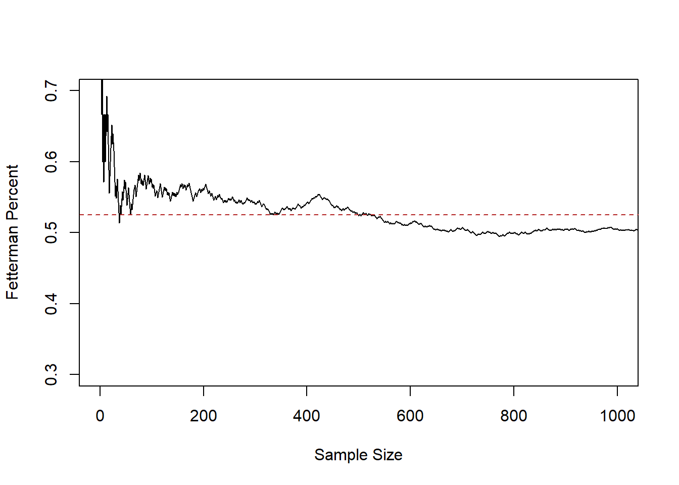
This line represents the sample mean at each sample size, from 1 up to 1000.
At sample size of 1 we are guaranteed to be quite far off from the truth, because the average at that point must be 0 or 1. But relatively quickly the 0’s and 1’s start to cancel out and by a sample of 50 we are down near the truth. From 200 to 1000 we continue to jump around, approximately around the true value of .525, however.
Let’s extend to look at the full 10,000:
plot(1:10000,relative.error, xlab="Sample Size",ylab="Fetterman Percent", type="l",
     ylim=c(0.3,0.7))
abline(h=.525, lty=2, col="firebrick")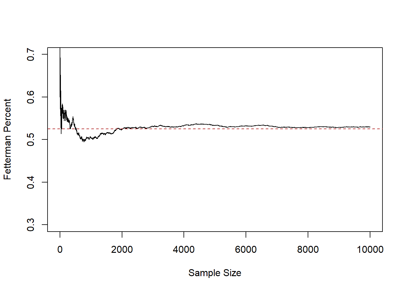
Here we see that after a sample size of about 2000 we get pretty close to the truth and stay relatively close to it.
This fact: that as the sample size increases the mean of the sample approaches the true population mean, is what is known as the Law of Large Numbers. To state it mathematically:
\[ \bar{X_n} = \frac{1}{n} \sum_{i=1}^n X_i \rightarrow E[X] \]
There are a couple of new things in here that we should slow down to take note of. The \(X\) with no subscript is the random variable we are sampling from. In the running example this is a Bernoulli RV with probability of success of .525. \(n\) represents the number of observations that we currently have. \(n\) will (I think, probably) always represent this. To the point where people will say “What’s the \(n\) of your study?”. \(X_i\) represents our sample from the random variable \(X\), and \(i\) is the index number for each observation. So for example: what are \(i\) 1 through 10:
samp[1:10]
#>  [1] 1 1 0 1 0 1 0 1 1 0
\(\bar{X}_n\) is the average across all observations. We usually put a bar over things that are averages.
Overall, this statement says that the sample average (add up all the X’s and divide by the sample size) approaches the overall Random Variables expected value as the number of observations increases.
As we will see, this is true of all random variables, not just a Bernoulli.
So the first principle of sampling:
- The larger a sample the more likely our sample mean equals the expected value of the random variable we are sampling from (LLN).
That’s helpful, but we still don’t have a good sense of being able to answer a question like: If I run a sample of 500 people, how much can I expect to miss the truth by?
To help us understand this, let’s dramatically ramp up what we are doing here. Right now we have one “run” of a sample of 1,2,3,4,…. all the way up to 10,000. I’m going to add 999 more samples of 10,000 people. I’m also going to highlight the original run in magenta.
#This code generates these samples but takes too long to run in class
#You can uncomment it and run it if you like, but i've also just saved
#the output to github and you can load it below.

#set.seed(19104)
#binomial.sample <- matrix(NA, nrow=10000, ncol=1000)
#
#for(i in 1:1000){
#  binomial.sample[,i]<- cumsum(rbinom(10000,1,.525))/1:10000
#}
#writeRDS(binomial.sample, file="FullSamples.rds")

binomial.sample <- import("https://github.com/marctrussler/IIS-Data/raw/main/FullSamples.rds")

plot(1:10000,binomial.sample[,1], xlab="Sample Size",ylab="Fetterman Percent", type="n",
     ylim=c(0.3,0.7))
for(i in 1:1000){
  points(1:10000,binomial.sample[,i], type="l", col="gray60")
}
abline(h=.525, lty=2, col="firebrick")
points(1:10000, binomial.sample[,1], col="magenta", type="l")
abline(v=c(100,500,1000,5000,10000), lty=2, col="darkblue")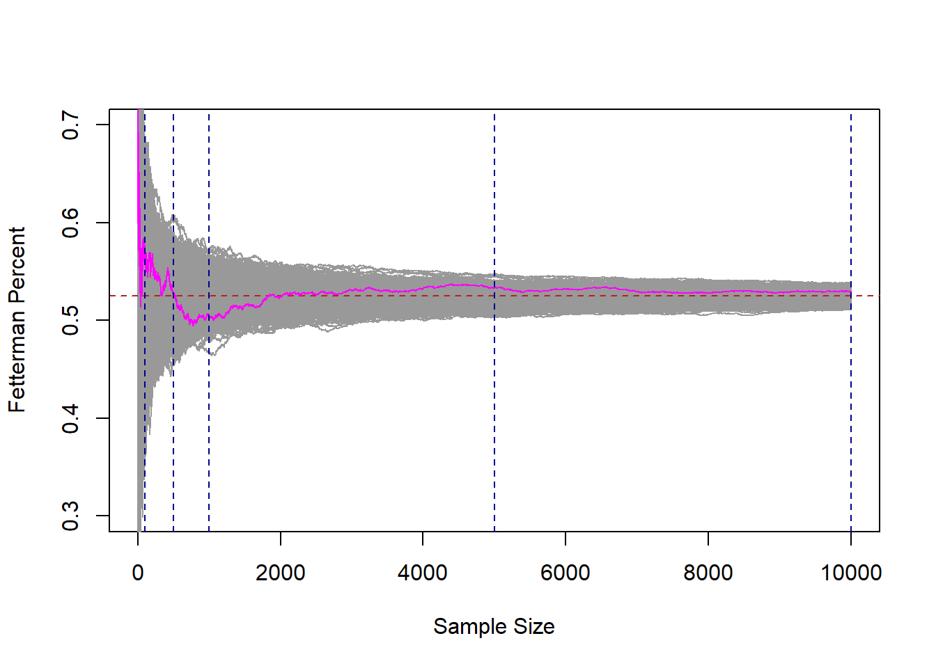
Each of these gray 1000 lines represents a cumulative sample of 1 all the way up to 10,000 units. If we look at any vertical cross-section of these lines, that represents 1000 surveys at that \(n\). Just as our original magenta line at position, say 50, represents the mean of this sample when n=50.
There are a couple of very important things about this graph so we can take some time to consider it.
If we take any given cross section of the data (i’ve highlight 100,500,1000, and 10,000), there are some surveys that are well below the target, and some surveys that are well above the target. However, we also see that if we consider all of the surveys together, they are centered on the true value of .525. The number of surveys that miss high are perfectly balanced by the number of surveys that miss low.
Indeed, if we look at the “average of the averages”:
means <- rep(NA,1000)

for(i in 1:1000){
means[i] <- mean(binomial.sample[,i])
}

plot(1:1000, means, pch=16,
     ylim=c(0.3,0.7), xlab="Average of Averages", ylab="Sample Size")
abline(h=.525, col="firebrick", lty=2)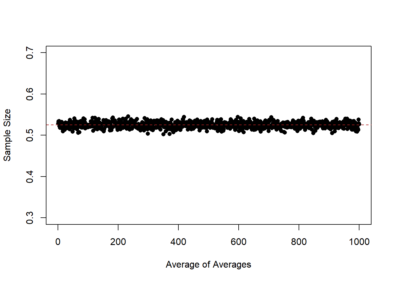
At every level of \(n\) they are approximately equal to the expected value of the distribution that we are sampling from. So while lines are missing by a whole lot in small sample sizes, the average of a large number of samples still equals the expected value of the distribution that we care about.
The law of large numbers tells us that as sample size increases the estimate we form is more likely to converge on the expected value of the distribution that we care about.
What we’ve uncovered here is something different, but also helpful. For any sample size, the expected value of our estimate is the expected value of the distribution that we are sampling from.
If I am doing a survey of 10 people I do not expect that my guess will be very close to the truth. However if before I take my sample you ask me what I expect will happen, I will tell you that my best guess is that the mean of my sample will be equal to the expected value of the random variable I am sampling.
So far we have:
- The larger a sample the more likely our sample mean equals the expected value of the random variable we are sampling from (LLN).
- For any sample size, the expected value of the sample mean is the expected value of the random variable we are sampling from.
The third principle of sampling we can visually see: the distribution of means at any given sample size decreases as the sample size increases. At very low n our guesses (while centered in the right place), are all over the place. Way too high, Way too low. Ranging from .7 all the way to .3. As the sample size increases the LLN kicks in and all the samples get close to the truth.
But is the “amount they miss on average” something that is measurable?
To understand that, i’ve placed 4 blue lines in the graph at some benchmark sample sizes: 100,500,1000,5000, and 10,000. What we are going to do now is look at the density of the samples at all of these points. Think about taking a knife and making a cross-section at each of these blue lines, we are going to do that and plot what that particular cross section looks like.
par(mfrow=c(2,3))
plot(density(binomial.sample[100,]), main="Sampling Distribution at n=100", xlim=c(0.3,0.7))
abline(v=.525, col="firebrick", lty=2)
plot(density(binomial.sample[500,]), main="Sampling Distribution at n=500", xlim=c(0.3,0.7))
abline(v=.525, col="firebrick", lty=2)
plot(density(binomial.sample[1000,]), main="Sampling Distribution at n=1000", xlim=c(0.3,0.7))
abline(v=.525, col="firebrick", lty=2)
plot(density(binomial.sample[5000,]), main="Sampling Distribution at n=5000", xlim=c(0.3,0.7))
abline(v=.525, col="firebrick", lty=2)
plot(density(binomial.sample[10000,]), main="Sampling Distribution at n=10000", xlim=c(0.3,0.7))
abline(v=.525, col="firebrick", lty=2)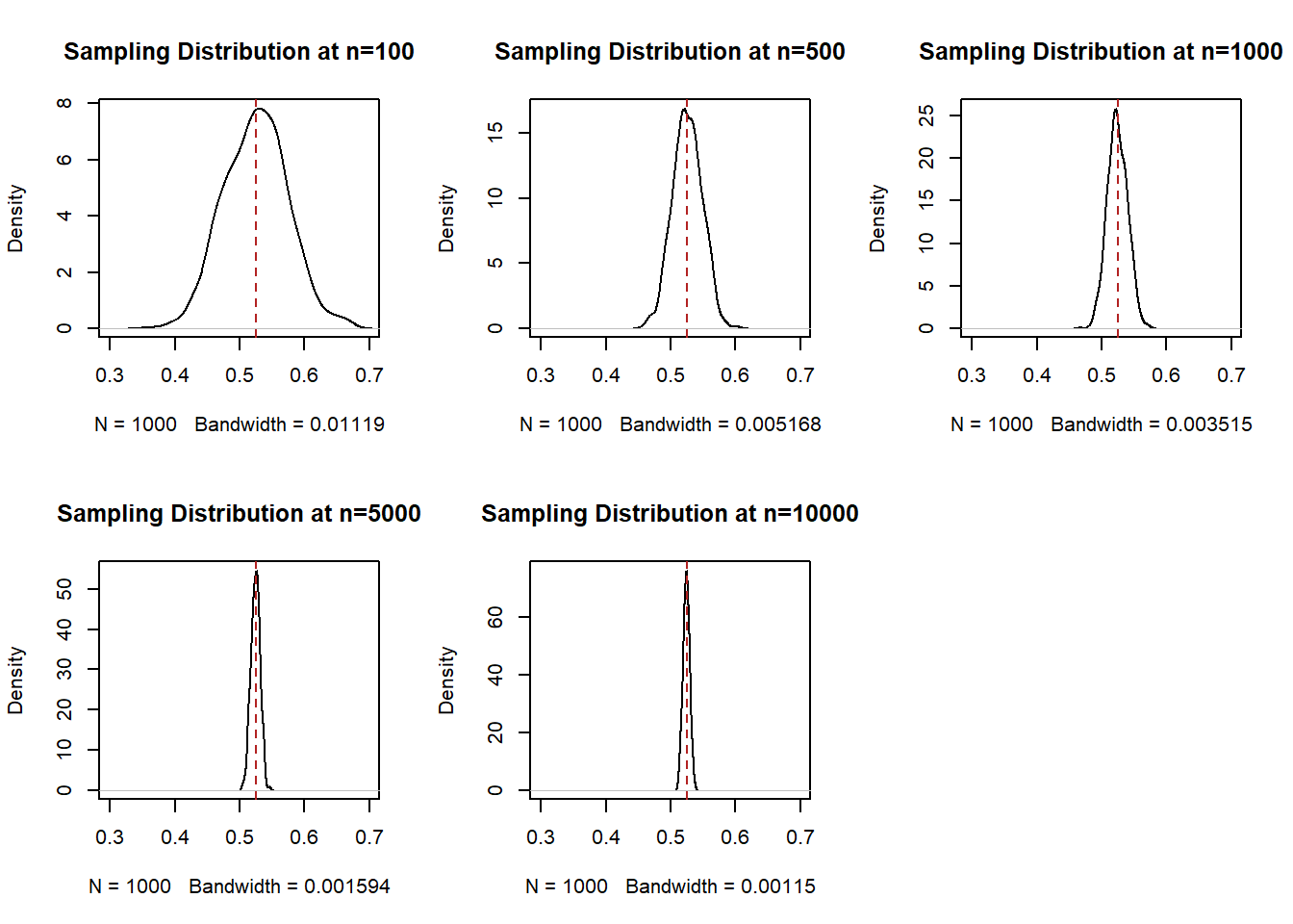
This is not necessarily crazy to you right now. But I want you to understand that this is wild. Each cross-section of this distribution is a normal distribution that is centered on the expected value of the variable that we are sampling.
We call each of these distributions a “sampling distribution”. This is one of the phrases you truly have to know and so really focus in at this moment. A sampling distribution is the distribution of all estimates (here, for a sample mean) for a given sample size. It is not a distribution of a particular sample, and it is not the distribution of the random variable we are sampling from. Rather, it is the theoretical distribution of all possible mean (or difference in means, or regression coefficients, or a sum, or anything we calcualte from a sample), if we sampled and calculated those estimates a large number of times.
Each sampling distribution is normally distributed, and each sampling distribution is centered on the true population mean. Knowing what we know now about normal distributions, we know they are defined by their central tendency and their variance. If I have those two pieces of information than I can draw the distribution perfectly.
We could calculate the variances of each of these distributions:
var(binomial.sample[100,])
#> [1] 0.002448655
var(binomial.sample[500,])
#> [1] 0.0005225665
var(binomial.sample[1000,])
#> [1] 0.0002416901
var(binomial.sample[5000,])
#> [1] 4.973981e-05
var(binomial.sample[10000,])
#> [1] 2.587326e-05
But remember our original goal is to understand: If I am taking a sample of 100 people, how much would I expect to miss the true answer by, on average? I can’t sample 100 people 1000 times, so I need a way to estimate that before I sample.
Incredibly, the variance of each of these sampling distributions is simply a function of the variance of the original variable and the sample size.
Specifically, the variance of each of these normal distributions is \(\frac{V[X]}{n}\), which means that the standard deviation of each of these normal distributions is \(\frac{sd(X)}{\sqrt{n}}\).
The variance of our original Bernoulli in this case is \(\pi*(1-\pi) = .525*.475= .249\), and therefore it’s standard deviation is \(\sqrt{.249}=.499\).
So I’ve posited that each of these sampling distributions ought to be normally distributed with mean equal to .525, and sd equal to \(\frac{.499}{\sqrt{n}}\).
Let’s plot those normal distributions against our empirical estimates to see if that’s true:
par(mfrow=c(2,3))
x <- seq(0,1,.0001)

plot(density(binomial.sample[100,]), main="Sampling Distribution at n=100", xlim=c(0.3,0.7))
points(x, dnorm(x, mean=.525, sd=.499/sqrt(100)), col="darkblue", type="l")
abline(v=.525, col="firebrick", lty=2)
plot(density(binomial.sample[500,]), main="Sampling Distribution at n=500", xlim=c(0.3,0.7))
points(x, dnorm(x, mean=.525, sd=.499/sqrt(500)), col="darkblue", type="l")
abline(v=.525, col="firebrick", lty=2)
plot(density(binomial.sample[1000,]), main="Sampling Distribution at n=1000", xlim=c(0.3,0.7))
points(x, dnorm(x, mean=.525, sd=.499/sqrt(1000)), col="darkblue", type="l")
abline(v=.525, col="firebrick", lty=2)
plot(density(binomial.sample[5000,]), main="Sampling Distribution at n=5000", xlim=c(0.3,0.7))
points(x, dnorm(x, mean=.525, sd=.499/sqrt(5000)), col="darkblue", type="l")
abline(v=.525, col="firebrick", lty=2)
plot(density(binomial.sample[10000,]), main="Sampling Distribution at n=10000", xlim=c(0.3,0.7))
points(x, dnorm(x, mean=.525, sd=.499/sqrt(10000)), col="darkblue", type="l")
abline(v=.525, col="firebrick", lty=2)
Fantastic! So before I take a sample and calculate a mean I can surmise that the distribution from which that mean is drawn from is normally distributed with mean equal to the expected value of the distribution I’m pulling from, and a standard deviation that is equal to the standard deviation of the distribution that i’m pulling from divided by the square root of the sample size.
The last part of this: that the sampling distribution is normally distributed with known paramaters, is called the “Central Limit Theorem”.
In math:
\[ \bar{X_n} \leadsto N(\mu=E[X],\sigma^2 = V[X]/n) \]
The sampling distribution of the sample mean is normally distributed with \(\mu=E[X]\) and \(\sigma^2=\frac{v[x]}{n}\).
Another definition (this is in the textbook) is:
\[ \frac{\bar{X}_n - E[X]}{\sqrt{V[X]/n}} \leadsto N(0,1) \]
This is just reworking the formula for the standard normal:
\[ \frac{X -\mu}{\sigma} = N(0,1) \]
and subbing in the fact that the CLT tells us that \(\mu=E[X]\) and \(\sigma^2=\frac{v[x]}{n}\).
If you want to remember only the following it is sufficient: the sample mean is itself a random variable with mean equal to the expected value of the distribution it is measuring, and standard deviation equal to the standard deviation of the random variable it is a sample of divided by the square root of the sample size.
The standard deviation of the sampling distribution (\(\frac{sd(X)}{\sqrt{n}}\)) has a special name. This is the “standard error”. The standard deviation of the sampling distribution is the standard error. I have a tattoo of this on my arm it’s so important to remember.
Take a minute to think of how cool that equation is. What determines how wide of a sampling distribution we will have? The less variance in the random variable we are sampling, the smaller the sampling distribution. The larger the sample size, the smaller the sampling distribution (at a decreasing rate).
Together these things give us the third principle of sampling:
- The larger a sample the more likely our sample mean equals the expected value of the random variable we are sampling from (LLN).
- For any sample size, the expected value of the sample mean is the expected value of the random variable we are sampling from.
- The distribution of all possible estimates – the sampling distribution, – is normally distributed with it’s mean centered on the RV’s expected value, and variance determined by the variance of the RV and the sample size.
To demonstrate this a bit more, we can mathematically derive for our running example of sampling Pennsylvania voters the range which 99% of all estimates will lie in for every sample size.
First, how many standard deviations of the normal distribution contain 99% of the probability mass? that’s leaving .5% in each tail, so measuring on the left tail:
qnorm(.005)
#> [1] -2.575829
-2.57 standard deviations.
The standard deviation of the sampling distribution at 1,2,3,4,….n is given by \(sd(X)/\sqrt{n}\), where \(sd(X)=.499\) in our case.
So the range that will contain 99% of all the samples will be:
\[ .525 \pm 2.57*\frac{.499}{\sqrt{n}} \]
[Go slow and break that down]
Use R to evaluate that for every level of \(n\):
interval.high <- .525 + 2.57*(.499/sqrt(1:10000))
interval.low <- .525 - 2.57*(.499/sqrt(1:10000))

plot(1:10000,binomial.sample[,1], xlab="Sample Size",ylab="Fetterman Percent", type="n",
     ylim=c(0.3,0.7))
points(1:10000, interval.high, col="darkorange", type="l", lwd=2)
points(1:10000, interval.low, col="darkorange", type="l", lwd=2)
for(i in 1:1000){
  points(1:10000,binomial.sample[,i], type="l", col="gray60")
}
abline(h=.525, lty=2, col="firebrick")
points(1:10000, binomial.sample[,1], col="magenta", type="l")
points(1:10000, interval.high, col="darkorange", type="l", lwd=2)
points(1:10000, interval.low, col="darkorange", type="l", lwd=2)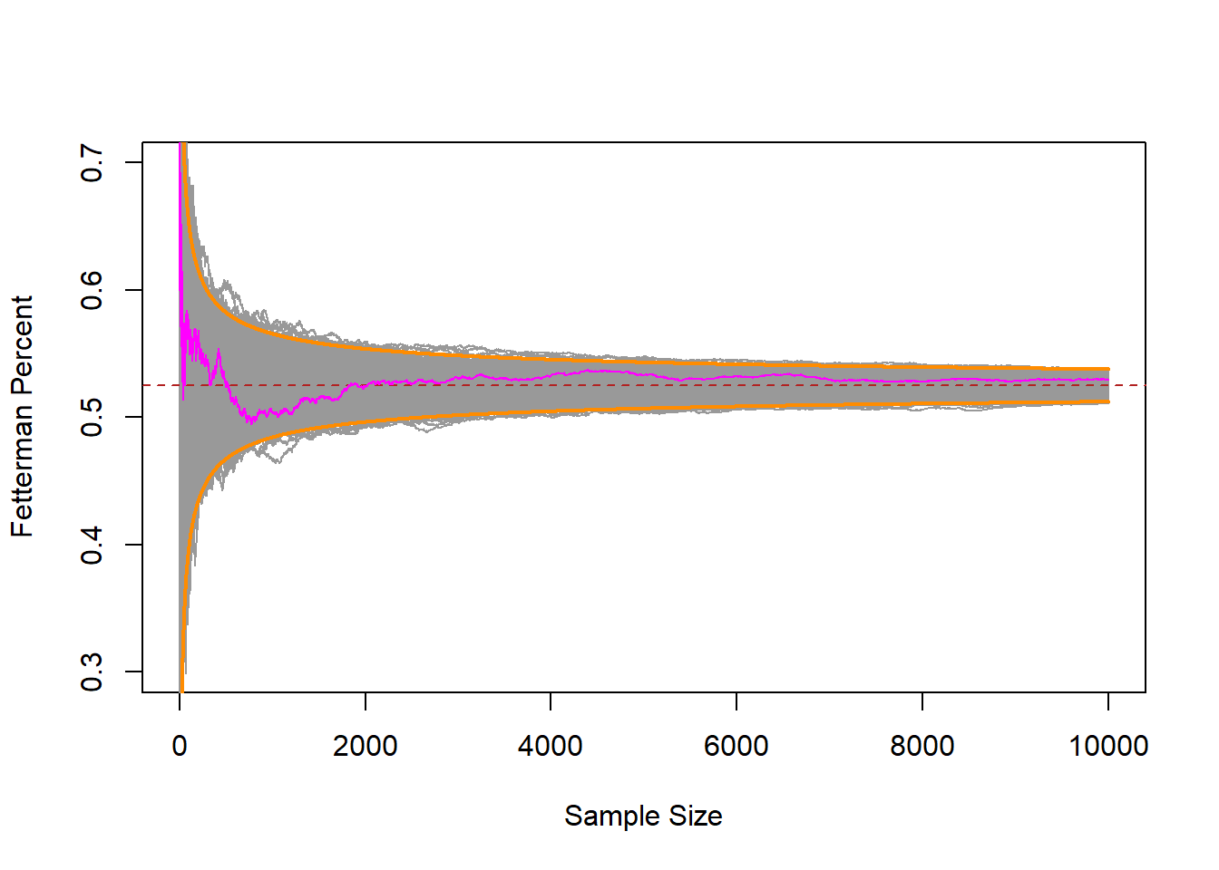
Indeed, those bounds that we derived before we even started sampling contained nearly all of the random samples!
6.2 A step back
Let’s take a step back and consider what we uncovered on Monday.
We started with this idea that, when we are sampling from a known probability distribution we can make inferences about the likelihood of events in a fairly straightforward way. If we have a coin and want to know if it’s fair, or not, we know what the distribution of that fair coin will be and can test against that. For the President’s example we could draw a hypothetical RV for if President’s were drawn randomly from the population of 10% left handedness. For the S&P 500 example we had a historical record that we could compare one estimate to.
But if we think about drawing a survey sample (and really, this is going to be true of nearly everything we do in statistics, the 3 examples above are the anomaly), there is no obvious hypothetical distribution to compare against. We looked, for example, of drawing a sample of 5000 Pennsylvanian’s and looking at their support for Fetterman. In this case I got one sample and needed to determine: If the truth was the race was tied, would it be crazy to get a result of 55.6%? Without more information making this conclusion is impossible.
We learned three principles of sampling last time that are going to help up start to answer these sorts of questions.
- The larger a sample the more likely our sample mean equals the expected value of the random variable we are sampling from (LLN).
- For any sample size, the expected value of the sample mean is the expected value of the random variable we are sampling from.
- The distribution of all possible estimates – the sampling distribution, – is normally distributed with it’s mean centered on the RV’s expected value, and variance determined by the variance of the RV and the sample size.
To be clear, we have used as our example thus far the sample mean, but these three principles roughly apply to all estimates we can make in a sample. A mean, a difference in means, a median, a regression coefficient…. The standard error won’t be calculated in the same way for all of these things, but the principles here will apply to all “good” estimators. More on “good” estimators to come.
So if we wanted to answer the question: what is the probability of seeing a result of 55.6% for Fetterman in a sample of 5000 Pennsylvanians if the truth was that the race was tied?
We want to know if the truth was a tie, what would the sampling distribution of all estimates look like. What shape what it have, and how wide would it be? If we can draw that distribution of estimates, we can compare our true “prime” estimate to that sampling distribution, and determine the relatively likelihood that our prime estimate was drawn from that distribution.
The principles we uncovered last time told us that the sampling distribution of the sample mean is defined by:
\[ \bar{X_n} \leadsto N(\mu=E[X],\sigma^2 = \sqrt{V[X]/n}) \]
So to draw this normal distribution we have to know the \(\mu\) and \(\sigma\).
We want to understand: how likely is this result if the race is tied? As such, the population expected value we are interested in is \(E[X]=.5\). If that’s the case, according to the CLT then \(\mu=.5\). The standard deviation of the population is \(\sqrt{\pi*(1-\pi)}=\sqrt{.5*.5}=.5\). The standard error is the standard deviation of the sampling distribution, which for the sample mean is \(\frac{sd(X)}{\sqrt{n}}= \frac{.5}{\sqrt{5000}}=.007\).
So know that the sampling distribution of the mean for this population Random Variable when n=5000 is \(N(\mu=.5, \sigma=.007)\).
Let’s use R to draw that, comparing it to our sample mean:
evaluation.values <- seq(.4,.6,.0001)
pdf <- dnorm(evaluation.values, mean=.5,sd=.007)

plot(evaluation.values,pdf, main="Sampling Distribution for Tied Race",
     xlim=c(.4,.6), type="l")
abline(v=.556, col="firebrick", lwd=2, lty=2)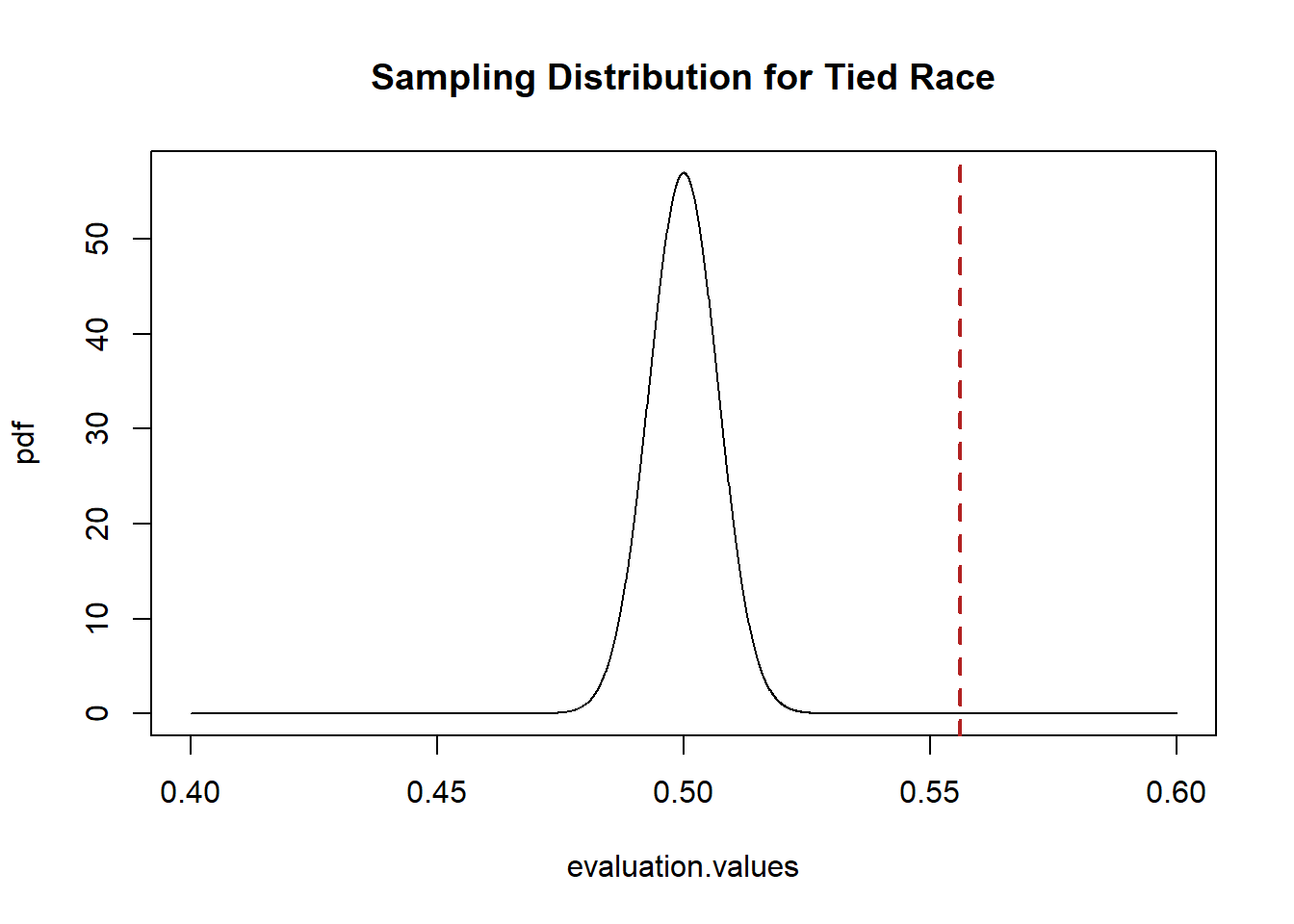
The sample estimate we drew is really far away from 50%! It would be extremely unlikely to draw this sample mean if the above was the sampling distribution that was producing means. As such, I would reject the idea that this is the sample mean that is producing means.
Let’s say, however, that I am bad at math (I am). What if I want to prove to myself that the sampling distribution I drew above was correct? I can use simulation to prove this to myself.
If we want to know the sampling distribution for the hypothetical situation where the race is tied, we can think of each individual in a sample as a draw from the Bernoulli RV with probability of success of .5. If each individual is independent from the last (an iid sample) then one full sample can be thought of as a binomial random variable with n=5000 and \(\pi=.5\).
Here is drawing one sample:
In our first sample we got 2501 successes out of an n of 5000, so the sample mean is \(2501/5000=50.02\).
Because the difference/connection between Bernoulli and Binomial can be a bit confusing, note that this is an equivalent (but less computationally efficient) method of drawing a sample of 5000 Bernoulli RVs:
samp <- rbinom(5000,1,.5)
head(samp,100)
#>   [1] 1 0 1 0 1 0 0 1 0 0 0 1 0 1 1 1 0 0 0 0 1 1 0 1 1 1 1
#>  [28] 0 1 0 1 1 1 1 1 0 0 1 0 0 0 1 0 0 0 1 0 1 1 1 0 0 0 1
#>  [55] 1 1 1 0 0 1 0 0 0 0 1 1 1 0 1 0 0 0 1 0 0 1 1 0 1 0 1
#>  [82] 0 0 0 1 1 1 0 0 0 0 1 1 0 0 1 0 1 1 0
That method gives us the 5000 0 and 1s that make up the sample, but if we just tell R to drawn a binomial with n=5000 it will give us the sum of all the 1s, which is what we want in the end and can save memory space!
OK, but we want to simulate what will happen if we repeatedly sample 5000 people and take the mean. How does that compare to the calculated sampling distribution we generated above?s
set.seed(19104)
simulation.means <- rbinom(10000,5000,.5)/5000

plot(evaluation.values,pdf, main="Sampling Distribution for Tied Race",
     xlim=c(.4,.6), type="l")
abline(v=.556, col="firebrick", lwd=2, lty=2)
points(density(simulation.means), type="l", col="magenta")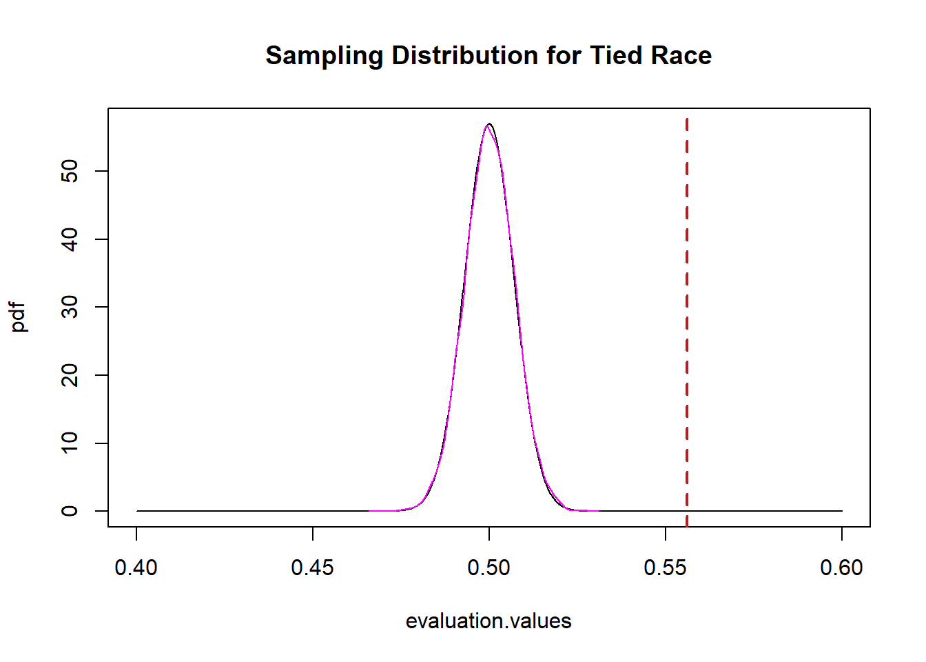
It’s exactly the same, which should not be surprising at this point! (Maybe just surprising I did the math right, above.)
Critically: this works for any initial distribution.
Let’s give another example of sampling from scratch to further make clear what it is we are talking about here.
What if we wanted to sample individuals to figure out the average income in an area. We know that income is not a normal, or even symmetrical, distribution.
Let’s say that the population we are sampling from has a PDF that looks like this:
#install.packages("fGarch")
#You can install that package but you don't have to know anything about fgarch or
#The dsnorm command. I just wanted to generate a skewed distribution to show you.
library(fGarch)

inc <- seq(0,100000)
plot(inc, dsnorm(inc, mean = 30000, sd = 20000, xi = 2.2), type="l")
legend("topright", c("Mean=30k", "SD=20K"))
Now because I’ve created this I know that the mean of this distribution is 30,000 and the standard deviation is 20,000.
What will the sampling distribution of means from this Random Variable look like?
We can determine this from the principles we have uncovered here.
The sampling distribution of the sample mean is \(N(\mu=E[X], \sigma^2 = \frac{V(X)}{n})\).
As such, the sampling distribution of sample means from this distribution will be \(N(\mu=30,000, \sigma=\frac{20000}{\sqrt{n}})\)
Because I know this, I can similarly determine for the mean of any given \(n\) that the sampling distribution of that mean will be normally distributed with a mean of 30,000 and a standard deviation of \(\frac{20000}{\sqrt{n}}\).
So for a n of 100, for example, the sample distribution will look like:
evaluation.values <- seq(20000,40000,1)
pdf <- dnorm(evaluation.values,30000,20000/sqrt(100))

plot(evaluation.values, pdf, type="l",
     main="Sampling Distribution of Sample Mean, n=100")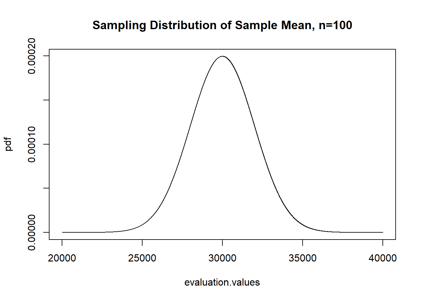
And to prove ourselves that this works, now let’s actually sample a bunch of times from this distribution and take the mean, to determine whether this hypothetical sampling distribution is correct:
library(fGarch)
#You don't have to know the "rsnorm" distribution. This was just a convenient example for: What if we are sampling from a
#skewed distribution?

income.sample.means <- rep(NA, 10000)
for(i in 1:10000){
income.sample.means[i]<- mean(rsnorm(100,mean = 30000, sd = 20000, xi = 2.2))
}

plot(evaluation.values, pdf, type="l",
     main="Sampling Distribution of Sample Mean, n=100")
points(density(income.sample.means), col="darkorange", type="l")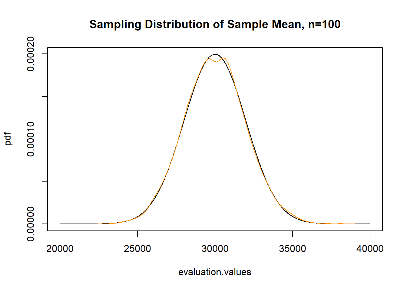
Confirmed the same!
While this should have been clear from the 3 postulates of sampling, the sampling distribution of the sample mean is normally distributed regardless of the shape of the distribution you are sampling from. The population is a skewed distribution. Our sample will be a skewed distribution. But the sampling distribution is normally distributed. Always.
We can further do what we did last time with this distribution, create samples of 10,000 and calculate the sample mean at n=1,n=2,n=3,n=4…n=10,000.
But even before I sample, I can similarly estimate the range in which 99% sample means will lie. At every sample size the population means are normally distributed with the paramaters above, we know that \(\pm 2.57 SDs\) in a normal distribution contain 99% of the probability mass. So if we evaluate the mean \(\pm\) that amount of SDs we will get the range in which nearly all of the sample means will lie:
interval.high <- 30000 + 2.57*(20000/sqrt(1:10000))
interval.low <- 30000 - 2.57*(20000/sqrt(1:10000))

plot(c(0,10000),c(0,60000), type="n", main="Sampling Distribution of Mean of Income",
     xlab="Sample Size", ylab="Sample Mean")
points(1:10000, interval.high, col="darkorange", lwd=2, type="l")
points(1:10000, interval.low, col="darkorange", lwd=2, type="l")
abline(h=30000, lty=2, col="firebrick")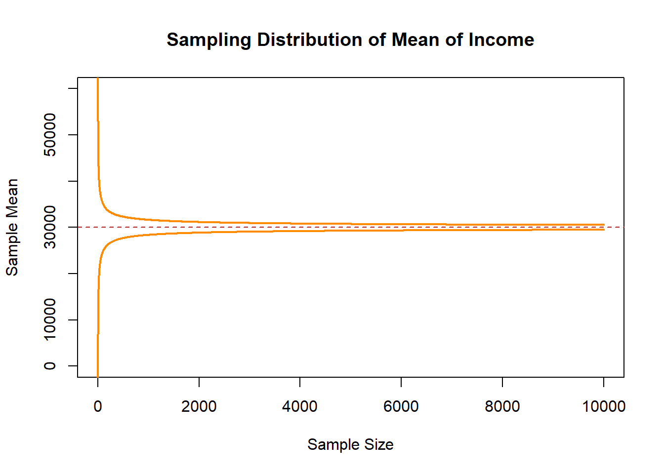
Now let’s sample an n of 1,2,3,4,5….10,000, and see what that looks like:
income.sample <- import("https://github.com/marctrussler/IIS-Data/raw/main/SkewedSamples.rds")

interval.high <- 30000 + 2.57*(20000/sqrt(1:10000))
interval.low <- 30000 - 2.57*(20000/sqrt(1:10000))

plot(c(0,10000),c(0,60000), type="n", main="Sampling Distribution of Mean of Income",
     xlab="Sample Size", ylab="Sample Mean")
for(i in 1:ncol(income.sample)){
  points(1:10000, income.sample[,i], type="l", col="gray80")
}
points(1:10000, interval.high, col="darkorange", lwd=2, type="l")
points(1:10000, interval.low, col="darkorange", lwd=2, type="l")
points(1:10000, income.sample[,1], col="magenta", type="l")
abline(h=30000, lty=2, col="firebrick")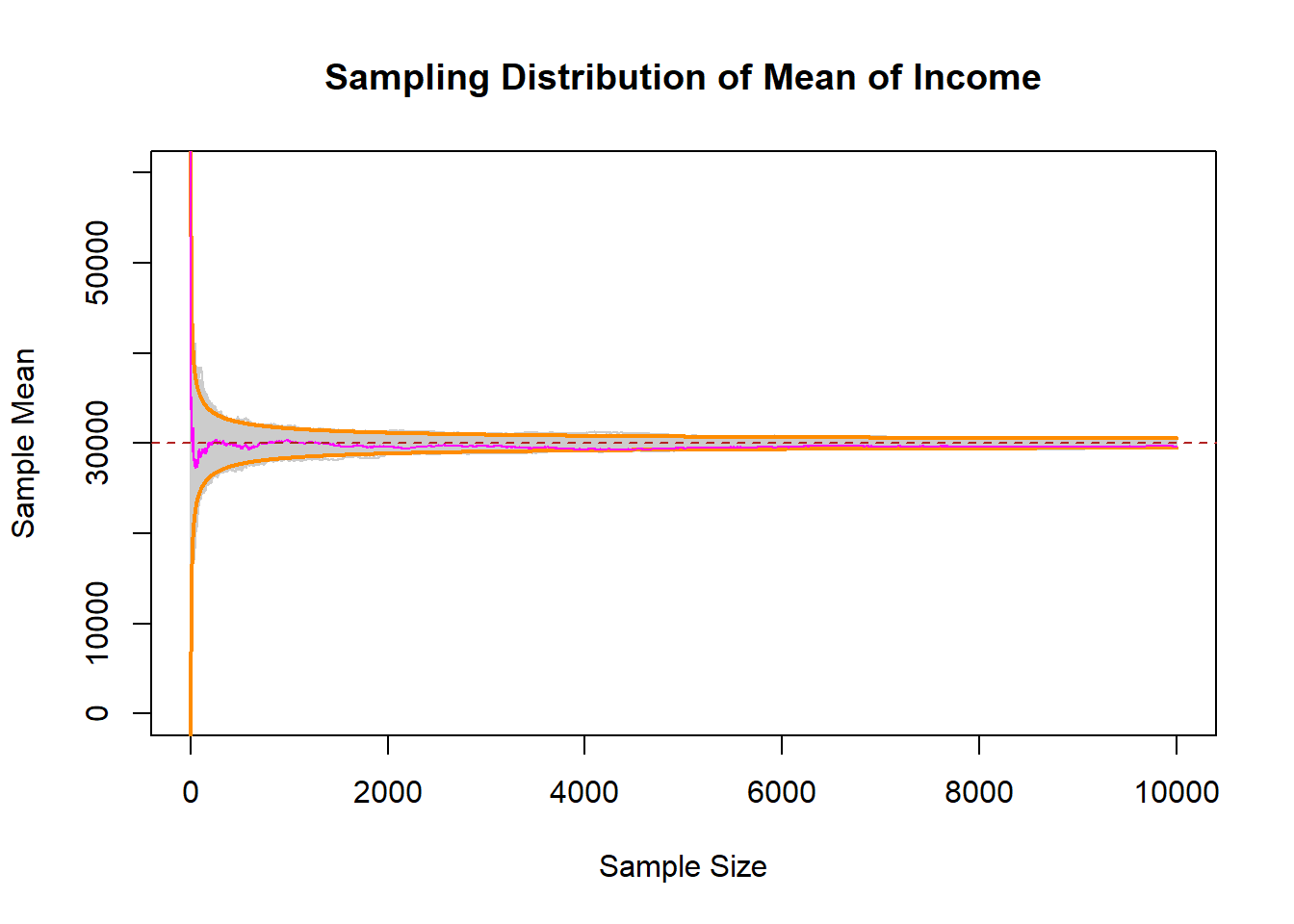
Even starting from a non-normal distribution, the samples means at all levels of \(n\) followed the normal distribution with the parameters that we have set!
6.3 What makes a good estimator?
We have taken for granted here that the sample mean is a “good” estimator for determining the expected value of the population we are sampling from.
For sure: it is. I’m not going to leave you in suspense on that, but it is helpful to set out guidelines for what makes a good estimator so that we can better evaluate more complicated estimators down the line.
First, to be precise when we talk about an “estimator”.
There is, in the population, a whole bunch of things that we would want to know. Primarily at this point we have discussed the mean which is targeted at understanding the central tendency of the population. But anything that we can estimate in our sample has a population level analog, which we call a “population parameter” (or “estimand”). If we calculate the difference in means in our sample, or a median, or a correlation, or a regression coefficient, or a predicted value…. truly anything. When we sample again and again we get different answers, but each of those answers is a random variable drawn from a sampling distribution centered around the “true” value.
So population parmaters are true, fixed, values.
We use an estimator (a method) to produce an estimate (a single number in our sample) which is one of an infinite number of estimates that can be drawn from an infinite number of samples.
The first principle we want for our estimates is for them to be unbiased. Mathematically a estimator is unbiased if:
\[ E[estimate-truth]=0 \]
If we took a sample, calculated a sample mean, subtracted off the truth, again, and again, and again, would the average of that result be 0? Yes! We have already seen that this is true.
But if we want to prove it to ourselves again:
#Randomly sample and take a mean
means <- rep(NA, 10000)
for(i in 1:length(means)){
  means[i] <- mean(rnorm(100, mean=35, sd=20))
}

#Is estimator unbiased?
plot(density(means-35), main="Bias of the Sample Mean")
abline(v=mean(means-35), lty=2, col="firebrick")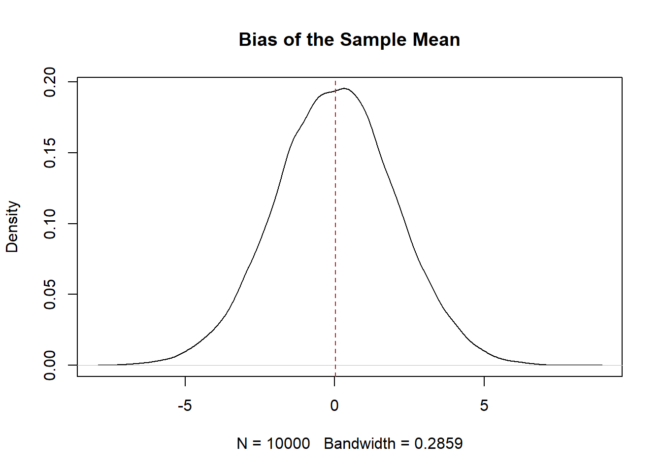
#YesMathematically in the case of the sample mean, we want to know if the expected value of the sample mean minus the expected value of the truth is equal to 0. To calculate this we have to learn a couple properties of the expected value operator along the way:
\[ E[\bar{X}_n-X]=0 \]
For expectation, we can split this equation apart in the following way:
\[ E[\bar{X}] - E[X] = 0 \] (The expected value operator is transitive so \(E[X+Z]=E[X]+E[Z]\))
So what is the expected value of the sample mean estimator?
We can write out what \(\bar{X}_n\) actually is, and figure out the expected value:
\[ E[\bar{X}_n] = E[\frac{1}{n}\sum_i^n X_i] \]
Lets get rid of the summation operator and think about what this is saying
\[ =E[\frac{1}{n}*X_1 + X_2 + X_3 \dots X_n] \]
The expected value of a constant times a variable is the same as that constant times the expected value of the variable \(E[cX] = c*E[X]\).
Prove this to ourselves:
We treat \(n\) as a constant. That’s not to say we can’t have different N’s, but for a series of samples we hold constant the \(n\) we are drawing, which is what we care about here. To put it another way: if we are thinking about there being a random variable representing the sampling distribution, to generate a particular sampling distribution n must be fixed. So:
\[ \frac{1}{n}*E[X_1 + X_2 + X_3 \dots X_n] \]
Again, the expected value operator is transitive, so we can further decompose this to:
\[ \frac{1}{n}*E[X_1] + E[X_2] + E[X_3] \dots E[X_n] \]
OK, what is the expected value of \(X_1\)? If I am sampling women’s height (which is normally distributed with mean equal to 64). Don’t make this too hard. If the truth in the population is that the central tendency is 64, and I made you give me ONE number for a guess of what height the first woman would be, what would you say? 64! Our best guess for any observation is the expected value of the population. Therefore we can decompose this to
\[ \frac{1}{n}*E[X]+E[X]+E[X] +E[X] \dots E[X] \]
So now we are adding up \(n\) \(E[X]\) and dividing that by n. So that is just
\[ \frac{1}{n}*nE[X]\\ E[\bar{X}_n]=E[X] \]
As such:
\[ E[\bar{X}_n]-E[X] = E[X]-E[X]=0 \]
Fantastic! So confirming our simulation the sample mean is also mathematically unbiased.
Let me propose an alternative estimator as a money saving technique. Instead of sampling a whole bunch of people, i’m going to sample 1 person. So my new estimator is \(X_1\).
Now, is this an unbiased estimator? Yes! As we just used, the expected value of any observation is the expected value of the population we are sampling from, so:
\[ E[X_1] - E[X]= E[X]-E[X]=0 \]
We can also show this via simulation. Let’s take one observation from the same distribution above and check for unbiasedness.
first.obs <- rep(NA, 10000)
for(i in 1:length(first.obs)){
  first.obs[i] <- mean(rnorm(1, mean=35, sd=20))
}

#Is estimator unbiased?
plot(density(first.obs-35), main="Bias of the Sample Mean")
abline(v=mean(first.obs-35), lty=2, col="firebrick")
Yes! Via Simulation taking the first observation as our measure is also an unbiased estimate of the population paramater.
What’s the problem here? Why is this a good estimator even though it is unbiased? What else might we be looking for in a good estimator?
This estimator is going to be all over the place. If we plot the two estimators on the same graph:
plot(density(first.obs-35), main="Comparison of the two estimators")
abline(v=mean(first.obs-35), lty=2, col="firebrick")
points(density(means-35), type="l")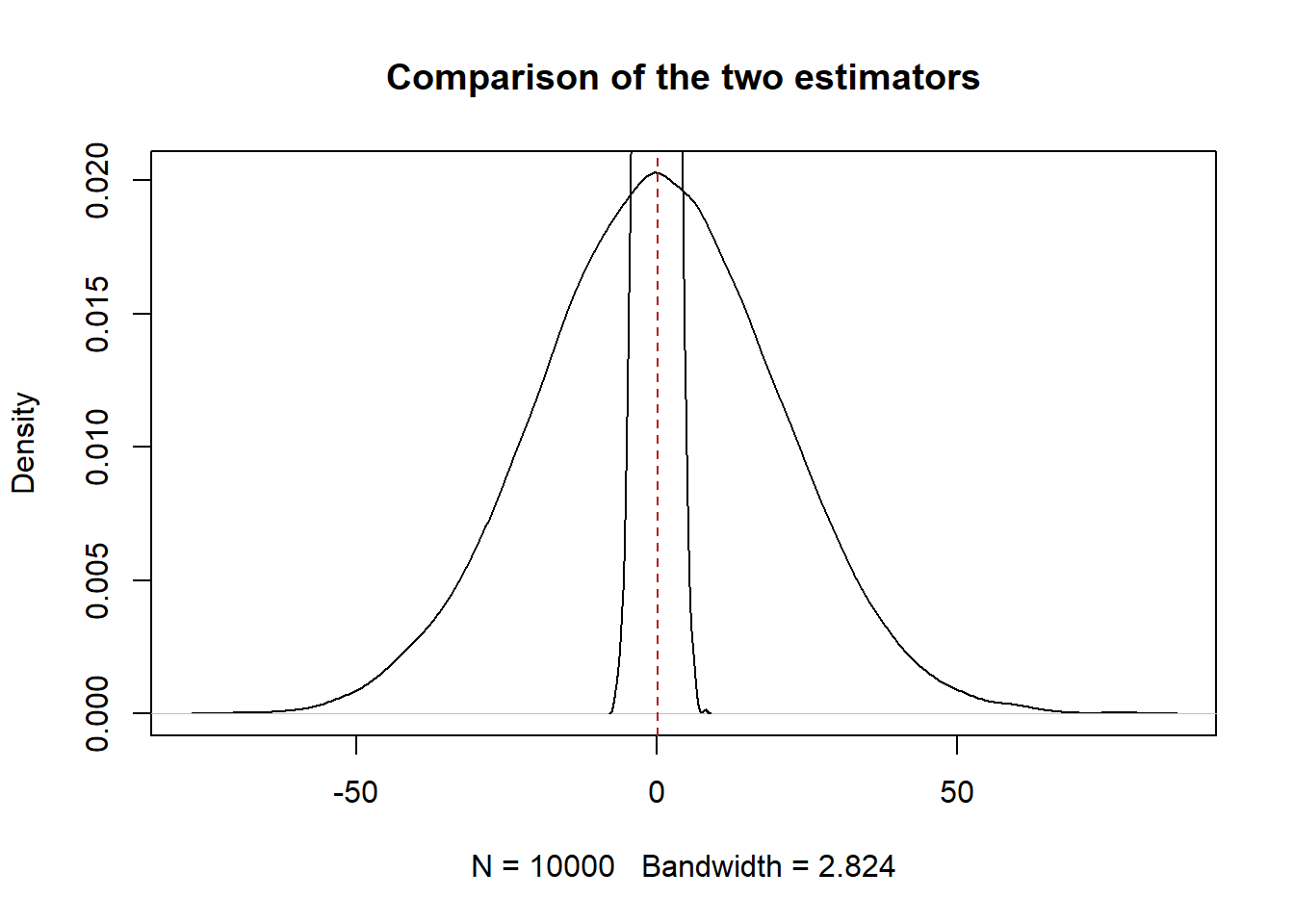
The sample mean is a way tighter sampling distribution. The second thing that we want is for our estimators to have low variance*. (This is half true right now, stick with me for a second. )
So what is the variance of the sample mean?
We can go through a similar mathematical exercise as we did above:
\[ V[\bar{X}_n]= V[\frac{1}{n}\sum_i^n X_i] \]
With the expectation operator we saw that \(E[cX_i]=c*E[X_i]\). This is not true for the variance operator. Instead: \(V[cX_i] = c^2V[X_i]\). Again we can prove this to ourselves
With that principle we can start decomposing the variance of the sample mean:
\[ \frac{1}{n^2}*V[X_1 + X_2 + X_3 \dots X_n] \]
Similar to expectation: \(V[X+Z]=V[X]+V[Z]\) if X&Z are indpendent. We are assuming a random iid sample here so \(X_1\) and \(X_2\) are independent. Therefore
\[ \frac{1}{n^2}*V[X_1] + V[X_2] + V[X_3] \dots V[X_n] \]
Now this move is slightly weirder, but the variance of any given observation is also equal to the variance of the underlying random variable. This seems non-sensical. How can any individual observation have variance? The way to think about this is not “What is the variance of one individual estimate” it is: how much variation can we expect when we draw one sample from the random variable.
We’ve actually already done this above when sampling from a normal distribution with an sd of 20. So what was the variance of our repeated sampling of one observation?
The variance of the population is indeed 20, so it does seem to be true that \(V[X_1]=V[X]\).
If that’s the case then the variance of the estimator can be broken down to:
\[ \frac{1}{n^2}*V[X]+ V[X] + V[X] \dots V[X]]\\ \frac{1}{n^2}*nV[X]\\ V[\bar{X}]= \frac{V[X]}{n} \]
This should seem very familiar! This is the variance of the sampling distribution that I gave you last class. Now we see that it is simply derived from taking the variance of the sample mean.
What is the variance of our low-cost estimator: \(X_1\)? By the same principles above, the variance of this estimator is just \(V[X]\).
So as long as n is greater than 1, the sample mean has a lower variance than just taking the 1st observation.
But notice the second thing about the equation for variance: it gets smaller as the sample size increases.
This is actually what we care about. If you give me two estimators I will prefer the one with the smaller variance, but what I really want is an estimator where the variance gets smaller as the number of observations increase.
We can combine the two principles of good estimators: unbiased and a variance related to the size of the sample to one concept called “consistency”.
A consistent estimator is one in which gets closer to the population parameter as we increase our sample size, which is exactly what we saw the sample mean do last week.
Mathematically, we can calculate the Mean Squared Error which is equal to the variance plus bias squared:
\[ MSE = Variance +Bias^2 = V[\hat{\theta}] + (E[\hat{\theta}- \theta])^2 \]
Where \(\theta\) is any estimator.
Sometimes people will refer to the RMSE: which is just the square root of the MSE. The RMSE is preferable because it puts things back into the scale of the underlyign variable by translating variance into sd, and undoing the square that was necessary to not have a negative bias.
A consistent estimator is one in which the MSE/RMSE goes to 0 as the sample size goes to infinity.
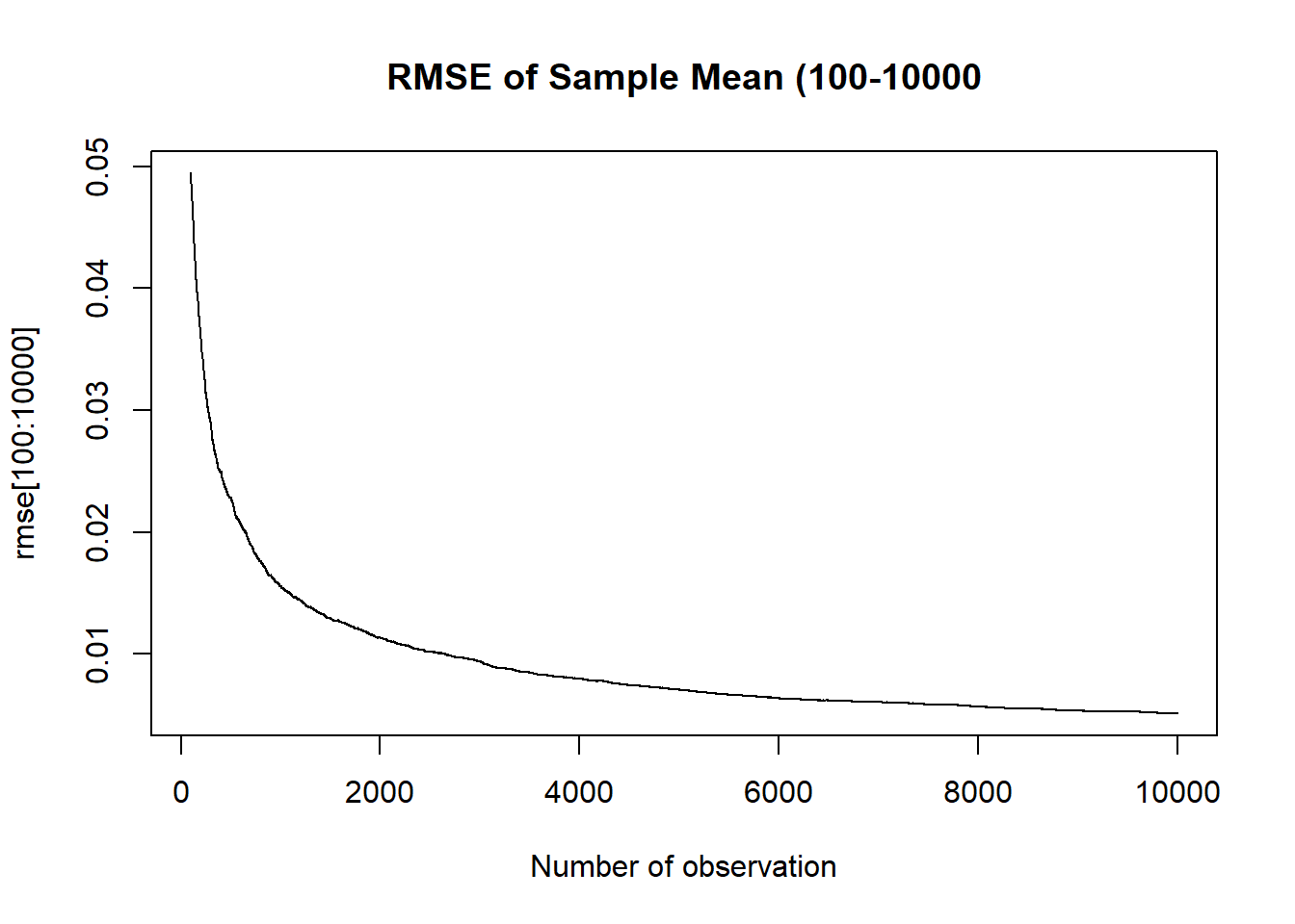
We can take our simulated binomial for population success rate of .525 at every n from 1 to 10,000 and calculate the simulated RMSE:
rmse <- rep(NA, 10000)
for(i in 1:10000){
  rmse[i] <- sqrt(var(binomial.sample[i,]) + mean( binomial.sample[i,]-.525 )^2)
}

plot(1:10000, rmse, main="RMSE of Sample Mean", xlab="Number of observation", type="l")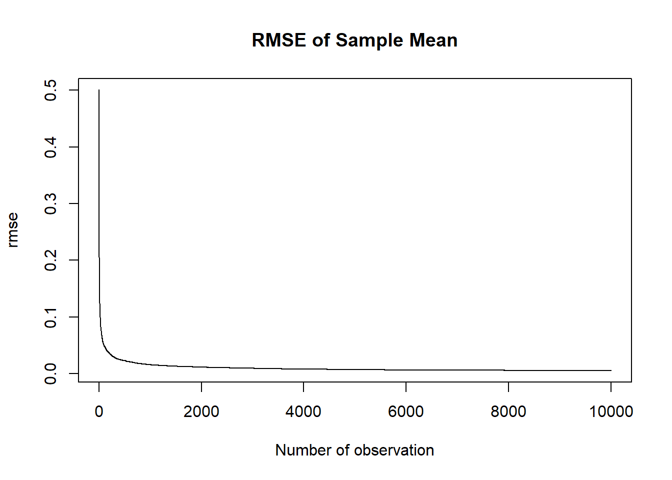
plot(100:10000, rmse[100:10000], main="RMSE of Sample Mean (100-10000", xlab="Number of observation", type="l")