12 Multivariate Regression
12.1 The standard error of a regression coefficient
Of course, our primary interest in this course is hypothesis testing. We know that each and every time we generate an estimate from our data, we have to think about it as one estimateof an infinite number of estimates we could have generated if we repeatedly resampled. For all of our estimates, therefore, there is a sampling distribution which describes what sort of range of estimates we will get if we repeatedly sample.
Let’s go back to our old standby of playing god and knowing a population to look at what the sampling distribution for a regression will look like. The mvrnorm() function from the MASS package allows us to draw from the “multivariate normal” we don’t need to know what this is, but just know that we can control the covariance between the two variables, as well as the variance of each variable. In this case we are setting the variance of each of x and y to 1, and the covariance between the two variables as 0.2. Here’s one draw:
library(MASS)
set.seed(19104)
sigma<-rbind(c(1,.2), c(.2,1))
sigma
#>      [,1] [,2]
#> [1,]  1.0  0.2
#> [2,]  0.2  1.0
mu <- c(0,0)
d <- as.data.frame(mvrnorm(n=100, mu=mu, Sigma=sigma))
names(d) <- c("x","y")
plot(d$x, d$y)
abline(lm(d$y ~ d$x), lwd=2, col="firebrick")
summary(lm(d$y ~ d$x))
#>
#> Call:
#> lm(formula = d$y ~ d$x)
#>
#> Residuals:
#>     Min      1Q  Median      3Q     Max
#> -2.2904 -0.7694  0.1109  0.6806  2.5906
#>
#> Coefficients:
#>             Estimate Std. Error t value Pr(>|t|)
#> (Intercept)  0.03485    0.10287   0.339    0.736
#> d$x          0.08855    0.10909   0.812    0.419
#>
#> Residual standard error: 1.026 on 98 degrees of freedom
#> Multiple R-squared:  0.006678,   Adjusted R-squared:  -0.003458
#> F-statistic: 0.6588 on 1 and 98 DF,  p-value: 0.4189
Focusing just on the slope, the coefficient here is .08855. The hypothesis test that we should fail to reject the null hypothesis that there are no relationship between these two variables, even though I set them up with a positive covariance. So this is a false negative.
What happens when we repeatedly re-sample from this distribution, capturing the beta coefficient each time? Let’s do 6 times:
par(mfrow=c(2,3))
for(i in 1:6){
d <- as.data.frame(mvrnorm(n=100, mu=mu, Sigma=sigma))
names(d) <- c("x","y")
m <- lm(d$y ~ d$x)

plot(d$x, d$y, main=paste("Slope = ", round(m$coefficients["d$x"],3)))
abline(lm(d$y ~ d$x), lwd=2, col="firebrick")
}
We get a pretty wide variety of outcomes. Now let’s look at doing this 1000 times. I’m going to record the beta each time, and stack on top of each other all of the regression lines.
par(mfrow=c(1,2))
plot(d$x, d$y, type="n", xlim=c(-3,3), ylim=c(-3,3))
betas <- rep(NA, 1000)

for(i in 1:1000){
d <- as.data.frame(mvrnorm(n=100, mu=mu, Sigma=sigma))
names(d) <- c("x","y")
m <- lm(d$y ~ d$x)
abline(lm(d$y ~ d$x),  lwd=2, col="gray80")
betas[i] <- m$coefficients["d$x"]
}
abline(h=0, lty=2)
abline(v=0, lty=2)

plot(density(betas), main="Sampling Distribution of Slope coefficient")
legend("topright", paste("se=", round(sd(betas), 3)))
Let’s think about both of these graphs in turn.
The graph that has all of the slopes on it is kind of a “double fan” pattern. All the lines seem to converge at 0,0. Note that both of these variables have, in the population, an expected value of 0.
It is actually true that every single regression line passes through the mean of the x variable and the mean of the y variable. This is very simple to show mathematically.
The regression line is:
\[ \hat{y} = \hat{\alpha} + \hat{\beta}x_i \]
And we want to know the value of \(\hat{y}\) for when \(x_i = \bar{x}\). Subbing in the equation we generated for \(\hat{\alpha}\):
\[ \hat{y} = \hat{\alpha} + \hat{\beta}\bar{x}\\ \hat{y} = (\bar{y} - \hat{\beta}\bar{x}) + \hat{\beta}\bar{x}\\ \hat{y} =\bar{y}\\ \]
So when x is equal to it’s mean, \(\hat{y}\) is equal to {y}. The inverse must be true because we are talking about a point on a line.
So every regression line passes through the sample means of the two variables. Looking at the graph to the left then, this makes it clear we will be more certain about the location of the regression line when we are close to the mean of x and y. This will have big ramifications when we start thinking about our ability to use regression for prediction!
Our main interest right now is the sampling distribution to the right. This appears to be a normal distribution centered around the true population slope coefficient.
To prove to ourselves that this is a normal distribution:
eval <- seq(-.2, .6, .001)
plot(density(betas), main="Sampling Distribution of Slope coefficient")
points(eval, dnorm(eval, mean=mean(betas), sd=sd(betas)), type="l", col="firebrick")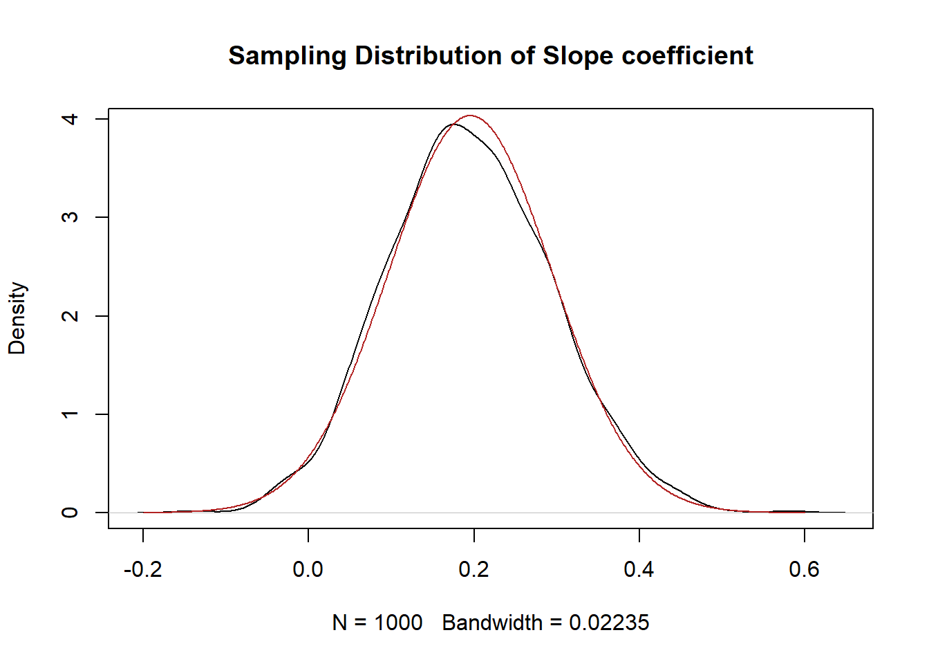
Yeah looks about right!
When we derived the standard error of the mean we learned that two components influenced the size of the standard error and thus the width of the sampling distribution: sample size and the randomness of the underlying variables. Is the same thing true here?
What if we up our sample size to 500?
par(mfrow=c(1,2))
plot(d$x, d$y, type="n", xlim=c(-3,3), ylim=c(-3,3))
betas <- rep(NA, 1000)

for(i in 1:1000){
d <- as.data.frame(mvrnorm(n=500, mu=mu, Sigma=sigma))
names(d) <- c("x","y")
m <- lm(d$y ~ d$x)
abline(lm(d$y ~ d$x),  lwd=2, col="gray80")
betas[i] <- m$coefficients["d$x"]
}
abline(h=0, lty=2)
abline(v=0, lty=2)

plot(density(betas), main="Sampling Distribution of Slope coefficient", xlim=c(-0.2,0.6))
legend("topright", paste("se=", round(sd(betas), 3)))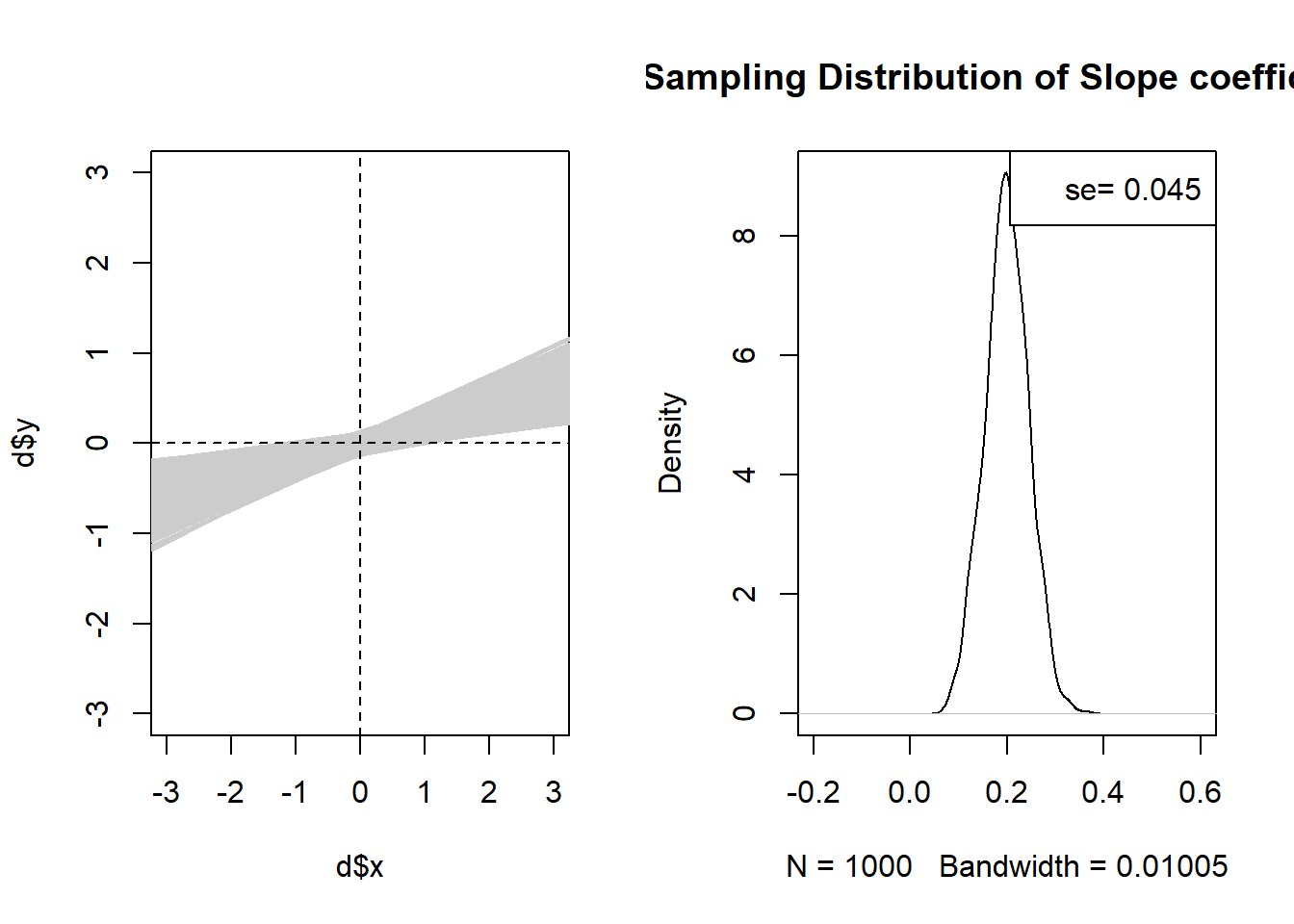
Yes for sure! We can see this in both graphs. The regression lines are much tighter around the “true” slope, and the sampling distribution is much smaller.
What about the randomness of the underlying variables? Again, we’ve seen before that if our underlying variables are more random it’s harder to make inferences about our samples. Does that matter here?
Let’s reduce the variance of y and see.
sigma<-rbind(c(1,.2), c(.2,.5))
sigma
#>      [,1] [,2]
#> [1,]  1.0  0.2
#> [2,]  0.2  0.5
par(mfrow=c(1,2))
plot(d$x, d$y, type="n", xlim=c(-3,3), ylim=c(-3,3))
betas <- rep(NA, 1000)

for(i in 1:1000){
d <- as.data.frame(mvrnorm(n=100, mu=mu, Sigma=sigma))
names(d) <- c("x","y")
m <- lm(d$y ~ d$x)
abline(lm(d$y ~ d$x),  lwd=2, col="gray80")
betas[i] <- m$coefficients["d$x"]
}
abline(h=0, lty=2)
abline(v=0, lty=2)

plot(density(betas), main="Sampling Distribution of Slope coefficient")
legend("topright", paste("se=", round(sd(betas), 3)))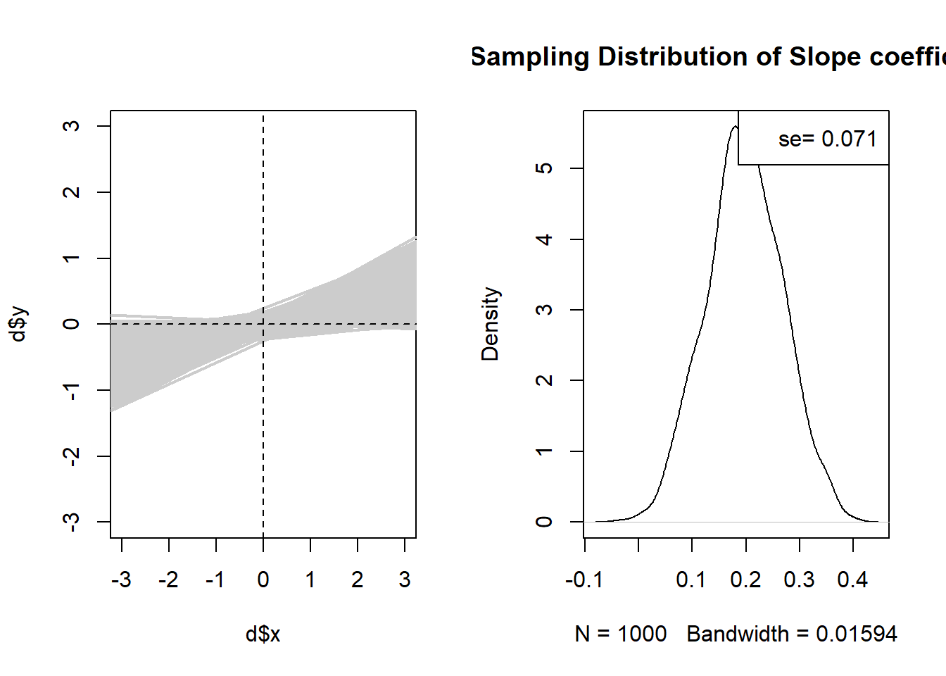
Yes…. that does seem to reduce the standard error.
What about reducing the variance of x?
sigma<-rbind(c(.5,.2), c(.2,1))

par(mfrow=c(1,2))
plot(d$x, d$y, type="n", xlim=c(-3,3), ylim=c(-3,3))
betas <- rep(NA, 1000)

for(i in 1:1000){
d <- as.data.frame(mvrnorm(n=100, mu=mu, Sigma=sigma))
names(d) <- c("x","y")
m <- lm(d$y ~ d$x)
abline(lm(d$y ~ d$x),  lwd=2, col="gray80")
betas[i] <- m$coefficients["d$x"]
}
abline(h=0, lty=2)
abline(v=0, lty=2)

plot(density(betas), main="Sampling Distribution of Slope coefficient")
legend("topright", paste("se=", round(sd(betas), 3)))
It got bigger! What!? Let’s look at some scatterplots with two different levels of variance of x to see why this is the case:
betas <- rep(NA, 1000)

par(mfrow=c(1,3))
for(i in 1:3){
sigma<-rbind(c(5,.2), c(.2,1))
d <- as.data.frame(mvrnorm(n=100, mu=mu, Sigma=sigma))
names(d) <- c("x","y")
plot(d$x, d$y, type="p", xlim=c(-7,7), ylim=c(-3,3))
abline(lm(d$y ~ d$x),  lwd=2, col="firebrick")
}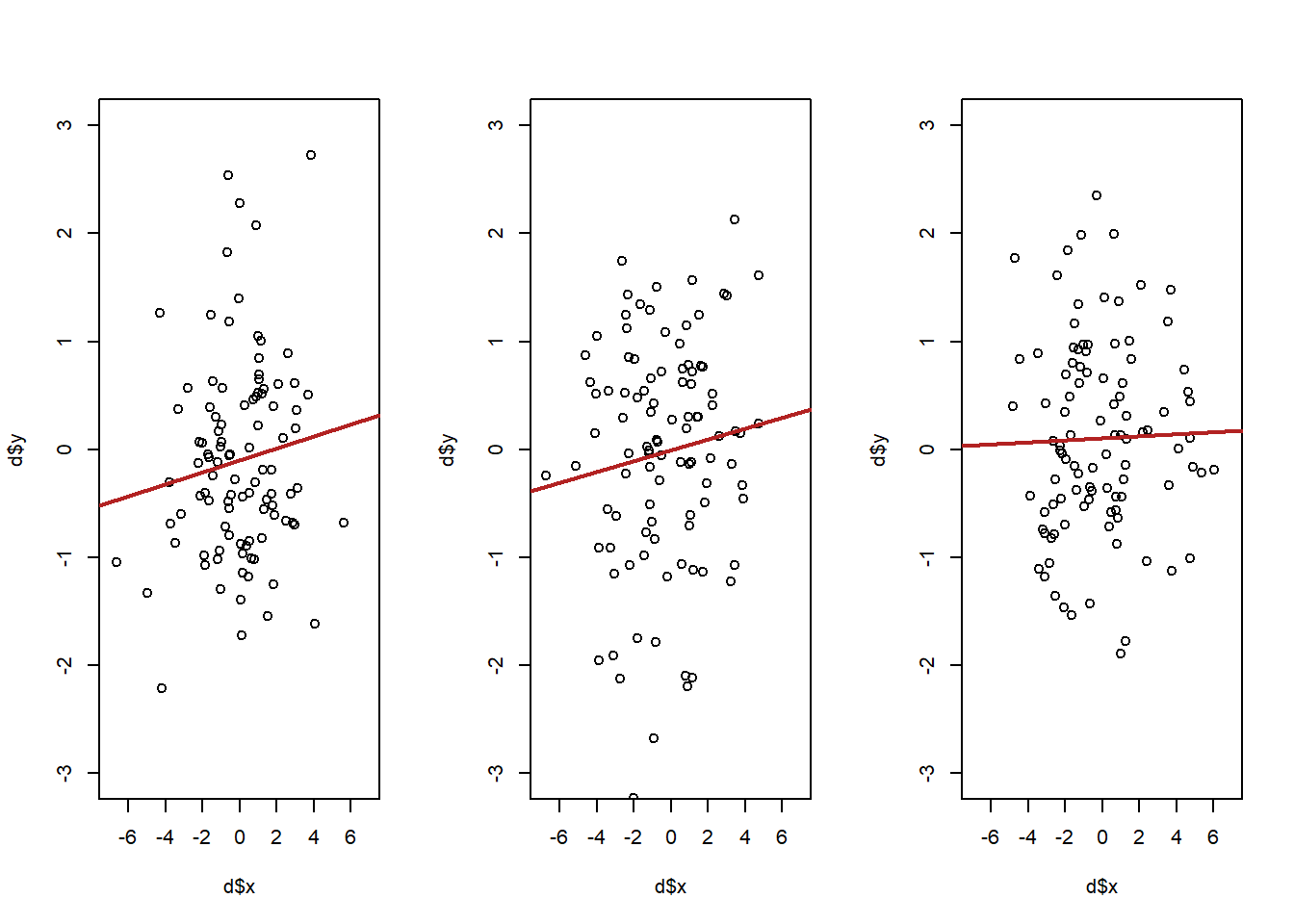
betas <- rep(NA, 1000)

par(mfrow=c(1,3))
for(i in 1:3){
sigma<-rbind(c(.5,.2), c(.2,1))
d <- as.data.frame(mvrnorm(n=100, mu=mu, Sigma=sigma))
names(d) <- c("x","y")
plot(d$x, d$y, type="p", xlim=c(-7,7), ylim=c(-3,3))
abline(lm(d$y ~ d$x),  lwd=2, col="firebrick")
}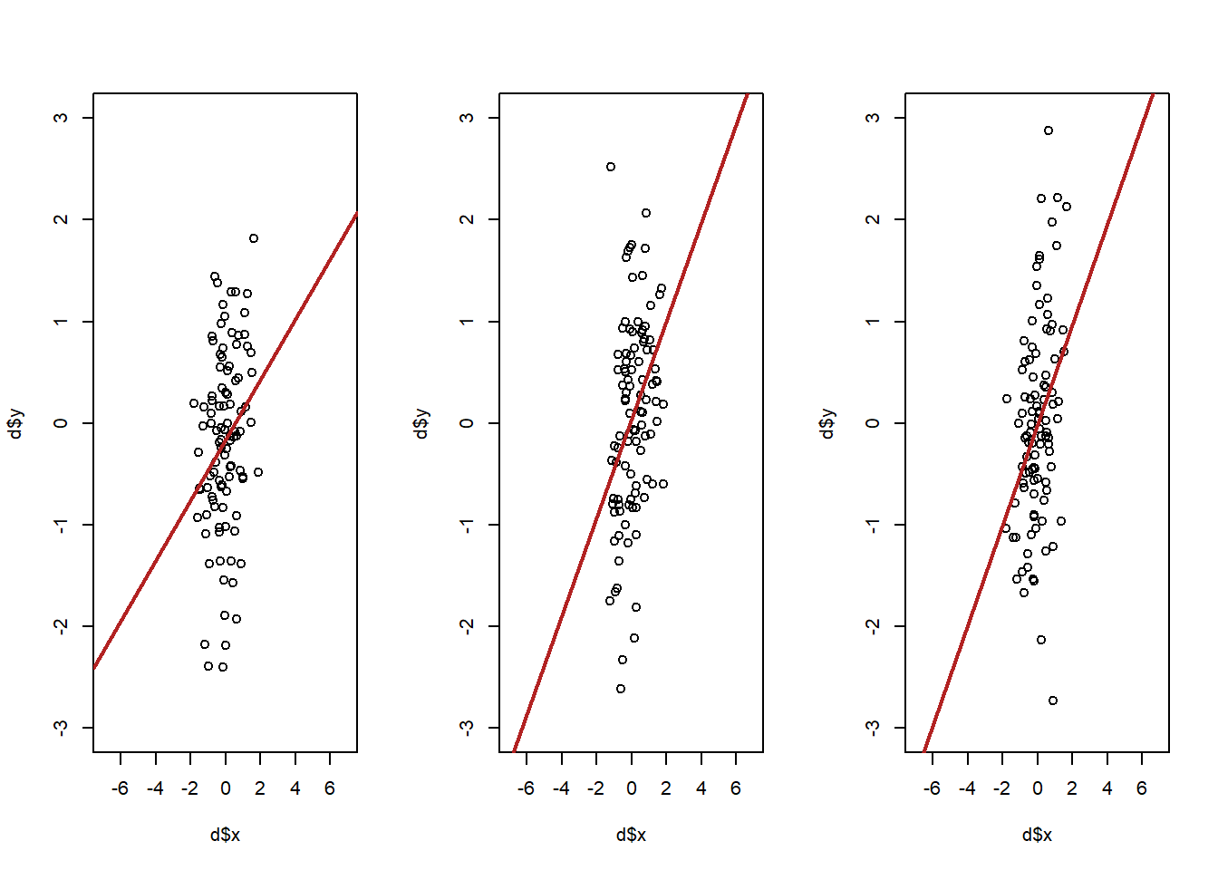
Which version of the above will lead to a lower variance in the slop of the regression line? It’s going to be the top. When x has less variation, small, random, changes in y are going to have large ramifications about where the regression line is. The best way to think about it is that more variation in x leads to more leverage in determining where the regression line is.
For the big reveal, here is the equation that generates the standard error of a regression coefficient:
\[ SE_{\beta} = \sqrt{\frac{ \frac{1}{n} \sum_{i=1}^n u_i^2 }{\sum_{i=1}^n (x_i-\bar{x})^2} } \]
The standard error is determined by the average squared residual, divided by the variance of x.
summary(m)
#>
#> Call:
#> lm(formula = d$y ~ d$x)
#>
#> Residuals:
#>      Min       1Q   Median       3Q      Max
#> -2.59804 -0.62515  0.04112  0.67740  1.70046
#>
#> Coefficients:
#>             Estimate Std. Error t value Pr(>|t|)
#> (Intercept)  0.10725    0.09155   1.172   0.2442
#> d$x          0.25168    0.12728   1.977   0.0508 .
#> ---
#> Signif. codes:
#> 0 '***' 0.001 '**' 0.01 '*' 0.05 '.' 0.1 ' ' 1
#>
#> Residual standard error: 0.9079 on 98 degrees of freedom
#> Multiple R-squared:  0.03837,    Adjusted R-squared:  0.02856
#> F-statistic:  3.91 on 1 and 98 DF,  p-value: 0.05081
sqrt(mean(m$residuals^2)/sum((d$x-mean(d$x))^2))
#> [1] 0.1249118
So what makes for a smaller standard error? As we’ve seen, more variance in x will lead to a smaller standard error, all else equal.
What else? Because of the \(n\) in the average formula, all things being equal more \(n\) will make the standard error smaller, but that’s only true if the \(n\) you add have relatively small residuals. In total the numerator of the equation tells us that more and smaller residuals will lead to a low standard error. What leads to smaller residuals? Less variation in \(y\) around the regression line. In other words if the points show a consistent relationship then there is going to be a smaller standard error, which makes a lot of sense!
I want to re-emphasize that once you have an estimate and a standard error literally everything that we’ve done so far is exactly the same.
For the regression \(m\) the standard error is .127, which is the standard deviation of a t distributed sampling distribution with 98 degrees of freedom. Where does 98 come from? The degrees of freedom for a regression is \(n\) minus the number of coefficients you are estimating, including the intercept, which here is 2. So the t distribution looks like:

How many standard errors is our test statistic away from the null?s
t.stat <- m$coefficients["d$x"]/.12728
eval <- seq(-3,3,.001)
plot(eval, dt(eval, df=98), type="l", main="t df=98")
abline(v=c(-t.stat, t.stat), lty=2)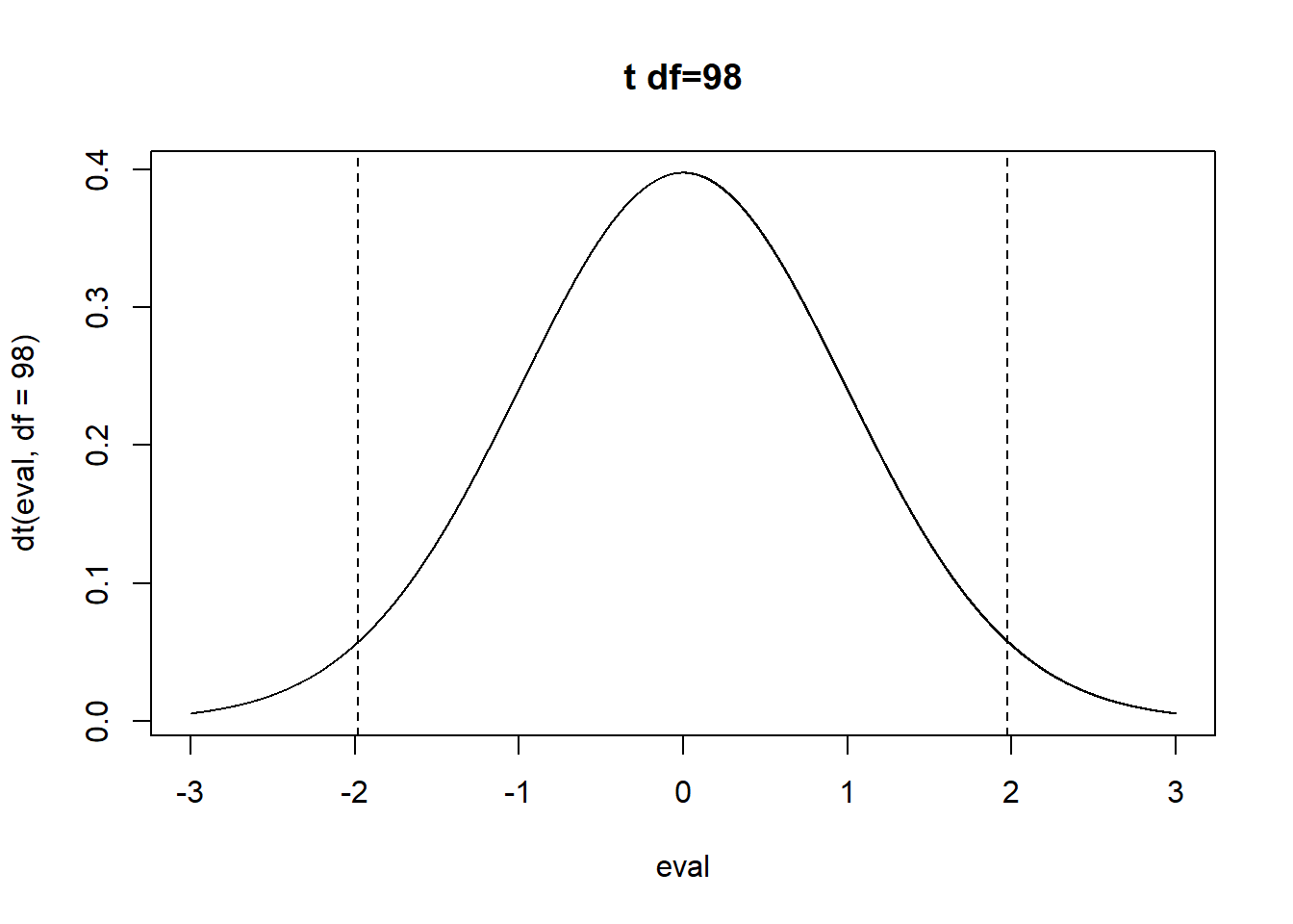
pt(-t.stat, df=98)*2
#>        d$x
#> 0.05080818
Same thing would go for a power calculation, or the confidence interval. Once you have the standard error, you are golden.
12.2 Regression with more than one independent variable
First, let’s install and load the “AER” package, which has some interesting built in data. We are just using this package for the data, it’s not a necessary package for regression or anything.
#install.packages("AER")
library(AER)
The AER package has some built in data on California schools
data("CASchools")

head(CASchools)
#>   district                          school  county grades
#> 1    75119              Sunol Glen Unified Alameda  KK-08
#> 2    61499            Manzanita Elementary   Butte  KK-08
#> 3    61549     Thermalito Union Elementary   Butte  KK-08
#> 4    61457 Golden Feather Union Elementary   Butte  KK-08
#> 5    61523        Palermo Union Elementary   Butte  KK-08
#> 6    62042         Burrel Union Elementary  Fresno  KK-08
#>   students teachers calworks   lunch computer expenditure
#> 1      195    10.90   0.5102  2.0408       67    6384.911
#> 2      240    11.15  15.4167 47.9167      101    5099.381
#> 3     1550    82.90  55.0323 76.3226      169    5501.955
#> 4      243    14.00  36.4754 77.0492       85    7101.831
#> 5     1335    71.50  33.1086 78.4270      171    5235.988
#> 6      137     6.40  12.3188 86.9565       25    5580.147
#>      income   english  read  math
#> 1 22.690001  0.000000 691.6 690.0
#> 2  9.824000  4.583333 660.5 661.9
#> 3  8.978000 30.000002 636.3 650.9
#> 4  8.978000  0.000000 651.9 643.5
#> 5  9.080333 13.857677 641.8 639.9
#> 6 10.415000 12.408759 605.7 605.4
Let’s set out a research question for these data. I want to know if the student to teacher ratio in a classroom is associated with better test scores. Specifically, as the student to teacher ratio increases, test scores should decrease.
The null hypothesis of this relationship is that student to teacher ratio has 0 association with test scores
Let’s first create two variables that capture these concepts. STR will be the student to teacher ratio:
CASchools$STR <- CASchools$students/CASchools$teachers
summary(CASchools$STR)
#>    Min. 1st Qu.  Median    Mean 3rd Qu.    Max.
#>   14.00   18.58   19.72   19.64   20.87   25.80
And the test scores will be the simple average of the reading and math test scores:
CASchools$score <- (CASchools$read + CASchools$math)/2
summary(CASchools$score)
#>    Min. 1st Qu.  Median    Mean 3rd Qu.    Max.
#>   605.5   640.0   654.5   654.2   666.7   706.8
To make my life easier I’m going to save a version of this dataset with a shorter name
dat <- CASchoolsOk, so first, what do these data look like?
plot(dat$STR, dat$score, xlab="Student:Teacher Ratio", ylab="Test Score", pch=16)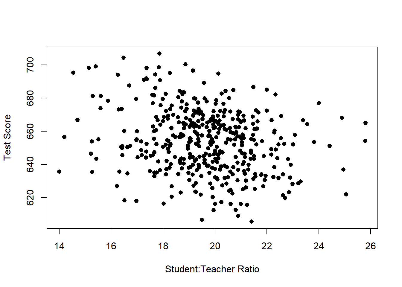 Well, these look much messier than the fake data we used earlier, which is about right. even still, there does seem to be a generally negative relationship here, though it’s not a slam dunk, and could be due to random chance.
Let’s use our new tool of regression to describe the relationship we are seeing here.
m <- lm(score ~ STR, data=dat)
summary(m)
#>
#> Call:
#> lm(formula = score ~ STR, data = dat)
#>
#> Residuals:
#>     Min      1Q  Median      3Q     Max
#> -47.727 -14.251   0.483  12.822  48.540
#>
#> Coefficients:
#>             Estimate Std. Error t value Pr(>|t|)
#> (Intercept) 698.9329     9.4675  73.825  < 2e-16 ***
#> STR          -2.2798     0.4798  -4.751 2.78e-06 ***
#> ---
#> Signif. codes:
#> 0 '***' 0.001 '**' 0.01 '*' 0.05 '.' 0.1 ' ' 1
#>
#> Residual standard error: 18.58 on 418 degrees of freedom
#> Multiple R-squared:  0.05124,    Adjusted R-squared:  0.04897
#> F-statistic: 22.58 on 1 and 418 DF,  p-value: 2.783e-06

plot(dat$STR, dat$score, xlab="Student:Teacher Ratio", ylab="Test Score", pch=16)
abline(lm(dat$score ~ dat$STR), lwd=2, col="firebrick")
What do we see here?
The coefficient on STR is negative. When STR increases by one unit, test scores decrease by -2.3 units, approximately.
Let’s put this in english. A one unit change in STR means one additional student for every teacher. So…A classroom with one additional student for every teacher, is associated with a 2.3 point decline in test scores on average.
Looking at the hypothesis test for this, the probability of obtaining a relationship this extreme if the truth was that there was no association between STR and test scores approaches zero. We reject the null hypothesis here.
What is the intercept telling us in this case ? When STR is zero, the average test score is 698.
But this is where we have to be smarter than the regression: can STR ever be zero??
12.3 Ommited variable bias
You’ve heard time and time again: correlation does not equal causation. Honestly I’m getting a bit tired of hearing it, as people often use it to mean “Can’t trust those scientists these days!”. Over the next few weeks we’ll formalize what this means and determine situations where correlation does equal causation. For right now, what we can think about doing is ruling out other plausible reasons for why these two variables might be correlated.
Theoretically, what we are interested in are variables that cause both a high student to teacher ratio and low test scores. In other words, might it be the case that some third, unseen, variable is driving this relationship?
There are some classic absurd omitted variable bias examples: There is a negative association between the number of firemen at a fire and property damage. It would be a mistake to conclude that firemen cause property damage. The truth is that both are driven by the severity of the fire.
Or above, we estimated the (fake) impact of years of schooling on income. What might be a third variable that causes someone to have more schooling and a higher income?
In the case we are dealing with here, a potential explanation for why a school might have a high student to teacher ratio and lower test scores might be because it is a school with a high number of children who speak english as a second language. Schools with a high number of children who speak english as a second language may be more likely to be in areas with a poor tax base and therefore less money to hire teachers. Standardized tests have been found to not capture the innate intelligence of those who do not speak english as their primary language.
In our original data, we have a variable that captures the percent of the school who has English as second language. To start let’s create a simple dummy variable that is equal to 1 if a school is above the median for ESL children, and 0 for schools that are below the median.
dat$high.esl <-NA
dat$high.esl[dat$english>=median(dat$english)]<- 1
dat$high.esl[dat$english<median(dat$english)]<- 0
Let’s visualize what this looks like
Here is our original data and regression line, where we are treating all the schools the same.
Within all these black dots, some are schools with a high number of ESL children, some are schools with a low number of ESL children.
plot(dat$STR, dat$score, xlab="Student:Teacher Ratio", ylab="Test Score", pch=16)
abline(lm(dat$score ~ dat$STR), lwd=2, col="firebrick")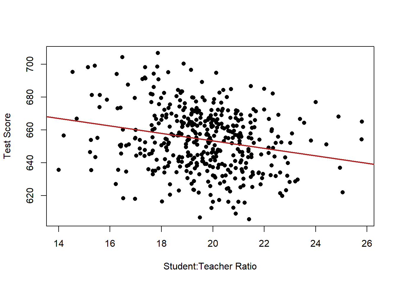
What if we reveal which points belong to which ESL group, how might we think differently about the relationship?
plot(dat$STR, dat$score, xlab="Student:Teacher Ratio", ylab="Test Score", pch=16, type="n")
points(dat$STR[dat$high.esl==0], dat$score[dat$high.esl==0], pch=16, col="darkblue")
points(dat$STR[dat$high.esl==1], dat$score[dat$high.esl==1], pch=16, col="firebrick")
legend("topright", c("Low ESL", "High ESL"), pch=c(16,16), col=c("darkblue", "firebrick"))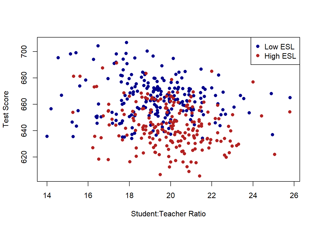
Just using the naked eye, there does seem to be a large number of schools which have both a high number of children who have English as a second language and also have lower test scores.
Here is what we want to do: Taking into account that there are two different types of schools, can we summarize what the relationship between STR and test scores are?
Mechanically, this is what regression is going to do: Choose a slope line for STR and TWO intercepts, one for each type of school, such that the sum of the squared residuals is minimized.
Visualizing this, it looks like this:
plot(dat$STR, dat$score, xlab="Student:Teacher Ratio", ylab="Test Score", pch=16, type="n")
points(dat$STR[dat$high.esl==0], dat$score[dat$high.esl==0], pch=16, col="darkblue")
points(dat$STR[dat$high.esl==1], dat$score[dat$high.esl==1], pch=16, col="firebrick")
abline(a=691.32, b=-1.3963, col="darkblue", lwd=3)
abline(a=691.32-19.49, b=-1.3963, col="firebrick", lwd=3)
legend("topright", c("Low ESL", "High ESL"), pch=c(16,16), col=c("darkblue", "firebrick"))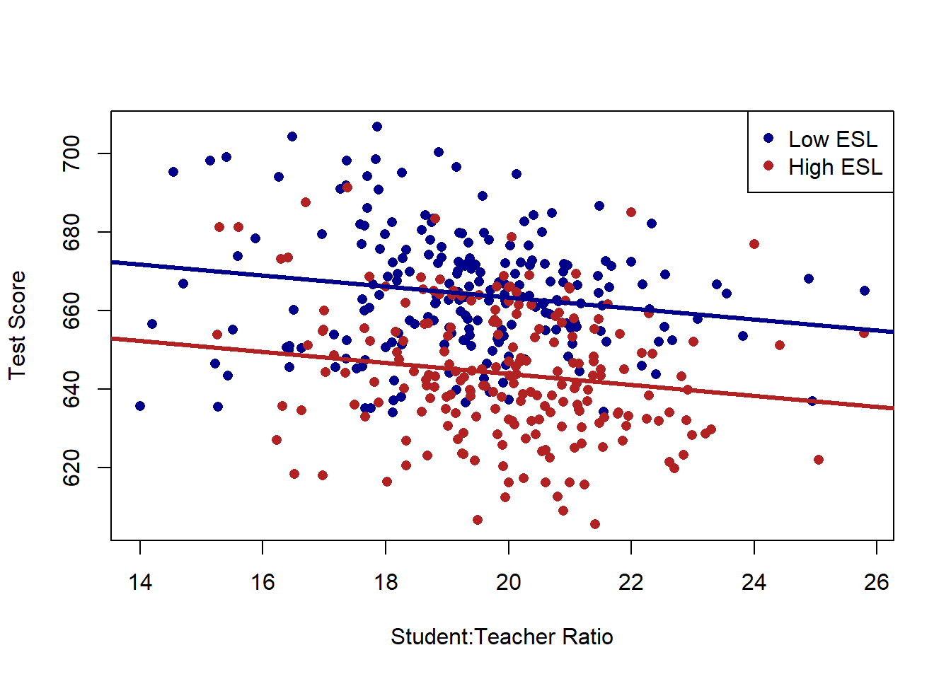
Now we are allowing each type of school to have its own intercept, and choosing a single slope that best fits the data with that limitation.
Let’s compare this new slope to what we had before.
plot(dat$STR, dat$score, xlab="Student:Teacher Ratio", ylab="Test Score", pch=16, type="n", xlim=c())
points(dat$STR[dat$high.esl==0], dat$score[dat$high.esl==0], pch=16, col="darkblue")
points(dat$STR[dat$high.esl==1], dat$score[dat$high.esl==1], pch=16, col="firebrick")
abline(a=691.32, b=-1.3963, col="darkblue", lwd=3)
abline(a=691.32-19.49, b=-1.3963, col="firebrick", lwd=3)
abline(lm(dat$score ~ dat$STR), lwd=3)
legend("topright", c("Low ESL", "High ESL"), pch=c(16,16), col=c("darkblue", "firebrick"))
abline(v=0, lty=2)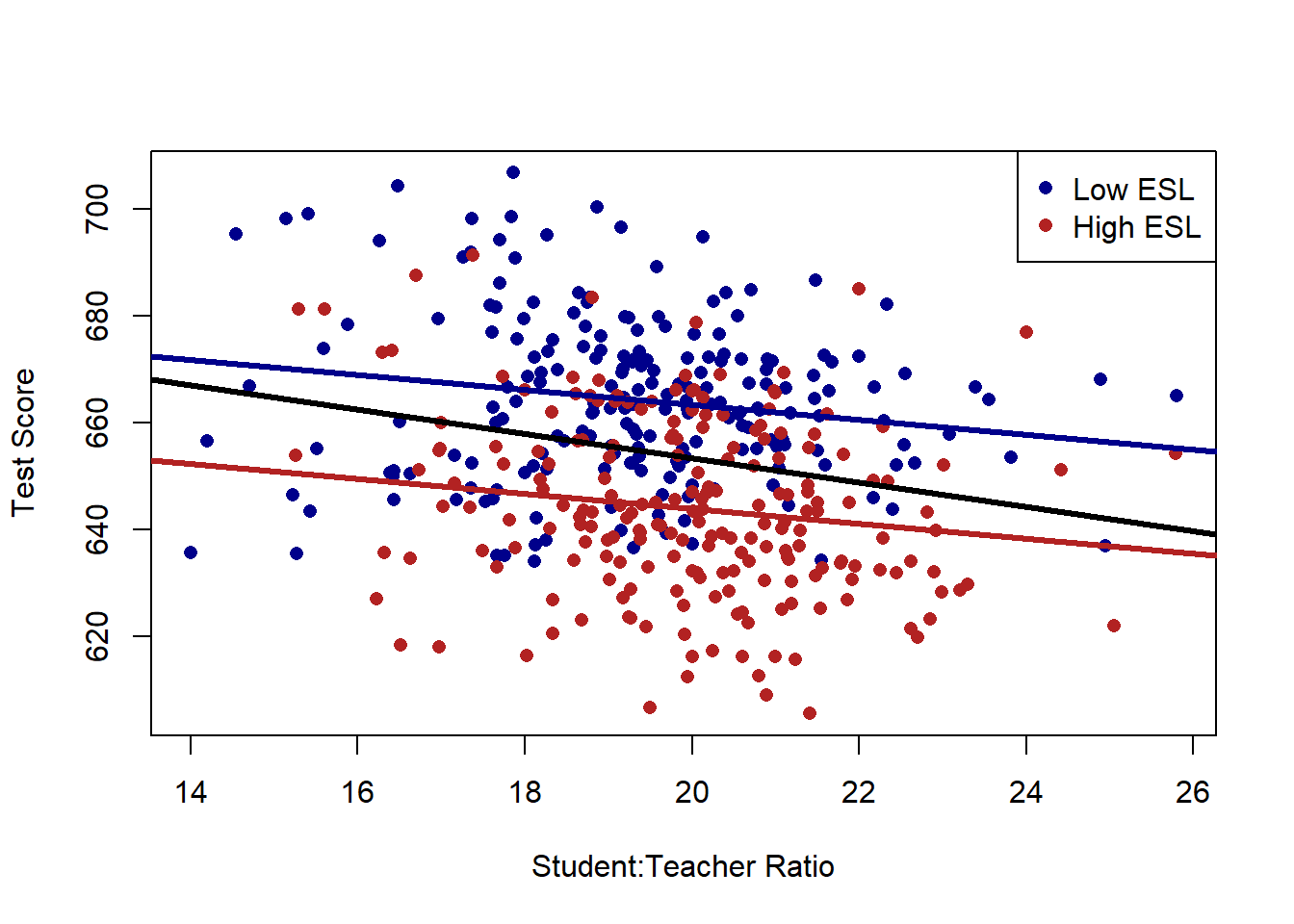
It’s much shallower. Why? The relationship between STR and test scores was driven, in part, by the fact that schools with high numbers of ESL children have both a high STR and low test scores. Once we take into account that fact (by focusing on the relationship within school types) the association between STR and test scores is much lower.
What does this look like in a regression equation?
m <- lm(score ~ STR + high.esl, data=dat)
summary(m)
#>
#> Call:
#> lm(formula = score ~ STR + high.esl, data = dat)
#>
#> Residuals:
#>     Min      1Q  Median      3Q     Max
#> -37.857 -10.853  -0.626  10.198  43.834
#>
#> Coefficients:
#>             Estimate Std. Error t value Pr(>|t|)
#> (Intercept) 691.3267     8.1315  85.019  < 2e-16 ***
#> STR          -1.3963     0.4171  -3.348 0.000889 ***
#> high.esl    -19.4911     1.5763 -12.365  < 2e-16 ***
#> ---
#> Signif. codes:
#> 0 '***' 0.001 '**' 0.01 '*' 0.05 '.' 0.1 ' ' 1
#>
#> Residual standard error: 15.91 on 417 degrees of freedom
#> Multiple R-squared:  0.3058, Adjusted R-squared:  0.3025
#> F-statistic: 91.84 on 2 and 417 DF,  p-value: < 2.2e-16
Helpfully, we are going to read these coefficients in the same way as we did with univariate regression. Each variable still represents how a one unit change in each independent variable is associated with a coefficient level change in the dependent variable. The major difference is that now these numbers are the effect of this variable holding the other variable constant. Another way to think of this is: accounting for the effect of the other variable, what’s the effect of this variable?
So for STR, holding constant whether a school has a high number of ESL students or not, the effect of an additional student for every teacher is to reduce test scores by 1.4 points.
The other variable high.esl is an indicator, which makes interpretation easier. Just as before a “one unit change” for an indicator variable is just changing categories, here from a low to a high ESL school.
Holding constant the student teacher ratio, schools with an above average number of children who have english as their second language perform nearly 20 points worse than schools with a below average number of childen who have english as their second language, holding constant the student to teacher ratio.
What about the intercept? For univariate regression we learned that the intercept is the average value of y when x is 0. Helpfully, the same thing applies here, with the caveat that now the intercept is the average value of y variable when all variables are equal to zero. In this case, the intercept is the average test scores when STR is zero (not real) and when high.esl is equal to zero.
What then, is the average test scores when STR is equal to zero in high esl schools? It would be 691-19.49! Indeed, when we look at the graph we’ve made, 19.49 is precisely the gap between the red and blue lines.
12.4 Multiple continuous variables.
What about when we have a regression with two continous variables?
The variable “engligh” is the percent of the students who have english as a second language. We think that “controlling” for this variable should have a similar effect on the relationship between STR and test scores as controlling for the the high.esl variable we created above. Schools with a high percentage of ESL students are likely to have higher STR and lower test scores.
But now, thinking about our original scatterplot, we can’t easily classify these dots into “high” and “low” as we did before
plot(dat$STR, dat$score, xlab="Student:Teacher Ratio", ylab="Test Score", pch=16)
abline(lm(dat$score ~ dat$STR), lwd=2, col="firebrick")
Indeed, there is a whole other dimension to these data now:
plot(dat$english, dat$score, xlab="% ESL Students", ylab="Test Score", pch=16)
abline(lm(dat$score ~ dat$english), lwd=2, col="firebrick")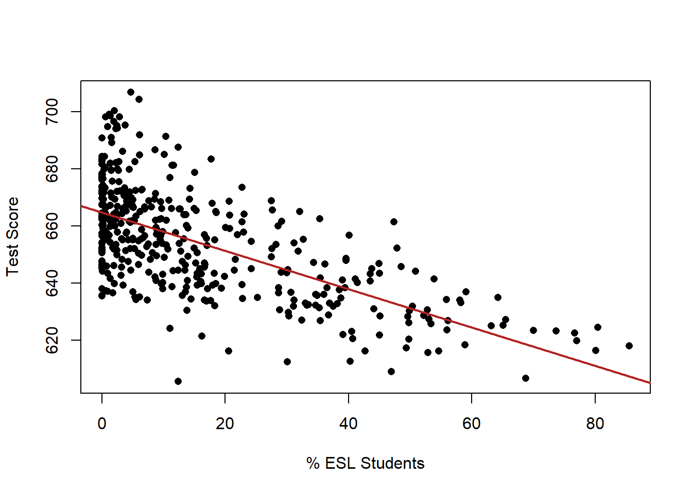
This is, unfortunately, where we leave the realm of easy-to-visualize regression.
We can think of this two variable case as a 3d plot:
#install.packages("rgl")
#library(rgl)
#plot3d(dat$STR, dat$english,dat$score, xlab="Student:Teacher Ratio", ylab="% ESL Students", zlab="Test Scores")
But I pretty much never do think about this way, and if you add just one additional variable there is no way to visualize!
At this point, just thinking about this through the regression output is much more helpful.
m <- lm(score ~ STR + english, data=dat)
summary(m)
#>
#> Call:
#> lm(formula = score ~ STR + english, data = dat)
#>
#> Residuals:
#>     Min      1Q  Median      3Q     Max
#> -48.845 -10.240  -0.308   9.815  43.461
#>
#> Coefficients:
#>              Estimate Std. Error t value Pr(>|t|)
#> (Intercept) 686.03224    7.41131  92.566  < 2e-16 ***
#> STR          -1.10130    0.38028  -2.896  0.00398 **
#> english      -0.64978    0.03934 -16.516  < 2e-16 ***
#> ---
#> Signif. codes:
#> 0 '***' 0.001 '**' 0.01 '*' 0.05 '.' 0.1 ' ' 1
#>
#> Residual standard error: 14.46 on 417 degrees of freedom
#> Multiple R-squared:  0.4264, Adjusted R-squared:  0.4237
#> F-statistic:   155 on 2 and 417 DF,  p-value: < 2.2e-16
Again, what we are seeing here is the association between each of these variables and the dependent variable while holding constant the other.
So in plain language: Holding constant the impact of the percent of students who have English as a second language, the impact of one additional student per teacher is to reduce test scores by 1.1 points.
Further, holding constant the impact of the student to teacher ratio, the impact of an additional 1% of students having English as a second language is to reduce test scores by .65 points.
12.5 Many variables
While visualization becomes harder/impossible with additional variables, the logic of what regression coefficients mean is infinitely scalable. The coefficients will always be the impact of a one-unit change in the variable on the dependent variable, holding the other variables constant.
So if we want to assess the impact of STR while controlling for % of students getting subsidized lunch as well as the income of (something, i’m not sure what this data is)
m <- lm(score ~ STR + english + lunch + income, data=dat)
summary(m)
#>
#> Call:
#> lm(formula = score ~ STR + english + lunch + income, data = dat)
#>
#> Residuals:
#>      Min       1Q   Median       3Q      Max
#> -30.7085  -4.9977  -0.2014   4.8411  28.7000
#>
#> Coefficients:
#>              Estimate Std. Error t value Pr(>|t|)
#> (Intercept) 675.60821    5.30886 127.261  < 2e-16 ***
#> STR          -0.56039    0.22861  -2.451   0.0146 *
#> english      -0.19433    0.03138  -6.193 1.42e-09 ***
#> lunch        -0.39637    0.02741 -14.461  < 2e-16 ***
#> income        0.67498    0.08333   8.100 6.19e-15 ***
#> ---
#> Signif. codes:
#> 0 '***' 0.001 '**' 0.01 '*' 0.05 '.' 0.1 ' ' 1
#>
#> Residual standard error: 8.448 on 415 degrees of freedom
#> Multiple R-squared:  0.8053, Adjusted R-squared:  0.8034
#> F-statistic: 429.1 on 4 and 415 DF,  p-value: < 2.2e-16
Note that regression does not care bout the order of variables on the “right hand” side of the equation:
m <- lm(score ~english + income + STR +  lunch, data=dat)
summary(m)
#>
#> Call:
#> lm(formula = score ~ english + income + STR + lunch, data = dat)
#>
#> Residuals:
#>      Min       1Q   Median       3Q      Max
#> -30.7085  -4.9977  -0.2014   4.8411  28.7000
#>
#> Coefficients:
#>              Estimate Std. Error t value Pr(>|t|)
#> (Intercept) 675.60821    5.30886 127.261  < 2e-16 ***
#> english      -0.19433    0.03138  -6.193 1.42e-09 ***
#> income        0.67498    0.08333   8.100 6.19e-15 ***
#> STR          -0.56039    0.22861  -2.451   0.0146 *
#> lunch        -0.39637    0.02741 -14.461  < 2e-16 ***
#> ---
#> Signif. codes:
#> 0 '***' 0.001 '**' 0.01 '*' 0.05 '.' 0.1 ' ' 1
#>
#> Residual standard error: 8.448 on 415 degrees of freedom
#> Multiple R-squared:  0.8053, Adjusted R-squared:  0.8034
#> F-statistic: 429.1 on 4 and 415 DF,  p-value: < 2.2e-16
It’s important to note here that this is just enough information to get yourself in trouble. Specifying a regression is hard, theoretical, work. There are some big pitfalls to be aware of.
Primarily: more variables isn’t necessarily better! Indeed, adding certain types of variables can actually make your estimates worse. Regression should be tricky, and I wouldn’t go out applying this to all sorts of things without learning more about the theory.
Here’s an example: Imagine had a dataset that had whether people smoked or not, whether they got pneumonia or not and whether they died.
You think: better be careful, let’s do
lm(die ~ smoke + pneumonia)
But people who smoke die of pneumonia. The effects of smoking within those who get pneumonia is probably close to zero, or greatly reduced.
This is what we call “post-treatment bias”
Another example is looking at the effects of gender on wages controlling for length of parental leave. You’re controlling away (one of) the reasons why women get paid lower wages: they reasonably take more time off when they have a child.