Practical Class Sheets 4
In this practical class, we will explore polynomial regression, step-wise functions, splines, generalised additive models and logistic regression.
To start, create a new R script by clicking on the corresponding menu button (in the top left); and save it somewhere in your computer. You can now write all your code into this file, and then execute it in R using the menu button Run or by simple pressing ctrl \(+\) enter.
In this practical class we will investigate two datasets for modelling. Firstly the dataset seatpos from the library faraway, followed by the Boston data analysed in the lecture practical demonstrations. Lastly we will apply logistic regression to address a binary classification problem.
Following practical class 3, we continue investigating the dataset seatpos.
library("MASS")
library("faraway")
Polynomial and Step-wise Function Regression
Exercise 4.1
This exercise models the seatpos data by polynomial and step-wise function regression.
We will analyse the effects of predictor variable Ht on the response variable hipcenter. Assign the hipcenter values to a vector y, and the Ht variable values to a vector x.
y = seatpos$hipcenter
x = seatpos$Ht
Plot variable
Htandhipcenteragainst each other. Remember to include suitable axis labels. From visual inspection of this plot, what sort of polynomial might be appropriate for this data?Fit a first and second order polynomial to the data using the commands
lmandpoly. Look at the corresponding summary objects. Do these back up your answer to part (a)?Plot the first and second polynomial fits to the data, along with \(\pm2\) standard deviation confidence intervals, similar to those generated in the lecture practical demonstrations. What do you notice about the degree-2 polynomial plot?
Use step function regression with 5 cut-points to model
hipcenterbased onHt. Plot the results.
Click for solution
## SOLUTION

# (a)
y.lab = 'hip center (mm)'
x.lab = 'Height (bare foot) in cm'
plot( x, y, cex.lab = 1.1, col="darkgrey", xlab = x.lab, ylab = y.lab,
      main = "", bty = 'l', pch = 16 )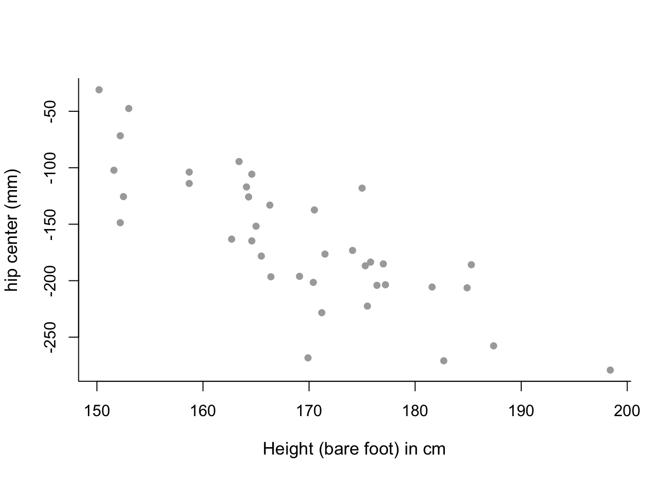
# mean trend in the data looks almost linear - perhaps only a
# first-order polynomial model is needed.

# (b)
poly1 = lm(y ~ poly(x,  1))
summary(poly1)
##
## Call:
## lm(formula = y ~ poly(x, 1))
##
## Residuals:
## Min 1Q Median 3Q Max
## -99.956 -27.850 5.656 20.883 72.066
##
## Coefficients:
## Estimate Std. Error t value Pr(>|t|)
## (Intercept) -164.88 5.90 -27.95 < 0.0000000000000002 ***
## poly(x, 1) -289.87 36.37 -7.97 0.00000000183 ***
## ---
## Signif. codes: 0 '***' 0.001 '**' 0.01 '*' 0.05 '.' 0.1 ' ' 1
##
## Residual standard error: 36.37 on 36 degrees of freedom
## Multiple R-squared: 0.6383, Adjusted R-squared: 0.6282
## F-statistic: 63.53 on 1 and 36 DF, p-value: 0.000000001831poly2 = lm(y ~ poly(x, 2))
summary(poly2)##
## Call:
## lm(formula = y ~ poly(x, 2))
##
## Residuals:
## Min 1Q Median 3Q Max
## -96.068 -25.018 4.418 22.790 75.322
##
## Coefficients:
## Estimate Std. Error t value Pr(>|t|)
## (Intercept) -164.885 5.919 -27.855 < 0.0000000000000002 ***
## poly(x, 2)1 -289.868 36.490 -7.944 0.00000000242 ***
## poly(x, 2)2 31.822 36.490 0.872 0.389
## ---
## Signif. codes: 0 '***' 0.001 '**' 0.01 '*' 0.05 '.' 0.1 ' ' 1
##
## Residual standard error: 36.49 on 35 degrees of freedom
## Multiple R-squared: 0.646, Adjusted R-squared: 0.6257
## F-statistic: 31.93 on 2 and 35 DF, p-value: 0.00000001282# p-value for second order term is high, suggesting that it is not
# necessary in the model. This backs up our conclusion to part (a).# (c)
sort.x = sort(x) # sorted values of x.
# Predicted values.
pred1 = predict(poly1, newdata = list(x = sort.x), se = TRUE)
pred2 = predict(poly2, newdata = list(x = sort.x), se = TRUE)
# Confidence interval bands.
se.bands1 = cbind( pred1$fit - 2*pred1$se.fit, pred1$fit + 2*pred1$se.fit )
se.bands2 = cbind( pred2$fit - 2*pred2$se.fit, pred2$fit + 2*pred2$se.fit )
# Plot both plots on a single graphics device.
par(mfrow = c(1,2))
# Degree-1 polynomial plot.
plot(x, y, cex.lab = 1.1, col="darkgrey", xlab = x.lab, ylab = y.lab,
main = "Degree-1 polynomial", bty = 'l')
lines(sort.x, pred1$fit, lwd = 2, col = "red")
matlines(sort.x, se.bands1, lwd = 2, col = "red", lty = 3)
# Degree-2 polynomial plot.
plot(x, y, cex.lab = 1.1, col="darkgrey", xlab = x.lab, ylab = y.lab,
main = "Degree-2 polynomial", bty = 'l')
lines(sort.x, pred2$fit, lwd = 2, col = "red")
matlines(sort.x, se.bands2, lwd = 2, col = "red", lty = 3)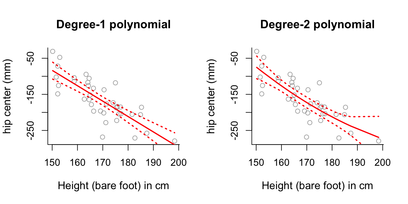
# Degree-2 polynomial plot looks relatively close to a straight line as
# well - perhaps this suggests the second order component isn't necessary?
# (d)
# Remember to define the number of intervals (one more than the number of
# cut-points).
step6 = lm(y ~ cut(x, 6))
pred6 = predict(step6, newdata = list(x = sort(x)), se = TRUE)
se.bands6 = cbind(pred6$fit + 2*pred6$se.fit, pred6$fit-2*pred6$se.fit)
# Plot the results.
plot(x, y, cex.lab = 1.1, col="darkgrey", xlab = x.lab, ylab = y.lab,
main = "5 cutpoints", bty = 'l')
lines(sort(x), pred6$fit, lwd = 2, col = "red")
matlines(sort(x), se.bands6, lwd = 1.4, col = "red", lty = 3)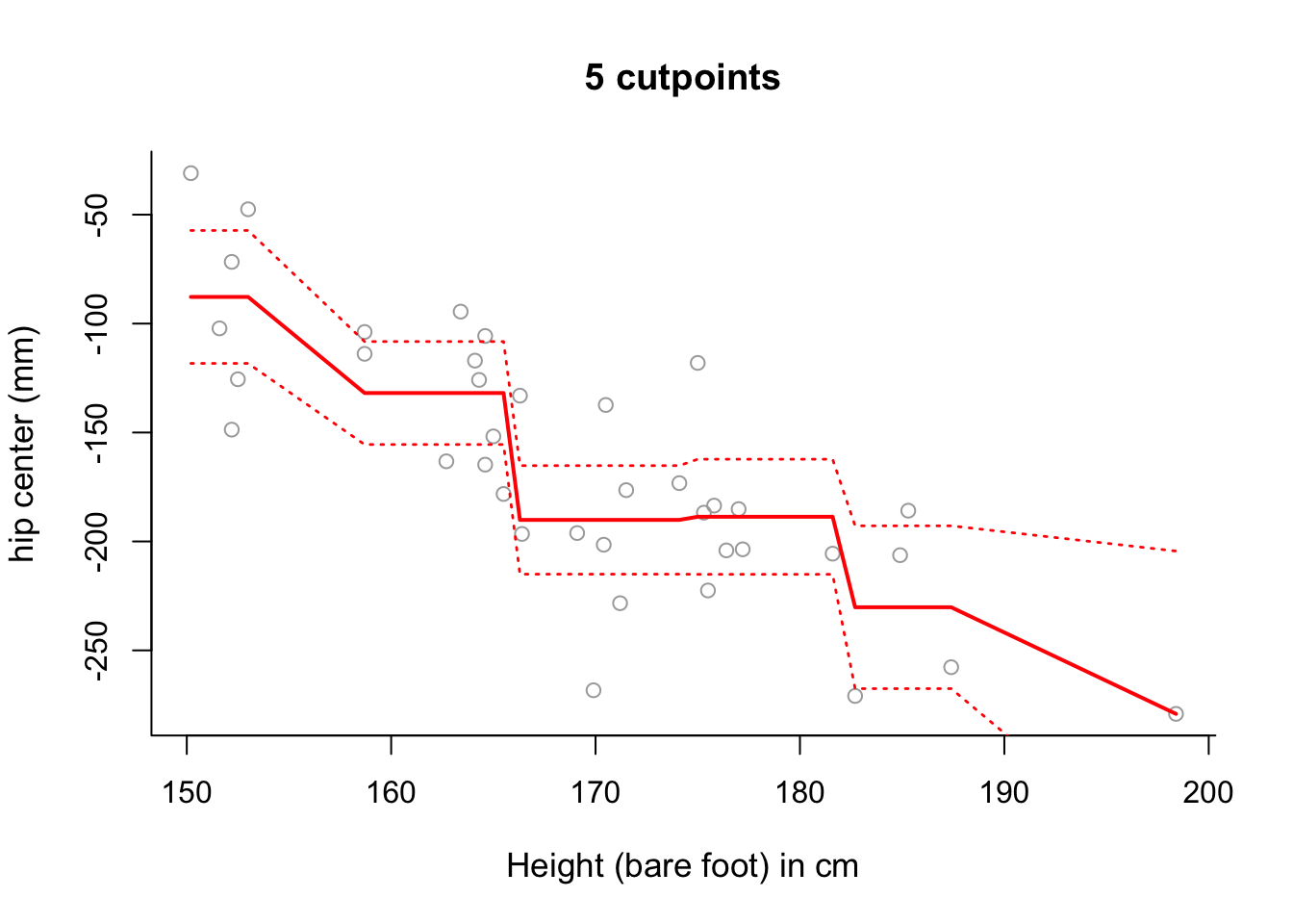
# Note that the slopes in this plot are an artifact of the way in which we
# have plotted the results.
# Use summary to see where the different intervals start and finish.
summary(step6)
##
## Call:
## lm(formula = y ~ cut(x, 6))
##
## Residuals:
## Min 1Q Median 3Q Max
## -78.209 -25.615 0.936 22.425 70.623
##
## Coefficients:
## Estimate Std. Error t value Pr(>|t|)
## (Intercept) -87.76 15.25 -5.753 0.00000222 ***
## cut(x, 6)(158,166] -44.11 19.29 -2.286 0.029 *
## cut(x, 6)(166,174] -102.35 19.69 -5.197 0.00001119 ***
## cut(x, 6)(174,182] -100.91 20.18 -5.001 0.00001983 ***
## cut(x, 6)(182,190] -142.44 24.12 -5.906 0.00000143 ***
## cut(x, 6)(190,198] -191.39 40.36 -4.742 0.00004197 ***
## ---
## Signif. codes: 0 '***' 0.001 '**' 0.01 '*' 0.05 '.' 0.1 ' ' 1
##
## Residual standard error: 37.36 on 32 degrees of freedom
## Multiple R-squared: 0.6606, Adjusted R-squared: 0.6076
## F-statistic: 12.46 on 5 and 32 DF, p-value: 0.0000009372# The fitted model can be more accurately fitted over the data as follows:
newx <- seq(from = min(x), to = max(x), length = 100)
pred6 = predict(step6, newdata = list(x = newx), se = TRUE)
se.bands6 = cbind(pred6$fit + 2*pred6$se.fit, pred6$fit-2*pred6$se.fit)
plot(x, y, cex.lab = 1.1, col="darkgrey", xlab = x.lab, ylab = y.lab,
main = "5 cutpoints", bty = 'l')
lines(newx, pred6$fit, lwd = 2, col = "red")
matlines(newx, se.bands6, lwd = 1.4, col = "red", lty = 3)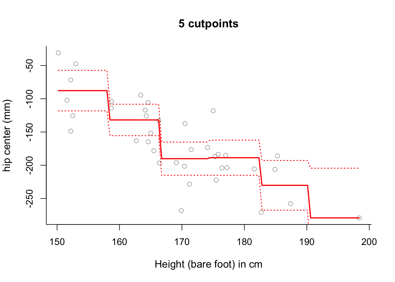
# Whilst there is still some sloping artifact to the plot, it is more
# negligible now - that is, the plot of the fitted values more accurately
# represents the step-wise nature of the model.
# Note that this was also present in the examples in
# Section 9.1 and 9.2 - but less noticable due to the amount of data.
# Change length = 1000 in the command seq for newx and you will see the
# steps become more step-like still!
Splines
In this exercise we continue modeling the seatpos data by splines. We will again analyse the effects of predictor variable Ht on the response variable hipcenter.
Exercise 4.2
Find the 25th, 50th and 75th percentiles of
x, storing them in a vectorcuts.Use a linear spline to model
hipcenteras a function ofHt, putting knots at the 25th, 50th and 75th percentiles ofx.Plot the fitted linear spline from part (b) over the data, along with \(\pm2\) standard deviation confidence intervals.
Use a smoothing spline to model
hipcenteras a function ofHt, selecting \(\lambda\) with cross-validation, and generate a relevant plot. What do you notice?
Click for solution
## SOLUTION

#(a)
summary(x)
## Min. 1st Qu. Median Mean 3rd Qu. Max.
## 150.2 163.6 169.5 169.1 175.7 198.4cuts <- summary(x)[c(2,3,5)]
#(b)
library("splines")
spline1 = lm(y ~ bs(x, degree = 1, knots = cuts))#(c)
# Sort the values of x from low to high.
sort.x <- sort(x)
# Obtain predictions for the fitted values along with confidence intervals.
pred1 = predict(spline1, newdata = list(x = sort.x), se = TRUE)
se.bands1 = cbind(pred1$fit + 2 * pred1$se.fit, pred1$fit - 2 * pred1$se.fit)
# Plot the fitted linear spline model over the data.
plot(x, y, cex.lab = 1.1, col="darkgrey", xlab = x.lab, ylab = y.lab,
main = "Linear Spline", bty = 'l')
lines(sort.x, pred1$fit, lwd = 2, col = "red")
matlines(sort.x, se.bands1, lwd = 2, col = "red", lty = 3)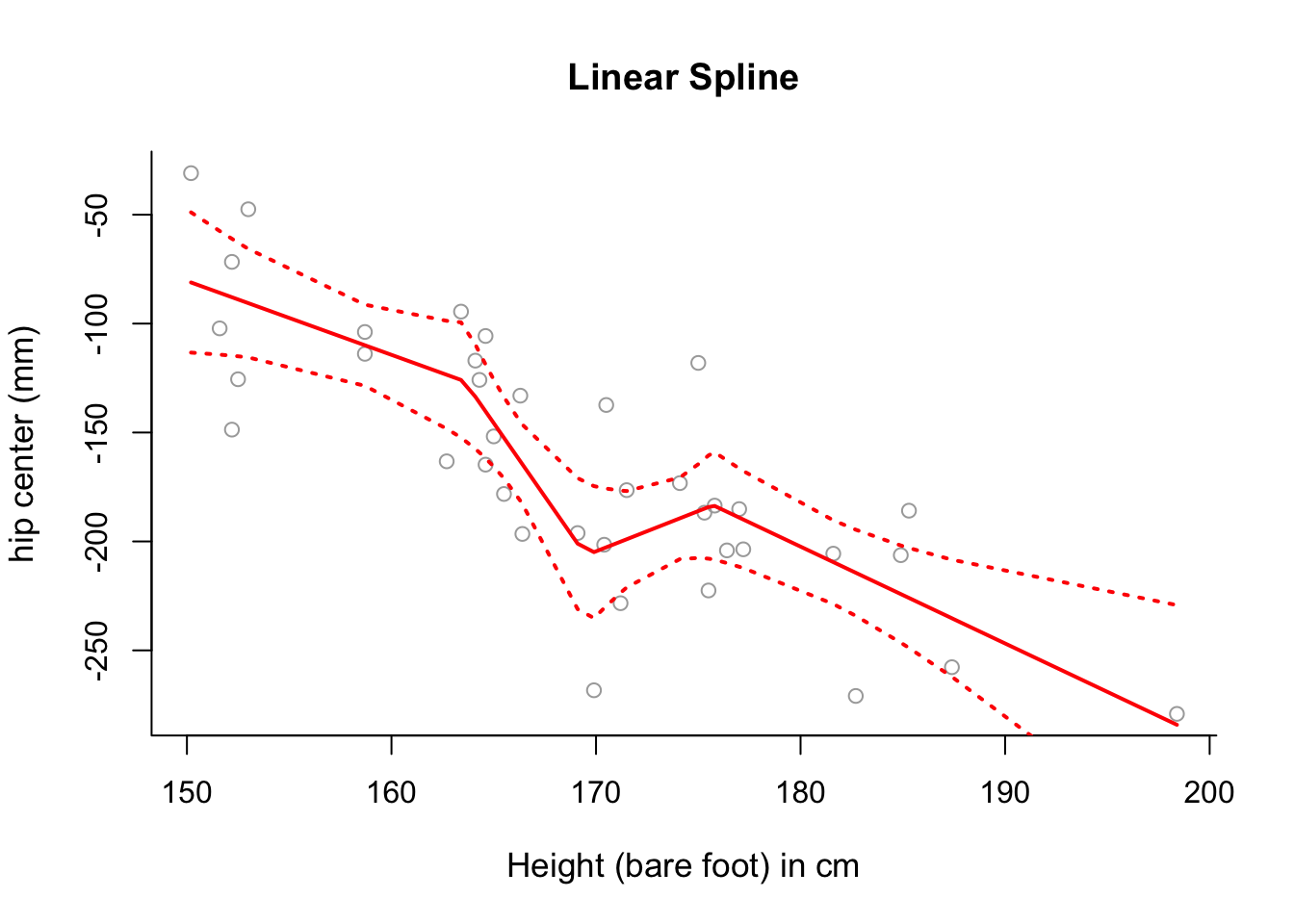
#(d)
smooth1 = smooth.spline(x, y, df = 3)

plot(x, y, cex.lab = 1.1, col="darkgrey", xlab = x.lab, ylab = y.lab,
     main = "Smoothing Spline (3df)", bty = 'l')
lines(smooth1, lwd = 2, col = "brown")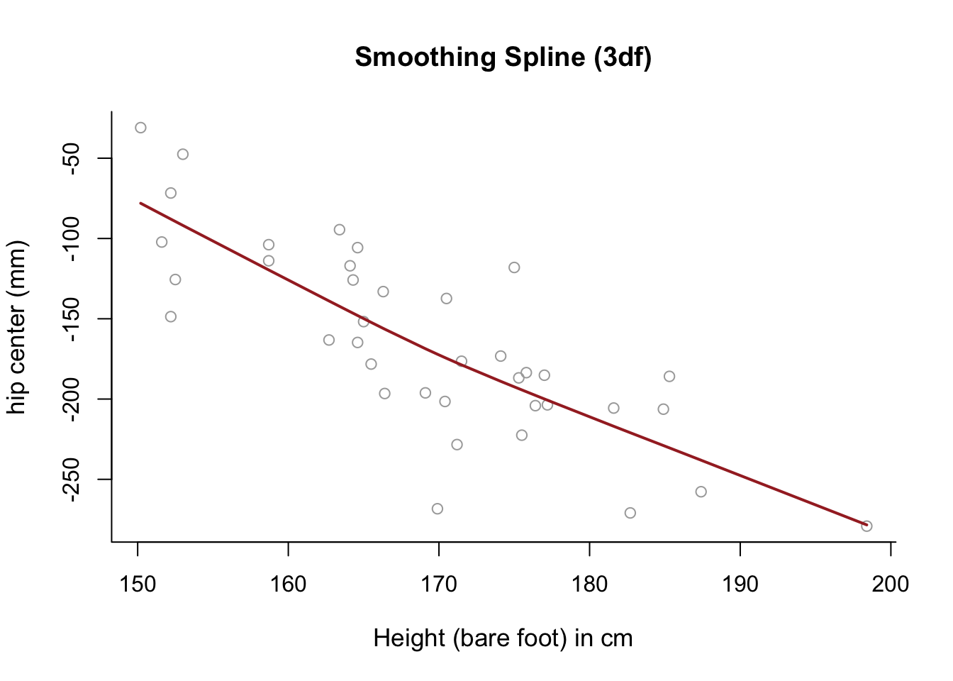
# The fitted model is almost completely linear.GAMs
In this exercise we consider multiple predictors for modeling the seatpos data by GAMs.
Exercise 4.3
- Fit a GAM for
hipcenterthat consists of three terms:
- a natural spline with 5 degrees of freedom for
Age, - a smoothing spline with 3 degrees of freedom for
Thigh, and - a simple linear model term for
Ht.
Plot the resulting contributions of each term to the GAM, and compare them with plots of
hipcenteragainst each of the three variablesAge,ThighandHt.Does the contribution of each term of the GAM make sense in light of these pair-wise plots. Is the GAM fitting the data well?
Click for solution
## SOLUTION

#(a)
# Require library gam.
library(gam)

# Fit a GAM.
gam = gam( hipcenter ~ ns( Age, df = 5 ) + s( Thigh, df = 3 ) + Ht,
           data = seatpos )
#(b)
# Plot the contributions.
par( mfrow = c(2,3) )
plot( gam, se = TRUE, col = "blue" )
# Compare with the following plots.
plot( seatpos$Age, seatpos$hipcenter, pch = 16, col = 2,
ylab = y.lab, xlab = "Age (years)" )
plot( seatpos$Thigh, seatpos$hipcenter, pch = 16, col = 2,
ylab = y.lab, xlab = "Thigh length (cm)" )
plot( seatpos$Ht, seatpos$hipcenter, pch = 16, col = 2,
ylab = y.lab, xlab = "Ht (bare foot) (cm)" )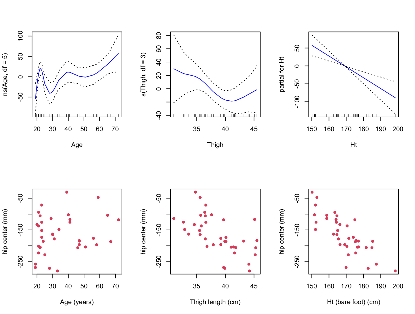
#(c)
# The linear fit of Ht is quite clear.  Perhaps the fits for Age and Thigh
# are less clear, although I think we can see that the curves are fitting
# the data somewhat.
# Perhaps they are overfitting, capturing variation across the predictor
# ranges (in the sample) that isn't really there (in the population).
Boston Data
In this exercise we will investigate the Boston Housing Data.
library("MASS")
library(splines)
Exercise 4.4
Investigate modelling
medvusing regression, natural and smoothing splines, takingindusas a single predictor.Choose a set of predictor variables to use in order to fit a GAM for
medv. Feel free to experiment with different modelling options.
Click for solution
## SOLUTION
#(a)

y = Boston$medv
x = Boston$indus
y.lab = 'Median Property Value'
x.lab = 'Non-retail business acres per town'

# Use summary on x to find 25th, 50th and 75th percentiles.  We will use
# these for the positions of the knots for regression and natural splines.
summary(x)
## Min. 1st Qu. Median Mean 3rd Qu. Max.
## 0.46 5.19 9.69 11.14 18.10 27.74cuts <- summary(x)[c(2,3,5)]
cuts## 1st Qu. Median 3rd Qu.
## 5.19 9.69 18.10# sort x for later.
sort.x = sort(x)
# Fit a cubic spline
spline.bs = lm(y ~ bs(x, knots = cuts))
pred.bs = predict(spline.bs, newdata = list(x = sort.x), se = TRUE)
se.bands.bs = cbind(pred.bs$fit + 2 * pred.bs$se.fit,
pred.bs$fit - 2 * pred.bs$se.fit)
# Fit a natural cubic spline.
spline.ns = lm(y ~ ns(x, knots = cuts))
pred.ns = predict(spline.ns, newdata = list(x = sort.x), se = TRUE)
se.bands.ns = cbind(pred.ns$fit + 2 * pred.ns$se.fit,
pred.ns$fit - 2 * pred.ns$se.fit)
# Fit a smoothing spline, with 3 effective degrees of freedom.
spline.smooth = smooth.spline(x, y, df = 3)
# Split the plotting device into 3.
par(mfrow = c(1,3))
# Plot the cubic spline.
plot(x, y, cex.lab = 1.1, col="darkgrey", xlab = x.lab, ylab = y.lab,
main = "Cubic Spline", bty = 'l')
lines(sort.x, pred.bs$fit, lwd = 2, col = "red")
matlines(sort.x, se.bands.bs, lwd = 2, col = "red", lty = 3)
# Plot the natural cubic spline.
plot(x, y, cex.lab = 1.1, col="darkgrey", xlab = x.lab, ylab = y.lab,
main = "Natural Cubic Spline", bty = 'l')
lines(sort.x, pred.ns$fit, lwd = 2, col = "darkred")
matlines(sort.x, se.bands.ns, lwd = 2, col = "darkred", lty = 3)
# Plot the smoothing spline.
plot(x, y, cex.lab = 1.1, col="darkgrey", xlab = x.lab, ylab = y.lab,
main = "Smoothing Spline (3 df)", bty = 'l')
lines(spline.smooth, lwd = 2, col = "brown")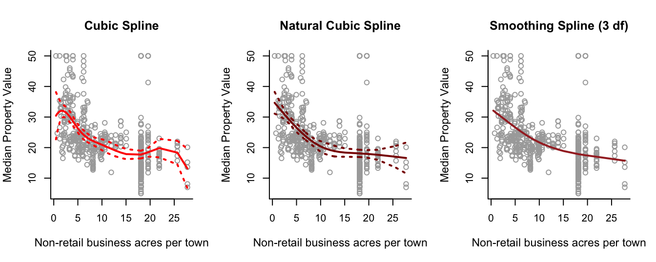
#(b)

# Of course we discussed one possible GAM in lecture practical
# demonstration. We try another one here.

# Let's set chas to be a factor (you may want to make rad a factor as well,
# if used).
Boston1 = Boston
Boston1$chas = factor(Boston1$chas)

# Let's fit a GAM - can you see how each predictor is contributing to
# modelling the response?
gam1 = gam( medv ~ ns( lstat, df = 5 ) + ns( nox, df = 7 ) +
              s( indus, df = 7 ) + poly( age, 5 ) + chas, data = Boston1 )
par(mfrow = c(2,3))
plot(gam1,  se = TRUE, col = "blue")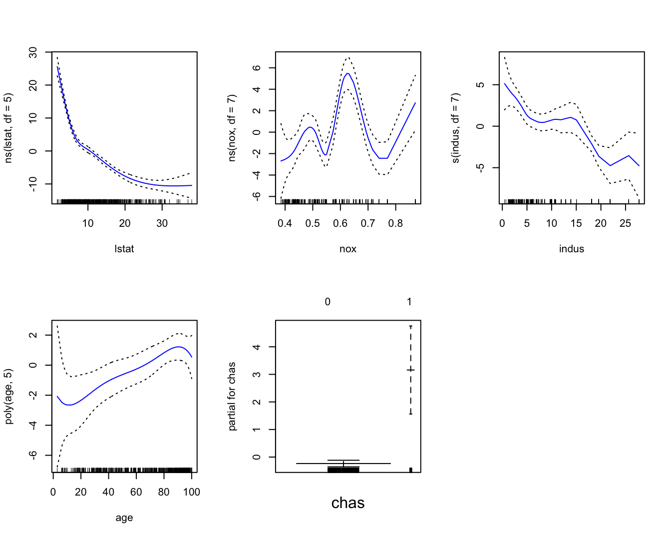
Logistic Regression
In this exercise we will apply logistic regression to a binary classification problem.
Suppose we are interested in how variables, such as GRE (Graduate Record Exam scores), GPA (grade point average) and prestige of the undergraduate institution, effect admission into graduate school. The response variable, admit/don’t admit, is a binary variable.
This admit dataset has a binary response (outcome, dependent) variable called admit. There are three predictor variables: gre, gpa and rank. We will treat the variables gre and gpa as continuous. The variable rank takes on the values 1 through 4. Institutions with a rank of 1 have the highest prestige, while those with a rank of 4 have the lowest.
admit <- read.csv("https://www.maths.dur.ac.uk/users/hailiang.du/data/admit.csv")
head(admit)
## admit gre gpa rank
## 1 0 380 3.61 3
## 2 1 660 3.67 3
## 3 1 800 4.00 1
## 4 1 640 3.19 4
## 5 0 520 2.93 4
## 6 1 760 3.00 2Exercise 4.5
Get basic descriptives for the entire data set by using
summary. Explore the data graphically by producing a pairs plot of the predictors and, additionally, colouring the points according to whether admit/don’t admit.Convert
rankto a factor to indicate that rank should be treated as a categorical variable.Fit a logistic regression model in order to predict
admitusinggre,gpaandrank. Theglm()function can be used to fit many types of generalized linear models , including logistic regression. The syntax of theglm()function is similar to that oflm(), except that we must pass in the argumentfamily = binomialin order to tellRto run a logistic regression rather than some other type of generalized linear model.Use the
predict()function to predict the probability ofadmit, given values of the predictors for the training data. Hint: [Thetype = "response"option tellsRto output probabilities of the formP(Y=1|X), as opposed to other information such as the logit. If no data set is supplied to thepredict()function, then the probabilities are computed for the training data that was used to fit the logistic regression model. ]Make a prediction as to whether admit or not by converting these predicted probabilities into binary values, 0 or 1, based on whether the predicted probability of admit is is greater than or less than 0.5.
Given these predictions, use the
table()function to produce a confusion matrix in order to determine how many observations were correctly or incorrectly classified. The confusion matrix is a two by two table with counts of the number of times each combination occurred e.g. predicted admit and the student is admitted, predicted admit and the student is not admitted etc.
Click for solution
## SOLUTION

#(a)
summary(admit)
## admit gre gpa rank
## Min. :0.0000 Min. :220.0 Min. :2.260 Min. :1.000
## 1st Qu.:0.0000 1st Qu.:520.0 1st Qu.:3.130 1st Qu.:2.000
## Median :0.0000 Median :580.0 Median :3.395 Median :2.000
## Mean :0.3175 Mean :587.7 Mean :3.390 Mean :2.485
## 3rd Qu.:1.0000 3rd Qu.:660.0 3rd Qu.:3.670 3rd Qu.:3.000
## Max. :1.0000 Max. :800.0 Max. :4.000 Max. :4.000pairs(admit[,2:4], col=admit[,1]+1)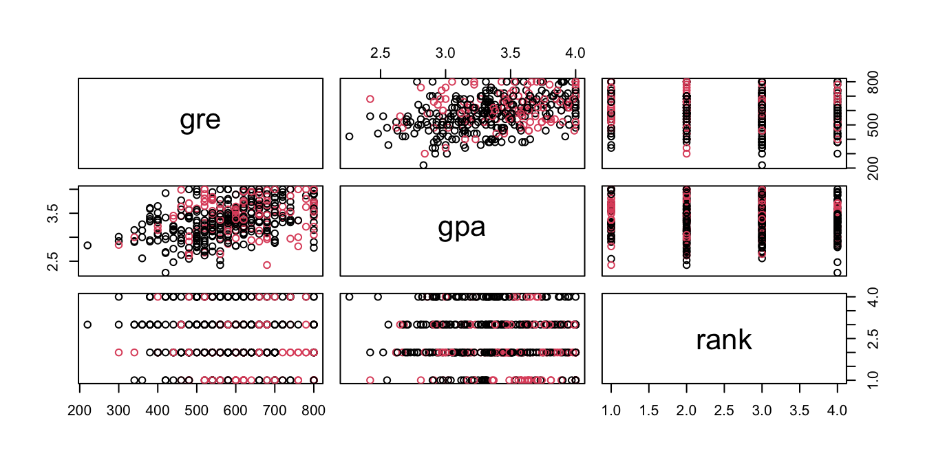
#it appears that higher gre score and gpa score tend to lead to admit.


#(b)
admit$rank <- factor(admit$rank)

#(c)
glm.fit = glm(admit ~ ., data=admit, family="binomial")
summary(glm.fit)
##
## Call:
## glm(formula = admit ~ ., family = "binomial", data = admit)
##
## Deviance Residuals:
## Min 1Q Median 3Q Max
## -1.6268 -0.8662 -0.6388 1.1490 2.0790
##
## Coefficients:
## Estimate Std. Error z value Pr(>|z|)
## (Intercept) -3.989979 1.139951 -3.500 0.000465 ***
## gre 0.002264 0.001094 2.070 0.038465 *
## gpa 0.804038 0.331819 2.423 0.015388 *
## rank2 -0.675443 0.316490 -2.134 0.032829 *
## rank3 -1.340204 0.345306 -3.881 0.000104 ***
## rank4 -1.551464 0.417832 -3.713 0.000205 ***
## ---
## Signif. codes: 0 '***' 0.001 '**' 0.01 '*' 0.05 '.' 0.1 ' ' 1
##
## (Dispersion parameter for binomial family taken to be 1)
##
## Null deviance: 499.98 on 399 degrees of freedom
## Residual deviance: 458.52 on 394 degrees of freedom
## AIC: 470.52
##
## Number of Fisher Scoring iterations: 4#(d)
glm.probs <- predict(glm.fit, type = "response")
glm.probs[1:10]## 1 2 3 4 5 6 7 8
## 0.1726265 0.2921750 0.7384082 0.1783846 0.1183539 0.3699699 0.4192462 0.2170033
## 9 10
## 0.2007352 0.5178682#(e)
glm.pred=rep(0, 400)
glm.pred[glm.probs > .5] = 1
#(f)
table(glm.pred, admit$admit)##
## glm.pred 0 1
## 0 254 97
## 1 19 30(254 + 30) / 400## [1] 0.71mean(glm.pred == admit$admit)## [1] 0.71#The diagonal elements of the confusion matrix indicate correct predictions,
# while the off-diagonals represent incorrect predictions.
# Hence our model correctly predicted 254+30 out of 400 cases.
#The `mean()` function can be used to compute the fraction of the prediction was correct.