19 Spatial Data
Spatial data is a little more complicated than the data we’ve been working with. Maybe complicated isn’t the word - more multifaceted perhaps. As such, this chapter will focus on the structure of the data and how to create maps using it. The following chapter will discuss some of the analytic techniques that spatial data allows, and some of the issues it can correct for.
19.1 Concepts
19.1.1 Data
Spatial data comes in several of different forms.
(images/geodata.png)
You can generally describe spatial data referring to one of three things: a point, a line, or a polygon.
Points are specific coordinates of something, be it a building, a crime, a car accident, a landmark, anything.
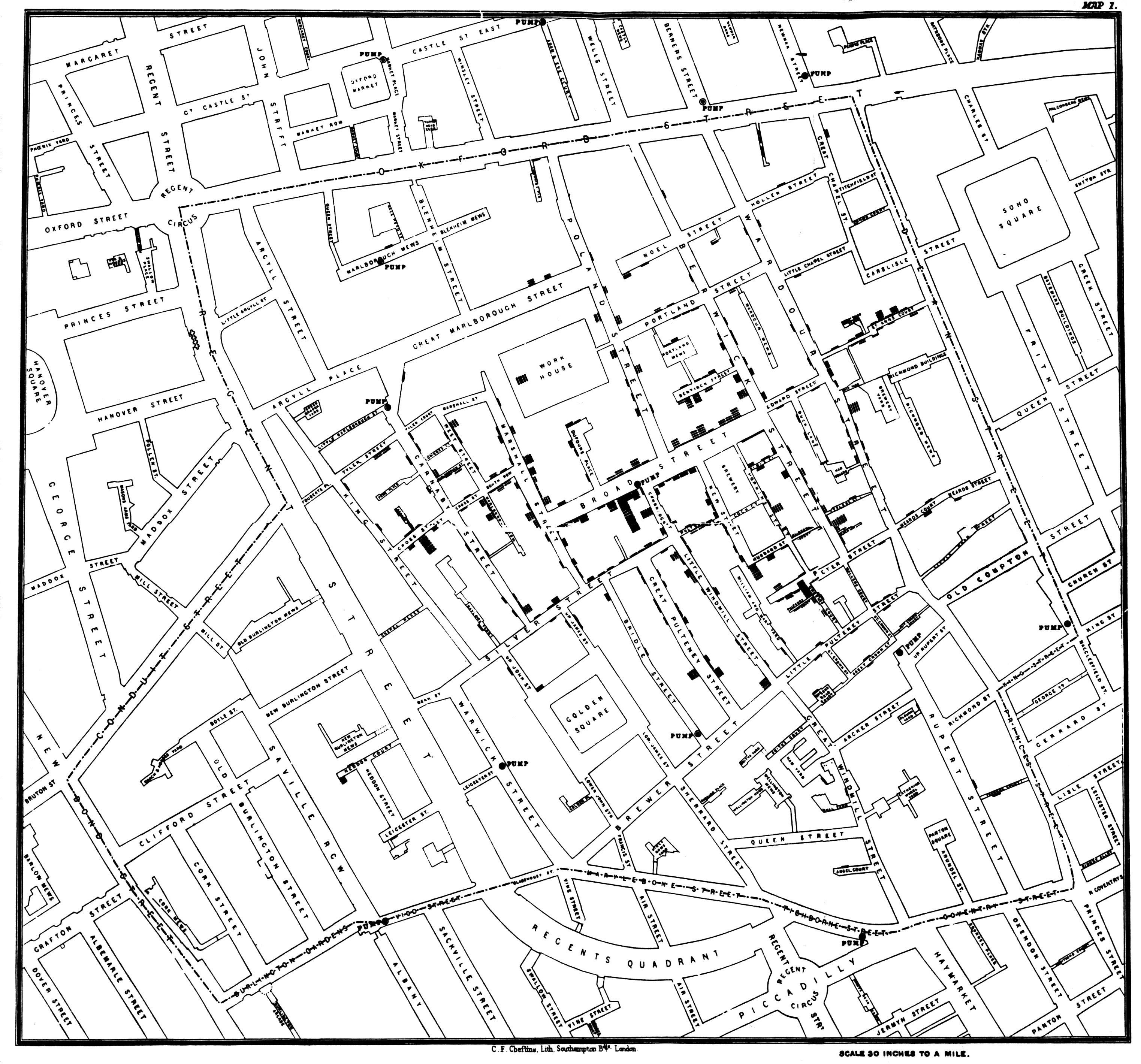
Knowing the exact location of something can be valuable to understanding an underlying process or trend. One of the first famous instances of the use of spatial data focused on points. In 1854 there was a cholera outbreak in London that would eventually kill hundreds. The leading theory at the time was that cholera was carried by the air, but physician John Snow believed it was related to germ-contaminated water. He created a map of the cholera cases, and was able to link them to the shared nearby public water that was spreading the disease. He actually used this stuff to save lives. There’s a pretty interesting book about the whole thing if you’re interested
A line goes between points, like a road or a river. Lines do not need to be straight, just continuous.
Finally, polygons are multisided shapes. They could be the shape of a city, or a city block, or a neighborhood, or a country, etc. Polygons are particularly useful when graphing data onto a map. For instance, every election season we see dozens (thousands?) of maps using the states as polygons.

We’re going to be principally concerned with points and polygons in this section.
Let’s start with graphing a point. Point data will come typically with a longitude and latitude, which can make them similar to the data we’ve already graphed.

Hopefully we’re all on the same page here and agree that the earth is round. Going as far back as Greek philosophers, it’s been proposed to divide the world into degrees in order to make it possible to identify specific points along the earth’s surface. You can graph latitude on the y-axis, being that it runs from North to South, and longitude on the x-axis. It can also be expressed as hours, minutes, seconds, but with data prepared for analysis it’ll most often be given as a decimal. I haven’t had to convert between longitude/latitude as time to decimals, but it might come up for you in your own exploration.
##   NOPD_Item  TypeText     InitialTypeText   Zip PoliceDistrict Latitude
## 1  G0402419 FIREWORKS DISTURBANCE (OTHER) 70131              4 29.89868
## 2  G0550019 FIREWORKS           FIREWORKS 70131              4 29.89905
## 3  L3774019 FIREWORKS DISCHARGING FIREARM 70131              4 29.90177
## 4  G3897819 FIREWORKS DISCHARGING FIREARM 70131              4 29.90389
## 5  A0135619 FIREWORKS DISTURBANCE (OTHER) 70131              4 29.90419
## 6  G3896019 FIREWORKS DISCHARGING FIREARM 70131              4 29.90419
##   Longitude
## 1 -89.99807
## 2 -89.99876
## 3 -90.00524
## 4 -89.99326
## 5 -89.99141
## 6 -89.99141
Take for instance the data above, which is all calls to 911 in 2019 in the city of New Orleans related to fireworks. We have the latitude and longitude for those calls (in the interest of privacy, the numbers are generally altered within a small radius, so that individual people or calls aren’t identifiable).
19.1.2 Creating Maps
We can actually use that data in our normal plot command to graph it. Again, you should probably insert longitude as the x variable with plot()and the latitude as the y variable; the plot command will then spread each point out appropriately.
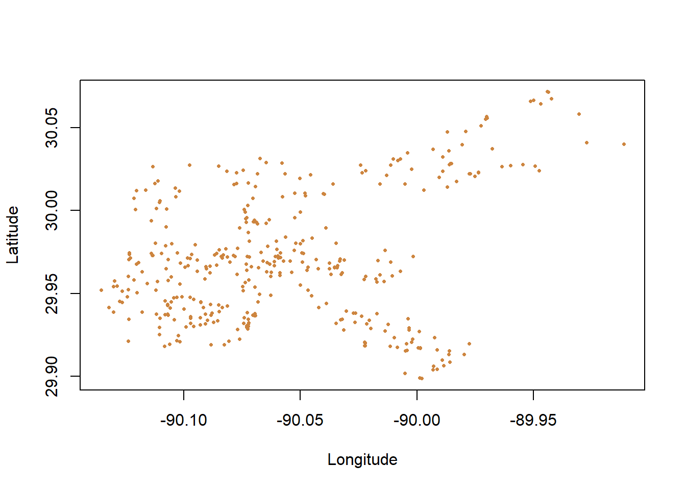
Notice that the range of latitude for the city of New Orleans is roughly 29.9 to 30.05, and the longitude goes from -90.05 to -89.90. Small numerical differences in longitude or latitude can make a big difference in where something happened on a map.
So that worked, though it’s a little hard to tell exactly what that is showing us. We don’t have much of an idea where any of those calls are happening, just based on what was shown, or what connects them. We can’t even really appreciate how spread out or clustered the calls are, just based on that graph.
We can add some polygons to add some more context, which will help to orient us about what is happening where on the map. However, data with polygons is structured a little bit different. We’ll talk about that more later, for now let’s just graph some polygons. What we’ll use is the census tracts (neighborhoods) across the entire state of Louisiana. The Census makes shapefiles (files used for spatial data) available from its website, which is really useful.
## OGR data source with driver: ESRI Shapefile
## Source: "C:\Users\evanholm\Dropbox\Class\UNO Stats\Textbook\tl_2019_22_tract\tl_2019_22_tract.shp", layer: "tl_2019_22_tract"
## with 1148 features
## It has 12 fields
## Integer64 fields read as strings:  ALAND AWATER
## STATEFP COUNTYFP TRACTCE GEOID NAME NAMELSAD MTFCC
## 0 22 065 960500 22065960500 9605 Census Tract 9605 G5020
## 1 22 071 001747 22071001747 17.47 Census Tract 17.47 G5020
## 2 22 071 001750 22071001750 17.50 Census Tract 17.50 G5020
## 3 22 109 000900 22109000900 9 Census Tract 9 G5020
## 4 22 083 970500 22083970500 9705 Census Tract 9705 G5020
## 5 22 083 970100 22083970100 9701 Census Tract 9701 G5020
## FUNCSTAT ALAND AWATER INTPTLAT INTPTLON
## 0 S 3552216 0 +32.3968264 -091.1914756
## 1 S 7166914 344001 +30.0414373 -089.9549478
## 2 S 1437944 166340 +30.0384832 -089.9176831
## 3 S 5541536 301932 +29.5904500 -090.7187865
## 4 S 55801361 346622 +32.4835210 -091.7502362
## 5 S 22522354 287704 +32.4522193 -091.4984774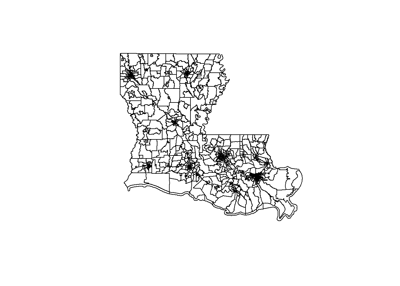 Those are the census tracts for the entire state of Louisiana. Some are really big, because census tracts are established to each contain roughly 10,000 people. Where there aren’t many people, the census tracts become larger. Where many people live (in cities) they become so small in that map the entire area is just black out from the borders.
Why did I map the entire state of Louisiana? The Census website doesn’t let you hand select exactly which units you want in your shapefile. Typically the files just come at the state level, like here, but luckily we can manipulate the file in R to limit what is shown.
So let’s map our calls for fireworks data to that, using just a map the city of New Orleans.
And then we can layer the calls for service on top of that.
We can also add color within the polygons. We can use the col= option to make the entire map on color if we choose, but we can also connect the polygons to external data and layer that data onto our map. For instance, let’s add data about the total population for each census tracts to the graph above.
That would be a choropleth map. In the above we can observe which neighborhoods have the largest populations in our data based on a darkening of the color.
And we can even layer the calls for service on top of that.
There are plenty of variations you can put on both of those types of graphs, but those are really good first steps to get a handle on working with spatial data and to start thinking about the different types of analysis and maps you’d want to be able to make.
19.2 Practice
This section will require installing a few packages, because most commands to work with spatial data aren’t available in base R.
We’ll work pretty slowly through the content here as step-by-step as possible where we can, exploring all the new things we’re using. Other times we’ll go a little quicker, when I’m describing code I’ve taken from helpful people online.
We’re going to use three data files for this example, and we’ll start with the familiar stuff.
This first file has the longitude and latitude of Airbnb’s in New Orleans from December 12, 2020.
listings <- read.csv("https://raw.githubusercontent.com/ejvanholm/DataProjects/master/listings.csv")
head(listings)## id name host_id host_name
## 1 10291 Spacious Cottage in Mid-City! 31004 Jill
## 2 19091 Fully Furnished Cozy Apartment 72880 John
## 3 26834 Maison Mandeville in the Marigny 114452 Rachel
## 4 71624 Ravenwood Manor (Historic Bywater) 367223 Susan
## 5 74498 Maison Marais 1: Large Local Living 391462 Georgia
## 6 76674 Luxury & history in the Big Easy #1 409545 Matt McShee
## neighbourhood_group neighbourhood latitude longitude room_type
## 1 NA Navarre 29.98666 -90.10928 Entire home/apt
## 2 NA Hollygrove 29.96317 -90.11888 Entire home/apt
## 3 NA Marigny 29.96557 -90.05531 Entire home/apt
## 4 NA St. Claude 29.96633 -90.03676 Entire home/apt
## 5 NA Marigny 29.96860 -90.05251 Entire home/apt
## 6 NA Bywater 29.96190 -90.03589 Private room
## price minimum_nights number_of_reviews last_review reviews_per_month
## 1 250 2 125 2020-08-18 1.05
## 2 60 1 467 2020-01-04 3.60
## 3 98 3 257 2020-12-04 2.02
## 4 130 3 226 2020-03-09 1.89
## 5 92 3 496 2020-03-09 4.18
## 6 99 3 191 2020-03-16 2.00
## calculated_host_listings_count availability_365
## 1 1 135
## 2 1 243
## 3 1 59
## 4 1 361
## 5 2 341
## 6 2 269The second data source will be another csv; this one contains community demographics at the census tract level. These are data that we may want to graph later, but will have to understand how to connect to our other data sources.
TractDemographics <- read.csv("https://raw.githubusercontent.com/ejvanholm/DataProjects/master/TractDemographics.csv")
head(TractDemographics)## tractid pop blkpct whtpct colpct medinc pcpinc mhmval
## 1 1001020100 1808 0.08185841 0.8716814 0.2667814 63030 23334 124800
## 2 1001020200 2355 0.62208068 0.3295117 0.2065949 44019 20101 129200
## 3 1001020300 3057 0.18285901 0.7716716 0.1740551 43201 22180 113800
## 4 1001020400 4403 0.02952532 0.8909834 0.2411533 54730 26624 130500
## 5 1001020500 10851 0.16274998 0.7833379 0.3920769 65132 28399 177000
## 6 1001020600 3408 0.12617371 0.8465376 0.1989724 49427 25562 128900
## medrent ownerocc vacpct gini
## 1 525 0.8230519 0.12000000 0.3953
## 2 704 0.6362545 0.05555556 0.4190
## 3 774 0.8161318 0.14844904 0.4108
## 4 1115 0.8257143 0.05761982 0.3764
## 5 898 0.5922166 0.02681722 0.3658
## 6 762 0.7671465 0.17470300 0.4864This link has a folder of what are called shapefiles. Anytime you download shapefiles there are actually multiple parts to the file, even though you’ll only load one into R. I think the other files are dependent on the other and are necessary, I’m not really sure. This is a good chance to practice stuff covered in the chapter on Loading Data and practice telling R where the files you want to use are located.
Once that file is downloaded on your computer, you can use readOGR from rgdal to load it into R. The file is for all of the census tracts in Louisiana.
library(rgdal)
louisiana <- readOGR("C:/Users/evanholm/Dropbox/Class/UNO Stats/Textbook/tl_2019_22_tract/tl_2019_22_tract.shp")## OGR data source with driver: ESRI Shapefile
## Source: "C:\Users\evanholm\Dropbox\Class\UNO Stats\Textbook\tl_2019_22_tract\tl_2019_22_tract.shp", layer: "tl_2019_22_tract"
## with 1148 features
## It has 12 fields
## Integer64 fields read as strings: ALAND AWATERA shape file has multiple layers of information included, which I’ll try to walk you through here. In order to access those multiple layers we need to use the @, to tell R which layer we want to work with. Within a shapefile there is a regular data component, where there is a listing for each observation and whatever data it has about that observation.
##   STATEFP COUNTYFP TRACTCE       GEOID  NAME           NAMELSAD MTFCC
## 0      22      065  960500 22065960500  9605  Census Tract 9605 G5020
## 1      22      071  001747 22071001747 17.47 Census Tract 17.47 G5020
## 2      22      071  001750 22071001750 17.50 Census Tract 17.50 G5020
## 3      22      109  000900 22109000900     9     Census Tract 9 G5020
## 4      22      083  970500 22083970500  9705  Census Tract 9705 G5020
## 5      22      083  970100 22083970100  9701  Census Tract 9701 G5020
##   FUNCSTAT    ALAND AWATER    INTPTLAT     INTPTLON
## 0        S  3552216      0 +32.3968264 -091.1914756
## 1        S  7166914 344001 +30.0414373 -089.9549478
## 2        S  1437944 166340 +30.0384832 -089.9176831
## 3        S  5541536 301932 +29.5904500 -090.7187865
## 4        S 55801361 346622 +32.4835210 -091.7502362
## 5 S 22522354 287704 +32.4522193 -091.4984774We can access a specific column within that layer using the dollar sign. Let’s look at a table for how many census tracts there are in each county in the state of Louisiana. That’s not important, just an example of how we can use the @ and $. That will come up later.
##
## 001 003 005 007 009 011 013 015 017 019 021 023 025 027 029 031 033 035
##  12   5  14   6   9   7   5  22  64  44   3   3   3   5   5   7  92   3
## 037 039 041 043 045 047 049 051 053 055 057 059 061 063 065 067 069 071
##   5   8   6   5  16   7   5 127   7  43  24   3  10  17   5   8   9 177
## 073 075 077 079 081 083 085 087 089 091 093 095 097 099 101 103 105 107
##  40   9   6  33   2   6   7  18  13   2   7  11  19  11  17  43  20   3
## 109 111 113 115 117 119 121 123 125 127
##  22   6  13  12  11  11   5   3   3   4
The shapefile also has a polygon layer. Which if you look at will just give you a bunch of numbers for how it’s forming the polygons that it contains. It’s best to leave such things alone. There’s also something called plotorder, bbox, and proj4string. Honestly, I’m not entirely sure what most of that is doing. The important thing is to understand that there are multiple sections of the data that we can access, which will become more important later.
19.2.1 Basic Mapping
Now that we’ve got all our data in place, let’s create a basic plot for the state of Louisiana. All you need for that is the plot command and the name of your shapefile. R knows how to convert all that different data into a map, which still amazes me. Again, all we need to do is provide R the name of the shapefile in this case. It takes all the different census tracts in Louisiana, and all the different lines to create these polygons, and does it itself.

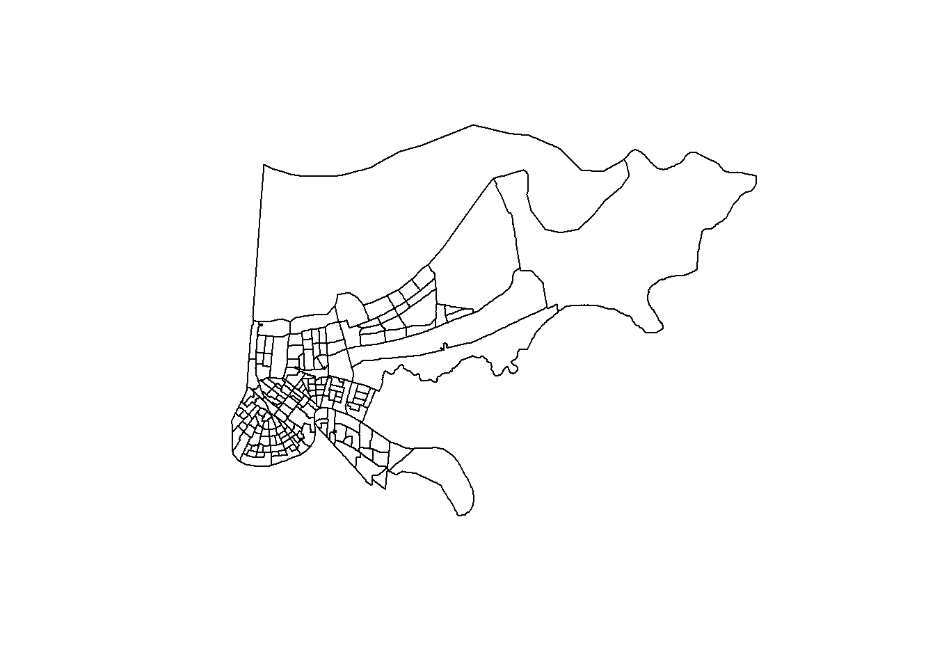
Okay, but let’s say we don’t want to graph all of Louisiana. If we want to just keep the polygons for the city of New Orleans, we can do that with subset and a column in the data for county FIPS (A federal id for each county). But we have to tell R where that column is - it’s not just in the shapefile, it’s in the data in the shapefile. The county FIPS for Orleans is 71, and the data for some reason is saved as a character (not numeric) so we have to use quotes below. It took me a minute to figure that out when I was putting this together.
As you work with spatial data, you’ll have to become somewhat versed in the different codes. Federal Information Processing Standards (FIPS) are numeric codes assigned by the National Institute of Standards and Technology (NIST) for US states and counties. Each state has a two-digit FIPS (01 for Alabama, and upwards) and each county has a three-digit FIPS (001 for Autauga county, the first alphabetically in Alabama). They can sometimes be combined into a state-county FIPS that is then 5 digits. Sometimes when you load the data into R it’ll drop the leading 0’s, which can make the same ostensible data not match (you can’t merge 01 to 1). Anyways, you can see codes here, and those are problems for another day/chapter.

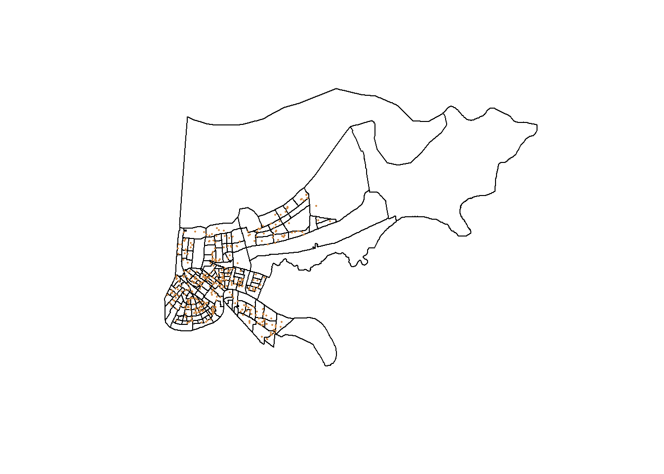
If we want to add a point for each Airbnb in the city on top of that we can with the points() command. We can plot the points separately, but points() is designed to add them on top of an existing plot. And to be clear, points() works whether you’re graphing a map or not. If you wanted to layer a second set of points for a scatterplot, you could do that with points() after your original plot().
orleans <- subset(louisiana, COUNTYFP=="071")
plot(orleans)
points(listings$longitude, listings$latitude)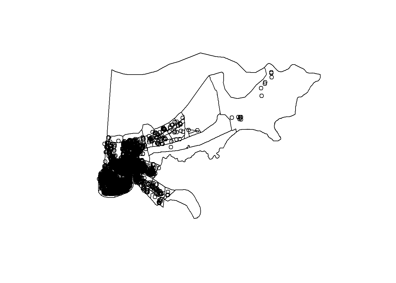
Whoops, that doesn’t look great. Let’s adjust those points using all the options we’ve learned for scatterplots earlier.
orleans <- subset(louisiana, COUNTYFP=="071")
plot(orleans)
points(listings$longitude, listings$latitude, col="purple", pch=16, cex=.1)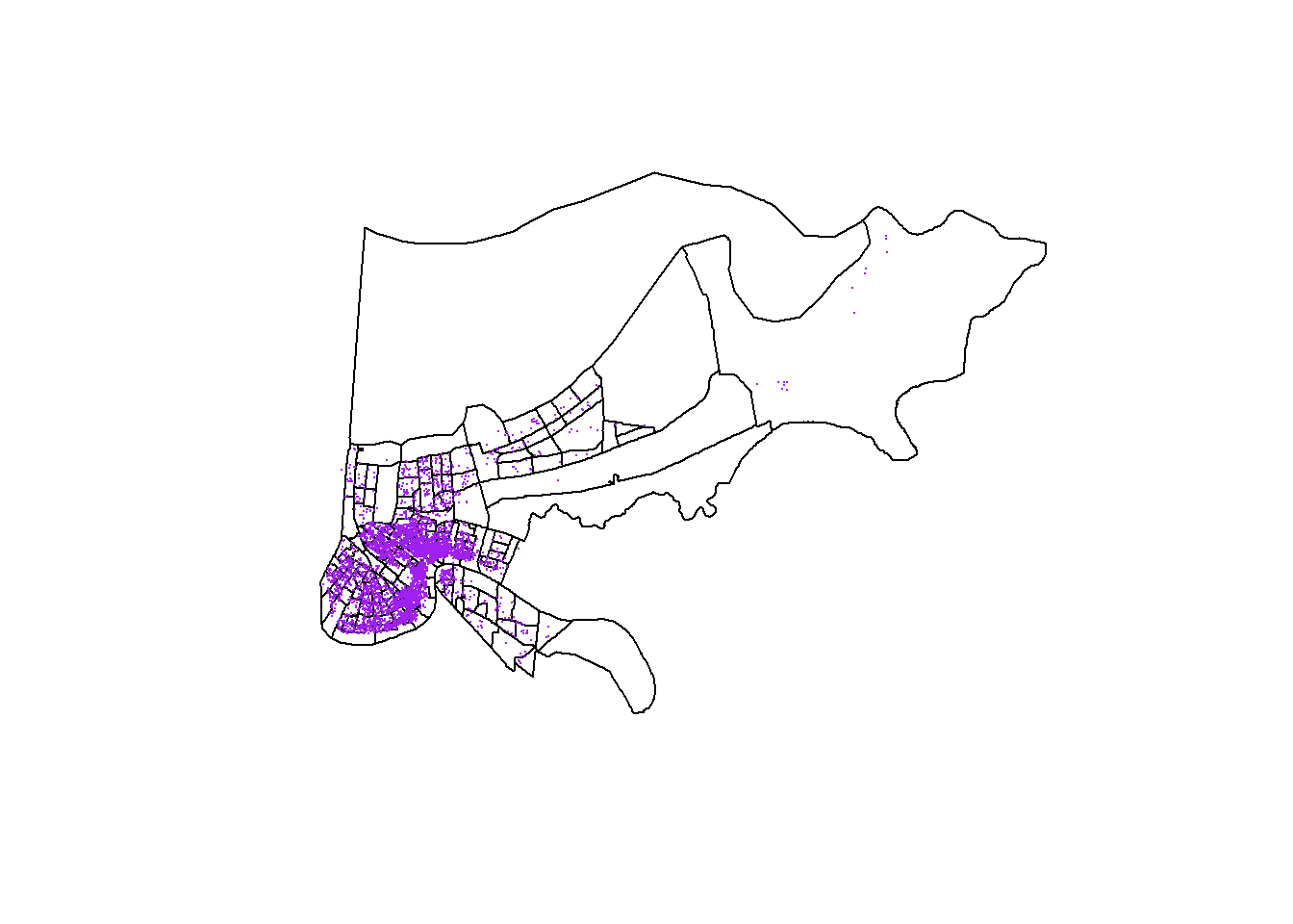
19.2.2 Combining Data
R is actaully pretty smart about emrging with shapefiles. You just need to provide it the name of the column in the data component for it to combine the two data sets.
## GEOID STATEFP COUNTYFP TRACTCE NAME NAMELSAD MTFCC
## 53 22071001747 22 071 001747 17.47 Census Tract 17.47 G5020
## 56 22071001750 22 071 001750 17.50 Census Tract 17.50 G5020
## 21 22071000800 22 071 000800 8 Census Tract 8 G5020
## 84 22071003600 22 071 003600 36 Census Tract 36 G5020
## 142 22071011400 22 071 011400 114 Census Tract 114 G5020
## 123 22071008600 22 071 008600 86 Census Tract 86 G5020
## FUNCSTAT ALAND AWATER INTPTLAT INTPTLON pop blkpct
## 53 S 7166914 344001 +30.0414373 -089.9549478 3595 0.77023644
## 56 S 1437944 166340 +30.0384832 -089.9176831 3443 0.24803950
## 21 S 602953 0 +29.9595871 -090.0198758 1201 0.92839301
## 84 S 385316 0 +29.9781089 -090.0736169 1986 0.84138973
## 142 S 468065 0 +29.9193262 -090.1200776 1825 0.05917808
## 123 S 329060 0 +29.9448184 -090.0896678 771 0.88845655
## whtpct colpct medinc pcpinc mhmval medrent ownerocc
## 53 0.004172462 0.39530091 75787 30640 279300 0 0.9747351
## 56 0.149288411 0.10535960 26398 13783 116600 680 0.4326180
## 21 0.040799334 0.17920657 32313 14765 107300 926 0.5766739
## 84 0.105236657 0.13175123 26175 12453 120400 927 0.3865653
## 142 0.889315068 0.69911504 81047 56614 405200 1215 0.5073529
## 123 0.049286641 0.06108202 16733 9918 109200 905 0.2017291
## vacpct gini
## 53 0.1635992 0.3847
## 56 0.2621913 0.4757
## 21 0.2650794 0.4452
## 84 0.1981707 0.4013
## 142 0.1329690 0.4946
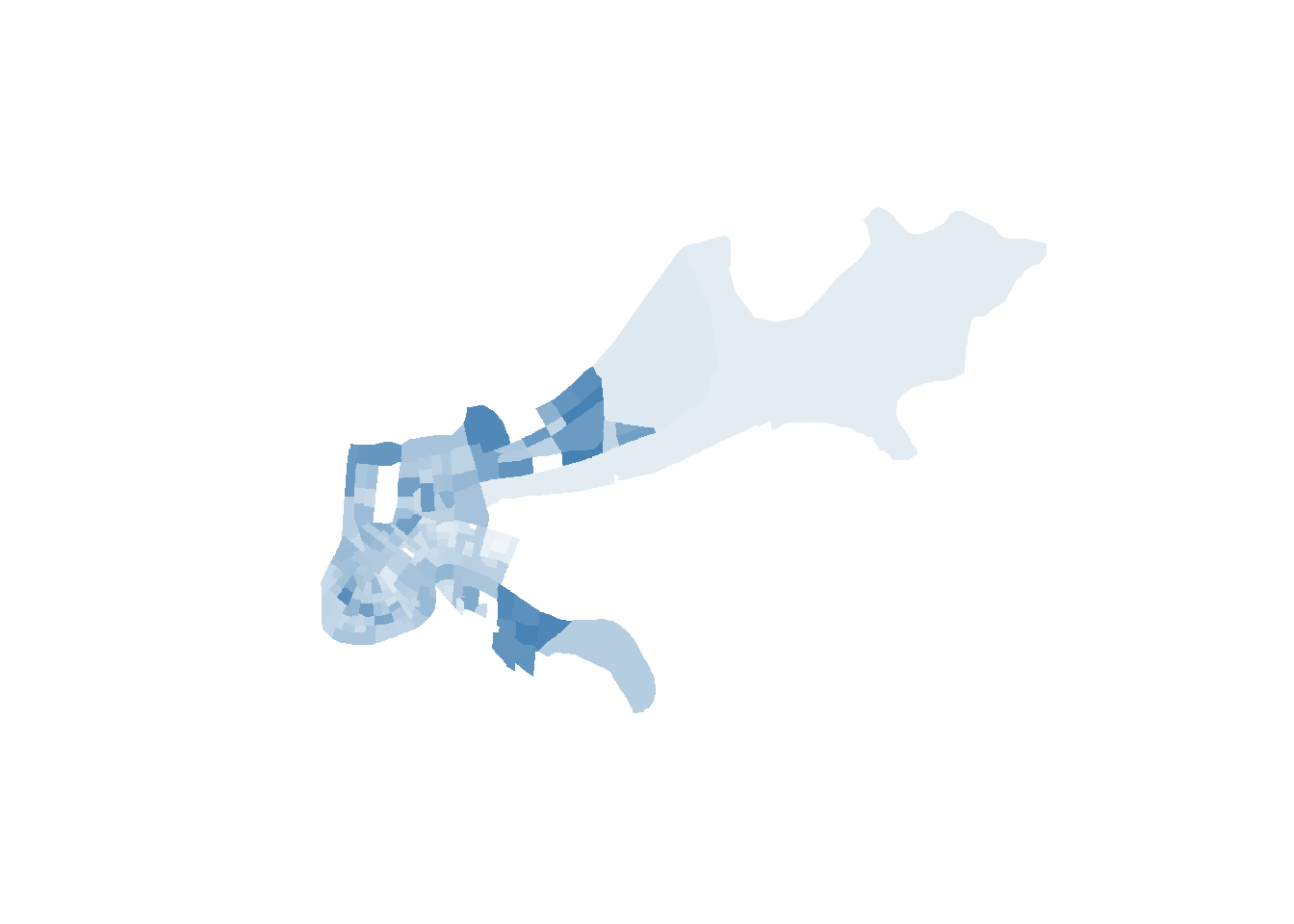
## 123 0.3890845 0.421319.2.3 Choropleth Maps
To create a Choropleth map, we first need to tell R how to shade the units based on the levels of whatever variable we’re mapping. Let’s do the share of college graduates (colpct).
We then need to set aside our data of interests into a new object, and have R divide that variable into normalized groups. Honestly, I don’t know exactly what these lines are doing, I got them from the internet, and they work.
college_data <- orleans2@data$colpct
colors <- (college_data - min(college_data)) / (max(college_data) - min(college_data))*254+1
Now we tell R to make up a new column based on the values we just computed, based on a palette we give R. I selected white to be the low color in my pallet and blue to be the high value. R is going to generate shades between those two ends depending on the percentage of college graduates in each neighborhood. I still don’t totally understand how it does that, I’m just thankful R does it for me. And then we can plot that, and we just need to tell R to use the column we generated as a list of colors.
## [1] 116.40752 31.75958 53.31909 39.46458 205.10561 18.83281We can look at the list of colors it’s going to use above. It works by converting the colors into the infinite number of shades that are available using a red-green-blue system. R is smart enough to convert shades between blue and white into these codes below. If you want to hunt for specific colors using that system you can
orleans2@data$color =  colorRampPalette(c("white", "blue"))( 177 ) ## (n)
plot(orleans2, col = orleans2@data$color, border=NA)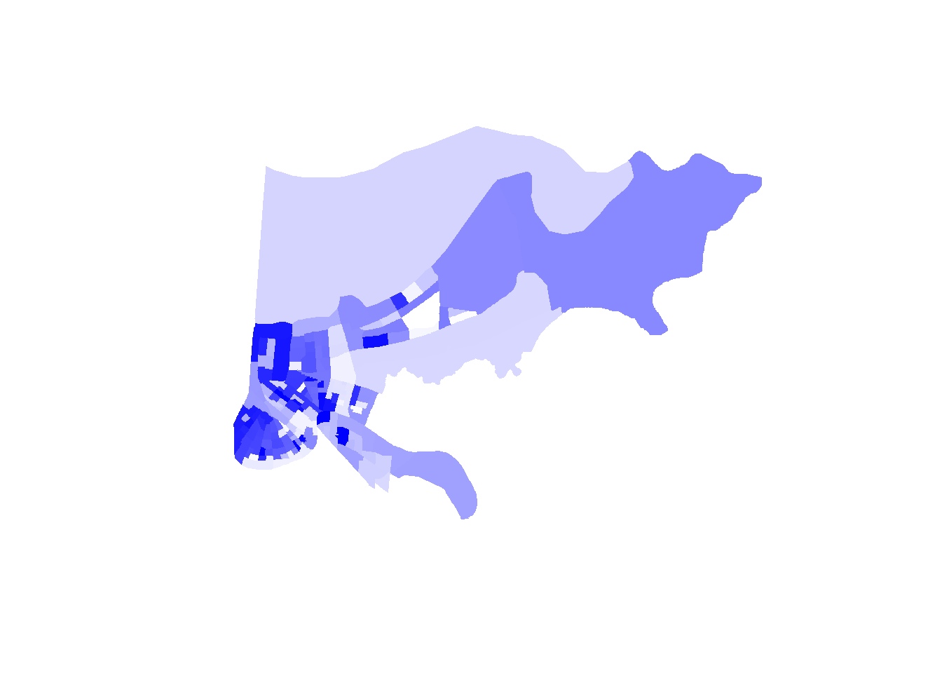
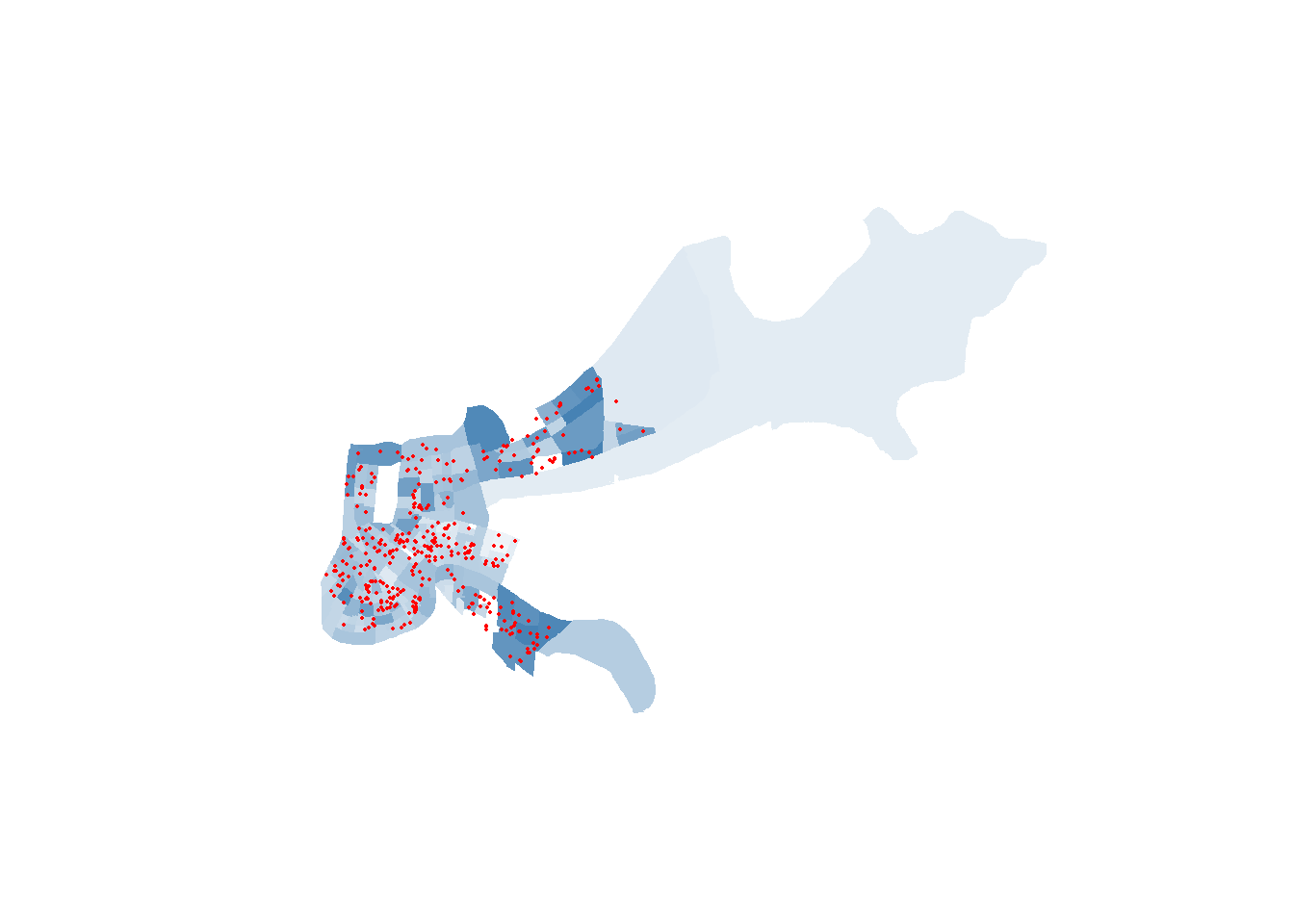
And of course, we can also add the points to the choropleth map if we want to detect a trend between our points and community demographics. Be mindful of colors in maps. Too many colors can obscure the message you’re attempting to convey.
orleans2@data$color =  colorRampPalette(c("white", "gray50"))( 177 ) ## (n)
plot(orleans2, col = orleans2@data$color, border=NA)
points(listings$longitude, listings$latitude, col="navy", pch=16, cex=.1)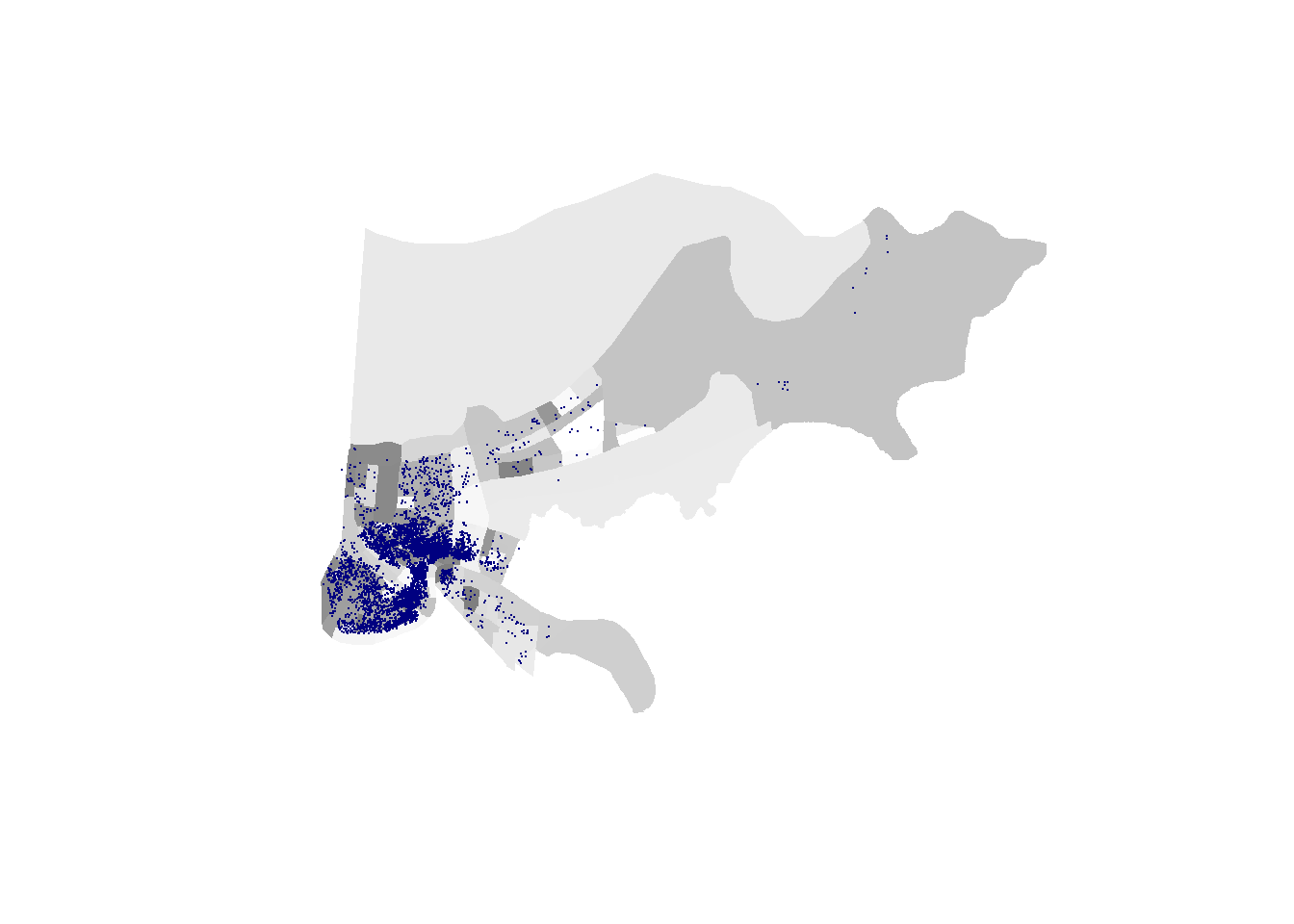
We should also provide readers a legend, so they can understand what the colors mean. Is dark gray high or low? They won’t know unless you tell them. We can create a legend, and do most of that mapping, automatically with tmap.
19.2.4 tmap
We can do a lot of what we did above with a package called tmap, which could be considered simpler. It’ll do more for you with less code, but the code will be structured slightly differently. This is actually going to look a lot simpler, which will make you wonder why I did all of that above, but in part it’s to show you that you CAN do anything in plot() and that sometimes it’s easier to use a more specialized tool.
tmap has a few packages that you don’t actually need to run, but it requires things from it to operate. So you may get an error message when trying to run tmap, but installing the package rgeos should let it run smoothly.
library(tmap)
tm_shape(orleans2) + tm_polygons( col = "colpct") +
  tm_legend(outside = TRUE, text.size = .8)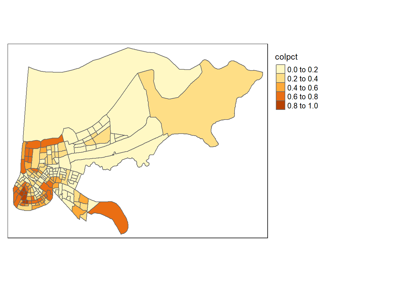
tmaps is an example of additive coding, where instead of having one piece of code where you select options, here you can do different things in different sections and combine them using a plus sign.
The first part of that line of code tells tmap the name of our shapefile: tm_shape(orleans2)
The second part tells it how to choose the color. We can provide it a color name, or the name of a column as we have done, and it’ll create groups based on the values for that variable: tm_polygons( col = “colpct”)
And the final part creates a legend: tm_legend(outside = TRUE, text.size = .8)
We can change the colors with the option palette, and the number of groups our variable is grouped into. To see the color palettes that are available run this line of code (you may need to install some packages for it to work): tmaptools::palette_explorer()
library(tmap)
tm_shape(orleans2) + tm_polygons( col = "colpct", n=7, palette="Blues") +
  tm_legend(outside = TRUE, text.size = .8)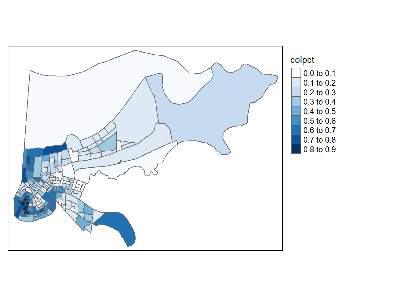
19.2.5 Wrapping up
The next chapter will discuss some ways we can use spatial data in regressions, but there’s also a lot more we can do with maps. This chapter has ignored heat maps, or ways to count the number of points within a polygon, and lots of other useful techniques. If you’re curious to learn more I’d recommend reading this book by Juanjo Medina and Reka Solymosi, because their approach is far more polished than mine.
In addition, maps can also be produced using a package called ggplot, which can also be used for all types of graphing. Some people swear by it, and a lot of help/advice you’ll find online uses it. The book above utilizes it. I should probably add a section on ggplot in the future because it is so common, but I don’t love using it myself (other than being able to communicate with people that use it). The biggest difference is that ggplot() works iteratively (like tmaps), where you add details to your graph step by step, which can help for debugging your map if you have a problem. Anyways, that’s just a quick note to finish this section.