17 Transforming Variables in Regression
To this point we have only talked about linear regression. Specifically, we’ve been focused on situations in which the relationship between the independent variable(s) and the dependent variable can be approximated by a linear line. Or at least, we’ve been assuming that we have. As we know from the previous section, that is a critical assumption if using a simple linear regression. However, some of the examples in earlier chapters don’t actually meet that condition. You can often jam a circular peg into a square hole with regression, but it wont fit as cleanly as possible. In this chapter we’ll talk about what to do when your regressions don’t meet the linearity condition and a few other ways we might want to transform variables as part of our regressions.
17.1 Concepts
The code used in the Concepts section of this chapter can be viewed here and copied into R to process. You may need to install additional packages for the code to work.
17.1.1 Types of Relationships
Linear relationships are one type of relationship between an independent and dependent variable, but it’s not the only form. In regression we’re attempting to fit a line that best represents the relationship between our predictor(s), the independent variable(s), and the dependent variable. And as a first step it’s valuable to look at those variables graphed to try and appreciate the different shape their relationship may take.
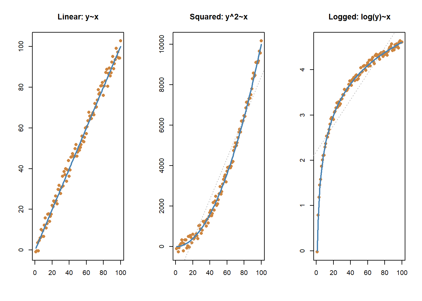
You can see the three different relationships correctly modeled with the blue line above. In addition, on the two non-linear graphs, you can also see what would happen if we tried to approximate a linear relationship in those instances. The line isn’t entirely useless - it correctly judges that as values increase on the x-axis they also increase on the y-axis. But it does a far worse job of predicting the actual values at specific points. We can do better than a linear relationship in those cases.
17.1.2 Polynomial Regressions
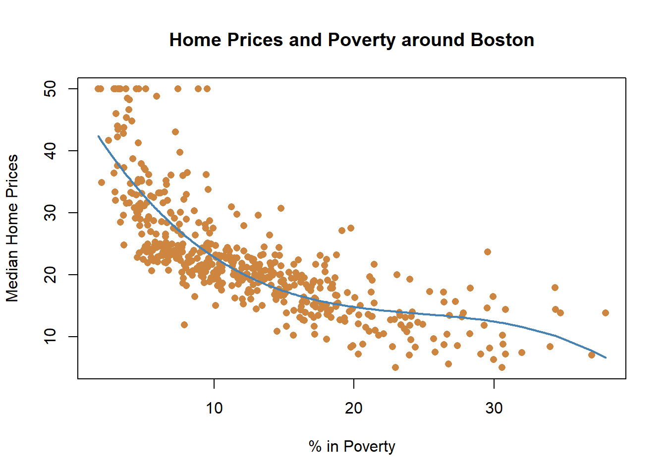
Let’s look at some data on median housing prices in neighborhoods in the suburbs of Boston. Specifically, we’ll start by analyzing the relationship between neighborhood poverty and housing prices. Do you think places with more poverty have higher or lower median home prices?
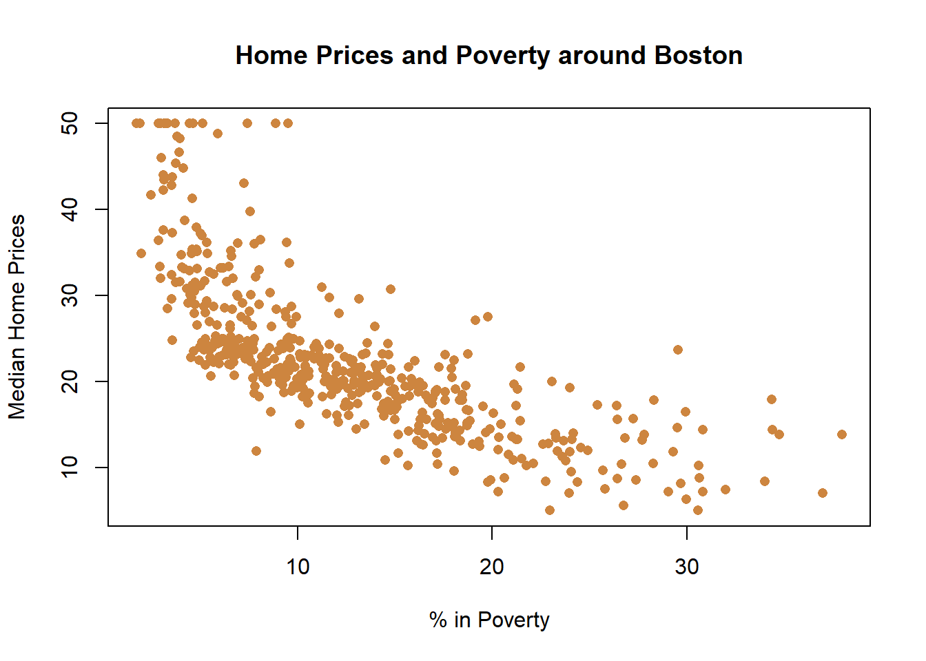
Unsurprisingly, it appears the relationship is negative: Where there is more poverty, there are lower home prices. But is that relationship linear? Is every increase in poverty associated with an equal decrease in home prices?
We can fit a straight line to the graph.

And if we used a linear regression, we would get a significant result.
##
## Call:
## lm(formula = medv ~ lstat, data = Boston)
##
## Residuals:
##     Min      1Q  Median      3Q     Max
## -15.168  -3.990  -1.318   2.034  24.500
##
## Coefficients:
##             Estimate Std. Error t value Pr(>|t|)
## (Intercept) 34.55384    0.56263   61.41   <2e-16 ***
## lstat       -0.95005    0.03873  -24.53   <2e-16 ***
## ---
## Signif. codes:  0 '***' 0.001 '**' 0.01 '*' 0.05 '.' 0.1 ' ' 1
##
## Residual standard error: 6.216 on 504 degrees of freedom
## Multiple R-squared:  0.5441, Adjusted R-squared:  0.5432
## F-statistic: 601.6 on 1 and 504 DF,  p-value: < 2.2e-16
But now we want to start asking whether that’s an appropriate approximation of the relationship. If we look back at the earlier graph, it appears that as poverty increase from very low levels that home prices fall drastically, and once you hit roughly 5% poverty the decline in home prices slow down. They continue to decline, but not as quickly as they do earlier.

What we’ve done there is squared the independent variable, and fit a new and better line. Let’s see what happens when we include that in our regression results.
##
## Call:
## lm(formula = medv ~ lstat + lstat_sq, data = Boston)
##
## Residuals:
##      Min       1Q   Median       3Q      Max
## -15.2834  -3.8313  -0.5295   2.3095  25.4148
##
## Coefficients:
##              Estimate Std. Error t value Pr(>|t|)
## (Intercept) 42.862007   0.872084   49.15   <2e-16 ***
## lstat       -2.332821   0.123803  -18.84   <2e-16 ***
## lstat_sq     0.043547   0.003745   11.63   <2e-16 ***
## ---
## Signif. codes:  0 '***' 0.001 '**' 0.01 '*' 0.05 '.' 0.1 ' ' 1
##
## Residual standard error: 5.524 on 503 degrees of freedom
## Multiple R-squared:  0.6407, Adjusted R-squared:  0.6393
## F-statistic: 448.5 on 2 and 503 DF,  p-value: < 2.2e-16
That would be considered a polynomial regression. A polynomial regression models the dependent variable using the independent variable taken to the nth degree. Here we’re using the second degree, by squaring the independent variable. Adding a squared term is the most common polynomial regression you’ll do, so it’s worth taking a moment to discuss it thoroughly. The graph below displays a graph of two different lines for squared variables so that we understand some of the related language, and then we can apply that to our regression above.
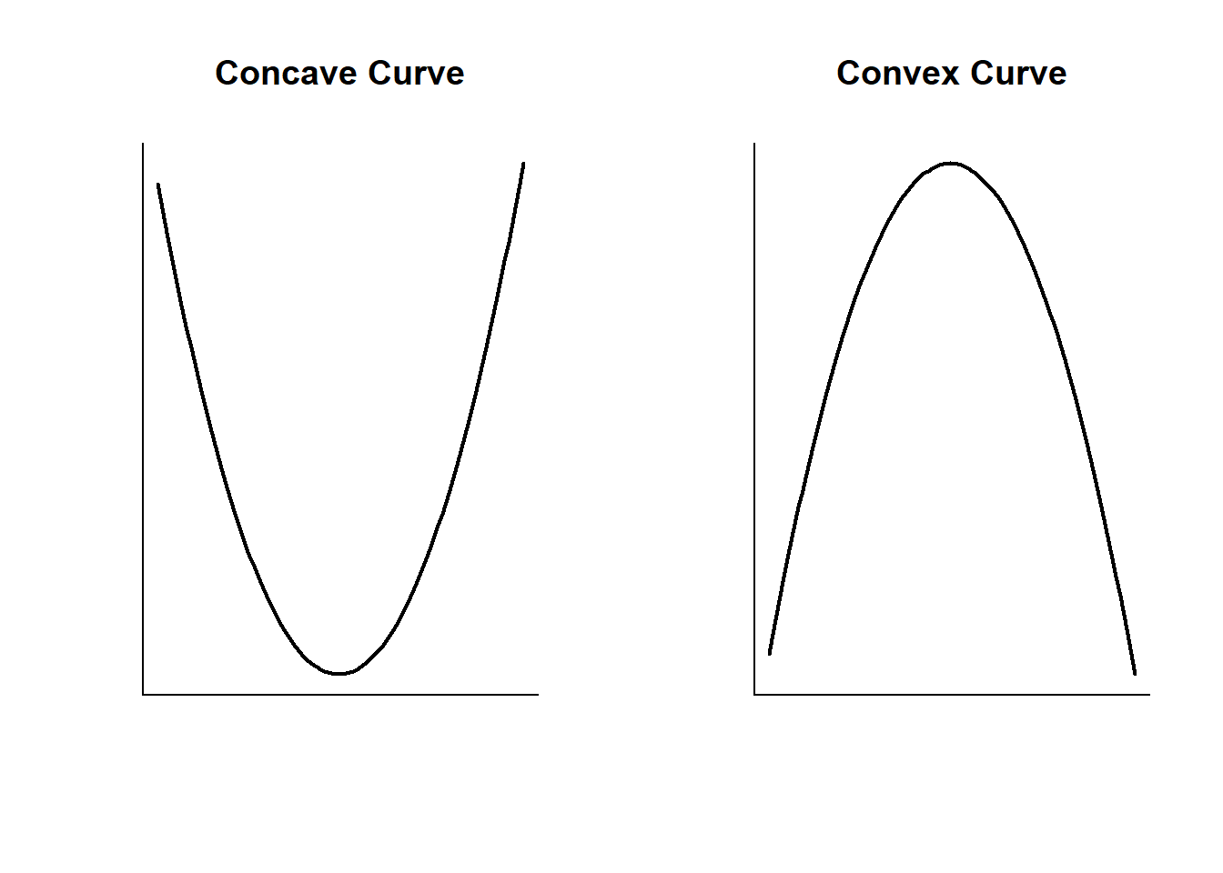
You can figure out the shape of your line by looking at the coefficients from your regression. if the first linear term (lstat here) is negative AND the squared term is positive, then the curve is concave and opens upward (like a U). If the linear term is positive AND the squared term is negative, then the curve is convex and opens downward (like, uh, an upside down U). Let’s focus on the concave example, which is what we have in the case of housing prices and poverty rates.
Let’s start by looking at the equation for our regression above.
\(Y\) = \(\beta_{0}\) + \(\beta_1 X\) +\(\beta_2 X^2\) + \(\epsilon\)
What \(\beta_1\) tell us in this case is the slope of our line where x=0, You can look at the blank graph immediately above, or the one earlier for the data on housing prices - where x=0 the line is sloping downward. \(\beta_2\) tells us the steepness of the curve, and because it is positive that indicates that housing prices decline but at a slowing rate.
A better discussion of the math behind that can be found here from UCLA, but that’s beyond what I want to review here.
Interpreting the results for regressions with polynomials is slightly different than just interpreting a linear regression. The two independent variables here, lstat and lstat_sq, need to be interpreted jointly. The coefficient for lstat (-2.33) indicates that as poverty (lstat) increases, median home prices decrease. The coefficient for the squared term helps us to understand the rate of change for the line; because it is positive, that means the rate is slowing down.
This is an area where our modelling gets imperfect and it’s worth reminding that models are designed to improve our understanding of the world, but they can’t replicate it exactly. If we go back to the earlier to that graph earlier, what does it tell us to predict about home prices if poverty rates were at 50% in the Boston suburbs?
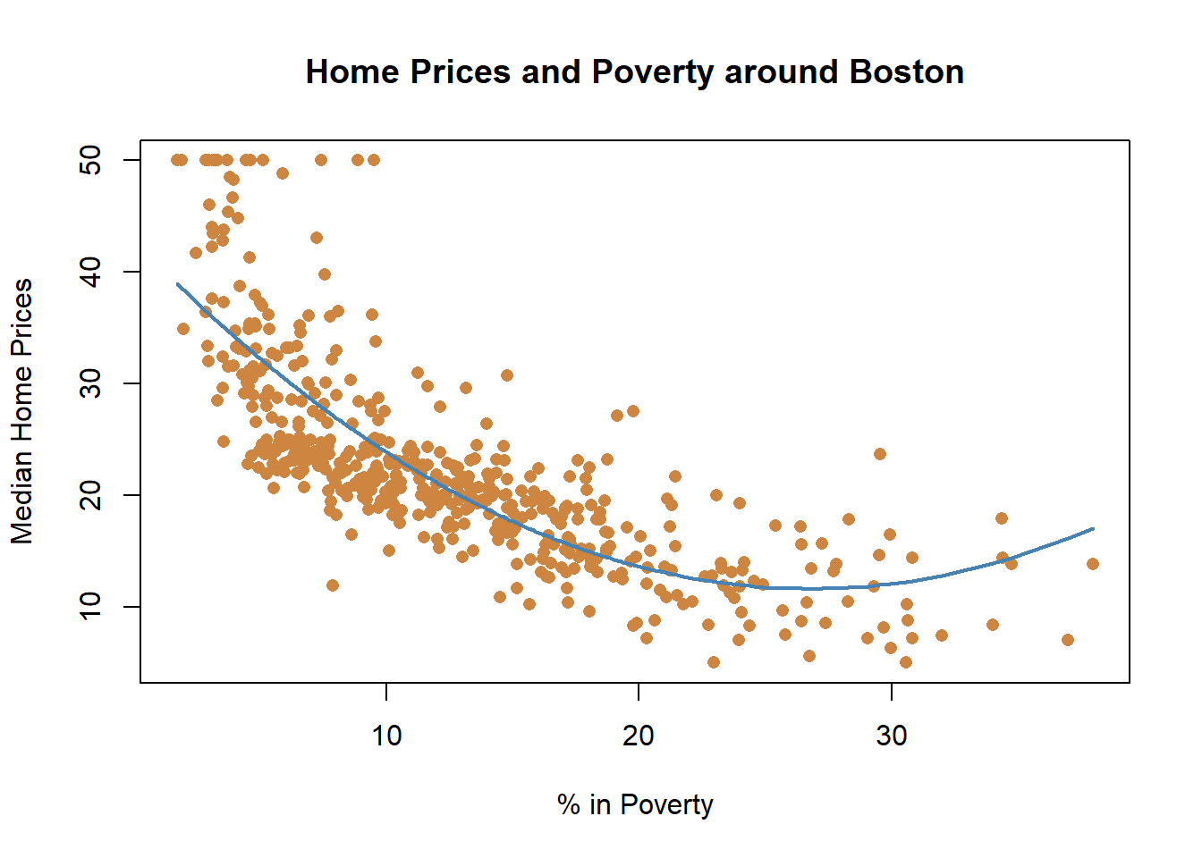
We would predict that they would be higher than if the poverty was 30%. Does that make sense? Not really. The highest poverty rate in the data is around 40%, and we wouldn’t predict that if a community had eve worse poverty that home prices would start to rise. That’s an artifact of our modeling with a squared term. When you square a value it will increase around the parabola (or vertex), the bottom point of the curve. Whether values to the right or the left of that curve are realistic in the data or not is a question you have to understand based on your data. So let’s go back then to the regression output. The positive term on the squared term indicates that as lstat increases median home prices decrease at an accelerating rate initially.
But maybe we’re unhappy with the little upward curve at the end of our graph. What if we fit our data using a cubic model?
That looks like a (still imperfect) but improved fit for our data. And all three terms included were significant below. But I’ll be honest, I’ve never used a cubic regression. I included it because looking at the graph it seemed like it would fit, and it did and then I went hunting on the internet for a guide to understand how to interpret a cubic term on a regression. They just aren’t that common I think, and I don’t remember ever seeing one used in a paper. Which is to say, maybe it’s not worth worrying about, but I’m gonna leave it here just in case anyone reads the section and is curious.
##
## Call:
## lm(formula = medv ~ lstat + lstat_sq + lstat_cube, data = Boston)
##
## Residuals:
##      Min       1Q   Median       3Q      Max
## -14.5441  -3.7122  -0.5145   2.4846  26.4153
##
## Coefficients:
##               Estimate Std. Error t value Pr(>|t|)
## (Intercept) 48.6496253  1.4347240  33.909  < 2e-16 ***
## lstat       -3.8655928  0.3287861 -11.757  < 2e-16 ***
## lstat_sq     0.1487385  0.0212987   6.983 9.18e-12 ***
## lstat_cube  -0.0020039  0.0003997  -5.013 7.43e-07 ***
## ---
## Signif. codes:  0 '***' 0.001 '**' 0.01 '*' 0.05 '.' 0.1 ' ' 1
##
## Residual standard error: 5.396 on 502 degrees of freedom
## Multiple R-squared:  0.6578, Adjusted R-squared:  0.6558
## F-statistic: 321.7 on 3 and 502 DF,  p-value: < 2.2e-16
Did including the squared or cubic term improve the model? The new variables were significant, which indicates that the relationship was in fact non-linear. And we increased the Adjusted R-Squared from .54 in the linear model to .63 and .66 in the polynomial regressions, which is a nice improvement. And the AIC dropped from 3288.975 to 3170.516 and 3147.796. Clearly, the polynomials were necessary if we wanted to understand the relationship between median home values and poverty.
But here’s part of the difficulty with adding polynomials, and more complex models in general. Yes, we’ve done a better job of modeling the phenomena we’re studying, but we’d now have a harder time interpreting the effect of our independent variable. In the original linear variable we could interpret the regression as saying that each 1 percent increase in poverty was associated with a 950 dollar decrease in median home prices. That’s easy to understand! As our models have improved, they’ve also become more difficult to interpret, as now we have to reference where we are in the line and the change that is occurring. One of my teachers used to recommend using the simplest model, if it has consistent results overall with more complex designs. You still need to be aware of what issues OLS can cause for your results, and be prepared to test more complex models, but I think it’s good advice. Anyways, let’s keep making things more complex.
17.1.3 Logged variables
We might also consider taking the log of our dependent or independent variable(s).
In case you don’t remember from algebra or wherever you learned about logs, the logarithm is the inverse function to exponentiation, which means that the logarithm of a given number x is the exponent to which another fixed number (the base b) must be raised in order to produce that number x. In statistics we use the natural logarithm mostly, which has a base that is approximately equal to 2.718281828459. Honestly, I’m not a math person, maybe that makes sense to you or it doesn’t. I don’t really know why we use the natural log at this point. What taking the log of a number does is transform it, essentially shrinking it and making growth at higher numbers non-linear. When you take the log of a series of numbers, it can make them linear if they were formerly non-linear.
Let’s see how taking the log of poverty percentage and median home values adjusts the relationship below.
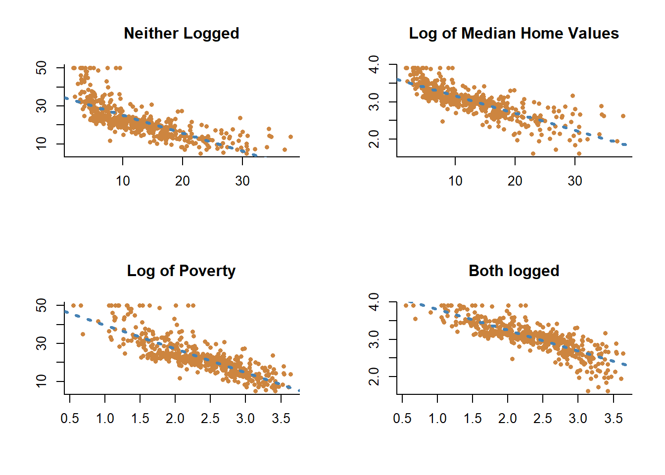
Adding the logs doesn’t make the relationship perfectly linear, but it does make the relationship closer.
If we use the log for both poverty rates and median home prices, how do our regression results look?
##
## Call:
## lm(formula = log(medv) ~ log(lstat), data = Boston)
##
## Residuals:
##      Min       1Q   Median       3Q      Max
## -0.99756 -0.12935 -0.00315  0.14045  0.81228
##
## Coefficients:
##             Estimate Std. Error t value Pr(>|t|)
## (Intercept)  4.36182    0.04210  103.60   <2e-16 ***
## log(lstat)  -0.55982    0.01721  -32.52   <2e-16 ***
## ---
## Signif. codes:  0 '***' 0.001 '**' 0.01 '*' 0.05 '.' 0.1 ' ' 1
##
## Residual standard error: 0.2324 on 504 degrees of freedom
## Multiple R-squared:  0.6773, Adjusted R-squared:  0.6766
## F-statistic:  1058 on 1 and 504 DF,  p-value: < 2.2e-16
17.1.3.1 Interpreting Log-Log
The adjusted R-Squared is now .68, even higher than when we were including the squared term. However, interpreting a logged regression coefficient is slightly different than interpreting one for a linear regression. Pretty much any time I do an analysis with logs I end up going back to this website from UCLA where they describe in great detail how to interpret your coefficient depending on whether the dependent or independent variable is logged. But I’ll try and replicate that here for you.
The regression above would be considered a log-log regression, because both the independent and dependent variable are logged. For the independent variable lstat, we expect the size of the change in the dependent variable to depend on how large a change in the independent variable we want to observe. While for a linear regression any change in the independent variable is associated with the same change in the dependent variable, looking at a one unit vs 2 unit changes in a logged variable is associated with different rates of change in the dependent variable.
The way to calculate the change for a logged independent variable is to take two values you’re interested in. Say we’re interested in going from a 5% poverty rate (\(m_{1}\)) to a 7% poverty rate (\(m_{2}\)). We divide those two values by each other, and exponentiate it by the coefficient for the variable.
\(\frac{m_2}{m_1}^{\beta_1}\)
7 divided by 5 equals 1.4, which means going from 5 to 7 is a 40% increase in poverty. If we take 1.4 to the -0.55982 power…
\(\frac{7}{5}^{-0.55982}\) = 0.8283132
That’s essentially the percentage change in median home values. A value of 1 indicates no change in the outcome, and values above 1 indicate an increase. In this case, we take 1-0.8283132, which equals 17.16868, so a 40% increase in poverty rates is associated with a 17 percent decrease in home prices.
Let’s use another value for (\(m_{1}\)) and (\(m_{2}\)). Let’s see what happens if poverty increases by 3 times from 5 to 15 percent.
\(\frac{15}{5}^{-0.55982}\) = 0.5406273. We’d expect median home prices to decrease by 1-.54, or 46 percent.
17.1.3.2 Interpreting Log-Linear
That is how to interpret the independent variable if both our variables are logged. What if the dependent variable is logged but the independent variable isn’t? Let’s run that regression and interpret it.
##
## Call:
## lm(formula = log(medv) ~ lstat, data = Boston)
##
## Residuals:
##      Min       1Q   Median       3Q      Max
## -0.94921 -0.14838 -0.02043  0.11441  0.90958
##
## Coefficients:
##              Estimate Std. Error t value Pr(>|t|)
## (Intercept)  3.617572   0.021971  164.65   <2e-16 ***
## lstat       -0.046080   0.001513  -30.46   <2e-16 ***
## ---
## Signif. codes:  0 '***' 0.001 '**' 0.01 '*' 0.05 '.' 0.1 ' ' 1
##
## Residual standard error: 0.2427 on 504 degrees of freedom
## Multiple R-squared:  0.6481, Adjusted R-squared:  0.6474
## F-statistic: 928.1 on 1 and 504 DF,  p-value: < 2.2e-16
When our dependent variable is logged we need to take the exponent of the coefficient, and we can interpret that as the percentage change on our dependent variable for a one unit change in the independent variable.
exp(\(\beta_1\))
Above the coefficient for lstat is -.04608, which if we take the exponent for we get…
exp(-0.046080) = 0.9549656.
So for each one unit increase in poverty, we expect a (1-.96) 4 percent decrease in median home values.
17.1.3.3 Interpreting Linear-Log
Finally, let’s talk about how to interpret our variables if the dependent variable is a linear and the independent variable is logged. First the results.
##
## Call:
## lm(formula = medv ~ log(lstat), data = Boston)
##
## Residuals:
##      Min       1Q   Median       3Q      Max
## -14.4599  -3.5006  -0.6686   2.1688  26.0129
##
## Coefficients:
##             Estimate Std. Error t value Pr(>|t|)
## (Intercept)  52.1248     0.9652   54.00   <2e-16 ***
## log(lstat)  -12.4810     0.3946  -31.63   <2e-16 ***
## ---
## Signif. codes:  0 '***' 0.001 '**' 0.01 '*' 0.05 '.' 0.1 ' ' 1
##
## Residual standard error: 5.329 on 504 degrees of freedom
## Multiple R-squared:  0.6649, Adjusted R-squared:  0.6643
## F-statistic:  1000 on 1 and 504 DF,  p-value: < 2.2e-16
How do we interpret the coefficient -12.4810 for the log of lstat? In this case we multiple the coefficient by the log of the percentage increase in the independent variable we wish to test. So if we’re interested in a 40% increase in poverty rates, we could calculate that with…
\({\beta_1}\) x \(log(\frac{m_2}{m_1})\)
-12.4810 * log(1.4) = -4.19951
Which means that if poverty increased by 40% we’d expect median home values to decrease by 4.1. I should note here that the dependent variable, median home values, are in units of $1000, so that’d actually be about $4100 dollars. Considering that the mean for the median home values in this data is 25 and the 1st quartile is 17, 4.1 is a pretty significant drop.
In general, when interpreting regressions with independent variables that are logs, it’s most common to analyze them for a one percent change in the independent variable. A one percent change is the type of small increase that is similar to a one-unit increase with a linear variable. But that’s just what’s done mostly commonly, you’ll see people write about 10% changes as well.
17.1.4 Interactions
Another way we may want to transform our independent variable is by analyzing the potential effects of interactions. In general, we analyze our independent variables while holding the other variables constant. But sometimes, the value of one independent variable makes a significant difference in the value of another one. Let’s work through a different example for that, by looking at pay differences based on wages and gender. This will build on the work we did in a previous chapter on the presence of discrimination in wages
##
## Call:
## lm(formula = wage ~ gender + ethnicity, data = PSID1982)
##
## Residuals:
##    Min     1Q Median     3Q    Max
## -901.1 -311.1  -69.8  203.2 3885.9
##
## Coefficients:
##               Estimate Std. Error t value Pr(>|t|)
## (Intercept)    1214.08      22.49  53.989  < 2e-16 ***
## genderfemale   -420.27      67.23  -6.252 7.77e-10 ***
## ethnicityafam  -259.01      82.07  -3.156  0.00168 **
## ---
## Signif. codes:  0 '***' 0.001 '**' 0.01 '*' 0.05 '.' 0.1 ' ' 1
##
## Residual standard error: 507 on 592 degrees of freedom
## Multiple R-squared:  0.09186,    Adjusted R-squared:  0.08879
## F-statistic: 29.94 on 2 and 592 DF,  p-value: 4.108e-13
In the above regression we show that females earn 420 less in wages then males when holding ethnicity constant, and that change is significant. And we find that African Americans earned 259 less than other ethnicities when holding gender constant, and that change is significant. Okay, but what would we predict the wages of an African American women to be? Here we’re holding either ethnicity or gender constant, so we can’t see the joint effect of ethnicity AND gender with this regression. We assume that being female has the same effect for African Americans and other ethnicities, and that being African American has the same effect for males and females. But is that true?
If we include an interaction for the two variables we can see whether being African American has a different effect on women than men, and simultaneously whether being a female has a different effect on African Americans than others. We can include an interaction just by multiplying the two independent variables. You’ll see below that the call has gender and ethnicity multiplied (gender*ethnicity), rather than being added together (gender + ethnicity).
##
## Call:
## lm(formula = wage ~ gender * ethnicity, data = PSID1982)
##
## Residuals:
##    Min     1Q Median     3Q    Max
## -902.6 -307.2  -71.6  209.9 3884.4
##
## Coefficients:
##                            Estimate Std. Error t value Pr(>|t|)
## (Intercept)                 1215.56      22.69  53.582  < 2e-16 ***
## genderfemale                -435.92      73.91  -5.898  6.2e-09 ***
## ethnicityafam               -286.81      98.51  -2.911  0.00373 **
## genderfemale:ethnicityafam    91.10     178.35   0.511  0.60967
## ---
## Signif. codes:  0 '***' 0.001 '**' 0.01 '*' 0.05 '.' 0.1 ' ' 1
##
## Residual standard error: 507.3 on 591 degrees of freedom
## Multiple R-squared:  0.09226,    Adjusted R-squared:  0.08765
## F-statistic: 20.02 on 3 and 591 DF,  p-value: 2.269e-12
Including an interaction changes our interpretation of the regression slightly. There are now three lines for our regression below the intercept: genderfemale, ethnicityafam, and the interaction genderfemale:ethnicityafam. The coefficient for genderfemale is no longer for females when holding ethnicity constant, the coefficient now represents the wages for females that are not African American, because other ethnicities is the excluded category. And the line for ethnicity indicates the change in wages for African Americans that are male, because male is the excluded category. The final line for the interaction gives us the difference in wages for being African American and Female.
Lets work through that with the help of a two-by two table.
##          gender
## ethnicity     male   female
##     other 1215.556 779.6346
##     afam   928.750 583.9333
So in our regression, the intercept was 1215.56, which represents the expected wage for someone that is a 0 on both independent variables, or in this case is in the excluded category for both. Here, that would be a male that is other ethnicity (not African American). That same number pops up in the two-by-two table too, as the mean wage of a male that is other ethnicity.
The coefficient for gender, being female rather than male, is -435.92. So females make 435.92 less on average than men, and 1215.56-435.92 = 779.64, which is the mean wage for other females in the two by two table.
The coefficient for ethnicity is -286.81. So African Americans earn on average 286.61 less. 1215.56-286.61 = 928.95, which unsurprisingly at this point is the mean wage of African American males.
And finally, the interaction term is 91.10, which is the change in wages we would expect if someone is BOTH African American and female. 1215.56 - 435.92 -286.81 + 91.10 = 583.93, the mean wage for African American females in the table above.
Again, we walked through all of that to show that we aren’t holding variables constant at any given value with an interaction. When we interpret the coefficient for females, we’re interpreting it as the difference between white males and white females. -435.92 isn’t the difference in pay for all females, regardless of ethnicity, it is the difference in pay for females that are white.
I should also mention, the interaction term was insignificant. That means that the difference in earnings for African American females isn’t significantly different than for African American males or other females. But that’s not as important a point, relative to just interpreting the value.
17.2 Practice
We’ll use the PSID1982 data on wages to practice doing different transformations of our variables. This section will mostly focus on how to implement the transformations described above.
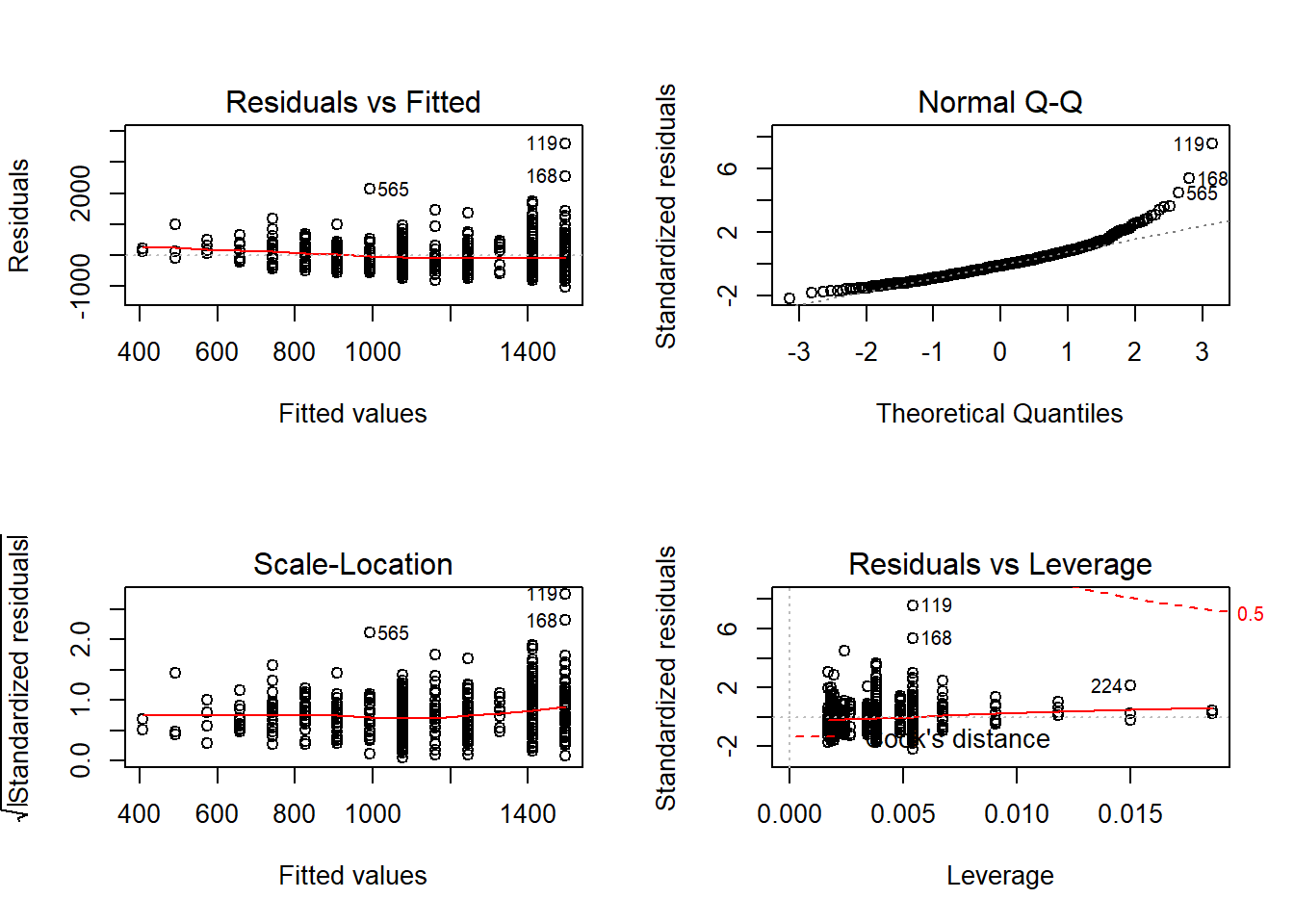
PSID1982 <- read.csv("https://raw.githubusercontent.com/ejvanholm/DataProjects/master/PSID1982.csv")Let’s imagine we’re primarily interested in the relationship between education and wages. We’ll start by just running a linear model to set a baseline and we’ll look at the graphs for the regression as well to help identify any issues.
##
## Call:
## lm(formula = wage ~ education, data = PSID1982)
##
## Residuals:
## Min 1Q Median 3Q Max
## -1038.6 -311.6 -48.1 222.3 3603.4
##
## Coefficients:
## Estimate Std. Error t value Pr(>|t|)
## (Intercept) 70.467 92.231 0.764 0.445
## education 83.888 7.017 11.955 <2e-16 ***
## ---
## Signif. codes: 0 '***' 0.001 '**' 0.01 '*' 0.05 '.' 0.1 ' ' 1
##
## Residual standard error: 477.1 on 593 degrees of freedom
## Multiple R-squared: 0.1942, Adjusted R-squared: 0.1929
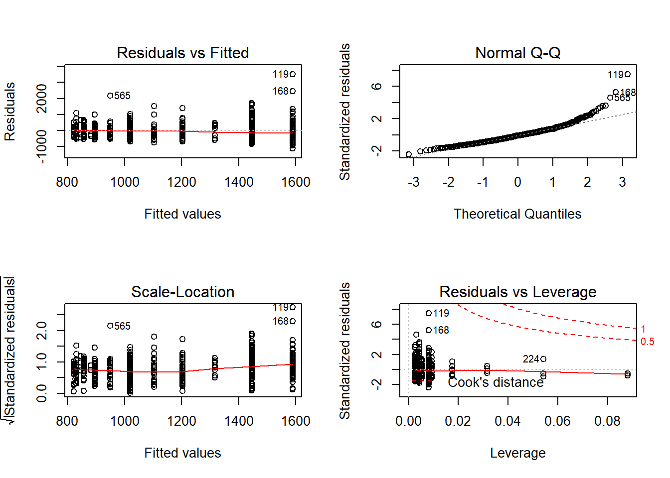
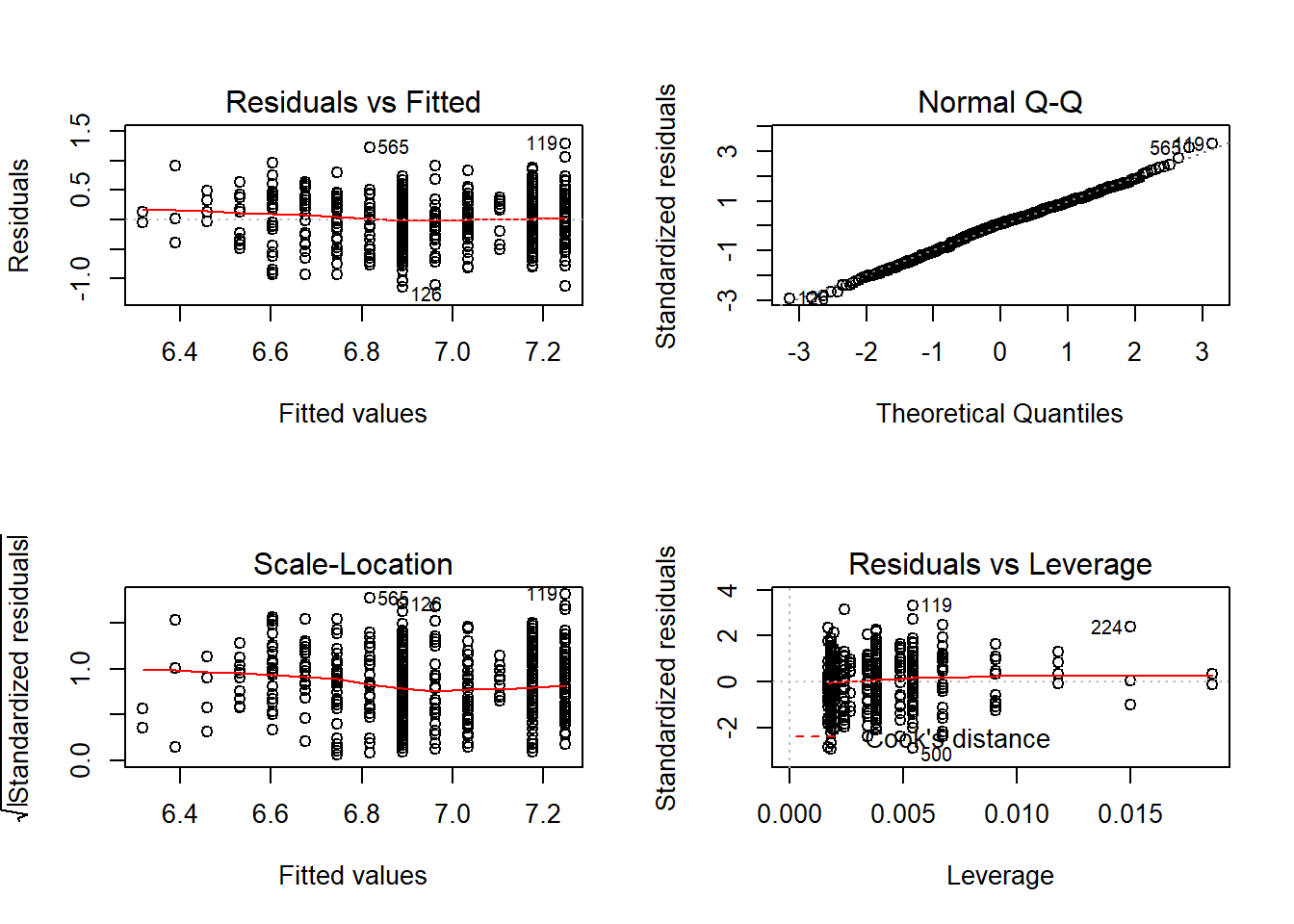
## F-statistic: 142.9 on 1 and 593 DF, p-value: < 2.2e-16## [1] 9032.201The graphs show some things to be concerned about. It doesn’t look like the means for the residuals are 0 in the Residuals vs. Fitted plot, and the Q-Q Plot shows that the high values are pulling away from line. Let’s see if a non-linear transformation addresses those issues. Let’s first look at what happens if we add a square term. When adding a square term it’s important to keep the linear term also in your model; to add the square term just wrap the variable name in I(), and add ^2 to say you want it squared. I don’t know where the I() command comes from, so I can’t explain that, it’s just what you use.
##
## Call:
## lm(formula = wage ~ education + I(education^2), data = PSID1982)
##
## Residuals:
##     Min      1Q  Median      3Q     Max
## -1131.2  -319.5   -39.0   234.1  3510.8
##
## Coefficients:
##                Estimate Std. Error t value Pr(>|t|)
## (Intercept)     1168.58     301.19   3.880 0.000116 ***
## education       -101.40      48.93  -2.072 0.038663 *
## I(education^2)     7.42       1.94   3.825 0.000144 ***
## ---
## Signif. codes:  0 '***' 0.001 '**' 0.01 '*' 0.05 '.' 0.1 ' ' 1
##
## Residual standard error: 471.7 on 592 degrees of freedom
## Multiple R-squared:  0.2137, Adjusted R-squared:  0.211
## F-statistic: 80.42 on 2 and 592 DF, p-value: < 2.2e-16## [1] 9019.671That didn’t do a lot, although the AIC did go down slightly. Let’s see if using the log of wage improves the fit.
##
## Call:
## lm(formula = log(wage) ~ education, data = PSID1982)
##
## Residuals:
##      Min       1Q   Median       3Q      Max
## -1.14389 -0.25317  0.03051  0.26343  1.28819
##
## Coefficients:
##             Estimate Std. Error t value Pr(>|t|)
## (Intercept) 6.029191   0.075460    79.9   <2e-16 ***
## education   0.071742   0.005741    12.5   <2e-16 ***
## ---
## Signif. codes:  0 '***' 0.001 '**' 0.01 '*' 0.05 '.' 0.1 ' ' 1
##
## Residual standard error: 0.3904 on 593 degrees of freedom
## Multiple R-squared:  0.2085, Adjusted R-squared:  0.2071
## F-statistic: 156.2 on 1 and 593 DF, p-value: < 2.2e-16## [1] 573.1512The AIC went down a lot! Although, that’s meaningless in comparing our models. Models with different dependent variables essentially can’t be directly compared using R-Squared or AIC. Taking the log of wage is the equivalent of creating a new variable, so we have to use other means to figure out if the fit is better. For one , the Q-Q plot looks greatly improved. taking the log of wages is probably the best strategy in this case. It’s really common to take the log of a continuous variable like wages because they tend to be nonlinear.
Now let’s add an interaction between occupation and education We can add an interaction by just listing the second variable we’re interested in with a * (the sign for multiplication), rather than a plus. The interaction is helping us to understand whether the difference in wage gains for additional education for white and blue collar workers is different, so let’s find out below.
##
## Call:
## lm(formula = log(wage) ~ education * occupation, data = PSID1982)
##
## Residuals:
##      Min       1Q   Median       3Q      Max
## -1.15572 -0.25280  0.03827  0.25973  1.25441
##
## Coefficients:
##                           Estimate Std. Error t value  Pr(>|t|)
## (Intercept)                6.29374    0.12133  51.871   < 2e-16 ***
## education                  0.04509    0.01074   4.196 0.0000313 ***
## occupationwhite           -0.23689    0.19509  -1.214    0.2251
## education:occupationwhite  0.02701    0.01488   1.816    0.0699 .
## ---
## Signif. codes:  0 '***' 0.001 '**' 0.01 '*' 0.05 '.' 0.1 ' ' 1
##
## Residual standard error: 0.3877 on 591 degrees of freedom
## Multiple R-squared:  0.2219, Adjusted R-squared:  0.218
## F-statistic: 56.19 on 3 and 591 DF, p-value: < 2.2e-16## [1] 566.9302When our dependent variable is logged we need to take the exponent of the coefficient to interpret the size of change. So each one unit increase in education is associated with a 4.6 percent increase in wage, for blue collar workers and that is significant.
## [1] 1.046122White collar workers with zero education would be expected to make 21 percent less in wages than a blue collar worker with no education, but that difference is insignificant. That result doesn’t totally make sense on it’s own because we’d expect white collar workers to earn more, but these are just for workers with zero education, which no one in the data actually has.
## [1] 0.7890781Earlier we found that education increases the wages of a blue collar worker. With the interaction we find that each one unit increase in education for white collar workers is associated with an increase in wages that is 2.7 percent more than the increase that blue collar workers receive, and that change is slightly significant. So all workers see positive gains from education, but for white collar workers the increase in wages is larger.
## [1] 1.027378Was the interaction valuable? The model with the interaction had a lower AIC and a higher r-squared, so it’s probably worth including. Though, the positive result for wages for uneducated blue-collar workers looks a little odd in isolation, and the variable occupation isn’t significant. However, knowing that there are differences in the benefit of education to different types of workers does add additional information to help understand the wages of workers.