14 Intro to Regression
14.1 Concepts
This chapter will introduce one of the largest and most important concepts in the social sciences - regression. Really, it’s an introduction to an entire new kind of life in terms of quantitative analysis. Before we were just hunting and gathering, trying to make due with what we had. Regression is like the agricultural revolution, and once you get started with regression if you live long enough you’ll see people land on the moon. There’s just so much more we can do.
Regression is more a group of similar activities than any one thing. That’s all to say, we will in no way finish with regression in one chapter. This section is just meant as an introduction.
Regression is the bread and butter of quantitative analysis in a number of fields, and is hard to avoid in even basic analyses. Even if you’re focusing on qualitative research, it’s important to at least be able to interpret regression analyses to understand the research of others working on similar topics.
14.1.1 Defining Regression
You might know the word “regression”, or it might just sound sorta familiar. In everyday vocabulary it means to move backwards. “Johnny was doing well at sleeping through the night, but he’s regressed,” or “I was mostly earning A’s sophomore year, but I’ve started regressing”. A dictionary definition of the term regress could be “return to a former or less developed state.” That is not what we mean by regression analysis in this chapter. I’m going to spend the chapter explaining what we do mean by regression, and at the end of the chapter I’ll explain how it got that confusing and unclear name. It’s a bit of a weird story.
14.1.2 Back to Correlation
Before we move forward, let’s move back. Regression is intimately associated with things we’ve already learned like correlation. We’ll first discuss the overlaps in order to orient ourselves, before setting sail into new and more difficult waters.
Let’s take a look at some data from 1982 for 595 employed adults. The data is from the Panel Study on Income Dynamics from 1982, so it isn’t very current but the relationships we want to describe haven’t changed that significantly. And we’ll use this data as an example for a bit of this chapter and the next, so it’s worth taking a second to make sure we understand it.
##   experience weeks occupation industry south smsa married gender union
## 1          9    32      white      yes   yes   no     yes   male    no
## 2         36    30       blue      yes    no   no     yes   male    no
## 3         12    46       blue      yes    no   no      no   male   yes
## 4         37    46       blue       no    no  yes      no female    no
## 5         16    49      white       no    no   no     yes   male    no
## 6         32    47       blue      yes    no  yes     yes   male    no
##   education ethnicity wage
## 1         9     other  515
## 2        11     other  912
## 3        12     other  954
## 4        10      afam  751
## 5        16     other 1474
## 6        12     other 1539
There are variables for…
- experience - Years of full-time work experience.
- weeks - Weeks worked.
- occupation - factor. Is the individual a white-collar (“white”) or blue-collar (“blue”) worker?
- industry - factor. Does the individual work in a manufacturing industry?
- south - factor. Does the individual reside in the South?
- smsa - factor. Does the individual reside in a SMSA (standard metropolitan statistical area)?
- married - factor. Is the individual married?
- gender - factor indicating gender.
- union - factor. Is the individual’s wage set by a union contract?
- education - Years of education.
- ethnicity - factor indicating ethnicity. Is the individual African-American (“afam”) or not (“other”)?
- wage - Wage.
This data is handy for predicting the wages of workers. If you’re entering the labor market or thinking about the type of job you want, it’s valuable to know what type of job or credentials will earn you the largest wages. So let’s use this data to try and understand just that.
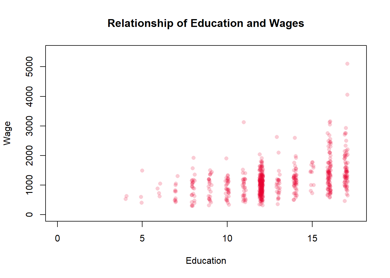
Let’s take a closer look at wages and education - if you’re reading this textbook you’re probably enrolled in a college program, so it’s worth asking why? Why did you go to college? Probably so that you’d earn higher wages once you entered the labor market. Let’s see whether people with more education earn higher wages.
On the x-axis is Education, or more specifically years of education. High school typically takes 12 years, or is considered 12th grade, so a person with a high school degree would have a value of 12 for education. College typically takes 4 more years, so a college graduate would have a value of 16. Someone that only finished the 8th grade would have a value of 8. There are some individuals that are more difficult to input with that scheme, such as a person that finished high school and completed less than a year of college. Should they be entered as a 13 or a 12 - they got slightly more education than the high school graduate, but less than a person that completed their first year of college. Typically years of education is entered as the highest year of school completed though.
On the y-axis is wages, which is easier to understand. Wages typically are the weekly pay a worker receives, so you’d have to multiply that total by 51 to get their annual salary. And inflation has boosted incomes since 1982, so the figures might seem low through modern eyes.
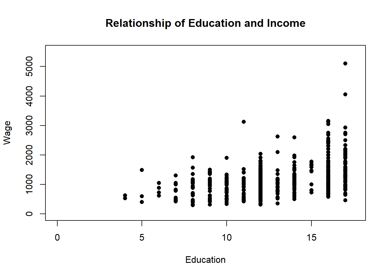
Education here is a discrete variable, so it isn’t ideal to graph it on a scatter plot with wage, but there’s no better way to display the data. The education data points cluster because they don’t have very many different values. This is going to be a bit of a digression, but there are ways to make it so you can better see the density of the data points though. We can make each point transparent, so that you can see if it overlaps with another point, and we can jitter it so that it moves slightly on the x-axis to improve the visualization.
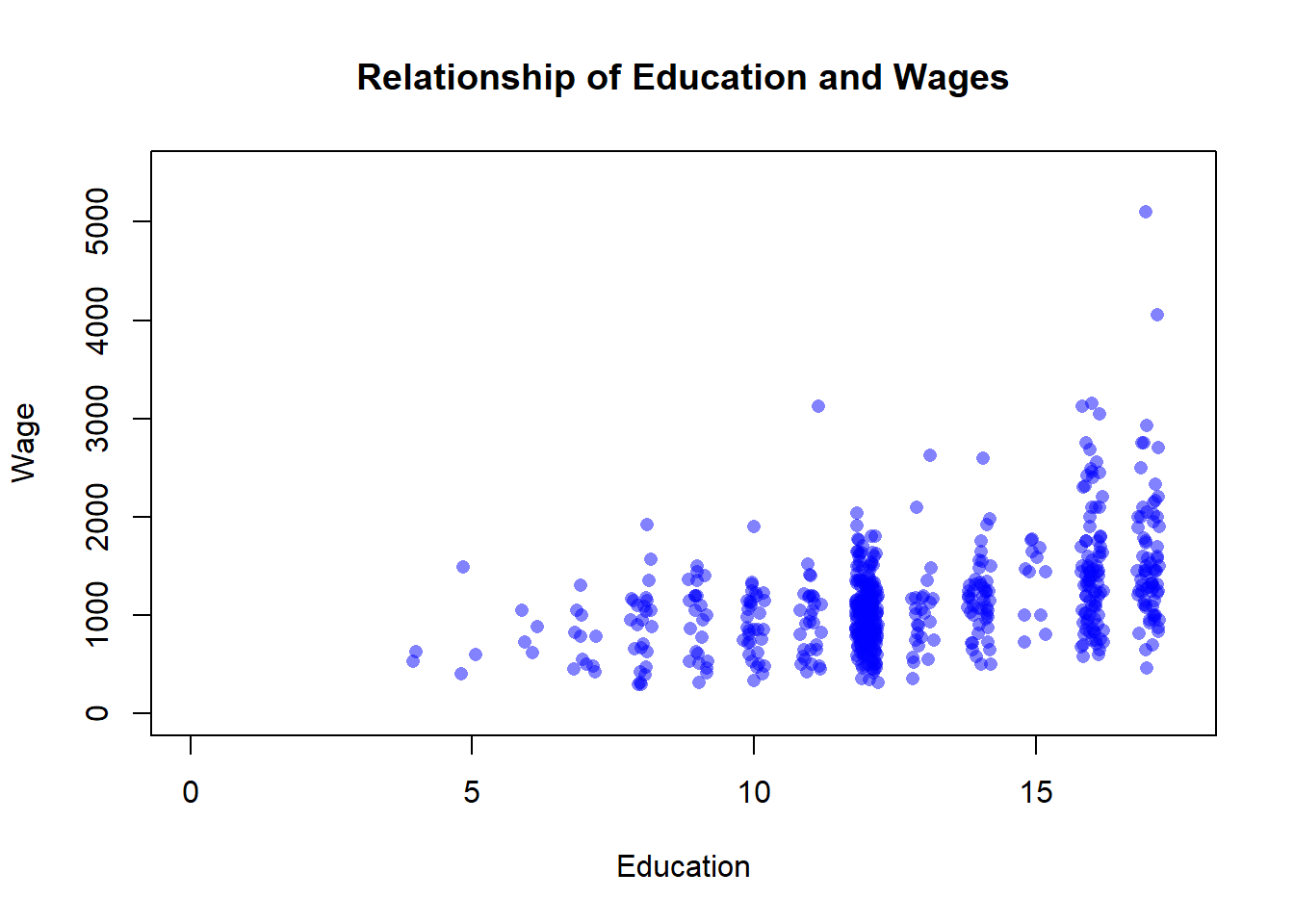
That makes the data a bit clearer. You can see that a lot of the education values are 12, which means high school graduate. It makes sense that a lot of workers in 1982 would have that credential. I’ll add a note below on how I did that, but that’s enough advanced graphing for now. Just a reminder that R provides more flexibility and options than you can imagine in terms of displaying your data.
So just looking visually, what do we think the relationship between education and income is? Generally, we would say that the two have a positive relationship, with higher levels of education predicting higher levels of wages There is definitely variation, some college educated individuals earn incomes that are similar to people that didn’t complete elementary school. But in general high earning individuals completed more years of education.
And the correlation coefficient agrees, which was .44. That’s a moderate and positive correlation, so a good predictor but clearly far from perfect. As you’d expect, the United States don’t have such a highly structured economy that getting a certain level of education can perfectly predict what your salary would be.
But that’s all we know from correlation. As education years increase, income tends to increase as well. But how much? If you’re thinking about finishing your degree or getting more education it’s probably worth wondering how much will completing this year of college add to your personal income. The correlation coefficient can’t tell us that. It can say that incomes tend to increase, but it can’t tell us how much of an increase we should expect.
Regression can.
14.1.3 Drawing Lines
Before we answer how much additional income you can expect based on completing more years of schooling, let’s talk about what regression is.
At it’s most basic, regression is all about drawing lines. Or more specifically, it’s about drawing a line of best fit. A line of best fit is a single line that attempts to minimize its distance from each point on a graph. Let’s add one to the graph we drew above.
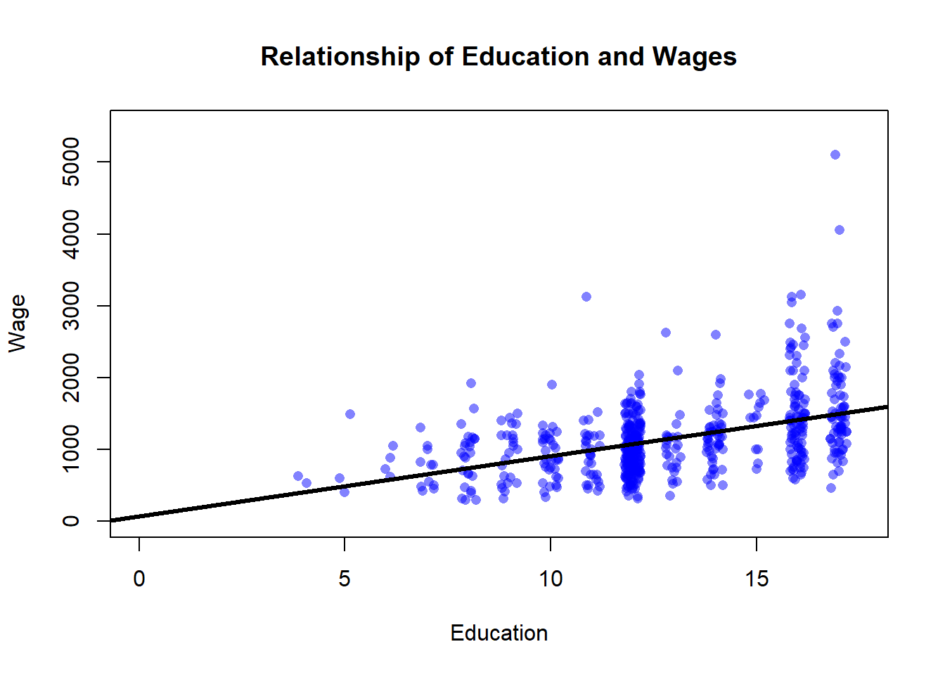
That line doesn’t connect the points on the graph. It’s meant to minimize the distance between it and each point on the plot. Why is the line drawn right there? Because R determined that was the place that would make it closest to each point in the aggregate. If it shifted up or down slightly that would reduce it’s fit overall, even if it made the line closer to some individual points.
What that line does then is give us a prediction of what a person’s income will be based on their education.
Do you remember the equation for a line that you learned back in high school math? It was y = mx+b.
Y was the y-value on the plot, and in our plot above the y-axis is the person’s wage
m is the slope of the line, or the rise over the run. For each one unit increase on the x-axis, how many units do you move up or down on the y-axis. That’s what m told us.
b is the y-intercept, the point where the line would cross the y-axis.
x is the value on the x-axis. So if we plug in a value from our data for the number of years of education a person has, we can multiply it by the slope and add it to the y-intercept to predict our y value.
Which variable is on the x axis and which is on the y axis thus makes a big difference here. We call the variable on the x axis the independent variable and the variable on the y axis the dependent variable. Why? Because we change the independent variable, to observe changes in the dependent variable. The dependent variable depends on the changes we make to the independent variable. What you make the independent and dependent variable is important. What do you want to predict? That’s the dependent variable. Whatever you use to make that prediction goes as the independent variable.
That basic structure underlies regression. Let’s visualize that a bit more directly on our graph then. Also, I’m going to adjust the size of the graph below so that we can really see the line. Specifically, I’m going to limit the length of the y-axis so that there isn’t so much space above the line. It’s a small change that wont affect what we get from the graph later, but it does mean I’ll end up omitting a few points of the data.
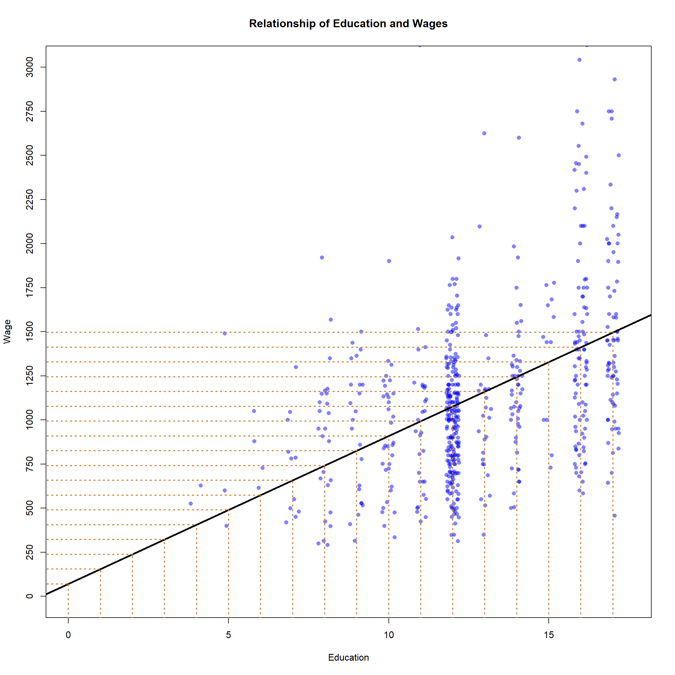
Those orange lines are the predicted wages of people at each individual level of education. The line of best fit is giving us a specific prediction of each person’s wages based on their level of education. Let’s work that out, using our equation for a line (y=mx+b).
What is b? The y-intercept can be seen here by finding the value of the line at the point where x=0. To identify that find 0 on the x-axis (there’s an orange line) and follow the horizontal orange line that runs to the y-axis to identify the value. The line is above 0 on the y-axis, but less than 250 - it looks like it’s at about 70? Maybe 75? Let’s go with 70 for now. Okay so we can plug that in for b.
y=mx+70
What is m? We can identify that by figuring out how much the line rises for each unit that it runs. If the line is at 70 when x=0, what is y when x=1? I’d guess that the line is at about 150, which would mean that y increased 80 dollars for a one unit increase in x. So we can estimate that the slope of the line is about 80.
y = 80x+70.
That’s the equation for our line. We can use it to predict any other value in our data. What about a high school graduate with 12 years of education, what would we predict their wages to be? Well, y= 80 times years of education plus 70 (the intercept), so…
y = 80 * 12 + 70…
so about 1030. Is that where the line is on our graph above? It looks pretty close.
So we’ve figured out our line. The line is fitting our data as best it can, and we can use it to predict a person’s wages based on their education. We can make a really specific prediction based on that line, that each additional year of education will increase wages by 80 dollars (I know that doesn’t sound like much, but it’d be 80*51 for annual salary, and a dollar went a lot further in 1982).
I just want to pause here and try to grab you by the shoulders and shake you to make you understand how exciting that is.
We can identify how much a year of education will increase your wages. Or how much of a difference race makes in hiring decisions. Or whether a minimum income increases or decreases employment. Or how much income inequality impacts a person’s health. Regression is a tool for answering all of those questions and so many more, and we can go beyond whether things are positively or negatively related to say exactly how much a difference they make.
14.1.4 Regression Output
But we don’t have to do that just by physically drawing lines and identifying where they land on graphs. Regression does that for us automatically. Now we’re going to have to lean into some specific terminology and a little math, but we’ll go slow.
Let’s take a look at the output R would give us for the regression we did above, using education and wages.
##
## Call:
## lm(formula = wage ~ education, data = PSID1982)
##
## Residuals:
## Min 1Q Median 3Q Max
## -1038.6 -311.6 -48.1 222.3 3603.4
##
## Coefficients:
## Estimate Std. Error t value Pr(>|t|)
## (Intercept) 70.467 92.231 0.764 0.445
## education 83.888 7.017 11.955 <2e-16 ***
## ---
## Signif. codes: 0 '***' 0.001 '**' 0.01 '*' 0.05 '.' 0.1 ' ' 1
##
## Residual standard error: 477.1 on 593 degrees of freedom
## Multiple R-squared: 0.1942, Adjusted R-squared: 0.1929
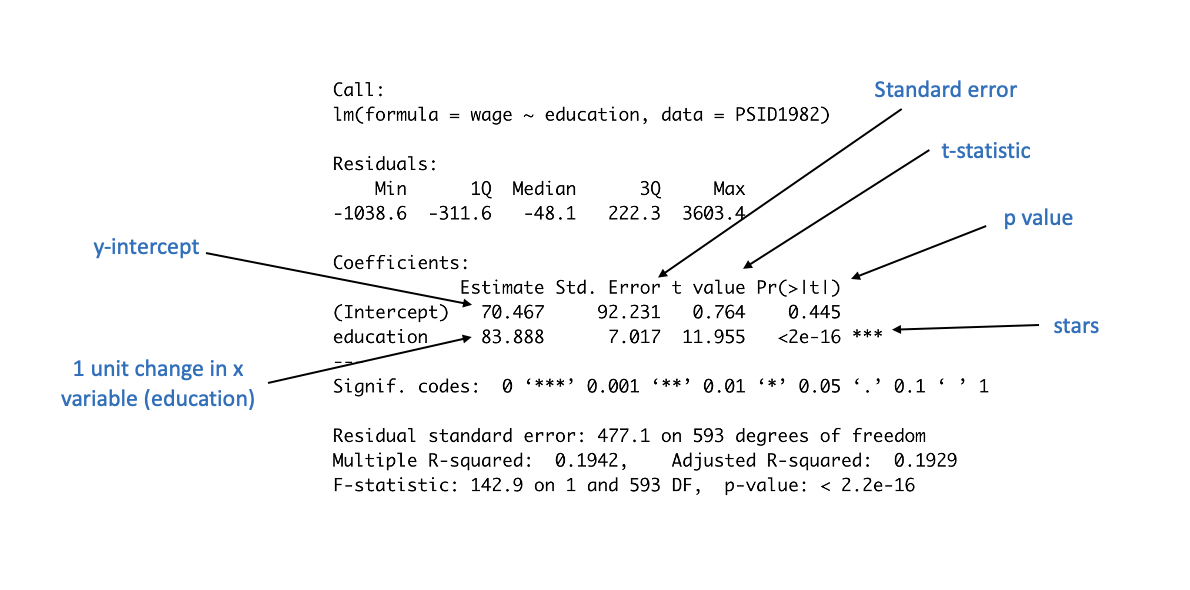
## F-statistic: 142.9 on 1 and 593 DF, p-value: < 2.2e-16That’s a lot of numbers! So lets annotate it and work through it slowly. Many of those numbers wont matter to us right now (in this chapter at least), so don’t let that overwhelm you. Let’s first just look at the ones that we might already recognize, and then we’ll keep adding more details.
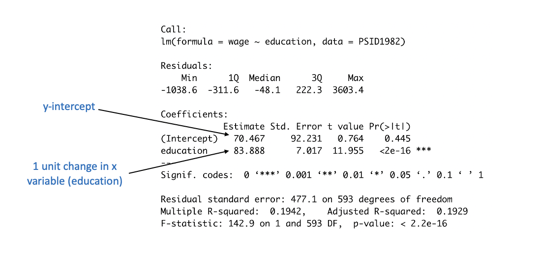
Those are the numbers we eyeballed earlier from the graph (and we were pretty close). The y-intercept, the value for the line when x=0 is 70.467. More specifically, the value we would predict for someone with 0 years of education would be 70.467. Whatever our independent variable is, the intercept is the predicted value for the dependent variable if we set the independent variable equal to 0.
The value next to education indicates the expected increase in y (wages) for each 1 unit increase in x (education) For each additional year of education, we predict an increase in wages of 83.888. Again, that’s pretty close to what we saw on the graph, but more precise.
To reiterate, regression is just fitting a line to our data. We can do that by hand, which is more cumbersome, or we can just use regression to get more precise estimates. What the regression tells us is that someone with 0 years of education would earn a wage of $70.467, and that for each additional year they would earn $83.888 more.
Those values - we’ll call them coefficients from now on. Coefficient just means the “value that a variable takes on”, so 83.888 is the coefficient for education. 70.467 is the coefficient for the intercept. More specifically, a coefficient for the independent variable is the predicted change in the dependent variable for a one unit change in the independent variable. The coefficient for the intercept is the value that the dependent variable takes when the independent variable is set to 0.
We can put that back into our equation for a line too.
y = 70.467(x) + 83.888
That output is telling us a bit more than just the coefficients though. What they’re tell us about, in part, is the significance of our model.
14.1.5 Statistical Significance
Remember back to our chapter on polling, when we had data that showed 52.3% of voters supported candidate Duke. We knew that was true in the sample, but what we were concerned with was whether the population also supported Duke. We have a similar concern here with education and wages.
We know, based on what we’ve done, that on average people in the sample earns $80 more for every additional year of education. But does the population, which means workers in general, earn more if they are more educated?
Our regression indicates that yes, we can be pretty confident that this relationship is present in the population, as well as the sample. That, to a large degree, is what we care about! Finding that among these 595 education is associated with higher wages is fine, but what we are really concerned with is whether education is associated with wages among everyone else.
So how do we know that? Part of what we’re doing in regression is hypothesis testing. We’re testing the hypothesis that education makes a difference in peoples wages. “Hypothesis testing” in statistics means something slightly more specific than just testing a hunch. It has a more specific structure, which starts with the null hypothesis.
Before we do anything with our data, we’re operating under the assumption that our variable of interest (education) doesn’t make any difference on wages. We just can’t know that until we test it. So we begin with the null hypothesis that education has no relationship to wages. We denote the null hypothesis as H0.
H0: Education does not make a difference on wages.
What we propose then is an alternative hypothesis, something that can either be proven correct or failed to be proven. That is the alternative hypothesis. Normally we denote the alternative hypothesis with H1
H1: Education does make a difference on wages.
There’s a lot of specific language built around hypothesis testing. Null hypothesis is a bit of a weird phrase. And we don’t ever accept or confirm the null hypothesis - if we don’t find evidence to accept the alternative hypothesis we say that we have failed to reject the null. I know, it’s a little weird, but it’s good lingo to sound like a data nerd. That’s the structure of the test that interpreting the regression results is built around.
And I get that it sounds weird. I know we have a lot of evidence already that education increases wages, the regression we just ran in this chapter is not revolutionary. But that’s the structure of the statistical test were using because it makes the results more easily interpretable.
Essentially, we’re testing whether the effect of education on wages is equal to 0, or not. Does getting more education mean workers earn $0 additional dollars, or do they earn some amount (either positive or negative). What we can calculate is the probability that education makes 0 difference on wages.
We know what difference in makes in the sample though, what we’re concerned with is whether it makes a difference in the population.
Okay, so let’s go back to our output to point out how we judge our hypothesis test. Do we find enough evidence to accept the alternative hypothesis or not?
Yes, we can accept the alternative hypothesis. In this case, we find pretty strong evidence that education makes a difference in wages.
What the p-value, or Pr(>|t|) is telling us, is the probability of us getting a coefficient as large as we did if in the population education doesn’t actually make a difference on peoples wages. How do we know that? I’m gonna offer a brief foray into math here to explain that. If your eyes glaze over, skip the next paragraph and start reading closely again. I’ll explain it in more depth elsewhere in this book, but in the spirit of completeness I make a quick attempt here.
All the pieces are actually in the output above. We’re testing what the chances are that we’d get a coefficient as large as 83.888 for education if the actual relationship in 0. So to figure out the chances of that, we subtract our coefficient from our null relationship (0), and divide that figure by the standard error (which was already calculated for us). So 83.888-0 / 7.017, which equals 11.955. That is the t-statistic that is also in the output. Essentially, it’s asking the chances we’d get this large of a difference in the means depending on how tightly clustered our data is. And t statistics are similar to the z values we used in the chapter on polling. If we get a t statistic above 1.96, that means we will be more than 95% confident. Anyways, that’s all explained in more detail in another future chapter. If you’d like to understand that better I’d recommend this video from Khan Academy.
So back to the output again. A few things to note. Pay attention to the potential for scientific notation in R.
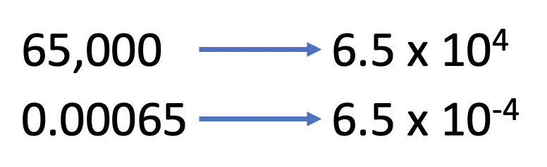
The p value here is not 2, it is .0000000000000002. Probabilities run from 0 to 1, so 2 is impossible. .0000000000000002 is really low, because it’s showing us the probability that we would get a coefficient as large as 80 from our data, if there was no relationship between education and wages. That means it isn’t impossible, but highly highly unlikely. We can often more quickly see that with the stars that have become a traditional part of regression outputs. Stars are given to statistically significant results, like those above.
At the far right of the output is our p values, and next to them are stars (or asterisks). The asterisks are there to help us quickly judge whether our results are significant. If a p value is between .1 and .05, so almost significant, it will get a period ‘.’ or sometimes it will get a single star (*).
If the value is between .05 and .01, so more significant but still not a crazy strong finding, it’ll generally get two stars (**).
And if the p value is even smaller, like it is in this analysis, it’ll get the coveted three stars (***) which indicates to readers very quickly that the result is very strong.
| P Value | Strength | Stars |
|---|---|---|
| .1-.05 | Not really | * or . |
| 0.05 - .01 | Moderate | ** or * |
| 0.01 - 0.001 | Strong | *** or ** |
| 0.001 or less | Very strong | *** |
R’s default output is actually a bit different with the stars than most programs, which makes it a bit difficult to give you a steadfast rule. In general though, more stars equals stronger results, and anything below .05 is considered significant. I’m not sure why statisticians started using stars, it’s become a bit corny in some corners. I used to have a colleague would would talk about whether “the stars were out” when he was working on a new analysis, to indicate whether he was getting the significant results he wanted.
Why do we care about significance? Again, it’s because we care whether our results say something about the population or not. The results we have are true for the sample regardless, but what we really want is to find things that are generalizable to the larger population.
14.1.6 More examples
Let’s keep working with the data on wages and do a few more examples. A lot of this will become more clear with extra repetition. You’ll learn where to look on the output for the key information you want to extract with a little practice. And to some degree, a lot of this can be done (short term) just by rote memorization. If you learn where to look and can put those numbers together in the right order, you can correctly interpret a regression. It’d be great to understand everything, but sometimes that comes with time. We’re focusing here on understanding and interpreting a regression, before worrying about understanding all the gears within the machine.
Let’s look at the relationship between experience and wages. Do people earn more after they’ve spent additional years in the job?
##
## Call:
## lm(formula = wage ~ experience, data = PSID1982)
##
## Residuals:
##    Min     1Q Median     3Q    Max
## -954.5 -347.9  -62.3  220.2 3955.8
##
## Coefficients:
##             Estimate Std. Error t value Pr(>|t|)
## (Intercept) 1046.608     50.865  20.576   <2e-16 ***
## experience     4.438      2.013   2.205   0.0278 *
## ---
## Signif. codes:  0 '***' 0.001 '**' 0.01 '*' 0.05 '.' 0.1 ' ' 1
##
## Residual standard error: 529.4 on 593 degrees of freedom
## Multiple R-squared:  0.008131,   Adjusted R-squared:  0.006459
## F-statistic: 4.861 on 1 and 593 DF,  p-value: 0.02785
The answer is yes, for each additional year of experience a worker has, they can expect an additional $4.4 in wages. But more importantly, we can expect people in the population (beyond this sample) to see their wages increase. The p-value for this regression is .0278, below the .05 cutoff we described above for a statistically significant result.
Let’s lay out a structure for describing those results. In my PhD stats class the teacher laid out this sentence for us, and we’d go around the room practicing filling in the blanks. This isn’t the only way to describe a regression correctly, but it’s a safe way that is accurate.
For each one unit increase in __________, we observe a __________ increase/decrease in ___________, and that change is/isn’t significant.
So, for what we just ran above…
For each one unit increase in experience, we observe a 4.4 increase in wages, and that change is significant.
Let’s do another. Let’s see whether being in a union makes a difference in wages.
##
## Call:
## lm(formula = wage ~ union, data = PSID1982)
##
## Residuals:
##    Min     1Q Median     3Q    Max
## -887.1 -355.1  -44.2  220.9 3920.9
##
## Coefficients:
##             Estimate Std. Error t value Pr(>|t|)
## (Intercept)  1179.15      27.29  43.202   <2e-16 ***
## unionyes      -84.90      45.09  -1.883   0.0602 .
## ---
## Signif. codes:  0 '***' 0.001 '**' 0.01 '*' 0.05 '.' 0.1 ' ' 1
##
## Residual standard error: 529.9 on 593 degrees of freedom
## Multiple R-squared:  0.005943,   Adjusted R-squared:  0.004267
## F-statistic: 3.545 on 1 and 593 DF,  p-value: 0.0602
The variable (union) looks a little different than in the earlier examples. The variable we tested was named union, but in the output it shows as unionyes. That is because the variable isn’t numeric, it’s categorical. Individuals are either in a union, or not. What unionyes is showing us then is the impact on wages of being a “yes” on union, as opposed to a “no”. So what effect does being in a union have? It lowers wages by $84.90. Is that result significant? No. Almost, but no. The p value is higher than .05, being .06. Thus, we can’t quite be confident enough to say that in the population being in a union makes a difference in wages, or more specifically, we can’t say whether being in a union makes a difference of 0 on wages. We fail to reject the null hypothesis in this case.
For each one unit increase in union status, we observe a 84.9 decrease in wages, and that change is not significant.
That sentence doesn’t work quite as well for categorical variables. There aren’t very many different units of change in the union variable, it is either a yes or a no. It might be better to state it as…
For those in a union we observe a 84.9 decrease in wages, and that change is not significant.
Let’s spend on extra minute here. We’ve talked about the intercept above. What does the intercept represent here? It always is the expected value of the dependent variable where x=0, which in this case means… a non-Union worker. If the independent variable represents the wages for a work in a union, then the intercept is the wages for the comparison group (non-union workers). So what would their expected wages be? 1179.15.
The intercept doesn’t always have an interesting value. There’s no worker in the data with 0 years of education, so the y intercept is sort of a statistical projection rather than a real meaningful value. But if there was a worker with 0 years of education we would have predicted they would earn 70.467. Here, there are workers that don’t work for a union, and we can identify their predicted wages pretty quickly.
14.1.7 A brief note about causality
Many of the same caveats about causality we discussed with correlation apply here. We haven’t proven anything causes wages to go up. What we’ve found is the relationship between education (and other things) and wages, and whether those relationships were likely generated by chance or not. Causality takes more to prove, but regression has additional techniques that allow us to get as close as we can to proving causality without using an experiment.
If I were reporting the results from this regression in a paper, I might actually describe them as showing that there is a correlation between education and wages. Why? Because that is purposefully weak language, that most people will read as implying that I’m not making a causal argument. I’ve shown more than I could by just calculating the correlation coefficient, such as the size of the change and adding a statistical test for the strength, but not much else.
Let’s remind ourselves what is necessary to show causation.
- Co-variation
- Temporal Precedence
- Elimination of Extraneous Variables or Hypotheses
What we’ve shown again is co-variation. As education increases, wages increases.
And we’ve shown somewhat that there is temporal precedence. Most people finish their educations before getting a job. It’s possible that people got a good paying job and then used that money to take more classes, but that would be less likely than the reverse. So this example does have some causal strength.
Have we eliminated extraneous variables, or other explanations of the relationship? No. It may be that people who do better in school (and thus get more education) are better workers, and thus earn higher wages. Such workers might just be smarter and quicker thinking and are thus more successful professionally. In addition, different people might have different opportunities to get an education. Today, and in prior decades, access to education was not equal across genders and races, and there has also been a long history of discrimination in wages. So the fact that someone got an education may be an indication they were born with the opportunity to do so, and those same factors lead employers to pay them more whether they are a better worker or not. Those are just a start, there may be other explanations for the link between education and wages.
The real question is if we took two individuals that had the same qualities (race, age, intelligence, upbringing, everything) and we have one an additional year of education, how much of a difference in wages would it make. That’s the experiment we want to run, that’s the question we really want to have answered. We’ve shown that on average people with more education earn more, and that’s good since we don’t have the tools to answer the question we want yet. But for now, it’s just a stepping stone.
I’m not saying education doesn’t make any causal difference in wages. All I’m saying is we haven’t proven that quite yet with what we’ve done. But we’ll keep working towards that goal.
14.1.8 Intimidating Terminology
So at the beginning of the chapter I said I would explain why it’s called regression. There’s a longer (and better) blog post about that question here, but in brief there was a prominent statistician in the 19th century, Sir Francis Galton, that was studying the relationship of height between parents and children. What he found was that children heights generally regresses form the extremes of their parents, which means that really short parents tend to have shorter children on average, but their children are slightly taller than their parents. At the other end, extremely tall parents have children that are taller than average, but are still shorter than their parents.
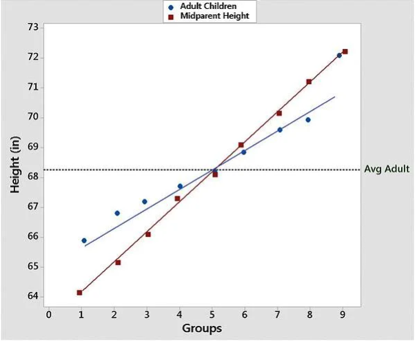
From the Minitab Blog
Do you see? That graph shows some lines of best fit for the data on height for parents and their children. Galton sort of developed regression analysis in the studying of parental-children height in the process of finding that height regresses between generations, and so the name got stuck. The method doesn’t have anything to do with regression, it was just an accident that an early project it got used for featured regression. Regression is a way overly complicated and intimidating term for what we’ve done in this chapter, but such are the accidents of history.
14.1.9 Summary
We covered a lot in this chapter. Let’s just quickly work through a few of the key takeaways before we start on the practice.
Regression analysis at its most basic is fitting a line to our data to predict how changes in the x axis impact changes in the y axis.
The regression output is structured a lot like the equation from a line you learned long ago in math class: y=mx+b. b is the y-intercept, where the independent variable is set to 0. m is the coefficient for the independent variable. That allows us to test different values of x in the equation to predict values for the dependent variable.
From a regression we can identify whether the independent variable makes a difference for the dependent variable, both in the sample and the population.
We can use the coefficient to identify the size of the change in the dependent variable, for each one unit change in the independent variable for the sample.
We can use the p value to identify the chances that there is a relationship between the independent and dependent variable in the population.
14.2 Practice
The basic command for running a regression is lm(). lm stands for linear model, which is what we’re estimating. Linear means straight, and we’re using a straight line of best fit to model the relationship between our independent and dependent variable.
So the equation for a line is y=mx+b. We’ll give the command something similar to run our regression.
Let’s use wage and education again, since we’re familiar with those results already. Wages then would be the dependent variable again (y) and married would be the x variable. I annotate the command for that regression below to illustrate how I write it.
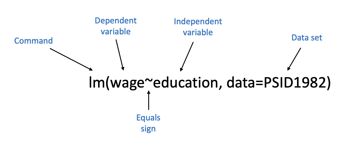
So there are five aspects there.
- The command, lm(), which works the same as every other command we’ve used.
- We insert the dependent variable on the left side of the equation, similar to the y=mx+b structure we typically use for the equation of a line. The dependent variable always goes on the left side.
- The wavy sign (called the tilde mark) is actually the equals sign in our equation. Why don’t we use an actual equal sign? Because we use those typically in R for the different options we set within commands. We aren’t saying that wage is equal to education here, we’re not setting their values as equivalent. So the tilde sign is used to indicate that we’re modeling wage. I’m not sure that explanation even makes sense to me, so just learn to use the tilde mark.

- The independent variable goes on the right side of the equal sign, where the m usually goes in the equation for a line.
- We have to specify what data set contains our variables using the option data=. We could just put the name of our data set with the variables, but that can be a bit more clunky in future lessons. So we just have to use the names of our columns, because we tell the equation what data set to look for our variables in.
PSID1982 <- read.csv("https://raw.githubusercontent.com/ejvanholm/DataProjects/master/PSID1982.csv") ## Reading in Data

lm(wage~education, data=PSID1982)
##
## Call:
## lm(formula = wage ~ education, data = PSID1982)
##
## Coefficients:
## (Intercept) education
## 70.47 83.89That output looks a little different than what I showed throughout the chapter. That’s just the coefficients for the intercept and independent variable. Where’s the significance test or stars or standard errors or all of it? We get that additional output by asking for the summary of the regression model. We just add the command summary() outside of what we did above, and we get that additional information.
##
## Call:
## lm(formula = wage ~ education, data = PSID1982)
##
## Residuals:
##     Min      1Q  Median      3Q     Max
## -1038.6  -311.6   -48.1   222.3  3603.4
##
## Coefficients:
##             Estimate Std. Error t value Pr(>|t|)
## (Intercept)   70.467     92.231   0.764    0.445
## education     83.888      7.017  11.955   <2e-16 ***
## ---
## Signif. codes:  0 '***' 0.001 '**' 0.01 '*' 0.05 '.' 0.1 ' ' 1
##
## Residual standard error: 477.1 on 593 degrees of freedom
## Multiple R-squared:  0.1942, Adjusted R-squared:  0.1929
## F-statistic: 142.9 on 1 and 593 DF,  p-value: < 2.2e-16
That matches what we did above. In general you’ll want to run regressions with the summary command wrapped around the lm() command, because that additional information is pretty valuable.
Let’s do another example. Let’s say I want to test whether married workers earn higher wages than unmarried workers using the PSID9182 data we used throughout the chapter.
##
## Call:
## lm(formula = wage ~ married, data = PSID1982)
##
## Residuals:
##    Min     1Q Median     3Q    Max
## -901.7 -339.7  -80.7  210.8 3885.3
##
## Coefficients:
##             Estimate Std. Error t value Pr(>|t|)
## (Intercept)   872.59      47.71  18.288  < 2e-16 ***
## marriedyes    342.16      53.18   6.434 2.56e-10 ***
## ---
## Signif. codes:  0 '***' 0.001 '**' 0.01 '*' 0.05 '.' 0.1 ' ' 1
##
## Residual standard error: 513.9 on 593 degrees of freedom
## Multiple R-squared:  0.06526,    Adjusted R-squared:  0.06368
## F-statistic:  41.4 on 1 and 593 DF,  p-value: 2.561e-10
For individuals that are married, we observe a 342.16 increase in wages, and that change is significant.
What are the wages for a unmarried worker? That is answered by the y-intercept: 872.59.
The following video will walk through those steps.
There are plenty of great data sets built into R that you can use to construct your own regression analyses. Try using any of these commands to find additional data to practice:
data(USArrests)
data(swiss)
data(mtcars)
data(USJudgeRatings)
14.2.1 Advanced Graphing
I know I promised to show you the tricks of what I did to the graph above.
To jitter a variable (move it around from it’s actual position) you use the command jitter(). I’ll use the same education and wage data as above.
plot(jitter(PSID1982$education), PSID1982$wage, pch=16,
     main="Relationship of Education and Wages",
     xlab="Education",
     ylab="Wage",
     ylim=c(0, 5500),
     xlim=c(0,17.5))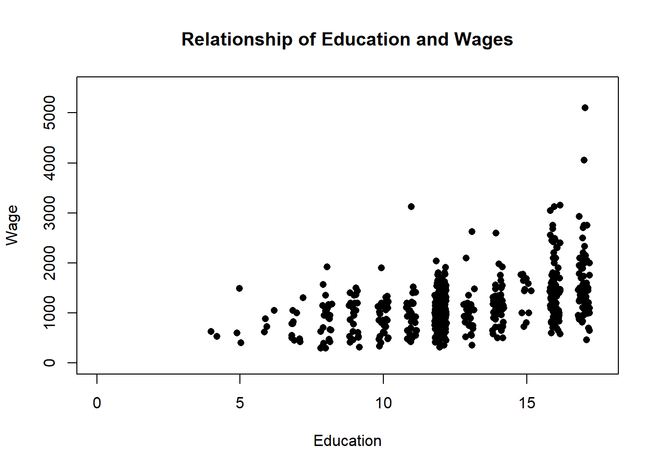
You can make the ‘jitter’ larger or smaller by adding a number inside the command. The default is 1, so if I insert .5 the size of the change will be a little smaller.
plot(jitter(PSID1982$education, .5), PSID1982$wage, pch=16,
     main="Relationship of Education and Wages",
     xlab="Education",
     ylab="Wage",
     ylim=c(0, 5500),
     xlim=c(0,17.5))
To make the points transparent I use the command rgb() to set the color.
rgb has a number of options that let you create a custom color. We talked about all the preset colors in the section on graphing, but you can also create your own colors. You specify a value for the level of red, green, and blue in your color, and then adjusting the alpha sets the transparency. The default command is copied below, and I’ll just run through a few examples. It’s only something I use in graphs when I really have to. The values you use are structured by the option you set for max, which if you set it as 1 everything else you use has to be below 1. But if you set max to say 255, you can insert values up to 255. Anyways, just have fun.
rgb(red, green, blue, alpha=1, max = 1)
plot(jitter(PSID1982$education, .5), PSID1982$wage, pch=16,
     main="Relationship of Education and Wages",
     xlab="Education",
     ylab="Wage",
     ylim=c(0, 5500),
     xlim=c(0,17.5),
     col=rgb(0, 64, 123, max = 255, alpha = 125),)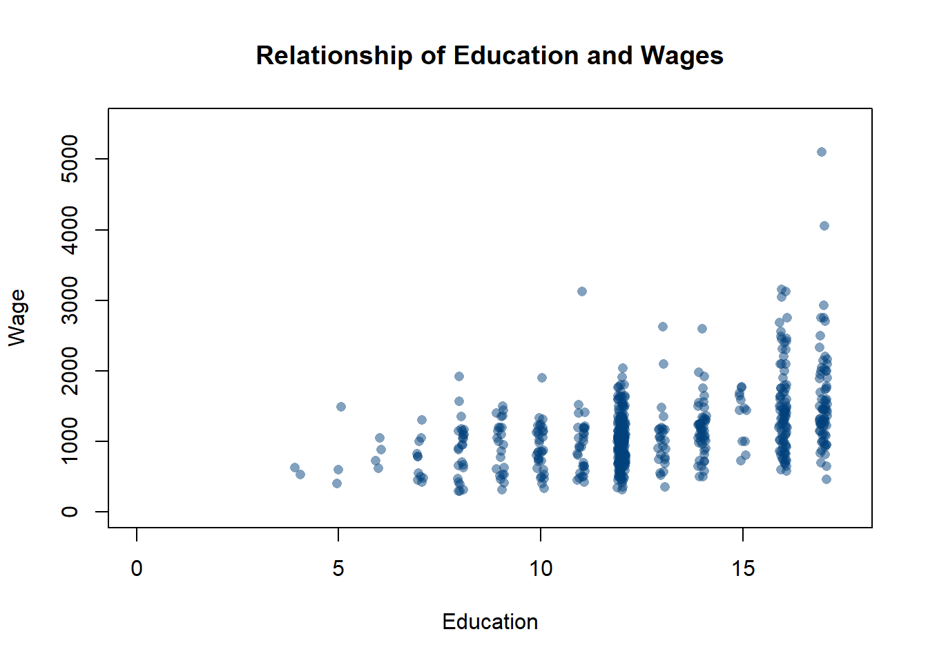
plot(jitter(PSID1982$education, .5), PSID1982$wage, pch=16,
     main="Relationship of Education and Wages",
     xlab="Education",
     ylab="Wage",
     ylim=c(0, 5500),
     xlim=c(0,17.5),
     col=rgb(31, 89, 13, max = 255, alpha = 45),)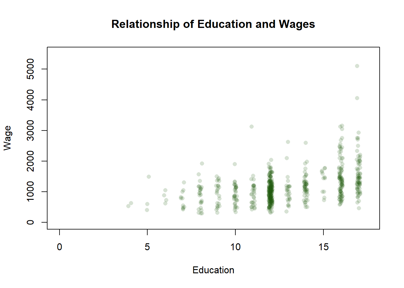
plot(jitter(PSID1982$education, .5), PSID1982$wage, pch=16,
     main="Relationship of Education and Wages",
     xlab="Education",
     ylab="Wage",
     ylim=c(0, 5500),
     xlim=c(0,17.5),
     col=rgb(.90, 0, .18, max = 1, alpha = .2),)