11 Displaying Data
11.1 Concepts
Last chapter we met the struggle of having too much data. We laid out 420 scores from math tests in California schools, and 420 data points is hard to digest (and there are many data sets with millions of rows). Descriptive statistics offered ways to summarize that data and provide some order to the mess, but it isn’t the only way.
Another effective way of summarizing large quantities of data is to graph it. Graphing adds a bit of art to the information we communicate, and can be a more interesting way to show that the average test score in California was 653. Graphing data is also a great way to look at multiple variables simultaneously and examine relationships between them.
There’s no one best type of graph. The right way to graph your data will be dependent on the type of data you have, as well as what you’re trying to show. We’ll run through a few common types of graphs in this chapter, along with things to avoid. However, we’ll start by talking about different types of data, as a way to explain the different graphs we might use.
11.1.1 Data Types
Let’s begin then by taking a half step back. Last week we started working with data, but we can first talk a bit more about the different types of data that there are. This distinction wont cover the differences between qualitative and quantitative data, but rather the different types of variables you might encounter particularly in doing quantitative analyses.
There are four types of data we’ll worry about here, which are summarized in the flowchart below. We’ll talk about each in turn.
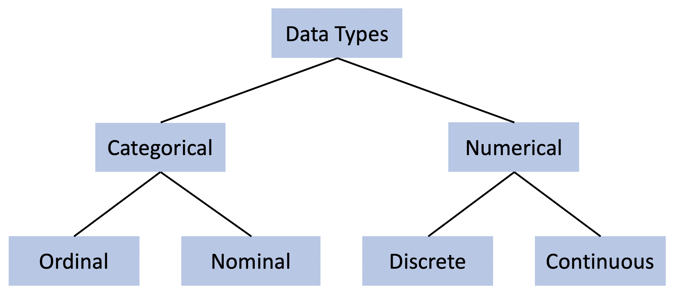
11.1.1.1 Numerical Data
We can start on the right side of that figure. Numerical data is probably what you think about when you picture “quantitative data”. Like it sounds , numerical data has numbers.
Numerical data is that which can be counted: the number of books you own, hairs on your head, wings on a pterodactyl, ounces of water in a glass, sand on the beach, and on and on. Numerical data further comes in two distinct forms: discrete and continuous.
The essential difference between the two comes from whether the items once counted can be subdivided into smaller units. Let me explain. Discrete data comes in amounts that can be individually definable, generally in units of 1. Imagine that you’re measuring the number of items people have in their fridge. That would be a discrete number - they could have 0, or 23, or 105, or any number. But they couldn’t have 1.5 items. Each item is counted individually and discretely. You can’t subdivide the times into smaller units. You can think of yourself counting discrete data.
On the other hand, if you’re measuring time, to take one example, you can subdivide those units. You can measure hours, or minutes, or seconds, or milliseconds, or on and on. Each unit isn’t neatly divided from each other, but rather made up of millions of breakpoints in between. That is considered continuous data. Generally you’d think of yourself measuring continuous data, not counting the number of seconds someone takes to run a 40 yard dash.
In actuality, those two types aren’t that cleanly separated. You can change a continuous measure to look like a discrete one, just by rounding. But you can’t make a discrete measure continuous. Imagine if I measured how long it took my students to take a test. I could measure that in the number of seconds they took, and make the number continuous. Alternatively, I could round the data to the number of hours they took, which would make the data more similar to a discrete figure.
11.1.1.2 Categorical Data
Categorical data refers to categories or characteristics. Those could be hair color, color of shoes, car type, education, language spoken, etc. The distinction between ordinal and nominal data comes from whether the data has a natural order to it.
Nominal data like shoe color doesn’t have any particular hierarchy, green, brown, blue - none of those are the highest color of shoes or the lowest. On the other hand, ordinal data does have an order. Take for instance happiness: how happy do you feel today? Very happy is higher than happy, which is higher that unhappy. Different answers to how happy you are fall into an implicit range that has some natural order.
| Name | Type | Appearance | Examples |
|---|---|---|---|
| Discrete | Numeric | Integers | pairs of shoes, books owned, children |
| Continuous | Numeric | Decimals | Time spent, speed, weight |
| Nominal | Categorical | Words no order | Race, shoe color, car type |
| Ordinal | Categorical | Words with order | Education, happiness |
| ——- | ———- | ————– | ————————————– |
11.1.2 Graph Types
All of that was to get us ready to start graphing data. There’s no one best type of graph for all situations - but there is a best type of graph depending on the data you have. And sometimes we’ll make the definitions we developed above a little less clear and more complicated as we start to actually work with the data.
The important thing to keep in mind as you create a graph is that you’re telling a story. Just like a picture is worth 1,000 words, a graph can capture a lot of information. You shouldn’t just make a graph, you should always reflect on what that graph is telling you. It’s not just a place to throw information, it should be designed to tell the reader something specific. Anytime you make a graph as part of a project, step back and make sure it’s at least telling you something about your data. If a graph isn’t tell you anything identifiable about your data, then it wont tell your reader anything either and it’s just taking up space.
Let me give you an example of story telling with graphs. What’s the story of this graph below?
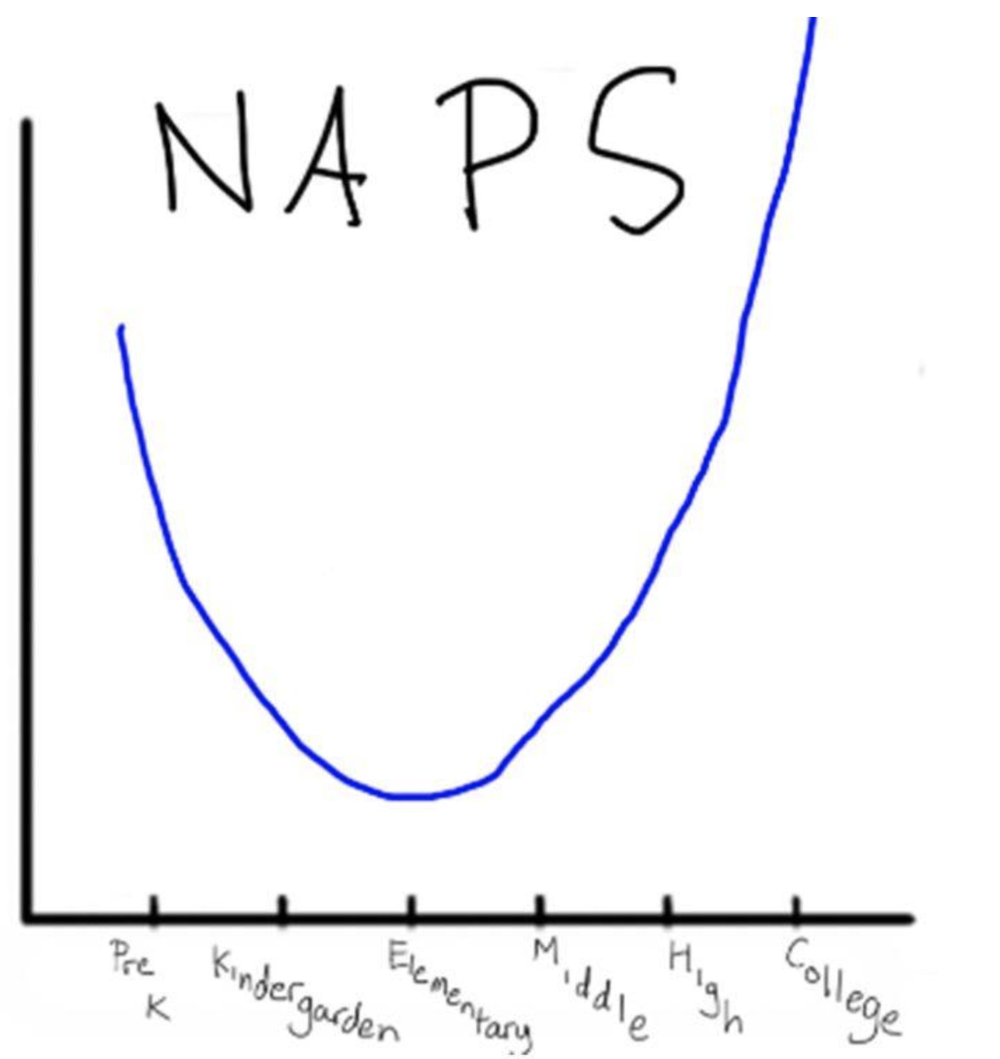
I’d love to attribute this to the creater but I don’t know who that is
Pretty clearly the graph is saying people take a similar number of naps in preschool and college, and fewer in between. That was posted as a series of memes, so it isn’t meant to be taken seriously or an example of rigorous data collection. But what it does show is the way that you can communicate an idea very simply just with pictures or a graph, instead of telling the reader what your data about age and naps shows.
You can be really creative in developing graphs. It’s sort of like the rules of fashion or cooking, where there are different rules for beginners than there are experts. I wouldn’t dare to put cucumber on my pizza, but I’m sure there’s some chef in New York doing that who knows enough to do it well. Here we’re going to go over the basics of creating good graphs. Choosing the right graph becomes something you’ll understand through practice, but in the meantime this flow chart should walk you through the decision. We’ll go down each path to describe the 5 chart types listed.
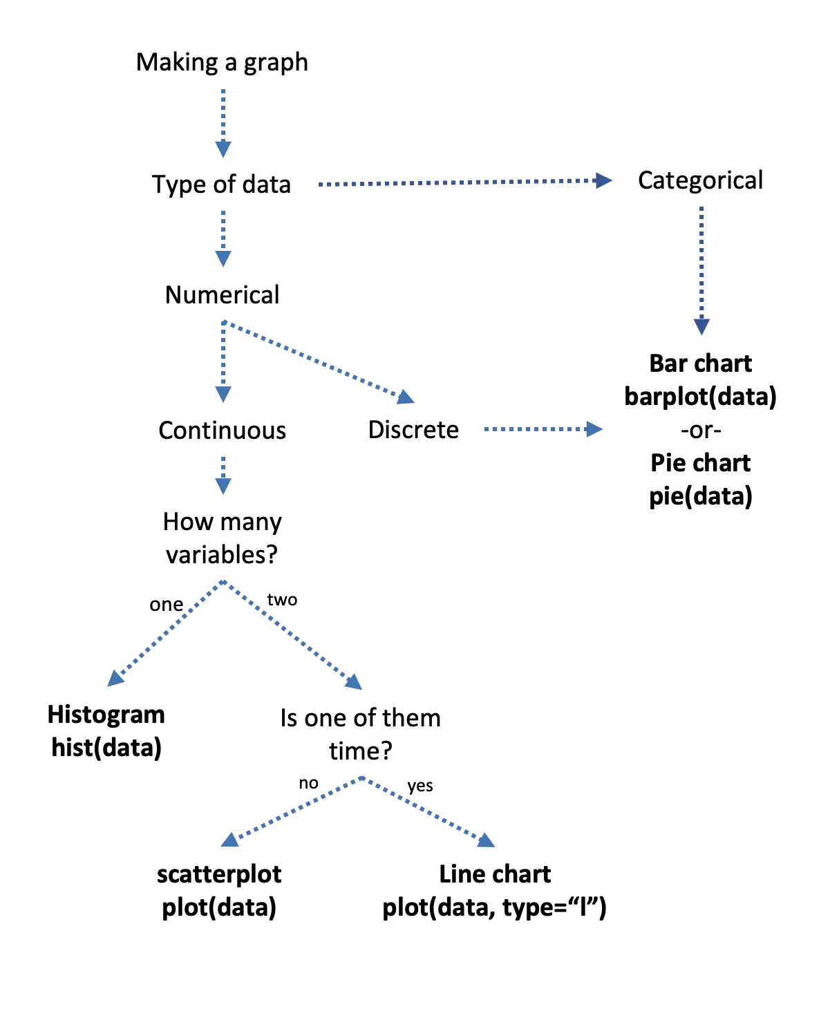
11.1.2.1 Histogram
If you have one variable that you’re interested in graphing, and it’s numerical and continuous the correct choice is to graph it using something called a histogram. Let’s first look at the type of data we’d want to use with a histogram. I’ll print the top 100 lines of age data from a survey on voters below:
##   [1] 41 44 19 29 28 40 47 36 49 44 33 49 28 32 29 47 36 48 28 24 39 32 60
##  [24] 37 31 33 49 28 24 27 31 41 36 48 50 45 23 29 51 32 57 27 30 39 18 58
##  [47] 48 30 37 41 46 26 34 34 34 46 44 34 35 32 51 28 33 40 35 32 49 48 48
##  [70] 37 51 26 49 19 45 31 23 39 28 43 41 50 58 19 29 54 32 40 39 20 32 62
##  [93] 45 37 60 40 33 26 41 28
Why is that data considered continuous and not discrete when it’s all integers? Age could be sub-divided, we could measure age by the number of days or hours or week’s you’ve lived. I am technically, as of writing this chapter, 33.17 years old. Now, I would probably round that to 33 if putting it into a survey, but the unit can be subdivided, unlike the number of items I have in the fridge.
So what I would do to graph that data is use a histogram, such as this:
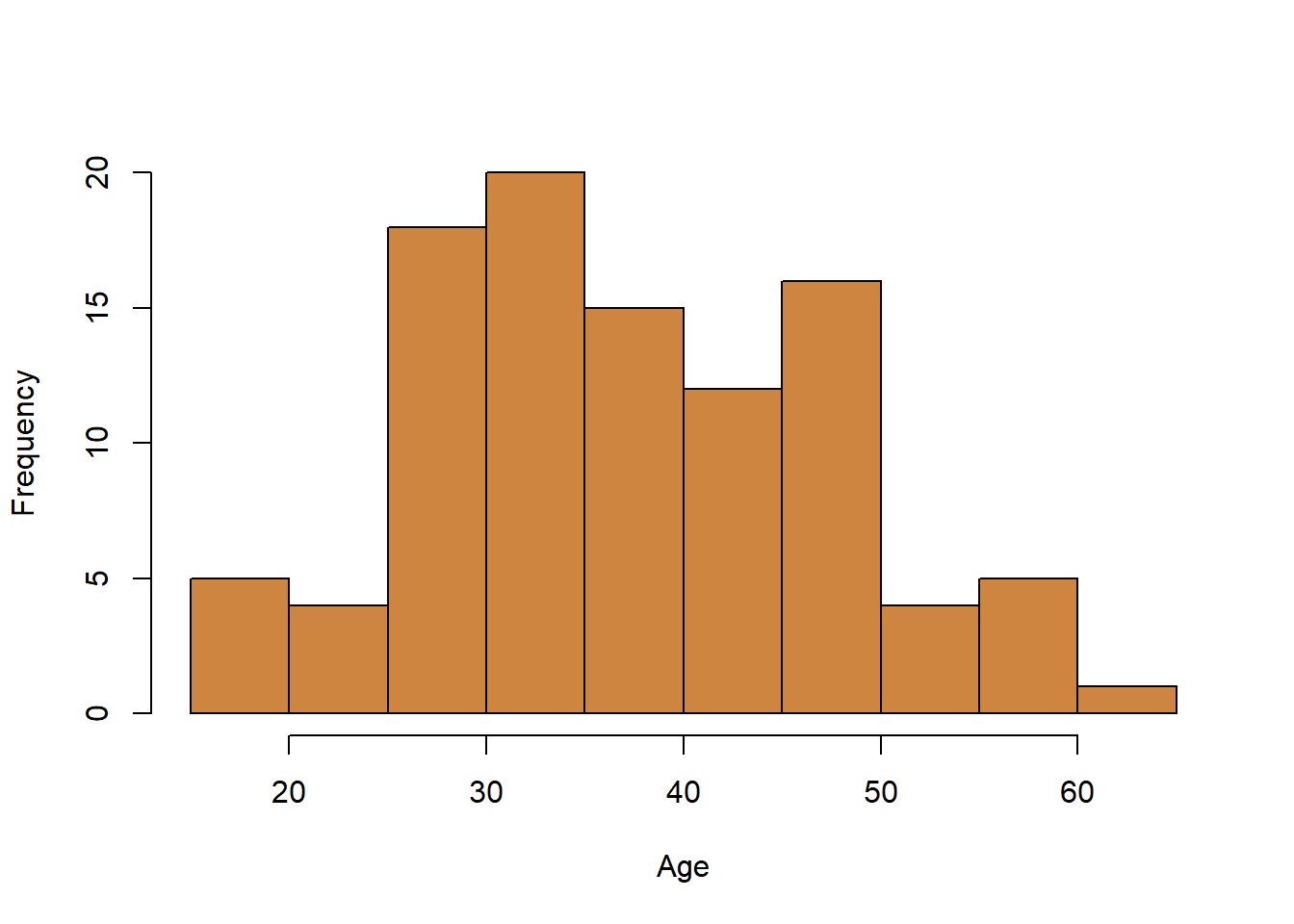
What the histogram is showing is the distribution of your data. by showing each individual observation you have. What R does is break your continuous data into different groupings, and then it counts how many observations or rows in your data are within those groups.
The variable we graphed here is age and what R has done is created intervals of 5 year periods. How many people in the data have an age between 15 and 19? Or 20 and 24? or 25 and 29 and on and on. Here is the same data in table form:
| Breaks | Frequency |
|---|---|
| 15-19 | 2584 |
| 20-20 | 4997 |
| 25-20 | 5596 |
| 30-20 | 5675 |
| 35-20 | 5694 |
| 40-20 | 5221 |
| 45-20 | 5727 |
| 50-20 | 5892 |
| 55-20 | 6470 |
| 60-20 | 6360 |
| 65-20 | 5632 |
| 70-20 | 4215 |
| 75-20 | 4132 |
| 80-20 | 1618 |
| ———- | ——- |
Its the same information, but I think the graph is easier and more attractive to look at. We use a histogram because it gives readers a quick look at all your data and the shape of it. Is it skewed? Where does most of the data fall? You can get a quick idea just from the histogram above of what the largest and smallest values in the data is (although you wouldn’t know exactly) and you can pretty quickly see that the data isn’t heavily group towards one age or another, but is fairly evenly distributed. That is by and large what the graph above is showing, and are the types of things that histograms in generally should be used to show.
Let’s take a look at another histogram for the income of respondents in the same data on voters. What does this graph show?
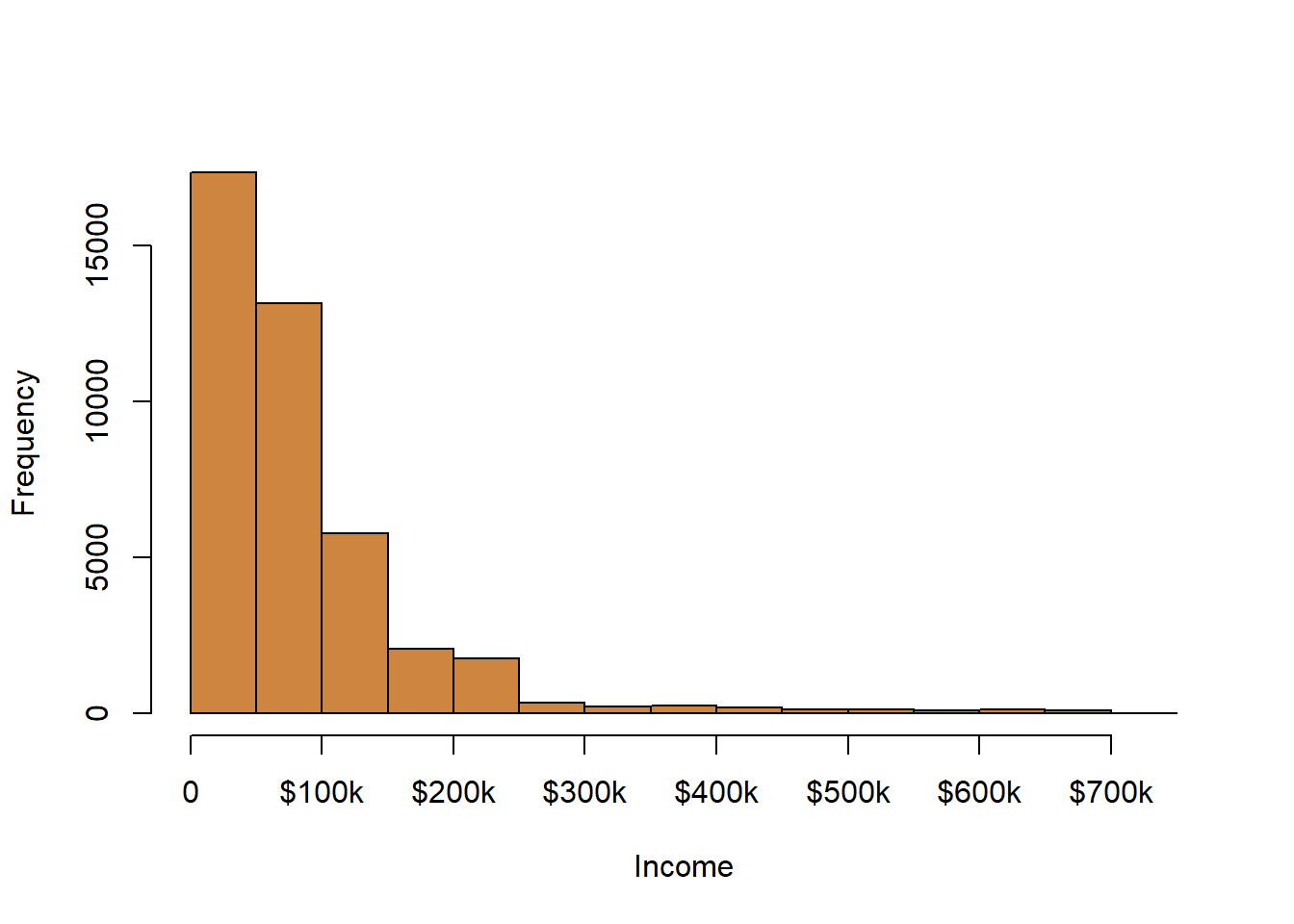
Here the data is broken up into intervals of $50 thousand dollars. As shown, the vast majority of respondents earned less than $100 thousand, with very few responses for those above $250 thousand. Overall we’d say this data is skewed with a right tail. That’s all it’s saying, but that’s also important to say because that might affect how we use this data later (but that’s getting ahead of ourselves somewhat).
Histograms are good for showing the distribution of your data when you have one continuous variable you want to graph.
11.1.2.2 Line Chart
With a histogram we were only looking to graph one continuous variable at a time, whether age or income or something else. A second variable is sort of generated by the counts or frequencies that are put on the y-axis of the graph, but we’re only concerned with the one value in our data set.
Sometimes though we want to look at two variables, and in particular the relationship between two variables. If one of the variables we’re interested in is time, a line chartis probably the best choice. A line chart is ideal for showing the changes that one variables has undergone over time.
Before we go forward, let’s quickly review the anatomy of a graph. The y-axis always runs up and down (vertical) on the graph, and the x-axis runs side to side. The reason that’s important to memorize is so that if someone says something like “you should graph time on the x-axis” you sort of immediately picture what that means.
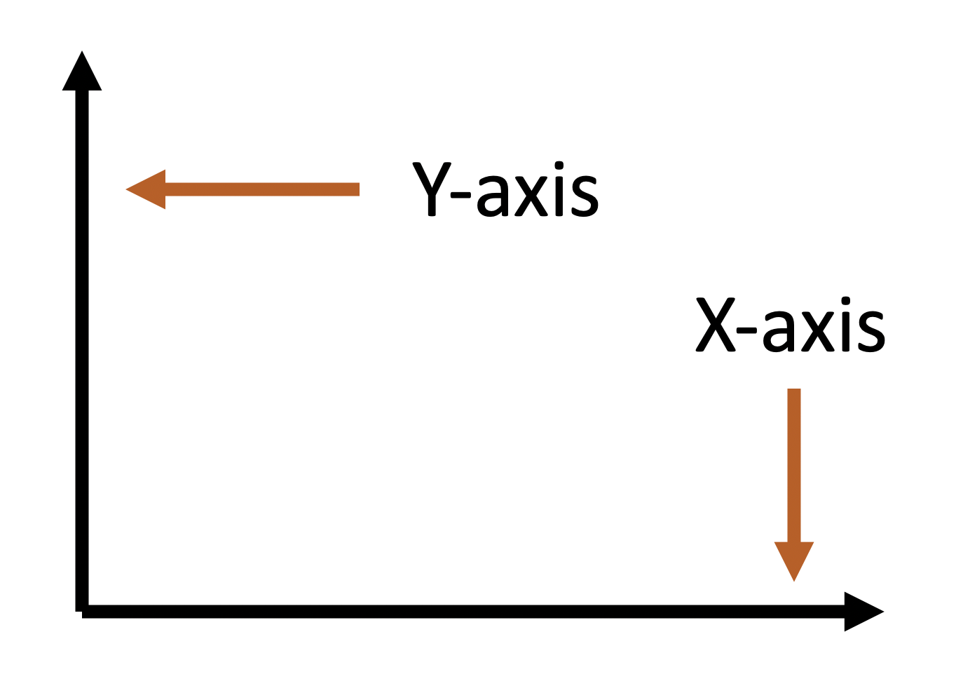
You should graph time on the x-axis, and whatever variable you’re interested in seeing the change in should go on the y-axis. Is it possible to do it the other way? Mechanically, yes. But it will probably look odd to other people because they’re conditioned to see time on the x-axis.
What might we want to graph using a line chart? First and foremost, something that has changed over time. For instance, let’s see how the population of the United States has changed between 1790 and 1970.
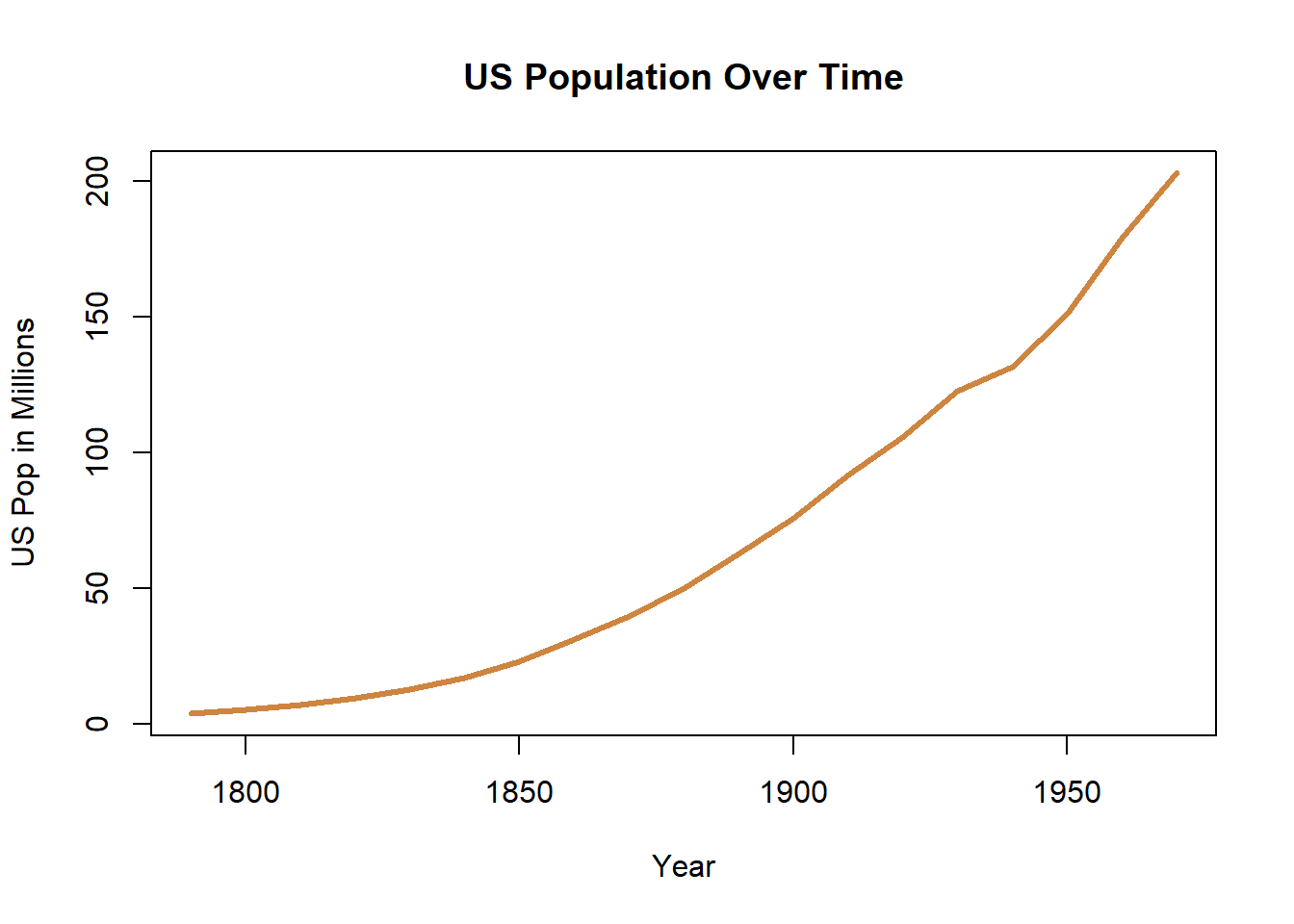
What’s the story? The population of the US has increased over time. That’s not a revolutionary story, but the graph communicates that very clearly. Not every graph is actually worth 1000 words.
A line graph typically has few observations (we have 16 here) and they are all connected in a continuous line (time only moves forward). One great feature of line graphs is that we can add a second line (or more). Let’s take a look at voting in Louisiana for Republicans and Democrats in presidential elections.
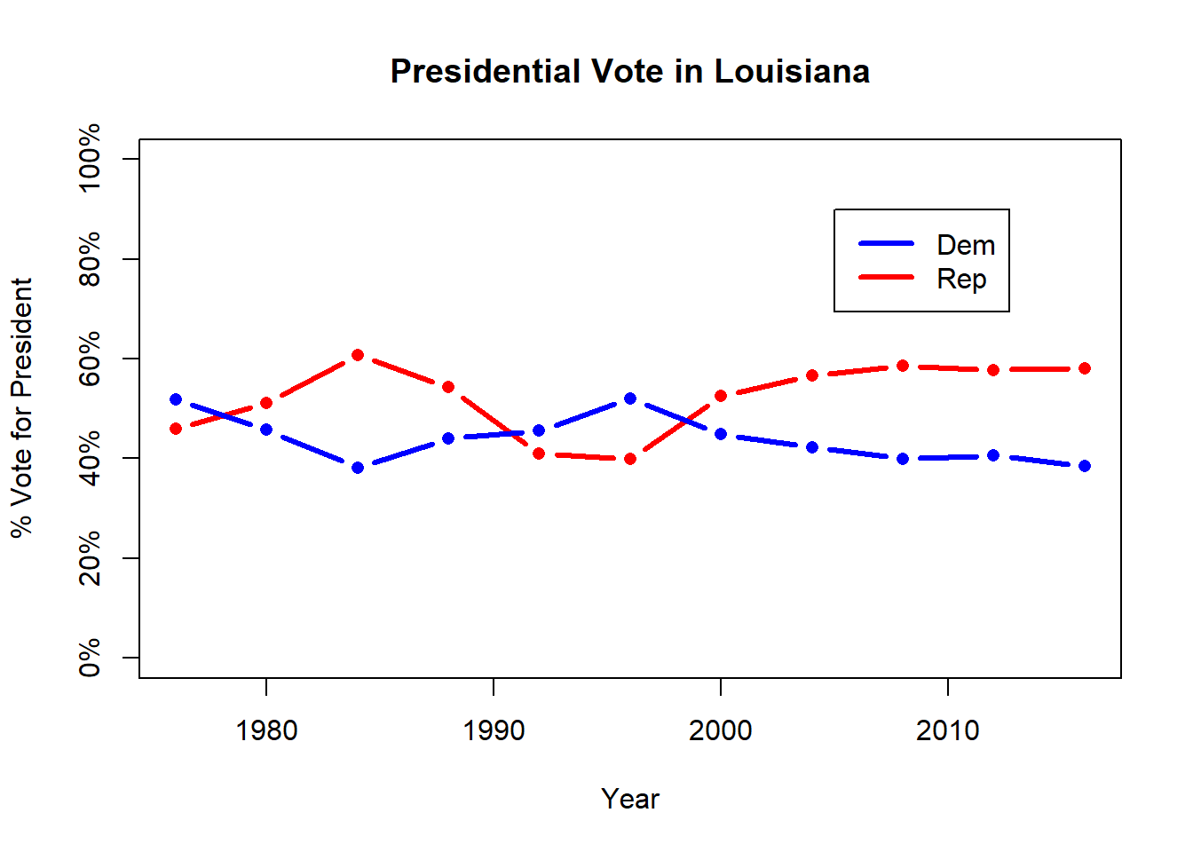
What’s the story? Republicans typically win Louisiana, and the relationship has become very stable the last few elections. If you do add a second line to a line graph, it’s important to add a legend to identify which line is which. We’ve used the traditional colors of the Republican and Democratic party so it might be clear with a legend in this case, but if you handed this to an alien from Mars they wouldn’t know that.
So a line graph is best for data that has a linear relationship to it. The percentage vote for Democrats and Republicans on the y-axis can move up or down, but it can’t move back and forth. Time moves forward, so it’s easy for the line to connect the dots. The line signifies that each of those observations for the Democrats and Republicans are connected or related. That’s not always true, some data can move in either direction on both the y and x axis, and in those cases a different graph would be better.
11.1.2.3 Scatter plot
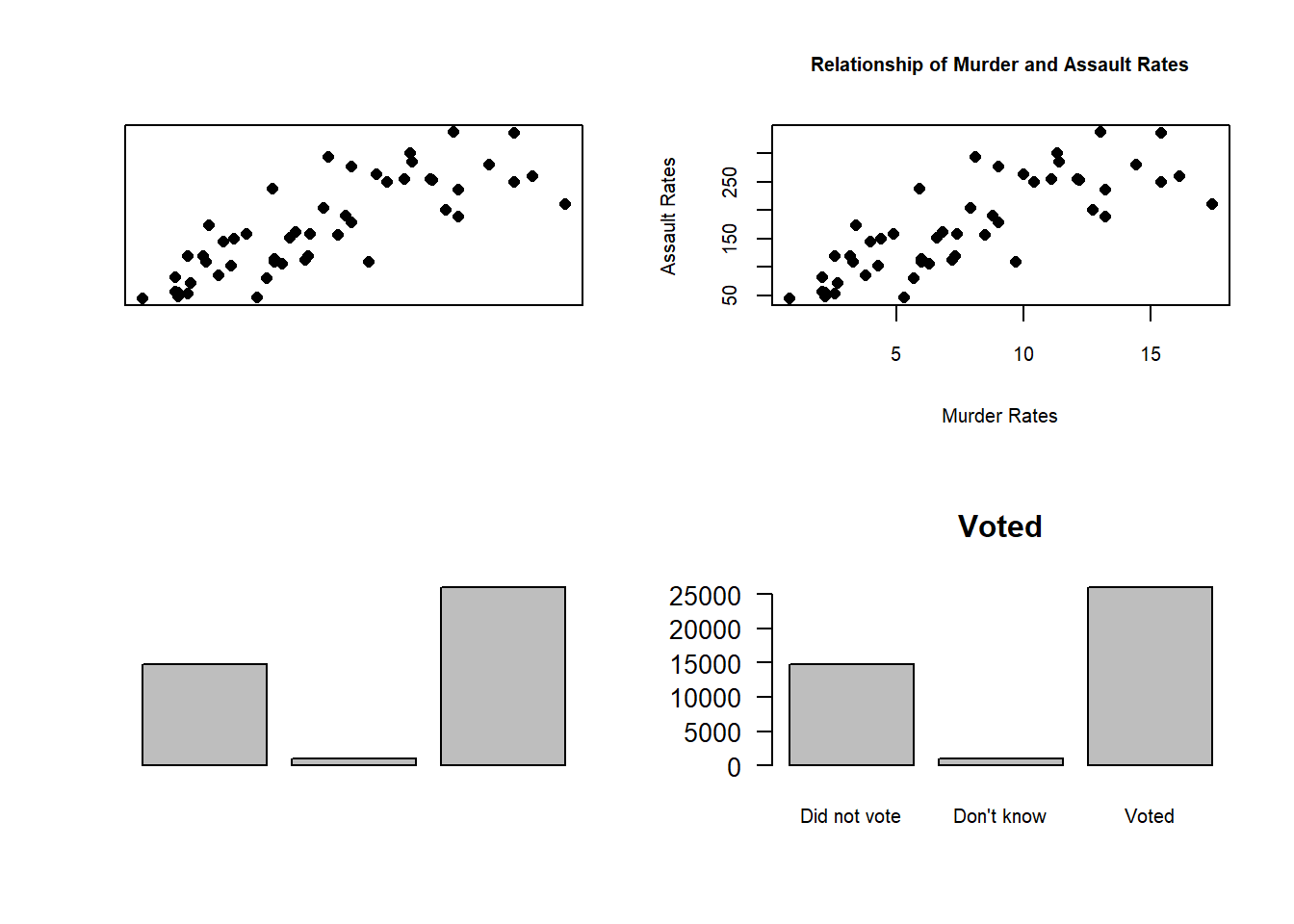
When you want to graph two continuous variables from your data and neither is time a scatter plot is the most likely way forward. Scatter plots are an excellent way to see if there is a relationship between the variable on the x-axis and the y-axis. We used a line chart to see if the variable we were graphing changed over time. With a scatter plot we want to see whether differences in the value of the x-axis is associated with changes in the y-axis. For instance, let’s graph some data for crime rates in US states, and see if there is a relationship between the murder rate in a state and the assault rate.
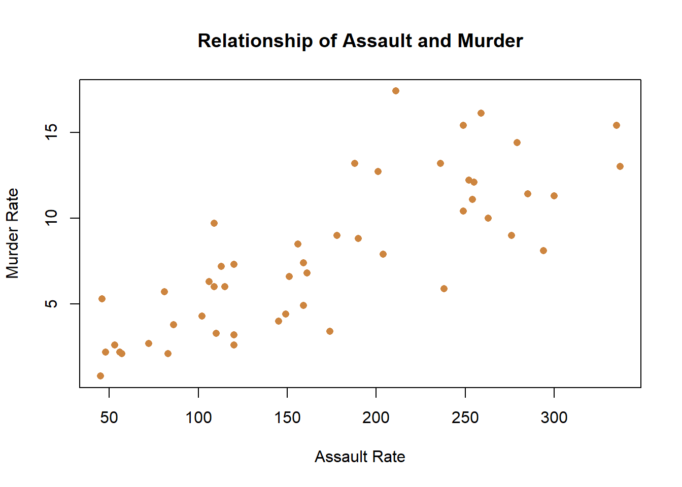
A scatter plot gets its name from the way that data scatters across the graph. Whereas in the line chart the data was connected with a line because the observations were linked across time, here each point is an individual state.
What’s the story? That data is very scattered, but it does show a relationship. Knowing the assault rate of a state would help you to predict the murder rate. That is, states with higher assault rates (further to the right on the x-axis) have higher murder rates (higher on the y-axis), and vice versa. That’s good to know if you’re wondering what a state’s murder rate is, but you only know the assault rate. They aren’t perfectly related, knowing one doesn’t exactly predict the other, but it’s a useful relationship.
Two variables don’t need to have a clear relationship to be graphed using a scatter plot. For instance, let’s graph the percentage of people in each state that live in cities and the murder rate, and see if there’s a relationship.
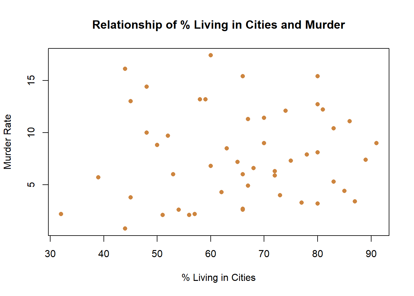
What’s the story here? The story is that there is no relationship between the two variables. Knowing that a state is higher on one doesn’t help you know if it’s higher on the other. The graph shows the lack of a relationship fairly clearly. That isn’t necessarily bad, but if I was trying to write a paper about how the percentage of people living in cities was predictive of the murder rates at the state level I would be worried. It’s pretty clear from that one graph that my paper isn’t going to return an interesting finding, since there clearly is no relationship.

11.1.2.4 Bar Chart
If your data isn’t continuous you have other options, and generally discrete numerical data or categorical data (either nominal or ordinal) can be graphed in the same way.
With categorical or discrete data a bar chart is typically your best option. A bar chart places the separate values of the data on the x-axis and the height of the bar indicates the count of that category. Let’s demonstrate.
In the data on voters that we’ve used a few times there’s a column indicating whether the survey respondent had voted or not in the November 2018 election. Let’s see how many of the respondents voted.
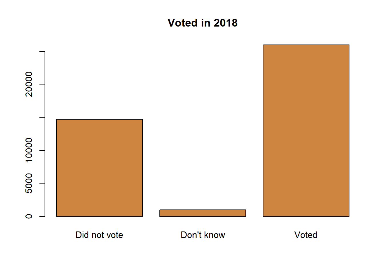
What’s the story? Most of the survey respondents reported having voted. Almost twice as many people said they voted as admitted to not voting, and small share of the respondents couldn’t remember. That is displaying information for one nominal variable.
What about an ordinal variable? If our data has an order (going from a natural order of high to low) we typically want to make sure that our graph communicates that.
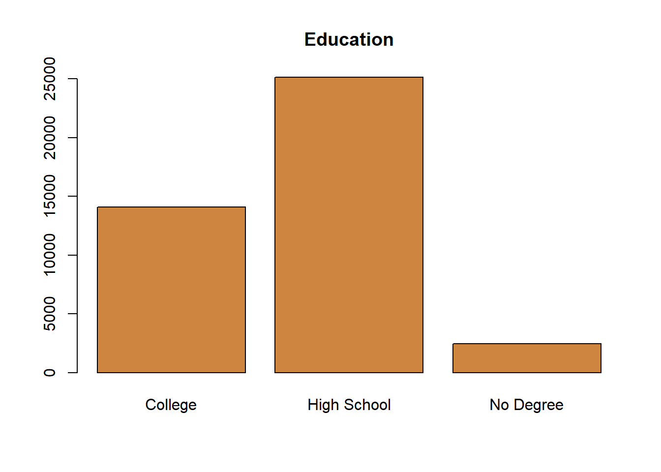
Bar charts can also work for discrete data, particularly when there aren’t very many different options in the data. Take for instance the number of children for respondents on a survey.
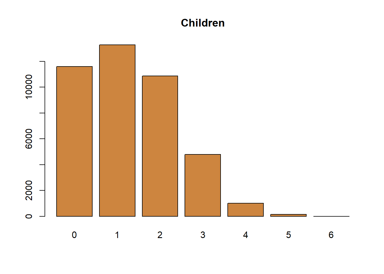
The data is numeric, but because each value is discrete you want to show each value individually. For instance, you may see someone use discrete data as part of a line graph, like below.
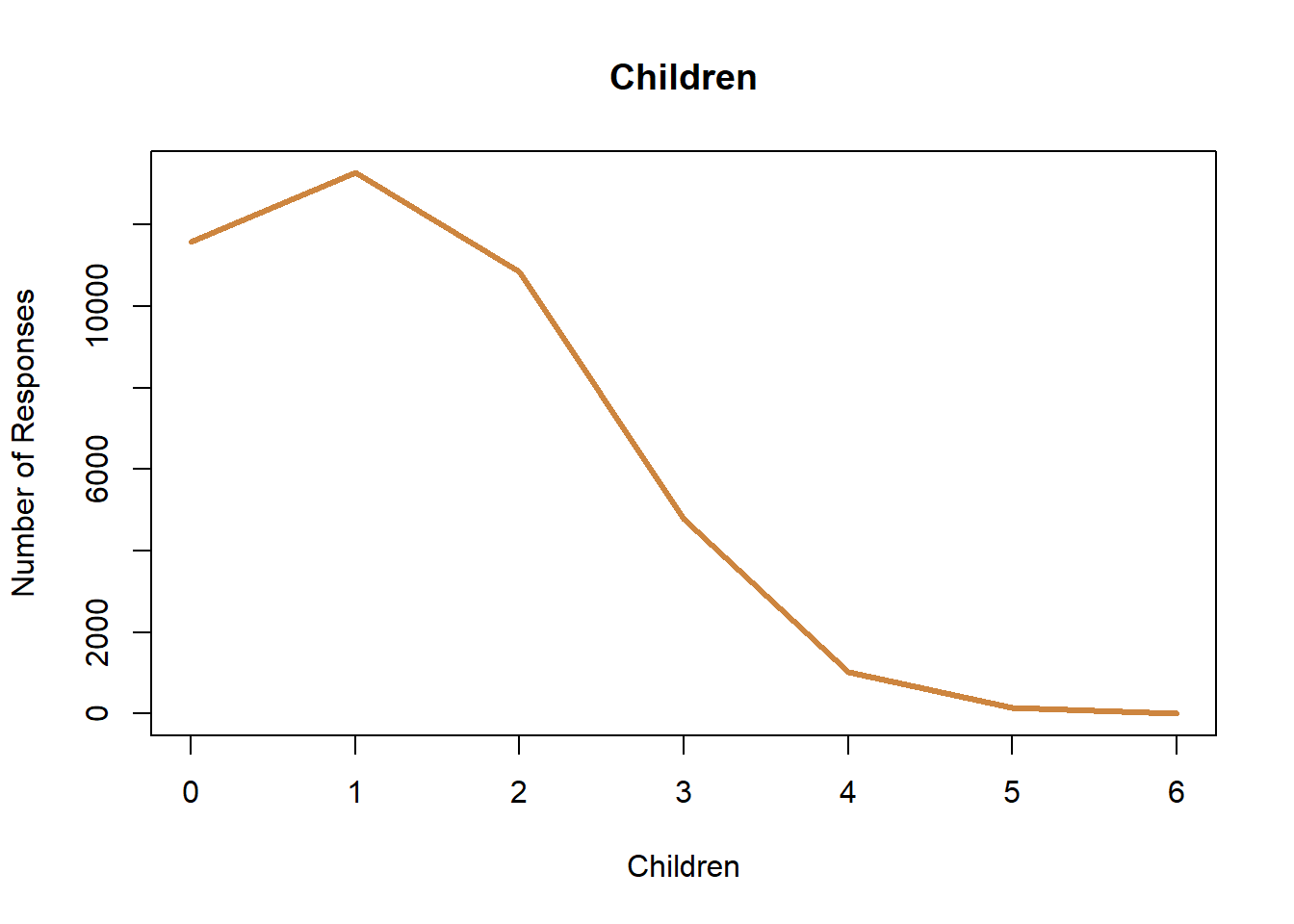
That does communicate the same information. If you look at it you can tell most of the respondents had 2 or fewer children, and you can identify how many responses there were in each category. But, I have a problem with the graph in general. The line connecting the points implies there’s some value for 1.5 children, which is just impossible. With continuous data there are values between those points, but with discrete data there aren’t. Discrete data is more similar to categorical data, than numeric in that way. That’s why I think a bar chart is the appropriate choice.
11.1.2.5 Pie Chart
You know what also isn’t appropriate? A pie chart. Not because it’s actually wrong for the data, but just because it’s bad at communicating information. A pie chart occasionally can be as good as a bar chart, but it will never be better and often times will be worse. As such, I just don’t recommend using them. There are a few big problems with pie charts. One is the lack of natural scale for communicating data to readers, and the second is the way they get crowded very quickly. Let’s start by talking about scale, by comparing a pie chart with a bar chart.
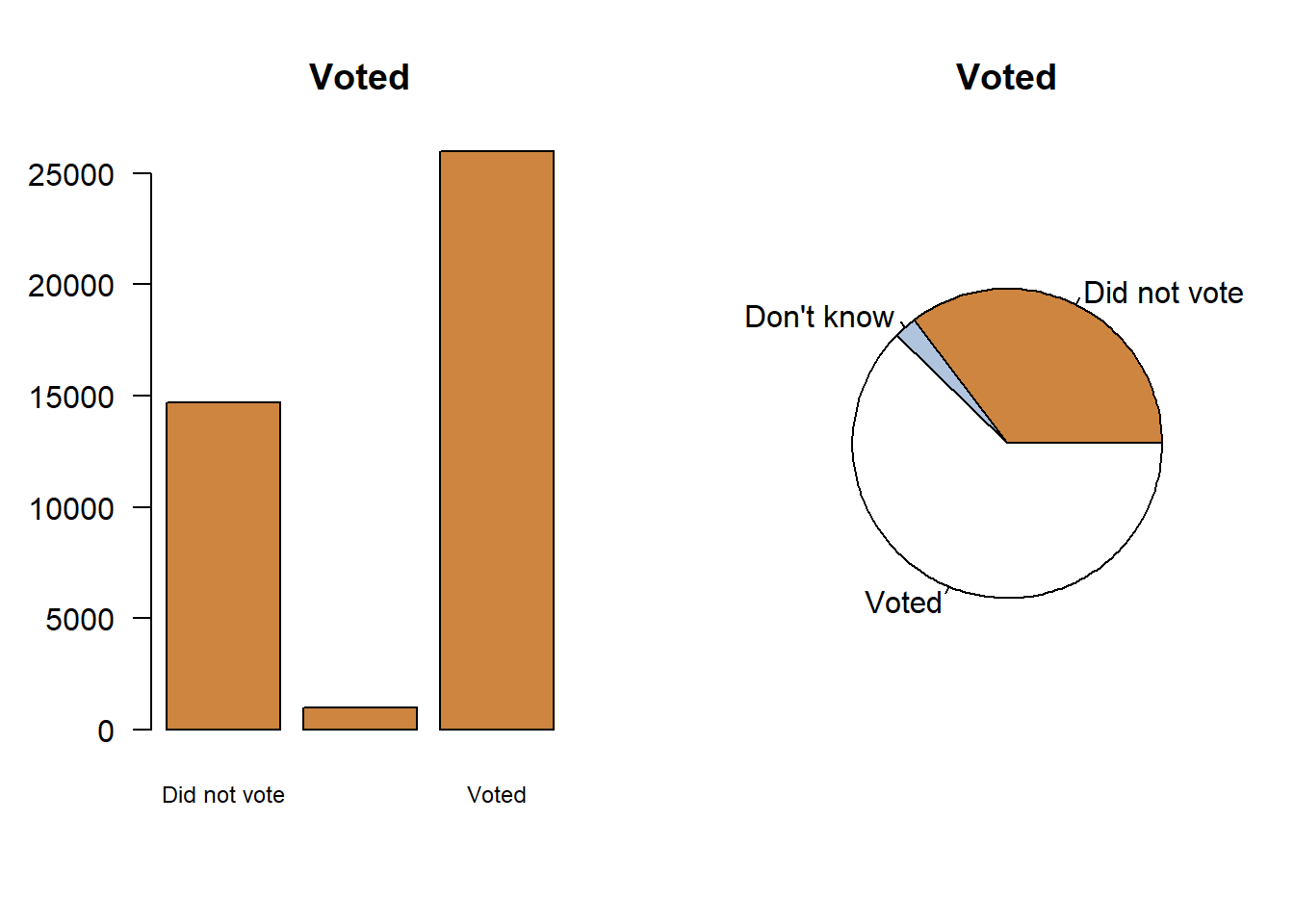
You can tell that most people in the survey voted with either graph. How many people voted though? We can add that detail to the pie chart, and move the labels to a legend.

So that’s an extra step to make the two graphs equivalent. You might prefer the pie chart, but it really doesn’t add anything and is typically a little harder for the reader to quickly interpret. And it gets worse if you have a lot of categories in your data. Let’s look at what happens if I make a pie chart for the number of children people have.
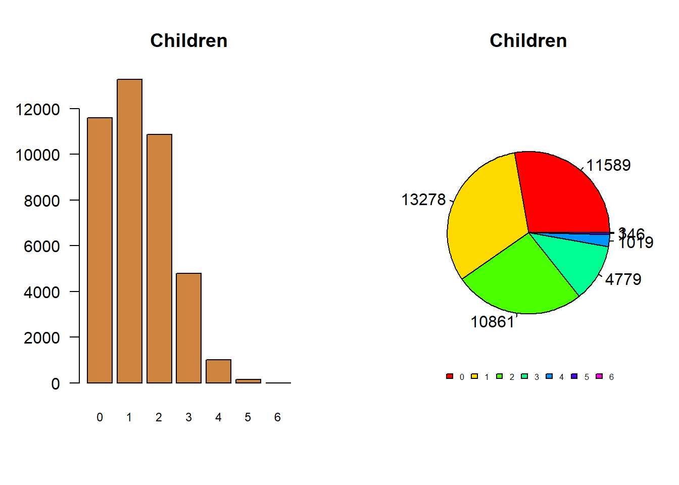
It’s just a lot of information to cram into a pie chart, which we had no problem doing with the bar chart. Which is to say again, a pie chart can be about as good as a bar chart, with a few extra steps, but I’ve never seen one that was better. As such, it’s best to throw them out.
11.1.3 Good graphing habits
I know I’ve said it before, but the most important thing to keep in mind in creating a good graph is just to ensure that it tells the story you want. That can mean making the graph more or less complex. More data and information can obscure the message you want to send, but making it too simple may make it less visually interesting and difficult to identify what is being communicated. As with most things in research, it’s a balancing act.
I’ll walk through three rules for creating good graphs here.
11.1.3.1 Labeling
Same information, same data: Which one tells the story more clearly? Clearly the two graphs on the right, where the axes are labeled and there is a title. If you don’t provide clear labels for your axes people wont be able to make sense of what the data is shown.
Rule 1: label your axes.
11.1.3.2 Colors
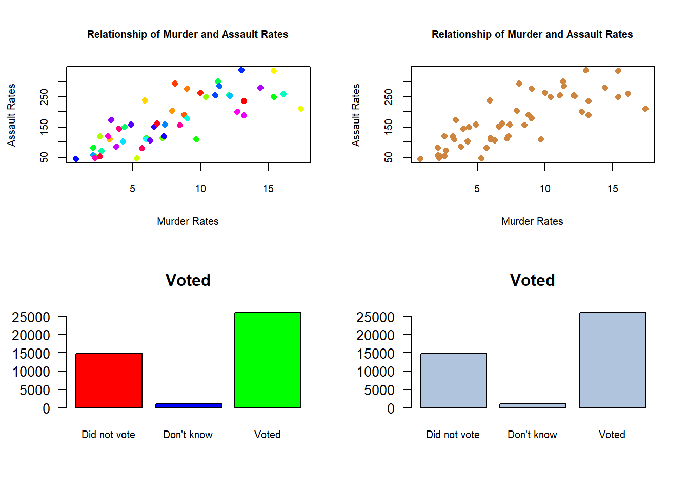
Color can be really useful and add some “pop” to your graph. But too much color can become distracting. The human mind likes differences, but make sure every different color you use is communicating something unique and meaningful.
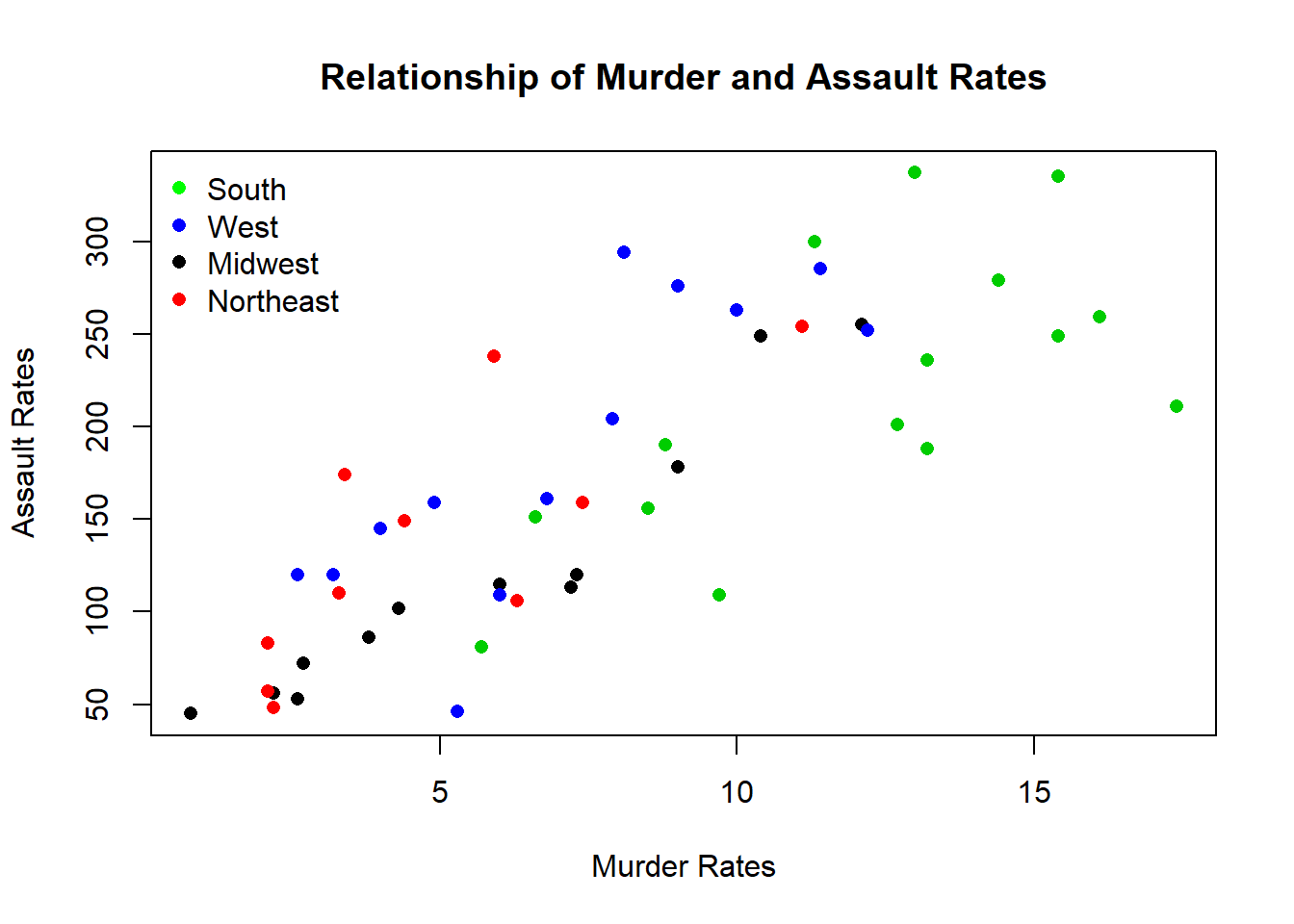
Adding a separate color for different regions adds some new information to the graph. Now you can see that Southern states typically have higher murder rates, and the Midwest and Northeast are typically lower on both measures. What’s important is that I should only add that information if it’s part of the story I’m trying to tell. I could do a lot of things on this graph, I could make each dot represent the number of young people in the state, or make the colors gradient based on spending in schools - there are a lot of other parts of data I could layer on. But I only want to layer that on if it’s part of the story I’m trying to tell. Is differences across regions important to my researcher question? Otherwise it’ll be just more of a distraction.
Rule 2: every color should have a purpose.
11.1.3.3 Fit the data
One of the great things about R is that it’ll set the size of the axes for you automatically, based on the data you’re using. But it’s still important to think about how the use of axes can shape or reshape your interpretation of a graph. For instance, let’s say your city is considering increasing sales taxes by .5%.
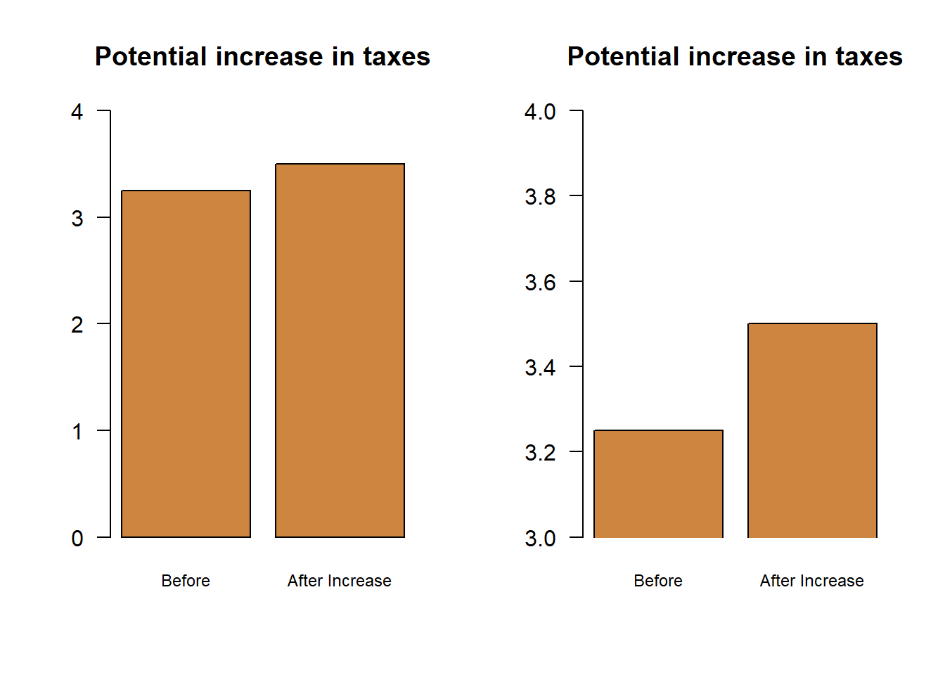
Same data, same information: Which one makes the change look bigger? The graph on the right makes it look like the tax is doubling, while on the left the change is much smaller. That’s despite the fact that the change is exactly the same in reality. I adjusted the y-axis to show more or less information, which helps to shape the story the graph is telling. A bar plot should always start at 0, so that viewers can appreciate the total size of the bars.
But not every graph needs to have the 0 for the y axis showing. Let’s look at the crime data again.
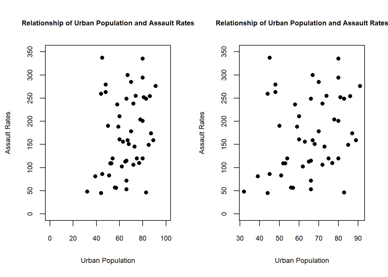
In the graph on the left we force the x and y axis to show 0, and this creates a bunch of blank space with no data points. With the bar plots above there is data at 0, so showing the full length of the bar makes the graph more honest. Here we haven’t changed the graph to change the message, we’ve just added useless space that doesn’t communicate any new information.
There’s actually a pretty famous example (in data science communities) of how changing the y axis car distort data. Let’s look at the graph below, which shows up on blogs and articles that are skeptical of climate change. It’s a bit out of date, but the interesting point will still hold.
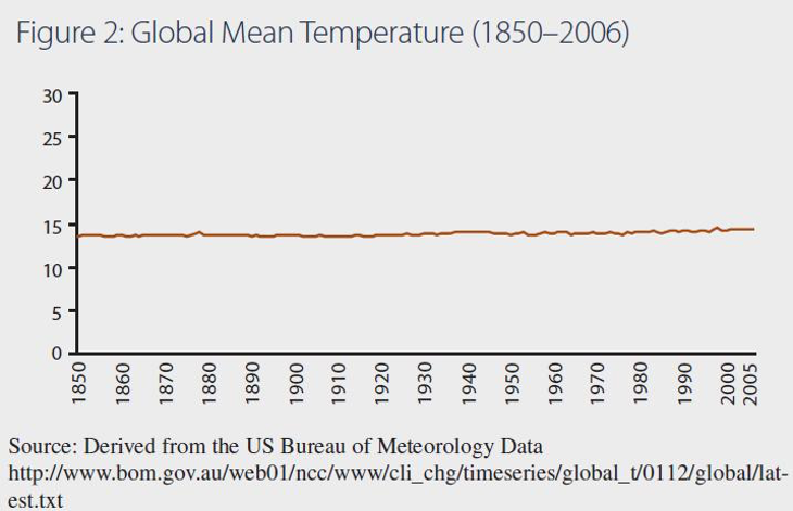
That shows a really small change in temperature as the line has barely moved as a result of warming, so what’s the big deal? The issue isn’t just that the y-axis is large, but that makes any change look small. But the fact that such space is empty is part of the point right, temperatures haven’t changed that significantly! Except, if temperatures change that significantly there probably wouldn’t be anyone left around to graph it.
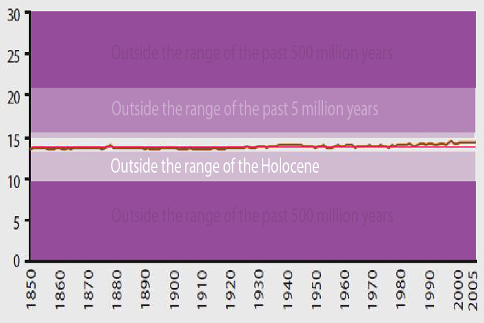
I didn’t make this, if I could figure out who did I’d credit them
Those values aren’t just absent from the data, but well beyond what anyone should expect to observe based on the last 500 years of the Earth’s history. If you shrink the graph to just the types of values that humans have experienced in their 300,000 years of existence the change in temperatures appears a lot larger. Same data, very different story.
Rule 3: Make sure the graph fits the data.
11.2 Practice
We’ll use 3 different commands to create the 4 plots described above. We’ll both create a very very basic plot for each, before showing all of the options we can customize to create an attractive and professional graph. The default options are sufficient if analyzing the data for yourself, but you’ll want to put some gloss on the graphs before using them as part of a project.
One of the great things about creating a graph in R is the number of options you can customize to make your graph look exactly the way that you want. But before we talk about the options, we should first get the basic graph down. You should generally start with a basic or plane graph to see how the default options make the data look, before beginning to add your customizations. In particular, different options may be more or less applicable depending on the type of graph you choose.
11.2.1 Scatter plot
We’ll start with a scatter plot, and we’ll slowly build out the options to see how they affect the resulting graph. Then we’ll move to a few other types of graphs where we can see if those options apply. Recall that a scatter plot is best for showing the relationship between two continuous variables.
To create a basic scatter plot you’ll use the command plot() and provide it a variable to go on the x-axis and a variable to go on the y-axis. Let’s create a scatter plot using the data on California schools we used in the last chapter, and look at the number of students on the x-axis and the number of computers on the y-axis
CASchools <- read.csv("https://raw.githubusercontent.com/ejvanholm/DataProjects/master/CASchools.csv") ## Loading in the data
plot(CASchools$students, # x variable
     CASchools$computer) # y variable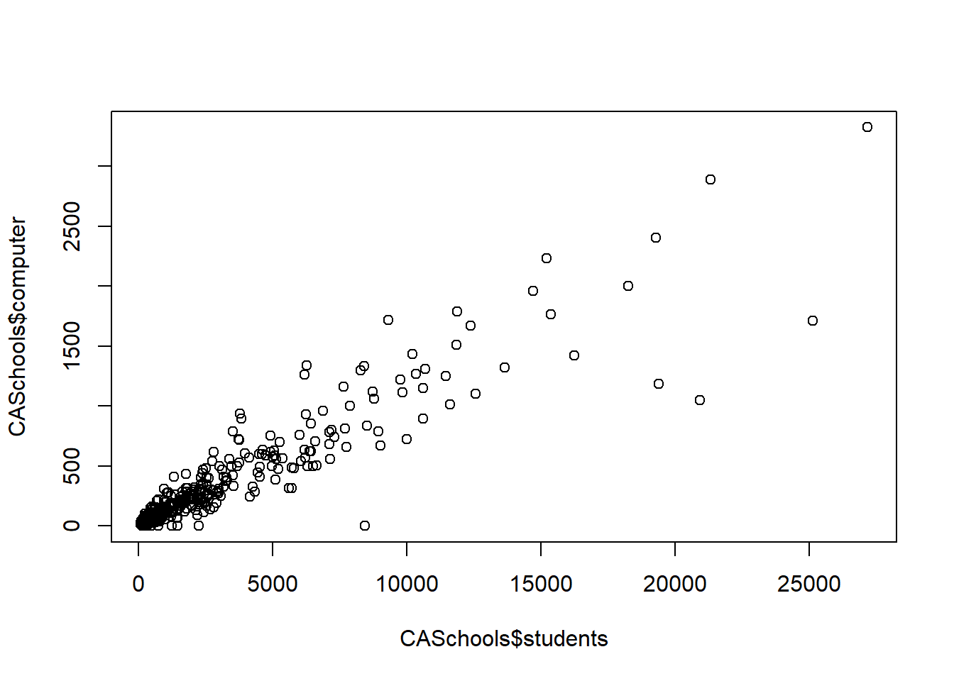
Let’s start by adding some color. The default option in R is black, but R is full of options. I should reemphasize though that you don’t have to, because black and white is great. But sometimes you’ll want to add a little color just to add something special.
Take a look at this link with a full list of colors that are available, but there’s a snapshot below. You can also start by entering typical names of colors like red, blue, purple, etc.
To change the color we add col to the plot command and insert the name of the color we want.
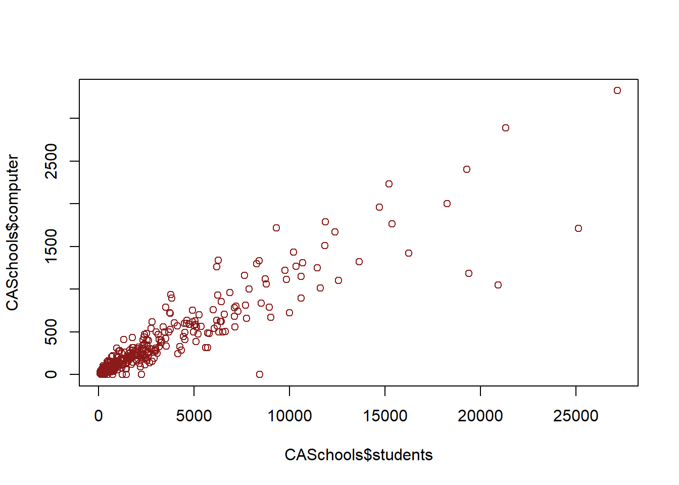
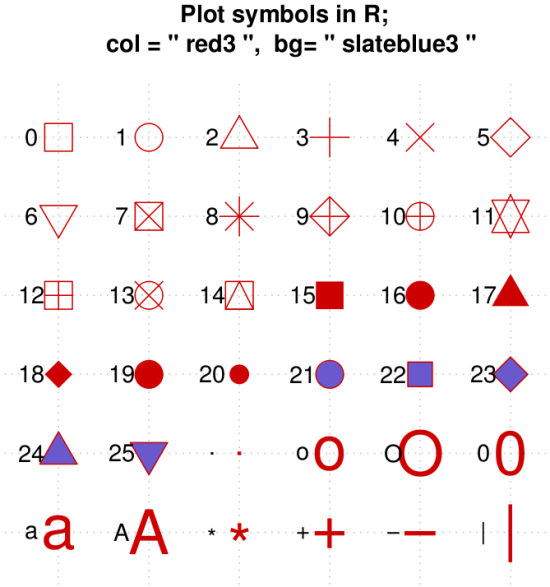
We can also change the shape of our dots using the option pch. pch stands for point character, if that helps anyone remember. I typically use number 16, but other options can look great too.
plot(CASchools$students, # x variable
     CASchools$computer, # y variable
     col="firebrick4",  # color
     pch=16) # shape of dot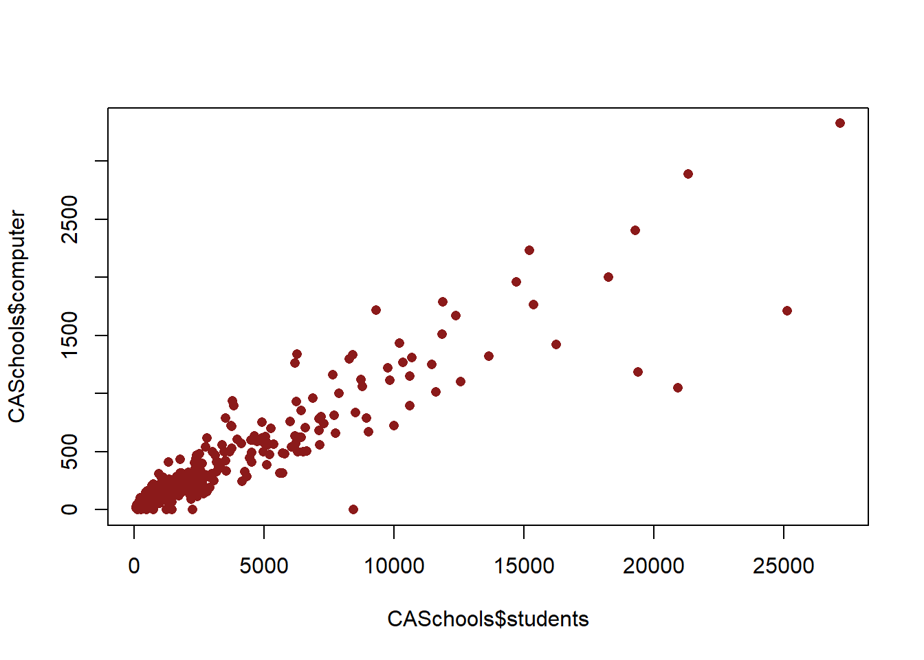
Let’s follow rule #1 though an label things appropriately. You can see that the axis are labeled automatically based on exactly the data we used in the plot command. That’s a) doesn’t look great and b) isn’t always clear. In order to label the x axis we use the option xlab, and for the y axis it is ylab. And we can add a title to the plot using main
plot(CASchools$students, # x variable
     CASchools$computer, # y variable
     col="firebrick4", # color
     pch=16, # shape of dot
     xlab="Number of Students", # x axis label
     ylab="Number of Computers", # y axis label
     main="Students and Computers at California Schools") # title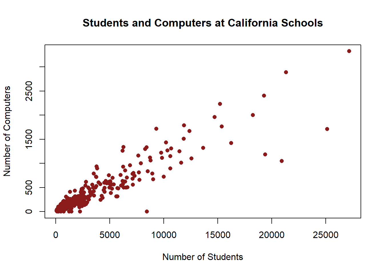
That’s a pretty good basic graph, that looks somewhat attractive and has all the information we’d want to provide someone so they can understand the basics of what the graph shows.
Alright so we worked with several options in creating our scatter plot above, many of which we’ll want to use on other types of graphs too, so let’s review:
- col changes the color
- pch changes the shape of the dot
- xlab changes the label on the x axis
- ylab changes the label on the y axis
- main changes the title
11.2.2 Line Chart
In order to create a line chart we use the same command as above, but we activate an option to turn it into a line chart. We need some different data for a line chart, because as you’ll recall we only use line charts for data to look at changes over time. Since the California Schools data is only from one year, it isn’t an appropriate choice of graph for any of the variables.
We’ll read in some data on the electoral college for our line chart. It has data on the vote in the electoral college (not the popular vote) in each presidential election. Since this is the first time we’ve used that data, let’s take a quick look at the top few lines.
ElectoralCollege <- read.csv("https://raw.githubusercontent.com/ejvanholm/DataProjects/master/ElectoralCollege.csv") ## Loading in the data
head(ElectoralCollege)
## ï..Rank Year Winner Total Winner.1
## 1 1 1788 George Washington[f][g] 69 69
## 2 2 1792 George Washington[f] 132 132
## 3 55 1796 John Adams 138 71
## 4 53 1800 tie: Thomas Jefferson, Aaron Burr[b] 138 73
## 5 7 1804 Thomas Jefferson 176 162
## 6 29 1808 James Madison 175 122
## Runnerup Normalized.victory.margin Percentage Party
## 1 34 1.000 100.00 Federalist
## 2 77 1.000 100.00 Federalist
## 3 68 0.029 51.45 Federalist
## 4 65 0.000 52.90 Democratic-Republican
## 5 14 0.841 92.05 Democratic-Republican
## 6 47 0.394 69.71 Democratic-Republican
## BirthState Region
## 1 Virginia South
## 2 Virginia South
## 3 Massachusetts Northeast
## 4 Virginia South
## 5 Virginia South
## 6 Virginia SouthLet’s graph the percentage vote in the electoral college for the winning candidate. We’ll start with a basis plot with no options to see how that looks. We’ll put the variable Year on the x axis and Percentage on the y axis.
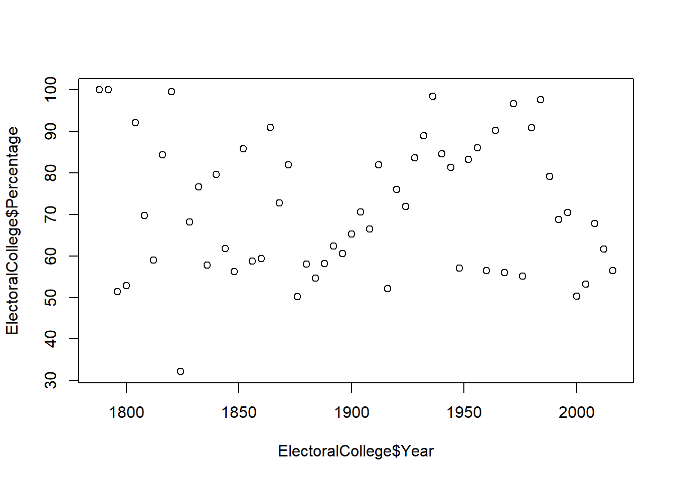
Interesting, that looks a lot like a scatter plot. R isn’t necessarily wrong to graph the data this way, years look like a continuous variable unless you know they represent time. However, we can modify how the data is presented by telling plot what type of graph we want. We’ll set type equal to “l” to tell r we want a line chart.
plot(ElectoralCollege$Year, # x variable
     ElectoralCollege$Percentage, # y variable
     type="l") # type of plot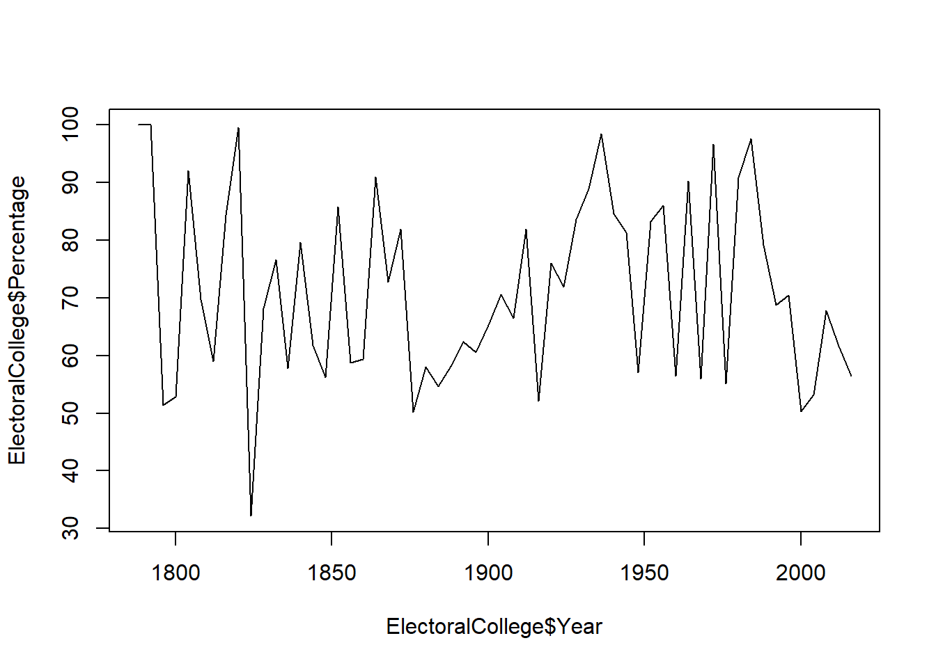
We can also make the graph have both a line connecting the points and a dot at each point with the option type=“b”. And we can change the size of the line with lwd which is short for line wwidth.
plot(ElectoralCollege$Year, # x variable
     ElectoralCollege$Percentage, # y variable
     type="b", # type of plot
     lwd=3) # line width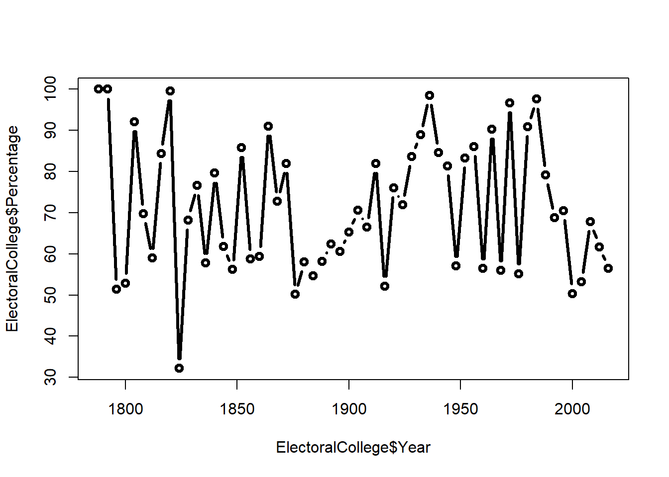
Okay, now let’s flex those options we used on our earlier scatter plot and change the color, type of dot, and labels on the graph.
plot(ElectoralCollege$Year, # x variable
     ElectoralCollege$Percentage, # y variable
     type="b", # type of plot,
     lwd=3,
     col="steelblue", # color
     pch=15, # shape of dott
     xlab="Year", # x axis label
     ylab="Voting Percentage", # y axis label
     main="Share of Electoral College Votes for Winner") # title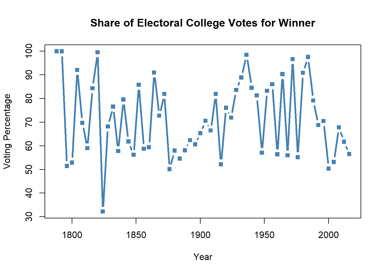
11.2.3 Histogram
Next let’s create a histogram that shows the number of students at each school in California . This is a good moment to think or look back to remember what a histogram is used to show. The answer is the distribution of one continuous variable. For this example, let’s look at the distribution of the number of students across schools in California.
In order to create a histogram we use the command hist(). We’ll start with a basic histogram with none of the options activated in order to get a feel for the graph.
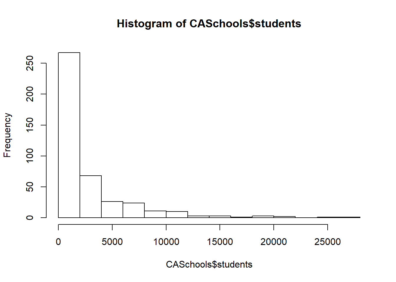
What do we want to change to make this graph look better? The x label shows the variable we used again, so we’ll want to change that to make it more readable. On the other hand, the label on the y axis is “Frequency” by default for a histogram, so I think we can leave that; I don’t think there’s a better way to describe what that axis shows. The title is just the name of the graph, so we’ll want to edit that too. And we can add some color. I’m going to change all those features in one step this time.
hist(CASchools$students, # data
     col="firebrick3", # color
     xlab="Number of Students", # x axis label
     main="Distribution of Students in California Schools") # title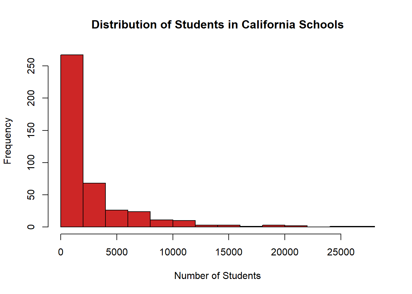
Let’s add two more options that apply only to histograms. R automatically generates the size of the categories for the data. But we can specify that we want it to print more or fewer bars with the option breaks. If we set breaks=20 there should be 20 bars on the final graph, rather than the whatever default R decides on.
hist(CASchools$students, # data
     col="firebrick3", # color
     xlab="Number of Students", # x axis label
     main="Distribution of Students in California Schools", # title
     breaks = 20) # number of bars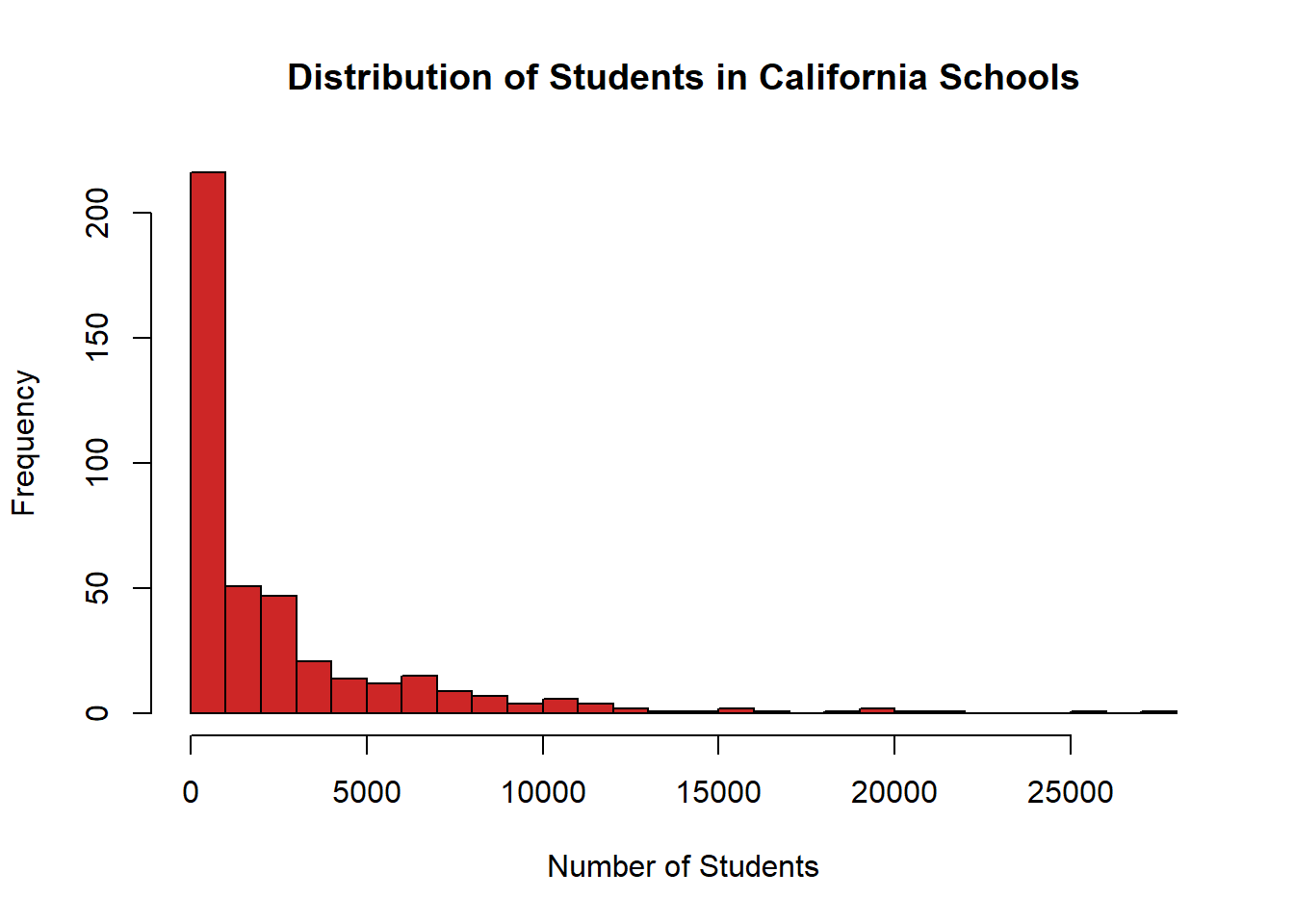
More bars, smaller categories. We can adjust it the other way and tell R we want the categories to be bigger and have fewer bars.
hist(CASchools$students, # data
     col="firebrick3", # color
     xlab="Number of Students", # x axis label
     main="Distribution of Students in California Schools", # title
     breaks = 5) # number of bars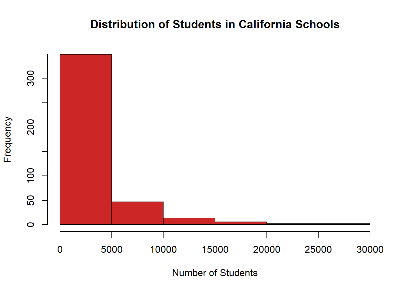
11.2.4 Bar Charts
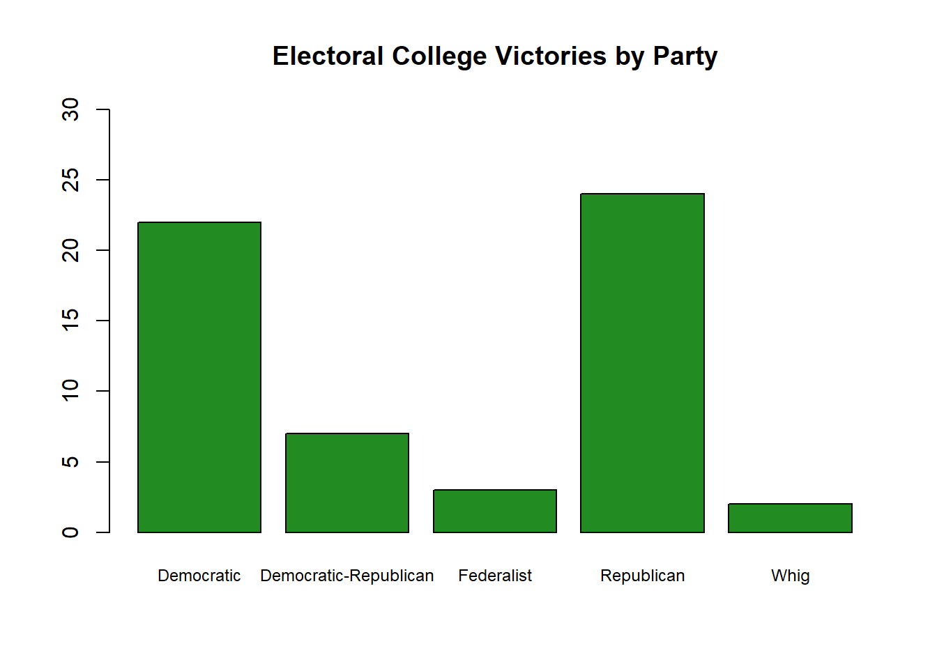
Last but not least we need a bar chart. Let’s jump back to the data on the Electoral College and make a bar chart to show how many times each party has won the electoral college.
We’ll need one significant extra step to make a bar chart. A bar chart wants to show how many time any value shows up in our data. It isn’t plotting each data point individually, like we did in a line graph, but rather how many times each category collectively is in our data. In order to change our data so that it is just a list of the unique values and the number of times they are present we need to create a table.
##
##            Democratic Democratic-Republican            Federalist
##                    22                     7                     3
##            Republican                  Whig
##                    24                     2
And the great thing is we can feed that table directly into the command barplot() to graph it.
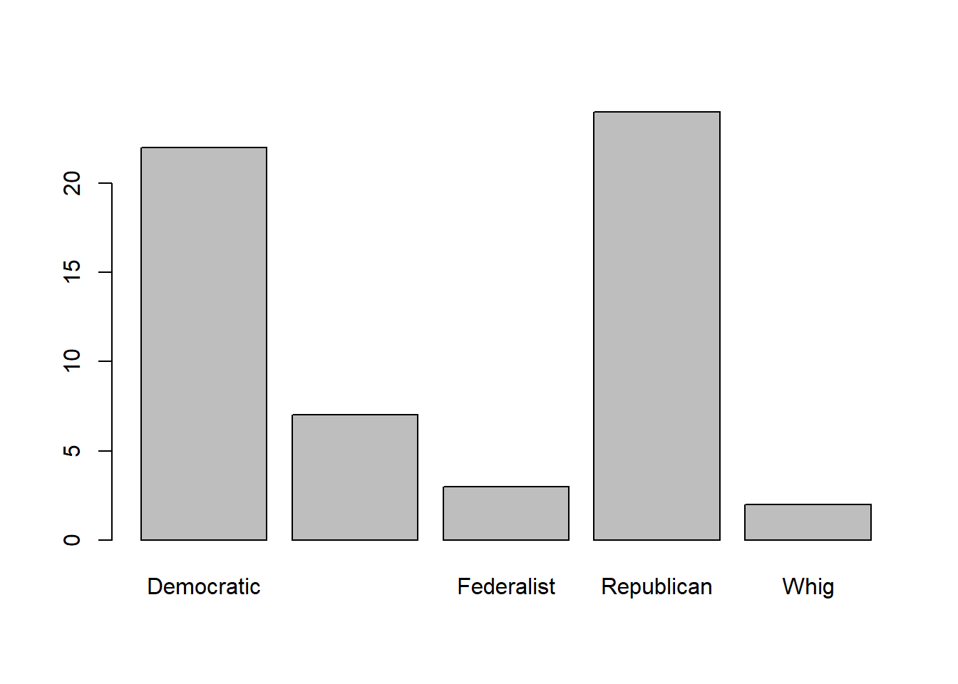
Now we can use most of the options we used above. We might want to re-size the names on the x axis so that they can all show more easily on the chart. We can do that with the option cex.names. The baseline is 1, so if we want them to be larger we can give the command a value above 1, or a value below 1 will shrink them.
And maybe we want to adjust the y axis so that we can see exactly how high each bar goes. We can do that with ylim, which we need to give a list of two numbers to set the minimum for the bar (usually 0) and the maximum. We can do the same thing for the x axis with xlim, but for a barchart that isn’t necessary.
barplot(table(ElectoralCollege$Party), # data
        cex.names=.75, # size of labels on x axis
        ylim=c(0,30)) # height of y axis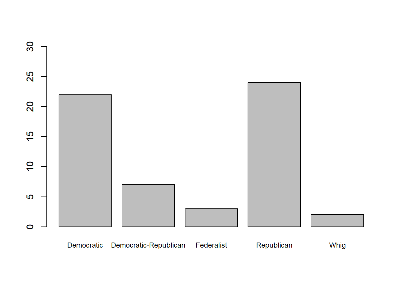
Now let’s add a title and some color to finish it off.
barplot(table(ElectoralCollege$Party), # data
        cex.names=.75, # size of labels on x axis
        ylim=c(0,30), # height of y axis
        col="forestgreen", # color
        main="Electoral College Victories by Party") # title