Chapter 19 Scatterplots and Best Fit Lines - Two Sets
We learned how to draw a single set of scatterplot and regression line. We will now learn how to draw two sets of scatterplots and regression lines using the dataset called, Melanoma, which is found in the package, MASS. This is a data frame on 205 patients in Denmark with malignant melanoma. There are quite a few variables in this dataset. However, we will only be focusing on the variables age, for age of the patient in years and time, for their survival time, in days.
19.1 Two Scatterplots in Basic R
Let variable, age, be the explanatory variable and time, be the response variable. First, let us do a scatterplot that combines all the information on the age of the patient and their survival time.
plot(Melanoma$age, Melanoma$time,
     main = "Survival Time from Malignant Melanoma",
     xlab = "Age (in years)",
     ylab = "Survival Time (in days)")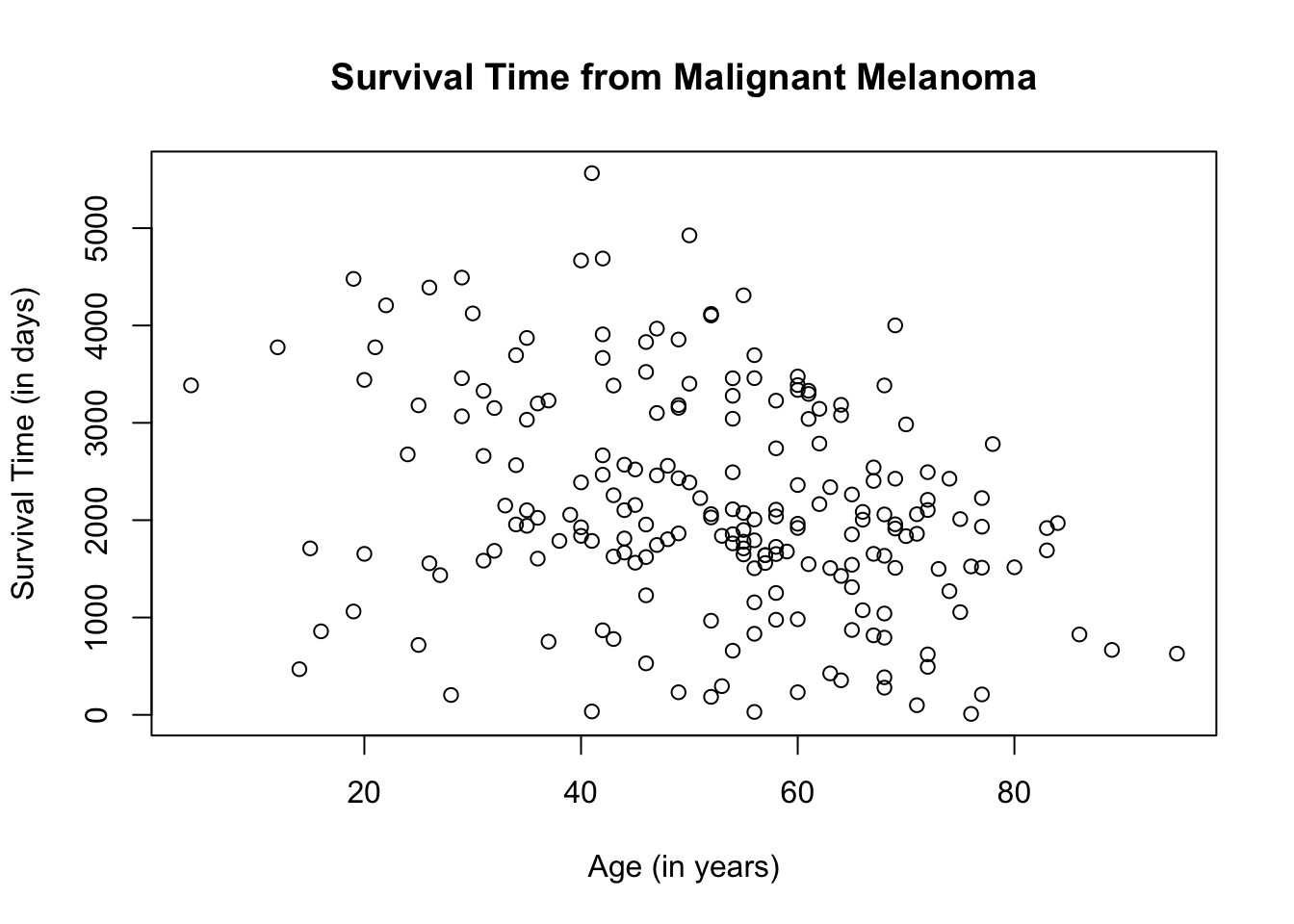
What if we want to separate the scatterplot by sex? Different plot colors and/or shapes will need to be used to differentiate the scatterplots. For this particular scatterplot, we will use the color blue to represent male patients, which is the entry, 1, on the dataset and red to represent female patients, which is the entry, 0.
plot(Melanoma$age, Melanoma$time,
     col = ifelse(Melanoma$sex == "1", "blue", "red"),
     main = "Survival Time from Malignant Melanoma",
     xlab = "Age (in years)",
     ylab = "Survival Time (in days)")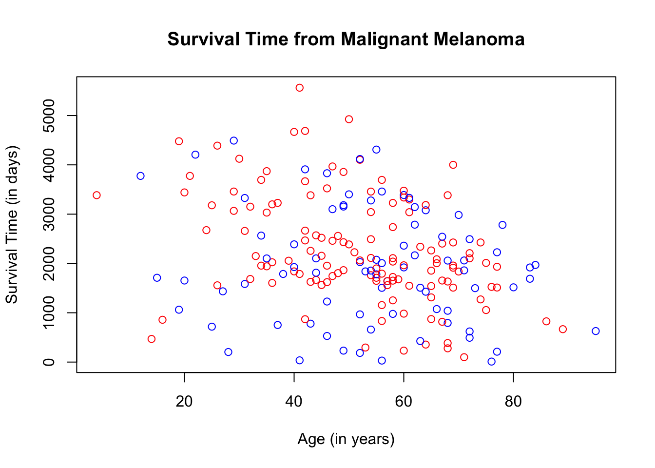
The ifelse( ) argument used above is the same as the if…else statement in programming but the ifelse( ) argument in R creates an if…else statement in one line of code. Use the ifelse( ) argument when you only have 2 choices such as true or false, yes or no, etc. In our case, since we have only 2 color choices, we can use the ifelse( ) argument to assign the colors.
In the ifelse code, the first choice for the variable, sex, is 1, followed by the color blue. That means, that if the patient is male, the scatterplot will be color blue. If the patient is female, then the scatterplot will be red.
To make the scatterplot more understandable, let us add a legend by using the function, legend( ). You can position the legend anywhere on the scatterplot. In this case, we will place it on the top-left corner. At the same time, let us change the shape of the plots by denoting male patients with blue triangles and female patients with red circles. The ifelse( ) argument will be used to change the plot shape since we have only two shape choices.
plot(Melanoma$age, Melanoma$time,
     col = ifelse(Melanoma$sex == "1", "blue", "red"),
     pch = ifelse(Melanoma$sex == "1", 17, 19),
     main = "Survival Time from Malignant Melanoma",
     xlab = "Age (in years)",
     ylab = "Survival Time (in days)")
legend("topleft",
       pch = c(19, 17),
       c("Female", "Male"),
col = c("red", "blue")) 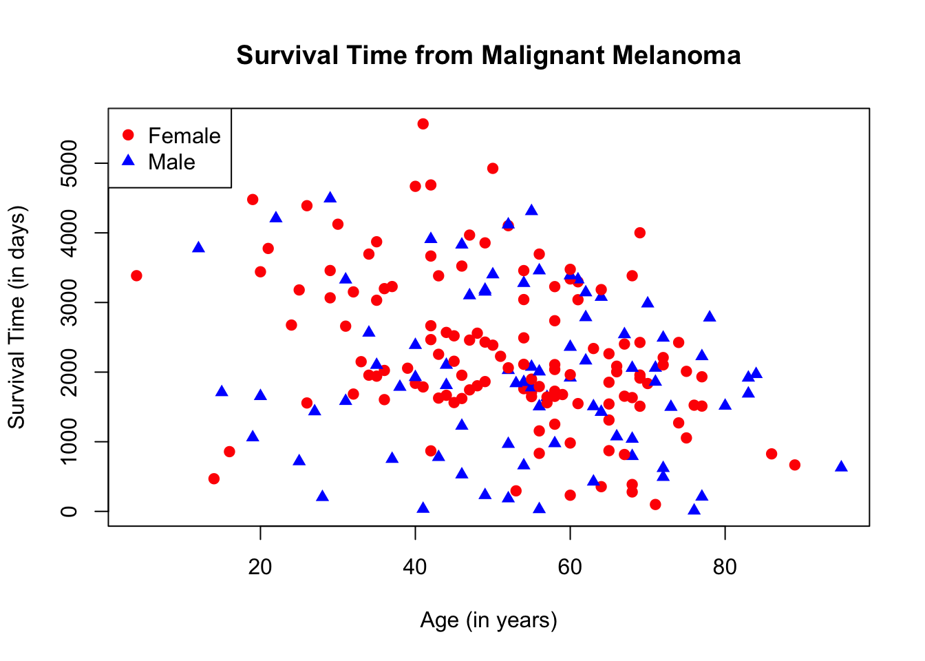
19.2 Two Regression Lines in Basic R
To graph two regression lines in Basic R, we need to isolate the male data from the female data by subsetting. We will call the male data, melanoma_male and the female data, melanoma_female.
The regression line will be drawn using the function abline( ) with the function, lm( ), for linear model. The syntax is: abline(lm(y-coordinate ~ x-coordinate). We will use the same colors as those used in the scatterplot to differentiate the two regression lines.
plot(Melanoma$age, Melanoma$time,
     main = "Survival Time from Malignant Melanoma",
     xlab = "Age (in years)",
     ylab = "Survival Time (in days)",
     col = ifelse(Melanoma$sex == "1", "blue", "red"))
legend("topleft",
       pch = c(1, 1),
       c("Female", "Male"),
       col = c("red", "blue"))
abline(lm(melanoma_female$time ~ melanoma_female$age), col = "red")
abline(lm(melanoma_male$time ~ melanoma_male$age), col = "blue")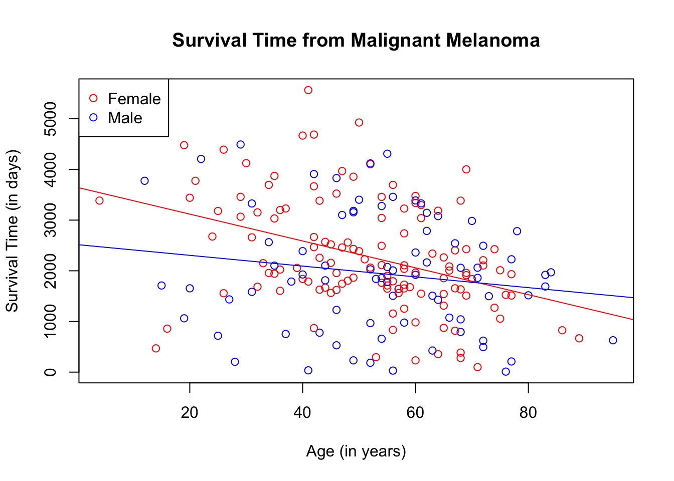
You can use different shapes for the plots, if desired.
plot(Melanoma$age, Melanoma$time,
     col = ifelse(Melanoma$sex == "1", "blue", "red"),
     pch = ifelse(Melanoma$sex == "1", 17, 19),
     main = "Survival Time from Malignant Melanoma",
     xlab = "Age (in years)",
     ylab = "Survival Time (in days)")
legend("topleft",
       pch = c(19, 17),
       c("Female", "Male"),
       col = c("red", "blue"))
abline(lm(melanoma_female$time ~ melanoma_female$age), col = "red")
abline(lm(melanoma_male$time ~ melanoma_male$age), col = "blue")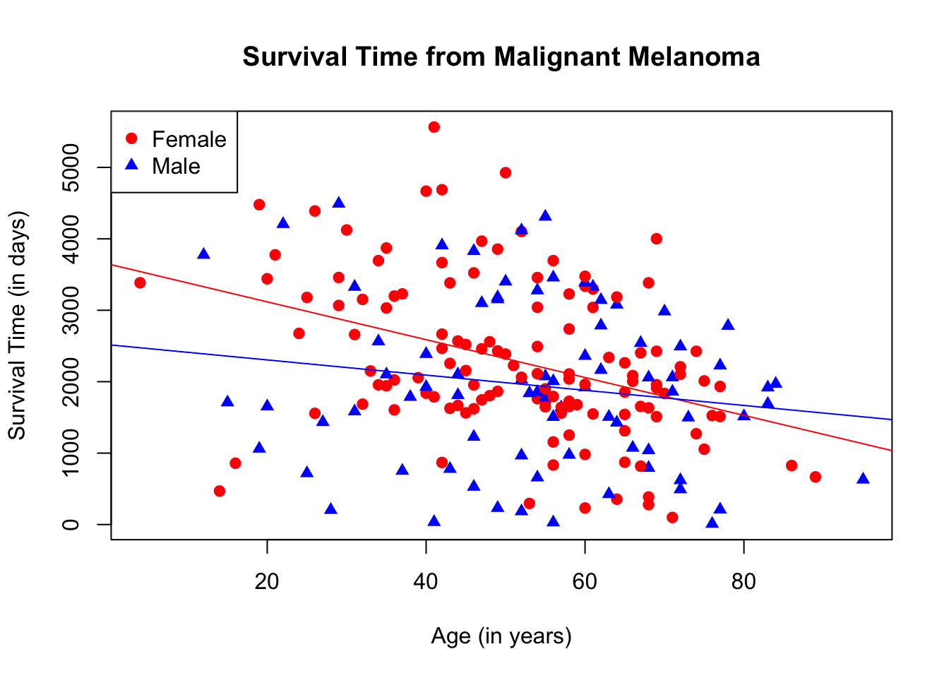
19.3 Two Scatterplots Using Ggplot2
This is how the scatterplot looks if the age and survival time of both male and female patients are combined.
ggplot(data = Melanoma, aes(x = age, y = time)) +
        geom_point() +
        labs(title = "Survival Time from Malignant Melanoma",
             x = "Age (in years)",
             y = "Survival Time (in days)")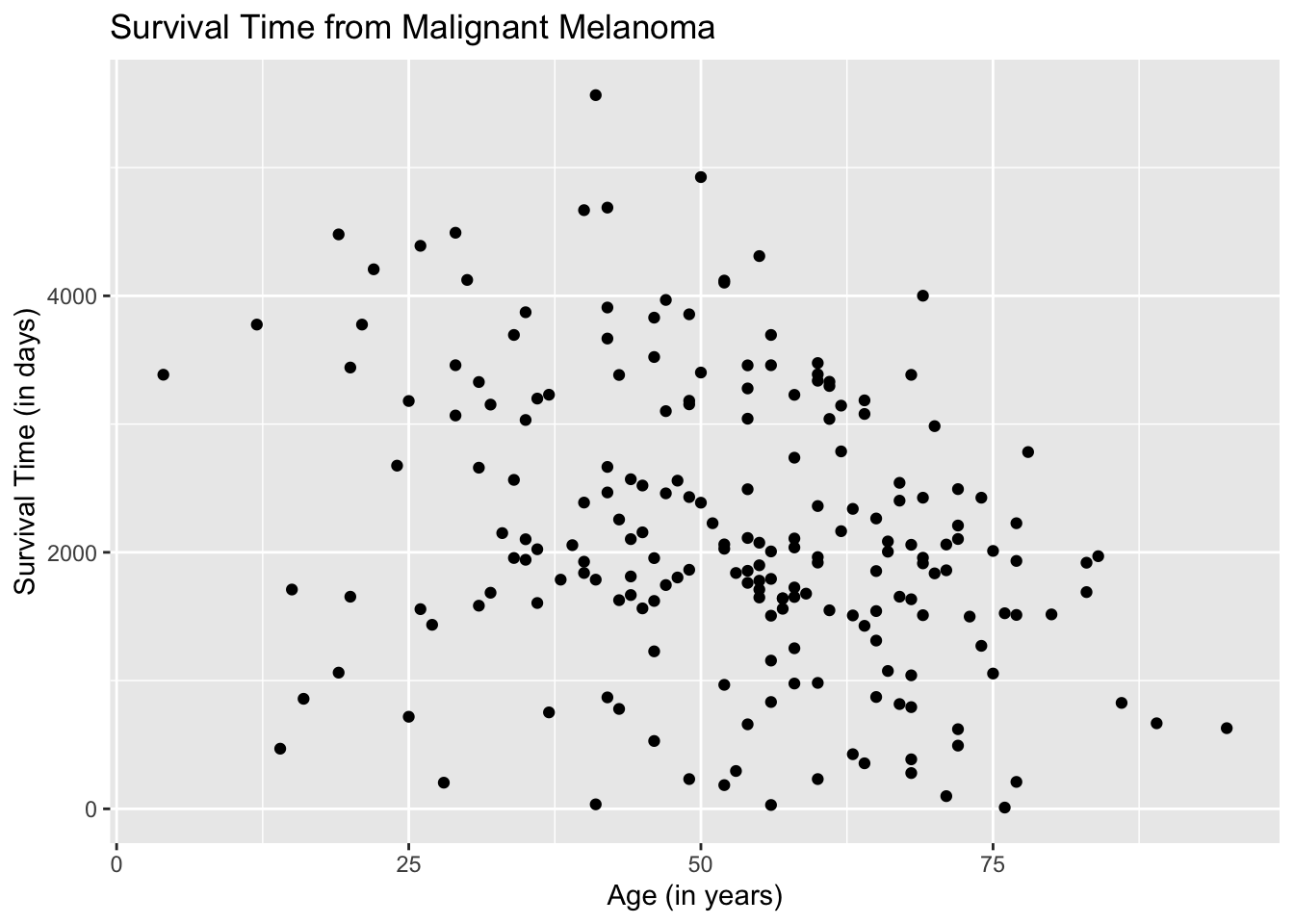
Let us now separate the data. The entries, male and female, fall under the varaiable, sex. We instruct the aes( ) argument in the ggplot( ) function to differentiate the plots by color based on the variable, sex. By default, ggplot2 chooses the color, unless specified.
ggplot(data = Melanoma, aes(x = age, y = time, color = sex)) +
        geom_point() +
        labs(title = "Survival Time from Malignant Melanoma",
             x = "Age (in years)",
             y = "Survival Time (in days)")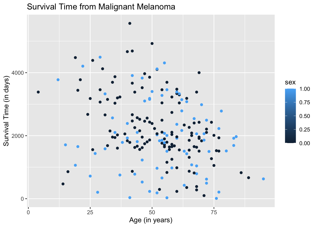
The resulting plot may be what we want. However, if we take a closer look at the legend, ggplot2 is treating the variable sex as quantitative when it is categorical. We need to instruct the aes( ) argument in geom_point( ) to treat sex as a categorical variable by using the argument, factor(sex).
ggplot(data = Melanoma, aes(x = age, y = time)) +
        geom_point(aes(color = factor(sex))) +
        labs(title = "Survival Time from Malignant Melanoma",
             x = "Age (in years)",
             y = "Survival Time (in days)")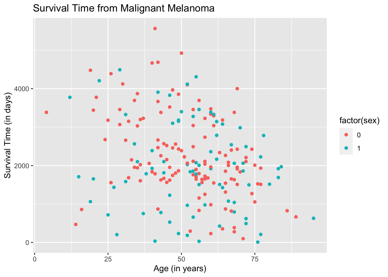
The result is better but the legend will not make sense to readers.
One way to make ggplot2 recognize the entries in the variable, sex, as categorical and to make the legend more meaningful is to change the entries to non-numeric. We will change all entries that are “1” to male and all entries that are “0” to female.
Let us redraw the scatterplot.
ggplot(data = Melanoma, aes(x = age, y = time, color = sex)) +
        geom_point() +
        labs(title = "Survival Time from Malignant Melanoma",
             x = "Age (in years)",
             y = "Survival Time (in days)")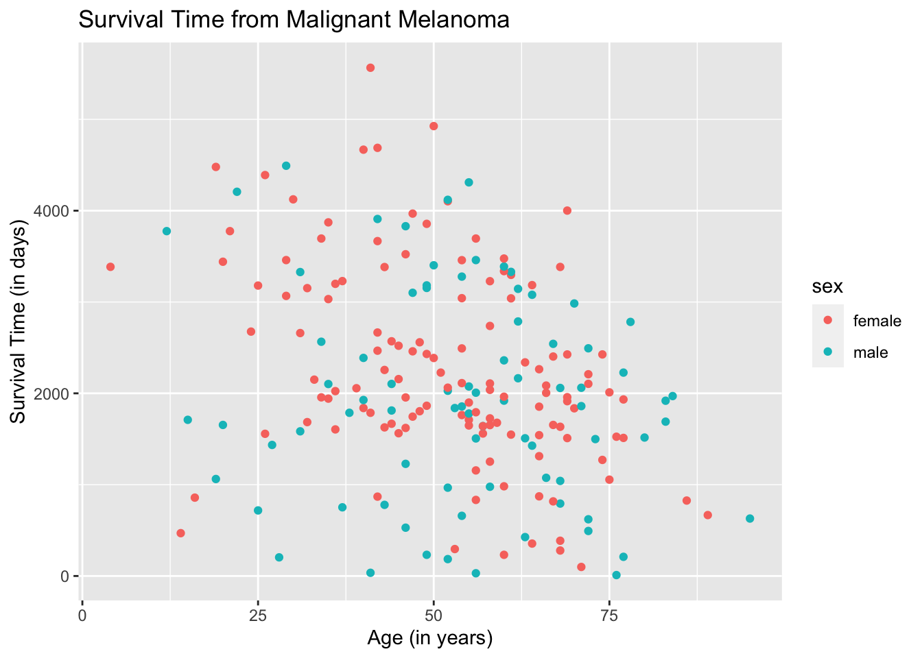
The plots are now separated in color by sex and the legend is meaningful. To make the plots look fancier, we can change the plot shape in the argument geom_point( ).
ggplot(data = Melanoma, aes(x = age, y = time)) +
        geom_point(aes(shape = factor(sex))) +
        geom_point(aes(color = factor(sex))) +
        labs(title = "Survival Time from Malignant Melanoma",
             x = "Age (in years)",
             y = "Survival Time (in days)")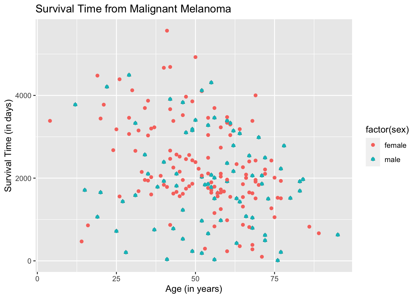
The color and shape are automatically chosen by ggplot2. You can change the color and/or shape to what you desire but it will be left for you to explore.
19.4 Two Regression Lines Using Ggplot2
To draw the regression lines, we append the function geom_smooth( ) to the code of the scatterplot. However, geom_smooth( ) needs to know what kind of line to draw, ie, vertical, horizontal, etc. In this case, we want a regression line, which R calls “lm” for linear model.
Note that the default for geom_smooth( ) is to draw the confidence interval for the mean response, which will come out as a gray band. To remove the gray band, add the argument “se= FALSE” in the function geom_smooth( ) as follows.
ggplot(data = Melanoma, aes(x = age, y = time, color = sex)) +
        geom_point() +
        geom_smooth(method = "lm", se = FALSE) +
        labs(title = "Survival Time from Malignant Melanoma",
             x = "Age (in years)",
             y = "Survival Time (in days)")
## `geom_smooth()` using formula 'y ~ x'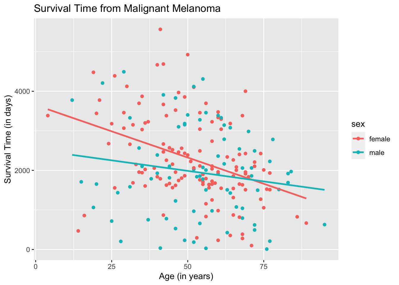
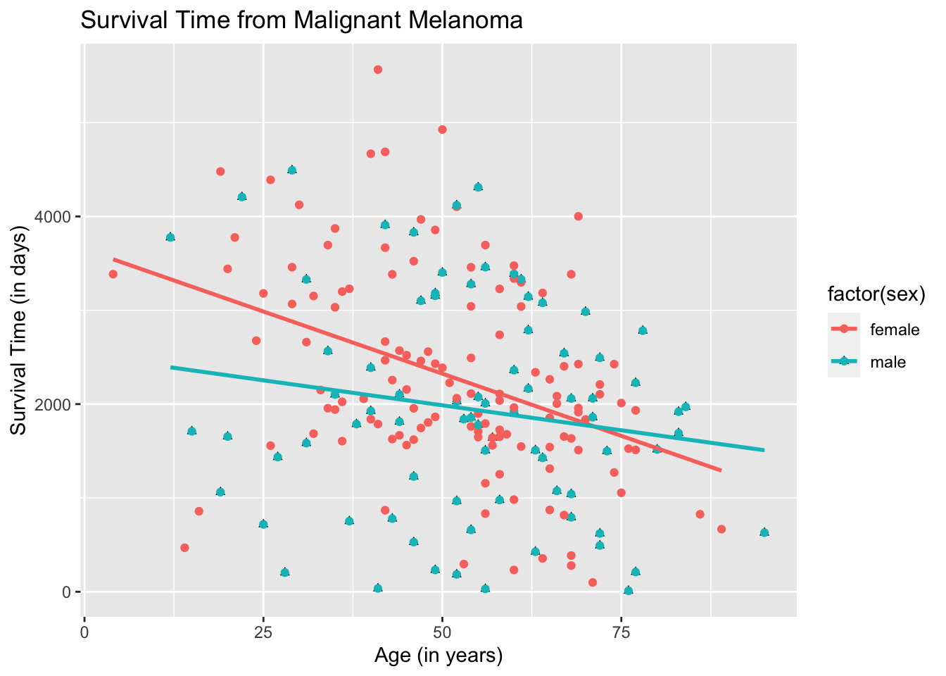
To use different shapes for the scatterplot and superimpose the regression line onto the plots:
ggplot(data = Melanoma, aes(x = age, y = time)) +
        geom_point(aes(shape = factor(sex))) +
        geom_point(aes(color = factor(sex))) +
        geom_smooth(method = "lm",
                    se = FALSE,
                    aes(color = factor(sex))) +
        labs(title = "Survival Time from Malignant Melanoma",
             x = "Age (in years)",
             y = "Survival Time (in days)")
## `geom_smooth()` using formula 'y ~ x'