Chapter 17 Normal Quantile Plot
Graphics such as stemplot, boxplot, and histogram help us determine whether a distribution is approximately symmetric or not. We are now going to add another graphics to check for normality.
17.1 Symmetric Distribution
Let us look at the data frame, birthwt, found in the package MASS. The data frame consists of 10 columns and 189 rows. However, we will only focus on the variable, bwt, the baby’s birthweight which is measured in grams.
Let us see how the histogram of the baby’s birth weight looks.
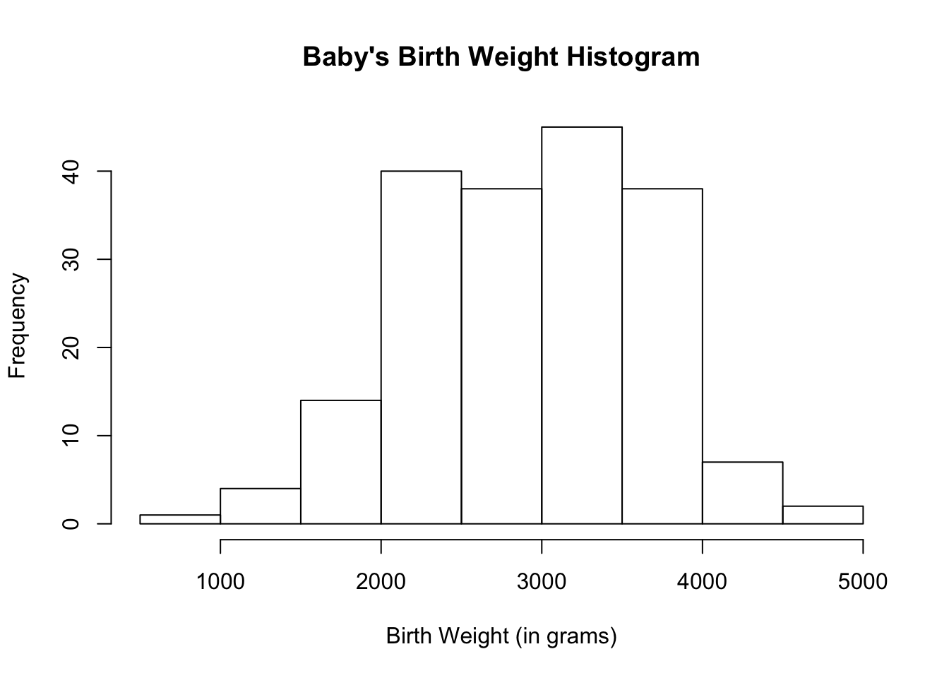
The histogram for the baby’s birth weight looks approximately normal.
Using Basic R
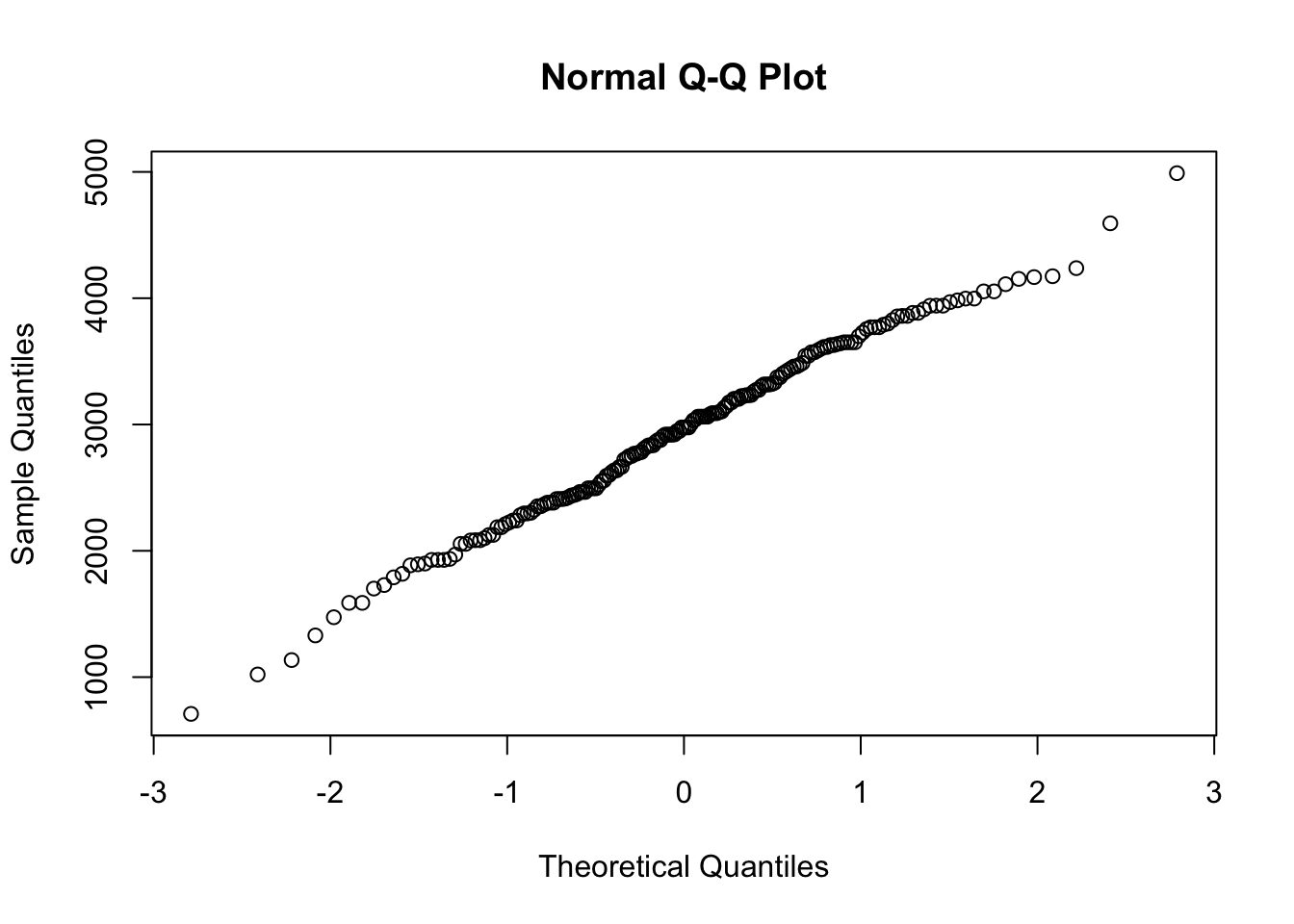
Let us draw the normal quantile plot using the function qqnorm( ). If a distribution is approximately normal, points on the normal quantile plot will lie close to a straight line.
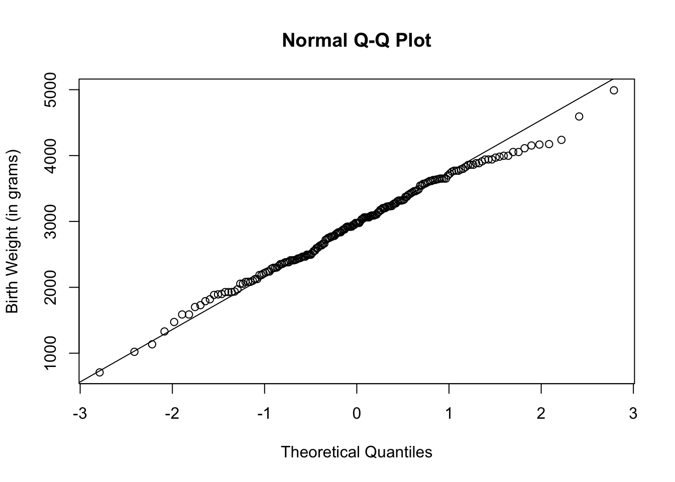
Sometimes, a line is superimposed onto the normal quantile plot. This helps visualize whether the points lie close to a straight line or not. Use the function qqline( ) to draw the line.
To further help with visualization, you can let the plots and/or line take on a different color other than black.
qqnorm(birthwt$bwt,
       ylab = "Birth Weight (in grams)",
       col = "dark green")
qqline(birthwt$bwt,
       col = "red")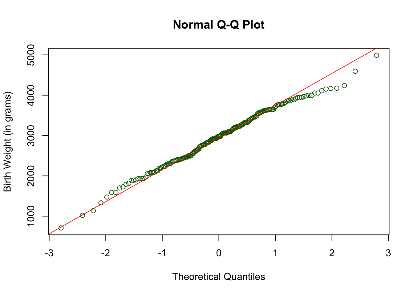
From the histogram and normal quantile plot, we can conclude that the baby’s weight distribution is approximately normal.
Using Ggplot2
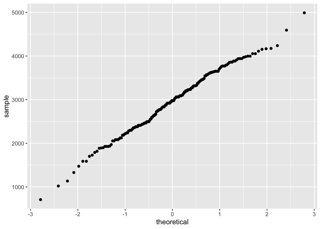
To draw the normal quantile plot, use the geometric shape called geom_qq( ). Note that the aesthetic mapping in the function ggplot should use the argument, sample because the vertical axis in this case is called sample.
To superimpose a line to the normal quantile plot, add the geometric shape, geom_qq_line( ).
ggplot(data = birthwt, aes(sample = bwt)) +
  geom_qq( ) +
  geom_qq_line( ) +
labs(y = "Birth Weight (in grams)") 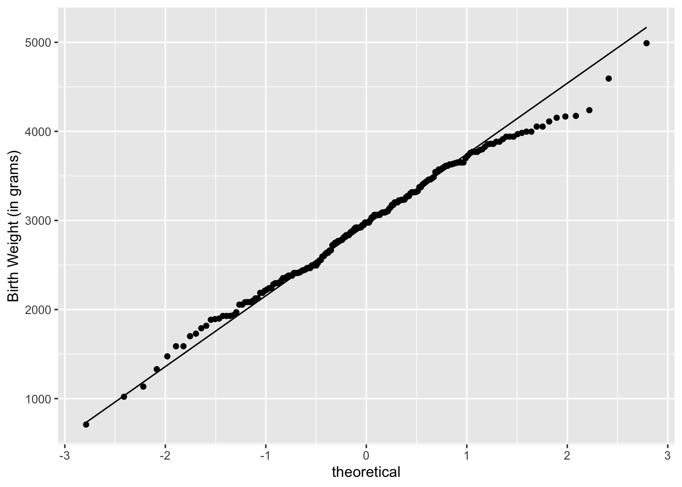
If you want to use colors other than black to help with visualization, add the argument color to geom_qq to change the plot color and geom_qq_line to change the line color.
ggplot(data = birthwt, aes(sample = bwt)) +
  geom_qq(color = "dark blue") +
  geom_qq_line(color = "orange") +
labs(y = "Birth Weight (in grams)") 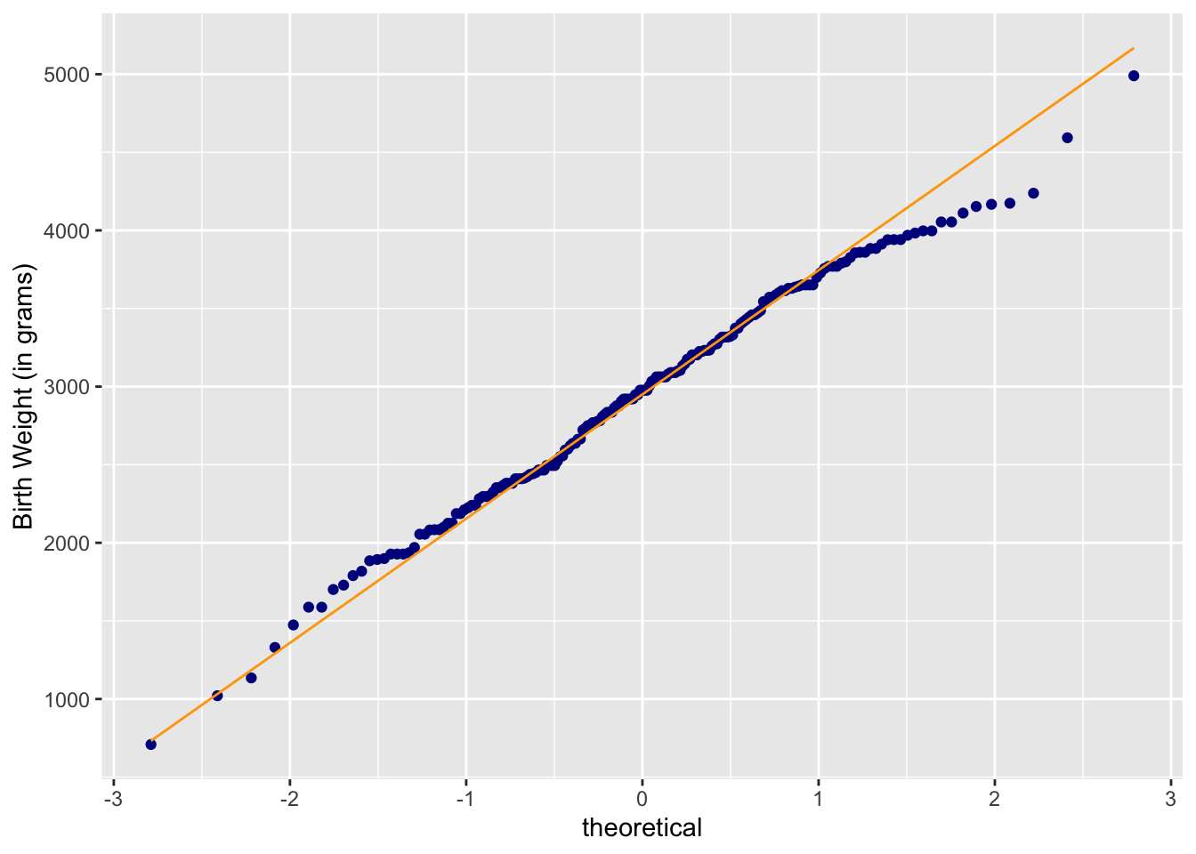
We can conclude that the baby weight distribution is approximately normal since the normal quantile plots lie approximately in a staright line.
17.2 Skewed Distribution
Right-Skewed Distribution
Let us look skewed distributions like those of rivers.
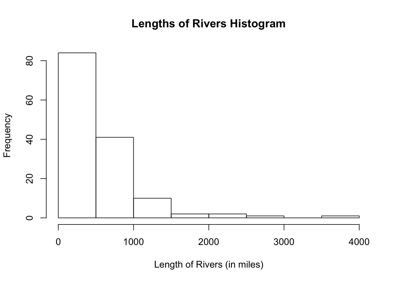
The histogram shows a right-skewed distribution.
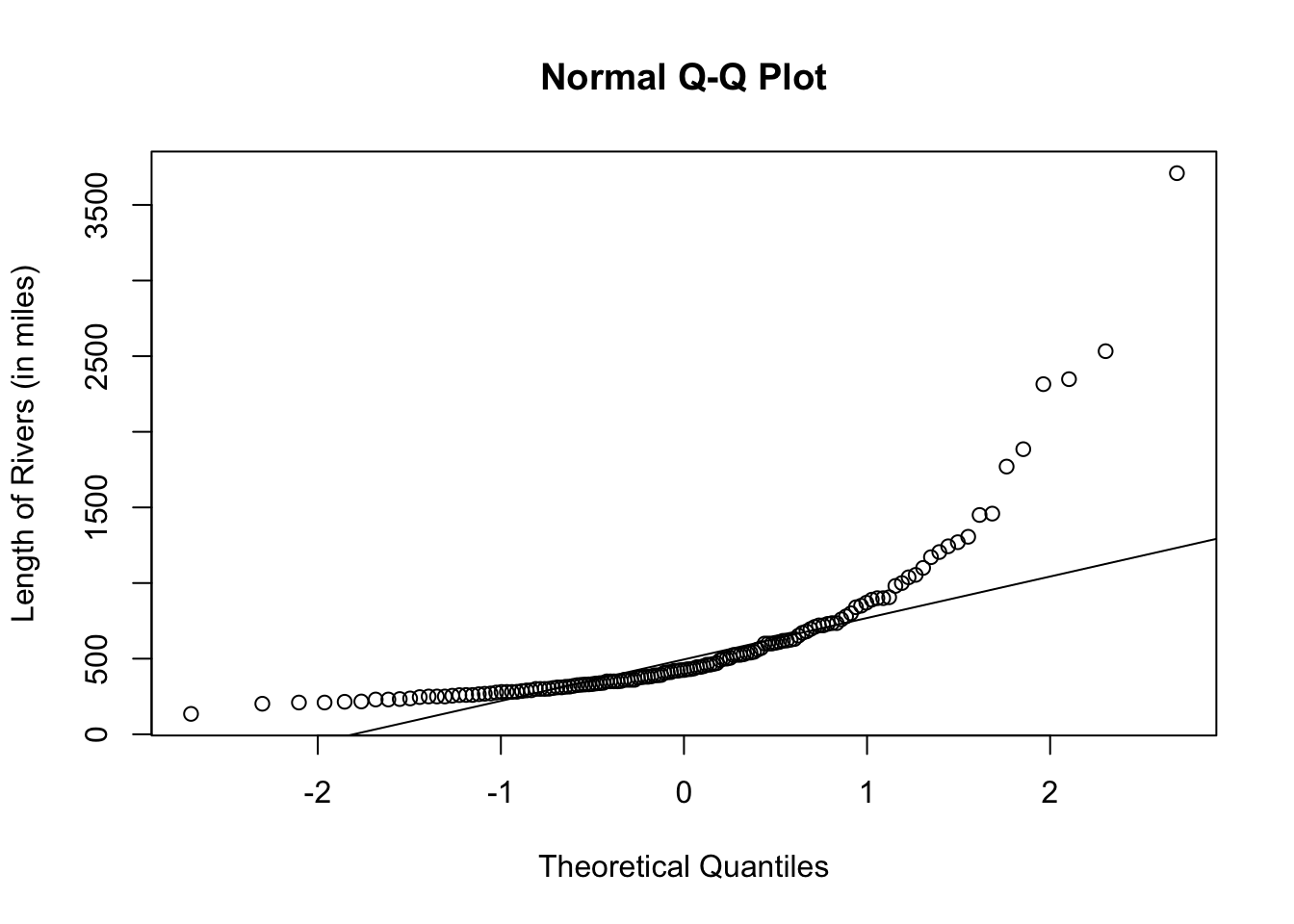
In Basic R
Let us take a look at how the normal quantile plot looks for a right-skewed distribution.
Using Ggplot2
Remember that rivers is a vector so leave the argument in the function ggplot blank and put the aesthetic mapping in the function geom_qq( ).
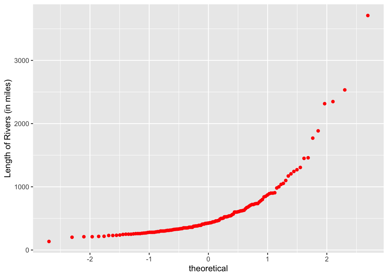
The normal quantile plot shows that the distribution of rivers is skewed.
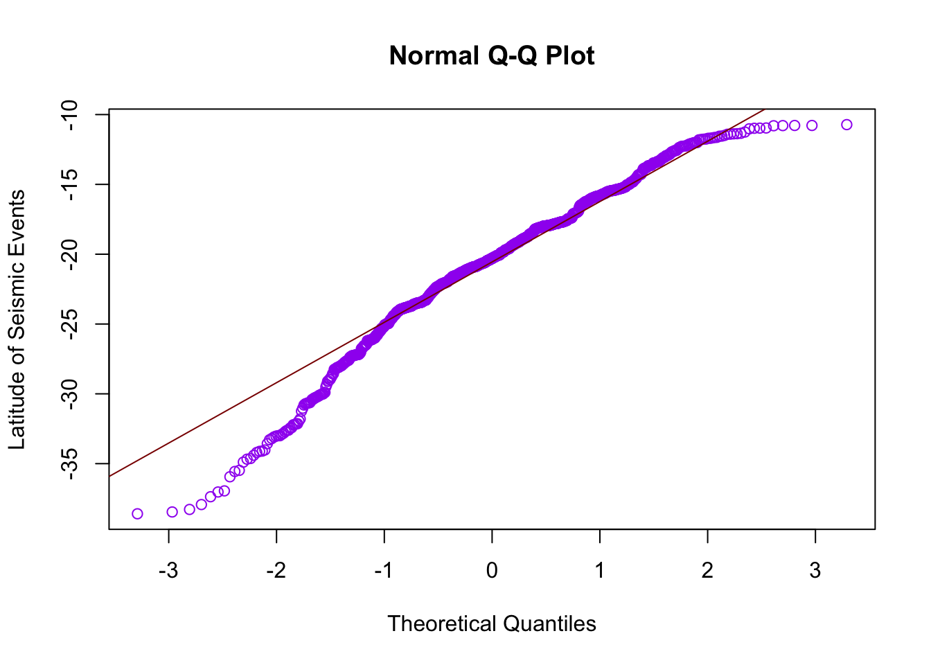
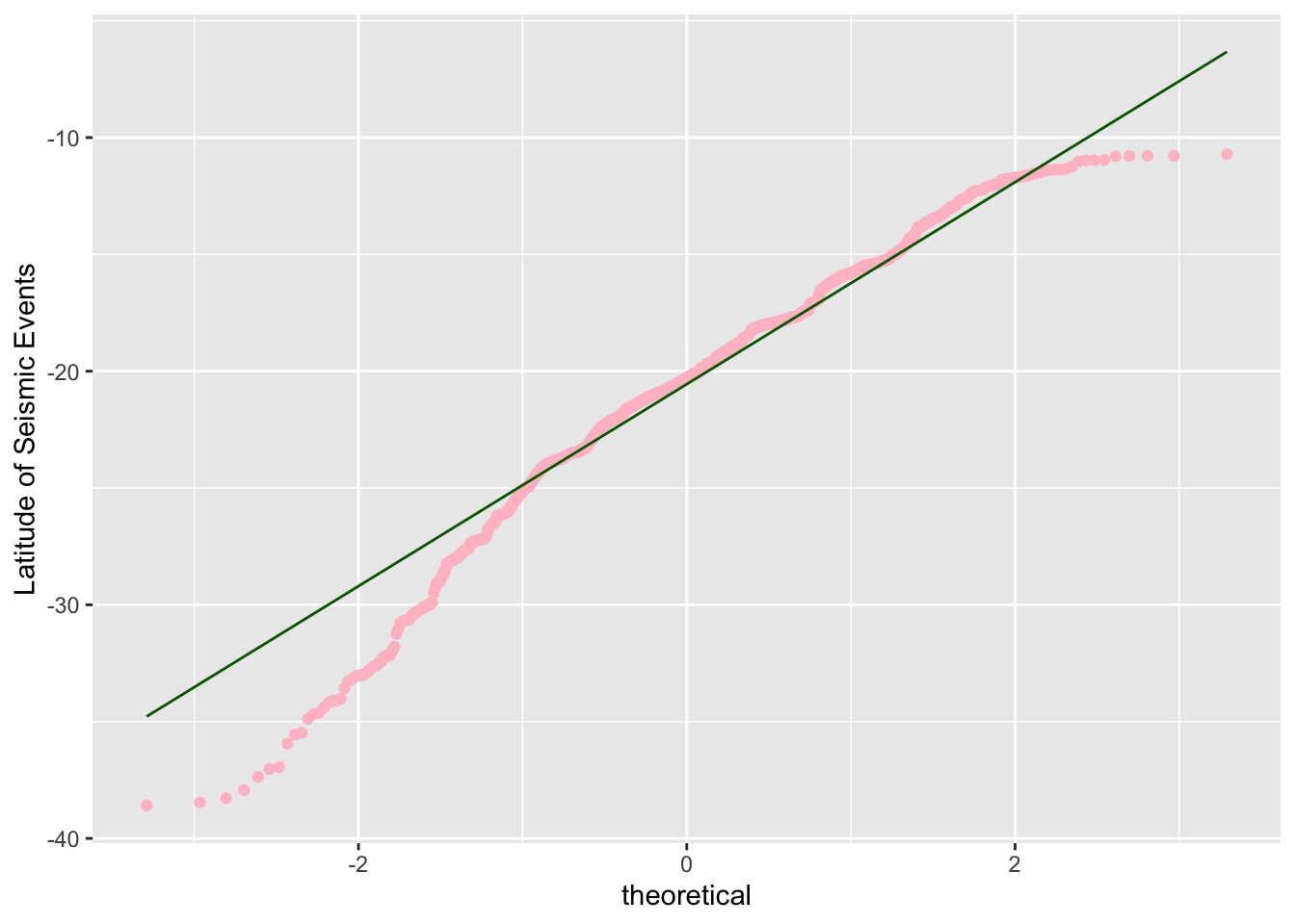
Left-Skewed Distribution
Let us look at the dataset called quakes which gives locations of seismic events near Fiji. We will focus on the variable, lat, which is the numeric latitude of a seismic event.
hist(quakes$lat,
     main = "Histogram of the Latitude of Seismic Events",
     xlab = "Latitude of Seismic Events")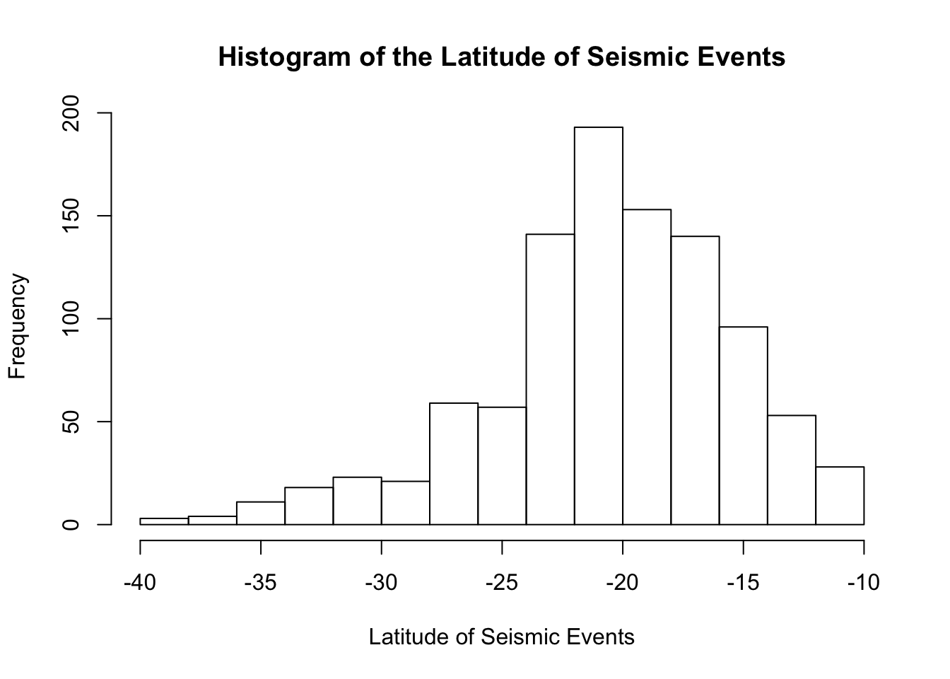
The histogram shows a distribution that is slightly left-skewed.
17.3 Other Distributions
What if we have a non-symmetric, non-skewed distibution? We will compare the histogram and normal quantile plot of the following. Each of the dataset is built into R.
Let us look at the variable, eruptions, in the dataset, faithful.
hist(faithful$eruptions,
     main = "Histogram of Old Faithful Eruption Times",
     xlab = "Eruption Time (in minutes)",
     xlim = c(1, 6))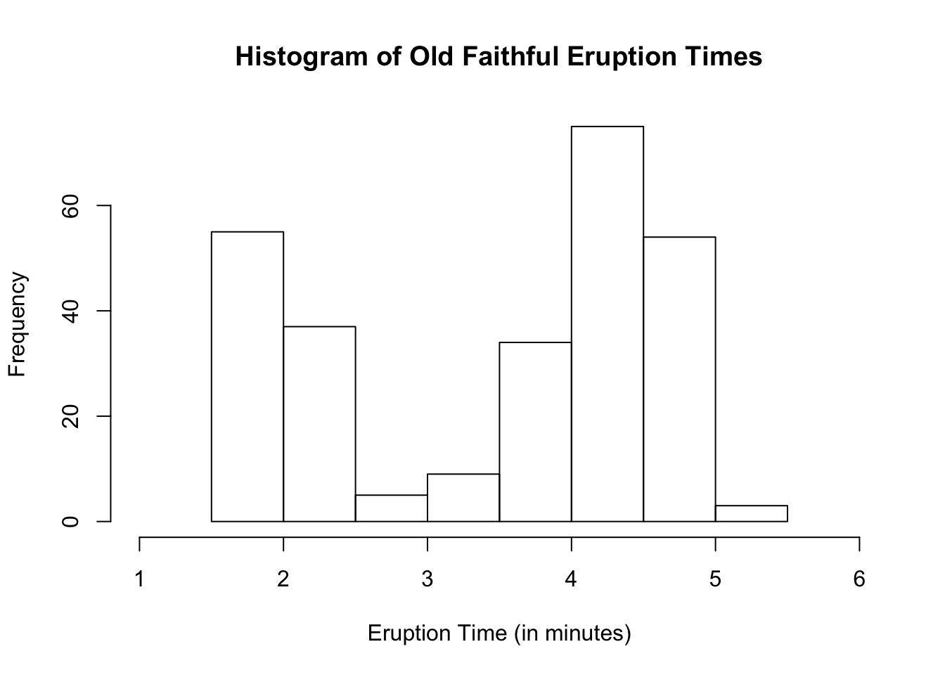
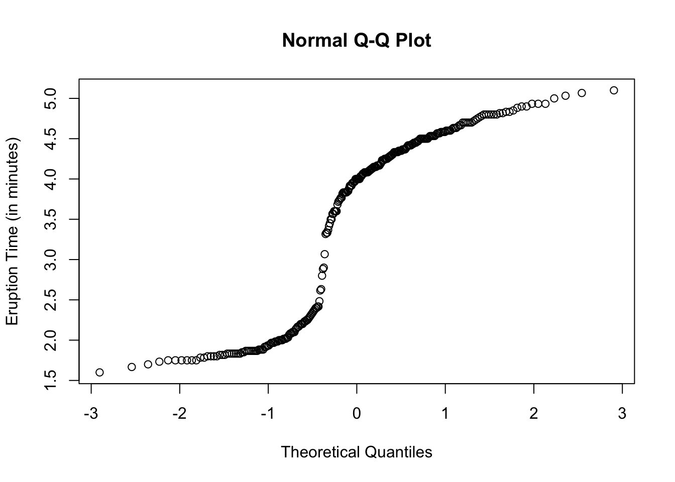
We see a bimodal distribution. Let us see how the normal quantile plot will look.
Using Ggplot2
ggplot(data = faithful, aes(sample = eruptions)) +
  geom_qq(color = "blue") +
labs(y = "Eruption Time (in minutes)") 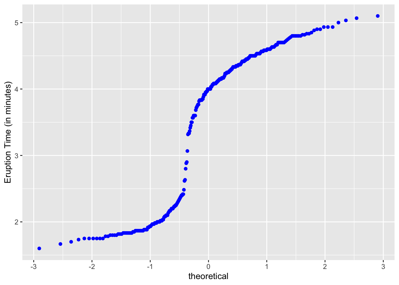
Another interesting one to look at is the variable, conc (for the plant study’s ambient carbon dioxide concentrations in mL/L), found in the dataset called CO2.
hist(CO2$conc,
     main = "Histogram of Ambient Carbon Dioxide Concentrations",
     xlab = "Ambient CO2 Concentrations (in mL/L)")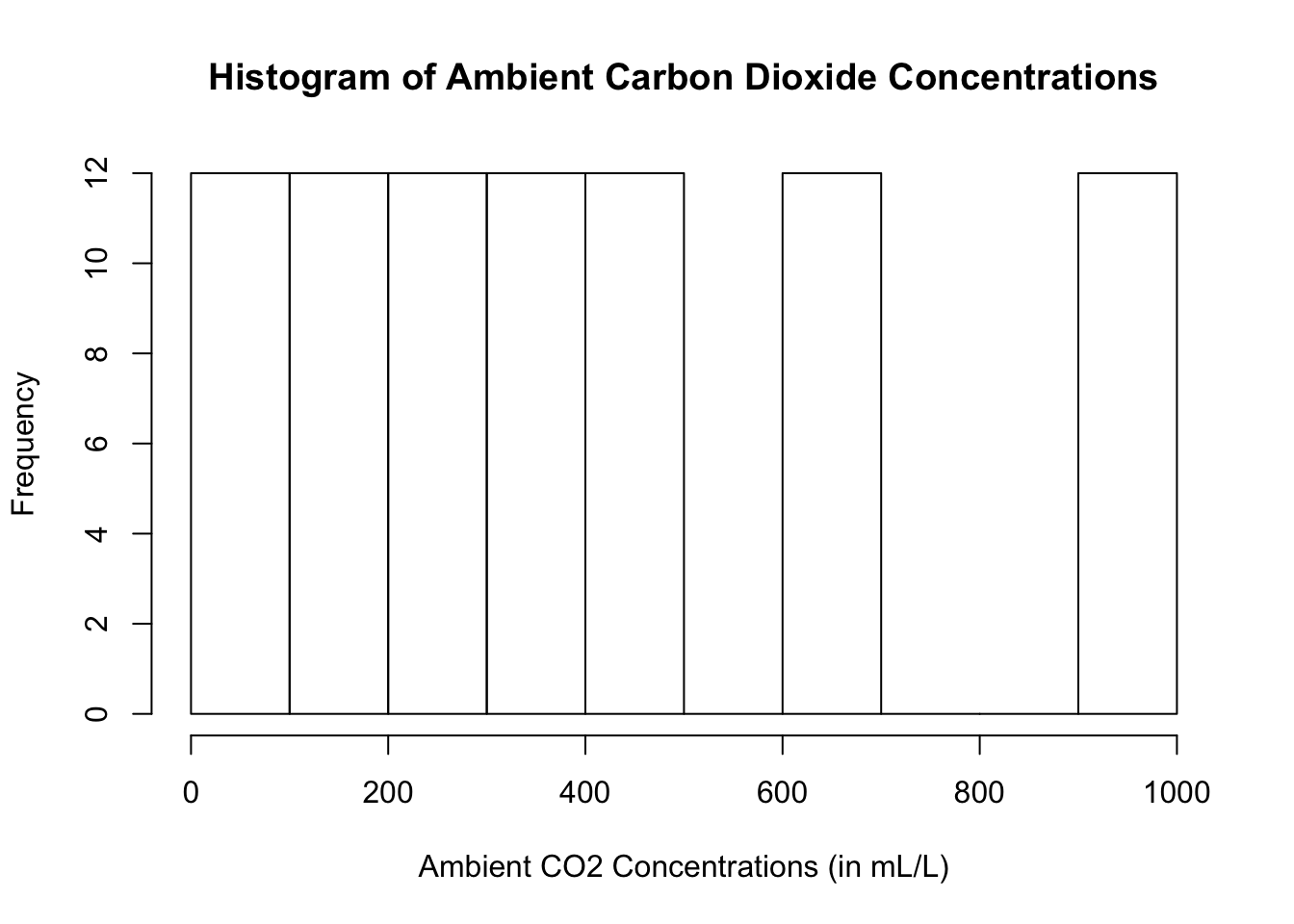
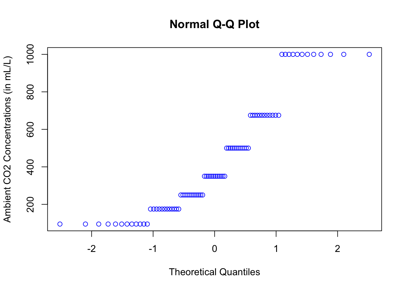
Using Ggplot2
ggplot(data = CO2, aes(sample = conc)) +
  geom_qq(color = "purple") +
labs(y = "Ambient CO2 Concentrations (in mL/L)") 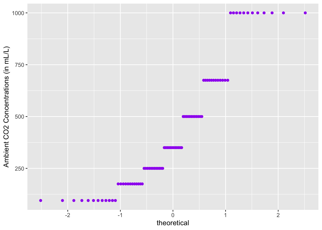
All of the plots clearly do not lie on a straight line.