Chapter 18 Scatterplots and Best Fit Lines - Single Set
We will be working with the dataset called Cars93 found in the package, MASS. Using that dataset, we will draw the scatterplot and regression line of the weight of the car versus the miles per gallon achieved in the city. These will be done in basic R and ggplot2.
18.1 Basic R Scatterplot
Use the function, plot(explanatory_variable, response_variable) to draw the scatterplot. Be careful when deciding which variable is the explanatory variable and which is the response variable so that the graph is meaningful. Make sure both explanatory and response variable are quantitative and not categorical.
In this example, we want to see the relationship between the weight of a car and the miles per gallon achieved. Therefore, we will let the explanatory variable (or x-coordinate) be the weight of the car and the response variable (or y-coordinate) be the mileage achieved by driving in the city.
plot(Cars93$Weight, Cars93$MPG.city,
     main = "Scatterplot of Weight of Car vs City MPG",
     xlab = "Weight of Car (in pounds)",
     ylab = "City Miles per Gallon")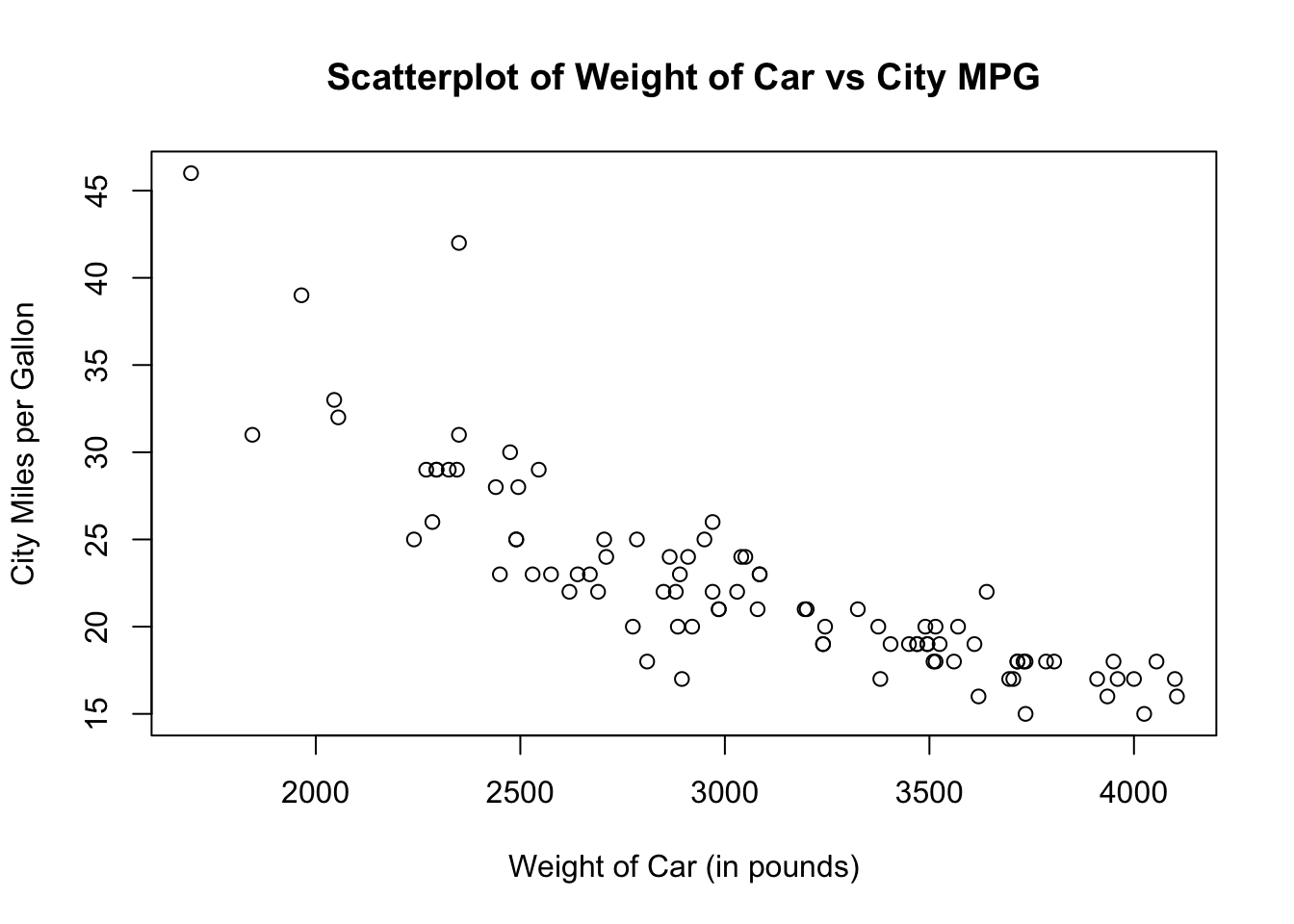
The default scatterplot is a black unfilled circle. You can change the color, shape or fill of the plots by using the argument, pch. Here are a few commonly used shapes and their corresponding pch (or plotting character).
- pch = 0: unfilled square
- pch = 1: unfilled circle
- pch = 2: unfilled triangle pointing up
- pch = 3: plus sign
- pch = 4: cross sign
- pch = 5: unfilled diamond
- pch = 6: unfilled triangle pointing down
- pch = 15: filled square
- pch = 16: filled circle
- pch = 17: filled triangle pointing up
- pch = 18: filled diamond
- pch = 19: filled larger circle
- pch = 20: filled smaller circle (like a bullet point)
Let us redraw the scatterplot using filled smaller circles in dark green color.
plot(Cars93$Weight, Cars93$MPG.city,
     pch = 20,
     col = "dark green",
     main = "Scatterplot of Weight of Car vs City MPG",
     xlab = "Weight of Car (in pounds)",
     ylab = "City Miles per Gallon")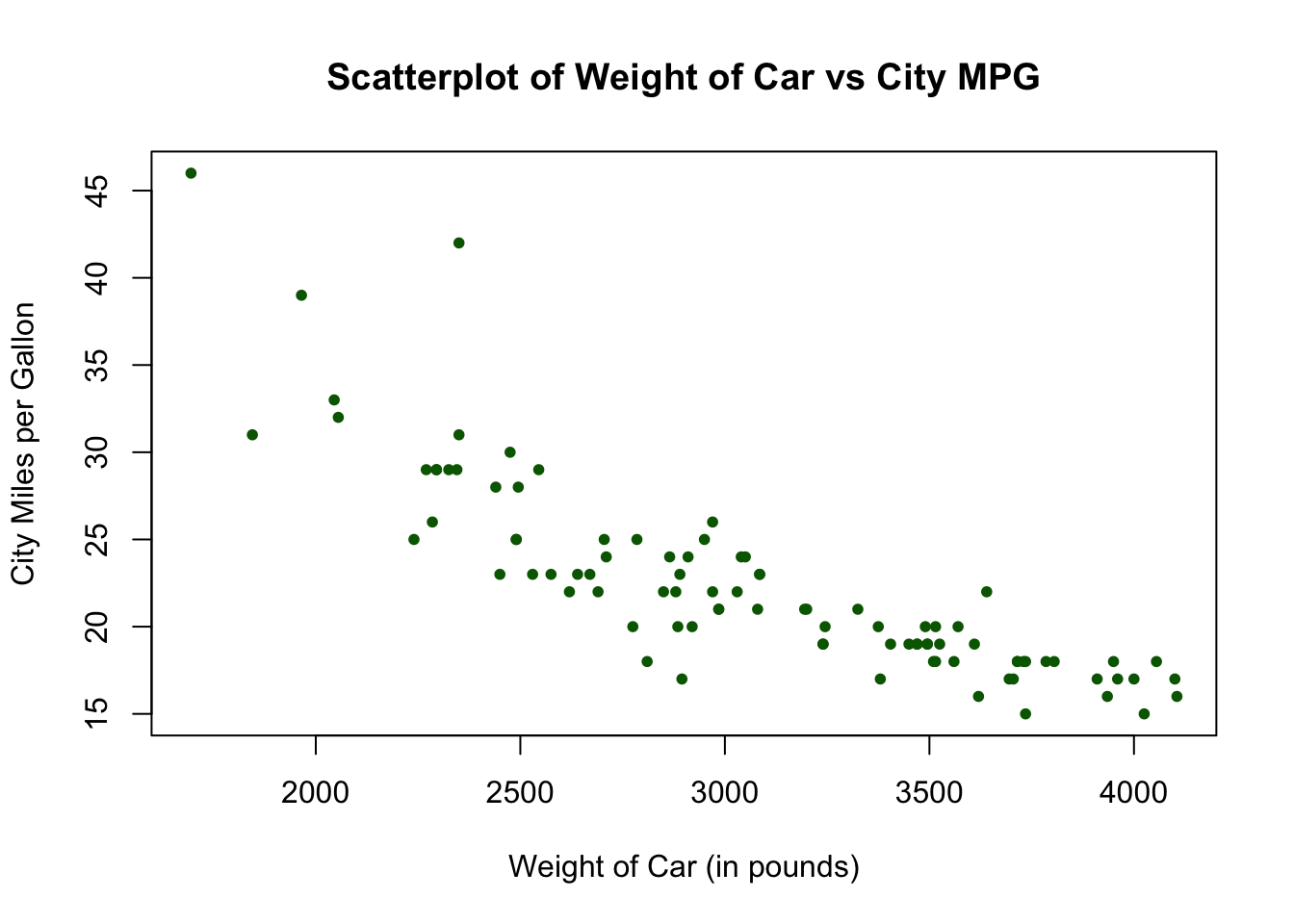
18.2 Basic R Regression Line
We will now add a regression line to the scatterplot drawn above. To do so, we use the function abline( ) with the function, lm( ) which stands for linear model. The syntax looks like this:plot(Cars93$Weight, Cars93$MPG.city,
pch = 20,
col = "dark green",
main = "Scatterplot of Weight of Car vs City MPG",
xlab = "Weight of Car (in pounds)",
ylab = "City Miles per Gallon")
abline(lm(Cars93$MPG.city ~ Cars93$Weight))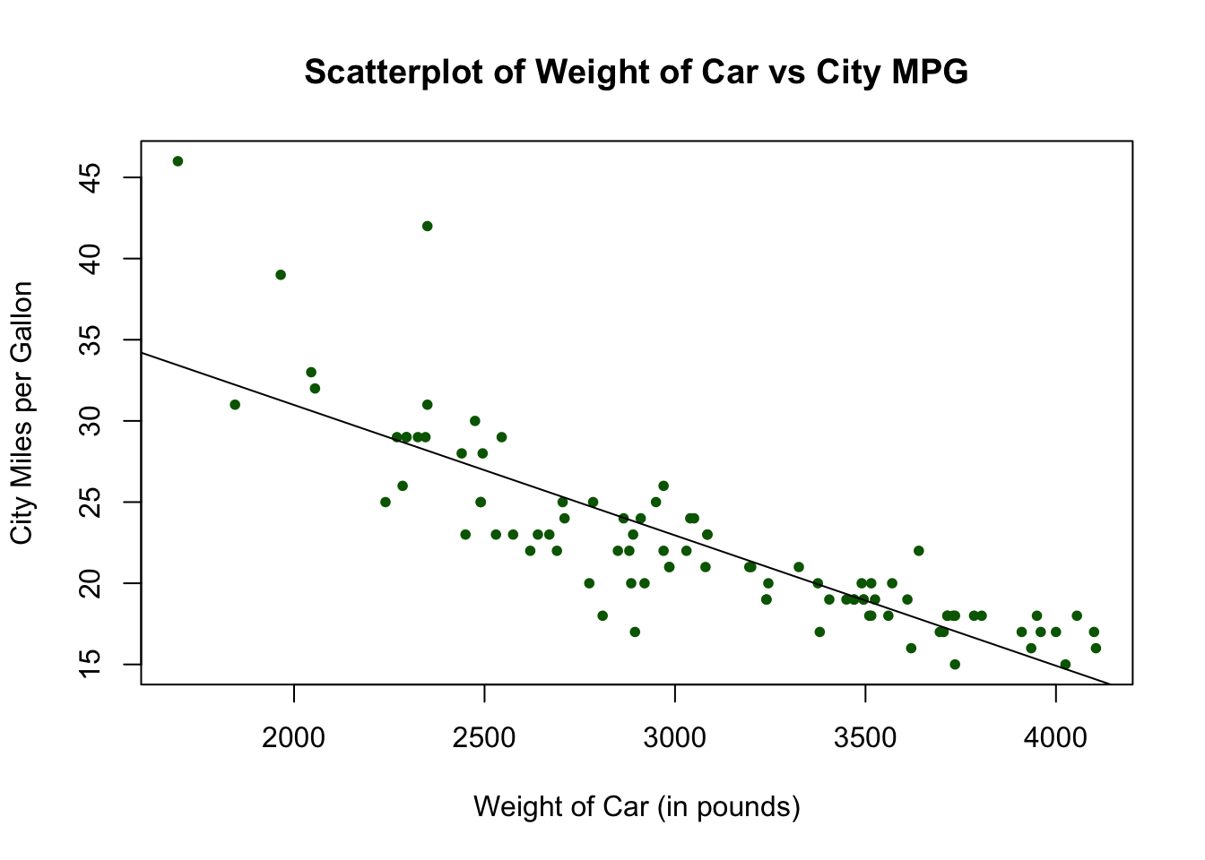
18.3 Ggplot2 Scatterplot
Let us do the same graph in ggplot2. The geometric function to use is called geom_point( ). For this example, let x be the variable, Weight and y be the variable, MPG.city.
ggplot(data = Cars93, aes(x = Weight, y = MPG.city)) +
        geom_point() +
        labs(title = "Scatterplot of Weight of Car vs City MPG",
             x = "Weight of Car (in pounds)",
             y = "City Miles per Gallon")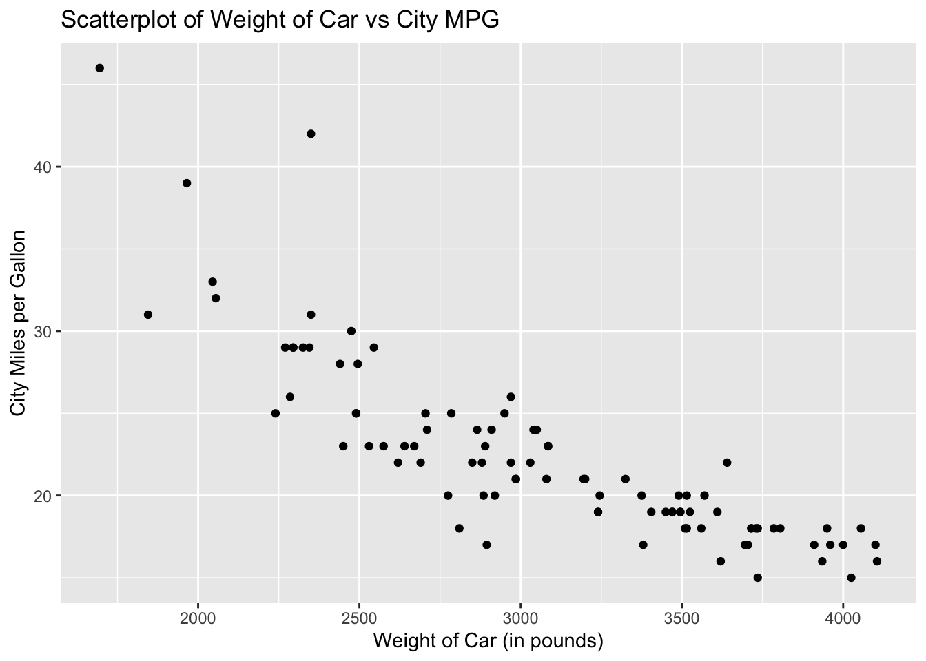
The default scatterplot for ggplot2 is a black filled circle. To change the color, specify your preference in the argument geom_point. Let us redraw the scatterplot using red circles.
ggplot(data = Cars93, aes(x = Weight, y = MPG.city)) +
        geom_point(aes(color = "red")) +
        labs(title = "Scatterplot of Weight of Car vs City MPG",
             x = "Weight of Car (in pounds)",
             y = "City Miles per Gallon")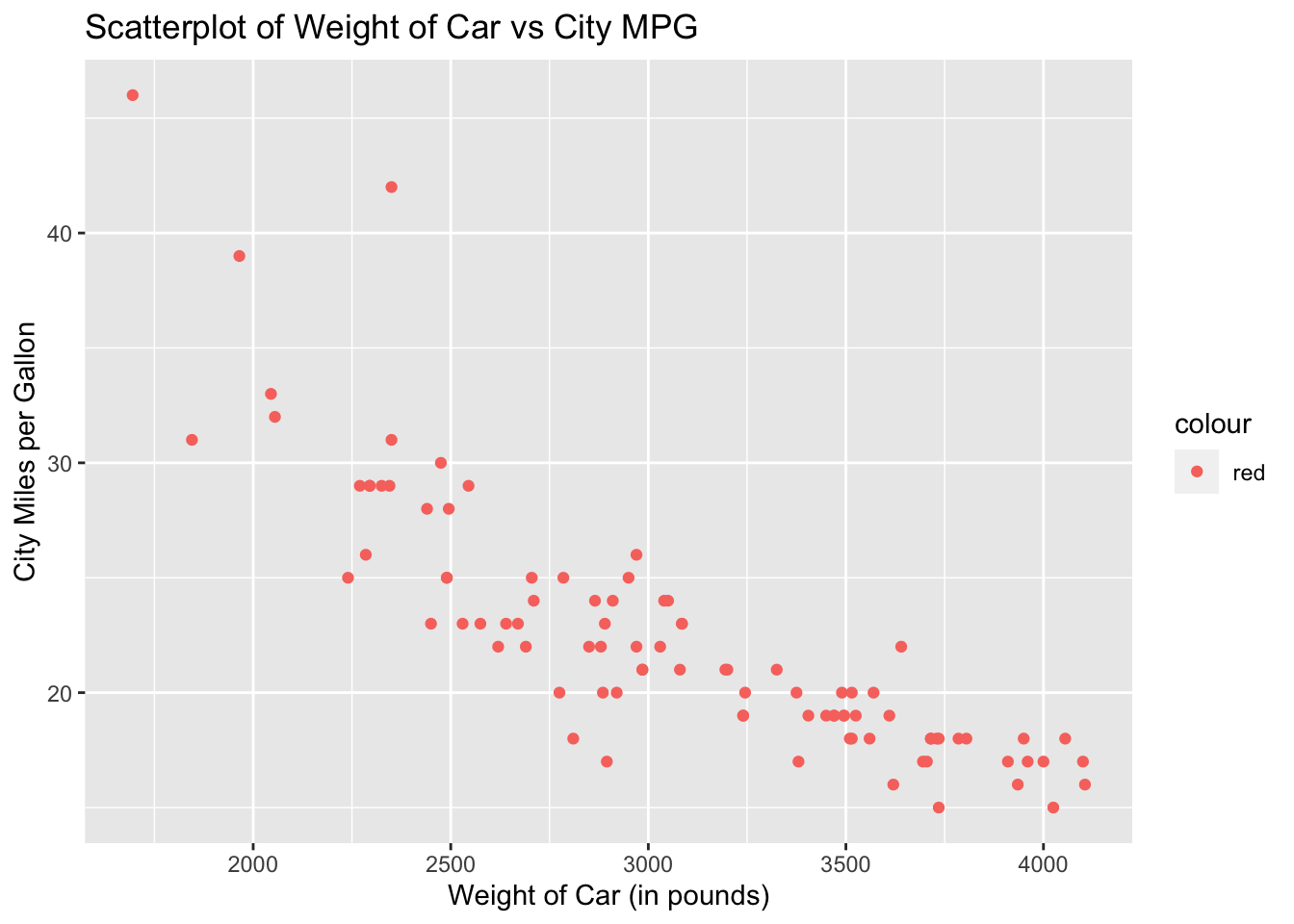
18.4 Ggplot2 Regression Line
To add a regression line to the scatterplot, add the geometric function, geom_smooth( ). The function, geom_smooth( ), needs to know what kind of line to draw, ie, vertical, horizontal, etc. In this case, we want a regression line, which R calls “lm” for linear model. Add the argument, method = “lm”, in the geom_smooth( ) function.
ggplot(data = Cars93, aes(x = Weight, y = MPG.city)) +
        geom_point(aes(color = "red")) +
        geom_smooth(method = "lm") +
        labs(title = "Scatterplot of Weight of Car vs City MPG",
             x = "Weight of Car (in pounds)",
             y = "City Miles per Gallon")
## `geom_smooth()` using formula 'y ~ x'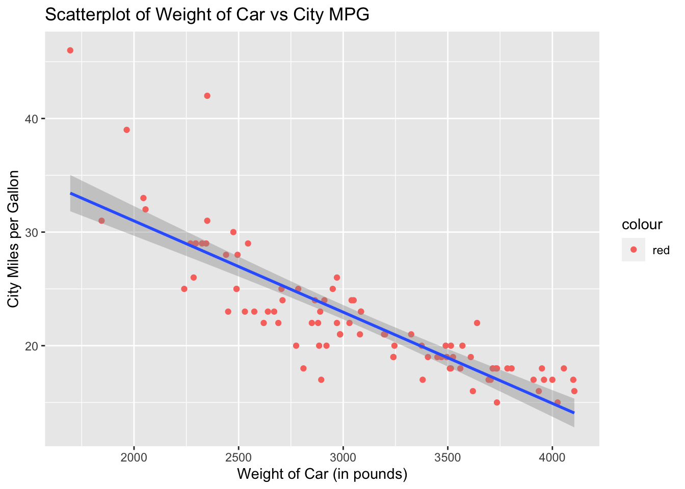
Notice the gray band around the regression line. What ggplot2 is doing is displaying the confidence interval but we are not interested in the confidence interval at this point. To remove the gray band, we need to add another argument to geom_smooth( ) which is, se = FALSE. The default for geom_smooth( ) is to draw the confidence interval unless specified otherwise. With se = FALSE, we turn off the confidence interval display.
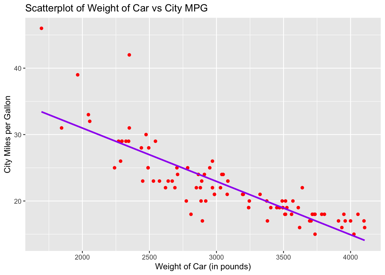
The default color for the regression line is blue. You can specify a different color if you prefer. Let us redraw the regression line using the color purple.
ggplot(data = Cars93, aes(x = Weight, y = MPG.city)) +
        geom_point(color = "red") +
        geom_smooth(method = "lm", se = FALSE, col = "purple") +
        labs(title = "Scatterplot of Weight of Car vs City MPG",
             x = "Weight of Car (in pounds)",
             y = "City Miles per Gallon")
## `geom_smooth()` using formula 'y ~ x'