Chapter 11 Histogram
Let us take a look at the Old Faithful Geyser data that is built into R. To get a description of the dataset, enter ?faithful. The description will appear on the 4th panel under the Help tab.
To view the whole dataset, use the command View(faithful). A column of observations will appear on the Source panel, under the tab called faithful. You should see 2 columns and 272 rows.
11.1 Basic R Histogram
Let us draw a histogram of the waiting time between eruptions. To do so, we use the function hist(quantitative_variable). The histogram will be drawn with bin widths and number of bins automatically calculated by R so as to produce a nice histogram.
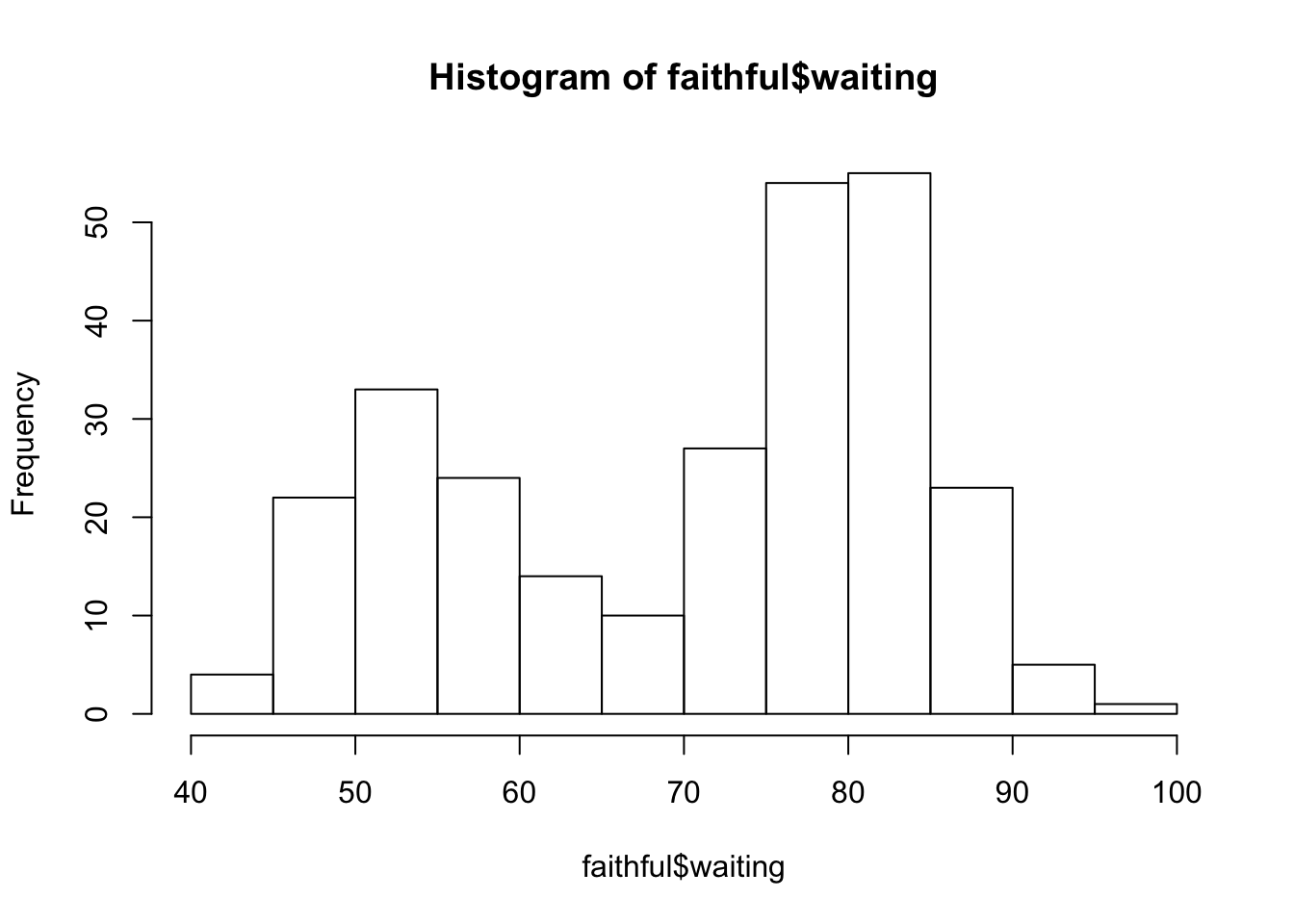
The histogram is a good way to see what kind of distribution a particular variable has. In this case, we see that the waiting time for Old Faithful eruption is bimodal.
Basic R histogram automatically adds a title and labels the horizontal axis using the vector given in the argument. To change the title to make it more meaningful, use the argument main. To relabel the horizontal axis, use the argument xlab. Basic R always uses the same arguments for labeling.
Changing Bin Widths in Basic R (Optional)
To change bin widths in basic R, we change the number of bars showing. Right now, we see 12 bars each with bin width of 5. If we want to double the bin width, we lessen the number of bars showing by using the argument breaks and writing down the number of bars to be shown. In this case, if we want the bin width to be 10, we lessen the number of bars to 6 by using the argument breaks.
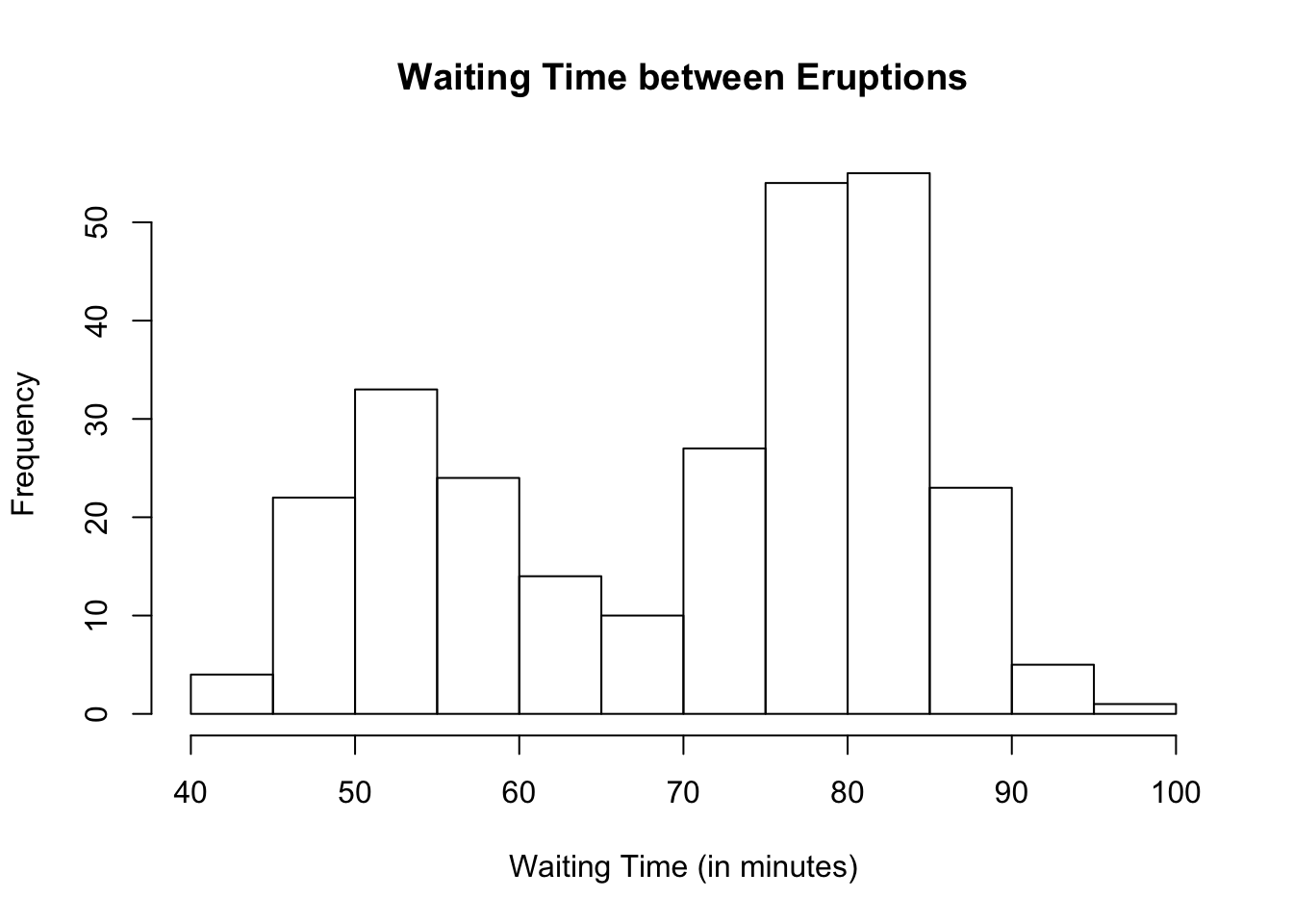
hist(faithful$waiting,
     main = "Waiting Time between Eruptions",
     xlab = "Waiting Time (in minutes)",
     breaks = 6)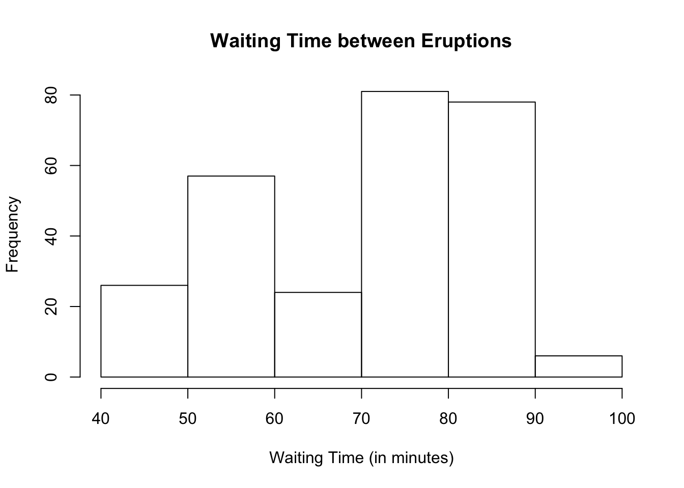
Suppose we want to lessen the bin width. In other words, suppose we want to double the number of bars showing to 20.
hist(faithful$waiting,
     main = "Waiting Time between Eruptions",
     xlab = "Waiting Time (in minutes)",
     breaks = 20)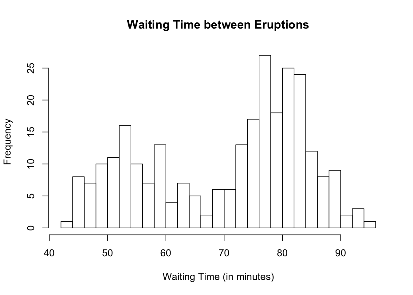
You can play with the number of breaks. However, be careful not to make the bin widths too small or too wide as it may not make the actual shape of the histogram apparent as seen in the next example where the bin width is 20.
hist(faithful$waiting,
     main = "Waiting Time between Eruptions",
     xlab = "Waiting Time (in minutes)",
     breaks = 3)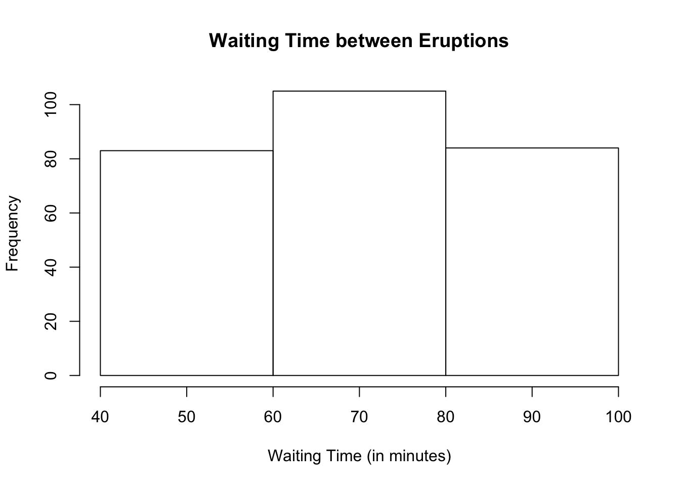
Changing Range of Values in Basic R (Optional)
If you want to see only certain horizontal range of values, use the argument xlim. To change the vertical range of values, use the argument ylim.
In our Old Faithful dataset, suppose we only want to see waiting times between 70 and 100 minutes.
hist(faithful$waiting,
     main = "Waiting Time between Eruptions",
     xlab = "Waiting Time (in minutes)",
     xlim = c(70, 100))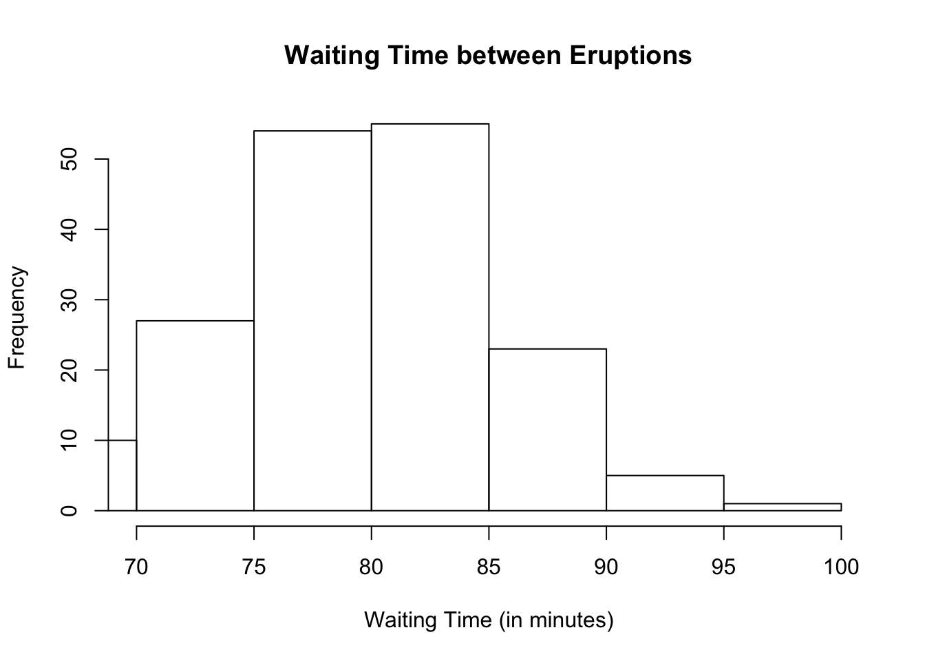
To extend the vertical axis so we can see the top values more clearly, change the vertical values to go from 0 to 60.
hist(faithful$waiting,
     main = "Waiting Time between Eruptions",
     xlab = "Waiting Time (in minutes)",
     xlim = c(70, 100), ylim = c(0, 60))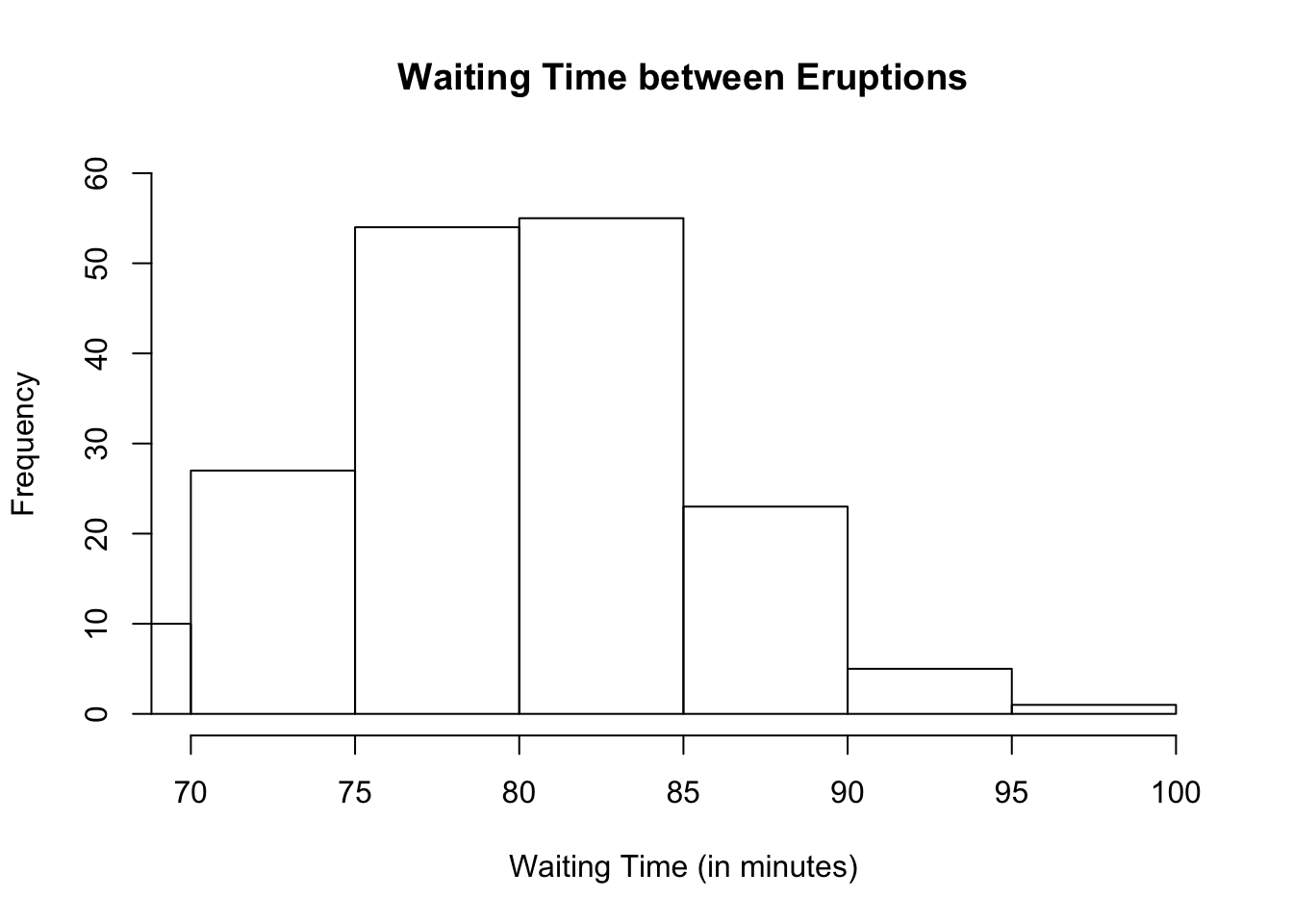
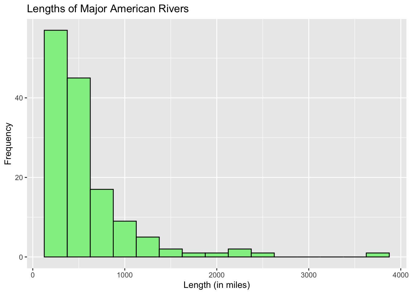
Let us take a look at another dataset built into R called rivers. If you look at the dataset for rivers, you will find that it consists of only 1 column, meaning, rivers is a vector. Let us draw its histogram.
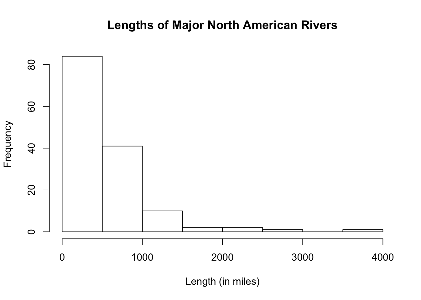
From the histogram, we see that the lengths of major north american rivers are extremely right-skewed with possible outlier(s).
Adding Colors in Basic R (Optional)
If you want to add colors to the histogram, use the exact same arguments as those of bar graphs. Suppose we want to make the borders, blue, and the fill, orange.
hist(rivers,
     main = "Lengths of Major North American Rivers",
     xlab = "Length (in miles)",
     border = "purple",
     col = "orange",
     ylim = c(0, 100))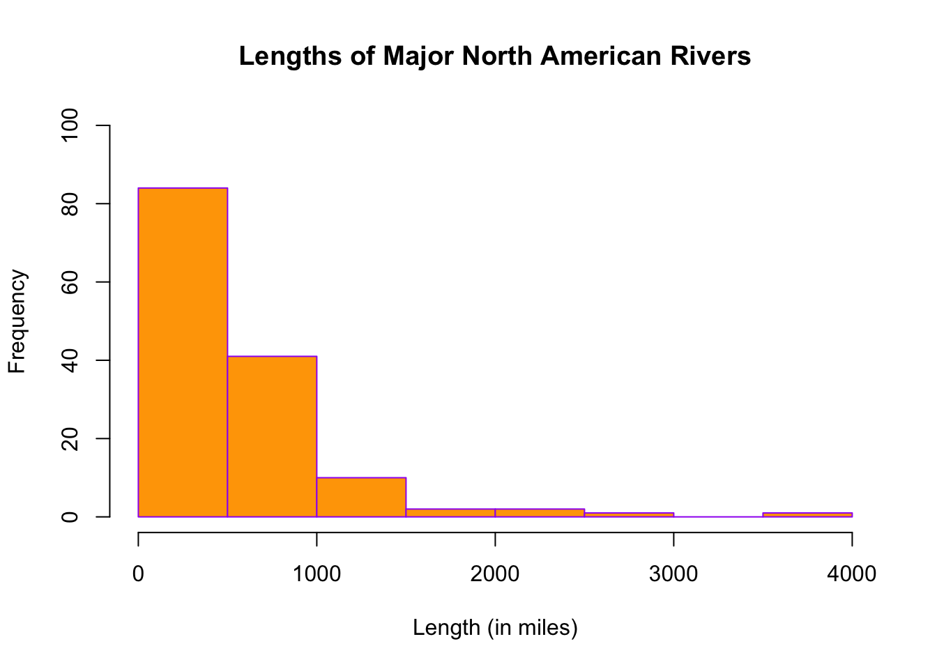
11.2 Ggplot2 Histogram
To draw a histogram in ggplot2, we use the geometric function, geom_histogram. Let us take a look at how this is done using the variable, waiting, in the dataset, faithful.
## `stat_bin()` using `bins = 30`. Pick better value with `binwidth`.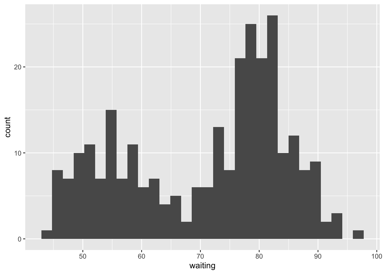
As you can see, the histogram is not as nice as those in Basic R. The default fill and border color is black which makes it hard to differentiate one bar from another. There is also a message from R concerning the number of bins. If the number of bins is not specified, ggplot2 defaults to 30. This value may or may not produce a nice histogram.
To enhance the histogram:
- change the binwidth (you may have to play around with the binwidth to get the desired width)
- add color to outline the bars
- filling the bars with a color different from the outline color to better see each bar
- add a title and labels to the axes
ggplot(data = faithful, aes(x = waiting)) +
        geom_histogram(binwidth = 5, color = "black", fill = "white") +
        labs(title = "IQ Score", x = "IQ Score", y = "Frequency")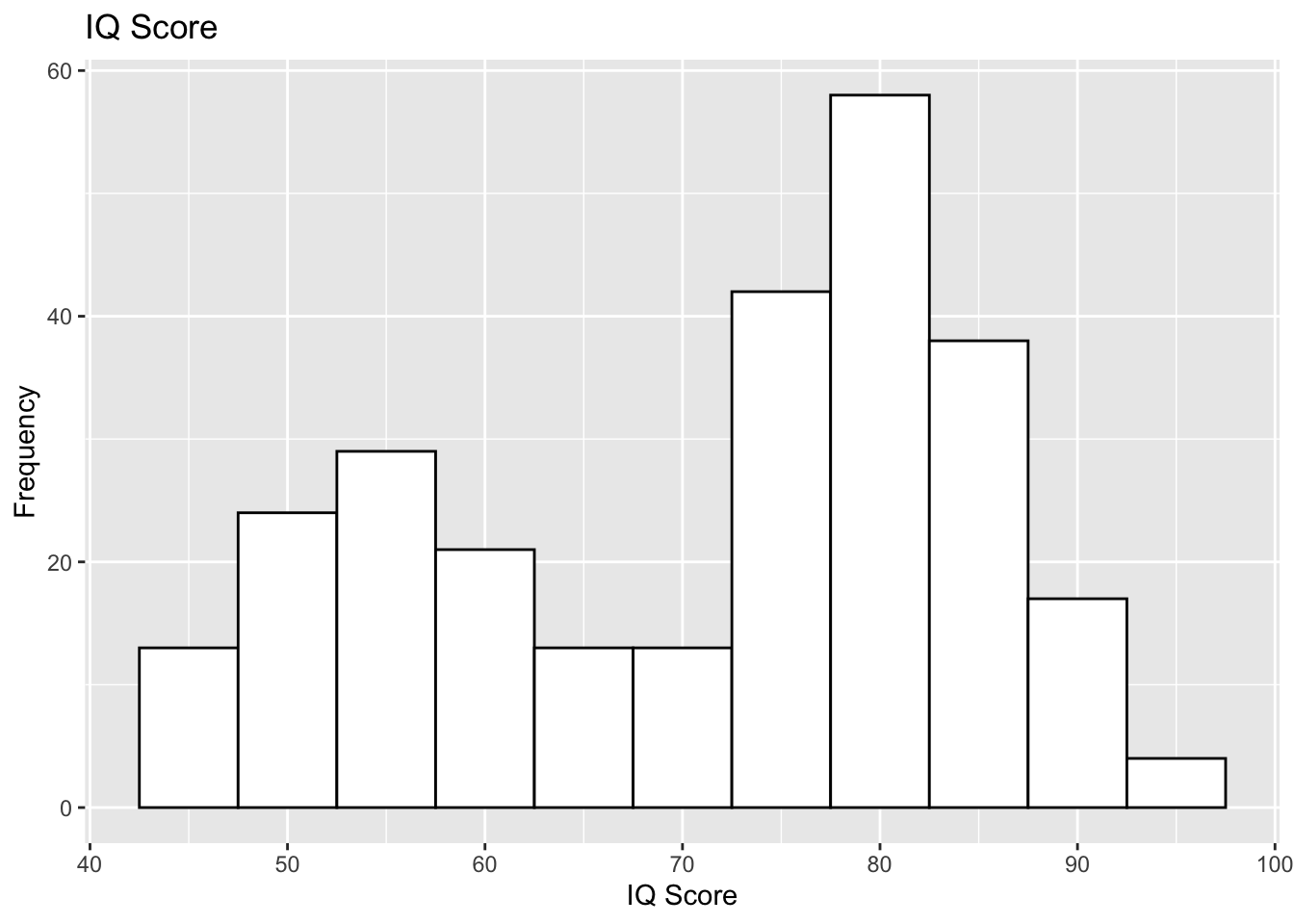
Ggplot2 Histogram of a Vector
Let us take a look at how to draw the histogram when your dataset happens to be a vector by looking at the dataset, rivers. Because rivers is a numeric vector, we leave the argument empty in the ggplot function.
ggplot() +
  geom_histogram(aes(rivers), binwidth = 250, color = "black", fill= "light green") +
  labs(title = "Lengths of Major American Rivers", x = "Length (in miles)",
       y = "Frequency")