Chapter 8 Bar Graph
The information below shows the number of users (in millions) of selected internet browsers in 2018. (Source: statista.com)
- Chrome - 2502.4
- Edge - 150.78
- Firefox - 395.83
- Internet Explorer - 238.05
- Opera - 86.49
- Safari - 387.65
- Others - 134.8
Let us first create a data frame, called IB, using the given information.
Browser <- c("Chrome", "Edge", "Firefox", "IE",
             "Opera", "Safari", "Others")
Users <- c(2502.4, 150.78, 395.83, 238.05, 86.49, 387.65, 134.8)
IB <- data.frame(Browser, Users)
IB
## Browser Users
## 1 Chrome 2502.40
## 2 Edge 150.78
## 3 Firefox 395.83
## 4 IE 238.05
## 5 Opera 86.49
## 6 Safari 387.65
## 7 Others 134.808.1 Basic R Bar Graph
To draw a bar graph, use the function, barplot(height = quantitative_variable). Note that we want the height of the bar graph to follow the entries in Users. You can include the word “height” in the barplot function or exclude it, as shown in the next two examples. As long as the vector of values is the first vector in the barplot function, barplot will use those values to determine each bar’s height.
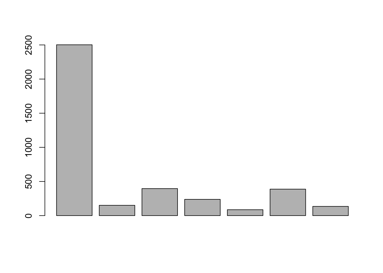
The barplot default is a vertical bar graph with black borders and gray filling. The bar graph is drawn in the same order as the data frame entries.
Enhancements in Basic R
As you can see, the previously drawn barplot does not tell us much. To add a title, labels on the axes and color to your bar graph, we use the following arguments.
- main = “Header of the graph”
- xlab = “x-axis label”
- ylab = “y-axis label”
- name.arg = vector (used for labelling each of the bar graphs)
- border = “bar graph border color”
- col = “color to fill bar graph”
barplot(height = IB$Users,
        main = "2018 Internet Browser Users (in million)",
        xlab = "Internet Browser",
        ylab = "Users",
        names.arg = IB$Browser,
        border = "dark blue",
        col = "pink")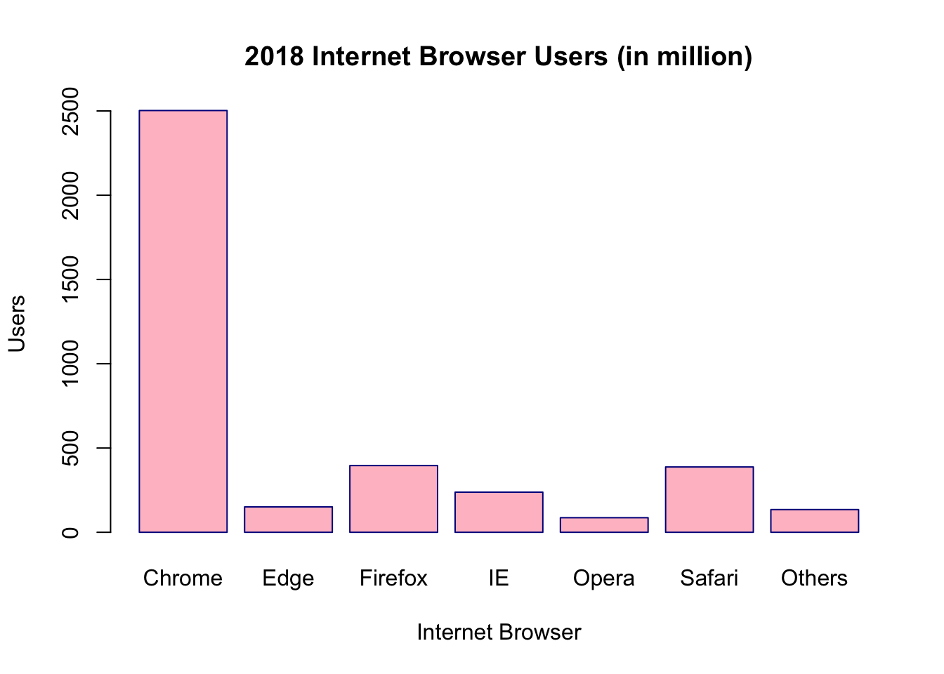
Rearranging Results in Basic R
Suppose we want to show the bar graph in ascending order. First, arrange the dataset in ascending order and rename the object. Then draw the bar graph of the new object.
IB_asc <- IB[order(IB$Users),]
barplot(IB_asc$Users,
        main = "2018 Internet Browser Users (in millions)",
        xlab = "Internet Browser",
        ylab = "Users",
        names.arg = IB_asc$Browser)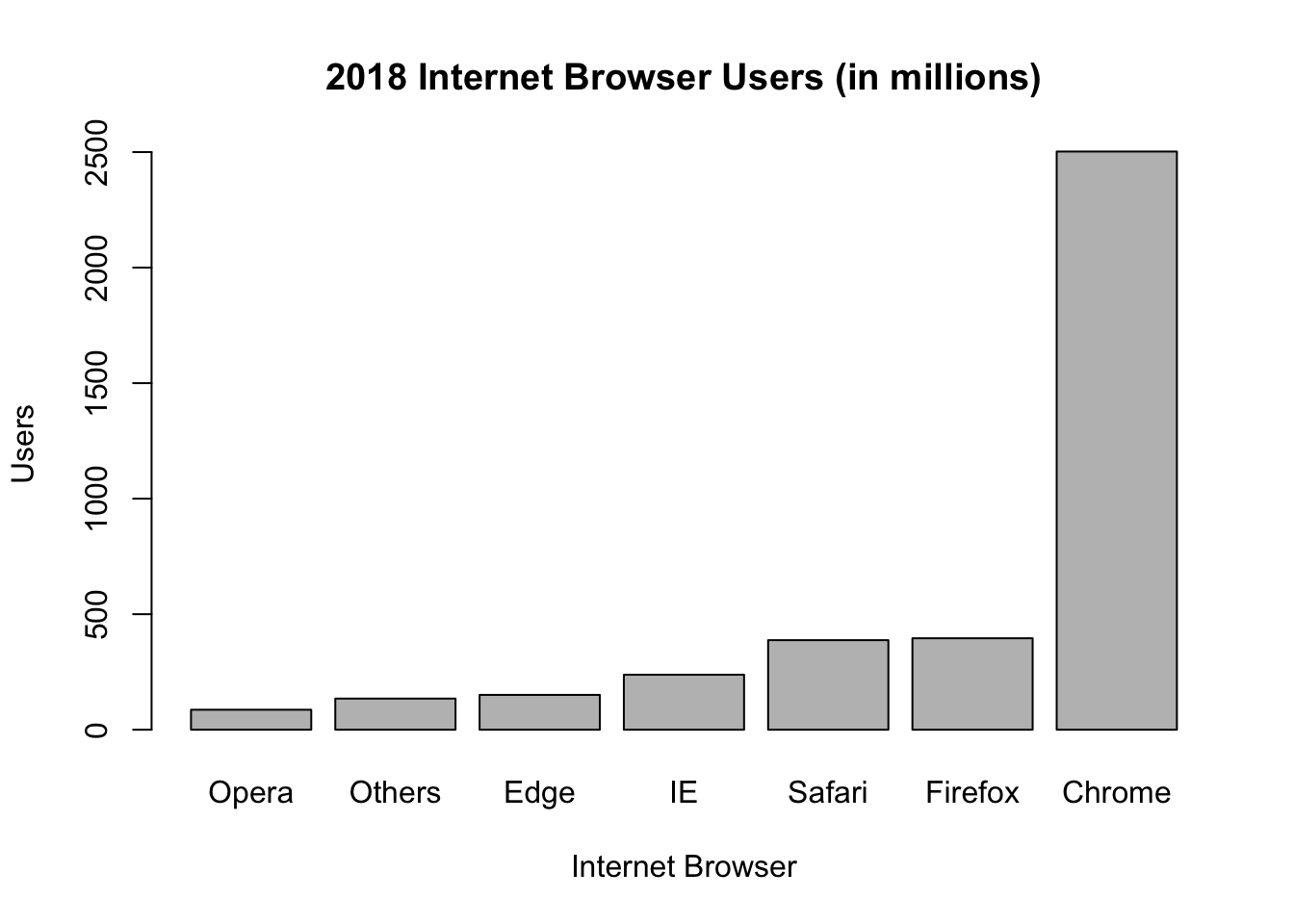
If you want the bar graph to go in descending order, put a negative sign on the target vector and rename the object. Then draw the bar graph of the new object.
IB_desc <- IB[order(-IB$Users),]
barplot(IB_desc$Users,
        main = "2018 Internet Browser Users (in millions)",
        xlab = "Internet Browser",
        ylab = "Users",
        names.arg = IB_desc$Browser)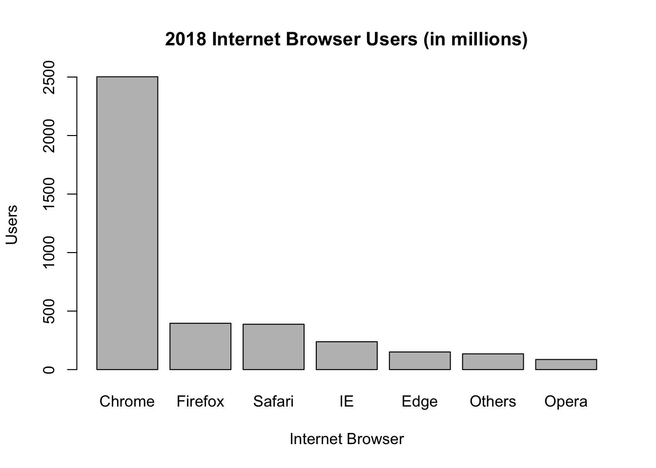
Horizontal Bar Graphs in Basic R
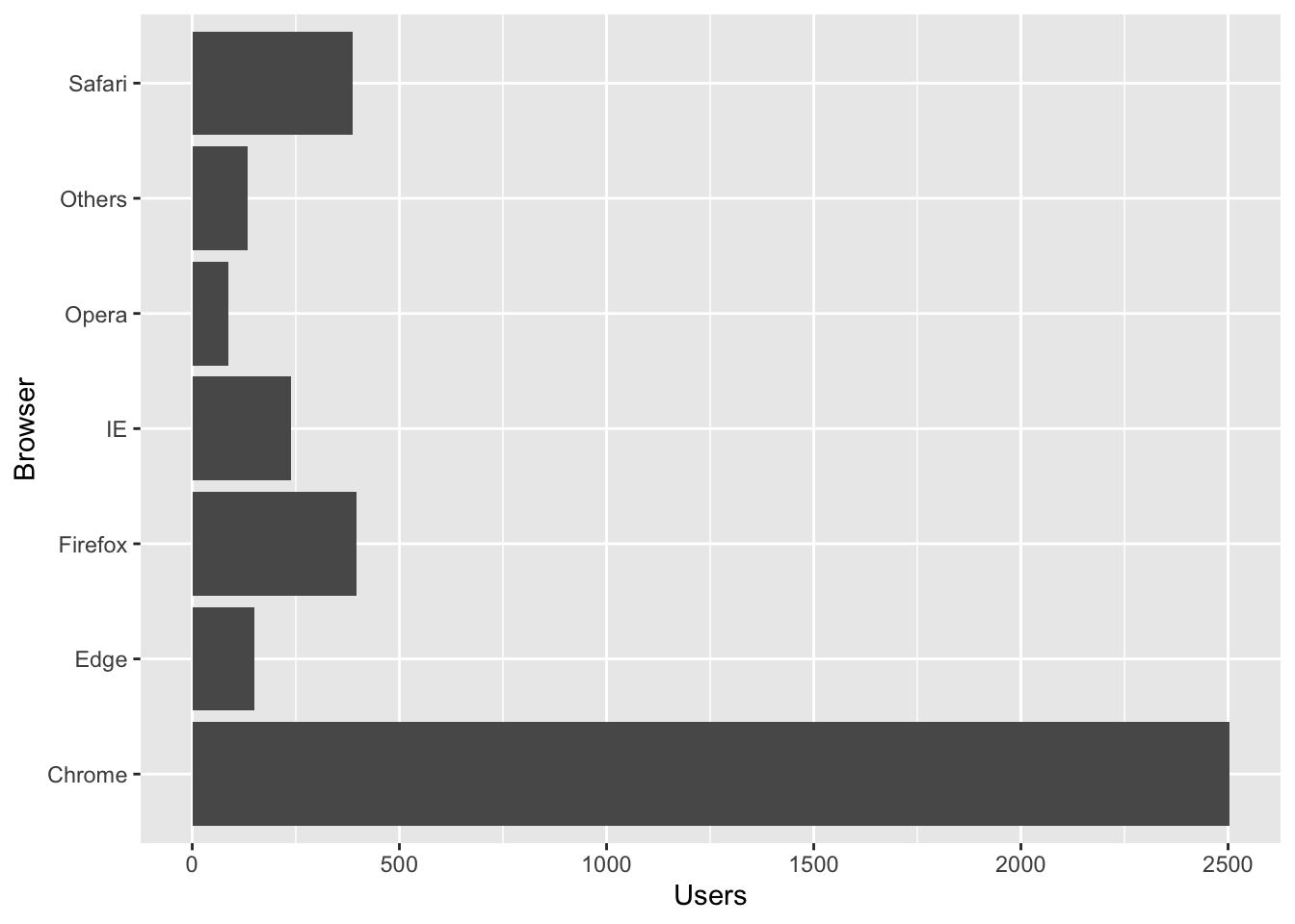
To do a horizontal bar graph, specify horiz = TRUE.
barplot(IB$Users,
        main = "2018 Internet Browser Users (in millions)",
        xlab = "Users",
        names.arg = IB$Browser,
        horiz = TRUE)
Notice that the y-axis label default is parallel to the axis. Notice also that some of the browsers have names longer than the height of the bar graph. Therefore, not all the names can fit on the graph and be shown.
To change the label to make it perpendicular to the y-axis, add the argument, las = 1. In case the horizontal bar graph makes the y-axis labels go out of chart, use the argument, cex.names, to change the expansion factor. 1 is the default. To shrink the label, choose expansion factor less than 1. In case the labels are too small and you want to enlarge them, use an expansion factor greater than 1.
barplot(IB$Users,
        main = "2018 Internet Browser Users (in millions)",
        xlab = "Users",
        names.arg = IB$Browser,
        horiz = TRUE,
        las = 1,
        cex.names = 0.9)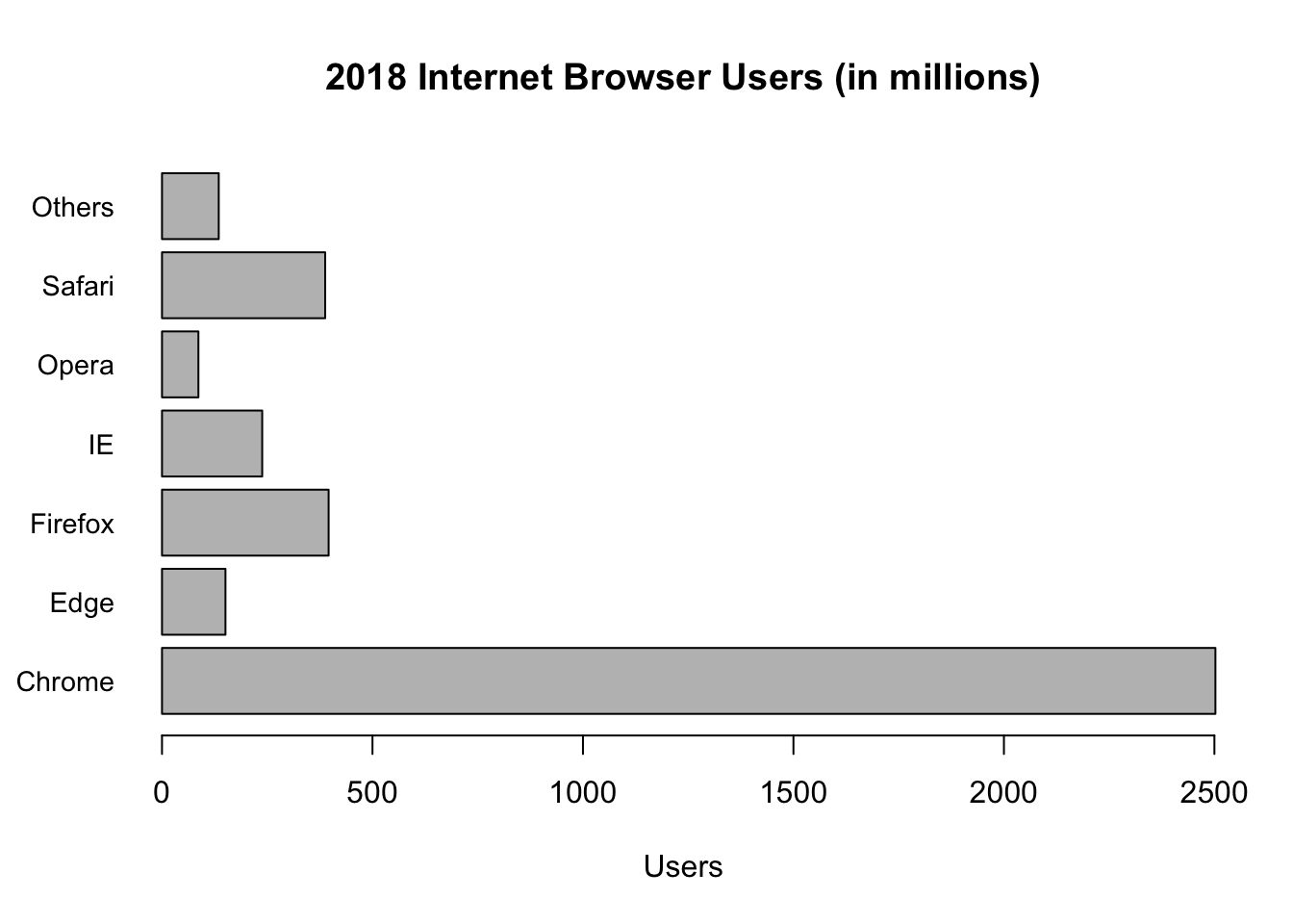
To draw a bar graph in a particular order, first rearrange the dataset in a particular order before drawing the bar graph. Let us take a look at the bar graph of IB_desc that was reordered previously.
barplot(IB_desc$Users,
        main = "2018 Internet Browser Users (in millions)",
        xlab = "Users",
        names.arg = IB_desc$Browser,
        horiz = TRUE, las = 1,
        cex.names = 0.9,
        col = "yellow")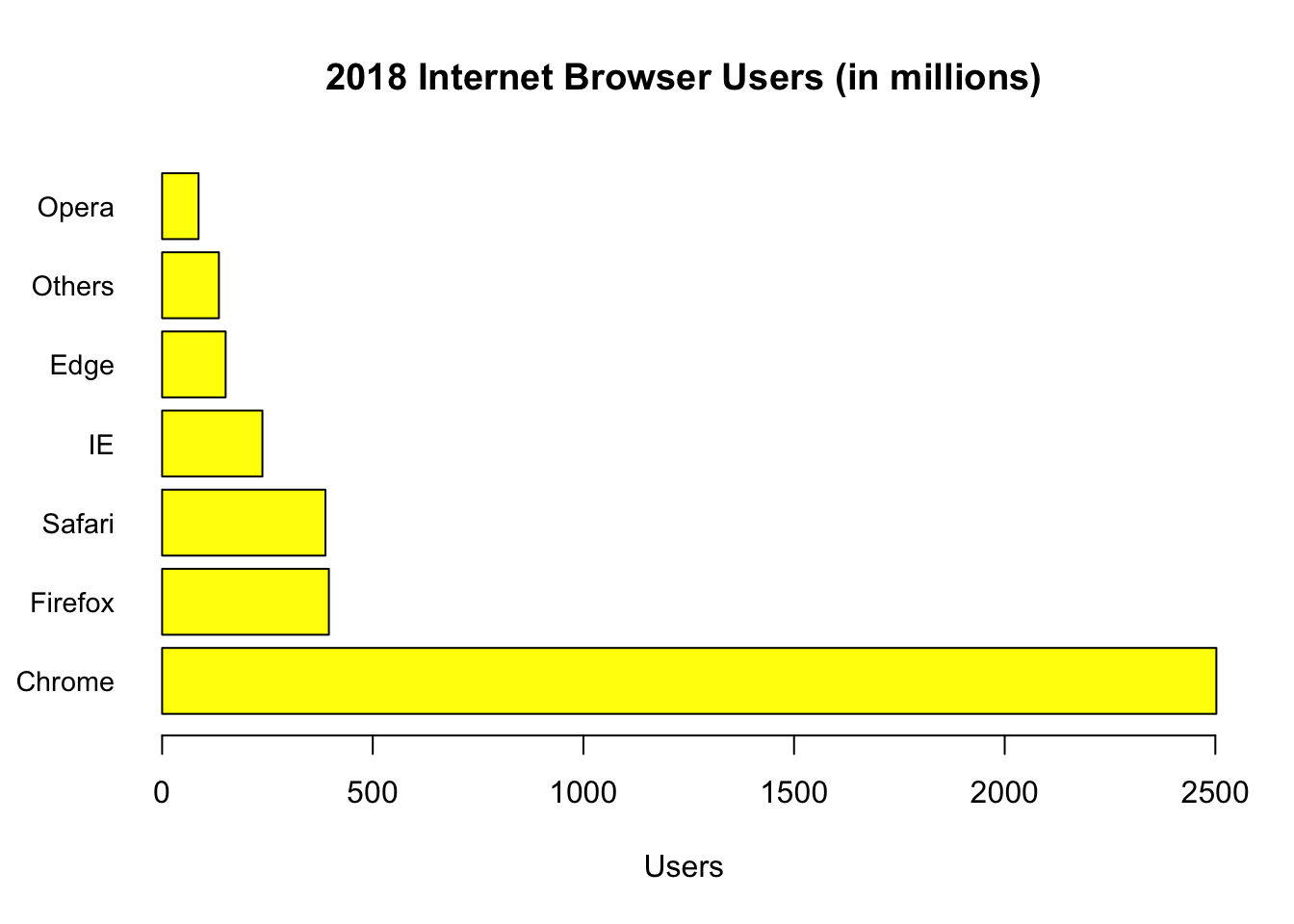
8.2 Ggplot2 Bar Graph
Ggplot2 is most likely already installed. If it is not installed, an error message will be shown when you load the package in which case, you will need to install ggplot2 first.
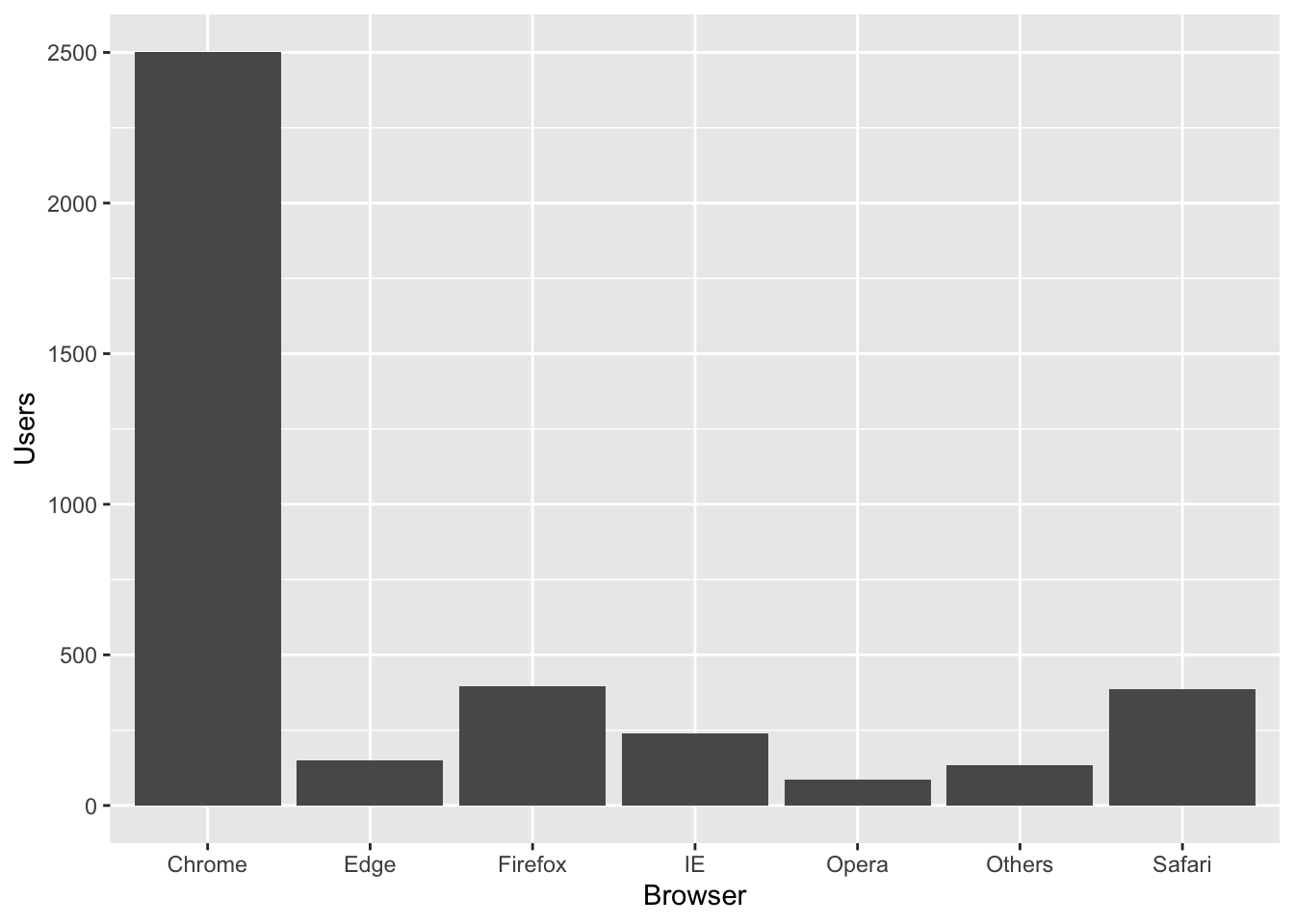
The syntax to do a bar graph in ggplot2 is:The geometric function called geom_bar( ) is used to draw a bar graph in ggplot2. Axes labels are automatically added and graphs are arranged in alphabetical order.
The heights of the bars commonly represent either a count of cases in each group or the values in a column of the data frame. By default, geom_bar uses stat = “bin.” That means that the height of each bar equals the number of cases in each group. In our case, we want the heights of the bars to represent values in Users. Therefore, we use stat = “identity” and map a value to the y aesthetic.

A clearer way to write the ggplot command is to declare the dataset and specify the set of plot aesthetics as follows:
The default for geom_bar is a vertical barplot. To do a horizontal barplot, we flip the coordinates by adding the commnand cood_flip( ) as follows.
Enhancements in Ggplot2
The ggplot2 default fill and border color on a bar graph is black. To fill the bar graph with a different color, use fill = “color choice”. For a different border color, use color = “color choice”. Put the desired changes in the geom_bar function.
Suppose we want the bar graph to be orange with purple borders.
ggplot(data = IB, aes(x = Browser, y = Users)) +
   geom_bar(stat = "identity", fill = "orange", color = "purple")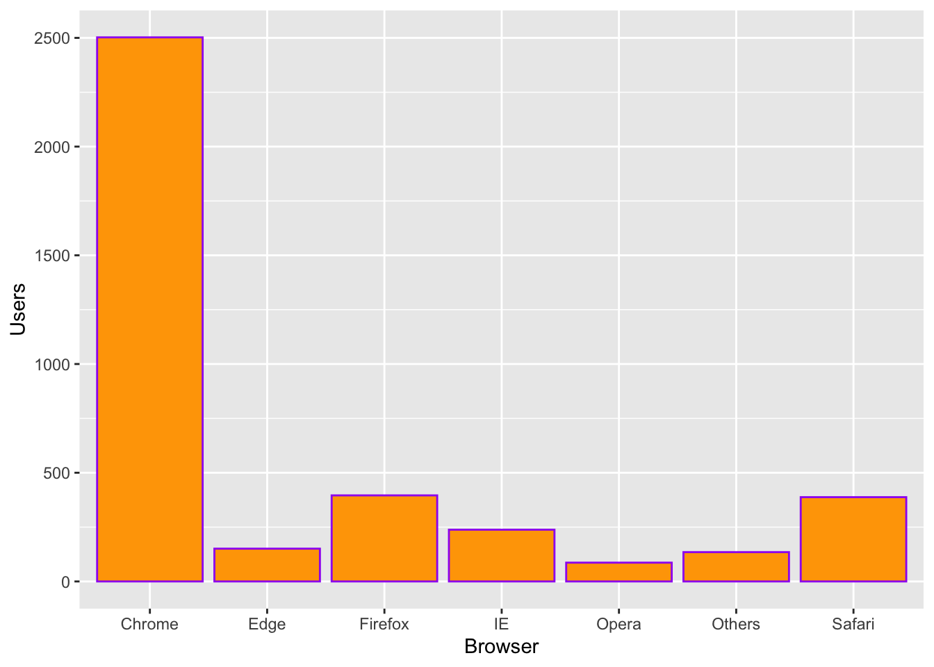
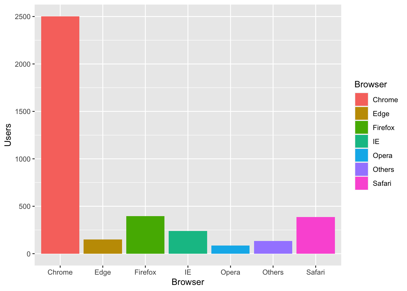
To make each bar graph take on a different color, use fill = variable in the ggplot function. Ggplot2 will fill each bar graph with a different color and add a legend.
To reorder the bar graph in descending or ascending order, use the function reorder( ). There is no need to rename the data frame.
Suppose we want to reorder the internet browsers in descending order by the number of users. Browser is on the x-axis. Under the x of the aesthetic function, use the function reorder( ) as follows.
ggplot(data = IB, aes(x = reorder(Browser, -Users),
                           y = Users, fill = Browser)) +
   geom_bar(stat = "identity") +
   labs(title = "2018 Internet Browser Users (in millions)",
        x = "Internet Browser", y = "Users")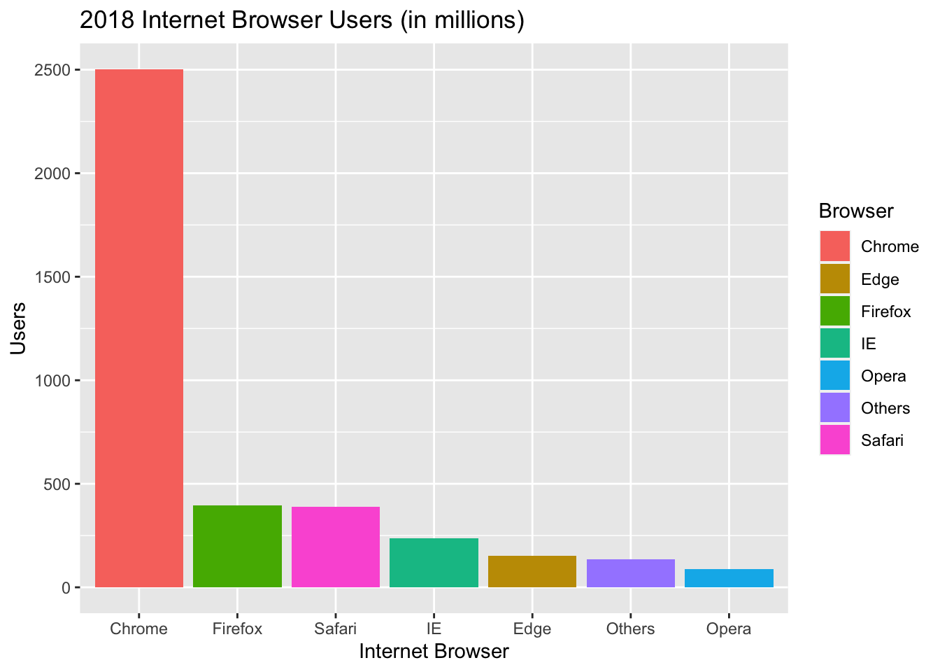
8.3 Side-by-Side Bar Graph
Let us add another column to our data frame. The new column will be data for web browser users in 2020. To make our column header clearer, we will change the variable “Users” to “2018” and add a new column with variable “2020.”
8.3.1 Renaming a Column Header
We use the function, names( ) as such:Let us rename, Users, as 2018.
Let us now add a new column, that has the 2020 web browser usage data to our data frame. To add a new column, we list all the vector values and assign it a variable name. We will call the new variable, 2020. Be sure to put backticks on 2020 so R does not treat 2020 as a numerical value.
Let us take a look at our data frame with the new column added.
##   Browser    2018     2020
## 1  Chrome 2502.40 2948.130
## 2    Edge  150.78  165.290
## 3 Firefox  395.83  241.650
## 4      IE  238.05  264.850
## 5   Opera   86.49   77.330
## 6  Safari  387.65  778.113
## 7  Others  134.80  357.420
Suppose we want to compare web browser usage between 2018 and 2020, sorted by web browser. A side-by-side bar graph would be a perfect graph to use. Be sure to include the argument, beside = TRUE, so that the graph comes out side-by-side.
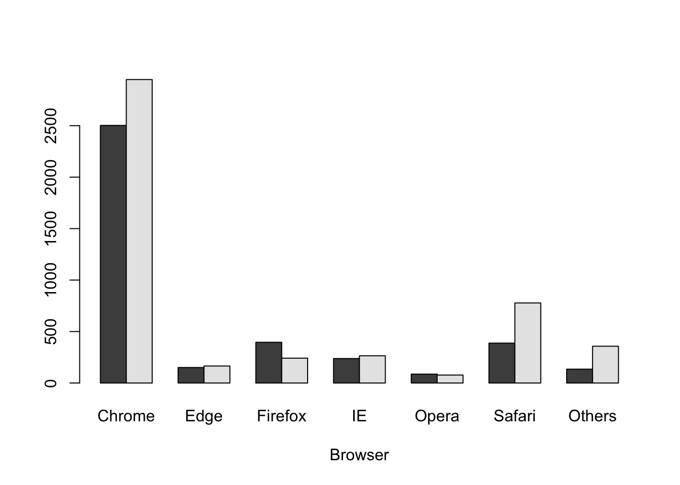
The graph will be more readable if we add labels and colors to differentiate usage between 2018 and 2020. Adding a legend and stretching the vertical axis will be helpful.
barplot(cbind(IB$`2018`, IB$`2020`) ~ IB$Browser,
        beside = TRUE,
        xlab = "Browser",
        ylab = "Web Browser Users (in Millions)",
        ylim = c(0, 3000),
        col = c("green", "purple"),
        legend.text = c("2018", "2020"))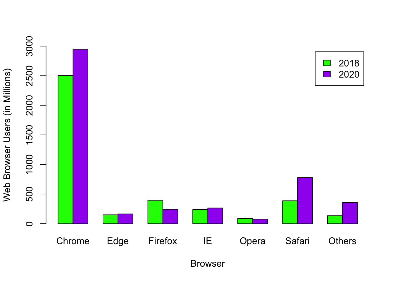
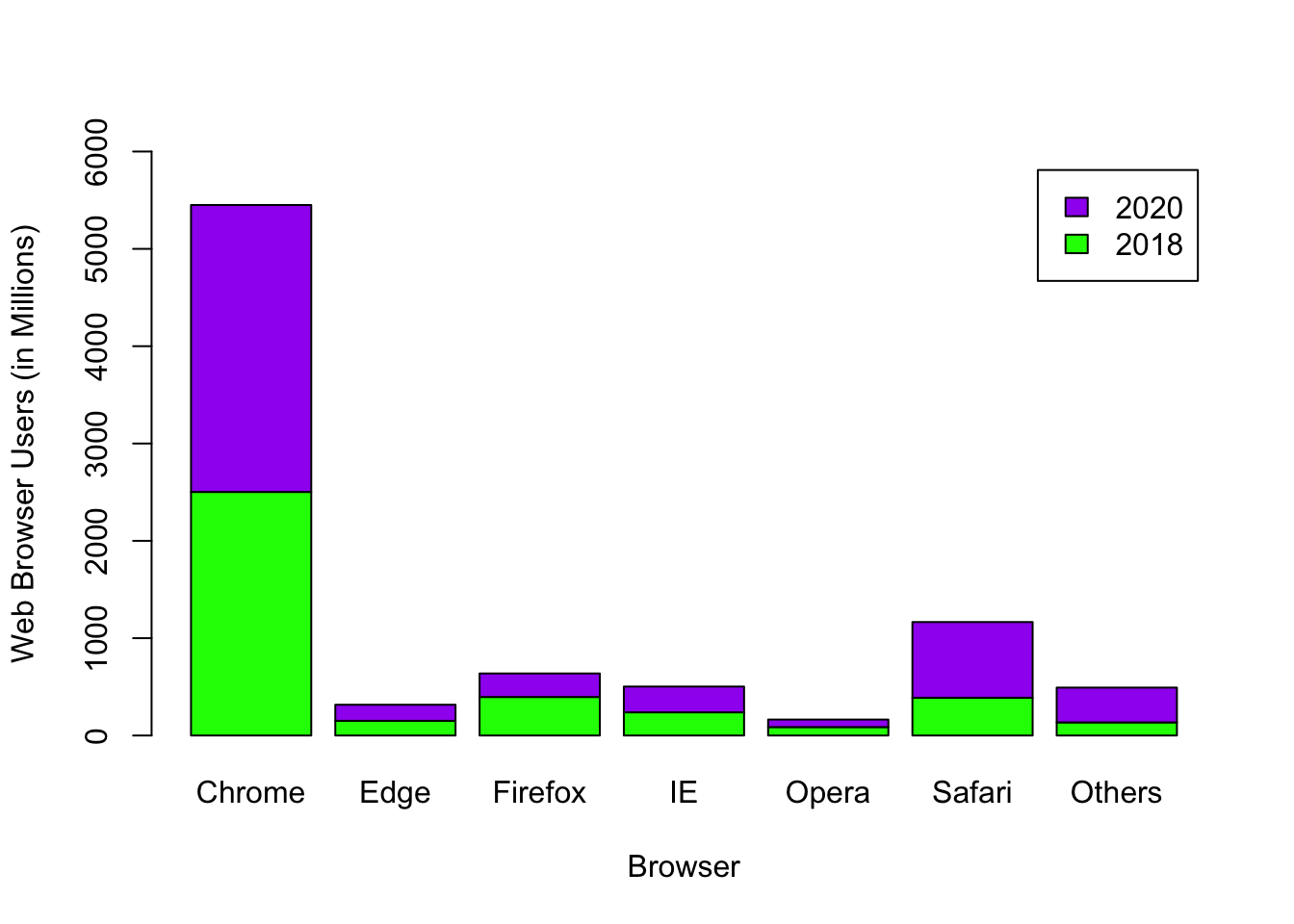
8.4 Stacked Plot
If you do not add the argument, beside = TRUE, the graph defaults to a stacked graph.
barplot(cbind(IB$`2018`, IB$`2020`) ~ IB$Browser,
        xlab = "Browser",
        ylab = "Web Browser Users (in Millions)",
        ylim = c(0, 6000),
        col = c("green", "purple"),
        legend.text = c("2018", "2020"))