Chapter 9 Pie Chart
The information below shows the population (in millions) of the top ten most populous cities in the US in 2019. (Source: moving.com)
- New York - 8.60
- Los Angeles - 4.06
- Chicago - 2.68
- Houston - 2.40
- Phoenix - 1.71
- Philadelphia - 1.58
- San Antonio - 1.57
- San Diego - 1.45
- Dallas - 1.40
- San Jose - 1.03
Using the given information, let us create a data frame and call it top_ten.
Cities <- c("New York", "Los Angeles", "Chicago", "Houston", "Phoenix",
            "Philadelphia", "San Antonio", "San Diego", "Dallas", "San Jose")
Population <- c(8.60, 4.06, 2.68, 2.40, 2.71, 1.58, 1.57, 1.45, 1.40, 1.03 )
top_ten <- data.frame(Cities, Population)
top_ten
## Cities Population
## 1 New York 8.60
## 2 Los Angeles 4.06
## 3 Chicago 2.68
## 4 Houston 2.40
## 5 Phoenix 2.71
## 6 Philadelphia 1.58
## 7 San Antonio 1.57
## 8 San Diego 1.45
## 9 Dallas 1.40
## 10 San Jose 1.039.1 Basic R Pie Chart
To draw a pie chart, use the function pie(quantitative_variable)
The pie chart is drawn in the clockwise direction from the given data. Different color slices are added automatically. The color default are the pastels. However, the graph does not tell us much. Let us add labels to each slice using the argument labels = variable.

The graph is now more understandable. The pie chart is drawn according to the data frame entries going in the counterclockwise motion. If you want to draw the pie chart in ascending or descending order, you will want to rearrange the dataset and rename the object first. Then draw the pie chart of the new object.
Let us rearrange the dataset in descending order and name it top_ten_descend. Then draw and add a title to the pie chart.
top_ten_descend <- top_ten[order(-top_ten$Population), ]
pie(top_ten_descend$Population,
    labels = Cities,
    main = "Most Populous US Cities in 2019 (in millions)")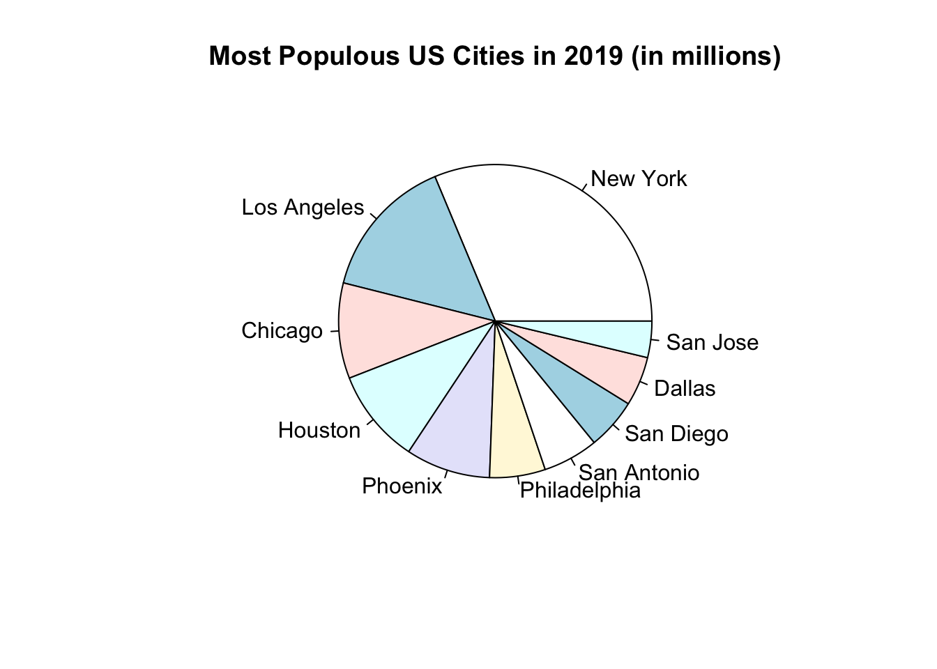
Enhancements in Basic R (Optional)
Here are some enhancements for your pie chart.
- Use the argument, col = rainbow(length(vector)) to make the color of each pie more vibrant
- Add percentages to the labels
To add percentages to the label, calculate the percentage of each entry as compared to the total. Then round the result to the nearest whole number in order to avoid decimals.
# Calculate percentages
pct <- round(100*top_ten_descend$Population/sum(top_ten_descend$Population))
# Draw oie chart
pie(top_ten_descend$Population,
    labels = paste(top_ten_descend$Cities, sep = " ", pct, "%"),
    col = rainbow(length(top_ten_descend$Population)),
    main = "Most Populous US Cities in 2019 (in millions)")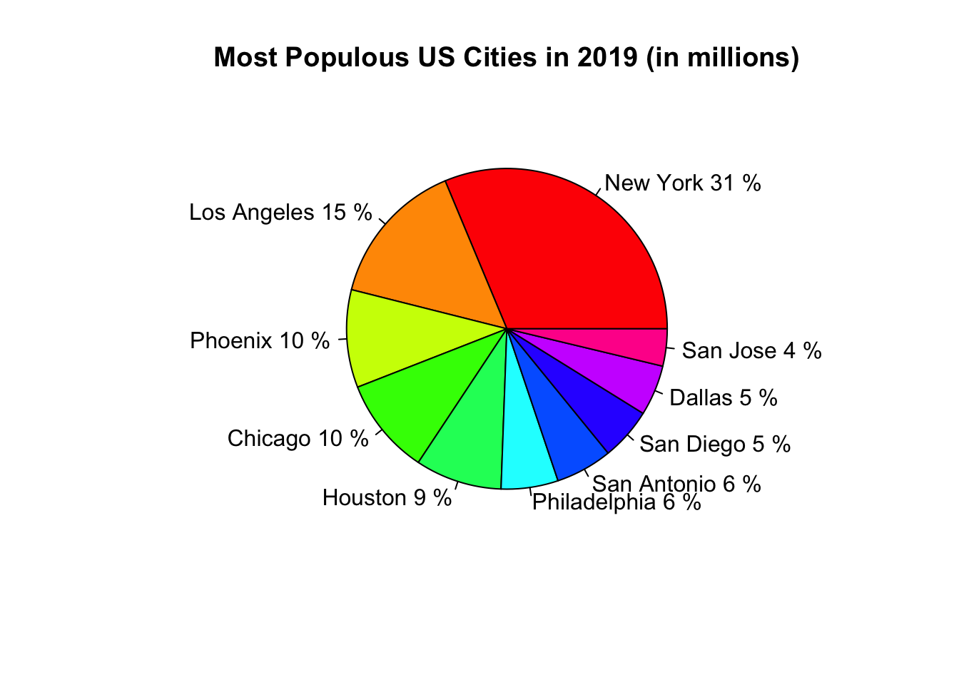
9.2 Ggplot2 Pie Chart
Ggplot2 does not have a specific geometric function to build pie charts. The key is to go back to geom_bar( ) and add the polar coordinate function to make the graph circular. There are ways to enhance the pie chart but we will keep it to a minimum here. Leave the x in aesthetics blank with just the quotation marks. The pie chart will be drawn in the counterclockwise motion, alphabetically.
ggplot(data = top_ten, aes(x = "", y = Population, fill = Cities)) +
  geom_bar(stat = "identity") +
  coord_polar("y")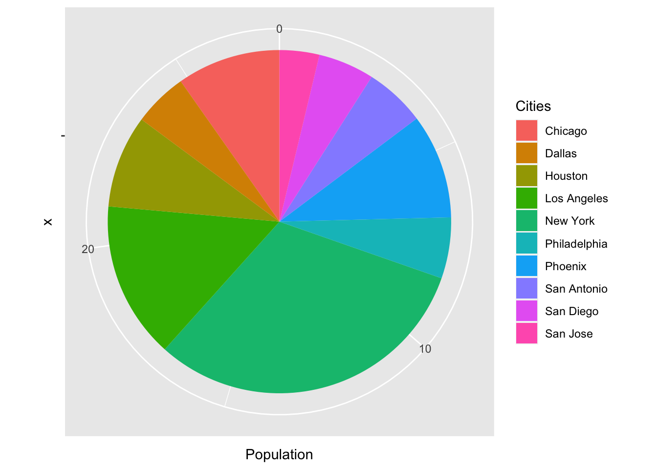
As you can see, the pie chart has many extraneous background information. Let us make some changes and enhance the pie chart a little bit.
- Remove the numeric labels and the polar grid by appending the function, theme_void( ).
- Add borders to each slice by adding the argument color into geom_bar( ).
- Draw the pie chart in the clockwise motion by adding a negative sign to the target vector.
Let us incorporate the changes, add a title and look at the resulting pie chart.
ggplot(data = top_ten, aes(x = "", y = -Population, fill = Cities)) +
  geom_bar(stat = "identity", color = "black") +
  labs(title = "Most Populous US Cities in 2019 (in millions)") +
  coord_polar("y") +
  theme_void()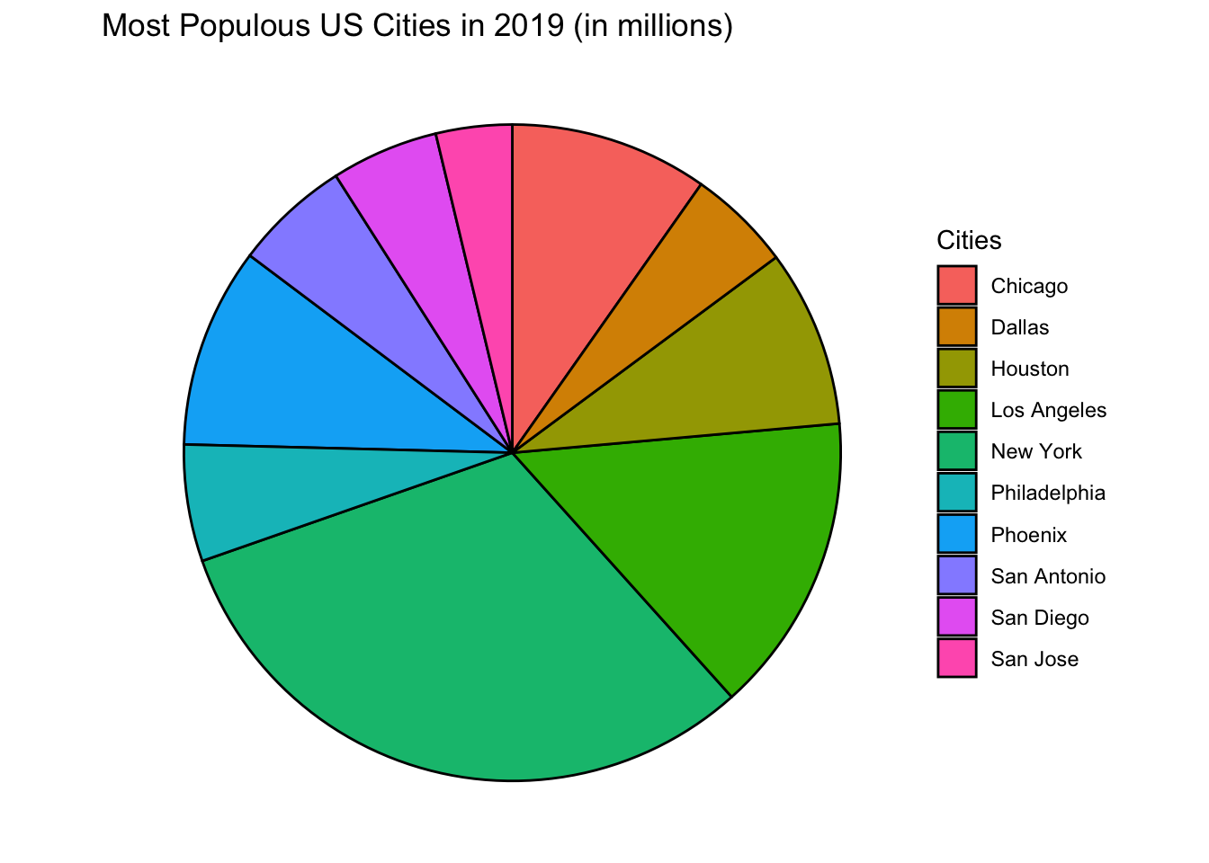
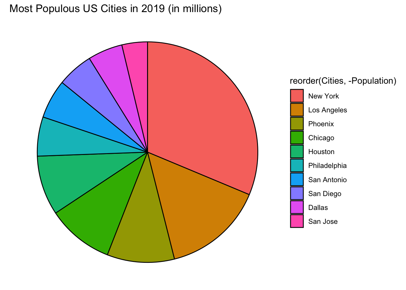
Reordering the pie chart in ggplot2 is similar to reordering bar graphs. For the argument fill, use the function reorder( ).
ggplot(data = top_ten, aes(x = "", y = -Population,
                           fill = reorder(Cities, -Population))) +
  geom_bar(stat = "identity", color = "black") +
  labs(title = "Most Populous US Cities in 2019 (in millions)") +
  coord_polar("y") +
  theme_void()