Chapter 11 More Granular Data on Vaccines and Deaths
Malaysia has made publicly available larger, more detailed, and granular data sets on Covid. We “copy and paste” below the description of the csv datasets from the GitHub depository.49
1. Cases
All aggregated data on cases available via Github is derived from this line list.
date: yyyy-mm-dd format; date of casedays_dose1: number of days between the positive sample date and the individual’s first dose (if any); values 0 or less are nulleddays_dose2: number of days between the positive sample date and the individual’s second dose (if any); values 0 or less are nulledvaxtype: p = Pfizer, s = Sinovac, a = AstraZeneca, c = Cansino, m = Moderna, h = Sinopharm, j = Janssen, u = unverified (pending sync with VMS)import: binary variable with 1 denoting an imported case and 0 denoting local transmissioncluster: binary variable with 1 denoting cluster-based transmission and 0 denoting and unlinked casesymptomatic: binary variable with 1 denoting an individual presenting with symptoms at the point of testingstate: state of residence, coded as an integer (refer to param_geo.csv)district: district of residence, coded as an integer (refer to param_geo.csv)age: age as an integermale: binary variable with 1 denoting male and 0 denoting femalemalaysian: binary variable with 1 denoting Malaysian and 0 denoting non-Malaysian
2. Deaths
All aggregated data on deaths available via Github is derived from this line list. The deaths line list was released before the cases line list. As such, it is formatted differently, because several optimizations had to be made to reduce the size of the case line list (in particular, coding as many things as possible as integers).
date: yyyy-mm-dd format; date of deathdate_announced: date on which the death was announced to the public (i.e. registered in the public line list)date_positive: date of positive sampledate_dose1: date of the individual’s first dose (if any)date_dose2: date of the individual’s second dose (if any)vaxtype: p = Pfizer, s = Sinovac, a = AstraZeneca, c = Cansino, m = Moderna, h = Sinopharm, j = Janssen, u = unverified (pending sync with VMS)state: state of residenceage: age as an integer; note that it is possible for age to be 0, denoting infants less than 6 months oldmale: binary variable with 1 denoting male and 0 denoting femalebid: binary variable with 1 denoting brought-in-dead and 0 denoting an inpatient deathmalaysian: binary variable with 1 denoting Malaysian and 0 denoting non-Malaysiancomorb: binary variable with 1 denoting that the individual has comorbidities and 0 denoting no comorbidities declared. (Comorbidity is the state of having multiple medical conditions at the same time, especially when they interact with each other in some way.)
We chose to download the linelist_deaths.csv and param_geo.csv data sets for now. We may add others later. We activate some packages.
# deaths <- read.csv("https://raw.githubusercontent.com/MoH-Malaysia/covid19-public/main/epidemic/linelist/linelist_deaths.csv")
# param_geo <- read.csv("https://raw.githubusercontent.com/MoH-Malaysia/covid19-public/main/epidemic/linelist/param_geo.csv")

# saveRDS(deaths, "data/deaths.rds")
# saveRDS(param_geo, "data/param_geo.rds")


deaths <- readRDS("data/deaths.rds")
param_geo <- readRDS("data/param_geo.rds")
We downloaded the data on “2021-20-23”. We will visually explore this data frame. Initial data exploration should reveal some questions to further explore. We will focus on the deaths and vaccinations. All the data is in the deaths data frame.
11.1 Data frame structure
deaths
##           date date_announced  date_positive     date_dose1     date_dose2
##    "character"    "character"    "character"    "character"    "character"
##        vaxtype          state            age           male            bid
##    "character"    "character"      "integer"      "integer"      "integer"
##      malaysian         comorb
##      "integer"      "integer"
Note that the date, date_announced, date_positive, date_dose1, and date_dose2 columns are of type character. We will have to make the necessary adjustments when we use them.
param_geo
##       state    district        idxs        idxd
## "character" "character"   "integer"   "integer"
We change the following columns (male, bid, malaysian, comorb) from type integer to character.
deaths %>%
  mutate(jantina = ifelse(male == 1, "M", "F"),
         BID = ifelse(bid == 1, "BID", "InPatient"),
         warga = ifelse(malaysian == 1, "Tempatan", "Asing"),
         sebab = ifelse(comorb == 1, "Comorbiditi", "Covid")) %>%
  select(-male, -bid, -malaysian, -comorb) -> deaths
deaths %>% head(10)
## date date_announced date_positive date_dose1 date_dose2 vaxtype
## 1 2020-03-17 2020-03-17 2020-03-12
## 2 2020-03-17 2020-03-17 2020-03-15
## 3 2020-03-20 2020-03-20 2020-03-11
## 4 2020-03-21 2020-03-21 2020-03-17
## 5 2020-03-21 2020-03-21 2020-03-13
## 6 2020-03-21 2020-03-21 2020-03-21
## 7 2020-03-21 2020-03-21 2020-03-14
## 8 2020-03-22 2020-03-22 2020-03-18
## 9 2020-03-22 2020-03-22 2020-03-14
## 10 2020-03-22 2020-03-22 2020-03-20
## state age jantina BID warga sebab
## 1 Johor 34 M InPatient Tempatan Comorbiditi
## 2 Sarawak 60 M InPatient Tempatan Comorbiditi
## 3 Sabah 58 M InPatient Tempatan Comorbiditi
## 4 Kelantan 69 M InPatient Tempatan Comorbiditi
## 5 Melaka 50 M InPatient Tempatan Comorbiditi
## 6 Sarawak 39 F InPatient Tempatan Comorbiditi
## 7 W.P. Kuala Lumpur 57 M InPatient Tempatan Comorbiditi
## 8 Perlis 48 M InPatient Tempatan Comorbiditi
## 9 Pulau Pinang 73 M InPatient Tempatan Comorbiditi
## 10 Sarawak 80 F BID Tempatan Comorbiditi11.1.1 Shape of the data
We run summary to find the ranges for the numeric data.
##      date           date_announced     date_positive       date_dose1
##  Length:28312       Length:28312       Length:28312       Length:28312
##  Class :character   Class :character   Class :character   Class :character
##  Mode  :character   Mode  :character   Mode  :character   Mode  :character
##
##
##
##   date_dose2          vaxtype             state                age
##  Length:28312       Length:28312       Length:28312       Min.   : -1.00
##  Class :character   Class :character   Class :character   1st Qu.: 49.00
##  Mode  :character   Mode  :character   Mode  :character   Median : 62.00
##                                                           Mean   : 60.75
##                                                           3rd Qu.: 72.00
##                                                           Max.   :130.00
##    jantina              BID               warga              sebab
##  Length:28312       Length:28312       Length:28312       Length:28312
##  Class :character   Class :character   Class :character   Class :character
##  Mode  :character   Mode  :character   Mode  :character   Mode  :character
##
##
##
The summary shows the range, [-1, 130] for the age. It is difficult to explain the unborn Covid death (age < 1), we will drop it. The median age is
62, to the right of, but very close to the mean of 60.75. We do the first plot to see the shape of the distribution of the deaths by age.
bins = max(deaths$age)
max_date <- as.Date(max(deaths$date, na.rm = T))
deaths <- deaths %>% filter(age >= 0)
deaths %>%
  ggplot(aes(x = age)) +
  geom_histogram(aes(y=..density..), binwidth=1,
                 fill="bisque", color="white", alpha=0.7) +
  geom_density() +
  geom_rug() +
  labs(title = "Total Death Distribution by Age",
       caption = paste0("As of ", max_date),
       x = "Age")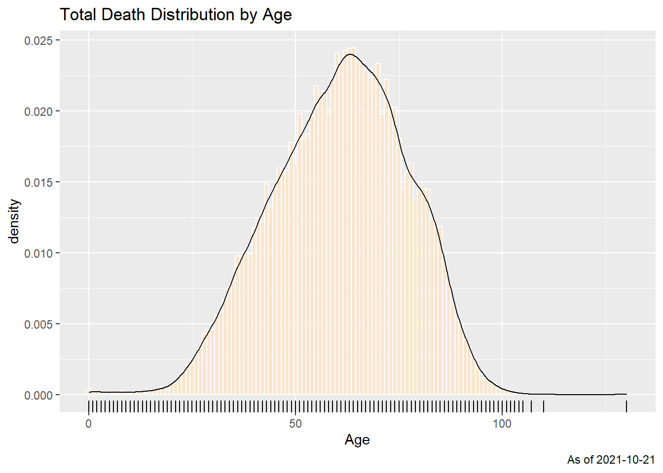
Figure 11.1: Summary distribution of Covid deaths by age
The frequency chart with a density curve in Figure 11.1 shows a bell-shaped distribution. We repeat the frequency plot and facet it by states to see the distribution.
deaths %>%
  filter(age >= 0) %>%
  ggplot(aes(x = age)) +
  geom_histogram(aes(y=..density..), binwidth=1,
                 fill="bisque", color="white", alpha=0.7) +
  geom_density() +
  facet_wrap(~state)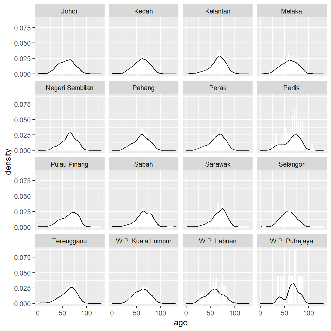
Figure 11.2: Summary distribution of Covid deaths by age faceted by state
## $x
## [1] "Age"
##
## $title
## [1] "Total Death Distribution by Age"
##
## $caption
## [1] "As of 2021-10-21"
##
## attr(,"class")
## [1] "labels"
The bell shape seems consistent. While the density curve is informative, it can be too technical. A better way is binning the values into discrete categories and plotting the count of each bin in bars.
11.1.2 Summarizing data
We count the new Covid deaths and use group_by to group the data based on the granular categories we need. We permanently remove all data with age < 0 from the deaths data frame.
We look at a simple visual distribution of deaths by age. Follow the flow of the pipe operator %>% (read %>% as “and then”) to understand the sequential steps in drawing the plots. We set (binwidth = 1).
deaths %>%
  group_by(age, state) %>%
  summarize(count = n()) %>%
  ggplot(aes(x = age, fill = state)) +
  geom_histogram(binwidth = 1) +
  labs(title = "Total Death Distribution by Age",
       subtitle = "Color by state",
       caption = paste0("As of ", max_date),
       x = "Age",
       y = "Number of deaths",
       fill = "State")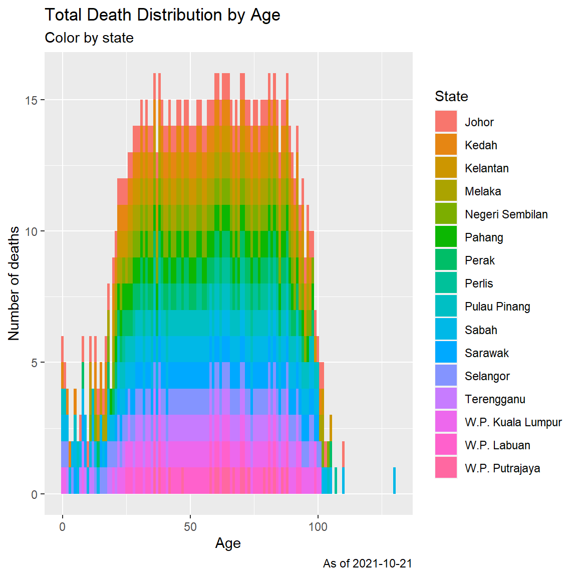
Figure 11.3: Histogram of Covid deaths by age
Figure 11.3 may have an outlier data for the maximum death case of 130 years old. In Figure 11.4, we repeat the histogram but with a more coarse (binwidth = 10), ([1-10 years], [11-20 years], and so on).
deaths %>%
  group_by(age, state) %>%
  summarize(count = n()) %>%
  ggplot(aes(x = age, fill = state)) +
  geom_histogram(binwidth = 10) +
  labs(title = "Total Death Distribution by Age",
       subtitle = "Color by state and age group of 10 years",
       caption = paste0("As of ", max_date),
       x = "Age",
       y = "Number of deaths",
       fill = "State")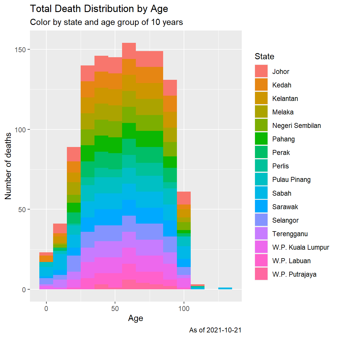
Figure 11.4: Histogram of Covid deaths by age group
Next we look at morbidity cases. We also add a kernel density plot.
deaths %>%
  group_by(age, sebab) %>%
  summarize(count = n()) %>%
  ggplot(aes(x = age, fill = sebab)) +
  geom_histogram(binwidth = 10) +
  labs(title = "Total Death Distribution by Age",
       x = "Age",
       y = "Number of deaths",
       fill = "Cause") -> p1

deaths %>%
  group_by(age, sebab) %>%
  summarize(count = n()) %>%
  ggplot(aes(x = age, fill = sebab)) +
  geom_density(alpha = 0.5) +
  labs(title = "Total Death Distribution by Age",
       x = "Age",
       y = "Number of deaths",
       fill = "Cause") -> p2

cowplot::plot_grid(
     p1,
     p2, ncol = 1)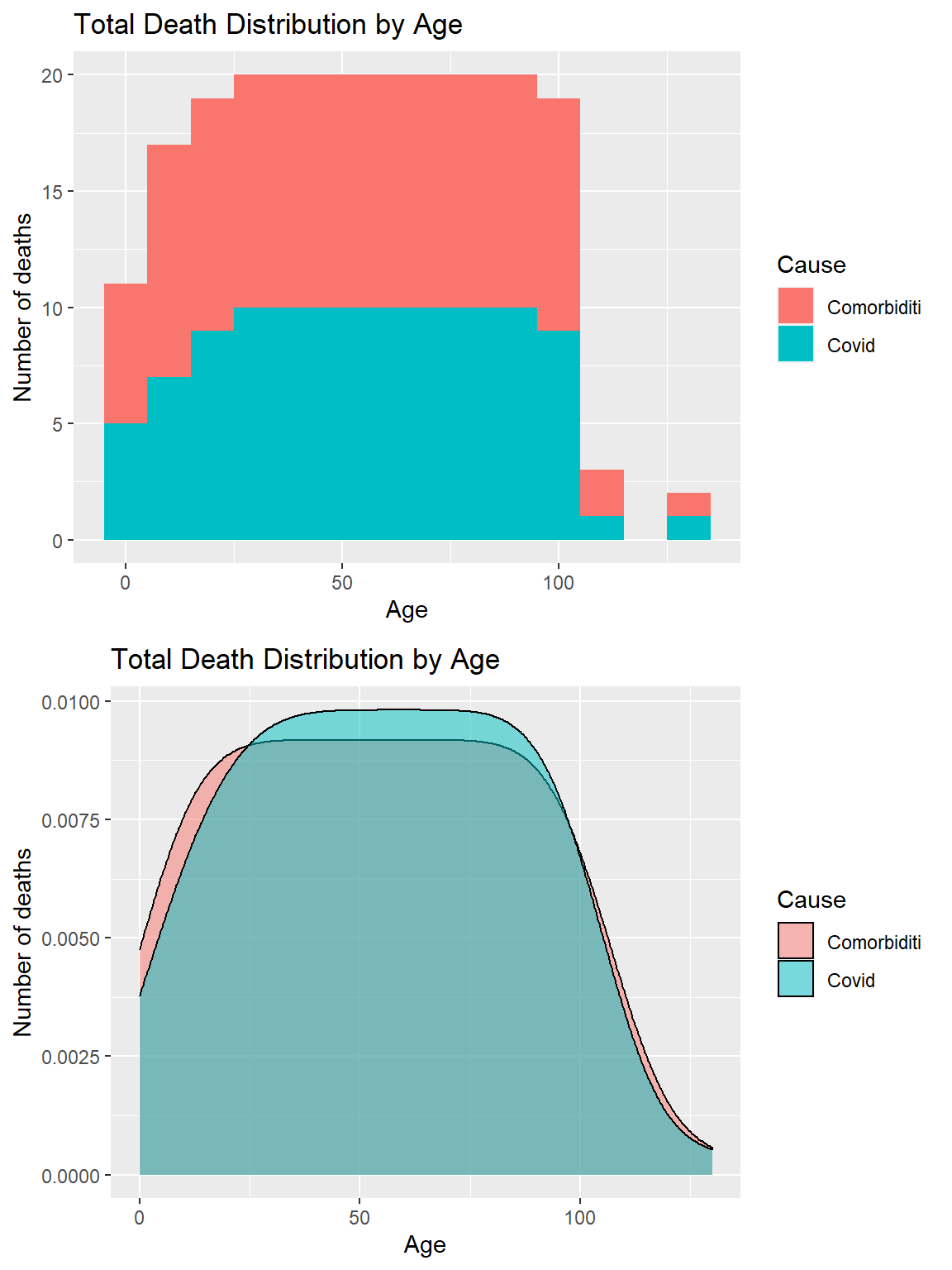
Figure 11.5: Covid deaths by age group and morbidity
Figure 11.5 shows an almost equal distribution of morbidity and non-morbidity death cases.
Facets
Figure 11.3 and Figure 11.4 look busy with too many colors (16 states). In Figure 11.6, we define facets by the 16 levels of the state column. We also look at the death cases by jantina.
deaths %>%
  group_by(age, state, jantina) %>%
  summarize(count = n()) %>%
  ggplot(aes(x = age, fill = jantina)) +
  geom_histogram(binwidth = 10) +
  labs(title = "Total Death Distribution by Age",
       subtitle = "Facet by states",
       caption = "Fixed y-axis scales to compare the actual values",
       x = "Age",
       y = "Number of deaths",
       fill = "Gender") +
  scale_y_continuous(breaks = seq(0, 300, 50)) +
facet_wrap(~state) 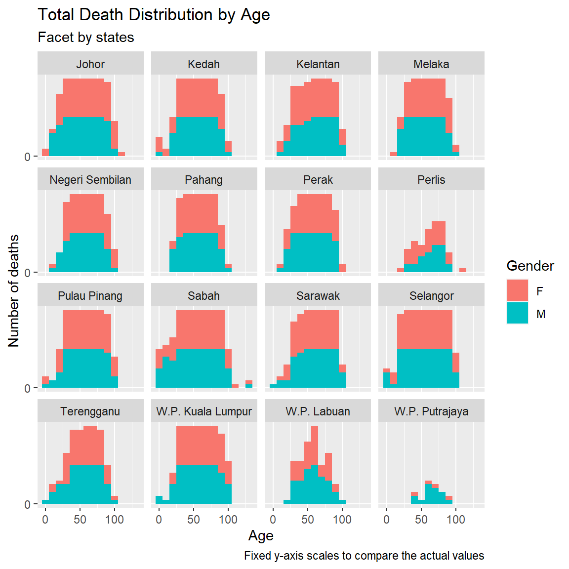
Figure 11.6: Deaths by age and gender faceted by state
We repeat Figure 11.6 for scales = "free".
deaths %>%
  group_by(age, state, jantina) %>%
  summarize(count = n()) %>%
  ggplot(aes(x = age, fill = jantina)) +
  geom_histogram(binwidth = 10) +
  labs(title = "Total Death Distribution by Age",
       subtitle = "Facet by states",
       caption = "Free y-axis scales to compare the actual trends",
       x = "Age",
       y = "Number of deaths",
       fill = "Gender") +
facet_wrap(~state, scales = "free") 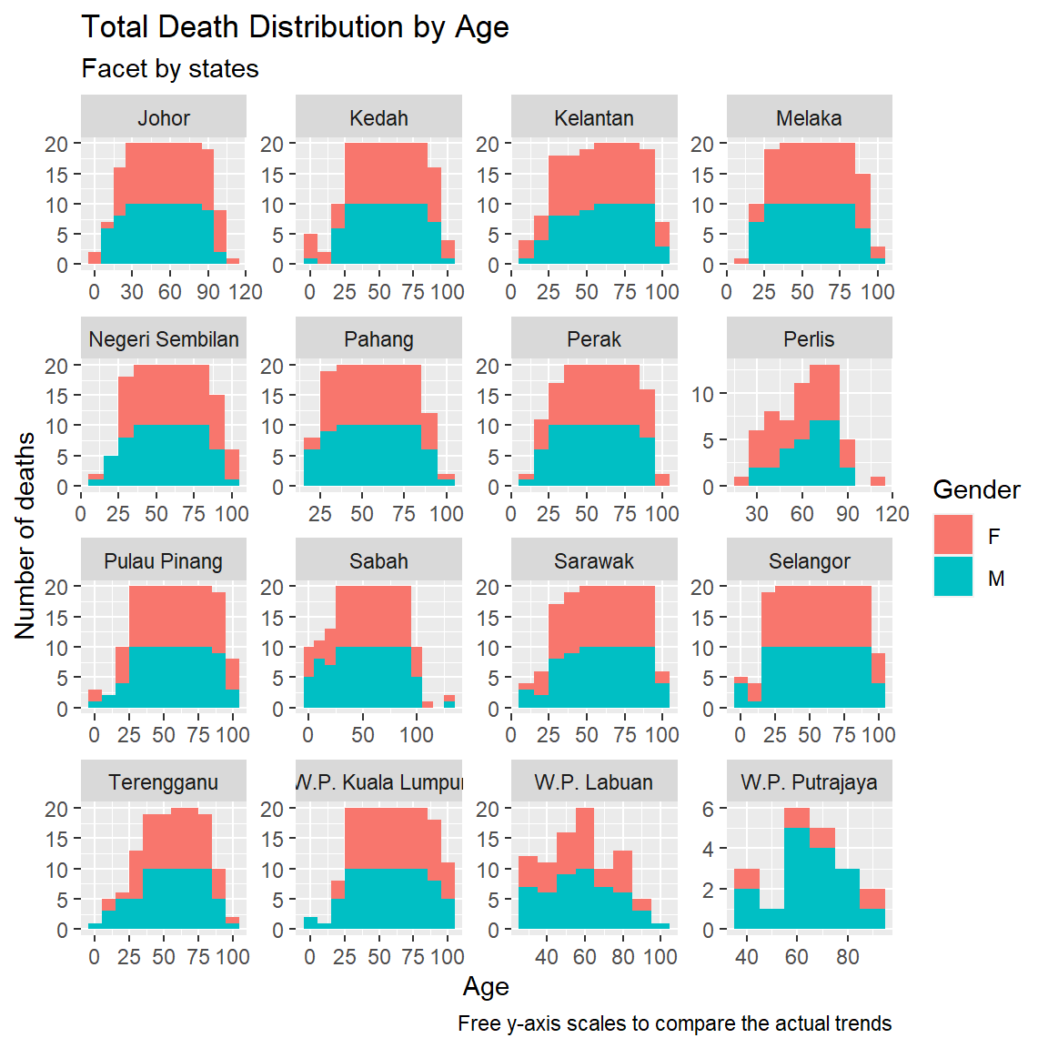
Figure 11.7: Deaths by age and gender faceted by state and free scale
We have visually explored the Covid death count distribution by age and state while checking on some categories like jantina and sebab. Figures 11.1 to 11.4 show a normal bell curve distribution of deaths by age group. Figure 11.5 shows the bell shape varies only slightly when we split the comorbidity cases. Figure 11.7 shows that the bell shape is approximately reflected for most states.
Are the shapes expected, in the sense that larger data samples will generate a “more bell-shaped” distribution?50
11.1.3 Compute Means by Group
We want to compare the mean, median, and weighted mean for a subgroup of our data. We calculate several weighted means of the deaths by age.
deaths %>%
  group_by(age, state) %>%
  summarize(count = n()) %>%
  group_by(state) %>%
  summarise(meandeaths = mean(count, na.rm = TRUE),
            mediandeaths = median(count, na.rm = TRUE),
            meanage = mean(age, na.rm = TRUE),
            medianage = mean(age, na.rm = TRUE),
            weighted_mean = weighted.mean(count, age, na.rm = TRUE)) %>%
  arrange(-meandeaths)
## # A tibble: 16 x 6
## state meandeaths mediandeaths meanage medianage weighted_mean
## <chr> <dbl> <dbl> <dbl> <dbl> <dbl>
## 1 Selangor 104. 98 54.1 54.1 111.
## 2 Johor 37.3 38 56.2 56.2 38.7
## 3 W.P. Kuala Lumpur 30.2 32 58.9 58.9 31.3
## 4 Sabah 23.5 14 53.5 53.5 28.5
## 5 Kedah 22.7 20 54.9 54.9 25.0
## 6 Pulau Pinang 17.9 16 57.3 57.3 20.2
## 7 Negeri Sembilan 15.1 13 58.9 58.9 16.2
## 8 Sarawak 14.2 10 58.4 58.4 16.5
## 9 Perak 13.2 10.5 56.5 56.5 14.9
## 10 Kelantan 11.4 8 57.9 57.9 13.0
## 11 Melaka 11.0 11 56.9 56.9 11.5
## 12 Pahang 8.56 7 57.1 57.1 9.01
## 13 Terengganu 5.41 4 54.1 54.1 6.19
## 14 W.P. Labuan 2.76 3 58.8 58.8 2.73
## 15 Perlis 2.35 2 61.6 61.6 2.49
## 16 W.P. Putrajaya 1.21 1 64.8 64.8 1.22We plot the above.
deaths %>%
  group_by(age, state) %>%
  summarize(count = n()) %>%
  group_by(state) %>%
  summarise(meandeaths = mean(count, na.rm = TRUE),
            mediandeaths = median(count, na.rm = TRUE),
            meanage = mean(age, na.rm = TRUE),
            medianage = mean(age, na.rm = TRUE),
            weighted_mean = weighted.mean(count, age, na.rm = TRUE)) %>%
  gather("metric", "value", 2:6) %>%
  ggplot(aes(x = state,
             y = value,
             color = metric,
             shape = metric)) +
  geom_point() +
  coord_flip() +
  labs(title = "Daily Death Averages by State",
       caption = paste0("As of ", max_date),
       x = "State",
       y = "",
       color = "Metric",
       shape = "Metric")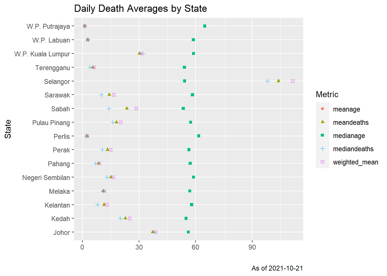
Figure 11.8: Mean, median and weighted means of daily Covid deaths by state
Figure 11.8 shows that the three metrics are quite close to each other for all the states. Normal distributions are bell-shaped and symmetric. The mean and median are equal. Thus we see that the plots are bell-shaped but not perfectly symmetric.
The Central Limit Theorem says that, if we take the mean of a large number of independent samples, then the distribution of that mean will be approximately normal. In practice, if the population we are sampling from is symmetric with no outliers, then we can start to see a good approximation to normality after as few as 15-20 samples. If the population is moderately skew, then it can take between 30-50 samples before getting a good approximation.51 We see that in Figures 11.1 to 11.3 with 28306 data points.
11.2 Vaccination and deaths
Of direct interest is the relationship between vaccination and deaths which we covered in Chapter 10. Now we have more granular data on both the deaths and vaccinations. We have to at least filter the deaths data frame to only reflect the data since the start of the vaccination program on “2021-02-25”. We can group_by(state, age, vaxtype, jantina, BID, warga, sebab) and count the number of death cases.
min_date <- as.Date("2021-02-25")
max_date <- as.Date(max(deaths$date, na.rm = T))

deaths %>%
  mutate(vaxtype = replace(vaxtype, vaxtype == "", "0-None")) -> deaths

deaths %>%
  filter(as.Date(date) >= min_date) %>%
  group_by(state, age, vaxtype, jantina, BID, warga, sebab) %>%
  summarize(count = n()) %>%
  filter(age >= 0) %>%
  head(15)
## # A tibble: 15 x 8
## # Groups: state, age, vaxtype, jantina, BID, warga [14]
## state age vaxtype jantina BID warga sebab count
## <chr> <int> <chr> <chr> <chr> <chr> <chr> <int>
## 1 Johor 0 0-None F BID Asing Comorbiditi 1
## 2 Johor 1 0-None F InPatient Tempatan Comorbiditi 1
## 3 Johor 7 0-None M InPatient Tempatan Comorbiditi 1
## 4 Johor 8 0-None M InPatient Tempatan Comorbiditi 1
## 5 Johor 10 0-None M BID Tempatan Comorbiditi 1
## 6 Johor 11 0-None M InPatient Tempatan Comorbiditi 1
## 7 Johor 13 0-None M BID Tempatan Comorbiditi 1
## 8 Johor 14 0-None F InPatient Tempatan Comorbiditi 1
## 9 Johor 14 0-None M InPatient Tempatan Comorbiditi 1
## 10 Johor 16 0-None F InPatient Tempatan Comorbiditi 1
## 11 Johor 18 0-None F InPatient Tempatan Comorbiditi 2
## 12 Johor 18 0-None F InPatient Tempatan Covid 1
## 13 Johor 18 Pfizer M InPatient Tempatan Comorbiditi 1
## 14 Johor 20 0-None F InPatient Tempatan Comorbiditi 2
## 15 Johor 20 0-None M BID Asing Covid 1We first plot the distribution of the deaths by age and identify the category by the vaccination type. We only need two categories as reflected by group_by(age, vaxtype). With select(age, vaxtype) we have created a uni-variable temporary tibble or data frame (see Chapter 3 on Single Variable Graphs).
deaths %>%
  filter(as.Date(date) >= min_date) %>%
  group_by(age, vaxtype) %>%
  select(age, vaxtype) %>%
  arrange(age) %>%
  ggplot(aes(x = age, fill = vaxtype)) +
  geom_histogram(binwidth = 5) +
  labs(title = "Total Death Distribution by Age",
       subtitle = "Color by Vaccine Type and age group of 5 years",
       caption = paste0("Between ", min_date,  " and ", max_date),
       x = "Age",
       y = "Number of deaths",
       fill = "Vaccine type")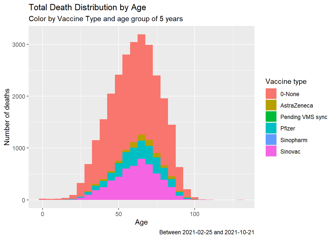
Figure 11.9: Summary distribution of Covid deaths by age group and vaccine type
Figure 11.9 shows that from the summary data the death cases between those vaccinated and not vaccinated are about the same (visually). AstraZeneca has the lowest cases within the data set. But we must rule out other causes of death since they are all Covid vaccines. We separate Figure 11.9 neatly with a simple facet.
deaths %>%
  filter(as.Date(date) >= min_date) %>%
  group_by(age, vaxtype, sebab) %>%
  select(age, vaxtype, sebab) %>%
  arrange(age) %>%
  ggplot(aes(x = age, fill = vaxtype)) +
  geom_histogram(binwidth = 5) +
  labs(title = "Total Death Distribution by Age",
       subtitle = "Color by Vaccine Type and age group of 5 years",
       caption = paste0("Between ", min_date,  " and ", max_date),
       x = "Age",
       y = "Number of deaths",
       fill = "Vaccine type") +
  facet_wrap(~sebab)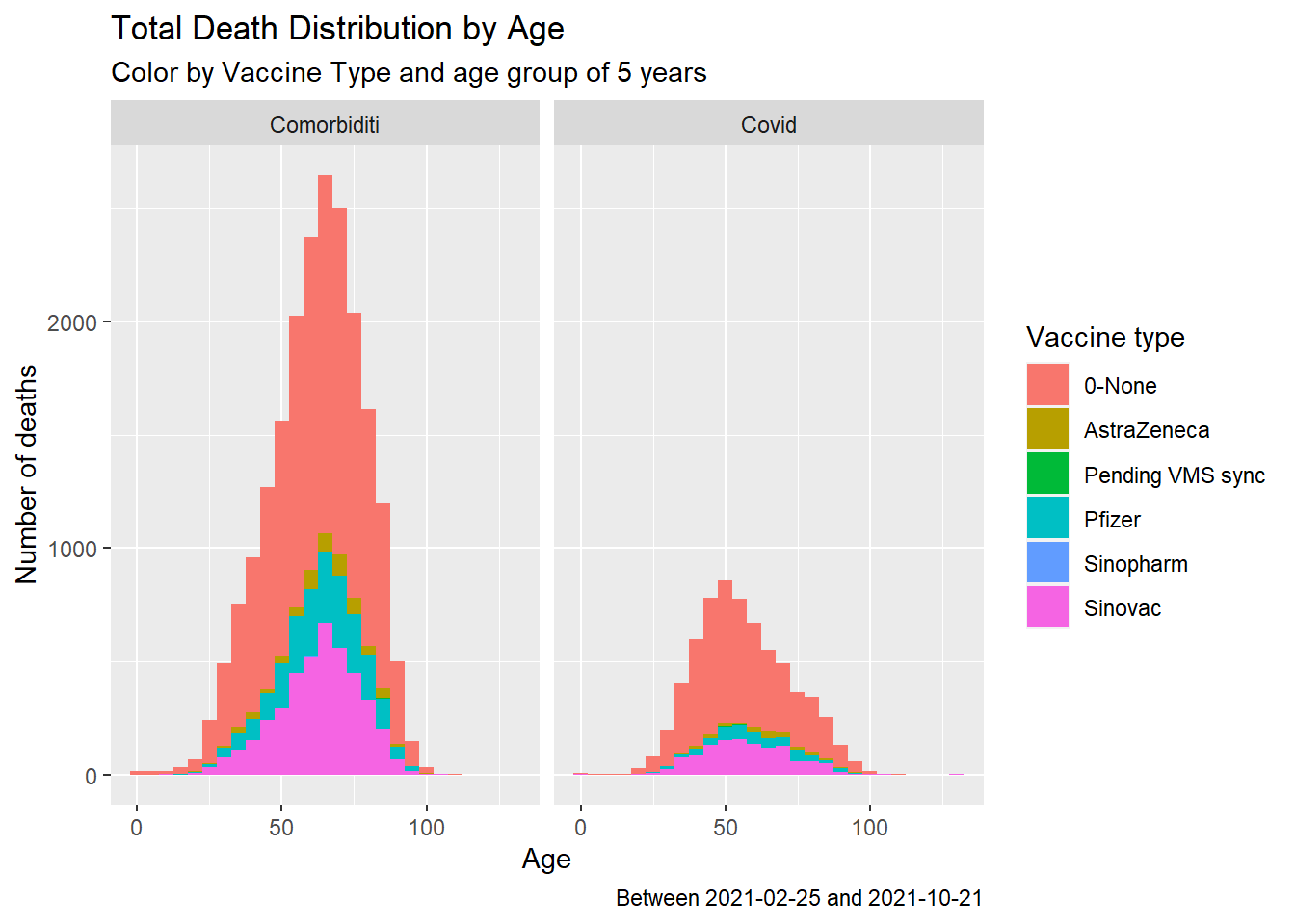
Figure 11.10: Summary distribution of Covid deaths by age group, vaccine type and cause
Figure 11.10 does not paint a good picture about vaccinations to prevent deaths due to Covid.
We look at the breakdown by gender.
deaths %>%
  filter(as.Date(date) >= min_date) %>%
  group_by(age, vaxtype, sebab) %>%
  select(age, vaxtype, sebab, jantina) %>%
  arrange(age) %>%
  ggplot(aes(x = age, fill = vaxtype)) +
  geom_histogram(binwidth = 5) +
  labs(title = "Total Death Distribution by Age",
       subtitle = "Color by Vaccine Type and age group of 5 years",
       caption = paste0("Between ", min_date,  " and ", max_date),
       x = "Age",
       y = "Number of deaths",
       fill = "Vaccine type") +
  facet_grid(jantina ~ sebab)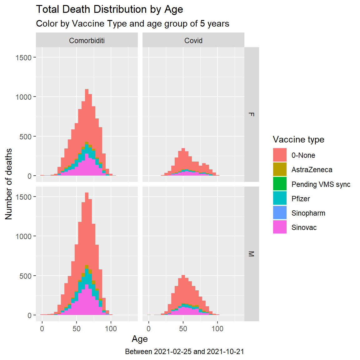
Figure 11.11: Summary distribution of Covid deaths by age group and vaccine type with dual facet
Figure 11.11 confirms the visual trend shown in Figure 11.9. Based on the Malaysian case, we cannot conclude that Covid vaccinations prevent Covid related deaths.
11.3 Timing Trends
Let us look at the timing trends between a death case being vaccinated and then contracting Covid and succumbing to deaths. We filter out the un-vaccinated cases when required. We also convert all the date types to double from character so the calculations should be faster.
We also define some bucket intervals and give names to bin some of the data by categories. Grouping by a range of values is referred to as data binning or bucketing in data science, i.e., categorizing a number of continuous values into a smaller number of bins (buckets). Each bucket defines an interval. A category name is assigned to each bucket.52
deaths$date <- as.Date(deaths$date)
deaths$date_announced <- as.Date(deaths$date_announced)
deaths$date_positive <- as.Date(deaths$date_positive)
deaths$date_dose1 <- as.Date(deaths$date_dose1)
deaths$date_dose2 <- as.Date(deaths$date_dose2)

tags <- c("<10","10s", "20s", "30s", "40s", "50s","60s", "70s","80>s")
Clearly, there are death cases that only received the first dose. positivefromdose2 = date_positive - date_dose2 results in NA when date_dose2 is also NA. We look at some summary data. Since we are taking the averages and not considering the population and percentage of the population being vaccinated, we do not group by state.
death_vacn_sum <- deaths %>%
  filter(as.Date(date) >= min_date) %>%
  mutate(agegroup = case_when((age < 10) ~ tags[1],
                              (age >=10 & age < 20) ~ tags[2],
                              (age >=20 & age < 30) ~ tags[3],
                              (age >=30 & age < 40) ~ tags[4],
                              (age >=40 & age < 50) ~ tags[5],
                              (age >=50 & age < 60) ~ tags[6],
                              (age >=60 & age < 70) ~ tags[7],
                              (age >=70 & age < 80) ~ tags[8],
                              (age >=80) ~ tags[9]),
         positivefromdose1 = as.double(date_positive - date_dose1),
         positivefromdose2 = as.double(date_positive - date_dose2),
         deathfrompositive = as.double(date - date_positive))
summary(death_vacn_sum)
## date date_announced date_positive
## Min. :2021-02-25 Min. :2021-02-25 Min. :2020-12-22
## 1st Qu.:2021-07-16 1st Qu.:2021-07-25 1st Qu.:2021-07-08
## Median :2021-08-08 Median :2021-08-25 Median :2021-08-02
## Mean :2021-08-04 Mean :2021-08-15 Mean :2021-07-29
## 3rd Qu.:2021-09-02 3rd Qu.:2021-09-14 3rd Qu.:2021-08-27
## Max. :2021-10-21 Max. :2021-10-22 Max. :2021-10-21
##
## date_dose1 date_dose2 vaxtype
## Min. :2021-03-02 Min. :2021-03-24 Length:27112
## 1st Qu.:2021-06-17 1st Qu.:2021-06-27 Class :character
## Median :2021-07-05 Median :2021-07-13 Mode :character
## Mean :2021-07-06 Mean :2021-07-13
## 3rd Qu.:2021-07-26 3rd Qu.:2021-07-29
## Max. :2021-10-08 Max. :2021-10-13
## NA's :18097 NA's :23423
## state age jantina BID
## Length:27112 Min. : 0.0 Length:27112 Length:27112
## Class :character 1st Qu.: 49.0 Class :character Class :character
## Mode :character Median : 61.0 Mode :character Mode :character
## Mean : 60.6
## 3rd Qu.: 72.0
## Max. :130.0
##
## warga sebab agegroup positivefromdose1
## Length:27112 Length:27112 Length:27112 Min. :-231.00
## Class :character Class :character Class :character 1st Qu.: 13.00
## Mode :character Mode :character Mode :character Median : 24.00
## Mean : 38.38
## 3rd Qu.: 56.00
## Max. : 217.00
## NA's :18097
## positivefromdose2 deathfrompositive
## Min. :-76.00 Min. : 0.000
## 1st Qu.: 16.00 1st Qu.: 0.000
## Median : 41.00 Median : 4.000
## Mean : 46.69 Mean : 6.617
## 3rd Qu.: 72.00 3rd Qu.: 10.000
## Max. :196.00 Max. :249.000
## NA's :23423The new column agegroup from case_when is a character vector. We make it a factor.
death_vacn_sum$agegroup <- factor(death_vacn_sum$agegroup,
                                  levels = tags,
                                  ordered = FALSE)
summary(death_vacn_sum$agegroup)
## <10 10s 20s 30s 40s 50s 60s 70s 80>s
## 48 70 646 2149 3983 5429 6332 4947 3508We first look at the average number of days between the first vaccine dose and testing positive. Due to data errors, we filter (positivefromdose1 >= 0).
death_vacn_sum %>%
  filter(positivefromdose1 >= 0) %>%
  filter(vaxtype %in% c("AstraZeneca", "Pfizer", "Sinovac")) %>%
  group_by(agegroup, vaxtype) %>%
  summarize(avgpositivedose1 = mean(positivefromdose1, na.rm = T)) %>%
  ggplot(aes(x = agegroup, y = avgpositivedose1, fill = vaxtype)) +
  geom_col(position="dodge") +
  labs(title = "Death Distribution by Age Group",
       subtitle = "Avg number of days between first dose and positive test",
       caption = paste0("Data between ", min_date,  " and ", max_date),
       x = "Age Group",
       y = "Number of days",
       fill = "Vaccine type")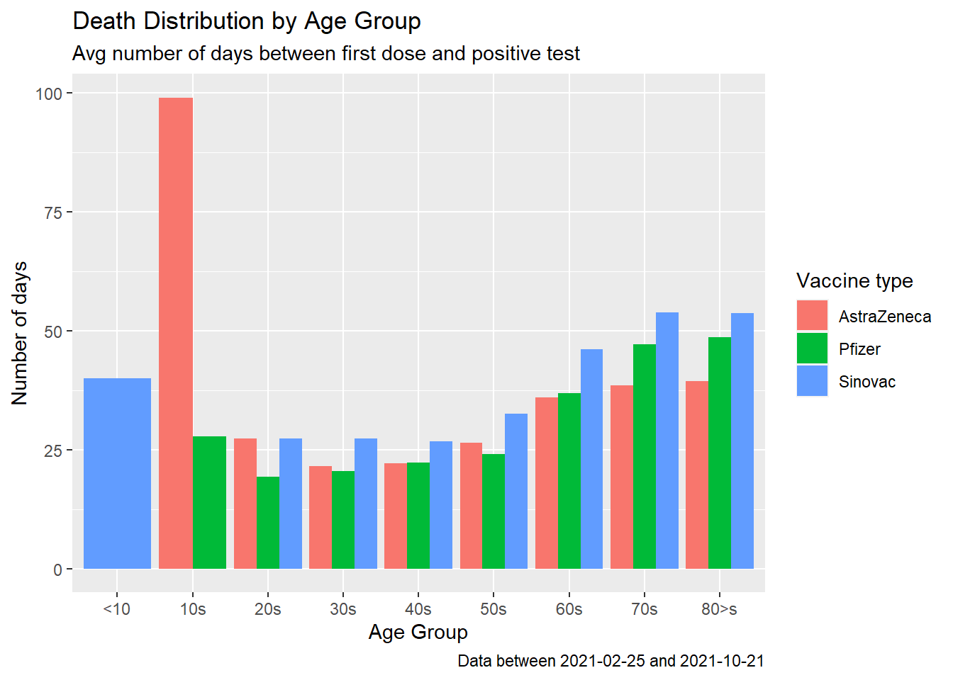
Figure 11.12: Covid deaths by age group
We repeat to look at the average number of days between the second dose and testing positive. Due to data errors, we filter (positivefromdose2 >= 0)
death_vacn_sum %>%
  filter(positivefromdose2 >= 0) %>%
  filter(vaxtype %in% c("AstraZeneca", "Pfizer", "Sinovac")) %>%
  group_by(agegroup, vaxtype) %>%
  summarize(avgpositivedose2 = mean(positivefromdose2, na.rm = T)) %>%
  ggplot(aes(x = agegroup, y = avgpositivedose2, fill = vaxtype)) +
  geom_col(position="dodge") +
  labs(title = "Death Distribution by Age Group",
       subtitle = "Avg number of days between second dose and positive test",
       caption = paste0("Data between ", min_date,  " and ", max_date),
       x = "Age Group",
       y = "Number of days",
       fill = "Vaccine type")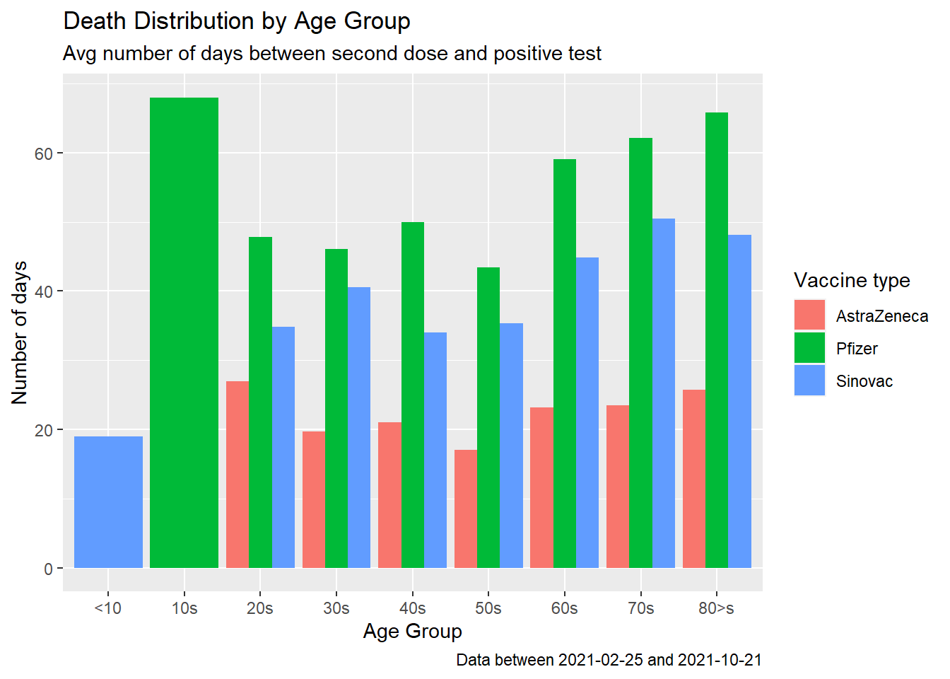
Figure 11.13: Covid deaths by age group
Figure 11.13 seems to show that Pfizer is more effective in preventing deaths after receiving the second dose. Does this corroborate with data from other countries?53
Now we look at the important average number of days between testing positive and succumbing to death. The minimum number of days between testing positive and dying is 0. Since there are no logical errors for deathfrompositive we take all the data.
death_vacn_sum %>%
  filter(vaxtype %in% c("AstraZeneca", "Pfizer", "Sinovac", "0-None")) %>%
  group_by(agegroup, vaxtype) %>%
  summarize(avgdeathfrompositive = mean(deathfrompositive, na.rm = T)) %>%
  ggplot(aes(x = agegroup, y = avgdeathfrompositive, fill = vaxtype)) +
  geom_col(position="dodge") +
  labs(title = "Death Distribution by Age Group",
       subtitle = "Avg number of days between positive test and death",
       caption = paste0("Data between ", min_date,  " and ", max_date),
       x = "Age Group",
       y = "Number of days",
       fill = "Vaccine type")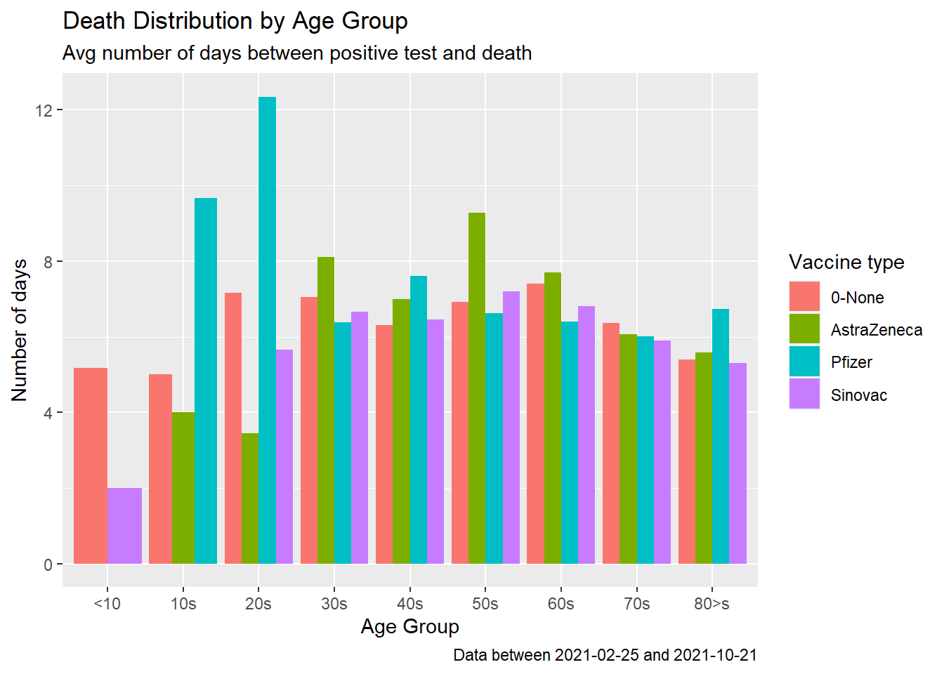
Figure 11.14: Covid deaths by age group
Figure 11.14 shows that for some of the age groups the red bars are longer, that the un-vaccinated cases survive longer upon testing positive. It is echoing, like Figure 11.9 and Figure 11.11 that the jury is still out there on vaccinations preventing deaths.
We do a check on the cause of death.
death_vacn_sum %>%
  filter(vaxtype %in% c("AstraZeneca", "Pfizer", "Sinovac", "0-None")) %>%
  group_by(agegroup, vaxtype, jantina, sebab) %>%
  summarize(avgdeathfrompositive = mean(deathfrompositive, na.rm = T)) %>%
  ggplot(aes(x = agegroup, y = avgdeathfrompositive, fill = vaxtype)) +
  geom_col(position="dodge") +
  facet_grid(jantina ~ sebab) +
  labs(title = "Death Distribution by Age Group",
       subtitle = "Avg number of days between positive test and death",
       caption = paste0("Data between ", min_date,  " and ", max_date),
       x = "Age Group",
       y = "Number of days",
       fill = "Vaccine type")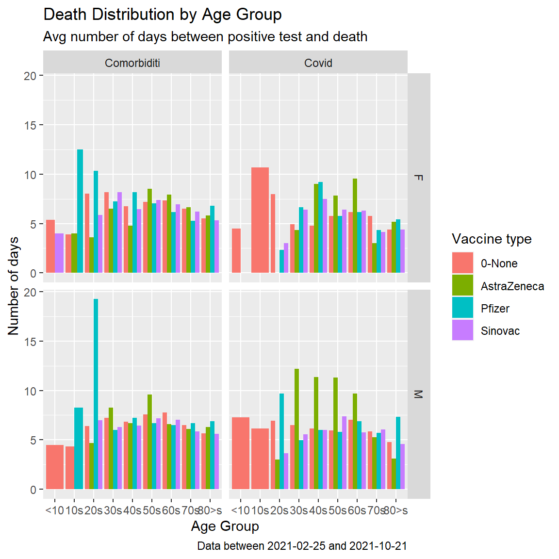
Figure 11.15: Covid deaths by age group facet by cause
Figure 11.15 confirms that as of 2021-10-21, the length of days for Covid cases in Malaysia who died due to Covid does not depend on vaccination.
Next, we plot the number of death cases against the number of days between testing positive and death while looking at the vaccination they received.
death_vacn_sum %>%
  mutate(daygroup =
      case_when((deathfrompositive <8) ~ "1wk",
                (deathfrompositive >=8 & deathfrompositive <14) ~ "2wk",
                (deathfrompositive >=14 & deathfrompositive <21) ~ "3wk",
                (deathfrompositive >=21 & deathfrompositive <28) ~ "4wk",
                (deathfrompositive >=28 & deathfrompositive <35) ~ "5wk",
                (deathfrompositive >=35 & deathfrompositive <42) ~ "6wk",
                (deathfrompositive >=42 & deathfrompositive <49) ~ "7wk",
                (deathfrompositive >=49 & deathfrompositive <56) ~ "8wk",
                (deathfrompositive >=56 & deathfrompositive <63) ~ "9wk",
                (deathfrompositive >=63) ~ "9wk above")) %>%
  group_by(daygroup, vaxtype) %>%
  summarize(count = n()) %>%
  ggplot(aes(x = daygroup, y = count, fill = vaxtype)) +
  geom_col() +
  labs(title = "Death Distribution",
       subtitle = "Number of days between positive test and death",
       caption = paste0("Data between ", min_date,  " and ", max_date),
       x = "Week",
       y = "Number of deaths",
       fill = "Vaccine type")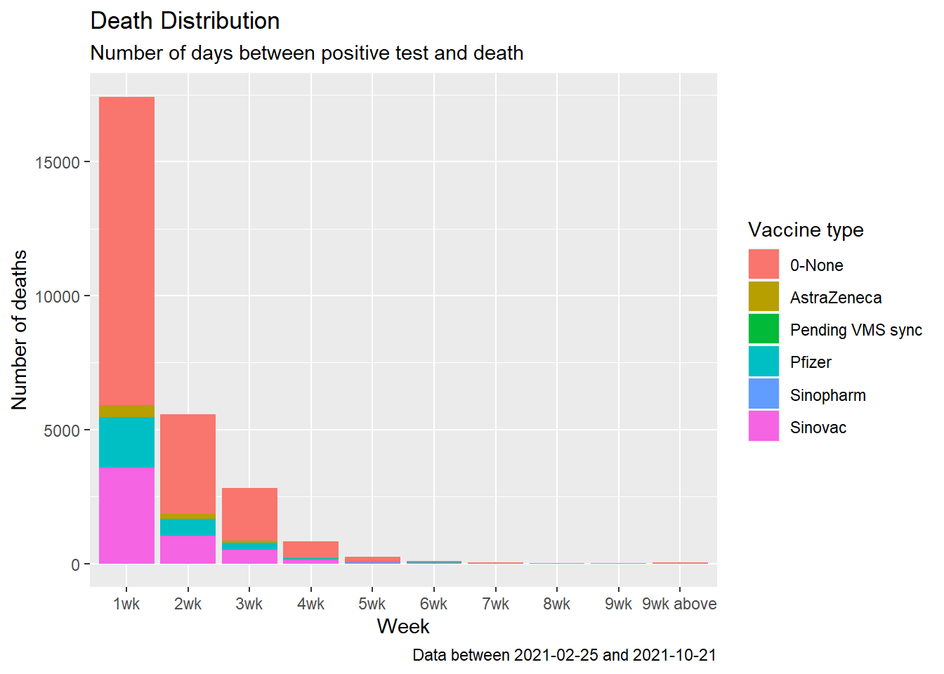
Figure 11.16: Summary distribution of Covid deaths by week
We redo Figure 11.16 using geom_point() and geom_line(). Line graphs can be made with categorical or numeric variables on the x-axis. In Figure 11.17, the variable daygroup is of type character. We convert it to a factor with factor(daygroup). When the x variable is a factor and we are using an additional aesthetic to compare data, we must also use aes(group = vaxtype) to draw lines connecting the related points.
death_vacn_sum %>%
  mutate(daygroup =
      case_when((deathfrompositive <8) ~ "1wk",
                (deathfrompositive >=8 & deathfrompositive <14) ~ "2wk",
                (deathfrompositive >=14 & deathfrompositive <21) ~ "3wk",
                (deathfrompositive >=21 & deathfrompositive <28) ~ "4wk",
                (deathfrompositive >=28 & deathfrompositive <35) ~ "5wk",
                (deathfrompositive >=35 & deathfrompositive <42) ~ "6wk",
                (deathfrompositive >=42 & deathfrompositive <49) ~ "7wk",
                (deathfrompositive >=49 & deathfrompositive <56) ~ "8wk",
                (deathfrompositive >=56 & deathfrompositive <63) ~ "9wk",
                (deathfrompositive >=63) ~ "9wk above")) %>%
  group_by(daygroup, vaxtype) %>%
  summarize(count = n()) %>%
  ggplot(aes(x = factor(daygroup), y = count,
             color = vaxtype, group = vaxtype)) +
  geom_point() +
  geom_line() +
  labs(title = "Death Distribution",
       subtitle = "Number of days between positive test and death",
       caption = paste0("Data between ", min_date,  " and ", max_date),
       x = "Week",
       y = "Number of deaths",
       color = "Vaccine type")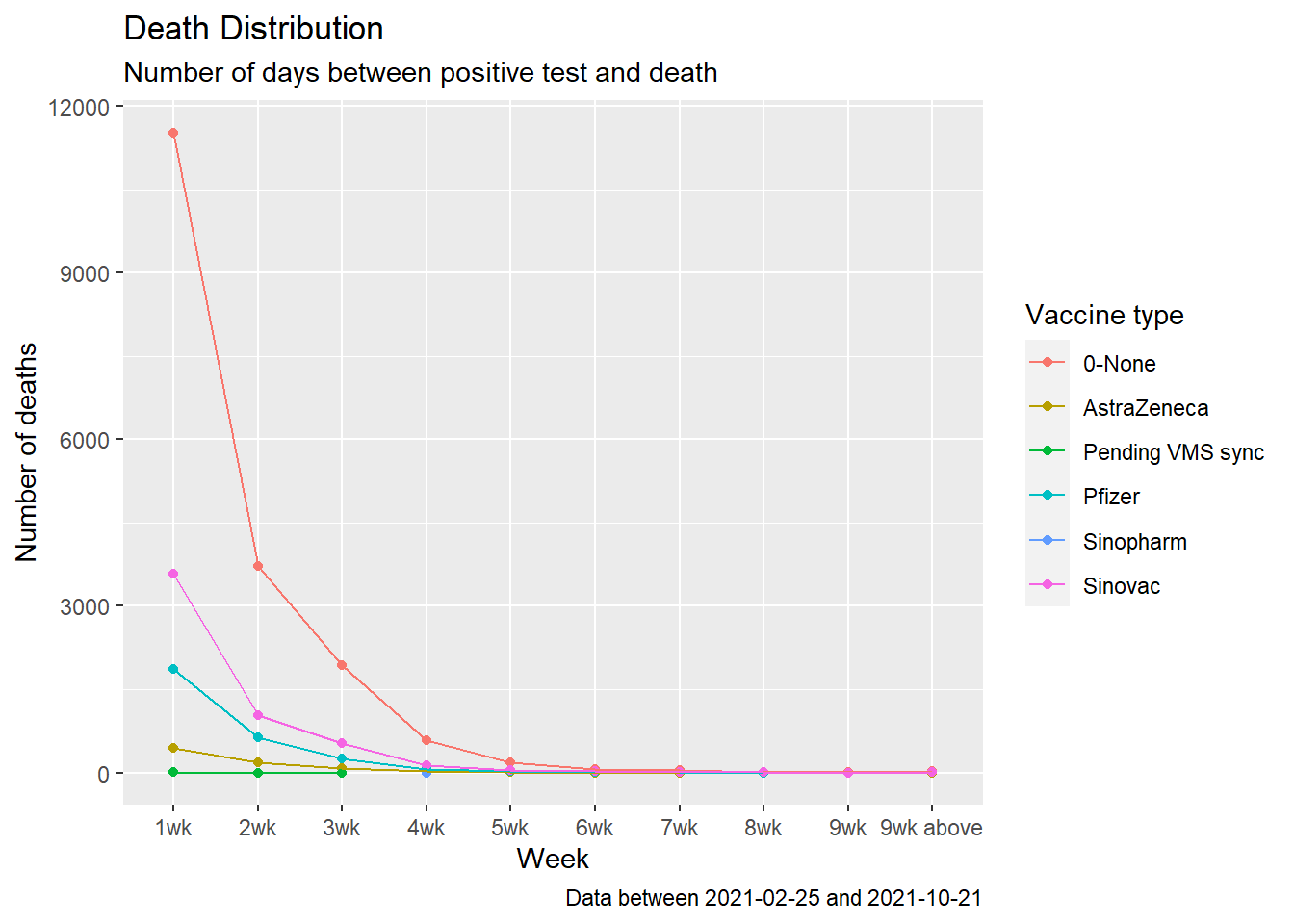
Figure 11.17: Summary distribution of Covid deaths by week
Finally, we do a box plot for comparing distributions of deathfrompositive with vaxtype. A box plot consists of a box and “whiskers.” The box goes from the 25th percentile to the 75th percentile of the data, also known as the inter-quartile range (IQR). There’s a line indicating the median or the 50th percentile of the data. The whiskers start from the edge of the box and extend to the furthest data point that is within 1.5 times the IQR. Any data points that are past the ends of the whiskers are considered outliers and displayed with dots.54 We change the size and shape of the outlier points with outlier.size and outlier.shape. We also add geom_jitter to visualize the data points.
death_vacn_sum %>%
  ggplot(aes(x = vaxtype, y = deathfrompositive, fill=vaxtype)) +
  geom_jitter(aes(color = vaxtype),alpha=0.2) +
  geom_boxplot(color="black", alpha=0.3, outlier.size=4, outlier.shape=21) +
  labs(title = "Death Distribution",
       subtitle = "Number of days between positive test and death",
       caption = paste0("Data between ", min_date,  " and ", max_date),
       x = "",
       y = "Number of days",
       fill = "Vaccine type",
       color = "Vaccine type") +
  coord_flip()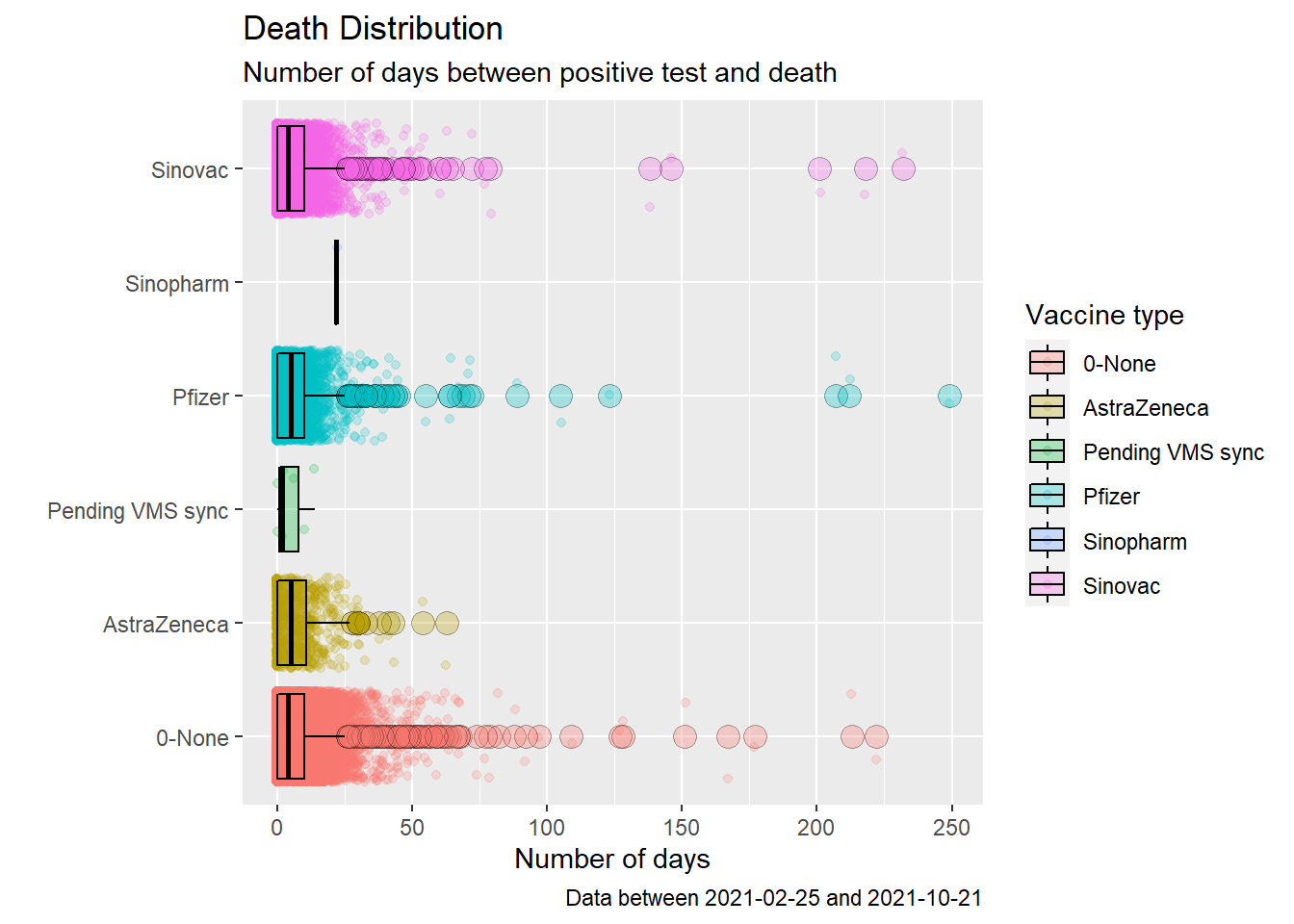
Figure 11.18: Box plot of Covid deaths by week
Figure 11.18 may look pretty but it does not paint a pretty picture about Covid deaths and vaccination in Malaysia. The number of days between testing positive and death for those vaccinated or not have about the same median (except for Sinopharm that does not have much data). The boxes also have similar widths, the inter-quartile range (IQR). Recall that, quartiles divide the data into 4 parts. The interquartile range (IQR) - corresponding to the difference between the first and third quartiles - is sometimes used as a robust alternative to the standard deviation.
Let us calculate the summary statistics for each vaxtype to see some actual numbers. We explore some R functions for computing descriptive statistics.55
death_vacn_sum %>%
  group_by(vaxtype) %>%
  summarise(mean = mean(deathfrompositive),
            median = median(deathfrompositive),
            mad = mad(deathfrompositive),
            var = var(deathfrompositive),
            sd = sd(deathfrompositive),
            IQR = IQR(deathfrompositive))
## # A tibble: 6 x 7
## vaxtype mean median mad var sd IQR
## <chr> <dbl> <dbl> <dbl> <dbl> <dbl> <dbl>
## 1 0-None 6.64 4 5.93 70.6 8.40 10
## 2 AstraZeneca 7.17 5 7.41 59.9 7.74 11
## 3 Pending VMS sync 4.86 2 2.97 29.1 5.40 7
## 4 Pfizer 6.63 5 7.41 112. 10.6 10
## 5 Sinopharm 22 22 0 NA NA 0
## 6 Sinovac 6.47 4 5.93 85.2 9.23 10Below is a summary description of the statistics.
- mean: the average value. It is sensitive to outliers.
- median: the middle value. It’s a robust alternative to mean.
- median absolute deviation (MAD): measures the deviation of the values, in the data, from the median value.
- variance: represents the average squared deviation from the mean.
- standard deviation: is the square root of the variance. It measures the average deviation of the values, in the data, from the mean value.
- quantile: by default, the function returns the minimum, the maximum, and three quartiles (the 0.25, 0.50, and 0.75 quartiles).
- interquartile range (IQR): corresponds to the difference between the first and third quartiles - is sometimes used as a robust alternative to the standard deviation.
We calculate the default quantiles.
## # A tibble: 30 x 2
## # Groups:   vaxtype [6]
##    vaxtype     quantile
##    <chr>          <dbl>
##  1 0-None             0
##  2 0-None             0
##  3 0-None             4
##  4 0-None            10
##  5 0-None           222
##  6 AstraZeneca        0
##  7 AstraZeneca        0
##  8 AstraZeneca        5
##  9 AstraZeneca       11
## 10 AstraZeneca       63
## # ... with 20 more rows
We calculate the deciles.
death_vacn_sum %>%
  group_by(vaxtype) %>%
  summarise(decile = quantile(deathfrompositive, seq(0, 1, 0.1)))
## # A tibble: 66 x 2
## # Groups: vaxtype [6]
## vaxtype decile
## <chr> <dbl>
## 1 0-None 0
## 2 0-None 0
## 3 0-None 0
## 4 0-None 0
## 5 0-None 2
## 6 0-None 4
## 7 0-None 7
## 8 0-None 9
## 9 0-None 12
## 10 0-None 16
## # ... with 56 more rowsLet us plot the quantiles.
death_vacn_sum %>%
  group_by(vaxtype) %>%
  summarise(q0 = quantile(deathfrompositive, 0.0),
            q1 = quantile(deathfrompositive, 0.25),
            q2 = quantile(deathfrompositive, 0.50),
            q3 = quantile(deathfrompositive, 0.75),
            q4 = quantile(deathfrompositive, 1.0)) %>%
  gather("quantile", "value", 2:6) %>%
  ggplot(aes(x = vaxtype,
             y = value,
             color = quantile,
             shape = quantile)) +
  geom_point() +
  coord_flip() +
  labs(title = "Days between positive test and death",
       subtitle = "Quantiles by vaccination",
       caption = paste0("Data between ", min_date,  " and ", max_date),
       x = "Vaccine",
       y = "",
       color = "Quantile",
       shape = "Quantile")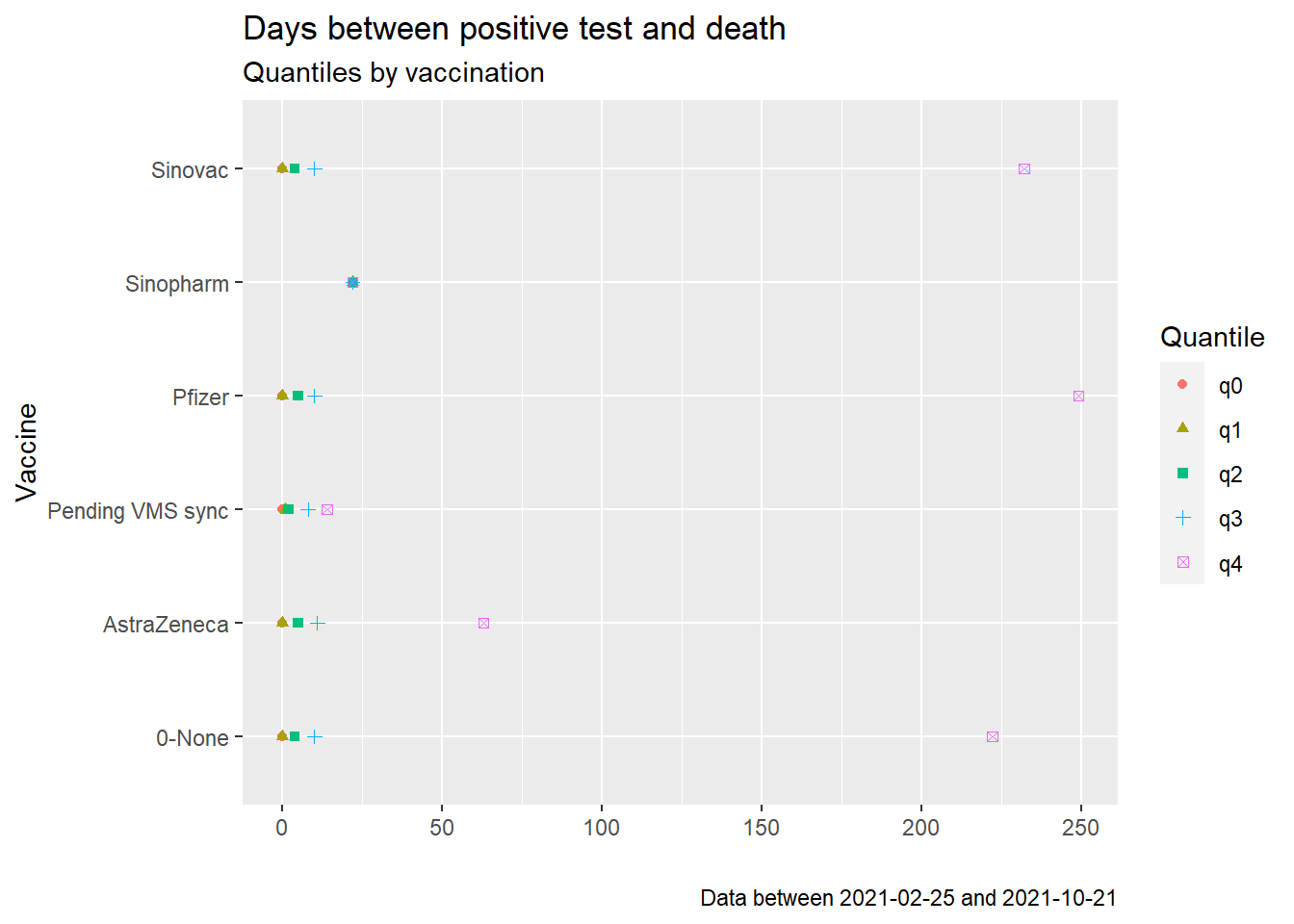
Figure 11.19: Quantiles of days between positive test and death
11.3.1 When percentage of population fully vaccinated exceed 60%
Recall that Figures 11.9 to 11.19 were based on data starting from the first day of vaccination, 2021-02-25. Based on Figures 10.19 to 10.22, the new cases and deaths trend changed as the selected countries crossed the 50% fully vaccinated status. Let us narrow down the interval of our analysis to start at 2010-09-01 when the general percentage of the population that is fully vaccinated has crossed 50%.
We redo Figures 11.17 to 11.19.
new_min_date = as.Date("2021-09-01")
death_vacn_sum %>%
  filter(as.Date(date) >= new_min_date) %>%
  mutate(daygroup =
      case_when((deathfrompositive <8) ~ "1wk",
                (deathfrompositive >=8 & deathfrompositive <14) ~ "2wk",
                (deathfrompositive >=14 & deathfrompositive <21) ~ "3wk",
                (deathfrompositive >=21 & deathfrompositive <28) ~ "4wk",
                (deathfrompositive >=28 & deathfrompositive <35) ~ "5wk",
                (deathfrompositive >=35 & deathfrompositive <42) ~ "6wk",
                (deathfrompositive >=42 & deathfrompositive <49) ~ "7wk",
                (deathfrompositive >=49 & deathfrompositive <56) ~ "8wk",
                (deathfrompositive >=56 & deathfrompositive <63) ~ "9wk",
                (deathfrompositive >=63) ~ "9wk above")) %>%
  group_by(daygroup, vaxtype) %>%
  summarize(count = n()) %>%
  ggplot(aes(x = factor(daygroup), y = count,
             color = vaxtype, group = vaxtype)) +
  geom_point() +
  geom_line() +
  labs(title = "Death Distribution",
       subtitle = "Number of days between positive test and death",
       caption = paste0("Data between ", new_min_date,  " and ", max_date),
       x = "Week",
       y = "Number of deaths",
       color = "Vaccine type")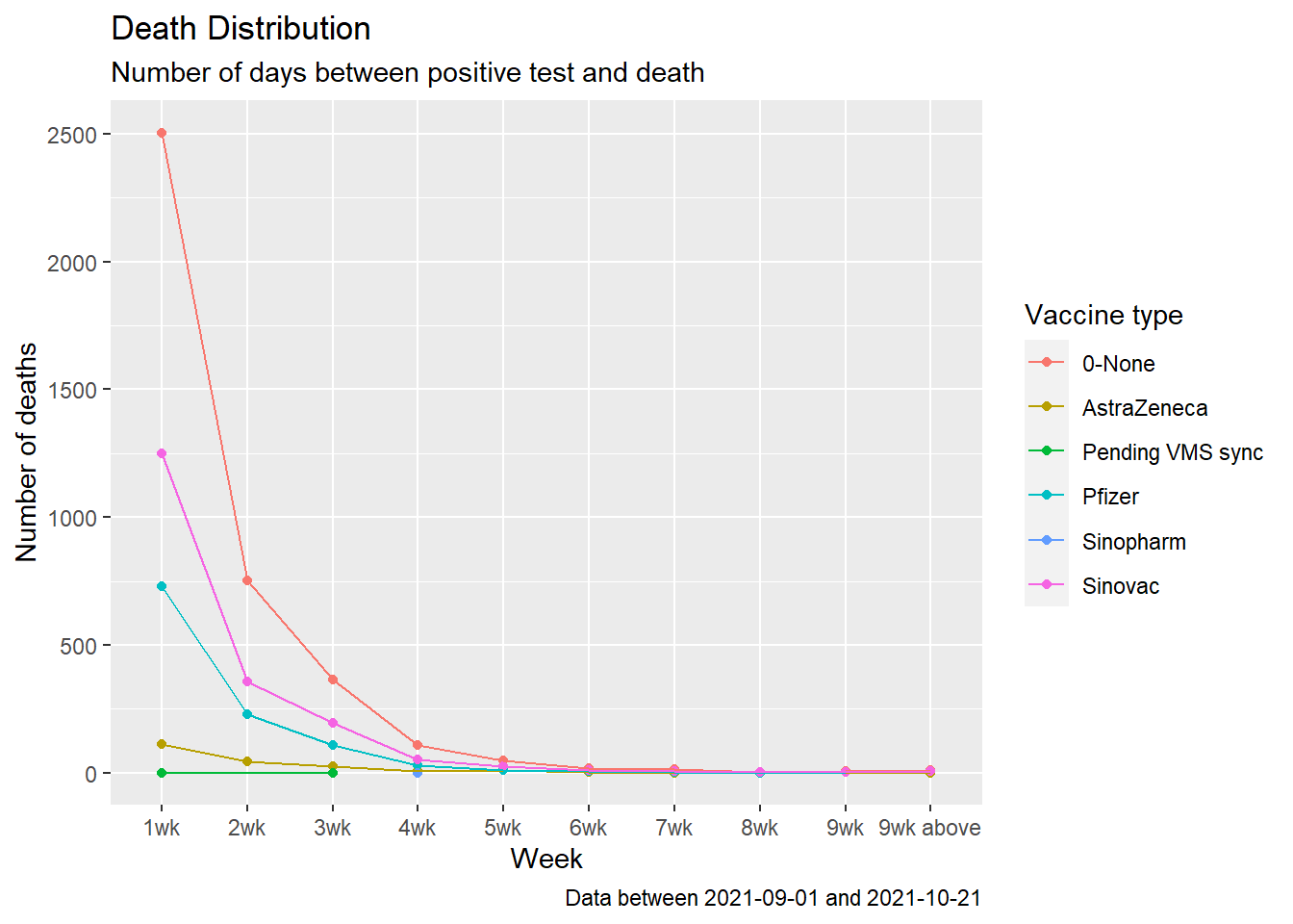
Figure 11.20: Summary distribution of Covid deaths by week starting Sep 2021
death_vacn_sum %>%
  filter(as.Date(date) >= new_min_date) %>%
  ggplot(aes(x = vaxtype, y = deathfrompositive, fill=vaxtype)) +
  geom_jitter(aes(color = vaxtype),alpha=0.2) +
  geom_boxplot(color="black", alpha=0.3, outlier.size=4, outlier.shape=21) +
  labs(title = "Death Distribution",
       subtitle = "Number of days between positive test and death",
       caption = paste0("Data between ", new_min_date,  " and ", max_date),
       x = "",
       y = "Number of days",
       fill = "Vaccine type",
       color = "Vaccine type") +
  coord_flip()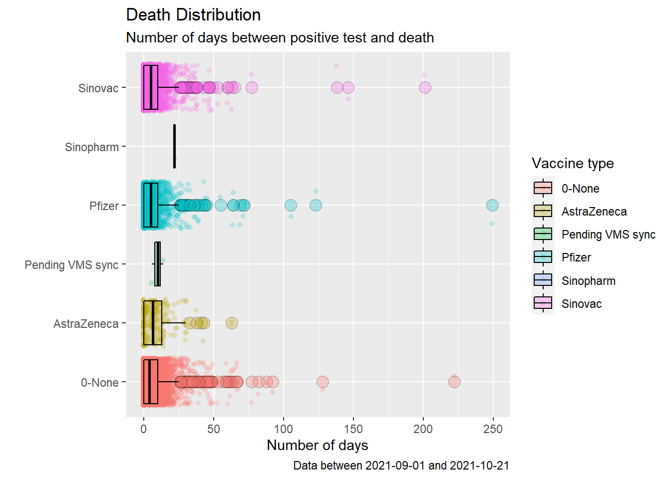
Figure 11.21: Box plot of Covid deaths by week starting Sep 2021
death_vacn_sum %>%
  filter(as.Date(date) >= new_min_date) %>%
  group_by(vaxtype) %>%
  summarise(q0 = quantile(deathfrompositive, 0.0),
            q1 = quantile(deathfrompositive, 0.25),
            q2 = quantile(deathfrompositive, 0.50),
            q3 = quantile(deathfrompositive, 0.75),
            q4 = quantile(deathfrompositive, 1.0)) %>%
  gather("quantile", "value", 2:6) %>%
  ggplot(aes(x = vaxtype,
             y = value,
             color = quantile,
             shape = quantile)) +
  geom_point() +
  coord_flip() +
  labs(title = "Days between positive test and death",
       subtitle = "Quantiles by vaccination",
       caption = paste0("Data between ", min_date,  " and ", max_date),
       x = "Vaccine",
       y = "",
       color = "Quantile",
       shape = "Quantile")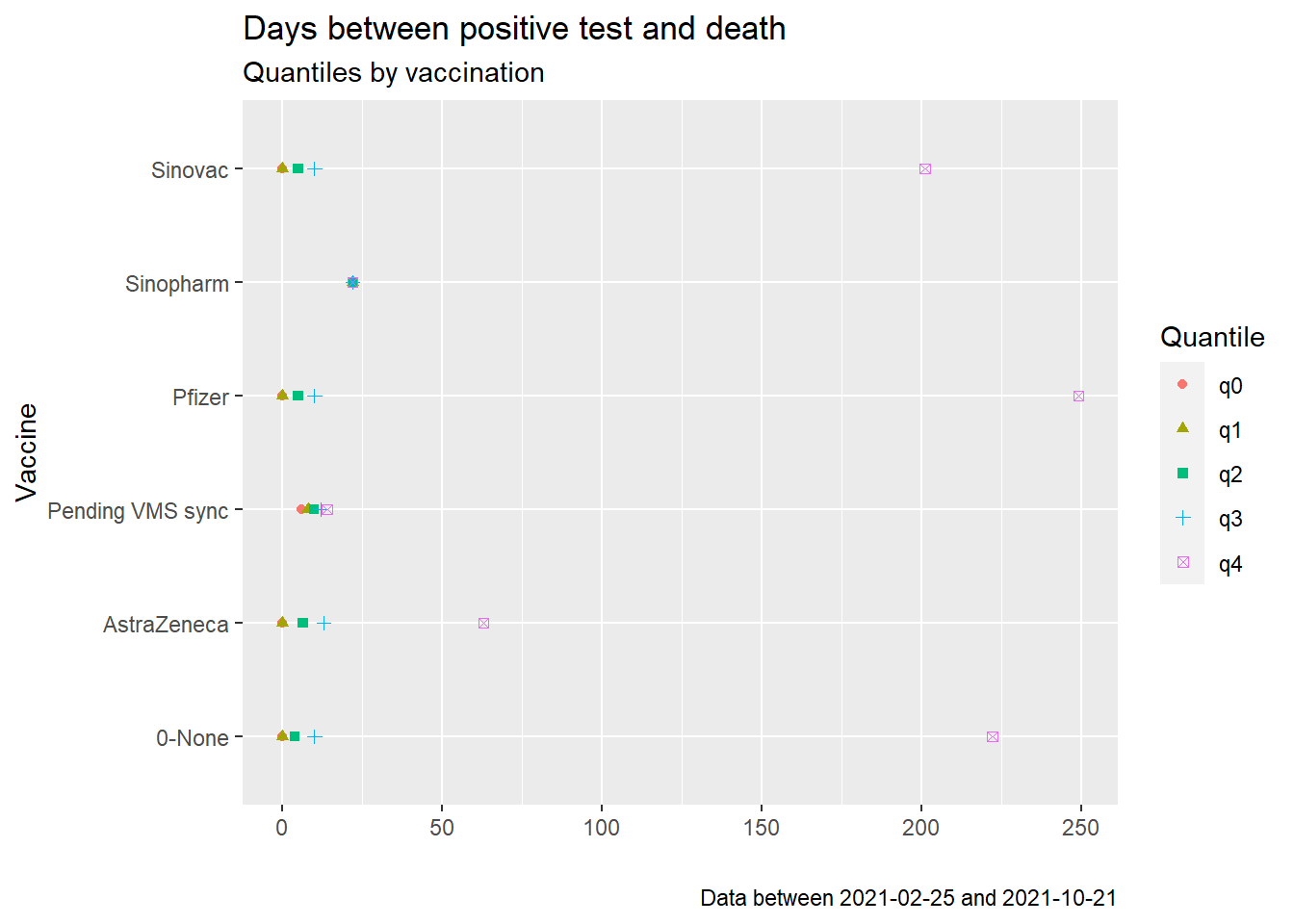
Figure 11.22: Quantiles of days between positive test and death starting Sep 2021
Figures 11.18 and 11.21 look similar except for the outlier data. Figures 11.19 and 11.22 are almost identical. As we have commented a few times, the visuals do not paint a nice conclusion of the deaths and vaccination data.
11.4 Discussion
This is an initial visual exploration of the deaths data frame. It is not prudent to test any hypothesis or develop models until we have more specific questions. Many of the visuals we painted from the data raise questions rather than provide answers. The deaths data frame has 28306 observations. Visualization helps us see the relationships between the 12 variables.
In general, the visuals show that the jury is still out there on the effectiveness of Covid vaccinations in preventing Covid deaths.
Correlation studies between vaccination, COVID-19 incidence, and mortality using the data available up to April 23, 2021, show that 60 countries presented positive correlations and 27 countries with negative correlation for the number of new cases. This finding reinforces the need to keep social distance and the use of face masks recommendations to reduce the virus transmission. The same approach was employed with the number of new deaths and 37 countries show positive correlations and 33 countries have negative correlations. Malaysia showed negative correlations for both cases. These results show that the implementation of vaccines is not the final solution and the maintenance of the non-pharmacological interventions should not be abandoned.56
To further analyze the data more accurately requires some knowledge of statistics, modeling, and hypothesis testing, as evidenced from the reference above. This is beyond the scope of this book.
References
https://github.com/MoH-Malaysia/covid19-public/tree/main/epidemic/linelist↩︎
https://opentextbc.ca/introductorybusinessstatistics/chapter/the-normal-and-t-distributions-2/↩︎
https://bookdown.org/speegled/foundations-of-statistics/simulation-of-random-variables.html↩︎
https://www.jdatalab.com/data_science_and_data_mining/2017/01/30/data-binning-plot.html↩︎
https://www.reuters.com/business/healthcare-pharmaceuticals/pfizerbiontech-covid-19-vaccine-effectiveness-drops-after-6-months-study-2021-10-04/↩︎
https://r-graphics.org/recipe-distribution-basic-boxplot#RECIPE-DISTRIBUTION-BASIC-BOXPLOT↩︎
http://www.sthda.com/english/wiki/descriptive-statistics-and-graphics#r-functions-for-computing-descriptive-statistics↩︎
Correlation Between SARS-Cov-2 Vaccination, COVID-19 Incidence and Mortality: Tracking the Effect of Vaccination on Population Protection in Real Time, https://www.frontiersin.org/articles/10.3389/fgene.2021.679485/full↩︎