Chapter 6 Time-series graphs
Visualizing how data changes over time is important to see improving or worrying trends like an increase in the daily new Covid infections. The most common time-dependent graph is the time-series line graph.
6.1 Time series
Time series data relate observations at regular successive time points. The intervals between time points like minutes, hours, days, weeks, months, or years, are usually equal.
We will start with the mysdeaths data frame which gives the new deaths (deaths_new) per day per state. It is a daily time series. We will do the following to plot our first simple time-series graph.
- Filter the data frame for Selangor state
- Convert the
datecolumn to numeric date.
mysdeaths %>%
  filter(state == "Selangor") %>%
  ggplot(aes(x = as.Date(date), y = deaths_new)) +
  geom_line() +
  labs(title = "Covid Deaths",
       subtitle = "Selangor",
       x = "Date",
       y = "Cases")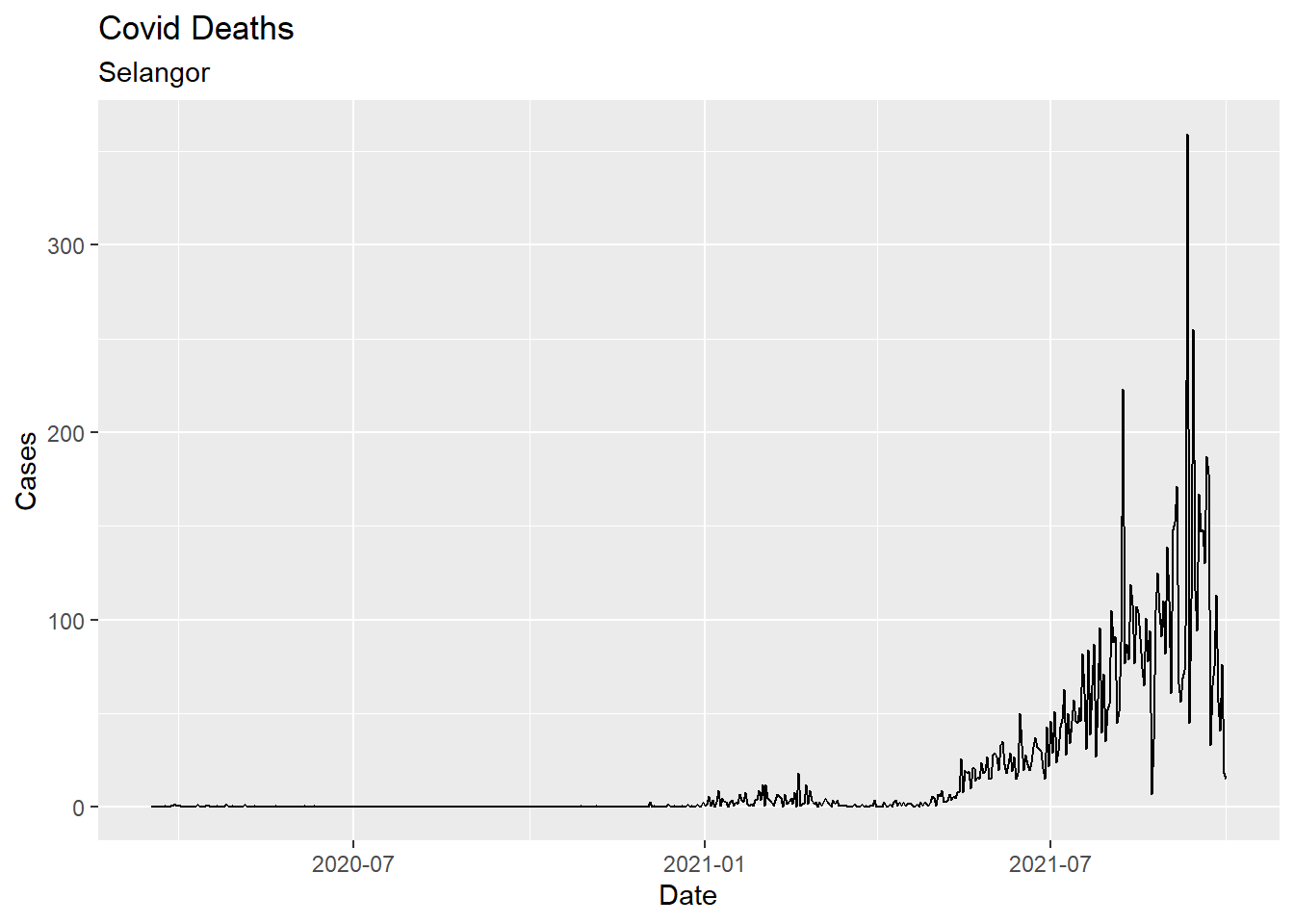
Figure 6.1: First basic time series
We use the scale_x_date function to reformat dates. In Figure 6.2, tick marks appear every month, and dates are presented in Mmm-YY format. The time-series line is given an orange color and made thicker. We add a trend line (loess) and titles. We adjust the theme for the x-axis.
library(scales)
mysdeaths %>%
  filter(state == "Selangor") %>%
  ggplot(aes(x = as.Date(date), y = deaths_new)) +
  geom_line(color = "orange2",
            size = 1) +
  geom_smooth(color = "darkblue") +
  scale_x_date(date_breaks = '1 month',
               labels = date_format("%b-%y")) +
  labs(title = "Covid Deaths",
       subtitle = "Selangor",
       x = "Date",
       y = "Cases") +
  theme(axis.text.x = element_text(color = "steelblue", angle = 45, hjust = 1))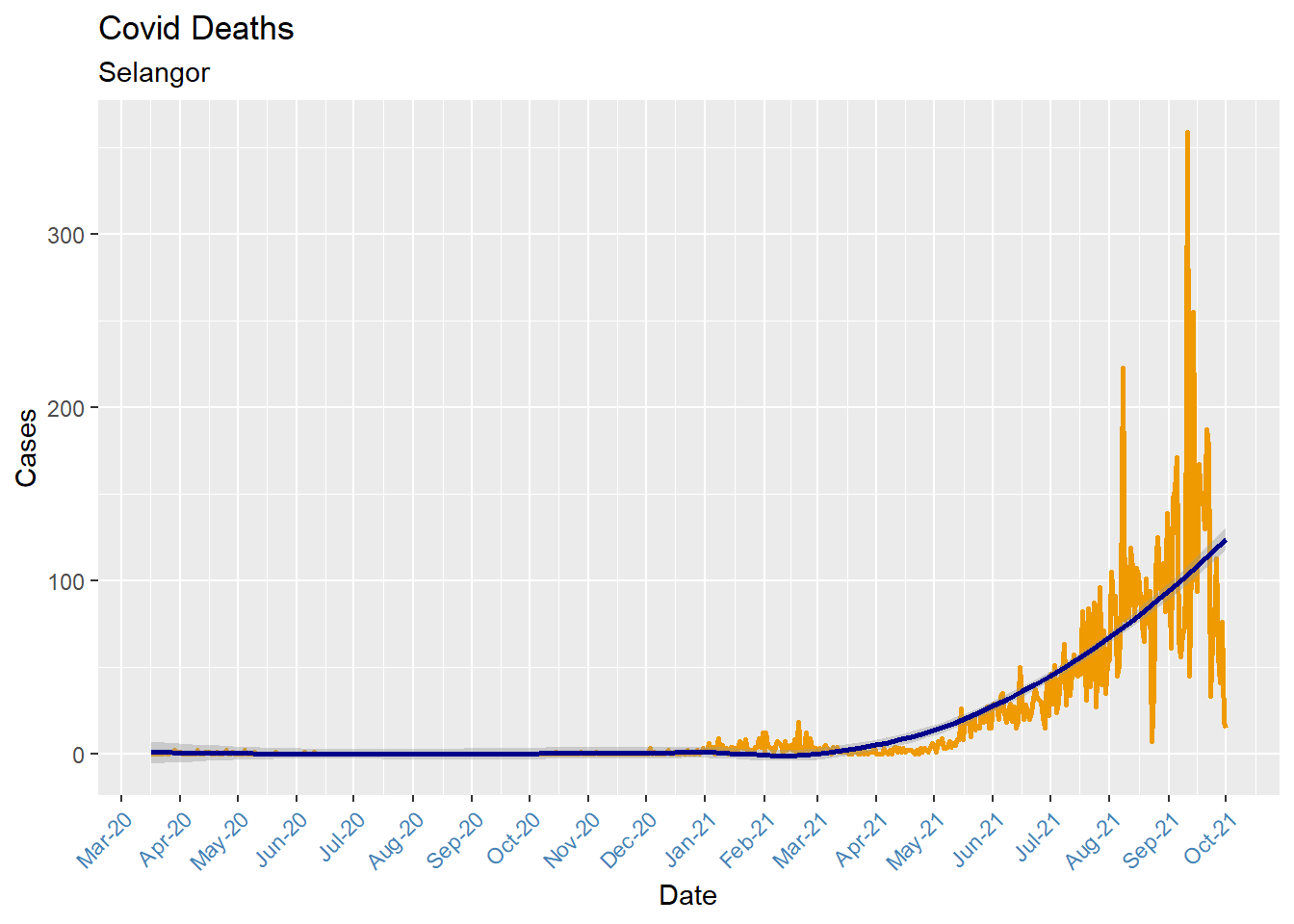
Figure 6.2: Time series with custom date axis
When plotting time-series, be sure that the date variable is class date and not class character. (Run the command class(mysdeaths$date) from the console window in RStudio)
We close this section with a multivariate time series (more than one series). Look at how we filter for selected states using the %in% operator (so that the plot will not be too busy). Just remove that line to plot for all states.
mysdeaths %>%
  filter(state %in% c("Kelantan", "Sabah", "Sarawak",
                      "Negeri Sembilan", "Melaka", "Johor")) %>%
  ggplot(aes(x = as.Date(date), y = deaths_new, color = state)) +
  geom_line(size = 1) +
  geom_smooth() +
  scale_x_date(date_breaks = '1 month',
               labels = date_format("%b-%y")) +
  labs(title = "Covid Deaths",
       subtitle = "Selected States",
       x = "Date",
       y = "Cases") +
  theme(axis.text.x = element_text(color = "steelblue", angle = 45, hjust = 1))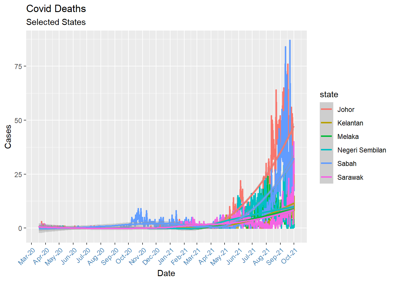
Figure 6.3: Multivariate time series
We next use the faceting feature we learned in the previous chapter to plot for all the states. We use theme(axis.text.x = element_blank()) to remove clutter at the x-axis.
mysdeaths %>%
  ggplot(aes(x = as.Date(date), y = deaths_new, color = state)) +
  geom_line(size = 1) +
  geom_smooth() +
  scale_x_date(date_breaks = '1 month',
               labels = date_format("%b-%y")) +
  facet_wrap(~ state, scales = "free") +
  labs(title = "Covid Deaths",
       subtitle = "Facet by states",
       caption = "Free y-axis scales to compare the actual trends",
       x = "Date",
       y = "Cases") +
  theme(legend.position = "none") +
  theme(axis.text.x = element_blank())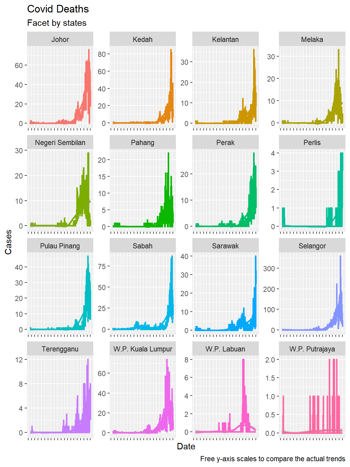
Figure 6.4: Time series and faceting
We repeat without the scales = "free" option, as we did in the previous chapter. In Figure 6.4 we included the facet_wrap(~state, scales = "free") option. Figure 6.5 allows us to compare the Covid deaths over time for each state. Selangor dwarfed the states with lower numbers, but we cannot see the trend for each state. Figure 6.4 shows the real trend over time for all states.
mysdeaths %>%
  ggplot(aes(x = as.Date(date), y = deaths_new, color = state)) +
  geom_line(size = 1) +
  geom_smooth() +
  scale_x_date(date_breaks = '1 month',
               labels = date_format("%b-%y")) +
  facet_wrap(~ state) +
  labs(title = "Covid Deaths",
       subtitle = "Facet by states",
       caption = "Fixed y-axis scales to compare the actual numbers",
       x = "Date",
       y = "Cases") +
  theme(legend.position = "none") +
  theme(axis.text.x = element_blank())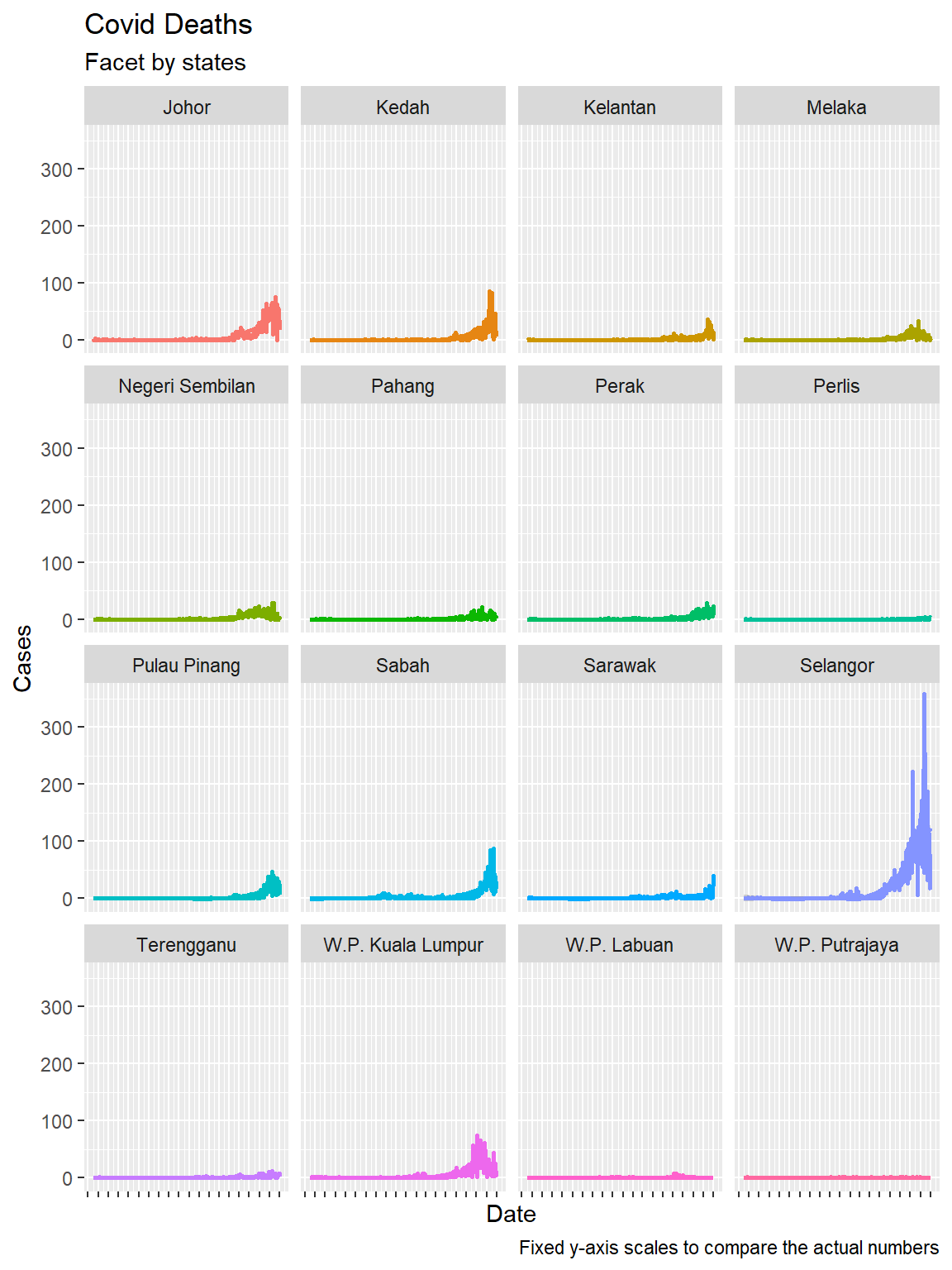
Figure 6.5: Time series and faceting
6.2 Area Charts
An area chart is actually a line graph with a fill from the x-axis to the point (line).
mysdeaths %>%
  filter(state == "Johor") %>%
  ggplot(aes(x = as.Date(date), y = deaths_new)) +
  geom_area(fill="orange", color="darkblue") +
  scale_x_date(date_breaks = '1 month',
               labels = date_format("%b-%y")) +
  labs(title = "Covid Deaths per Day",
       subtitle = "Johor state",
       x = "Date",
       y = "Cases") +
  theme(axis.text.x = element_text(color = "steelblue", angle = 45, hjust = 1))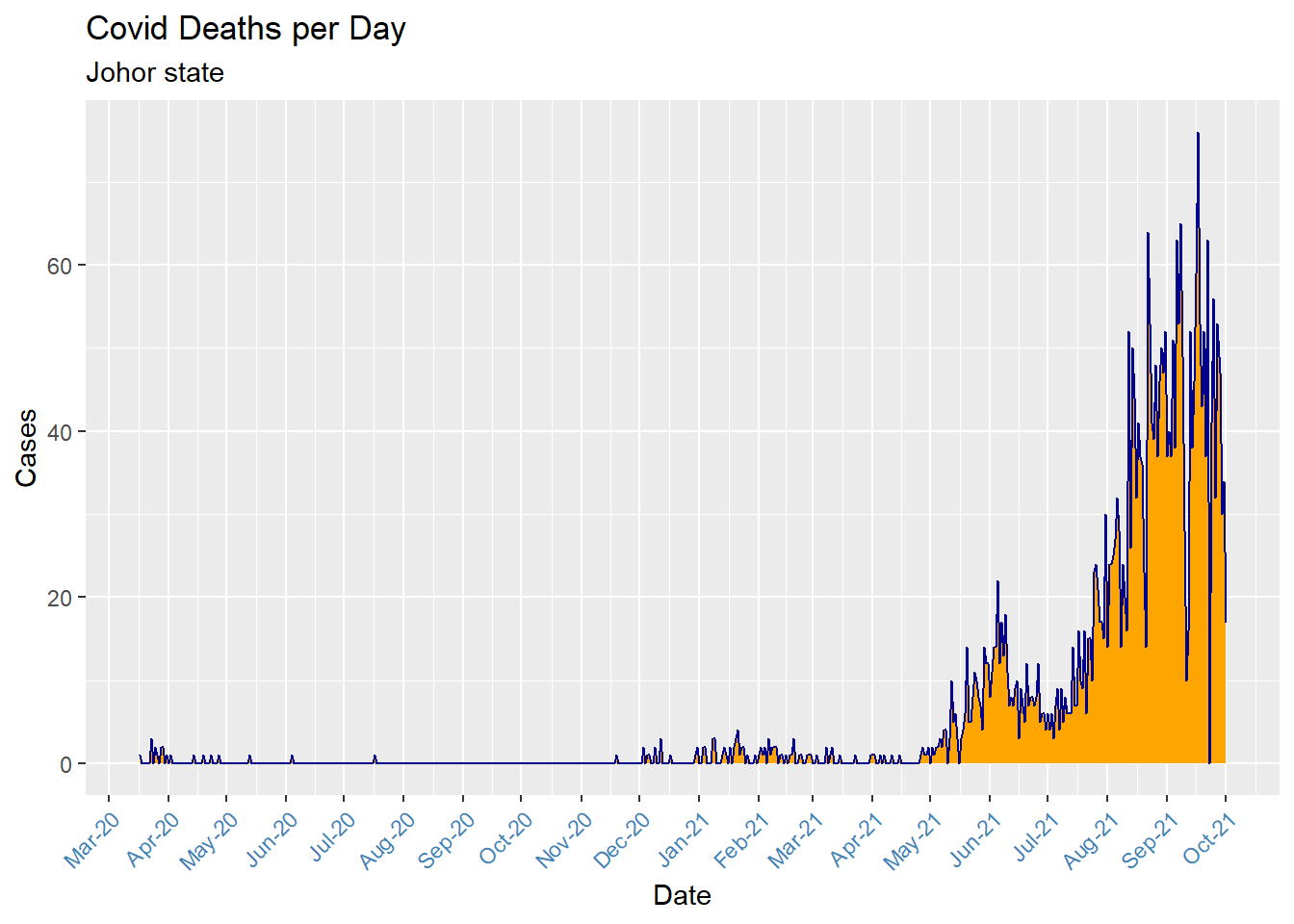
Figure 6.6: Simple area chart
We can use a stacked area chart (geom_area())to show differences between groups of data (fill = state) over time.
mysdeaths %>%
  ggplot(aes(x = as.Date(date), y = deaths_new, fill = state)) +
  geom_area() +
  scale_x_date(date_breaks = '1 month',
               labels = date_format("%b-%y")) +
  labs(title = "Covid Deaths",
       subtitle = "All states stacked together",
       x = "Date",
       y = "Cases") +
  theme(axis.text.x = element_text(color = "steelblue", angle = 45, hjust = 1))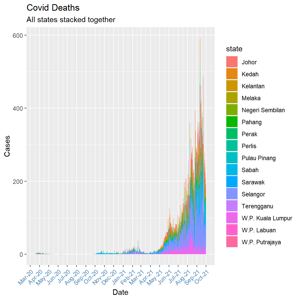
Figure 6.7: Stacked area chart with daily data
Figure 6.7 appears too jagged for an area plot. Perhaps we can look at the monthly deaths. We need some data wrangling because the x option in aes must be date not character or factor.
mysdeaths %>%
  mutate(yearmonth = format(as.Date(date), "%Y-%m")) %>%
  group_by(yearmonth, state) %>%
  summarise(total = sum(deaths_new), .groups = 'drop') %>%
  mutate(date = as.Date(paste(yearmonth,"-01",sep=""))) -> plotdata

plotdata %>%
  ggplot(aes(x = date, y = total, fill = state)) +
  geom_area() +
  scale_x_date(date_breaks = '1 month',
               labels = date_format("%b-%y")) +
  labs(title = "Covid Deaths per Month",
       subtitle = "All states stacked together",
       x = "Month-Year",
       y = "Total deaths",
       fill = "State") +
  theme(axis.text.x = element_text(color = "darkblue", angle = 45, hjust = 1))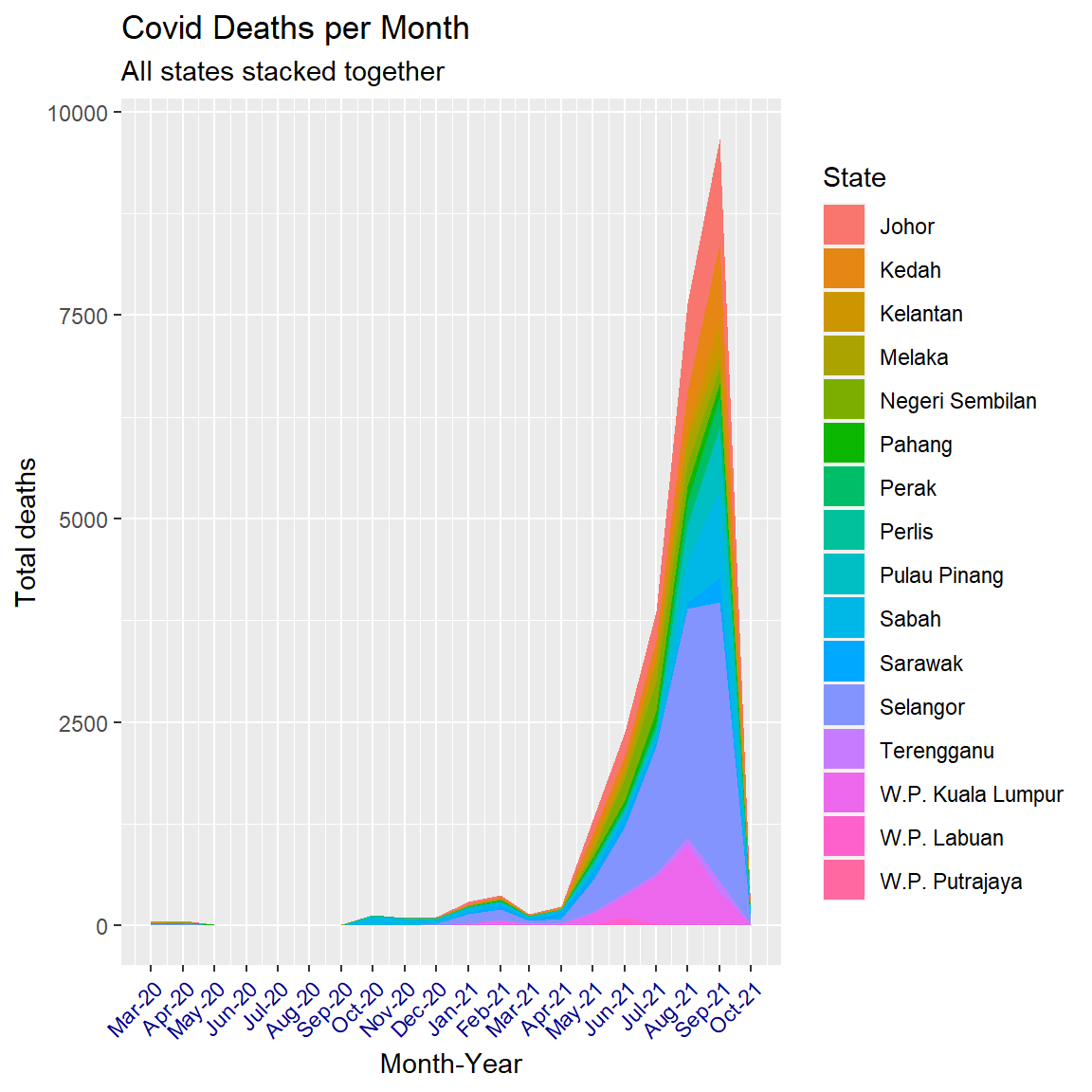
Figure 6.8: Smoother stacked area chart
6.3 Rolling or moving averages
Rolling or moving averages are a way to reduce noise and smooth time series data.14 During the Covid-19 pandemic, rolling averages have been used by researchers and journalists around the world to understand and visualize cases and deaths. For example, the often-quoted Covid-19 Data Explorer offers a 7-day rolling average.15
The zoo package helps in calculating rolling averages.
6.3.1 Calculating rolling averages
We will calculate and visualize the rolling averages for cumulative deaths and new cases in the states of Selangor and Melaka and compare them to the other 16 states.
To calculate a simple moving average (over 7 days), we can use the rollmean() function from the zoo package. This function takes a k, which is an integer width of the rolling window.
The code below calculates a 3, 5, 7, 15, and 21-day rolling average for the deaths from Covid in Malaysia. Notice that the <- operator will change the mysdeaths data frame.
deathsroll <- mysdeaths %>%
  select(date, state, deaths_new) %>%
  dplyr::arrange(desc(state)) %>%
  dplyr::group_by(state) %>%
  dplyr::mutate(death_03da = zoo::rollmean(deaths_new, k = 3, fill = NA),
                death_05da = zoo::rollmean(deaths_new, k = 5, fill = NA),
                death_07da = zoo::rollmean(deaths_new, k = 7, fill = NA),
                death_15da = zoo::rollmean(deaths_new, k = 15, fill = NA),
                death_21da = zoo::rollmean(deaths_new, k = 21, fill = NA)) %>%
  dplyr::ungroup()
Below is an example of this calculation for the state of Selangor,
deathsroll %>%
  dplyr::arrange(date) %>%
  dplyr::filter(state == "Selangor") %>%
  dplyr::select(state,
                date,
                deaths_new,
                death_03da:death_07da) %>%
  utils::head(15)
## # A tibble: 15 x 6
## state date deaths_new death_03da death_05da death_07da
## <chr> <chr> <int> <dbl> <dbl> <dbl>
## 1 Selangor 2020-03-17 0 NA NA NA
## 2 Selangor 2020-03-18 0 0 NA NA
## 3 Selangor 2020-03-19 0 0 0 NA
## 4 Selangor 2020-03-20 0 0 0 0
## 5 Selangor 2020-03-21 0 0 0 0.143
## 6 Selangor 2020-03-22 0 0 0.2 0.143
## 7 Selangor 2020-03-23 0 0.333 0.2 0.143
## 8 Selangor 2020-03-24 1 0.333 0.2 0.286
## 9 Selangor 2020-03-25 0 0.333 0.4 0.429
## 10 Selangor 2020-03-26 0 0.333 0.6 0.714
## 11 Selangor 2020-03-27 1 0.667 0.8 0.857
## 12 Selangor 2020-03-28 1 1.33 1 0.857
## 13 Selangor 2020-03-29 2 1.33 1.2 1
## 14 Selangor 2020-03-30 1 1.33 1.2 1
## 15 Selangor 2020-03-31 1 1 1 0.857The calculation works like this. The first value in our new death_03da variable (0.3333333) is the average deaths in Selangor from the first date with a data point on either side of it (i.e. the date 2020-03-24 has 2020-03-23 preceding it, and 2020-03-25 following it). We can check our math below.
## [1] 0.3333333The first value in death_05da (0.2) is the average deaths in Selangor from the first date with two data points on either side of it. (2020-03-23 has 2020-03-21 and 2020-03-22 preceding it, and 2020-03-24 and 2020-03-25 following it). We can check our math below.
## [1] 0.2The first value in death_07da (0.1428571) is the average death rate in Selangor from the first date with three data points on either side, 2020-03-22. We check our math again.
## [1] 0.1428571It’s good practice to calculate rolling averages using an odd number for k because it makes the resulting values symmetrical.
Each rolling mean is calculated from the numbers surrounding it. If we want to visualize and compare the various rolling means against the original deaths data, we can do this by converting the data frame into a long format. Covid related deaths increased significantly during May 2021, so we filter the data to start from say 1 April 2021.
deathsroll %>%
  filter(state == "Selangor") %>%
  gather(key = "rolling_mean_key", value = "rolling_mean_value", 3:8) %>%
  filter(date >= as.Date("2021-04-01")) %>%
  ggplot(aes(x = as.Date(date),
             y = rolling_mean_value,
             color = rolling_mean_key)) +
  geom_line() +
  labs(title = "Selangor rolling average total COVID deaths",
       subtitle = "After 01 April 2021",
       x = "Date",
       y = "Deaths",
       color = "Metric")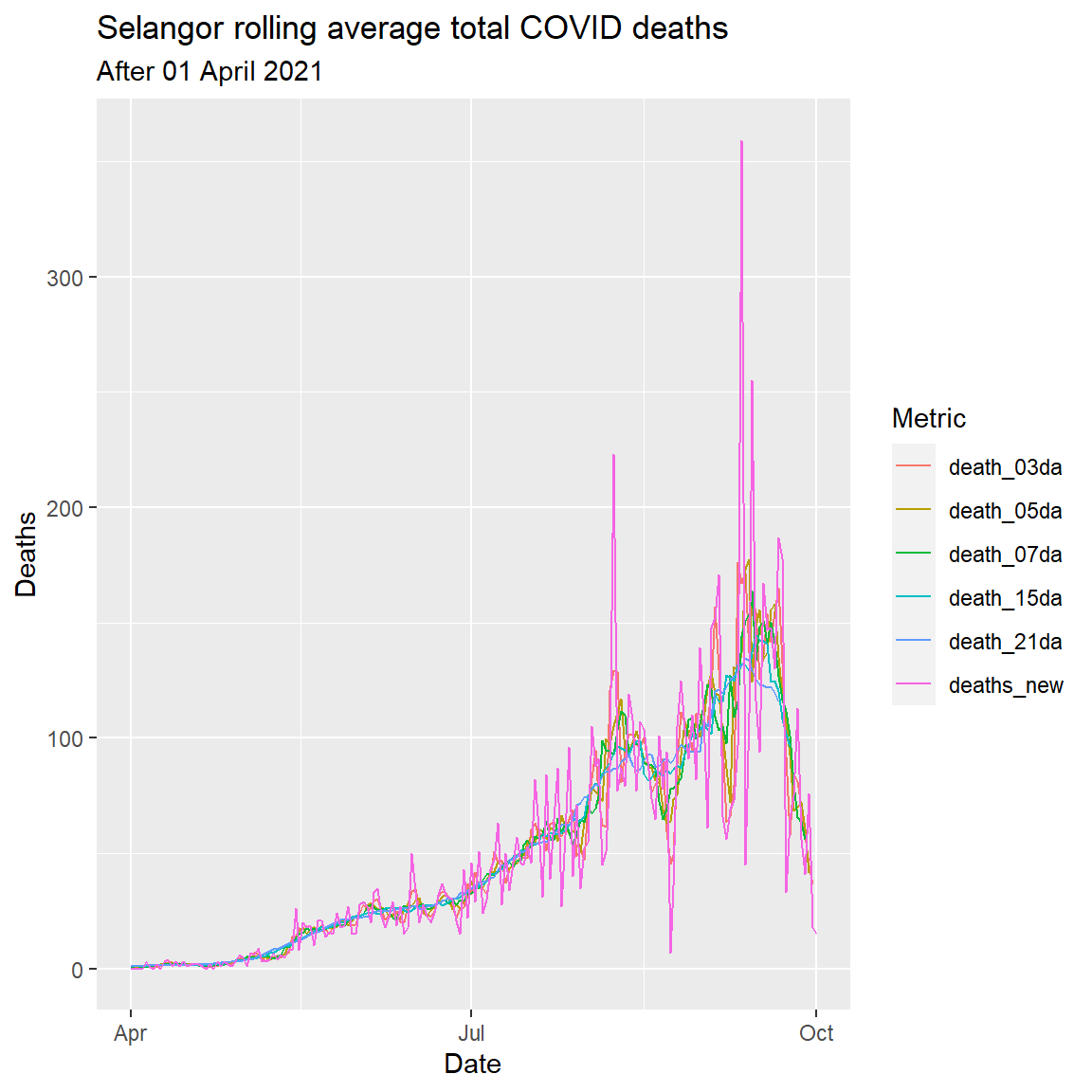
Figure 6.9: Rolling averages for various number of days
Figure 6.9 shows the smoothness of the curve increasing with the number of “rolling days”. The rough eye seems to indicate that a 7-day rolling average is optimal.
Figure 6.10 repeats the plot for Melaka.
deathsroll %>%
  filter(state == "Melaka") %>%
  gather(key = "rolling_mean_key", value = "rolling_mean_value", 3:8) %>%
  filter(date >= as.Date("2021-04-01")) %>%
  ggplot(aes(x = as.Date(date),
             y = rolling_mean_value,
             color = rolling_mean_key)) +
  geom_line() +
  labs(title = "Melaka rolling average total COVID deaths",
       subtitle = "After 01 April 2021",
       x = "Date",
       y = "Deaths",
       color = "Metric")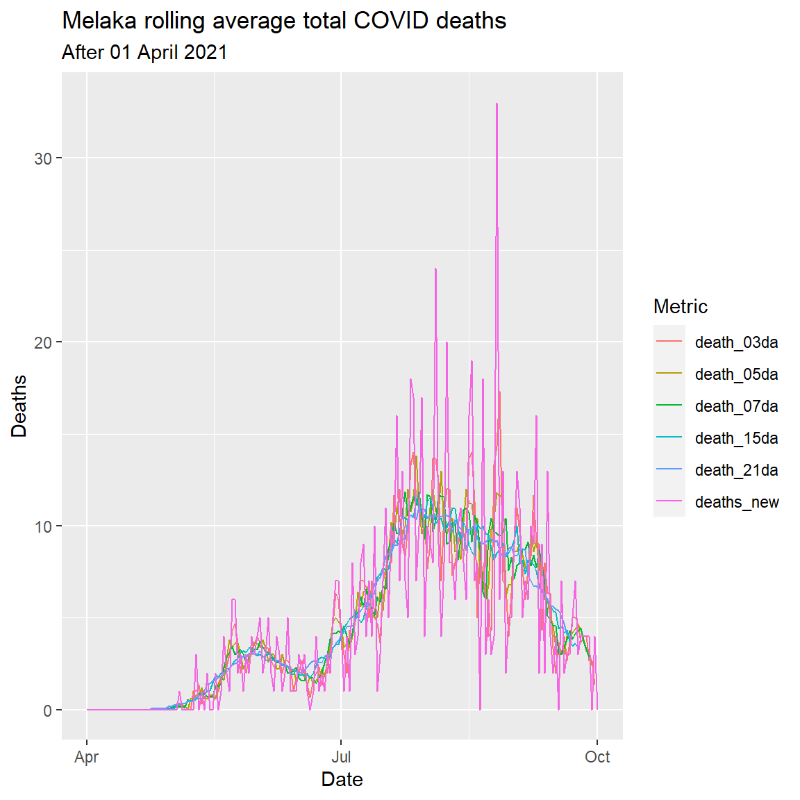
Figure 6.10: Rolling averages for various number of days
Which mean should we use? The zoo::rollmean() function works by successively averaging each period (k) together. Knowing which period (k) to use in zoo::rollmean() is a judgment call. The higher the value of k, the smoother the line gets, but we are also sacrificing more data.
If we compare the 3-day average (death_3da) to the 21-day average (death_21da), we see the line for deaths gets increasingly smooth.
6.3.2 Moving averages with facets
We’ll take a look at the 3-day and 7-day moving averages of new cases across all states using facet.
We first calculate the rolling mean for the new confirmed cases in each state.
casesroll <- mysstates %>%
  select(date, state, cases_new) %>%
  dplyr::group_by(state) %>%
  dplyr::mutate(
    new_conf_03da = zoo::rollmean(cases_new, k = 3, fill = NA),
    new_conf_05da = zoo::rollmean(cases_new, k = 5, fill = NA),
    new_conf_07da = zoo::rollmean(cases_new, k = 7, fill = NA),
    new_conf_15da = zoo::rollmean(cases_new, k = 15, fill = NA),
    new_conf_21da = zoo::rollmean(cases_new, k = 21, fill = NA)) %>%
  dplyr::ungroup()
Next we will build two plots for Selangor, combine them, and then extend this approach to the other states. We will limit the casesroll data to after April 1st.
Column graph for new cases
We create a geom_col() for the new confirmed cases for Selangor.
mysstatesNewCasesApr %>%
  filter(state == "Selangor") %>%
  ggplot(aes(x = as.Date(date),
             y = cases_new)) +
  geom_col(alpha = 0.2) +
  labs(title = "Selangor new COVID cases",
       subtitle = "After 2021-04-01",
       y = "New Cases",
       x = "Day")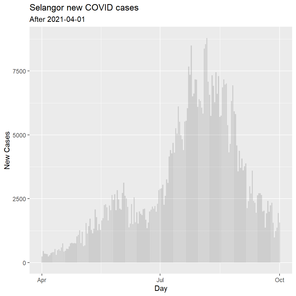
Figure 6.11: Simple column bar graph of new Covid cases
Tidy data frame of new cases
Now we want to add lines for the new_conf_ variables, so we use gather to convert the data frame into a long format. (3:7 shows that we are taking columns 3 to 7 to convert into a long format. We ignore the 21-day rolling average for now.)
SelNewCasesTidy <- mysstatesNewCasesApr %>%
  filter(state == "Selangor") %>%
  gather(key = "new_conf_av_key",
         value = "new_conf_av_value", 3:7) %>%
  select(date,
         state,
         new_conf_av_value,
         new_conf_av_key)
Now we can combine them into a single plot.
Line graph for new cases
mysstatesNewCasesApr %>%
  filter(state == "Selangor") %>%
  ggplot(aes(x = date, y = cases_new, group(date))) +
  geom_col(alpha = 0.2) +
  geom_line(data = SelNewCasesTidy,
            mapping = aes(x = date,
                          y = new_conf_av_value,
                          color = new_conf_av_key)) +
  labs(title = "Selangor new COVID cases",
       subtitle = "Rolling average after 2021-04-01",
       x = "Day",
       y = "New Cases",
color = "Metric") 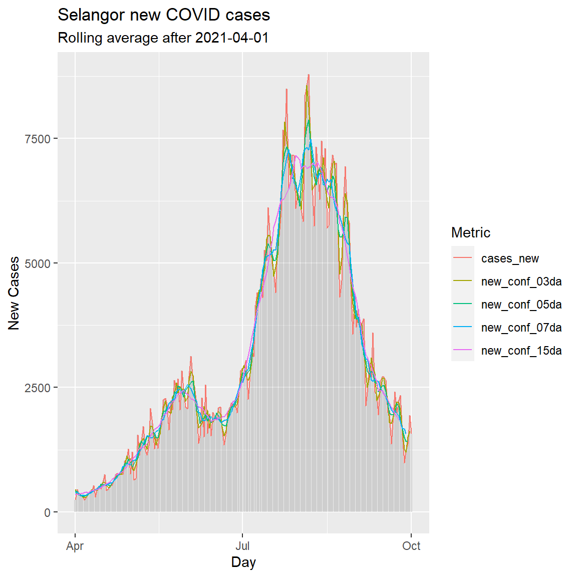
Figure 6.12: Simple column bar graph of new Covid cases with various rolling averages
We can see that the blue line representing the 7-day rolling average (rolling weekly average) of new confirmed cases is sufficiently smooth.
Let us compare it to the 3-day average using a geofacet for the other states in Malaysia.
Again, we build our tidy data frame of new confirmed case metrics.
NewCasesTidy <- mysstatesNewCasesApr %>%
  gather(key = "new_conf_av_key",
         value = "new_conf_av_value",
         new_conf_03da, new_conf_07da) %>%
# better labels for printing
  mutate(new_conf_av_key = case_when(
    new_conf_av_key == "new_conf_03da" ~ "3-day avg new cases",
    new_conf_av_key == "new_conf_07da" ~ "7-day avg new cases",
    TRUE ~ NA_character_)) %>%
  select(date,
         state,
         new_conf_av_key,
         new_conf_av_value)
In Figure 6.13 we combine 3 ggplot functions; geom_col, geom_line, and facet_wrap. We also use the min and max to get values for the subtitle.
min_date <- min(mysstatesNewCasesApr$date, na.rm = TRUE)
max_date <- max(mysstatesNewCasesApr$date, na.rm = TRUE)
mysstatesNewCasesApr %>%
  ggplot(aes(x = as.Date(date), y = cases_new)) +
  geom_col(alpha = 0.3, linetype = 0) +
  geom_line(data = NewCasesTidy,
            mapping = aes(x = as.Date(date), y = new_conf_av_value,
                          color = new_conf_av_key)) +
  facet_wrap(~state, scale="free_y") +
  labs(title = "Rolling 3 and 7 day averages of new COVID cases",
       subtitle = paste0("Between ", min_date,  " and ", max_date,
                         " with free scale y-axis"),
       x = "Day",
       y = "New Cases",
       color = "Metric") +
  theme_bw() +
  theme(legend.position = "top")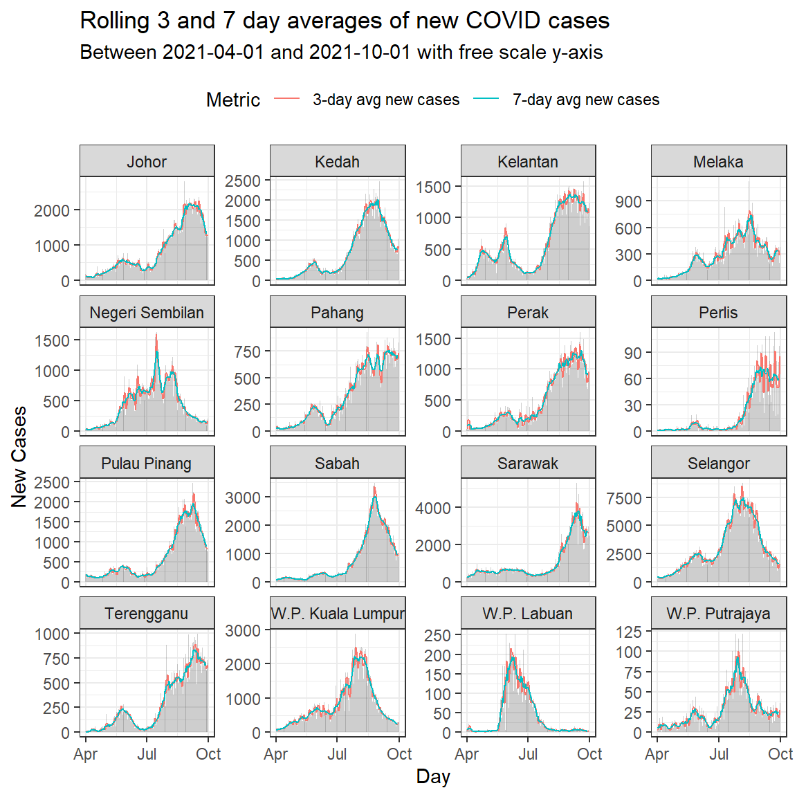
Figure 6.13: Column bar graph of new Covid cases with rolling averages faceted by state
As in our facetexamples before, we repeat using the same scale for the y-axis. Figure 6.13 allows us to compare the trend while Figure 6.14 compares the actual numbers.
mysstatesNewCasesApr %>%
  ggplot(aes(x = as.Date(date), y = cases_new)) +
  geom_col(alpha = 0.3, linetype = 0) +
  geom_line(data = NewCasesTidy,
            mapping = aes(x = as.Date(date), y = new_conf_av_value,
                          color = new_conf_av_key)) +
  facet_wrap(~state) +
  labs(title = "Rolling 3 and 7 day averages of new COVID cases",
       subtitle = paste0("Between ", min_date,  " and ", max_date,
                         " with same scale y-axis"),
       x = "Day",
       y = "New Cases",
       color = "Metric") +
  theme_bw() +
  theme(legend.position = "top")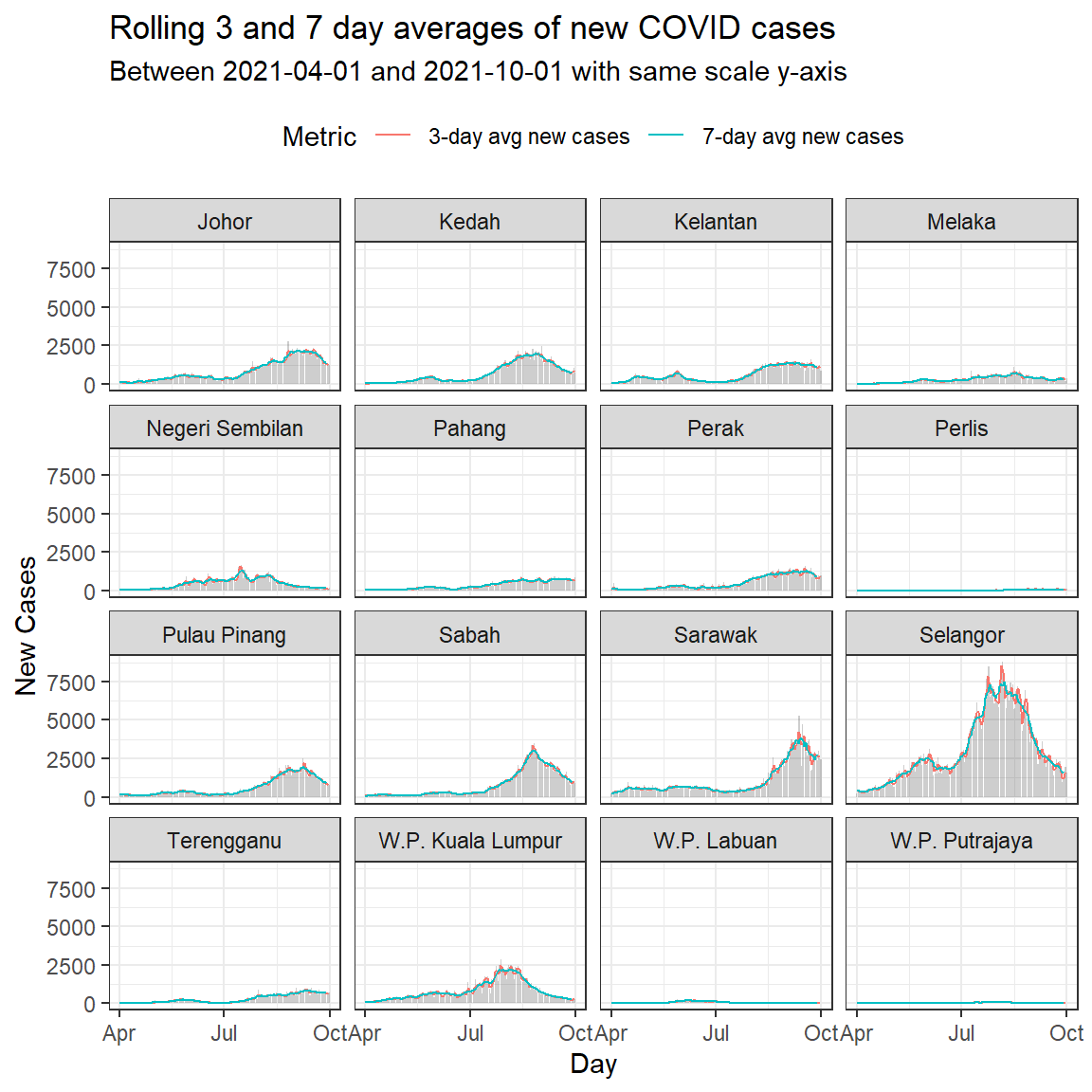
Figure 6.14: Column bar graph of new Covid cases with rolling averages faceted by state
Through Figure 6.13 and Figure 6.14 we’re able to cram a lot of information into a single plot, and compare some important trends.
6.3.3 Saving changed datasets
We have created two data frames with the rolling averages deathsroll and casesroll. It is good practice to save them for the coming chapters. We are saving it in the current working directory.
6.4 Discussion
Some notes on rolling/moving averages:16
- A moving average term in a time series model is a past error (multiplied by a coefficient). Moving average is also used to smooth the series. It does this by removing noise from the time series by successively averaging terms together.
- Moving average is a smoothing approach that averages values from a window of consecutive time periods, thereby generating a series of averages. The moving average approaches primarily differ based on the number of values averaged, how the average is computed, and how many times averaging is performed”.
- To compute the moving average of size
kat a pointp, thekvalues symmetric aboutpare averaged together which then replace the current value. The more points are considered for computing the moving average, the smoother the curve becomes, with the compromise loss of some details.
References
https://www.storybench.org/how-to-calculate-a-rolling-average-in-r/↩︎
Machine Learning Using R: With Time Series and Industry-Based Use Cases in R↩︎