Chapter 3 Single Variable Graphs
Single variable or univariate graphs plot the distribution of data from a single variable. The variable can be categorical (e.g., state) or quantitative (e.g., deaths_new).
3.1 Categorical variable
The distribution of a single categorical variable is usually plotted with a bar chart or a pie chart.
We will use geom_bar to plot bar charts in this chapter. geom_bar() makes the height of the bar proportional to the number of cases in each group (or if the weight aesthetic is supplied, the sum of the weights). geom_bar() uses stat_count() by default: it counts the number of cases at each x position. This is not useful for us because the number of cases will be the same for the state category that we want to plot. We want the heights of the bars to represent values in the data. We can use geom_col() which uses stat_identity(): it leaves the data as-is. Else we can use geom_bar(stat = "identity") since it practically does the same thing with geom_col(). geom_bar
For geom_bar(), the default behavior is to count the rows for each x (state) value. It does not expect a y-value, since it will count that up itself. In fact, it will flag a warning if we give it one since it thinks we’re confused. How aggregation is to be performed is specified as an argument to geom_bar(), which is stat = "count" for the default value. If we explicitly say stat = "identity" in geom_bar(), we’re telling ggplot2 to skip the aggregation and that we’ll provide the y values.
3.1.1 Bar chart
Let us look at the vaccination data. We select just the latest date in the vacn data frame.
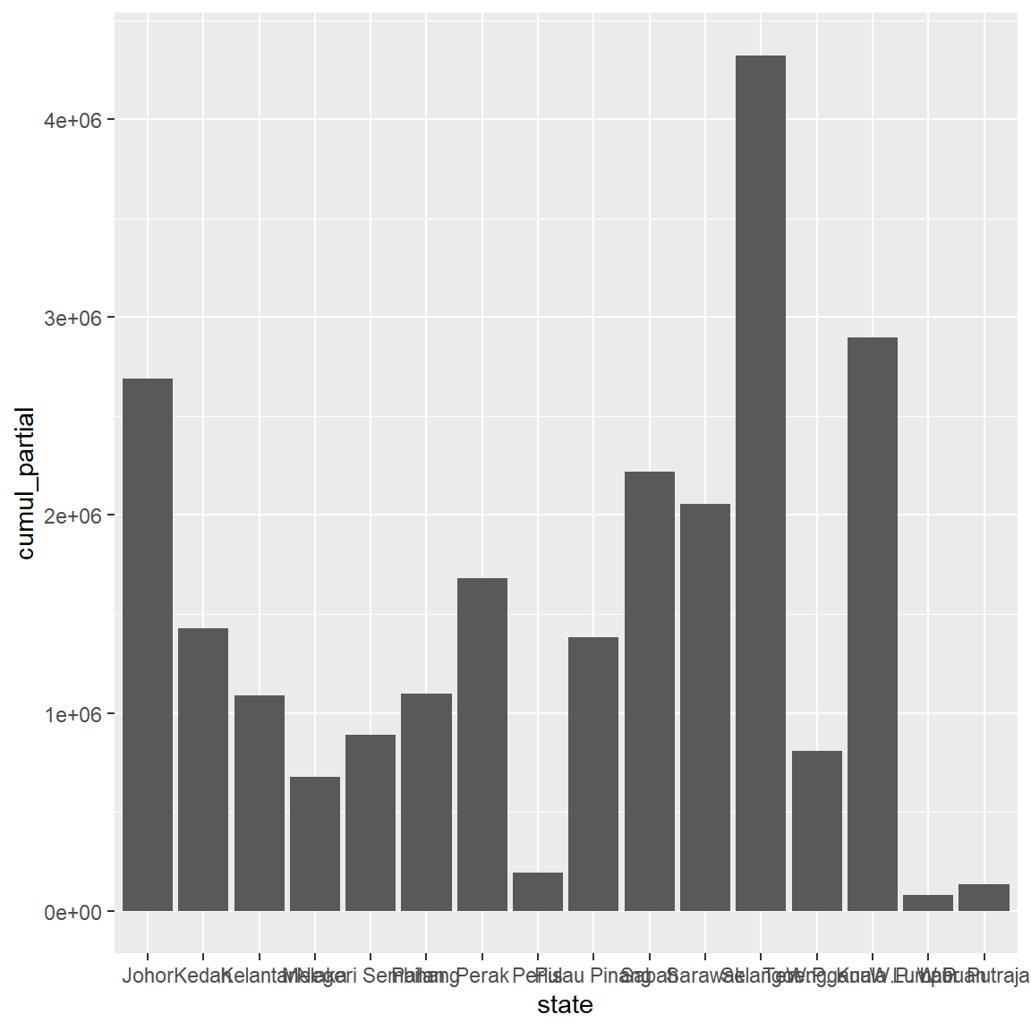
Figure 3.1: Simple barchart
We can modify the column fill and border colors, plot labels, and title by adding options to the geom_bar function. The state labels along the x-axis in Figure 3.1 overlap. We’ll fix that later.
ggplot(vacnlatest, aes(x = state, y = cumul_partial)) +
  geom_bar(stat = "identity",
           fill = "gold2",
           color = "black") +
  labs(title = "Vaccination by state",
       x = "State",
       y = "First Dose Administered")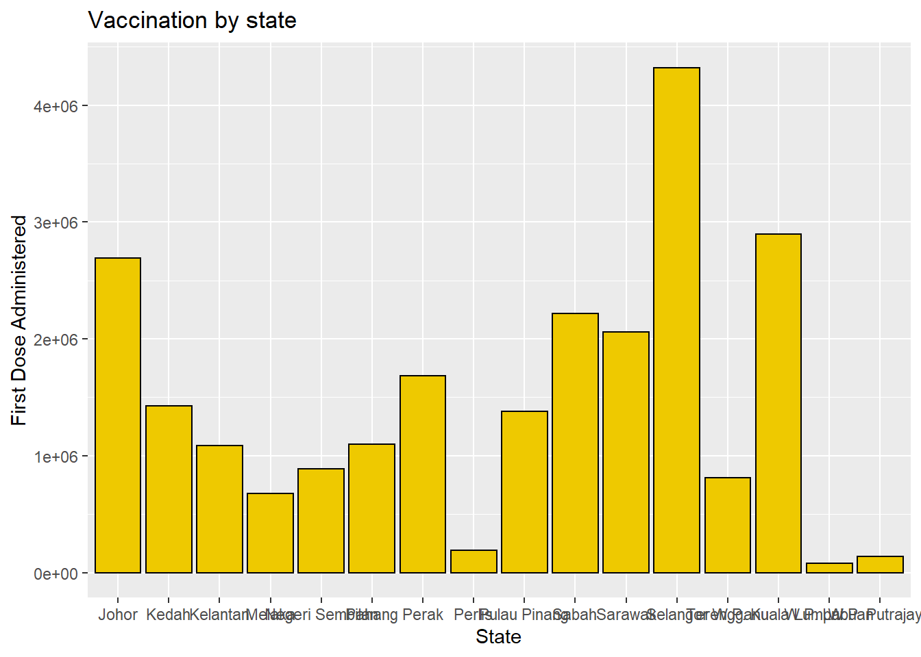
Figure 3.2: Barchart with colors, labels, and title
Percentages
Bars can represent percentages rather than counts. Figure 3.3 plots the first dose administered as a percentage of the same for other states.
To see the percentage of the population having been vaccinated for each state we need to combine the data with the population data. We will show that at the end of this section.
ggplot(vacnlatest, aes(x = state, y = cumul_partial/sum(cumul_partial))) +
  geom_bar(stat = "identity",
           fill = "gold3",
           color = "black") +
  labs(title = "Vaccination by state",
       x = "State",
       y = "First Dose Administered by Percentage")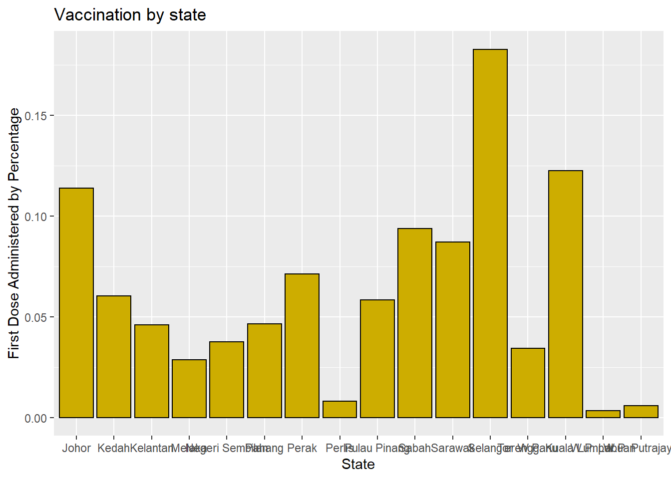
Figure 3.3: Barchart with percentages
Sorting
It is better to sort the columns. For Figure 3.4, the reorder function is used to sort the categories by the value in ascending order.
ggplot(vacnlatest, aes(x = reorder(state, cumul_partial),
                       y = cumul_partial)) +
  geom_bar(stat = "identity",
           fill = "gold4",
           color = "black") +
  labs(title = "Vaccination by state",
       x = "State",
       y = "First Dose Administered by Percentage")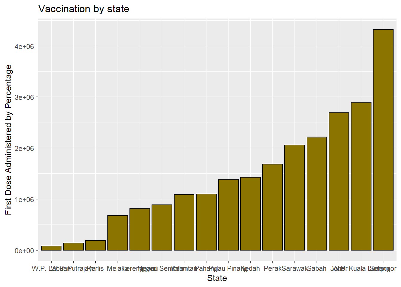
Figure 3.4: Bar chart sorted
The graph bars are sorted in ascending order. In Figure 3.5, we use reorder(state, -n) to sort in descending order. We purposely use different color options so the reader can see what these pre-defined colors in ggplot2 look like.
ggplot(vacnlatest, aes(x = reorder(state, -cumul_partial/sum(cumul_partial)),
                       y = cumul_partial/sum(cumul_partial))) +
  geom_bar(stat = "identity",
           fill = "cyan3",
           color = "black") +
  labs(title = "Vaccination by state",
       x = "State",
       y = "First Dose Administered by Percentage")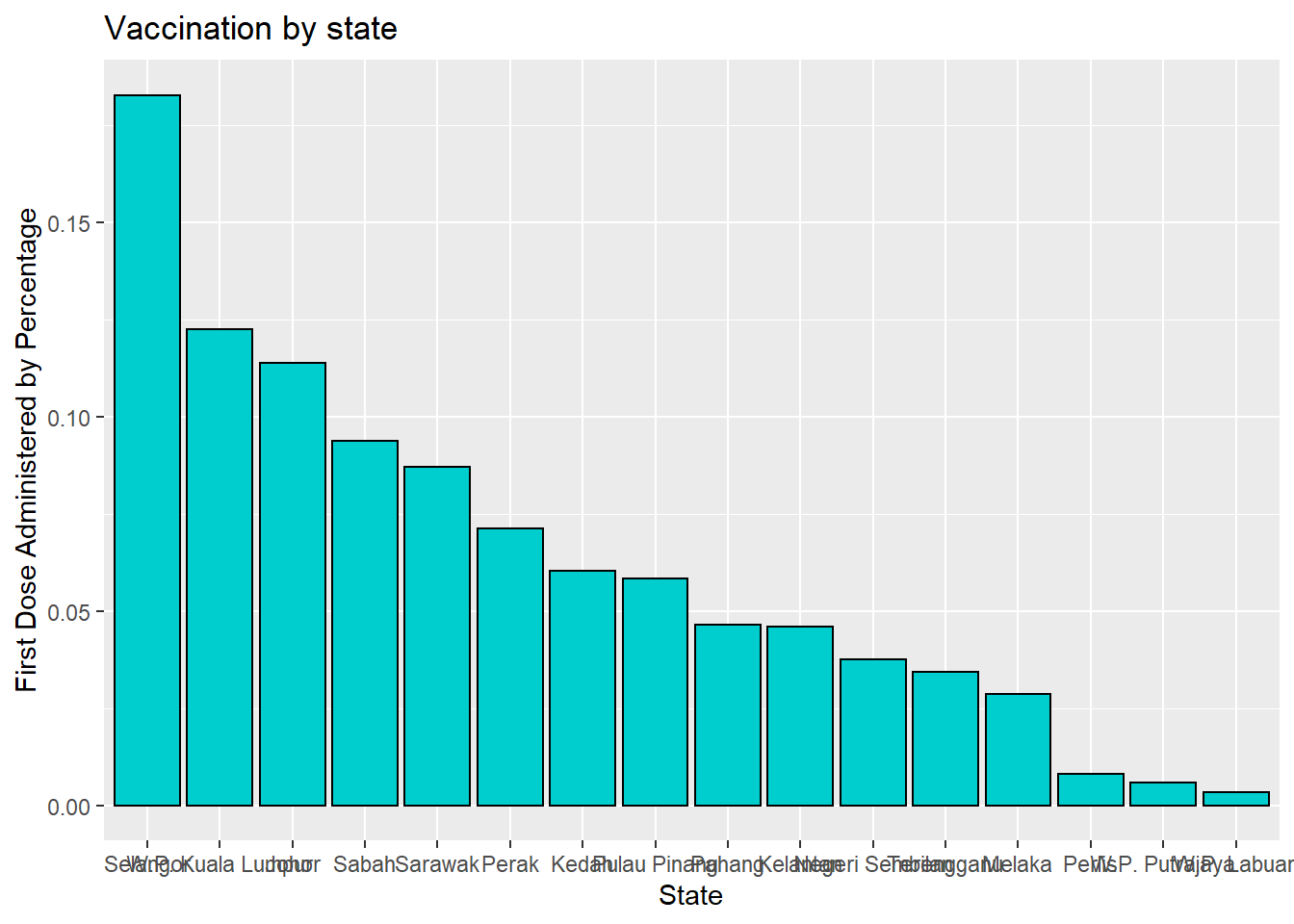
Figure 3.5: Bar chart sorted in descending order
Labeling bars
Finally, we may want to label each bar with its numerical value. Here geom_text adds the labels, size and controls for vertical justification. See the options under theme for more details. color or colour can be defined by some fixed color choices in ggplot like “blue”, “deeppink” or by the RGB hex codes. We show both examples in Figure 3.6.
ggplot(vacnlatest, aes(x = reorder(state, cumul_partial),
                       y = cumul_partial)) +
  geom_bar(stat = "identity",
           fill = "gold4",
           color = "black") +
  geom_text(aes(label = cumul_partial), size =3,
            vjust=-0.5) +
  labs(title = "Vaccination by state",
       x = "State",
       y = "First Dose Administered") +
  theme(axis.text.x = element_text(face = "bold", color = "#993333",
                                   size = 10, angle = 90),
        axis.text.y = element_text(face = "bold", color = "blue",
                                   size = 10, angle = 30))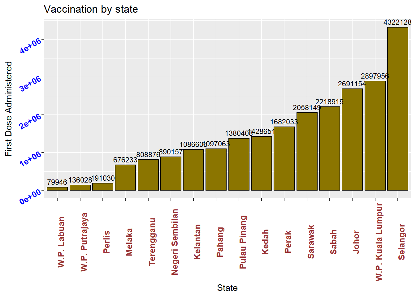
Figure 3.6: Bar chart with labels
Putting these ideas together, we can create a graph like Figure 3.7.
vacnlatest %>%
  mutate(pct = (cumul_full/sum(cumul_full))*100,
         pctlabel = paste0(round(pct), "%")) %>%
  ggplot(aes(x = reorder(state, -pct),
             y = pct)) +
  geom_bar(stat = "identity",
           fill = "cyan4",
           color = "black") +
  geom_text(aes(label = pctlabel), size =3,
            vjust = -0.25) +
  labs(title = "Vaccination by state",
       x = "State",
       y = "First Dose Administered") +
  theme(axis.text.x = element_text(face = "bold", color = "#993333",
                                   size = 10, angle = 90),
        axis.text.y = element_text(face = "bold", color = "blue",
                                   size = 10, angle = 30))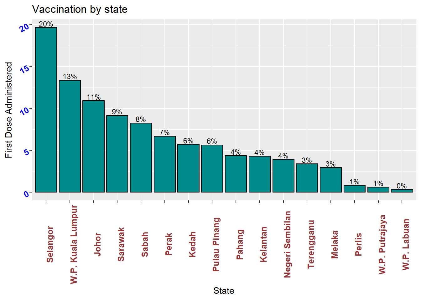
Figure 3.7: Sorted bar chart with percent labels
3.1.2 Flipping coordinates
Category labels may overlap if
- there are many categories or
- the labels are long
We tidy up Figure 3.6. We flip the x and y axes using coord_flip()
ggplot(vacnlatest, aes(x = reorder(state, cumul_partial),
                       y = cumul_partial)) +
  geom_bar(stat = "identity",
           fill = "gold4",
           color = "black") +
  geom_text(aes(label = cumul_partial), size = 3,
            vjust = 0.1) +
  labs(title = "Vaccination by state",
       x = "State",
       y = "First Dose Administered") +
  theme(axis.text.x = element_text(face = "bold", color = "#993333",
                                   size = 10, angle = 30, hjust = 1),
        axis.text.y = element_text(face = "bold", color = "blue",
                                   size = 10)) +
  coord_flip()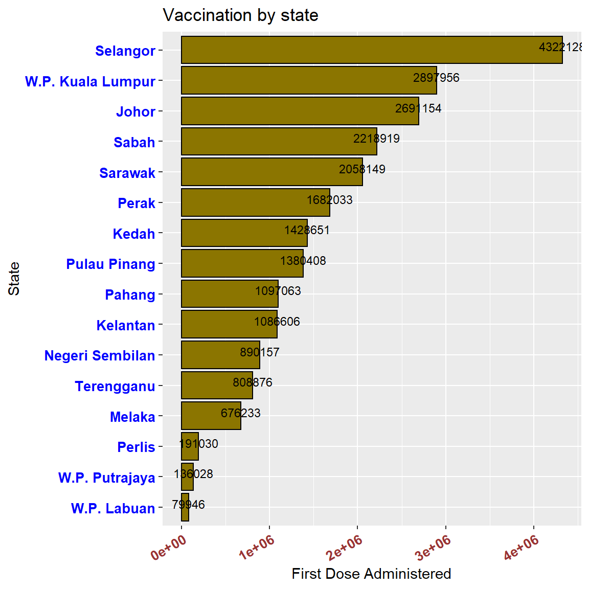
Figure 3.8: Horizontal bar chart with numeric labels
3.2 Combining two datasets
It is seldom that data analysis involves only a single dataset. Sometimes we must combine datasets to answer the questions that we’re interested in. For the Malaysia Covid data, we have downloaded 8 separate datasets. In the future chapters, we will combine these with other datasets. Here we show a simple example to answer an immediate important question, what percentage of the population is fully or partially vaccinated? We have the vaccination and population datasets separately and need to join or bind them.
Relationships are always defined between a pair of datasets. The vacn, vacnlatest, and popn data frames are related by the variable or column state.
We will use the left_join function to combine the data sets and then mutate to calculate the percentages we need. The two data frames vacnlatest and popn are combined and then connected (by = "state").
## date state daily_partial daily_full daily
## 1 2021-10-01 Johor 13536 18873 32409
## 2 2021-10-01 Kedah 8264 13199 21463
## 3 2021-10-01 Kelantan 2436 3174 5610
## 4 2021-10-01 Melaka 7086 907 7993
## 5 2021-10-01 Negeri Sembilan 6659 2616 9275
## 6 2021-10-01 Pahang 8713 12450 21163
## 7 2021-10-01 Perak 10450 19714 30164
## 8 2021-10-01 Perlis 986 364 1350
## 9 2021-10-01 Pulau Pinang 11166 12691 23857
## 10 2021-10-01 Sabah 8593 12725 21318
## 11 2021-10-01 Sarawak 3073 18349 21422
## 12 2021-10-01 Selangor 12816 8479 21295
## 13 2021-10-01 Terengganu 162 929 1091
## 14 2021-10-01 W.P. Kuala Lumpur 7943 9510 17453
## 15 2021-10-01 W.P. Labuan 32 38 70
## 16 2021-10-01 W.P. Putrajaya 1106 206 1312
## daily_partial_child daily_full_child cumul_partial cumul_full cumul
## 1 12255 221 2691154 2226257 4914644
## 2 7811 147 1428651 1161747 2588303
## 3 2088 35 1086606 878049 1963184
## 4 6840 48 676233 597602 1272008
## 5 6275 54 890157 796611 1686420
## 6 7862 184 1097063 887266 1982110
## 7 8995 311 1682033 1365287 3041417
## 8 897 2 191030 166248 356826
## 9 10182 128 1380408 1151496 2530042
## 10 2987 195 2218919 1681254 3823535
## 11 2598 17422 2058149 1864399 3922431
## 12 11265 176 4322128 4006842 8327035
## 13 76 47 808876 689099 1494720
## 14 6614 35 2897956 2724654 5622528
## 15 7 0 79946 67601 147547
## 16 982 0 136028 125210 261238
## cumul_partial_child cumul_full_child pfizer1 pfizer2 sinovac1 sinovac2
## 1 157869 4733 13247 11110 251 1429
## 2 149593 4882 8255 3965 5 235
## 3 118517 1927 2316 2761 91 231
## 4 58232 2527 7001 718 20 84
## 5 60311 1422 6269 2251 38 302
## 6 107135 2082 8684 10718 21 1545
## 7 113553 4070 8424 14564 144 730
## 8 15175 103 986 341 0 18
## 9 70198 1327 10599 6931 358 2934
## 10 229186 4885 8291 5632 126 778
## 11 186564 35520 2821 17855 243 461
## 12 159241 3958 12623 3397 118 2074
## 13 70037 2736 160 879 2 30
## 14 75914 1516 7034 853 673 2611
## 15 7926 50 32 29 0 9
## 16 6557 41 1106 199 0 5
## astra1 astra2 cansino pending idxs pop pop_18 pop_60
## 1 0 5904 0 468 1 3781000 2711900 428700
## 2 0 8408 35 560 2 2185100 1540600 272500
## 3 0 0 10 201 3 1906700 1236200 194100
## 4 6 26 25 113 4 932700 677400 118500
## 5 42 1 28 344 5 1128800 814400 145000
## 6 0 1 39 155 6 1678700 1175800 190200
## 7 0 2970 591 2741 8 2510300 1862700 397300
## 8 0 0 0 5 9 254900 181200 35100
## 9 0 2096 270 669 7 1773600 1367200 239200
## 10 43 5627 205 616 12 3908500 2758400 238900
## 11 0 0 14 28 13 2816500 2042700 332800
## 12 0 2791 108 184 10 6538000 4747900 575800
## 13 0 0 0 20 11 1259300 808400 115200
## 14 0 5825 14 443 14 1773700 1348600 205800
## 15 0 0 0 0 15 99600 68500 7900
## 16 0 0 0 2 16 110000 67700 5000We can see from the results above that all the columns in the popn data frame are appended after the columns in the vacnlatest data frame. We will select just the data we require to answer our question on the vaccinated population.
vacnlatest %>%
left_join(popn, by = "state") %>%
# Select the relevant columns
select(state, cumul_partial, cumul_full, pop) %>%
# Calculate the percentages
mutate(Dose1 = round((cumul_partial/pop)*100, 2),
Dose2 = round((cumul_full/pop)*100), 2) %>%
# Select the relevant columns and convert to long format
select(state, pop, Dose1, Dose2) %>%
gather(key = "vaccinated", value = "percent", 3:4) -> popnvaccinated
popnvaccinated## state pop vaccinated percent
## 1 Johor 3781000 Dose1 71.18
## 2 Kedah 2185100 Dose1 65.38
## 3 Kelantan 1906700 Dose1 56.99
## 4 Melaka 932700 Dose1 72.50
## 5 Negeri Sembilan 1128800 Dose1 78.86
## 6 Pahang 1678700 Dose1 65.35
## 7 Perak 2510300 Dose1 67.01
## 8 Perlis 254900 Dose1 74.94
## 9 Pulau Pinang 1773600 Dose1 77.83
## 10 Sabah 3908500 Dose1 56.77
## 11 Sarawak 2816500 Dose1 73.07
## 12 Selangor 6538000 Dose1 66.11
## 13 Terengganu 1259300 Dose1 64.23
## 14 W.P. Kuala Lumpur 1773700 Dose1 163.38
## 15 W.P. Labuan 99600 Dose1 80.27
## 16 W.P. Putrajaya 110000 Dose1 123.66
## 17 Johor 3781000 Dose2 59.00
## 18 Kedah 2185100 Dose2 53.00
## 19 Kelantan 1906700 Dose2 46.00
## 20 Melaka 932700 Dose2 64.00
## 21 Negeri Sembilan 1128800 Dose2 71.00
## 22 Pahang 1678700 Dose2 53.00
## 23 Perak 2510300 Dose2 54.00
## 24 Perlis 254900 Dose2 65.00
## 25 Pulau Pinang 1773600 Dose2 65.00
## 26 Sabah 3908500 Dose2 43.00
## 27 Sarawak 2816500 Dose2 66.00
## 28 Selangor 6538000 Dose2 61.00
## 29 Terengganu 1259300 Dose2 55.00
## 30 W.P. Kuala Lumpur 1773700 Dose2 154.00
## 31 W.P. Labuan 99600 Dose2 68.00
## 32 W.P. Putrajaya 110000 Dose2 114.00ggplot(popnvaccinated, aes(x = state,
y = percent,
fill = vaccinated)) +
geom_bar(stat = "identity", position="dodge") +
labs(title = "Population Vaccinated by state",
x = "State",
y = "Percent") +
theme(axis.text.x = element_text(face = "bold", color = "#993333",
size = 10, angle = 30, hjust = 1),
axis.text.y = element_text(face = "bold", color = "blue",
size = 10)) +
coord_flip()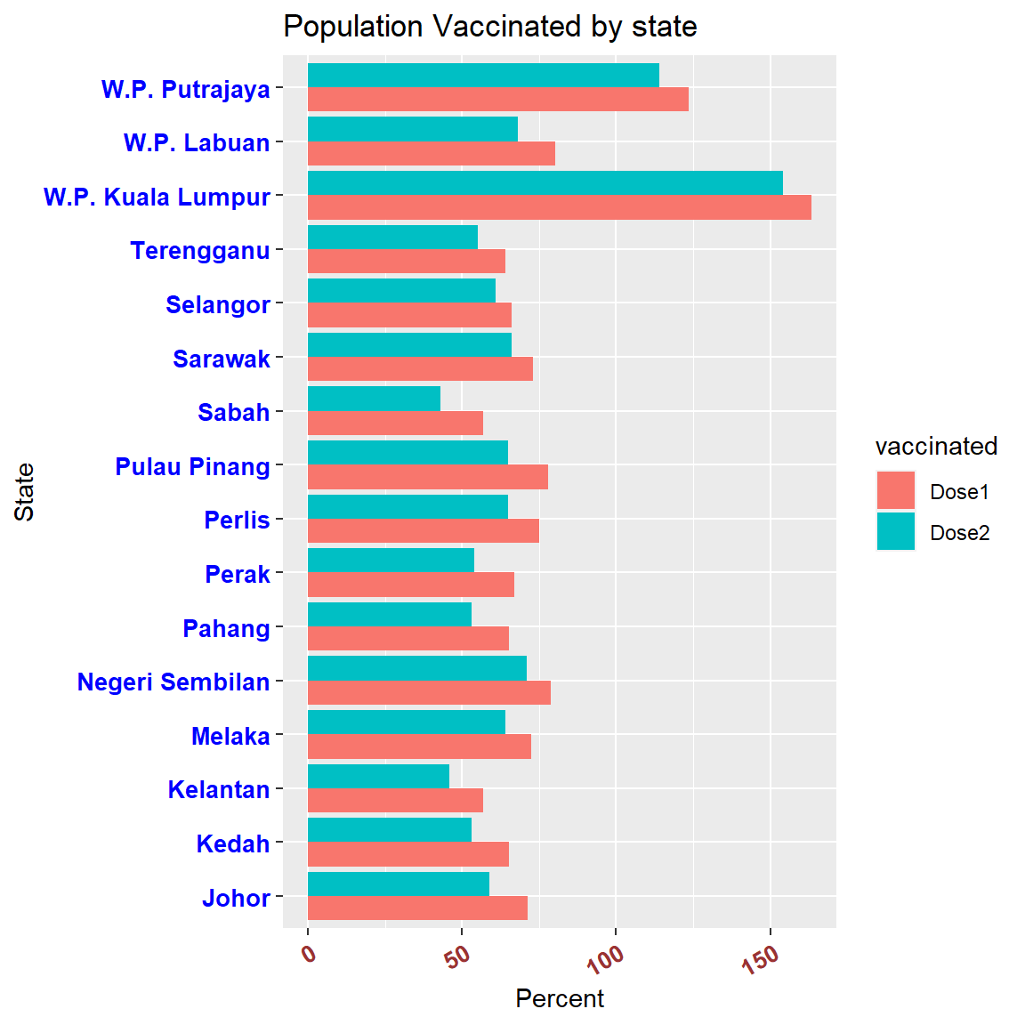
Figure 3.9: Population vaccinated
W.P. Putrajaya and W.P. Kuala Lumpur showed more than 100% of the population having received the first dose? Foreign workers? Probably, but we need more granular data to verify.
This simple example involved join, select, mutate, gather, and the cute %>% just to prepare the data.
3.2.1 Pie chart
The usefulness of pie charts is disputed in statistics. If the purpose is to compare categories, bar charts are better (humans are better at judging the length of bars than the size of pie slices). It takes a bit more code and setting the coord_polar function to make a pie chart in R.
vacnlatest %>%
  mutate(pct = (cumul/sum(cumul))*100) %>%
  ggplot(aes(x = "",
             y = pct,
             fill = state)) +
  geom_bar(stat = "identity",
           width = 1,
           color = "black") +
  coord_polar(theta = "y",
              start = 0,
              direction = -1) +
  theme_void()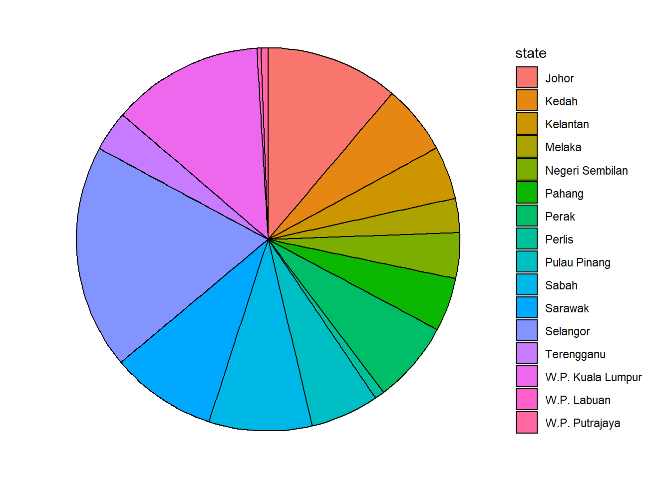
Figure 3.10: Simple pie chart
Now we add labels. By default, the values are not displayed inside each slice. We add them with geom_text. The position_stack(vjust = 0.5) will place the labels in the correct position.
Reordering the pie chart in ggplot2 is similar to reordering bar graphs. For the parameter fill, we use the function reorder(). Notice our use of the option labs(x = NULL, y = NULL, fill = NULL) to keep the legend but not the legend title for the fill parameter.
max_date = max(vacn$date)
vacnlatest %>%
  mutate(pct = (cumul/sum(cumul))*100,
         label = paste0(round(pct), "%")) %>%
  arrange(desc(pct)) %>%
  ggplot(aes(x = "",
             y = pct,
             fill = reorder(state, pct))) +
  geom_bar(stat = "identity",
           width = 1,
           color = "white") +
  geom_text(aes(label = label),
            position = position_stack(vjust = 0.5),
            size = 3) +
  coord_polar("y",
              start = 0,
              direction = -1) +
  theme_void() +
  labs(title = "Total vaccines administered by state",
       subtitle = as.character(max_date),
x = NULL, y = NULL, fill = NULL) 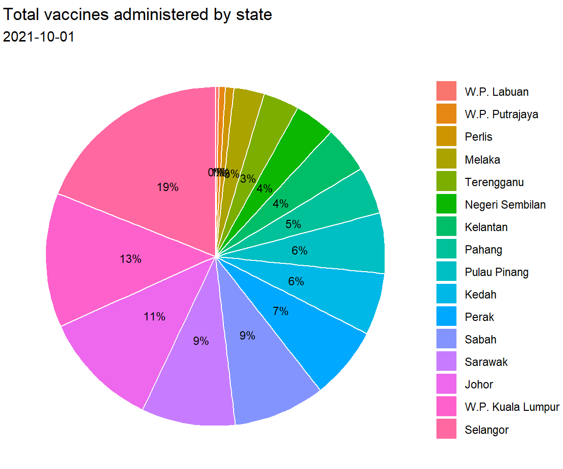
Figure 3.11: Pie chart with percent labels
3.2.2 Basic donut chart
Next we display a donut or ring chart using geom_col, coord_polar(theta = "y") and setting the x-axis limit with xlim.
hsize <- 4
vacnlatest %>%
  mutate(pct = (cumul/sum(cumul))*100,
         label = paste0(round(pct), "%")) %>%
  arrange(desc(pct)) %>%
  ggplot(aes(x = hsize,
             y = pct,
             fill = reorder(state, pct))) +
  geom_bar(stat = "identity",
           width = 1,
           color = "white") +
  xlim(c(0.2, hsize + 0.5)) +
  coord_polar("y",
              start = 0,
              direction = -1) +
  theme_void() +
  labs(title = "Total vaccines administered by state",
       subtitle = as.character(max_date))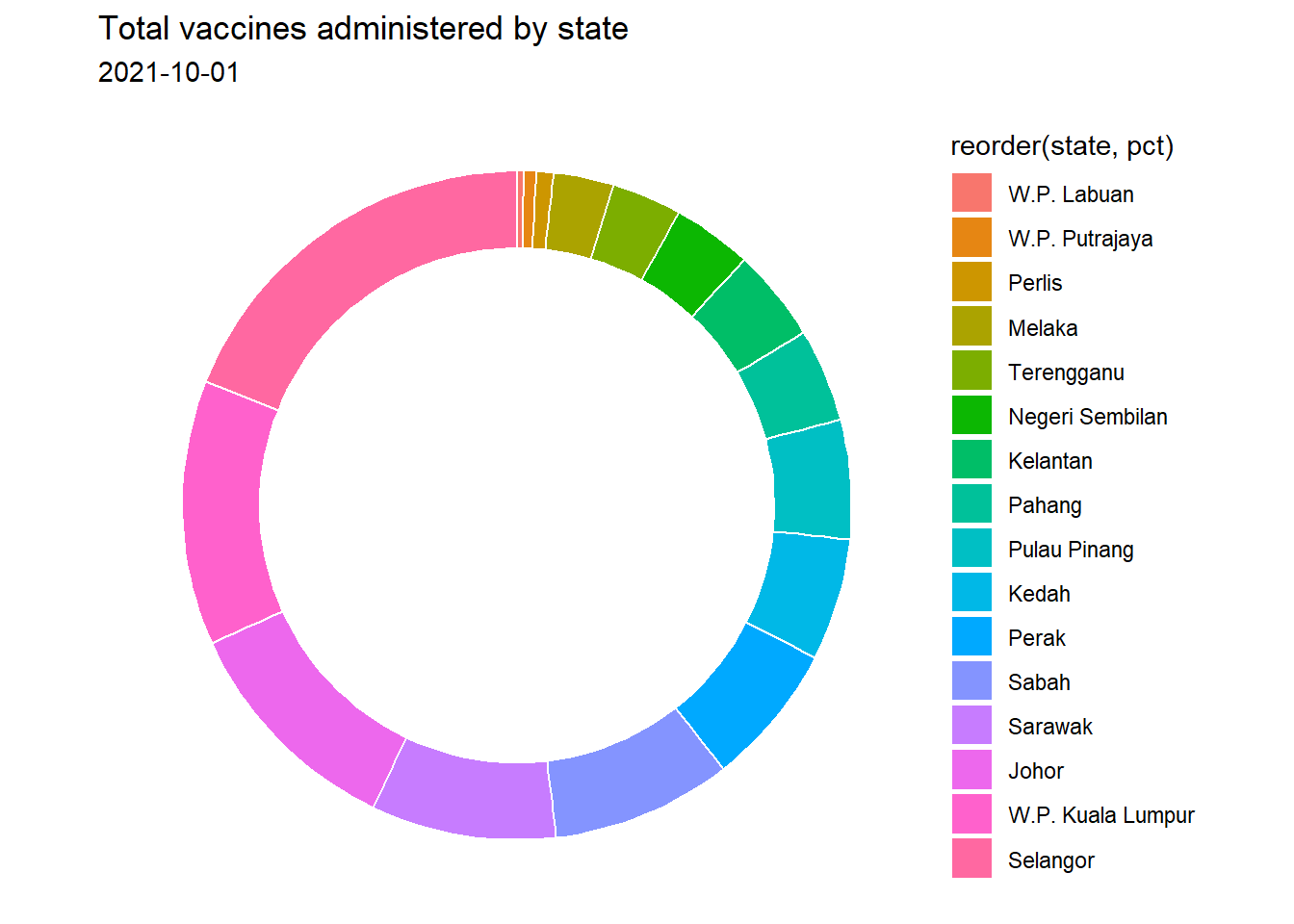
Figure 3.12: Simple donut chart
Hole size
We can set the hole size with hsize. The bigger the value the bigger the hole size. Note that the hole size must be bigger than 0.
Adding labels
We can add labels to each slice of the donut using geom_text or geom_label, specifying the position as follows, so the text will be in the middle of each slice.11
hsize <- 2
vacnlatest %>%
  mutate(pct = (cumul/sum(cumul))*100,
         label = paste0(round(pct), "%")) %>%
  arrange(desc(pct)) %>%
  ggplot(aes(x = hsize,
             y = pct,
             fill = reorder(state, pct))) +
  geom_bar(stat = "identity",
           width = 1,
           color = "white") +
  xlim(c(0.2, hsize + 0.5)) +
  geom_text(aes(label = label),
            size = 3,
            position = position_stack(vjust = 0.5)) +
  coord_polar("y",
              start = 0,
              direction = -1) +
  theme_void() +
  labs(title = "Total vaccines administered by state",
       subtitle = as.character(max_date),
       x = NULL, y = NULL, fill = NULL)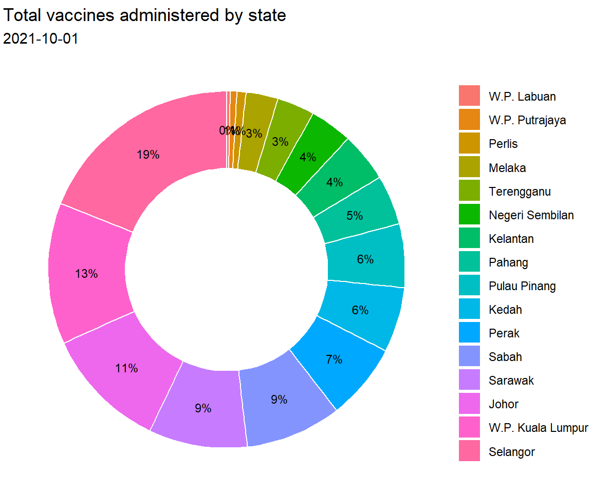
Figure 3.13: Donut chart with percent labels
The pie and donut charts make it easy to compare each slice with the whole. For example, roughly a quarter of the total vaccination was administered in Selangor.
3.3 Quantitative Variable
The distribution of a single quantitative variable is usually plotted with a histogram, kernel density plot, or dot plot.
3.3.1 Histogram
We plot the total daily vaccinations distribution using a histogram.
vacn %>%
  ggplot(aes(x = daily)) +
  geom_histogram(binwidth = 1000) +
  labs(title = "Total Daily Vaccinations",
       subtitle = "Bandwidth = 1000",
       x = "Total Daily Vaccinations")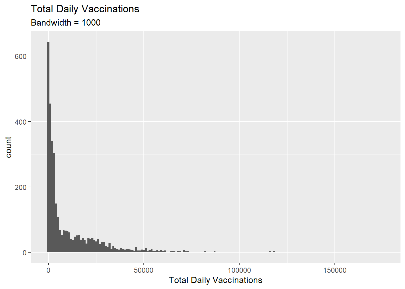
Figure 3.14: Simple histogram
The vacn data set is granulated by date and state. Thus Figure 3.14 shows the distribution of total vaccinations done per day and per state. We set binwidth = 1000. So the count refers to the number of data points for which the variable daily fits into the bins [0-1000], [1001-2000], [2001-3000], and so on.
Bins and bandwidths
One of the most important histogram parameters is bins, which controls the number of bins into which the numeric variable is divided (i.e., the number of bars in the plot). The default is 30. We should try smaller and larger numbers to get a better impression of the shape of the data distribution.
We can specify the binwidth, the width of the bins represented by the bars, as in Figure 3.14.
Alternatively, we can plot our histogram by specifying that it has 50 bins. Here we also set the fill color for the bars and the border color around the bars.
vacn %>%
  ggplot(aes(x = daily)) +
  geom_histogram(fill = "lightblue",
                 color = "darkblue",
                 bins = 50) +
  labs(title = "Total Daily Vaccinations",
       subtitle = "50 bins",
       x = "Total Daily Vaccinations")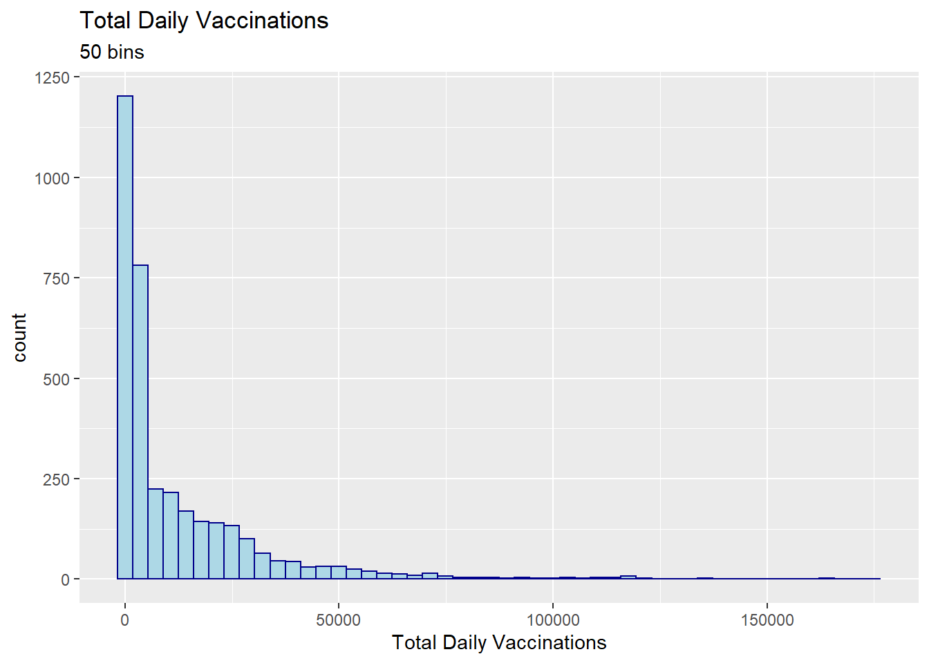
Figure 3.15: Histogram with a specified number of bins
The y-axis can represent counts or percent of the total.
- Plot the histogram with percentages on the y-axis
- Increase bins to 100
- Change colors
- Use
scale_y_continuous(labels = percent)fromscalespackage
library(scales)
vacn %>%
  ggplot(aes(x = daily,
             y = ..count.. / sum(..count..))) +
  geom_histogram(fill = "lightgreen",
                 color = "darkgreen",
                 bins = 100) +
  labs(title = "Total Daily Vaccinations",
       x = "Total Daily Vaccinations",
       y = "Percent") +
  scale_y_continuous(labels = percent)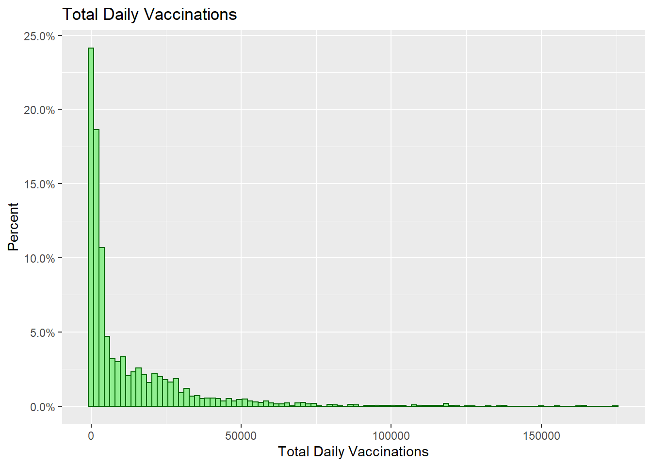
Figure 3.16: Histogram with percentages on the y-axis
3.3.2 Kernel density plot
The kernel density plot is an alternative to the histogram. It is a non-parametric method for estimating the probability density function of a continuous random variable. We are trying to draw a smoothed histogram, where the area under the curve equals one.
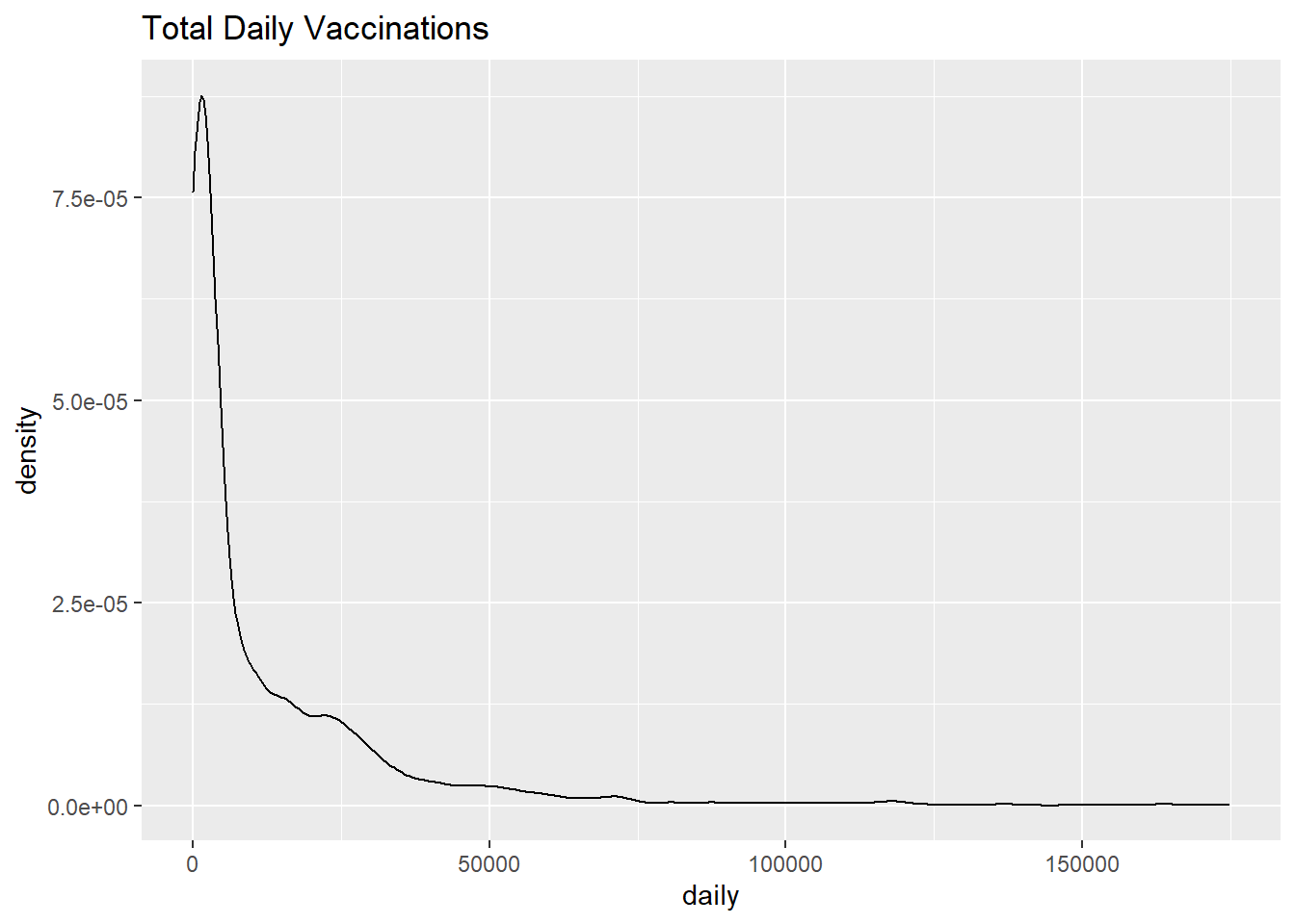
Figure 3.17: Simple kernel density plot
Figure 3.17 shows the distribution of total daily vaccines administered. For example, the proportion of cases between 50000 and 100000 doses would be represented by the area under the curve between 50000 and 100000 on the x-axis.
Smoothing parameter
The degree of smoothness is controlled by the bandwidth parameter bw. We use the bw.nrd0 function to find the default value for a particular column. Larger values will result in more smoothing, while smaller values will produce less smoothing.
The default bandwidth for the daily variable is 2111.09. Choosing a value of 10 should result in less smoothing and more detail.
vacn %>%
  ggplot(aes(x = daily)) +
  geom_density(fill = "dodgerblue",
               bw = 10) +
  labs(title = "Total Daily Vaccinations",
       subtitle = "Bandwidth = 10")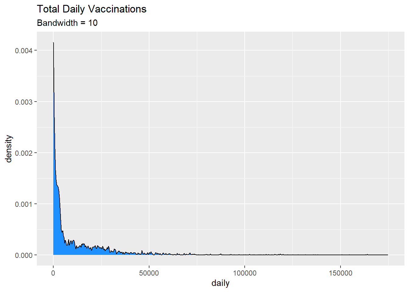
Figure 3.18: Kernel density plot with a specified bandwidth
Kernel density plots allow us to easily see which scores are most frequent and which are relatively rare.
As with previous charts, we can use fill and color to specify the fill and border colors. But let’s try looking at the density plot of daily vaccinations by state.
vacn %>%
  ggplot(aes(x = daily, fill = state)) +
  geom_density(alpha = 0.5) +
  labs(title = "Total Daily Vaccinations",
       subtitle = "Bandwidth = 10")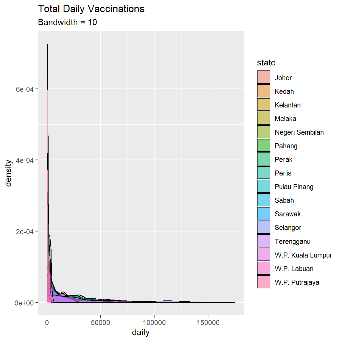
Figure 3.19: Kernel density plot by state
3.3.3 Dot chart
The dot chart is another alternative to the histogram. The quantitative variable is divided into bins, but instead of bars, each observation is displayed by a dot. By default, the dot width follows the bin width. The dots are stacked, with each dot representing one observation. We show some examples using the mys dataset.
- Plot the cases distribution using a dot plot
- Filter to start from “2021-01-01”
mys1 %>%
  filter(date >= as.Date("2021-01-01")) %>%
  ggplot(aes(x = cluster_community)) +
  geom_dotplot() +
  labs(title = "Number of cases",
       subtitle = "Community Cluster",
       y = "Proportion",
       x = "Cases")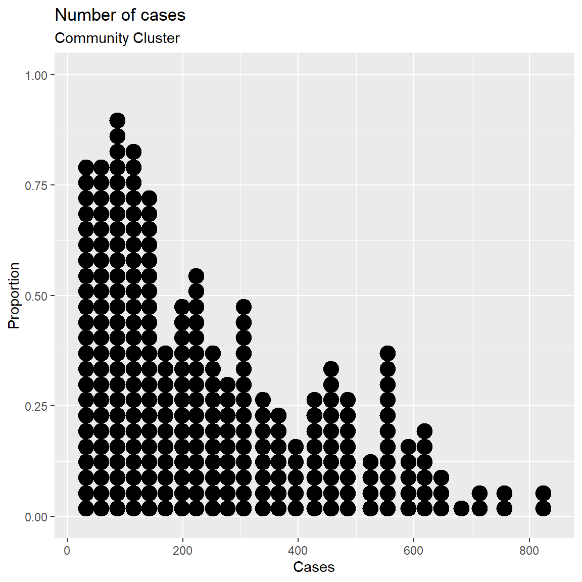
Figure 3.20: Simple dotplot
The fill and color options can be used to specify the fill and border color of each dot respectively.
Like geom_histogram, geom_dotplot uses the concept of bin. The function stat_bindot() defaults with bins = 30. We can change by setting binwidth. In the following example we set each bin to a count of 10.
mys1 %>%
  filter(date >= as.Date("2021-01-01")) %>%
  ggplot(aes(x = cluster_community)) +
  geom_dotplot(binwidth = 10,
               fill = "tomato",
               color = "black") +
  labs(title = "Number of cases",
       subtitle = "Community Cluster",
       y = "Proportion",
       x = "Cases")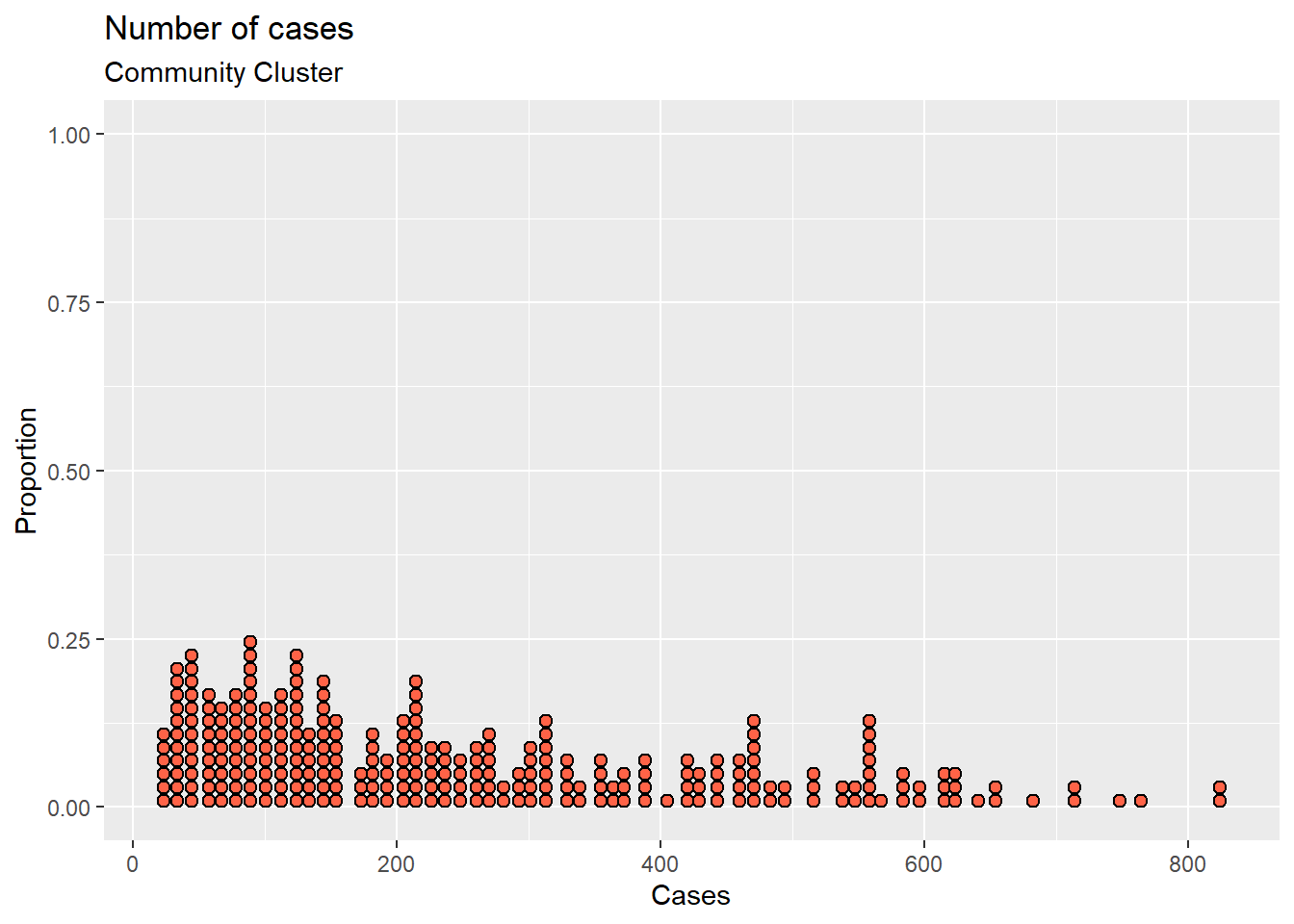
Figure 3.21: Simple dotplot with color options
There are many more options available. Type ?geom_dotplot() at the console prompt for details and examples.
3.4 Discussion
Single variable analyses are usually simple to show us the distribution of data. The distinction between category and continuous variables is important. Both have their roles in describing the types of the Malaysian Covid data.