Chapter 13 Time Series Forecasting
This chapter aims to introduce time-series forecasting methods applied to selected Malaysian Covid data. We will not give a thorough discussion of the theoretical details behind the methods we illustrate in this chapter. We will do time-series forecasting with libraries that conform to tidyverse principles. There are two of these time-series meta-packages
modeltimewhich is created to be the time-series equivalent oftidymodelsfpp3which is created to do tidy time-series. Modeling can be done withfpp3but it is limited to sequential models and mostly uses classical forecasting approaches.
All the examples in this chapter mainly use the fpp3 package. An excellent reference we used for this chapter is the book Forecasting Principles and Practice.65 Some of the earlier examples also use the timetk package.
We load the following libraries.
## -- Attaching packages -------------------------------------------- fpp3 0.4.0 --## v tibble 3.1.6 v tsibble 1.1.1
## v dplyr 1.0.7 v tsibbledata 0.3.0
## v tidyr 1.1.4 v feasts 0.2.2
## v lubridate 1.7.9 v fable 0.3.1
## v ggplot2 3.3.5## -- Conflicts ------------------------------------------------- fpp3_conflicts --
## x lubridate::date() masks base::date()
## x dplyr::filter() masks stats::filter()
## x tsibble::intersect() masks base::intersect()
## x tsibble::interval() masks lubridate::interval()
## x dplyr::lag() masks stats::lag()
## x tsibble::setdiff() masks base::setdiff()
## x tsibble::union() masks base::union()## Registered S3 method overwritten by 'tune':
## method from
## required_pkgs.model_spec parsnipThis will attach several packages as listed above. These include several tidyverse packages and other packages to handle time-series and forecasting in a “tidy” framework.
13.1 Tidy time-series data using tsibbles
These suite of packages for tidy time-series analysis integrate easily into the tidyverse way of working.66 The tsibble package provides the data infrastructure for tidy temporal data with wrangling tools. A tsibble is a time-series object that is much easier to work with than existing classes such as ts, xts and others. We will use tsibbles throughout this chapter. The tsibble package is loaded as part of the fpp3 meta package.
We emphasize visual methods by using graphs to explore the data, analyze the validity of the models fitted and present the forecasting results.
13.2 Malaysian data on COVID-19 new cases and deaths
There have been some changes in the structure of the data files of the Malaysian Covid data67 since we worked on the earlier chapters. We decided to download the new data and make adjustments accordingly for the changes in column names.
We run this R chunk for the first time to get the latest data. Then we safe the files in the R rds format and use it throughout the examples in this chapter. Readers should edit the R chunk below by removing the # comment at the beginning of the line for the commands to be executed. There are 3 groups of commands to
- Download the required files from the source into an R data frame
- Save the R data frame into the current working directory
- Load the R data frame
We chose to download only 2 of the csv data sets for this chapter.
library(readr)

# casesDec29 <- read_csv("https://raw.githubusercontent.com/MoH-Malaysia/covid19-public/main/epidemic/cases_state.csv")
# deathsDec29 <- read.csv("https://raw.githubusercontent.com/MoH-Malaysia/covid19-public/main/epidemic/deaths_state.csv")


# saveRDS(casesDec29, "data/casesDec29.rds")
# saveRDS(deathsDec29, "data/deathsDec29.rds")


casesDec29 <- readRDS("data/casesDec29.rds")
deathsDec29 <- readRDS("data/deathsDec29.rds")
From Chapter 10 and Chapter 11, we can conclude that the new cases and deaths related to Covid should be different with a higher percentage of the population that is fully vaccinated. Figure 10.17 and Figure 10.19 indicate that the vaccination process started in February and began to gain momentum in July 2021. Since we are learning time-series forecasting in this chapter it is more realistic to rely on data after vaccination. Thus we will filter the data to start from “2021-06-01”.
In the first part of this chapter we will do a univariate time-series with columns, date and value, with value reflecting new daily deaths. Then we will show examples of modeling and forecasting using multi variables. We will filter and select from the data frames casesDec29 and deathsDec29 before doing a join to create a more simple data frame.
13.3 Hierarchical forecasting of Covid deaths
We adapt this section from a different example of forecasting of hospital admissions.68
Our mys_states data frame has state as one of the columns or variables. There are 16 states but we will only select 8 states in the following examples. We want to reduce clutter in the plots.
# library(fpp3)
# library(timetk)

state_vector = c("Johor", "Selangor", "Sarawak", "Sabah",
                 "Kelantan", "Melaka", "Terengganu", "W.P. Kuala Lumpur")

mys_states %>%
  mutate(date = as.Date(date)) %>%
  filter(state %in% state_vector) -> df

df %>%
  mutate(Week = yearweek(as.character(date))) %>%
  group_by(state, Week) %>%
  summarise(cases_new = sum(cases_new, na.rm = T),
            deaths_new = sum(deaths_new, na.rm = T)) %>%
  as_tsibble(key= c(state), index = Week) -> df_tsib

mys_states %>%
  mutate(Week = yearweek(as.character(date))) %>%
  group_by(Week) %>%
  summarise(cases_new = sum(cases_new, na.rm = T),
            deaths_new = sum(deaths_new, na.rm = T)) %>%
  as_tsibble(index = Week) -> df_nation

df_tsib
## # A tsibble: 248 x 4 [1W]
## # Key: state [8]
## # Groups: state [8]
## state Week cases_new deaths_new
## <chr> <week> <dbl> <int>
## 1 Johor 2021 W22 3160 81
## 2 Johor 2021 W23 3096 81
## 3 Johor 2021 W24 3354 55
## 4 Johor 2021 W25 2018 55
## 5 Johor 2021 W26 2514 35
## 6 Johor 2021 W27 2303 48
## 7 Johor 2021 W28 3850 66
## 8 Johor 2021 W29 5580 94
## 9 Johor 2021 W30 7470 138
## 10 Johor 2021 W31 8724 174
## # ... with 238 more rows## # A tsibble: 31 x 3 [1W]
## Week cases_new deaths_new
## <week> <dbl> <int>
## 1 2021 W22 44458 582
## 2 2021 W23 40693 530
## 3 2021 W24 38900 500
## 4 2021 W25 37640 536
## 5 2021 W26 44604 553
## 6 2021 W27 57644 660
## 7 2021 W28 80265 862
## 8 2021 W29 96877 975
## 9 2021 W30 116984 1190
## 10 2021 W31 132118 1565
## # ... with 21 more rowsWe kept the mys_states data frame and created df as a tibble and df_tsib as a tsibble. The Week column is being converted from text to a weekly time object with yearweek(). We then convert the data frame to a tsibble by identifying the index variable using as_tsibble(). Note the addition of [1W] on the first line indicating this is weekly data.
We can use dplyr functions such as mutate, filter, select, and summarise to work with tsibble data sets.
df_tsib is uniquely identified by the key: state. The distinct() function can be used to show the categories of each variable.
## # A tibble: 8 x 1
## # Groups:   state [8]
##   state
##   <chr>
## 1 Johor
## 2 Kelantan
## 3 Melaka
## 4 Sabah
## 5 Sarawak
## 6 Selangor
## 7 Terengganu
## 8 W.P. Kuala Lumpur
13.3.1 Visualization
We do some EDA before forecasting. In general, modeltime timetk package is more useful for visualization than fpp3 fable package. modeltime uses tibble while fpp3 uses their own unique time-series data format, tsibble. When converting to tsibble format, we need to explicitly state the temporal increment (e.g. monthly, weekly) for the time index of the time-series.
There are at least 5 concepts that we should visualize before forecasting a time-series69:
- Trend
- Seasonality
- Anomaly
- Lags
- Correlation of time-series features
Many time-series include trends, cycles, and seasonality. When choosing a forecasting method, is better to identify the time-series patterns in the data, and then choose a method that can capture the patterns properly.
1. Trend Trend refers to the long-term increase or decrease in the data, it indicates any changing direction of the data.
df %>%
  group_by(state) %>%
  plot_time_series(date, deaths_new,
                   .interactive = F, .legend_show = F,
                   .facet_ncol = 2,
                   .title="Time-Series (Covid Deaths)")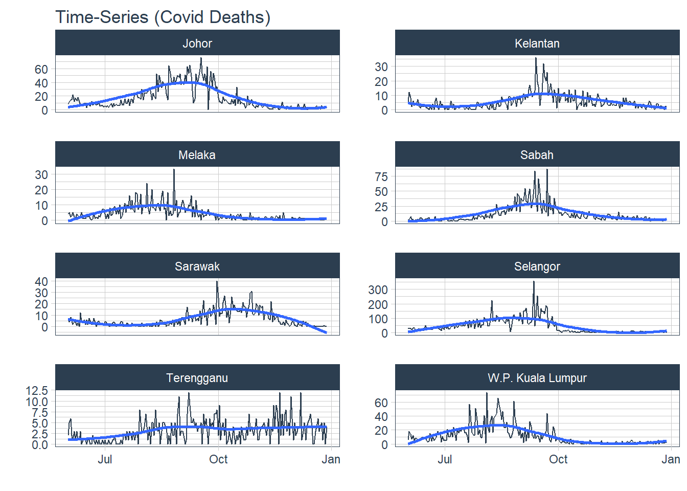
Figure 13.1: Covid deaths by state
For time-series data, the graph to start with is a time plot. The observations are plotted against the time (in our case, week) of observation. Figure 13.2 shows the Covid deaths for the selected states. We will use the autoplot function frequently. It automatically produces an appropriate plot of whatever we pass to it in the first argument. In Figure 13.2, it recognizes df_tsib as a time-series and produces a time plot.
df_tsib %>%
  autoplot(deaths_new) +
  labs(title = "Covid deaths",
       subtitle = "Selected states starting 01 June 2021",
       y = "Number of new deaths")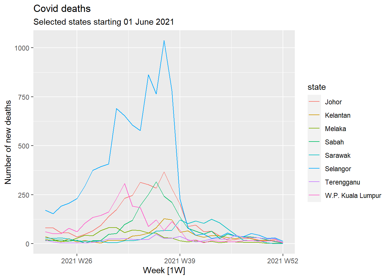
Figure 13.2: Covid deaths time-series using autoplot()
2. Seasonality Seasonality allows us to view patterns over time and identify time periods in which the patterns change. A seasonal pattern occurs when a time series is affected by seasonal factors such as the time of the year or the day of the week. Seasonality is always of a fixed and known period. Covid deaths may not (and should not) show any seasonality trends yet since it is a new pandemic and hopefully it will go away.
timetk plot_seasonal_diagnostics can plot the observations by month, year, and quarter. But, it has limited flexibility to adjust the aesthetics and the plots can be overcrowded.
df %>%
  group_by(state) %>%
  plot_seasonal_diagnostics(date, deaths_new,
                            .interactive=F,
                            .feature_set="month.lbl")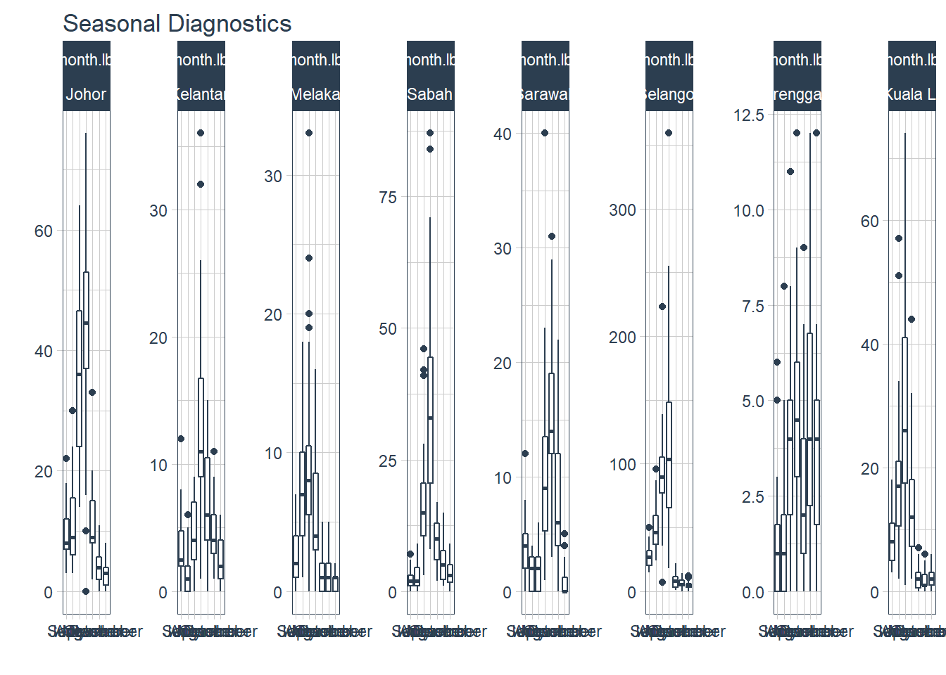
Figure 13.3: Deaths seasonality for selected states
Figure 13.4 zooms in to show what the seasonality looks like for one selected state.
df %>%
  group_by(state) %>%
  filter(state == "Selangor") %>%
  plot_seasonal_diagnostics(date, deaths_new,
                            .interactive=F,
                            .feature_set="month.lbl")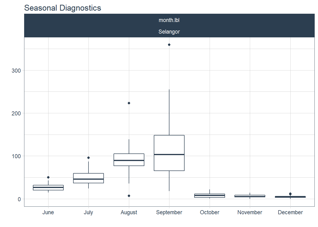
Figure 13.4: Deaths seasonality for Selangor
It would be nice to highlight outlier data with box plots like in timetk::plot_seasonal_diagnostics. We retrofit some plots similar to timetk::plot_seasonal_diagnostics but allow faceting for better aesthetics.7071
fun_season<- function(dat, var, f, t){
  ggplot(dat, aes(!!{{var}}, deaths_new)) +
    geom_boxplot() + facet_wrap(vars({{f}}), scales = "free_y") +
    scale_x_discrete(guide = guide_axis(angle = 45)) +
    labs(title= paste(var, t))}

c("Year", "Quarter", "Month") %>%
  syms() %>%
  map(., ~fun_season(
    dat = df %>% mutate(Year= as.factor(year(date)),
                         Quarter= as.factor(quarter(date)),
                         Month= as.factor(month(date))),
    .x, state, "Seasonality (State level)"))
## [[1]]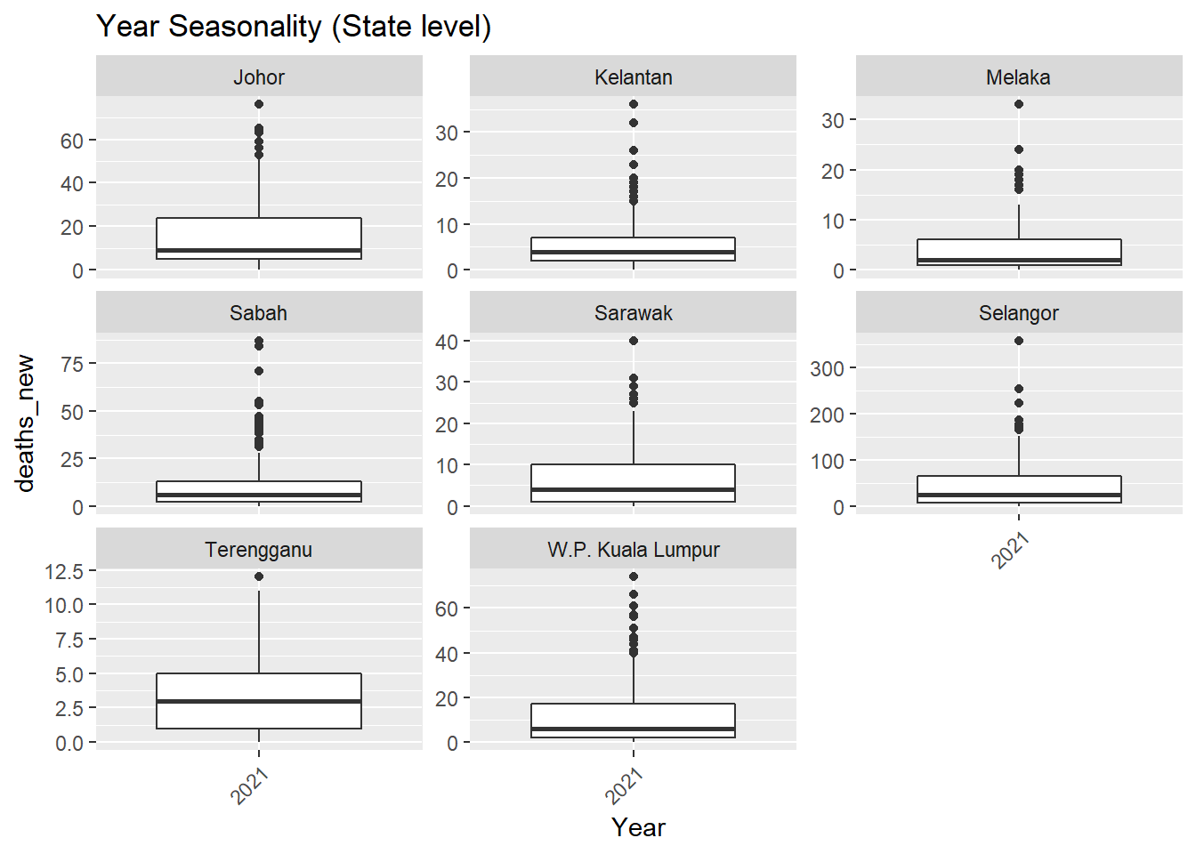
Figure 13.5: Deaths seasonality
##
## [[2]]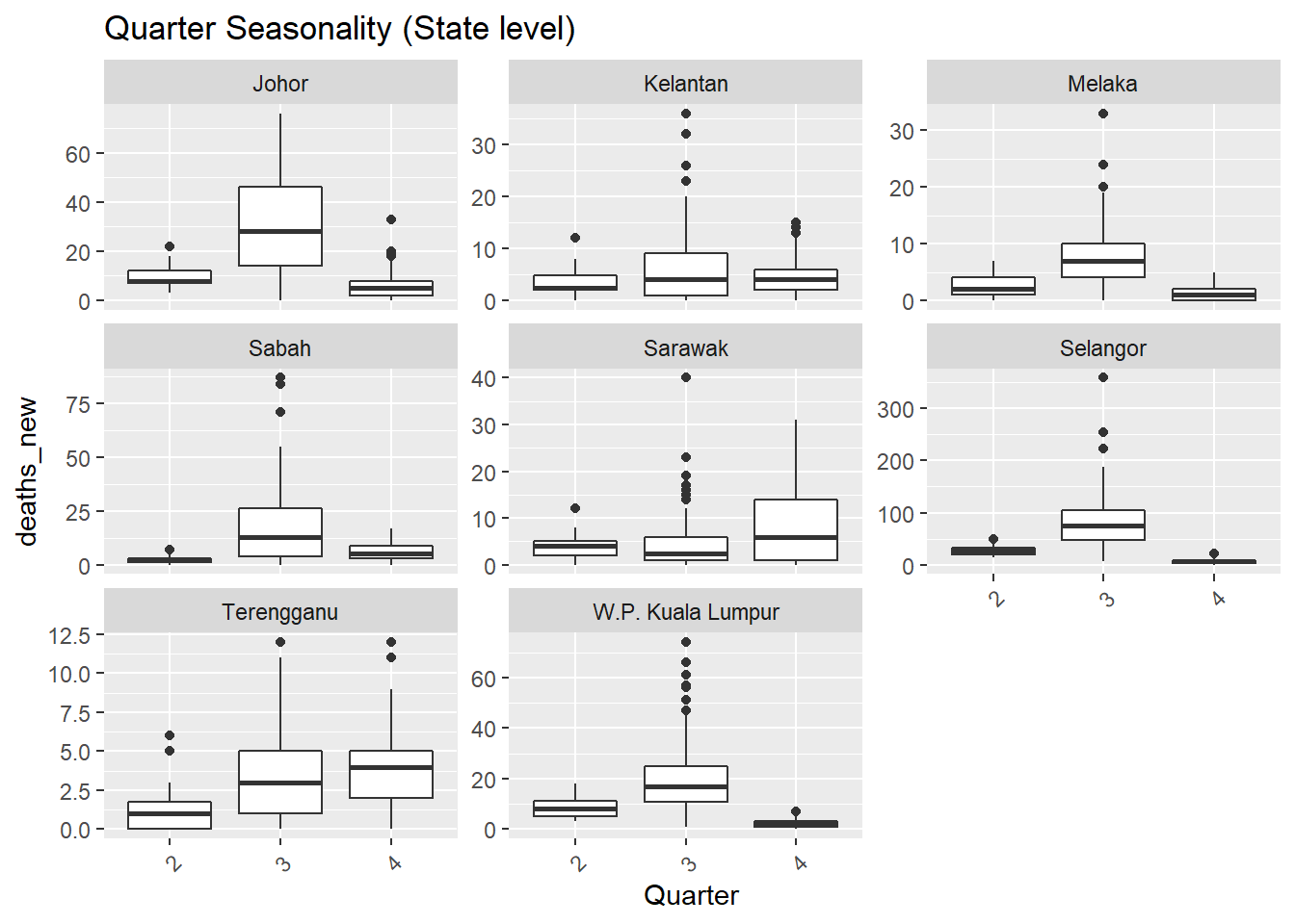
Figure 13.6: Deaths seasonality
##
## [[3]]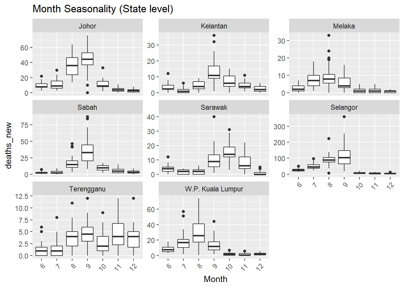
Figure 13.7: Deaths seasonality
The feasts package has gg_season to plot seasonal graphs as shown in Figure 13.8. A seasonal plot is similar to a time plot except that the data are plotted against the individual “seasons” in which the data were observed.
df_tsib %>%
  gg_season(deaths_new, labels = "both") +
  labs(title = "Covid deaths",
       subtitle = "Seasonality plot",
       y = "Number of deaths")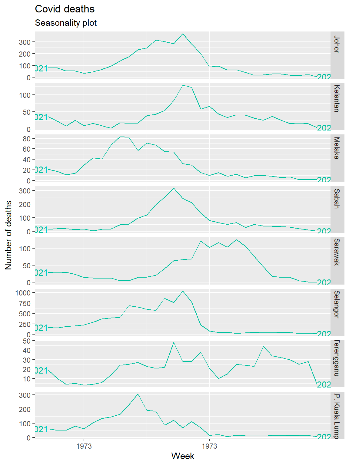
Figure 13.8: Deaths seasonality of selected states
Trend and seasonality
A more objective manner to determine trend and seasonality is to use the values from STL72, more specifically trend_strength and seasonal_strength_year. 0 implies weak strength while 1 implies strong strength. The fpp3 package fabletools, calculates STL values from the feasts package and outputs it into a data frame.
## # A tibble: 8 x 7
##   state      trend_strength spikiness linearity curvature stl_e_acf1 stl_e_acf10
##   <chr>               <dbl>     <dbl>     <dbl>     <dbl>      <dbl>       <dbl>
## 1 Johor               0.936   4089.     -164.      -369.       0.389       0.489
## 2 Kelantan            0.805    228.        8.92     -91.6      0.281       0.278
## 3 Melaka              0.931      5.48    -74.4      -63.5      0.208       0.261
## 4 Sabah               0.910   3534.      -11.1     -294.       0.579       0.947
## 5 Sarawak             0.931     53.0      42.1     -113.       0.274       0.327
## 6 Selangor            0.871 852068.     -656.      -872.       0.339       0.410
## 7 Terengganu          0.600     11.9      28.7      -17.5      0.113       0.275
## 8 W.P. Kual~          0.877   5480.     -225.      -153.       0.123       0.282
Since we have data for 2021 only, seasonal_strength_year is not calculated.
3. Anomaly
timetk has a useful plot_anomaly_diagnostics function to flag up anomaly observations. We need to replace NA to avoid calculation errors.
df %>%
  mutate(deaths_new = replace_na(deaths_new, 0)) %>%
  group_by(state) %>%
  plot_anomaly_diagnostics(.date_var = date, .value= deaths_new,
                           .facet_ncol = 2, .facet_scales="free_y",
                           .ribbon_alpha = .25, .message = F,
                           .legend_show=F,
                           .title= "Anomaly (State level)",
                           .interactive=F)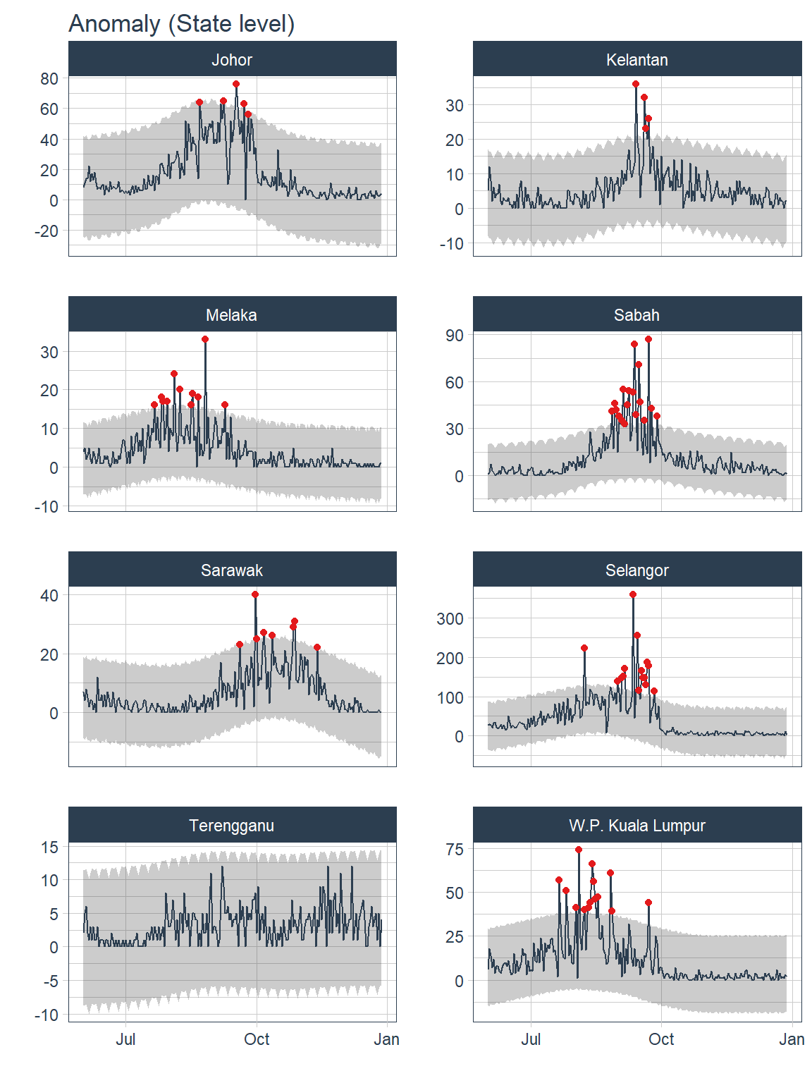
Figure 13.9: Anomalies for selected states
Most of the anomaly detected occurred during the peak of COVID19 pandemic from Aug 2021 to Oct 2021.
df %>%
  mutate(deaths_new = replace_na(deaths_new, 0)) %>%
  group_by(state) %>%
  tk_anomaly_diagnostics(.date_var = date,
                         .value = deaths_new) %>%
  ungroup() %>%
  filter(anomaly == "Yes") %>%
  count(date, sort=T)
## # A tibble: 51 x 2
## date n
## <date> <int>
## 1 2021-09-22 5
## 2 2021-09-19 4
## 3 2021-08-08 3
## 4 2021-07-21 2
## 5 2021-07-26 2
## 6 2021-08-04 2
## 7 2021-08-17 2
## 8 2021-08-26 2
## 9 2021-08-27 2
## 10 2021-09-03 2
## # ... with 41 more rows4. Lags
Lags can be used to screen for seasonality. The values of lags can be used to calculate auto-correlation (ACF) and partial auto-correlation (PACF). There are two approaches for using lags for forecasting.73
- Short lags (lag length < forecast horizon)
When the lag length (e.g. 1 month) is less than the forecast horizon (e.g. 3 months), missing values are generated in future data which may pose a problem for some forecasting models.
df %>%
  group_by(state) %>%
  future_frame(.date_var = date, .length_out = "3 weeks", .bind_data = T) %>%
  ungroup() %>%
  mutate(Lag1week = lag_vec(deaths_new, lag = 1)) %>%
  select(state, date, cases_new, deaths_new, Lag1week) %>%
  head()
## # A tibble: 6 x 5
## state date cases_new deaths_new Lag1week
## <chr> <date> <dbl> <int> <int>
## 1 Johor 2021-06-01 431 8 NA
## 2 Johor 2021-06-02 554 11 8
## 3 Johor 2021-06-03 752 14 11
## 4 Johor 2021-06-04 446 14 14
## 5 Johor 2021-06-05 412 22 14
## 6 Johor 2021-06-06 565 12 22Recursive predictions are iterated to artificially generate lags (e.g. lag of 1 week again and again). Recursive prediction is used in ARIMA.
- Long term lags (lag length >= forecast horizon)
Long-term lags can be used to create lagged rolling features that have predictive properties. A disadvantage of using long-term lags is the absence of short-term lags which may have predictive properties.
5. Correlation of time-series features
Auto-correlation (ACF) ACF measures the linear relationship between lagged values of a time series. It measures how much the most recent value of the series is correlated with past values of the series, there is a tendency for values in a time series to be correlated with past observations in that time series.
If the time-series has a trend, the ACF for small lags tends to be positive and large because observations nearby in time are also nearby in size. If the time series has seasonality, the ACF will have spikes. The autocorrelations will be larger at multiples of seasonal frequency than other lags.74 For a daily dataset, if there are spikes at day 7 and day 14, there is weekly seasonality. Nonetheless, if the spike at day 14 is larger than day 7, something is happening at the week 2 interval.
ACF can also provide candidate periods for Fourier terms. A regression model containing Fourier terms (aka harmonic regression) is better for time-series with longer seasonal periods. The longer seasonal pattern is modeled using Fourier terms while the short-term dynamics can be modeled with ARIMA or ETS.
Partial Autocorrelation (PACF) PACF measures the linear relationship between the correlations of the residuals (while ACF measures the linear relationship between lagged values). Using the correlation of residuals, PACF removes the dependence of lags on other lags. e.g. it looks at the direct effect between Jan and Mar and omits indirect effect between Jan to Feb and Feb to Mar.
ACF tells us which lags are important while PACF tells us which lags are different and have functional implications.
plt_acf <- df %>%
  nest(-state) %>%
  mutate(p = map2(.x=data, .y=state, ~
                plot_acf_diagnostics(
                .data=.x,
                .date_var = date, .value = deaths_new,
                .show_white_noise_bars = TRUE,
.interactive = F, .title=.y)))## [[1]]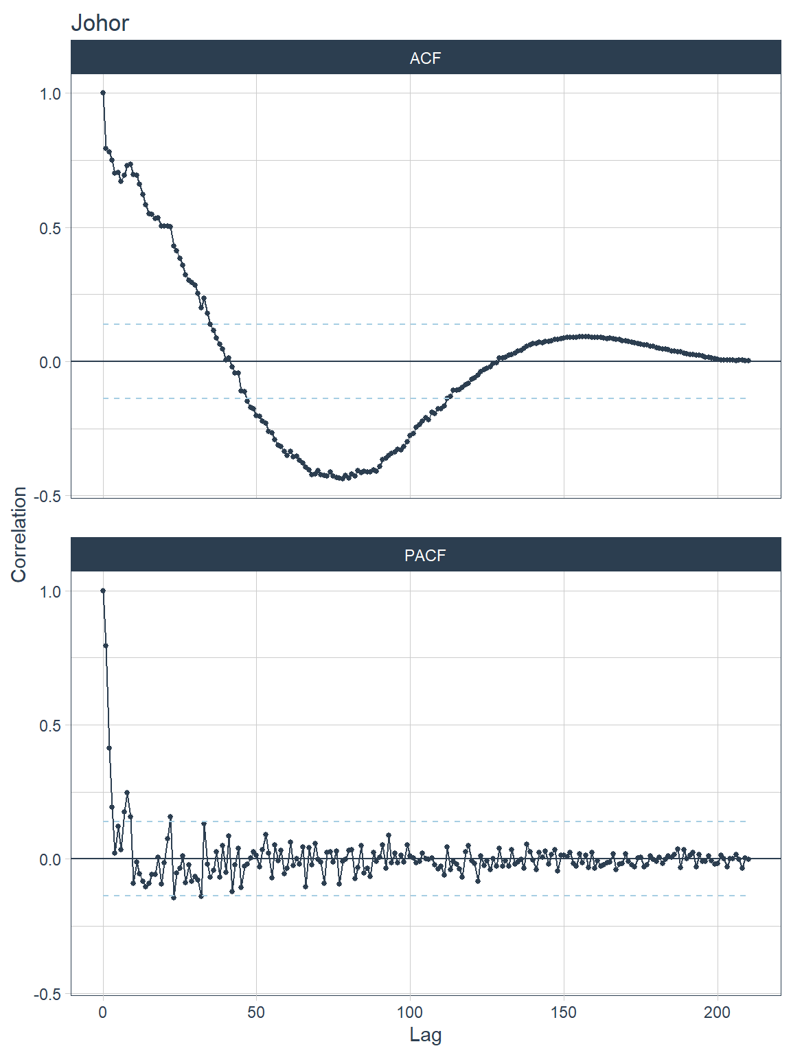
Figure 13.10: ACF and PACF plots for each state
##
## [[2]]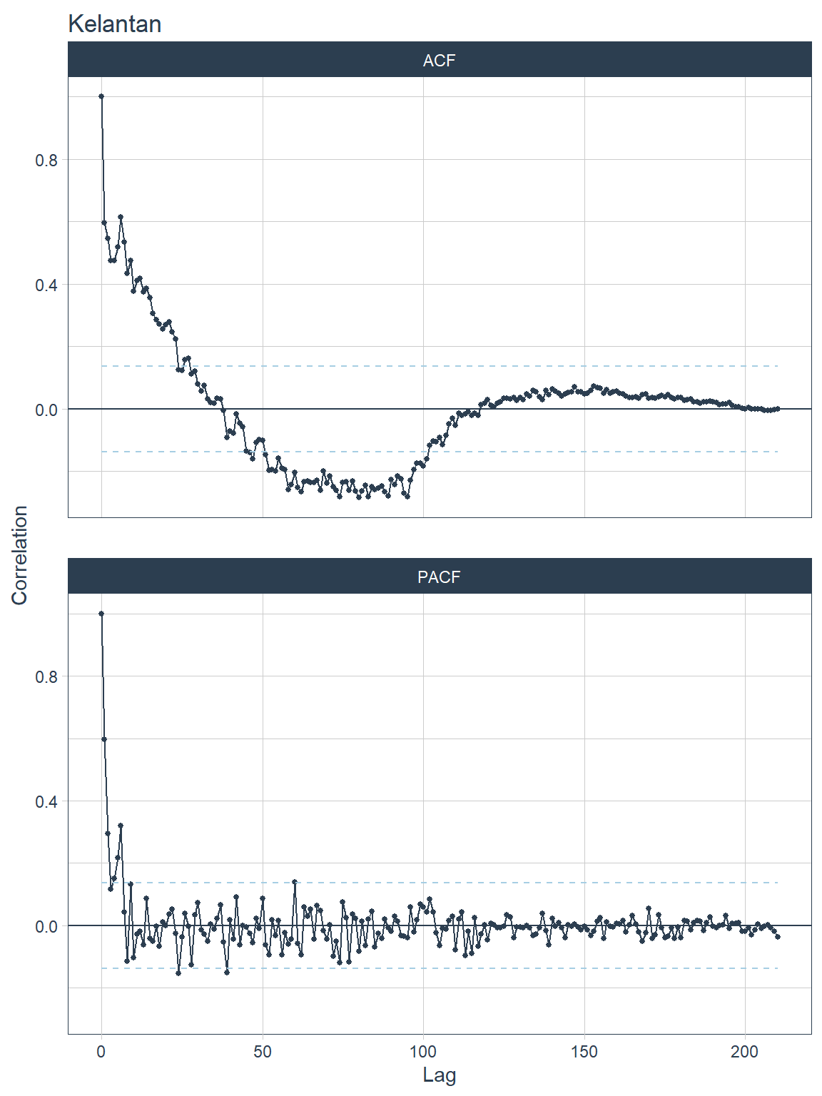
Figure 13.11: ACF and PACF plots for each state
##
## [[3]]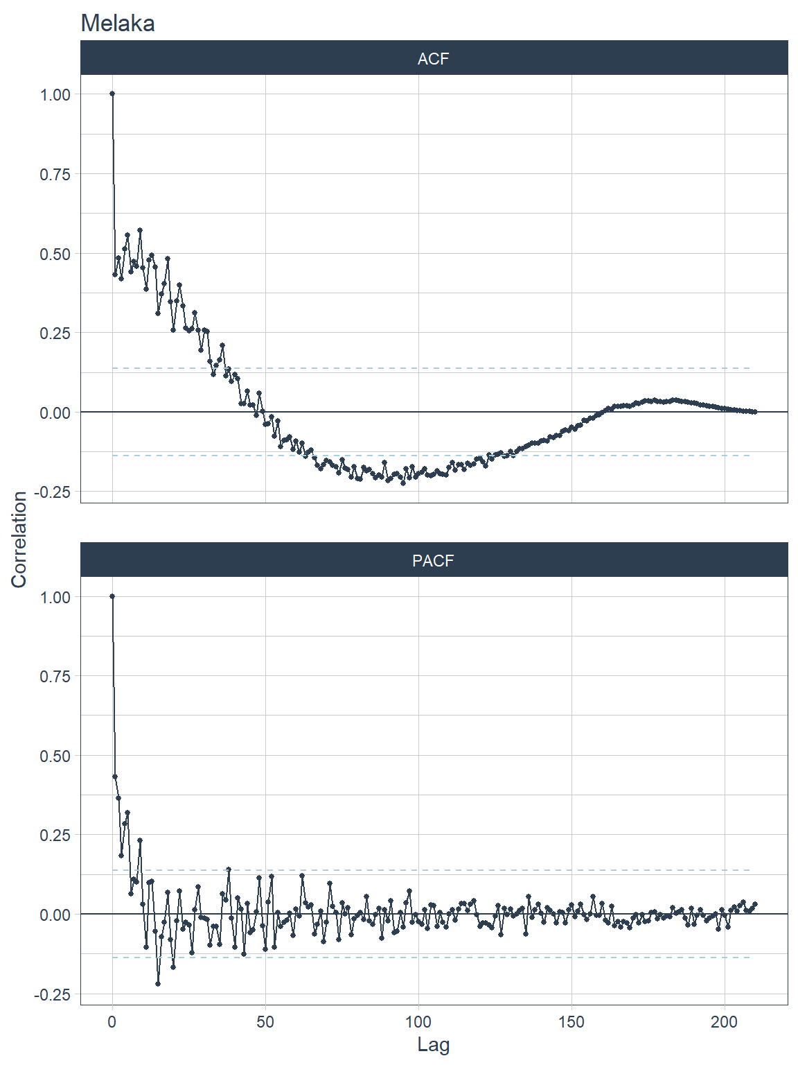
Figure 13.12: ACF and PACF plots for each state
##
## [[4]]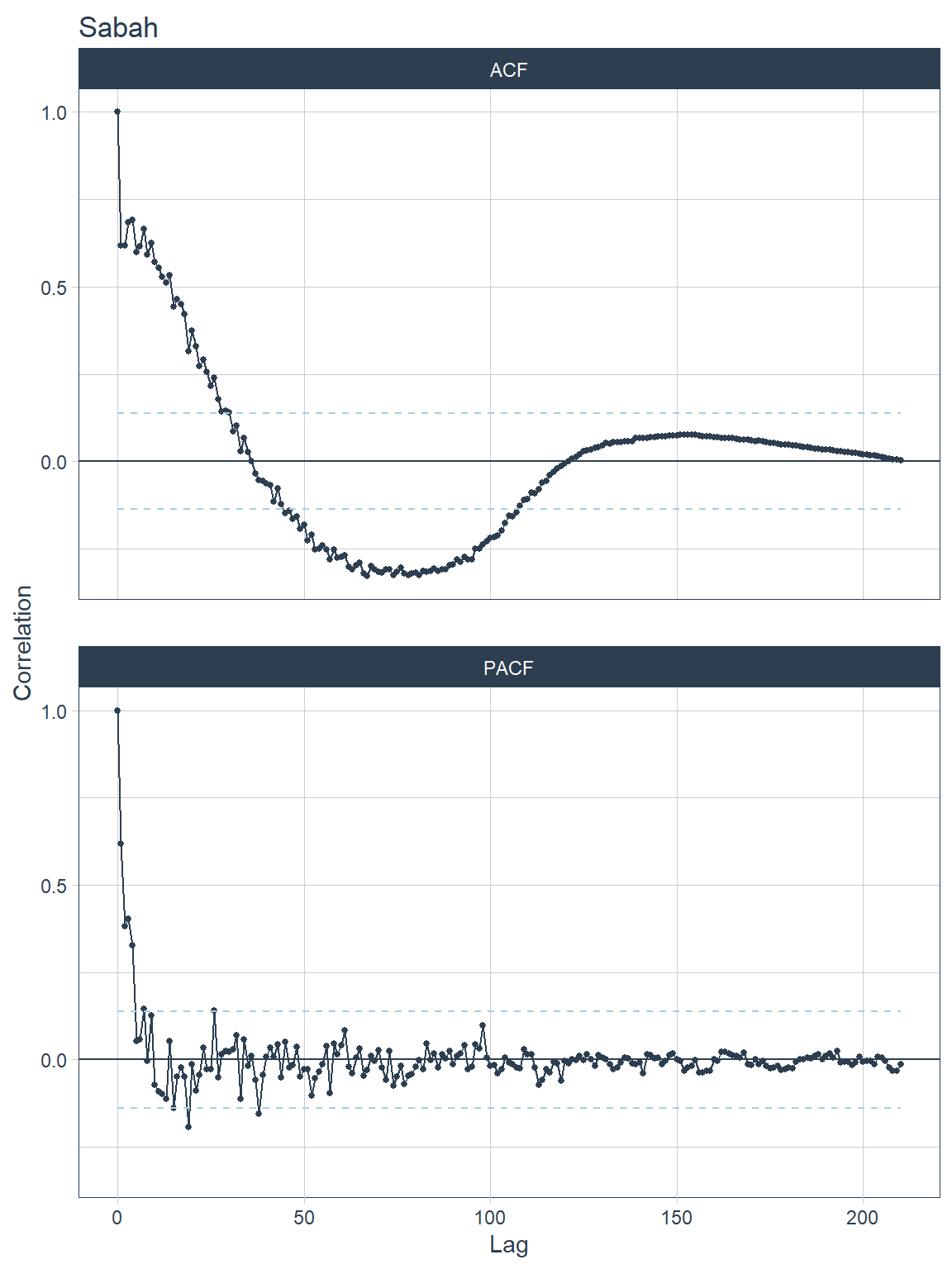
Figure 13.13: ACF and PACF plots for each state
##
## [[5]]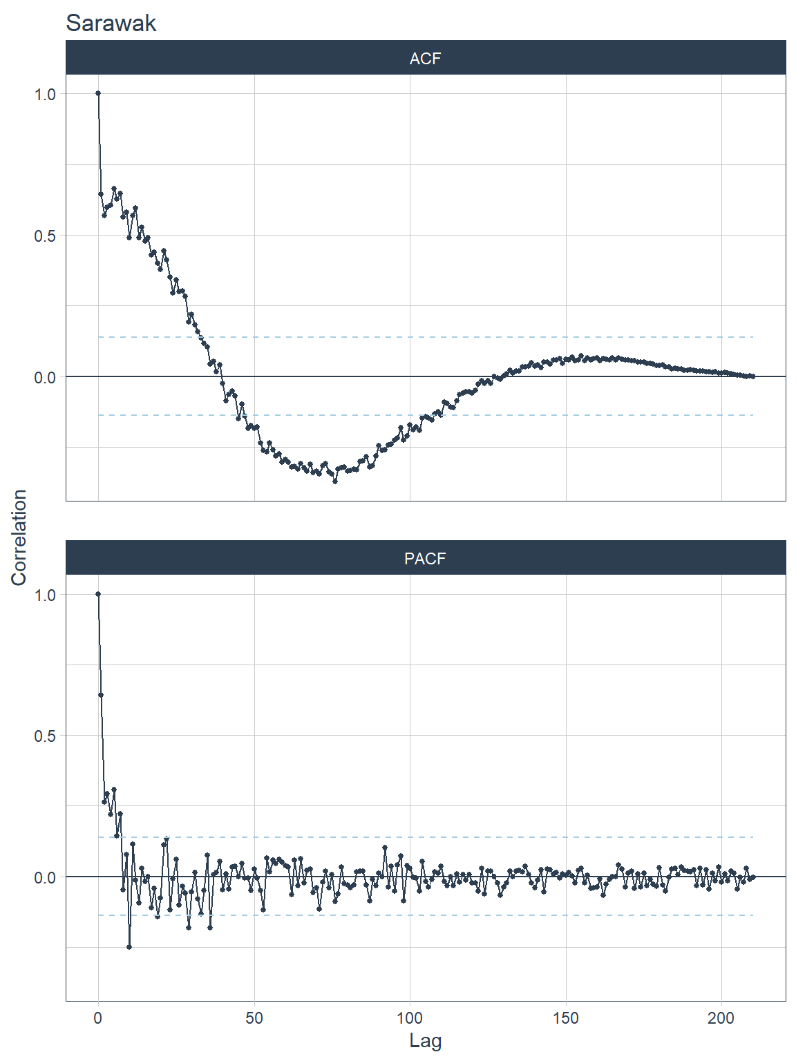
Figure 13.14: ACF and PACF plots for each state
##
## [[6]]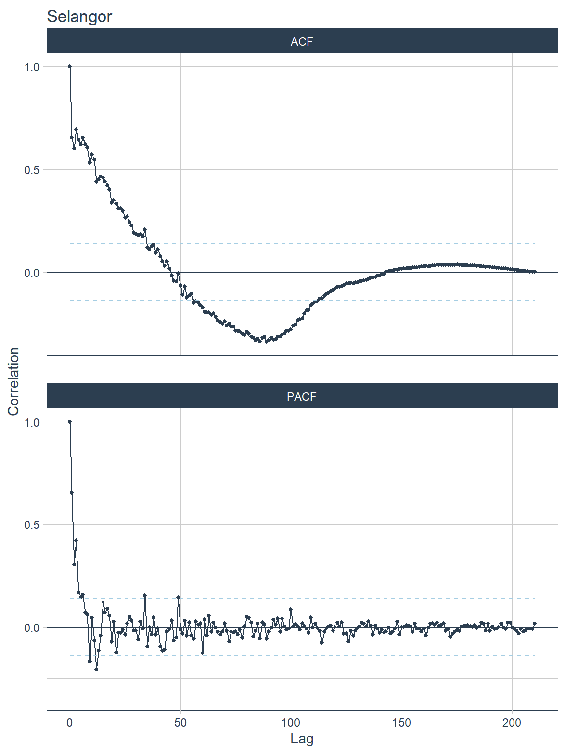
Figure 13.15: ACF and PACF plots for each state
##
## [[7]]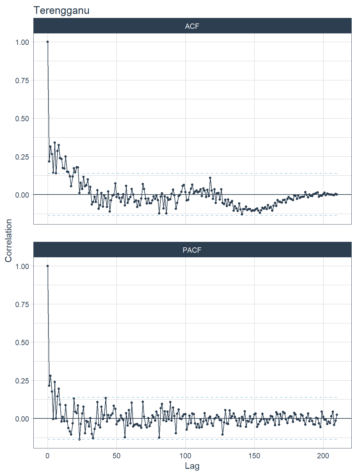
Figure 13.16: ACF and PACF plots for each state
##
## [[8]]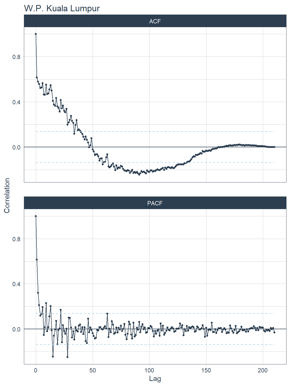
Figure 13.17: ACF and PACF plots for each state
13.3.2 Stationarity and differencing
A stationary time series is one whose statistical properties do not depend on the time at which the series is observed.75. Is df_tsib stationary? As well as the time plot of the data, the ACF plot is also useful for identifying non-stationary time series. For a stationary time series, the ACF will drop to zero relatively quickly, while the ACF of non-stationary data decreases slowly.
One way to make a non-stationary time-series stationary is to compute the differences between consecutive observations. This is known as differencing.
Transformations such as logarithms can help to stabilize the variance of a time series. Differencing can help stabilize the mean of a time series by removing changes in the level of a time series, and therefore eliminating (or reducing) trend and seasonality.
1. Unit root tests One way to determine more objectively whether differencing is required is to use a unit root test. These are statistical hypothesis tests of stationarity that are designed for determining whether differencing is required.
Several unit root tests are available. We use the Kwiatkowski-Phillips-Schmidt-Shin (KPSS) test. In this test, the null hypothesis is that the data are stationary, and we look for evidence that the null hypothesis is false. Consequently, small p-values (e.g., less than 0.05) suggest that differencing is required. The test can be computed using the unitroot_kpss() function.
## # A tibble: 8 x 3
##   state             kpss_stat kpss_pvalue
##   <chr>                 <dbl>       <dbl>
## 1 Johor                 0.296      0.1
## 2 Kelantan              0.200      0.1
## 3 Melaka                0.512      0.0389
## 4 Sabah                 0.204      0.1
## 5 Sarawak               0.256      0.1
## 6 Selangor              0.388      0.0822
## 7 Terengganu            0.449      0.0559
## 8 W.P. Kuala Lumpur     0.524      0.0363
The p-value is reported as 0.01 if it is less than 0.01, and as 0.1 if it is greater than 0.1. In this case, the test statistics are smaller than the 1% critical value, so the p-value is more than 0.01, indicating that the null hypothesis is rejected. That is, the data are not stationary. We can difference the data, and apply the test again.
## # A tibble: 8 x 3
##   state             kpss_stat kpss_pvalue
##   <chr>                 <dbl>       <dbl>
## 1 Johor                 0.205         0.1
## 2 Kelantan              0.127         0.1
## 3 Melaka                0.213         0.1
## 4 Sabah                 0.175         0.1
## 5 Sarawak               0.229         0.1
## 6 Selangor              0.157         0.1
## 7 Terengganu            0.151         0.1
## 8 W.P. Kuala Lumpur     0.144         0.1
This time, the test statistic is tiny, and well within the range we would expect for stationary data, so the p-value is greater than 0.1. We can conclude that the differenced data appear stationary.
This process of using a sequence of KPSS tests to determine the appropriate number of first differences is carried out using unitroot_ndiffs().
## # A tibble: 8 x 2
##   state             ndiffs
##   <chr>              <int>
## 1 Johor                  0
## 2 Kelantan               0
## 3 Melaka                 1
## 4 Sabah                  0
## 5 Sarawak                0
## 6 Selangor               0
## 7 Terengganu             0
## 8 W.P. Kuala Lumpur      1
As we saw from the KPSS tests above, one difference is required to make the df_tsib data stationary for Melaka and W.P. Kuala Lumpur which has the lowest kpss_pvalue before the first differencing step.
2. Correlation of features
Features and statistical values can be extracted from a time series. The fpp3 meta-package has a library feasts which provide provides up to 48 features. The features are tagged to 22 relevant concepts. 48 features is a relatively large number of variables to analyze, the correlation can help determine the associative relationship between the features.
The desired features are established with fabletools::feature_set and the features are extracted with fabeltools::features.
## Rows: 8
## Columns: 44
## $ state              <chr> "Johor", "Kelantan", "Melaka", "Sabah", "Sarawak", ~
## $ trend_strength     <dbl> 0.9362480, 0.8045855, 0.9313598, 0.9095258, 0.93111~
## $ spikiness          <dbl> 4.089342e+03, 2.284771e+02, 5.476773e+00, 3.533915e~
## $ linearity          <dbl> -164.446350, 8.922681, -74.431741, -11.096861, 42.0~
## $ curvature          <dbl> -369.43934, -91.56845, -63.45025, -294.49305, -113.~
## $ stl_e_acf1         <dbl> 0.3887993, 0.2805585, 0.2081062, 0.5786412, 0.27408~
## $ stl_e_acf10        <dbl> 0.4887749, 0.2775897, 0.2607668, 0.9472374, 0.32703~
## $ acf1               <dbl> 0.9080769, 0.7925676, 0.8984954, 0.8948933, 0.89481~
## $ acf10              <dbl> 2.6039381, 1.5234549, 2.2984792, 2.1619846, 2.64963~
## $ diff1_acf1         <dbl> 0.25215510, 0.07093529, 0.09265168, 0.40526691, 0.1~
## $ diff1_acf10        <dbl> 0.4357987, 0.1471572, 0.2502910, 0.5814732, 0.36052~
## $ diff2_acf1         <dbl> -0.5341120, -0.3955538, -0.5119264, -0.5370620, -0.~
## $ diff2_acf10        <dbl> 0.5372367, 0.4630057, 0.4536312, 0.8060561, 0.61305~
## $ season_acf1        <dbl> NA, NA, NA, NA, NA, NA, NA, NA
## $ pacf5              <dbl> 1.0464736, 0.7091751, 0.9299031, 1.1340447, 1.08676~
## $ diff1_pacf5        <dbl> 0.3655822, 0.3330044, 0.2740643, 0.7452390, 0.39480~
## $ diff2_pacf5        <dbl> 0.6846344, 0.6657949, 0.7115930, 0.8628257, 0.77024~
## $ season_pacf        <dbl> NA, NA, NA, NA, NA, NA, NA, NA
## $ zero_run_mean      <dbl> 0, 0, 0, 0, 1, 0, 0, 0
## $ nonzero_squared_cv <dbl> 0.8672901, 0.6958452, 0.8207284, 1.2620525, 0.84285~
## $ zero_start_prop    <dbl> 0, 0, 0, 0, 0, 0, 0, 0
## $ zero_end_prop      <dbl> 0.00000000, 0.00000000, 0.00000000, 0.00000000, 0.0~
## $ lambda_guerrero    <dbl> 1.999927, 1.999927, 1.999927, 1.999927, 1.999927, 1~
## $ kpss_stat          <dbl> 0.2962690, 0.2003494, 0.5123650, 0.2044794, 0.25630~
## $ kpss_pvalue        <dbl> 0.10000000, 0.10000000, 0.03888175, 0.10000000, 0.1~
## $ pp_stat            <dbl> -1.130579, -1.672558, -1.043125, -1.494955, -1.1632~
## $ pp_pvalue          <dbl> 0.1, 0.1, 0.1, 0.1, 0.1, 0.1, 0.1, 0.1
## $ ndiffs             <int> 0, 0, 1, 0, 0, 0, 0, 1
## $ nsdiffs            <int> 0, 0, 0, 0, 0, 0, 0, 0
## $ bp_stat            <dbl> 25.56271, 19.47307, 25.02611, 24.82586, 24.82159, 2~
## $ bp_pvalue          <dbl> 4.282351e-07, 1.020282e-05, 5.655907e-07, 6.275010e~
## $ lb_stat            <dbl> 28.11898, 21.42037, 27.52873, 27.30844, 27.30375, 2~
## $ lb_pvalue          <dbl> 1.140813e-07, 3.688313e-06, 1.547785e-07, 1.734525e~
## $ var_tiled_var      <dbl> 0, 0, 0, 0, 0, 0, 0, 0
## $ var_tiled_mean     <dbl> 0, 0, 0, 0, 0, 0, 0, 0
## $ shift_level_max    <dbl> 0, 0, 0, 0, 0, 0, 0, 0
## $ shift_level_index  <dbl> NA, NA, NA, NA, NA, NA, NA, NA
## $ shift_var_max      <dbl> 0, 0, 0, 0, 0, 0, 0, 0
## $ shift_var_index    <dbl> NA, NA, NA, NA, NA, NA, NA, NA
## $ spectral_entropy   <dbl> 0.5726035, 0.7048004, 0.4365508, 0.6075246, 0.56902~
## $ n_crossing_points  <int> 3, 5, 3, 4, 3, 2, 8, 2
## $ longest_flat_spot  <int> 9, 4, 9, 8, 3, 13, 5, 13
## $ coef_hurst         <dbl> 0.9844023, 0.9682755, 0.9834729, 0.9826531, 0.98312~
## $ stat_arch_lm       <dbl> 0.6328477, 0.5855113, 0.9619683, 0.6657217, 0.62923~
Missing values need to be dropped before the correlation can be calculated. There are features have missing values NA.
## [1] "season_acf1"       "season_pacf"       "shift_level_index"
## [4] "shift_var_index"## # A tibble: 8 x 44
## state trend_strength spikiness linearity curvature stl_e_acf1 stl_e_acf10
## <chr> <dbl> <dbl> <dbl> <dbl> <dbl> <dbl>
## 1 Johor 0.936 4089. -164. -369. 0.389 0.489
## 2 Kelantan 0.805 228. 8.92 -91.6 0.281 0.278
## 3 Melaka 0.931 5.48 -74.4 -63.5 0.208 0.261
## 4 Sabah 0.910 3534. -11.1 -294. 0.579 0.947
## 5 Sarawak 0.931 53.0 42.1 -113. 0.274 0.327
## 6 Selangor 0.871 852068. -656. -872. 0.339 0.410
## 7 Terengganu 0.600 11.9 28.7 -17.5 0.113 0.275
## 8 W.P. Kual~ 0.877 5480. -225. -153. 0.123 0.282
## # ... with 37 more variables: acf1 <dbl>, acf10 <dbl>, diff1_acf1 <dbl>,
## # diff1_acf10 <dbl>, diff2_acf1 <dbl>, diff2_acf10 <dbl>, season_acf1 <dbl>,
## # pacf5 <dbl>, diff1_pacf5 <dbl>, diff2_pacf5 <dbl>, season_pacf <dbl>,
## # zero_run_mean <dbl>, nonzero_squared_cv <dbl>, zero_start_prop <dbl>,
## # zero_end_prop <dbl>, lambda_guerrero <dbl>, kpss_stat <dbl>,
## # kpss_pvalue <dbl>, pp_stat <dbl>, pp_pvalue <dbl>, ndiffs <int>,
## # nsdiffs <int>, bp_stat <dbl>, bp_pvalue <dbl>, lb_stat <dbl>, ...We can treat this tibble like any data set and analyze it to find interesting observations or groups of observations.76
13.3.3 ARIMA models
ARIMA models are widely used approaches to time series forecasting. ARIMA models aim to describe the autocorrelations in the data. ARIMA is an acronym for AutoRegressive Integrated Moving Average.
ARIMA models are usually described as an ARIMA(p, d, q) model, where77
- p = order of the autoregressive part;
- d = degree of first differencing involved;
- q = order of the moving average part.
The following R code selects a non-seasonal ARIMA model automatically.
## Series: deaths_new
## Model: ARIMA(1,0,0)
##
## Coefficients:
##          ar1
##       0.9190
## s.e.  0.0547
##
## sigma^2 estimated as 21471:  log likelihood=-199.01
## AIC=402.03   AICc=402.46   BIC=404.89
This is an ARIMA(1,0,0) model. Forecasts from the model are shown in Figure 13.18. We set forecast(h=4) for the next 4 periods (weeks).
fit %>%
  forecast(h=4) %>%
  autoplot(df_tsib) +
  labs(y = "Number of deaths", title = "Selangor Covid Deaths")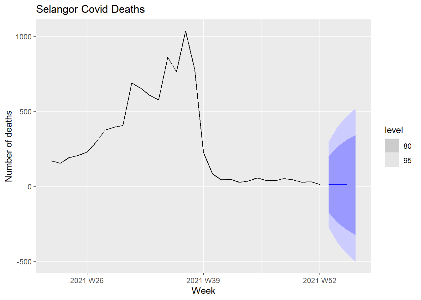
Figure 13.18: Forecasts of Covid deaths
The level legend refers to the confidence level for prediction intervals. The forecasts are shown as a blue line, with the 80% prediction intervals as a dark shaded area, and the 95% prediction intervals as a light shaded area.
We can qualitatively expect that the prediction intervals are wide because of the high peak of the Covid deaths that then flattened after Oct 2021.
13.3.4 ACF and PACF plots
It is usually not possible to tell, simply from a time plot, what values of
p and q are appropriate for the data. It is sometimes possible to use the ACF plot, and the closely related PACF plot, to determine appropriate values for p and q.
Figure 13.19 and Figure 13.20 show the ACF and PACF plots for the Selangor Covid deaths data shown in Figure 13.18.
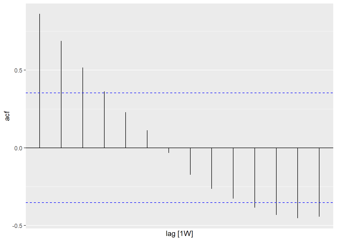
Figure 13.19: ACF of Selangor Covid deaths
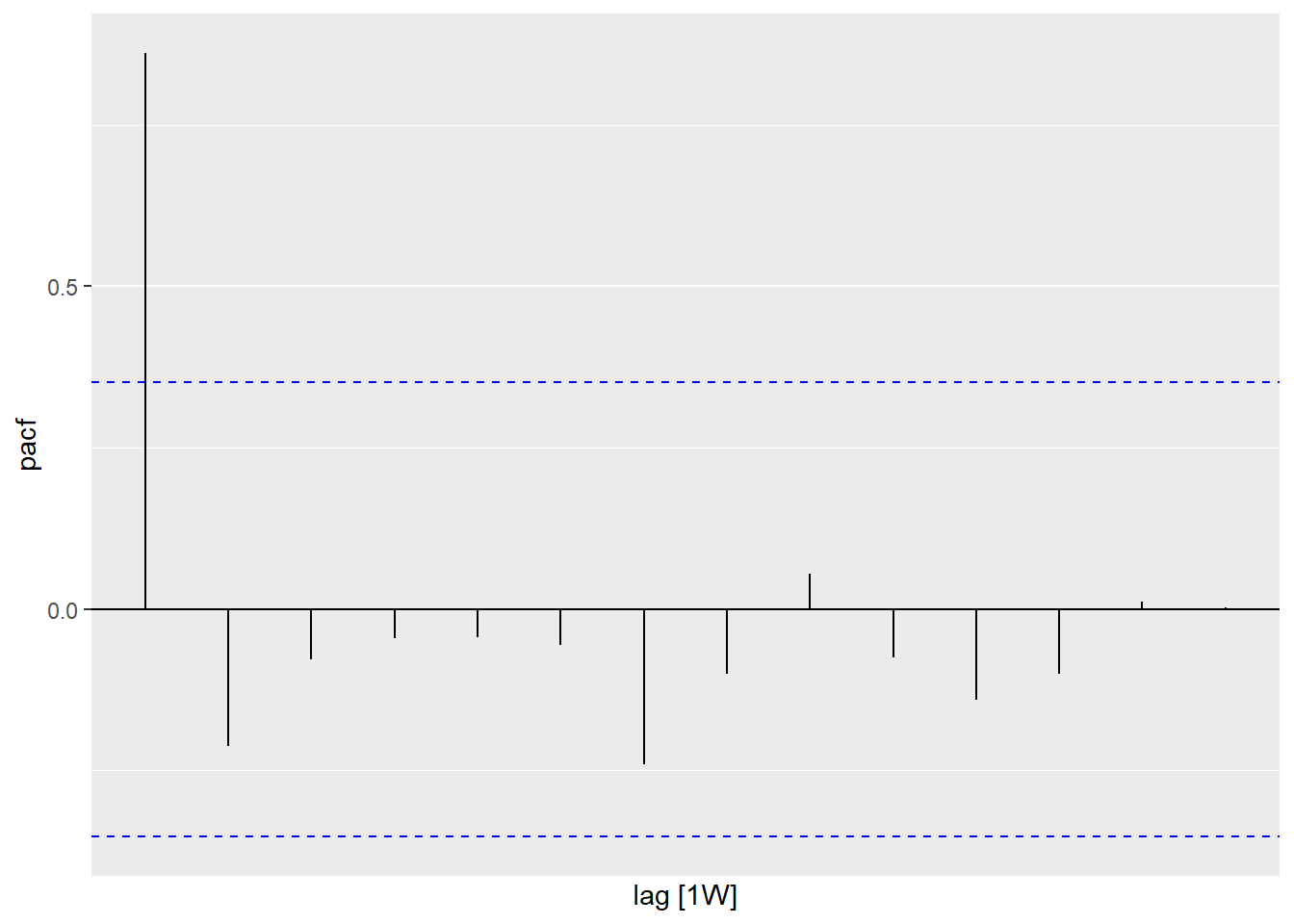
Figure 13.20: PACF of Selangor Covid deaths
A convenient way to produce a time plot, ACF plot, and PACF plot in one command is to use gg_tsdisplay() with plot_type = "partial".
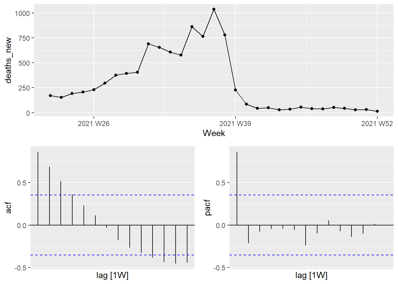
Figure 13.21: Combined plot for Selangor Covid deaths
If the data are from an ARIMA(p,d,0) or ARIMA(0,d,q) model, then the ACF and PACF plots can help determine the value of p or q. If p and q are both positive, then the plots do not help in finding suitable values of p and q.
The data may follow an ARIMA(p,d,0) model if the ACF and PACF plots of the differenced data show the following patterns:
the ACF is exponentially decaying or sinusoidal;
there is a significant spike at lag
pin the PACF, but none beyond lagp. The data may follow an ARIMA(0, d, q) model if the ACF and PACF plots of the differenced data show the following patterns:the PACF is exponentially decaying or sinusoidal;
there is a significant spike at lag
qin the ACF, but none beyond lagq
Figure 13.19 shows that there is a decaying sinusoidal pattern in the ACF. In Figure 13.20 the PACF shows the last significant spike at lag 1. This is what we expect from an ARIMA(1,0,0) model.
13.3.5 Modeling procedure
When fitting an ARIMA model to a set of (non-seasonal) time-series data, the following procedure provides a useful general approach.78
- Plot the data and identify any unusual observations.
- If necessary, transform the data (using a Box-Cox transformation) to stabilize the variance.
- If the data are non-stationary, take first differences of the data until the data are stationary.
- Examine the ACF/PACF: Is an ARIMA(p,d,0) or ARIMA(0,d,q) model appropriate?
- Try your chosen model(s), and use the AICc to search for a better model.
- Check the residuals from your chosen model by plotting the ACF of the residuals, and doing a portmanteau test of the residuals. If they do not look like white noise, try a modified model.
- Once the residuals look like white noise, calculate forecasts.
The Hyndman-Khandakar algorithm only takes care of steps 3–5. Even if we use it, we will still need to take care of the other steps.
We will apply this procedure to the Selangor Covid deaths shown in Figure 13.18.
To address the non-stationarity, we will take a first difference of the data. The differenced data are shown in Figure 13.22.
df_tsib %>%
  filter(state == "Selangor") %>%
  gg_tsdisplay(difference(deaths_new), plot_type = "partial")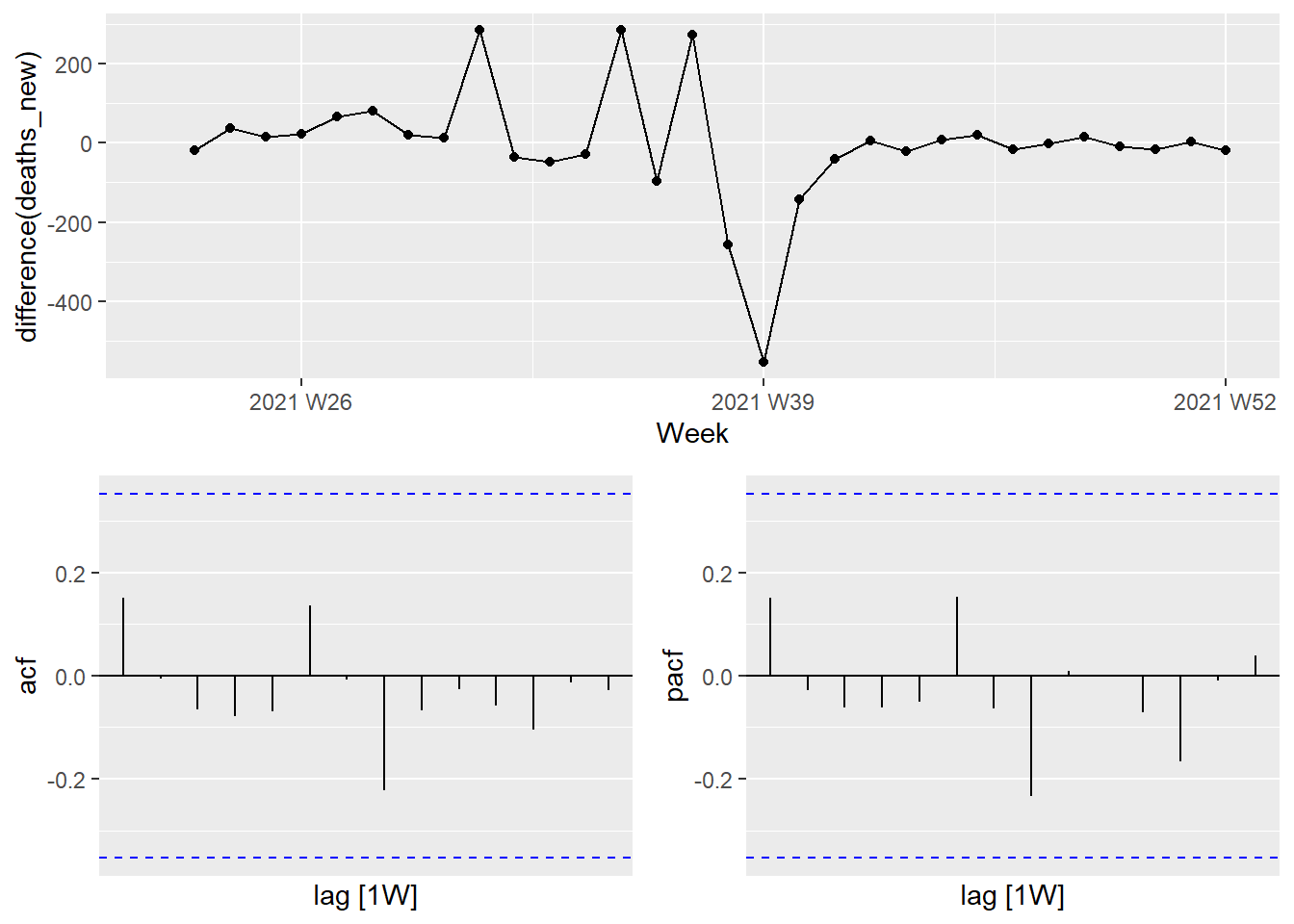
Figure 13.22: Time plot and ACF and PACF plots for the differenced Selangor Covid deaths
These now appear to be stationary.
The PACF shown in Figure 13.22 is suggestive of an AR(1) model; so an initial candidate model is an ARIMA(1,1,0). The ACF suggests an MA(1) model, so an alternative candidate is an ARIMA(0,1,1).
We fit both an ARIMA(1,1,0) and an ARIMA(0,1,1) model along with two automated model selections, one using the default stepwise procedure, and one working harder to search a larger model space.
sel_fit <- df_tsib %>%
  filter(state == "Selangor") %>%
  model(arima110 = ARIMA(deaths_new ~ pdq(1,1,0)),
        arima011 = ARIMA(deaths_new ~ pdq(0,1,1)),
        stepwise = ARIMA(deaths_new),
        search = ARIMA(deaths_new, stepwise=FALSE))

sel_fit %>% pivot_longer(!state, names_to = "Model name",
                         values_to = "Orders")
## # A mable: 4 x 3
## # Key: state, Model name [4]
## state `Model name` Orders
## <chr> <chr> <model>
## 1 Selangor arima110 <ARIMA(1,1,0)>
## 2 Selangor arima011 <ARIMA(0,1,1)>
## 3 Selangor stepwise <ARIMA(1,0,0)>
## 4 Selangor search <ARIMA(1,0,0)>## # A tibble: 4 x 6
## .model sigma2 log_lik AIC AICc BIC
## <chr> <dbl> <dbl> <dbl> <dbl> <dbl>
## 1 arima011 22222. -192. 388. 389. 391.
## 2 arima110 22230. -192. 388. 389. 391.
## 3 stepwise 21471. -199. 402. 402. 405.
## 4 search 21471. -199. 402. 402. 405.The four models have almost identical AICc values. An ARIMA(0,1,1) or ARIMA(1,1,0) gives the lowest AICc value. The automated stepwise selection has identified an ARIMA model, which has the highest AICc value.
The ACF plot of the residuals from the ARIMA(0,1,1) model shows that all autocorrelations are within the threshold limits, indicating that the residuals are behaving like white noise.
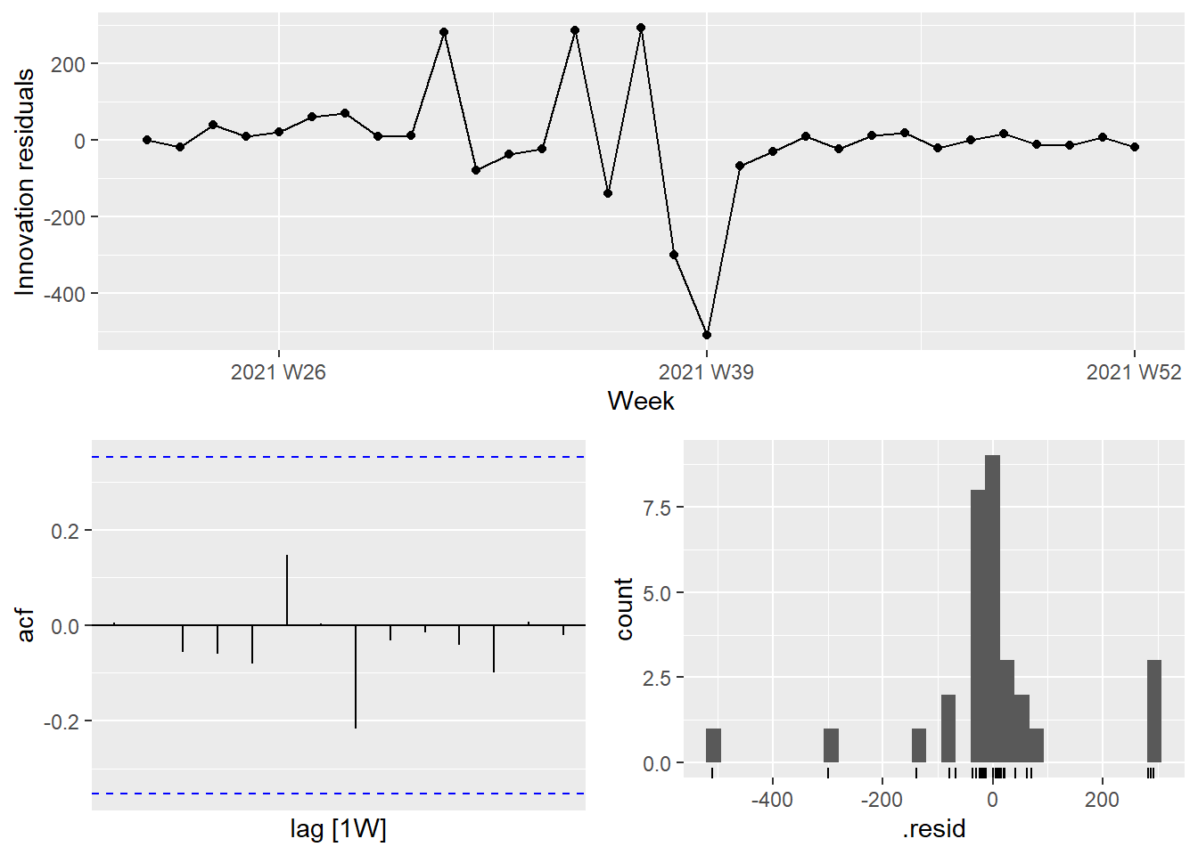
Figure 13.23: Residual plots for the selected ARIMA model
The next 4 weeks forecast from the ARIMA(0,1,1) model is shown in Figure 13.24.
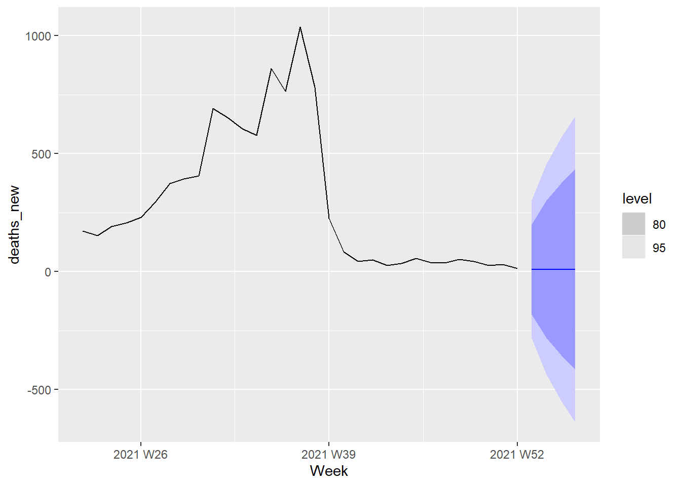
Figure 13.24: Forecast plot for the ARIMA(0,1,1) model
The next 4 weeks forecast from the ARIMA(1,1,0) model is shown in Figure 13.25.

Figure 13.25: Forecast plot for the ARIMA(1,1,0) model
As expected from the AIC and AICc values for the two models, Figure 13.24 and Figure 13.25 are identical.
13.4 Dynamic regression models
The time series models that we have explored until now are based on the information from past observations of a series, but not for the inclusion of other information that may also be relevant. For example, Covid deaths are obviously related to Covid cases. We have analyzed the relationship of vaccinations with deaths in Chapter 11. Other external variables, may explain some of the historical variations and may lead to more accurate forecasts. On the other hand, the models in Chapter 12 allow for the inclusion of other predictor variables but do not allow for the subtle time series dynamics that can be handled with ARIMA models.
13.4.1 Malaysia Covid deaths and confirmed cases
In this section, we look at the obvious relationship between cases_new and deaths_new from our df_nation tsibble. Recall that df_nation groups all the 16 states together and summarizes the data for the whole of Malaysia. We can add other variables but let us limit to explore how the time changes in cases_new affect deaths_new.
Figure 13.26 shows the weekly changes in Covid deaths and new cases. We would like to forecast changes in deaths based on changes in cases. A change in cases does not necessarily translate to an instant change in deaths (e.g., after being infected, a person may recover). Figure 11.12 and Figure 11.13 show that the number of days between being infected with Covid and sadly succumbing to death depends on the vaccine type and also age among other factors. However, we will ignore these complexities in this learning example and try to forecast the effect of cases_new on deaths_new.
df_nation %>%
  pivot_longer(c(cases_new, deaths_new),
               names_to = "var", values_to = "value") %>%
  ggplot(aes(x = Week, y = value)) +
  geom_line() +
  facet_grid(vars(var), scales = "free_y")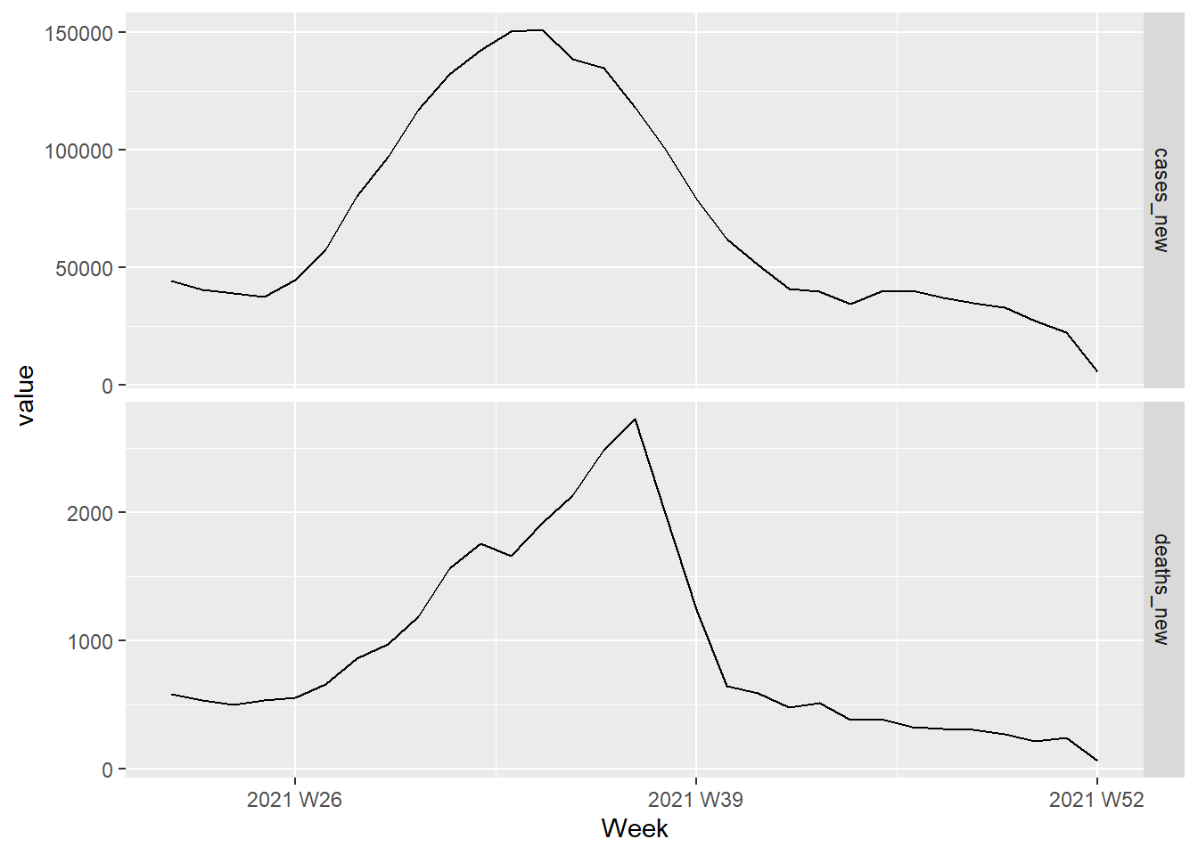
Figure 13.26: Changes in Covid deaths and cases from Jun to Dec 2021
The fitted model is
## Series: deaths_new
## Model: LM w/ ARIMA(2,0,0) errors
##
## Coefficients:
##          ar1      ar2  cases_new
##       1.2002  -0.5520     0.0136
## s.e.  0.1412   0.1385     0.0010
##
## sigma^2 estimated as 28083:  log likelihood=-201.99
## AIC=411.99 AICc=413.53 BIC=417.72- y(t) = 0.0136x(t) + η(t) (There is no intercept)
- η(t) = 1.2002η(t-1) + ε(t)
- ε(t) ~ NID(0, 28083)
We used the numbers from our fitted model following the example here.79 Next we plot the Regression residuals η(t) and ARIMA residuals ε(t) from the fitted model.
bind_rows(
    `Regression residuals` =
        as_tibble(residuals(fit, type = "regression")),
    `ARIMA residuals` =
        as_tibble(residuals(fit, type = "innovation")),
    .id = "type"
  ) %>%
  mutate(
    type = factor(type, levels=c(
      "Regression residuals", "ARIMA residuals"))
  ) %>%
  ggplot(aes(x = Week, y = .resid)) +
  geom_line() +
  facet_grid(vars(type))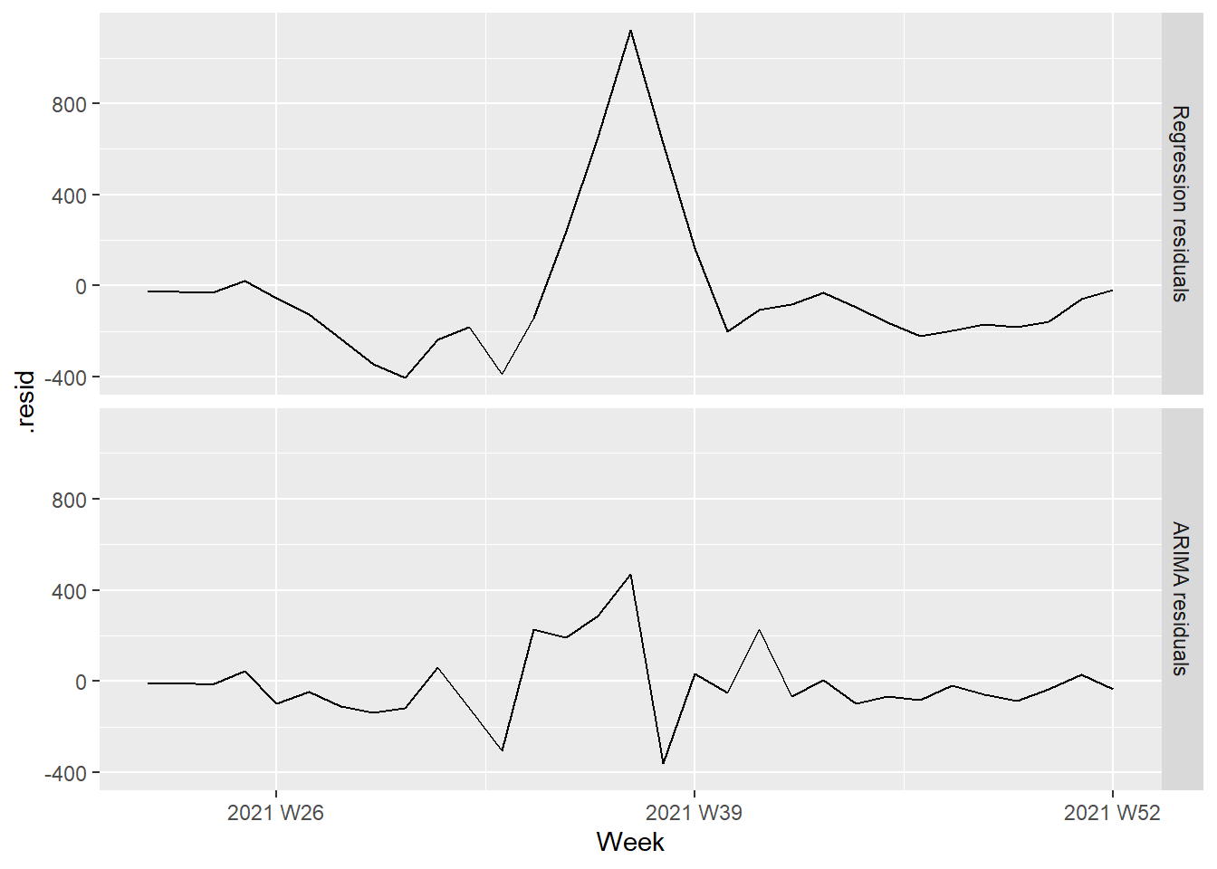
Figure 13.27: Regression and ARIMA residuals from the fitted model
It is the ARIMA estimated errors (the innovation residuals) that should resemble a white noise series. The innovation residuals (i.e., the estimated ARIMA errors) are not significantly different from white noise.
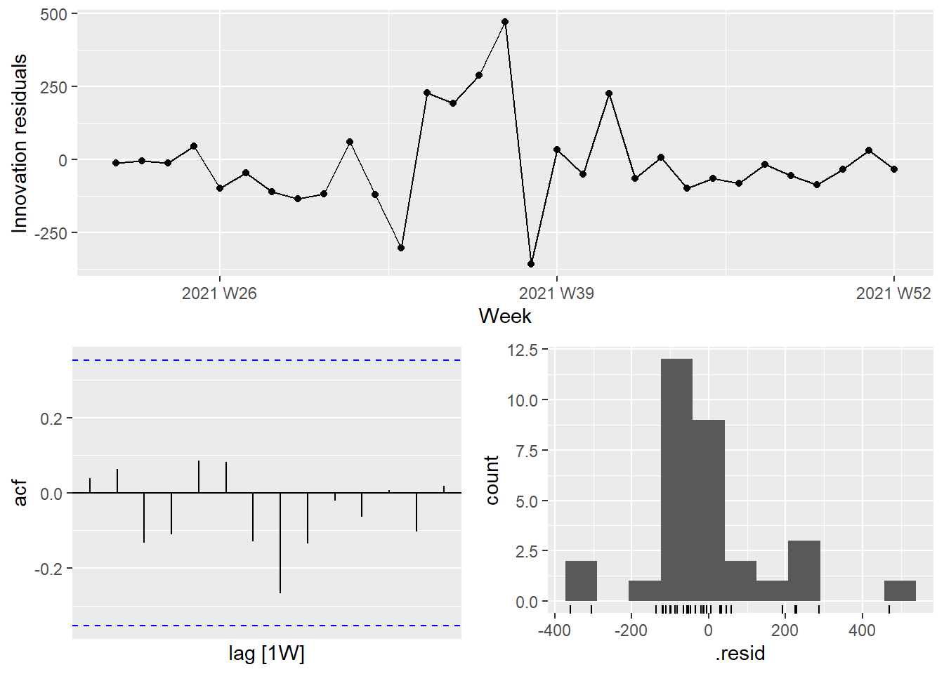
Figure 13.28: Innovation residuals from the fitted model
13.4.2 Forecasting Covid deaths
Let us model Covid deaths as a function of Covid cases. We plot the weekly deaths and cases in Figure 13.29. It is an almost linear relationship.
df_nation %>%
  ggplot(aes(x = cases_new, y = deaths_new)) +
  geom_point() +
  geom_smooth(method = "lm") +
  labs(y = "Covid cases per week",
       x = "Covid deaths per week")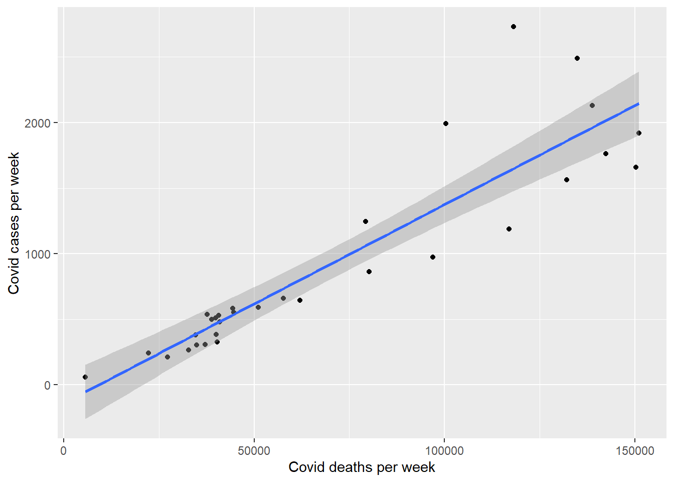
Figure 13.29: Relationship between deaths and cases
We fit a linear regression model with ARMA errors using the ARIMA() function.

Figure 13.30: ARIMA model between deaths and cases
13.4.3 Stochastic and deterministic trends
There are two different ways of modeling a linear trend,80 a deterministic trend and a stochastic trend. Based on Figure 13.26, the deaths and new cases do not follow a linear trend but rather an inverted parabolic. Figure 13.29 however shows that there is a linear fit between the deaths and cases.
We will fit both a deterministic and a stochastic trend model to these data.
The deterministic trend model is obtained as follows.
fit_deterministic <- df_nation %>%
  model(deterministic = ARIMA(deaths_new ~ 1 + trend() +
                                pdq(d = 0)))
report(fit_deterministic)
## Series: deaths_new
## Model: LM w/ ARIMA(2,0,0) errors
##
## Coefficients:
## ar1 ar2 trend() intercept
## 1.4991 -0.6209 -28.0492 1279.691
## s.e. 0.1321 0.1341 27.2209 522.186
##
## sigma^2 estimated as 45706: log likelihood=-209.61
## AIC=429.23 AICc=431.63 BIC=436.4This model can be written as
- y(t) = 1279.691 -28.0492t + η(t)
- η(t) = 1.4991η(t-1) + ε(t)
- ε(t) ∼ NID(0,45706)
The estimated growth, ε(t), is 45706. Alternatively, the stochastic trend model can be estimated.
fit_stochastic <- df_nation %>%
  model(stochastic = ARIMA(deaths_new ~ pdq(d = 1)))
report(fit_stochastic)
## Series: deaths_new
## Model: ARIMA(1,1,0)
##
## Coefficients:
## ar1
## 0.5714
## s.e. 0.1447
##
## sigma^2 estimated as 48702: log likelihood=-204.16
## AIC=412.32 AICc=412.76 BIC=415.12This model can be written as
- y(t) − y(t-1) = 0.5714 + ε(t), or equivalently
- y(t) = y(0) + 0.5714t + η(t)
- η(t) = η(t−1) + ε(t)
- ε(t) ∼ NID(0,48702)
In this case, the estimated growth, ε(t), is 48702. Although the growth estimates are similar, the prediction intervals are not, as Figure 10.10 shows. In particular, stochastic trends have much wider prediction intervals because the errors are non-stationary.
df_nation %>%
  autoplot(deaths_new) +
  autolayer(fit_stochastic %>% forecast(h = 4),
    colour = "blue", level = 95) +
  autolayer(fit_deterministic %>% forecast(h = 4),
    colour = "gold", alpha = 0.65, level = 95)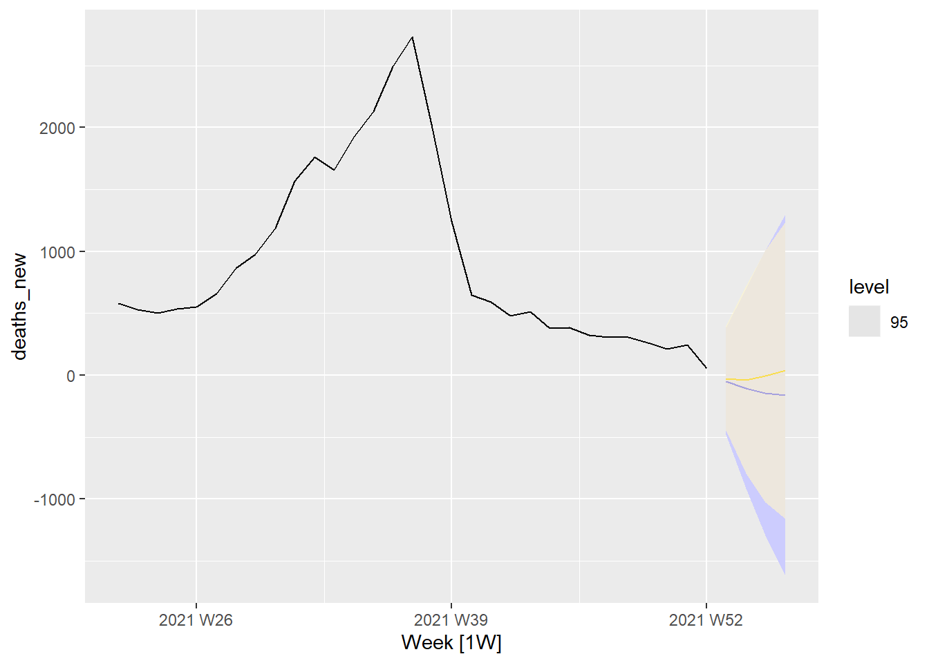
Figure 13.31: Forecasts deaths based on cases with 95 percent interval
Comparing Figure 13.31 with Figure 13.24 and Figure 13.25 shows that the predicted deaths for the next 4 periods (weeks) will taper to about zero. The biggest difference is that the “error range” is much higher for Figure 13.31 with the stochastic forecast in blue having a higher range than the deterministic forecast in gold. (Between 1,000 and -1,000 for Figure 13.31 and between 500 and -500 for Figure 13.24 and Figure 13.25. Note that there should not be a negative number of deaths.)
There is an implicit assumption with deterministic trends that the slope of the trend is not going to change over time. On the other hand, stochastic trends can change, and the estimated growth is only assumed to be the average growth over the historical period, not necessarily the rate of growth that will be observed into the future. Consequently, it is safer to forecast with stochastic trends, especially for longer forecast horizons, as the prediction intervals allow for greater uncertainty in future growth.
13.4.4 Generating bottom-up forecasts
Forecasts of hierarchical or grouped time series involve selecting one level of aggregation and generating forecasts for that level. These are then either aggregated for higher levels, or disaggregated for lower levels, to obtain a set of coherent forecasts for the rest of the structure.81
A simple method for generating coherent forecasts is the bottom-up approach. We first generate forecasts for each series at the bottom level, and then sum these to produce forecasts for all the series in the structure.
We first create a simple tsibble object containing only state and national Covid deaths and cases totals for each week.
We generate the bottom-level state forecasts first, and then sum them to obtain the national forecasts.
fcasts_state <- df_states %>%
  filter(!is_aggregated(state)) %>%
  model(ets = ARIMA(deaths_new)) %>%
  forecast()

# Sum bottom-level forecasts to get top-level forecasts
fcasts_national <- fcasts_state %>%
  summarise(value = sum(deaths_new), .mean = mean(value))
We use the reconcile() function to specify how we want to compute coherent forecasts.
fit <- df_states %>%
  model(base = ARIMA(deaths_new)) %>%
  reconcile(
    bu = bottom_up(base),
    ols = min_trace(base, method = "ols"),
    mint = min_trace(base, method = "mint_shrink"),
  )
Here, fit contains the base ETS model for each series in df-states, along with the three methods for producing coherent forecasts as specified in the reconcile() function.
Passing fit into forecast() generates base and coherent forecasts across all the series in the aggregation structure. Figures 11.12 and 11.13 plot the four point forecasts for the Covid deaths for the Malaysian total, the states, and the actual observations of the test set.
fc %>%
  autoplot(df_states) +
  labs(y = "Number of deaths") +
  facet_wrap(vars(state), scales = "free_y")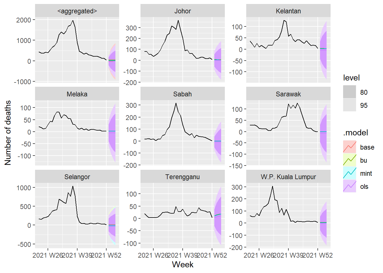
Figure 13.32: Forecasts across all the series
We will compare the forecasts from bottom-up and MinT methods applied to base ETS models
fc %>%
  filter(is_aggregated(state)) %>%
  autoplot(df_states, alpha = 0.7, level = 90) +
  labs(y = "Number of deaths",
       title = "Covid deaths")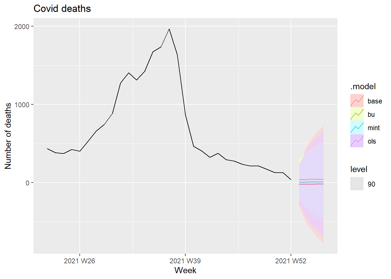
Figure 13.33: Forecasts Covid deaths at 90 percent interval level
fc %>%
  filter(is_aggregated(state)) %>%
  autoplot(df_states, alpha = 0.7, level = 85) +
  labs(y = "Number of deaths",
       title = "Covid deaths")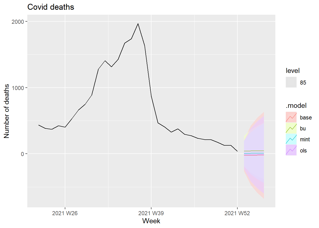
Figure 13.34: Forecasts Covid deaths at 85 percent interval level
13.5 Discussion
Forecasting pandemics is not easy.82 This article identified three major contributing factors that make forecasts relatively accurate.
- how well we understand the factors that contribute to it;
- how much data is available;
- whether the forecasts can affect what we are trying to forecast.
When we apply these ideas to the COVID-19 pandemic, we can see why forecasting its effect is difficult. We have limited and misleading data. The numbers for confirmed cases are underestimated due to the limited testing available. But the numbers for deaths are probably more accurate because deaths have to be reported in Malaysia. So it is difficult to model the spread of the pandemic using the available data.
The second problem is that the forecasts of COVID-19 can affect the thing we are trying to forecast because governments are reacting with interventions. A simple model using the available data will be misleading unless it can factor in the various interventions to improve the situation.
References
https://github.com/MoH-Malaysia/covid19-public/tree/main/epidemic↩︎
https://notast.netlify.app/post/2021-06-03-hierarchical-forecasting-of-hospital-admissions/↩︎
https://stackoverflow.com/questions/59142181/passing-unquoted-variables-to-curly-curly-ggplot-function↩︎
https://stackoverflow.com/questions/59095237/automate-ggplots-while-using-variable-labels-as-title-and-axis-titles?noredirect=1&lq=1↩︎
https://notast.netlify.app/post/2021-06-05-hierarchical-forecasting-of-hospital-admissions-eda-part-2/↩︎
https://otexts.com/fpp3/exploring-australian-tourism-data.html↩︎
https://otexts.com/fpp3/stochastic-and-deterministic-trends.html↩︎