Chapter 2 Introduction to ggplot2
This chapter introduces the basic plotting functions in the ggplot2 package. These functions build up a graph in layers. “gg” in the package name is the abbreviation of grammar of graphics. This visual grammar can be explained as data being mapped into aesthetics (like x, y, color, fill, alpha) of geometric objects (like geom_point(), geom_line(), and geom_bar()).
A statistical graph is a mapping from data to the graphical attributes (aes) contained in geometric objects (geom).
ggplot() the function has 9 parts:
- Data (data box)
- Mapping
- Geometry (geom)
- Statistical transformation (stats)
- Scale
- Coordinate system (coord)
- Facet
- Theme
- Storage and output (output)
The first three are required. The other functions are optional and can appear in any order. ggplot() follows a template that we will follow consistently in this book.
We will build a complete graph by starting with a simple graph and adding additional graphic elements, one at a time. The example uses the newdata data frame we created at the end of Chapter 1. We explore the relationship between new cases (cases_new) and workplace clusters (cluster_workplace).
2.1 Our first geom() to build a point plot
The first function in building a graph is the ggplot function. It specifies the
data framecontaining the data to be plotted- mapping of the variables to visual properties of the graph. The mappings are placed within the aes function (where aes stands for aesthetics).
Then we add the geometric objects (points, lines, bars) that can be displayed on a graph. These functions start with geom_. In Figure 2.1, we use points using geom_point(), creating a scatter plot. The functions in ggplot2 are chained together using the + sign to build a final plot.
We can set the height and width of the plot by specifying, for example, fig.height=6,fig.width=6, in the R chunk header where we also specify the figure caption, {r Chp2-1,fig.height=6,fig.width=6, fig.cap="Map variables and add points"}. We have set fig.height=4,fig.width=6 by default.
ggplot(data = newdata)says that the data framenewdatais used to draw the plot.aes()represents the mapping between numerical values and visual attributes.aes(x = cases_new, y = cluster_workplace)means that the columncases_newis mapped to the position in the x-axis direction, and the columncluster_workplaceis mapped to the position in the y-axis direction.
+says to add a layer.geom_point()says to draw a scatter plot.
library(ggplot2)
ggplot(data = newdata,
       mapping = aes(x = cases_new, y = cluster_workplace)) +
  geom_point()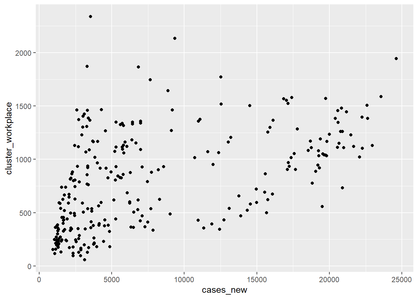
Figure 2.1: Map variables and add points
2.2 Mapping vs. Setting
The ggplot2 grammar makes a distinction between mapping and setting. To specify a point in the plot as a certain color, size, and alpha (transparency), we use a setting statement, as shown in Figure 2.2. Transparency ranges from 0 (completely transparent) to 1 (completely opaque). Adding a degree of transparency can help visualize overlapping points.
ggplot(data = newdata,
       mapping = aes(x = cases_new, y = cluster_workplace)) +
  geom_point(color = "steelblue",
             alpha = .7,
             shape = 1,
             size = 3)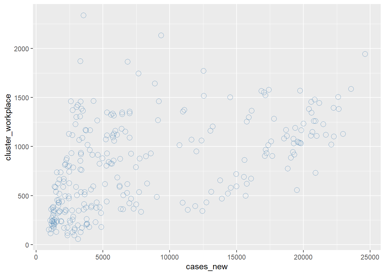
Figure 2.2: Modify point color, transparency, and size
In addition to mapping columns (variables) to the x and y axes, variables can be mapped to the color, shape, size, transparency, and other visual properties of geometric objects. This allows groups of data to be superimposed in a single graph. In Figure 2.3 we map the point color and shape at the aes function so that each different cluster will have its point represented by its own color and shape. Notice where we have put the color and shape options, they will now depend on the column cluster.
newdata %>%
  gather("cluster", "value", -date) %>%
  ggplot(aes(x=as.Date(date),
                 y=value,
                 color=cluster,
                 shape=cluster)) +
  geom_point() +
  scale_shape_manual(values=c(0,1,2,3,4,5,6,7,8,9)) +
  labs(title = "Daily New Cases by Cluster",
      subtitle = "Color by clusters")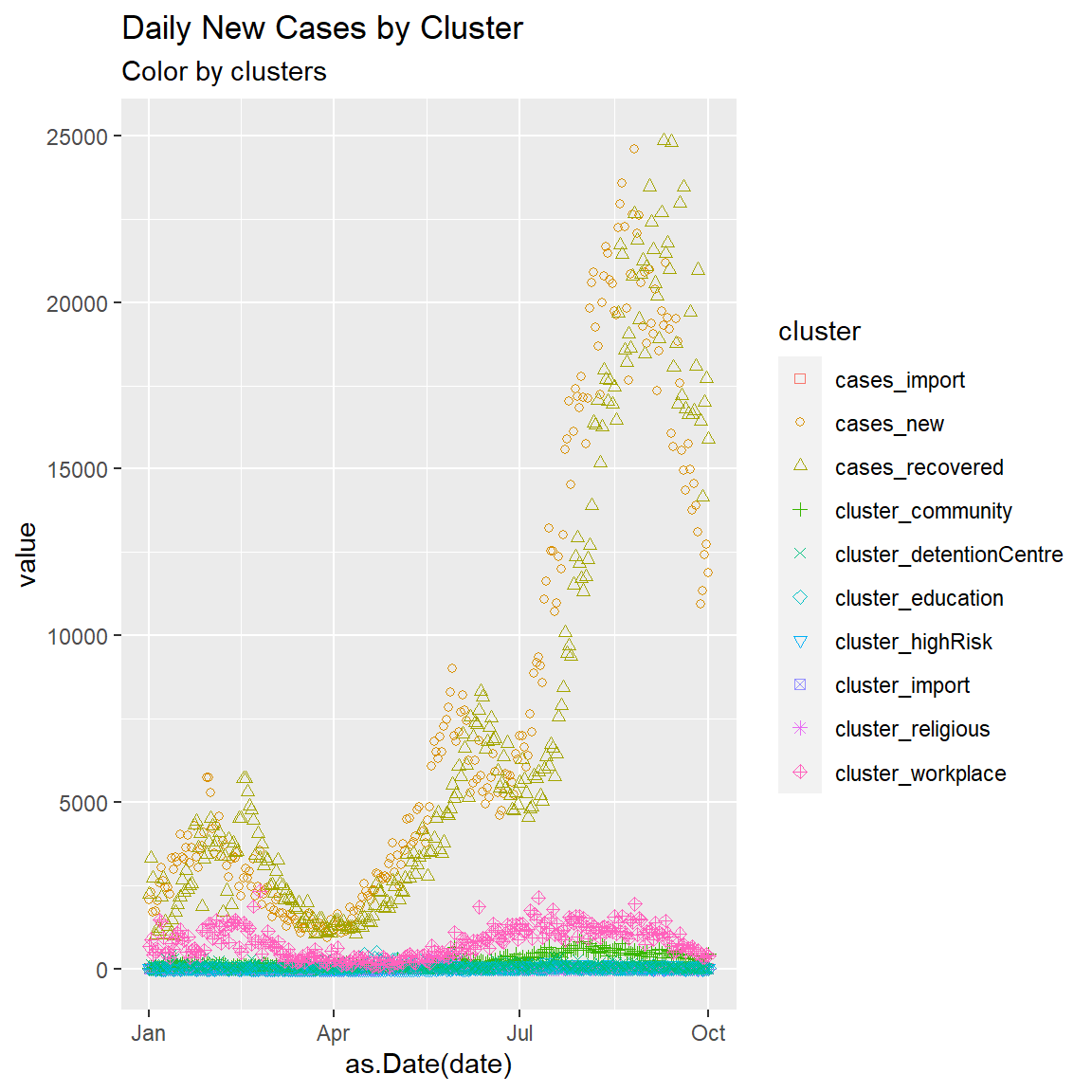
Figure 2.3: Point plot of Malaysia case data
We next add a line of best fit with the geom_smooth function. We can set the type of line (linear, quadratic, non-parametric), thickness of the line, it’s color, and the presence or absence of a confidence interval. We also set (method = lm) for a linear regression line (lm stands for linear model). We also show a different blue color setting.
ggplot(data = newdata,
       mapping = aes(x = cases_new, y = cluster_workplace)) +
  geom_point(color = "deepskyblue",
             alpha = .7,
             size = 3) +
  geom_smooth(method = "lm")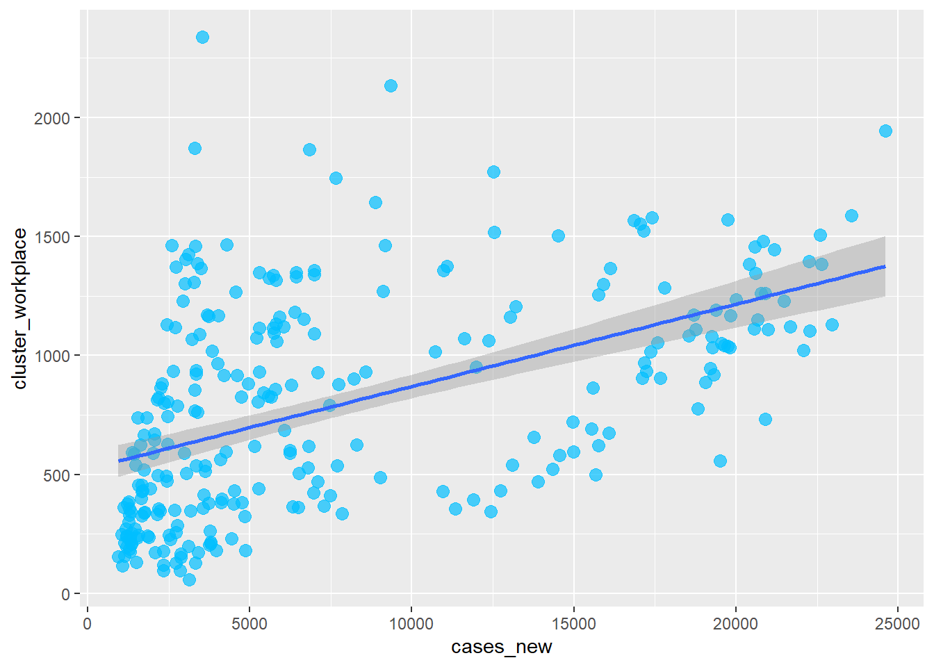
Figure 2.4: Add line of best fit
There is a positive relationship between new cases and cases at the workplace.
In Figure 2.3 we converted the newdata data frame into a long format with the gather function before we could show mapping of variables to the visual properties of geom_point() like color and shape. In Figure 2.5 we show the same mapping using the mysstates data frame, for which the state column is already in the long format. The variables to be studied are in the code below.
Let’s add state to the plot and represent it by color. By default, the shape parameter can show 6 different point shapes or symbols. We have 16 states, so we manually specify scale_shape_manual(values=c(0,1,2,3,4,5,6,7,8,9,10,11,12,13,14,15))
mysstates %>%
  ggplot(aes(x=date, y=cases_new,
             color=state, shape=state)) +
  geom_point() +
  scale_shape_manual(values=c(0,1,2,3,4,5,6,7,8,9,10,11,12,13,14,15))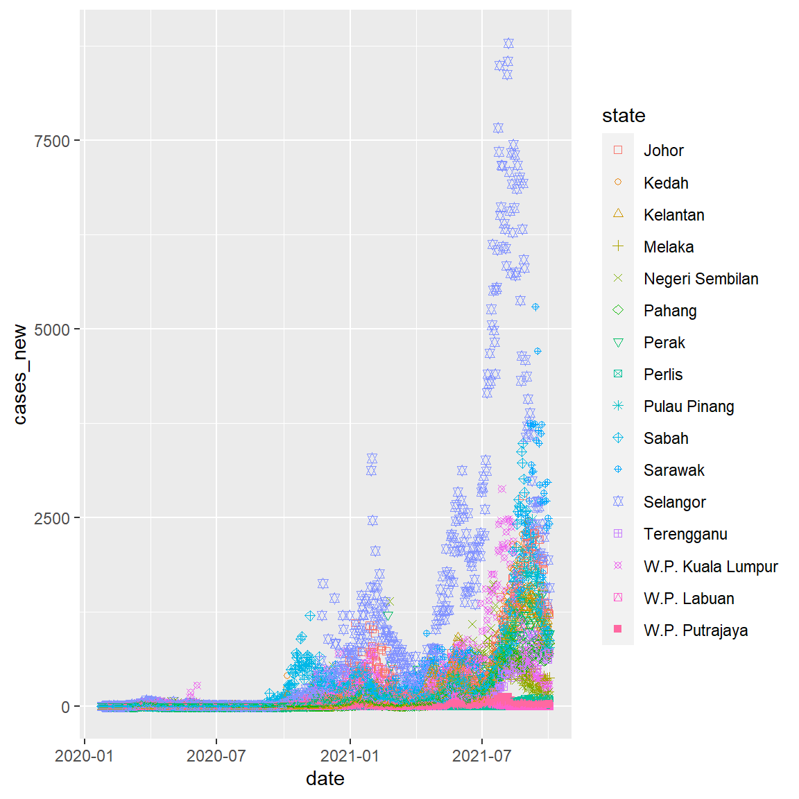
Figure 2.5: Point plot of Malaysia case data
2.3 Scales
Scales control how columns are mapped to the visual properties of the plot. Scale functions (scale_) can modify this mapping. In Figure 2.5, we changed the shape properties. In Figure 2.6, we change the y-axis scaling and slightly modify the choice of point shapes.
mysstates %>%
  ggplot(aes(x=date, y=cases_new,
             color=state, shape=state)) +
  geom_point(alpha=0.7, size = 3) +
  scale_y_continuous(breaks = seq(0, 10000, 1000)) +
scale_shape_manual(values=c(1,2,3,4,5,6,7,8,9,10,11,19,16,17,18,0)) 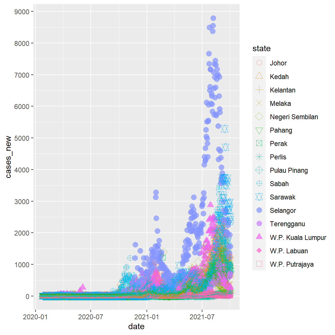
Figure 2.6: Change y-axis scale
The numbers on the y-axis now look better.
2.4 Facets
Figure 2.5 and Figure 2.6 look busy with too many columns (16 states). Facets reproduce a plot for each level of the specified column (or combination of columns). Facets functions start with facet_. In Figure 2.7, we define facets by the 16 levels of the state column.
mysstates %>%
  ggplot(aes(x=date, y=cases_new)) +
  geom_point(alpha=0.7, size = 1.5) +
  scale_y_continuous(breaks = seq(0, 10000, 1000)) +
facet_wrap(~state) 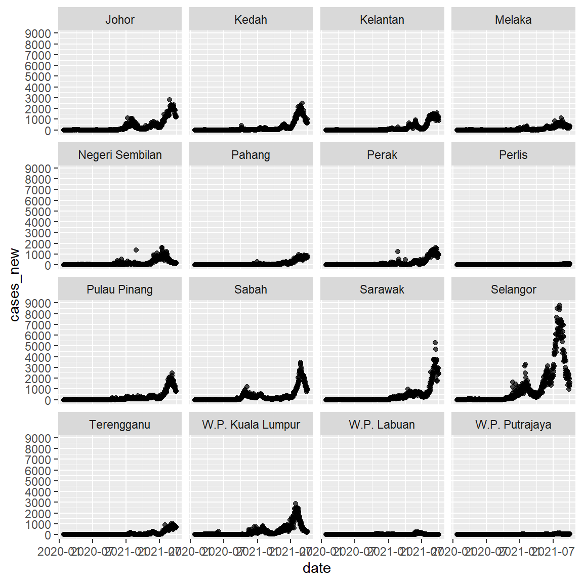
Figure 2.7: New cases by state using faceting
Facets will be used quite a lot in this book. We will explore other features of facets in Chapter 4, Chapter 5, and Chapter 6.
2.4.1 Labels
Graphs should be easy to interpret. Simple and informative labels help to achieve this goal. The labs function provides customized labels for the graph titles, subtitles, captions, axes, and legends.
mysstates %>%
  ggplot(aes(x=date, y=cases_new)) +
  geom_point(alpha=0.7, size = 0.5) +
  scale_y_continuous(breaks = seq(0, 10000, 1000)) +
  facet_wrap(~state) +
  labs(title = "New Cases in Malaysia",
       subtitle = "Facet by states",
       caption = "Fixed y-axis scales to compare the actual numbers",
       x = "Date",
       y = "New Cases")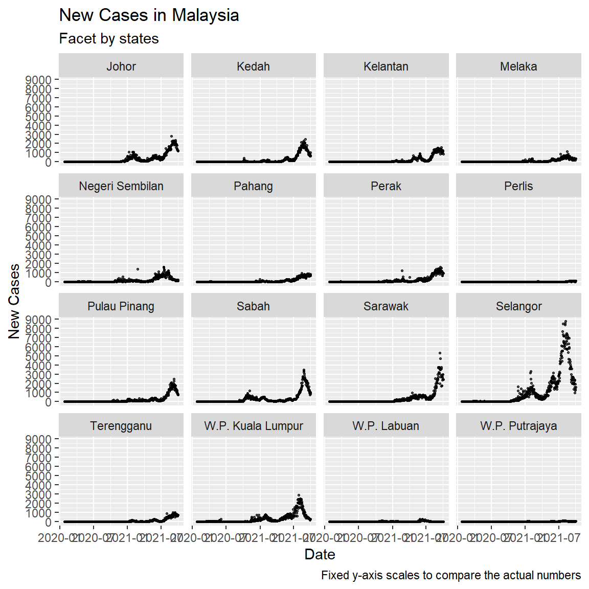
Figure 2.8: Add simple titles and labels
mysstates %>%
  ggplot(aes(x=date, y=cases_new)) +
  geom_point(alpha=0.7, size = 0.5) +
  facet_wrap(~state, scales = "free") +
  labs(title = "New Cases in Malaysia",
       subtitle = "Facet by states",
       caption = "Free y-axis scales to compare the actual trends",
       x = "Date",
       y = "New Cases")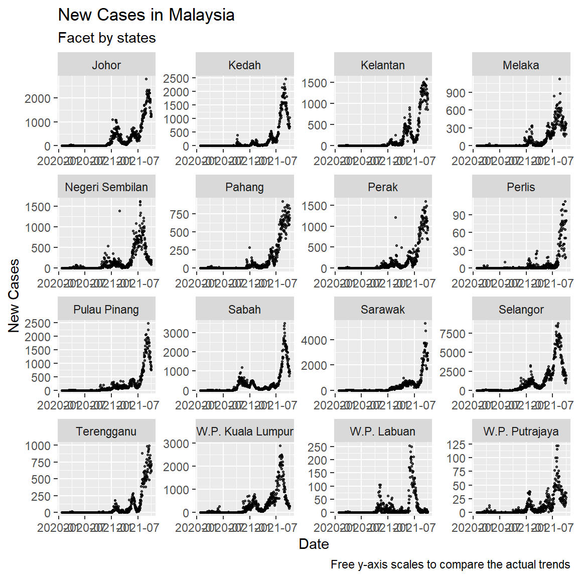
Figure 2.9: Facet with different y-axis scales
2.5 Themes
Theme related functions help fine tune non-data related features of the graph like background colors and legend placement. We show a simple example but using a different data frame, vacn, just to see initial visualizations of as many of the Malaysian Covid datasets that we have downloaded. Notice the three theme_ functions we used.
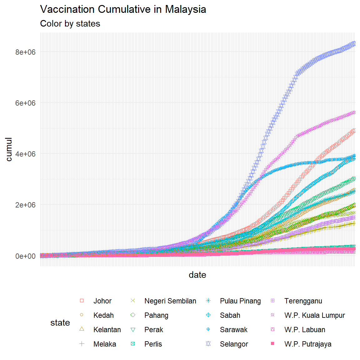
Figure 2.10: Initial point plot of Malaysia vaccination data with some theme functions
2.6 Save plot
We can use ggsave() functions to save the picture in the required format, such as “.pdf”, “.png”, etc.
p1 <- vacn %>%
  ggplot(aes(x=date, y=cumul, color=state, shape=state)) +
  geom_point() +
  scale_shape_manual(values=c(0,1,2,3,4,5,6,7,8,9,10,11,12,13,14,15)) +
  labs(title = "Vaccination Cumulative in Malaysia",
      subtitle = "Color by states") +
  theme_minimal() +
  theme(legend.position = "bottom") +
  theme(axis.text.x = element_blank())

ggsave(
  plot = p1,
  filename = "my_plot.png",
  width = 6,
  height = 6,
  dpi = 300
)
To save the current drawing, plot = p1, can be omitted. ggsave() will automatically save the most recent drawing.
mysstates %>%
  ggplot(aes(x=date, y=cases_new)) +
  geom_point(alpha=0.7, size = 0.5) +
  facet_wrap(~state, scales = "free") +
  labs(title = "New Cases in Malaysia",
       subtitle = "Facet by states",
       caption = "Free y-axis scales to compare the actual trends",
       x = "Date",
       y = "New Cases")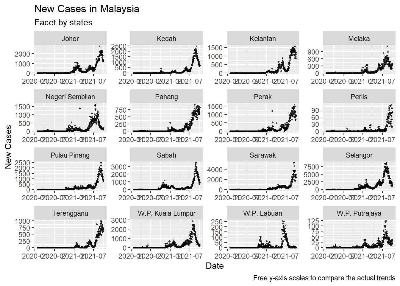
2.7 Discussion
We have briefly covered seven of the nine parts of the ggplot() function:
- Data (data box)
- Mapping
- Geometry (geom)
- Statistical transformation (stats)
- Scale
- Coordinate system (coord)
- Facet
- Theme
- Storage and output (output)
In Chapter 3, we will show some practical examples of statistical transformation and the different coordinate systems.