Chapter 12 Comparing Machine Learning Models
The purpose of this chapter is to introduce some techniques and packages in the R universe on modeling. We will learn the concepts by forecasting or predicting future scenarios of the Malaysian Covid new cases and new deaths based on the models we use. We will also compare the various machine learning models.
The purpose is to learn the techniques and processes involved by using real-world data without trying to be exact about the predictions.
12.1 Lag between a positive case and death
In the first example, we explore an interesting data science question.
- What is the lag between a positive case and a death?
- How does that vary among states?
- How has it varied as the pandemic has progressed?
This is an interesting investigation because it combines elements of time series forecasting and dependent variable prediction.
We retrofit the blog post on the relationship of COVID-19 cases to mortality57 with the Malaysian Covid data.
A function in the timetk package, tk_augment_lags, makes short work of building multiple lags. The emerging tidymodels framework58 using “list columns” is immensely powerful for this sort of thing.
Load libraries
12.1.1 Data preparation
We need to combine the new cases (mysstates), deaths (mysdeaths), vaccination (vacn), and population (popn) data frames. We will do this in deliberate steps while making small adjustments to the appropriate data columns like converting to the same case and data type.
For more efficient programming we should first check for the conditions of upper case and/or date types before converting but it will involve some if-else statements related to R programming. We want to avoid that in this book.
- Combine new cases (
mysstates), deaths (mysdeaths)
mysstates <- readRDS("data/mysstatesNov2021.rds")
mysdeaths <- readRDS("data/mysdeathsNov2021.rds")

mysstates$state <- toupper(mysstates$state)
mysdeaths$state <- toupper(mysdeaths$state)

mysstates$date <- as.Date(mysstates$date)
mysdeaths$date <- as.Date(mysdeaths$date)

mysstates %>% left_join(mysdeaths, by=c("date", "state")) -> df_raw

# use data from March 1 2020, a few days after the first lockdown
cutoff_start <- as.Date("2020-03-01")
cutoff_end <- max(df_raw$date) - 7 # discard last week since there are reporting lags

df_raw <- df_raw %>% filter(date >= cutoff_start)
df_raw <- df_raw %>% filter(date <= cutoff_end)

df_raw %>%
  select(date, state, cases_new, deaths_new, deaths_pvax, deaths_fvax) %>%
  mutate(cases_new = ifelse(is.na(cases_new), 0, cases_new),
         deaths_new = ifelse(is.na(deaths_new), 0, deaths_new),
         deaths_pvax = ifelse(is.na(deaths_pvax), 0, deaths_pvax),
         deaths_fvax = ifelse(is.na(deaths_fvax), 0, deaths_fvax)) %>%
  group_by(state) %>%
  mutate(cases_total = cumsum(cases_new),
         deaths_total = cumsum(deaths_new),
         deaths_totalpvax = cumsum(deaths_pvax),
         deaths_totalfvax = cumsum(deaths_fvax),
         state = as_factor(state)) %>%
  arrange(state,date) %>%
  group_by(state) %>%
  # smooth the data with 7 day moving average
  mutate(cases_7day = (cases_total - lag(cases_total,7))/7,
         deaths_7day = (deaths_total - lag(deaths_total,7))/7,
         deaths_pvax_7day = (deaths_totalpvax - lag(deaths_totalpvax,7))/7,
         deaths_fvax_7day = (deaths_totalfvax - lag(deaths_totalfvax,7))/7) %>%
  {.} -> mys_states
12.1.2 National analysis
Aggregate state data to national level.
mys <- mys_states %>%
  group_by(date) %>%
  summarize(across(.cols=where(is.double),
                   .fns = function(x)sum(x,na.rm = T),
                   .names="{.col}"))

mys %>% tail(15)
## # A tibble: 15 x 13
## date cases_new deaths_new deaths_pvax deaths_fvax cases_total
## <date> <dbl> <dbl> <dbl> <dbl> <dbl>
## 1 2021-11-06 4701 54 1 20 2501941
## 2 2021-11-07 4343 35 2 32 2506284
## 3 2021-11-08 4543 58 3 24 2510827
## 4 2021-11-09 5403 78 3 25 2516230
## 5 2021-11-10 6243 59 0 20 2522473
## 6 2021-11-11 6323 49 1 27 2528796
## 7 2021-11-12 6517 41 3 28 2535313
## 8 2021-11-13 5809 55 1 28 2541122
## 9 2021-11-14 5162 45 3 21 2546284
## 10 2021-11-15 5143 53 2 24 2551427
## 11 2021-11-16 5413 40 3 32 2556840
## 12 2021-11-17 6288 68 2 36 2563128
## 13 2021-11-18 6380 55 2 20 2569508
## 14 2021-11-19 6355 45 2 17 2575863
## 15 2021-11-20 5859 41 1 20 2581722
## # ... with 7 more variables: deaths_total <dbl>, deaths_totalpvax <dbl>,
## # deaths_totalfvax <dbl>, cases_7day <dbl>, deaths_7day <dbl>,
## # deaths_pvax_7day <dbl>, deaths_fvax_7day <dbl>12.1.3 Exploratory Data Analysis (EDA)
Does a simple scatter plot tell us anything about the relationship of deaths to cases?
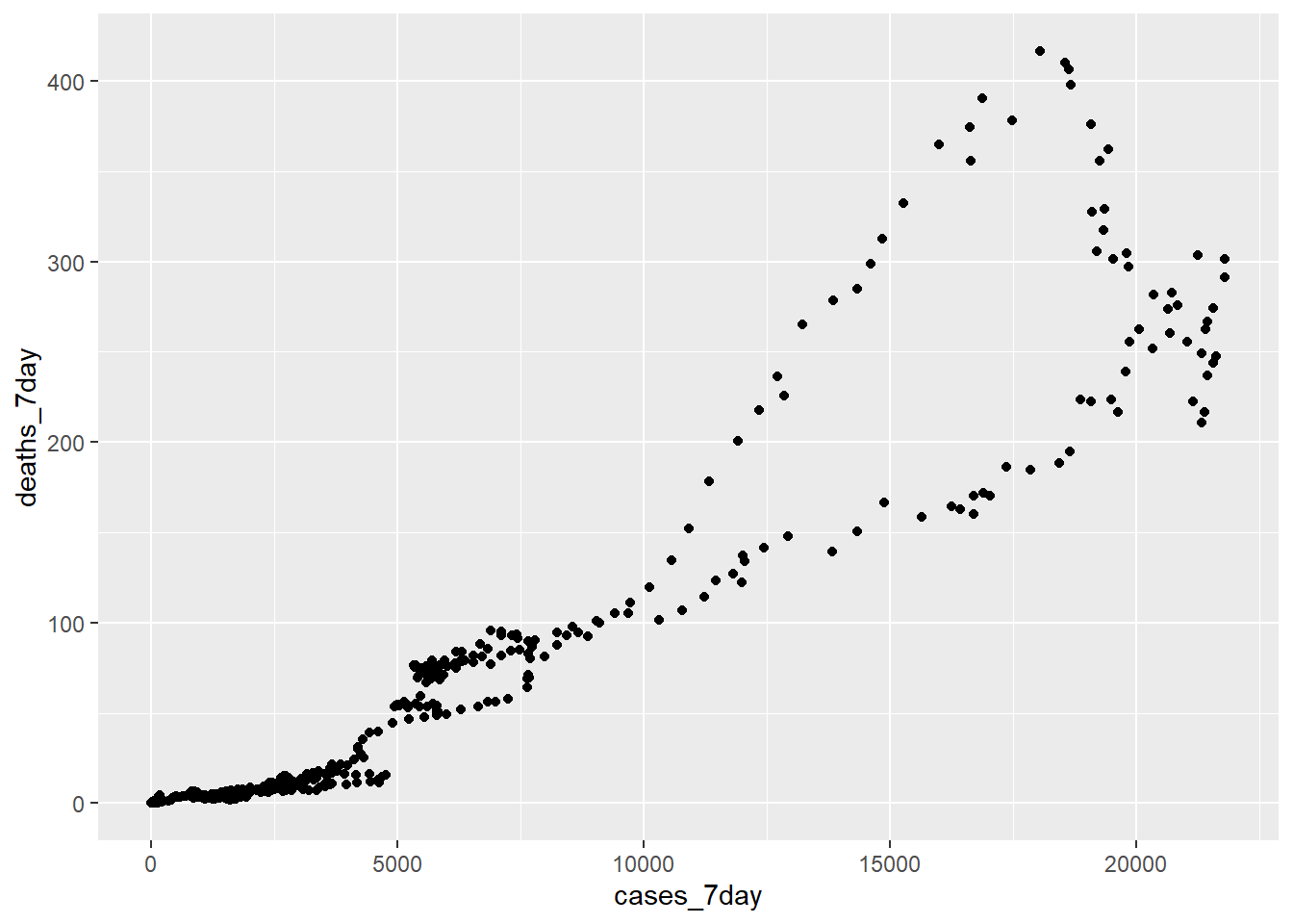
Figure 12.1: Scatter plot 7 day averages of cases and deaths
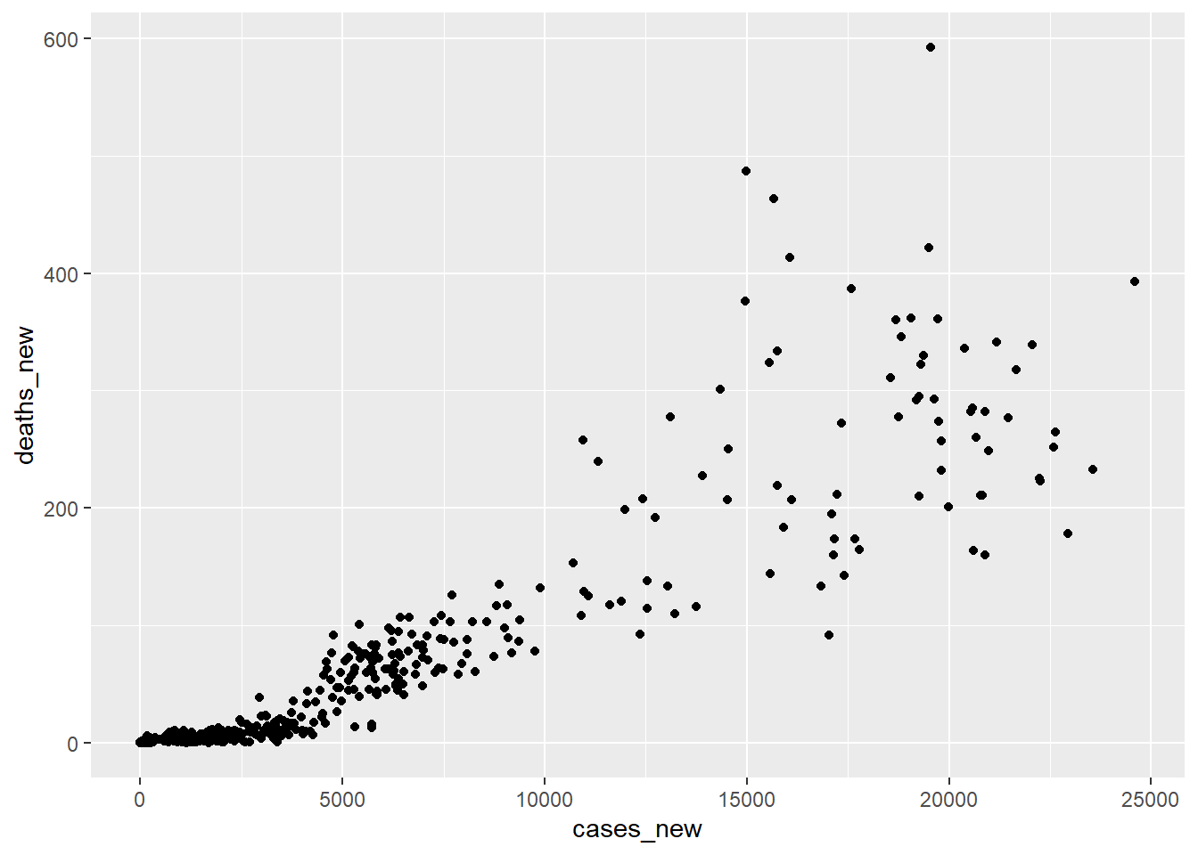
Figure 12.2: Scatter plot cases and deaths
No. The relationship of cases and deaths is strongly conditioned on time. This reflects the declining mortality rate as we have come to better understand the disease and a higher percentage of the population is vaccinated.
We can get better insight plotting smoothed deaths and cases over time. We use two different y-axes on a single plot.59 Some observations are obvious.
- When cases start to rise, deaths follow with a lag.
- Malaysia has had three spikes in cases so far and in each successive instance, the mortality rate has risen by a smaller amount. This suggests that we may be getting better at treating this disease.
We visualize the relationship between the rolling average of weekly cases and deaths.
coeff <- 50
mys %>%
  ggplot(aes(date,cases_7day)) +
  geom_line(color="darkblue") +
  theme(legend.position = "none") +
  geom_line(aes(x=date,y=deaths_7day*coeff),color="darkred") +
  scale_y_continuous(labels = scales::comma,
                     name = "Cases",
                     sec.axis = sec_axis(deaths_7day~./coeff,
                                         name="Deaths",
                                         labels = scales::comma)) +
  theme(
    axis.title.y = element_text(color = "darkblue", size=12),
    axis.title.y.right = element_text(color = "darkred", size=12)
  ) +
  labs(title =  "Malaysia Cases vs. Deaths",
       subtitle = "7-Day Average",
       caption = "Source: https://github.com/MoH-Malaysia/covid19-public",
       x = "Date")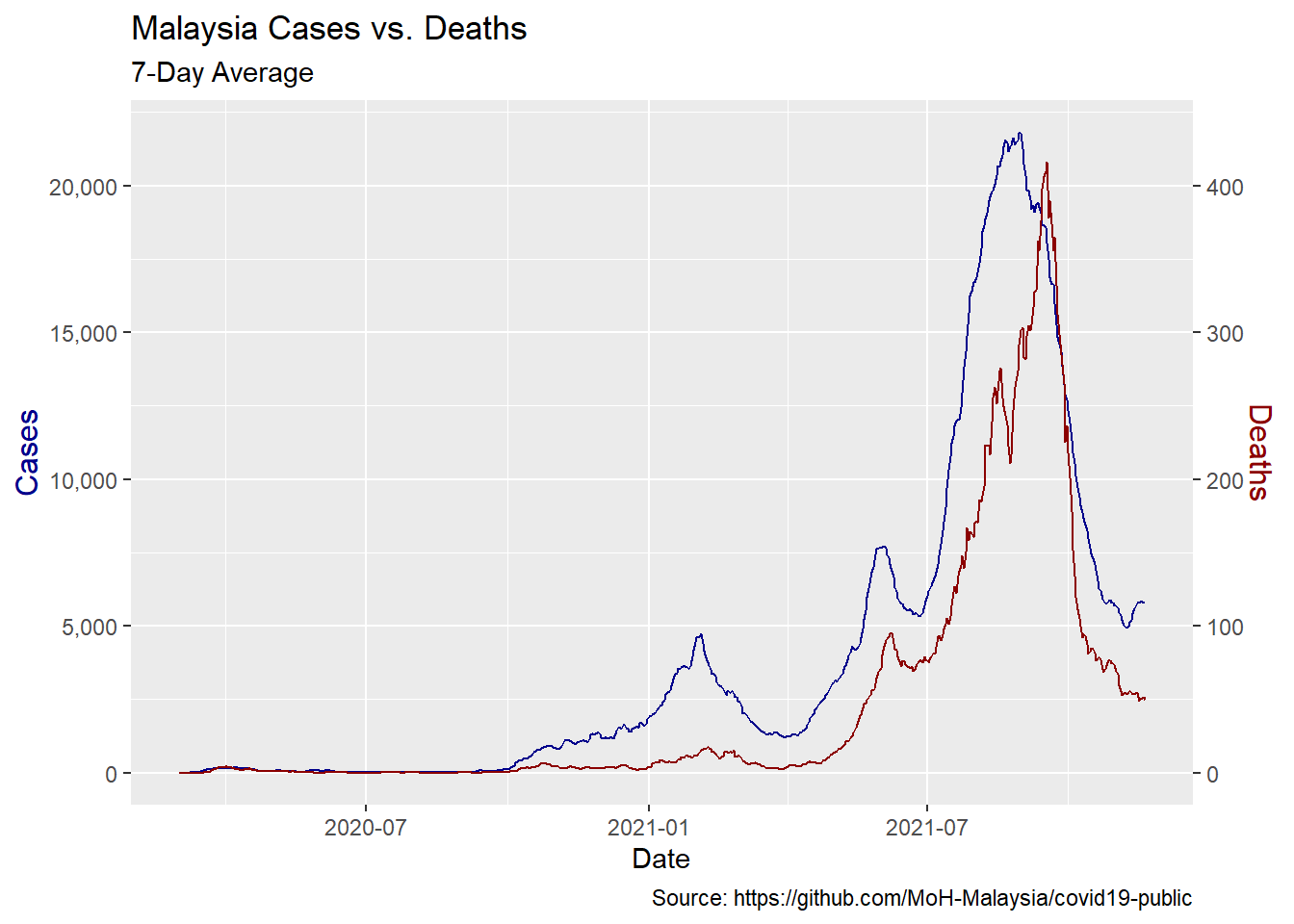
Figure 12.3: Rolling average of weekly cases and deaths
Passage of time affects deaths more than cases A simple regression of deaths vs. cases and time shows the passage of time has more explanatory power than cases in predicting deaths so we must take that into account.
## # A tibble: 3 x 5
##   term        estimate  std.error statistic   p.value
##   <chr>          <dbl>      <dbl>     <dbl>     <dbl>
## 1 (Intercept) 902.     168.            5.37 1.10e-  7
## 2 cases_7day    0.0154   0.000286     53.7  7.03e-237
## 3 date         -0.0492   0.00906      -5.43 7.88e-  8
12.1.4 Build some models
We will build regression models of deaths and varying leads (relative to deaths) of cases. We chose to lead deaths as opposed to lagging cases because it will help us to make predictions about the future of deaths given cases today. We include the date as a variable as well. After running regressions against each lead period, we chose the lead period that has the best fit (R-Squared) to the data.
The requires a lot of leads and a lot of models. R provides the tools to make this work in a simple and organized way. First we add new columns for each lead period using timetk::tk_augment_lags. This one function call does all the work but it only does lags so we have to make adjustments to get leads.
We chose to add thirty days of leads. We have about 21 months of data starting from `cutoff-start = “2020-03-01” and should have enough data points thirty days ahead. Once we have created the leads we can remove any dates for which we don’t have lead deaths.
Create columns for deaths led 0 to 30 days ahead.
max_lead <- 30
mys_lags <- mys %>%
# create lags by day
  tk_augment_lags(deaths_7day, .lags = 0:-max_lead, .names="auto")
# fix names to remove minus sign
names(mys_lags) <- names(mys_lags) %>%
  str_replace_all("lag-|lag","lead")

# use only case dates where we have complete future knowledge of deaths for all lead times.
mys_lags <- mys_lags %>%
  filter(date < cutoff_end - max_lead)

mys_lags
## # A tibble: 599 x 44
## date cases_new deaths_new deaths_pvax deaths_fvax cases_total
## <date> <dbl> <dbl> <dbl> <dbl> <dbl>
## 1 2020-03-01 4 0 0 0 4
## 2 2020-03-02 0 0 0 0 4
## 3 2020-03-03 7 0 0 0 11
## 4 2020-03-04 14 0 0 0 25
## 5 2020-03-05 5 0 0 0 30
## 6 2020-03-06 28 0 0 0 58
## 7 2020-03-07 10 0 0 0 68
## 8 2020-03-08 6 0 0 0 74
## 9 2020-03-09 18 0 0 0 92
## 10 2020-03-10 12 0 0 0 104
## # ... with 589 more rows, and 38 more variables: deaths_total <dbl>,
## # deaths_totalpvax <dbl>, deaths_totalfvax <dbl>, cases_7day <dbl>,
## # deaths_7day <dbl>, deaths_pvax_7day <dbl>, deaths_fvax_7day <dbl>,
## # deaths_7day_lead0 <dbl>, deaths_7day_lead1 <dbl>, deaths_7day_lead2 <dbl>,
## # deaths_7day_lead3 <dbl>, deaths_7day_lead4 <dbl>, deaths_7day_lead5 <dbl>,
## # deaths_7day_lead6 <dbl>, deaths_7day_lead7 <dbl>, deaths_7day_lead8 <dbl>,
## # deaths_7day_lead9 <dbl>, deaths_7day_lead10 <dbl>, ...Now we build the linear models. Since we have our lead days in columns we revert back to long-form data. For each date, we have a case count and 30 lead days with the corresponding death count. As will be seen below, the decline in the fatality rate has been non-linear, so we use a second-order polynomial to regress the date variable.
Our workflow looks like this:
- create the lags using tk_augment_lag (above).
- pivot to long-form.
- nest the data by lead day and state.
- map the data set for each lead day to a regression model.
- pull out the adjusted R-Squared using
glancefor each model to determine the best-fit lead time.
The result is a data frame with our lead times, the nested raw data, model, and R-squared for each lead time.
models <- mys_lags %>%
  ungroup %>%
  pivot_longer(cols = contains("lead"),
               names_to = "lead",
               values_to = "led_deaths") %>%
  select(date,cases_7day,lead,led_deaths) %>%
  mutate(lead = as.numeric(str_remove(lead,"deaths_7day_lead"))) %>%
  nest(data=c(date,cases_7day,led_deaths)) %>%
  # Run a regression on lagged cases and date vs deaths
  mutate(model = map(data,
                     function(df)
                       lm(led_deaths ~ cases_7day + poly(date,2), data = df)))

# Add regression coefficient
# get adjusted r squared
models <- models %>%
  mutate(adj_r = map(model,function(x) glance(x) %>%
                       pull(adj.r.squared)) %>%
           unlist)
models
## # A tibble: 31 x 4
## lead data model adj_r
## <dbl> <list> <list> <dbl>
## 1 0 <tibble [599 x 3]> <lm> 0.904
## 2 1 <tibble [599 x 3]> <lm> 0.912
## 3 2 <tibble [599 x 3]> <lm> 0.918
## 4 3 <tibble [599 x 3]> <lm> 0.923
## 5 4 <tibble [599 x 3]> <lm> 0.928
## 6 5 <tibble [599 x 3]> <lm> 0.932
## 7 6 <tibble [599 x 3]> <lm> 0.935
## 8 7 <tibble [599 x 3]> <lm> 0.937
## 9 8 <tibble [599 x 3]> <lm> 0.938
## 10 9 <tibble [599 x 3]> <lm> 0.938
## # ... with 21 more rowsWe choose the model with the highest R-squared to decide the best-fit lead time.
- show model fit by the lead time
- make predictions using the best model
best_fit <- models %>%
  summarize(adj_r = max(adj_r)) %>%
  left_join(models,by= "adj_r")

models %>%
  ggplot(aes(x = lead, y = adj_r)) +
  geom_line() +
  labs(subtitle = paste("Best fit lead =", best_fit$lead, "days"),
       title = "Model Fit By Lag Days",
       x = "Lead Time in Days for Deaths",
       y= "Adjusted R-squared")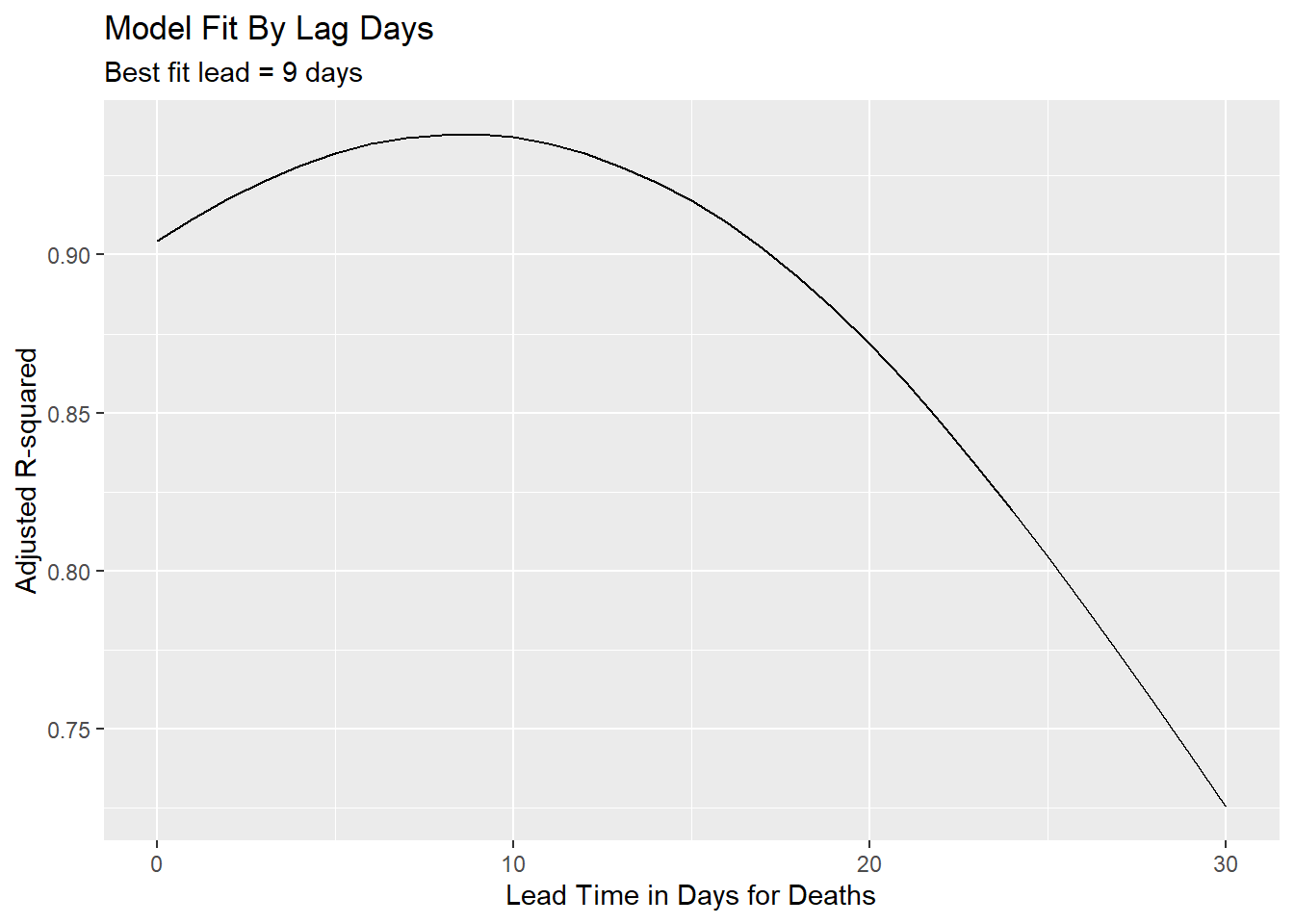
Figure 12.4: Using R-squared to decide best-fit lead time
We can have some confidence that we are not overfitting the date variable because the significance of the case count remains. With a high enough degree polynomial on the date variable, cases would vanish in importance.
## # A tibble: 4 x 5
##   term            estimate std.error statistic   p.value
##   <chr>              <dbl>     <dbl>     <dbl>     <dbl>
## 1 (Intercept)     -17.8     1.54       -11.6   5.32e- 28
## 2 cases_7day        0.0164  0.000314    52.4   6.35e-225
## 3 poly(date, 2)1 -350.     41.2         -8.48  1.76e- 16
## 4 poly(date, 2)2  -14.0    28.9         -0.484 6.29e-  1
12.1.5 Make predictions
The best-fit lead time is 9 days. We will use predict to see how well our model fits to the actual deaths.
Function to create prediction plot
show_predictions <- function(single_model,n.ahead){
  predicted_deaths = predict(single_model$model[[1]],newdata = mys)
  date = seq.Date(from=min(mys$date) + n.ahead,to=max(mys$date) + n.ahead,by=1)
  display = full_join(mys,tibble(date,predicted_deaths))

  gg <- display %>%
    pivot_longer(cols = where(is.numeric)) %>%
    filter(name %in% c("deaths_7day","predicted_deaths")) %>%
    ggplot(aes(date,value,color=name)) +
    geom_line() +
    scale_x_date(date_breaks = '1 month',
                 labels = scales::date_format("%b-%y")) +
    labs(title="Actual vs. Predicted Deaths",
         x = "Date",
         y = "Count",
         caption = "Source: https://github.com/MoH-Malaysia/covid19-public") +
    theme(axis.text.x = element_text(color = "steelblue",
                                     angle = 45, hjust = 1))
  gg
}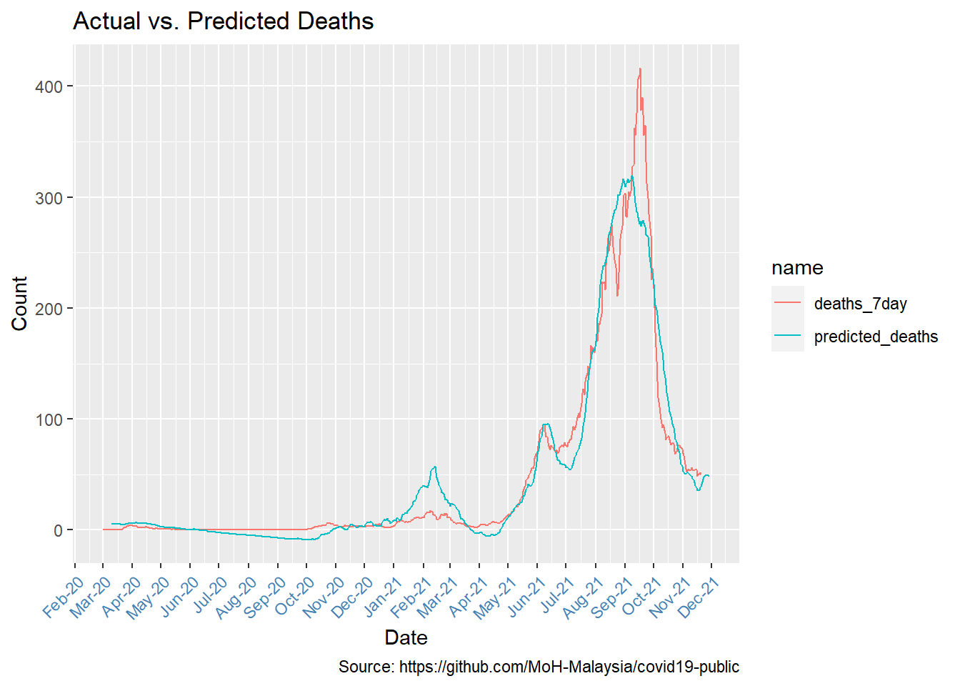
Figure 12.5: Comparing actual and predicted deaths
Figure 12.5 reflects the same shape trends with many data points visually quite close.
12.1.6 Declining mortality rate
Now that we have settled on the appropriate lag time, we can look at the fatality rate per identified case. This is but one possible measure of fatality rate, certainly not the definitive fatality rate. Testing rate, positivity rate, and other variables will affect this measure. We also assume our best-fit lag is stable over time so take the result with a grain of salt. The takeaway should be how it is declining, not exactly what it is.
Early on, the vaccination rate of the population was low. Based on Figure 10.19, we start our measure at the beginning of May 2021.
Sadly, we see that fatality rates are creeping up again.
fatality <- best_fit$data[[1]] %>%
  filter(cases_7day > 0) %>%
  filter(date >= as.Date("2021-05-01")) %>%
  mutate(rate = led_deaths/cases_7day)

fatality %>%
  ggplot(aes(x = date, y = rate)) +
  geom_line() +
  geom_smooth() +
  labs(x="Date", y="Fatality Rate",
       title = "Fatality Rate",
       subtitle = "Fatality Rate as a % of Lagged Cases Starting May 2021",
       caption = "Source: https://github.com/MoH-Malaysia/covid19-public") +
  scale_y_continuous(labels = scales::percent) +
  scale_x_date(date_breaks = '1 month',
               labels = scales::date_format("%b-%y"))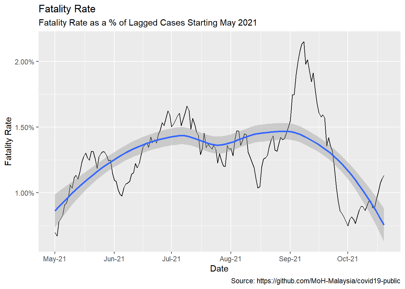
Figure 12.6: Averaged fatality rates
Figure 10.19 echoes our remark at the end of Chapter 11. As late as November 2021, in general, the visuals show that the jury is still out there on the effectiveness of Covid vaccinations in preventing Covid deaths.
12.1.7 State level analysis
One problem with the model for Malaysia at the national level is that each state saw the arrival of the virus at different times. Also the vaccination rate for each state is different as shown in Figure 10.1, Figure 10.2, and Figure 10.3. These suggest there might also be different relationships between cases and deaths. Looking at a few selected states illustrates this.
state_subset <- c("SELANGOR","JOHOR","SABAH",
                  "SARAWAK", "KELANTAN", "MELAKA")

# illustrate selected states
mys_states %>%
  filter(state %in% state_subset) %>%
  ggplot(aes(x = date, y = cases_7day)) +
  geom_line(color="darkblue") +
  facet_wrap(~state, scales = "free") +
  theme(legend.position = "none") +
  geom_line(aes(y = deaths_7day*coeff), color="darkred") +
  scale_y_continuous(labels = scales::comma,
                     name = "Cases",
                     sec.axis = sec_axis(deaths_7day~./coeff,
                                         name="Deaths",
                                         labels = scales::comma)) +
  theme(axis.title.y = element_text(color = "darkblue", size=12),
        axis.title.y.right = element_text(color = "darkred", size=12)) +
  labs(title =  "Malaysia Cases vs. Deaths",
       subtitle = "7-Day Average for selected states",
       caption = "Source: https://github.com/MoH-Malaysia/covid19-public",
       x = "Date")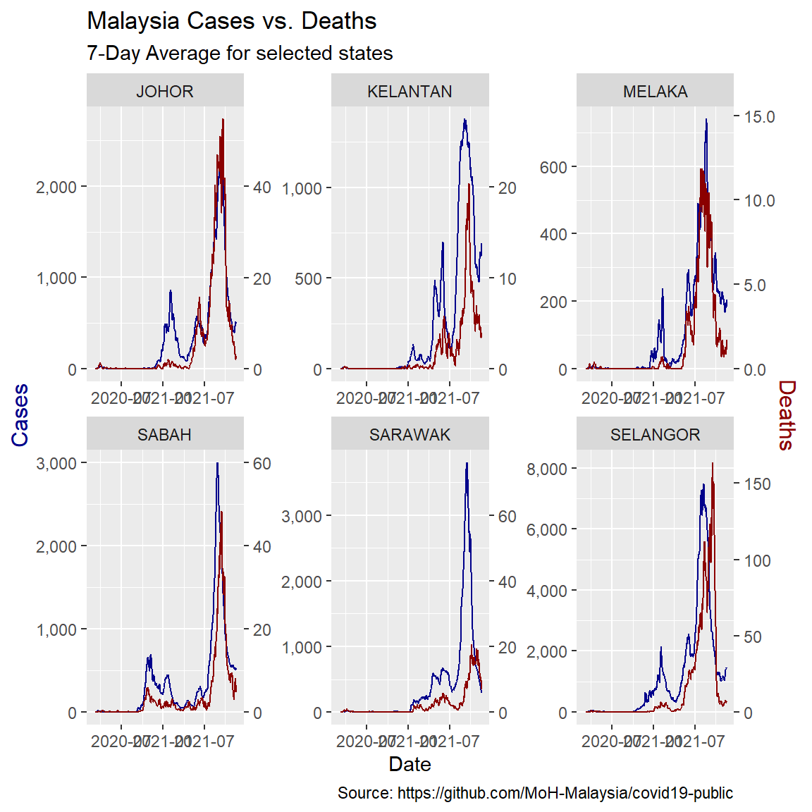
Figure 12.7: Comparing selected states
12.1.8 Run state models
Now we can run the same workflow we used above over the state-by-state data. Our data set is much larger because we have a full set of lags for each state but building our data frame of list columns is just as easy.
# create lags
mys_states_lags <- mys_states %>%
  # create lags by day
  tk_augment_lags(deaths_7day, .lags = -max_lead:0, .names="auto") %>%
  {.}
# fix names to remove minus sign
names(mys_states_lags) <- names(mys_states_lags) %>%
  str_replace_all("lag-","lead")

# make long form to nest
# initialize models data frame
models_st <- mys_states_lags %>%
  ungroup %>%
  pivot_longer(cols = contains("lead"),
               names_to = "lead",
               values_to = "led_deaths") %>%
  select(state, date, cases_7day, lead, led_deaths) %>%
  mutate(lead = as.numeric(str_remove(lead,"deaths_7day_lead"))) %>%
  {.}

# make separate tibbles for each regression
models_st <- models_st %>%
  nest(data=c(date, cases_7day,led_deaths)) %>%
  arrange(lead)

#Run a linear regression on lagged cases and date vs deaths
models_st <- models_st %>%
  mutate(model = map(data,
                     function(df)
                       lm(led_deaths ~ cases_7day + poly(date,2), data = df)))


# Add regression coefficient
# get adjusted r squared
models_st <- models_st %>%
  mutate(adj_r = map(model,function(x) glance(x) %>%
                       pull(adj.r.squared)) %>%
           unlist)

models_st %>%
#  filter(state %in% state_subset) %>%
  ggplot(aes(x = lead, y = adj_r)) +
  geom_line() +
  facet_wrap(~state) +
  labs(title = "Best Fit Lead Time",
       caption = "Source: https://github.com/MoH-Malaysia/covid19-public")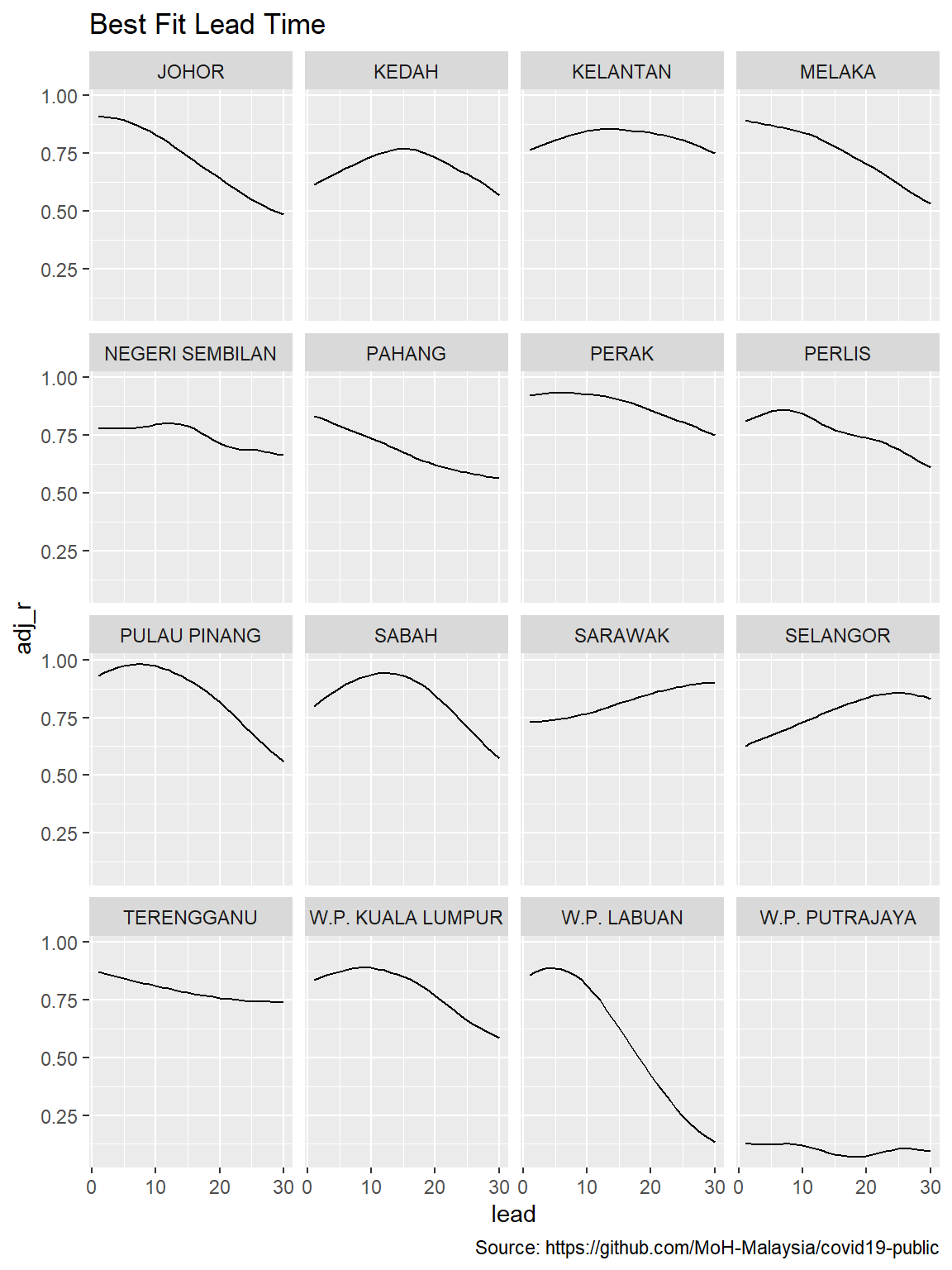
Figure 12.8: Lead times for states
To see how the fit looks for the data set as a whole we look at a histogram of all the state R-squareds. We see many of the state models have a worse accuracy than the national model.
# best fit lag by state
best_fit_st <- models_st %>%
  group_by(state) %>%
  summarize(adj_r = max(adj_r)) %>%
  left_join(models_st)

best_fit_st %>%
  ggplot(aes(adj_r)) +
  geom_histogram(bins = 30, color="white") +
  geom_vline(xintercept = best_fit$adj_r[[1]], color="darkred") +
  annotate(geom="text", x = 0.75, y = 18,
           label="Adj-R in Malaysia National Model") +
  labs(y = "State Count",
       x = "Adjusted R-Squared",
       title = "Goodness of Fit of State Models",
       caption = "Source: https://github.com/MoH-Malaysia/covid19-public")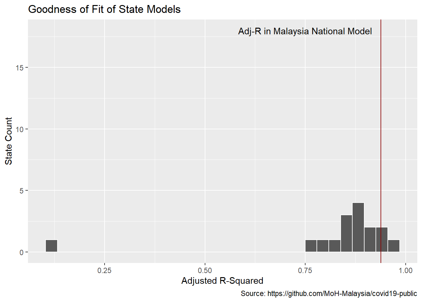
Figure 12.9: Lead times distribution for states
There are vast differences in the best-fit lead times across the states.
best_fit_st %>%
  ggplot(aes(lead)) +
  geom_histogram(binwidth = 1,color="white") +
  scale_y_continuous(labels = scales::label_number(accuracy = 1)) +
  geom_vline(xintercept = best_fit$lead[[1]],color="darkred") +
  annotate(geom="text", x = best_fit$lead[[1]] + 7,
           y = 10,
           label="Lead in Malaysian National Model") +
  labs(y = "State Count",
       x = "Best Fit Model Days from Case to Death",
       title = "COVID-19 Lag Time From Cases to Death")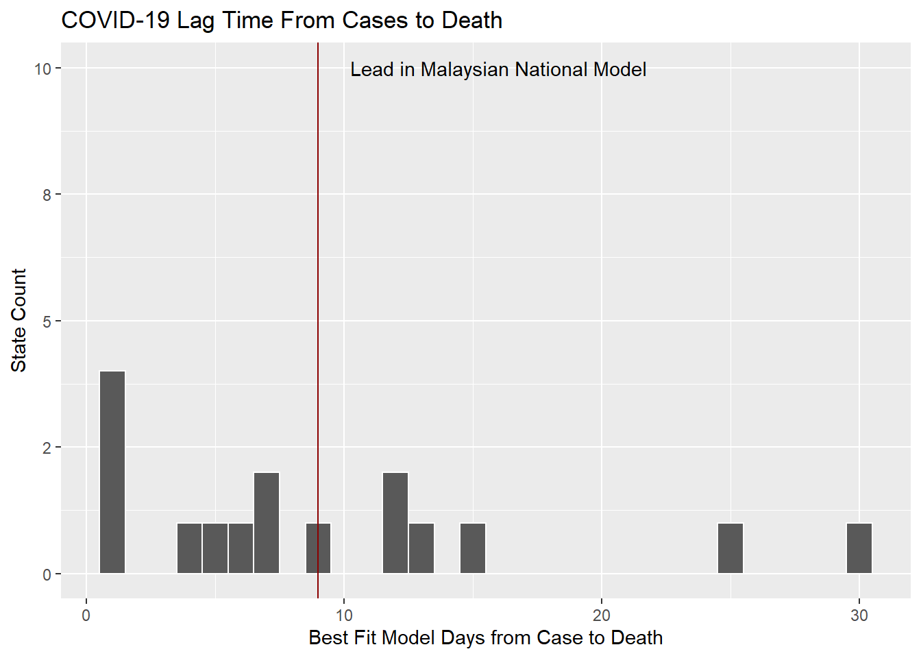
Figure 12.10: Lag times distribution for states
12.1.9 Discussion
For a data analyst, the challenge is the evolving relationship of all of the disparate data. Here we have gotten some insight into the duration between a positive case and mortality. We cannot have high confidence that our proxy model using aggregate cases is strictly accurate because the longitudinal data from many states show a different lag. We have seen that mortality has been declining but our model suggests that death will nonetheless surge along with the surge in cases.
12.2 Forecasting With tidymodels
We test a few models from the tidymodels package. The tidymodels framework is a collection of packages for modeling and machine learning using tidyverse principles.60 with the Malaysian Covid data. We adapt from a similar work using the Our World in Data.61
We load the following libraries.
library(tidyverse)
library(tidymodels)
library(modeltime)
library(timetk)
library(lubridate)
# library(readr)
# library(dplyr)
# library(tidyr)
library(glmnet)
library(randomForest)
12.2.1 Malaysian data on COVID-19 new cases
We start with the Covid daily time series data set that includes new daily cases. We simplify the data set to a univariate time series with columns, date and value. We continue with the mys data frame.
mys <- readRDS("data/mys.rds")

data_daily <- mys %>%
  select(date, cases_new) %>%
  drop_na(cases_new)

mys_cases <- aggregate(data_daily$cases_new, by=list(date=data_daily$date), FUN=sum)

mys_cases_tbl <- mys_cases %>%
  select(date, x) %>%
  rename(value = x)

mys_cases_tbl$date <- as.Date(mys_cases_tbl$date, format = "%Y-%m-%d")
mys_cases_tbl <- mys_cases_tbl %>%
  filter(date >= as.Date("2020-03-01"))

mys_cases_tbl <- as_tibble(mys_cases_tbl)
mys_cases_tbl
## # A tibble: 630 x 2
## date value
## <date> <dbl>
## 1 2020-03-01 4
## 2 2020-03-02 0
## 3 2020-03-03 7
## 4 2020-03-04 14
## 5 2020-03-05 5
## 6 2020-03-06 28
## 7 2020-03-07 10
## 8 2020-03-08 6
## 9 2020-03-09 18
## 10 2020-03-10 12
## # ... with 620 more rows12.2.2 Show COVID-19 new daily cases
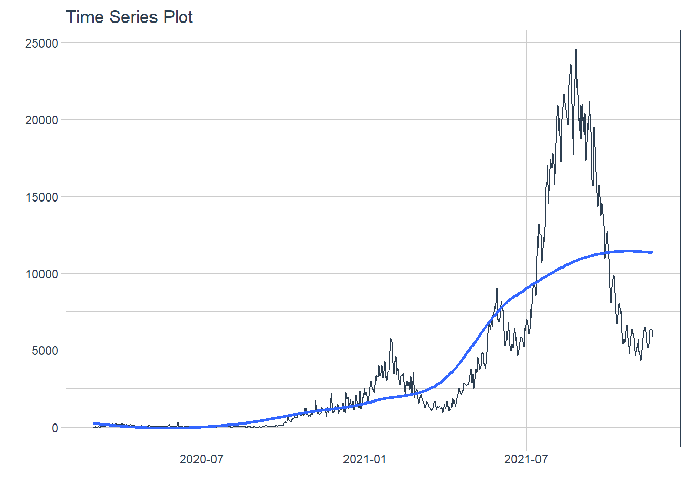
Figure 12.11: New daily cases
12.2.3 Training and test data
We split the time series data into training and testing sets. We use the last 5 days of data as the testing set.
splits <- mys_cases_tbl %>%
  time_series_split(assess = "5 days", cumulative = TRUE)

# Using date_var: date
splits %>%
  tk_time_series_cv_plan() %>%
  plot_time_series_cv_plan(date, value, .interactive = FALSE)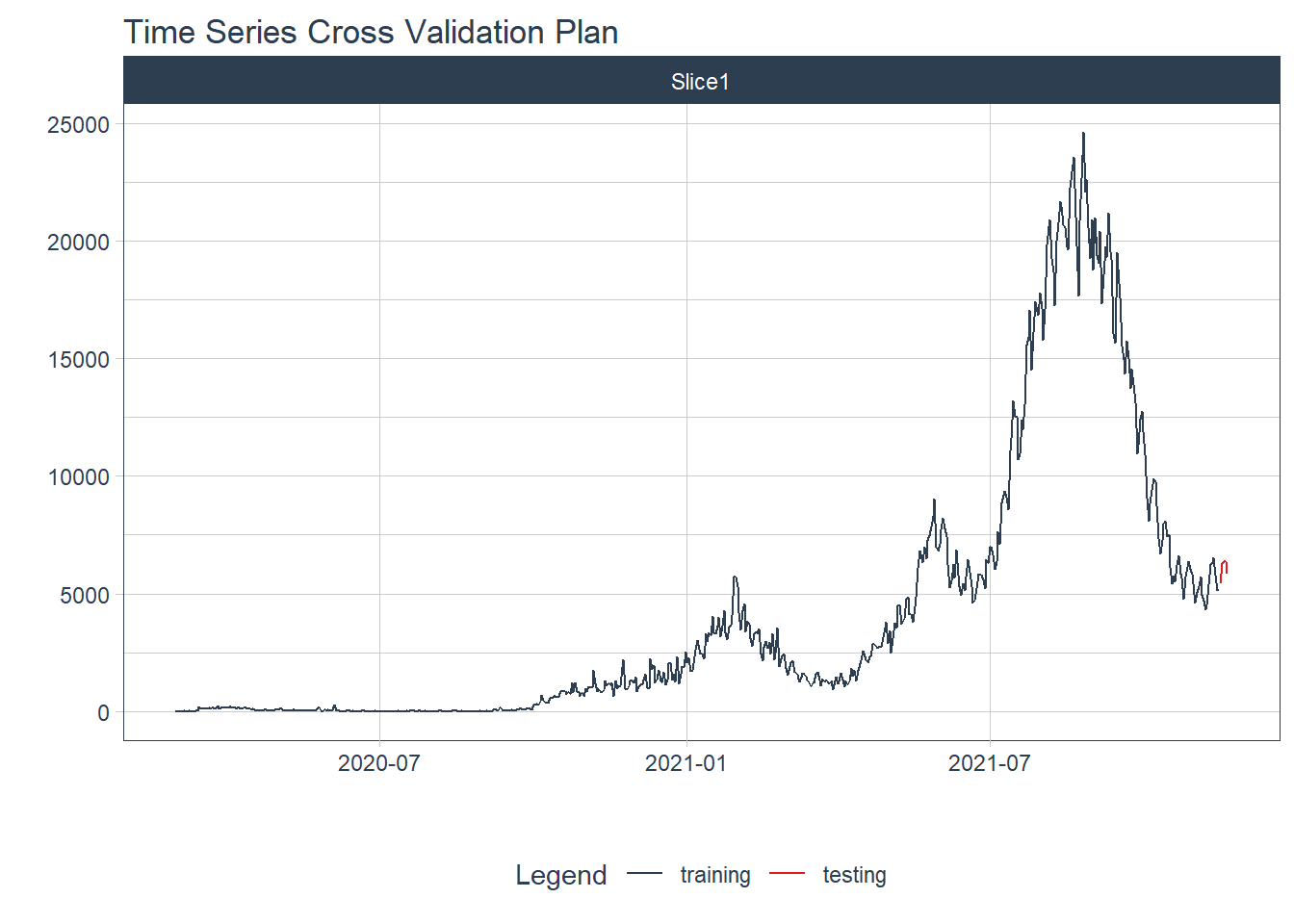
Figure 12.12: New daily training and test cases split
12.2.4 Modeling
We test several models to illustrate the process.
12.2.4.1 Auto ARIMA
ARIMA (auto-regressive integrated moving average) is a commonly used technique utilized to fit time series data and forecasting. It is a generalized version of ARMA (auto-regressive moving average) process, where the ARMA process is applied for a differenced version of the data rather than original.62
Auto Arima Model fitting process
model_fit_arima <- arima_reg() %>%
  set_engine("auto_arima") %>%
  fit(value ~ date, training(splits))
# frequency = 7 observations per 1 week
model_fit_arima
## parsnip model object
##
## Fit time: 880ms
## Series: outcome
## ARIMA(5,1,0)(1,0,2)[7]
##
## Coefficients:
## ar1 ar2 ar3 ar4 ar5 sar1 sma1 sma2
## -0.2950 -0.1350 -0.1495 -0.1610 0.1491 0.8989 -0.7244 0.1173
## s.e. 0.0417 0.0431 0.0438 0.0453 0.0412 0.0322 0.0531 0.0462
##
## sigma^2 estimated as 304649: log likelihood=-4823.28
## AIC=9664.56 AICc=9664.85 BIC=9704.4912.2.4.2 Machine Learning models
Pre-processing Recipe63
recipe_spec <- recipe(value ~ date, training(splits)) %>%
  step_timeseries_signature(date) %>%
  step_rm(contains("am.pm"), contains("hour"), contains("minute"),
          contains("second"), contains("xts")) %>%
  step_fourier(date, period = 365, K = 5) %>%
  step_dummy(all_nominal())

recipe_spec %>%
  prep() %>%
  juice()
## # A tibble: 625 x 47
## date value date_index.num date_year date_year.iso date_half
## <date> <dbl> <dbl> <int> <int> <int>
## 1 2020-03-01 4 1583020800 2020 2020 1
## 2 2020-03-02 0 1583107200 2020 2020 1
## 3 2020-03-03 7 1583193600 2020 2020 1
## 4 2020-03-04 14 1583280000 2020 2020 1
## 5 2020-03-05 5 1583366400 2020 2020 1
## 6 2020-03-06 28 1583452800 2020 2020 1
## 7 2020-03-07 10 1583539200 2020 2020 1
## 8 2020-03-08 6 1583625600 2020 2020 1
## 9 2020-03-09 18 1583712000 2020 2020 1
## 10 2020-03-10 12 1583798400 2020 2020 1
## # ... with 615 more rows, and 41 more variables: date_quarter <int>,
## # date_month <int>, date_day <int>, date_wday <int>, date_mday <int>,
## # date_qday <int>, date_yday <int>, date_mweek <int>, date_week <int>,
## # date_week.iso <int>, date_week2 <int>, date_week3 <int>, date_week4 <int>,
## # date_mday7 <int>, date_sin365_K1 <dbl>, date_cos365_K1 <dbl>,
## # date_sin365_K2 <dbl>, date_cos365_K2 <dbl>, date_sin365_K3 <dbl>,
## # date_cos365_K3 <dbl>, date_sin365_K4 <dbl>, date_cos365_K4 <dbl>, ...With a recipe, we can set up our machine learning pipelines.
12.2.4.3 Elastic Net
Glmnet is a package that fits generalized linear and similar models via penalized maximum likelihood. Glmnet stands for Lasso and Elastic-Net Regularized Generalized Linear Models.
Fitted workflow
12.2.4.4 Random Forest
Random Forest is an ensembling machine learning algorithm that works by creating multiple decision trees and then combining the output generated by each of the decision trees. It combines the output of multiple decision trees and then finally comes up with its own output.
Fit a Random Forest
12.2.5 Model evaluation and selection
We organize the models with IDs and create some generic descriptions.
## # Modeltime Table
## # A tibble: 3 x 3
##   .model_id .model     .model_desc
##       <int> <list>     <chr>
## 1         1 <fit[+]>   ARIMA(5,1,0)(1,0,2)[7]
## 2         2 <workflow> GLMNET
## 3         3 <workflow> RANDOMFOREST
12.2.6 Calibration
We quantify errors and estimate confidence intervals.
## # Modeltime Table
## # A tibble: 3 x 5
##   .model_id .model     .model_desc            .type .calibration_data
##       <int> <list>     <chr>                  <chr> <list>
## 1         1 <fit[+]>   ARIMA(5,1,0)(1,0,2)[7] Test  <tibble [5 x 4]>
## 2         2 <workflow> GLMNET                 Test  <tibble [5 x 4]>
## 3         3 <workflow> RANDOMFOREST           Test  <tibble [5 x 4]>
12.2.7 Forecast (Testing set)
We visualize the testing predictions (forecast).
calibration_table %>%
  modeltime_forecast(actual_data = mys_cases_tbl) %>%
  plot_modeltime_forecast(.interactive = FALSE)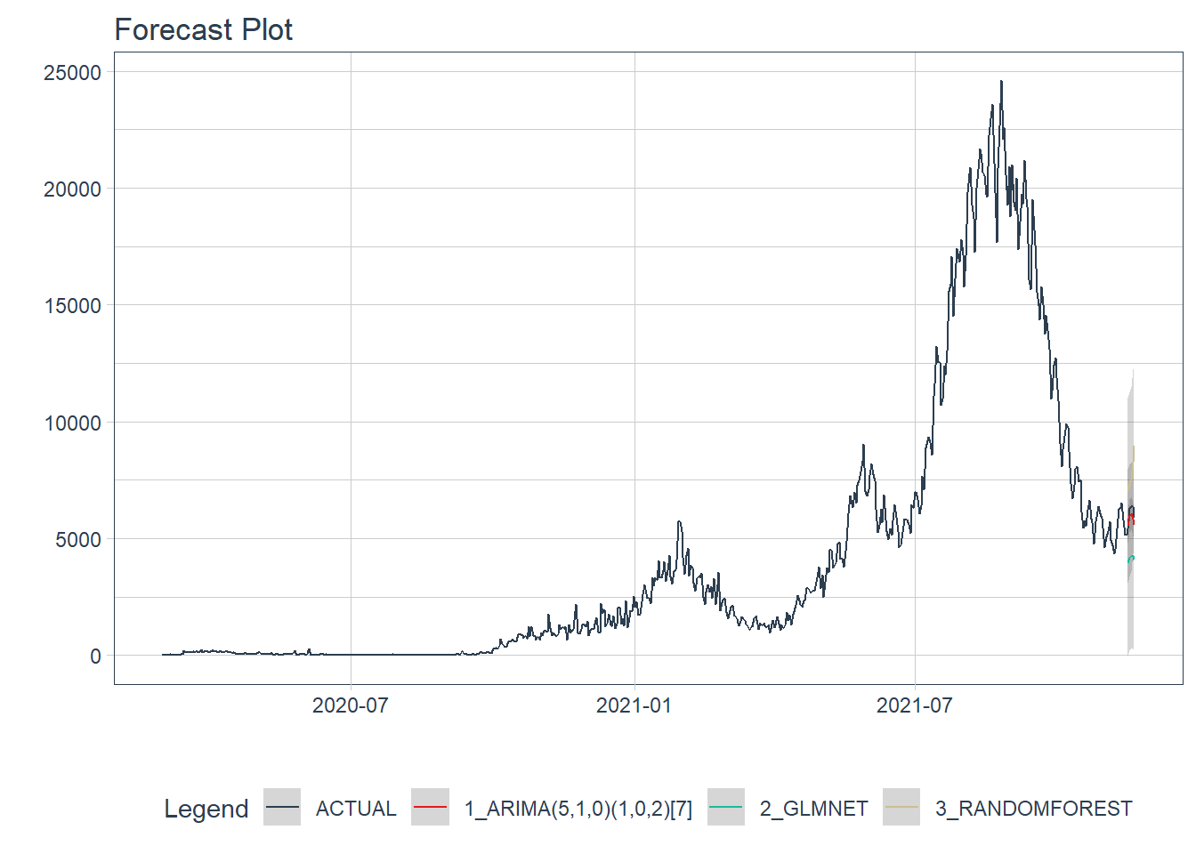
Figure 12.13: New daily cases forecast of the test data
Figure 12.13 shows quite a large error from the three models. In Figure 12.15 and Figure 12.16 we will see the errors from each model separately.
12.2.8 Accuracy (Testing set)
We calculate the testing accuracy to compare the models. The choice of which metrics to examine can be critical.64 For example, a common metric for regression models is the root mean squared error (RMSE) which measures accuracy. Lower RMSE values indicate a better fit for the data.
| Accuracy Table | ||||||||
|---|---|---|---|---|---|---|---|---|
| .model_id | .model_desc | .type | mae | mape | mase | smape | rmse | rsq |
| 1 | ARIMA(5,1,0)(1,0,2)[7] | Test | 311.59 | 5.04 | 0.84 | 5.19 | 340.14 | 0.80 |
| 2 | GLMNET | Test | 1909.66 | 31.36 | 5.13 | 37.25 | 1928.21 | 0.95 |
| 3 | RANDOMFOREST | Test | 1761.17 | 29.45 | 4.73 | 25.13 | 1910.80 | 0.02 |
12.2.9 Analyze results
From the accuracy measures and forecast results, we see that:
- RANDOMFOREST model is not a good fit for this data.
- The model with the lowest
rmseis ARIMA.
We exclude the RANDOMFOREST from our final model, then make future forecasts with the remaining models.
12.2.10 Refit and forecast forward
calibration_table %>%
  # Remove RANDOMFOREST model with low accuracy
  filter(.model_id != 3) %>%

  # Refit and Forecast Forward
  modeltime_refit(mys_cases_tbl) %>%
  modeltime_forecast(h = "3 months", actual_data = mys_cases_tbl) %>%
  plot_modeltime_forecast(.interactive = FALSE,
                          .title = "Compare all models forecast Plot",
                          .y_lab = "New daily cases")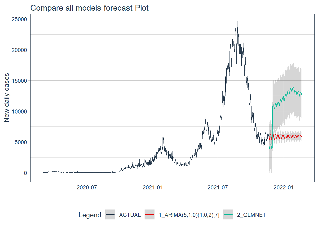
Figure 12.14: Forecast by all models of the test data
Figure 12.14 shows that the ARIMA model may have a better forecast compared to GLMNET.
12.2.11 ARIMA model forecast
We use ARIMA to forecast for the next 3 months.
calibration_table %>%
  filter(.model_id == 1) %>%
  # Refit and Forecast Forward
  modeltime_refit(mys_cases_tbl) %>%
  modeltime_forecast(h = "3 months", actual_data = mys_cases_tbl) %>%
  plot_modeltime_forecast(.interactive = FALSE,
                          .title = "ARIMA model forecast Plot",
                          .y_lab = "New daily cases")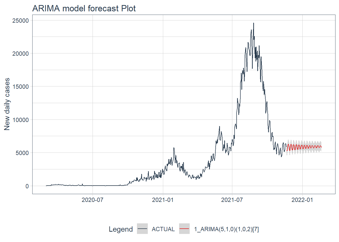
Figure 12.15: ARIMA model forecast of the test data
12.2.12 GLMNET model forecast
We use GLMNET to forecast for the next 3 months.
calibration_table %>%
  filter(.model_id == 2) %>%
  # Refit and Forecast Forward
  modeltime_refit(mys_cases_tbl) %>%
  modeltime_forecast(h = "3 months", actual_data = mys_cases_tbl) %>%
  plot_modeltime_forecast(.interactive = FALSE,
                          .title = "GLMNET model forecast Plot",
                          .y_lab = "New daily cases")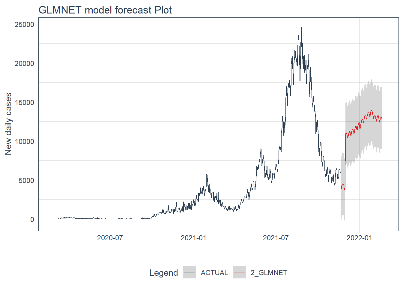
Figure 12.16: GLMNET model forecast of the test data
Figure 12.15 and Figure 12.16 confirm the bigger fluctuations in errors for the GLMNET model prediction.
12.3 Repeat for deaths
We repeat the same steps for new daily deaths using the same mys data frame.
data_daily <- mys %>%
  select(date, deaths_new) %>%
  drop_na(deaths_new)

mys_deaths <- aggregate(data_daily$deaths_new, by=list(date=data_daily$date), FUN=sum)

mys_deaths_tbl <- mys_deaths %>%
  select(date, x) %>%
  rename(value = x)

mys_deaths_tbl$date <- as.Date(mys_deaths_tbl$date, format = "%Y-%m-%d")
mys_deaths_tbl <- mys_deaths_tbl[mys_deaths_tbl[["date"]] >= "2020-03-01", ]

mys_deaths_tbl <- as_tibble(mys_deaths_tbl)
mys_deaths_tbl
## # A tibble: 630 x 2
## date value
## <date> <dbl>
## 1 2020-03-01 0
## 2 2020-03-02 0
## 3 2020-03-03 0
## 4 2020-03-04 0
## 5 2020-03-05 0
## 6 2020-03-06 0
## 7 2020-03-07 0
## 8 2020-03-08 0
## 9 2020-03-09 0
## 10 2020-03-10 0
## # ... with 620 more rows12.3.1 Show COVID-19 new daily deaths
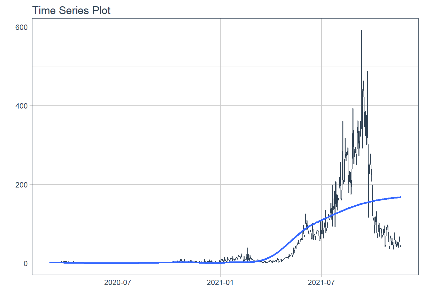
Figure 12.17: New daily deaths
12.3.2 Training and test data
We split the time series data into training and testing sets. We use the last 5 days of data as the testing set.
splits <- mys_deaths_tbl %>%
  time_series_split(assess = "5 days", cumulative = TRUE)

# Using date_var: date
splits %>%
  tk_time_series_cv_plan() %>%
  plot_time_series_cv_plan(date, value, .interactive = FALSE)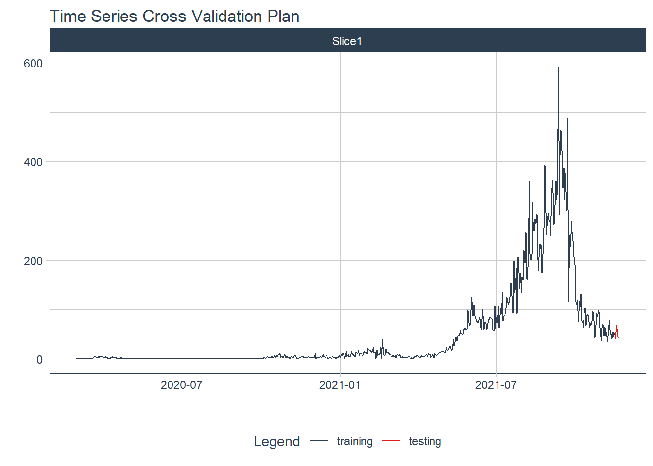
Figure 12.18: New daily training and test deaths split
12.3.3 Modeling
We test several models to illustrate the process.
12.3.3.1 Auto ARIMA
Auto Arima Model fitting process
model_fit_arima <- arima_reg() %>%
  set_engine("auto_arima") %>%
  fit(value ~ date, training(splits))
## frequency = 7 observations per 1 week
model_fit_arima
## parsnip model object
##
## Fit time: 360ms
## Series: outcome
## ARIMA(1,1,2)
##
## Coefficients:
## ar1 ma1 ma2
## 0.8476 -1.6072 0.6962
## s.e. 0.0559 0.0564 0.0405
##
## sigma^2 estimated as 644: log likelihood=-2902.28
## AIC=5812.56 AICc=5812.62 BIC=5830.312.3.3.2 Machine Learning models
Pre-processing Recipe
recipe_spec <- recipe(value ~ date, training(splits)) %>%
  step_timeseries_signature(date) %>%
  step_rm(contains("am.pm"), contains("hour"), contains("minute"),
          contains("second"), contains("xts")) %>%
  step_fourier(date, period = 365, K = 5) %>%
  step_dummy(all_nominal())

recipe_spec %>%
  prep() %>%
  juice()
## # A tibble: 625 x 47
## date value date_index.num date_year date_year.iso date_half
## <date> <dbl> <dbl> <int> <int> <int>
## 1 2020-03-01 0 1583020800 2020 2020 1
## 2 2020-03-02 0 1583107200 2020 2020 1
## 3 2020-03-03 0 1583193600 2020 2020 1
## 4 2020-03-04 0 1583280000 2020 2020 1
## 5 2020-03-05 0 1583366400 2020 2020 1
## 6 2020-03-06 0 1583452800 2020 2020 1
## 7 2020-03-07 0 1583539200 2020 2020 1
## 8 2020-03-08 0 1583625600 2020 2020 1
## 9 2020-03-09 0 1583712000 2020 2020 1
## 10 2020-03-10 0 1583798400 2020 2020 1
## # ... with 615 more rows, and 41 more variables: date_quarter <int>,
## # date_month <int>, date_day <int>, date_wday <int>, date_mday <int>,
## # date_qday <int>, date_yday <int>, date_mweek <int>, date_week <int>,
## # date_week.iso <int>, date_week2 <int>, date_week3 <int>, date_week4 <int>,
## # date_mday7 <int>, date_sin365_K1 <dbl>, date_cos365_K1 <dbl>,
## # date_sin365_K2 <dbl>, date_cos365_K2 <dbl>, date_sin365_K3 <dbl>,
## # date_cos365_K3 <dbl>, date_sin365_K4 <dbl>, date_cos365_K4 <dbl>, ...With a recipe, we can set up our machine learning pipelines.
12.3.3.3 Elastic Net
Fitted workflow
12.3.4 Model evaluation and selection
We organize the models with IDs and create some generic descriptions.
## # Modeltime Table
## # A tibble: 3 x 3
##   .model_id .model     .model_desc
##       <int> <list>     <chr>
## 1         1 <fit[+]>   ARIMA(1,1,2)
## 2         2 <workflow> GLMNET
## 3         3 <workflow> RANDOMFOREST
12.3.5 Calibration
We quantify errors and estimate confidence intervals.
## # Modeltime Table
## # A tibble: 3 x 5
##   .model_id .model     .model_desc  .type .calibration_data
##       <int> <list>     <chr>        <chr> <list>
## 1         1 <fit[+]>   ARIMA(1,1,2) Test  <tibble [5 x 4]>
## 2         2 <workflow> GLMNET       Test  <tibble [5 x 4]>
## 3         3 <workflow> RANDOMFOREST Test  <tibble [5 x 4]>
12.3.6 Forecast (Testing set)
We visualize the testing predictions (forecast).
calibration_table %>%
  modeltime_forecast(actual_data = mys_deaths_tbl) %>%
  plot_modeltime_forecast(.interactive = FALSE)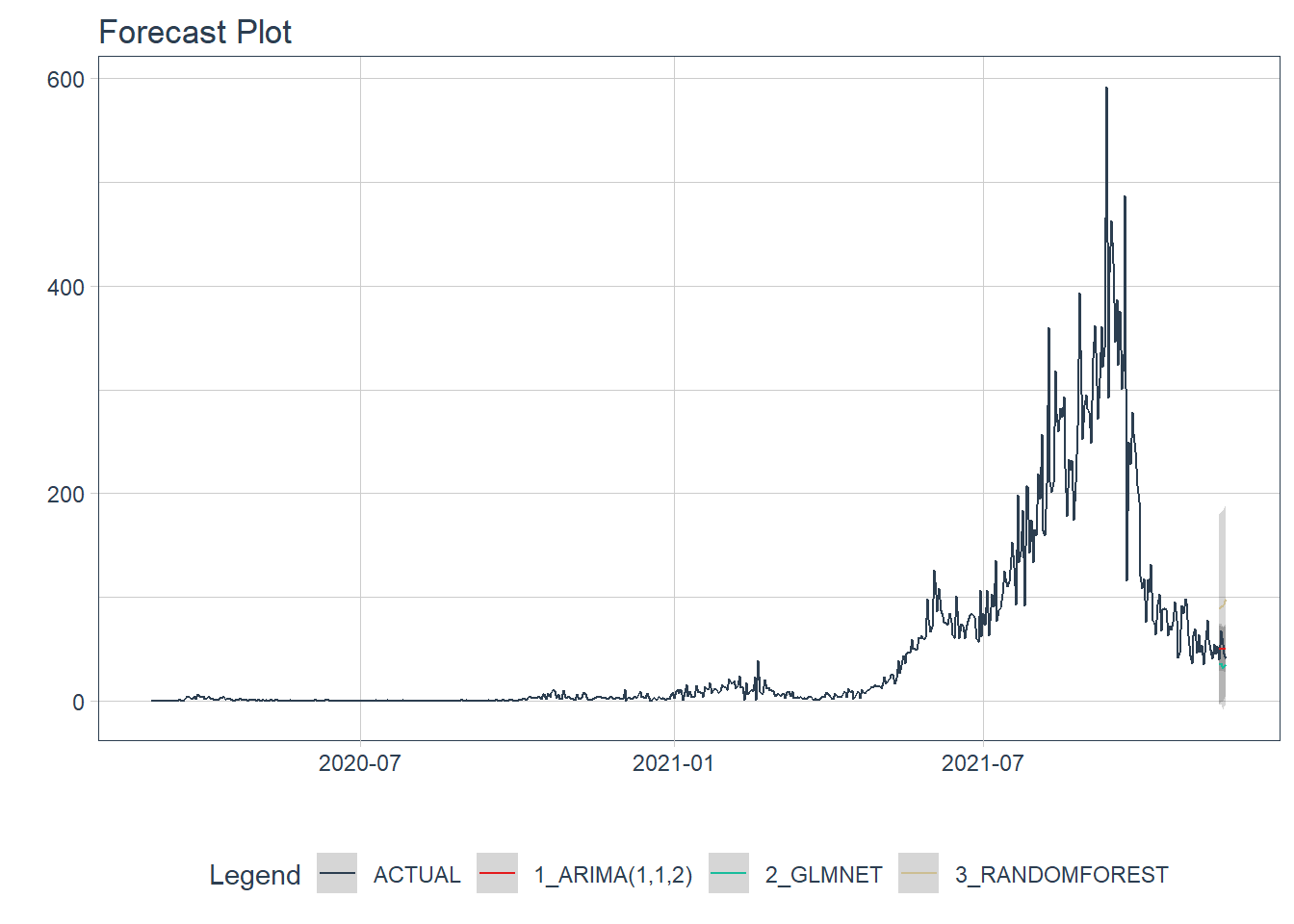
Figure 12.19: New daily deaths forecast of the test data
Figure 12.19 shows quite a large error from the three models. From Figure 12.21 to Figure 12.23 we will see the errors from each model separately.
12.3.7 Accuracy (Testing set)
We calculate the testing accuracy to compare the models. For regression models, lower RMSE values indicate a better fit to the data.
| Accuracy Table | ||||||||
|---|---|---|---|---|---|---|---|---|
| .model_id | .model_desc | .type | mae | mape | mase | smape | rmse | rsq |
| 1 | ARIMA(1,1,2) | Test | 9.37 | 18.76 | 0.68 | 18.45 | 10.48 | 0.04 |
| 2 | GLMNET | Test | 15.66 | 28.59 | 1.14 | 35.06 | 18.92 | 0.00 |
| 3 | RANDOMFOREST | Test | 42.73 | 93.77 | 3.11 | 61.28 | 44.38 | 0.11 |
12.3.8 Analyze results
From the accuracy measures and forecast results, we see that:
- RANDOMFOREST model is not a good fit for this data.
- The model with the lowest
rmseis ARIMA.
We make future forecasts with all three models.
12.3.9 Refit and forecast forward
calibration_table %>%
  # Refit and Forecast Forward
  modeltime_refit(mys_deaths_tbl) %>%
  modeltime_forecast(h = "3 months", actual_data = mys_deaths_tbl) %>%
  plot_modeltime_forecast(.interactive = FALSE,
                          .title = "Compare all models forecast Plot",
                          .y_lab = "New daily deaths")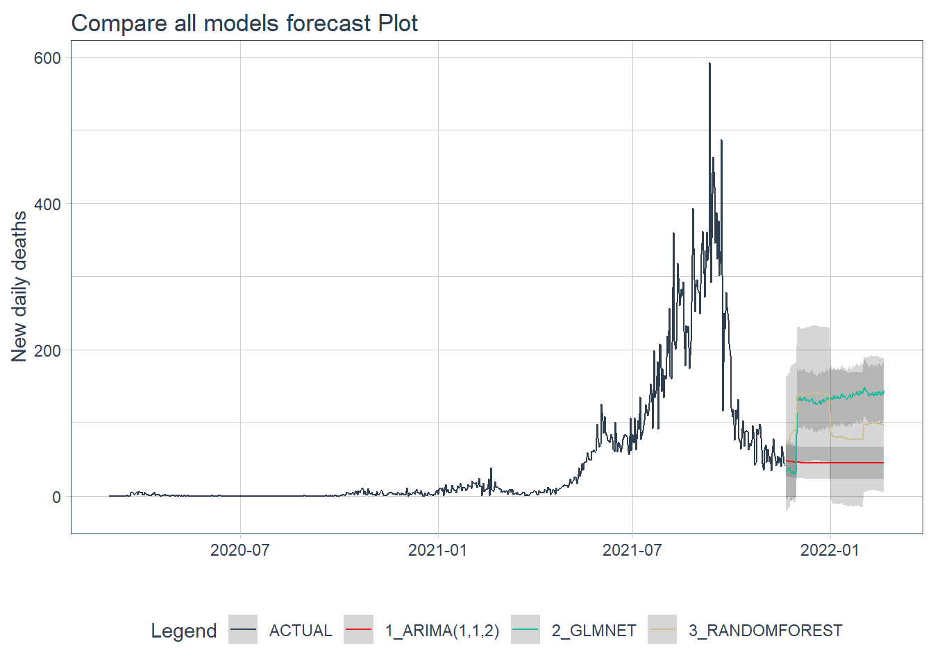
Figure 12.20: Forecast by all models of the test data
Figure 12.20 shows that the ARIMA model may have the better forecast compared to the others.
12.3.10 ARIMA model forecast
calibration_table %>%
  filter(.model_id == 1) %>%
  # Refit and Forecast Forward
  modeltime_refit(mys_deaths_tbl) %>%
  modeltime_forecast(h = "3 months", actual_data = mys_deaths_tbl) %>%
  plot_modeltime_forecast(.interactive = FALSE,
                          .title = "ARIMA model forecast Plot",
                          .y_lab = "New daily deaths")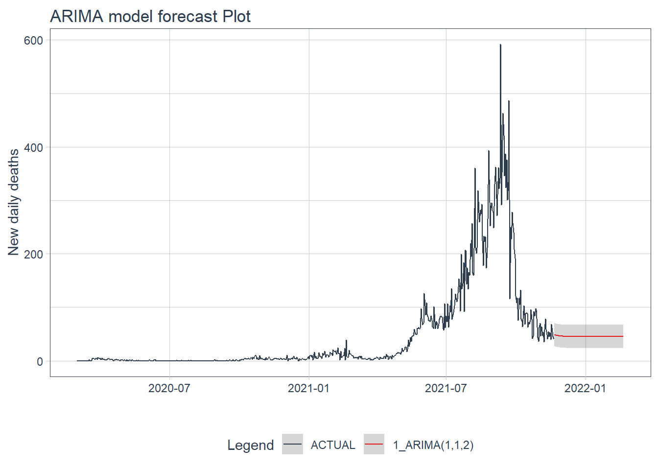
Figure 12.21: ARIMA model forecast of the test data
12.3.11 GLMNET model forecast
calibration_table %>%
  filter(.model_id == 2) %>%
  # Refit and Forecast Forward
  modeltime_refit(mys_deaths_tbl) %>%
  modeltime_forecast(h = "3 months", actual_data = mys_deaths_tbl) %>%
  plot_modeltime_forecast(.interactive = FALSE,
                          .title = "GLMNET model forecast Plot",
                          .y_lab = "New daily deaths")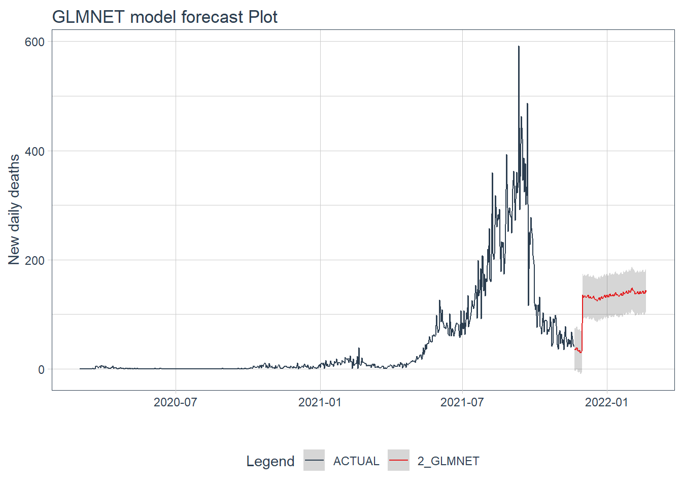
Figure 12.22: GLMNET model forecast of the test data
12.3.12 RANDOM FOREST model forecast
calibration_table %>%
  filter(.model_id == 3) %>%
  # Refit and Forecast Forward
  modeltime_refit(mys_deaths_tbl) %>%
  modeltime_forecast(h = "3 months", actual_data = mys_deaths_tbl) %>%
  plot_modeltime_forecast(.interactive = FALSE,
                          .title = "RANDOM FOREST model forecast Plot",
                          .y_lab = "New daily deaths")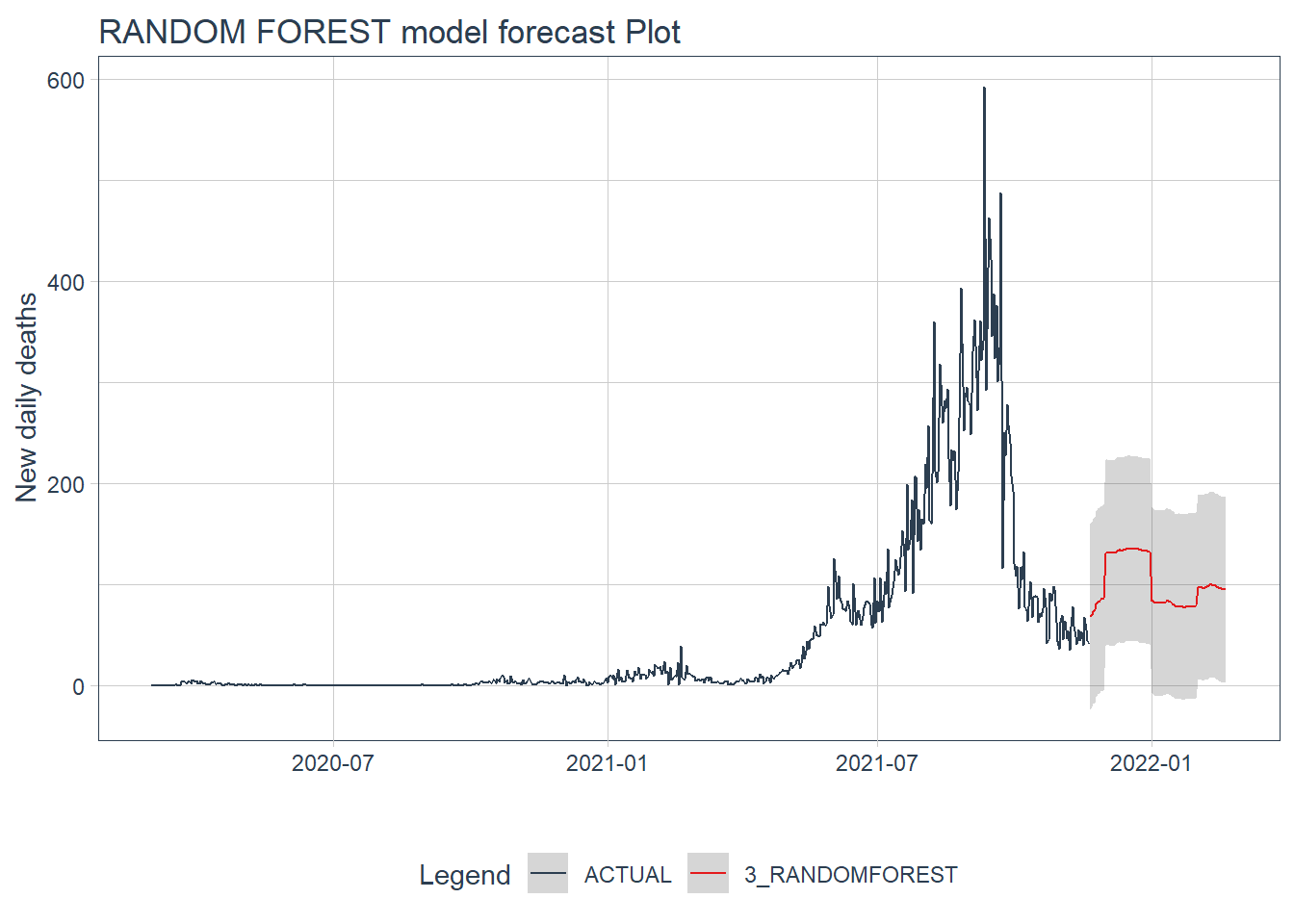
Figure 12.23: GLMNET model forecast of the test data
Figure 12.22 and Figure 12.23 confirm the bigger fluctuations in errors for the GLMNET and RANDOM FOREST model predictions. The ARIMA model forecast has lower error fluctuations and appears more realistic.
12.4 Discussion
In this chapter, all the models used to predict and forecast are purely based on data. We have not incorporated any physical factors like intervention measures (social distancing, face masks, travel restrictions) or even the R0 factor. It is always better to incorporate these physical factors.
However, our purpose is to start learning the various tools and packages in R for data modeling using some real, relevant, and recent Covid related data.
In the next chapter, we will learn specifically about time-series forecasting.