Chapter 9 Visualizing Covid Data With Network Parameters For State of Selangor
Like all infectious diseases, Covid-19 transmission happens through close contact. It has to pass from person to person, and these people will have to travel to spread the virus there. Thus networks have often been used to help model the spread of diseases, whether it is by using a social network to model the spread of the disease between people29, or geographic networks to help us understand the spread based on what’s going on in neighboring places.30 The network approach has also been used for cases in China31 and India32.
We will focus on geographic networks, where the nodes are districts, and the edges link two places if they are direct neighbors (first-degree) to each other. We will try and use such a network to propose which districts should be given priority for vaccination based on different specific objectives.
The accuracy of this approach will be limited as it does not take into account epidemiological factors (such as herd immunity and social distancing) or other ways areas are linked (such as trains). However, it still provides a helpful guide for visualizing networks and using them to create parameters for analysis. It also shows that network analysis should be seriously considered for a larger Covid model.
In Malaysia, the smallest areas that public Covid case data are published on are called districts so we will focus on these.
This chapter is based on an earlier blog post using the data then. We did not update the data here in this chapter since the purpose is to learn how network graphs can provide a different analysis of Covid data.
These are all the packages needed.
library(dplyr)
library(readr) # Loading the data
library(tidyr)
library(sf) # For the maps
library(sp) # Transform coordinates
library(ggplot2)
library(viridis)
library(igraph) # build network
library(spdep) # builds network
library(tidygraph)
library(ggraph) # for plotting networks
library(cowplot)
9.1 Getting the data
We visualize the spread of Covid in the state of Selangor by creating maps using the ggplot2 and sf packages.33 Another option is to use the raster package.34
We got the case data with permission from here.35
## # A tibble: 387 x 7
##    daerah Date         New `14 Days` Active Total negeri
##    <chr>  <date>     <dbl>     <dbl>  <dbl> <dbl> <chr>
##  1 Gombak 2021-05-03    57      1086    213 10790 Selangor
##  2 Gombak 2021-05-04    31      1091    175 10821 Selangor
##  3 Gombak 2021-05-05   164      1215    277 10984 Selangor
##  4 Gombak 2021-05-06   107      1246    225 11091 Selangor
##  5 Gombak 2021-05-07   139      1344    264 11230 Selangor
##  6 Gombak 2021-05-08    96      1382    232 11326 Selangor
##  7 Gombak 2021-05-09   151      1471    308 11477 Selangor
##  8 Gombak 2021-05-10   156      1491    377 11633 Selangor
##  9 Gombak 2021-05-11   204      1576    483 11837 Selangor
## 10 Gombak 2021-05-12   139      1600    530 11976 Selangor
## # ... with 377 more rows
The columns are:
- daerah : the Local Authority District (LAD)
- Date :
- New : number of new cases
- 14 Days : number of new cases for the last 14 days
- Active : active cases
- Total : total cases
- negeri : state
9.2 Initial point plot
The input data for the number of new cases per day is shown in Figure 9.1.
sel_cases %>% ggplot() +
  geom_point(aes(x=Date, y=New, color=daerah, shape=daerah)) +
  scale_shape_manual(values=c(0, 1, 2, 3, 4, 5, 6, 7, 8, 9)) +
  labs(title = "New Cases in Selangor",
      subtitle = "Color by districts")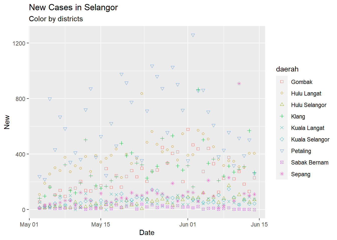
Figure 9.1: Point plot of Selangor case data
Petaling is consistently the district with the highest number of new cases. The simple point or line plot will not give us the same insight as if we plot it on a map.
9.3 Create and plot maps of districts
To plot a map, we have to download the shape file of districts in Malaysia.36
- Save and unzip the whole folder.
- Do not delete any of the files that have been unzipped.
- Then load the file
zd362bc5680.shp. (The directory notation may be different.) Again keep the other files in the same directory. - Rename columns to follow
sel_cases
## Reading layer `zd362bc5680' from data source `F:\RProjects\CovidBook\data\zd362bc5680.shp' using driver `ESRI Shapefile'
## Simple feature collection with 236 features and 9 fields
## Geometry type: POLYGON
## Dimension:     XY
## Bounding box:  xmin: 99.64061 ymin: 0.8537959 xmax: 119.267 ymax: 7.362766
## Geodetic CRS: WGS 84Figure 9.2 will be too large to visualize for all cases. For illustrative purposes, we focus on the state of Selangor for which we have the important case data.
district_sf %>%
   ggplot() +
   geom_sf(aes(geometry = geometry, fill = negeri)) +
   labs(title = "Map of all districts in Malaysia",
subtitle = "Color by States") 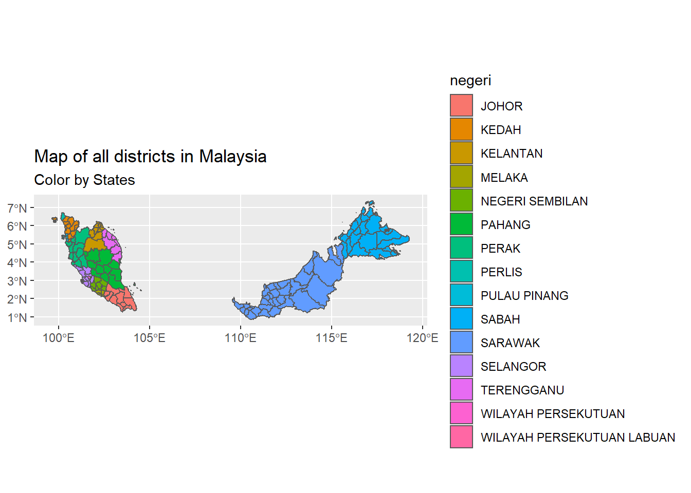
Figure 9.2: Map of all districts in Malaysia
We focus on SELANGOR State based on the available data. It is also the state with the highest population density. (We add WILAYAH PERSEKUTUAN to avoid a hollow in the map plots. We know that the case data for WILAYAH PERSEKUTUAN has a similar trend to Petaling District. Also note that Figure 9.2 shows 15 states while Figure 8.4 has 13 states. We used different shape files. This discussion is for learning and illustrative purposes only, so we compromise a bit on the data accuracy.
district_sf %>%
   filter(negeri %in% c("SELANGOR", "WILAYAH PERSEKUTUAN")) %>%
   ggplot() +
   geom_sf(aes(geometry = geometry, fill = daerah)) +
   labs(title = "Map of all districts in SELANGOR",
subtitle = "Color by districts") 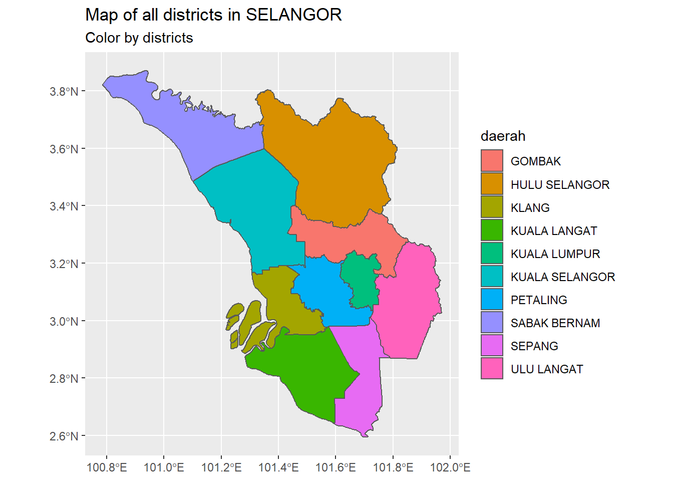
Figure 9.3: Map of all districts in SELANGOR
9.4 Combine with Covid case data
To plot the case data we group by daerah and create a tibble with the summary statistics of the data between 03/05/2021 and 14/06/2021.
- number of days of data
- mean of new cases
- median of new cases
- lowest new case
- highest new case
We do a join on the case data. We can now fill the districts based on the new case statistics. We convert daerah to the upper case to facilitate the join.
maxseldate = max(sel_cases$Date)
minseldate = min(sel_cases$Date)
sel_cases$daerah <- toupper(sel_cases$daerah)
district_sf$daerah[district_sf$daerah == "ULU LANGAT"] <- "HULU LANGAT"
sel_cases %>% group_by(daerah) %>%
  summarize(days_of_data = n(),
            avg_new = mean(New),
            med_new = median(New),
            lo_new = min(New),
            hi_new = max(New)) -> sel_new
We do a bubble plot of the summary data. Since we have learned many of the plotting functions and parameters in the earlier chapters, we will only comment on the codes when necessary.
sel_new %>%
  ggplot(aes(x=lo_new, y=hi_new, size=avg_new, fill=daerah)) +
  geom_point(alpha=0.9, shape=21, color="black") +
  geom_text(aes(label = daerah),
               size = 3,
               nudge_x = 0.25, nudge_y = 1,
               check_overlap = T) +
  labs(title = "Bubble Plot of New Covid Cases",
       caption = paste0("From ", minseldate, " to ", maxseldate),
       x = "Lowest Case",
       y = "Highest Case",
       size = "Daily Average",
       fill = "District")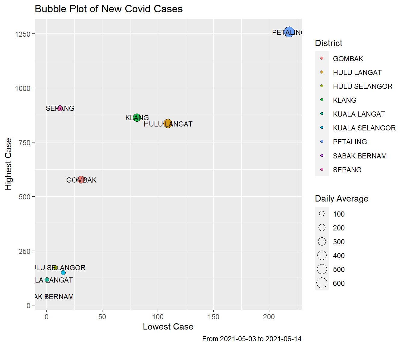
Figure 9.4: New case summary by disrict
PETALING is the highest on all the summary statistics. SABAK BERNAM is the lowest.
Next we join sel_new with district_sf and just plot the highest and lowest incidence of new cases. We can easily repeat for the other statistics.
district_sf %>%
    filter(negeri %in% c("SELANGOR", "WILAYAH PERSEKUTUAN")) %>%
    left_join(sel_new, by = "daerah") %>%
    ggplot() +
    geom_sf(aes(geometry = geometry, fill = hi_new)) +
# Everything past this point is only formatting:
    scale_fill_gradient2(low = "green",
                         mid = "yellow",
                         high = "red",
                         midpoint = 0,
                         space = "Lab",
                         na.value = "grey80",
                         guide = "colourbar",
                         aesthetics = "fill") +
    theme_void() +
    labs(title = "Highest New Cases by District",
         caption = paste0("From ", minseldate, " to ", maxseldate)) -> p1

district_sf %>%
    filter(negeri %in% c("SELANGOR", "WILAYAH PERSEKUTUAN")) %>%
    left_join(sel_new, by = "daerah") %>%
    ggplot() +
    geom_sf(aes(geometry = geometry, fill = lo_new)) +
# Everything past this point is only formatting:
    scale_fill_gradient2(low = "green",
                         mid = "yellow",
                         high = "red",
                         midpoint = 0,
                         space = "Lab",
                         na.value = "grey80",
                         guide = "colourbar",
                         aesthetics = "fill") +
    theme_void() +
    labs(title = "Lowest New Cases by District",
         caption = paste0("From ", minseldate, " to ", maxseldate)) -> p2

cowplot::plot_grid(
     p1,
     p2,
     labels = c("A", "B"))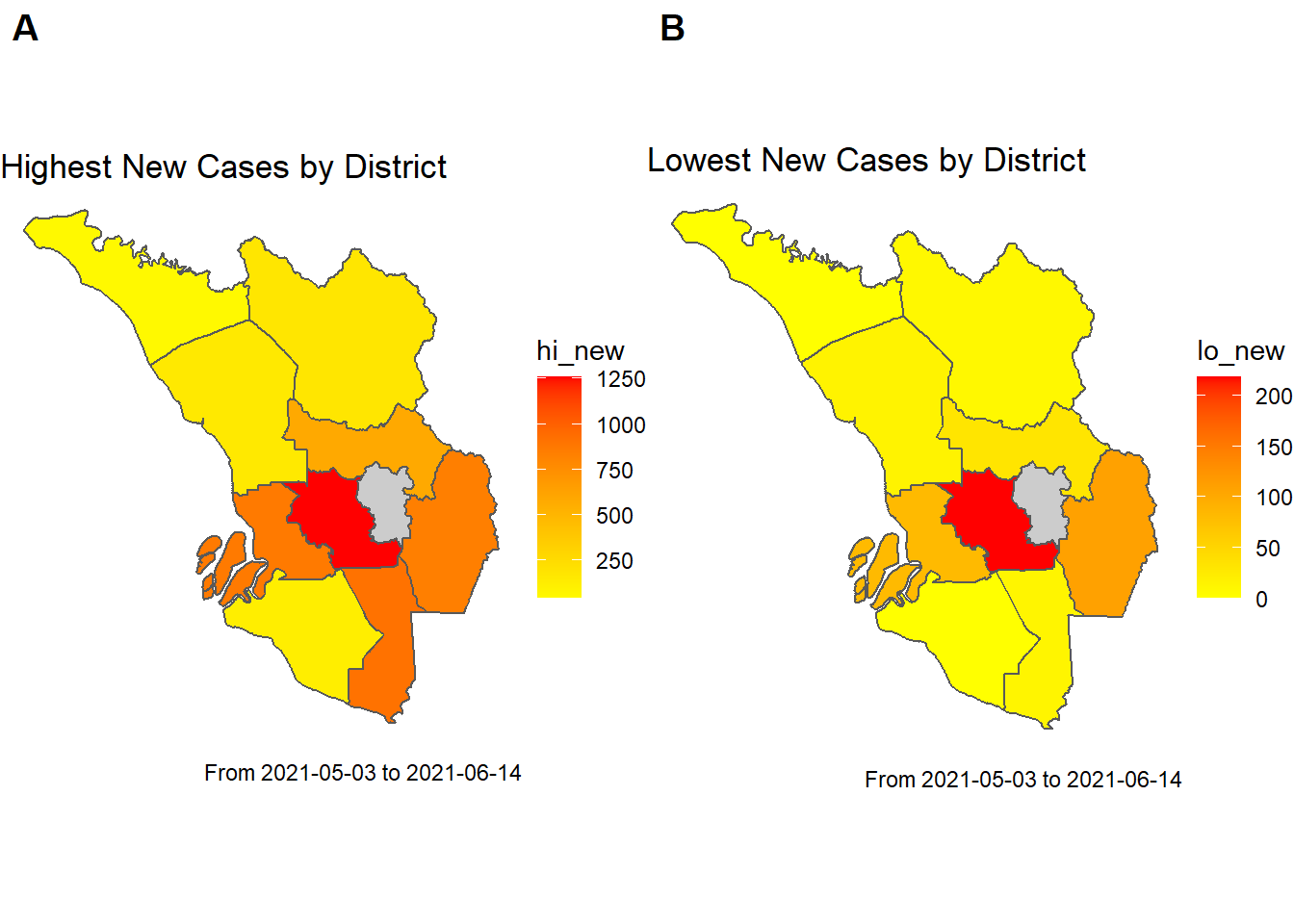
Figure 9.5: Map of new cases for districts in SELANGOR
The gray area in Figure 9.5 represents “WILAYAH PERSEKUTUAN” for which we did not include the case data.
This is where we get the first indication that networks will be useful. Figure 9.5 shows that neighboring districts have cases similar to neighboring areas. This makes sense. If we have an outbreak in one place we expect it to spread to neighboring places.
High case numbers spread from one area to neighboring areas. If we can define a network graph of the districts in SELANGOR we can further analyze the data based on the properties or features of a network graph.37
9.5 The Network
To define a network, it is enough to know what makes up the nodes, and how they join together (i.e. the edges). In our case, the nodes are just the districts. We know we want the edges to be such that two nodes are joined if the two districts they represent are immediate (first-degree) neighbors on our map. The poly2nb() function (read “polygon to neighbors”) from the spdep package helps us do just this. It can take a shapefile and tell us which areas are neighbors.
sel_sf <- district_sf %>%
  inner_join(sel_new, by = "daerah")
sel_sf %>% distinct(daerah, .keep_all = TRUE) -> sel_sf
# Use the poly2nb to get the neighborhood of each district
sel_district_neighbours <- spdep::poly2nb(sel_sf)
We can then use the nb2mat() function (“neighbors to matrix”) to turn this into an adjacency matrix. An adjacency matrix is such that cell i, j is equal to 1 if there is an edge connecting node i to node j, and a 0 otherwise. Thus an adjacency matrix defines a network. We can use the graph_from_adjacency_matrix function from the igraph package to create a network graph.
# Use nb2mat to turn this into an adjacency matrix
adj_mat <- spdep::nb2mat(sel_district_neighbours, style = "B")
rownames(adj_mat) <- sel_sf$daerah
colnames(adj_mat) <- sel_sf$daerah
sel_g <- igraph::graph_from_adjacency_matrix(adj_mat, mode = "undirected")
The tidygraph package handles network graphs using standard dplyr. We convert sel_g into a tidy graph object using as_tbl_graph().
## # A tbl_graph: 9 nodes and 16 edges
## #
## # An undirected simple graph with 1 component
## #
## # Node Data: 9 x 1 (active)
##   name
##   <chr>
## 1 KUALA LANGAT
## 2 SABAK BERNAM
## 3 HULU SELANGOR
## 4 SEPANG
## 5 KLANG
## 6 PETALING
## # ... with 3 more rows
## #
## # Edge Data: 16 x 2
##    from    to
##   <int> <int>
## 1     1     4
## 2     1     5
## 3     1     6
## # ... with 13 more rows
Our network has 9 nodes and 16 edges. We also see that it is defined by two tibbles, one for the node data, and one for the edge data.
The node data just contains the names of the districts, and the edge data tells us which nodes are connected based on their position in the node data. For example, the first row of the edge data tells us “KUALA LANGAT” and “SEPANG” are neighbors.
We can visualize the network using ggraph, a network-specific extension to ggplot2.
ggraph(sel_g)  +
  geom_edge_link(colour = 'grey', width = 1) +
  geom_node_point(size = 5, colour = 'darkred') +
  geom_node_text(aes(label = name), repel = TRUE) +
  theme_void() +
  labs(title = "Network plot of districts in SELANGOR",
       caption = "Each node is a district, and an edge joins two
       nodes if they are neighbors")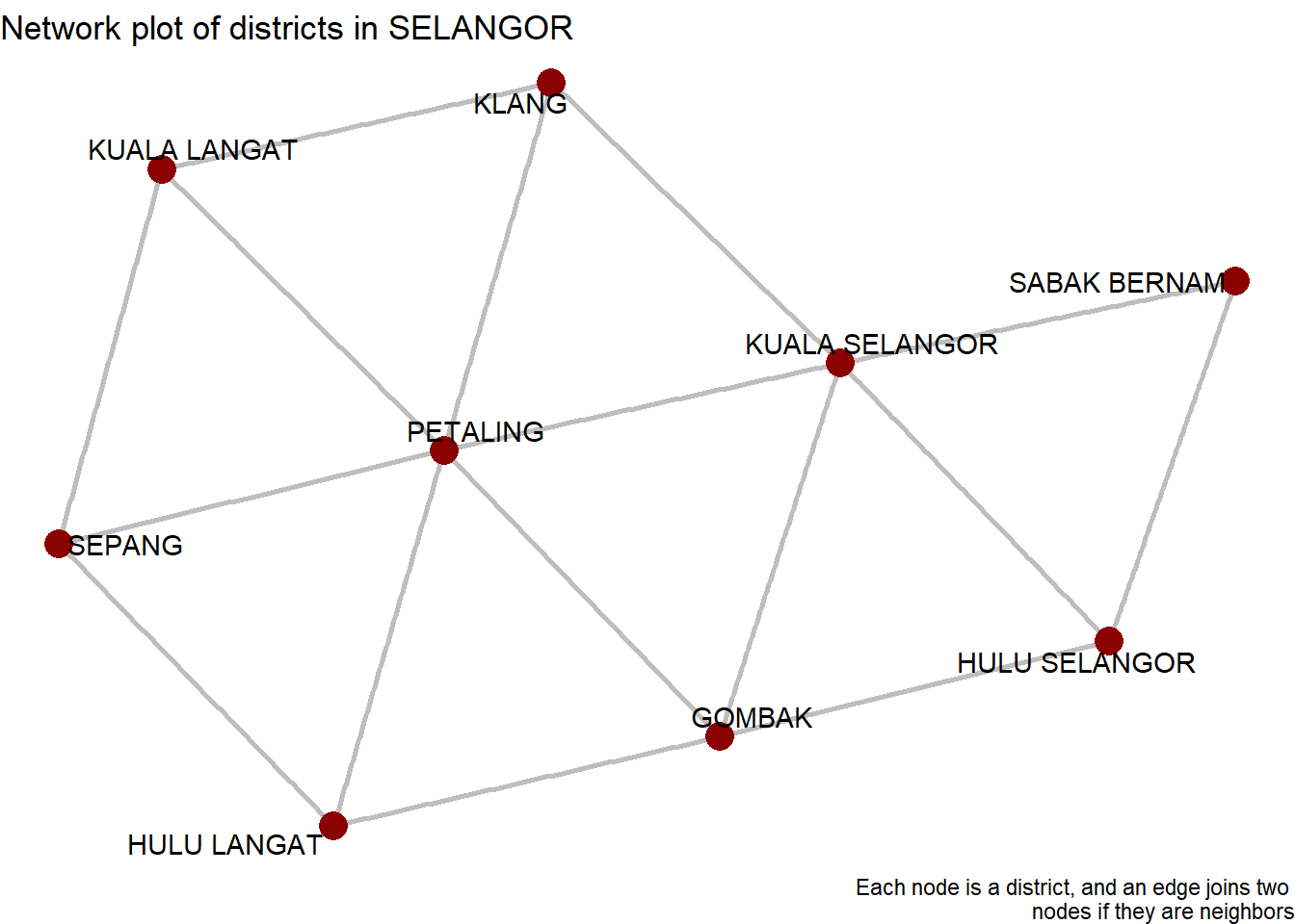
Figure 9.6: SELANGOR district network
We must overlay this network on top of our map from Figure 9.3. This makes it easier to translate between the conceptual network and reality.
We first need to get central coordinates for each district. The shapefile we downloaded does not come with a “clean” pair of latitude and longitude coordinates for each district. Unfortunately, the polygons themselves are under a different spatial projection.
We get some information about our specific shapefile from SELANGOR sel_sf.
## Classes 'sf' and 'data.frame':   9 obs. of  15 variables:
##  $ f_code      : chr  "FA001" "FA001" "FA001" "FA001" ...
##  $ coc         : chr  "MYS" "MYS" "MYS" "MYS" ...
##  $ negeri      : chr  "SELANGOR" "SELANGOR" "SELANGOR" "SELANGOR" ...
##  $ daerah      : chr  "KUALA LANGAT" "SABAK BERNAM" "HULU SELANGOR" "SEPANG" ...
##  $ pop         : int  -99999999 -99999999 -99999999 -99999999 -99999999 -99999999 -99999999 -99999999 -99999999
##  $ ypc         : int  0 0 0 0 0 0 0 0 0
##  $ adm_code    : chr  "UNK" "UNK" "UNK" "UNK" ...
##  $ salb        : chr  "UNK" "UNK" "UNK" "UNK" ...
##  $ soc         : chr  "MYS" "MYS" "MYS" "MYS" ...
##  $ days_of_data: int  43 43 43 43 43 43 43 43 43
##  $ avg_new     : num  51.2 15.2 54.9 108.9 296.7 ...
##  $ med_new     : num  45 12 53 91 285 557 376 68 226
##  $ lo_new      : num  0 0 8 12 81 218 109 15 31
##  $ hi_new      : num  117 40 173 908 865 ...
##  $ geometry    :sfc_POLYGON of length 9; first list element: List of 1
##   ..$ : num [1:1591, 1:2] 102 102 102 102 102 ...
##   ..- attr(*, "class")= chr [1:3] "XY" "POLYGON" "sfg"
##  - attr(*, "sf_column")= chr "geometry"
##  - attr(*, "agr")= Factor w/ 3 levels "constant","aggregate",..: NA NA NA NA NA NA NA NA NA NA ...
## ..- attr(*, "names")= chr [1:14] "f_code" "coc" "negeri" "daerah" ...## X Y
## 1 101.5014 2.828712
## 2 101.0852 3.682128
## 3 101.5811 3.559107
## 4 101.6858 2.803750
## 5 101.4268 3.056832
## 6 101.5735 3.094760
## 7 101.8499 3.063432
## 8 101.3242 3.395049
## 9 101.6498 3.281463If we do st_coordinates(st_centroid(sel_sf$geometry)) we get 9 values for latitude and longitude, but we also get a warning that st_centroid does not give correct centroids for longitude/latitude data. But for the level of precision which we require this may not matter.38 A MULTIPOLYGON can be defined by thousands of points with their own coordinates. We just need a single point, so we use st_centroid. The warning is just telling us that our polygon is unprojected but it still computes the centroid.
A data structure check with str(sel_sf) shows, that a column variable geometry is in list format, which can be unhandy. We extract the latitude and longitude and add them to sel_sf using mutate.
sel_sf <- sel_sf %>%
    dplyr::mutate(lon = st_coordinates(st_centroid(sel_sf$geometry))[,1],
                  lat = st_coordinates(st_centroid(sel_sf$geometry))[,2])
We extract the coordinates and transform the projection.
##        lon      lat         daerah
## 1 101.5014 2.828712   KUALA LANGAT
## 2 101.0852 3.682128   SABAK BERNAM
## 3 101.5811 3.559107  HULU SELANGOR
## 4 101.6858 2.803750         SEPANG
## 5 101.4268 3.056832          KLANG
## 6 101.5735 3.094760       PETALING
## 7 101.8499 3.063432    HULU LANGAT
## 8 101.3242 3.395049 KUALA SELANGOR
## 9 101.6498 3.281463         GOMBAK
This makes it easy to join the coordinates onto our network object. We essentially want to left_join onto our nodes tibble.
# Join on coordinates and sf geometry
sel_g <- sel_g %>%
  activate("nodes") %>%
  left_join(coords, by = c("name" = "daerah"))
We can use as_tibble() to extract the activated tibble (i.e. either nodes or edges). We see the coordinates have been successfully joined.
## # A tibble: 6 x 3
##   name            lon   lat
##   <chr>         <dbl> <dbl>
## 1 KUALA LANGAT   102.  2.83
## 2 SABAK BERNAM   101.  3.68
## 3 HULU SELANGOR  102.  3.56
## 4 SEPANG         102.  2.80
## 5 KLANG          101.  3.06
## 6 PETALING       102.  3.09
Now we create a ggraph plot, where we use the district shapefile for a geom_sf layer, and then overlay our network.
ggraph(sel_g, layout = "manual", x = lon, y = lat)  +
  geom_sf(data = sel_sf, fill = "white") +
  theme_void() +
  geom_edge_link(colour = 'black', width = 1) +
  geom_node_point(size = 3, colour = 'darkred') +
  geom_node_text(aes(label = name), size = 3, repel = TRUE) +
  theme_void() +
  labs(title = "Network plot of districts in SELANGOR",
       caption = "Each node is a district, and an edge joins two
       nodes if they are neighbors")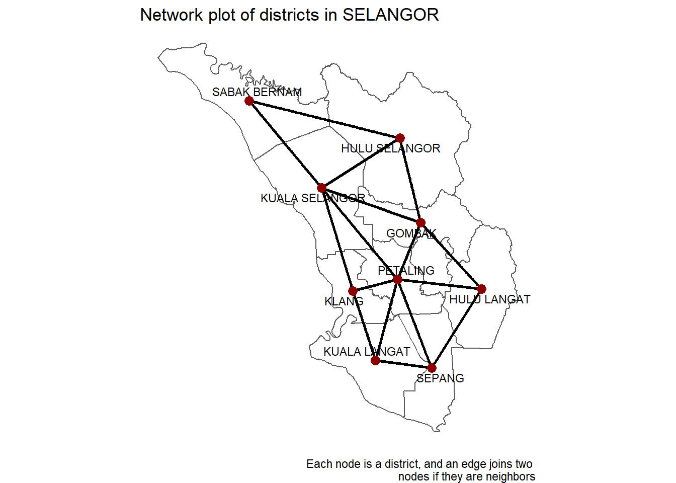
Figure 9.7: SELANGOR district network on map
The network map in Figure 9.7 is exactly what we want it to be; every node is a district, and an edge connects two nodes if the districts are neighbors.
We have shown why we might look to networks to help us understand how Covid spreads, and also how to build and visualize such a network.
Next, we will see how the network graph allows us to create powerful parameters quickly, and then use these new parameters to have better insights into our Covid data.
9.6 Network parameters
There are two ways we can use our network to create parameters, and it helps to think of them separately.
The first are parameters based on the structure of the network, for example, the number of neighbors a district has (its degree). The thinking here is that the way the districts are grouped and connected might be a good indication of how Covid spreads through the network.
The second are parameters based on what is happening in neighboring districts, for example, how many cases there are in neighboring districts. The thinking here is that an area surrounded by high case numbers can expect to see a rise itself in the following days.
We will examine a few of these parameters, show how we derived them for our network, and then show the values of these parameters for each district in SELANGOR.
We start with our network object sel_g. We activate the nodes, so it knows the following mutate is to be applied to the underlying node data. We use mutate to define our new parameters to be the corresponding tidygraph function applied to sel_g. These functions calculate some measures that define the characteristics of nodes in a network graph.
sel_features <- sel_g %>%
    activate(nodes) %>%
    mutate(
        degree = centrality_degree(),
        betweenness = centrality_betweenness(),
        closeness = centrality_closeness(normalized = T),
        pg_rank = centrality_pagerank(),
        eigen = centrality_eigen(),
        br_score = node_bridging_score(),
        coreness = node_coreness(),
        center = node_is_center(),
        dist_to_center = node_distance_to(node_is_center())
    )

node_measures <- sel_features %>% as_tibble()
9.6.1 Which district is the most important influencer?
We ask some questions about which is the “most important” node. We want to understand important concepts of network centrality and how to calculate those in R.
What does “most important” mean? It of course depends on the definition and this is where network centrality measures come into play. We will have a look at four of these centrality measures (there are many more out there).
## # A tibble: 9 x 12
##   name    lon   lat degree betweenness closeness pg_rank eigen br_score coreness
##   <chr> <dbl> <dbl>  <dbl>       <dbl>     <dbl>   <dbl> <dbl>    <dbl>    <dbl>
## 1 PETA~  102.  3.09      6       9.17      0.8    0.176  1      0.0100         3
## 2 KUAL~  101.  3.40      5       8.17      0.727  0.152  0.821  0.0109         3
## 3 GOMB~  102.  3.28      4       3.67      0.667  0.122  0.748  0.00868        3
## 4 KUAL~  102.  2.83      3       0.5       0.533  0.0955 0.558  0.00772        3
## 5 HULU~  102.  3.56      3       0.833     0.533  0.0985 0.491  0.00849        2
## 6 SEPA~  102.  2.80      3       0.5       0.533  0.0955 0.554  0.00810        3
## 7 KLANG  101.  3.06      3       1.33      0.615  0.0946 0.612  0.00926        3
## 8 HULU~  102.  3.06      3       0.833     0.571  0.0947 0.592  0.00849        3
## 9 SABA~  101.  3.68      2       0         0.471  0.0705 0.338  0.0104         2
## # ... with 2 more variables: center <lgl>, dist_to_center <dbl>
Now we plot the network features. The codes are similar for plotting each network centrality feature or measure. Thus, creating a user-defined function reflects a better programming style. But this is not the focus of our book.
We also use the color scales from the package viridis.
9.6.2 Degree network
sel_features %>%
    activate("nodes") %>%
    ggraph(layout = "manual", x = lon, y = lat)  +
    geom_sf(data = sel_sf, fill = "white", color = "grey") +
    theme_void() +
    geom_edge_link(colour = 'black', width = 1) +
    geom_node_point(aes(color = degree), size = 4) +
    geom_node_text(aes(label = name), size = 3, repel = TRUE) +
    scale_color_viridis_c() +
    ggtitle("District network for SELANGOR") +
    guides(color=guide_legend(title="Degree", reverse = TRUE)) -> p3
p3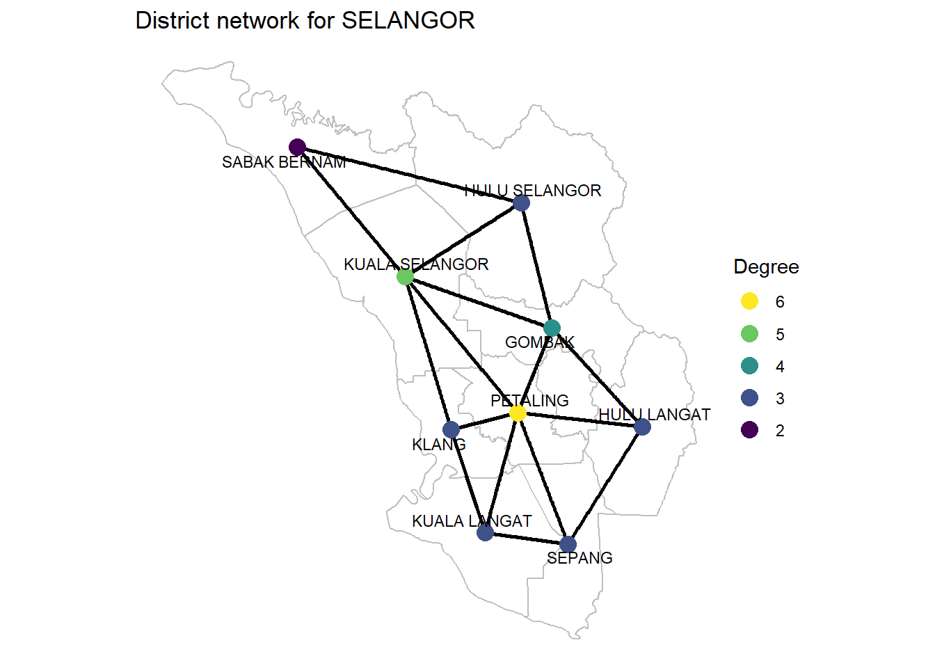
Figure 9.8: Degrees of SELANGOR district network
Degree centrality It is simply the number of nodes connected to each node, the number of direct neighbors. Degree centrality tells us the most connected district. It can denote “popularity” in a social network.
This is often the only measure given to identify “influencers”: how many followers do they have?. PETALING is the most connected district.
We have two different ways of visualizing this from Figure 9.8. The first is using the network, which makes it easier to see the edges connecting each district. We can easily count up all the neighbors of any district to see it matches their degree. We cannot do this for the bordering districts because we have not plotted all of their neighbors since some of them belong to other states.
The second method is to visualize using a map. This can make it easier to see the distribution of the degree values across the whole state of SELANGOR.
Degree denotes having the most direct friends in a social network like Facebook. For our virus network, PETALING is the potential super spreader from a physical district perspective.
9.6.3 Betweenness network
sel_features %>%
    activate("nodes") %>%
    ggraph(layout = "manual", x = lon, y = lat)  +
    geom_sf(data = sel_sf, fill = "white", color = "grey") +
    theme_void() +
    geom_edge_link(colour = 'black', width = 1) +
    geom_node_point(aes(color = betweenness), size = 4) +
    geom_node_text(aes(label = name), size = 3, repel = TRUE) +
    scale_color_viridis_c() +
    ggtitle("District network for SELANGOR") +
    guides(color=guide_legend(title="Betweenness", reverse = TRUE))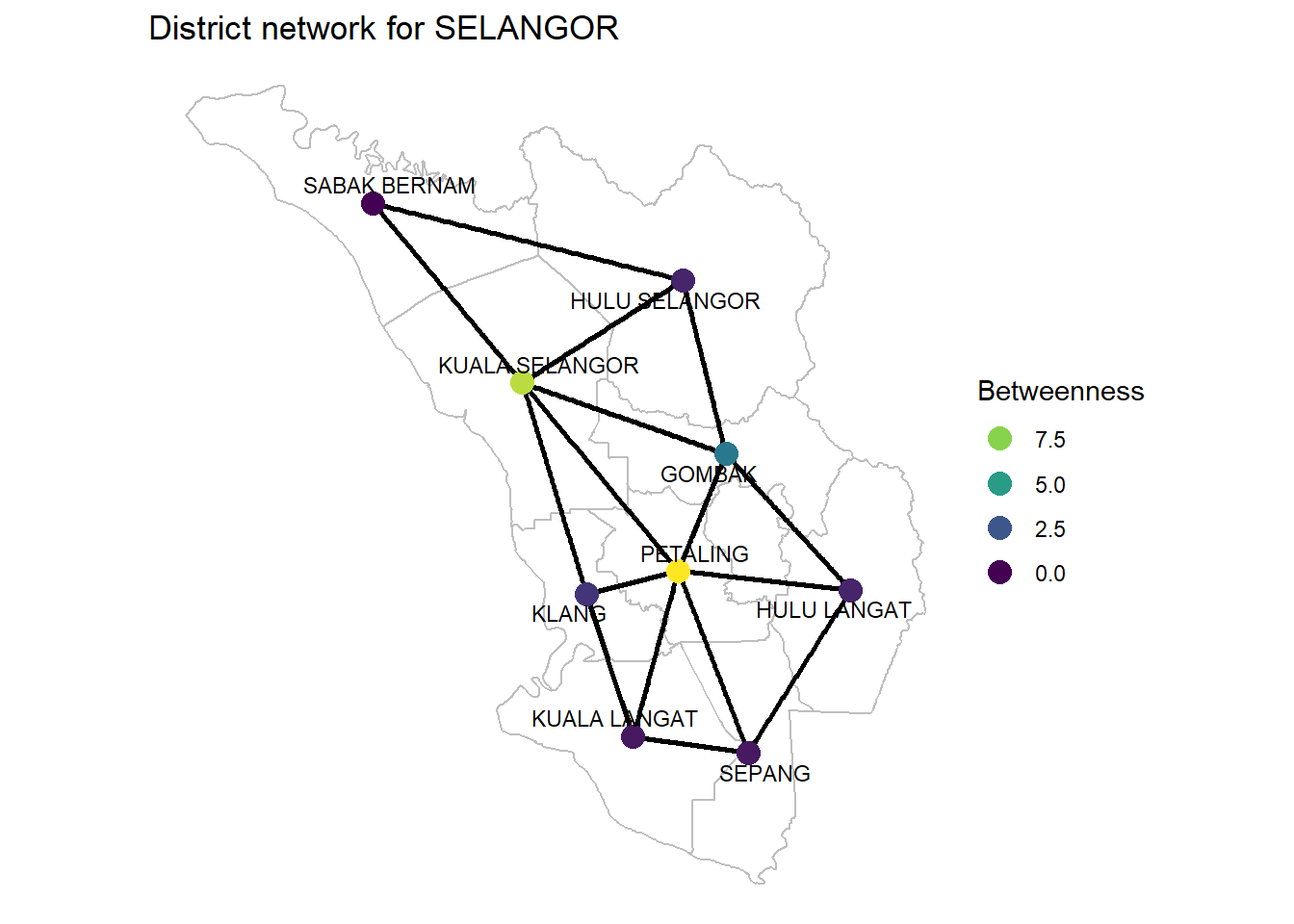
Figure 9.9: Betweenness of SELANGOR district network
Betweenness centrality Betweenness centrality tells us who is most important in maintaining connections throughout the network: it is the number of times the node is on the shortest path between any other pair of nodes. It can denote brokerage and bridging.
Betweenness = How many shortest paths a node sits on. This is a measure of node importance.
If we want to travel from one district to another, there is always at least one shortest route which minimizes the number of districts we have to go through. We expect a node with high betweenness to have more people traveling through it. In reality, this parameter is unlikely to represent this here, and the shortest travel distance in real life has nothing to do with minimizing the districts we travel through. However, it does give some extra context that a model might find helpful.
Again, as we are only plotting a subset of a whole network, we cannot calculate the betweenness just from the SELANGOR district network alone. PETALING is the highest but take note of the role of KUALA SELANGOR compared to other districts.
9.6.4 Closeness network
sel_features %>%
    activate("nodes") %>%
    ggraph(layout = "manual", x = lon, y = lat)  +
    geom_sf(data = sel_sf, fill = "white", color = "grey") +
    theme_void() +
    geom_edge_link(colour = 'black', width = 1) +
    geom_node_point(aes(color = closeness), size = 4) +
    geom_node_text(aes(label = name), size = 3, repel = TRUE) +
    scale_color_viridis_c() +
    ggtitle("District network for SELANGOR") +
    guides(color=guide_legend(title="Closeness", reverse = TRUE))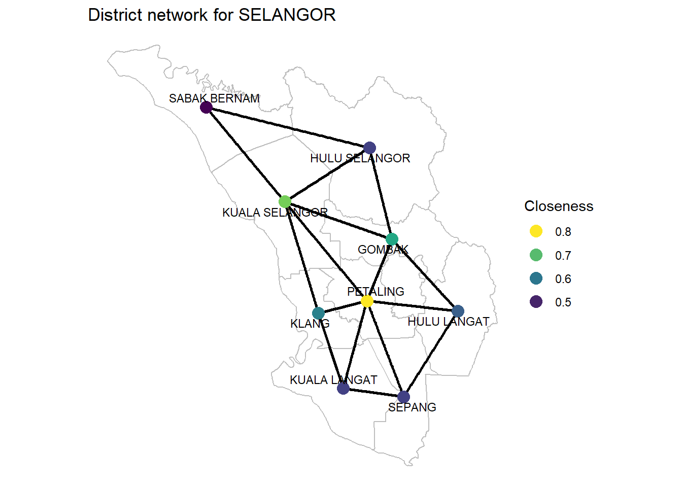
Figure 9.10: Closeness of SELANGOR district network
Closeness centrality Closeness centrality tells us who can propagate information quickest. The application of interest here is identifying the “super-spreaders” of Covid. PETALING is also the highest.
9.6.5 Eigenvector network
sel_features %>%
    activate("nodes") %>%
    ggraph(layout = "manual", x = lon, y = lat)  +
    geom_sf(data = sel_sf, fill = "white", color = "grey") +
    theme_void() +
    geom_edge_link(colour = 'black', width = 1) +
    geom_node_point(aes(color = eigen), size = 4) +
    geom_node_text(aes(label = name), size = 3, repel = TRUE) +
    scale_color_viridis_c() +
    ggtitle("District network for SELANGOR") +
    guides(color=guide_legend(title="Eigenvector", reverse = TRUE))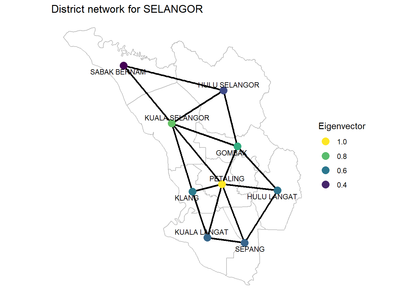
Figure 9.11: Eigenvector of SELANGOR district network
Eigenvector Centrality It can denote connections. Is a district connected to other “well-connected” districts? PETALING is the most “well-connected”. What other districts are “well-connected” to PETALING.
As we have seen, there is more than one definition of “most important”. It will depend on the context (and the available information) which one to choose. Without any doubt, PETALING scores the highest on all the measures. So it is the “most important” district. But we must take note of 3 other districts that can take the role of a “CENTER”; KUALA SELANGOR, GOMBAK, and KLANG.
Also, note the “least influential” district SABAK BERNAM.
We should learn a lot more when we populate our sel_features network with Covid data.
9.7 Features based on neighbors
We now want to generate new parameters based on what is happening in neighboring districts, for example, by combining the number of new cases with a particular network parameter like degree.
We left_join from the cases data to our network graph.
sel_cases_network <- sel_features %>%
  activate("nodes") %>%
  left_join(sel_new,
            by = c("name" = "daerah"))
What we want here is quite simple, and the most efficient way of calculating it is to use an adjacency matrix. An adjacency matrix defines a network. It has a row and column for every node in the network and the value of cell (i, j) is 1 if an edge connects node i to node j and 0 otherwise. We used an adjacency matrix to create our network in the first place. It is also easy to obtain an adjacency matrix from an existing network.
Now if we have a vector of values for each node in the network, like Covid cases per district, for example, let us see what happens if we multiply the adjacency matrix to this vector. The result will be a vector of the same length. Position i will just be the sum of all the values of the original vector multiply their positions in row i of the adjacency matrix. But we know row i is all 0s except for the neighbors of row i, and in those places, it is just 1. Therefore, the result is just a sum of all the related Covid cases in all the nodes that neighbor node i, which is exactly what we want. Because this is just matrix multiplication, it happens quickly.
So, to generate this “Covid cases in neighboring districts” parameter, we just need to multiply the adjacency matrix by a vector of Covid cases in each district.
sel_cases_network <- sel_cases_network %>%
  mutate(cases_in_neighbourhood =
             as.vector(adj_matrix %*% .N()$hi_new),
         cases_average_degree =
             cases_in_neighbourhood/degree)
We apply mutate to our tidygraph object. We get our vector of cases by using .N() which accesses the node data underlying the network and then using $hi_new to take the vector of new cases. We multiply our adjacency matrix to this using matrix multiplication, which in R is denoted by %*%. Finally, we wrap the result in as.vector() so mutate knows to treat this as a vector. We calculate the average number of cases by dividing by the degree of the node.
sel_cases_network %>%
  activate("nodes") %>%
  right_join(sel_sf, by = c("name" = "daerah")) %>%
  select(name,
         cases_in_neighbourhood,
         cases_average_degree,
         avg_new.y,
         med_new.y,
         lo_new.y,
         hi_new.y,
         geometry,
         lon.y,
         lat.y) %>%
  as.data.frame() %>%
  ggplot() +
  geom_sf(aes(geometry = geometry, fill = cases_in_neighbourhood)) +
# Everything past this point is just formatting:
#    scale_fill_viridis_c() +
    scale_fill_gradient2(low = "green",
                         mid = "yellow",
                         high = "red",
                         midpoint = 0,
                         space = "Lab",
                         na.value = "grey80",
                         guide = "colourbar",
                         aesthetics = "fill") +
  theme_void() +
  ggtitle("Cases in nearest neighbor") +
  guides(color=guide_legend(title="Cases in neighborhood", reverse=TRUE)) -> p4
p4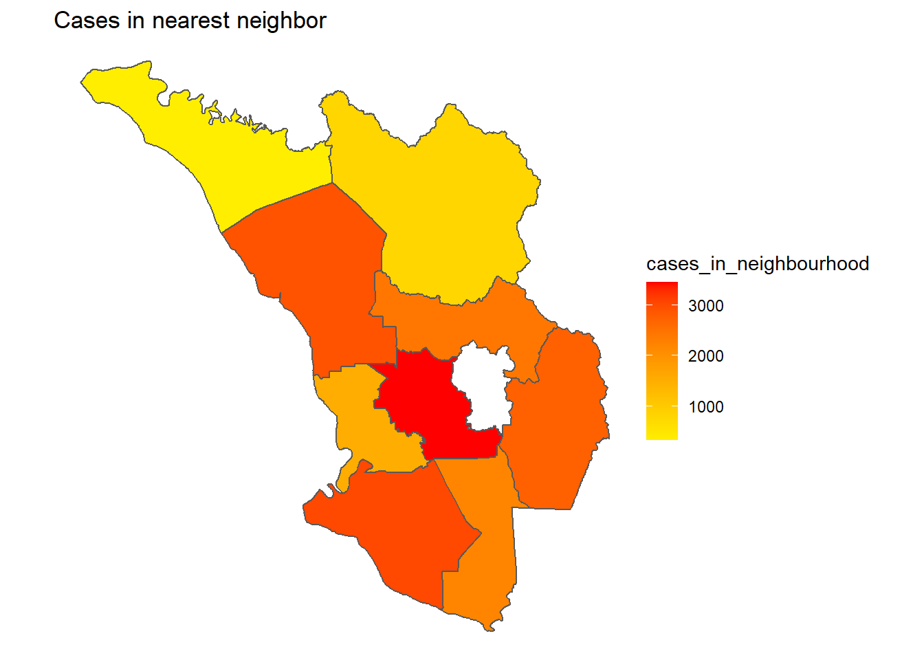
Figure 9.12: Cases of district network of neighbors
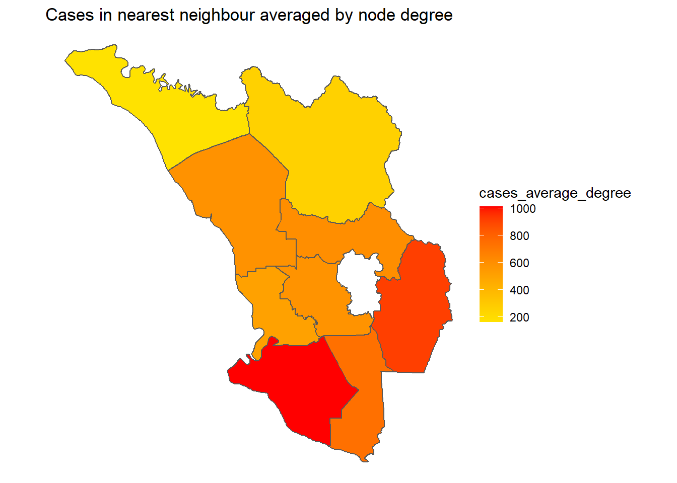
Figure 9.13: Cases of district network of neighbors
9.8 Discussion
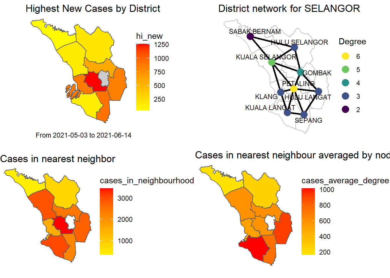
Figure 9.14: Combined plots
Figure 9.14 combines some of the earlier figures. It shows that when we combine our sample SELANGOR Covid case data with the graph network parameters, we get a richer analysis. Firstly, we just have the highest recorded cases within the period that we collected the data for each district. We focus on the simplest network centrality parameter, the degree. Degree centrality tells us the most connected district: it can denote popularity. There are other centrality parameters.39 By just incorporating the concept of node neighbors and degree we can get more insights.
Obviously, PETALING is the most influential district for Covid cases in SELANGOR. The plot clearly says that if the number of cases can be reduced in PETALING it will reduce the cases in 5 neighboring districts. Already it is the “hottest” district. Thus, “limiting access to and from” PETALING should be an effective NPI (non-pharmaceutical intervention). Vaccination must be prioritized for PETALING.
SABAK BERNAM offers a different scenario. It is the lowest on all measures and also not “influenced” by its neighbors. It is a good candidate for a Randomized Control Trial (RCT) where vaccination is accelerated, access is controlled but the restrictions on social distancing within the district are being relaxed. This can allow a gradual opening of businesses, secondary schools, and mosques.
KUALA SELANGOR and KUALA LANGAT highlight the value of networks. They appear “safe” on their own but not so when the neighbors are considered. KUALA SELANGOR has a relatively high betweenness, closeness, and eigenvalue measure.
There are many other network graph parameters40 like Eigenvectors which measures influence and Closeness which measures the ease of reaching other nodes. Incorporating these in the analysis will certainly give other insights.
These discussion points are based on the data then. We encourage our readers to repeat the codes with more recent data (hopefully things are better).
9.9 Conclusion
Networks are real in our world. Physical networks like the Internet, electricity grids, mobile networks, social networks, and virus networks are all real examples that have been extensively studied using network graphs.41 Any analysis of Covid data that does not incorporate network graphs will certainly miss out on important and rich insights.
This chapter has illustrated how to combine Covid case data with a physical geographical network. The various visuals exhibited show the difference and added value when the network parameters are incorporated in the analysis.
9.10 References
https://towardsdatascience.com/predicting-the-spread-of-covid-19-using-networks-in-r-2fee0013db91↩︎
https://towardsdatascience.com/predicting-the-spread-of-covid-19-using-networks-in-r-part-2-a85377f5fc39↩︎
Visualising Neighbouring Polygons in R, https://mikeyharper.uk/calculating-neighbouring-polygons-in-r/↩︎
https://earthworks.stanford.edu/catalog/stanford-zd362bc5680↩︎
r-spatial.github.io/sf/articles/sf6.html↩︎
http://www2.unb.ca/~ddu/6634/Lecture_notes/Lecture_4_centrality_measure.pdf↩︎
http://web.stanford.edu/~jacksonm/Jackson-IntroConcepts.pdf↩︎