Painting the Malaysian Covid Public Data
A Practical Introduction to Data Visualization Using R
11 January 2022
Welcome
The book is designed primarily for data science and R beginners who want to learn exploratory data analysis (EDA) through visualization in a practical way by working on actual data related to a real problem. We continue to stress these themes in the book; EDA, visualization, actual data, and learning by solving problems (#learnbydoing). We envisage that the book will only have an online version because of the dynamic nature of the problems related to Covid and the increasing data.
Why This Book
The Covid pandemic should be of concern to all. Everyone is affected through being infected, constrained by lockdowns and social distancing, loss or reduction of income, and deaths. Thus we must all try to help overcome the challenges thrown by the pandemic that we have not seen before.
The war metaphor is popularly used in the fight against Covid. But war, battles, and warfare require a different and unique way of thinking. A key to determining victory in fighting a war is measuring achievements on a defined metric scale. But even this is difficult due to the question of what happens when a war is started with one stated goal (with associated clear metrics like reducing the number of new cases), but during the course of the war, there is either a deliberate or subtle shift toward a different goal (like speeding up the vaccination). But clearly, reliable data is a fundamental asset or weapon in fighting this war.
Unfortunately, the lack of good and sufficient Covid related data from Malaysia was never forthcoming for a long time. The public gets summary data in infographic formats suitable for presentations but not analysis. This is in sharp contrast to the abundance and simply formatted data available from sources like John Hopkins University and Our World in Data (OWID). Concerned Malaysians often resort to these sites to do their own findings and analysis about the actual Covid situation in Malaysia.
As data science continual learners we had to do the same. We published some of the findings here. But it was quite frustrating not being able to get reliable and sufficient granular data from Malaysia.
Things changed surprisingly in July 2021 with the “Open data on COVID-19 in Malaysia” initiative. The scope and granularity of data in this repository improved over time. How do we make sense of this data? After getting and preparing the data, visualization is the fundamental process in exploring the data. Visualization will show things that we did not expect, or raise new questions about the data. It might also hint that we’re asking the wrong question, or need to collect different data. The last step of data science is communication. It does not matter how well our visualizations have led us to understand the data unless we can also communicate our results.
So the purpose of this book is to share (communicate) how we can explore and visualize the official Malaysian public Covid data.
“If a picture paints a thousand words, then how can I paint you”
The above are the beginning lyrics from the song “If” by “The Bread”. It inspired the title of the book.
With some experience writing blog posts and a full book using the tools available in R Markdown, we thought it would be nice to share our learning journey to visually explore (paint) the Malaysian Covid data. As such we will share the codes we used in the book without any claim that they are fool-proof or optimal (we are still learning). We hope this can help others to start using open-source tools to learn data science in a practical way by looking at actual data related to a real problem. We are not taking some generic nicely formatted data to analyze. We are learning how to explore and visualize “raw as-is data”.
#learnbydoing data science by analyzing actual data on an actual problem
Since we are not epidemiologists or proper research professionals, we will limit discussing or concluding on the visuals. We may raise questions or suggest some solutions. Again, the purpose is to explore and visualize.
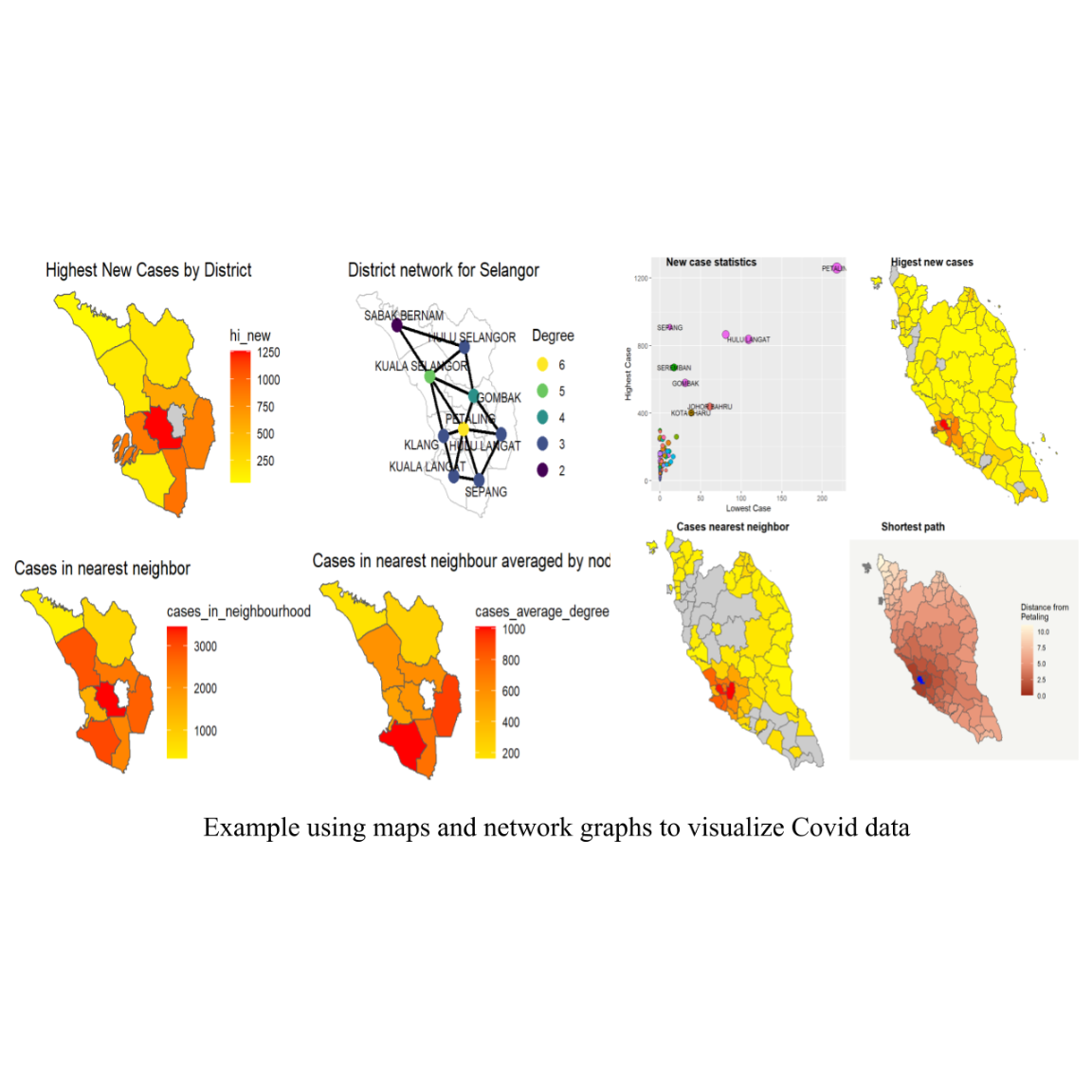
R is a great and versatile platform for exploratory data analysis, capable of creating almost any type of graph. This book helps you create the most popular visualizations - from quick and easy plots to publication-ready graphs. In addition to the normal graph layouts and formats, we will also cover how to combine the data with maps and network graphs.
The analysis is transparent and reproducible when the code is shared. If a reader is curious about where a value or statistic “came from”, or disagrees with a method, they can review the code, and are free to comment or ask questions if they like. We appreciate all the feedback.
Introduction to data science
Data science is the scientific method applied to data. We explore raw data to gain understanding, insight, and knowledge. The main “why” of “Painting the Malaysian Covid Public Data” is to help readers learn the most important tools in R that will allow them to apply the basics of data science to understand public data on Covid. After going through the many practical examples and more than 200 visuals in this book, readers will have the knowledge to apply the basic tools of data science using R.
What we will show
Data science is a huge field. We cannot cover everything in a single book. This book will give you a solid foundation in the most important tools; data preparation and visualization.
We adopt this easy model of the tools needed in a typical data science project from R for Data Science.
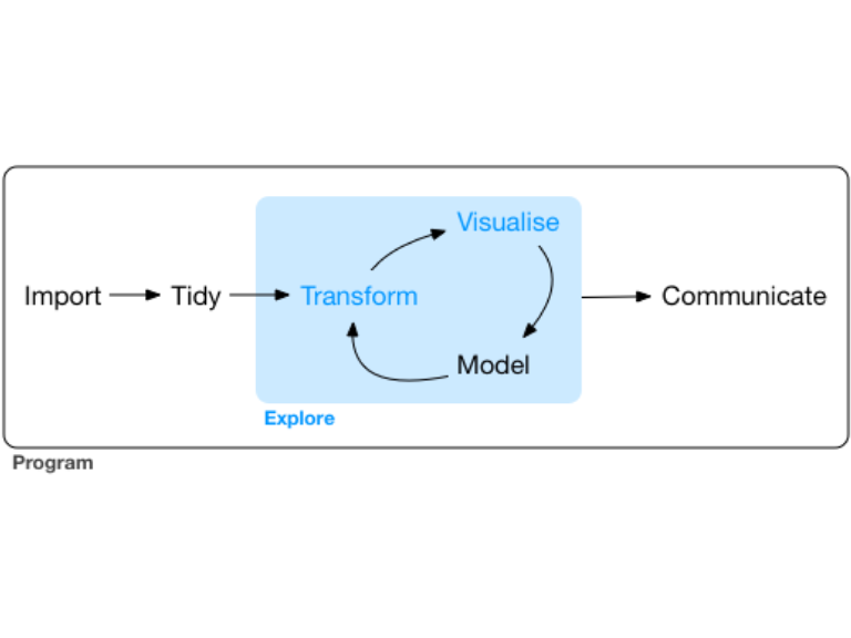
We will show examples of how to import the Malaysian and other Covid related data into R. We then use the relevant tools in R to tidy our Covid data in a consistent column and row format, where each column is a variable and each row is an observation. Our focus in this book is visualizing Covid data. But we need to transform the raw data we imported to use the visualization tools in R. We may need to narrow in on the data of interest by selecting columns and filtering rows. We may need to create new variables that are combinations or summaries of existing variables.
Our focus in this book is on visualization, so we will not do much modeling. We will visualize the data on an “as-is” basis, except for some data preparation to take advantage of the visualization tools in R.
We will try to limit programming in this book since we consider it an intermediate or advanced level in R. There will be some codes but we will guide our readers in the early chapters of the book to understand them. Being an expert programmer is not a requirement to be a data scientist, but better programming helps to automate common tasks, and solve new problems with greater ease.
How we organized this book
The book is an online version, dynamic and collaborative. We may add or modify chapters as new and more data becomes available.
We start immediately with the Malaysian public Covid data and show examples of visualizing it using some tools or packages of choice in R. We are not showing examples of nicely “canned” data but visualizing the actual real Malaysian and world public Covid data. We take a practical problem-solving approach and guide our readers on how to prepare the actual data to do basic plots. As we need to enhance the plots we will introduce the related plotting functions. We take a #learnbydoing approach.
The book has three parts. Part I covers the basic visualization tools like plotting axis, points, lines, columns, bars, pies, and donuts. But we do these using only one dataset at a time, without combining datasets. We have about 10 separate datasets on the Malaysian public Covid data.[https://github.com/MoH-Malaysia/covid19-public]
In Part II we take the next step to combine datasets and visualize them. This is very necessary in data science to augment existing data with other data for better analysis. For example, the daily new Covid cases dataset is separate from the daily new Covid deaths dataset. We need to combine them to explore and visualize simple relationships between Covid cases and deaths. Sometimes we need to combine with external datasets like maps (Chapter 8) and worldwide Covid data (Chapter 10). We also introduce some intermediate-level methods or techniques in data science, particularly network graphs. We find this to be missing in any analysis of the Malaysian Covid data. We will show how to use the tools of network graphs in R to analyze and visualize the Malaysian Covid data.
Part III We cover some advanced discussions on Covid in Malaysia and the world. The focus is still on visualization but the chapters are stand-alone and may combine other data like mobility, economic, and political. We also introduce other data science tools and techniques in R.
What we do not cover in this book
We focus on the basics of data preparation and visualization using only the R language. There are many topics in data science and visualization that we do not cover like
- Big data
- Python and other tools. We know that in practice, most data science teams use a mix of languages. R is a great place to start the data science exploration and visualization journey.
- Hypothesis confirmation. This book is on data exploration through visualization. There may be many interesting hypotheses to help explain why the Malaysian Covid data looks the way it does, but we will limit our comments on it.
- Modeling
Basic software required
Some software are required to run the example codes in this book: R, RStudio, a collection of R packages called the tidyverse, and a other packages that we will mention. We will guide the user on how to activate some of these packages but we leave it to the reader to explore other resources on how to download and install R https://cloud.r-project.org and RStudio http://www.rstudio.com/download for their own computers.
There are many excellent online resources to learn data science using R like R for Data Science.
Our sample R codes
Throughout the book we use a consistent set of conventions in our code:
- Many of the fonts for
functionslikeselect(), orgeom_point()are automatically formatted by theR Markdownfiles that we use to generate this book with the help of thebookdownpackage. - When we want to make it explicit what package a function comes from, we use the package name followed by two colons, like
dplyr::select(). - The codes here are free for our readers to use. They are written for ease to follow rather than efficiency. Thus they are not necessarily the best codes or even the best approach to solving the particular data preparation or data visualization problem. Our aim is to practically introduce the subject of data visualization in R using real-world Covid data on an “as-is” basis.
- We have spent some time to make our code easy for others to read:
- We used spaces and indents appropriately
- We avoided cryptic variable names.
- The codes work as long as the packages used are properly activated. Since this book is generated with
R Markdownandbookdown, the errors have been fixed. Again, the codes work but can be improved.
Permission to use

This work, as a whole, is licensed under a Creative Commons Attribution-NonCommercial-ShareAlike 4.0 International License.
The code contained in this book is simultaneously available under the MIT license; this means that you are free to use it in your own work, as long as you cite the source.
Acknowledgements
We wish to acknowledge the R programming community for the many wonderful packages which are well documented and supported by the developers. The packages are a significant contribution to the work of data science.
We thank RPubs which is an open publishing platform for HTML documents produced using RMarkdown from within RStudio, which we use to publish our blog articles.
The book is powered by https://bookdown.org which makes it easy to turn R markdown files into HTML, PDF, Word, and EPUB. It made preparations for this book easy.
Of course, a special thanks to those who worked hard to publish the Malaysian Covid data, without which we would not have started this project.
Lastly, we submit our gratitude to Allah (SWT) knowing that we can never thank Him (SWT) enough for having helped us in this project.
This book was built with:
Main references
“R for Data Science” introduces R as a tool for doing data science.
“R Graphics Cookbook” by Winston Chang, provides more than 150 recipes to help you generate high-quality graphs quickly.
“Data Visualization with R” by Rob Kabacoff, helps create the most popular visualizations in R.
“Data Visualization - A practical introduction” by Kieran Healy, introduces both the ideas and the methods of data visualization.
About the main authors

Azman Hussin is a continual learner of data science. He likes to use R, tidyverse, tidymodels, and text analytics.
He studied Physics in university many years ago but mainly worked in the IT industry. He then took up work in training and consulting on strategy management and completed his doctorate in that field. He has written a few books. He publishes some of his work on R at https://rpubs.com/azmanH. He also invests in listed technology companies. On Covid, he is a curious citizen who wants to get a sense of the prevalence of Covid through data so he can separate facts from opinions.
Contact at azman@nc.com.my.
“And our Lord is the Beneficent Allah, Whose help is sought” [Quran, 21:112]

Wan Hasni did his first degree in Statistics and Actuarial Science. He was engaged with data and numbers, statistics and modeling, and applications in risk studies, economic, and finance during his student years until the Ph.D. Today, the field that he was engaged in is called “Applied Data Science”.
His data science journey continued as he discovered the R programming language in its early days in 2001 when he worked on economic data. From 2010 onward, he took a deep dive into ML and AI algorithms, which took him to various fields of Statistical Learning, Machine Learning, Neural Networks, Deep Learning, and finally into Graph Theory and Network Science.
Dr. Wan has been instrumental in pushing for more granular public data on the Malaysian Covid situation.