Chapter 10 Vaccinations, New Cases and Deaths
One of the most frequently asked questions these days is whether the vaccine reduces the number of cases and deaths. This chapter will show examples of data visualization of the vaccination data with new cases, death, and population data. The work involves good data wrangling to combine four separate data frames.
As mentioned in the write-up for Part II, this chapter involves a combination of data frames with the necessary modifications.
We will need the following supporting packages. We have activated some in the earlier chapters.
library(ggplot2)
library(dplyr)
library(tidyverse)
library(tidyr)
library(readr)
library(sf)
library(maps)
library(patchwork)
library(leaflet)
Recall that the raw Malaysian vaccine dataset we downloaded in Chapter 1 is named vacn. We also calculated moving averages for mysstates and mysdeaths in Chapter 6 and saved it.
mysstates <- readRDS("data/casesroll.rds")
mysdeaths <- readRDS("data/deathsroll.rds")
popn <- readRDS("data/popn.rds")
vacn <- readRDS("data/vacn.rds")
10.1 Data Preparation
We need to combine the new cases (mysstates), deaths (mysdeaths), vaccination (vacn), and population (popn) data frames. We will do this in deliberate steps while making small adjustments to the appropriate data columns like converting to the same case and data type.
For more efficient programming we should first check for the conditions of upper case and/or date types before converting but it will involve some if-else statements related to R programming. We want to avoid that in this book.
1. Combine new cases (mysstates), deaths (mysdeaths)
mysstates$state <- toupper(mysstates$state)
mysdeaths$state <- toupper(mysdeaths$state)

mysstates$date <- as.Date(mysstates$date)
mysdeaths$date <- as.Date(mysdeaths$date)

mysstates %>% left_join(mysdeaths, by=c("date", "state")) -> df_raw
df_raw
## # A tibble: 9,856 x 14
## date state cases_new new_conf_03da new_conf_05da new_conf_07da
## <date> <chr> <dbl> <dbl> <dbl> <dbl>
## 1 2020-01-25 JOHOR 4 NA NA NA
## 2 2020-01-25 KEDAH 0 NA NA NA
## 3 2020-01-25 KELANTAN 0 NA NA NA
## 4 2020-01-25 MELAKA 0 NA NA NA
## 5 2020-01-25 NEGERI SEMBIL~ 0 NA NA NA
## 6 2020-01-25 PAHANG 0 NA NA NA
## 7 2020-01-25 PERAK 0 NA NA NA
## 8 2020-01-25 PERLIS 0 NA NA NA
## 9 2020-01-25 PULAU PINANG 0 NA NA NA
## 10 2020-01-25 SABAH 0 NA NA NA
## # ... with 9,846 more rows, and 8 more variables: new_conf_15da <dbl>,
## # new_conf_21da <dbl>, deaths_new <int>, death_03da <dbl>, death_05da <dbl>,
## # death_07da <dbl>, death_15da <dbl>, death_21da <dbl>Recall that in Chapter 6 we calculated the rolling averages for mysstates and mysdeaths. We carry over these additional columns for now. We can un-select them later.
2. Combine df_raw with vacn
vacn$state <- toupper(vacn$state)
vacn$date <- as.Date(vacn$date)

df_raw %>% left_join(vacn, by=c("date", "state")) -> df_raw
df_raw
## # A tibble: 9,856 x 32
## date state cases_new new_conf_03da new_conf_05da new_conf_07da
## <date> <chr> <dbl> <dbl> <dbl> <dbl>
## 1 2020-01-25 JOHOR 4 NA NA NA
## 2 2020-01-25 KEDAH 0 NA NA NA
## 3 2020-01-25 KELANTAN 0 NA NA NA
## 4 2020-01-25 MELAKA 0 NA NA NA
## 5 2020-01-25 NEGERI SEMBIL~ 0 NA NA NA
## 6 2020-01-25 PAHANG 0 NA NA NA
## 7 2020-01-25 PERAK 0 NA NA NA
## 8 2020-01-25 PERLIS 0 NA NA NA
## 9 2020-01-25 PULAU PINANG 0 NA NA NA
## 10 2020-01-25 SABAH 0 NA NA NA
## # ... with 9,846 more rows, and 26 more variables: new_conf_15da <dbl>,
## # new_conf_21da <dbl>, deaths_new <int>, death_03da <dbl>, death_05da <dbl>,
## # death_07da <dbl>, death_15da <dbl>, death_21da <dbl>, daily_partial <int>,
## # daily_full <int>, daily <int>, daily_partial_child <int>,
## # daily_full_child <int>, cumul_partial <int>, cumul_full <int>, cumul <int>,
## # cumul_partial_child <int>, cumul_full_child <int>, pfizer1 <int>,
## # pfizer2 <int>, sinovac1 <int>, sinovac2 <int>, astra1 <int>, ...We now have 32 columns of data. We will not need all of them but let us focus on combining the data frames into the df_raw data frame that we have progressively built.
3. Combine df_raw with popn
## # A tibble: 9,856 x 36
##    date       state          cases_new new_conf_03da new_conf_05da new_conf_07da
##    <date>     <chr>              <dbl>         <dbl>         <dbl>         <dbl>
##  1 2020-01-25 JOHOR                  4            NA            NA            NA
##  2 2020-01-25 KEDAH                  0            NA            NA            NA
##  3 2020-01-25 KELANTAN               0            NA            NA            NA
##  4 2020-01-25 MELAKA                 0            NA            NA            NA
##  5 2020-01-25 NEGERI SEMBIL~         0            NA            NA            NA
##  6 2020-01-25 PAHANG                 0            NA            NA            NA
##  7 2020-01-25 PERAK                  0            NA            NA            NA
##  8 2020-01-25 PERLIS                 0            NA            NA            NA
##  9 2020-01-25 PULAU PINANG           0            NA            NA            NA
## 10 2020-01-25 SABAH                  0            NA            NA            NA
## # ... with 9,846 more rows, and 30 more variables: new_conf_15da <dbl>,
## #   new_conf_21da <dbl>, deaths_new <int>, death_03da <dbl>, death_05da <dbl>,
## #   death_07da <dbl>, death_15da <dbl>, death_21da <dbl>, daily_partial <int>,
## #   daily_full <int>, daily <int>, daily_partial_child <int>,
## #   daily_full_child <int>, cumul_partial <int>, cumul_full <int>, cumul <int>,
## #   cumul_partial_child <int>, cumul_full_child <int>, pfizer1 <int>,
## #   pfizer2 <int>, sinovac1 <int>, sinovac2 <int>, astra1 <int>, ...
Again there are more efficient ways of doing this like using look-up tables42 but again our purpose is to prepare the data in an easy way for visualization.
So now we have all the relevant data combined in one data frame df_raw.
4. Rolling average for percent of population vaccinated
Let us build upon our knowledge of rolling averages from Chapter 6. We have in our df_raw dataset various rolling averages of the new cases and deaths. Let us do the same for the percentage of the population that has received the first and second doses respectively for each state. We will just calculate the 3-day rolling average which is equivalent to a weekly average. Our readers can try the other combinations on their own following the sample code below.
The absolute numbers of each metric like new cases or deaths or vaccinations will scale the graphs differently since vaccinations per state are by the order of thousands and deaths are by the order of tens. We chose to look at ratios and use percentages.
- New cases per population
- First vaccine dose per population (partially vaccinated)
- Second vaccine dose per population (fully vaccinated)
- Deaths per case
- Omit
NAdata - Use the long format for easy plotting
df_raw %>%
  arrange(desc(state)) %>%
  group_by(state) %>%
  mutate(dose1_03da = zoo::rollmean(round(cumul_partial/pop,4)*100,
                                    k = 3, fill = NA),
         dose2_03da = zoo::rollmean(round(cumul_full/pop,4)*100,
                                    k = 3, fill = NA)) %>%
  ungroup() %>%
  na.omit() %>%
  mutate(case_per_popn = round(new_conf_03da/pop,4)*100,
         death_per_case = round(death_03da/new_conf_03da,4)*100,
         popn_part_vacc = dose1_03da,
         popn_full_vacc = dose2_03da) %>%
  select(date, state, case_per_popn, death_per_case,
         popn_part_vacc, popn_full_vacc) %>%
  gather(Metric, Value, 3:6) -> df_long
df_long
## # A tibble: 13,376 x 4
## date state Metric Value
## <date> <chr> <chr> <dbl>
## 1 2021-02-25 W.P. PUTRAJAYA case_per_popn 0
## 2 2021-02-26 W.P. PUTRAJAYA case_per_popn 0
## 3 2021-02-27 W.P. PUTRAJAYA case_per_popn 0
## 4 2021-02-28 W.P. PUTRAJAYA case_per_popn 0
## 5 2021-03-01 W.P. PUTRAJAYA case_per_popn 0
## 6 2021-03-02 W.P. PUTRAJAYA case_per_popn 0
## 7 2021-03-03 W.P. PUTRAJAYA case_per_popn 0
## 8 2021-03-04 W.P. PUTRAJAYA case_per_popn 0
## 9 2021-03-05 W.P. PUTRAJAYA case_per_popn 0
## 10 2021-03-06 W.P. PUTRAJAYA case_per_popn 0
## # ... with 13,366 more rowsIn Figure 10.1 we combine geom_line, and facet_wrap. We also use the min and max to get values for the subtitle.
In addition we will show how to set our own colors for the lines using scale_colour_manual(values = myPalette) and for the fills using scale_fill_manual(values = myPalette). The default colors in ggplot2 can be difficult to distinguish from one another because they have equal luminance.43 There exists different options to specify a color in R44:
- using numbers from 1 to 8, e.g.
col = 1, - specifying the color name, e.g.
col = "blue", - the HEX value of the color, e.g.
col = "#0000FF", or - the RGB value making use of the rgb function, e.g. col =
rgb(0, 0, 1).
We will define using the color name option.
min_date <- min(df_long$date, na.rm = T)
max_date <- max(df_long$date, na.rm = T)

myPalette = c("darkblue", "darkred", "darkorange3", "aquamarine4")
df_long %>%
  ggplot(aes(x = date, y = Value, color = Metric)) +
  geom_line() +
  facet_wrap(~state) +
  labs(title = "Rolling 3 day averages of selected Covid metrics",
       subtitle = paste0("Between ", min_date,  " and ", max_date),
       y = "Percent",
       color = "Metric:",
       x = "Day") +
  scale_fill_manual(values = myPalette) +
  scale_colour_manual(values = myPalette) +
  theme_bw() +
  theme(legend.position = "top")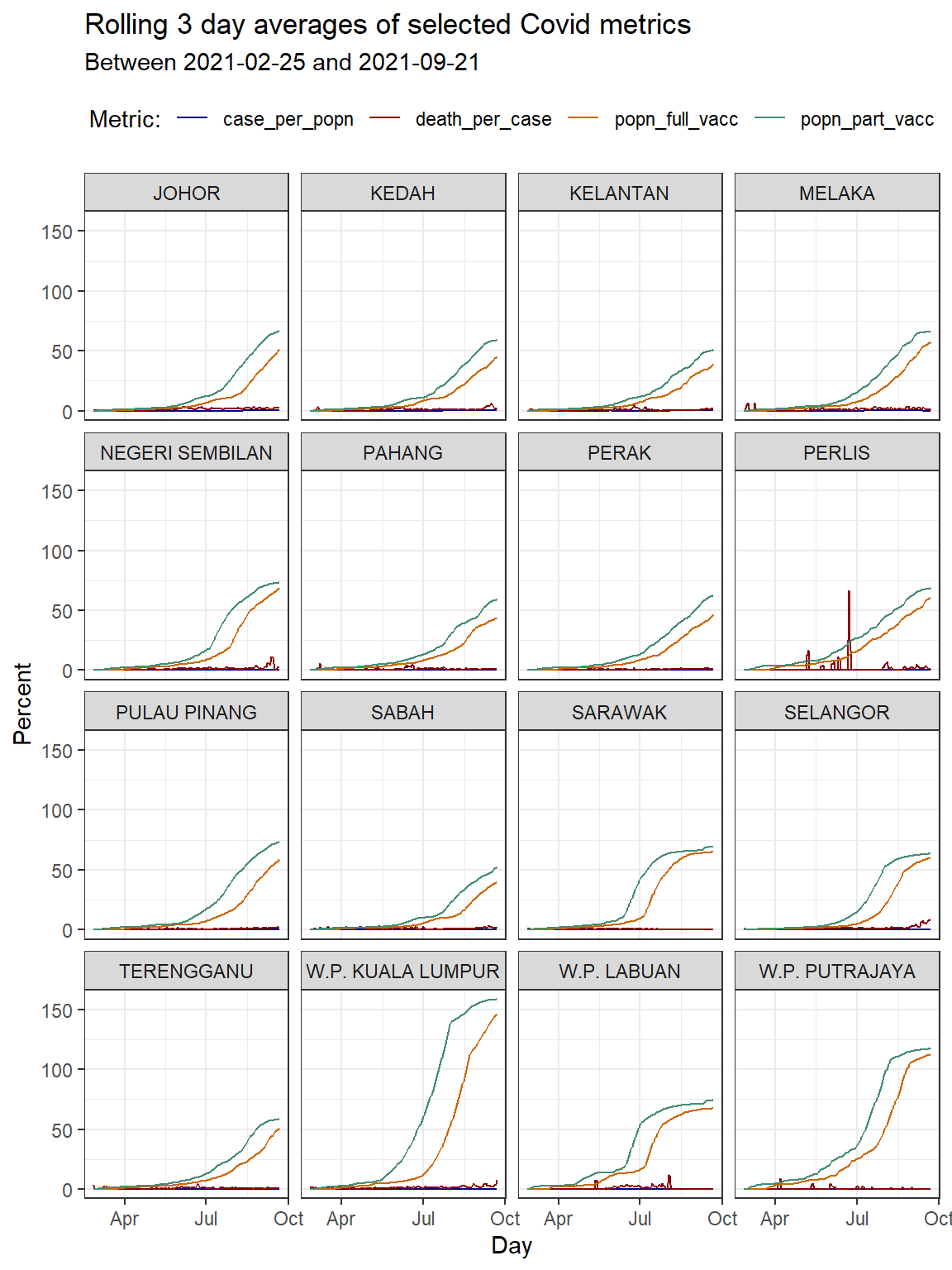
Figure 10.1: Line graph of 3-day rolling averages faceted by state
We suspect that the vaccination for some states includes foreign workers and foreign students who are not part of the population. This may explain the vaccination per population percentage that exceeds 100%.
Since the death cases per state are in the first order of magnitude (less than 100) we can fit it in the scale of the plot that we have (0 to 100). Although we have data until “2021-10-01”, Figure 10.1 says that after removing NA data the dates for the data plotted are between 2021-02-25 and 2021-09-21.
In Figure 10.2 we combine 3 ggplot functions; geom_col, geom_line, and facet_wrap.
df_raw %>%
  select (date, state, death_03da) -> deaths

deaths %>%
  ggplot(aes(x = date, y = death_03da)) +
  geom_col(alpha = 0.3, linetype = 0) +
  geom_line(data = df_long,
           mapping = aes(x = date, y = Value, color = Metric)) +
  scale_colour_manual(values = myPalette) +
  facet_wrap(~state) +
  labs(title = "Rolling 3 day averages of selected Covid metrics",
       subtitle = paste0("Between ", min_date,  " and ", max_date),
       caption = "Absolute deaths in gray columns",
       y = "Percent",
       color = "Metric:",
       x = "Day") +
  theme_bw() +
  theme(legend.position = "top")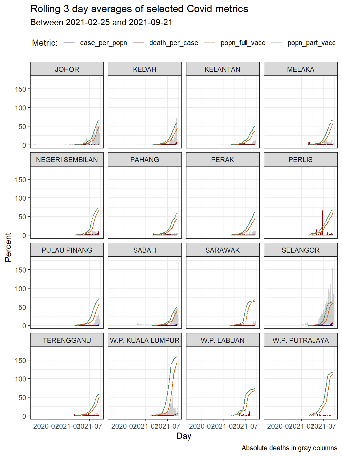
Figure 10.2: Column bar graph of new Covid cases with rolling averages faceted by state
We repeat Figure 10.2 but with “with free scale y-axis”.
df_raw %>%
  select (date, state, death_03da) -> deaths

deaths %>%
  ggplot(aes(x = date, y = death_03da)) +
  geom_col(alpha = 0.3, linetype = 0) +
  geom_line(data = df_long,
           mapping = aes(x = date, y = Value, color = Metric)) +
  scale_colour_manual(values = myPalette) +
  facet_wrap(~state, scale="free_y") +
  labs(title = "Rolling 3 day averages of selected Covid metrics",
       subtitle = paste0("Between ", min_date,  " and ", max_date),
       caption = "Absolute deaths in gray columns and free scale y-axis",
       y = "Percent",
       color = "Metric:",
       x = "Day") +
  theme_bw() +
  theme(legend.position = "top")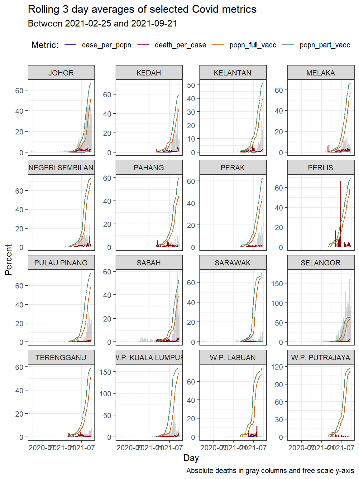
Figure 10.3: Column bar graph of new Covid cases with rolling averages faceted by state
As we have often mentioned that the scale="free_y" option used in Figure 10.3 helps us see the actual trends. We need more data to ascertain the effectiveness of the vaccination program like mobility, clusters where the cases or deaths are happening, etc. The plots show visual trends but cannot determine the “why”.
Let us zoom into the most problematic state SELANGOR.
df_raw %>%
  filter (state == "SELANGOR") %>%
  select (date, state, death_03da) -> deathSel

df_long %>%
  filter (state == "SELANGOR") -> df_Sel

deathSel %>%
  ggplot(aes(x = date, y = death_03da)) +
  geom_col(alpha = 0.3, linetype = 0) +
  geom_line(data = df_Sel,
           mapping = aes(x = date, y = Value, color = Metric)) +
  scale_colour_manual(values = myPalette) +
  labs(title = "Rolling 3 day averages of selected Covid metrics in Selangor",
       subtitle = paste0("Between ", min_date,  " and ", max_date),
       caption = "Absolute deaths in gray columns from the start",
       y = "Percent",
       color = "Metric:",
       x = "Day") +
  theme_bw() +
  theme(legend.position = "top")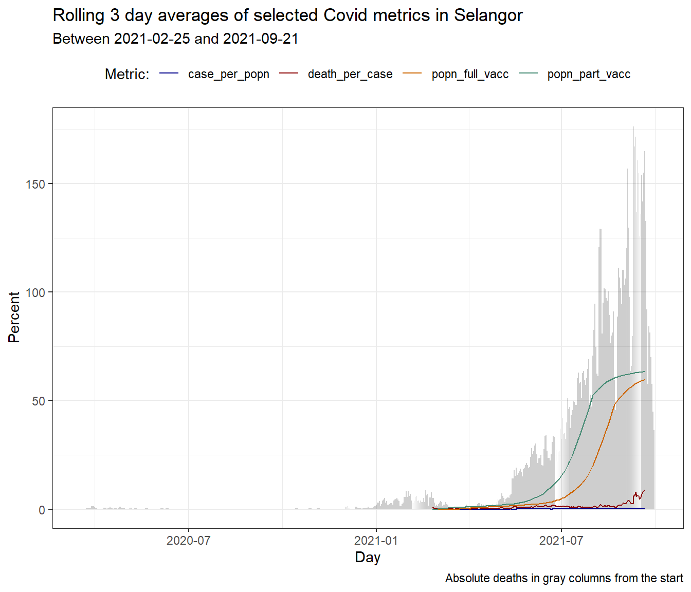
Figure 10.4: Column bar graph of new Covid deaths with rolling averages for SELANGOR
A casual look at Figure 10.4 raises the question as to what happened prior to January 2021 that led to the unabated rise in deaths (and new cases) in SELANGOR. Just for the sake of learning visualization in R, we add a vertical line to the plot to mark the end of the SABAH state by-elections.
df_raw %>%
  filter (state == "SELANGOR") %>%
  select (date, state, death_03da) -> deathSel

df_long %>%
  filter (state == "SELANGOR") -> df_Sel

deathSel %>%
  ggplot(aes(x = date, y = death_03da)) +
  geom_col(alpha = 0.3, linetype = 0) +
  geom_line(data = df_Sel,
           mapping = aes(x = date, y = Value, color = Metric)) +
  scale_colour_manual(values = myPalette) +
  geom_text(aes(x=as.Date("2020-09-26"), label="PRN Sabah", y = 20),
        colour="blue", angle=90, vjust = 0, size = 3) +
  geom_vline(xintercept=as.Date("2020-09-26"), color="blue") +
  labs(title = "Rolling 3 day averages of selected Covid metrics in Selangor",
       subtitle = paste0("Between ", min_date,  " and ", max_date),
       caption = "Absolute deaths in gray columns from the start",
       y = "Percent",
       color = "Metric:",
       x = "Day") +
  theme_bw() +
  theme(legend.position = "top")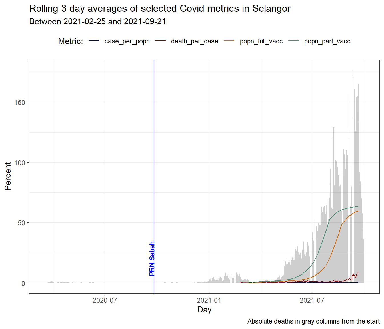
Figure 10.5: Adding a vertical mark line to a busy plot
10.2 Discussion
We have illustrated how to combine the Malaysian Covid case, death, and vaccination data and visualize some combinations of the data through simple column and line plots. All the figures show that the vaccination is not having the obvious desired effect of reducing new infections. There are of course other factors causing the spread of the virus. Of greater concern, is the death cases.
Vaccination is a key intervention that is being considered in moving a country toward normalcy.45 Except for the supply of vaccines (which is improving), everything else related to the vaccination is in our own hands. But we must administer the vaccines with a clear purpose. We must do it to fit some exit strategy out of Covid. Right now, the current data shows that the cases are not abating and the deaths are increasing. We need more granular data to answer some of the issues and questions raised.
10.3 Comparing With Other Countries
Covid-19 is a global pandemic. It is important to compare how we are doing in Malaysia with that of other countries especially our neighbours. The world has been very open in sharing Covid related data that has become the primary reference for many researchers and even the public. The most commonly referred to are Our World In Data or OWID46 and Johns Hopkins Coronavirus Research Center47.
Let us compare how Malaysia is faring compared to selected countries on some chosen metrics. Our main purpose here is to show how to visualize public data from OWID related to the title of this chapter, “Vaccinations, New Cases and Deaths”.
10.3.1 Download and prepare data
We will start with the OWID data first since it is quite comprehensive and is widely quoted. We download the raw data in .csv format and save it as an rds file. The data we analyze is as of “2021-09-15”. Again, we use this data in case there are changes to the owid data set. Our purpose is instructional rather than accuracy.
# owid = read.csv("https://raw.githubusercontent.com/owid/covid-19-data/master/public/data/owid-covid-data.csv")
# saveRDS(owid, "data/owid.rds")
owid <- readRDS("data/owid.rds")
str(owid)
## 'data.frame': 116807 obs. of 62 variables:
## $ iso_code : chr "AFG" "AFG" "AFG" "AFG" ...
## $ continent : chr "Asia" "Asia" "Asia" "Asia" ...
## $ location : chr "Afghanistan" "Afghanistan" "Afghanistan" "Afghanistan" ...
## $ date : chr "2020-02-24" "2020-02-25" "2020-02-26" "2020-02-27" ...
## $ total_cases : num 5 5 5 5 5 5 5 5 5 5 ...
## $ new_cases : num 5 0 0 0 0 0 0 0 0 0 ...
## $ new_cases_smoothed : num NA NA NA NA NA 0.714 0.714 0 0 0 ...
## $ total_deaths : num NA NA NA NA NA NA NA NA NA NA ...
## $ new_deaths : num NA NA NA NA NA NA NA NA NA NA ...
## $ new_deaths_smoothed : num NA NA NA NA NA 0 0 0 0 0 ...
## $ total_cases_per_million : num 0.126 0.126 0.126 0.126 0.126 0.126 0.126 0.126 0.126 0.126 ...
## $ new_cases_per_million : num 0.126 0 0 0 0 0 0 0 0 0 ...
## $ new_cases_smoothed_per_million : num NA NA NA NA NA 0.018 0.018 0 0 0 ...
## $ total_deaths_per_million : num NA NA NA NA NA NA NA NA NA NA ...
## $ new_deaths_per_million : num NA NA NA NA NA NA NA NA NA NA ...
## $ new_deaths_smoothed_per_million : num NA NA NA NA NA 0 0 0 0 0 ...
## $ reproduction_rate : num NA NA NA NA NA NA NA NA NA NA ...
## $ icu_patients : num NA NA NA NA NA NA NA NA NA NA ...
## $ icu_patients_per_million : num NA NA NA NA NA NA NA NA NA NA ...
## $ hosp_patients : num NA NA NA NA NA NA NA NA NA NA ...
## $ hosp_patients_per_million : num NA NA NA NA NA NA NA NA NA NA ...
## $ weekly_icu_admissions : num NA NA NA NA NA NA NA NA NA NA ...
## $ weekly_icu_admissions_per_million : num NA NA NA NA NA NA NA NA NA NA ...
## $ weekly_hosp_admissions : num NA NA NA NA NA NA NA NA NA NA ...
## $ weekly_hosp_admissions_per_million : num NA NA NA NA NA NA NA NA NA NA ...
## $ new_tests : num NA NA NA NA NA NA NA NA NA NA ...
## $ total_tests : num NA NA NA NA NA NA NA NA NA NA ...
## $ total_tests_per_thousand : num NA NA NA NA NA NA NA NA NA NA ...
## $ new_tests_per_thousand : num NA NA NA NA NA NA NA NA NA NA ...
## $ new_tests_smoothed : num NA NA NA NA NA NA NA NA NA NA ...
## $ new_tests_smoothed_per_thousand : num NA NA NA NA NA NA NA NA NA NA ...
## $ positive_rate : num NA NA NA NA NA NA NA NA NA NA ...
## $ tests_per_case : num NA NA NA NA NA NA NA NA NA NA ...
## $ tests_units : chr "" "" "" "" ...
## $ total_vaccinations : num NA NA NA NA NA NA NA NA NA NA ...
## $ people_vaccinated : num NA NA NA NA NA NA NA NA NA NA ...
## $ people_fully_vaccinated : num NA NA NA NA NA NA NA NA NA NA ...
## $ total_boosters : num NA NA NA NA NA NA NA NA NA NA ...
## $ new_vaccinations : num NA NA NA NA NA NA NA NA NA NA ...
## $ new_vaccinations_smoothed : num NA NA NA NA NA NA NA NA NA NA ...
## $ total_vaccinations_per_hundred : num NA NA NA NA NA NA NA NA NA NA ...
## $ people_vaccinated_per_hundred : num NA NA NA NA NA NA NA NA NA NA ...
## $ people_fully_vaccinated_per_hundred : num NA NA NA NA NA NA NA NA NA NA ...
## $ total_boosters_per_hundred : num NA NA NA NA NA NA NA NA NA NA ...
## $ new_vaccinations_smoothed_per_million: num NA NA NA NA NA NA NA NA NA NA ...
## $ stringency_index : num 8.33 8.33 8.33 8.33 8.33 ...
## $ population : num 39835428 39835428 39835428 39835428 39835428 ...
## $ population_density : num 54.4 54.4 54.4 54.4 54.4 ...
## $ median_age : num 18.6 18.6 18.6 18.6 18.6 18.6 18.6 18.6 18.6 18.6 ...
## $ aged_65_older : num 2.58 2.58 2.58 2.58 2.58 ...
## $ aged_70_older : num 1.34 1.34 1.34 1.34 1.34 ...
## $ gdp_per_capita : num 1804 1804 1804 1804 1804 ...
## $ extreme_poverty : num NA NA NA NA NA NA NA NA NA NA ...
## $ cardiovasc_death_rate : num 597 597 597 597 597 ...
## $ diabetes_prevalence : num 9.59 9.59 9.59 9.59 9.59 9.59 9.59 9.59 9.59 9.59 ...
## $ female_smokers : num NA NA NA NA NA NA NA NA NA NA ...
## $ male_smokers : num NA NA NA NA NA NA NA NA NA NA ...
## $ handwashing_facilities : num 37.7 37.7 37.7 37.7 37.7 ...
## $ hospital_beds_per_thousand : num 0.5 0.5 0.5 0.5 0.5 0.5 0.5 0.5 0.5 0.5 ...
## $ life_expectancy : num 64.8 64.8 64.8 64.8 64.8 ...
## $ human_development_index : num 0.511 0.511 0.511 0.511 0.511 0.511 0.511 0.511 0.511 0.511 ...
## $ excess_mortality : num NA NA NA NA NA NA NA NA NA NA ...It has 62 variables and has all the data we need to look at Vaccinations, New Cases, and Deaths. OWID has done all the work and more just like we did to combine our 4 data frames into df_raw.
In the owid data frame, we have the number of new cases and new deaths per day, and the population number of related countries. In the below code block, we are replacing blank and NA data with zeros for new cases and new deaths variables. We will limit the data to only this year. Almost every country is included in owid. We will select a few countries to compare in the initial plots.
Preparing the dataset
countrylist = c("Malaysia", "India", "Thailand", "Indonesia",
                "Saudi Arabia", "Vietnam", "Singapore", "Turkey")
owid %>%
  filter(location %in% countrylist) %>%
  mutate(
    date = as.Date(.$date),
    new_deaths = if_else(is.na(.$new_deaths), 0, .$new_deaths),
    new_cases = if_else(is.na(.$new_cases), 0 , .$new_cases)
    ) %>%
  filter(.$date >= "2021-01-01") -> dfo
First, we will compare the number of cases per day (new_cases) but we have to scale the related variable because each country has a different population.
owid and its subset for the 8 selected countries in dfo are both in the wide format. dfo has all the variables (columns) we need to repeat many of the Covid related metrics we calculated for the states in SELANGOR. We may need to combine some of the variables in dfo to get the exact metrics.
There are 8 selected countries. So we extend our myPalette = c("darkblue", "darkred", "darkorange3", "aquamarine4") to include another 4 colors. We again chose the darker colors.
We will start with some simple plots and then include combinations of the variables.
10.3.2 Plots to compare selected countries
myPalette = c("darkblue", "darkred", "darkorange3", "aquamarine4",
              "brown4", "darkolivegreen", "darkorchid", "deeppink")
dfo %>%
  group_by(location) %>%
  ggplot(aes(x = date,
             y = new_cases,
             color = location)) +
  geom_line(size=1) +
  scale_colour_manual(values = myPalette) +
  labs(x="", y="New Cases", color="Countries") +
  theme_minimal()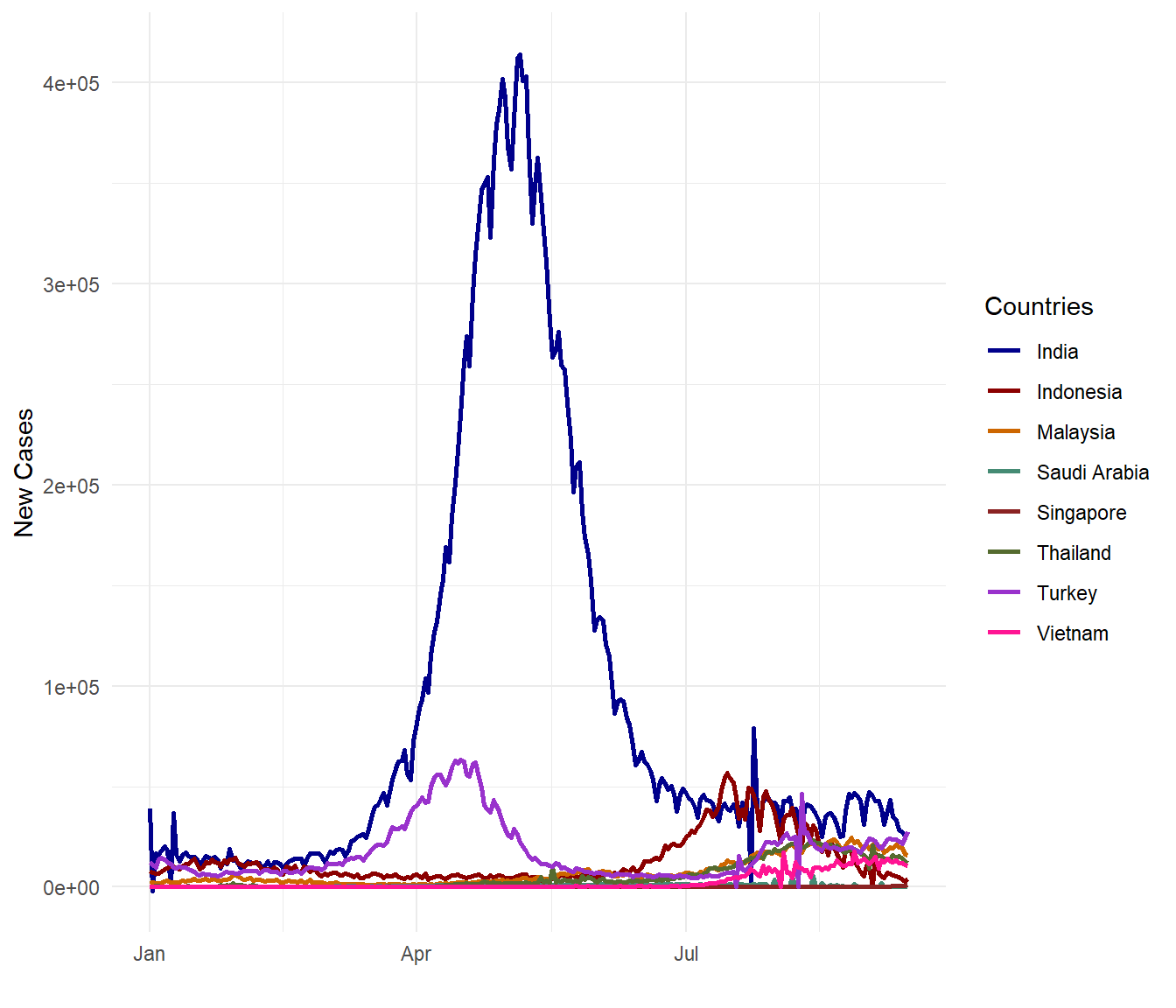
Figure 10.6: New Covid cases for selected countries
There have been many claims that Malaysia is doing bad on the Covid data on a per population basis. Let us see based on the selected countries. We use the new_cases_per_million variable.
dfo %>%
  group_by(location) %>%
  ggplot(aes(x = date,
             y = new_cases_per_million,
             color = location)) +
  geom_line(size=1) +
  scale_colour_manual(values = myPalette) +
  labs(x="", y="New Cases per Million", color="Countries") +
  theme_minimal()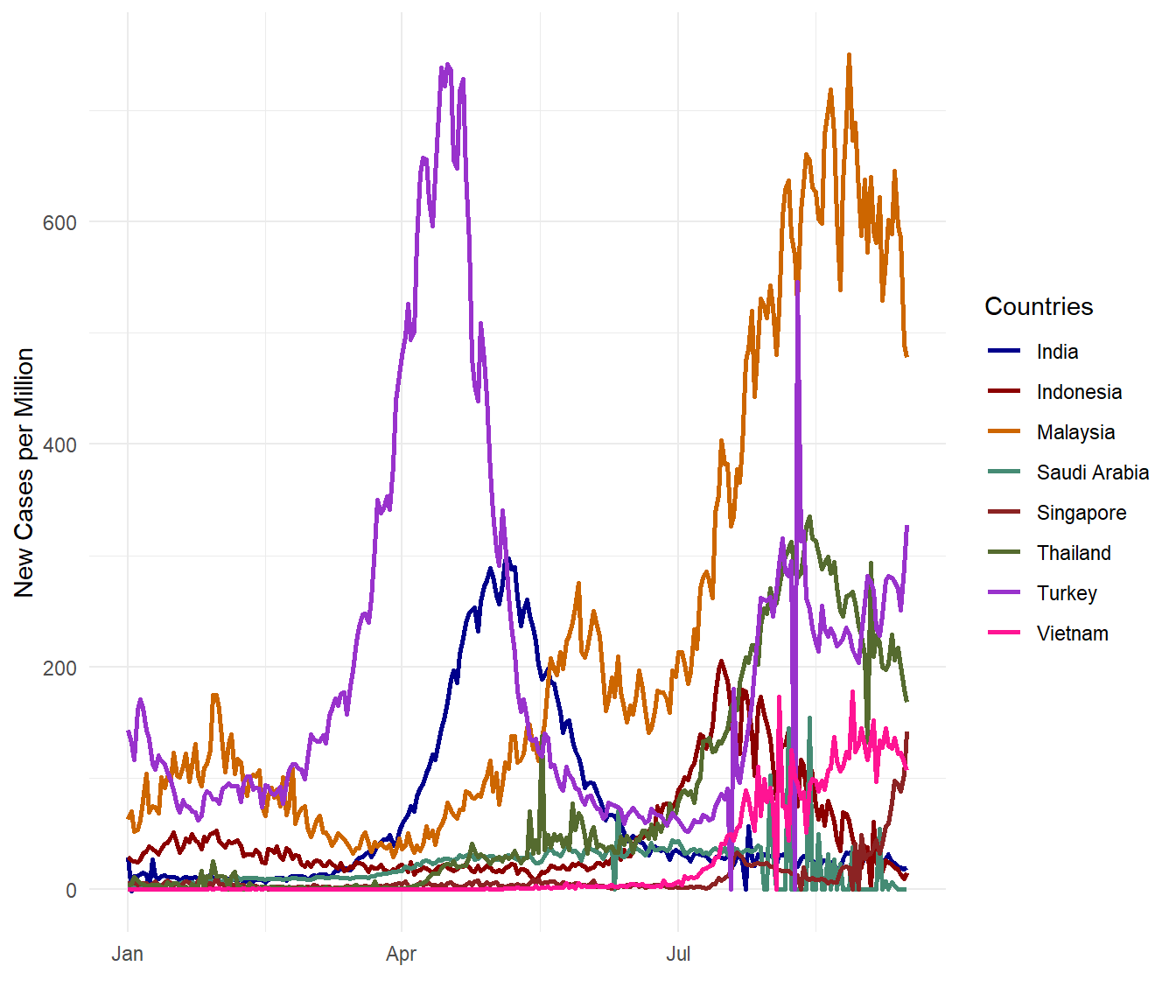
Figure 10.7: New Covid cases per million for selected countries
OMG! Malaysia is getting worse! (Visual exploration does invoke such exclamations.) Perhaps new_cases_per_million is not the same with new_cases_per_popn? Let us check (since we are indeed looking bad compared with the selected countries).
dfo %>%
  group_by(location) %>%
  mutate(new_cases_per_popn = (new_cases/population)*100) %>%
  ggplot(aes(x = date,
             y = new_cases_per_popn,
             color = location)) +
  geom_line(size=1) +
  scale_colour_manual(values = myPalette) +
  labs(x="", y="New Cases per Million", color="Countries") +
  theme_minimal()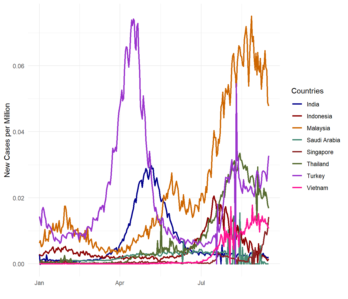
Figure 10.8: New Covid cases per population for selected countries
As expected, Figure 10.7 and Figure 10.8 show the same results trend-wise although the numbers are different by definition. new_cases_per_million takes the number of new cases for every one million persons in the population while new_cases_per_popn simply divides the new cases by the population.
Now we look into the more serious death data. We will plot 3 different graphs. Just to explore another variable in the dfo data frame, we look at the smoothed data new_deaths_smoothed which uses rolling averages that we discussed in Chapter 6. Please note that we are comparing selected countries starting from 01 January 2021. From the sample codes given, our readers can select their own countries and also the time periods they want to compare.
dfo %>%
  group_by(location) %>%
  ggplot(aes(x = date,
             y = new_deaths_smoothed,
             color = location)) +
  geom_line(size=1) +
  scale_colour_manual(values = myPalette) +
  labs(x="", y="New Deaths", color="Countries") +
  theme_minimal()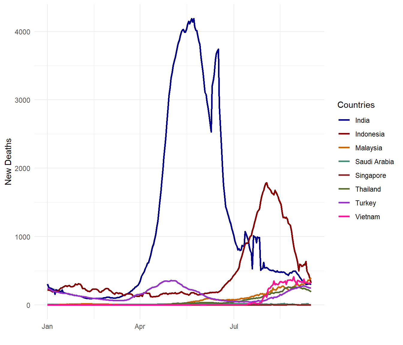
Figure 10.9: Smoothed daily Covid deaths for selected countries
dfo %>%
  group_by(location) %>%
  ggplot(aes(x = date,
             y = new_deaths_smoothed_per_million,
             color = location)) +
  geom_line(size=1) +
  scale_colour_manual(values = myPalette) +
  labs(x="", y="New Deaths per Million Population", color="Countries") +
  theme_minimal()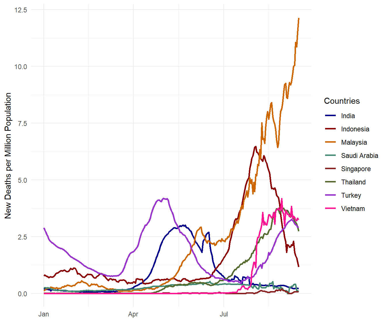
Figure 10.10: Daily Covid deaths per million population for selected countries
Figure 10.9 and Figure 10.10 show a contrasting picture. Both metrics are valid and correct in data analytics and data science and they are really beginning to tell a more complete story.
Let us look at two more plots on this sad topic of deaths. We will plot the total Covid death toll per population and per case amount. We will also make use of some functions from the scales package that allows us to display better labels. Instead of location we use the iso_code of the countries so the character length for the country will be the same.
mindfodate = min(dfo$date)
maxdfodate = max(dfo$date)

dfo %>%
  group_by(iso_code) %>%
  summarize(totaldeaths_million = sum(new_deaths_per_million, na.rm=TRUE)) %>%
  ggplot(aes(x = reorder(iso_code, totaldeaths_million),
             y = totaldeaths_million,
             fill = iso_code)) +
  geom_bar(stat = "identity", position = "identity") +
  scale_y_continuous(limits = c(0, NA)) +
  labs(x="", y="",
       title = "Total Covid Deaths per Million Population",
       subtitle = paste0("Between ", mindfodate,  " and ", maxdfodate)) +
  theme_minimal() +
  theme(legend.position = "none")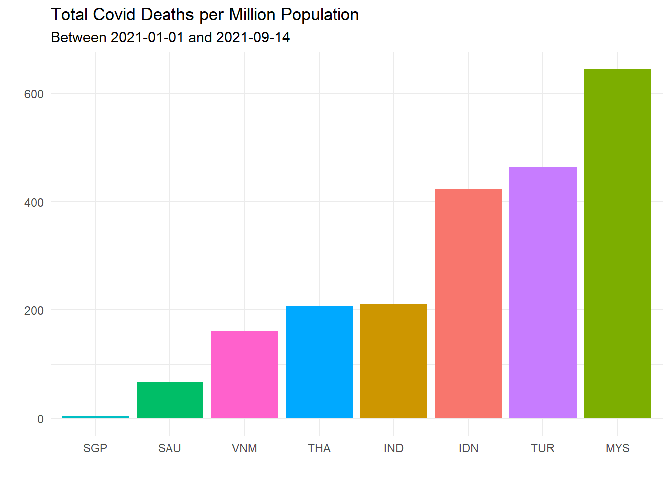
Figure 10.11: Total Covid deaths per million population for selected countries
Figure 10.11 confirms that MYS (Malaysia) looks worst for the Covid death rate per population.
dfo %>%
  group_by(iso_code) %>%
  summarize(totalcases = sum(new_cases, na.rm=TRUE),
            totaldeaths = sum(new_deaths, na.rm=TRUE)) %>%
  mutate(deathsPerCase = totaldeaths/totalcases) %>%
  ggplot(aes(x = reorder(iso_code, deathsPerCase),
             y = deathsPerCase,
             fill = iso_code)) +
  geom_bar(stat = "identity", position = "identity") +
  scale_y_continuous(limits = c(0, NA),
                     labels = scales::percent_format()) +
  labs(x="", y="",
       title = "Percent Total Covid Deaths per Total Case",
       subtitle = paste0("Between ", mindfodate,  " and ", maxdfodate)) +
  theme_minimal() +
  theme(legend.position = "none")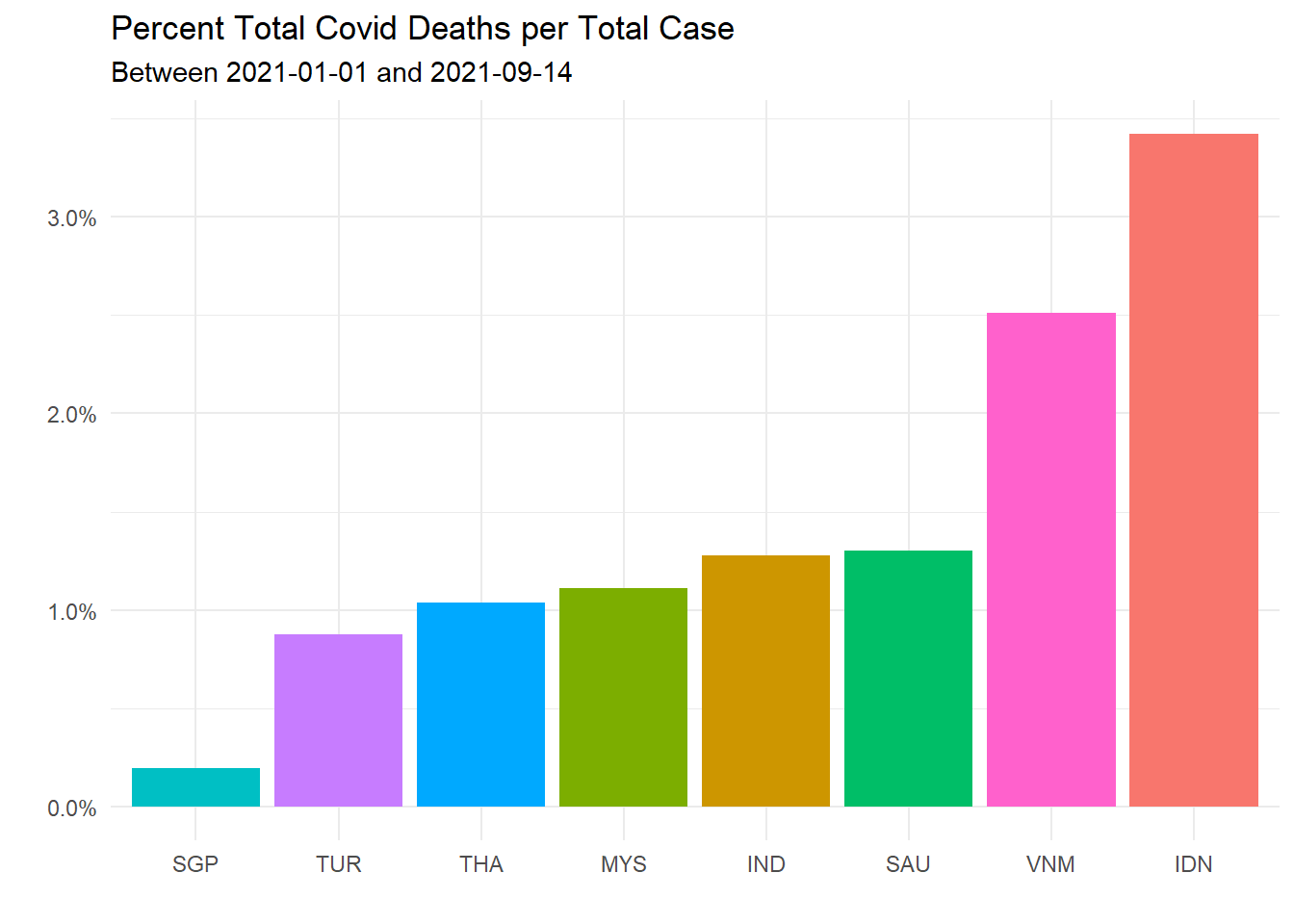
Figure 10.12: Total Covid deaths per total case for selected countries
Figure 10.12 says that our Covid death rate per population is high because our Covid case per population is high. Our death rate per case is about 1 percent, comparable to others among the selected list.
10.3.3 Where does Malaysia stand compared to the rest of the world?
Let us look at the last two parameters, totaldeaths_million and deathsPerCase, starting from 01 January 2021. Let us look at the worst 20 countries in the world. We make no other presumptions, just what the data says. We like that date because it is more than 12 months since the first Covid-19 outbreak in Wuhan, China in November 2019. So the world has had time to learn how each country coped with Covid.
In Figure 10.13 we make use of arrange(desc(totaldeaths_million)) and head(30) to find the worst 30 countries. Just to break the trend, we reuse the lollipop graph code we showed in Chapter 4.
owid %>%
  filter(date >= "2021-01-01") %>%
  group_by(iso_code) %>%
  summarize(totaldeaths_million = sum(new_deaths_per_million, na.rm=TRUE)) %>%
  arrange(desc(totaldeaths_million)) %>%
  head(30) %>%
  ggplot(aes(y = reorder(iso_code, totaldeaths_million),
             x = totaldeaths_million)) +
  geom_point(color = "darkblue",
             size = 4) +
  geom_segment(aes(x = 0,
                   xend = totaldeaths_million,
                   y = reorder(iso_code, totaldeaths_million),
                   yend = reorder(iso_code, totaldeaths_million)),
               color = "orange",
               size = 2) +
  labs(x="", y="Country",
       title = "Total Covid Deaths per Million Population",
       subtitle = paste0("Between ", mindfodate,  " and ", maxdfodate)) +
  theme_minimal() +
  theme(legend.position = "none") +
  theme(panel.grid.major = element_blank(),
        panel.grid.minor = element_blank())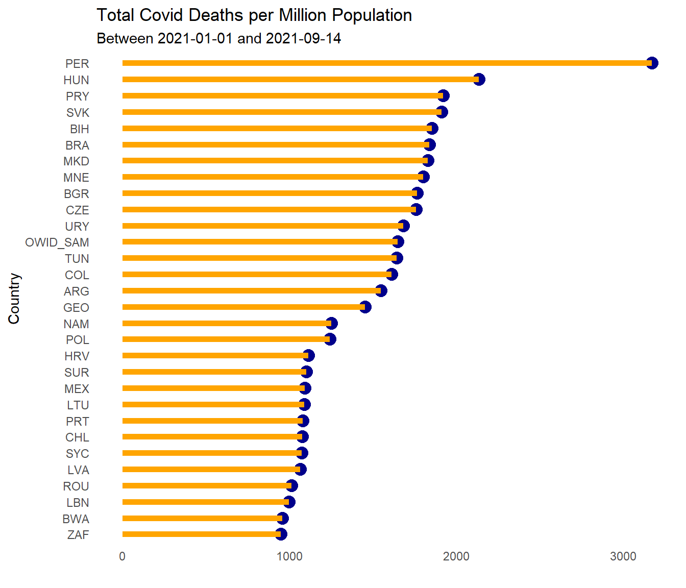
Figure 10.13: Sorted Cleveland dot plot of worst 30 countries for total Covid deaths per million population
Figure 10.14 repeats the same plot for deathsPerCase.
owid %>%
  filter(date >= "2021-01-01") %>%
  group_by(iso_code) %>%
  summarize(totalcases = sum(new_cases, na.rm=TRUE),
            totaldeaths = sum(new_deaths, na.rm=TRUE)) %>%
  mutate(deathsPerCase = totaldeaths/totalcases) %>%
  arrange(desc(deathsPerCase)) %>%
  head(30) %>%
  ggplot(aes(y = reorder(iso_code, deathsPerCase),
             x = deathsPerCase)) +
  geom_point(color = "darkred",
             size = 4) +
  geom_segment(aes(x = 0,
                   xend = deathsPerCase,
                   y = reorder(iso_code, deathsPerCase),
                   yend = reorder(iso_code, deathsPerCase)),
               color = "aquamarine2",
               size = 2) +
  scale_x_continuous(limits = c(0, NA),
                     labels = scales::percent_format()) +
  labs(x="", y="Country",
       title = "Total Covid Deaths per Total case",
       subtitle = paste0("Between ", mindfodate,  " and ", maxdfodate)) +
  theme_minimal() +
  theme(legend.position = "none") +
  theme(panel.grid.major = element_blank(),
        panel.grid.minor = element_blank())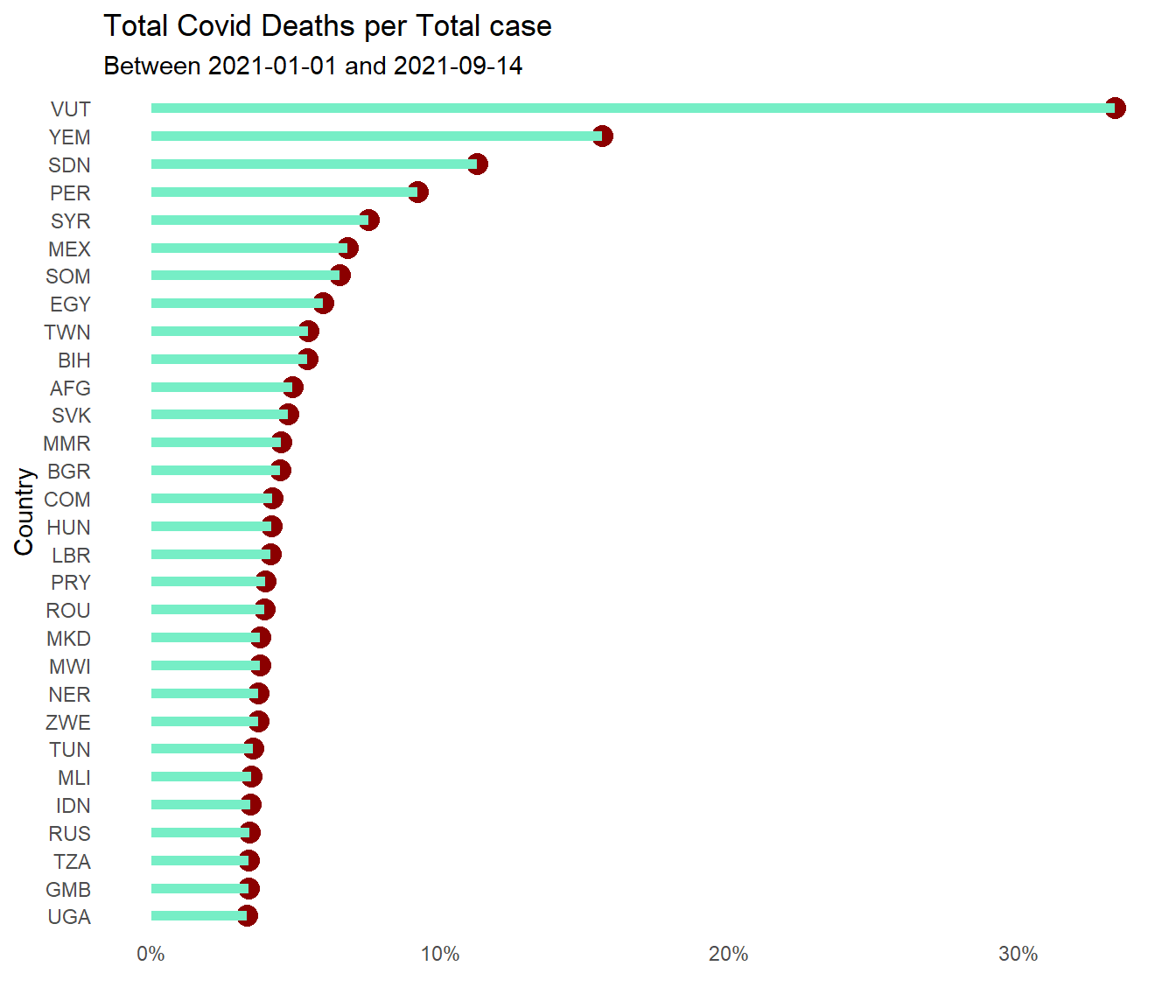
Figure 10.14: Sorted Cleveland dot plot of worst 30 countries for total Covid deaths per total case
Which countries should Malaysia compare with? What are the factors that can contribute to better treatment of Covid cases to avoid the dreadful death? Did the Covid patients die because of Covid or due to other factors like age, other health problems, etc. ? Each hypothesis needs to be studied with data. So a casual look at str(owid) that we did earlier shows other data that OWID has provided for us to analyze. Of course, owid does not have all the data for all countries.
Let us look at the relationship of two variables in owid that can be a fair benchmark to compare how Malaysia is doing; gdp_per_capita and hospital_beds_per_thousand. How do we visualize the relationship of a third variable with totaldeaths_million and deathsPerCase? We make use of the bubble plot that we introduced in Chapter 5 and used quite a bit in Chapter 8.
In Figure 10.15 we take the Malaysian data for gdp_per_capita and filter countries with gdp_per_capita within say 30% of Malaysia. (We use a tmp data frame to make the code easier to read and check.)
owidrepeatsgdp_per_capitafor every data point. We take themeanfor the period under consideration. (We did not assume it is only one same number. in case it fluctuates, themeanis a good statistic.)tmp %>% filter (iso_code == "MYS") %>% select(GPC)returns atibbleso we convert it usingas.double(). (There is a shorter way to do this but we stick to using thedplyrverbs.)
owid %>%
  filter(date >= "2021-01-01") %>%
  group_by(iso_code) %>%
  summarize(totaldeaths_million = sum(new_deaths_per_million, na.rm=TRUE),
            GPC = mean(gdp_per_capita, na.rm=TRUE),
            Beds = mean(hospital_beds_per_thousand, na.rm=TRUE),
            totalcases = sum(new_cases, na.rm=TRUE),
            totaldeaths = sum(new_deaths, na.rm=TRUE)) %>%
  mutate(deathsPerCase = totaldeaths/totalcases) -> tmp

MYSGPC = tmp %>%
  filter (iso_code == "MYS") %>%
  select(GPC) %>%
  as.double()

around = 0.3

tmp1 = tmp %>% filter ((GPC > (1-around)*MYSGPC) &
                         (GPC < (1+around)*MYSGPC))

tmp1 %>%
  ggplot(aes(x = deathsPerCase,
             y = totaldeaths_million,
             size = GPC,
             fill = iso_code)) +
  geom_point(alpha = 0.7, shape = 21, color = "black") +
  geom_text(data = tmp1,
            aes(label = iso_code),
            size = 3,
            nudge_x = 0.001, nudge_y = 1,
            check_overlap = T) +
  scale_x_continuous(limits = c(0, NA),
                     labels = scales::percent_format()) +
  labs(title = "Bubble Plot of Covid Deaths",
       subtitle = "Bubbles show countries with similar GDP per capita",
       caption = paste0("Between ", mindfodate,  " and ", maxdfodate),
       x = "Deaths per Case",
       y = "Total deaths per million") +
  theme_minimal() +
  theme(legend.position = "none") +
  theme(panel.grid.major = element_blank(),
        panel.grid.minor = element_blank())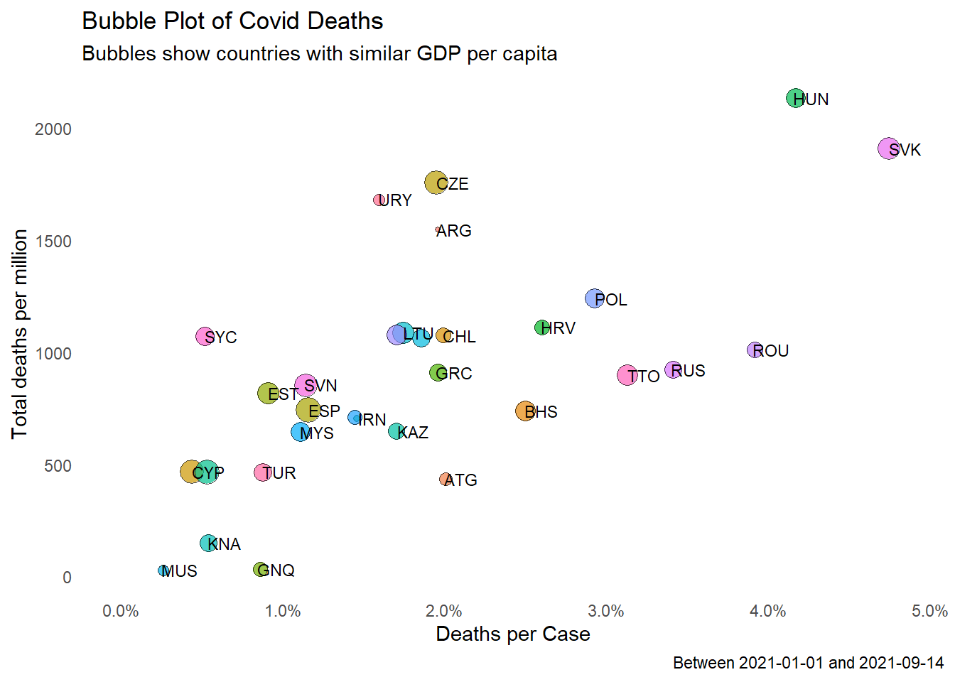
Figure 10.15: Bubble plot of selected Covid metrics for countries with similar GDP per capita
We repeat for hospital_beds_per_thousand in Figure 10.16.
MYSBeds = tmp %>%
  filter (iso_code == "MYS") %>%
  select(Beds) %>%
  as.double()

around = 0.3

tmp1 = tmp %>% filter ((Beds > (1-around)*MYSBeds) &
                         (Beds < (1+around)*MYSBeds))

tmp1 %>%
  ggplot(aes(x = deathsPerCase,
             y = totaldeaths_million,
             size = Beds,
             fill = iso_code)) +
  geom_point(alpha = 0.7, shape = 21, color = "black") +
  geom_text(data = tmp1,
            aes(label = iso_code),
            size = 3,
            nudge_x = 0.001, nudge_y = 1,
            check_overlap = T) +
  scale_x_continuous(limits = c(0, NA),
                     labels = scales::percent_format()) +
  labs(title = "Bubble Plot of Covid Deaths",
       subtitle = "Bubbles show countries with similar hospital beds per thousand population",
       caption = paste0("Between ", mindfodate,  " and ", maxdfodate),
       x = "Deaths per Case",
       y = "Total deaths per million") +
  theme_minimal() +
  theme(legend.position = "none") +
  theme(panel.grid.major = element_blank(),
        panel.grid.minor = element_blank())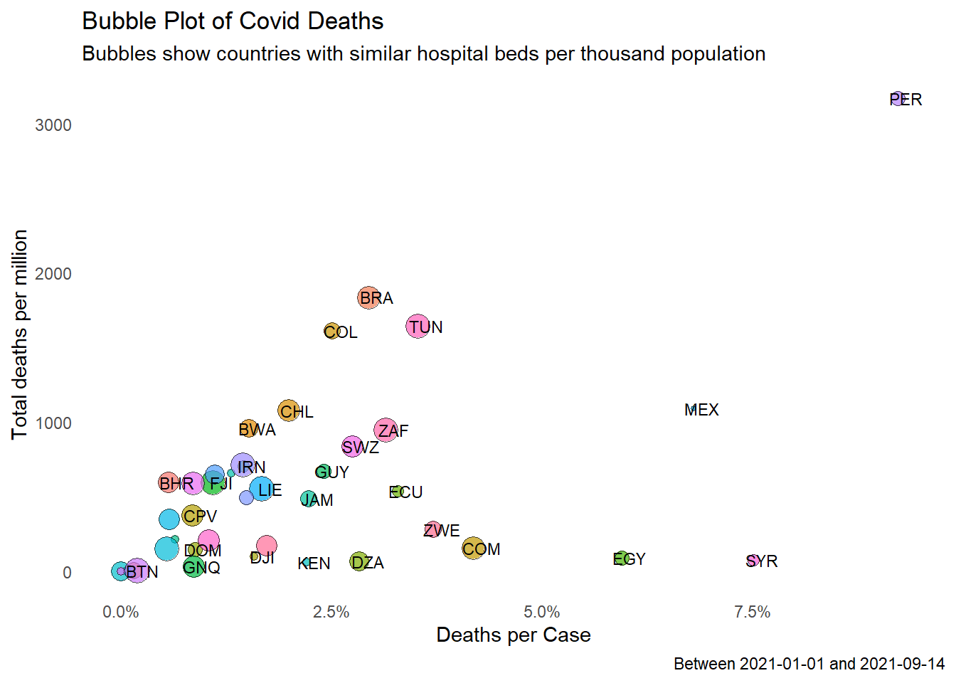
Figure 10.16: Bubble plot of selected Covid metrics for countries with similar number of hospital beds per thousand
Figure 10.15 and Figure 10.16 show that the situation in Malaysia is comparable to similar countries (Malaysia is not an outlier data point).
We leave this subject of deaths for now and return to look at vaccinations of other countries compared with Malaysia.
10.4 How Other Countries Are Faring On Vaccination
We come back to the owid and dfo data frames. We will determine the partial and total vaccination rates as a percentage of the population. We will plot the relationship between the number of cases and deaths given in certain monthly periods and the vaccination rates.
As we have seen in Figure 10.2, Figure 10.3, Figure 10.4 and Figure 10.5, to plot two ggplot graph functions like geom_col and geom_line we need two separate data frames. In the following code, we prepare the vaccination data to get the percentage of the population being partially or fully vaccinated. (owid and dfo also have total_boosters, but we will skip that for now since booster vaccinations are not yet common.)
dfo %>%
  mutate(date = as.Date(date),
         partly = round((people_vaccinated-people_fully_vaccinated)/population,4)*100,
         fully = round(people_fully_vaccinated/population,4)*100) %>%
  select(iso_code, date, partly, fully) %>%
  arrange(iso_code, date) %>%
  gather(vaccinated, percentage, 3:4) -> dfo_vacn
We will build the plots step by step and solve some problems or customize them as the needs arise. Figure 10.17 shows the basic vaccinated population trend for the selected countries.
dfo_vacn %>%
  ggplot(aes(x = date, y = percentage, fill = vaccinated)) +
  geom_col(alpha = 0.7, linetype = 0) +
  facet_wrap(~iso_code) +
  theme(legend.position = "top")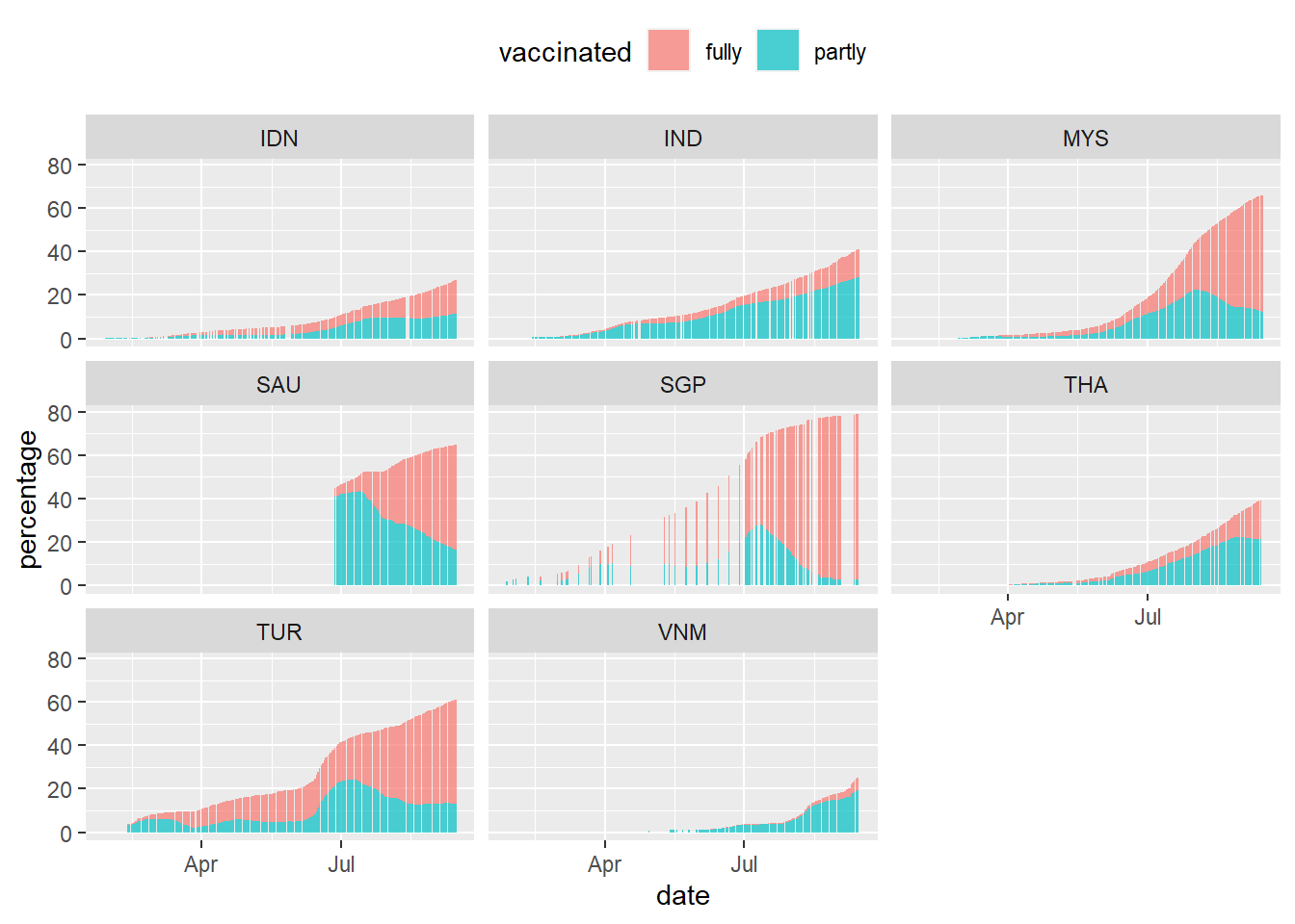
Figure 10.17: Vaccination trend for selected countries
Some countries have missing data or days that no vaccination is done. SGP started early and have reached 80%. VNM is clearly lagging behind. Next, we want to overlay the new_cases data on top of the vaccination column plot. We know that daily cases are in the thousands or hundreds so scaling of the plots needs to be considered. Let us look at MYS to illustrate. To make the code more legible we show the second temporary data frame we created dfo_tmp.
dfo %>%
  filter (iso_code == "MYS") %>%
  select(iso_code, date, new_cases) %>%
  ggplot(aes(x = date, y = new_cases)) +
  geom_line(color = "darkblue") +
  geom_col(data = filter(dfo_vacn, iso_code == "MYS"),
           mapping = aes(x = date,
                         y = percentage,
                         fill = vaccinated),
           alpha = 0.5) +
  theme(legend.position = "top")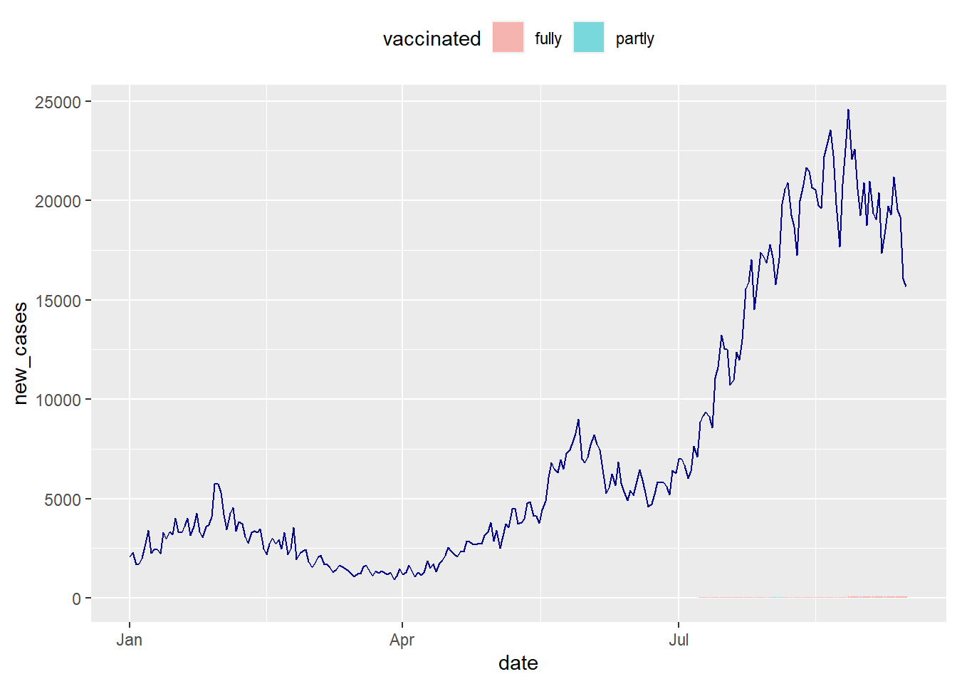
Figure 10.18: Vaccination trend and new cases for MYS to illustrate a scaling problem
The vaccination plot that ranges from (0 to 100) percent is significantly dwarfed by new_cases that exceeds 20000. We want to display both series on the same chart, thus we need a second y-axis. We can show 2 series on the same line chart thanks to sec.axis(). It allows us to do a mathematical transformation to display 2 series that has a different range.48
Since new_cases has a maximum value that is 1000 times bigger than the maximum vaccination rate:
- the second y-axis is like the first multiplied by 1000
(trans=~.*1000). - the value be displayed in the second variable geom_line() call must be divided by 1000 to mimic the range of the first variable.
- use a user-defined
coeffvariable to control this transformation factortrans
coeff <- 500
dfo %>%
  filter (iso_code == "MYS") %>%
  select(iso_code, date, new_cases) %>%
  ggplot(aes(x = date, y = new_cases/coeff)) +
  geom_line(color = "black") +
  geom_col(data = filter(dfo_vacn, iso_code == "MYS"),
           mapping = aes(x = date,
                         y = percentage,
                         fill = vaccinated),
           alpha = 0.5) +
  scale_y_continuous(

    # Features of the first axis
    name = "Percent vaccinated",

    # Add a second axis and specify its features
    sec.axis = sec_axis(trans = ~.*coeff, name="Daily new cases")
  ) +

  theme(axis.title.y = element_text(color = "darkred", size=10),
        axis.title.y.right = element_text(color = "darkblue", size=10)) +
  theme(legend.position = "top")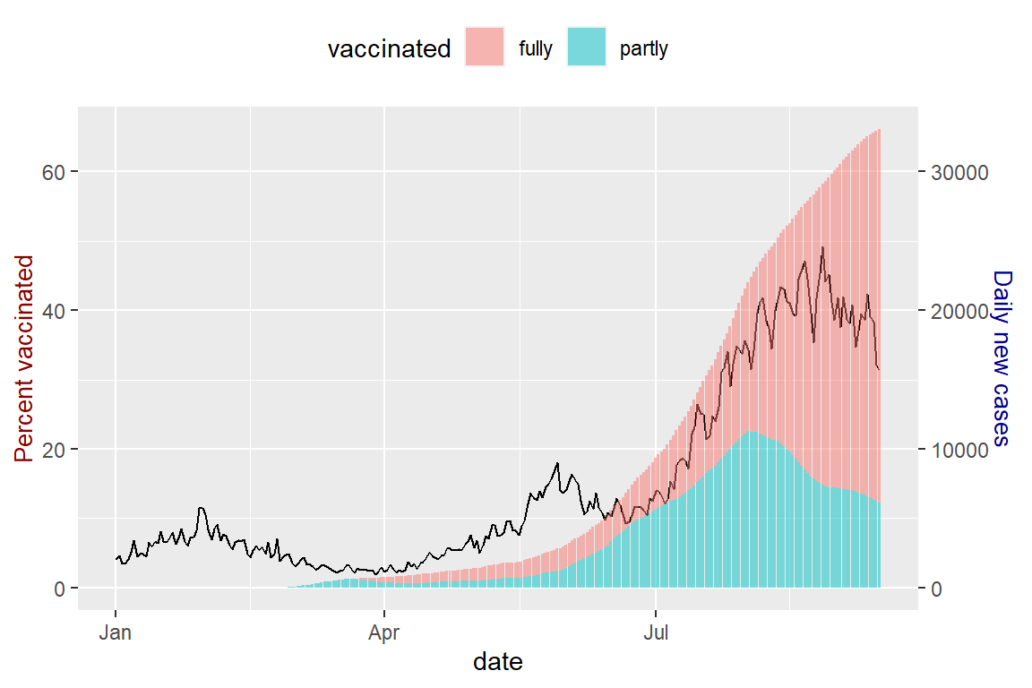
Figure 10.19: Vaccination trend and new cases for MYS with 2 different scales for the y-axis
Figure 10.19 solves the problem of the vaccination data being dwarfed by the new_cases data as in Figure 10.18. This transformation of the different y-axis is a tweak to visualize the data by controlling coeff. We must read Figure 10.19 properly to see the rising daily new_cases for MYS despite more of the population are vaccinated. We purposely colored the y-axis labels differently.
There are better ways to do this but for now, we stick to using ggplot without additional packages. We prefer not to introduce other R packages for now. This book intends to show how we can visualize the public Covid data from Malaysia and OWID “as-is” with some data wrangling and customization to solve the problems that we face as we explore the data. We are using real data in this book and have to show the adjustments and compromises we make to generate the visual plots. We learn the features and functions of the packages we are currently using while we solve problems as we explore the data visually.
Now that we know how to properly overlay other data on top of our basic vaccination plot we can compare how MYS is faring with some selected countries. We will be using facets but as in Figure 10.17 and the earlier examples in this chapter too many countries make the plots small. So we illustrate with three countries that have a similar deathsPerCase metric as in Figure 10.12.
coeff <- 500
dfo %>%
  filter (iso_code %in% c("TUR", "MYS", "SAU")) %>%
  select(iso_code, date, new_cases) %>%
  ggplot(aes(x = date, y = new_cases/coeff)) +
  geom_line(color = "black") +
  geom_col(data = filter(dfo_vacn, iso_code %in% c("TUR", "MYS", "SAU")),
           mapping = aes(x = date,
                         y = percentage,
                         fill = vaccinated),
           alpha = 0.5) +
  scale_y_continuous(name = "Percent vaccinated",
                     sec.axis = sec_axis(trans = ~.*coeff,
                                         name="Daily new cases")) +
  theme(axis.title.y = element_text(color = "darkred", size=10),
        axis.title.y.right = element_text(color = "darkblue", size=10)) +
  facet_wrap(~iso_code) +
  labs(title = "Vaccination and daily Covid cases for selected countries",
       subtitle = paste0("Between ", mindfodate,  " and ", maxdfodate),
       caption = "Vaccination % in colored bars and fixed scale y-axis",
       x = "Day") +
  theme(legend.position = "top")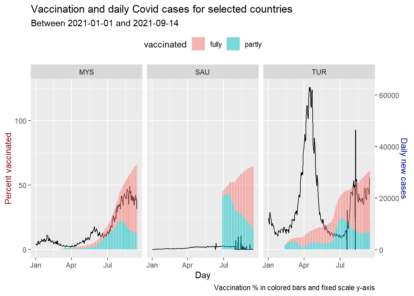
Figure 10.20: Vaccination trend and new cases for selected countries
We repeat Figure 10.20 with scale="free_y".
coeff <- 500
dfo %>%
  filter (iso_code %in% c("TUR", "MYS", "SAU")) %>%
  select(iso_code, date, new_cases) %>%
  ggplot(aes(x = date, y = new_cases/coeff)) +
  geom_line(color = "black") +
  geom_col(data = filter(dfo_vacn, iso_code %in% c("TUR", "MYS", "SAU")),
           mapping = aes(x = date,
                         y = percentage,
                         fill = vaccinated),
           alpha = 0.5) +
  scale_y_continuous(name = "Percent vaccinated",
                     sec.axis = sec_axis(trans = ~.*coeff,
                                         name="Daily new cases")) +
  theme(axis.title.y = element_text(color = "darkred", size=10),
        axis.title.y.right = element_text(color = "darkblue", size=10)) +
  facet_wrap(~iso_code, scale="free_y") +
  labs(title = "Vaccination and daily Covid cases for selected countries",
       subtitle = paste0("Between ", mindfodate,  " and ", maxdfodate),
       caption = "Vaccination % in colored bars and free scale y-axis",
       x = "Day") +
  theme(legend.position = "top")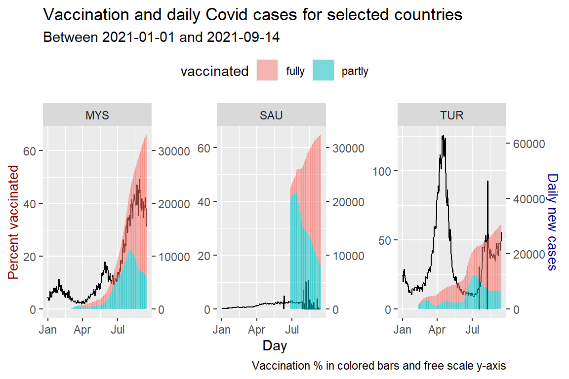
Figure 10.21: Vaccination trend and new cases for selected countries
As of the last date of the data, all three countries have crossed the 50% fully vaccinated status. MYS is showing a significant increase, far above the two previous peaks. TUR shows a dip and rise but below previous peaks. The same applies to SAU with much lower cases compared to MYS and TUR.
We repeat for new daily Covid deaths. We changed new_cases to new-deaths and also coeff since new_deaths are in the hundreds.
coeff <- 10
dfo %>%
  filter (iso_code %in% c("TUR", "MYS", "SAU")) %>%
  select(iso_code, date, new_deaths) %>%
  ggplot(aes(x = date, y = new_deaths/coeff)) +
  geom_line(color = "black") +
  geom_col(data = filter(dfo_vacn, iso_code %in% c("TUR", "MYS", "SAU")),
           mapping = aes(x = date,
                         y = percentage,
                         fill = vaccinated),
           alpha = 0.5) +
  scale_y_continuous(name = "Percent vaccinated",
                     sec.axis = sec_axis(trans = ~.*coeff,
                                         name="Daily new deaths")) +
  theme(axis.title.y = element_text(color = "darkred", size=10),
        axis.title.y.right = element_text(color = "darkblue", size=10)) +
  facet_wrap(~iso_code) +
  labs(title = "Vaccination and daily Covid deaths for selected countries",
       subtitle = paste0("Between ", mindfodate,  " and ", maxdfodate),
       caption = "Vaccination % in colored bars and fixed scale y-axis",
       x = "Day") +
  theme(legend.position = "top")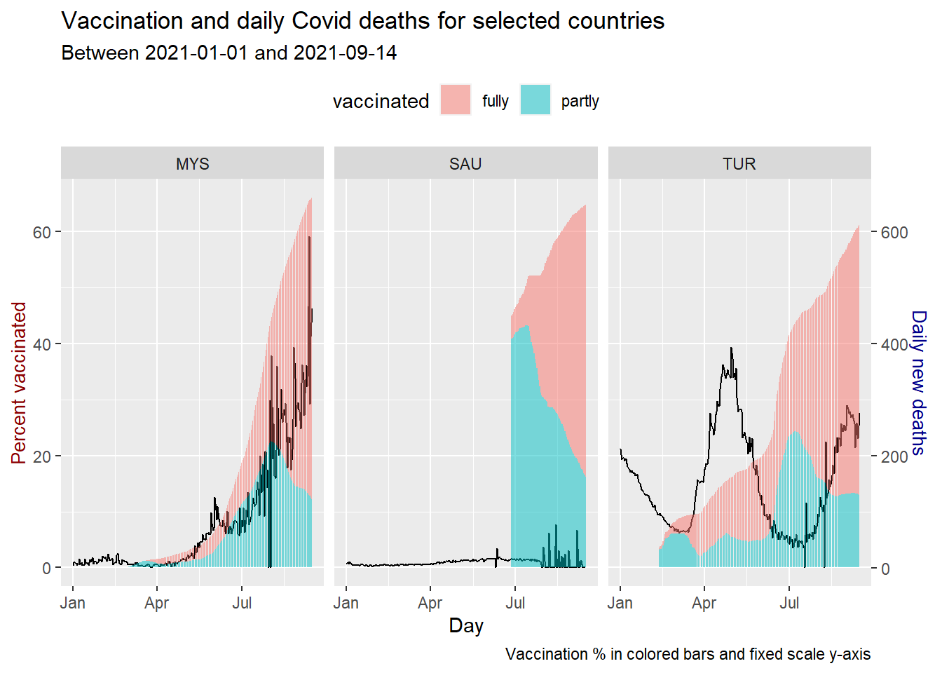
Figure 10.22: Vaccination trend and new deaths for selected countries
Figure 10.20, Figure 10.21, and Figure 10.22 show the vaccination alone does not give the same results on new_cases and new_deaths. All 3 countries are at about 60% of the population being vaccinated.
Finally, we take a look at the reproduction_rate or R0 factor since it is there in dfo.
coeff <- 0.1
dfo %>%
  filter (iso_code %in% c("TUR", "MYS", "SAU")) %>%
  select(iso_code, date, reproduction_rate) %>%
  ggplot(aes(x = date, y = reproduction_rate/coeff)) +
  geom_line(color = "black") +
  geom_col(data = filter(dfo_vacn, iso_code %in% c("TUR", "MYS", "SAU")),
           mapping = aes(x = date,
                         y = percentage,
                         fill = vaccinated),
           alpha = 0.5) +
  scale_y_continuous(name = "Percent vaccinated",
                     sec.axis = sec_axis(trans = ~.*coeff,
                                         name="Daily R0 factor")) +
  theme(axis.title.y = element_text(color = "darkred", size=10),
        axis.title.y.right = element_text(color = "darkblue", size=10)) +
  facet_wrap(~iso_code) +
  labs(title = "Vaccination and daily R0 factor for selected countries",
       subtitle = paste0("Between ", mindfodate,  " and ", maxdfodate),
       caption = "Vaccination % in colored bars and fixed scale y-axis",
       x = "Day") +
  theme(legend.position = "top")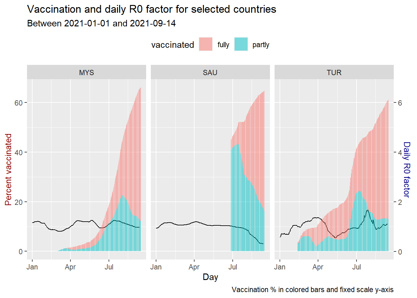
Figure 10.23: Vaccination trend and R0 for selected countries
Compared to the three, SAU seems to be getting the required results from its vaccination program.
10.5 Discussion
We learned some new tricks in wrangling datasets and also tweaking some functions in ggplot in this chapter. We now have a better picture of the effectiveness of the vaccination program in Malaysia.
The world is still learning from the efficacy of the various types and brands of vaccines. The virus has new mutations. So let us learn from more data in the days to come.
10.6 Conclusion
With these 3 chapters in Part II, we have applied the basic techniques of data wrangling and visualization that we covered in Part I.
- plotting points, lines, bars, columns, pies, donuts, and maps
- converting a data frame into long format
- using the
dplyrverbs to prepare the data and add columns or variables by combining columns from the same data frame - combining data frame with
join - differentiating with colors and symbols
- customizing titles, subtitles, captions, axis
- using facets
- combining different
ggplotfunctions within one plot
We have covered a lot in terms of the techniques and how to apply them to solve our visualization problems. There are other graph types that we can learn. We can also cover more customization options. But we prefer to learn and apply these as the needs arise when we try to visualize the data using other data science techniques.
We conclude Part II of this book with this chapter.