Chapter 5 Multi Variable Graphs
Multi-variable or multivariate graphs show the relationships among three or more variables. There are two common methods used for multiple variables: grouping and faceting.
We have introduced faceting earlier in Chapter 2 and Chapter 4. In this chapter, we will give more examples of faceting after we discuss grouping.
5.1 Grouping
In grouping, we take the values of any first two variables and map them to the x and y axes. Then we map additional variables to other visual properties like color, shape, size, line type, and alpha (transparency).
We use the mysclusters data frame and display the relationship between cases_total and deaths. We then incorporate other variables.
ggplot(mysclusters,
       aes(x = cases_total,
           y = deaths)) +
  geom_point() +
  labs(title = "Total cases and deaths")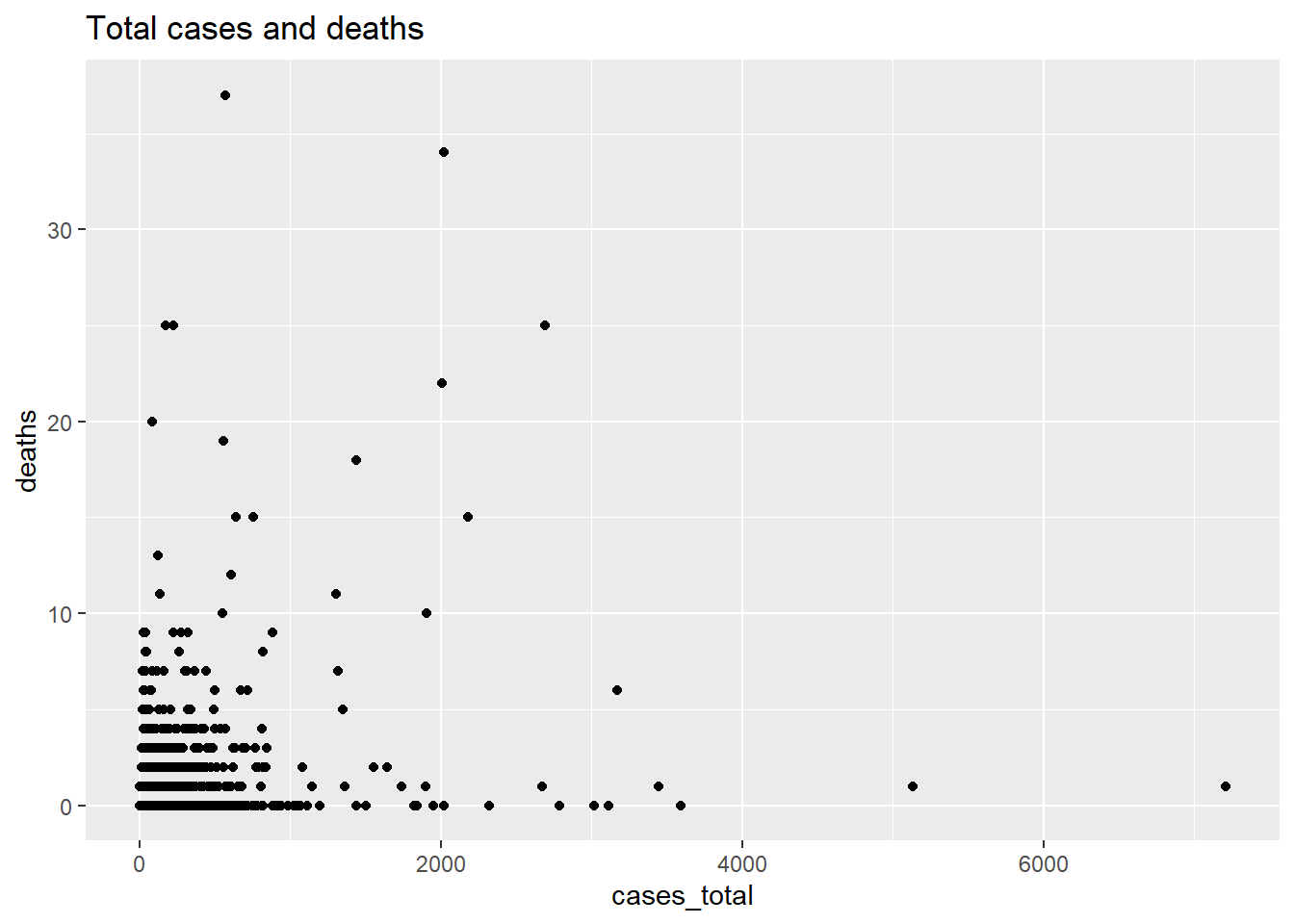
Figure 5.1: Scatter plot of cluster data
Next, we differentiate the cluster type using the color option.
ggplot(mysclusters,
       aes(x = cases_total,
           y = deaths,
           color = category)) +
  geom_point() +
  labs(title = "Total cases and deaths by cluster category")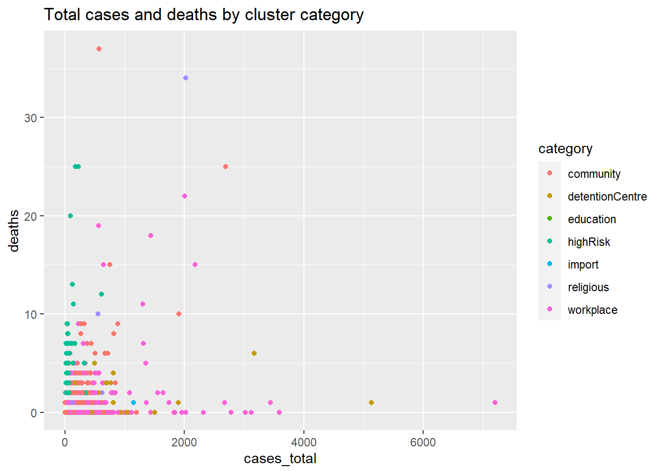
Figure 5.2: Scatter plot with third category variable by color
Next we add the status, using the shape option. We change the point size and add the alpha option to make the individual points clearer.
ggplot(mysclusters,
       aes(x = cases_total,
           y = deaths,
           color = category,
           shape = status)) +
  geom_point(size = 3,
             alpha = .6) +
  labs(title = "Total cases and deaths by cluster category and status")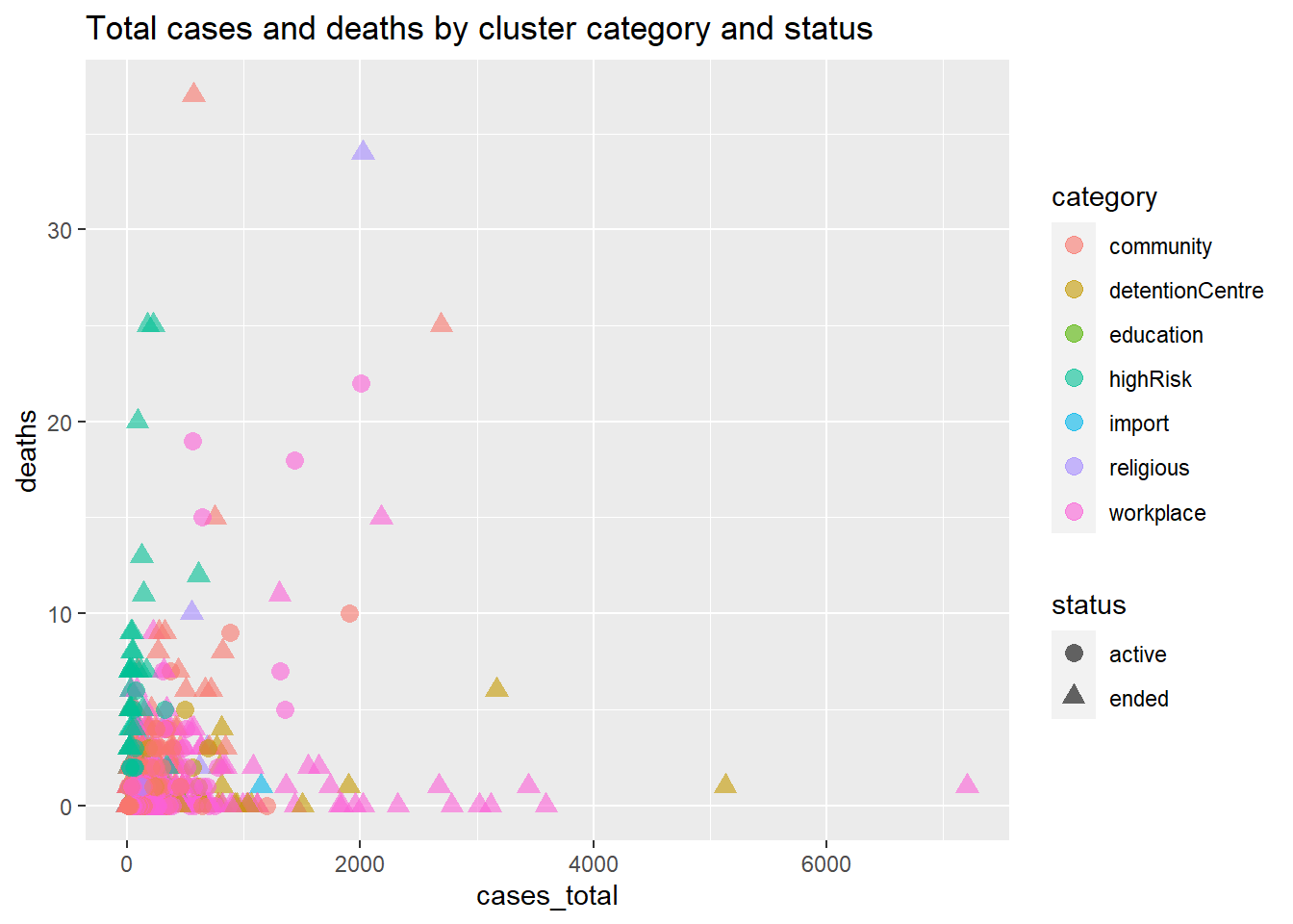
Figure 5.3: Scatter plot with third category variable by color and fourth category by shape
Figure 5.3 visualizes two quantitative and two categorical variables. We used the mysclusters data frame as is, without even transforming it into a long format. It is quite busy, and it can be difficult to see the difference between the categories and/or status.
Note the way we specified a constant value (like size = 3) and a mapping of a variable to a visual characteristic (like color = category). Mappings of data frame variables or columns are always placed within the aes function while the assignment of a constant value always appears outside of the aes function.
5.1.1 Bubble plot
In Figure 5.4 we visualize the relationship between cases_total, deaths, category, and tests. We map the tests column to the size of the points within the aes function. This is called a bubble plot.
Note the color = "Cluster Category" and size = "Tests Conducted" options in the labs function to customize the legend titles.
ggplot(mysclusters,
       aes(x = cases_total,
           y = deaths,
           color = category,
           size = tests)) +
  geom_point(alpha = 0.5) +
  labs(title = "Total cases and deaths by cluster category and number of tests",
       x = "Total cases",
       y = "Deaths",
       color = "Cluster Category",
       size = "Tests Conducted")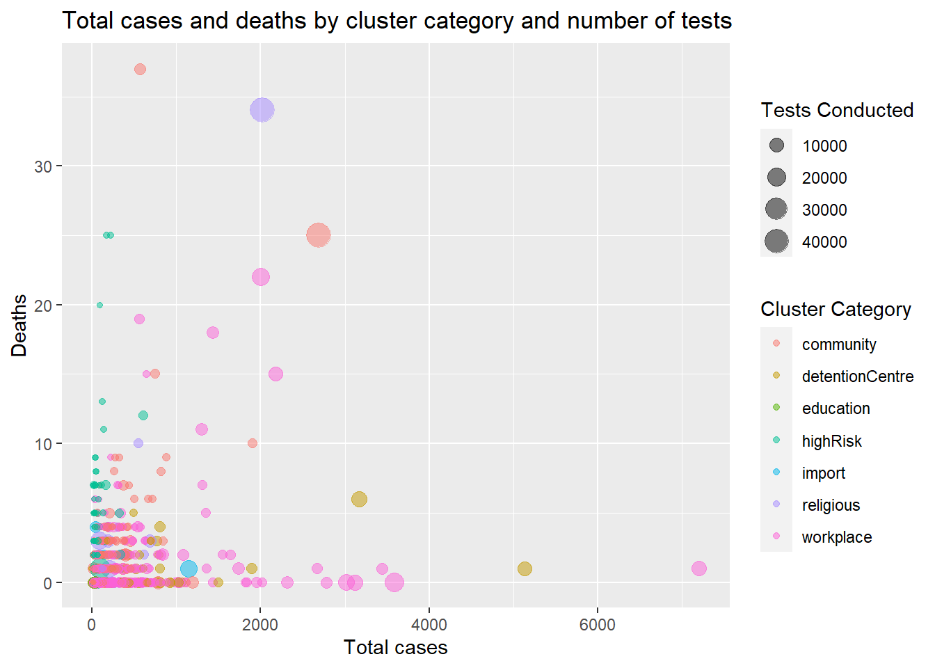
Figure 5.4: Scatter plot with one category variable by color and another by size
Figure 5.4 clearly highlights the worrying clusters with higher number of deaths.
As a final example, we look at the cases_total vs deaths and add category using color and quadratic best fit lines.
ggplot(mysclusters,
       aes(x = cases_total,
           y = deaths,
           color = category)) +
  geom_point(alpha = 0.7,
             size = 2) +
  geom_smooth(se = FALSE,
              method = "lm",
              formula = y~poly(x,2),
              size = 1.5) +
  labs(x = "Total cases",
       title = "Total cases and deaths by cluster category",
       subtitle = "Starting 01 Jan 2021",
       y = "Deaths",
       color = "Cluster Category") +
  scale_color_brewer(palette = "Dark2") +
  theme_minimal()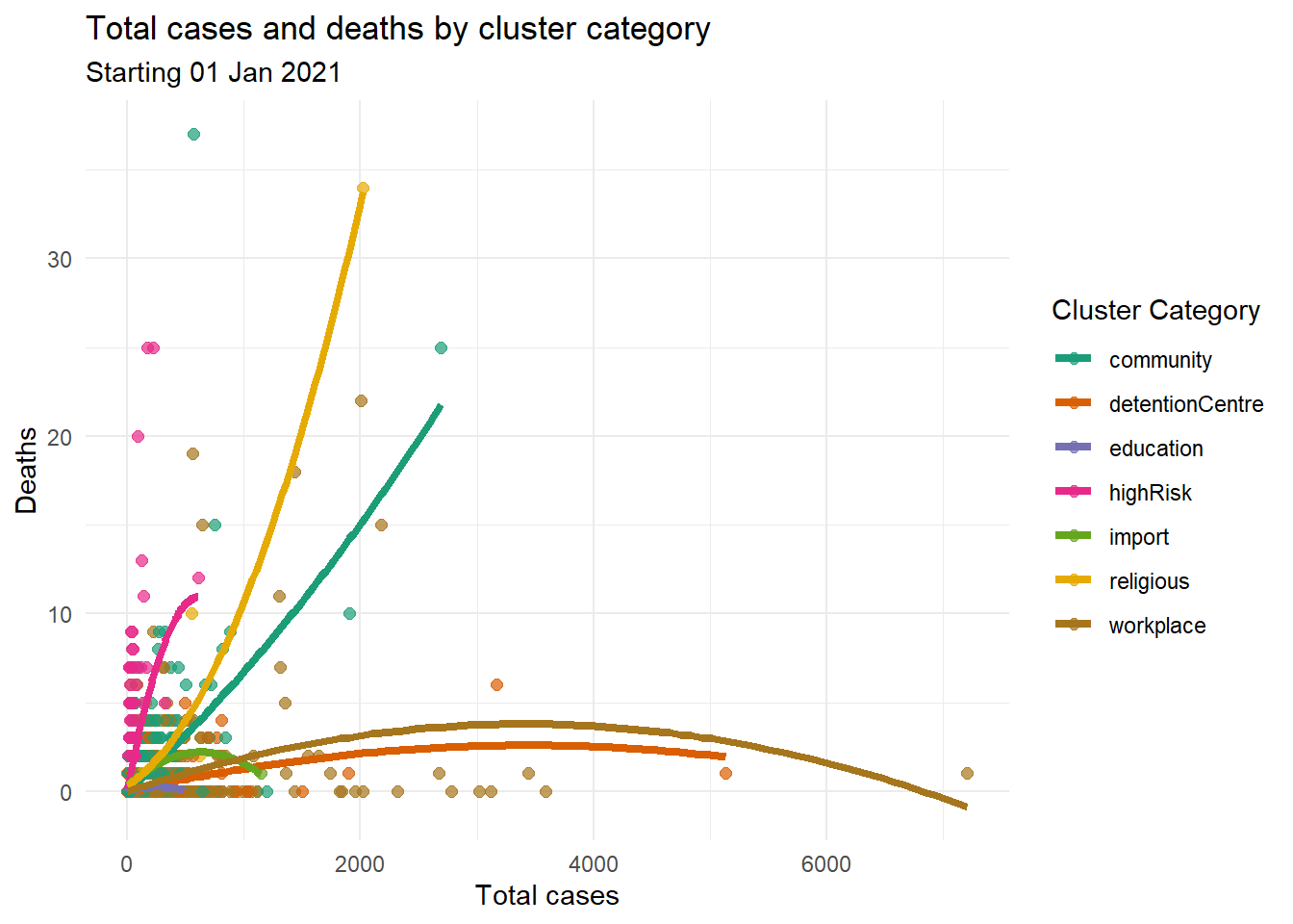
Figure 5.5: Scatter plot with one category variable by color and quadratic fit lines
5.2 Faceting
One of the most useful techniques in data visualization is displaying groups of data alongside each other. This makes it easy to compare the groups. With ggplot2, one way to do this is by grouping multiple variables in a single graph, using visual properties like color, shape, and size. Another way of doing this is to create a subplot for each group and draw the subplots side by side. Faceting draws a graph for each level of a given variable (or combination of variables). Facets use functions that start with facet_.
We start with a simple example again using the mysclusters data frame. Facet plots are usually busy so we increase the height for Figure 5.6.
ggplot(mysclusters,
       aes(x = as.Date(date_announced), y = cases_total)) +
  geom_col(fill = "orange4") +
  facet_wrap(~category, ncol = 3) +
  labs(title = "Total cases over time by cluster category",
       y = "Cases",
       x = "Date")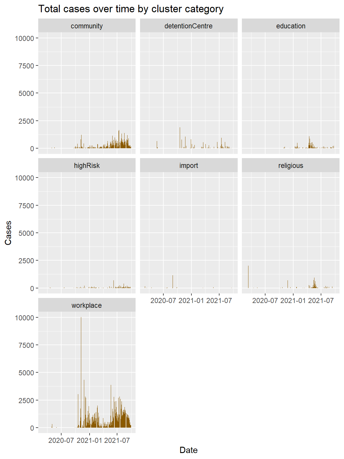
Figure 5.6: Cases distribution by cluster category
The facet_wrap function creates a separate graph for each cluster category. The default is to use the same number of rows and columns. In Figure 5.6, there were seven facets, and they fit into a 3×3 square. To change this, we can define nrow or ncol. The ncol option controls the number of columns. Do the periods of zero cases for the education and religious clusters correspond to the different lock down restrictions?
In Figure 5.7, two variables are used to define the facets using facet_grid(category ~ status). We specify a variable to split the data into vertical sub-panels, and another variable to split it into horizontal sub-panels.
ggplot(mysclusters,
       aes(x = as.Date(date_announced), y = cases_total)) +
  geom_col(fill = "orange4") +
# Split by category (vertical) and status (horizontal)
  facet_grid(category ~ status) +
  labs(title = "Total cases over time by cluster category and status",
       y = "Cases",
       x = "Date")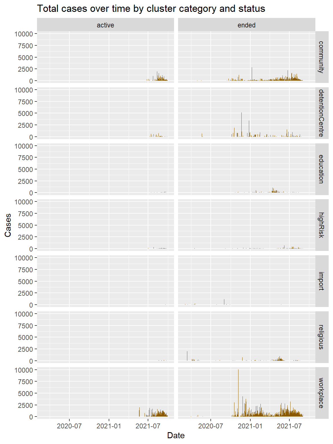
Figure 5.7: Cases distribution by cluster category and status
The format of the facet_grid function is
- facet_grid( row/horizontal variable(s) ~ column/vertical variable(s))
In Figure 5.7, we assigned category to the rows and status to the columns, creating a matrix of 14 plots in one graph. Note that we adjusted the height of the graph (fig.height=8,fig.width=6).
5.2.1 Labels
We next shift to the mysstates data frame and replicate some of the examples in this chapter. We want to add some labeling features to the facet plots. We start with a basic facet plot.
Note that because we use the color = state mapping within the aes function, the color legend will appear by default. We suppress it with theme(legend.position = "none").
mysstates %>%
  ggplot(aes(x=as.Date(date),
             y=cases_new,
             color = state)) +
  geom_point(alpha=0.7, size = 0.5) +
  scale_y_continuous(breaks = seq(0, 10000, 1000)) +
  facet_wrap(~state) +
  theme(legend.position = "none")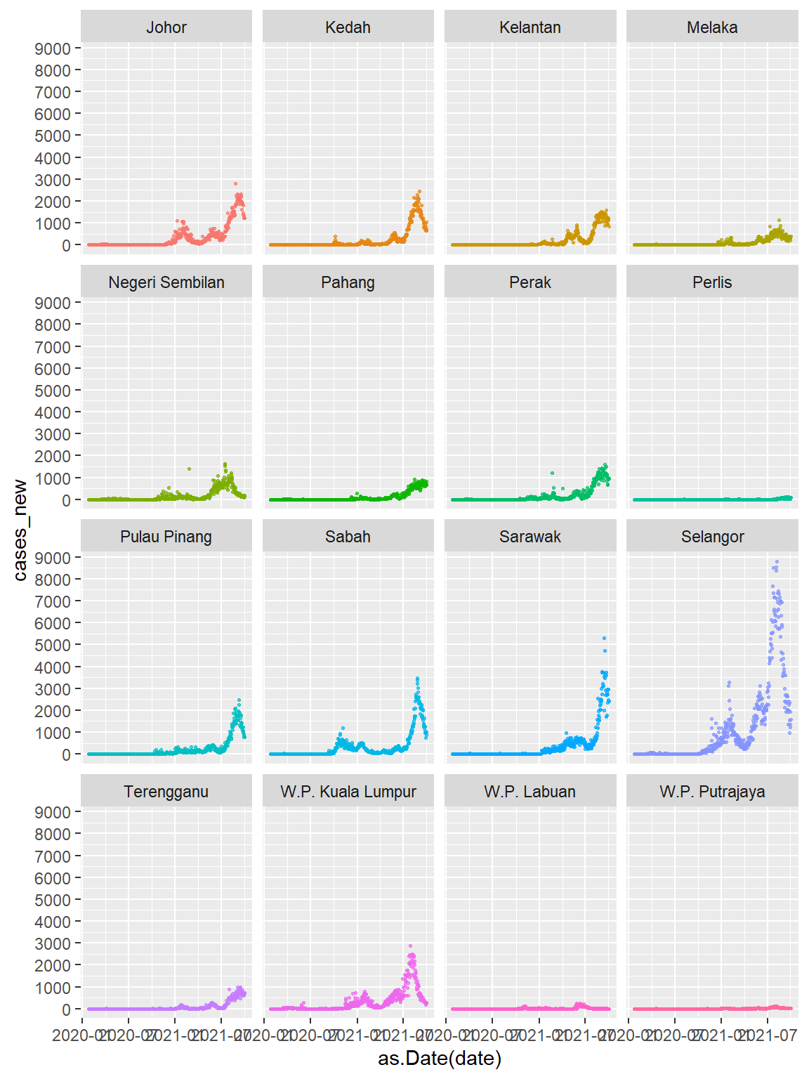
Figure 5.8: Cases by State using simple faceting
Graphs should be easy to interpret and informative labels are a key element in achieving this goal. We have been using the labs function to customize the labels for the axes and legends. Additionally, a custom title, subtitle, and caption can be added.
The theme_ functions create a black and white theme and eliminate vertical grid lines and minor horizontal grid lines. We also specify for no legends that are displayed by default because we used color = state in the aes.
mysstates %>%
  ggplot(aes(x=as.Date(date),
             y=cases_new,
             color = state)) +
  geom_point(alpha=0.7, size = 0.5) +
  scale_y_continuous(breaks = seq(0, 10000, 1000)) +
  facet_wrap(~state) +
  labs(title = "New Cases in Malaysia",
       subtitle = "Facet by states",
       caption = "Fixed y-axis scales to compare the actual numbers",
       x = "Date",
       y = "New Cases") +
  theme_bw() +
  theme(legend.position = "none",
        panel.grid.major.x = element_blank(),
        panel.grid.minor.y = element_blank())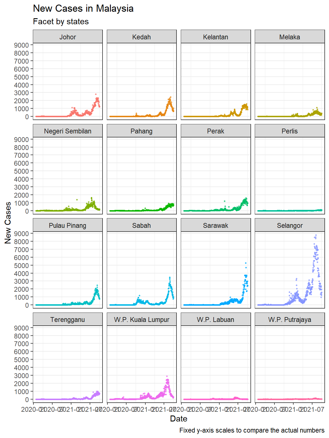
Figure 5.9: Customize titles and labels
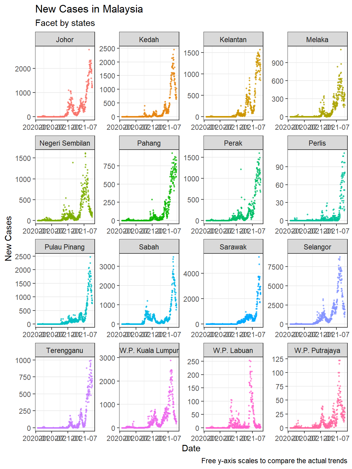
Figure 5.10: Facets with free y-axis
In Figure 5.10 we include the facet_wrap(~state, scales = "free") option. Figure 5.9 allows us to compare the new cases over time for each state. Selangor dwarfed the states with lower numbers, but we cannot see the trend for each state. Figure 5.10 shows that the trend over time is almost similar for all states.
5.3 Discussion
It is nice to be able to show simple visuals using all eight of the separate Malaysian public Covid related datasets that we downloaded. We used the data frames without any changes to the data except to convert it to a long format or add new columns by combining selected columns.
In this chapter, we also increased the complexity of the visuals to include more variables into a single plot. When there are many category levels (like 16 states), faceting produces a cleaner and more legible graph than grouping. We have to make the graph bigger and set the scales option accordingly to compare actual numbers and see the data trends with the naked eye.
We have now covered the basics of visualizing data with points, lines, bars, and columns while customizing their properties like size, color, shape, and transparency. We will mention polygons as a basic visual format when we cover maps in Chapter 8.
We will next apply what we have learned to discuss some particular techniques in visualizing time-series data since all the Covid data are dynamic and updated daily.