Chapter 4 Dual Variable Graphs
Dual variable or bivariate graphs display the relationship between two variables. The type of graph will depend on the type of the variables; categorical or quantitative.
4.1 Categorical vs. Categorical
We normally use stacked, grouped, or segmented bar charts when plotting the relationship between two categorical variables.
4.1.1 Prepare data for more categories
Let us continue with the vacn data frame. It has only state as the category. We convert it to a long format so state and vaccination are the categories. We select the columns related to adult vaccination and ignore the vaccine types.
4.1.2 Stacked bar chart
We simply plot the new data frame df to visualize the two categories.
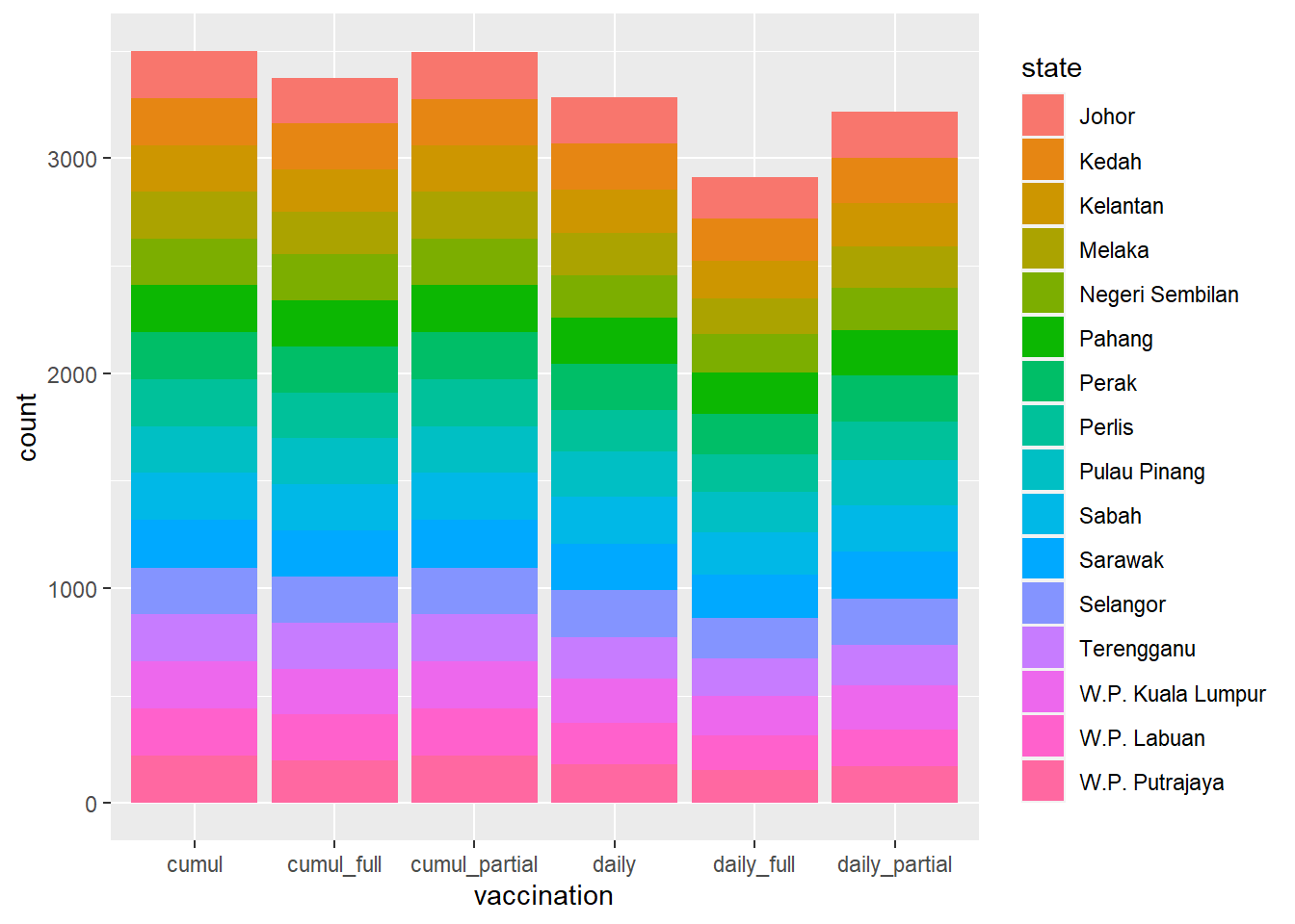
Figure 4.1: Stacked bar chart
Figure 4.1 is not too interesting since the count on the y-axis just shows the number of data points for each vaccination category separated by each state category. Since the second dosage can only start some days (about 14) after the first dosage, all the data points related to the second dosage will be less compared to the first. Also, the state distribution is about the same since even if no vaccination was administered at a state for any particular date, it is registered as 0 but the count in geom_bar still counts it as a data point (row or occurrence) regardless of its value.
Perhaps Figure 4.2 is more meaningful where we can see the daily administration of doses per state.
df %>%
  filter(vaccination %in% c("daily_partial", "daily_full", "daily")) %>%
  ggplot(aes(x = vaccination,
             y = doses,
             fill = state)) +
  geom_bar(stat = "identity", position = "stack")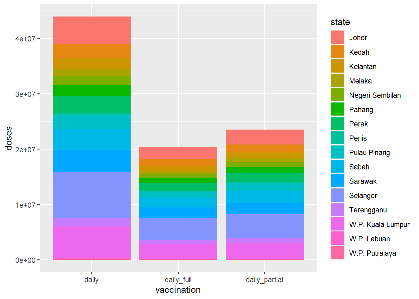
Figure 4.2: Stacked bar chart for dosage
From Figure 4.2, we can see that most of the doses were administered in Selangor, Sarawak, and W.P. Kuala Lumpur.
(position = "stack") for stacked bars is the default, so the last line could have also been written as geom_bar(stat = "identity").
4.1.3 Grouped bar chart
Grouped bar charts place bars for the second categorical variable side-by-side. We use the (position = "dodge") option.
df %>%
  filter(vaccination %in% c("daily_partial", "daily_full", "daily")) %>%
  ggplot(aes(x = vaccination,
             y = doses,
             fill = state)) +
  geom_bar(stat = "identity", position = "dodge")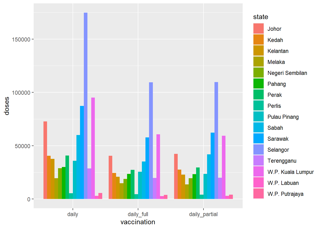
Figure 4.3: Side-by-side bar chart for dosage
Compare Figure 4.3 and Figure 4.4 to see the difference between doses and count.
df %>%
  filter(vaccination %in% c("daily_partial", "daily_full", "daily")) %>%
  ggplot(aes(x = vaccination,
             fill = state)) +
  geom_bar(position = "dodge")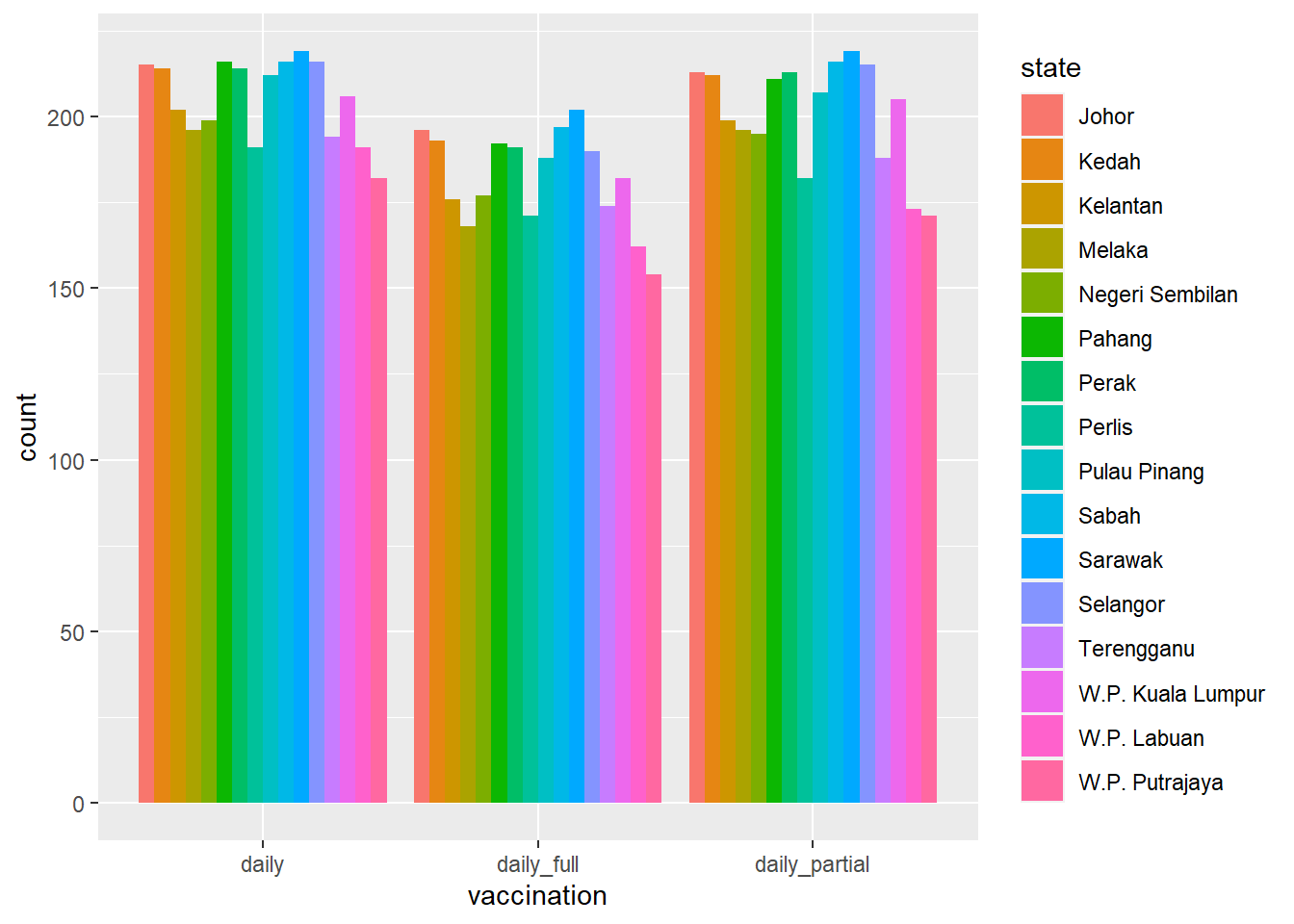
Figure 4.4: Side-by-side bar chart for data counts
4.1.4 Segmented bar chart
A segmented bar plot is a stacked bar plot where each bar represents 100 percent. We use the (position = "fill") option.
df %>%
  filter(vaccination %in% c("daily_partial", "daily_full", "daily")) %>%
  ggplot(aes(x = vaccination,
             y = doses,
             fill = state)) +
  geom_bar(stat = "identity", position = "fill") +
  labs(y = "Proportion")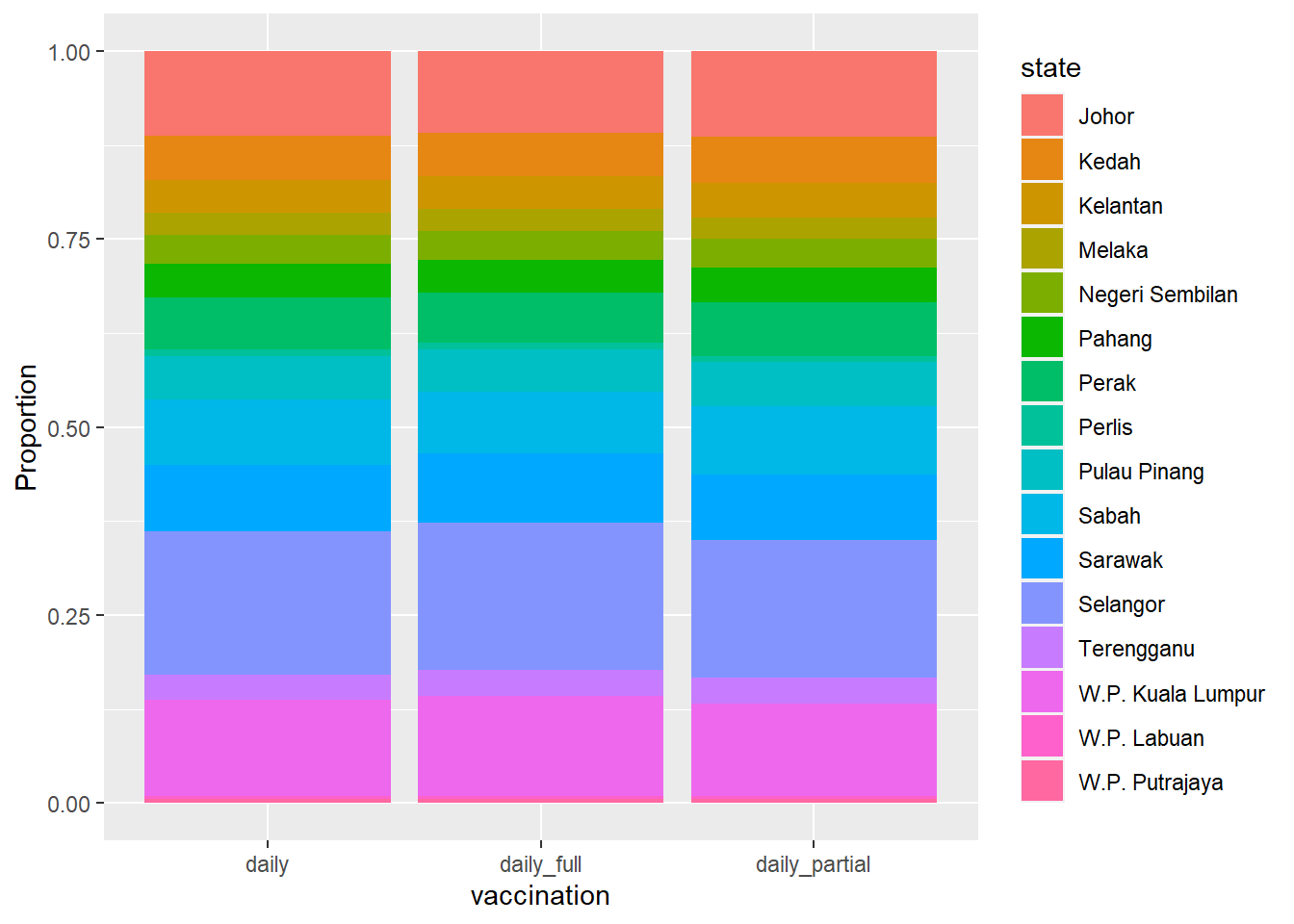
Figure 4.5: Segmented bar chart for dosage with each bar representing 100%
The segmented bar chart is useful to compare the percentage of a category in one variable across each level of another variable. We redo Figure 4.5 with the state on the x-axis.
df %>%
  filter(vaccination %in% c("daily_partial", "daily_full", "daily")) %>%
  ggplot(aes(x = state,
             y = doses,
             fill = vaccination)) +
  geom_bar(stat = "identity", position = "fill") +
  labs(y = "Proportion")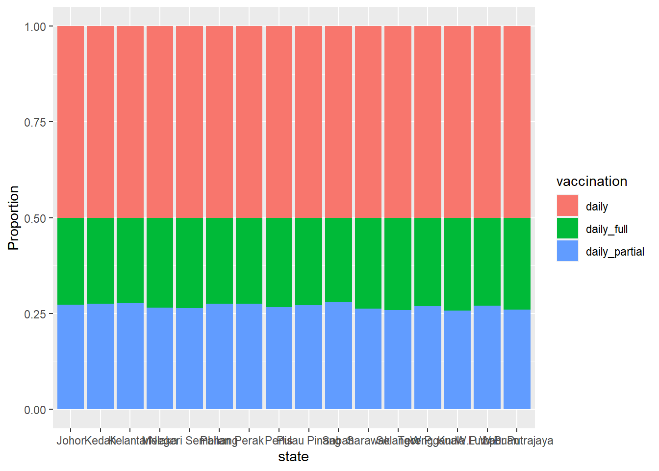
Figure 4.6: Segmented bar chart for state with each bar representing 100%
Why are the blue bars all of the same height in Figure 4.6?
4.1.5 Color and labeling
In Figure 4.7, factor changes the order and the labels of the categories for the vaccination column. We also flipped the co-ordinates.
We have
- a bar plot, with each bar representing 100%,
- reordered bars with better labels
- colors from a different palette with
scale_fill_brewer(palette = "Dark2")
df %>%
  filter(vaccination %in% c("daily_partial", "daily_full")) %>%
  ggplot(aes(x = state,
             y = doses,
             fill = factor(vaccination,
                           levels = c("daily_partial", "daily_full"),
                           labels = c("First dose", "Second dose")))) +
  geom_bar(stat = "identity", position = "fill") +
  scale_y_continuous(breaks = seq(0, 1, .2)) +
  scale_fill_brewer(palette = "Dark2") +
  labs(y = "Percent",
       fill = "Vacination type",
       x = "State",
       title = "Vaccination by State") +
  coord_flip() +
  theme_minimal()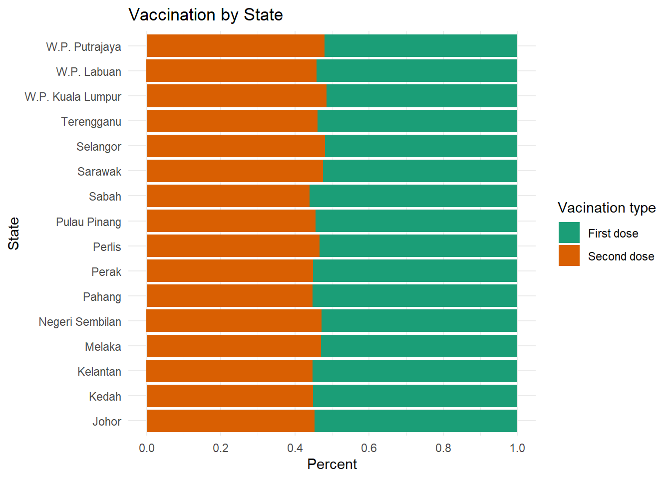
Figure 4.7: Segmented bar chart with labels and color
In Figure 4.7, we used the factor function to reorder and/or rename the levels of a category. We could also apply this to the original data frame, making these changes permanent. It would then apply to all future graphs using that data frame.
Next, we add labels to each segment. Follow the flow of modifications to the data shown by %>%. We use (x = reorder(state, pct) to nicely order Figure 4.8.
df %>%
  filter(vaccination %in% c("daily_partial", "daily_full")) %>%
  group_by(state, vaccination) %>%
  summarize(n = n(), .groups = 'drop') %>%
  mutate(pct = round((n/sum(n))*100, 1)) %>%
  ggplot(aes(x = reorder(state, pct),
             y = pct,
             fill = factor(vaccination,
                         levels = c("daily_partial", "daily_full"),
                         labels = c("First dose", "Second dose")))) +
  geom_bar(stat = "identity") +
  geom_text(aes(label = pct),
            size = 3,
            position = position_stack(vjust = 0.5)) +
  scale_fill_brewer(palette = "Dark2") +
  labs(y = "Percent",
       fill = "Vacination type",
       x = "State",
       title = "Vaccination by State") +
  coord_flip() +
  theme_minimal()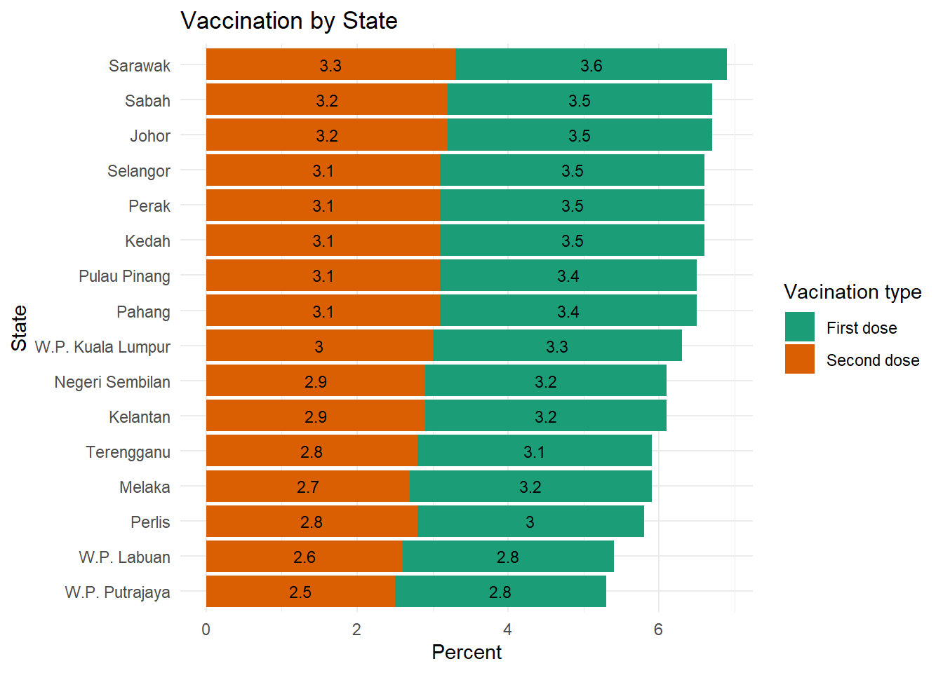
Figure 4.8: Segmented bar chart with value labels of count percentage
Figure 4.8 calculates the percentage of data points or count as per summarize(n = n() in the code. We see not much difference in all the states because of the way count works. Figure 4.9 uses this same data frame to calculate the percentage of doses administered per state. Compare closely the summarize(doses = sum(doses)) option here and in the previous code chunk.
We use the geom_text function to add labels to each bar segment.
df %>%
  filter(vaccination %in% c("daily_partial", "daily_full")) %>%
  group_by(state, vaccination) %>%
  summarize(doses = sum(doses), .groups = 'drop') %>%
  mutate(pct = round((doses/sum(doses))*100, 1)) %>%
  ggplot(aes(x = reorder(state, pct),
             y = pct,
             fill = factor(vaccination,
                         levels = c("daily_partial", "daily_full"),
                         labels = c("First dose", "Second dose")))) +
  geom_bar(stat = "identity") +
  geom_text(aes(label = pct),
            size = 3,
            position = position_stack(vjust = 0.5)) +
  scale_fill_brewer(palette = "Dark2") +
  labs(y = "Percent",
       fill = "Vacination type",
       x = "State",
       title = "Vaccination by State") +
  coord_flip() +
  theme_minimal()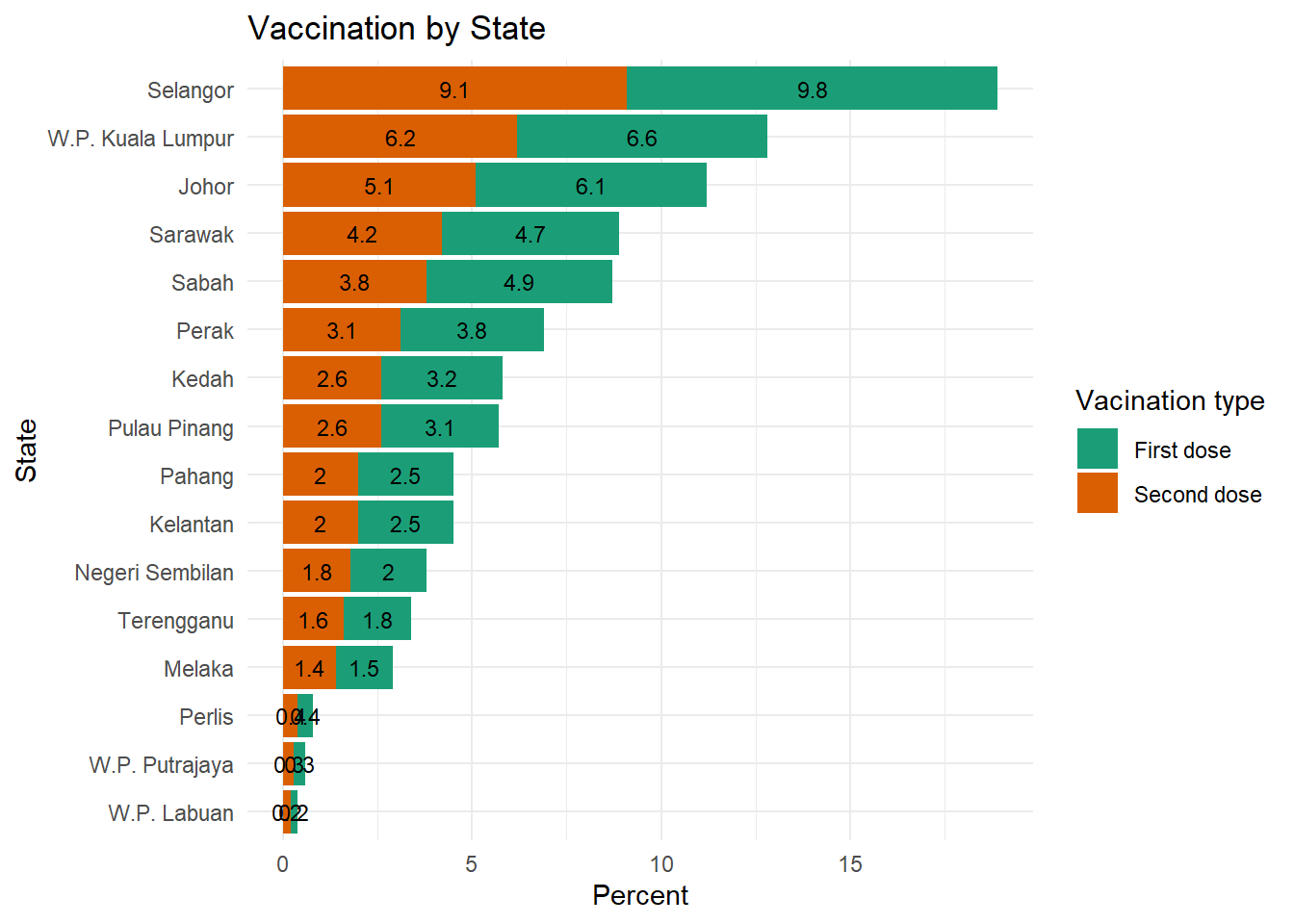
Figure 4.9: Segmented bar chart with value labels of dose percentage
Now we have a graph that is easy to read and interpret. Again note the difference between Figure 4.8 and Figure 4.9;
summarize(n = n(), .groups = 'drop')andsummarize(doses = sum(doses), .groups = 'drop')
the .groups = 'drop') option is to avoid some warning signs due to default settings of the new version of dplyr.12
We purposely leave it to the reader to adjust the geom_text parameters to make the labels look better.
4.2 Quantitative vs. Quantitative
We normally use scatter plots and line graphs to visualize the relationship between two quantitative variables.
4.2.1 Scatterplot
We will go through some examples using the mys1 dataset. It has many numeric columns or variables.
Again recall that we try to learn the basic visualization functions and techniques provided for by ggplot using the datasets we downloaded without any modifications. So far we have only changed some of the datasets to a long format using the gather function. We also showed a simple example of combining two data frames with a left_join.
mys1 %>%
  filter(date >= "2021-01-21") %>%
  ggplot(aes(x = cluster_workplace,
             y = cluster_community)) +
  geom_point()
Figure 4.10: Simple scatter plot
As we have seen in Chapter 2, geom_point parameters can be used to change the
- color - point color
- size - point size
- shape - point shape
- alpha - point transparency, from 0 (transparent) to 1 (opaque), and is a useful parameter when points overlap.
The functions scale_x_continuous and scale_y_continuous control the scaling on x and y axes respectively.
We can use these parameters and functions to improve upon Figure 4.10.
4.2.2 A bit on color combinations
We suggest the reader finds the color pairs or combinations that deliver the required theme. We will use these two based on some cool recommendations.13
- Blue and Orange: Balance and Strength. These two complimentary shades look amazing together. Punchy orange (#e54b22) and cool blue (#abd1ff) creates a perfectly balanced and stylish look.
- Blue and Deep Peach: Professional yet Sophisticated. Blue (#0f149a) and peach (#fd9b4d) make a dynamic color scheme. This mix of cool and warm tones works well in contemporary and traditional contexts.
mys1 %>%
  filter(date >= "2021-01-01") %>%
  ggplot(aes(x = cluster_workplace,
             y = cluster_community)) +
  geom_point(color="#e54b22",
             size = 2,
             alpha= 0.8) +
  scale_y_continuous(limits = c(0, 1000),
                     breaks = seq(0, 1000, 100)) +
  scale_x_continuous(limits = c(0, 3000),
                     breaks = seq(0, 3000, 500)) +
  labs(x = "Cases at workplace",
       y = "Cases at community",
       title = "Workplace and Community Cases",
       subtitle = "Daily starting 01 Jan 2021")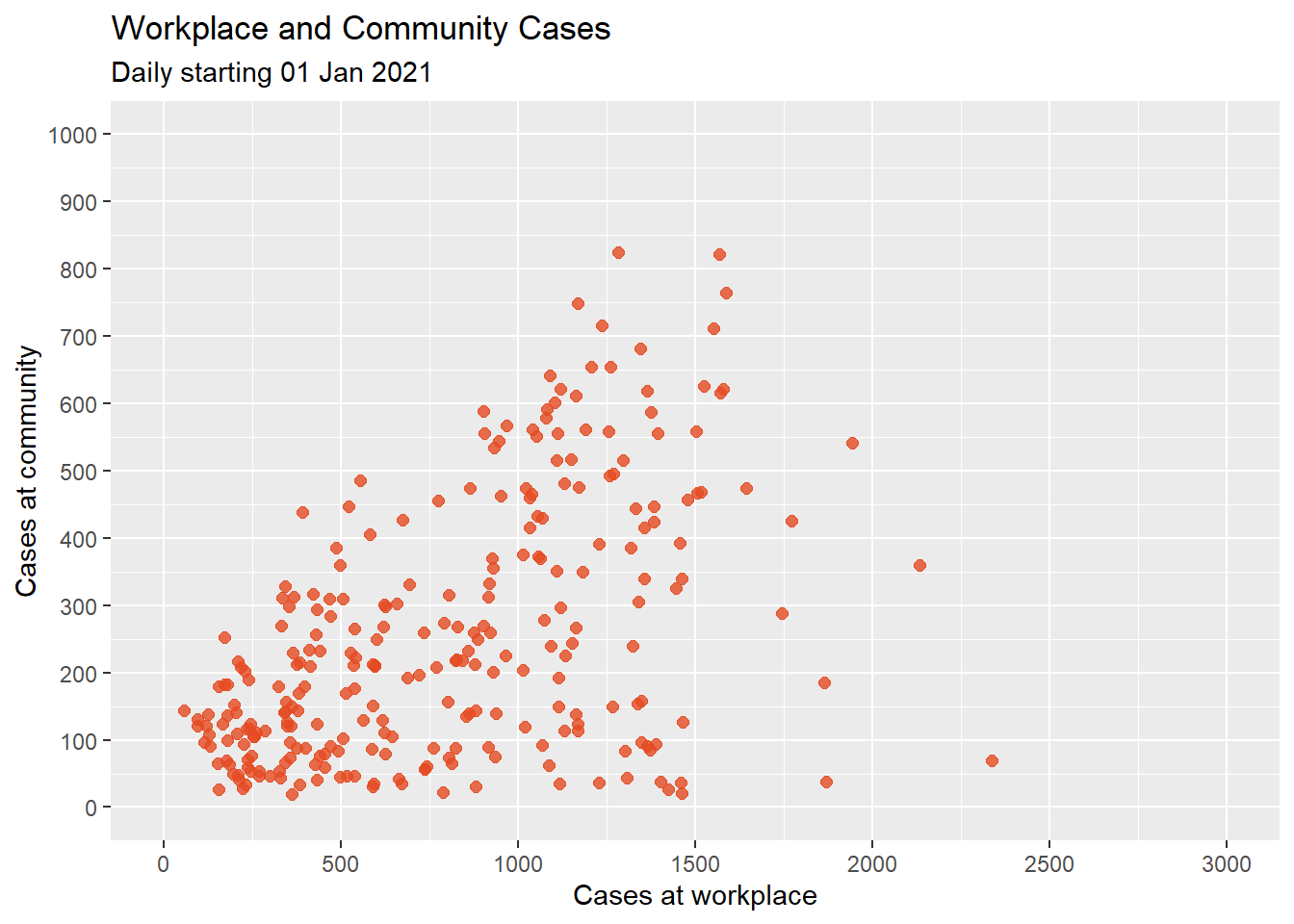
Figure 4.11: Scatterplot with color, transparency, and axis scaling
4.2.3 Best fit lines
We can display a best-fit line to show the relationship between the points. The geom_smooth() function has a few line types like linear, polynomial, and non-parametric (loess). By default, 95% confidence limits for these lines are displayed.
mys1 %>%
  filter(date >= "2021-01-01") %>%
  ggplot(aes(x = cluster_workplace,
             y = cluster_community)) +
  geom_point(color="#e54b22",
             size = 2,
             alpha= 0.8) +
  geom_smooth(method = "lm", color = "darkblue") +
  scale_y_continuous(limits = c(0, 900),
                     breaks = seq(0, 1000, 100)) +
  scale_x_continuous(limits = c(0, 2500),
                     breaks = seq(0, 3000, 500)) +
  labs(x = "Cases at workplace",
       y = "Cases at community",
       title = "Workplace and Community Cases",
       subtitle = "Daily starting 01 Jan 2021")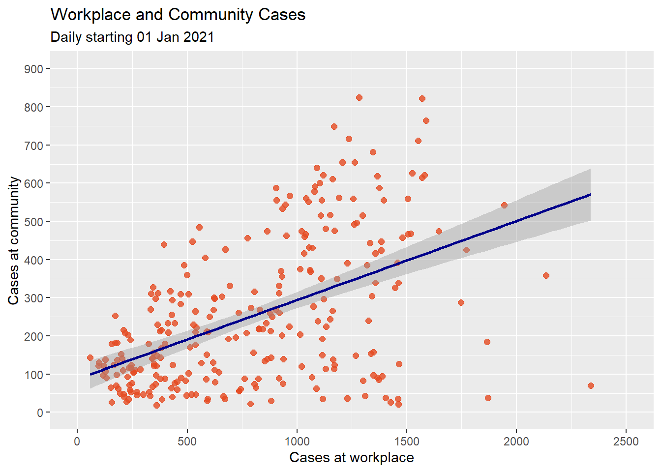
Figure 4.12: Scatter plot with linear fit line
It seems the community cases increases with workplace cases. However, there seems to be a dip at the right end. A straight line does not capture this. A line with a bend will fit better here. We can try a polynomial regression line with either a quadratic (one bend), or cubic (two bends) option. Higher order(> 3) polynomials are seldom used. Figure 4.13 applies a quadratic fit.
mys1 %>%
  filter(date >= "2021-01-01") %>%
  ggplot(aes(x = cluster_workplace,
             y = cluster_community)) +
  geom_point(color="#e54b22",
             size = 2,
             alpha= 0.8) +
  geom_smooth(method = "lm",
              formula = y ~ poly(x, 2),
              color = "#0f149a") +
  scale_y_continuous(limits = c(0, 900),
                     breaks = seq(0, 1000, 100)) +
  scale_x_continuous(limits = c(0, 2500),
                     breaks = seq(0, 3000, 500)) +
  labs(x = "Cases at workplace",
       y = "Cases at community",
       title = "Workplace and Community Cases",
       subtitle = "Daily starting 01 Jan 2021")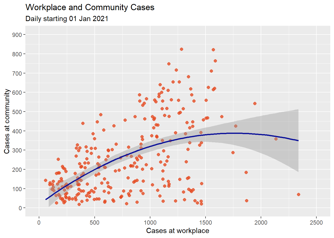
Figure 4.13: Scatter plot with quadratic fit line
Figure 4.14 applies a smoothed non-parametric fit line. The default in ggplot2 is a loess line.
mys1 %>%
  filter(date >= "2021-01-01") %>%
  ggplot(aes(x = cluster_workplace,
             y = cluster_community)) +
  geom_point(color="orange2",
             size = 2,
             alpha= 0.8) +
  geom_smooth(color = "darkblue") +
  scale_y_continuous(limits = c(0, 900),
                     breaks = seq(0, 1000, 100)) +
  scale_x_continuous(limits = c(0, 2500),
                     breaks = seq(0, 3000, 500)) +
  labs(x = "Cases at workplace",
       y = "Cases at community",
       title = "Workplace and Community Cases",
       subtitle = "Daily starting 01 Jan 2021")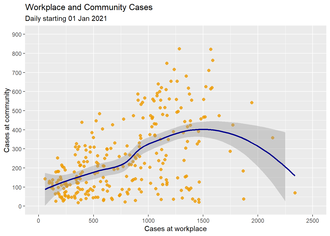
Figure 4.14: Scatter plot with non-parametric fit line
We can suppress the confidence bands by including the option se = FALSE.
Figure 4.15 is a more complete plot.
mys1 %>%
  filter(date >= "2021-01-01") %>%
  ggplot(aes(x = cluster_workplace,
             y = cluster_community)) +
  geom_point(color="orange3",
             size = 2,
             alpha= 0.8) +
  geom_smooth(size = 1.5,
              color = "blue3") +
  scale_y_continuous(limits = c(0, 900),
                     breaks = seq(0, 1000, 100)) +
  scale_x_continuous(limits = c(0, 2500),
                     breaks = seq(0, 3000, 500)) +
  labs(x = "Cases at workplace",
       y = "Cases at community",
       title = "Workplace and Community Cases",
       subtitle = "Daily starting 01 Jan 2021") +
  theme_minimal()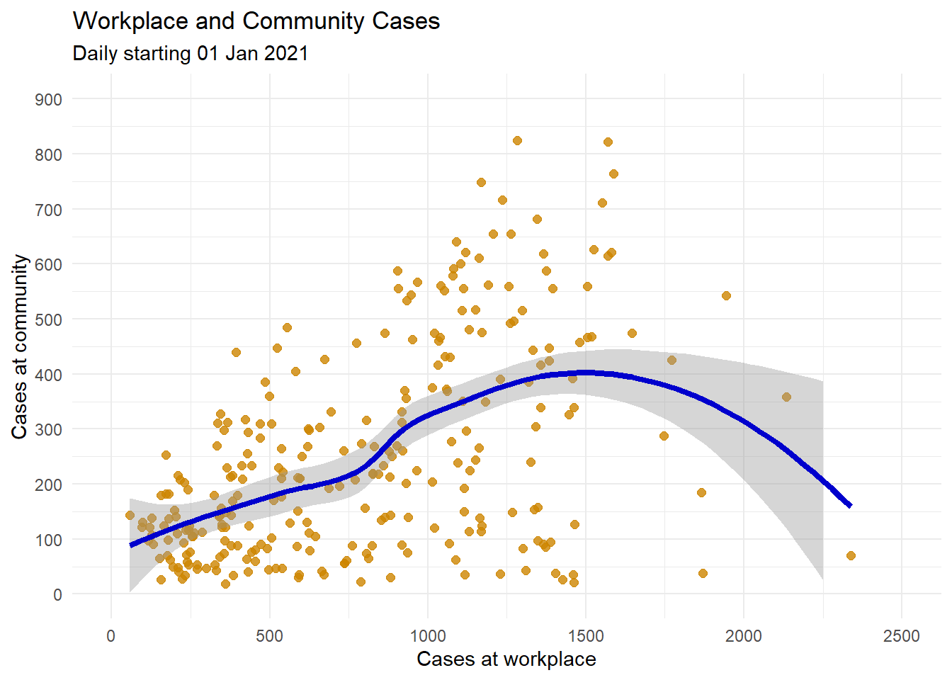
Figure 4.15: Scatter plot with loess smoothed line and better labeling and color
4.2.4 Line plot
Most of our datasets have a time (date) column. A line plot can be an effective method of displaying relationship between new cases, new deaths, and others with the date. We may need to convert the character date to numeric date using as.Date(date). We have seen in Chapter 1 that the date data from the source files have mixed formats for the date. We stick with the mys1 data frame for the following few examples.
mys1 %>%
  filter(date >= "2021-01-01") %>%
  ggplot(aes(x = as.Date(date),
             y = cluster_community)) +
  geom_line()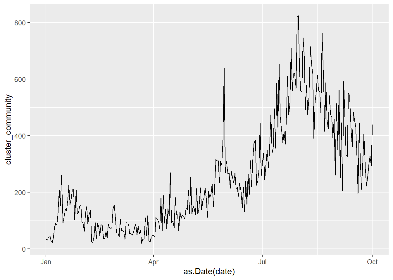
Figure 4.16: Basic line plot
It is difficult to read individual values in the graph above. In Figure 4.17, we add the points as well.
mys1 %>%
  filter(date >= "2021-01-01") %>%
  ggplot(aes(x = as.Date(date),
             y = cluster_community)) +
  geom_line(size = 1.5,
            color = "#fd9b4d") +
  geom_point(size = 1,
             color = "blue4") +
  labs(y = "Number",
       x = "Day",
       title = "Cases for Community Cluster over time",
       subtitle = "Malaysia starting 01 Jan 2021",
       caption = "Source: https://github.com/MoH-Malaysia/covid19-public/blob/main/epidemic/cases_malaysia.csv")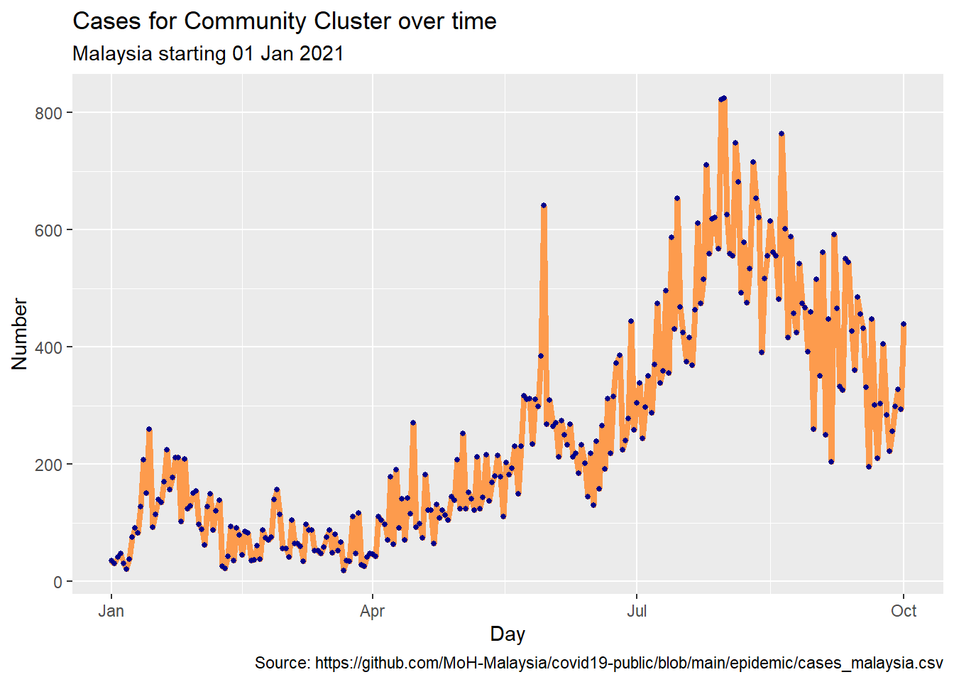
Figure 4.17: Line plot with points and improved labeling
4.3 Categorical and Quantitative
Several graph types are available to plot the relationship between a categorical variable and a quantitative variable. These include bar charts using summary statistics, grouped kernel density plots, side-by-side box plots, side-by-side violin plots, and Cleveland plots.
4.3.1 Bar chart (on summary statistics)
Before this, we used bar charts to display the number of counts or cases or percentages by category for a single variable or two variables. We can also use bar charts to display other summary statistics like the mean or median of a quantitative variable based on each level of a categorical variable.
# calculate mean cases for each cluster
plotdata <- mys1 %>%
  filter(date >= "2021-01-01") %>%
  gather(key = "cluster", value = "cases", 3:9) %>%
  group_by(cluster) %>%
  summarize(mean_cases = mean(cases),
            median_cases = median(cases),
            min_cases = min(cases),
            max_cases = max(cases))
plotdata %>%
  ggplot(aes(x = cluster,
             y = mean_cases)) +
  geom_bar(stat = "identity")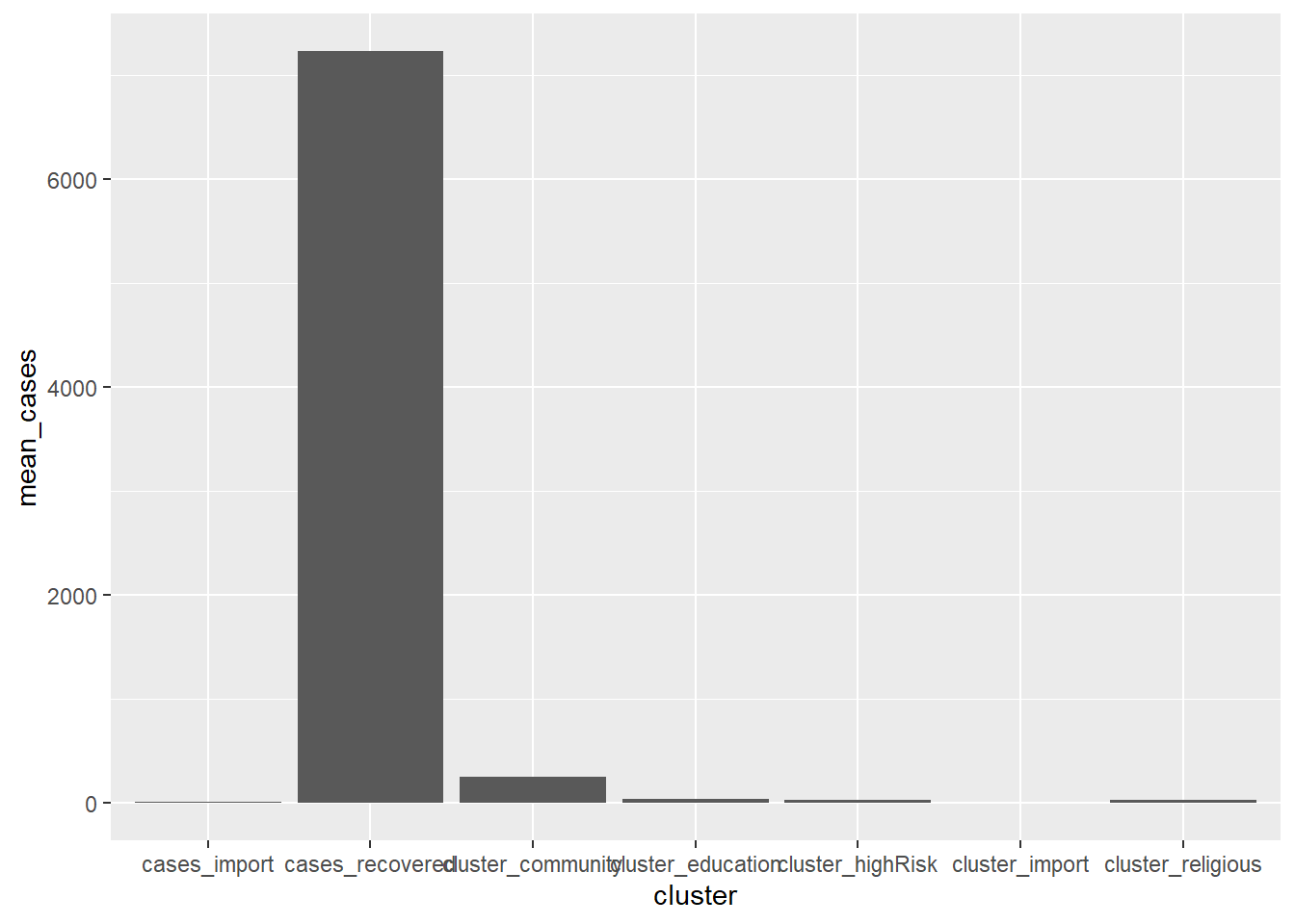
Figure 4.18: Bar chart of the mean for each cluster
We improve upon Figure 4.18 with some options. Again we purposely try fill = "salmon" to see how it looks like.
ggplot(plotdata,
       aes(x = factor(cluster,
                      labels = c("Import", "Religious", "Community",
                                 "HighRisk", "Education", "DetentionCentre",
                                 "Workplace")),
           y = mean_cases)) +
  geom_bar(stat = "identity",
           fill = "salmon") +
  geom_text(aes(label = round(mean_cases, 0)),
            size = 3,
            vjust = -0.25) +
  scale_y_continuous(breaks = seq(0, 1000, 100)) +
  labs(title = "Mean Cases by Cluster",
       subtitle = "Starting 01 Jan 2021",
       x = "",
       y = "Mean Cases")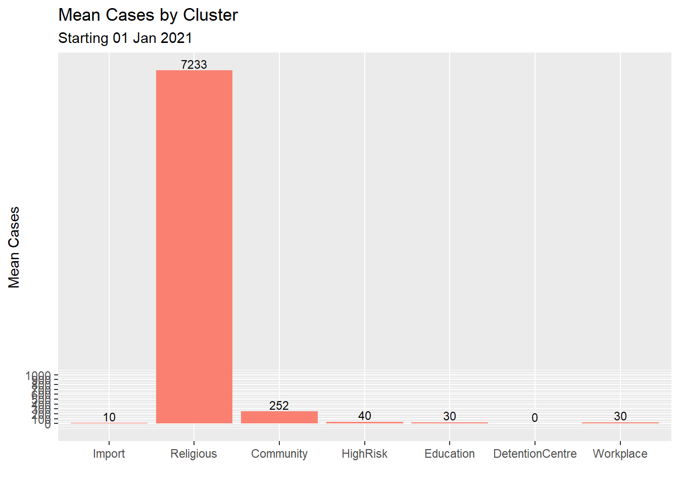
Figure 4.19: Improved bar chart of the mean for each cluster
4.3.2 Grouped kernel density plots
We can compare groups on a numeric variable by superimposing kernel density plots in a single graph as in Figure 4.20 which shows the distribution of cases by cluster.
mys1 %>%
  filter(date >= "2021-01-01") %>%
  gather(key = "cluster", value = "cases", 3:9) -> myslong

myslong %>%
ggplot(aes(x = cases,
           fill = cluster)) +
  geom_density(alpha = 0.4) +
  labs(title = "Cases by Cluster")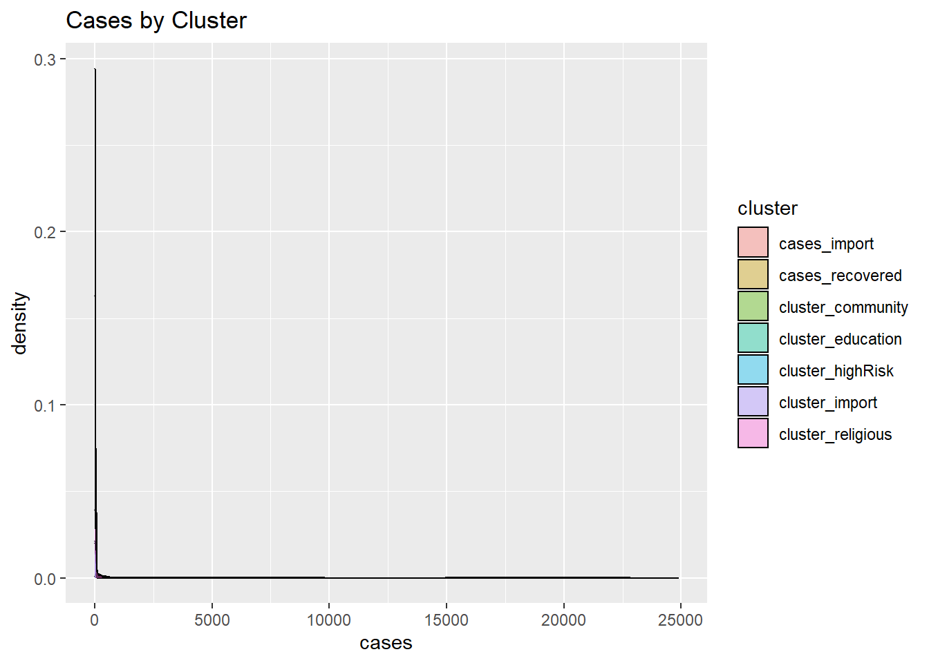
Figure 4.20: Grouped kernel density plots
This is actual data, it may not appear nice or correct but it shows the dominance of a few clusters based on the data. Figure 4.20 makes clear that the workplace and community clusters dominate.
4.3.3 Box plots
A boxplot displays the 25th percentile, median, and 75th percentile of a distribution. The vertical lines capture about 99% of a normal distribution, and observations outside this range are plotted as points representing outliers (see Figure 4.21).
Side-by-side box plots are useful for comparing groups (the levels of a categorical variable like cluster types or states) on a numerical variable like the number of cases.
Figure 4.21 shows the distribution of cases by cluster using box plots.
myslong %>%
  ggplot(aes(x = factor(cluster,
                      labels = c("Import", "Religious", "Community",
                                 "HighRisk", "Education", "DetentionCentre",
                                 "Workplace")),
           y = cases)) +
  geom_boxplot() +
  labs(title = "Box Plot of Cases Distribution by Cluster",
       x = "Cluster",
       y = "Daily cases")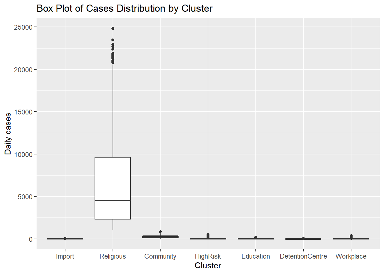
Figure 4.21: Side by side boxplots
We can set geom_boxplot(notch = TRUE) to create notched box plots. They provide an approximate method for visualizing whether groups differ.
myslong %>%
  ggplot(aes(x = factor(cluster,
                      labels = c("Import", "Religious", "Community",
                                 "HighRisk", "Education", "DetentionCentre",
                                 "Workplace")),
             y = cases)) +
  geom_boxplot(notch = TRUE,
               fill = "salmon2",
               alpha = .7) +
  labs(title = "Box Plot of Cases Distribution by Cluster",
       x = "Cluster",
       y = "Daily cases")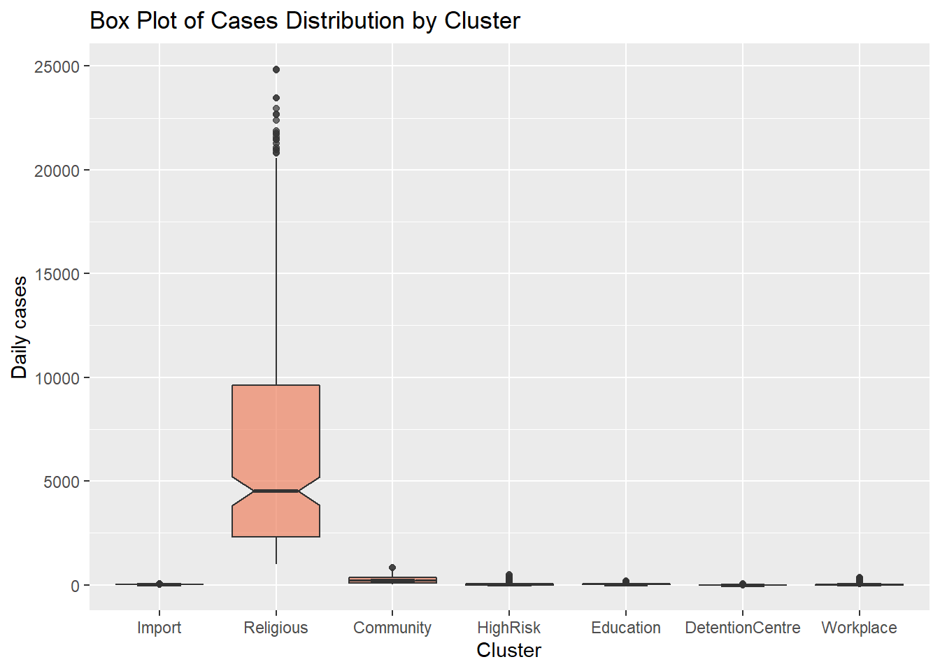
Figure 4.22: Side by side notched box plots
Figure 4.21 and Figure 4.22 show that all clusters appear to have different distributions of data. Some have several outlier observations.
4.3.4 Violin plots
Violin plots allow us to compare multiple data distributions. With ordinary density curves, it is difficult to compare several distributions together because the lines and shaded areas visually interfere with each other, as we have seen in Figure 4.20. With a violin plot, they are placed side by side.
myslong %>%
  ggplot(aes(x = cluster,
             y = cases)) +
  geom_violin() +
  labs(title = "Cases distribution by Cluster")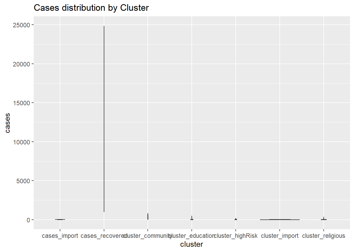
Figure 4.23: Violin plots
Our mys1 data frame in its long format myslong does not give a useful violin plot. We may have to look at other datasets with other variables. Sometimes we see box plots layered on top of violin plots.
myslong %>%
  ggplot(aes(x = factor(cluster,
                      labels = c("Import", "Religious", "Community",
                                 "HighRisk", "Education", "DetentionCentre",
                                 "Workplace")),
             y = cases)) +
  geom_violin(fill = "darkblue") +
  geom_boxplot(width = 0.2,
               fill = "salmon2",
               outlier.color = "salmon4",
               outlier.size = 2) +
  labs(title = "Box and Violin Plot of Cases Distribution by Cluster",
       x = "Cluster",
       y = "Daily cases")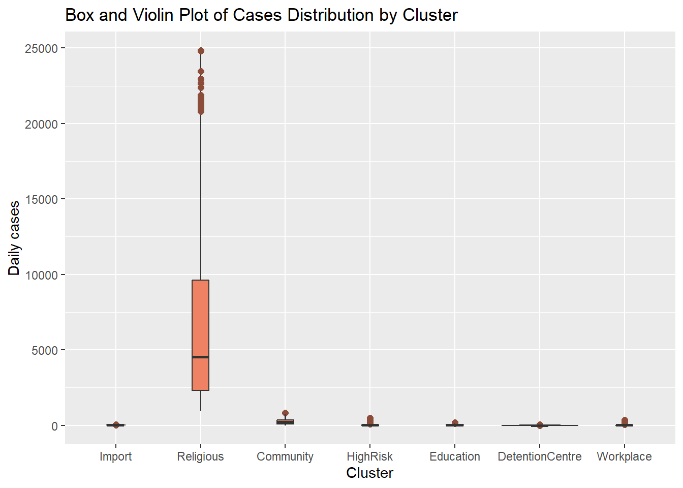
Figure 4.24: Violin and box plots together
4.3.5 Mean/SEM plots
Another method for comparing groups on a quantitative variable using mean plots with error bars. Error bars can represent different parameters like standard deviations, or confidence intervals. In Figure 4.25 we plot the mean and standard deviations. We first calculate the means, standard deviations, standard errors, and 95% confidence intervals by cluster.
plotdata <- myslong %>%
  group_by(cluster) %>%
  summarize(n = n(),
            mean = mean(cases),
            sd = sd(cases),
            se = sd / sqrt(n),
            ci = qt(0.95, df = n - 1) * sd / sqrt(n))

ggplot(plotdata,
       aes(x = factor(cluster,
                      labels = c("Import", "Religious", "Community",
                                 "HighRisk", "Education", "Detention\nCentre",
                                 "Workplace")),
           y = mean,
           group = 1)) +
  geom_point(size = 2) +
  geom_line() +
  geom_errorbar(aes(ymin = mean - sd,
                    ymax = mean + sd),
                width = .1) +
  labs(title = "Mean and Standard Deviation of daily cases by cluster",
       x = "Cluster Type",
       y = "Mean cases")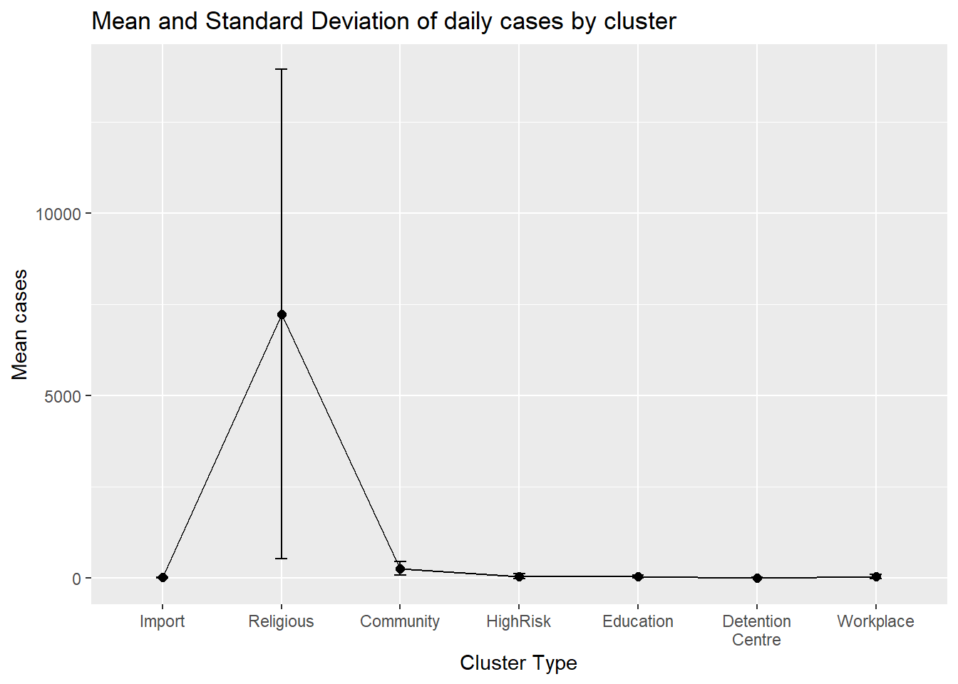
Figure 4.25: Mean and standard deviations for each cluster
Figure 4.26 adds some options to make Figure 4.25 nicer.
ggplot(plotdata,
       aes(x = factor(cluster,
                      labels = c("Import", "Religious", "Community",
                                 "HighRisk", "Education", "Detention\nCentre",
                                 "Workplace")),
           y = mean,
           group = 1)) +
  geom_point(size = 2, color = "salmon3") +
  geom_line() +
  geom_errorbar(aes(ymin = mean - sd,
                    ymax = mean + sd),
                width = .1, color = "darkblue") +
  labs(title = "Mean and Standard Deviation of daily cases by cluster",
       subtitle = "(mean +/- standard deviation)",
       x = "Cluster Type",
       y = "")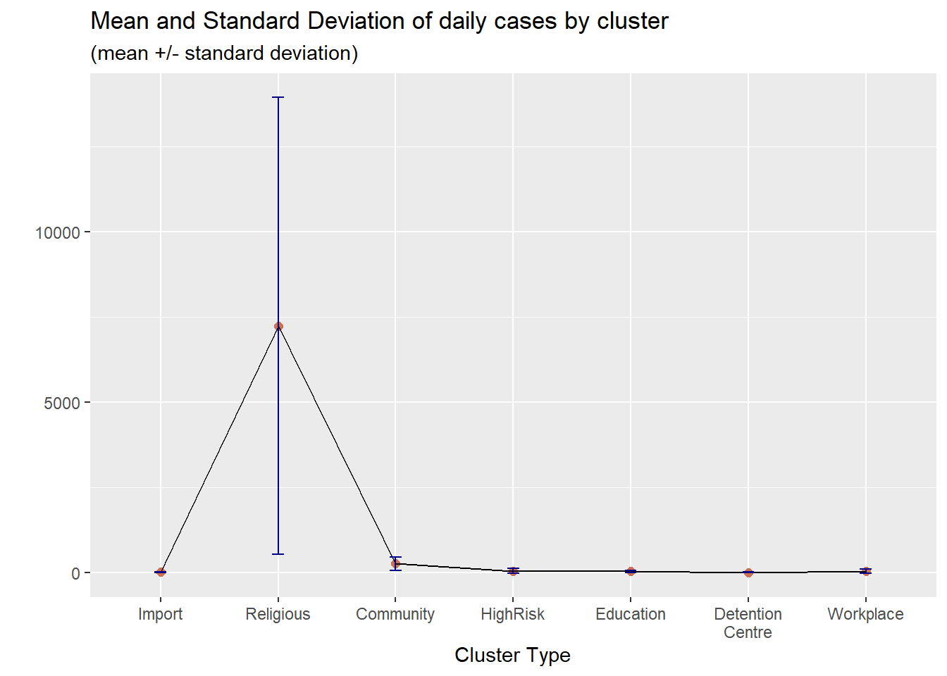
Figure 4.26: Mean/SD plot with labels and colors
4.3.6 Multiple dot plots for grouped data
The relationship between a group category and a quantitative variable can be displayed with a scatter plot. Figure 4.27 plots the distribution of cases by cluster using one-dimensional strip plots.
ggplot(myslong,
       aes(y = cluster,
           x = cases)) +
  geom_point(alpha = 0.5) +
  labs(title = "Cases distribution by cluster")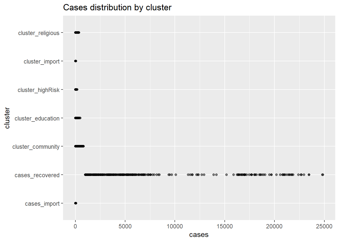
Figure 4.27: Quantiative by category strip plot
When there are too many points, overprinting of points makes interpretation difficult, even when we use geom_point(alpha = 0.5). We can jitter the points using geom_jitter() which jitters the points using a small random number within a limited range. Figure 4.28 plots the distribution of cases by cluster using jittering.
ggplot(myslong,
       aes(y = cluster,
           x = cases)) +
  geom_jitter() +
  labs(title = "Cases distribution by cluster")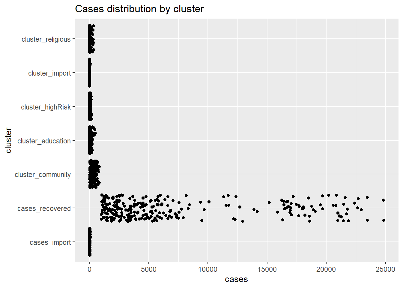
Figure 4.28: Jitter point plot
We use colors for easier comparison.
ggplot(myslong,
       aes(y = factor(cluster,
                      labels = c("Import", "Religious", "Community",
                                 "HighRisk", "Education", "Detention\nCentre",
                                 "Workplace")),
           x = cases,
           color = cluster)) +
  geom_jitter(alpha = 0.7,
              size = 1.5) +
  labs(title = "Cases distribution by cluster",
       subtitle = "Starting 01 Jan 2021",
       x = "Daily cases",
       y = "") +
  theme_minimal() +
  theme(legend.position = "none")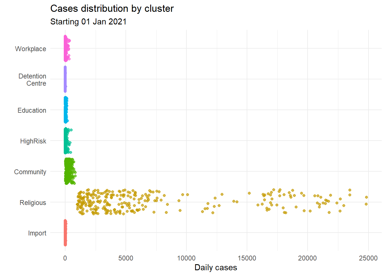
Figure 4.29: Jitter plot with cluster categories by color
Jitter line plots allow us to nicely visualize the distribution of point data by category when the number of points are not that many.
4.3.7 Combining jitter and boxplots
We can combine box plots and jitter plots.
ggplot(myslong,
       aes(y = factor(cluster,
                      labels = c("Import", "Religious", "Community",
                                 "HighRisk", "Education", "Detention\nCentre",
                                 "Workplace")),
           x = cases,
           color = cluster)) +
  geom_boxplot(size = 1,
               outlier.shape = 4,
               outlier.color = "black",
               outlier.size  = 3) +
  geom_jitter(alpha = 0.5,
              width = 0.2) +
  labs(title = "Cases distribution by cluster",
       subtitle = "Starting 01 Jan 2021",
       x = "Daily cases",
       y = "Cluster Type") +
  theme_minimal() +
  theme(legend.position = "none")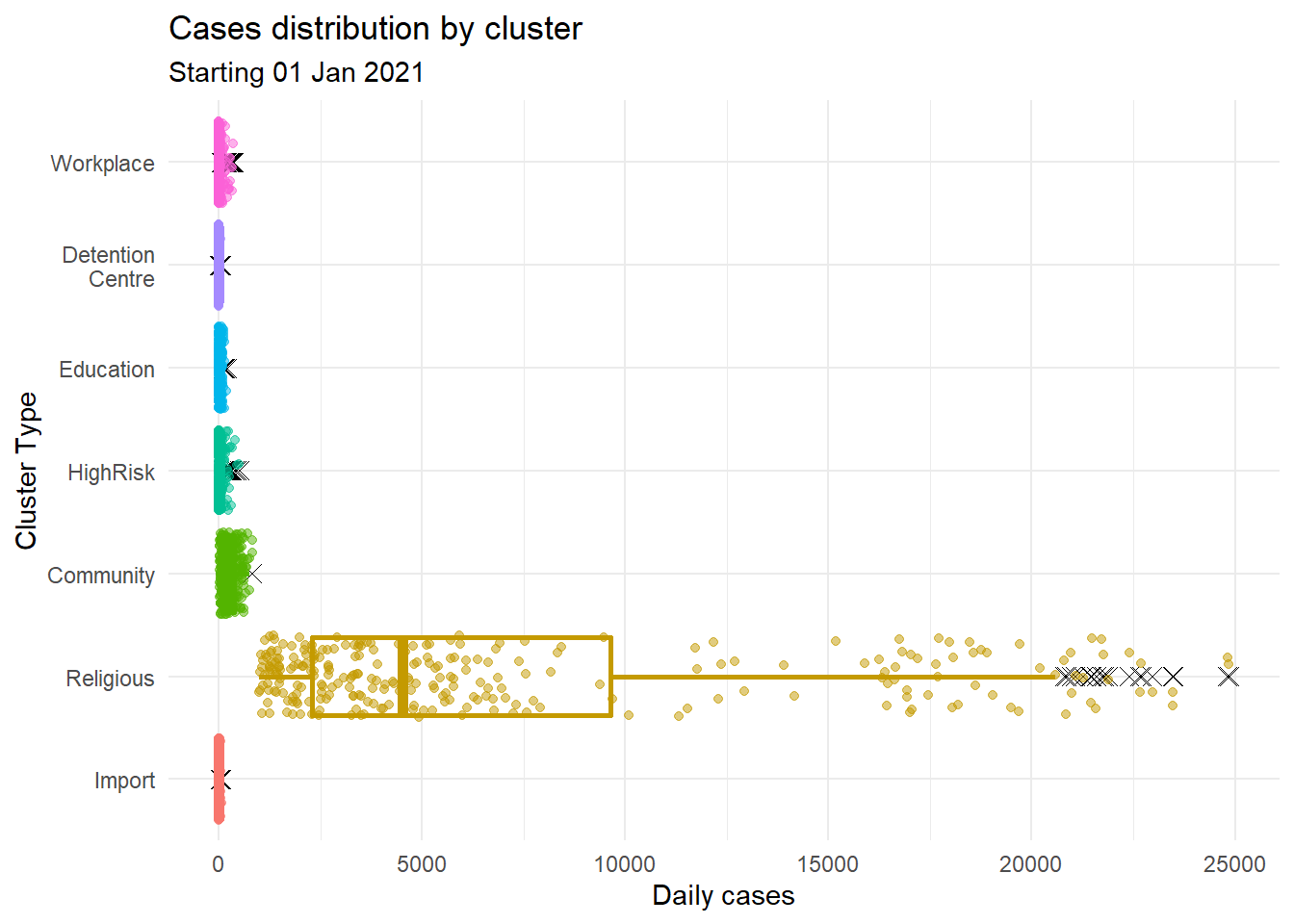
Figure 4.30: Jitter plot with box plots
We used several options in Figure 4.30.
For the boxplot
- size = 1 makes the lines thicker
- outlier.color = “black” makes outlier points black
- outlier.shape = 4 specifies X for outlier points
- outlier.size = 2 increases the size of the outlier symbol
For the jitter
- alpha = 0.5 makes the points more transparent
- width = 0.2 decreases the amount of jitter (0.4 is the default)
4.3.8 Cleveland dot plots
Cleveland plots are useful when we want to compare a quantitative statistic for many group categories. For example, we want to compare the mean number of new Covid cases per state using the mysstates dataset.
plotdata <- mysstates %>%
  group_by(state) %>%
  summarize(n = n(),
            mean = mean(cases_new))

ggplot(plotdata,
       aes(x= mean, y = state)) +
  geom_point()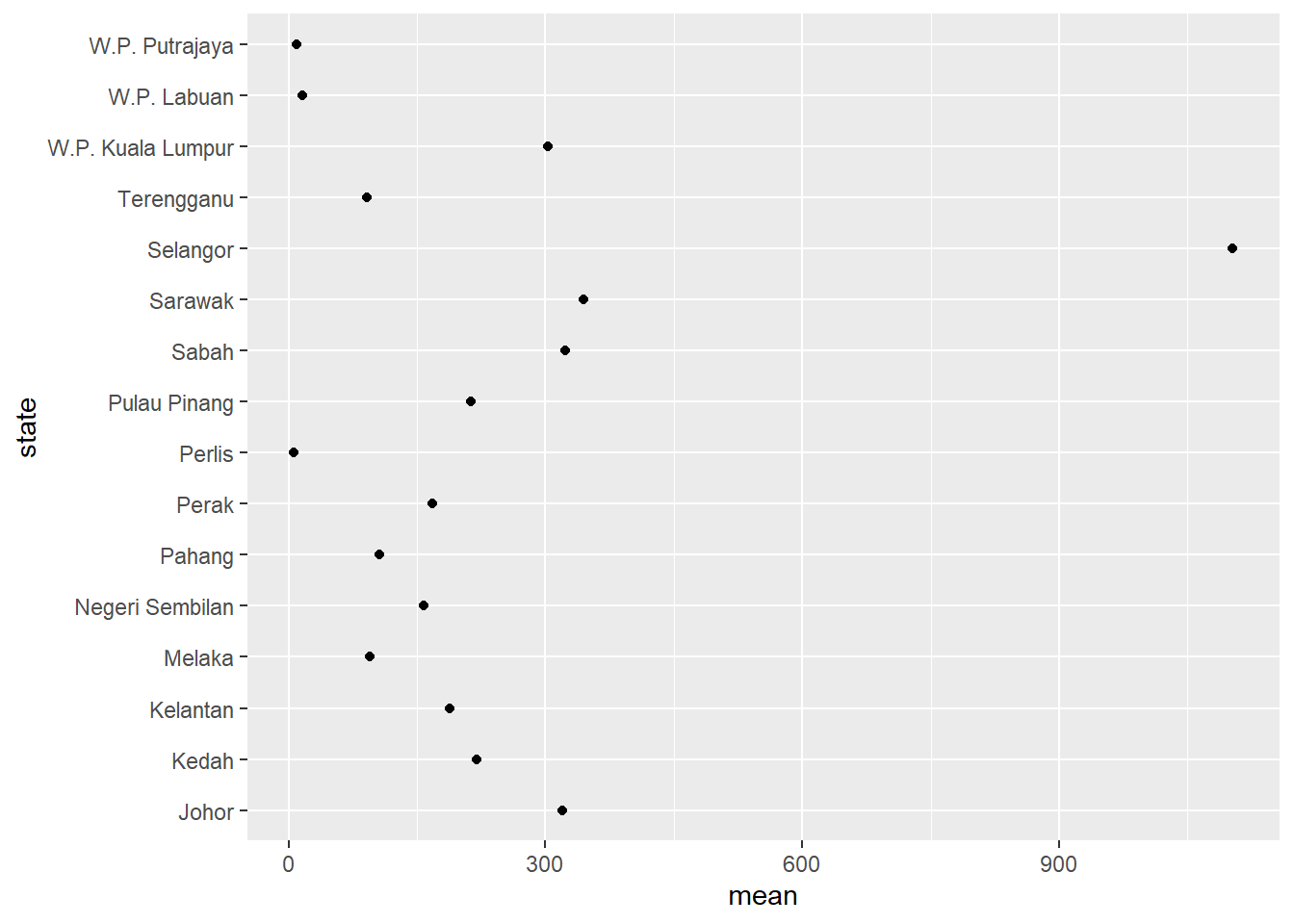
Figure 4.31: Simple Cleveland dot plot
We should sort the states along the y-axis.
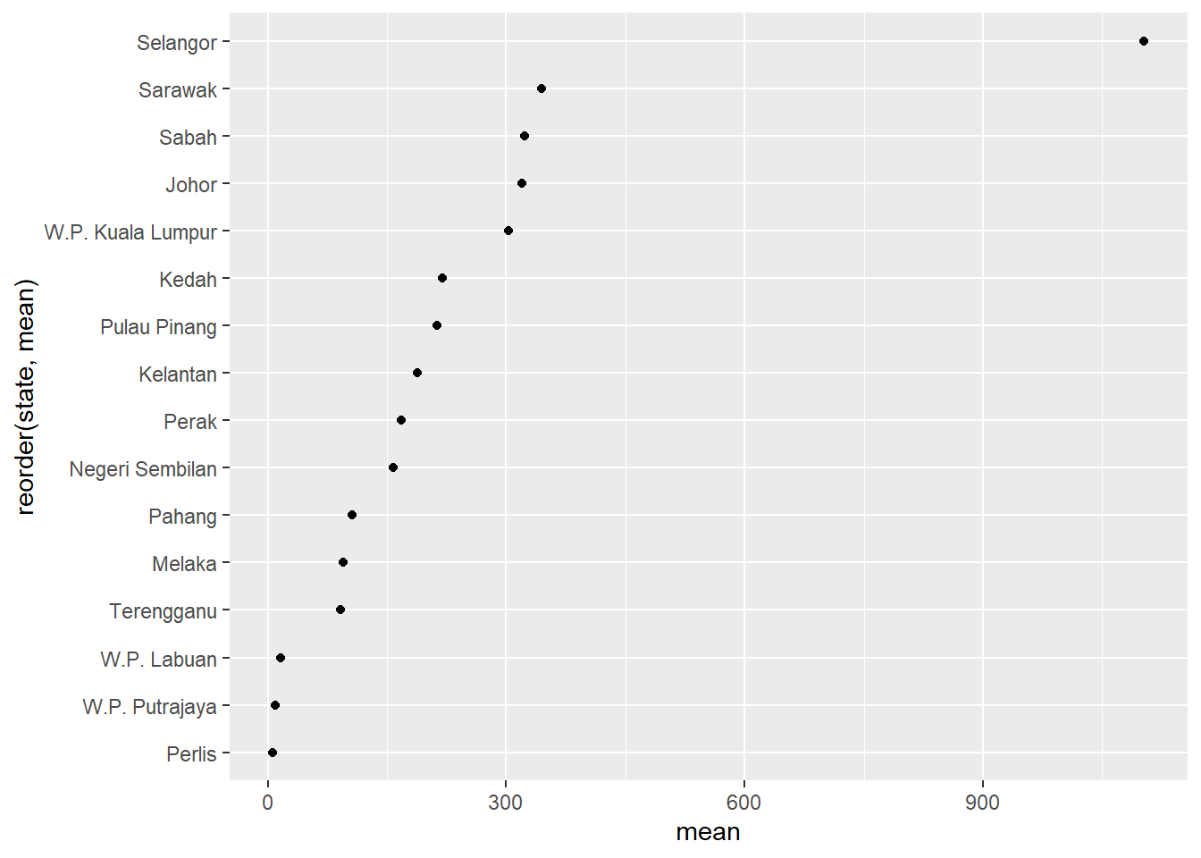
Figure 4.32: Cleveland dot plot with sorting
Figure 4.33 uses some options to improve upon Figure 4.32.
ggplot(plotdata,
       aes(x = mean,
           y = reorder(state, mean))) +
  geom_point(color = "darkblue",
             size = 5) +
  geom_segment(aes(x = 0,
               xend = mean,
               y = reorder(state, mean),
               yend = reorder(state, mean)),
               color = "salmon3",
               size = 2) +
  labs (x = "Mean Cases",
        y = "State",
        title = "Mean daily new cases by state") +
  theme_minimal() +
  theme(panel.grid.major = element_blank(),
        panel.grid.minor = element_blank())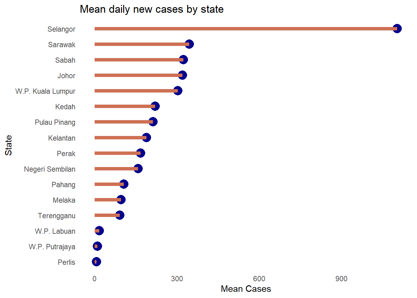
Figure 4.33: Nicer sorted Cleveland dot plot
Selangor clearly has the highest mean daily cases. This last plot is also called a lollipop graph.
4.4 Combining some visual tools learned
In the next few plots we will explore the hospital data frame. We convert it to a long format so state and category are the categories.
Figure 4.34 uses geom_col and facet_wrap to simply visualize the two categories we have in the data frame. This is an exploratory visualization. Imagine if we have a large data frame with millions of rows. This short code will simply paint the data frame.
We introduce the use of geom_col here instead of geom_bar(stat = "identity", position = "stack"). It is simpler. We also increase the height of the plot.
ggplot(hosplong,
       aes(x = as.Date(date), y = patients,
           fill = category)) +
  geom_col() +
  facet_wrap(~ state)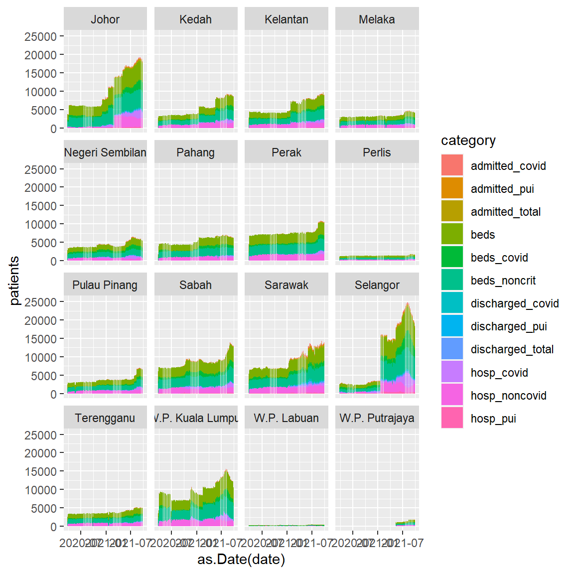
Figure 4.34: Stacked bar chart with facet
In Figure 4.35 we filter some categories. The fixed scale shows the more demanding states.
hosplong %>%
  filter(category %in% c("beds_covid", "admitted_covid",
                         "hosp_covid", "discharged_covid")) %>%
  ggplot(aes(x = as.Date(date), y = patients,
           fill = category)) +
  geom_col() +
  facet_wrap(~ state) +
  labs(title = "Covid hospitalization by state",
       caption = "Fixed y-axis",
       x =  "Date")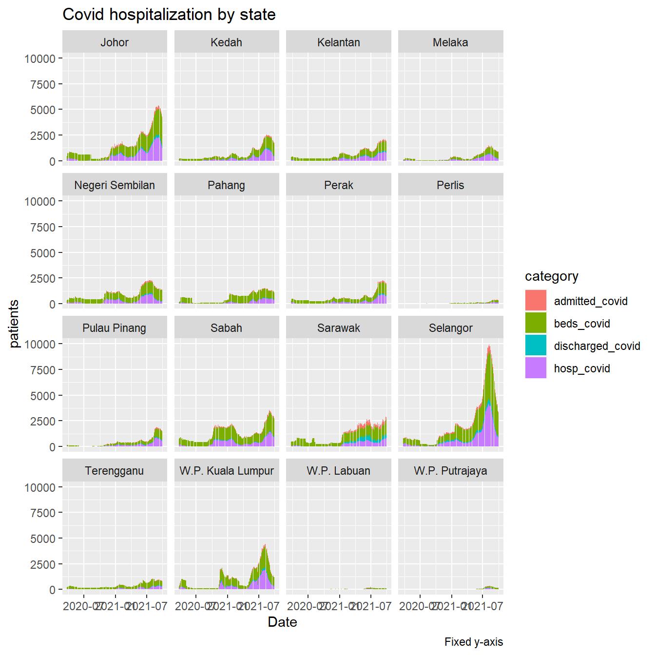
Figure 4.35: Covid cases and beds in hospitals
Figure 4.36 uses scale="free_y" to see the visual trend by state.
hosplong %>%
  filter(category %in% c("beds_covid", "admitted_covid",
                         "hosp_covid", "discharged_covid")) %>%
  ggplot(aes(x = as.Date(date), y = patients,
           fill = category)) +
  geom_col() +
  facet_wrap(~ state, scale="free_y") +
  labs(title = "Covid hospitalization by state",
       caption = "Free y-axis",
       x =  "Date")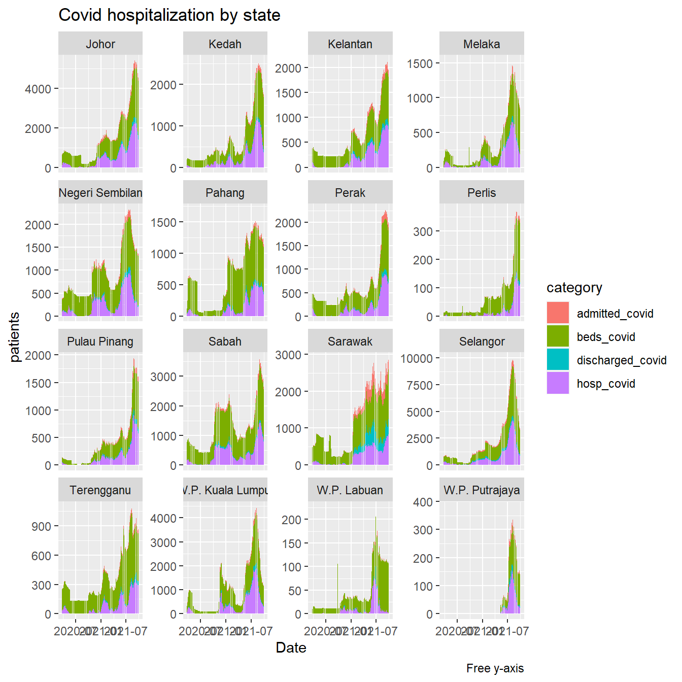
Figure 4.36: Covid cases and beds in hospitals
Figure 4.37 shows the visual trend by state of only two categories.
hosplong %>%
  filter(category %in% c("beds_covid", "beds")) %>%
  ggplot(aes(x = as.Date(date), y = patients,
           fill = category)) +
  geom_col() +
  facet_wrap(~ state, scale="free_y") +
  labs(title = "Hospital bed allocation by state",
       caption = "Free y-axis",
       x =  "Date")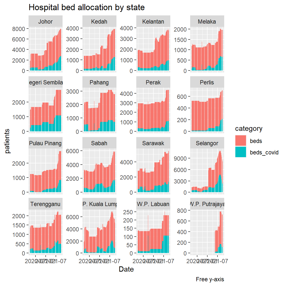
Figure 4.37: Hospital bed allocation by states
The above visuals that combine bar charts and facets allow simple visual comparisons between the state categories.