Chapter 6 Basic data visualization
In this chapter, you will learn to:
- Visualize the distribution of a single categorical or continuous variable,
- Visualize the association between two variables, and
- Visualize the associations between more than two continuous variables.
You can use base R to create graphics or you can use a more polished function called ggplot(). ggplot() loads with tidyverse or can be loaded directly using library(ggplot2) (Wickham et al. 2025; Wickham 2016)
While ggplot() is extremely powerful, it is still well worth your while to learn base R plotting commands, as well. One reason is so you can understand other programmers’ code. Another reason is that, in many cases, using base R involves less typing to get a quick, basic plot for exploratory purposes.
Base R functions each have their own syntax. ggplot(), however, uses a consistent syntax, starting with the aes() function, which stands for “aesthetic” and serves to tell ggplot() what role each variable plays in the visualization.
In general, ggplot() has the following syntax.
mydat %>%                            # Use %>% (pipe) to connect the data and ggplot
  ggplot(aes(x = var1, y = var2)) +  # Use + to connect ggplot() statements
  geom_XXXX()                        # For example, geom_point() to plot points
This chapter is not meant to be exhaustive. In particular, the ggplot() examples are meant for you to imitate, not necessarily to understand at this point. To imitate them for a different situation, replace the dataset and variable names with others. See Section 6.10 for a list of resources for learning more about data visualization in R, including a number of resources for ggplot().
The approach taken here is to teach by example, using basic plotting commands, with a section at the end (Section 6.8) that provides some customization options.
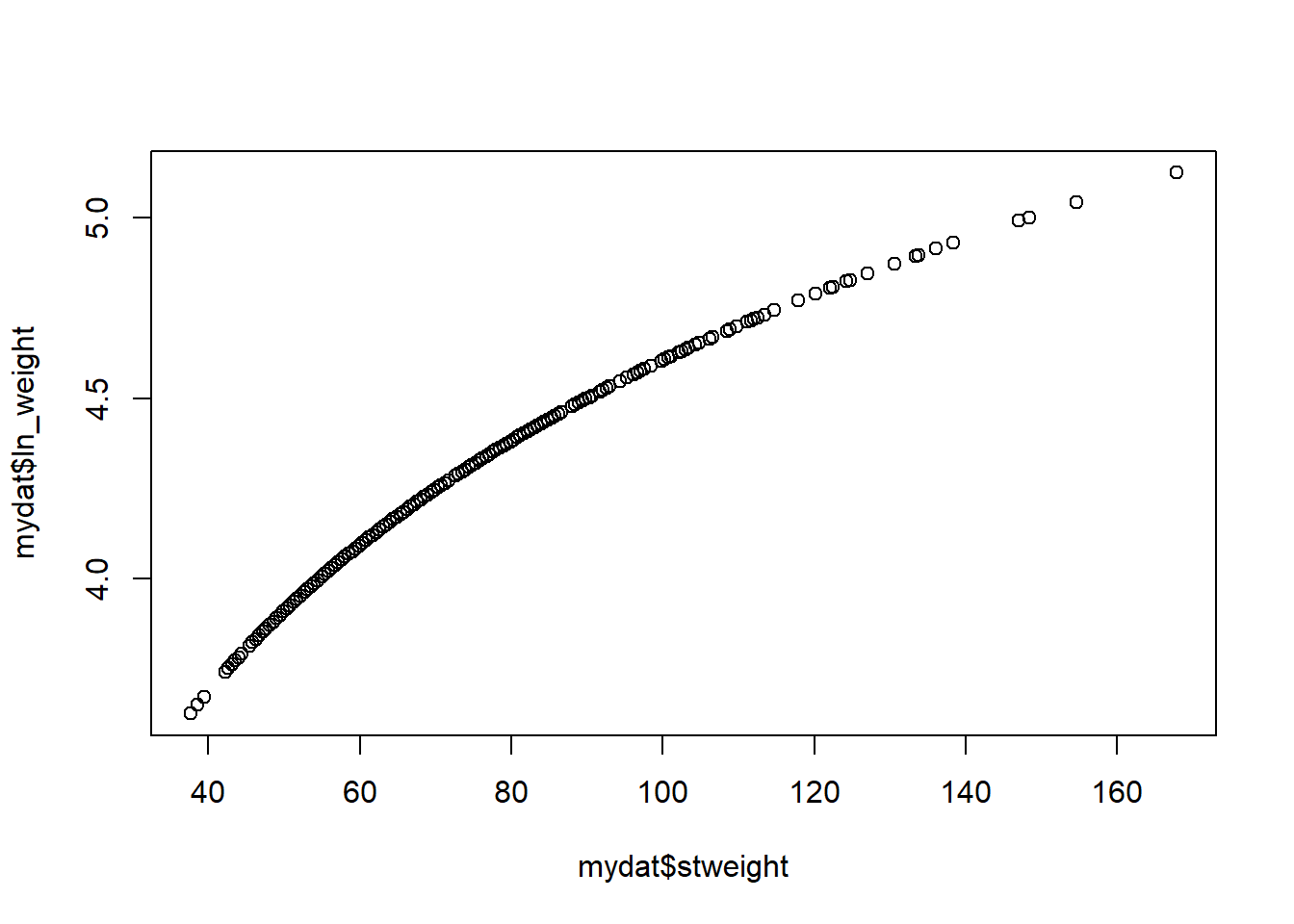
For this chapter, we will use a 1% random subsample of youths from 2017 Youth Risk Behavior Surveillance System (YRBSS) dataset (Section 1.20.3). Use the code below to load the data, convert categorical variables to factors before plotting (otherwise, the labels will not appear), and create a log-transformed version of weight which we will use later.
library(tidyverse)
load("Data/YRBS-2017-sub.RData")
# The dataset is called "mydat"

# Data processing
mydat <- mydat %>%
  mutate(race = factor(race7,
                       levels = 1:7,
                       labels = c("AmInd", "Asian", "Black", "Hispanic",
                                  "Haw/PI", "White", "Multiple")),
         evercig = factor(q30,
                          levels = 1:2,
                          labels = c("Yes", "No")),
         grade_orig = grade,
         grade   = factor(grade,
                          levels = 1:4,
                          labels = 9:12),
         sex_orig = sex,
         sex     = factor(sex,
                          levels = 1:2,
                          labels = c("Female", "Male")),
         ln_weight = log(stweight))

# Check derivations
table(mydat$race7,      mydat$race, useNA = "ifany")
##
## AmInd Asian Black Hispanic Haw/PI White Multiple <NA>
## 1 21 0 0 0 0 0 0 0
## 2 0 68 0 0 0 0 0 0
## 3 0 0 380 0 0 0 0 0
## 4 0 0 0 475 0 0 0 0
## 5 0 0 0 0 13 0 0 0
## 6 0 0 0 0 0 738 0 0
## 7 0 0 0 0 0 0 46 0
## <NA> 0 0 0 0 0 0 0 37##
## Yes No <NA>
## 1 959 0 0
## 2 0 723 0
## <NA> 0 0 96##
## 9 10 11 12 <NA>
## 1 319 0 0 0 0
## 2 0 512 0 0 0
## 3 0 0 492 0 0
## 4 0 0 0 449 0
## <NA> 0 0 0 0 6##
## Female Male <NA>
## 1 889 0 0
## 2 0 884 0
## <NA> 0 0 5## Min. 1st Qu. Median Mean 3rd Qu. Max. NA's
## 37.6 55.8 64.0 68.1 76.7 167.8 556## Min. 1st Qu. Median Mean 3rd Qu. Max. NA's
## 3.63 4.02 4.16 4.19 4.34 5.12 556