6.4 Categorical vs Categorical: Clustered bar charts
6.4.1 Base R
We can also use barplot() to illustrate the relationship between two categorical variables. The following will plot the frequency of lifetime cigarette use, clustered by grade.
# Frequency of ever cigarette use clustered by grade
# If you leave out beside = T you will get a stacked bar chart (not recommended)
barplot(table(mydat$evercig, mydat$grade),
        beside = T,
        legend.text = T,
        xlab = "Grade",
        ylab = "Frequency",
        main = "Lifetime Cigarette Use by Grade")
# Add a box around the plot
box()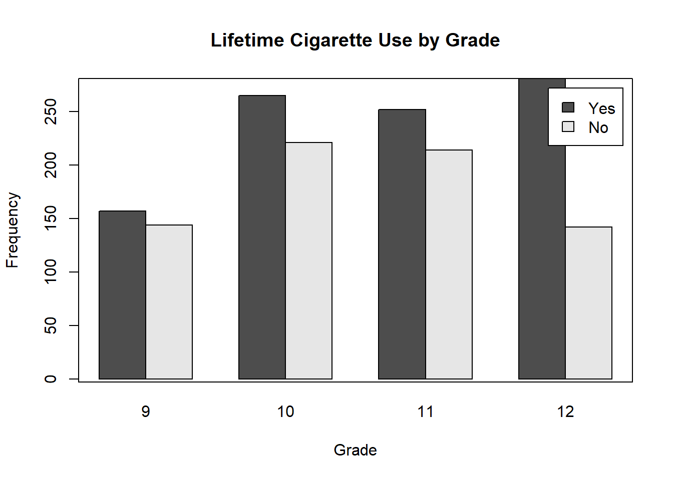
NOTE: Some optional arguments, like xlab and ylab, work in pretty much any base R plotting function. Others, like legend.text, only work in a specific function. See the help for each function (e.g., ?barplot) for the specific arguments that work with that function. If you see 3 dots (...) as one of the arguments, that means that it also allows additional arguments, typically the ones you can find by looking at ?par.
The figure above displayed the frequencies within groups. But since grades have different numbers of students, it is hard to compare lifetime cigarette use between grades. To do that, we need the proportion within each grade. Remember, barplot() simply plots whatever numbers you give it, so we need to produce a table where the correct margins sum to 100. To do this, use prop.table() with margin = 2 (which tells R to compute proportions within columns).
# Proportion chart, where bars sum to 100% within clusters
barplot(prop.table(table(mydat$evercig, mydat$grade), margin = 2),
        beside = T,
        legend.text = T,
        xlab = "Grade",
        ylab = "Proportion",
        main = "Lifetime Cigarette Use by Grade")
box()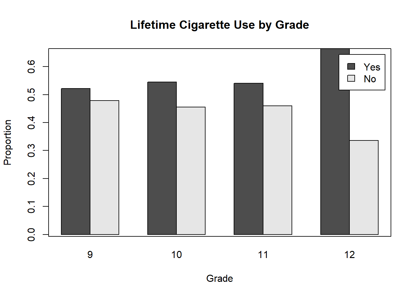
# To see what prop.table() is doing
addmargins(
  prop.table(
    table(mydat$evercig, mydat$grade), margin = 2
    ),
  1)
##
## 9 10 11 12
## Yes 0.5216 0.5453 0.5408 0.6643
## No 0.4784 0.4547 0.4592 0.3357
## Sum 1.0000 1.0000 1.0000 1.00006.4.2 ggplot
Base R barplot() requires, as input, a table to compute the counts or proportions. In ggplot(), however, you can input the variables directly. However, as shown below, to get a proportion chart, we still need to compute the proportions first.
# NOTE: "fill" tells ggplot which variable is filled with different colors
mydat %>%
  # By default, geom_bar() will plot a bar for NA values
  # Filter them out if you want to prevent this
  filter(!is.na(evercig) & !is.na(grade)) %>%
  ggplot(aes(x = grade, fill = evercig)) +
  # If you leave out position = "dodge" you will get a stacked bar chart
  # (not recommended)
  geom_bar(position = "dodge") +
  # \n in a string tells R to break the line there
  labs(y = "Frequency",
       x = "Grade",
       fill = "Lifetime\nCigarette\nUse")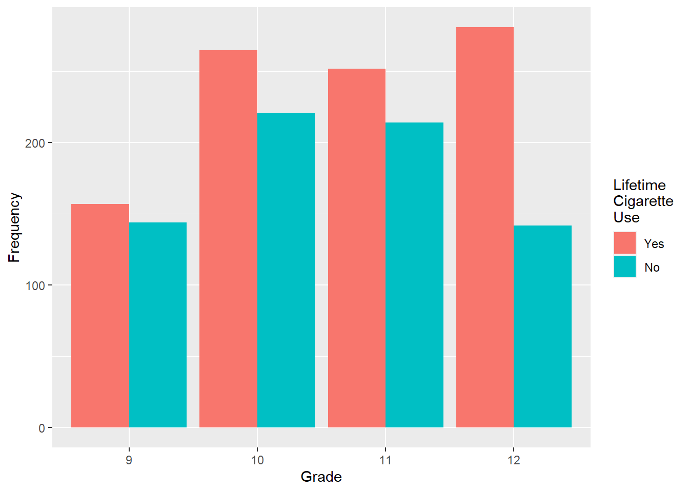
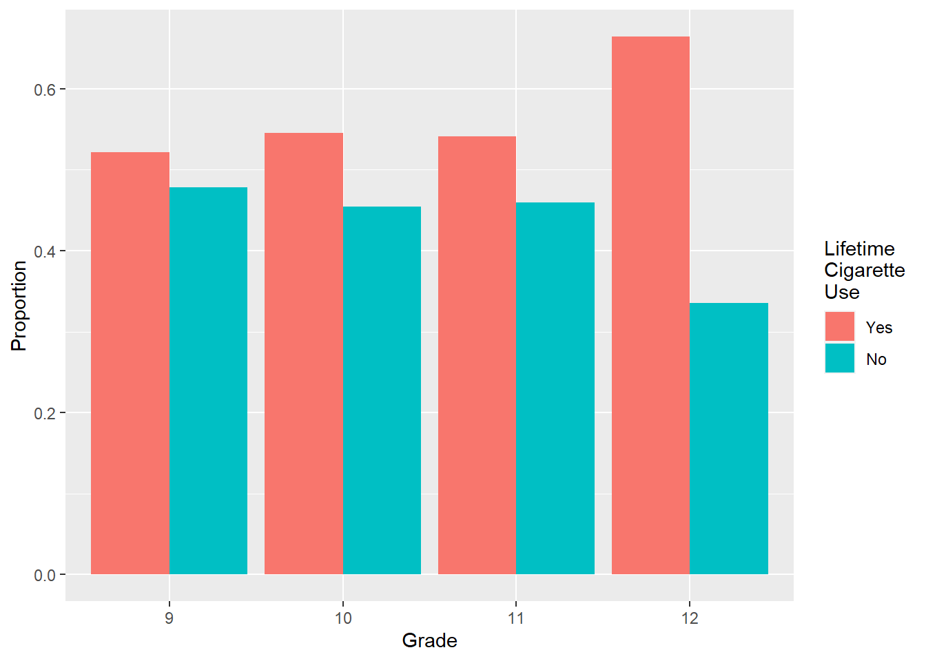
Getting a proportion chart in ggplot() is trickier. This is one of those example where base R is much more concise.
# Proportion chart, where bars sum to 100% within clusters
mydat %>%
  filter(!is.na(evercig) & !is.na(grade)) %>%
  # Compute frequency within each combination
  group_by(grade, evercig) %>%
  count() %>%
  # Compute proportions within grade
  # n is the default variable created by count()
  group_by(grade) %>%
  mutate(Proportion = n/sum(n)) %>%
  # This time add y to tell geom_bar what to put on the y-axis
  ggplot(aes(x = grade, y = Proportion, fill = evercig)) +
  geom_bar(position = 'dodge', stat = 'identity') +
  labs(y = "Proportion",
       x = "Grade",
       fill = "Lifetime\nCigarette\nUse")