6.1 Categorical: Bar chart
Bar charts are appropriate for displaying the distribution of a categorical variable (nominal or ordinal).
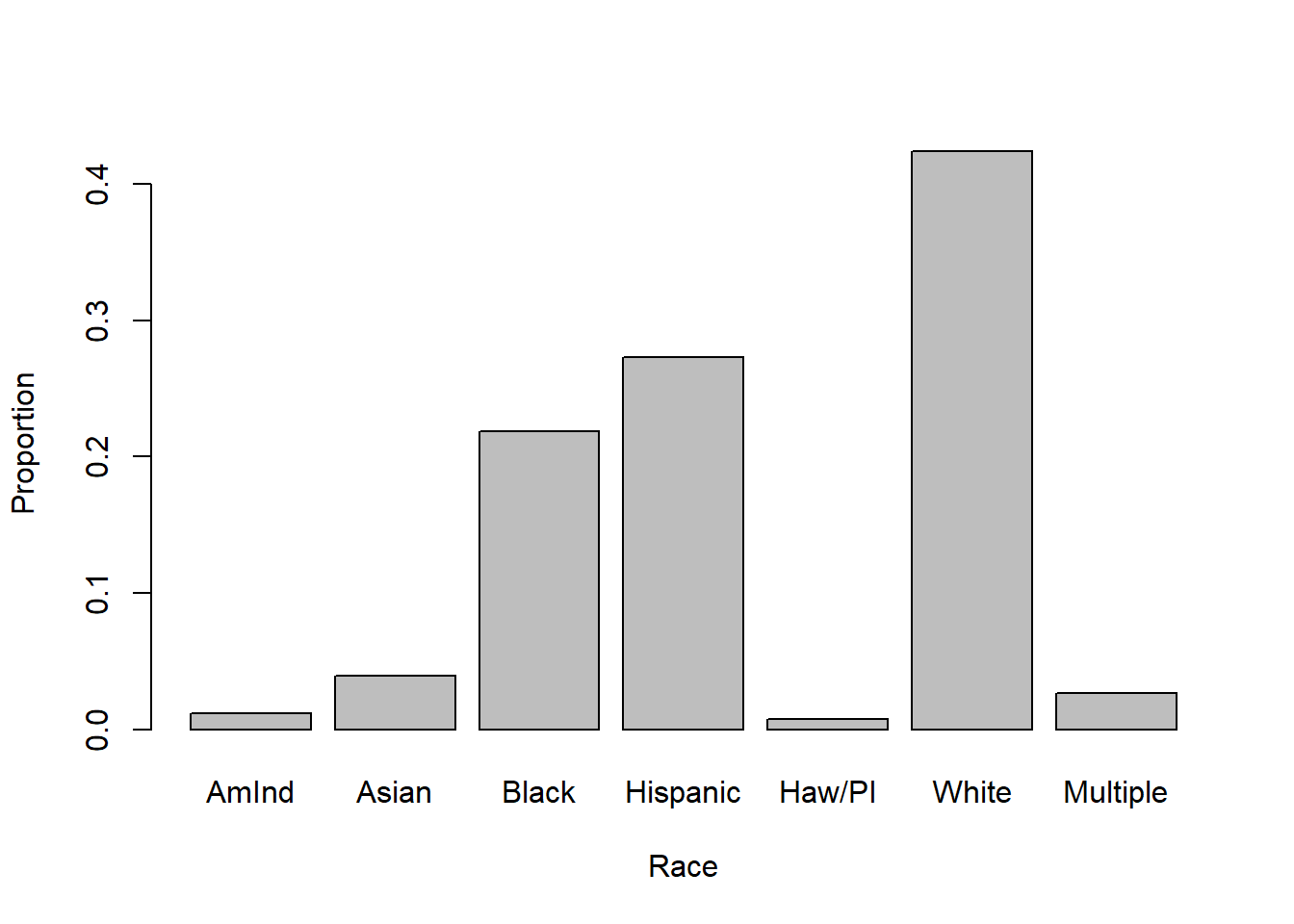
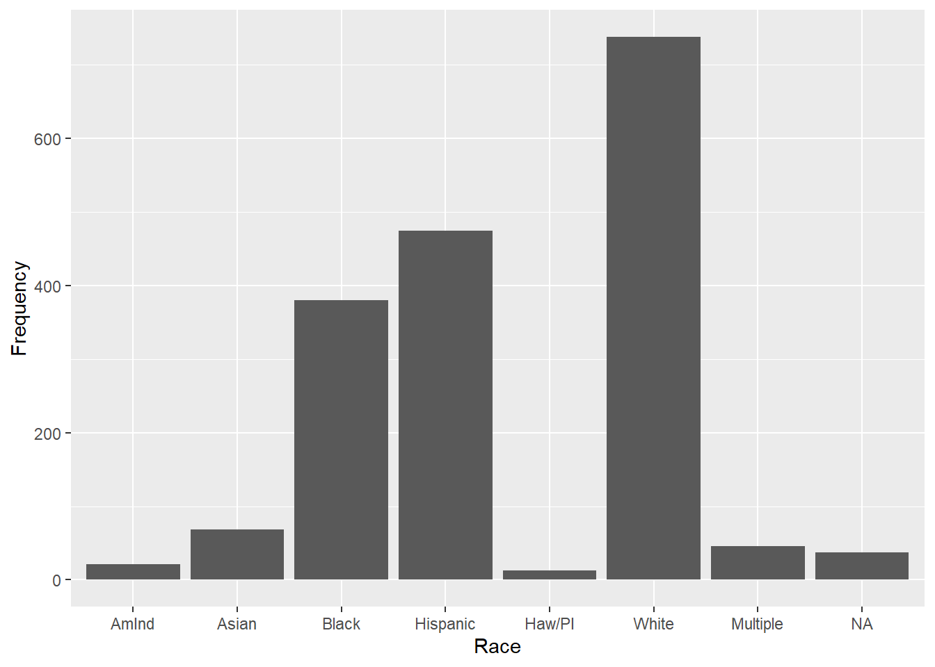
6.1.1 Base R
In base R, use barplot(). Rather than input a variable, you must input a table() of counts for each bar.

The above produced a frequency chart – the height of each bar is the number of observations in that level. To get a probability chart, where the height of each bar is the proportion of observations in that level, input a table of proportions instead of frequencies using prop.table().
NOTE: The examples in this chapter will introduce various optional arguments, such as ylab and xlab to label the axes. These optional arguments for customizing graphics are presented all together in Section 6.8.
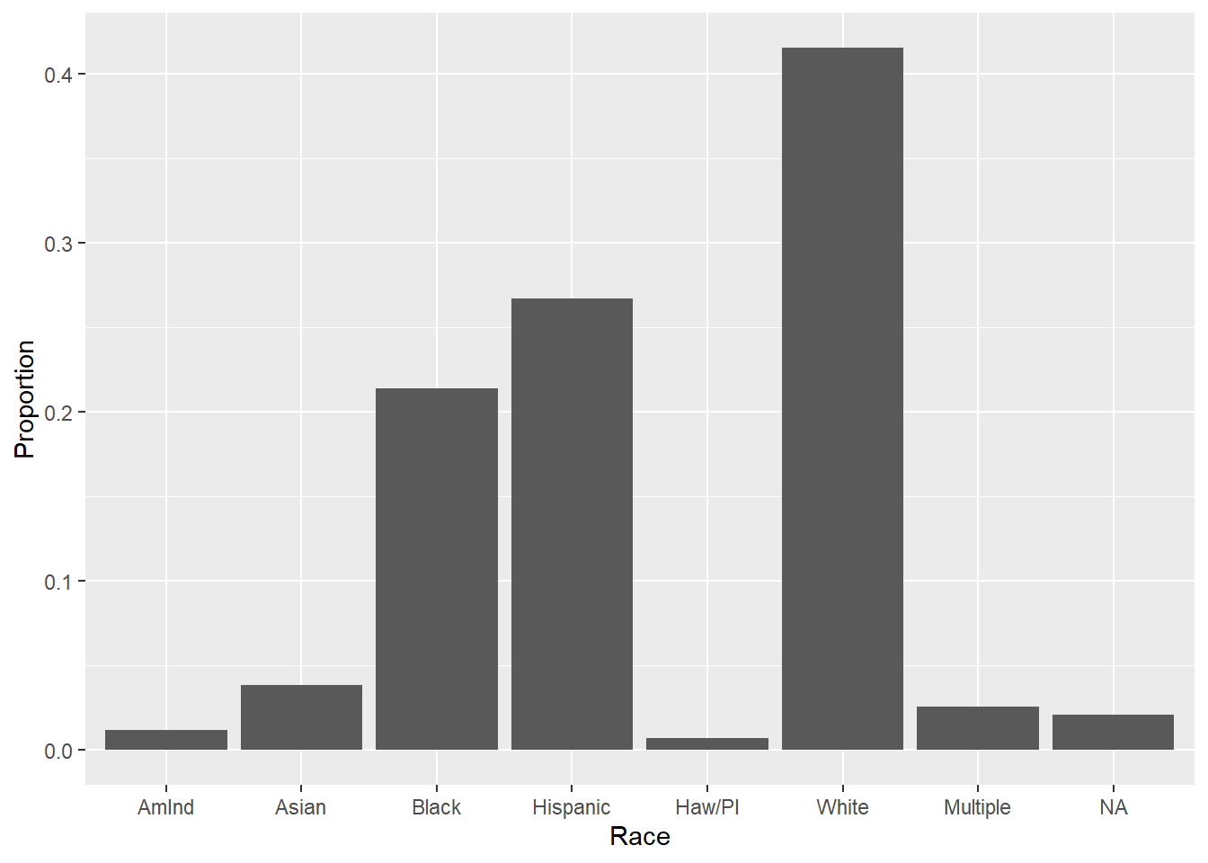
6.1.2 ggplot
In ggplot(), use geom_bar() to plot bars.
To get a probability chart, we use the ..count.. internal variable to create a proportion. ..count.. tells ggplot() to count up the number of observations at each level of x and put those values in y. Dividing by the sum turns that into a proportion.
# Proportion chart
mydat %>%
  ggplot(aes(x = race, y = ..count../sum(..count..))) +
  geom_bar() +
  labs(y = "Proportion", x= "Race")