6.5 Continuous vs. Categorical
There are multiple options for visualizing the association between continuous and categorical variables. Below, we will use three methods to examine the relationship between BMI and grade (9th, 10th, 11th, 12th).
6.5.1 Bar chart with mean and SD by group
One option is to create a bar chart of grade but, instead of the number of children in each grade, the height of the bar will indicate the mean bmi of children in that grade. We will also include 1-standard-deviation error bars to visualize the variation in bmi within grade. This is best done using ggplot(). This example also demonstrates the use of geom_text() to add text (in this case, the number within each bar).
# Bar chart of grade showing mean and SD of BMI within each grade
mydat %>%
  filter(!is.na(grade)) %>%
  # Group by grade
  group_by(grade) %>%
  # Compute n, and mean and sd of BMI, within grade
  summarize(n    = n(),
            mean = mean(bmi, na.rm = T),
            sd   = sd(  bmi, na.rm = T)) %>%
  # Specify x and y
  ggplot(aes(x = grade, y = mean)) +
  geom_bar(stat = "identity", color = "black", fill = "light blue") +
  # Specify where the bars start and end with ymin and ymax
  # Width controls the width of error bar whiskers
  # Size controls thickness of error bar lines
  geom_errorbar(aes(x= grade, ymin = mean - sd, ymax = mean + sd),
                width = 0.5, size = 0.75) +
  # Add the counts stored in n as text, y = 5 specifies how high along the y-axis
  geom_text(aes(y = 5, label = n)) +
  labs(y = "Body Mass Index (kg/m2)", x = "Grade")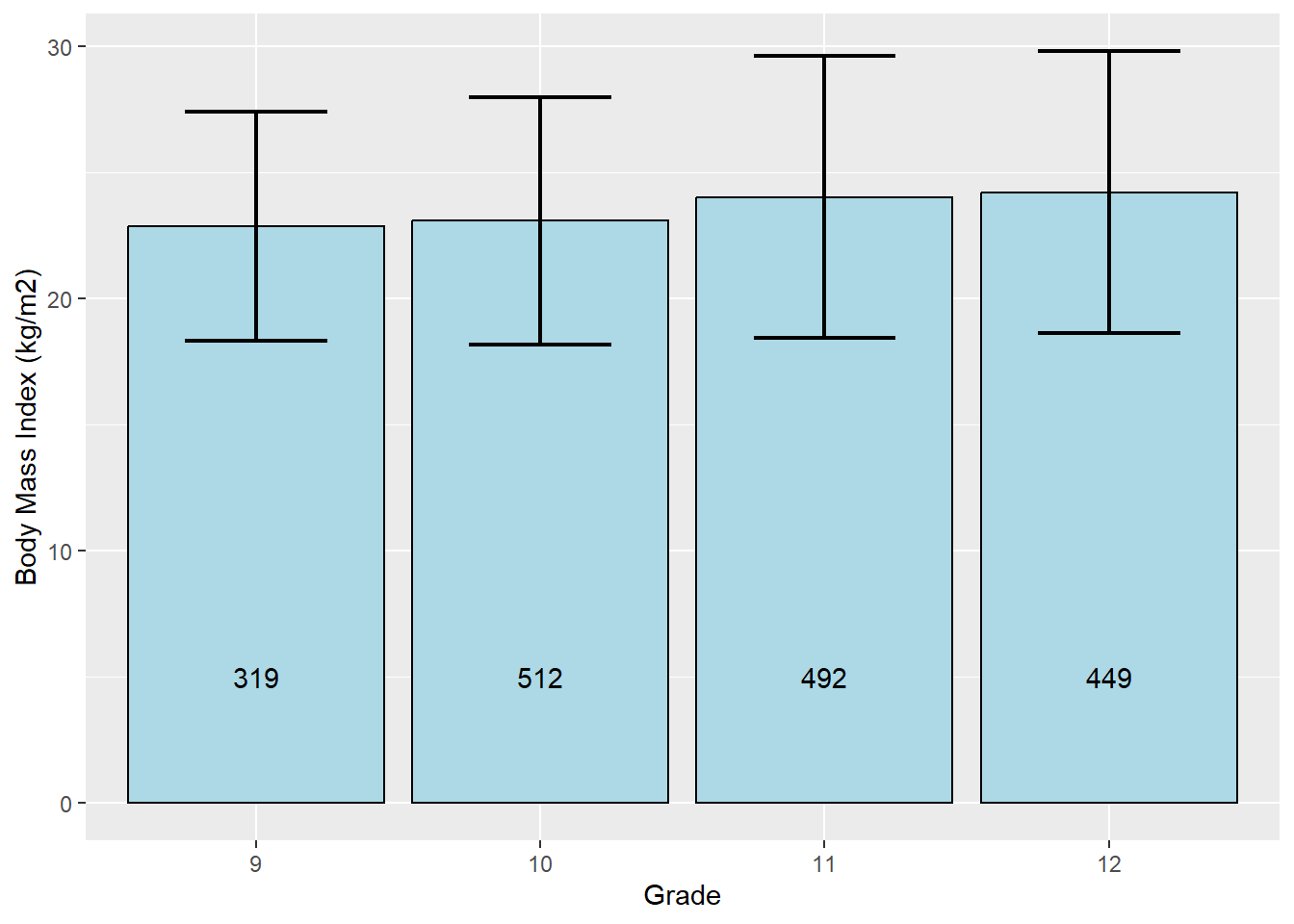
What if you also want to compare mean bmi between values of sex within grade?
# Compare BMI between sexes within grades
mydat %>%
  filter(!is.na(grade) & !is.na(sex)) %>%
  # Group by grade and sex
  group_by(grade, sex) %>%
  # Compute n, and mean and sd of BMI, within grade
  summarize(n    = n(),
            mean = mean(bmi, na.rm = T),
            sd   = sd(  bmi, na.rm = T)) %>%
  # Specify x and y, fill specifies the variable within clusters
  ggplot(aes(x = grade, y = mean, fill = sex)) +
  # Plot bars
  geom_bar(stat = "identity", position = "dodge") +
  # Specify where the bars start and end with ymin and ymax
  geom_errorbar(aes(ymin = mean - sd, ymax = mean + sd),
                width = 0.5, size = 0.75, position = position_dodge(0.9)) +
  # Add the counts stored in n as text, y = 5 specifies how high along the y-axis
  geom_text(aes(y = 5, label = n), position = position_dodge(0.9)) +
  labs(y = "Body Mass Index (kg/m2)", x = "Grade", fill = "Sex")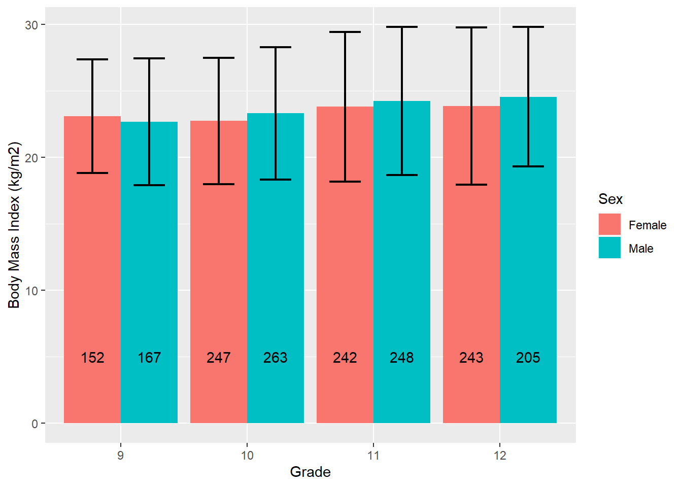
  # The position_dodge function is needed to get the error bars and n
  # to match the clusters, and the 0.9 works in this case to place them
  # in the middle of each bar
Let’s create the same bar chart, but this time compare mean BMI between grades by sex by reversing the roles of grade and sex in the chart.
# Compare BMI between grades within sex
mydat %>%
  filter(!is.na(sex) & !is.na(grade)) %>%
  group_by(sex, grade) %>%
  summarize(n    = n(),
            mean = mean(bmi, na.rm = T),
            sd   = sd(  bmi, na.rm = T)) %>%
  ggplot(aes(x = sex, y = mean, fill = grade)) +
  geom_bar(stat = "identity", position = "dodge") +
  geom_errorbar(aes(ymin = mean - sd, ymax = mean + sd),
                width = 0.5, size = 0.75, position = position_dodge(0.9)) +
  geom_text(aes(y = 5, label = n), position = position_dodge(0.9)) +
  labs(y = "Body Mass Index (kg/m2)", fill = "Grade", x = "Sex")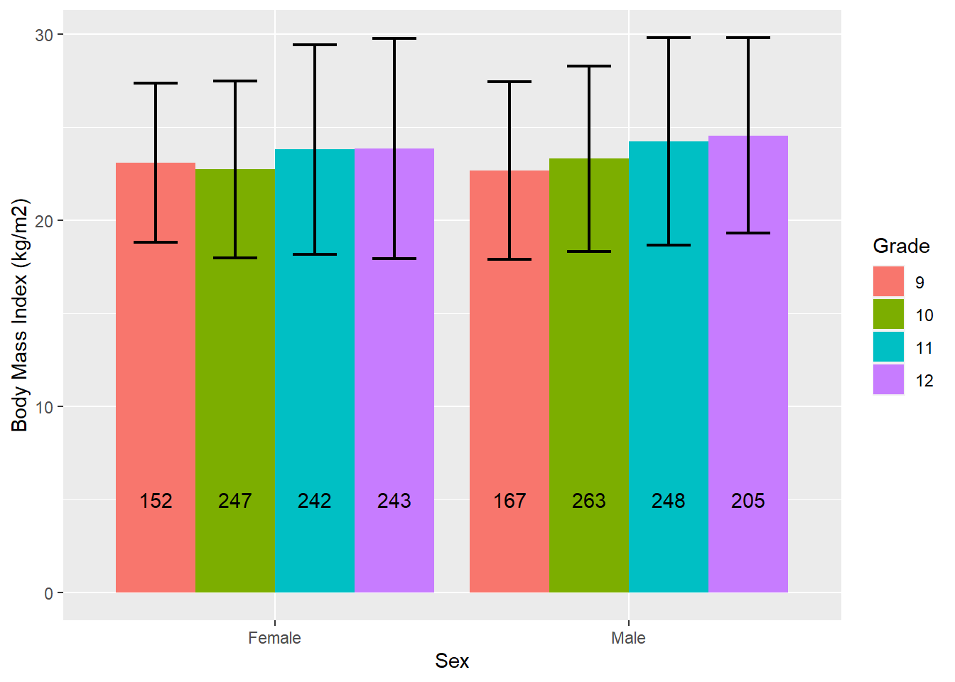
6.5.2 Side-by-side boxplots
Side-by-side boxplots are helpful for visualizing how the distribution of a continuous variable varies across the levels of a categorical variable.
6.5.2.1 Base R
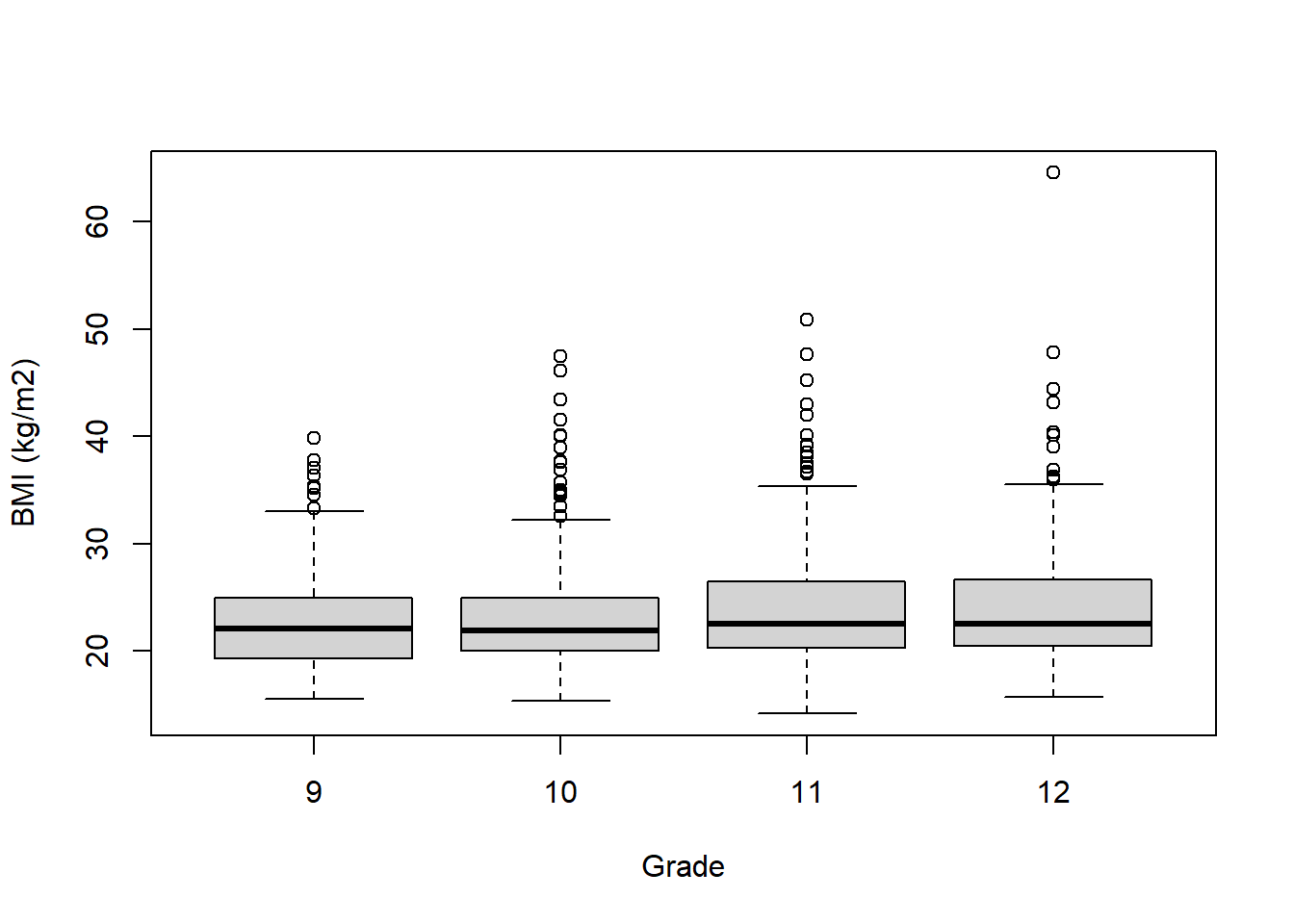
The syntax for boxplot() is different from many other plotting functions in that it allows the use of the formula operator ~ (typically the upper left of your keyboard). On the left of the ~ is the variable on the y-axis, and on the right is the variable on the x-axis. Also, instead of using the $ operator to refer to variables (e.g., mydat$bmi), boxplot() allows you to just use variable names along with a dataset specified using the data option. The following displays the distribution of BMI by grade.
Extending to multiple x-axis variables is accomplished by stringing them together with plus signs, and the order you put them in determines the nature of the clustering in the figure. cex.axis = 0.7 reduces the font size of the axis labels so they fit (the default value is 1).
# More than one clustering variable
boxplot(bmi ~ grade + sex,
        data = mydat,
        xlab = "Grade x Sex",
        ylab = "BMI (kg/m2)",
        cex.axis = 0.7)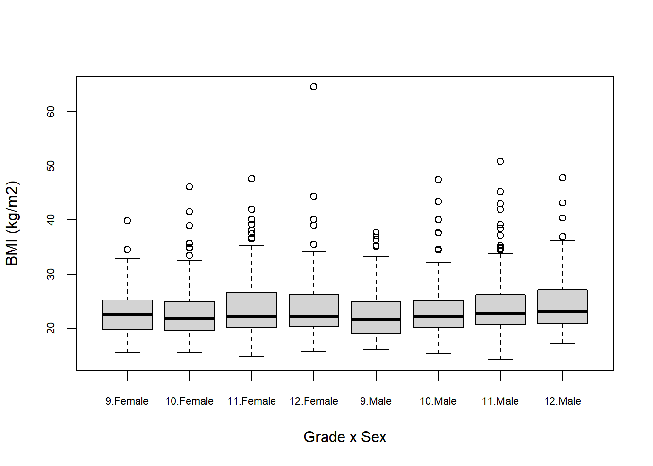
boxplot(bmi ~ sex + grade,
        data = mydat,
        xlab = "Sex x Grade",
        ylab = "BMI (kg/m2)",
        cex.axis = 0.7)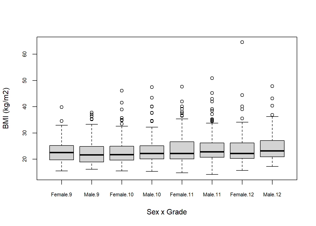
6.5.2.2 ggplot
In ggplot(), to get side-by-side boxplots, take a univariate boxplot and add a categorical x variable inside aes.
mydat %>%
  filter(!is.na(grade) & !is.na(sex) & !is.na(bmi)) %>%
  ggplot(aes(y = bmi, x = grade)) +
  geom_boxplot() +
  labs(y = "BMI (kg/m2)", x = "Grade")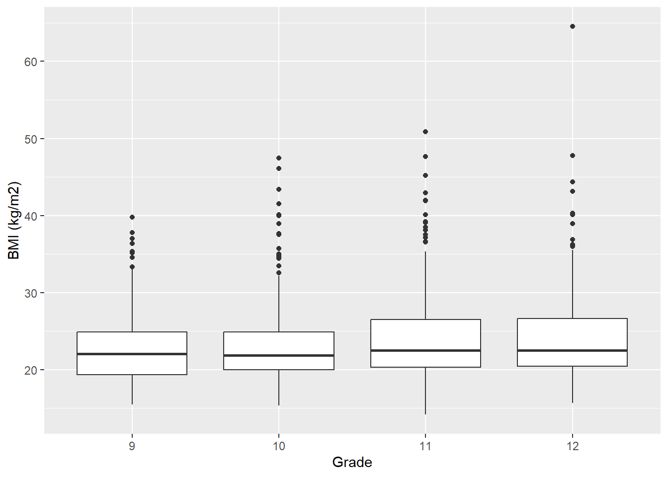
If you want to cluster by an additional categorical variable, add it as the fill variable (the variable that corresponds to different fill colors).
# More than one clustering variable
mydat %>%
  filter(!is.na(grade) & !is.na(sex) & !is.na(bmi)) %>%
  ggplot(aes(y = bmi, x = grade, fill = sex)) +
  geom_boxplot() +
  labs(y = "BMI (kg/m2)", x = "Grade", fill = "Sex")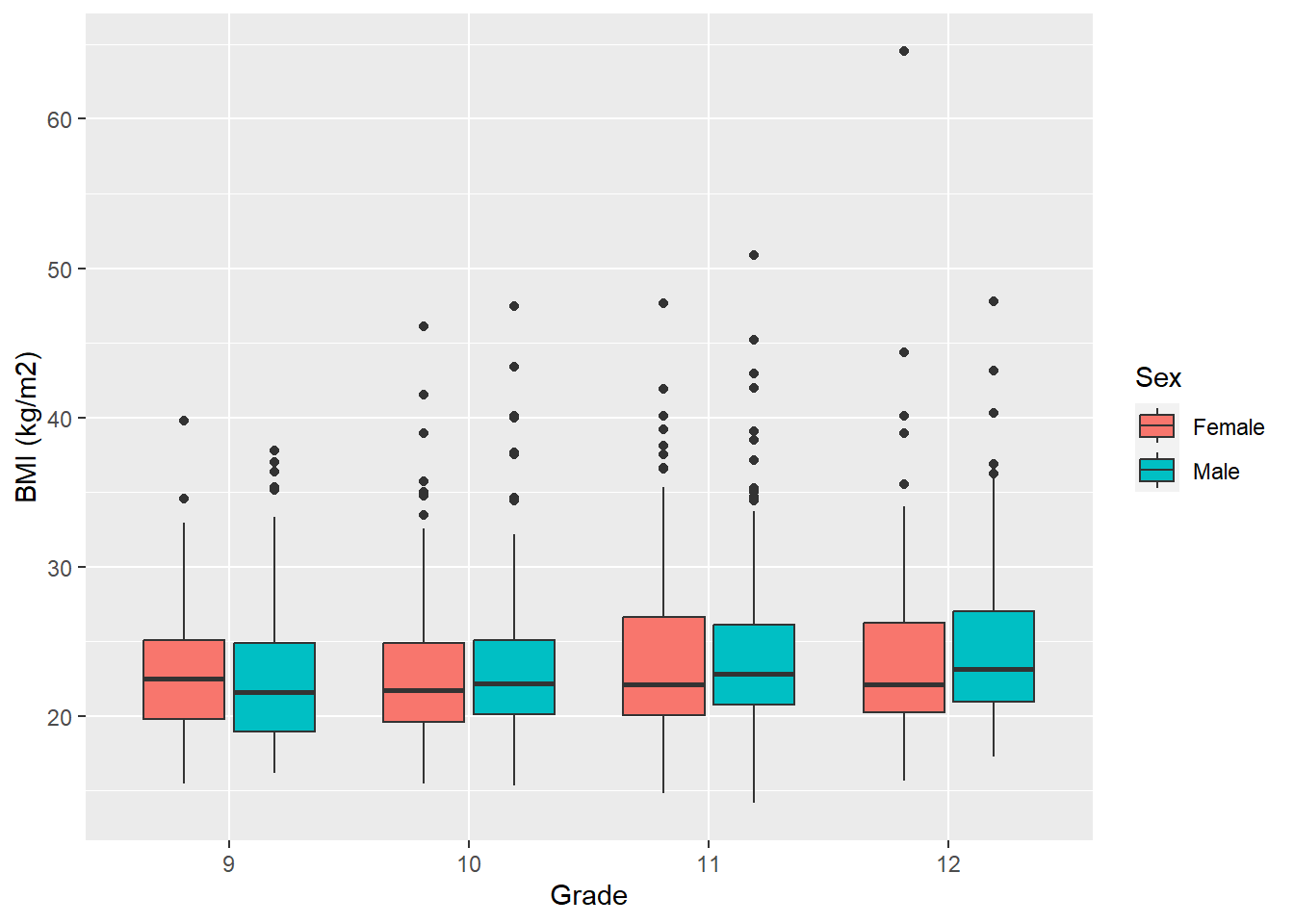
mydat %>%
  filter(!is.na(grade) & !is.na(sex) & !is.na(bmi)) %>%
  ggplot(aes(y = bmi, x = sex, fill = grade)) +
  geom_boxplot() +
  labs(y = "BMI (kg/m2)", x = "Sex", fill = "Grade")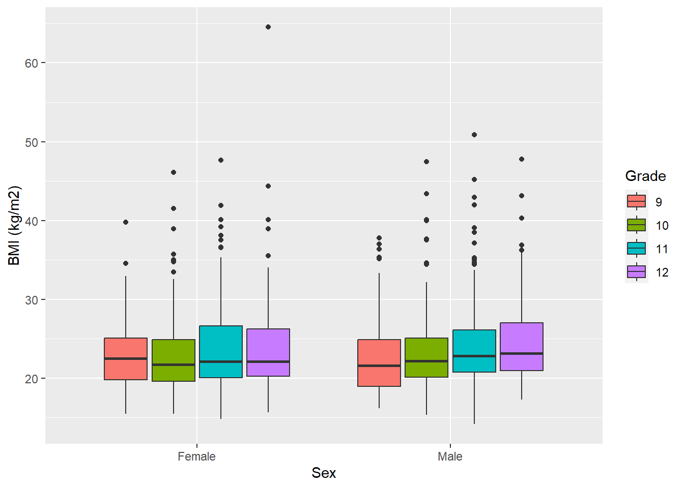
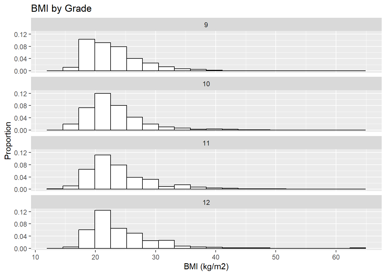
6.5.3 Rows of histograms
Another way to compare the distribution of a continuous variable across levels of a categorical variable is to plot rows of histograms (all on the same scale so they are comparable).
6.5.3.1 Base R
In base R, subset the data and plot a histogram for each subset, being careful to use the same x- and y-axis limits for each so they are on the same scale. The following demonstrates the use of par to change the margins, main and xlab to suppress the title and axis labels for all but specific plots, and xlim and ylim to put all the plots on the same scale. Base R in this case is a bit awkward to use; in the next subsection you will see that ggplot() is more concise for plotting rows of histograms.
SUB1 <- mydat$grade == "9"
SUB2 <- mydat$grade == "10"
SUB3 <- mydat$grade == "11"
SUB4 <- mydat$grade == "12"
# Compute range to use as limits so all plots are on the same scale
XLIM <- range(mydat$bmi, na.rm = T)
YLIM <- c(0, 0.14) # Set this after looking at the plots
# Set margins to make the histograms fill the space better
# Default par(mar=c(5, 4, 4, 2) + 0.1) for c(bottom, left, top, right)
par(mar=c(5, 4, 2.2, 2)) # c(bottom, left, top, right)
par(mfrow = c(4, 1))
hist(mydat$bmi[SUB1], xlim=XLIM, ylim=YLIM, ylab="Proportion", xlab="",
     main="BMI by Grade\n9", breaks=10, probability=T)
hist(mydat$bmi[SUB2], xlim=XLIM, ylim=YLIM, ylab="Proportion", xlab="",
     main="10", breaks=20, probability=T)
hist(mydat$bmi[SUB3], xlim=XLIM, ylim=YLIM, ylab="Proportion", xlab="",
     main="11", breaks=20, probability=T)
hist(mydat$bmi[SUB4], xlim=XLIM, ylim=YLIM, ylab="Proportion", xlab="BMI (kg/m2)",
main="12", breaks=20, probability=T) 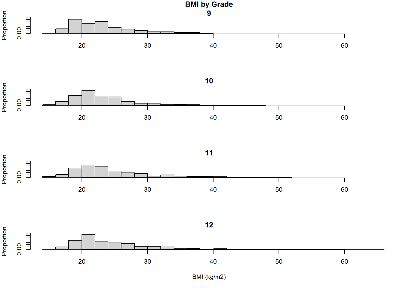
6.5.3.2 ggplot
The ggplot() method for rows of histograms is more concise and demonstrates the use of group_by() and facet_wrap(). Whereas, before, we used Rmisc::multiplot() to put multiple plots on a grid, facet_wrap() (preceded by group_by()) allows you to create plots stratified by another variable and place them on a labeled grid. Additionally, this method leads to plots that are automatically on the same scale.
NOTE: The formula operator ~ is used inside facet_wrap(), implying that if you want to stratify by more than one variable, just add it to the formula (e.g., ~ grade + sex) –- try it!
Unlike the base R method, you only have to specify labels and other options once here, and the margins are automatically adjusted so everything fits nicely.
mydat %>%
  filter(!is.na(grade) & !is.na(sex) & !is.na(bmi)) %>%
  group_by(grade) %>%
  ggplot(aes(x = bmi)) +
  geom_histogram(aes(y = ..density..), bins = 20,
                 color="black", fill="white") +
  labs(x = "BMI (kg/m2)", y = "Proportion") +
  facet_wrap(~grade, nrow = 4) +
  ggtitle("BMI by Grade")